Graphic Design Book
36
I’M YOUR GUY. QUENTIN COLLE Adresse: 5 rue Louis Eugène Varlin 13500 Martigues Téléphone: +336 950 691 76 Mail: [email protected]
-
Upload
quentin-colle -
Category
Documents
-
view
227 -
download
0
description
watch inside
Transcript of Graphic Design Book

I’M
YOU
R G
UY.
QUENTIN COLLE
Adresse:5 rue Louis Eugène Varlin13500 Martigues
Téléphone: +336 950 691 76
Mail:[email protected]


1 °
Avantages Plantes - 2013 / 2014
BrandingDirection artistique
Layers

Avantages PlantesBranding / Art Direction
I was asked by « Avantages Plantes » to create his logo and the global communication of the socity.
Avantages Plantes make infusions, aromes, salte and vinegar made from plant extracts. The two directors are doctor in nutrition which provide an eff ective eff ects on their products.
The logotype represent a leef to integrate the natural part of the products, the leef texture is a geometricals elements to bring a doctor manufacturing side. The white part of the logotype represente a hallmark to confi e the quality of the product.
1 - Logotype, Avantages Plantes,2013

3 - Typographie, Avantages Plantes,2013
2 - Système papèterie, Avantages Plantes,2013
ARCHER�/�Book
abcdefghijklmnopqrstuvwxyzABCDEFGHIJKLMNOPQRSTUVWXYZ1234567890
ARCHER�/�Book italic
abcdefghijklmnopqrstuvwxyzABCDEFGHIJKLMNOPQRSTUVWXYZ1234567890
ARCHER�/�Bold
abcdefghijklmnopqrstuvwxyzABCDEFGHIJKLMNOPQRSTUVWXYZ1234567890
ARCHER�/�Bold italic
abcdefghijklmnopqrstuvwxyzABCDEFGHIJKLMNOPQRSTUVWXYZ1234567890
aA

4 - Flyers, Avantages Plantes,2014
5 - Étiquettes packaging, Avantages Plantes,2014
VINAIGRES & SELS INFUSIONS, AROMES

2 °
Berlin.otf - 2012
Type design

Berlin.otfType design
We was asked to create a typography for a magazine named “Pavane”. To illustrated a storytelling in Berlin
We was ispireted by the old factory in Berlin and the underground cultur of this place.
1 - GLYPHS, Berlin.otf,2012

3 °
Hidden Heroes - 2012
Branding Direction artistique
Layers Technical drawing

Hidden HeroesBranding / Art Direction
Vitra museum want to create a new concept store named Hidden heroes. Création of the logotype and global communication of this store.
Hidden heroes is a new concept store where Vitra sell objects with a amazing design realy fonctional and clear design.
The logotype a monogram of “ Hidden Heroes ” with a sall caps “h” fi lpped to hide the heroes. All the condept of this project is to reveal the heroes but not on the fi rst check.
1 - Logotype, Hidden Heroes,2012
HIDDENHEROES
VITRADESIGN MUSEUM

2 - Système papèterie, Hidden Heroes,2012
3 - Typographie, Hidden Heroes,2012
GOTHAM / Book
abcdefghijklmnopqrstuvwxyzABCDEFGHIJKLMNOPQRSTUVWXYZ1234567890
GOTHAM / Book italic
abcdefghijklmnopqrstuvwxyzABCDEFGHIJKLMNOPQRSTUVWXYZ1234567890
GOTHAM / Bold
abcdefghijklmnopqrstuvwxyzABCDEFGHIJKLMNOPQRSTUVWXYZ1234567890
GOTHAM / Bold italic
abcdefghijklmnopqrstuvwxyzABCDEFGHIJKLMNOPQRSTUVWXYZ1234567890
aAaA

4 - Packaging, hidden heroes,2012
5 - Étiquettes packaging, Hidden Heroes,2012


6 - News paper, hidden heroes,2012

4°
Les Foodies - 2012
BrandingArt Direction
Layers illustations
Interior design
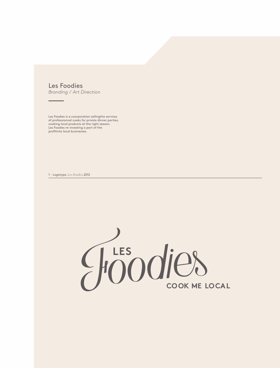
Les FoodiesBranding / Art Direction
Les Foodies is a coorporation sellingthe services of professionnal cooks for private dinner parties, cooking local products at the right season. Les Foodies re-investing a part of the profi tinto local buisnesses.
1 - Logotype, Les Foodies,2012
COOK ME LOCAL

2 - Système papèterie, Les Foodies,2012
3 - Typographie, Les Foodies,2012
Brown / Regular
abcdefghijklmnopqrstuvwxyzABCDEFGHIJKLMNOPQRSTUVWXYZ1234567890
Brown/ Regular italic
abcdefghijklmnopqrstuvwxyzABCDEFGHIJKLMNOPQRSTUVWXYZ1234567890
Brown/ Bold
abcdefghijklmnopqrstuvwxyzABCDEFGHIJKLMNOPQRSTUVWXYZ1234567890
Brown / Bold italic
abcdefghijklmnopqrstuvwxyzABCDEFGHIJKLMNOPQRSTUVWXYZ1234567890
aA

4 - Poster, Les foodies,2012

5 - Design d’espace, Les Foodies,2012
5 - Past Card, Les Foodies,2012
LE PICNIK C’EST CHIC.
AUJOURD’HUI GARDEN PARTY !
30, A
v M
arx
Dor
moy
8374
0 La
Cad
ière
d’A
zur
FRAN
CE
T 04
94
90 12
56
M 0
6 44
78
94 2
5E
lesf
oodi
es@
cook
mel
ocal
.fr
ww
w.le
sfoo
dies
.fr
LES
CO
OK
ME
LOC
AL

7 - Website, Les foodies,2012
LE CONCEPTACCUEIL
NOS PRODUCTEURSLES VEGGIESNOS CHEFSRESERVATION
LES
LES FOODIES C'EST VOUS.LES INITIATEURS C'EST NOUS.MAIS CE N'EST QUE GRÂCE À VOUS QUE NOUS SOUTENONS LES AGRICULTEURS DE NOS RÉGIONS.AVEC NOUS VOUS POURREZ DÉGUSTER UN SUCCULENT REPAS CUISINER POUR VOUS,CHEZ VOUS PAR UN DE NOS CHEFS AVEC LES PRODUITS DE NOS AGRICULTEURS. 30%
DE NOS PROFITS SONT REVERSER À
NOS PORDUCTEURS ET NOS FOURNISSEURS.
LE CONCEPTNOS PRODUCTEURSLES VEGGIESNOS CHEFSRESERVATION
LES
ACCUEIL

5°
Off Marseille 2012 / 2013 ( Marseille Capital Européenne de la culture ) - 2013
BrandingArt Direction
poster

Off Marseille 2012 / 2013Branding / Art Direction
The “Off Marseille” is the underground part of the year of Marseille European Capital
Hidden heroes is a new concept store where Vitra sell objects with a amazing design realy fonctional and clear design.
The logotype a monogram of “ Hidden Heroes ” with a sall caps “h” fi lpped to hide the heroes. All the condept of this project is to reveal the heroes but not on the fi rst check.
1 - Logotype, Off Marseille,2013

2 - Système papèterie, Off Marseille,2012/2013
3 - Typographie, Off Marseille,2012/2013
Akkurat / Regular
abcdefghijklmnopqrstuvwxyzABCDEFGHIJKLMNOPQRSTUVWXYZ1234567890
Citizen/ Regular
abcdefghijklmnopqrstuvwxyzABCDEFGHIJKLMNOPQRSTUVWXYZ1234567890
Akkurat/ Bold
abcdefghijklmnopqrstuvwxyzABCDEFGHIJKLMNOPQRSTUVWXYZ1234567890
Citizen / Bold
abcdefghijklmnopqrstuvwxyzABCDEFGHIJKLMNOPQRSTUVWXYZ1234567890
aA

4 - Event’s Poster , off Marseille,2012/2013

6°
Human to Human - 2013
Type designArt directionNews paper

Human to Human 2013Type design / Art Direction / News paper
I decided to create a news paper to show a the complexicity of the communication between human and how the typography can infl uence the prossess.
Human to Human is a news paper publish all three months about an emotion experimentation
1 - Font design, Human to Human,2013
abcdefg
hijklmn
opqrstu
vwxyz
!«»ÁÂ.ÈÉÙ
tristesse
a

abcdefg
hijklmn
opqrstu
vwxyz
!«»ÁÂ.ÈÉÙ
tristesse

4 - Newspaper , Human to Human,2013

7°
Opera studio - 2014
Branding Art direction

Opera Studio 2014Branding / Art Direction
1 -Logo design, Opera studio,2013
I was asked by « Made agency» to create the logo of Opera studio
Opera studio is a interior design studio based in China.
Design with passion

2 - Système papèterie, Opera studio,2014
3 - Typographie, Opera Studio,2014
SangBleu BP/ Hairline
abcdefghijklmnopqrstuvwxyzABCDEFGHIJKLMNOPQRSTUVWXYZ1234567890
SangBleu BP/ Hairline italic
abcdefghijklmnopqrstuvwxyzABCDEFGHIJKLMNOPQRSTUVWXYZ1234567890
Sangbleu BP/ light
abcdefghijklmnopqrstuvwxyzABCDEFGHIJKLMNOPQRSTUVWXYZ1234567890
Sangbleu BP/ Light italic
abcdefghijklmnopqrstuvwxyzABCDEFGHIJKLMNOPQRSTUVWXYZ1234567890
aA


8°
Fanny Vignaud - 2014
IdentityArt Direction

Fanny Vignaud 2014Identity / Art Direction
1 -Logo design, Opera studio,2013
I was asked by Fanny Vignaud to create his logo for and his stationery.
Fanny Vignaud is a french psychotherapist
The logotype is inspirated by the Rorschach’s test with the two first letter of the name and firstman.

2 - Système papèterie, Fanny Vignaud,2014
3 - Typographie, Fanny Vignaud,2014
Salomon/ Regular
abcdefghijklmnopqrstuvwxyzABCDEFGHIJKLMNOPQRSTUVWXYZ1234567890
Didot/ Regular
abcdefghijklmnopqrstuvwxyzABCDEFGHIJKLMNOPQRSTUVWXYZ1234567890
Didot/ Italic
abcdefghijklmnopqrstuvwxyzABCDEFGHIJKLMNOPQRSTUVWXYZ1234567890
Didot/ Bold
abcdefghijklmnopqrstuvwxyzABCDEFGHIJKLMNOPQRSTUVWXYZ1234567890
aA

STO
PLO
OK-
ING