Google Fusion Tables Tutorial: Displaying Facilities in ...
6
Drew University – Spatial Data Center Geographic Information Systems 2014-2015 Tutorial, EPA TRI University Challenge Drew University – Spatial Data Center 1 Google Fusion Tables Tutorial: Displaying Facilities in Discharge Monitoring Reports (DMR) This tutorial will introduce you to the following: Obtaining Data from EPA – DMR, and relevant base map materials Mapping DMR quantitative attributes Creating webmaps for sharing DMR results Part 1: Obtaining DMR Data Discharge Monitoring Reports are an excellent source of data to begin to understand the sources and impacts of water pollution. Navigate to the Discharge Monitoring Report (DMR) Pollutant Loading Tool website: http://cfpub.epa.gov/dmr/. Click the EZ Search tab, and select the appropriate searches for your project. For example, to study discharges in the Delaware River Basin, first choose the year, then Major Watershed > Delaware River Basin. It takes a few moments. When the data are returned you have several options for downloads. Facilities are a great choice for examining spatial data, because all facilities contain geographic information (Lat/Long) that you can map. You might choose facility emissions in pounds or in Toxic-Weighted Pounds (TWPE), then click download all data. When you have the option, save the file (.csv) to your computer. This also may take some time to download.
Transcript of Google Fusion Tables Tutorial: Displaying Facilities in ...
Drew University – Spatial Data Center Geographic Information Systems 2014-2015 Tutorial, EPA TRI University Challenge
Drew University – Spatial Data Center 1
Google Fusion Tables Tutorial: Displaying Facilities in Discharge Monitoring Reports (DMR) This tutorial will introduce you to the following:
Obtaining Data from EPA – DMR, and relevant base map materials
Mapping DMR quantitative attributes
Creating webmaps for sharing DMR results
Part 1: Obtaining DMR Data Discharge Monitoring Reports are an excellent source of data to begin to understand the sources and impacts of water pollution. Navigate to the Discharge Monitoring Report (DMR) Pollutant Loading Tool website: http://cfpub.epa.gov/dmr/. Click the EZ Search tab, and select the appropriate searches for your project. For example, to study discharges in the Delaware River Basin, first choose the year, then Major Watershed > Delaware River Basin.
It takes a few moments. When the data are returned you have several options for downloads. Facilities are a great choice for examining spatial data, because all facilities contain geographic information (Lat/Long) that you can map. You might choose facility emissions in pounds or in Toxic-Weighted Pounds (TWPE), then click download all data. When you have the option, save the file (.csv) to your computer. This also may take some time to download.

Drew University – Spatial Data Center Geographic Information Systems 2014-2015 Tutorial, EPA TRI University Challenge
Drew University – Spatial Data Center 2
Part 2: Mapping DMR Quantitative Attributes
Step 1: Edit Downloaded Data
After your .csv file downloads, open it to see what is contains. It should automatically open in Excel.
The current format is not suitable as an input in Google Fusion. You’ll need to first delete the extra header rows (as shown below, the top two rows have been deleted. To do this, simple select row one and two, right-click and choose delete).
You can then save your edited data as a .csv (Comma Separate Values) file. Close Excel. Step 2: Add Spreadsheet to Google Fusion To use Google Fusion Tables, you will need a Google Account. Google accounts are free, and you can register for them at Gmail.com. Once you have a Google Account, visit drive.google.com. Click Create, than Connect to More Apps, and search for Fusion Table. Once you find it, connect to it, then you can use this app in Google Drive. In Google Drive, click Create > Fusion Table. You will be prompted to upload a .csv file. Navigate to the file that you just created in the previous step, and upload it. Then, click Next >>, Next >>, and Finish.
Drew University – Spatial Data Center Geographic Information Systems 2014-2015 Tutorial, EPA TRI University Challenge
Drew University – Spatial Data Center 3
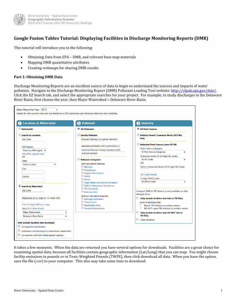
Step 3: Display Points
The spreadsheet that you downloaded and edited, should now appear as a Fusion Table (example below).
Click the Map of Latitude tab to display the point locations (an example of points for the Delaware River Basin are shown below). You can click on the points to learn the attributes associated with each facility (displayed by lat/long).

Drew University – Spatial Data Center Geographic Information Systems 2014-2015 Tutorial, EPA TRI University Challenge
Drew University – Spatial Data Center 4
There are more attributes in your data sheet than are displayed in Google Fusion Tables by default. To see more (or less), click “Change info window…” to select or unselect fields to change the pop-up information that is seen.
Step 4: Change the Point Symbology A common way to illustrate the point symbology is to use graduated symbols. To change the symbol color, based on a criteria, click “Change feature styles.” Click Points > Marker icon, then click the buckets tab. Here you can select the quantitative column that you wish to map (e.g. TWPE), and then you can select the break points for each color classification.
Drew University – Spatial Data Center Geographic Information Systems 2014-2015 Tutorial, EPA TRI University Challenge
Drew University – Spatial Data Center 5
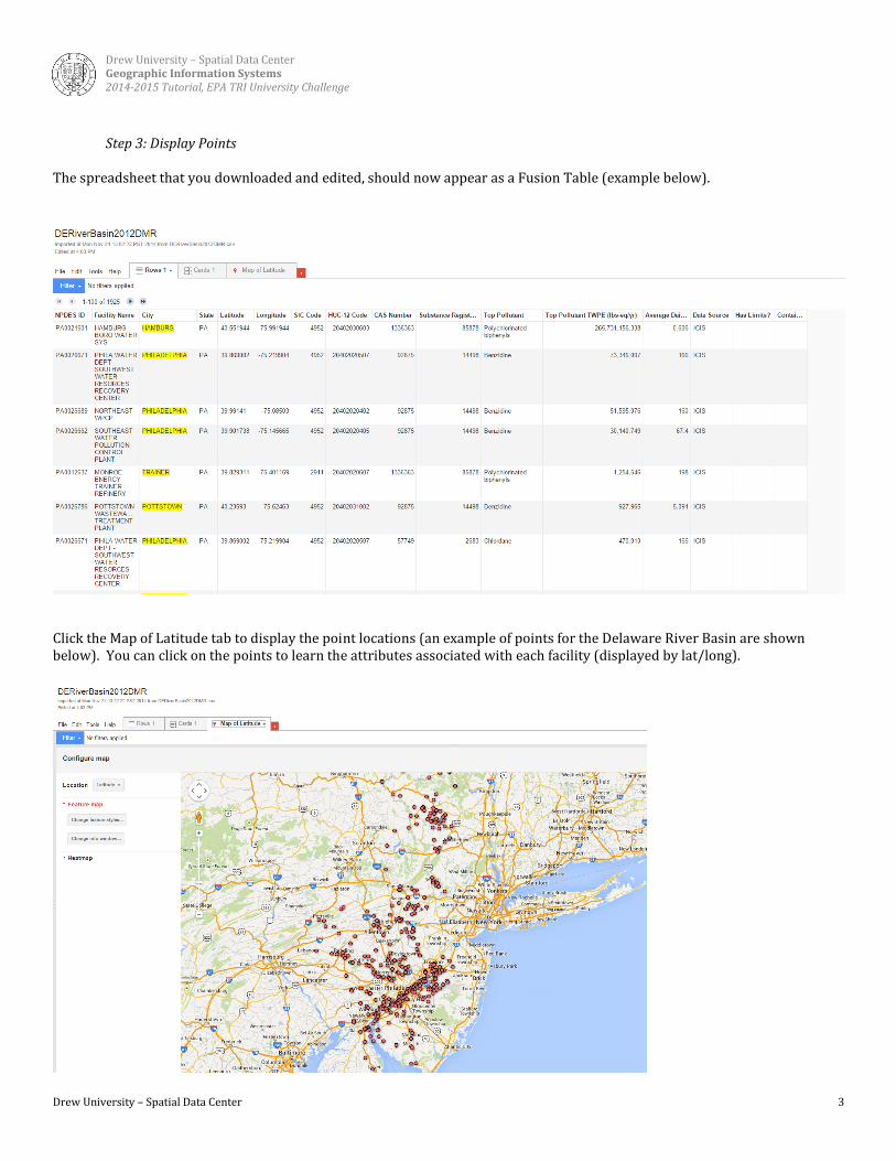
By clicking Legend > Automatic Legend, you can add a legend to your map.
By changing the symbol color, and adding a legend, you can improve the readability of your map, allowing you to sift more easily through numerous data points.
Another useful way to display your data is to create a heat map. To create a heat map, just click heat map, and select the weight that you would like to visualize.

Drew University – Spatial Data Center Geographic Information Systems 2014-2015 Tutorial, EPA TRI University Challenge
Drew University – Spatial Data Center 6
Part 3. Creating Web Maps to Share Your Data When you are done editing the web map that you would like to create. Then, click on the title to edit the title name to be descriptive of your work. Then, click Done (on the left side of your map). You can share either your Google Fusion Table, which includes the table and map, or you can share just the map (or both). To share just the map, select Tools > Publish, then copy the URL to share in an email or post on a website. For example, https://www.google.com/fusiontables/embedviz?q=select+col4+from+1CbLgyrzIaiH0nvDKwigwo6eNwr9pznk2N3vdycvb&viz=MAP&h=false&lat=40.01250365003144&lng=-73.99904616992188&t=3&z=9&l=col4&y=2&tmplt=2&hml=TWO_COL_LAT_LNG. To share the Google Fusion table, select Share in the upper right corner, and change the permission to allow others to view the document. Then, you will have access to a URL directly to your fusion tables. For example, https://www.google.com/fusiontables/DataSource?docid=1CbLgyrzIaiH0nvDKwigwo6eNwr9pznk2N3vdycvb.