Ggplot in python
38
GGPLOT IN PYTHON -By Sarah Masud
-
Upload
ajay-ohri -
Category
Data & Analytics
-
view
952 -
download
2
Transcript of Ggplot in python
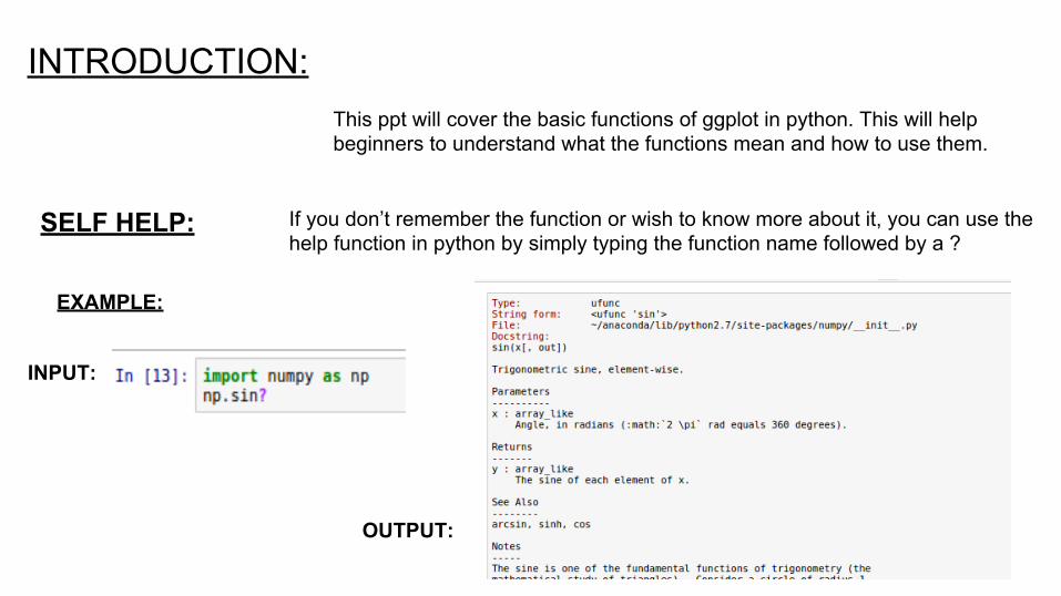
INTRODUCTION:This ppt will cover the basic functions of ggplot in python. This will help beginners to understand what the functions mean and how to use them.
SELF HELP: If you don’t remember the function or wish to know more about it, you can use the help function in python by simply typing the function name followed by a ?
EXAMPLE:
INPUT:
OUTPUT:

PREREQUISITES INSTALLED:● pip● easy install ● matplotlib● pandas● numpy● scipy● statmodels
INSTALL ggplot UNDER PYTHON:
FOR LINUXMethod 1: pip install ggplot
Method 2: pip install git+git://github.com/yhat/ggplot.git

SOURCE OF DATA:
Big Diamonds data set is used through the presentation. You can download the data set from:https://github.com/SolomonMg/diamonds-data
HOW TO OBTAIN THE CSV:METHOD 1: Read the RDA file in R and writeback as CSV.
METHOD 2: Use rpy2.

WHAT IS ggplot?
Created by H. Wickman, ggplot provides an easy interface to generate state of art visualizations.Written originally for R, its success enabled it be used for Python as well.
COMPONENTS OF ggplot:● ggplot API- Used to implement the plots.● Data- Uses data as Data Frames as in pandas. ● Aesthetics- How the axes and theme looks.● Layer- what information is annotated on top of basic plot.

TIME TAKEN TO EXECUTE A FUNCTION:
Source: http://stackoverflow.com/questions/6786990/find-out-time-it-took-for-a-python-script-to-complete-execution

INPUT THE DATA:
Import necessary packages.
Read Data:
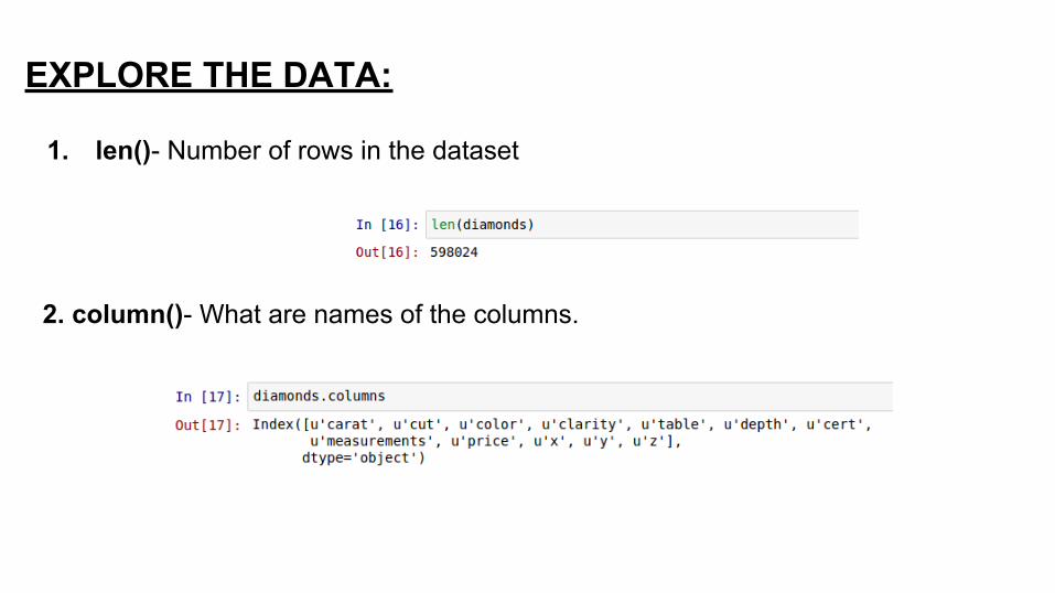
EXPLORE THE DATA:
1. len()- Number of rows in the dataset
2. column()- What are names of the columns.

WHAT DOES THE COLUMNS CONTAIN:
1. Carat- Weight of the diamond (1 carat=0.2g)2. Cut- Quality of cut3. Color- Color of diamond (J-worst D-best)4. Clarity- A measure of how clear the diamond is.5. Cert- The level of certification granted.6. x- Length in mm.7. y- Breadth in mm.8. z- Height in mm.9. Measurement- Volume in terms of x*y*z.
10. Table- Width of top of diamond relative to widest point.11. Depth- Numerically = (2*z) /(x+y)

3. head()/tail()- To know the first few & last few values, respectively.
NOTE: The dataset contains both quantitative(numeric)and qualitative fields.

4. Random selection- To see data values at random.

5. Describe()- Give the mathematical details of fields with numerical value.
NOTE: The mean of x,y are approximately same. Do diamonds have proportionate length/breadth?
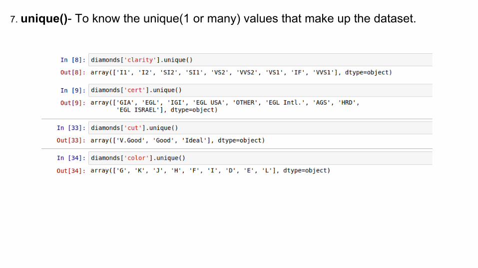
7. unique()- To know the unique(1 or many) values that make up the dataset.

PREPARING DATA:
1.Check for null values.
2. Check for zero price values.

3. Obtain clean data set by removing null values.

EVALUATION OF DATA:
1. New Statistical Information:

2. Correlations

3. The plot of density of diamond
NOTE:stat.lingress is used to calculate the components of the line of best fit of the form y=mx+c, where m=slope and c=y-intercept. The r_value is the regression coefficient, the p_value s a constant usually zero, while std_err is the error of estimation.
ggplot(dataset,aesthetics(y,x)- Gives us a blank coordinate systemgeom_points- Plots the dataset on the blank plot.scale_y/x_continous- Use to give name and range of the axis.geom_abline- Draw a line of form y=mx+c.

OUTPUT:
HOW IT WORKS:1. ggplot is invoked.2. A blank coordinate system
with labeled axes is put up.3. The points are plotted.4. The axis redefined and
cropped.5. The line draw as another
layer on top of the points.

PRICE EVALUATION:
Diamonds are expensive!Let us try to map what factors make them so.

PRICE VS BREADTH
NOTE:labs-use to label the graph and the axises.x-lab and y-lab can also be separately used.
stats_smooth provides a mechanism to plot the line of regression and help determine the relation among the variants.

PRICE VS LENGTH

PRICE VS HEIGHT
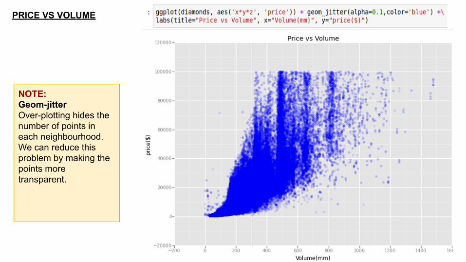
PRICE VS VOLUME
NOTE:Geom-jitterOver-plotting hides the number of points in each neighbourhood. We can reduce this problem by making the points more transparent.

PRICE VS TABLE
NOTE:A horizontal line of regression means that value of f(x) can be calculated without much consideration of the value of x.Thus, price is not considerably affected by table and can be calculated without taking table into account.

PRICE VS DEPTH

PRICE VS CARATS

NOTE:A quadratic line of regression signifies that value of price depends on the value of carat. But is only carat, lets see closely.

PRICE vs CARAT
NOTE:Since the original Price VS carat graph was not providing us accurate information, we narrow down the scale to a particular section.In the next slide we narrow it down further.
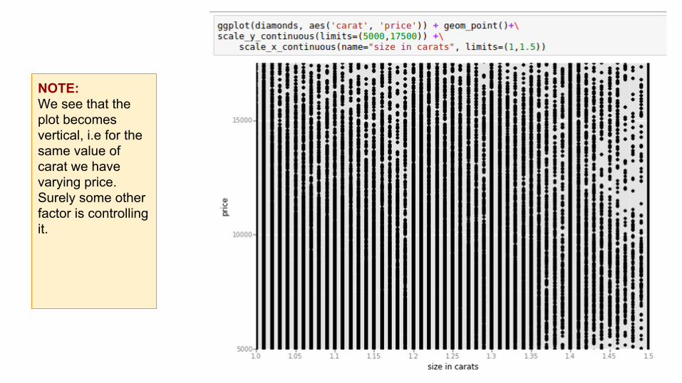
NOTE:We see that the plot becomes vertical, i.e for the same value of carat we have varying price. Surely some other factor is controlling it.

NOTE:This is plotting the price with respect to the cut.We see that for a given carat value the quality of changes the price.

Differentiate price VS carat with respect to cut.

Differentiate price VS carat with respect to color.

Differentiate price VS carat with respect to clarity.

NOTE:Facets- It features the same set of data with respect to a given factor. This helps us determine which value of factor affects f(x) the most,
FACETS

FACETS

This presentation is a part of the larger pool of learning resources provided by DecisionStats.org
FURTHER SOURCES:
1. https://decisionstats.org2. https://github.com/SolomonMg/diamonds-data3. https://themessier.wordpress.com/2015/06/17/ggplot-in-python-part-14. http://nbviewer.ipython.org/gist/sara-02/d5a61234ef32e60bddda5. http://nbviewer.ipython.org/gist/sara-02/d38da4a2023da169ac136. https://gist.github.com/sara-02/4eb520fd1b82521e8a11
CITATION:1. http://ggplot.yhathq.com/2. https://github.com/yhat/ggplot
FOR QUERIES:
[email protected]@gmail.com

THANK YOU