Get read - Enabling Change · Get read A guide to making reader-friendly ... B O O K S p r actical...
28
Les Robinson new citi z e n B O O K S Want to write and design a brochure,newsletter, booklet or manual? This simple, illuminating booklet shows you how to make a publication which speaks to your audience in a language they’ll really understand. It contains: ■ An easy guide to planning and writing a ‘reader friendly’ publication. ■ A simplified guide to graphic design, especially for those starting their own desktop publishing. ■ A ‘survivor’s guide to dealing with printers’ – essential for anyone who has to venture into these tricky waters. Get read A guide to making reader-friendly publications ‘Fantastic stuff on publishing. I've been doing it “blind” for many months now, but you have enlightened me on the things everyone else seems to know about, except me. Thank you.’ – Indira Narayan, desktop publisher
Transcript of Get read - Enabling Change · Get read A guide to making reader-friendly ... B O O K S p r actical...

Les Robins o n newciti z e nB O O K S
Want to write and design a brochure,newsletter,booklet or manual?
This simple, illuminating booklet shows you how to make apublication which speaks to your audience in a languagethey’ll really understand.
It contains:
■ An easy guide to planning and writing a ‘reader friendly’publication.
■ A simplified guide to graphic design, especially for thosestarting their own desktop publishing.
■ A ‘survivor’s guide to dealing with printers’ – essentialfor anyone who has to venture into these tricky waters.
Get readA guide to making
reader-friendlypublications
‘Fantastic stuff on publishing.I've been doing it “blind” formany months now, but youhave enlightened me on thethings everyone else seems toknow about, except me. Thank you.’
– Indira Narayan, desktop publisher

Making reader friendly publications 3
First published in 1989.
This fully updated edition published in 2001 byPluto Press Australia, Locked Bag 199, Annandale NSW 2038
Copyright © Les Robinson 2001
ISBN
Les Robinson has been a cartoonist and a graphic designer.He now creates social marketing campaigns for Social ChangeMedia in Sydney.
Thanks to Louise Dow for the snails (p18).
New Citizen Books is an imprint of Pluto Press Australia.
Order additional copies of New Citizen Books throughhttp://www.newcitizen.com.au
ContentsBeing friendly . . . . . . . . . . . . . . . . . . . 4
Designing from the start . . . . . . . . . . . 6
Know your purpose . . . . . . . . . . . . . . . 7
Five styles of publication . . . . . . . . . . . 8
Know your readers . . . . . . . . . . . . . . . 12
Deciding on a plan of contents. . . . . . 13
Stop being logical . . . . . . . . . . . . . . . 14
Make it chunky . . . . . . . . . . . . . . . . . 16
Be interesting, be visual . . . . . . . . . . . 18
Put your ‘page furniture’ to work . . . . 21
Editing – be brief, be simple. . . . . . . . 23
Avoiding sexist language . . . . . . . . . . 27
Pre-testing – your insurance policy . . . 29
Graphic design. . . . . . . . . . . . . . . . . . 33
Some basic design rules . . . . . . . . . . . 34
The elements of good design . . . . . . . 36
Choosing type . . . . . . . . . . . . . . . . . . 38
A survivor’s guide to hiring graphic artists42
A survivor’s guide to printers . . . . . . . 44
Green printing . . . . . . . . . . . . . . . . . . 50
Useful books . . . . . . . . . . . . . . . . . . . 51
newciti z e nB O O K S
p ract ica l tools for c it izens

communication medium in our society,but it has to work harder to get andkeep an audience’s attention. This is a‘post-literate’ generation – most peoplewould rather talk to another humanbeing or watch TV.
In fact, written publications have a lot tolearn from television. TV is visual. Itknows its audience. It makes fewdemands on viewers. It presentsinformation in breakfast-cereal sizedchunks. It is dramatic. It rewards itsaudience. Even at its most stupid it isgood to look at.
This is the competition facing printedmatter, but any publication can improveits effectiveness by understanding itsreaders and answering their needs in aninteresting way.
Making reader friendly publications 5
Organisations and groupsroutinely produce forestsof newsletters, brochures, and bookletsfilled with important information.
But how much of this information isread and understood?
Many publications fail to communicatebecause they aren’t relevant orinteresting to their audience, becausethey are boring, or because they areincomprehensible or illegible.
This booklet is about how to make yourpublications interesting, relevant andreadable.
The idea is to put yourself in theaudience’s place before you start writingyour document and ask the mostimportant question: ‘Why should I readthis?’
Starting with your audience’s perceptionsand needs in mind is the essence ofbeing reader friendly.
Your readers are interested in their ownlives and jobs. They are often busy,distracted, bored or tired. They have littleuse for your message unless it fits intotheir needs and concerns.
Paper is still the most important
4 Making reader friendly publications
Being readerfriendly

The first and most important questionyou need to ask before start on yourpublication is:
‘What is the publication supposed to do?’
Simply ‘informing people’ is rarely a verymeaningful purpose.
Ask yourself, ‘What do we want peopleto DO as a result of the information?’ or,‘Which audience responses or actions cantell us we have been successful?’
For example, a government departmentwants to produce a booklet onenvironmentally-friendly shopping.Assuming a booklet is part of the answerto this problem (for example, as part of alarger campaign), the purpose of thebooklet is to encourage shoppers tomake different buying choices.
A booklet which simply discusses benefitsto the environment will not achieve thispurpose. It would be better to focus onthe benefits to the shopper – like healthyeating, dollar savings, family safety, andincreased leisure time – and to focus onovercoming practical barriers, like theproblems of storing foods bought inbulk.
This approach is called ‘audience-centred’.
Making reader friendly publications 7
Most people think design is somethinggraphic artists do after a publication iswritten. But for a publication to beeffective, the content itself must be‘designed’. This means being crystal clearabout the purpose of the publication(see opposite), finding out what thereaders’ interests, priorities andperceptions are and then structuring thepublication to suit them.
For example your communityorganisation might think the ExecutiveDirector’s report is the most importantpart of its newsletter. And yet what doyour readers really want to know? Gossipand news, of course! You don’t have tocut the EO’s report, but the surest wayto turn off your readers will be to put iton page one.
People will feel good about using yourpublication if they feel it is relevant totheir needs, can easily grasp its structureand quickly find out what is relevant tothem.
6 Making reader friendly publications
Designing from thestart
Know your purpose

Five styles ofpublicationAnother way to think about purpose is interms of WHAT you need tocommunicate. There are, generallyspeaking, at least five kinds of thingsyou might want to communicate in apublication –
1) Facts
2) Values
3) Skills
4) Desires
5) Action requests.
Keep in mind that your publication maylook, feel and read completely differentdepending which of these things you aretrying to communicate!
1) Communicating factsYou may want to pass on importantfacts like policies, historic facts, statistics,allegations etc.
To communicate facts it’s good to besuccinct, with each fact listed as separatea chunk or point. Statistics can berendered as graphs and tables. Maps andinfographics can make facts much easierto digest. Captions should repeat andreinforce the most important facts. Ifpossible, try to humanise your statistics;
Making reader friendly publications 9
To make your publication effective, youshould think carefully about how tomake it best fit your audience’s wants,needs, and lifestyles.
8 Making reader friendly publications

Making reader friendly publications 11
for example, 240 football fields insteadof 290 hectares.
2) Communicating values To mobilise an audience you may needto explain why certain facts areimportant, or ‘bring home’ a situation sopeople can empathise with the humandimension.
10 Making reader friendly publications
Stories, examples and case studies –especially reporting human passions –are the best way to humanise facts andevoke the values you believe areimportant.
NGOs, like Greenpeace, know the powerof a human story – see the excerpt froma Greenpeace anti-nuclear ‘action’brochure on the opposite page.
3) Communicating skillsWhen you want people to perform anaction it’s valuable to include ‘how-to’illustrations or photos – even if theaction is just making a phone call,answering a letter or clicking a website.
Illustrations and photos harness ourhuman capacity for mimicry. They areinstantly interpreted by the motor partsof the brain, and are much easier tocomprehend than written words.
If your action is complex, make sure youinclude a step-by-step guide. Note thatphotos tend to be more credible thanillustrations.
4) Communicating desiresAh ... now we are in the business ofmarketing! To encourage people to wantsomething – whether a product or adifferent future, you may need toprompt their imaginations.
People do want a just, cleaner, more

Making reader friendly publications 13
Know your readersA vital stage in designing a friendlypublication is working out what kind ofpeople your readers are and what they arelikely to be interested in.
Answer these questions:
❏ What kinds of people are myreaders?
❏ How busy are they?
❏ What is important to them?
❏ What are they lo
❏ What are their expectations?
❏ What are their needs?
❏ If it's for sale, why should they buy it?
Then put yourself in the readers' place.
Ask:
❏ What's in it for me?
❏ Why should I keep reading?
Note: It’s a good idea to be a little cynicalwhen picturing your reader, for example, acomputer manual for a manager who hasjust been told her job is on the line, who isin a hurry to get results and has six otherthings to do before going home to feedthe kids.
12 Making reader friendly publications
natural world, but for people to believein that future and mobilise theirenergies, it’s valuable to help them seethat future a little more clearly.
So use photographs or illustrations tocreate desirable visions in which youraudience can easily place themselves.Advertisers do this all the time – youdon’t buy a cigarette, you buy the sundipping on a limpid evening as yourLamborgini sweeps down the GreatOcean Road etc.
Why should we let advertisers have amonopoly on the human imagination?
5) Communicating actionsOften a nice overall formula for an‘action’ publication is: problem→
credible alternative→ audience action.
You’ll need to use the above four kindsof communication to evoke the problemand the credible alternative.
Then, when you want people to join,march, write, call, give or visit, ask themvery clearly, simply and prominently.Don’t let the action request get lost inthe fine print, and avoid complicatedactions (eg, ask people to write to justone politician, not six).

Making reader friendly publications 1514 Making reader friendly publications
It’s not good enough just to write aboutyour subjects in the order which islogical to you. You know the subject, thereaders do not. The readers’ logic is thelogic of learning. The presentation thatmakes sense to you may simplyoverwhelm the reader.
Often the reader’s order of informationis EXACTLY the opposite of a writer’s!It’s surprising how many boring articlescan be made interesting simply byreversing the order of paragraphs,putting the last one first, and so on.That’s because academic and technicalwriters are trained to start by setting outthe evidence and proceeding step-by-step to a conclusion. But in journalism,the conclusion comes first!
Good popular writing always proceedsfrom the simple to the complex. A goodway to match the readers’ learning curveis to start in soft focus and graduallyphase in more detail. Start by giving anoverall word picture or some basic facts.Write interestingly and aim to createmotivation. Then discuss your subject ina way that is relevant and interesting to
Stop beinglogical Put yourself in the readers' place.
Ask: ‘Why should I read this?’
Deciding on a planof contents
Once you have thought about yourpurpose and your audience(s) it’s a goodidea to brainstorm the things yourreaders might be looking for in yourpublication.
Make a list of the audience wants andneeds you can reasonably expect toanswer in your publication. Thenprioritise the list from most to leastinteresting (from your readers’ point ofview) and use it when drawing up thecontents of the publication. You maynot have all the articles to suit thereaders’ needs, but at least you will bestructuring things according to theiragenda, not your own.
Remember that the readers’ minds arefocused on their lives and their jobs.They don't don’t see things from your oryour organisation’s point of view; theyjust want the information that helpsthem – and they want to find it easily.
What things might your readers be lookingfor in your publication?

Making reader friendly publications 1716 Making reader friendly publications
Readers don't like to drown in oceans ofinformation. Consider how you canbreak up your publication and articlesinto easilydigestiblechunks.
Why are newsbriefs and letters tothe editor often the most read parts of anewspaper? It has to do with attentionspan.
Attention spansdepend on readers’stress levels,available time, andbusyness. What is agood article lengthfor an intellectualjournal will becompletely unsuitable for a businessnewsletter or practical handbook.Consider how much time your readershave for your publication, then tailor thearticle or section sizes to suit. Often arange of sizes is appropriate.
Remember that your readership willusually decline in proportion to thelength of your articles. People just don'tlike to read long pieces unless they areespecially interesting.
If you are writing a manual or handbook
Make it chunky
Remember thatyour readershipwill usuallydecline inproportion to thelength of yourarticles.
your readers. Complicated points can beintroduced in stages.
Highly detailed information is often bestgiven at the back of your publication, inreference chapters, where it won’t be anobstacle to the reader.
One of the best ways to reward readers iswith the spark of illumination. If youmake points that are clear, simple andarresting you give readers theencouragement to continue.
Remember: People are not interestedin you or your organisation – they areinterested in their own lives and work.Your job is to understand the readerand highlight the things they will beespecially interested in.

Making reader friendly publications 1918 Making reader friendly publications
Be interesting, be visual‘People don’t read a magazine at first.They look at it.’
– Roger Black, designer
Think of your publication asgiving an illuminatingperformance for the reader.Be a showperson. Peopledon't read things that areboring.
Clarity, simplicity and asense of humour areimportant in almost allpublications. Just think – what styles of publications do you enjoy reading most?
Cartoons and photos are thebest way to add interest toyour publication.
Even purely frivolous illustrations like these canbe useful to set a tone and reward readers.
for people in a hurry, it’s a good idea tobreak long sections into lots of smallmodules, preferably with illustrations andplenty of graphic signposts to helppeople find what they need quickly.
Remember: We are all slow learners andpeople in a hurry are worse.
Two useful ways to ‘chunkify’ yourpublication:
Breakouts or 'pull quotes'These are interesting quotes extractedfrom the article and emphasised inlarger type in the middle of the text(like on the previous page). They givea ‘taste’ of the article and makerefreshing graphic elements.
Boxed storiesSmall articles or sections can be boxedfor interest or emphasis, often with alight screen background. Use these tobreak up a page but try to avoidbreaking up an article; that is, avoidinterrupting the flow of reading.

■ Always use captions. Don’t justdescribe what is obvious. Usecaptions to enlarge on the content,draw attention to the article, totease, to set moods, to askquestions. Be creative – address theaudience. Readers expect captions.After headings, they are the mostread parts of a publication.Skimming readers use captions totell whether an article is worthreading.
PS. Set captions ‘ragged’ (see page 41)and in a different type style, forexample, italic or smaller size.
Making reader friendly publications 2120 Making reader friendly publications
Cartoons and illustrationsManagers and administrators often treathumour like an enemy of the people.But think – what kinds of publication doyou most enjoy reading?
No matter how serious your publicationis, cartoons are still a great way to makeit more approachable, human andinteresting. The essence of a goodcartoon is irreverence and ‘risk’. Cartoonsneed not follow the editorial line. Onceagain, your managers may need someeducating on this point.
Photos and captionsPhotos are another great way to addinterest to your publication. If there isone rule for the best use of photos it is‘the bigger the better’.
Keep the following hints in mind.
■ Faces, emotion and action are thebest subjects. Look for photoswhich are stories in their ownright.
■ The subject should be strong,inherently interesting and fill thephotograph.
■ Technically, photos should be ofgood contrast.
■ Crop carefully, to direct thereader’s attention.

■ Avoid content-free headings like‘introduction’ or ‘case study’.
■ Avoid making your heading aquestion. For example, ‘Why join aunion?’ is a meaningless andambiguous statement – it could bereplaced with a positive assertionlike, ‘Unions provide solid jobprotection for members’.
Making reader friendly publications 2322 Making reader friendly publications
Put your ‘page furniture’to work
Only a small number of people will readyour publication in full.
Most people just ‘browse’ – often veryquickly – to find the bits that interestthem. They use the ‘page furniture’ orsignposts – like headings, pull quotes,opening paragraphs, subheadings andcaptions – to judge whether an article isworth reading more closely.
This means two things:
1) You should carefully write yoursignposts to be both interesting andsuggestive, conveying enoughinformation to suggest what thearticle is about.
2) It can be a good idea to packvaluable information into those samesignposts – so even four-secondgrazers will get your meaning.
Keep these points in mind:
■ Try to make each heading, sub-heading etc into an informativestatement, as if it were a micro-summary of your message (studysome newspaper headlines to seehow to do it).

concise way of saying something. It alsomeans letting the reader imply many ofthe qualifications (if’s, but’s, whereas’s),that the writer thinks are reallyimportant, but which readers don’tactually care about. Sometimes it meansmaking what seem breathtakinglygeneral statements. Sometimes it meanswholesale excision. It almost alwaysmeans replacing generalities withconcrete words.
Look at this example, from a manuscriptprepared for a children’s service:
What is a Mobile Service?Mobile Services provideprogrammes for a particular targetgroup on a part-time basis at anumber of venues. Most servicestransport equipment to one or twodifferent locations on a day, weeklyor on a fortnightly basis. Theyoperate their programmes in halls,schools, parks, churches,community centres or otheravailable venues.
This could be re-written as:
Bringing child’s play to youMobile services bring toys, booksand expert advice to the placeswhere people live. They set up inhalls, schools, parks and churches.
It may not be precisely correct to the
Making reader friendly publications 2524 Making reader friendly publications
It is vital that your publication be editedby an objective person. Writers are oftentoo close to their work to edit iteffectively. They know their subject tooclosely to see it from the readers’perspective. They often become attachedto their writing.
The editor stands between the writerand the reader. A good editor issomeone who understands language andthe needs and perspectives of theaudience first, and the subject second.
If you don’t already have an editor orproof reader, you can hire one.
Keep your language clean and succinct.
Remember that people prefer short,simple, easy things to long, complex,difficult things.
Easiness means making the choices seemfew.
Shortness means finding the most
Editing – be brief, be simple‘Perfection then, is finallyachieved, not when thereis nothing left to add, butwhen there is nothing leftto take away.’
– Antoine de St Exupéry

Making reader friendly publications 27
writer but it gets the message to thereader. That‘s what matters. You want tocommunicate an overall message first.Detailed information can be placed laterwhen the reader is more ready to absorbit.
Once again, remember that the size ofyour readership usually declines with thelength of your text. People don’t havethe time or interest to read longtechnical texts unless they are speciallyinterested in the subject matter.
The hard part when editing is tomaintain the overall structure in yourhead, and bend the text to it. This maymean brutally cutting lines or sectionsthat sound great but don't really helpinform the reader.
If you are editing regularly, it is a goodidea to use standard proof-correctionmarks. They are listed in The StyleManual (available from the Ausinfo, theAustralian Government publishingservice).
26 Making reader friendly publications
Writing hints■ Communicate in specifics and
concrete terms, rather thangeneralities and abstractions.Use word-pictures whereverpossible.
■ Beware of ambiguities. Youraudience doesn't think like you;at least half of them will getthe meaning you didn’t expect.
■ One way to write an idea clearlyis to speak it. Everyone getsstuck in a grammaticalquagmire from time to time. Agood way out is to imagine anaudience and to try to explainyourself to them verbally.
■ The complexity of thebook/article should not begreater than the readers’ ownneeds. Build your writing on thereaders’ knowledge, not yourown.

Making reader friendly publications 2928 Making reader friendly publications
Editing checklist❑ Write strong suggestive headings,
subheadings, captions, openingparas and pull quotes.
❑ Could any items become boxed orsubsidiary stories?
❑ Have the facts and phone numbersbeen checked?
❑ Do the figures add up?
❑ If the writing is about someone, hasa comment been sought?
❑ If the article is critical, is thereevidence to back it up?
❑ Have comments been attributed?
Sub-editing❑ Keep sentences short.
❑ Keep paragraphs short.
❑ Active instead of passive words.
❑ Be concrete, use word-pictures,avoid abstract words.
❑ Avoid acronyms.
❑ Check for consistency in spelling,punctuation and capitalisation.
Avoid sexistlanguageDon't alienate your readersthrough thoughtless use of discriminatorylanguage.
■ Avoid ‘man’-based words: eg,mankind (= humanity), chairman (=chairperson), ancient man (=ancient people), watchman (=guard), foreman (= supervisor).
■ Avoid female diminutives: eg,conductress (= conductor),authoress (= author).
■ Don’t use ‘he’ for mixed sex groups:try s/he, she or he, one, you, they.
■ Don’t use Miss, Mrs, Mr: use fullnames instead.
■ Avoid sexist stereotypes in text andgraphics.
■ Be aware also of language thatdiscriminates against races, ethnicgroups, nationalities, theoverweight, the old, the disabledand against people not living inheterosexual nuclear families.

Making reader friendly publications 3130 Making reader friendly publications
your chosen target audience.
Alternatively, you can organise your owninformal group. Typically you’ll findbetween three and 15 members of theaudience. Sit down with them in a quietroom while they read the publication.Then ask them careful questions toexplore how effectively your messagesare communicated. You should alwayshold at least two focus groups, so thatmajor conclusions can be corroborated.
Pre-testing should be carried out at thedraft design stage, so the readers cancomment on the typography,arrangement of articles, readability, useof visuals and overall impact.
Typical questions might include:
The front page/cover:
❑ What is this publication about?
❑ Can you tell who it is aimed at?
❑ Does it encourage you to read on?
❑ How do you feel about theimagery?
❑ Is the type legible?
The whole document:
❑ Which parts did you read first?
❑ Which parts did you findmost/least interesting?
So, your draft publication is ready. You’velavished care and attention on it. But willit really communicate?
If it’s a newsletter, you can probably takea risk, publish it, and iron out the bugsin the next edition. But mostpublications aren’t like that. They cost alot of money and you don’t get a secondchance.
So you need to do pre-testing. It’s a vitalpart of the cycle of publishing.
Don’t be intimidated by pre-testing. Itcan be simple or elaborate to suit yourtime, budget and funder’s ‘risk assurance’needs (although it always means morethan showing your publication aroundthe office).
Professionally recruited, facilitated anddocumented focus groups typically cost$3,500 per group of, say 8-12 randomlyselected, carefully screened members of
Pre-testing – yourinsurance policy
Making reader friendly publications 33
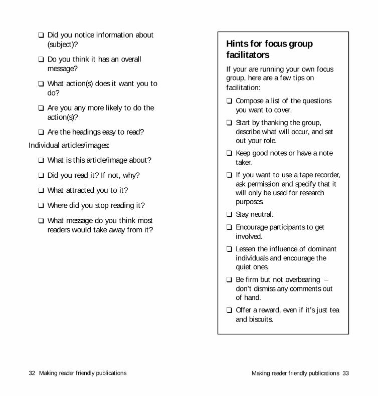
❑ Did you notice information about(subject)?
❑ Do you think it has an overallmessage?
❑ What action(s) does it want you todo?
❑ Are you any more likely to do theaction(s)?
❑ Are the headings easy to read?
Individual articles/images:
❑ What is this article/image about?
❑ Did you read it? If not, why?
❑ What attracted you to it?
❑ Where did you stop reading it?
❑ What message do you think mostreaders would take away from it?
32 Making reader friendly publications
Hints for focus groupfacilitatorsIf your are running your own focusgroup, here are a few tips onfacilitation:
❑ Compose a list of the questionsyou want to cover.
❑ Start by thanking the group,describe what will occur, and setout your role.
❑ Keep good notes or have a notetaker.
❑ If you want to use a tape recorder,ask permission and specify that itwill only be used for researchpurposes.
❑ Stay neutral.
❑ Encourage participants to getinvolved.
❑ Lessen the influence of dominantindividuals and encourage thequiet ones.
❑ Be firm but not overbearing –don’t dismiss any comments outof hand.
❑ Offer a reward, even if it’s just teaand biscuits.

Making reader friendly publications 3534 Making reader friendly publications
■ Be clean, be simple. Use the minimumvariation in typefaces, column size,headings etc. necessary to maintaininterest. The eye gets used to reading onetypeface; using too many just creates workfor the reader. (This booklet uses only onetypeface.)
■ Think of the flow of reading. Grade thesize of headings and articles to establish anatural flow of emphasis on each page, sothe reader knows where to look next.There is nothing worse than a pagecrowded in screaming headlines and bitsyblocks of text all competing for attention.
■ Be interesting. Use cartoons,illustrations, pull quotes, boxes, sub-headings, and ‘running headings’ to createvisual interest and depth. There is nogreater turnoff than a page of solid text.Think like the reader; ask, ‘Why should Iread this page?’
■ Use white space. It’s a great tool forcontrolling the appearance of apublication. Simplicity and white space arethe secrets of good design. Generally usewhite space at the top of a page aroundheadings and pictures.
■ Avoid any graphic elements that presentthe reader with obstacles to the flow ofattention, difficult choices or visualconfusion.
Some basic design rulesGraphic design
Graphic design is the process of takingyour raw text, ideas, photos, drawingsand turning them into finished ‘artwork’ready for the printer.
Good graphic design makes apublication look interesting andaccessible. It grasps and maintains thereader’s attention, creates visualsignposts and leads the reader throughthe publication according to the naturaldirection of reading (see next page).
Graphic design consists of layout (that is,making a rough design) and finalartwork.
The easiest way to graphic design yourpublication is to employ a graphicdesigner (see page 42). But if you aredoing it yourself, there are a few basicrules you'll need to know.

Making reader friendly publications 3736 Making reader friendly publications
What makes a good graphic design?Here are a few points to consider.
A good graphic design is:
1) Identifiable
A member of the intended audienceshould be able to immediately tellwhether the publication is for him or her.
This is one of the roles of the cover (theother role is to get attention).
2) Interesting
Use illustrations, colour, graphic elementsto create variety and interest, withoutdetracting from readability.
3) ReadableChoose your fonts carefully to be easyon the eye. Avoid using compressed orornamental fonts. Be careful withreversed or coloured type.
Placing graphics or patterns behind textis the most common cause of illegibility.Play it safe – don’t do it unless you arevery experienced.
4) NavigableIdeally, readers should be able to grasp
The elements ofgood design
What is the natural direction ofreading?
Left-to-right and top-to-bottom ofcourse! The reader naturally starts atthe top left-hand corner of a pageand expects to finish at the bottomright-hand corner. The bottom leftand top right corners are hence‘fallow corners’ which are naturalplaces for illustrations which won'timpede the flow of reading.
A page which follows the natural‘gravity’ of reading.

Making reader friendly publications 3938 Making reader friendly publications
■ Lower case is more readable than upper case.
Rapid reading is really patternrecognition. The mind reads quickly byrecognising words and phrases by theirshape. Lower case is very readablebecause the ascenders and descendersgive each word a distinctive shape that iseasy to recognize. UPPER CASE BYCOMPARISON GIVES WORDS A PLAINSQUARE OUTLINE. The mind musttherefore read the individual letters towork out the word. This is much slower.
■ WHEN DOES UPPER CASE WORK?
Upper case has one real advantage overlower case. Upper case turns words intoneat rectangular blocks. This makes themeasy to build into ornamental titles andheadlines. They are not as easy to readas lower case, but that doesn't matter, ashere the looks count as much as themeaning, and you are not expectingpeople to read in bulk. Titles andheadlines still work best when they canbe taken in at a glance. Hence long
ChoosingtypeHere are a few general principlesto help avoid reader-hostiletypography.
the overall structure and quickly findwhat they want.
Headlines are the most importantnavigation tools – that’s one reason tomake them meaningful and positive.
Consider having an easy-to-use contentspage. Clear ‘running heads’ (smallheadings on the top corners of pages)are also helpful.
5) ComprehensibleThink of graphic design as a deliverysystem for ideas. The design shouldnever obscure or confuse the meaning ofa publication.
Graphic design does not exist for its ownsake – it’s an applied art. No matter howgood it looks, if a design fails tocommunicate, it fails.
How do you know whether your designcommunicates well? That’s the role ofpre-testing.

text.
■ Maximum line length
There are three useful rules to helpdecide your column widths:
1 Lines should not exceed 12 words.
2 Lines should not have less than 20characters or more than 60 characters(these lines have about 26 characters).
3 The maximum line length in emsshould be no greater than three timesthe point size, that is, 11pt = max 33ems.
These lines are about 16 ems long. nJustified is easier to read than ragged(see diagrams below)
■ Justified is easier to read thanragged
Making reader friendly publications 41
headlines or headlines over four lineshigh should be avoided.
■ Is serif type is more readable thansans serif type?
The serifs are the wiggles and caps onthe letters you are reading now. Serifsprovide a sub-conscious cue to help eyemovement. They form linearities whichhelp the eye to slide easily from left toright along each line. Hence they alsomake it harder for the eye to wander offa line or miss a line.
Sanserif is type without serifs, like theletters in this sentence.
Graphic designers have long debated themerits of sanserif versus serif type. Theconsensus seems to be that, while largebodies of serif type are easier on the eye,contemporary readers are used to seeingboth types, so the decision is very mucha matter of taste.
■ Coloured text
Text printed in coloured ink has lowreadability, especially when colours arebright. But a coloured heading is a goodway to make an article attractive andhelps grab the reader’s attention.
■ Bold and Italic
Blocks of italic and bold text are a goodway to create interest and emphasis inyour text. Italic has slightly betterreadability than bold in large blocks of
40 Making reader friendly publications
Ragged leftRapid reading is really patternrecognition. The mind reads quickly b yrecognising words and phrases by theirshape. Lower case is very readablebecause the ascenders and descendersgive each word a distinctive shape thatis easy to recognize. UPPER CASE BYCOMPARISON GIVES WORDS A PLAINSQUARE OUTLINE. The mind musttherefore read the individual letters towork out the word. This is much slower.
CentredRapid reading is really pattern
recognition. The mind reads quickly byrecognising words and phrases by their
shape. Lower case is very readablebecause the ascenders and descenders
give each word a distinctive shape that i seasy to recognize. UPPER CASE BY
COMPARISON GIVES WORDS A PLAINSQUARE OUTLINE. The mind must
therefore read the individual letters towork out the word. This is much slower.
Ragged rightRapid reading is really pattern
recognition. The mind reads quickly byrecognising words and phrases by their
shape. Lower case is very readablebecause the ascenders and descenders
give each word a distinctive shape thatis easy to recognize. UPPER CASE BY
COMPARISON GIVES WORDS A PLAINSQUARE OUTLINE. The mind must
therefore read the individual letters towork out the word. This is much slower .
JustifiedRapid reading is really patternrecognition. The mind reads quickly byrecognising words and phrases by theirshape. Lower case is very readable becausethe ascenders and descenders give eachword a distinctive shape that is easy torecognize. UPPER CASE BY COMPARISONGIVES WORD A PLAIN SQUARE OUTLINE. The mindmust therefore read the individual lettersto work out the word. This is muchslower.

Making reader friendly publications 4342 Making reader friendly publications
A graphic artist is someone who takesyour raw text, ideas, photos, drawingsand turns them into finished ‘artwork’ready for the printer. They may alsobe able to create or sourceillustrations or photographs for you.
Where to find one? Try asking similarpublications or printers. When youmeet one ask to see examples of hisor her work. Make sure it suits yourneeds.
It’s a good idea to get your own ideasabout the ‘look’ you want bybrowsing through magazines andother publications.
Brief the graphic artist thoroughly,describe your audience, the type of‘look’ you imagine, your constraintsof time and money. Since they knowmore about graphic design andprinting than you do, it’s importantto listen to their advice.
Get an estimate of the number ofhours, and hence the cost, for yourpublication. Remember that this willusually be an under-estimate,especially since you are sure to bemaking last-minute corrections orchanges. A private or ‘freelance’graphic artist (charging $40-$80 per
A survivor’s guide to hiringgraphic artists
Ragged left or centred text is very hardto read because the start of the lines ishard to pick up. Ragged right text isgood to create a sense of informality.Justified text is the most read able formfor large bodies of text.
■ Blocks of reversed text have lowreadability But reversal works well for pagefurniture (running heads, page numbers)and major headings.
■ Tinted backgrounds
Black text on a light tint is effective foremphasis.

Making reader friendly publications 4544 Making reader friendly publications
The first thing to remember about printersis that they are tradespeople. They know alot about their kind of printing.
Discuss your needs. They can be veryhelpful and great sources of advice. Tapinto their expertise, establish a workingrelationship, and learn what you can aboutthe printing process. Be assertive, but notpushy.
The second thing is that printers aren’tartists or editors. They are busy and over-worked and you can’t expect them toexercise any discrimination or think forthemselves about the subtleties of yourpublication. They’ve got enough to thinkabout with the printing. They’ll do whatyou tell them to, no more. That’s why yourinstructions should be in writing.
Your instructions should be super-clear;write whatever is needed on each piece ofartwork and again on a separate coveringletter. Don’t be ambiguous. If you are notsure, discuss it in detail with the printer.Don’t be ashamed to show your ignorance– keep asking questions until youunderstand.
The third thing to remember about printersis that you are in a contractual relationshipwith them. Your instructions to them arepart of your contract. That’s another reason
A survivor’s guide toprinters
hour) is much cheaper than anagency designer ($100-$200 perhour). It’s important to agree abouthow extra time will be charged.
Graphic design has several stages.You will want to see roughs of whatthe artist intends. When you aresatisfied with these the designer willgo away and produce a draft design.When you give the OK the designerwill make final art. It is essential tocheck this thoroughly. Then you ‘signoff’ and the job is sent to the printer,usually on a disc.
The more times you see the designer,the more control you will have overthe publication, although you maydrive up costs. Just remember to betactful when discussing changes –they are, after all, artists.

Instructing your printer1. Discuss options with the printer (often aprint rep will visit you).
2. Get a written quote.
3. Send the disc + instructions + printoutof the artwork.
4. Receive a proof for checking. This isvital … check it carefully. Usually film costswill have been incurred at this point, butmaking film changes is cheaper thanreprinting a whole job!
5. Sign off the proof.
6. Receive the job.
Things to think about
❏ Dead-line for delivery
Make sure the printer knows your requireddelivery date. If things are on a tightschedule ring up the printer every coupleof days just to keep them on their toes, soif an urgent job comes in they don’t giveyour job a lower priority.
❏ Print-run, that is, how many youwant
This is a complex question that dependson your distribution network and the timeperiod you expect to distribute.
Hint: it’s easy to over-estimate thenumbers needed for short shelf-lifepublications and easy to under-estimateyour needs for long shelf-life publications.
Making reader friendly publications 4746 Making reader friendly publications
why all instructions should be in writing.And keep a copy.
Choosing the right kind of printer
Always get three or more quotes fromdifferent printers. Prices can vary widely.Generally instant printers are cheaper forshort print-runs and general printerscheaper for long print-runs. Screen-printersare only for very short print-runs.
Never send work to a printer without aquote in advance. Make sure it includesGST.
Different sorts of printers suit differenttypes of jobs.
■ A print-run of over 2,000 or wherephotos or full-colour is required or wheresize is larger than A3 = use a generalprinter.
■ A print-run of 200 to 2,000, withoutphotos, without full colour, with sizes A3or less = use an instant printer (instantprinters really come into their own whenyou have plain text documents with notinted areas, with only line drawings andno link ‘bleeding’ off the edges of thepage – then they can avoid metal plates,using cheaper paper plates instead).
■ A few hundred sheets of A4 = use aphotocopier.

be ‘self-covering’. This is more economical.Where the cover stock is different it isprinted separately and folded in at a laterstage.
Leave enough timeTo be safe, give printers advance warningof your job so they can book it into theirprinting schedule. Printing times varyaccording to the type of job.
Note: It can be impossible to get urgentprinting in the six weeks before Christmas.
Instant printers: 3-4 days
General printers: 5-10 days
Book printers: up to 8 weeks
Making reader friendly publications 49
❏ Colours
Remember each colour requires anadditional film, plate, ink change and runthrough the press. Make sure the numberof colours is included in the quote. Doesthe artwork have large areas of black orcolour? If so the printer will charge a littlemore for the extra ink.
❏ ‘Stock’, that is, type of paper Let your printer show you samples of thetypes of paper you can choose from.Coated papers are more expensive butbecause the ink doesn’t ‘bleed’ they arebetter for photographs. Uncoated or mattpapers are suitable for newsletters. Askyour printer for advice.
Note: Paper is specified by weight asgrams per square metre (gsm). Photocopypaper is usually 75-80 gsm, the cover of apaperback is often about 230 gsm.
❏ Folding, stapling, trimming Make sure these are included in the quoteand instructions, preferably with a sketch.
• Number of pages
Plan your publication size from the start.Because books and booklets are folded andtrimmed out of large sheets of paper, thenumber of pages is almost always limitedto muliples of 8, that is, eight, 16, 24, 32,... It is possible to have an odd numberbut it might be more expensive to do so.Where the covers are on the same stock asthe inside pages the publication is said to
48 Making reader friendly publications

Making reader friendly publications 5150 Making reader friendly publications
Green printingPrinting is far from an environmentallyfriendly activity.
Inks and solvents release huge amountsof volatile organic compounds (VOCs).These are toxic and form majoringredients in urban air pollution.
Plus there’s all that paper!
A Melbourne graphic design company,Earth Design, has an informative andfascinating web site with succinct infoon the environmental costs of printing,and alternatives, like soy-based inks.
http://www.earthdesign.com.au/enviro
Always ask your printer about recycledpaper. There are plenty of varietiesavailable. Recycled papers only slightlymore expensive and most printers arehappy to order them in. There is verylittle excuse these days for printing withnon-recycled papers.
Checklist:
Printer instructions❑ deadline
❑ delivery address
❑ print-run
❑ page size (often called the ‘format’or ‘trim’)
❑ paper type and weight (‘stock’)
❑ folding, stapling, or perforating
❑ colours
❑ number of pages
❑ are the covers on a different paperor with extra inks?
❑ keep a copy of the printinstructions – you’ll need them incase of a dispute!

Making reader friendly publications 5352 Making reader friendly publications
Useful booksThe Style Manual - A Guide for Authors,Editors and Printers, AustralianGovernment Publishing Service, Canberra,4th edition, 1988. This is the publisher’s‘bible’ and essential for editors anddesigners. Available from the AustralianGovernment Publishing Service bookshopin your capital city.
The Complete Plain Words, by Sir ErnestGowers, Pelican, London, 2nd edition,1973. This is the classic guide to wordsand how to use them. It has beenreprinted 25 times since 1945.
The Elements of Style, by William S.Strunk and E. B. White, Macmillan, NewYork, 3rd edition, 1979. A famous tractfull of rules and admonitions for goodwriting.
Communicating or Just Making PrettyShapes, Colin Wheildon, NewspaperAdvertising Bureau of Australia, 1984. Thisis a short but important study of theelements of good graphic design. A veryimportant book for desktop publishers.

54 Making reader friendly publications