Fundamentals of User Interface Design
45
User Interface Design Fundamentals
-
Upload
merlin-rebrovic -
Category
Design
-
view
13.854 -
download
3
Transcript of Fundamentals of User Interface Design

User Interface DesignFundamentals

Who’s this forThis presentation covers fundamentals of user interface (UI) design and how they’re used to build a simple interface element. It’s been tailored for:
● Programmers who don’t have much experience building UIs.
● Beginner UI designers who are still learning basic concepts.
● People who want to learn more about the process, like project managers.

From idea to product
Getting to the final product requires lots of activities and skills. The timeline on the left is a simplified model. The real process is more complex and often iterative.
Research Problem solving Implementation
Idea Product
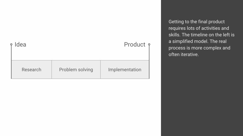
We’ll tackle only a narrow part of the timeline. This part is especially important because it is—for better or worse—the most common point where designers and programmers meet. A lot of conversations happen here, so it’s good to share the same vocabulary.
Research Problem solving Implementation
Idea Product
Designers Programmers

NoteWhen you’re starting, spending just a couple of hours on learning basic principles of visual design greatly improves your ability to produce a decent looking user interface. It won’t make you an expert, but it will steer you away from major disasters. If you continue to learn, you will become good.

Building blocks

Lines and shapes
Straight or curved lines, circles, different polygons, ...
What we perceive as text is just a combination of different lines and shapes.
Text
نص文章

Size
All shapes can vary in size, width and height. Lines can be thicker or thinner. We usually assign more importance to bigger things.

Color
Color can be evaluated on three dimensions: hue, lightness, and saturation.
Hue is what most people mean by color and what we have a clear name for: red, green, yellow, etc.
Lightness, often called value, is how light or dark a color is.
Saturation is how vivid and intense a color is. Desaturating a color leads to gray.
Lightness
Hue
Saturation

Texture
Surface patterns, shininess, reflection are all texture components.

Basic principles

Balance
Saturated or dark colors and big size add weight to elements. We can use that to visually balance the page.

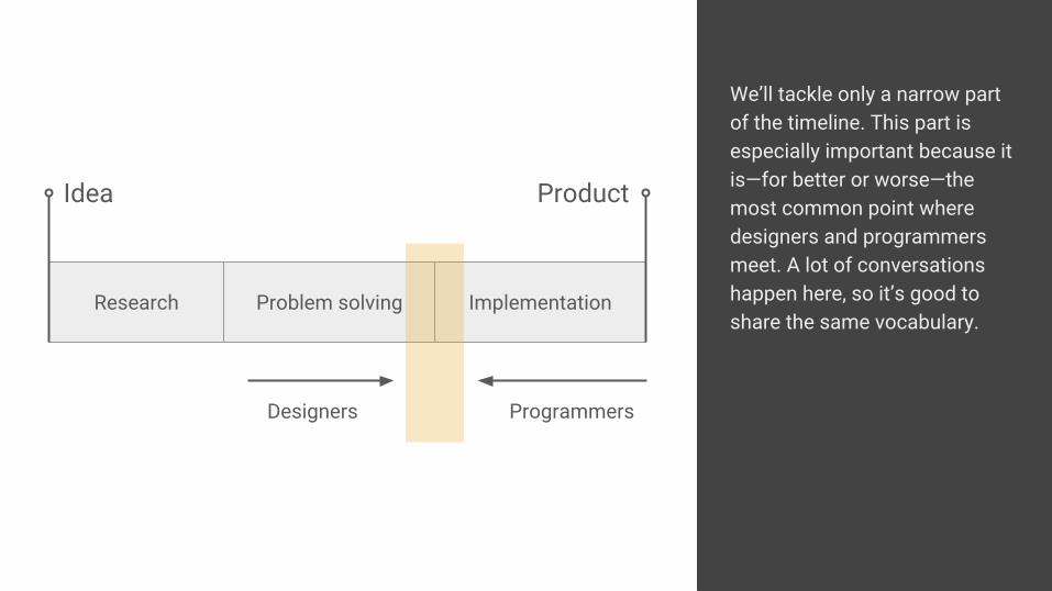
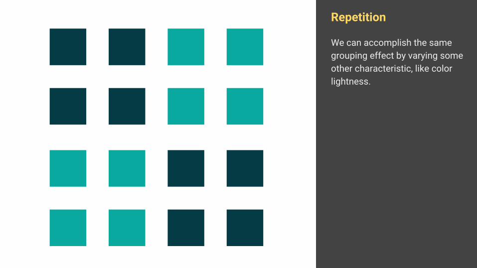
Repetition
If similar things are repeated, we see them as belonging together; they form a group.
Repeated element don’t have to share all characteristics. But the more they do, the easier it is for us to group them.
Repetition
Here we see one group of sixteen elements.

Repetition
If we change the position of some elements, we suddenly see four groups. It’s almost impossible to perceive all elements as one group, even though they are exactly the same.
Repetition
We can accomplish the same grouping effect by varying some other characteristic, like color lightness.
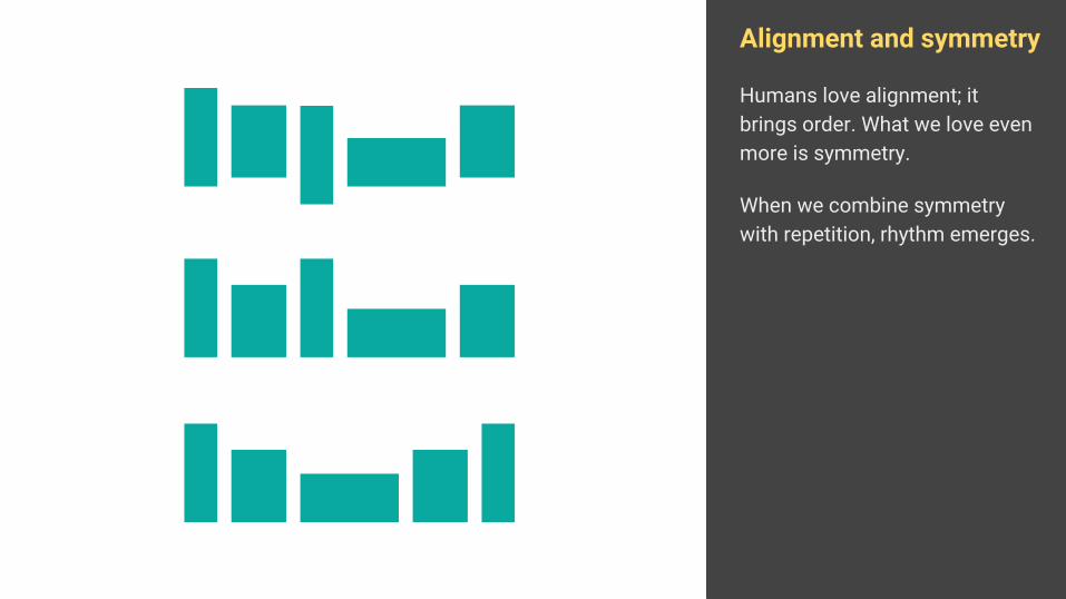
Alignment and symmetry
Humans love alignment; it brings order. What we love even more is symmetry.
When we combine symmetry with repetition, rhythm emerges.
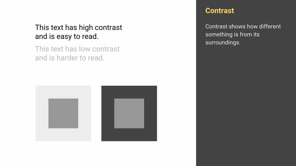
Contrast
Contrast shows how different something is from its surroundings.
This text has high contrast and is easy to read.
This text has low contrast and is harder to read.

Contrast
Contrast is always a relative measure and depends on the context. For example, the same gray fills both inner squares even though the left one looks darker than the right.
This text has high contrast and is easy to read.
This text has low contrast and is harder to read.

Contrast is used to point out different elements in a group. It’s easy to spot which three elements are different from all other in the example.
Repetition and contrast
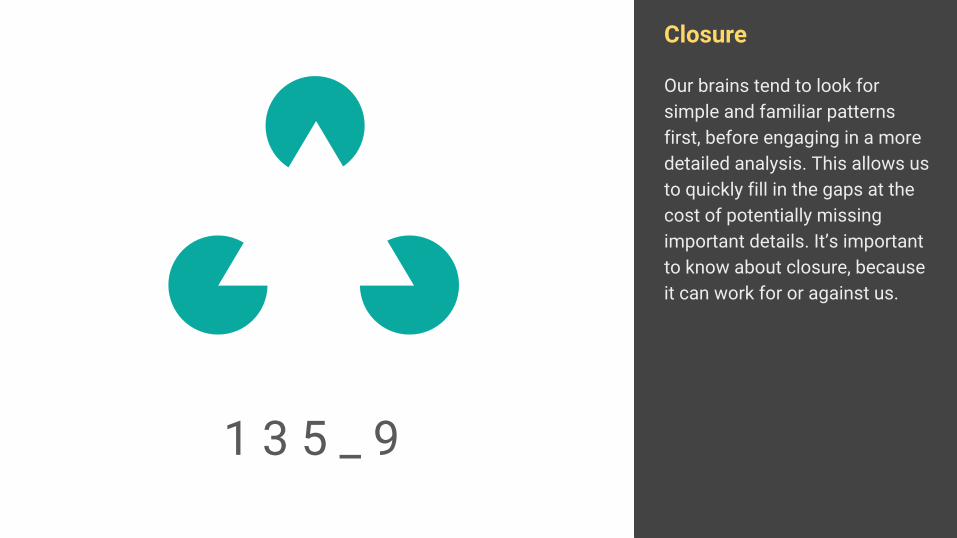
Closure
Our brains tend to look for simple and familiar patterns first, before engaging in a more detailed analysis. This allows us to quickly fill in the gaps at the cost of potentially missing important details. It’s important to know about closure, because it can work for or against us.
1 3 5 _ 9

SummaryBuilding blocks:
Lines and shapesSizeColorTexture
Basic principles:
BalanceRepetitionAlignment and symmetryContrastClosure
Keep in mindMajority of described principles belong to Gestalt principles first mentioned in the 1920s. There are many other design principles, but the ones here form the core and will be enough to start with.

Let’s apply what we learned
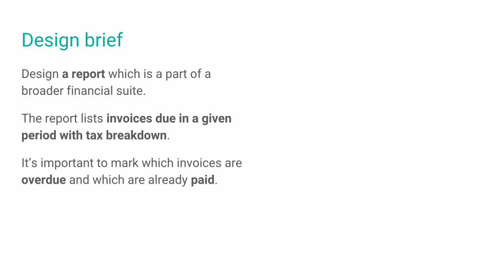
Design briefDesign a report which is a part of a broader financial suite.
The report lists invoices due in a given period with tax breakdown.
It’s important to mark which invoices are overdue and which are already paid.

I move things around until they look right.Milton Glaser, graphic designer
“
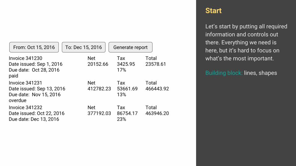
Start
Let’s start by putting all required information and controls out there. Everything we need is here, but it’s hard to focus on what’s the most important.
Building block: lines, shapes
Invoice 341231Date issued: Sep 13, 2016Due date: Nov 15, 2016 overdue
Net412782.23
Tax53661.6913%
Total466443.92
Invoice 341232Date issued: Oct 22, 2016Due date: Dec 13, 2016
Net377192.03
Tax86754.1723%
Total463946.20
Invoice 341230Date issued: Sep 1, 2016Due date: Oct 28, 2016paid
Net20152.66
Tax3425.9517%
Total23578.61
From: Oct 15, 2016 To: Dec 15, 2016 Generate report

Squint test
If we do a “highly scientific” squint test, we see our data is grouped in two big chunks: left group with invoice numbers and dates, and right group with monetary values.
We want to have horizontal groups for each entry, like rows, and not two vertical groups.
Principle: grouping
Invoice 341231Date issued: Sep 13, 2016Due date: Nov 15, 2016 overdue
Net412782.23
Tax53661.6913%
Total466443.92
Invoice 341232Date issued: Oct 22, 2016Due date: Dec 13, 2016
Net377192.03
Tax86754.1723%
Total463946.20
Invoice 341230Date issued: Sep 1, 2016Due date: Oct 28, 2016paid
Net20152.66
Tax3425.9517%
Total23578.61
From: Oct 15, 2015 To: Dec 15, 2015 Generate report

Spread things around
Since “due date” is important, we moved it to a dedicated column. This will make it more prominent and balance everything on the screen.
These rows look very much like a table, so let’s do just that.
Principle: balance
Invoice 341231Date issued: Sep 13, 2016
Net412782.23
Tax53661.6913%
Total466443.92
Invoice 341232Date issued: Oct 22, 2016
Net377192.03
Tax86754.1723%
Total463946.20
Invoice 341230Date issued: Sep 1, 2016
Net20152.66
Tax3425.9517%
Total23578.61
From: Oct 15, 2016 To: Dec 15, 2016 Generate report
Due dateNov 15, 2016 overdue
Due dateDec 13, 2016
Due dateOct 28, 2016paid

Move to a table
Redundant labels are removed. A new header row is created to explain data in the table. Lines are drawn between rows to create a clear boundary.
Building block: linePrinciple: groupingInvoice 341231
Sep 13, 2016412782.23 53661.69
13%466443.92
Invoice 341232Oct 22, 2016
377192.03 86754.1723%
463946.20
Invoice 341230Sep 1, 2016
20152.66 3425.9517%
23578.61
From: Oct 15, 2016 To: Dec 15, 2016 Generate report
Nov 15, 2016 overdue
Dec 13, 2016
Oct 28, 2016paid
Invoice ID and date issued Net TaxDue date Total

Align numbers
Numbers are much easier to scan and compare if they’re aligned to the right.
Principle: alignment
Invoice 341231Sep 13, 2016
412782.23 53661.6913%
466443.92
Invoice 341232Oct 22, 2016
377192.03 86754.1723%
463946.20
Invoice 341230Sep 1, 2016
20152.66 3425.9517%
23578.61
From: Oct 15, 2016 To: Dec 15, 2016 Generate report
Nov 15, 2016 overdue
Dec 13, 2016
Oct 28, 2016paid
Invoice ID and date issued Net TaxDue date Total

Create hierarchy
We need to show what information is the most important. For example, headers, issue dates, and tax percentages aren’t. By decreasing them in size and changing color to gray, we decreased the contrast between them and the background. The lines between rows were also too strong and they got a similar treatment.
Building blocks: color, sizePrinciple: contrast
Invoice 341231Sep 13, 2016
412782.23 53661.6913%
466443.92
Invoice 341232Oct 22, 2016
377192.03 86754.1723%
463946.20
Invoice 341230Sep 1, 2016
20152.66 3425.9517%
23578.61
Nov 15, 2016 overdue
Dec 13, 2016
Oct 28, 2016paid
Invoice ID and date issued Net TaxDue date Total
From: Oct 15, 2016 To: Dec 15, 2016 Generate report

Create hierarchy
Big buttons were towering above the table and weren’t too clear. Were “From” and “To” referencing due date or date issued?
Introducing a label makes it clearer. It also looks less intense and more balanced.
Building blocks: lines, shapes, color, sizePrinciple: contrast
Invoice 341231Sep 13, 2016
412782.23 53661.6913%
466443.92
Invoice 341232Oct 22, 2016
377192.03 86754.1723%
463946.20
Invoice 341230Sep 1, 2016
20152.66 3425.9517%
23578.61
Nov 15, 2016 overdue
Dec 13, 2016
Oct 28, 2016paid
Invoice ID and date issued Net TaxDue date Total
Generate reportInvoices due from Oct 15, 2016 ▾ to Dec 15, 2016 ▾

Create rhythm
Moving things around and modifying their properties changes their relative position and spacing. We want things to have good rhythm that comes from alignment and symmetry.
The best measure depends on the situation. We want to improve vertical rhythm in this situation so we took the height of the main text line in the table as the basic measure.
Overlaying the grid over everything allows us to see where are things out of sync.
Invoice 341231Sep 13, 2016
412782.23 53661.6913%
466443.92
Invoice 341232Oct 22, 2016
377192.03 86754.1723%
463946.20
Invoice 341230Sep 1, 2016
20152.66 3425.9517%
23578.61
Nov 15, 2016 overdue
Dec 13, 2016
Oct 28, 2016paid
Invoice ID and date issued Net TaxDue date Total
Generate reportInvoices due from Oct 15, 2016 ▾ to Dec 15, 2016 ▾
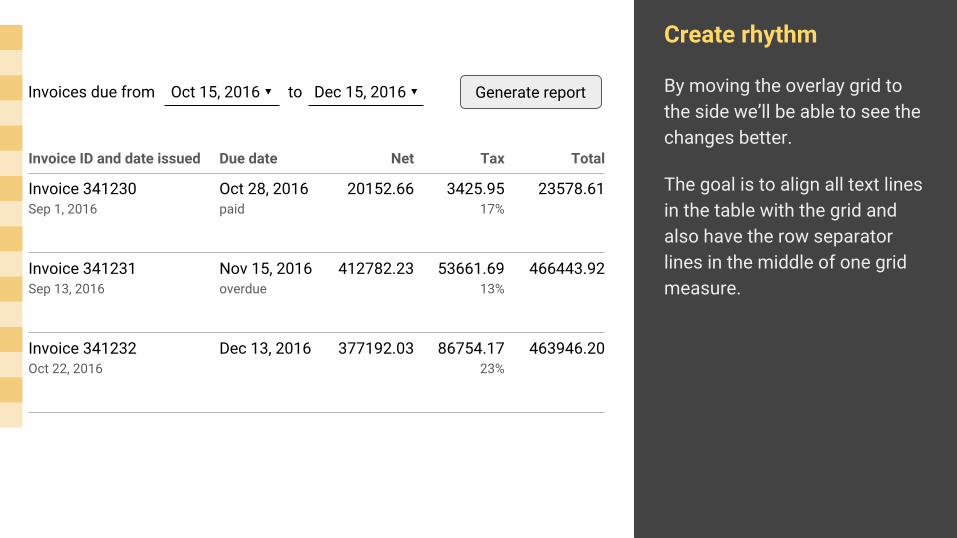
Create rhythm
By moving the overlay grid to the side we’ll be able to see the changes better.
The goal is to align all text lines in the table with the grid and also have the row separator lines in the middle of one grid measure.
Invoice 341231Sep 13, 2016
412782.23 53661.6913%
466443.92
Invoice 341232Oct 22, 2016
377192.03 86754.1723%
463946.20
Invoice 341230Sep 1, 2016
20152.66 3425.9517%
23578.61
Nov 15, 2016 overdue
Dec 13, 2016
Oct 28, 2016paid
Invoice ID and date issued Net TaxDue date Total
Generate reportInvoices due from Oct 15, 2016 ▾ to Dec 15, 2016 ▾

Create rhythm
Changes are minor, but the result is easier to scan and more pleasant to see.
Rhythm and grids are guidelines, not hard rules. For example, the header labels are not aligned with the grid, but rather stayed closer to the separator line.
Principle: alignment and symmetry
Invoice 341231Sep 13, 2016
412782.23 53661.6913%
466443.92
Invoice 341232Oct 22, 2016
377192.03 86754.1723%
463946.20
Invoice 341230Sep 1, 2016
20152.66 3425.9517%
23578.61
Nov 15, 2016 overdue
Dec 13, 2016
Oct 28, 2016paid
Invoice ID and date issued Net TaxDue date Total
Generate reportInvoices due from Oct 15, 2016 ▾ to Dec 15, 2016 ▾
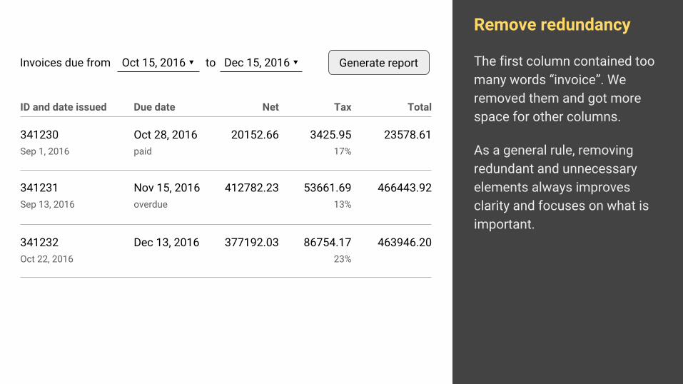
Remove redundancy
The first column contained too many words “invoice”. We removed them and got more space for other columns.
As a general rule, removing redundant and unnecessary elements always improves clarity and focuses on what is important.
341231Sep 13, 2016
412782.23 53661.6913%
466443.92
341232Oct 22, 2016
377192.03 86754.1723%
463946.20
341230Sep 1, 2016
20152.66 3425.9517%
23578.61
Nov 15, 2016 overdue
Dec 13, 2016
Oct 28, 2016paid
ID and date issued Net TaxDue date Total
Generate reportInvoices due from Oct 15, 2016 ▾ to Dec 15, 2016 ▾

Group
Long numbers are hard to read. We formatted monetary values by creating groups of three digits. This makes them easy to scan and compare.
The same principle is used for grouping credit card and phone numbers.
Principle: grouping
341231Sep 13, 2016
412,782.23 53,661.6913%
466,443.92
341232Oct 22, 2016
377,192.03 86,754.1723%
463,946.20
341230Sep 1, 2016
20,152.66 3,425.9517%
23,578.61
Nov 15, 2016 overdue
Dec 13, 2016
Oct 28, 2016paid
ID and date issued Net TaxDue date Total
Generate reportInvoices due from Oct 15, 2016 ▾ to Dec 15, 2016 ▾
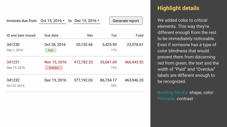
Highlight details
We added color to critical elements. This way they’re different enough from the rest to be immediately noticeable. Even if someone has a type of color blindness that would prevent them from discerning red from green, the text and the width of “Paid” and “Overdue” labels are different enough to be recognized.
Building blocks: shape, colorPrinciple: contrast
341231Sep 13, 2016
412,782.23 53,661.6913%
466,443.92
341232Oct 22, 2016
377,192.03 86,754.1723%
463,946.20
341230Sep 1, 2016
20,152.66 3,425.9517%
23,578.61
Nov 15, 2016
Dec 13, 2016
Oct 28, 2016
ID and date issued Net TaxDue date Total
Generate reportInvoices due from Oct 15, 2016 ▾ to Dec 15, 2016 ▾
Paid
Overdue
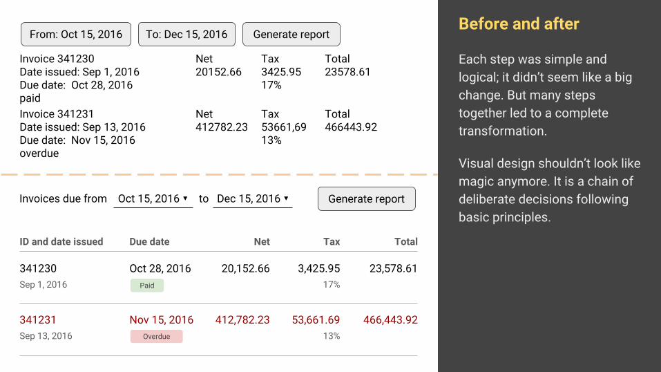
Before and after
Each step was simple and logical; it didn’t seem like a big change. But many steps together led to a complete transformation.
Visual design shouldn’t look like magic anymore. It is a chain of deliberate decisions following basic principles.
Invoice 341231Date issued: Sep 13, 2016Due date: Nov 15, 2016 overdue
Net412782.23
Tax53661,6913%
Total466443.92
Invoice 341230Date issued: Sep 1, 2016Due date: Oct 28, 2016paid
Net20152.66
Tax3425.9517%
Total23578.61
From: Oct 15, 2016 To: Dec 15, 2016 Generate report
341231Sep 13, 2016
412,782.23 53,661.6913%
466,443.92
341230Sep 1, 2016
20,152.66 3,425.9517%
23,578.61
Nov 15, 2016
Oct 28, 2016
ID and date issued Net TaxDue date Total
Generate reportInvoices due from Oct 15, 2016 ▾ to Dec 15, 2016 ▾
Paid
Overdue

SuccessThat was neat, right? You should be able to build similar components by yourself now. Just remember basic principles and do one step at the time.

Learn more about designWe’ve talked about one particular step in the whole process. Activities before user interface design determine what actually gets built.
Research Problem solving Implementation
Idea Product
“Will this solve our problem?”

Recommended readingIf the step just before user interface design interests you, there are some very good books about it.
http://merlin.rebrovic.net/blog/recommended-ux-reading

Learn. Build. Improve. Repeat.
merlin.rebrovic.net
@merlinrebrovic