Fundamental Principles of Analytical Design · Fundamental Principles of Analytical Design – P....
16
DATA SCIENCE REPORT SERIES – DATA VISUALISATION Fundamental Principles of Analytical Design Patrick Boily [[email protected]] Manager, Centre for Quantitative Analysis and Decision Support, Carleton University, Ottawa, Ontario, Canada Adjunct Professor, Department of Mathematics and Statistics, University of Ottawa, Ottawa, Ontario, Canada Adjunct Research Professor, Sprott School of Business, Carleton University, Ottawa, Ontario, Canada President, Idlewyld Analytics and Consulting Services, Wakefield, Qu ´ ebec, Canada Summary In his 6 offering Beautiful Evidence, Edward Tufte highlights what he calls the Fundamental Principles of Analytical Design []. In this short article, we illustrate Tufte’s principles by analyzing the Gapminder’s Foundation Health and Wealth data visualization () []. Background Why do we display evidence in a report, in a newspaper article, or online? What is the fundamental goal of our charts and graphs? Tufte suggests that we present evidence to assist our thinking processes [, p.]. In this regard, his principles are universal – a strong argument can be made that they are dependent neither on technology nor on culture. Reasoning (and communicating our thoughts) is intertwined with our lives in a causal and dynamic multivariate Universe (the dimensions of space-time making up only a small subset of available variates); whatever cognitive skills allow us to live and evolve can also be brought to bear on the presentation of evidence. Tufte also highlights a particular symmetry to visual displays of evidence, being that consumers should be seeking exactly what producers should be providing (more on exactly what that is in a little bit). Physical science displays tend to be less descriptive and verbal, and more visual and quanti- tative; up to now, these trends have tended to be reversed when dealing with evidence displays about human behaviour. In spite of this, Tufte argues that his principles of analytical design can also be applied to social science and medicine. To demonstrate the universality of his principles, he describes in detail how they are applied in a visual display by Charles Joseph Minard (see Fig. ). His lengthy analysis of the image is well worth the read [, pp.-] – it will not be repeated here (I must confess that the chart itself leaves me somewhat cold). Rather, I will illustrate the principles with the help of the following image from the Gapminder Foundation (see Fig. ). The latter image a bubble chart that plots the life expectancy, adjusted income per person in USD (log-scaled), population, and continental membership for UN members and other countries, using the latest available data. A high-resolution version of the image can be found on the Gapminder website. © Patrick Boily, 8
Transcript of Fundamental Principles of Analytical Design · Fundamental Principles of Analytical Design – P....

DATA SCIENCE REPORT SERIES – DATA VISUALISATION
Fundamental Principles of Analytical DesignPatrick Boily [[email protected]]
Manager, Centre for Quantitative Analysis and Decision Support, Carleton University, Ottawa, Ontario, CanadaAdjunct Professor, Department of Mathematics and Statistics, University of Ottawa, Ottawa, Ontario, CanadaAdjunct Research Professor, Sprott School of Business, Carleton University, Ottawa, Ontario, CanadaPresident, Idlewyld Analytics and Consulting Services, Wakefield, Quebec, Canada
SummaryIn his 2006 offering Beautiful Evidence, Edward Tufte highlights what he calls the Fundamental Principlesof Analytical Design [1]. In this short article, we illustrate Tufte’s principles by analyzing the Gapminder’sFoundation Health and Wealth data visualization (2012) [2].
1 BackgroundWhy do we display evidence in a report, in a newspaper article, or online? What is the fundamentalgoal of our charts and graphs? Tufte suggests that we present evidence to assist our thinkingprocesses [1, p.137].
In this regard, his principles are universal – a strong argument can be made that they aredependent neither on technology nor on culture. Reasoning (and communicating our thoughts)is intertwined with our lives in a causal and dynamic multivariate Universe (the 4 dimensions ofspace-time making up only a small subset of available variates); whatever cognitive skills allowus to live and evolve can also be brought to bear on the presentation of evidence.
Tufte also highlights a particular symmetry to visual displays of evidence, being that consumersshould be seeking exactly what producers should be providing (more on exactly what that is ina little bit).
Physical science displays tend to be less descriptive and verbal, and more visual and quanti-tative; up to now, these trends have tended to be reversed when dealing with evidence displaysabout human behaviour.
In spite of this, Tufte argues that his principles of analytical design can also be applied to socialscience and medicine. To demonstrate the universality of his principles, he describes in detailhow they are applied in a visual display by Charles Joseph Minard (see Fig. 1).
His lengthy analysis of the image is well worth the read [1, pp.122-139] – it will not be repeatedhere (I must confess that the chart itself leaves me somewhat cold). Rather, I will illustrate theprinciples with the help of the following image from the Gapminder Foundation (see Fig. 2).
The latter image a bubble chart that plots the 2012 life expectancy, adjusted income per personin USD (log-scaled), population, and continental membership for 193 UN members and 5 othercountries, using the latest available data. A high-resolution version of the image can be found onthe Gapminder website.
© Patrick Boily, 2018

FUNDAMENTAL PRINCIPLES OF ANALYTICAL DESIGN – P. BOILY
Figure 1. Carte Figurative des pertes successives en hommes de l’Armee Francaise dans la campagne deRussie 1812-1813, (M.Minard, 1869, [3]; indicates the number of Napoleon’s troops, the distance, thetemperature, the latitude and longitude, the direction of travel, and the location relative to specific dates.)
2 Fundamental PrinciplesTufte identifies 6 basic properties of superior analytical charts:
meaningful comparisonscausal and underlying structuresmultivariate linksintegrated and relevant datahonest documentationprimary focus on content
2.1 Comparisons
First Principle
Show comparisons, contrasts, differences. [1, p.127]
Comparisons come in varied flavours: for instance, one could compare a
unit at a given time against the same unit at a later time;unit’s component against another of its components;unit against another unit,or any number of combinations of these flavours.
DATA VISUALISATION – 2

FUNDAMENTAL PRINCIPLES OF ANALYTICAL DESIGN – P. BOILY
Figure 2. Life expectancy and income per capita in 2012, by nation (Gapminder Foundation)
DATA VISUALISATION – 3

FUNDAMENTAL PRINCIPLES OF ANALYTICAL DESIGN – P. BOILY
Tufte further explains that
the fundamental analytical act in statistical reasoning is to answer the question “Comparedwith what?” Whether we are evaluating changes over space or time, searching big databases, adjusting and controlling for variables, designing experiments, specifying multipleregressions, or doing just about any kind of evidence-based reasoning, the essential point isto make intelligent and appropriate comparisons [emphasis added]. Thus, visual displays[...] should show comparisons. [1, p.127]
Not every comparison will turn out to be insightful, but avoiding comparisons altogether is equiva-lent to producing a useless display, built from a single datum.
Health and Wealth of Nations
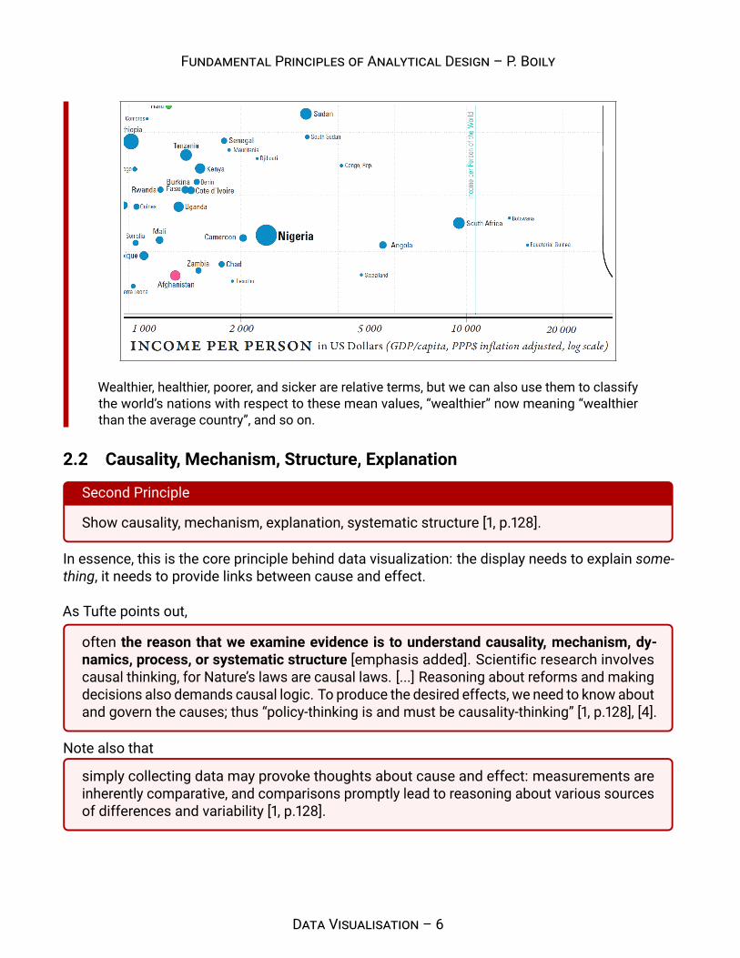
Where to begin? First, note that each bubble represents a different country, and thatthe location of each bubble’s centre is a precise point corresponding to the country’s lifeexpectancy and its GDP per capita. The size of the bubble correlates with the country’spopulation and its colour is linked to continental membership.
The chart’s compass provides a handy tool for comparison:
a bubble further to the right (resp. the left) rep-resents a wealthier (resp. poorer) country;a bubble further above (resp. below) representsa healthier (resp. sicker) country.
For instance, a comparison between Japan, Germany and the USA shows that Japanis healthier than Germany, which is itself healthier than the USA, as determined by lifeexpectancy, while the USA is wealthier than Germany, which is itself wealthier than Japan, asdetermined by GDP per capita (see below).
DATA VISUALISATION – 4

FUNDAMENTAL PRINCIPLES OF ANALYTICAL DESIGN – P. BOILY
It is possible for two countries to have roughly the same health and the same wealth: considerIndonesia and Fiji, or India and Tuvalu, for instance (see below).
In each pair, the centres of both bubbles overlap: any difference in the data must be found inthe bubbles’ area or in their colour.
Countries can also be compared against world values for life expectancy and GDPper capita (a shade under 70 years and in the neighbourhood of 11K$, respectively). Theworld’s mean life expectancy and income per person are traced in light blue (see below for lifeexpectancy and on the next page for GDP per capita).
DATA VISUALISATION – 5
FUNDAMENTAL PRINCIPLES OF ANALYTICAL DESIGN – P. BOILY
Wealthier, healthier, poorer, and sicker are relative terms, but we can also use them to classifythe world’s nations with respect to these mean values, “wealthier” now meaning “wealthierthan the average country”, and so on.
2.2 Causality, Mechanism, Structure, Explanation
Second Principle
Show causality, mechanism, explanation, systematic structure [1, p.128].
In essence, this is the core principle behind data visualization: the display needs to explain some-thing, it needs to provide links between cause and effect.
As Tufte points out,
often the reason that we examine evidence is to understand causality, mechanism, dy-namics, process, or systematic structure [emphasis added]. Scientific research involvescausal thinking, for Nature’s laws are causal laws. [...] Reasoning about reforms and makingdecisions also demands causal logic. To produce the desired effects, we need to know aboutand govern the causes; thus “policy-thinking is and must be causality-thinking” [1, p.128], [4].
Note also that
simply collecting data may provoke thoughts about cause and effect: measurements areinherently comparative, and comparisons promptly lead to reasoning about various sourcesof differences and variability [1, p.128].
DATA VISUALISATION – 6

FUNDAMENTAL PRINCIPLES OF ANALYTICAL DESIGN – P. BOILY
Finally, if the visualization can be removed without diminishing the narrative, then that chart should,in all probability, be excluded from the final product, no matter how pretty and modern it looks, orhow costly it was to produce.
Health and Wealth of Nations (continued)
At a quick glance, the relation between life expectancy and the logarithm of the in-come per person seems to be increasing more or less linearly. The exact parameter values arenot known (and cannot be estimated analytically without the data points), but an approximateline-of-best-fit has been added in black to the figure below.
Using the points (10000 USD, 73.5 years) and (50000 USD, 84.5 years) yields a line with equation
Life Expectancy (in years) ≈ 6.83× ln(Income Per Capita (in USD)) + 10.55
The exact form of the relationship and the numerical values of the parameters are of littlesignificance at this stage – the key insight is that wealthier countries appear to be healthier,generally, and vice-versa.
The chart also highlights an interesting feature in the data, namely that the four quad-rants created by separating the data along the Earth’s average life expectancy and the GDP percapita for the entire planet do not host the same patterns.
DATA VISUALISATION – 7

FUNDAMENTAL PRINCIPLES OF ANALYTICAL DESIGN – P. BOILY
Naıvely, it might have been expected that each of thequadrants would contain about 25% of the world’s coun-tries (although the large population of China and Indiamuddle the picture somewhat). However, one quadrant issubstantially under-represented in the visualization. Shouldit come as a surprise that there are so few “wealthier” yet“sicker” countries? (see next image, below).
It could even be argued that Russia and Kazakhstanare in fact too near the separators to really be consideredclear-cut members of the quadrant, so that the overwhelm-ing majority of the planet’s countries are found in one ofonly three quadrants.
In the same vein, when we consider the data visual-ization as a whole, there seems to be one group of outliersbelow the main trend, to the right, and to a lesser extent,one group above the main trend, to the left (see below).
These cry out for an explanation: South Africa, for instance, has a relatively high GDP percapita but a low life expectancy (potentially, income disparity between a poor majority anda substantially wealthier minority might help push the bubble to the right, while the lowerlife expectancy of the majority drives the overall life expectancy to the bottom). This bringsup a crucial point about data visualization: it seems virtually certain that the racial politics
DATA VISUALISATION – 8

FUNDAMENTAL PRINCIPLES OF ANALYTICAL DESIGN – P. BOILY
of apartheid played a major role in the position of the South African outlier... but the chartemphatically DOES NOT provide a proof of that assertion. Charts suggest, but proof comesfrom deeper domain-specific analyses.
2.3 Multivariate Analysis
Third Principle
Show multivariate data; that is, show more than 1 or 2 variables. [1, p.130]
In an age where data collection is becoming easier by the minute, this seems like a no-brainer:why waste time on uninformative univariate plots? Indeed,
nearly all the interesting worlds (physical, biological, imaginary, human) we seek to under-stand are inevitably multivariate in nature. [1, p.129]
Furthermore, as Tufte suggest,
the analysis of cause and effect, initially bivariate, quickly becomes multivariate through suchnecessary elaborations as the conditions under which the causal relation holds, interactioneffects, multiple causes, multiple effects, causal sequences, sources of bias, spuriouscorrelation, sources of measurement error, competing variables, and whether the allegedcause is merely a proxy or a marker variable (see for instance, [5]). [1, p.129]
While we should not dismiss low-dimensional evidence simply because it is low-dimensional,Tufte cautions that
reasoning about evidence should not be stuck in 2 dimensions, for the world we seek tounderstand is profoundly multivariate [emphasis added]. [1, p.130]
Alert readers may question the ultimate validity of this principle: after all, doesn’t Occam’s Razorwarn us that “it is futile to do with more things that which can be done with fewer”? This wouldseem to be a fairly strong admonition to not reject low-dimensional visualizations out of hand.
This interpretation depends, of course, on what it means to “do with fewer”: are we attemptingto “do with fewer”, or to “do with fewer”? If it’s the former, then we can produce simple charts torepresent the data (which quickly balloons into a multivariate meta-display), but any significant linkbetween 3 and more variables is unlikely to be shown, which drastically reduces the explanatorypower of the charts. If it’s the latter, the difficulty evaporates: we simply retain as many featuresas are necessary to maintain the desired explanatory power.
Health and Wealth of Nations (continued)
Only 4 variables are represented in the display, which we could argue just barely qual-ifies the data as multivariate. The population size seems uncorrelated with both of the axes’
DATA VISUALISATION – 9

FUNDAMENTAL PRINCIPLES OF ANALYTICAL DESIGN – P. BOILY
variates, unlike continental membership: there is a clear divide between the West, most of Asia,and Africa (see below). This “clustering” of the world’s nations certainly fits with commonwisdom about the state of the planet, which provides some level of validation for the display.
Other variables could also be considered or added, notably the year, allowing for bubblemovement: one would expect that life expectancy and GDP per capita have both been increasingover time. The Gapminder Foundation’s online tool can build charts with other variates, leadingto interesting inferences and suggestions.
2.4 Integration of Evidence
Fourth Principle
Completely integrate words, numbers, images, diagrams. [1, p.131]
Data does not live in a vacuum. Tufte’s approach is clear:
the evidence doesn’t care what it is – whether word, number, image. In reasoning aboutsubstantive problems, what matters entirely is the evidence, not particular modes of evi-dence [emphasis added]. [1, p.130]
The main argument is that evidence from data is better understood when it’s presented withcontext and accompanying meta-data.
DATA VISUALISATION – 10

FUNDAMENTAL PRINCIPLES OF ANALYTICAL DESIGN – P. BOILY
Indeed,
words, numbers, pictures, diagrams, graphics, charts, tables belong together [emphasisadded]. Excellent maps, which are the heart and soul of good practices in analytical graphics,routinely integrate words, numbers, line-art, grids, measurement scales. [1, p.131]
Finally, Tufte makes the point that we should think of data visualizations and data tables aselements that provide vital evidence, and as such they should be integrated in the body of the text:
Tables of data might be thought of as paragraphs of numbers, tightly integrated with thetext for convenience of reading rather than segregated at the back of a report. [...] Perhapsthe number of data points may stand alone for a while, so we can get a clean look at thedata, although techniques of layering and separation may simultaneously allow a clean lookas well as bringing other information into the scene. [1, p.131]
When authors and researchers select a single specific method or mode of information during theinquiries, the focus switches from “can we explain what’s happening?” to “can the method weselected explain what’s happening?”. There is an art to method selection, and experience canoften suggest relevant methods, but remember that “when all one has is a hammer, everythinglooks like a nail”: the goal should be to use whatever (and all) evidence is necessary to shed lighton “what’s happening”. If that goal is met, it makes no difference which modes of evidence wereused.
Health and Wealth of Nations (continued)
The various details attached to the chart (such as country names, font sizes, axesscale, grid, and world landmarks) provide substantial benefits when it comes to consumingthe display. They may become lost in the background, with the consequence of beingtaken forgranted. Compare the display obtained from (nearly) the same data, but without integration ofevidence (see below).
DATA VISUALISATION – 11
FUNDAMENTAL PRINCIPLES OF ANALYTICAL DESIGN – P. BOILY
2.5 DocumentationFifth Principle
Thoroughly describe the evidence. Provide a detailed title, indicate the authors and sponsors,document the data sources, show complete measurement scales, point out relevant issues.[1, p.133]
We cannot always tell at a glance whether a pretty graphic speaks the truth or presents a relevantpiece of information. Documented charts may provide a hint, as
the credibility of an evidence presentation depends significantly on the quality and integrityof the authors and their data sources. Documentation is an essential mechanism of qual-ity control for displays of evidence. Thus authors must be named, sponsors revealed,their interests and agenda unveiled, sources described, scales labeled, details enumer-ated [emphasis added]. [1, p.132]
Depending on the context, questions and items to address could include:
What is the title/subject of the visualization?Who did the analysis? Who created the visualization? (if distinct from the analyst(s))When was the visualization published? Which version of the visualization is rendered here?Where did the underlying data come from? Who sponsored the display?What assumptions were made during data processing and clean-up?What colour schemes, legends, scales are in use in the chart?
It’s not obvious whether all this information can fit inside a single chart in some cases. But,keeping in mind the Principle of Integration of Evidence, charts should not be presented in isolationin the first place, and some of the relevant information can be provided in the text, on the webpage,or in an accompanying document.
This is especially important when it comes to discussing the methodological assumptionsused for data collection, processing, and analysis. An honest assessment may require sizableamounts of text, and it may not be reasonable to include that information with the display (in thatcase, a link to the accompanying documentation should be provided).
Publicly attributed authorship indicates to readers that someone is taking responsibilityfor the analysis; conversely, the absence of names signals an evasion of responsibility.[...] People do things, not agencies, bureaus, departments, divisions [emphasis added]. [1,p.132-133]
Health and Wealth of Nations (continued)
The documentation of the Gapminder map is perhaps one of the best-documentedchart out there. Let us see if we can answer the questions suggested above.
DATA VISUALISATION – 12

FUNDAMENTAL PRINCIPLES OF ANALYTICAL DESIGN – P. BOILY
What is the title/subject of the visualization?The health and wealth of nations in 2012, using the latest available data (2011).Who did the analysis? Who sponsored the display? Who created the visualization?The analysis was done by the Gapminder Foundation; the map layout was created by PauloFausone. No data regarding the sponsor is found on the chart or in the documentation.The relevant Wikipedia article states that “the Gapminder Foundation is a non-profitventure registered in Stockholm, Sweden, that promotes sustainable global developmentand achievement of the United Nations Millennium Development Goals by increaseduse and understanding of statistics and other information about social, economic andenvironmental development at local, national and global levels.” It seems plausible thatthere is no external sponsor, but that is no certainty.When was the visualization published? Which version is rendered here?The 11th version of this chart was published in September 2012. It is the latest availableversion as of October 2016.Where did the underlying data come from? What assumptions were made during dataprocessing and clean-up?Typically, the work that goes into preparing the data is swept under the carpet in favourof the visualization itself; there are no explicit source of data on this chart, for instance.However, there is a URL in the legend box that leads to detailed information. For mostcountries, life expectancy data was collected from:– the Human Mortality database,– the UN Population Division World Population Prospects,– files from historian James C. Riley,– the Human Life Table database,– data from diverse national statistical agencies,– the CIA World Fact book,– the World Bank, and– the South Sudan National Bureau of Statistics.
Benchmark 2005 GDP data was derived via regression analysis from International Com-parison Program data for 144 countries, and extended to other jurisdictions using anotherregression against data from– the UN Statistical Division,– Maddison Online,– the CIA World Fact book,and– estimates from the World Bank.
The 2012 values were then derived from the 2005 benchmarks using long-term growthrates estimate from– Maddison Online,– Barro & Ursua,– the United Nations Statistical Division,– the Penn World Table (mark 6.2),– the International Monetary Fund’s World Economic Outlook database,– the World Development Indicators,– Eurostat, and– national statistical offices or some other specific publications.
DATA VISUALISATION – 13
FUNDAMENTAL PRINCIPLES OF ANALYTICAL DESIGN – P. BOILY
Population estimates were collated from– the United Nations Population Division World Population Prospects,– Maddison Online,– Mitchell’s International Historical Statistics,– the United Nations Statistical Division,– the US Census Bureau,– national sources,– undocumented sources, and– “guesstimates”.
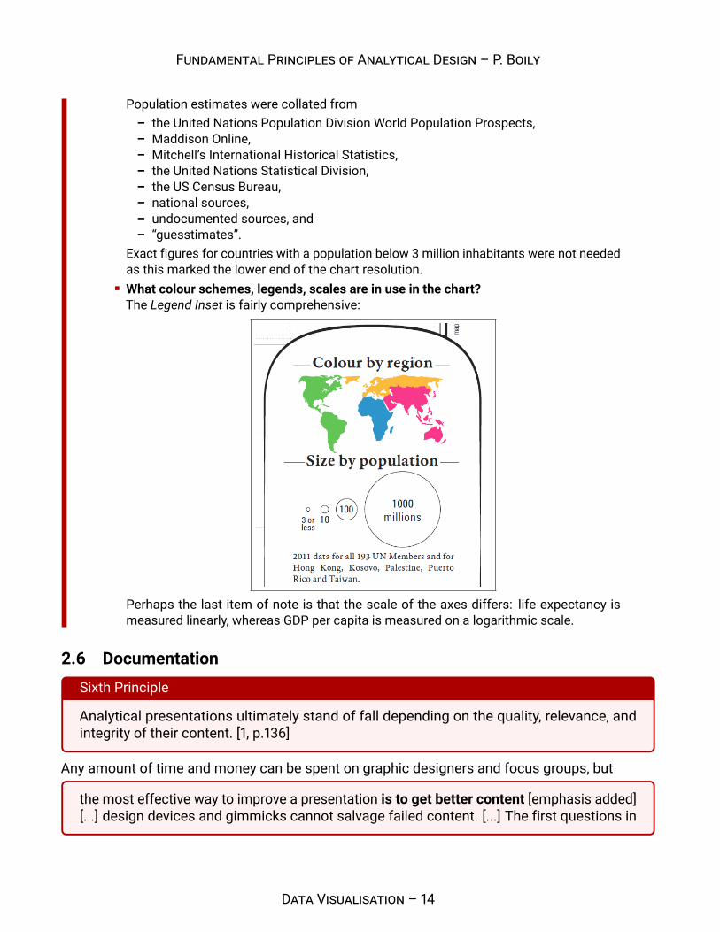
Exact figures for countries with a population below 3 million inhabitants were not neededas this marked the lower end of the chart resolution.What colour schemes, legends, scales are in use in the chart?The Legend Inset is fairly comprehensive:
Perhaps the last item of note is that the scale of the axes differs: life expectancy ismeasured linearly, whereas GDP per capita is measured on a logarithmic scale.
2.6 DocumentationSixth Principle
Analytical presentations ultimately stand of fall depending on the quality, relevance, andintegrity of their content. [1, p.136]
Any amount of time and money can be spent on graphic designers and focus groups, but
the most effective way to improve a presentation is to get better content [emphasis added][...] design devices and gimmicks cannot salvage failed content. [...] The first questions in
DATA VISUALISATION – 14

FUNDAMENTAL PRINCIPLES OF ANALYTICAL DESIGN – P. BOILY
constructing analytical displays are not “How can this presentation use the color purple?” Not“How large must the logotype be?” Not “How can the presentation use the Interactive VirtualCyberspace Protocol Display Technology?” Not decoration, not production technology. Thefirst question is “What are the content-reasoning tasks that this display is supposed tohelp with?” [1, p.136]
The main objective is to produce a compelling narrative, which may not necessarily be the one thatwas initially expected to emerge from a solid analysis of sound data. Simply speaking, the visualdisplay should assist in explaining the situation at hand and in answering the original questionsthat were asked of the data.
Health and Wealth of Nations (continued)
How would we answer the following questions:
Do we observe similar patterns every year?Does the shape of the relationship between life expectancy and log-GDP per capita varycontinuously over time?Do countries ever migrate large distances in the display over short periods?Do exceptional events affect all countries similarly?What are the effects of secession or annexation?
The 2012 Health and Wealth of Nations data represent a single datum in the general space ofdata visualizations; in this context, getting better content means getting data for other yearsas well 2012.
DATA VISUALISATION – 15

FUNDAMENTAL PRINCIPLES OF ANALYTICAL DESIGN – P. BOILY
References[1] Tufte, E. [2006], Beautiful Evidence, Graphics Press.
[2] Rosling, H. [2012], Gapminder World 2012, Gapminder Foundation.
[3] Minard, C. J. [1869], “Carte figurative des pertes successives en hommes de l’Armee Francaisedans la campagne de Russie 1812-1813”.
[4] Dahl, R.A. [1965], “Cause and Effect in the Study of Politics”
[5] Hill, A.B. [1965], ”The Environment and Disease: Association or Causation?”.
Contents1 Background 1
2 Fundamental Principles 22.1 Comparisons . . . . . . . . . . . . . . . . . . . . . . . . . . . . . . . . . . . . . . . . 22.2 Causality, Mechanism, Structure, Explanation . . . . . . . . . . . . . . . . . . . . . . 62.3 Multivariate Analysis . . . . . . . . . . . . . . . . . . . . . . . . . . . . . . . . . . . 92.4 Integration of Evidence . . . . . . . . . . . . . . . . . . . . . . . . . . . . . . . . . . 102.5 Documentation . . . . . . . . . . . . . . . . . . . . . . . . . . . . . . . . . . . . . . . 122.6 Documentation . . . . . . . . . . . . . . . . . . . . . . . . . . . . . . . . . . . . . . . 14
DATA VISUALISATION – 16