Fullerton Photo Analysis
8
Ingrid Fullerton.Zufelt.March2014 | 1 Building, Nature, and the Predominance of Weather: An Analysis of Ben Busch’s “Material Senescence” Architectural designer and photographer Ben Busch, an American who relocated to Berlin, begins his photo essay entitled “Material Senescence” (citation?) by describing the predominant relationship between the natural world outside and human-built interiors. He explains that because inside is actually just a replication of what is already outside, there can be no actual line of distinction between the two (Busch). “The two spheres coalesce at the building envelope, where the artificial and the natural physically intersect. This threshold is under imminent environmental impact” (Busch, internet). What many architectural designers have not grasped effectively, he asserts, is that the constant bombardment of nature upon the built environment has not been taken into account when selecting materials for a building’s exterior. He coins this appropriately as ‘material senescence,’ the biological process of self-aging. Patina, one might ask? Not, as Busch argues, when this decomposition of materials leaves buildings in a state of decay and city dwellers disgusted with their surroundings. Formal Analysis Busch is able to convey captivating ideas about architectural design and the effects of weathering in his photo essay by utilizing several important tools in the creation of artwork and photography alike. These principles are explained in both Scott McCloud’s Understanding Comics and National Geographic’s Complete Photography. Use of Lines
-
Upload
ingridfullerton -
Category
Documents
-
view
225 -
download
0
Transcript of Fullerton Photo Analysis
I n g r i d F u l l e r t o n . Z u f e l t . M a r c h 2 0 1 4 | 1
Building, Nature, and the Predominance of Weather:
An Analysis of Ben Busch’s “Material Senescence”Architectural designer and photographer Ben Busch, an American who relocated
to Berlin, begins his photo essay entitled “Material Senescence” (citation?) by describing the predominant relationship between the natural world outside and human-built interiors. He explains that because inside is actually just a replication of what is already outside, there can be no actual line of distinction between the two (Busch). “The two spheres coalesce at the building envelope, where the artificial and the natural physically intersect. This threshold is under imminent environmental impact” (Busch, internet). What many architectural designers have not grasped effectively, he asserts, is that the constant bombardment of nature upon the built environment has not been taken into account when selecting materials for a building’s exterior. He coins this appropriately as ‘material senescence,’ the biological process of self-aging. Patina, one might ask? Not, as Busch argues, when this decomposition of materials leaves buildings in a state of decay and city dwellers disgusted with their surroundings.
Formal AnalysisBusch is able to convey captivating ideas about architectural design and the
effects of weathering in his photo essay by utilizing several important tools in the creation of artwork and photography alike. These principles are explained in both Scott McCloud’s Understanding Comics and National Geographic’s Complete Photography.
Use of Lines
I n g r i d F u l l e r t o n . Z u f e l t . M a r c h 2 0 1 4 | 2
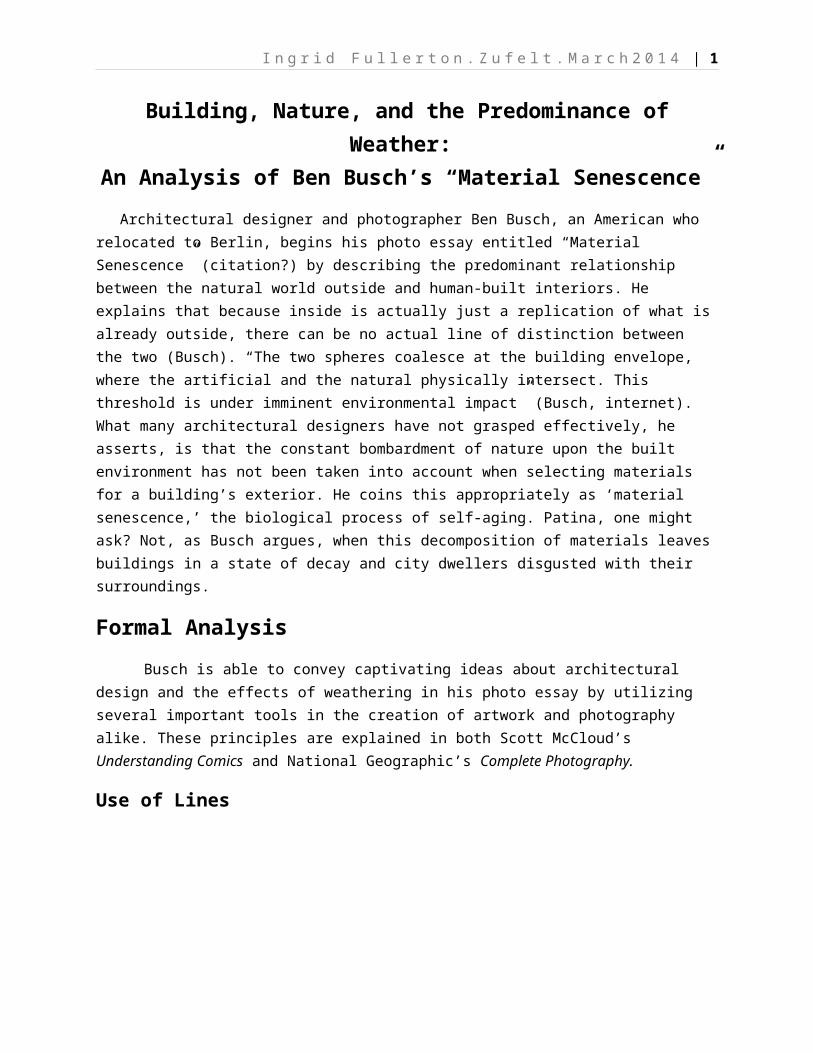
A majority of Busch’s photos emphasize the powerful lines of a building. In
Understanding Comics, McCloud writes that vertical lines induce a feeling of pride and strength, and that sharp right angles convey being rational and conservative (125). A metaphor for post-World War II German building efforts may be perfectly appropriate here, describing methods used to throw up inexpensive housing and offices for the good and proper citizens of East Berlin. Leading lines, according to Complete Photography, enhance a picture’s ability to draw attention in a particular direction and, in the instance of architectural photography, imply the comparably insignificant size of human beings. “Vertical [lines] emphasize power, and diagonal ones imply action” (88). The leading lines in Busch’s photography therefore suggest a strong point of view, which according to Complete Photography is used to emphasize a photograph’s reference point. Where a person is at the base of the object (the building) indicates how far away the camera’s viewpoint is (95). In figure one, vertically converging lines lead the eye upward, “accentuating the soaring quality” (310) of this building. In figure two, diagonal lines lead the eye forward, implying forward movement. Busch tactically exemplifies important aspects of post-World War II Berlin: progressive, powerful, and rational.
Patterns and Texture
Figure One
Figure Two
I n g r i d F u l l e r t o n . Z u f e l t . M a r c h 2 0 1 4 | 3
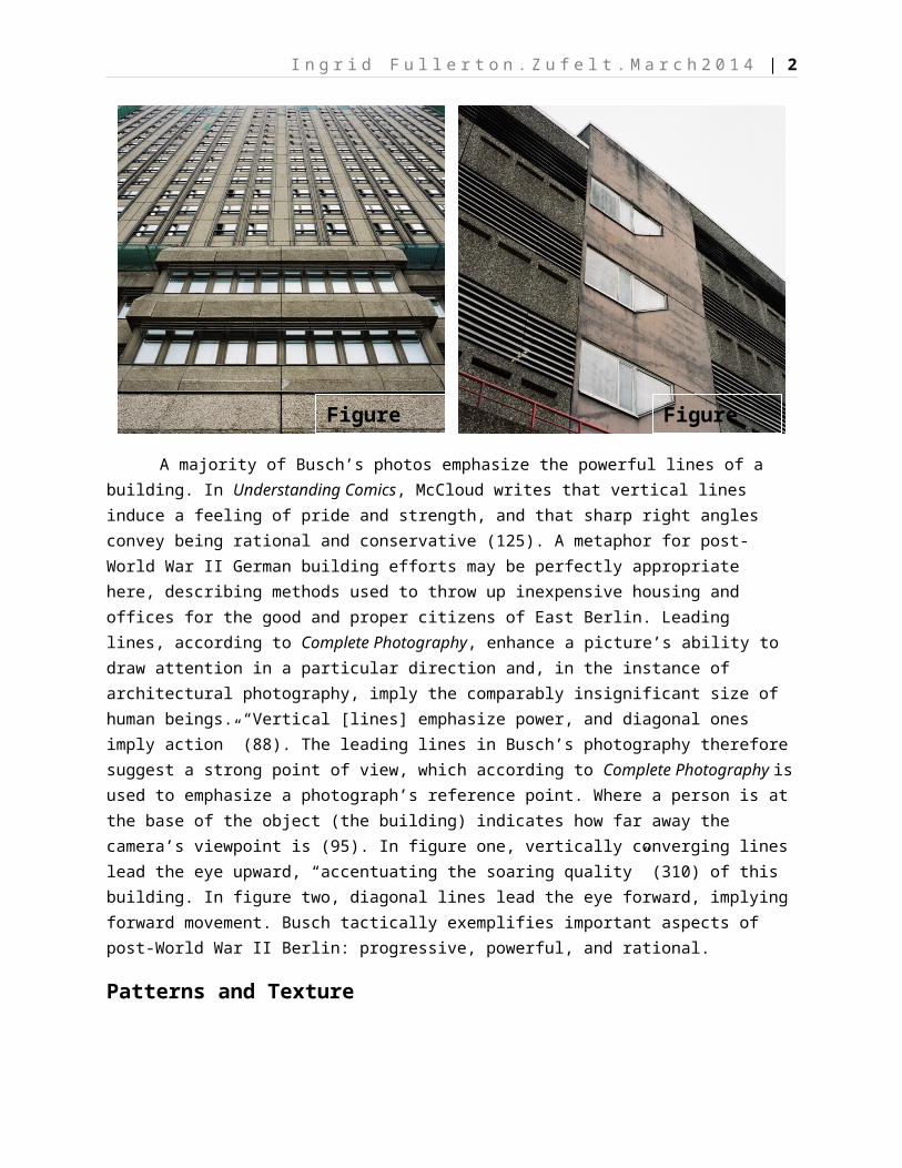
Complete Photography also speaks of using patterns and texture to express
how a situation might actually feel. Such patterns create “rhythm and movement” (100), adding interest to the picture. Most of Busch’s photographs entail some type of pattern or texture, whether it be the grid-like pattern of windows fastened into the façade of each building, or the aging lichen-spotted exterior of figure three. In figure four, Busch created his own pattern and texture by framing the picture around similar elements of an apartment building stacked on top of each other. In human activity, this suggests that there is a commonality to their daily lifestyle, and that one size fits all. The aging of the materials on their balconies, however, suggests wear and tear to the building. Both photographs are great examples of texture, showing how weather induces what McCloud refers to as a ‘rank’ effect on material; cracks, blotches, and deformities detract from one’s perceived sensory experience of the building (123). McCloud goes on to discuss the theory that is now called synaesthetics (123), in which two-dimensional graphic design can indeed communicate a sensory feeling to humans. Overbearing lines, cracks, blotches, roughness, and hardness can all be interpreted as less than thrilling experiences to the brain. This idea, as Busch highlights in his pictures, is no less relevant in the weathering of buildings’ exteriors.
Sense of Scale
Figure Three
Figure Four
I n g r i d F u l l e r t o n . Z u f e l t . M a r c h 2 0 1 4 | 4
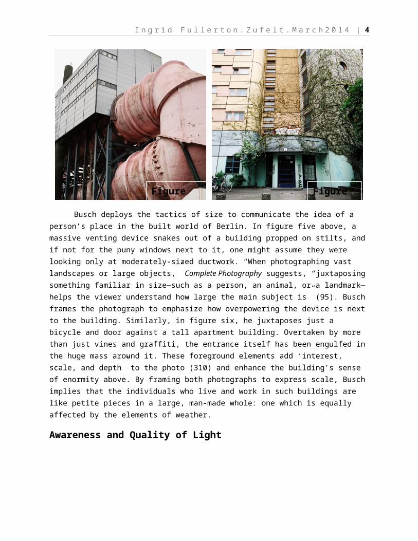
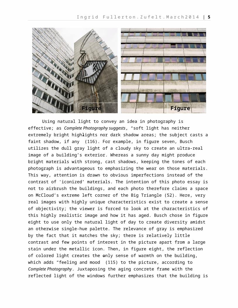
Busch deploys the tactics of size to communicate the idea of a person’s place
in the built world of Berlin. In figure five above, a massive venting device snakes out of a building propped on stilts, and if not for the puny windows next to it, one might assume they were looking only at moderately-sized ductwork. “When photographing vast landscapes or large objects,” Complete Photography suggests, “juxtaposing something familiar in size—such as a person, an animal, or a landmark—helps the viewer understand how large the main subject is” (95). Busch frames the photograph to emphasize how overpowering the device is next to the building. Similarly, in figure six, he juxtaposes just a bicycle and door against a tall apartment building. Overtaken by more than just vines and graffiti, the entrance itself has been engulfed in the huge mass around it. These foreground elements add ‘interest, scale, and depth” to the photo (310) and enhance the building’s sense of enormity above. By framing both photographs to express scale, Busch implies that the individuals who live and work in such buildings are like petite pieces in a large, man-made whole: one which is equally affected by the elements of weather.
Awareness and Quality of Light
Figure Five
Figure Six
I n g r i d F u l l e r t o n . Z u f e l t . M a r c h 2 0 1 4 | 5
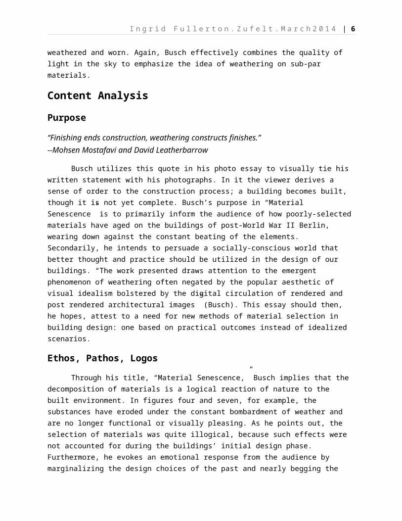
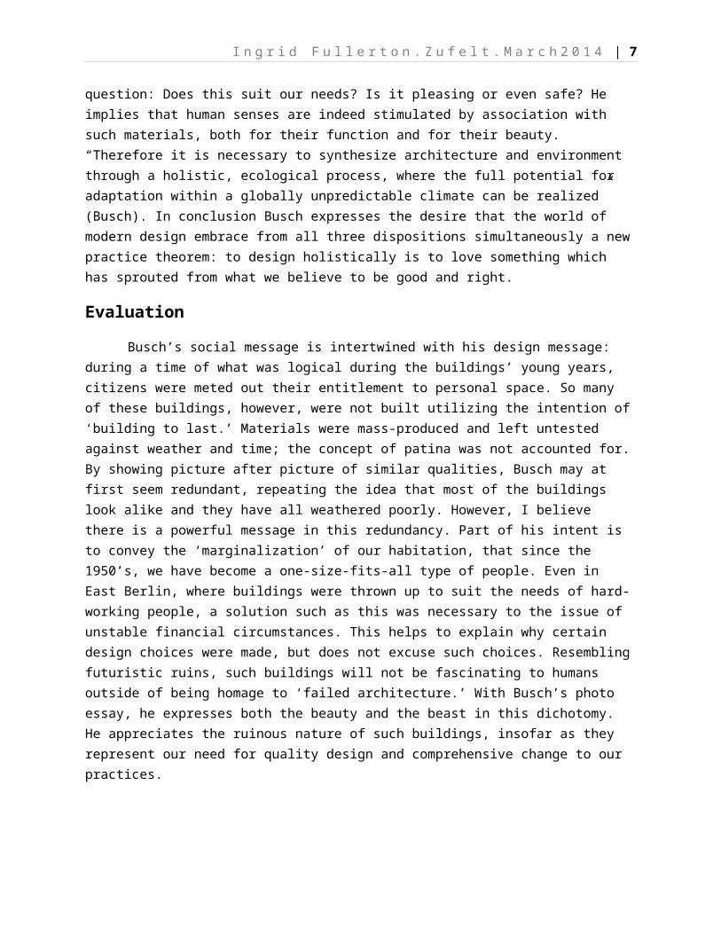
Using natural light to convey an idea in photography is effective; as Complete
Photography suggests, “soft light has neither extremely bright highlights nor dark shadow areas; the subject casts a faint shadow, if any” (116). For example, in figure seven, Busch utilizes the dull gray light of a cloudy sky to create an ultra-real image of a building’s exterior. Whereas a sunny day might produce bright materials with strong, cast shadows, keeping the tones of each photograph is advantageous to emphasizing the wear on those materials. This way, attention is drawn to obvious imperfections instead of the contrast of 'iconized’ materials. The intention of this photo essay is not to airbrush the buildings, and each photo therefore claims a space on McCloud’s extreme left corner of the Big Triangle (52). Here, very real images with highly unique characteristics exist to create a sense of objectivity; the viewer is forced to look at the characteristics of this highly realistic image and how it has aged. Busch chose in figure eight to use only the natural light of day to create diversity amidst an otherwise single-hue palette. The relevance of gray is emphasized by the fact that it matches the sky; there is relatively little contrast and few points of interest in the picture apart from a large stain under the metallic icon. Then, in figure eight, the reflection of colored light creates the only sense of warmth on the building, which adds “feeling and mood” (115) to the picture, according to Complete Photography. Juxtaposing the aging concrete frame with the reflected light of the windows further emphasizes that the building is weathered and worn. Again, Busch effectively combines the quality of light in the sky to emphasize the idea of weathering on sub-par materials.
Content AnalysisPurpose
Figure Eight
Figure Seven
I n g r i d F u l l e r t o n . Z u f e l t . M a r c h 2 0 1 4 | 6
“Finishing ends construction, weathering constructs finishes.”--Mohsen Mostafavi and David Leatherbarrow
Busch utilizes this quote in his photo essay to visually tie his written statement with his photographs. In it the viewer derives a sense of order to the construction process; a building becomes built, though it is not yet complete. Busch’s purpose in “Material Senescence” is to primarily inform the audience of how poorly-selected materials have aged on the buildings of post-World War II Berlin, wearing down against the constant beating of the elements. Secondarily, he intends to persuade a socially-conscious world that better thought and practice should be utilized in the design of our buildings. “The work presented draws attention to the emergent phenomenon of weathering often negated by the popular aesthetic of visual idealism bolstered by the digital circulation of rendered and post rendered architectural images” (Busch). This essay should then, he hopes, attest to a need for new methods of material selection in building design: one based on practical outcomes instead of idealized scenarios.
Ethos, Pathos, LogosThrough his title, “Material Senescence,” Busch implies that the
decomposition of materials is a logical reaction of nature to the built environment. In figures four and seven, for example, the substances have eroded under the constant bombardment of weather and are no longer functional or visually pleasing. As he points out, the selection of materials was quite illogical, because such effects were not accounted for during the buildings’ initial design phase. Furthermore, he evokes an emotional response from the audience by marginalizing the design choices of the past and nearly begging the question: Does this suit our needs? Is it pleasing or even safe? He implies that human senses are indeed stimulated by association with such materials, both for their function and for their beauty. “Therefore it is necessary to synthesize architecture and environment through a holistic, ecological process, where the full potential for adaptation within a globally unpredictable climate can be realized” (Busch). In conclusion Busch expresses the desire that the world of modern design embrace from all three dispositions simultaneously a new practice theorem: to design holistically is to love something which has sprouted from what we believe to be good and right.
EvaluationBusch’s social message is intertwined with his design message: during a time
of what was logical during the buildings’ young years, citizens were meted out their entitlement to personal space. So many of these buildings, however, were not built utilizing the intention of ‘building to last.’ Materials were mass-produced and left untested against weather and time; the concept of patina was not accounted for. By showing picture after picture of similar qualities, Busch may at first seem redundant, repeating the idea that most of the buildings look alike and they have all
I n g r i d F u l l e r t o n . Z u f e l t . M a r c h 2 0 1 4 | 7
weathered poorly. However, I believe there is a powerful message in this redundancy. Part of his intent is to convey the ‘marginalization’ of our habitation, that since the 1950’s, we have become a one-size-fits-all type of people. Even in East Berlin, where buildings were thrown up to suit the needs of hard-working people, a solution such as this was necessary to the issue of unstable financial circumstances. This helps to explain why certain design choices were made, but does not excuse such choices. Resembling futuristic ruins, such buildings will not be fascinating to humans outside of being homage to ‘failed architecture.’ With Busch’s photo essay, he expresses both the beauty and the beast in this dichotomy. He appreciates the ruinous nature of such buildings, insofar as they represent our need for quality design and comprehensive change to our practices.
I n g r i d F u l l e r t o n . Z u f e l t . M a r c h 2 0 1 4 | 8
Works Cited1. Busch, Ben. "Material Senescence." Web log post. Ben Busch. N.p., 2013.
Web. 3 Mar. 2014.2. McCloud, Scott. Understanding Comics: The Invisible Art. New York:
HarperPerennial, 1994. Print.3. National Geographic Complete Photography. Washington, D.C.: National
Geographic, 2011. Print.