front-end formations
494
Level 1 - Overview & Updates
-
Upload
ilkin-abdullayev -
Category
Technology
-
view
63 -
download
1
Transcript of front-end formations

Level 1 - Overview & Updates

๏ HTML5 Overview๏ CSS3 Overview๏ Updated HTML5 Elements๏ Existing HTML5 Tag Updates
TABLE OF CONTENTS
LEVEL 1

๏ HTML5 Overview๏ CSS3 Overview๏ Updated HTML5 Elements๏ Existing HTML5 Tag Updates
TABLE OF CONTENTS
LEVEL 1
1.1 HTML5 OVERVIEW
HTML5 OVERVIEW
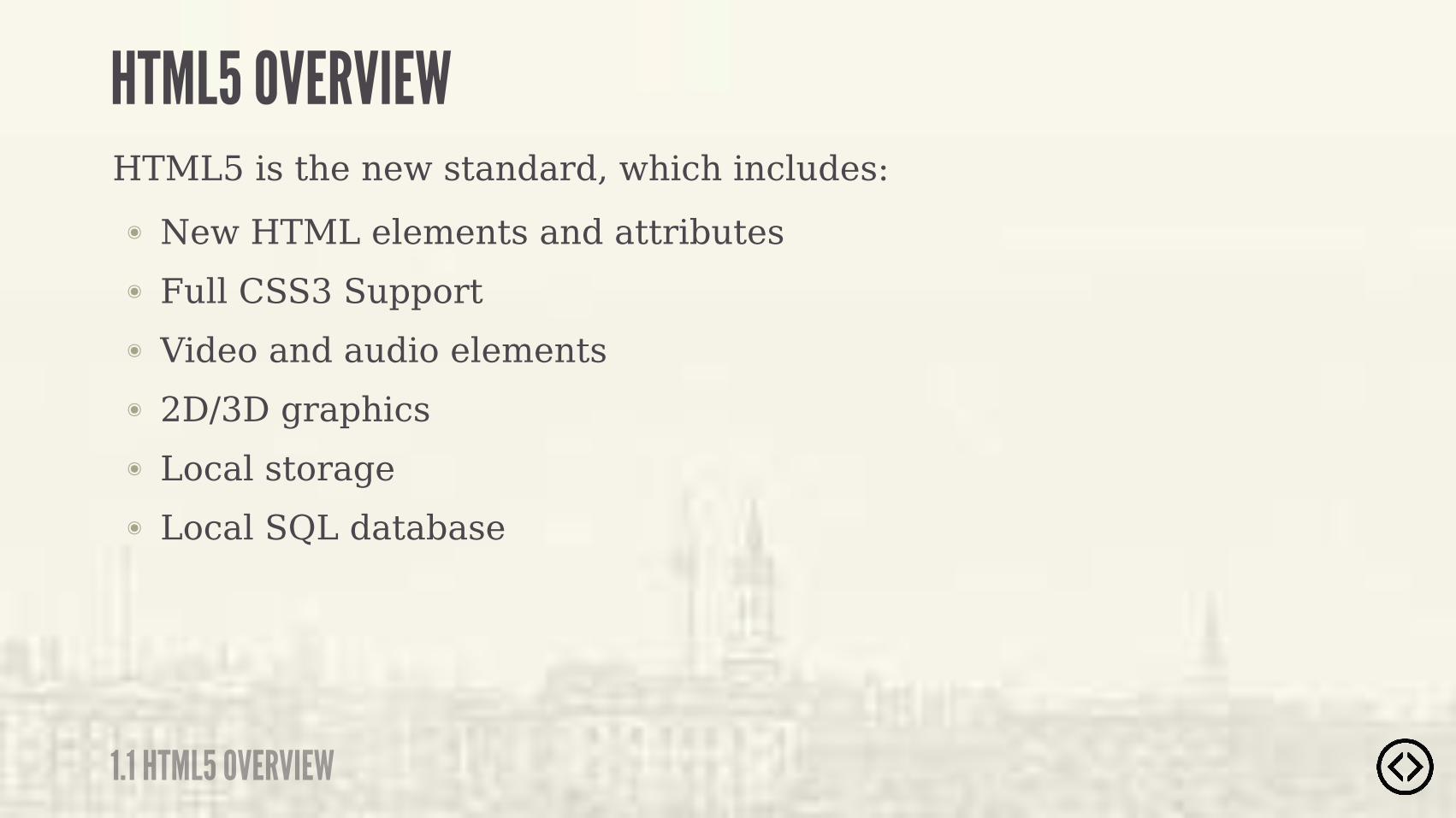
๏ New HTML elements and attributes๏ Full CSS3 Support๏ Video and audio elements๏ 2D/3D graphics๏ Local storage๏ Local SQL database
HTML5 is the new standard, which includes:

๏ New HTML elements and attributes๏ Full CSS3 Support๏ Video and audio elements๏ 2D/3D graphics๏ Local storage๏ Local SQL database
HTML5 is the new standard, which includes:
�� ������!�����#�&������!����� ����������������������%�
1.1 HTML5 OVERVIEW
HTML5 OVERVIEW

TABLE OF CONTENTS๏ HTML5 Overview๏ CSS3 Overview๏ Updated HTML5 Elements๏ Existing HTML5 Tag Updates
LEVEL 1

๏ HTML5 Overview๏ CSS3 Overview๏ Updated HTML5 Elements๏ Existing HTML5 Tag Updates
TABLE OF CONTENTS
LEVEL 1
1.2 CSS3 OVERVIEW
CSS3 OVERVIEW
CSS3 is the latest standard of CSS.

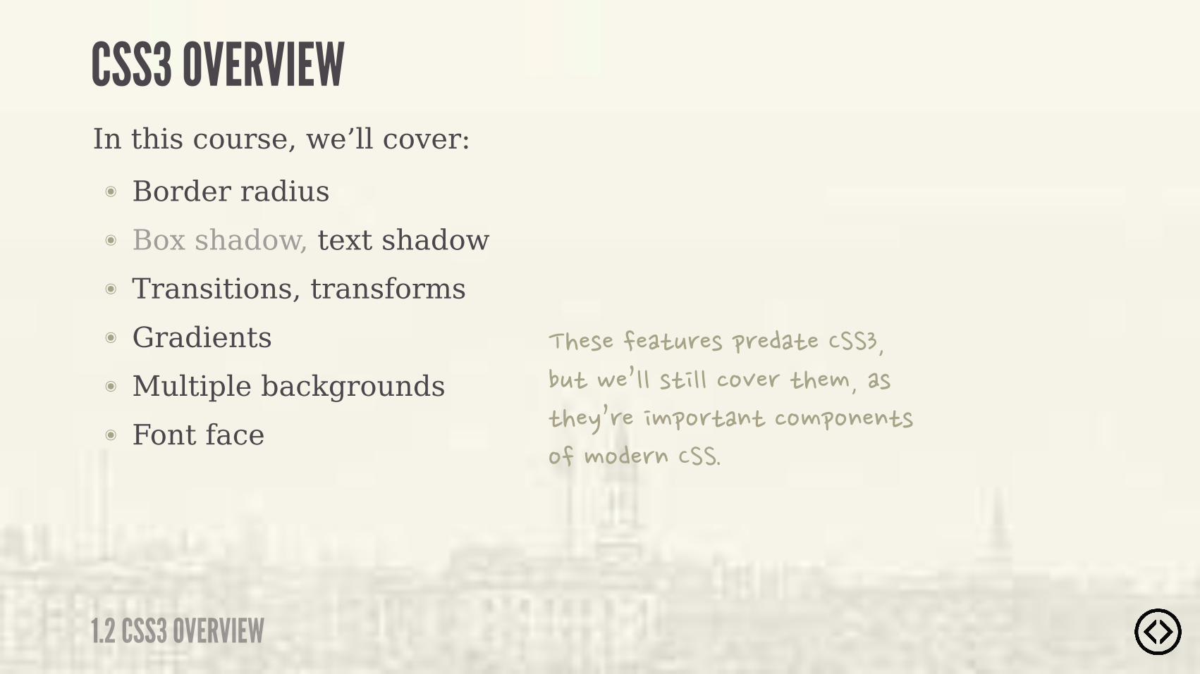
๏ Border radius๏ Box shadow, text shadow๏ Transitions, transforms๏ Gradients๏ Multiple backgrounds๏ Font face
In this course, we’ll cover:
1.2 CSS3 OVERVIEW
CSS3 OVERVIEW
๏ Border radius๏ Box shadow, text shadow๏ Transitions, transforms๏ Gradients๏ Multiple backgrounds๏ Font face
In this course, we’ll cover:
1.2 CSS3 OVERVIEW
CSS3 OVERVIEW
�������� !��������� ���������! �#�&���� ������"��� �������� ��%&�������� �� ��������� ����������������

๏ HTML5 Overview๏ CSS3 Overview๏ Updated HTML5 Elements๏ Existing HTML5 Tag Updates
TABLE OF CONTENTS
LEVEL 1
๏ HTML5 Overview๏ CSS3 Overview๏ Updated HTML5 Elements๏ Existing HTML5 Tag Updates
TABLE OF CONTENTS
LEVEL 1
1.3 UPDATED HTML5 ELEMENTS
UPDATED HTML5 ELEMENTS
๏ Link tag
๏ Script tag
๏ Meta declaration
๏ Doctype

HTML 4.01 Strict
<!DOCTYPE HTML PUBLIC "-//W3C//DTD HTML 4.01//EN" "http://www.w3.org/TR/html4/strict.dtd">
1.3 UPDATED HTML5 ELEMENTS
DOCTYPE

<!DOCTYPE HTML PUBLIC "-//W3C//DTD HTML 4.01 Transitional//EN" "http://www.w3.org/TR/html4/loose.dtd">
HTML 4.01 Transitional
HTML 4.01 Strict
<!DOCTYPE HTML PUBLIC "-//W3C//DTD HTML 4.01//EN" "http://www.w3.org/TR/html4/strict.dtd">
1.3 UPDATED HTML5 ELEMENTS
DOCTYPE
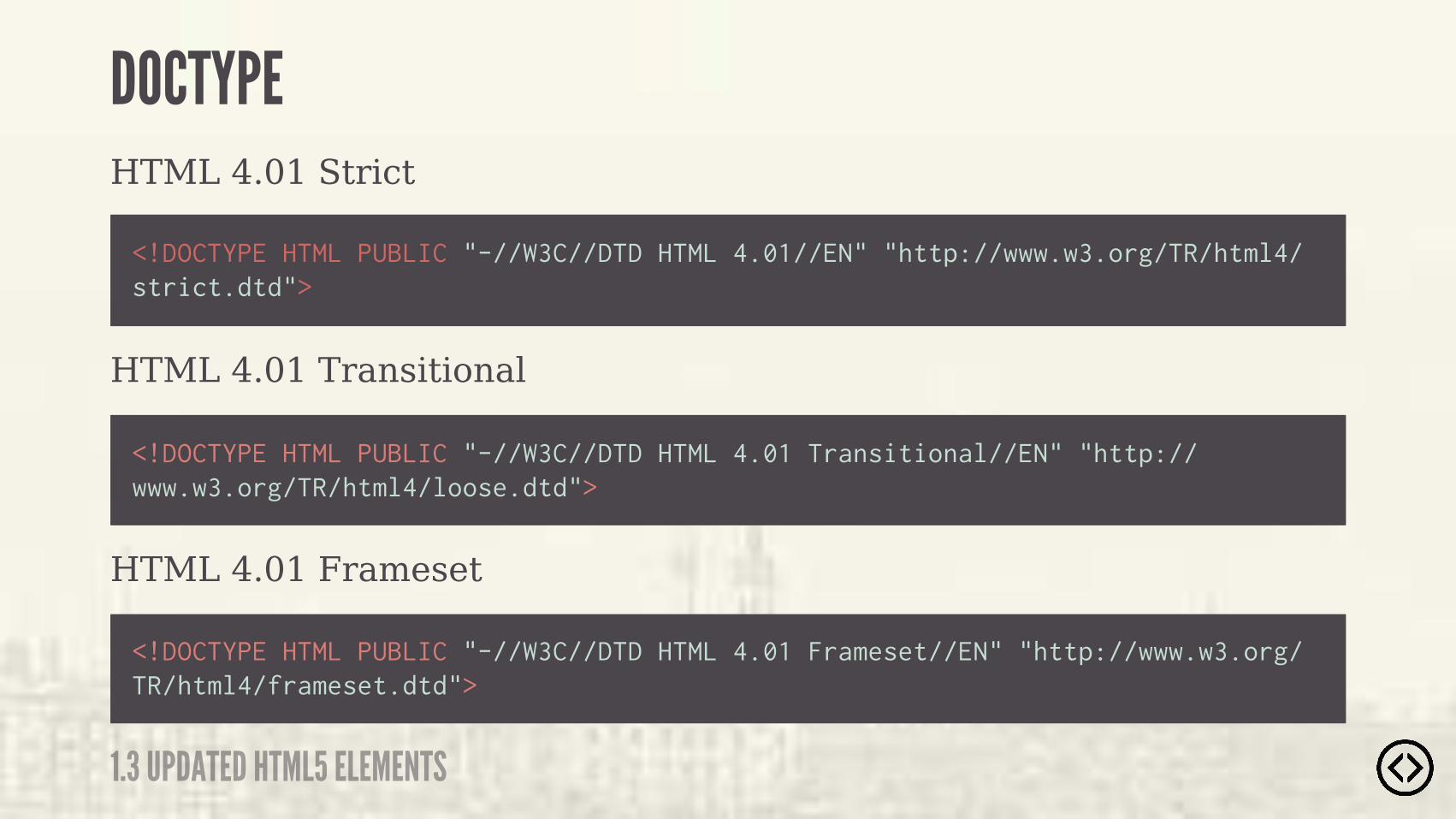
<!DOCTYPE HTML PUBLIC "-//W3C//DTD HTML 4.01 Frameset//EN" "http://www.w3.org/TR/html4/frameset.dtd">
HTML 4.01 Transitional
HTML 4.01 Frameset
HTML 4.01 Strict
<!DOCTYPE HTML PUBLIC "-//W3C//DTD HTML 4.01//EN" "http://www.w3.org/TR/html4/strict.dtd">
<!DOCTYPE HTML PUBLIC "-//W3C//DTD HTML 4.01 Transitional//EN" "http://www.w3.org/TR/html4/loose.dtd">
1.3 UPDATED HTML5 ELEMENTS
DOCTYPE
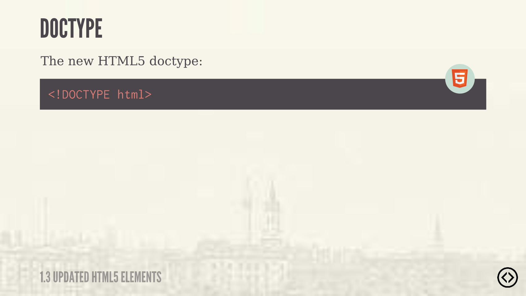
The new HTML5 doctype:
<!DOCTYPE html>
1.3 UPDATED HTML5 ELEMENTS
DOCTYPE
The new HTML5 doctype:
1.3 UPDATED HTML5 ELEMENTS
DOCTYPE
<!DOCTYPE html>
������� ���� �������������� ����������� ����!���� ���������������#����� ���!��� ���� ���"�������

1.3 UPDATED HTML5 ELEMENTS
META DECLARATIONThe meta declaration in HTML4:
<meta http-equiv="Content-Type" content="text/html; charset=UTF-8">

The meta declaration in HTML4:
<meta charset="UTF-8">
<meta http-equiv="Content-Type" content="text/html; charset=UTF-8">
1.3 UPDATED HTML5 ELEMENTS
META DECLARATION
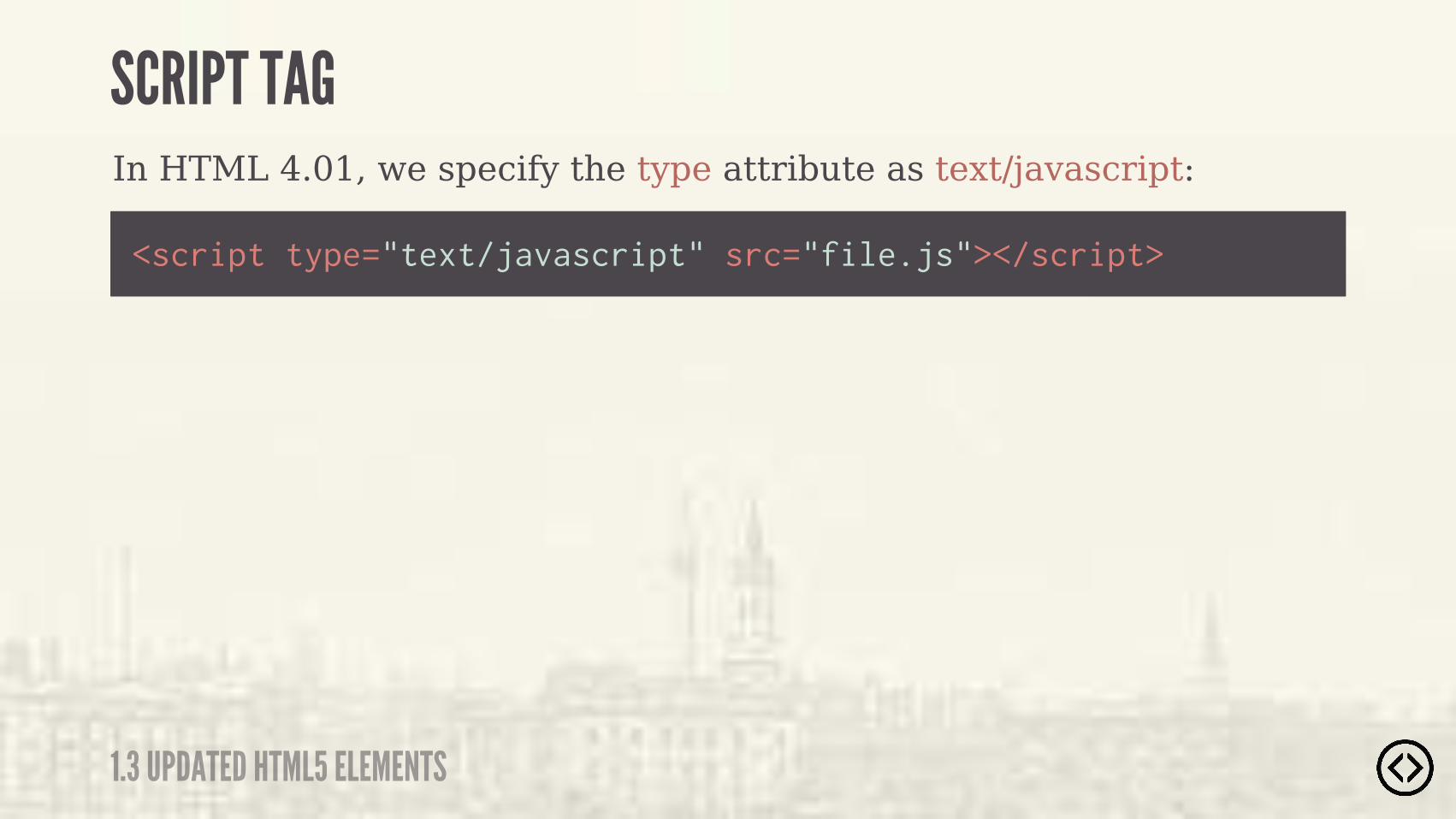
In HTML 4.01, we specify the type attribute as text/javascript:
<script type="text/javascript" src="file.js"></script>
1.3 UPDATED HTML5 ELEMENTS
SCRIPT TAG
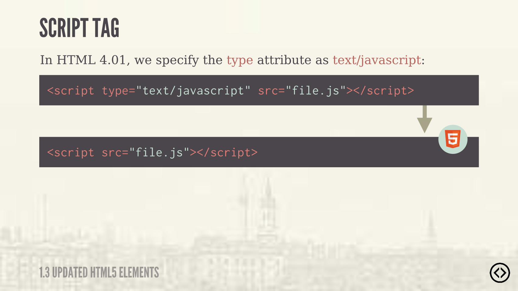
<script src="file.js"></script>
<script type="text/javascript" src="file.js"></script>
In HTML 4.01, we specify the type attribute as text/javascript:
1.3 UPDATED HTML5 ELEMENTS
SCRIPT TAG
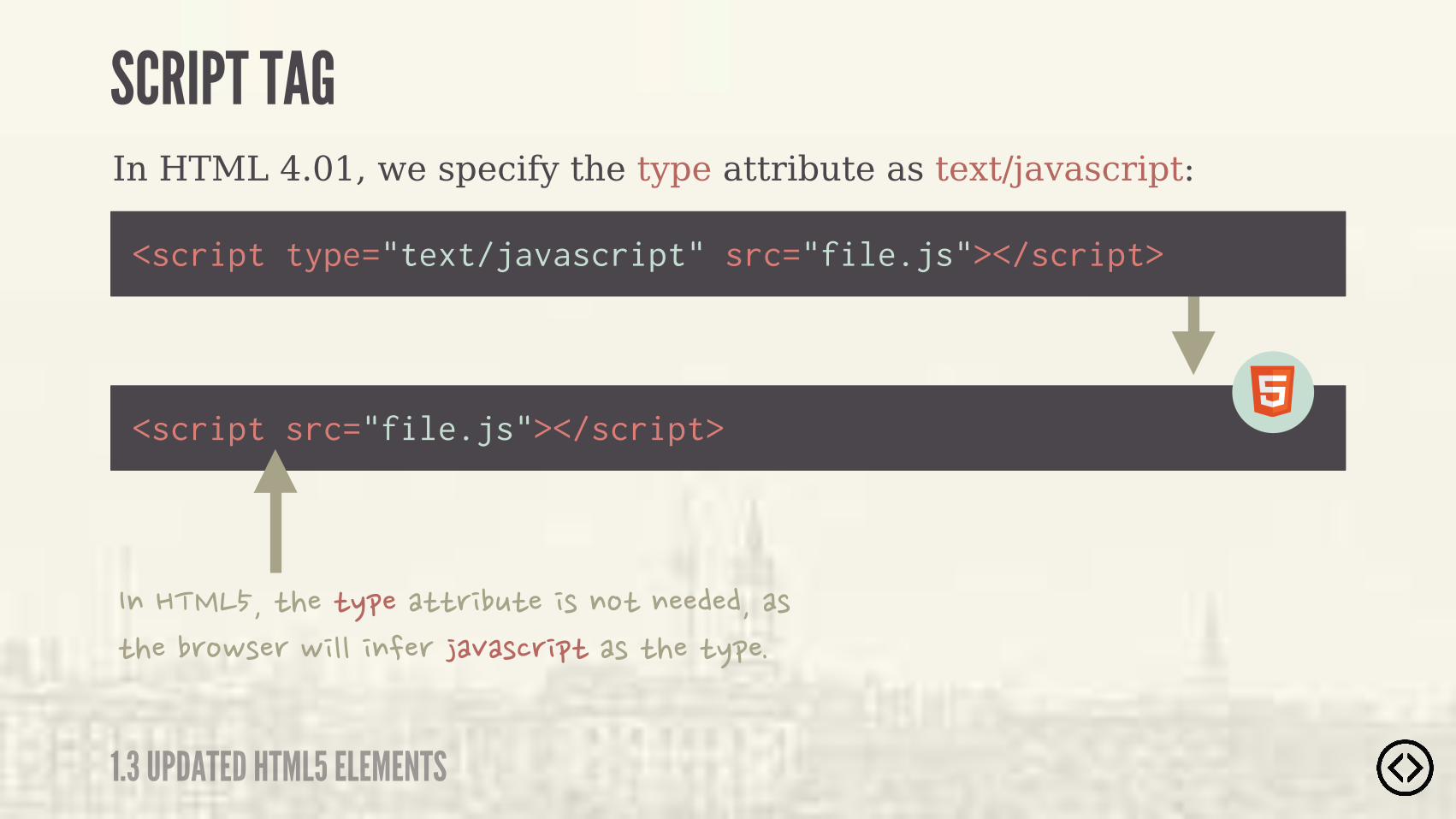
<script type="text/javascript" src="file.js"></script>
��� ���� ��� %���� ���! ������� ������������ ������#����#������������"������ ���� ��� %���
In HTML 4.01, we specify the type attribute as text/javascript:
<script src="file.js"></script>
1.3 UPDATED HTML5 ELEMENTS
SCRIPT TAG
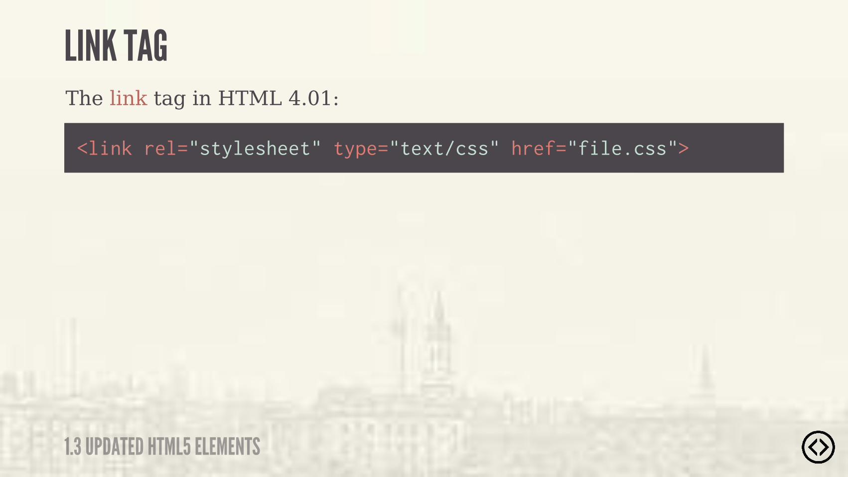
The link tag in HTML 4.01:
<link rel="stylesheet" type="text/css" href="file.css">
1.3 UPDATED HTML5 ELEMENTS
LINK TAG

The link tag in HTML 4.01:
<link rel="stylesheet" href="file.css">
<link rel="stylesheet" type="text/css" href="file.css">
1.3 UPDATED HTML5 ELEMENTS
LINK TAG
����������� ����#�����& ������ ��� %���� ���! ����� �������� ���

๏ HTML5 Overview๏ CSS3 Overview๏ Updated HTML5 Elements๏ Existing HTML5 Tag Updates
TABLE OF CONTENTS
LEVEL 1

๏ HTML5 Overview๏ CSS3 Overview๏ Updated HTML5 Elements๏ Existing HTML5 Tag Updates
TABLE OF CONTENTS
LEVEL 1
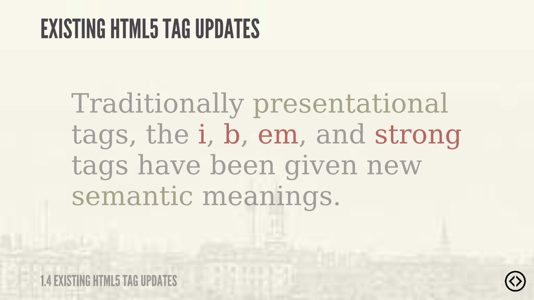
Traditionally presentational tags, the i, b, em, and strong tags have been given new semantic meanings.
EXISTING HTML5 TAG UPDATES
1.4 EXISTING HTML5 TAG UPDATES
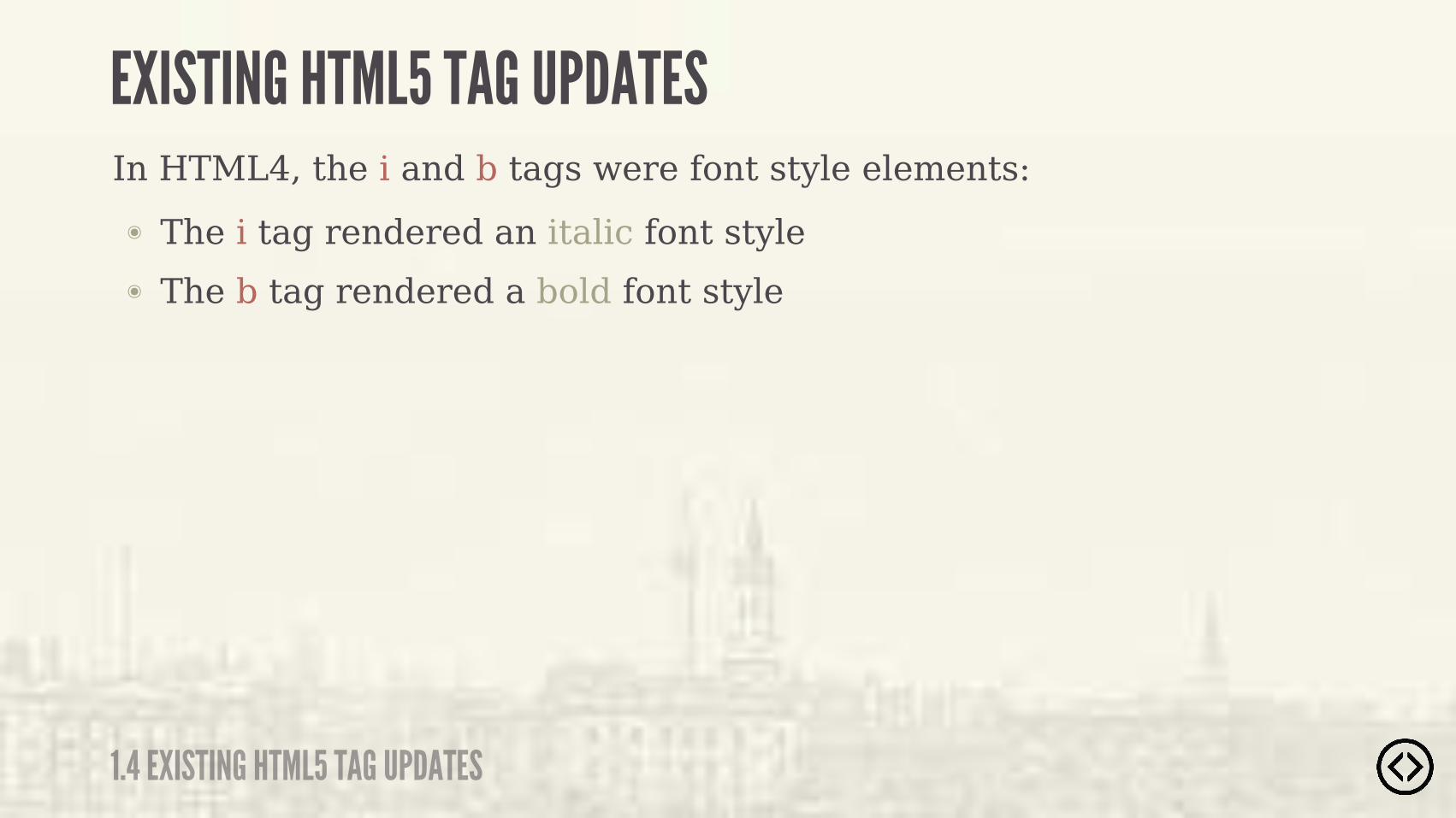
In HTML4, the i and b tags were font style elements:
๏ The b tag rendered a bold font style
๏ The i tag rendered an italic font style
1.4 EXISTING HTML5 TAG UPDATES
EXISTING HTML5 TAG UPDATES
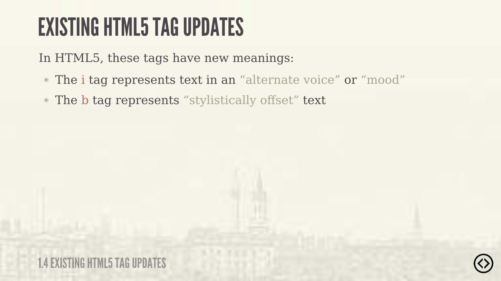
In HTML5, these tags have new meanings:
๏ The b tag represents “stylistically offset” text
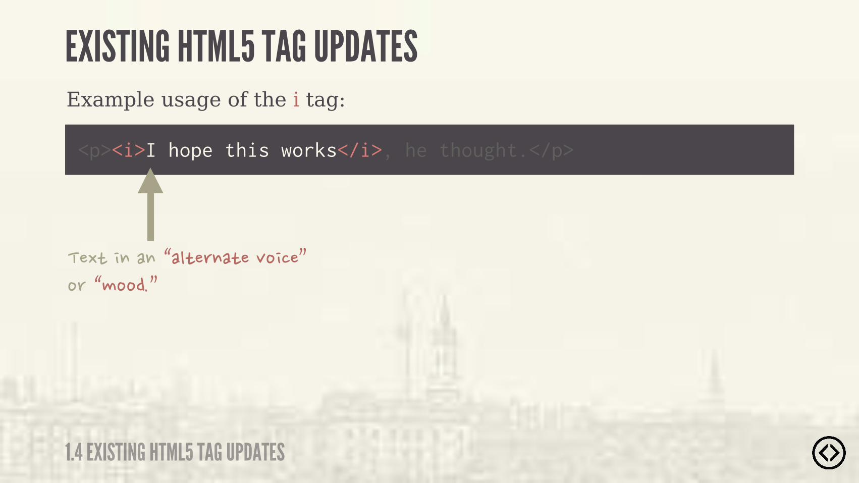
๏ The i tag represents text in an “alternate voice” or “mood”
1.4 EXISTING HTML5 TAG UPDATES
EXISTING HTML5 TAG UPDATES

Some example uses for the i tag:
๏ Ship name in Western texts
๏ A thought
๏ Transliteration
๏ Idiomatic phrase from another language
๏ Technical term
๏ Taxonomic designation
1.4 EXISTING HTML5 TAG UPDATES
EXISTING HTML5 TAG UPDATES
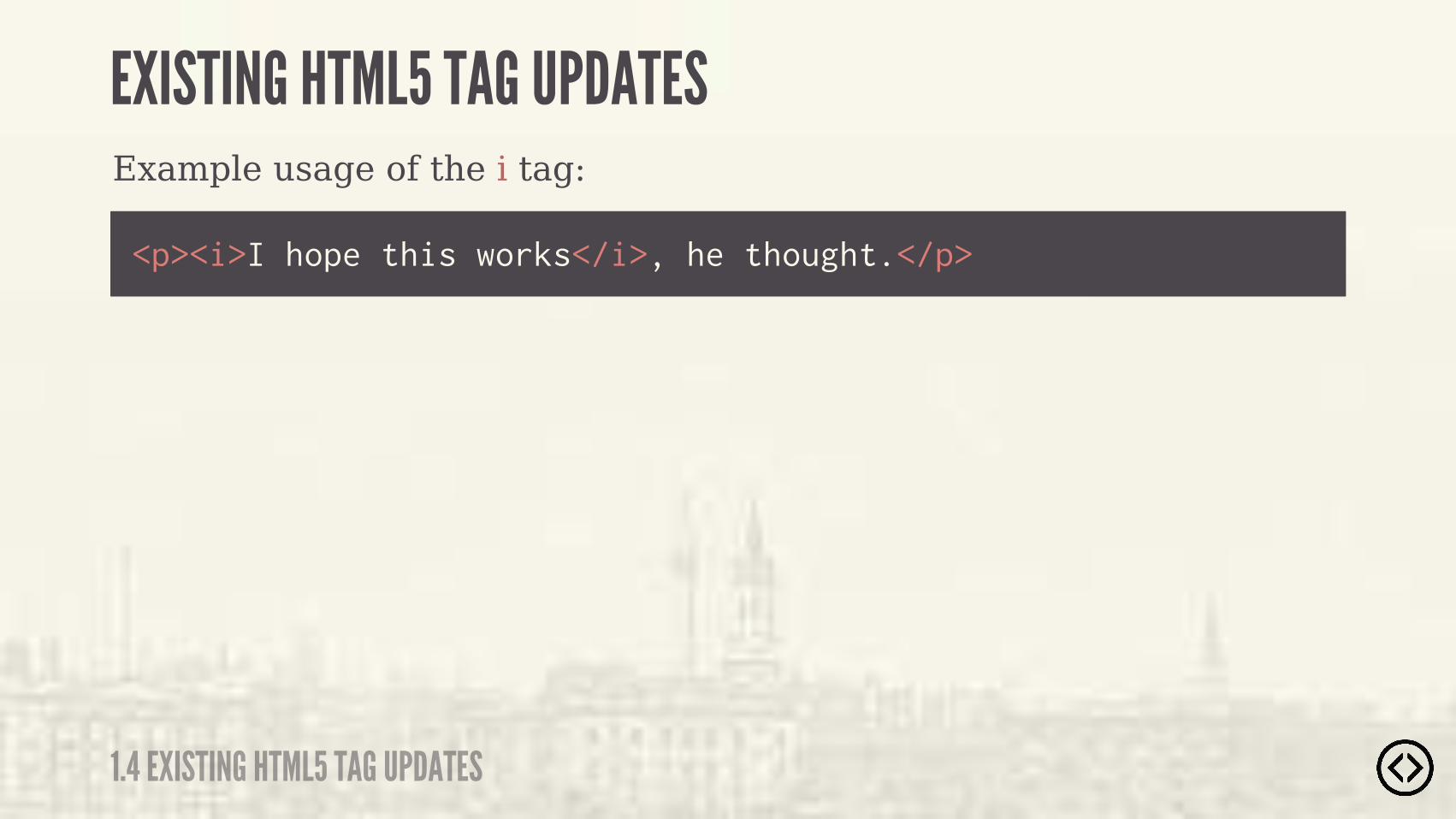
Example usage of the i tag:
<p><i>I hope this works</i>, he thought.</p>
1.4 EXISTING HTML5 TAG UPDATES
EXISTING HTML5 TAG UPDATES
Example usage of the i tag:
<p><i>I hope this works</i>, he thought.</p>
�$ �������'�� ���� ��"����(����'�����(
1.4 EXISTING HTML5 TAG UPDATES
EXISTING HTML5 TAG UPDATES
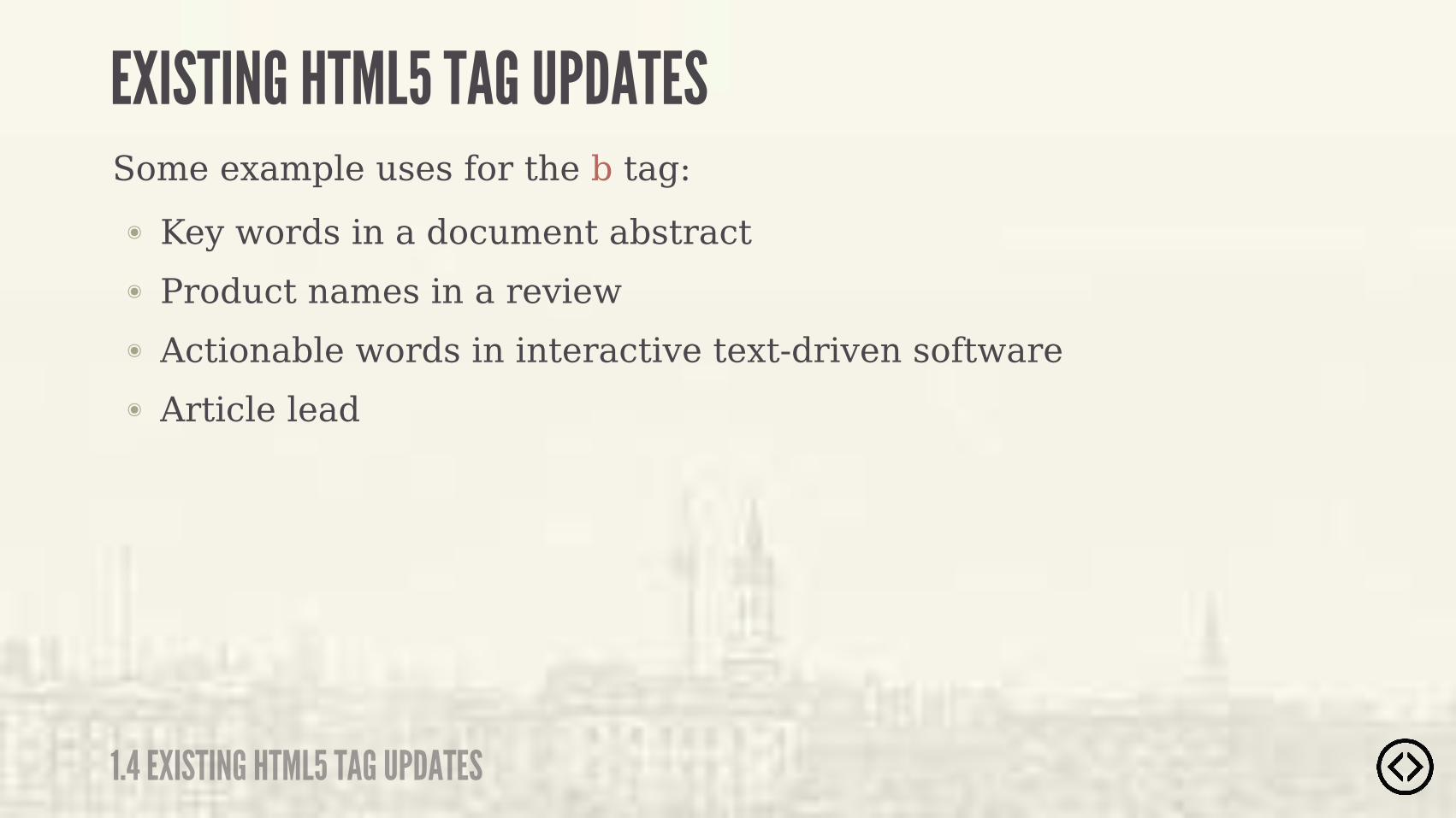
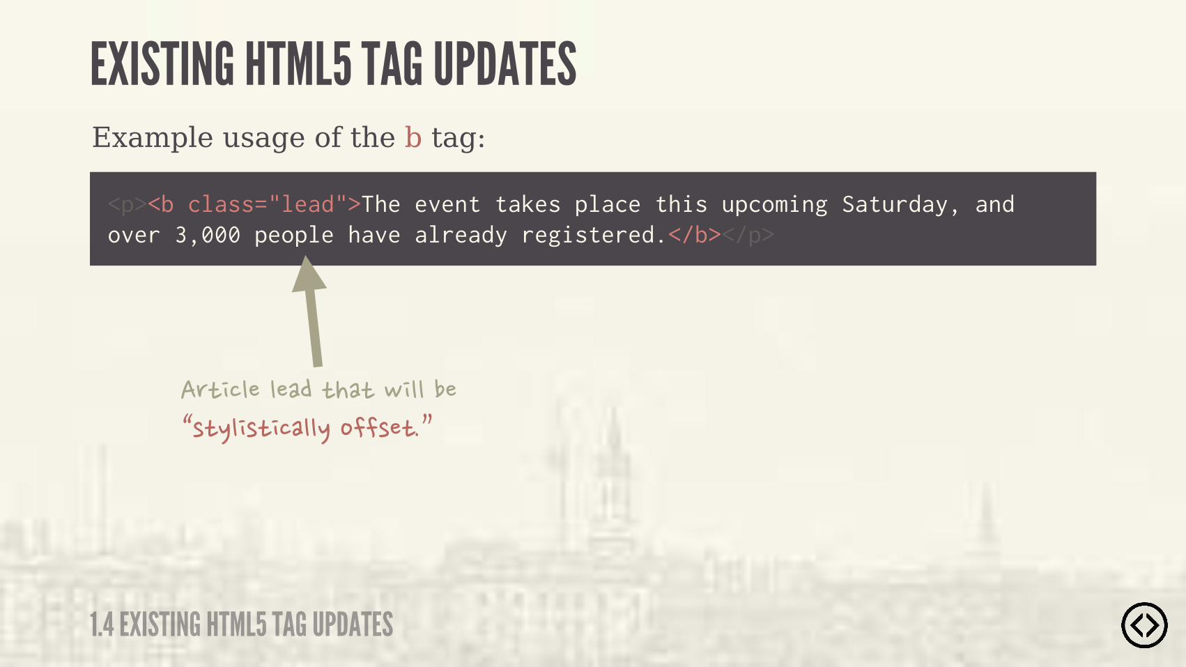
Some example uses for the b tag:
๏ Article lead
๏ Actionable words in interactive text-driven software
๏ Product names in a review
๏ Key words in a document abstract
1.4 EXISTING HTML5 TAG UPDATES
EXISTING HTML5 TAG UPDATES
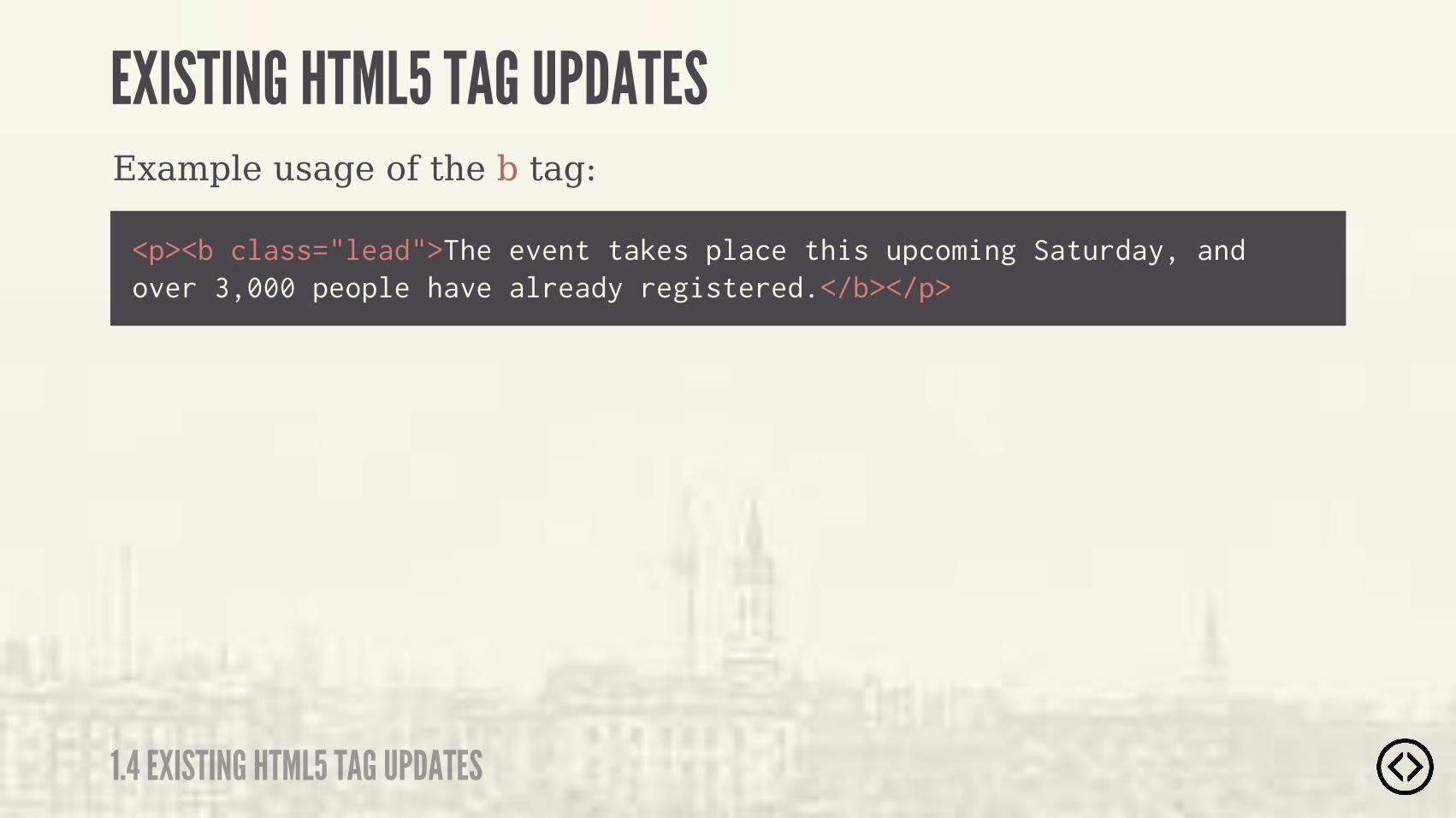
Example usage of the b tag:
<p><b class="lead">The event takes place this upcoming Saturday, and over 3,000 people have already registered.</b></p>
1.4 EXISTING HTML5 TAG UPDATES
EXISTING HTML5 TAG UPDATES
Example usage of the b tag:
<p><b class="lead">The event takes place this upcoming Saturday, and over 3,000 people have already registered.</b></p>
�� ���������� �� �#�������'� %��� �����%������ �(
1.4 EXISTING HTML5 TAG UPDATES
EXISTING HTML5 TAG UPDATES
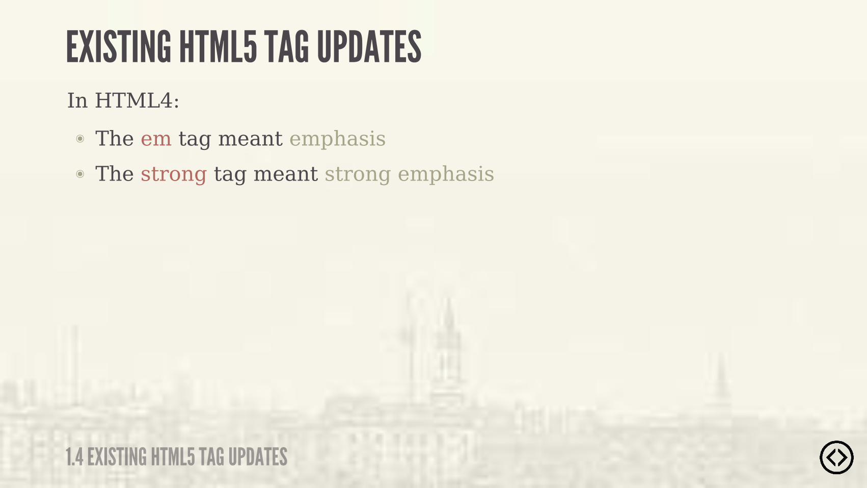
In HTML4:
๏ The strong tag meant strong emphasis
๏ The em tag meant emphasis
1.4 EXISTING HTML5 TAG UPDATES
EXISTING HTML5 TAG UPDATES
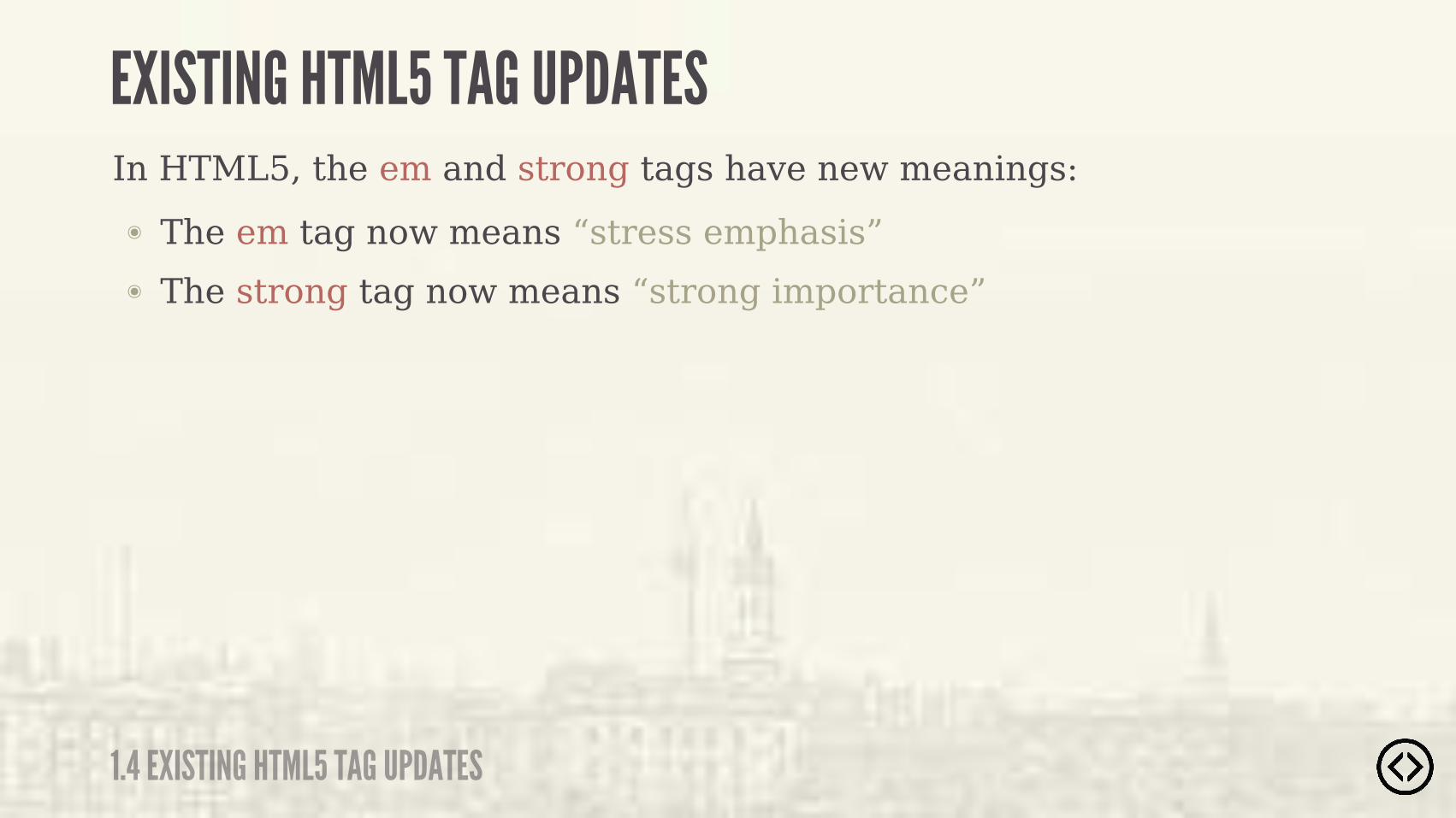
In HTML5, the em and strong tags have new meanings:
๏ The strong tag now means “strong importance”
๏ The em tag now means “stress emphasis”
1.4 EXISTING HTML5 TAG UPDATES
EXISTING HTML5 TAG UPDATES

Example usage of the em tag:
<p>Make sure to sign up <em>before</em> the day of the event, September 16, 2013.</p>
1.4 EXISTING HTML5 TAG UPDATES
EXISTING HTML5 TAG UPDATES

<p>Make sure to sign up <em>before</em> the day of the event, September 16, 2013.</p>
�����#�&�����"����'� �������������(� ��'�������(
Example usage of the em tag:
1.4 EXISTING HTML5 TAG UPDATES
EXISTING HTML5 TAG UPDATES
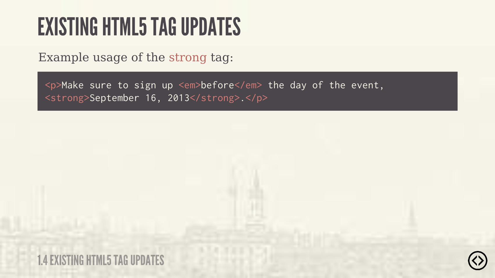
<p>Make sure to sign up <em>before</em> the day of the event, <strong>September 16, 2013</strong>.</p>
Example usage of the strong tag:
1.4 EXISTING HTML5 TAG UPDATES
EXISTING HTML5 TAG UPDATES

Example usage of the strong tag:
<p>Make sure to sign up <em>before</em> the day of the event, <strong>September 16, 2013</strong>.</p>
�����#�&�����"����'� ���������� ����(� �� ����� ����� ����"�� �
1.4 EXISTING HTML5 TAG UPDATES
EXISTING HTML5 TAG UPDATES

Level 2 - HTML5 Elements

LEVEL 2
TABLE OF CONTENTS๏ Section๏ Header๏ Footer๏ Aside๏ Nav๏ Article๏ Main๏ Figure/figcaption๏ Time

๏ Section๏ Header๏ Footer๏ Aside๏ Nav๏ Article๏ Main๏ Figure/figcaption๏ Time
LEVEL 2
TABLE OF CONTENTS

2.1 SECTION
SECTION
- W3C SPECIFICATION
“ The section element represents a generic document or application section.
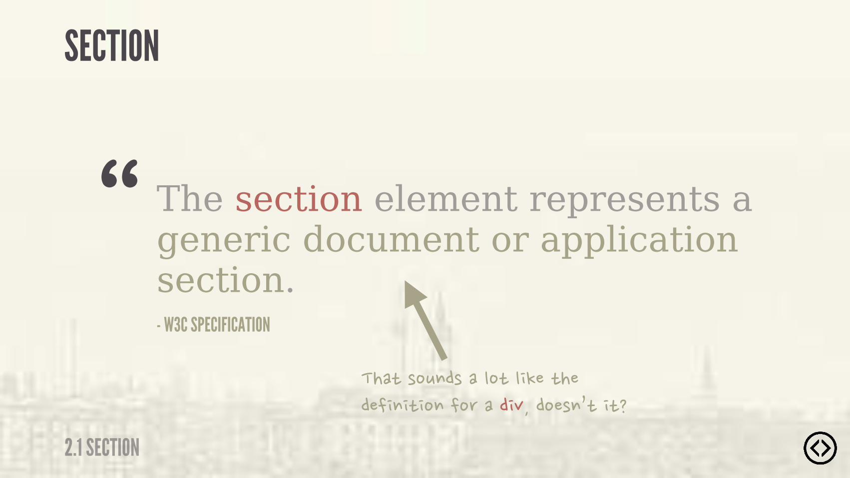
- W3C SPECIFICATION
“ The section element represents a generic document or application section.
���"�!�#��!�����"������"���������"������ �����$�����!�("��"�
2.1 SECTION
SECTION
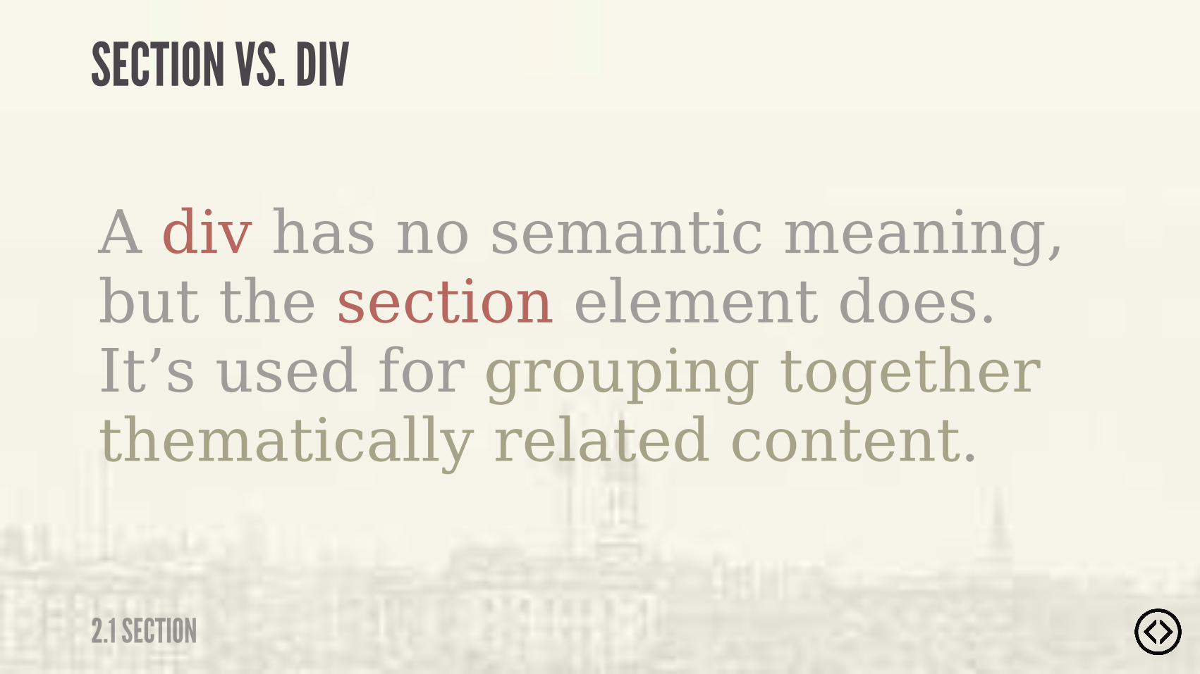
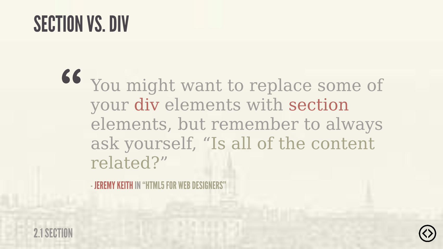
SECTION VS. DIV
A div has no semantic meaning, but the section element does. It’s used for grouping together thematically related content.
2.1 SECTION
2.1 SECTION
SECTION VS. DIV
You might want to replace some of your div elements with section elements, but remember to always ask yourself, “Is all of the content related?”- JEREMY KEITH IN “HTML5 FOR WEB DESIGNERS”
“


��� �#�������� ���"������"��"�"��"����"���!�����"# �����������

2.1 SECTION
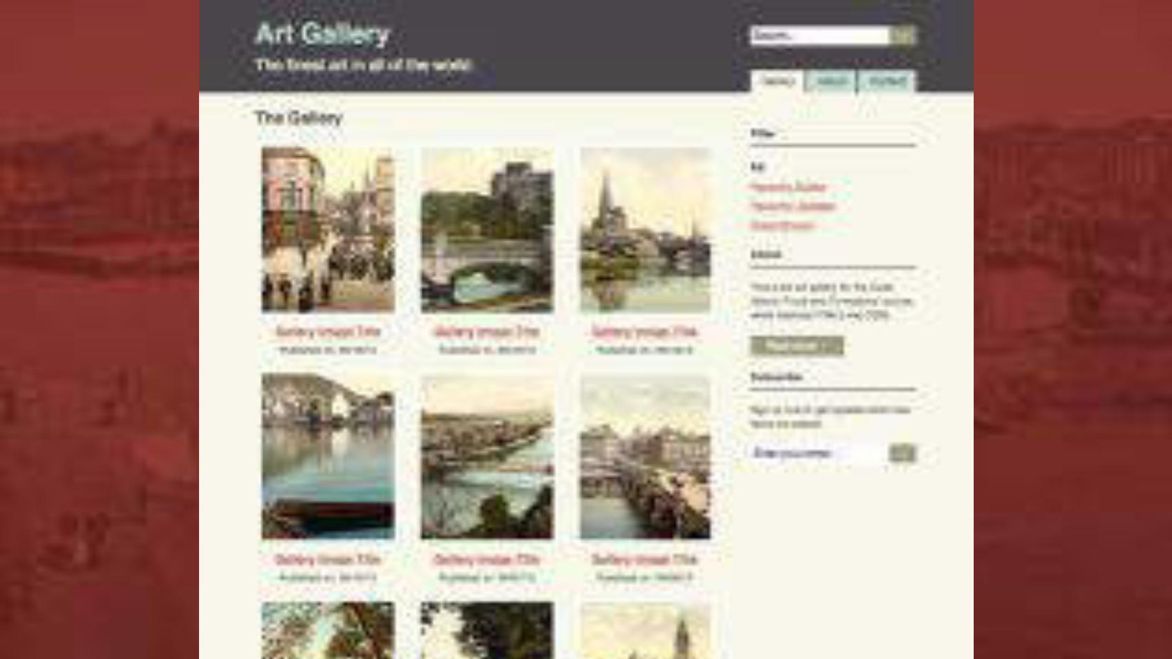
SECTIONExample usage of the section tag:
<div class="section"> <h2>The Gallery</h2> <!-- ... --></div>
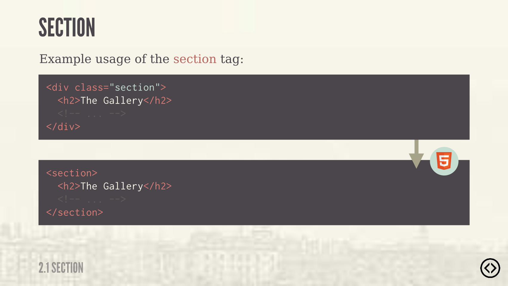
Example usage of the section tag:
<section> <h2>The Gallery</h2> <!-- ... --></section>
<div class="section"> <h2>The Gallery</h2> <!-- ... --></div>
2.1 SECTION
SECTION

The document outline produces an outline summary of an HTML document based on how it is marked up.
THE DOCUMENT OUTLINE
2.1 SECTION
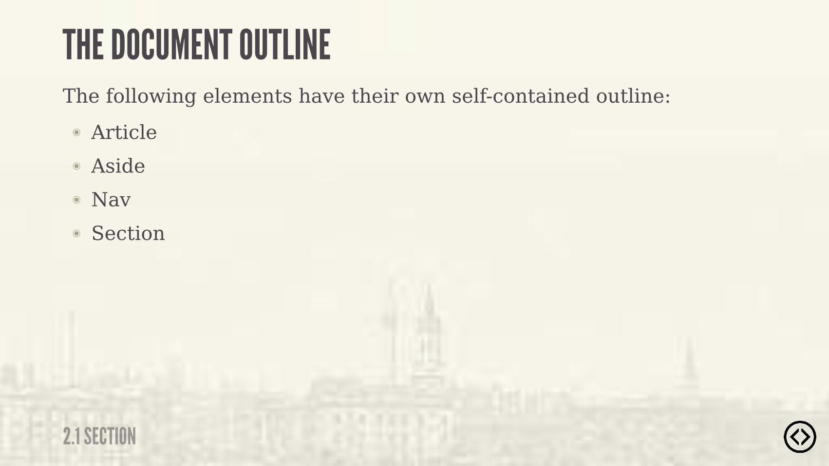
๏ Article๏ Aside๏ Nav๏ Section
The following elements have their own self-contained outline:
2.1 SECTION
THE DOCUMENT OUTLINE
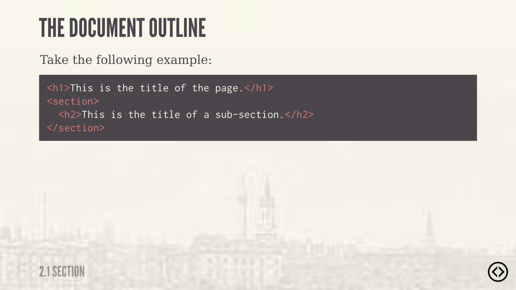
Take the following example:
<h1>This is the title of the page.</h1><section> <h2>This is the title of a sub-section.</h2></section>
2.1 SECTION
THE DOCUMENT OUTLINE
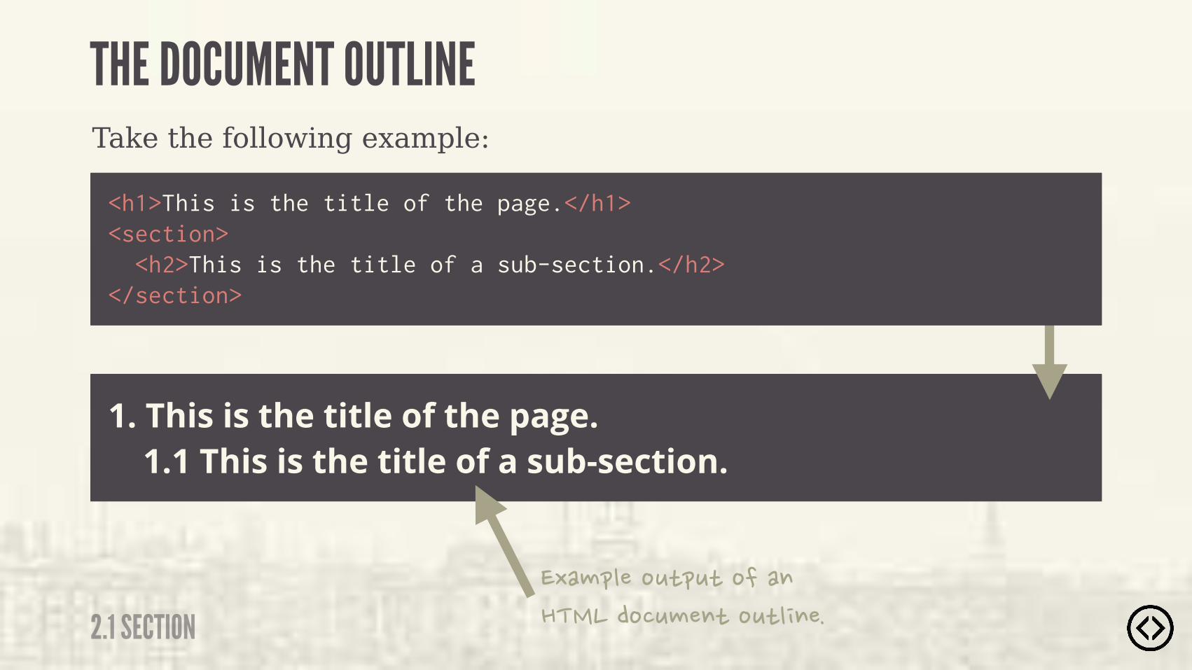
1. This is the title of the page. 1.1 This is the title of a sub-section.
<h1>This is the title of the page.</h1><section> <h2>This is the title of a sub-section.</h2></section>
Take the following example:
THE DOCUMENT OUTLINE
2.1 SECTION�&�������#"�#"��������������#���"��#"�����
๏ Upcoming Section Title
�������#!����������!�������"���!��"����"��������"������#���"��#"������!�#���������
<h1>This is the title of the page.</h1><section> </section> <h1>This is the title of a sub-section.</h1>
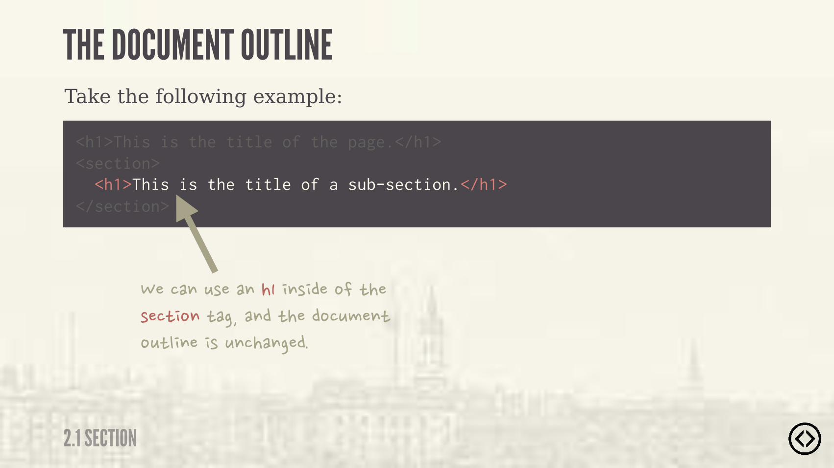
Take the following example:
THE DOCUMENT OUTLINE
2.1 SECTION
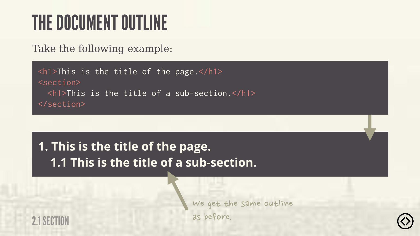
1. This is the title of the page. 1.1 This is the title of a sub-section.
<h1>This is the title of the page.</h1><section> <h1>This is the title of a sub-section.</h1></section>
Take the following example:
THE DOCUMENT OUTLINE
2.1 SECTION�����"�"���!�����#"������!����� ��
LEVEL 2
TABLE OF CONTENTS๏ Section๏ Header๏ Footer๏ Aside๏ Nav๏ Article๏ Main๏ Figure/figcaption๏ Time

๏ Section๏ Header๏ Footer๏ Aside๏ Nav๏ Article๏ Main๏ Figure/figcaption๏ Time
LEVEL 2
TABLE OF CONTENTS

2.2 HEADER
HEADER
- W3C SPECIFICATION
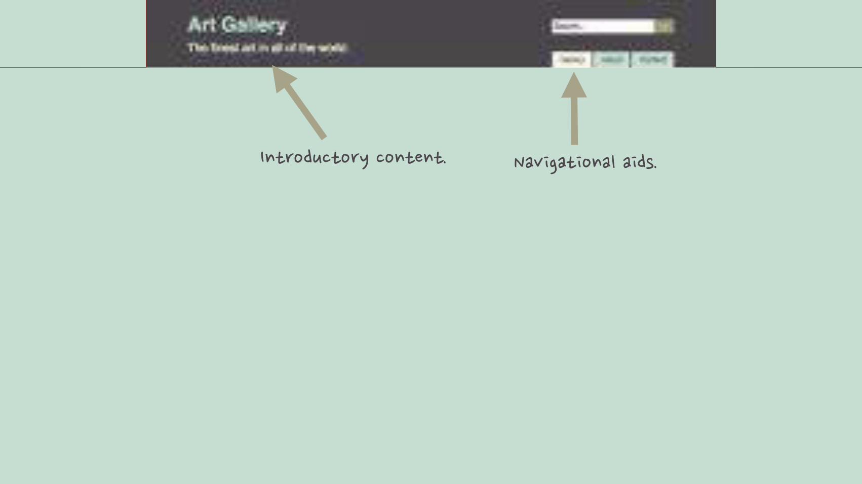
“ A group of introductory or navigational aids.
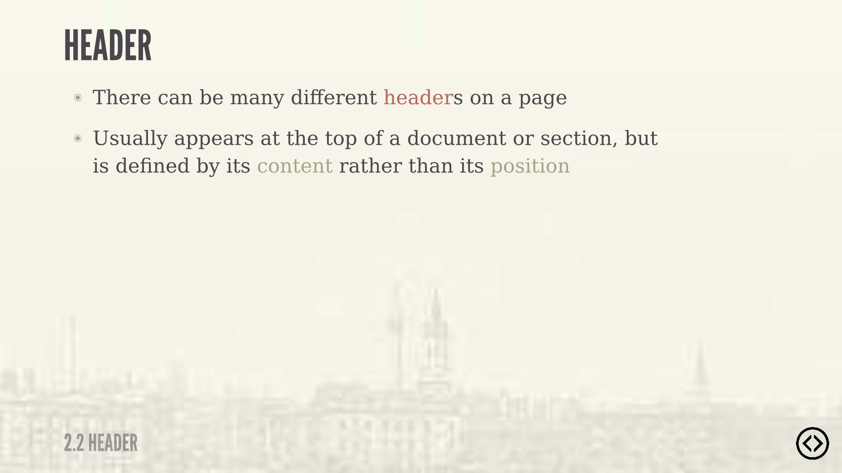
๏ Usually appears at the top of a document or section, but is defined by its content rather than its position
๏ There can be many different headers on a page
2.2 HEADER
HEADER

�" ��#�"� '����"��"� ��$���"���������!�
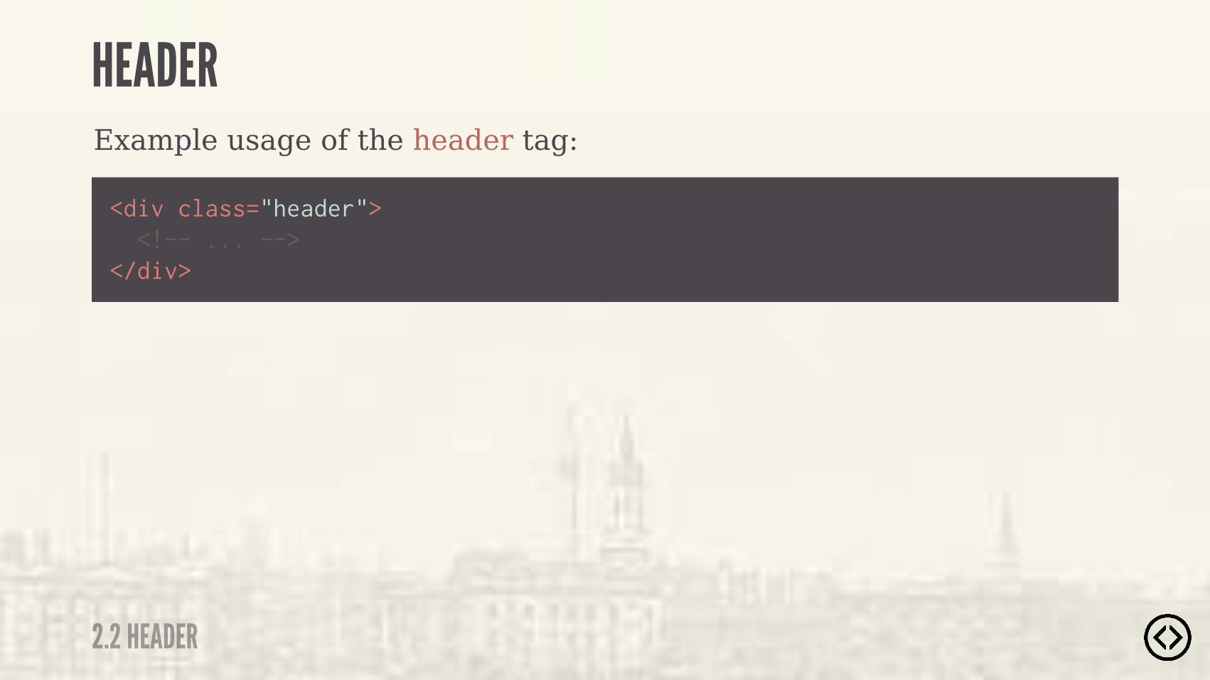
Example usage of the header tag:
<div class="header"> <!-- ... --></div>
2.2 HEADER
HEADER
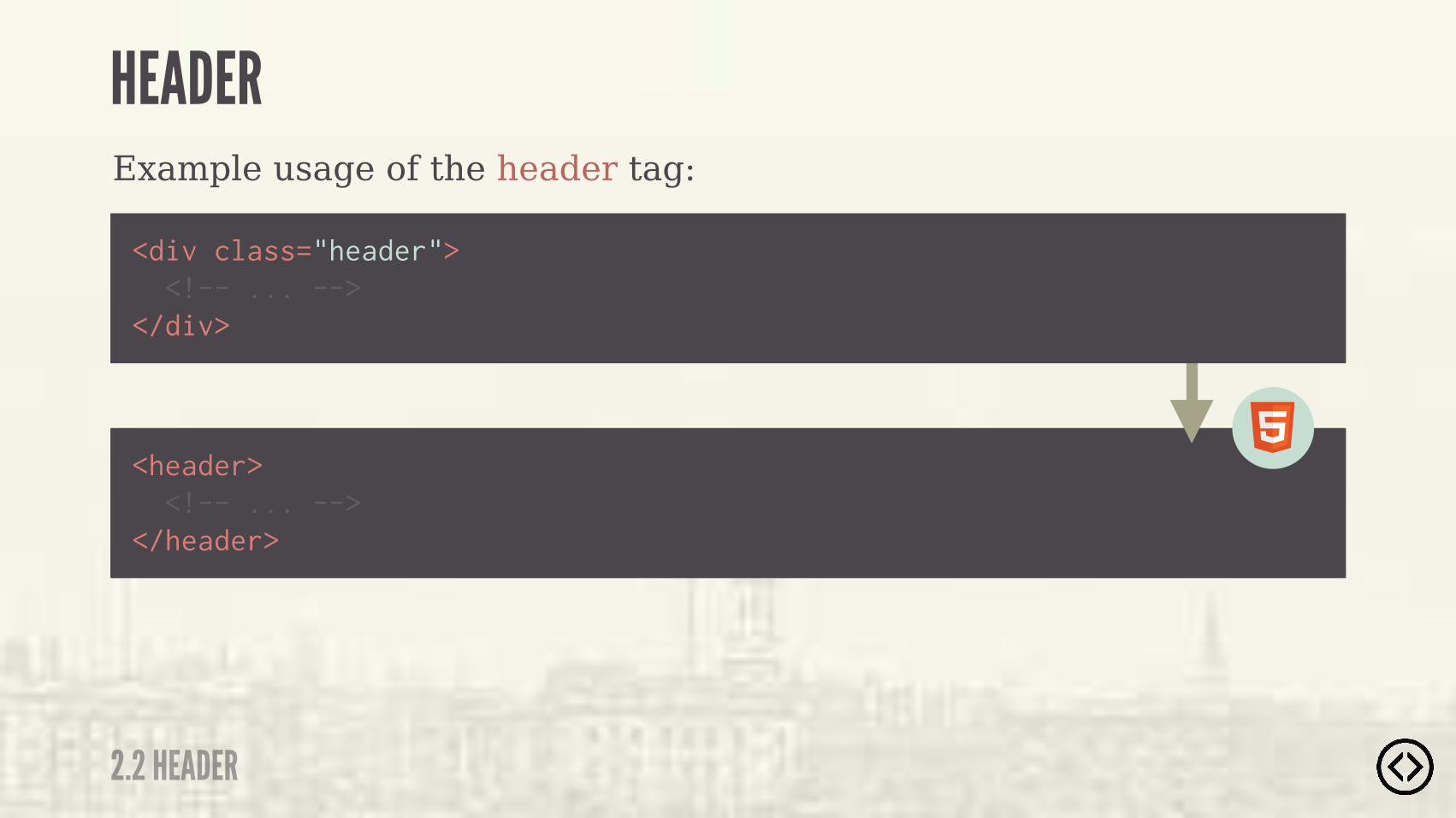
Example usage of the header tag:
<header> <!-- ... --></header>
<div class="header"> <!-- ... --></div>
2.2 HEADER
HEADER
๏ Upcoming Section Title
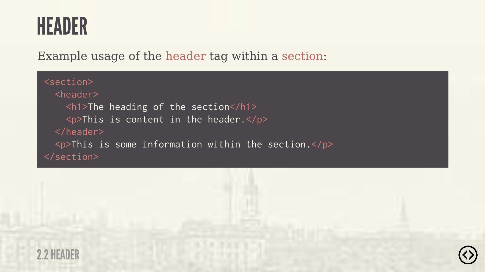
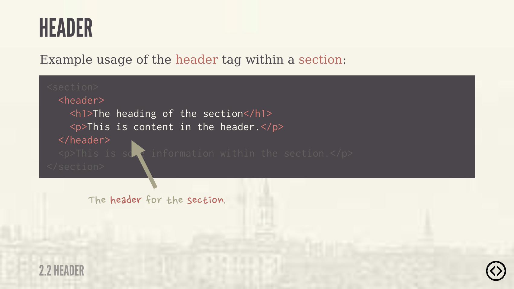
<section> <header> <h1>The heading of the section</h1> <p>This is content in the header.</p> </header> <p>This is some information within the section.</p></section>
Example usage of the header tag within a section:
2.2 HEADER
HEADER
๏ Upcoming Section Title
<section> <header> <h1>The heading of the section</h1> <p>This is content in the header.</p> </header> <p>This is some information within the section.</p></section>
Example usage of the header tag within a section:
��������� ��� �"���!��"����
2.2 HEADER
HEADER

LEVEL 2
TABLE OF CONTENTS๏ Section๏ Header๏ Footer๏ Aside๏ Nav๏ Article๏ Main๏ Figure/figcaption๏ Time

๏ Section๏ Header๏ Footer๏ Aside๏ Nav๏ Article๏ Main๏ Figure/figcaption๏ Time
LEVEL 2
TABLE OF CONTENTS
2.3 FOOTER
FOOTER
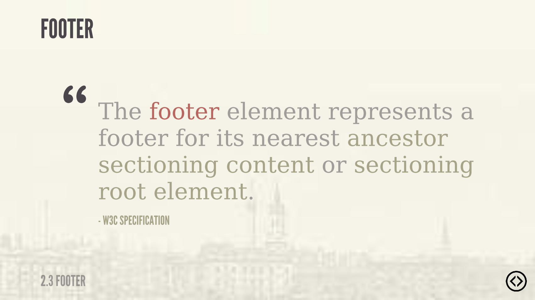
The footer element represents a footer for its nearest ancestor sectioning content or sectioning root element.- W3C SPECIFICATION
“
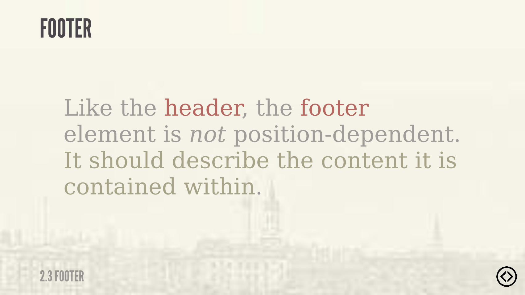
Like the header, the footer element is not position-dependent. It should describe the content it is contained within.
2.3 FOOTER
FOOTER

�����"� ��� �"�����"� ��!�"��
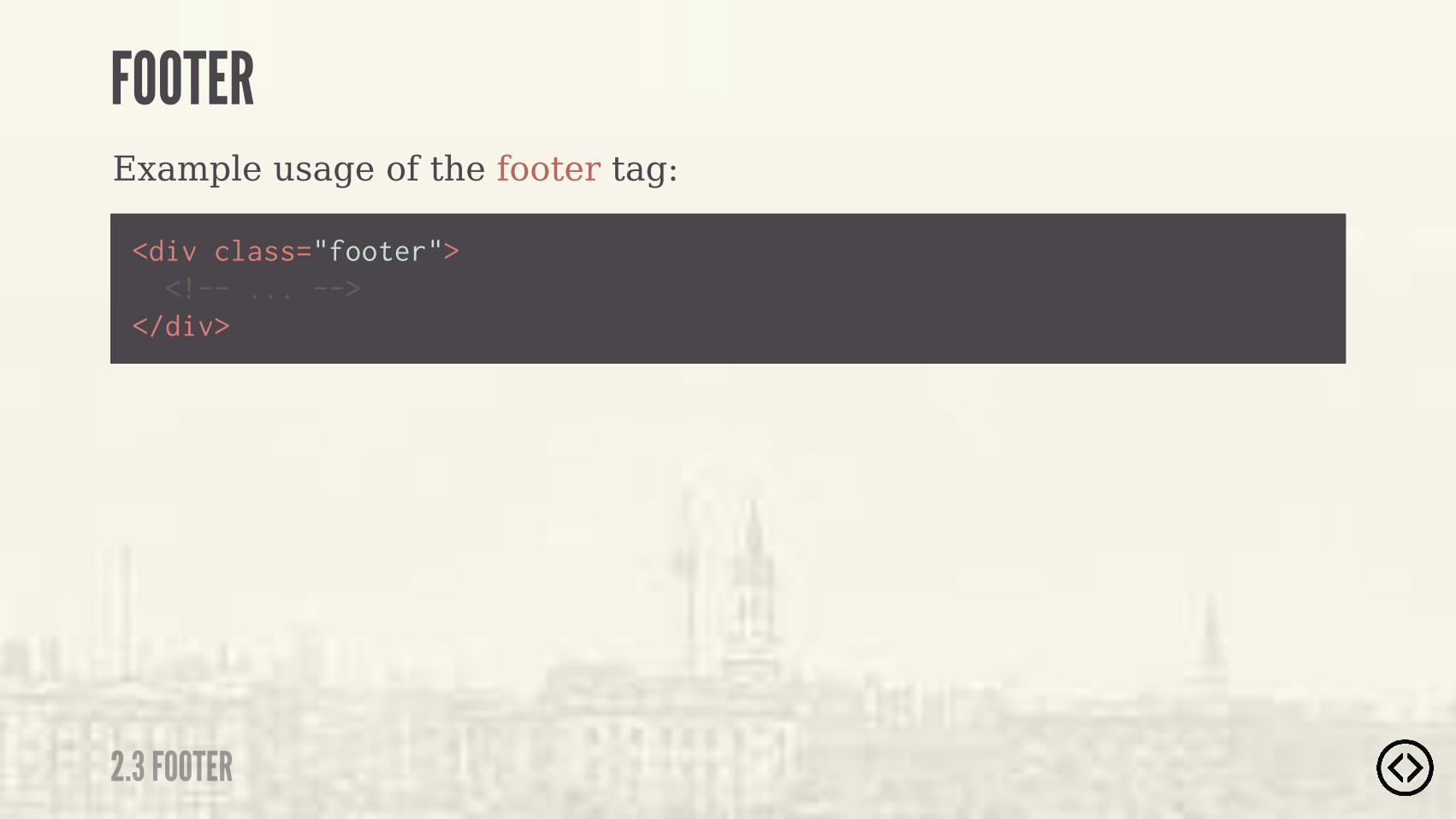
Example usage of the footer tag:
<div class="footer"> <!-- ... --></div>
2.3 FOOTER
FOOTER
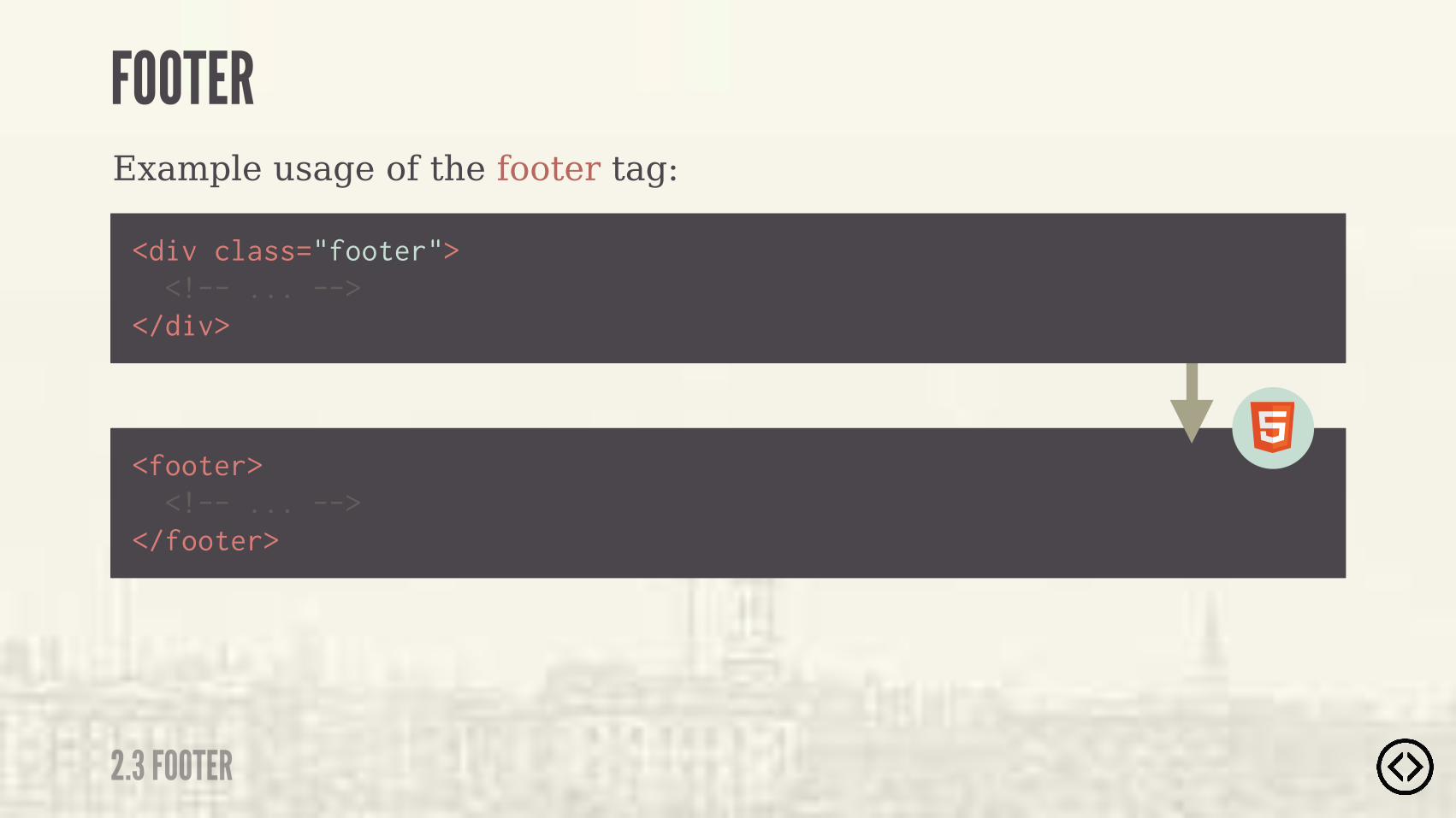
Example usage of the footer tag:
<footer> <!-- ... --></footer>
<div class="footer"> <!-- ... --></div>
2.3 FOOTER
FOOTER
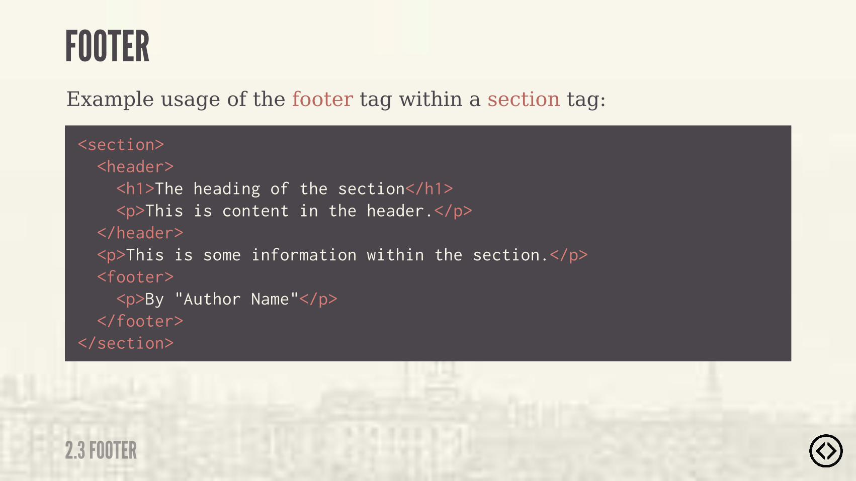
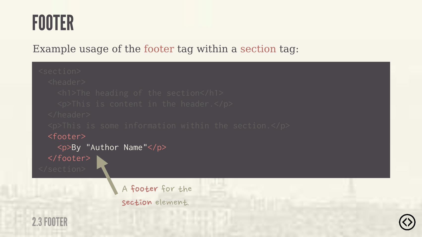
๏ Upcoming Section Title
<section> <header> <h1>The heading of the section</h1> <p>This is content in the header.</p> </header> <p>This is some information within the section.</p> <footer> <p>By "Author Name"</p> </footer></section>
Example usage of the footer tag within a section tag:
2.3 FOOTER
FOOTER
๏ Upcoming Section Title
<section> <header> <h1>The heading of the section</h1> <p>This is content in the header.</p> </header> <p>This is some information within the section.</p> <footer> <p>By "Author Name"</p> </footer></section>
Example usage of the footer tag within a section tag:
�����"� ��� �"���!��"����������"�
2.3 FOOTER
FOOTER

LEVEL 4
TABLE OF CONTENTS๏ Section๏ Header๏ Footer๏ Aside๏ Nav๏ Article๏ Main๏ Figure/figcaption๏ Time

๏ Section๏ Header๏ Footer๏ Aside๏ Nav๏ Article๏ Main๏ Figure/figcaption๏ Time
LEVEL 4
TABLE OF CONTENTS
2.4 ASIDE
ASIDE
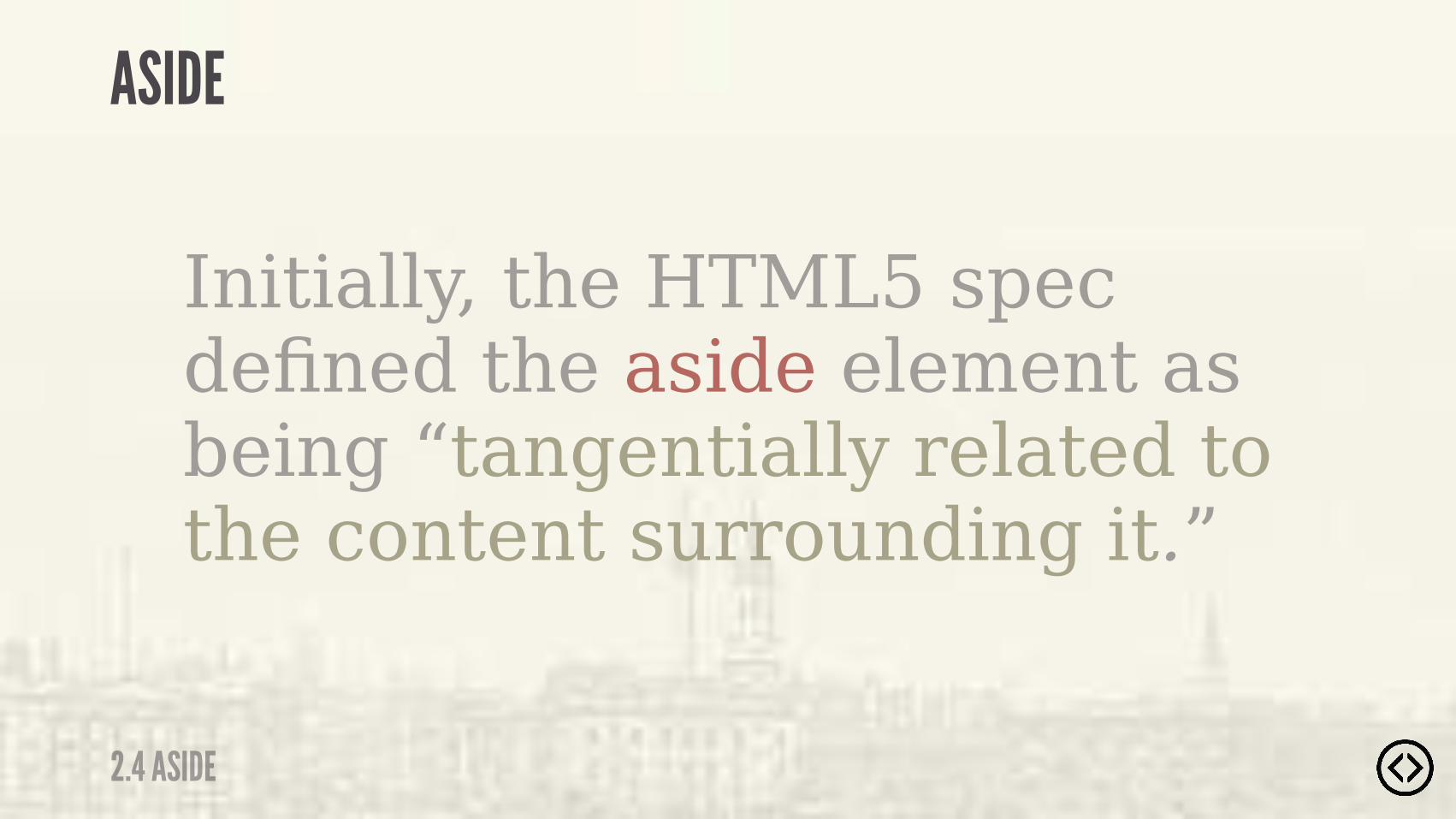
Initially, the HTML5 spec defined the aside element as being “tangentially related to the content surrounding it.”
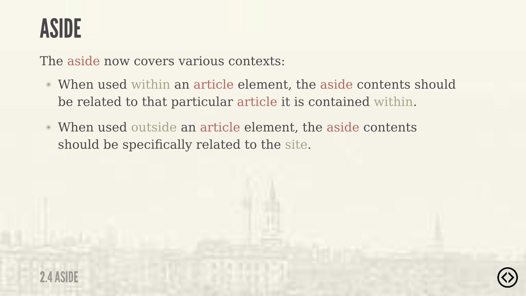
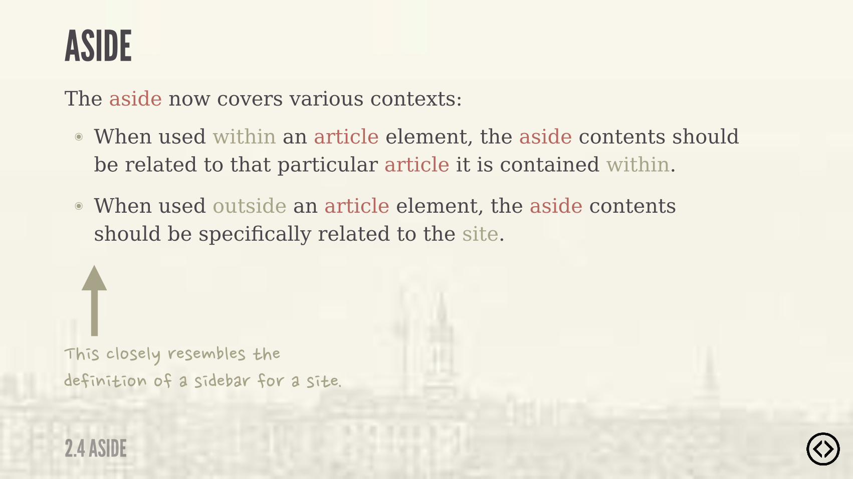
๏ When used within an article element, the aside contents should be related to that particular article it is contained within.
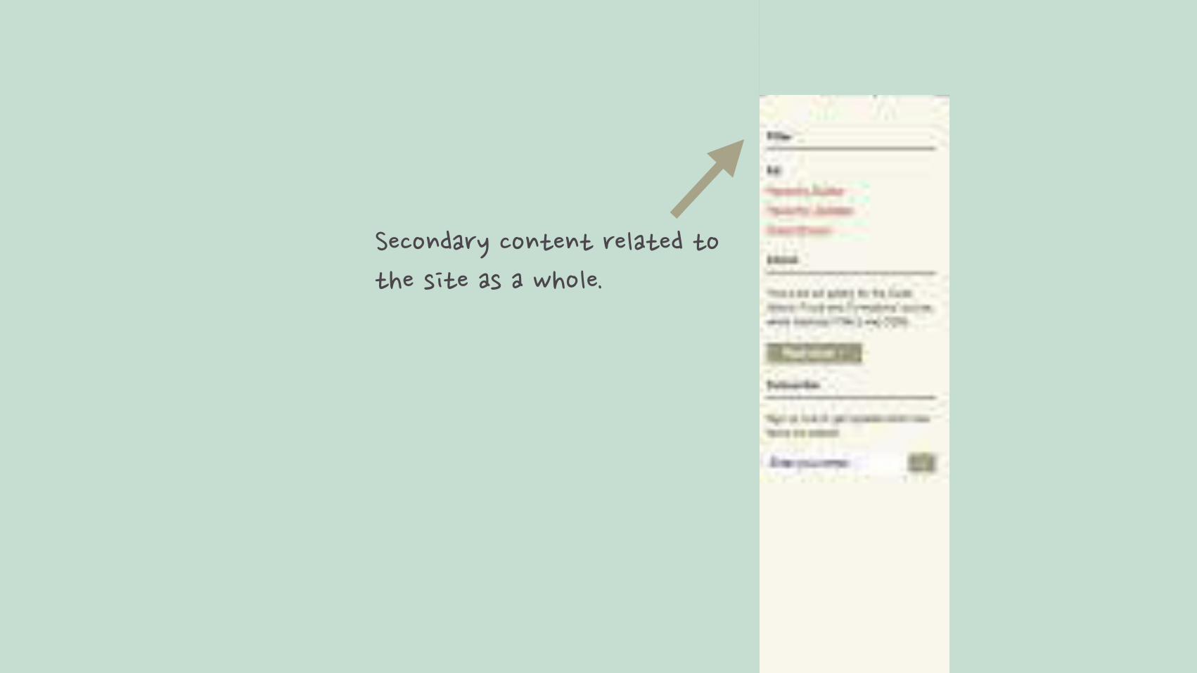
๏ When used outside an article element, the aside contents should be specifically related to the site.
The aside now covers various contexts:
2.4 ASIDE
ASIDE
๏ When used within an article element, the aside contents should be related to that particular article it is contained within.
๏ When used outside an article element, the aside contents should be specifically related to the site.
The aside now covers various contexts:
���!����!��'� �!�����!�"���������"���������!����� ��� ���!�"��
2.4 ASIDE
ASIDE
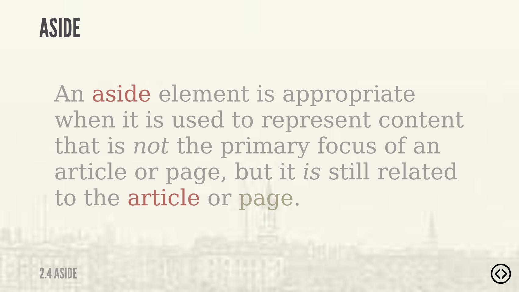
An aside element is appropriate when it is used to represent content that is not the primary focus of an article or page, but it is still related to the article or page.
2.4 ASIDE
ASIDE

������ '����"��"� ���"���"��"���!�"���!���%�����
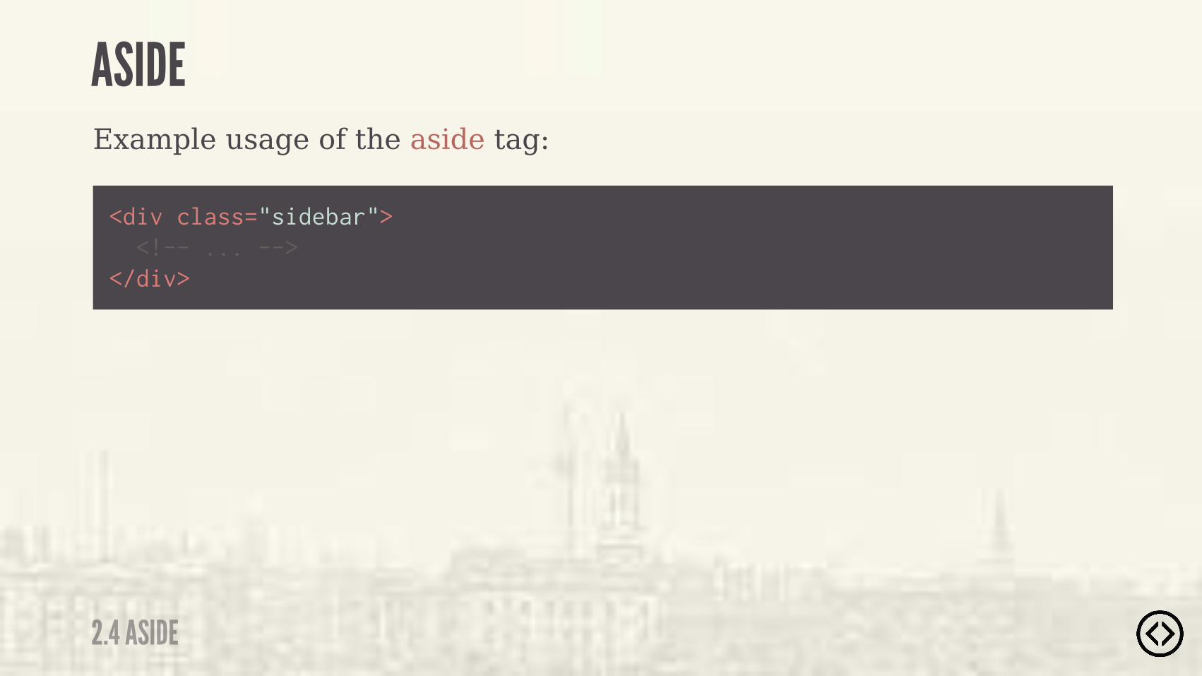
Example usage of the aside tag:
<div class="sidebar"> <!-- ... --></div>
2.4 ASIDE
ASIDE
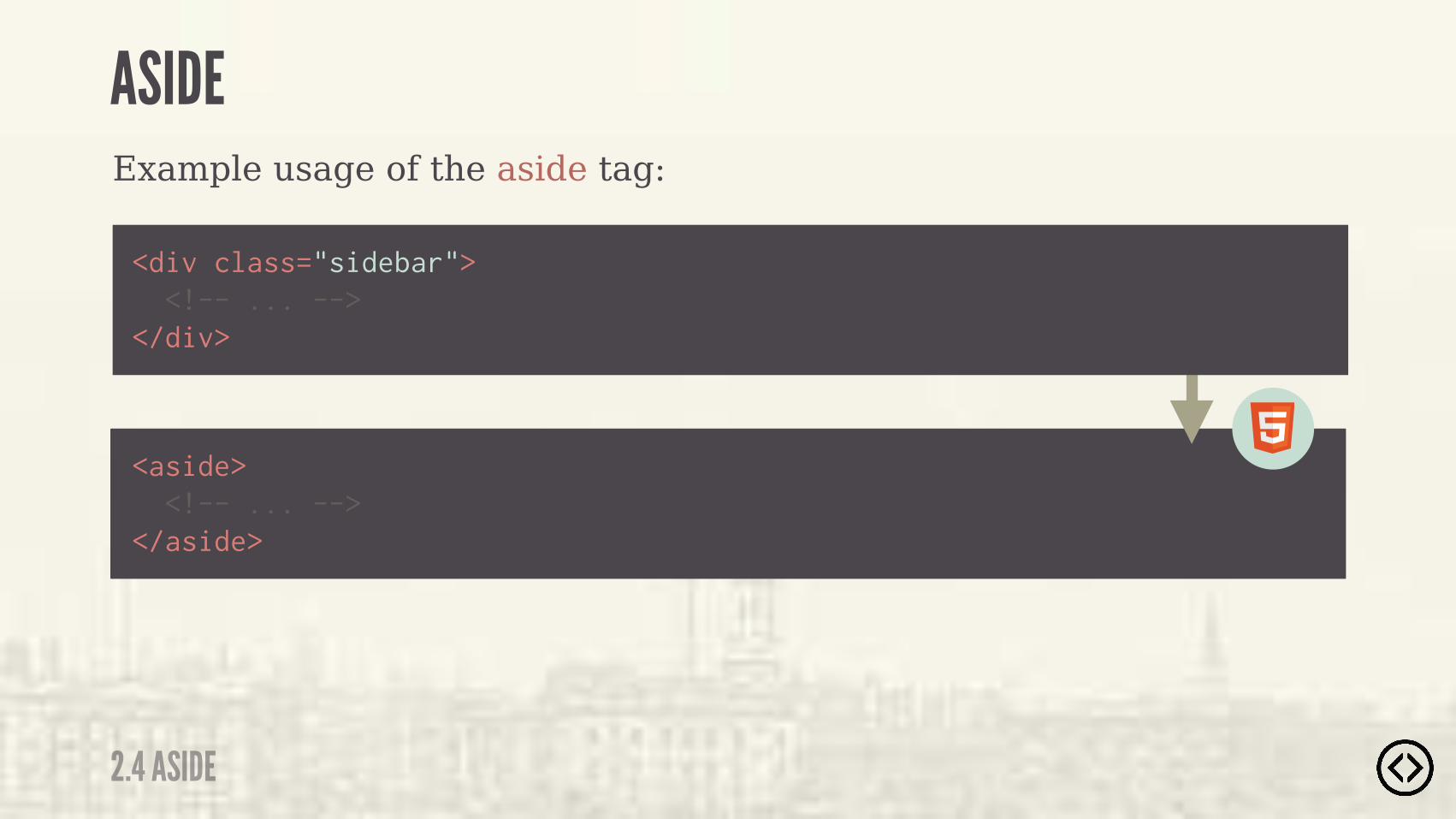
Example usage of the aside tag:
<aside> <!-- ... --></aside>
<div class="sidebar"> <!-- ... --></div>
2.4 ASIDE
ASIDE

๏ Upcoming Section Title
<section> <header> <h1>The heading of the section</h1> <p>This is content in the header.</p> </header> <p>This is some information within the section.</p> <aside> <p>Some secondary information.</p> </aside> <footer> <p>By "Author Name"</p> </footer></section>
Example usage of the aside tag within a section:
2.4 ASIDE
ASIDE

<section> <header> <h1>The heading of the section</h1> <p>This is content in the header.</p> </header> <p>This is some information within the section.</p> <aside> <p>Some secondary information.</p> </aside> <footer> <p>By "Author Name"</p> </footer></section>
Example usage of the aside tag within a section:
����!������ �"���!��"����������"�
2.4 ASIDE
ASIDE

LEVEL 2
TABLE OF CONTENTS๏ Section๏ Header๏ Footer๏ Aside๏ Nav๏ Article๏ Main๏ Figure/figcaption๏ Time

๏ Section๏ Header๏ Footer๏ Aside๏ Nav๏ Article๏ Main๏ Figure/figcaption๏ Time
LEVEL 2
TABLE OF CONTENTS
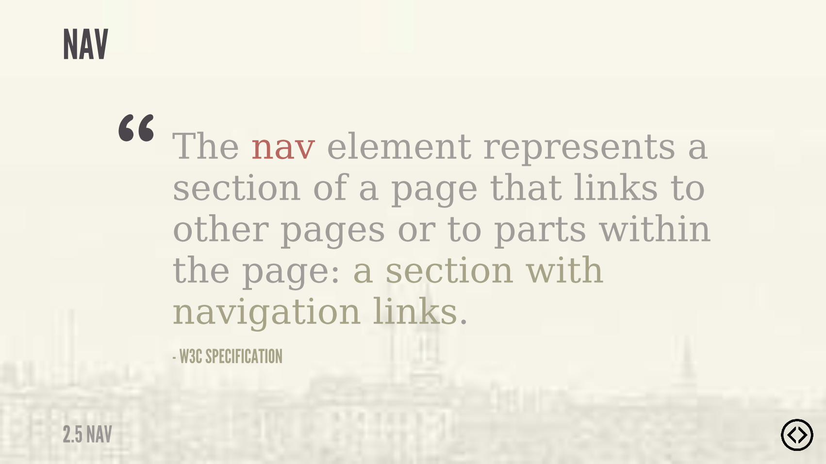
2.5 NAV
NAV
The nav element represents a section of a page that links to other pages or to parts within the page: a section with navigation links.- W3C SPECIFICATION
“
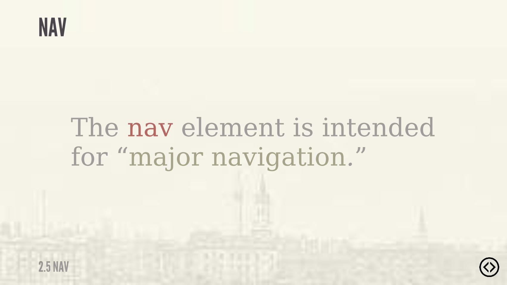
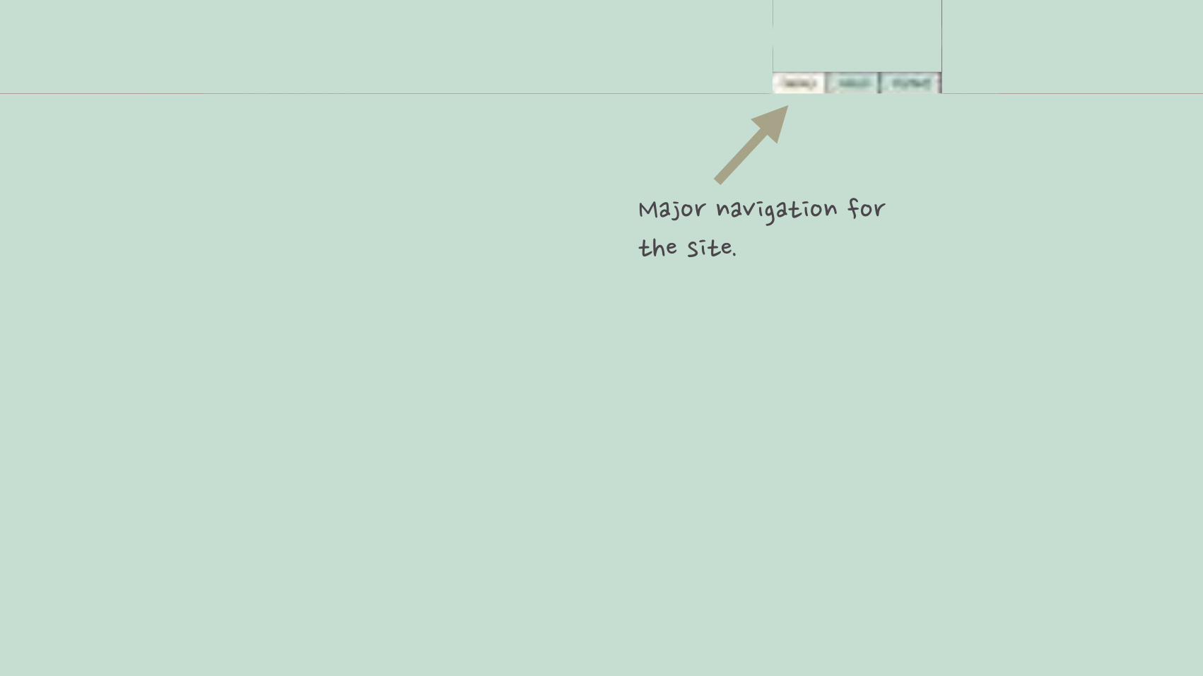
The nav element is intended for “major navigation.”
2.5 NAV
NAV

���� ���$���"������ �"���!�"��

Example usage of the nav tag:
<ul class="nav"> <!-- ... --></ul>
2.5 NAV
NAV
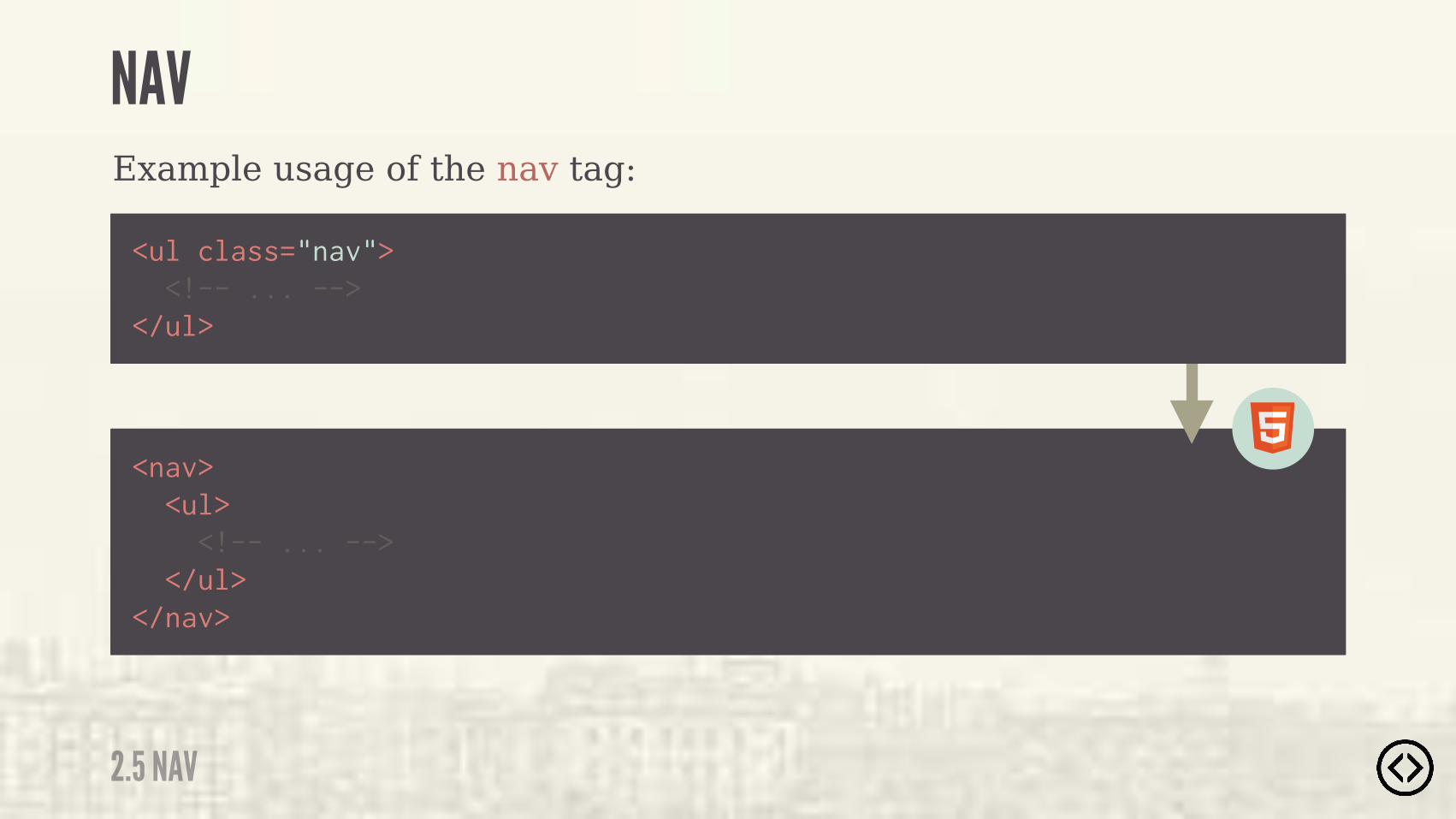
Example usage of the nav tag:
<nav> <ul> <!-- ... --> </ul></nav>
<ul class="nav"> <!-- ... --></ul>
2.5 NAV
NAV


LEVEL 2
TABLE OF CONTENTS๏ Section๏ Header๏ Footer๏ Aside๏ Nav๏ Article๏ Main๏ Figure/figcaption๏ Time

๏ Section๏ Header๏ Footer๏ Aside๏ Nav๏ Article๏ Main๏ Figure/figcaption๏ Time
LEVEL 2
TABLE OF CONTENTS
2.6 ARTICLE
ARTICLE
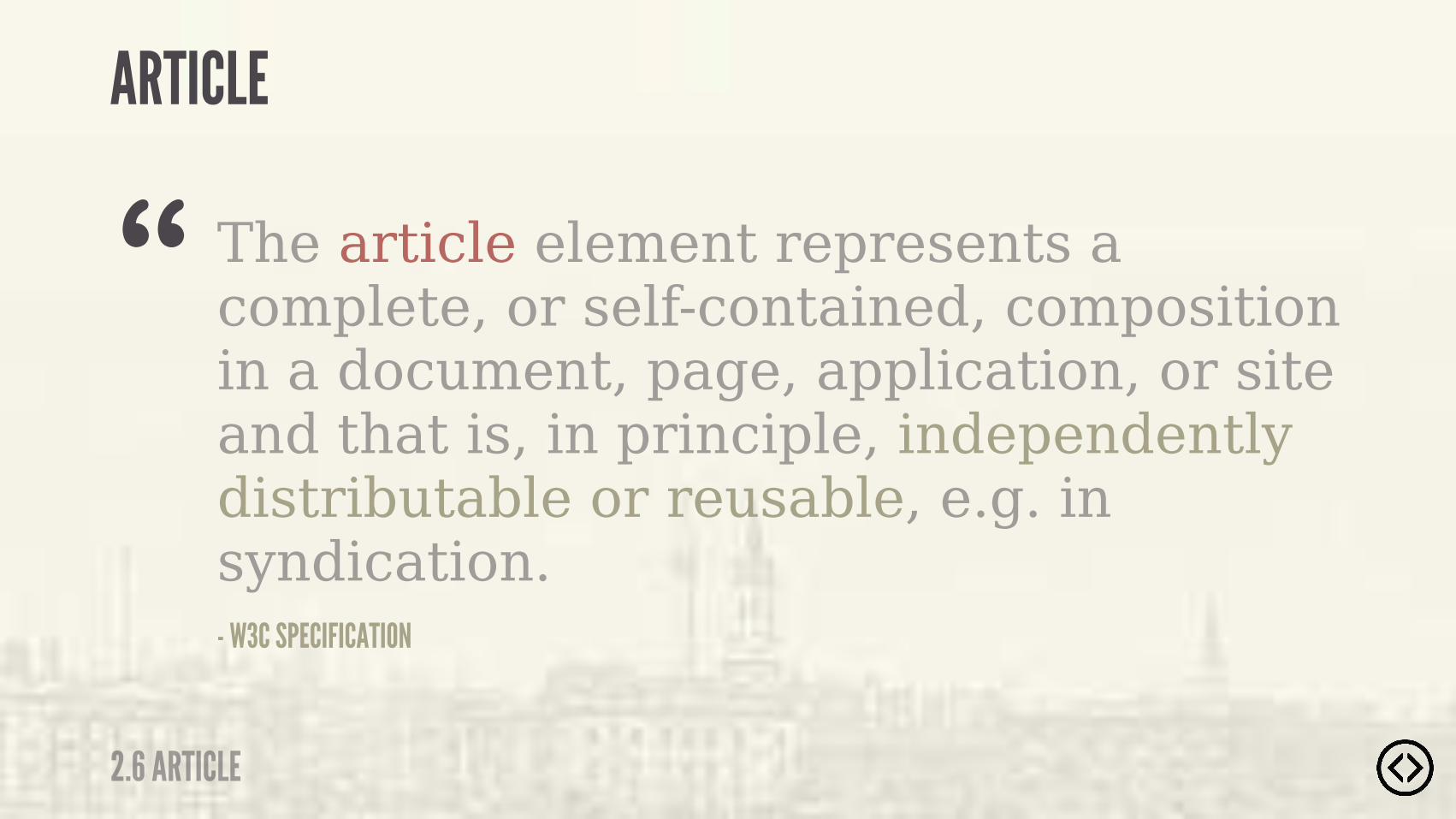
The article element represents a complete, or self-contained, composition in a document, page, application, or site and that is, in principle, independently distributable or reusable, e.g. in syndication.- W3C SPECIFICATION
“

The article element is another type of section. It is used for self-contained related content.
2.6 ARTICLE
ARTICLE
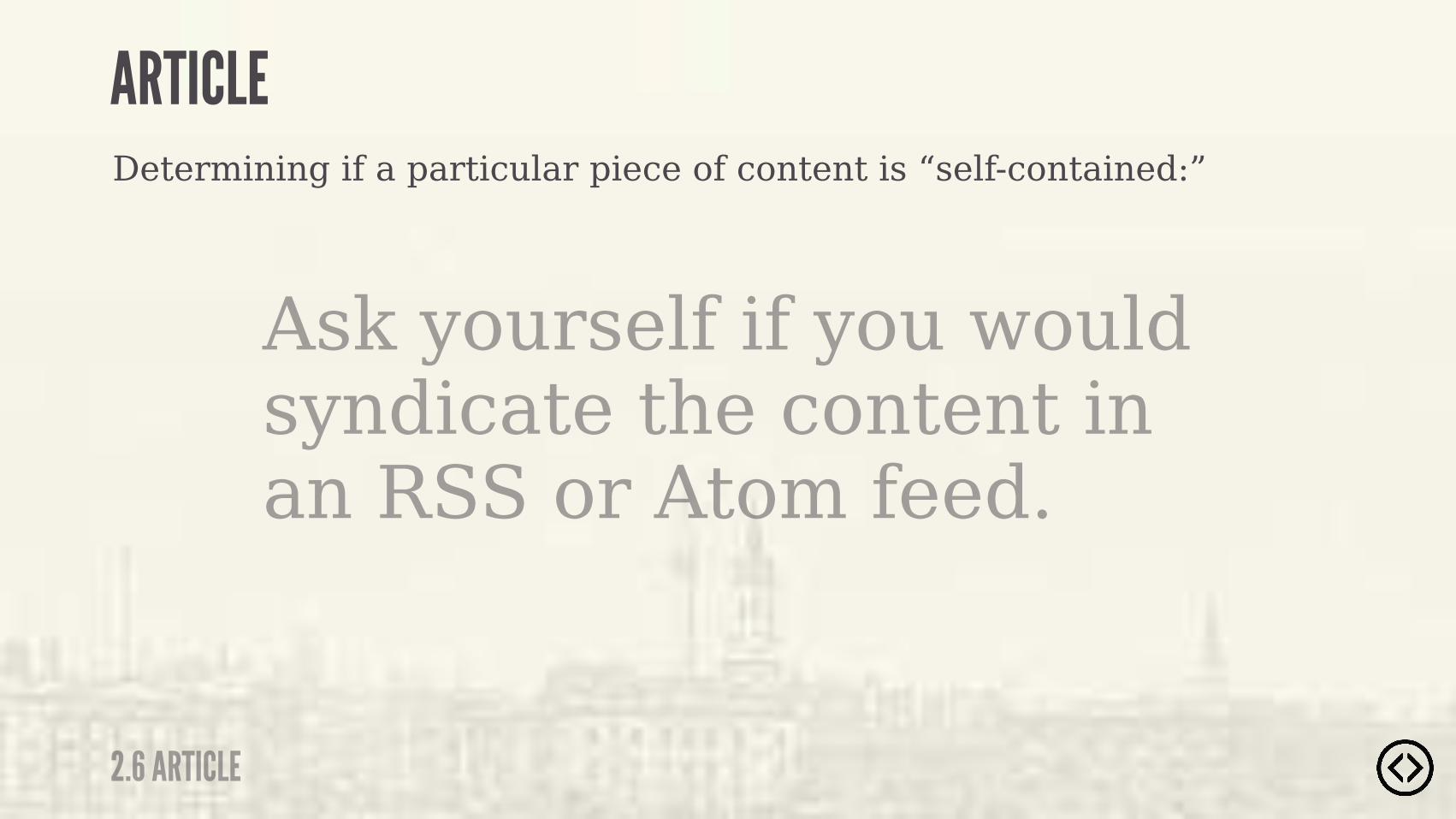
Ask yourself if you would syndicate the content in an RSS or Atom feed.
Determining if a particular piece of content is “self-contained:”
2.6 ARTICLE
ARTICLE
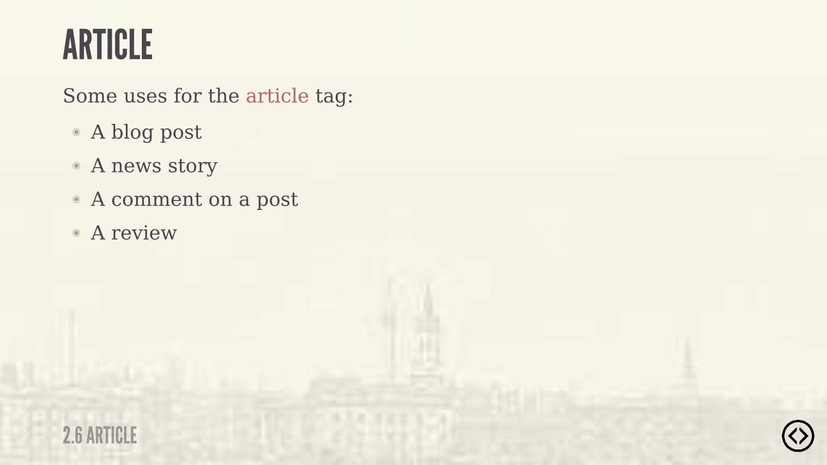
๏ A blog post๏ A news story๏ A comment on a post๏ A review
Some uses for the article tag:
2.6 ARTICLE
ARTICLE

'�����"������"��"��� ��������%������ '��"���

Example usage of the article tag:
<div class="article"> <!-- ... --></div>
2.6 ARTICLE
ARTICLE
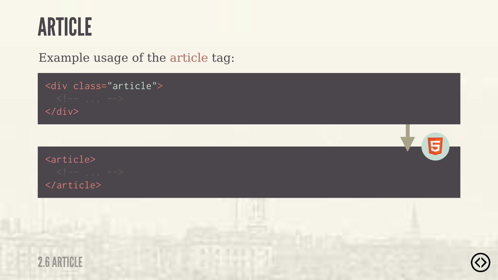
Example usage of the article tag:
<article> <!-- ... --></article>
<div class="article"> <!-- ... --></div>
2.6 ARTICLE
ARTICLE

LEVEL 2
TABLE OF CONTENTS๏ Section๏ Header๏ Footer๏ Aside๏ Nav๏ Article๏ Main๏ Figure/figcaption๏ Time

๏ Section๏ Header๏ Footer๏ Aside๏ Nav๏ Article๏ Main๏ Figure/figcaption๏ Time
LEVEL 2
TABLE OF CONTENTS

2.7 MAIN
MAIN
- W3C SPECIFICATION
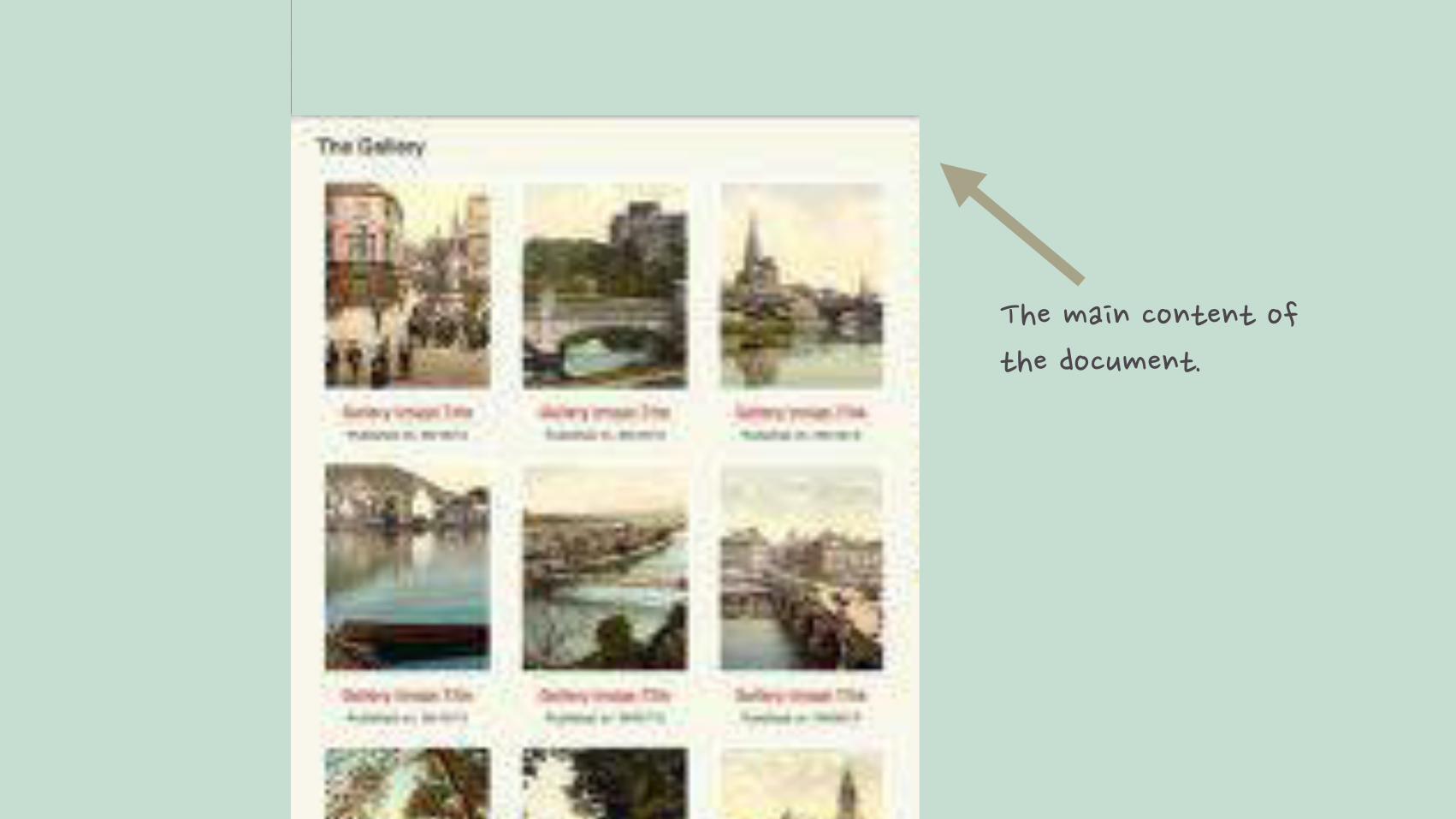
“ The main element represents the main content of the body of a document or application.
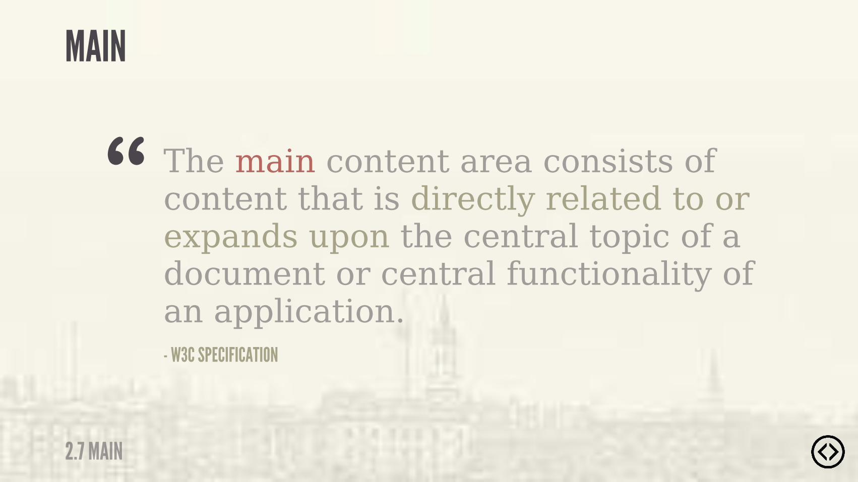
The main content area consists of content that is directly related to or expands upon the central topic of a document or central functionality of an application.- W3C SPECIFICATION
“
2.7 MAIN
MAIN

๏ Do not include more than one main element in a document๏ Do not include the main element inside of an article, aside,
footer, header, or nav element
2.7 MAIN
MAIN

������������"��"����"������#���"�
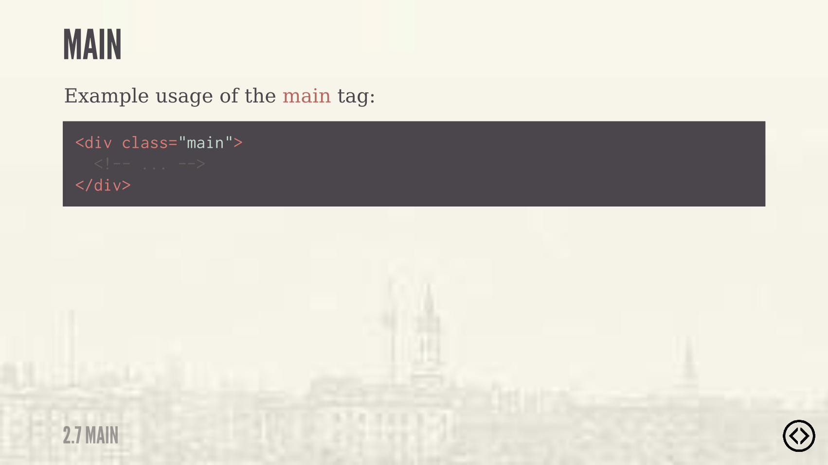
Example usage of the main tag:
<div class="main"> <!-- ... --></div>
2.7 MAIN
MAIN

Example usage of the main tag:
<main> <!-- ... --></main>
<div class="main"> <!-- ... --></div>
2.7 MAIN
MAIN

LEVEL 2
TABLE OF CONTENTS๏ Section๏ Header๏ Footer๏ Aside๏ Nav๏ Article๏ Main๏ Figure/figcaption๏ Time

๏ Section๏ Header๏ Footer๏ Aside๏ Nav๏ Article๏ Main๏ Figure/figcaption๏ Time
LEVEL 2
TABLE OF CONTENTS
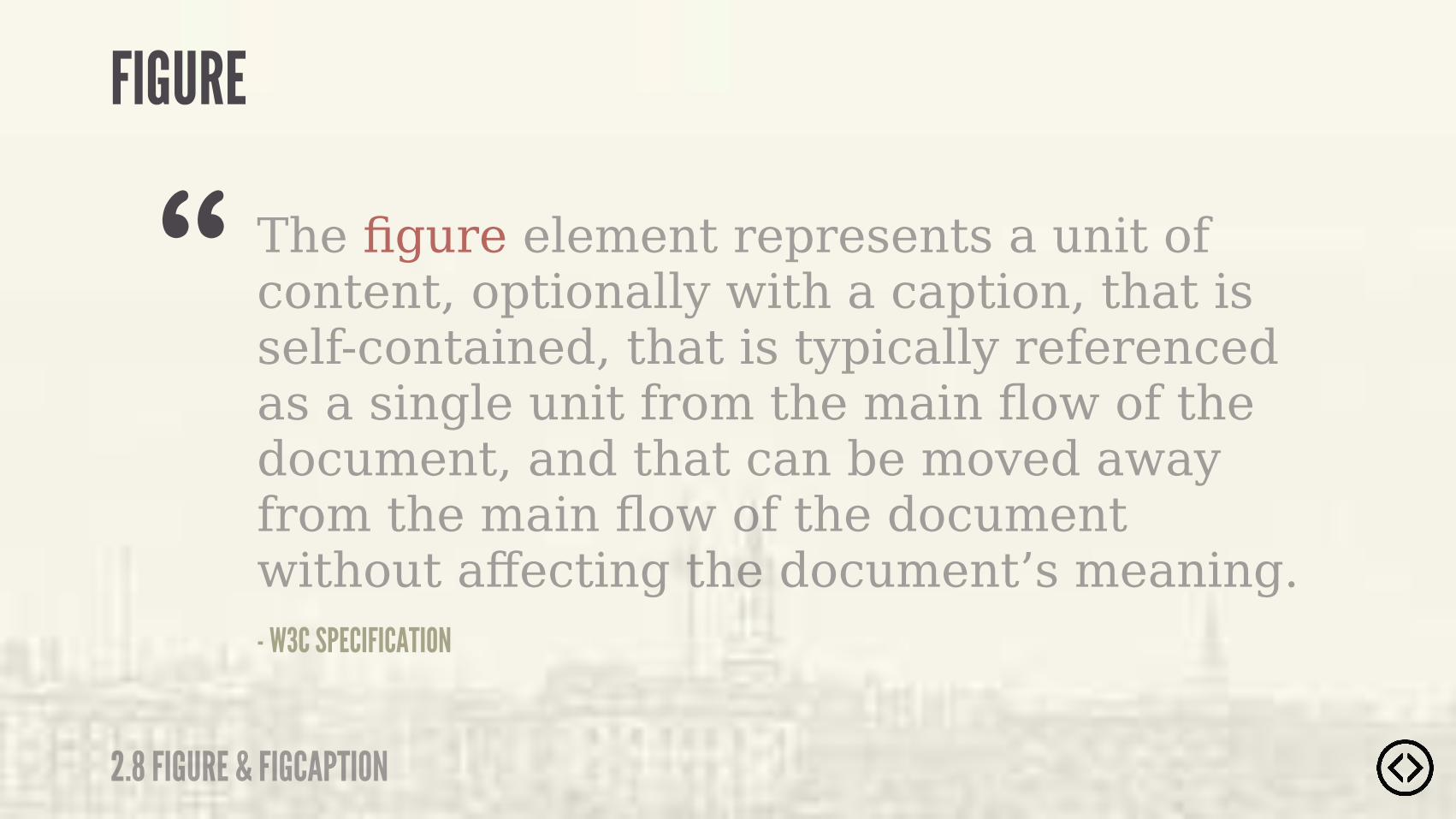
2.8 FIGURE & FIGCAPTION
FIGURE
The figure element represents a unit of content, optionally with a caption, that is self-contained, that is typically referenced as a single unit from the main flow of the document, and that can be moved away from the main flow of the document without affecting the document’s meaning.- W3C SPECIFICATION
“
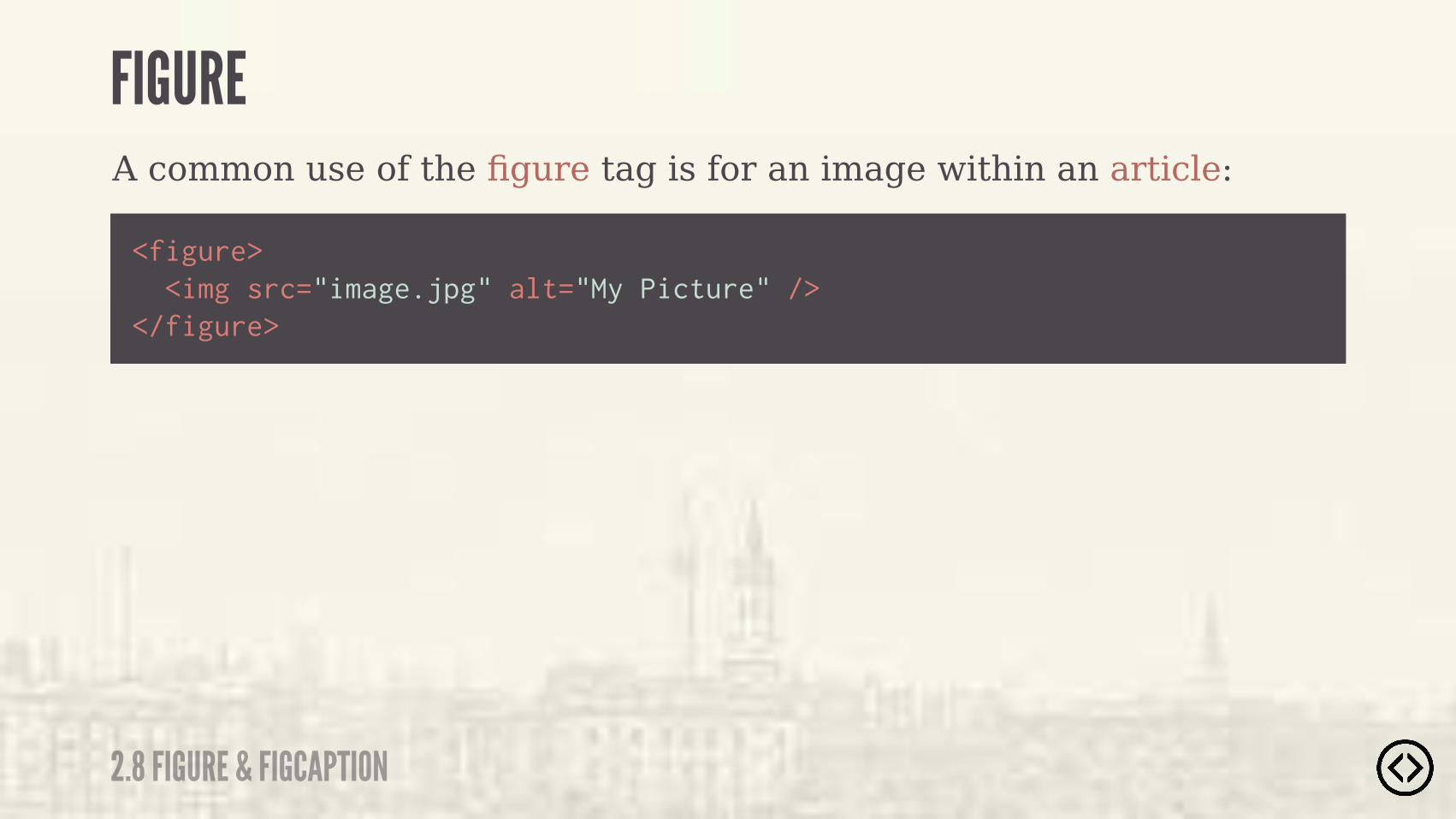
A common use of the figure tag is for an image within an article:
<figure> <img src="image.jpg" alt="My Picture" /></figure>
2.8 FIGURE & FIGCAPTION
FIGURE
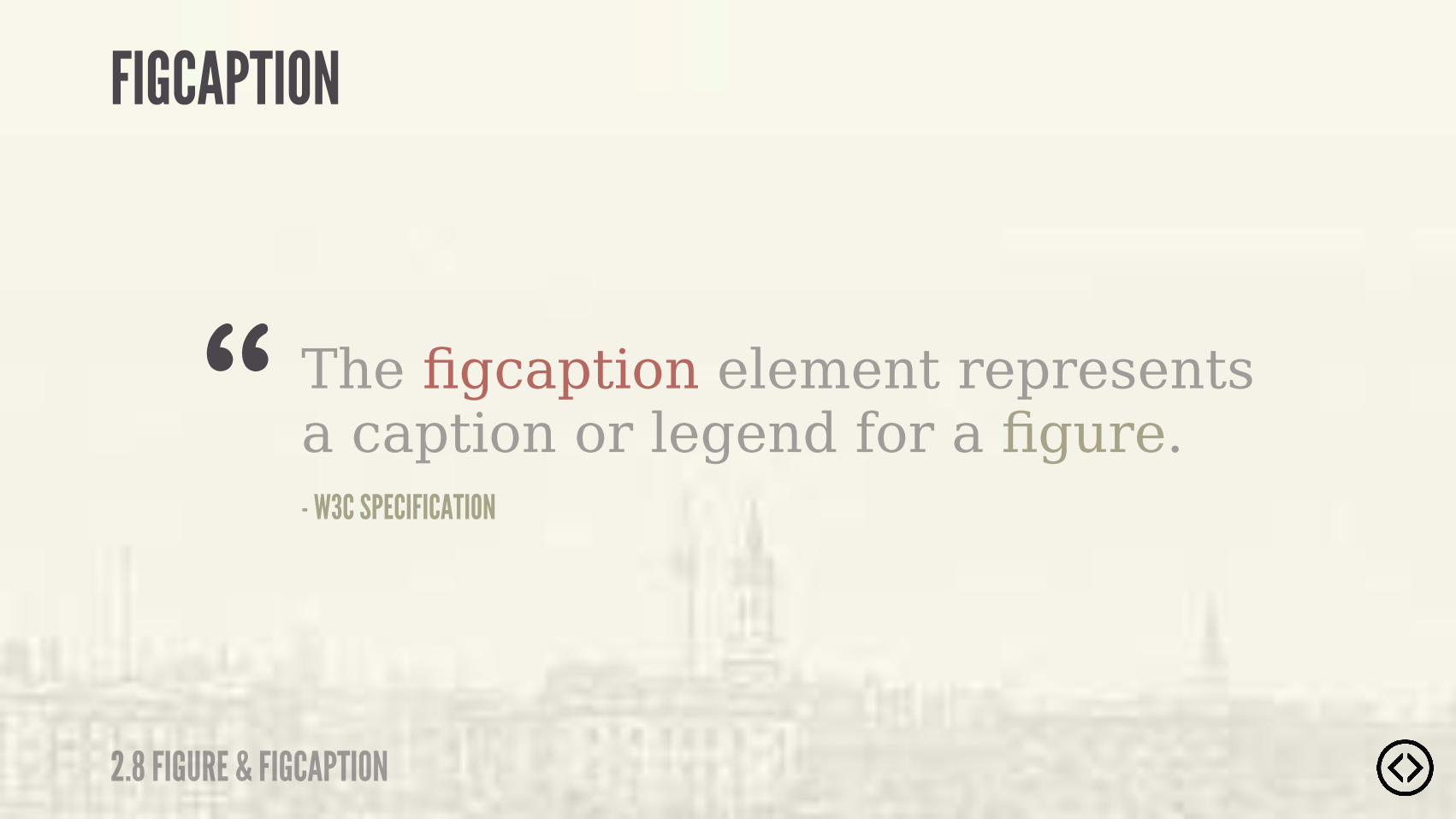
- W3C SPECIFICATION
“ The figcaption element represents a caption or legend for a figure.
2.8 FIGURE & FIGCAPTION
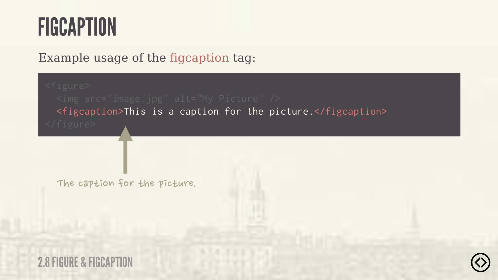
FIGCAPTION
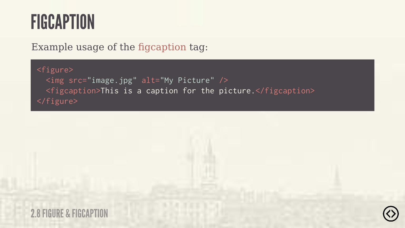
Example usage of the figcaption tag:
๏ Upcoming Section Title
<figure> <img src="image.jpg" alt="My Picture" /> <figcaption>This is a caption for the picture.</figcaption></figure>
2.8 FIGURE & FIGCAPTION
FIGCAPTION
Example usage of the figcaption tag:
๏ Upcoming Section Title
<figure> <img src="image.jpg" alt="My Picture" /> <figcaption>This is a caption for the picture.</figcaption></figure>
2.8 FIGURE & FIGCAPTION
FIGCAPTION
�������"������ �"������"# ��

FIGURE & FIGCAPTION
2.8 FIGURE & FIGCAPTION
Example output of the figure and figcaption elements:

LEVEL 2
TABLE OF CONTENTS๏ Section๏ Header๏ Footer๏ Aside๏ Nav๏ Article๏ Main๏ Figure/figcaption๏ Time

๏ Section๏ Header๏ Footer๏ Aside๏ Nav๏ Article๏ Main๏ Figure/figcaption๏ Time
LEVEL 2
TABLE OF CONTENTS
2.8 TIME
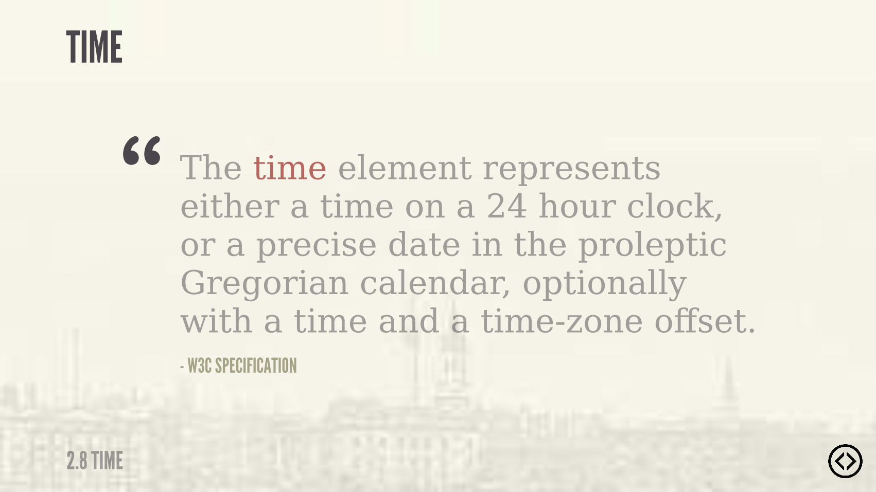
TIME
The time element represents either a time on a 24 hour clock, or a precise date in the proleptic Gregorian calendar, optionally with a time and a time-zone offset.- W3C SPECIFICATION
“

�����#���!���������"������#!����"����������"�
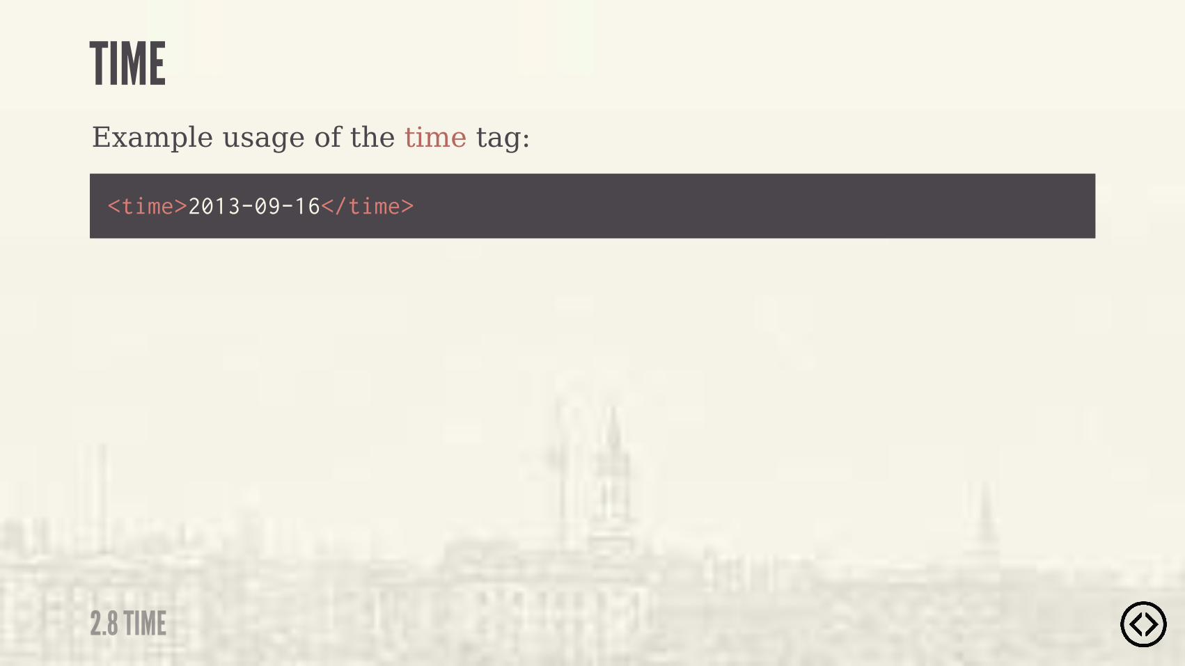
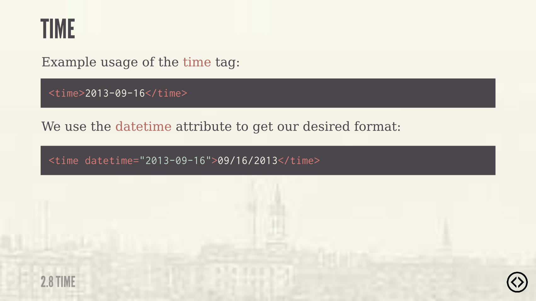
Example usage of the time tag:
<time>2013-09-16</time>
2.8 TIME
TIME

Example usage of the time tag:
<time>2013-09-16</time>
<time>09/16/2013</time>
We want the format “mm/dd/yyyy”:
2.8 TIME
TIME
Example usage of the time tag:
<time>2013-09-16</time>
<time datetime="2013-09-16">09/16/2013</time>
We use the datetime attribute to get our desired format:
2.8 TIME
TIME

Example usage of the time tag:
<time>2013-09-16</time>
<time datetime="2013-09-16">09/16/2013</time>
��"��"�����"�"�����"" ��#"���"������"��"����������'"����� ���$��"�
2.8 TIME
TIME
We use the datetime attribute to get our desired format:

Without the datetime attribute, content must be a valid date, time, or precise datetime.
2.8 TIME
TIME

Level 3 - HTML5 Forms

๏ New input types๏ New form elements๏ New form attributes
TABLE OF CONTENTS
LEVEL 3
๏ New input types๏ New form elements๏ New form attributes
TABLE OF CONTENTS
LEVEL 3

๏ Search๏ Email๏ URL๏ Tel๏ Number๏ Range
HTML5 provides several new input types:
๏ Date
๏ Month๏ Week๏ Time๏ Datetime๏ Datetime-local๏ Color
NEW INPUT TYPES
3.1 NEW INPUT TYPES
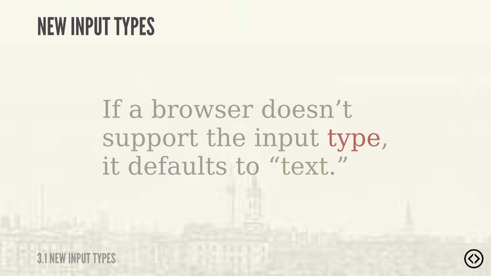
If a browser doesn’t support the input type, it defaults to “text.”
NEW INPUT TYPES
3.1 NEW INPUT TYPES
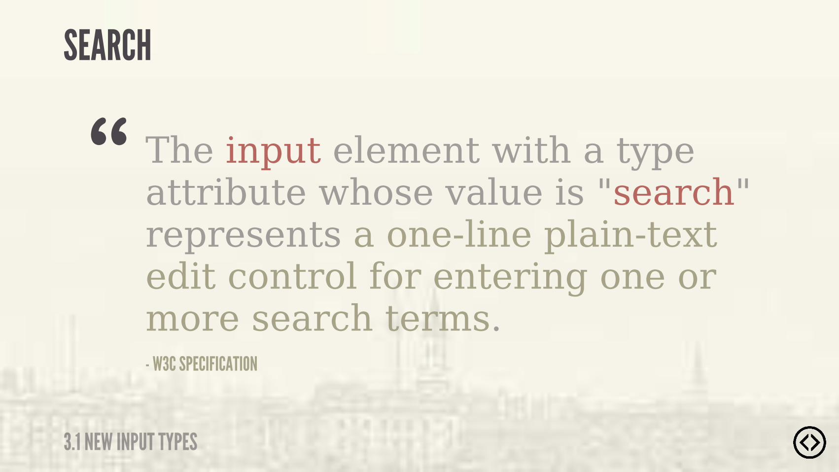
The input element with a type attribute whose value is "search" represents a one-line plain-text edit control for entering one or more search terms.- W3C SPECIFICATION
“SEARCH
3.1 NEW INPUT TYPES

���� ����������

Example usage of the search input type:
<input type="text" />
SEARCH
3.1 NEW INPUT TYPES

Example usage of the search input type:
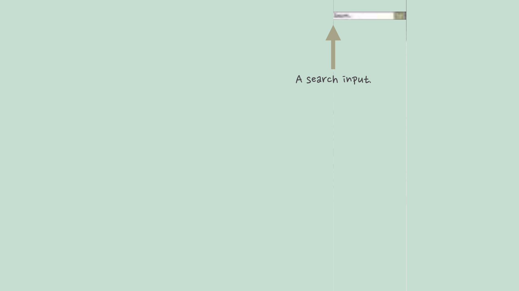
<input type="search" />
<input type="text" />
SEARCH
3.1 NEW INPUT TYPES

Example output of the search input type:
SEARCH
3.1 NEW INPUT TYPES
Google Chrome 29

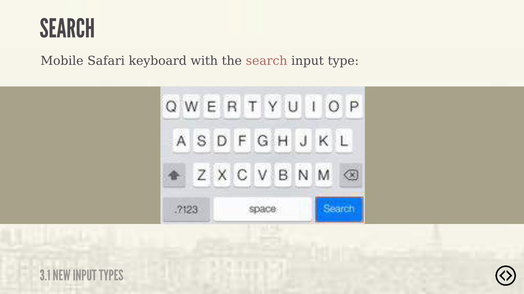
Mobile Safari keyboard with the search input type:
SEARCH
3.1 NEW INPUT TYPES
��� ��������������� ��������$� ����%
SEARCH
3.1 NEW INPUT TYPES
Mobile Safari keyboard with the search input type:
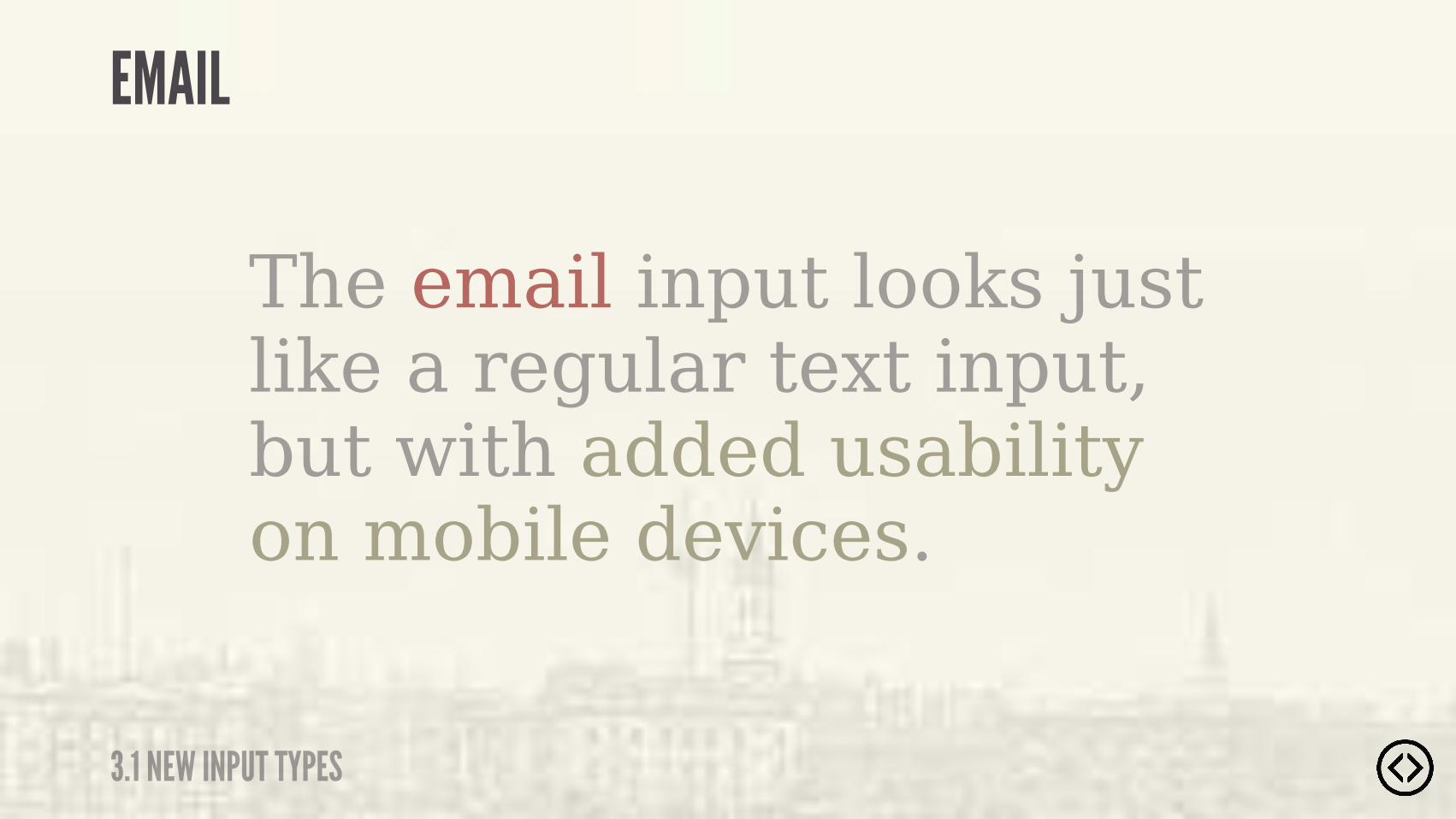
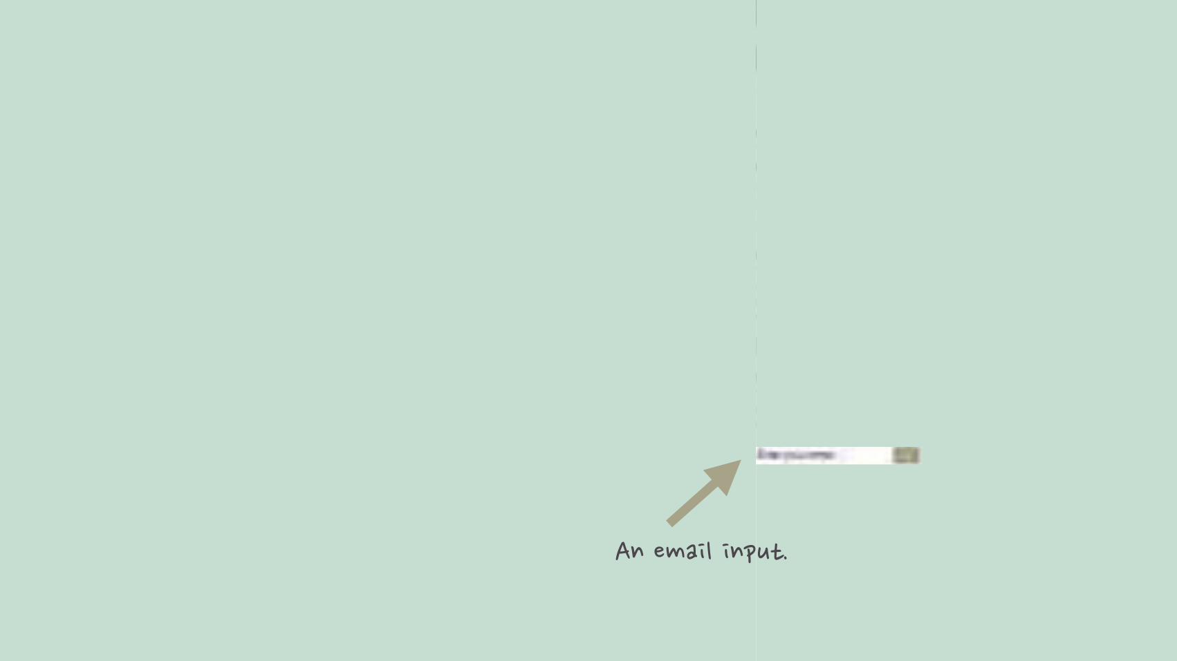
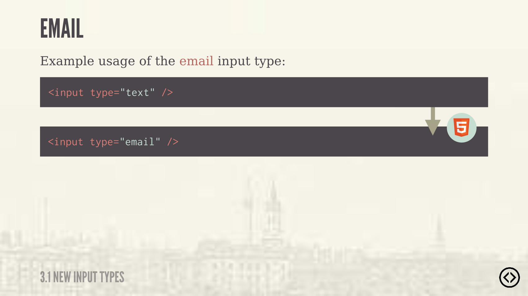
The email input looks just like a regular text input, but with added usability on mobile devices.
3.1 NEW INPUT TYPES

����� ���������
Example usage of the email input type:
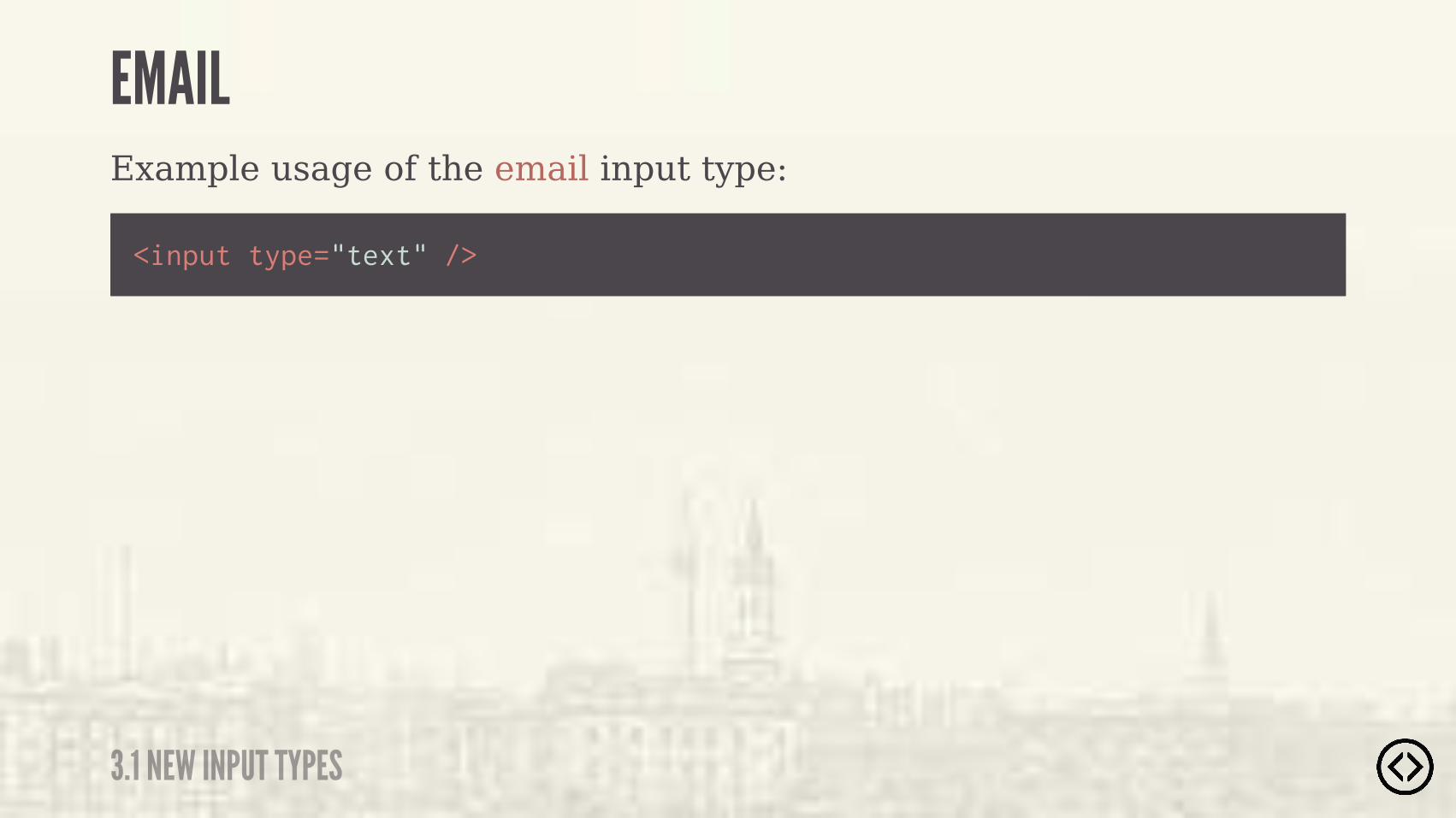
<input type="text" />
3.1 NEW INPUT TYPES
Example usage of the email input type:
<input type="email" />
<input type="text" />
3.1 NEW INPUT TYPES
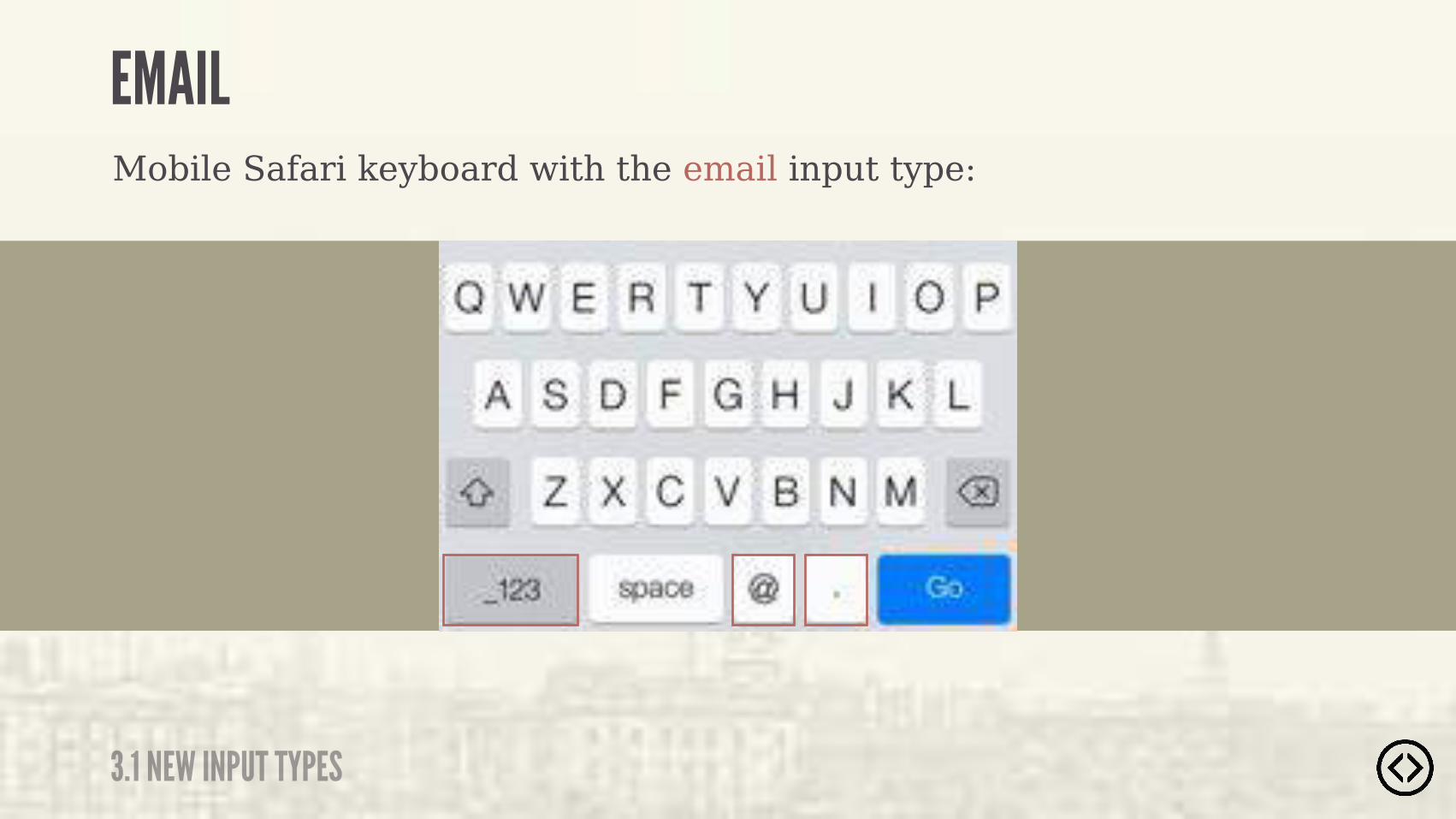
Mobile Safari keyboard with the email input type:
3.1 NEW INPUT TYPES
��������� ������ ������#�� �����!������#���� ����
3.1 NEW INPUT TYPES
Mobile Safari keyboard with the email input type:

The url input looks just like a regular text input, but with added usability on mobile devices.
URL
3.1 NEW INPUT TYPES

3.1 NEW INPUT TYPES
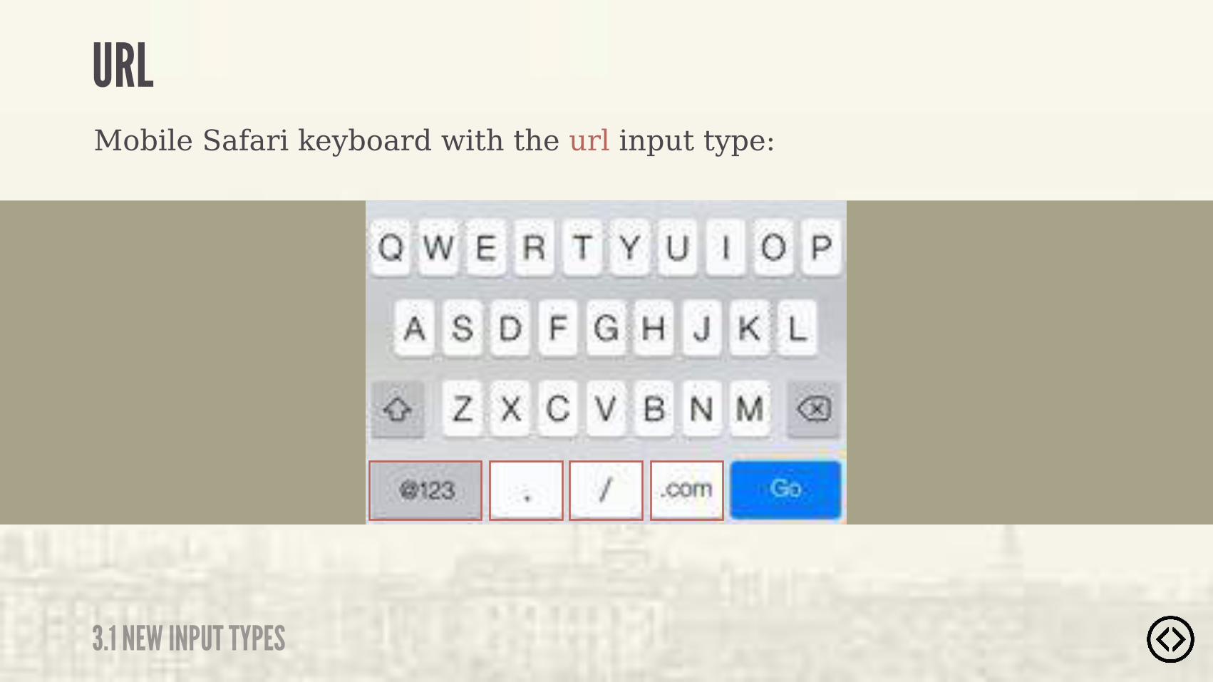
URLMobile Safari keyboard with the url input type:
�������������� ������#�� �����!������#���� ����
URL
3.1 NEW INPUT TYPES
Mobile Safari keyboard with the url input type:

The input element with a type attribute whose value is "date" represents a control for setting the element’s value to a string representing a date.- W3C SPECIFICATION
“DATE
3.1 NEW INPUT TYPES

Example usage of the date input type:
<input type="text" />
DATE
3.1 NEW INPUT TYPES
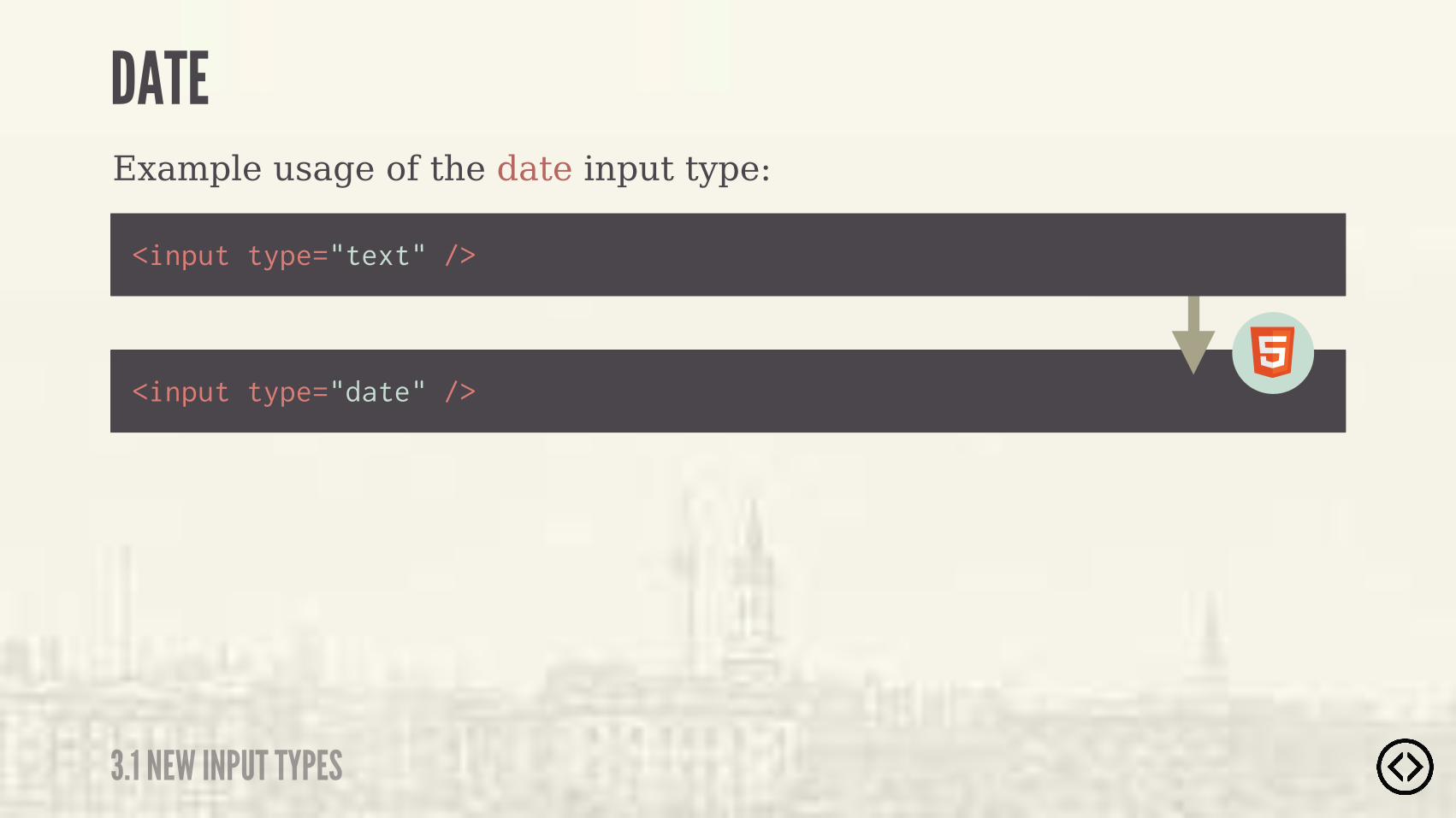
Example usage of the date input type:
<input type="date" />
<input type="text" />
DATE
3.1 NEW INPUT TYPES
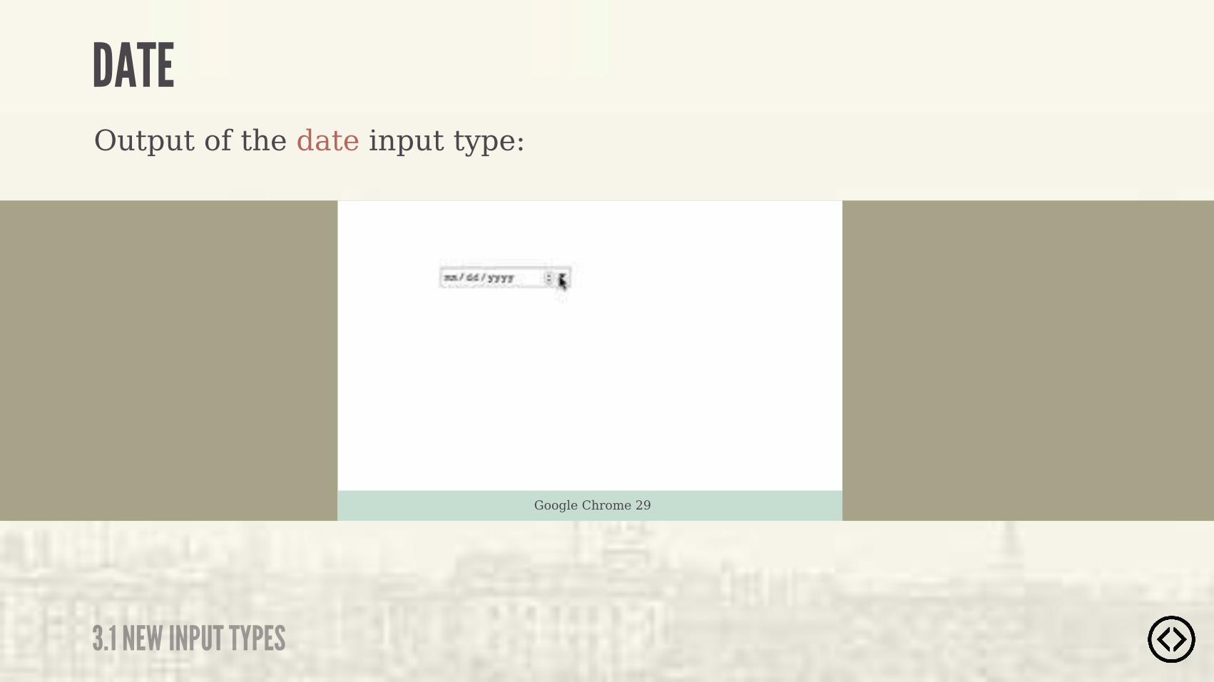
Output of the date input type:
Google Chrome 29
DATE
3.1 NEW INPUT TYPES
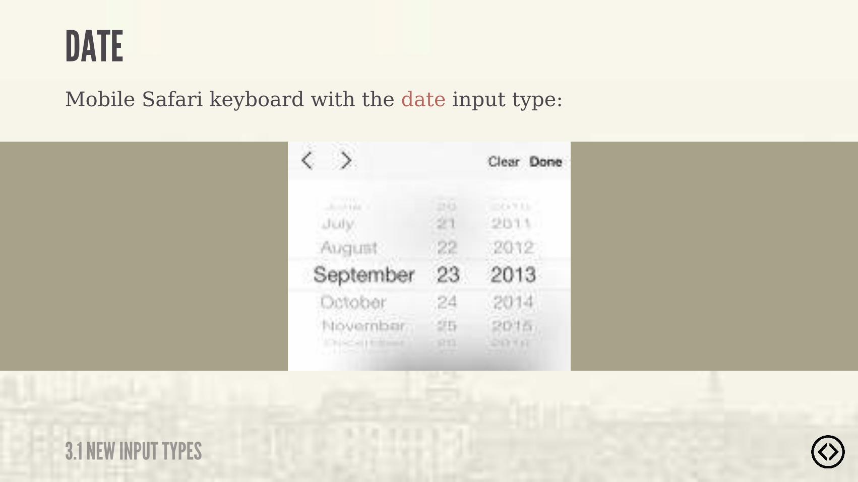
Mobile Safari keyboard with the date input type:
DATE
3.1 NEW INPUT TYPES
TEL
3.1 NEW INPUT TYPES
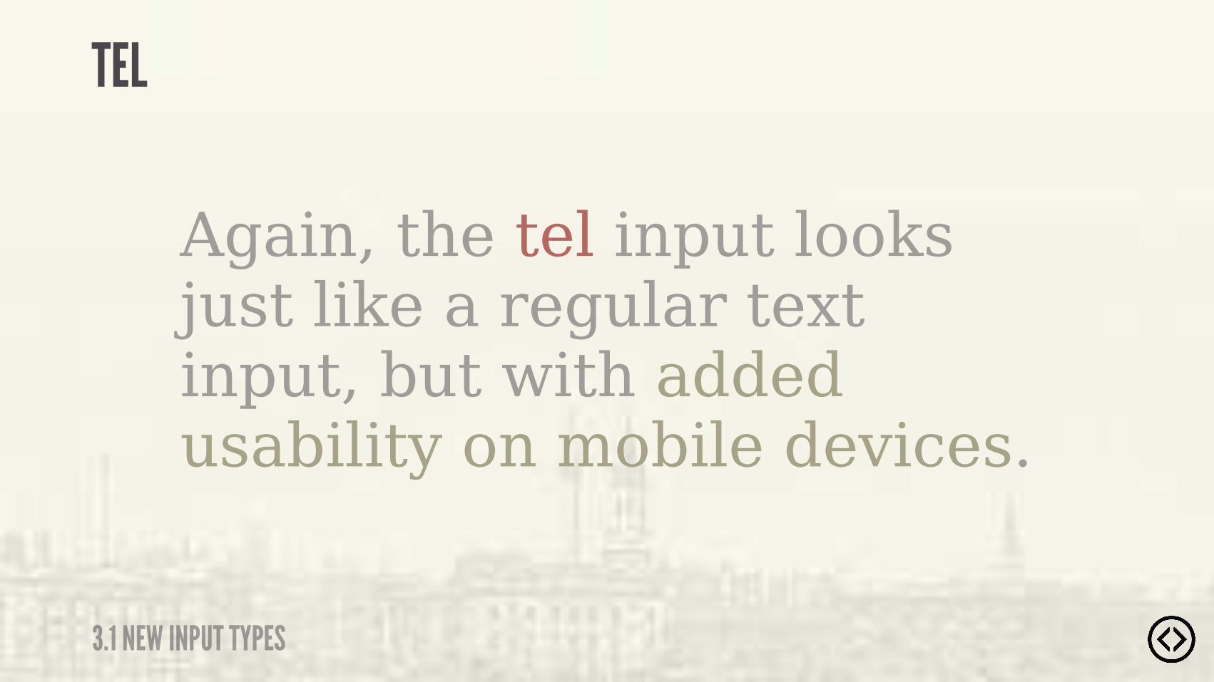
Again, the tel input looks just like a regular text input, but with added usability on mobile devices.
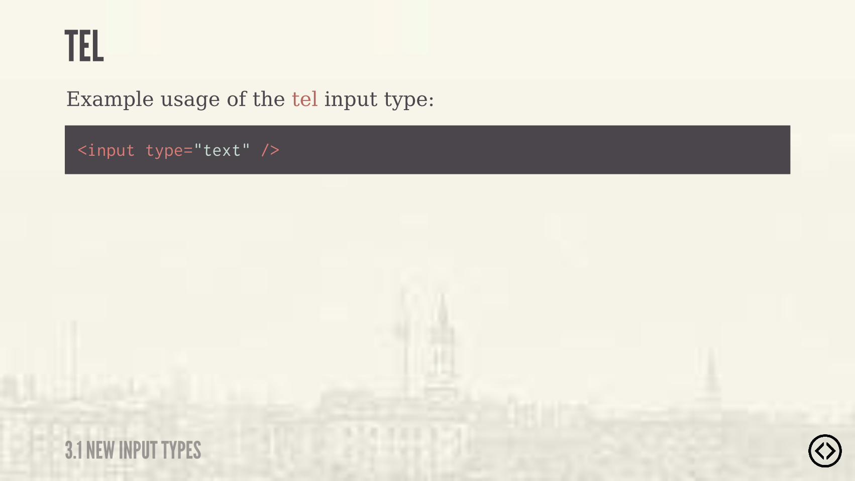
Example usage of the tel input type:
<input type="text" />
TEL
3.1 NEW INPUT TYPES
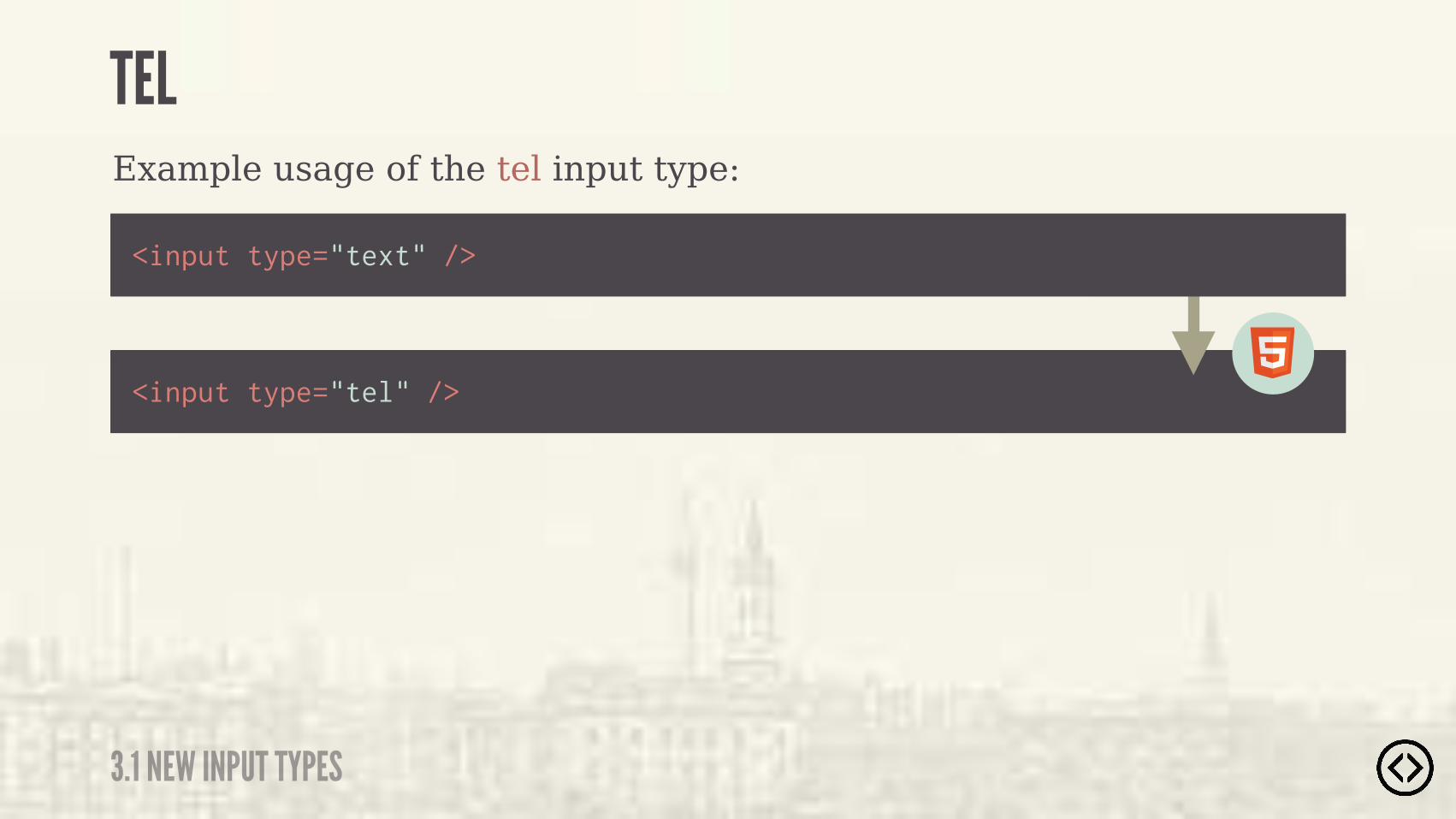
Example usage of the tel input type:
<input type="tel" />
<input type="text" />
TEL
3.1 NEW INPUT TYPES
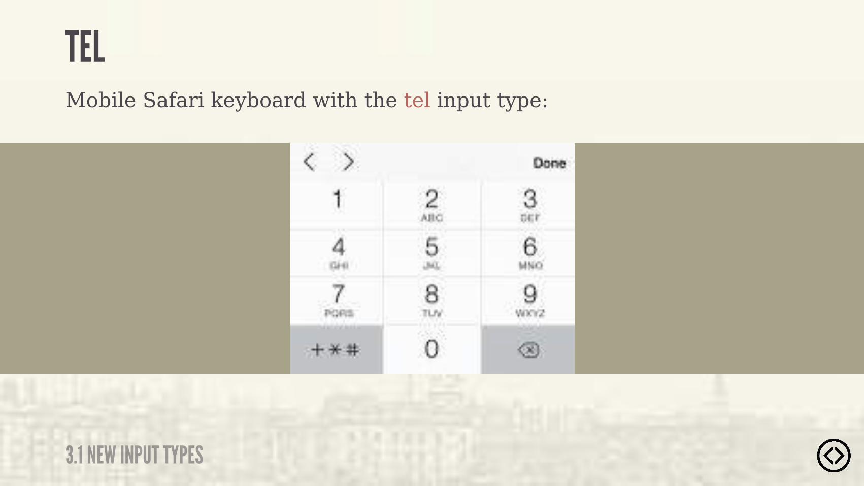
Mobile Safari keyboard with the tel input type:
TEL
3.1 NEW INPUT TYPES
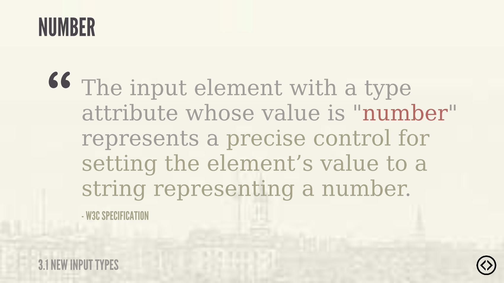
The input element with a type attribute whose value is "number" represents a precise control for setting the element’s value to a string representing a number.- W3C SPECIFICATION
“NUMBER
3.1 NEW INPUT TYPES
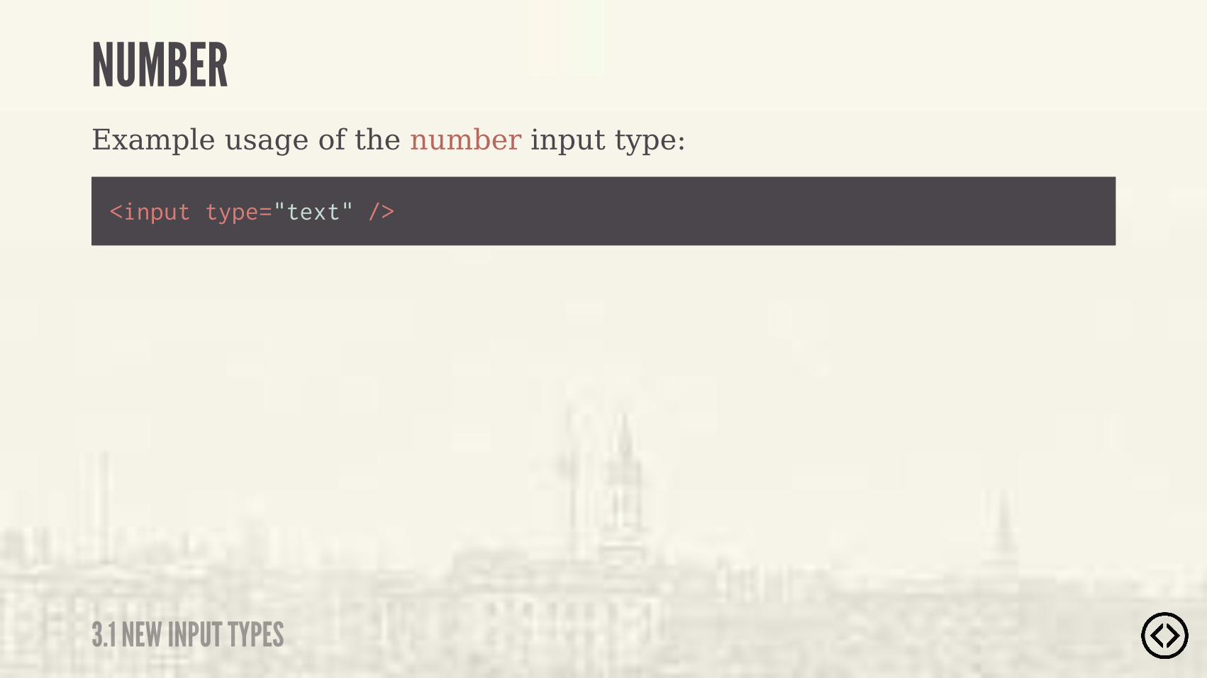
Example usage of the number input type:
<input type="text" />
NUMBER
3.1 NEW INPUT TYPES
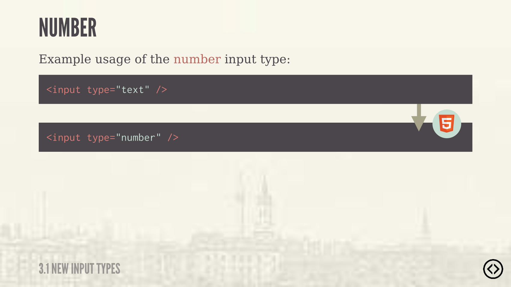
Example usage of the number input type:
<input type="number" />
<input type="text" />
NUMBER
3.1 NEW INPUT TYPES
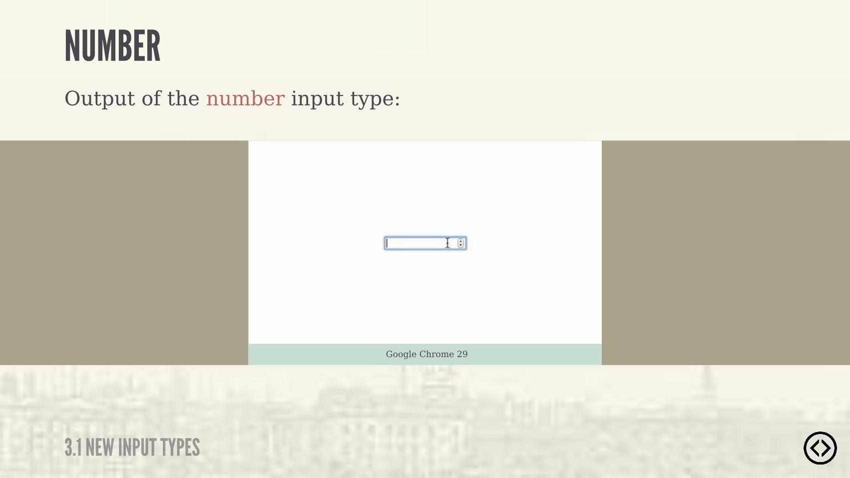
Output of the number input type:
Google Chrome 29
NUMBER
3.1 NEW INPUT TYPES
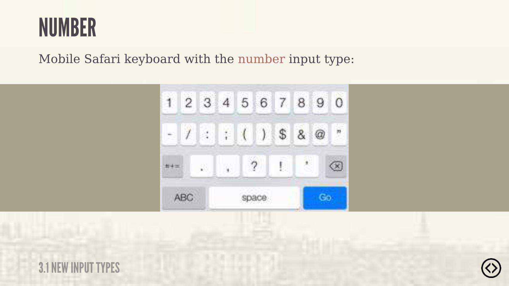
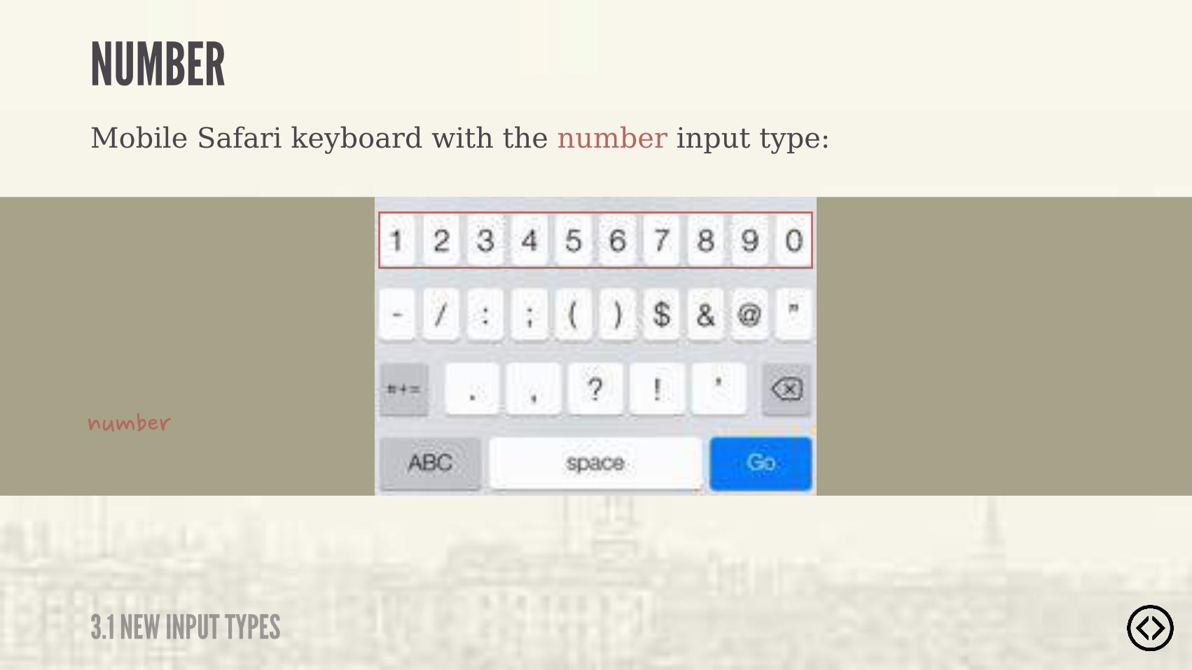
Mobile Safari keyboard with the number input type:
NUMBER
3.1 NEW INPUT TYPES
Mobile Safari keyboard with the number input type:
���������#�� ��� ��������������#�� ���!��������������� ��������������
NUMBER
3.1 NEW INPUT TYPES
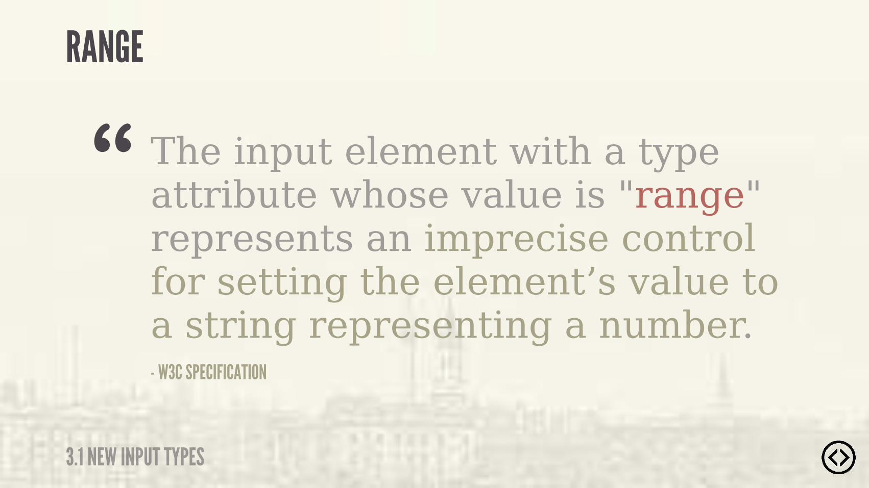
The input element with a type attribute whose value is "range" represents an imprecise control for setting the element’s value to a string representing a number.- W3C SPECIFICATION
“RANGE
3.1 NEW INPUT TYPES
Example usage of the range input type:
<input type="text" />
RANGE
3.1 NEW INPUT TYPES

Example usage of the range input type:
<input type="range" />
<input type="text" />
RANGE
3.1 NEW INPUT TYPES
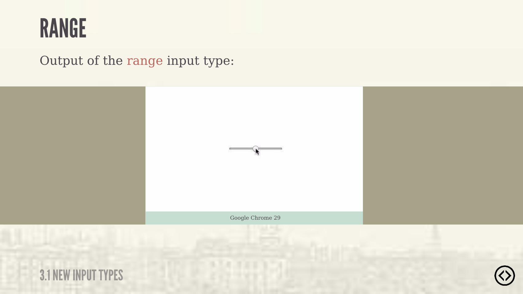
Output of the range input type:
Google Chrome 29
RANGE
3.1 NEW INPUT TYPES
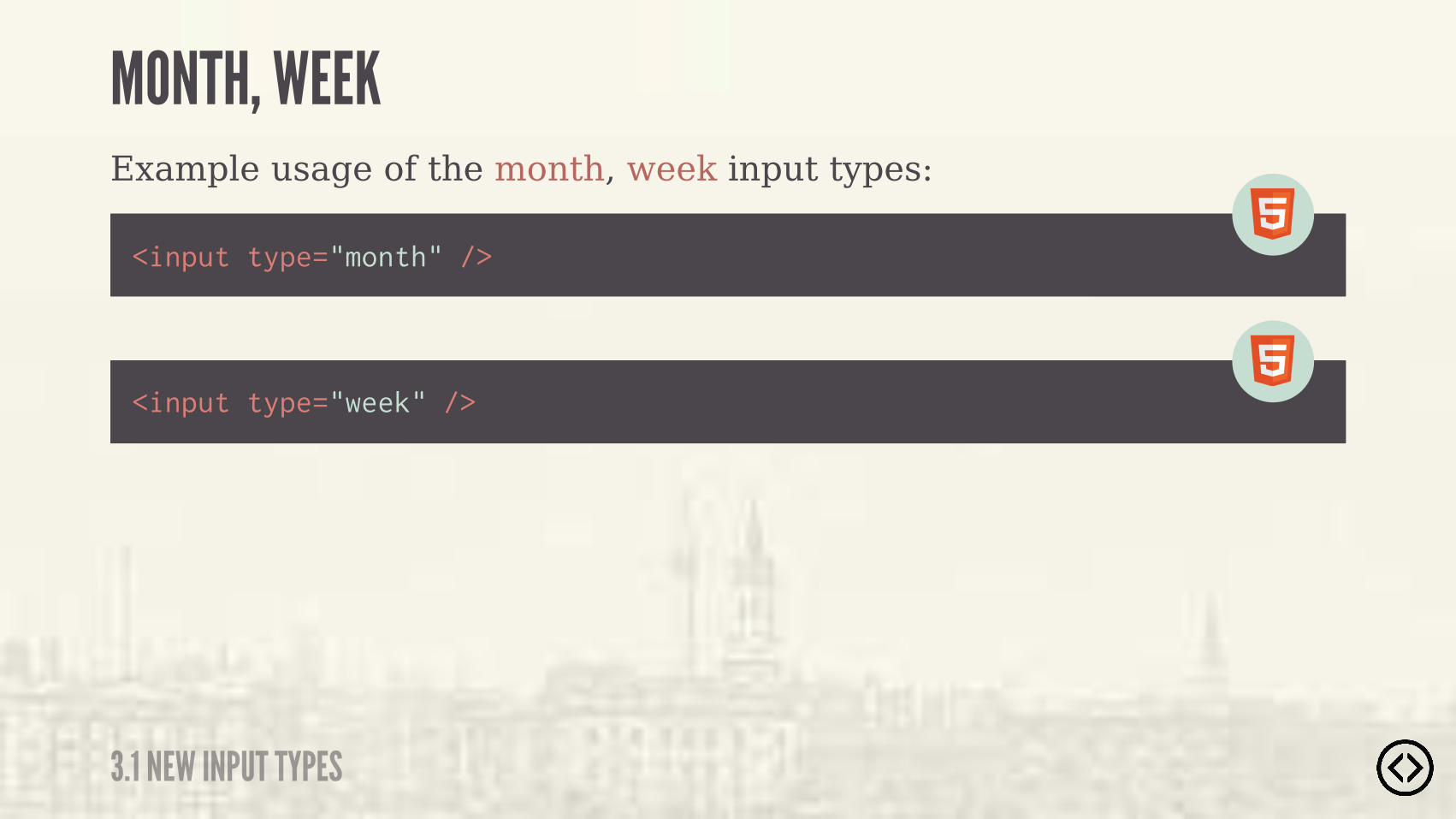
Example usage of the month, week input types:
<input type="month" />
<input type="week" />
MONTH, WEEK
3.1 NEW INPUT TYPES
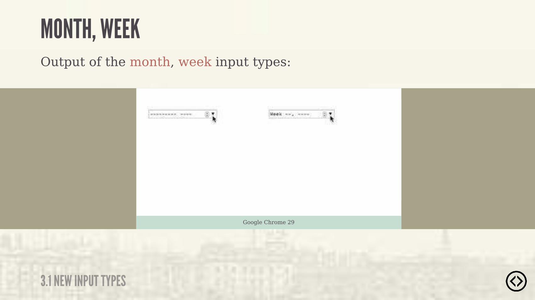
Output of the month, week input types:
Google Chrome 29
MONTH, WEEK
3.1 NEW INPUT TYPES

Example usage of the time, datetime-local input types:
<input type="datetime-local" />
<input type="time" />
TIME, DATETIME-LOCAL
3.1 NEW INPUT TYPES

Output of the time, datetime-local input type:
Google Chrome 29
TIME, DATETIME-LOCAL
3.1 NEW INPUT TYPES
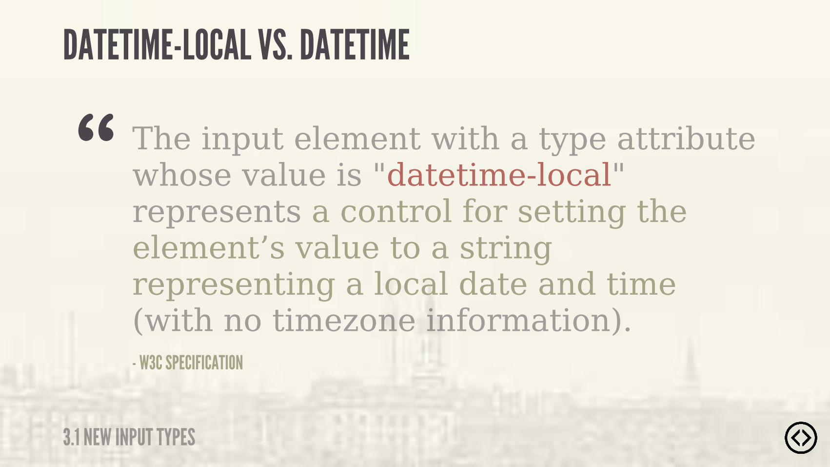
The input element with a type attribute whose value is "datetime-local" represents a control for setting the element’s value to a string representing a local date and time (with no timezone information).- W3C SPECIFICATION
“DATETIME-LOCAL VS. DATETIME
3.1 NEW INPUT TYPES
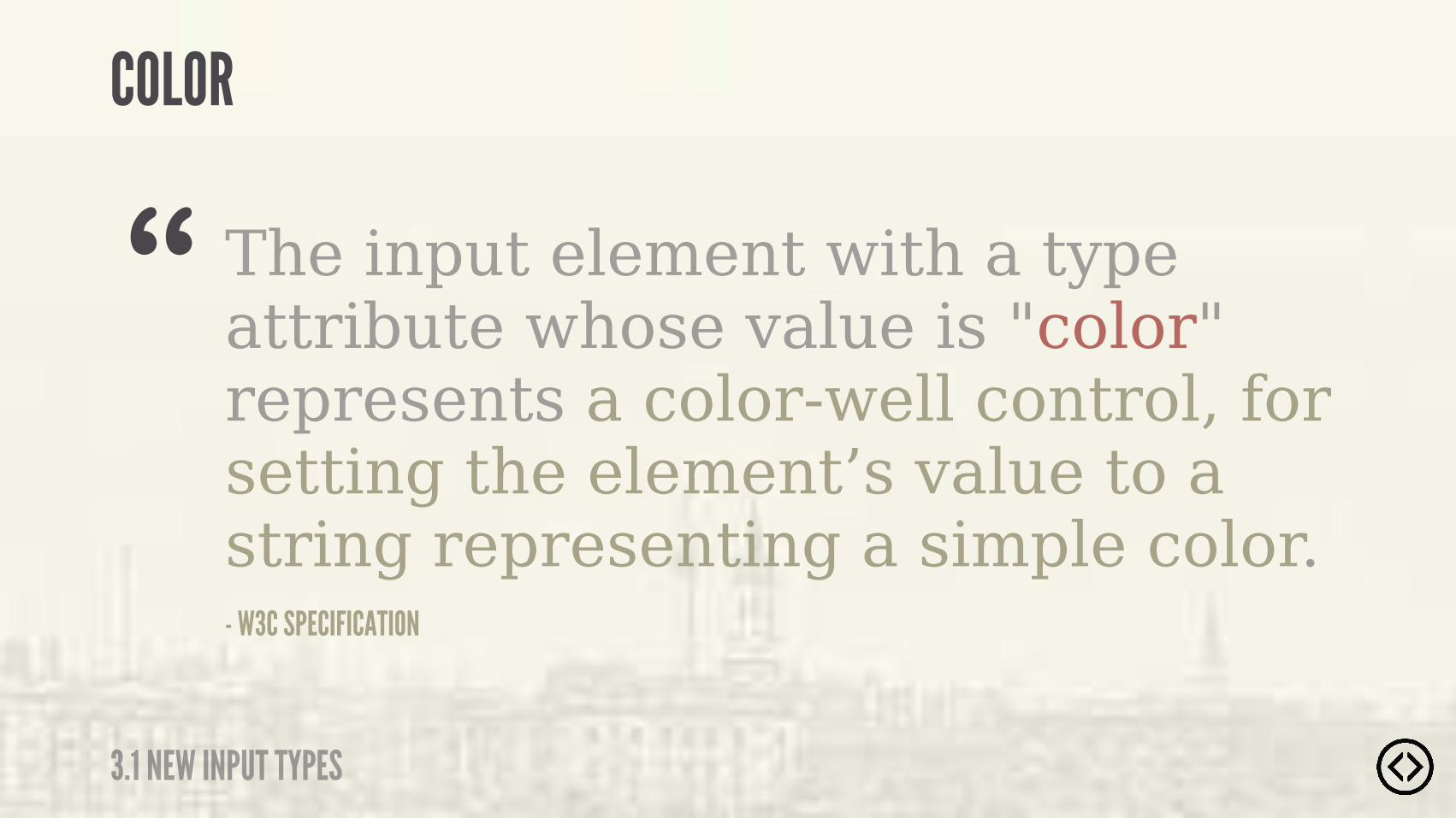
The input element with a type attribute whose value is "color" represents a color-well control, for setting the element’s value to a string representing a simple color.- W3C SPECIFICATION
“COLOR
3.1 NEW INPUT TYPES

Example usage of the color input type:
<input type="color" />
COLOR
3.1 NEW INPUT TYPES

Example output of the color input type:
Google Chrome 29
COLOR
3.1 NEW INPUT TYPES

๏ New input types๏ New form elements๏ New form attributes
TABLE OF CONTENTS
LEVEL 3

๏ New input types๏ New form elements๏ New form attributes
TABLE OF CONTENTS
LEVEL 3
3.2 NEW FORM ELEMENTS
NEW FORM ELEMENTS
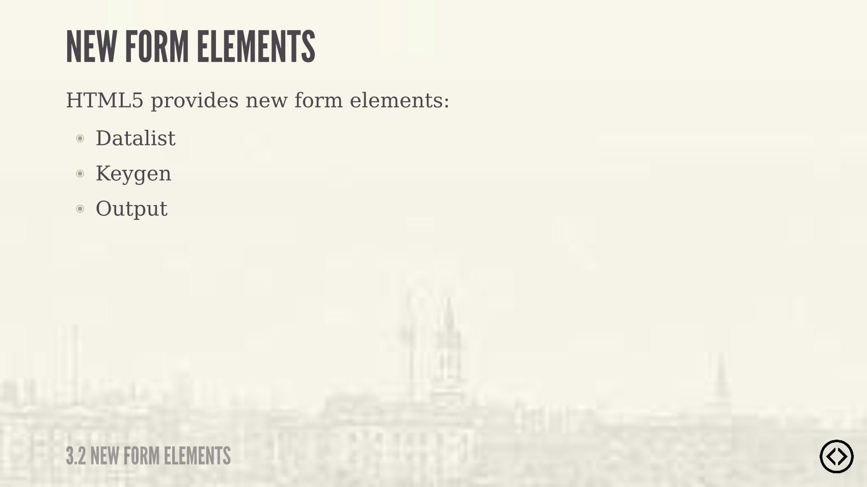
๏ Datalist๏ Keygen๏ Output
HTML5 provides new form elements:

๏ Datalist๏ Keygen๏ Output
HTML5 provides new form elements:
��%������������������������� � ������������������
NEW FORM ELEMENTS
3.2 NEW FORM ELEMENTS
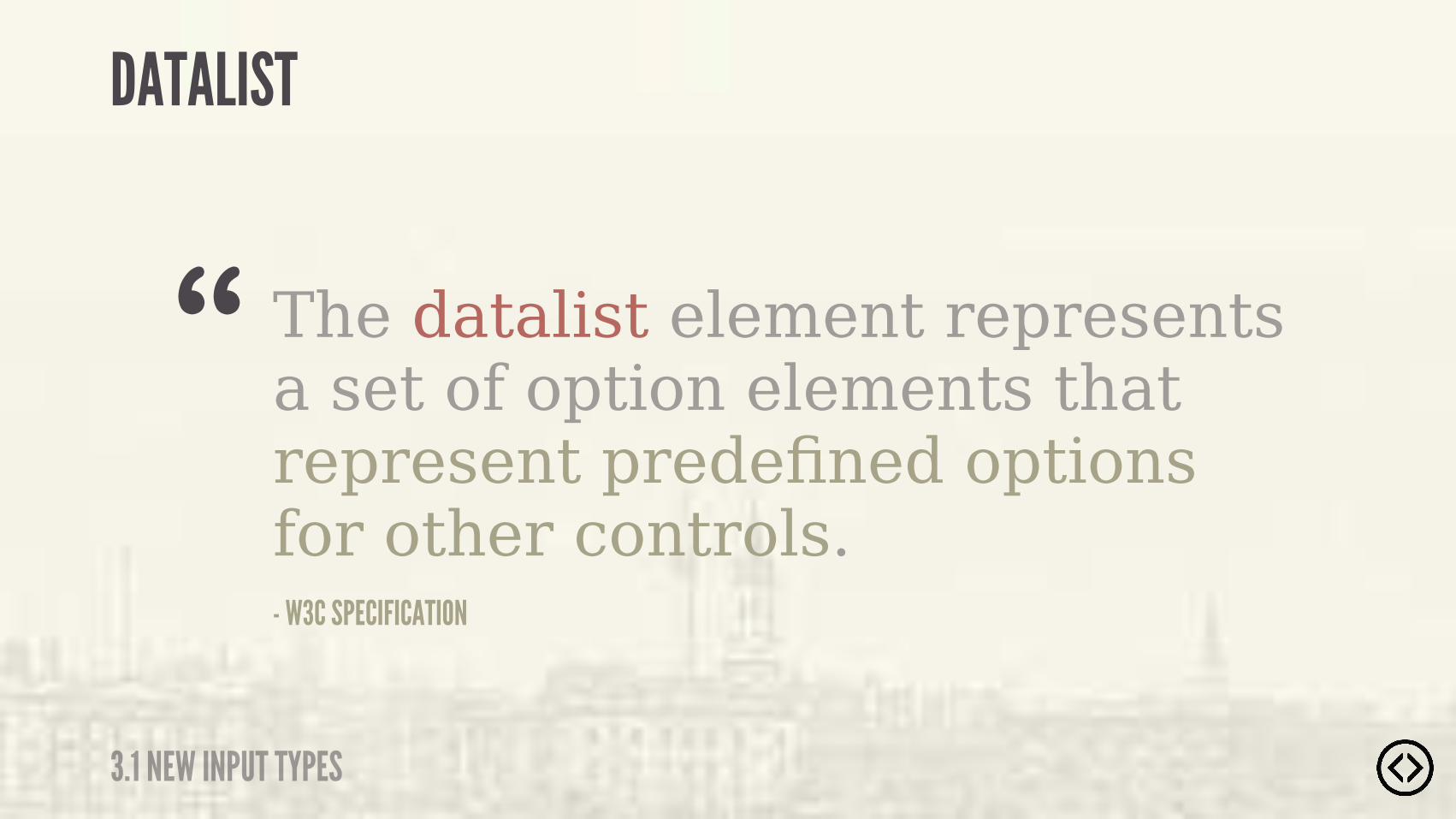
The datalist element represents a set of option elements that represent predefined options for other controls.- W3C SPECIFICATION
“
DATALIST
3.1 NEW INPUT TYPES

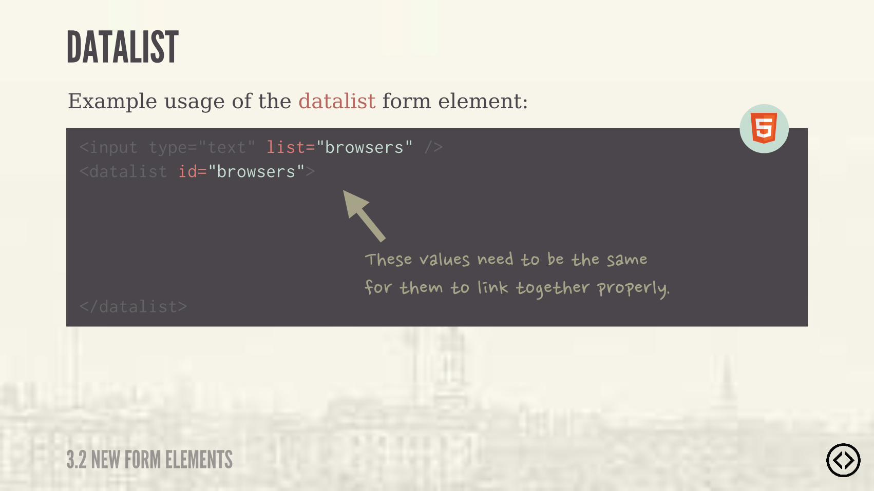
Example usage of the datalist form element:
<input type="text" list="browsers" />
DATALIST
3.2 NEW FORM ELEMENTS

Example usage of the datalist form element:
<datalist id="browsers">
</datalist>
DATALIST
3.2 NEW FORM ELEMENTS
<input type="text" list="browsers" />
Example usage of the datalist form element:
<datalist id="browsers">
</datalist>
DATALIST
3.2 NEW FORM ELEMENTS
����� ��������������������� ������������������������������������#�
<input type="text" list="browsers" />

<datalist id="browsers">
</datalist>
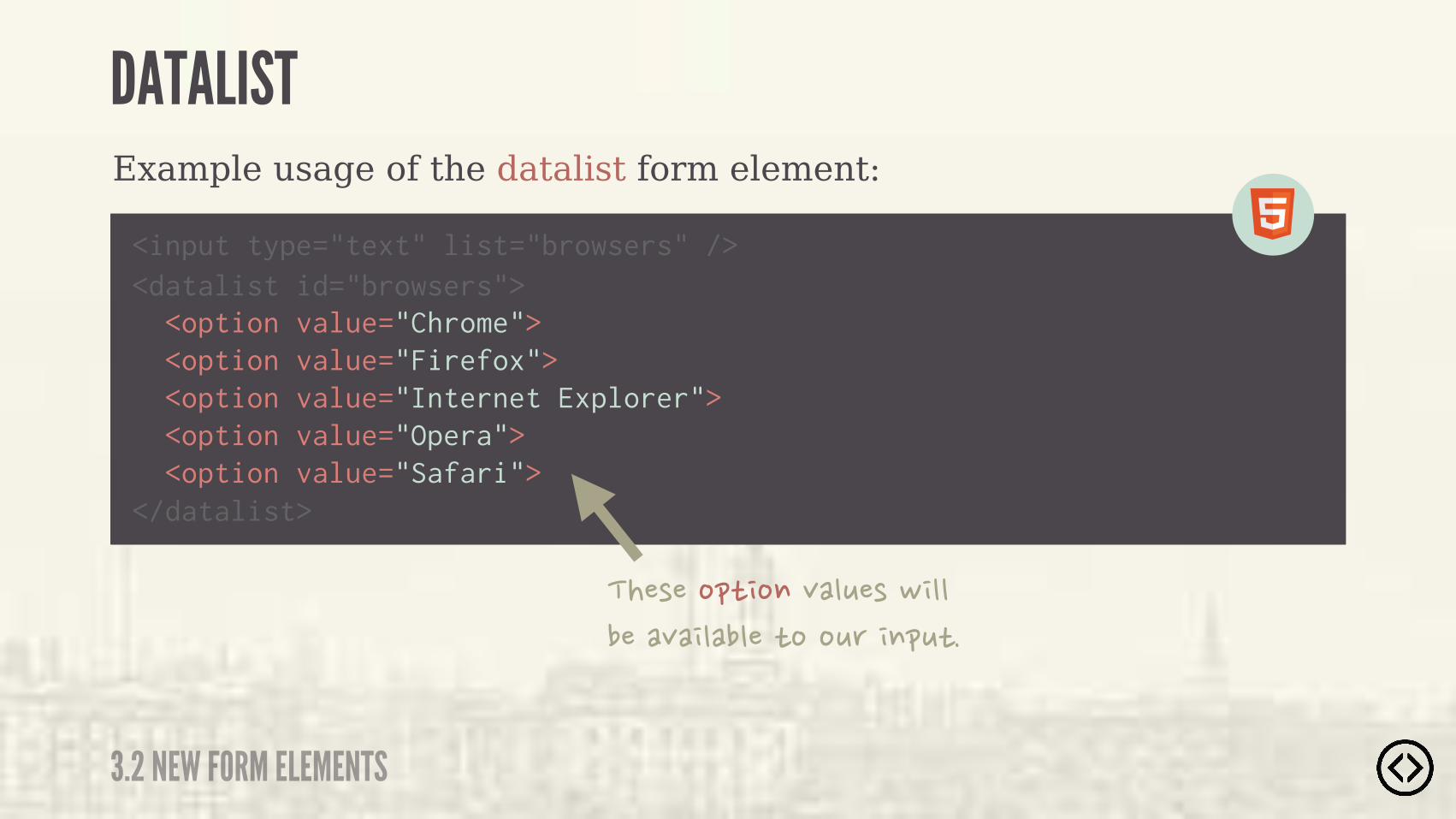
Example usage of the datalist form element:
<option value="Chrome"> <option value="Firefox"> <option value="Internet Explorer"> <option value="Opera"> <option value="Safari">
DATALIST
3.2 NEW FORM ELEMENTS
<input type="text" list="browsers" />
<datalist id="browsers">
</datalist>
Example usage of the datalist form element:
<option value="Chrome"> <option value="Firefox"> <option value="Internet Explorer"> <option value="Opera"> <option value="Safari">
DATALIST
3.2 NEW FORM ELEMENTS
<input type="text" list="browsers" />
������������ �����!������� �� �����������������
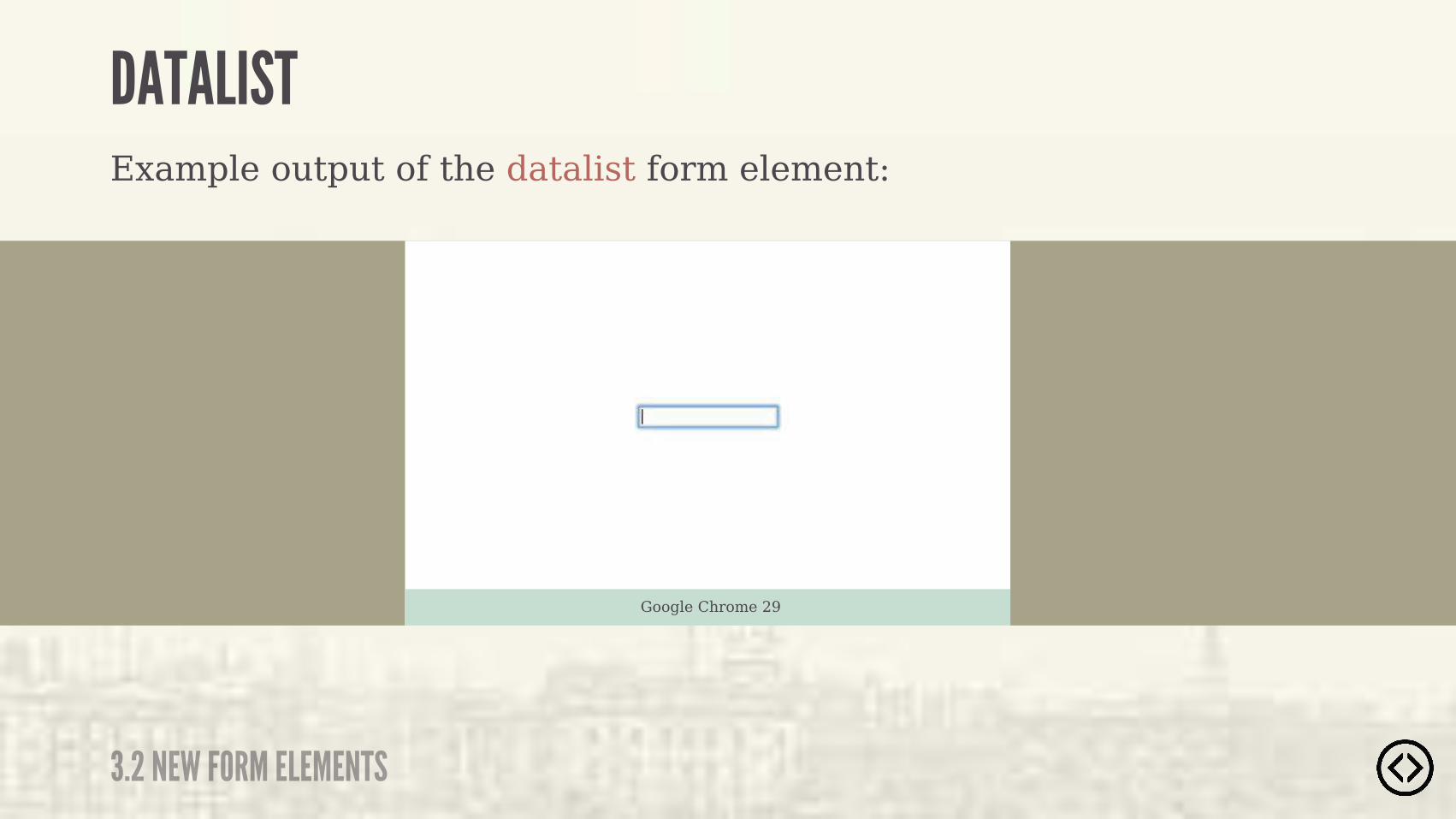
Example output of the datalist form element:
Google Chrome 29
DATALIST
3.2 NEW FORM ELEMENTS

๏ New input types๏ New form elements๏ New form attributes
TABLE OF CONTENTS
LEVEL 3

๏ New input types๏ New form elements๏ New form attributes
TABLE OF CONTENTS
LEVEL 3
3.3 NEW FORM ATTRIBUTES
NEW FORM ATTRIBUTES
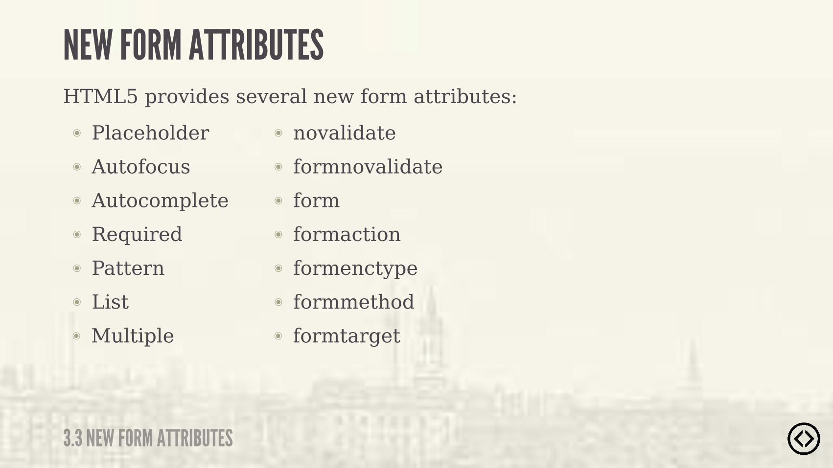
๏ Placeholder๏ Autofocus๏ Autocomplete๏ Required๏ Pattern๏ List
HTML5 provides several new form attributes:
๏ Multiple
๏ novalidate๏ formnovalidate๏ form๏ formaction๏ formenctype๏ formmethod๏ formtarget

๏ Placeholder๏ Autofocus๏ Autocomplete๏ Required๏ Pattern๏ List
HTML5 provides several new form attributes:
๏ Multiple
๏ novalidate๏ formnovalidate๏ form๏ formaction๏ formenctype๏ formmethod๏ formtarget
����� ������������ ����������!�%���������������������
3.3 NEW FORM ATTRIBUTES
NEW FORM ATTRIBUTES
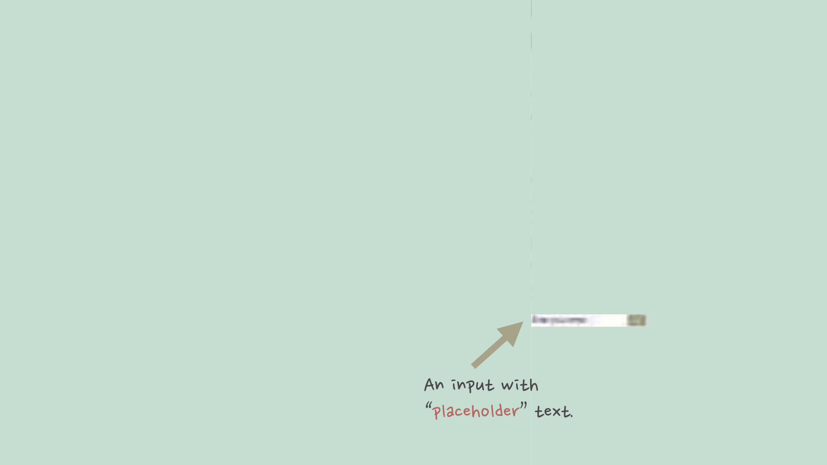
The placeholder attribute allows you to specify a message that is shown inside the input, hidden when the user starts typing, and then returns when focus is lost on the input (when the input is blank).
3.3 NEW FORM ATTRIBUTES
PLACEHOLDER

���������!����&�� ��������'���"��
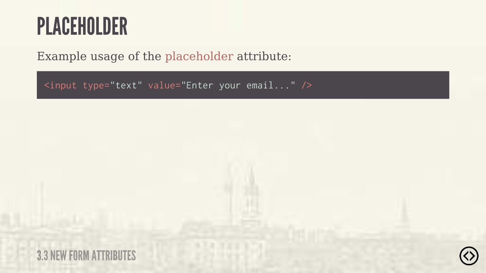
Example usage of the placeholder attribute:
<input type="text" value="Enter your email..." />
3.3 NEW FORM ATTRIBUTES
PLACEHOLDER
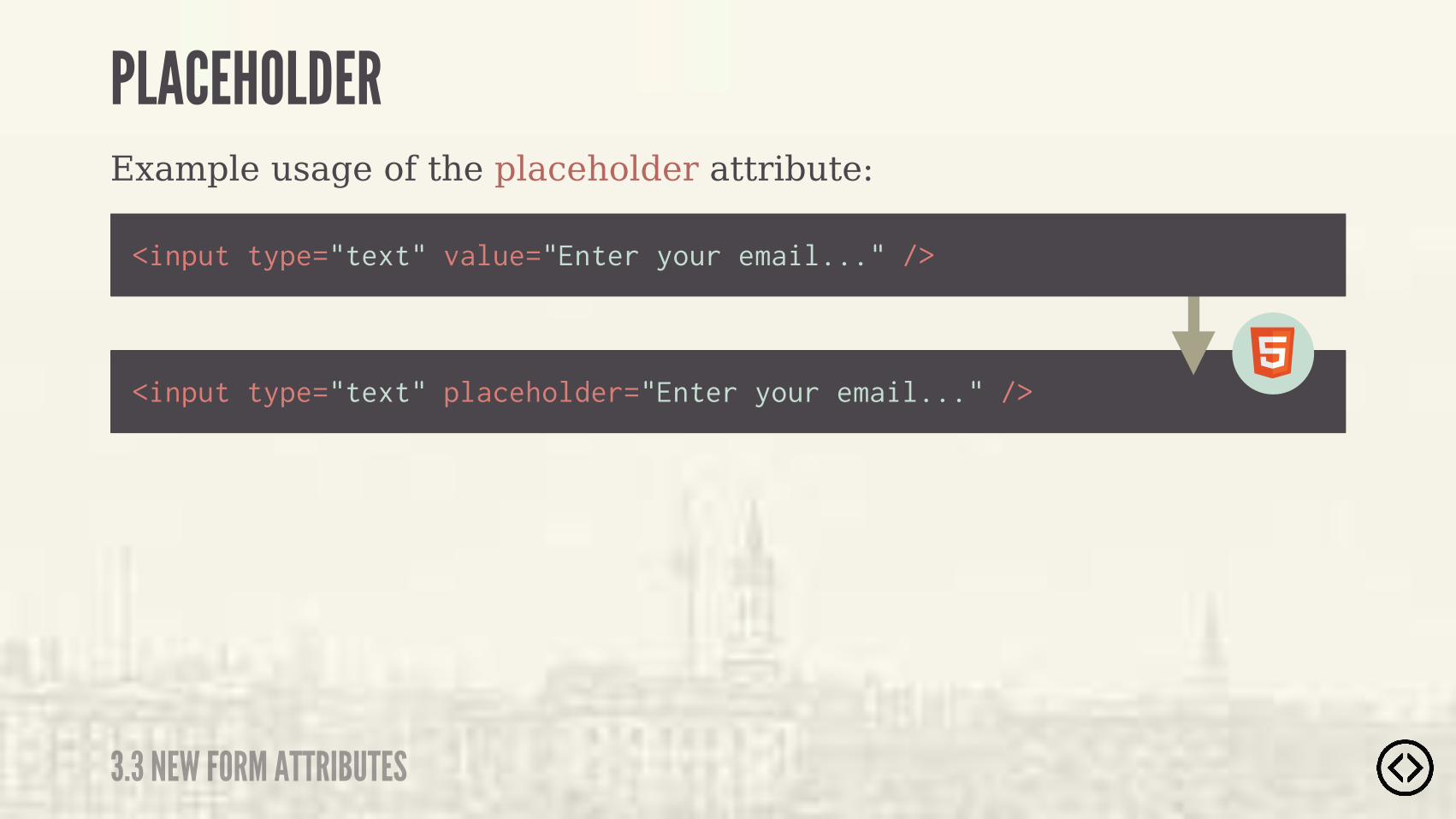
Example usage of the placeholder attribute:
<input type="text" placeholder="Enter your email..." />
<input type="text" value="Enter your email..." />
3.3 NEW FORM ATTRIBUTES
PLACEHOLDER
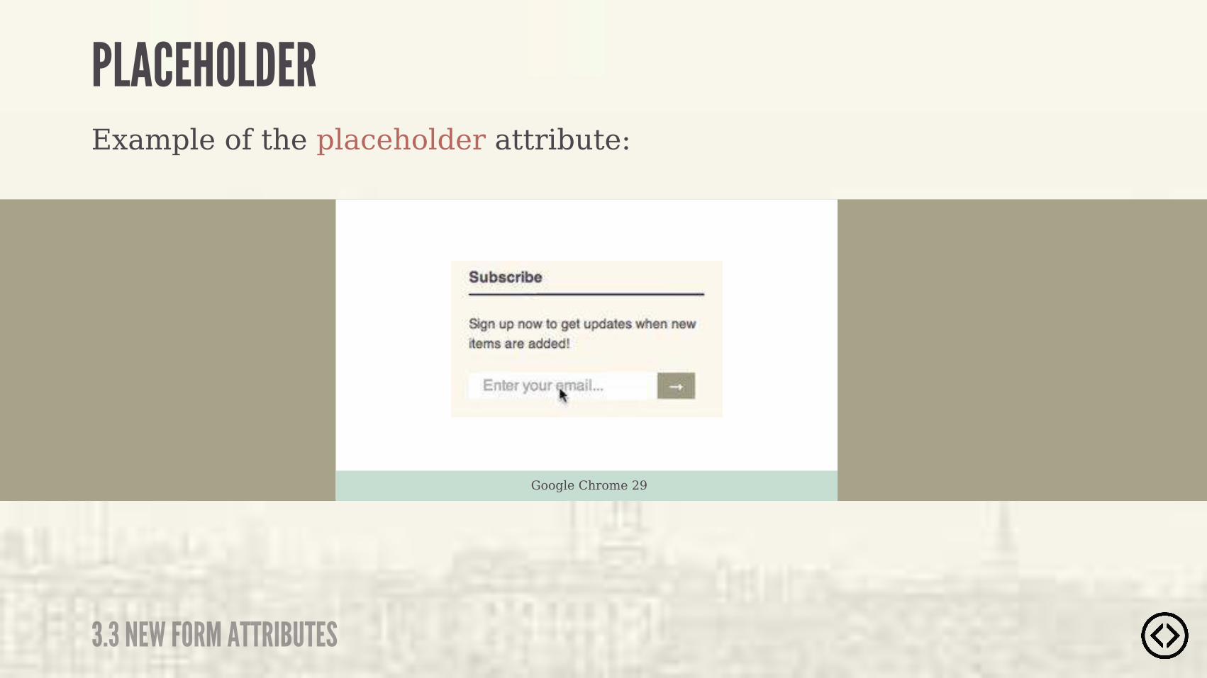
3.3 NEW FORM ATTRIBUTES
PLACEHOLDERExample of the placeholder attribute:
Google Chrome 29

The autofocus attribute will automatically focus the specified input when the page is rendered.
3.3 NEW FORM ATTRIBUTES
AUTOFOCUS
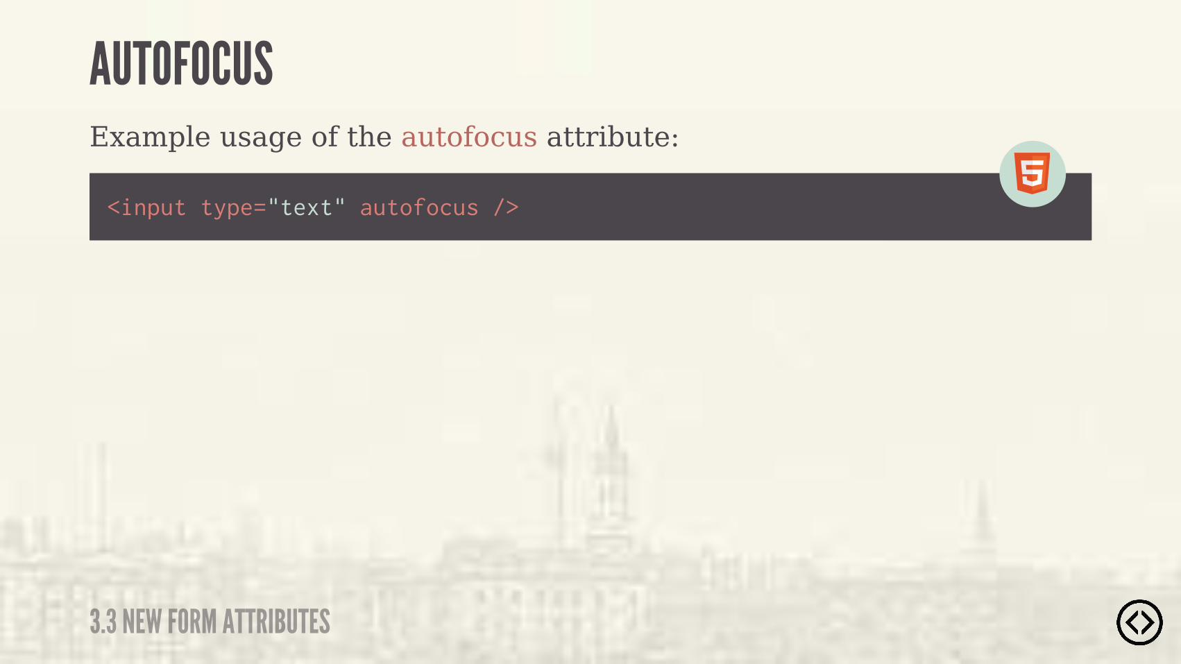
<input type="text" autofocus />
Example usage of the autofocus attribute:
3.3 NEW FORM ATTRIBUTES
AUTOFOCUS
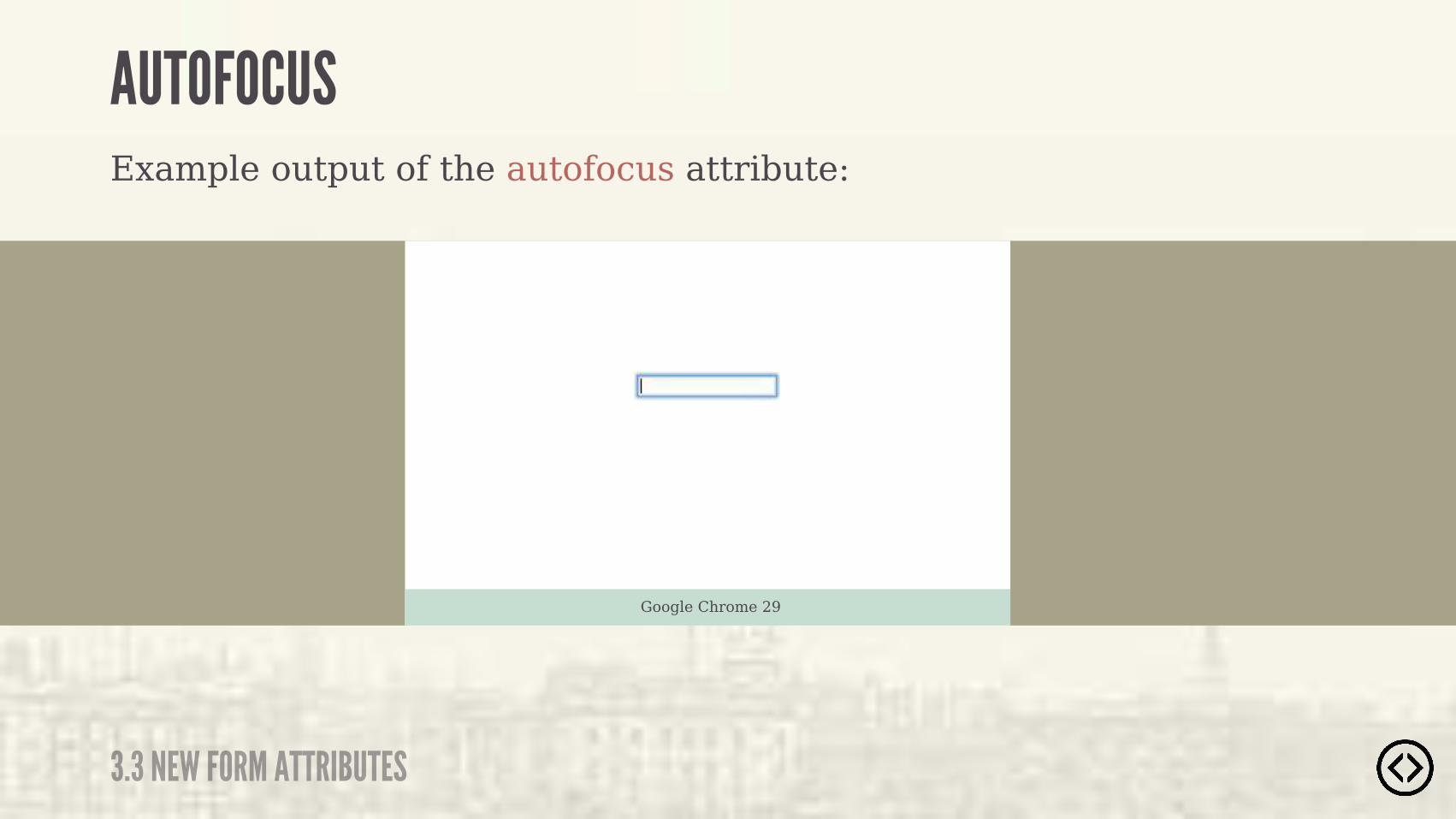
Example output of the autofocus attribute:
3.3 NEW FORM ATTRIBUTES
AUTOFOCUS
Google Chrome 29
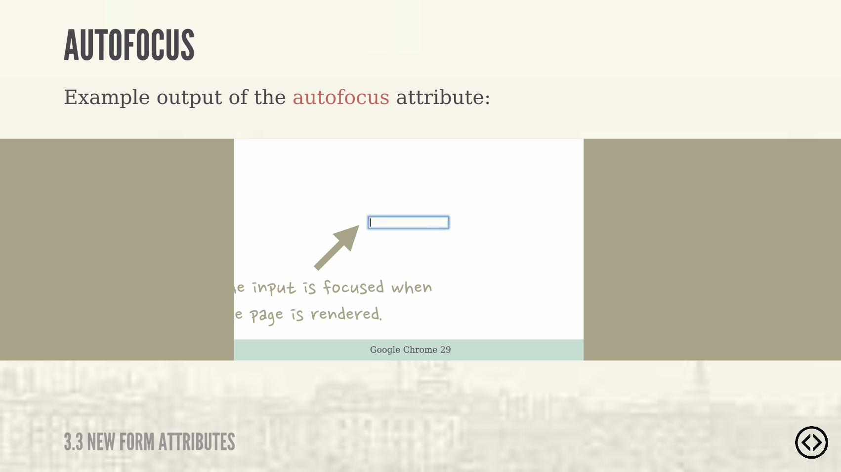
Example output of the autofocus attribute:
3.3 NEW FORM ATTRIBUTES
AUTOFOCUS
Google Chrome 29
��������������������!��������� ���������������

If you add the new HTML5 required attribute to an input, when the form is submitted, the user will be notified of an error if the field is left blank.
3.3 NEW FORM ATTRIBUTES
REQUIRED
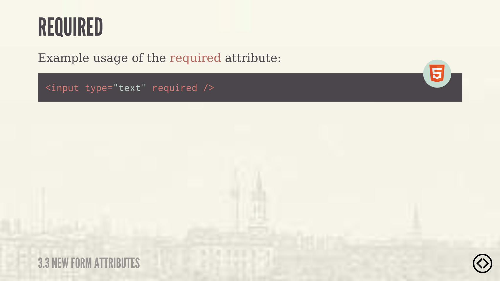
Example usage of the required attribute:
<input type="text" required />
3.3 NEW FORM ATTRIBUTES
REQUIRED
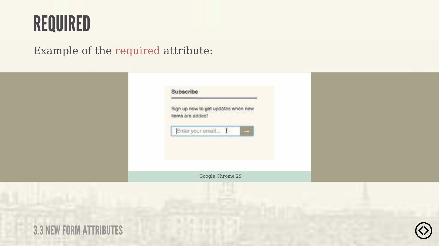
Example of the required attribute:
3.3 NEW FORM ATTRIBUTES
REQUIRED
Google Chrome 29
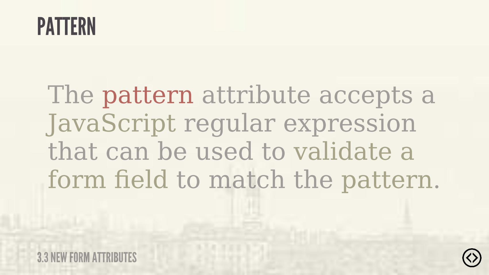
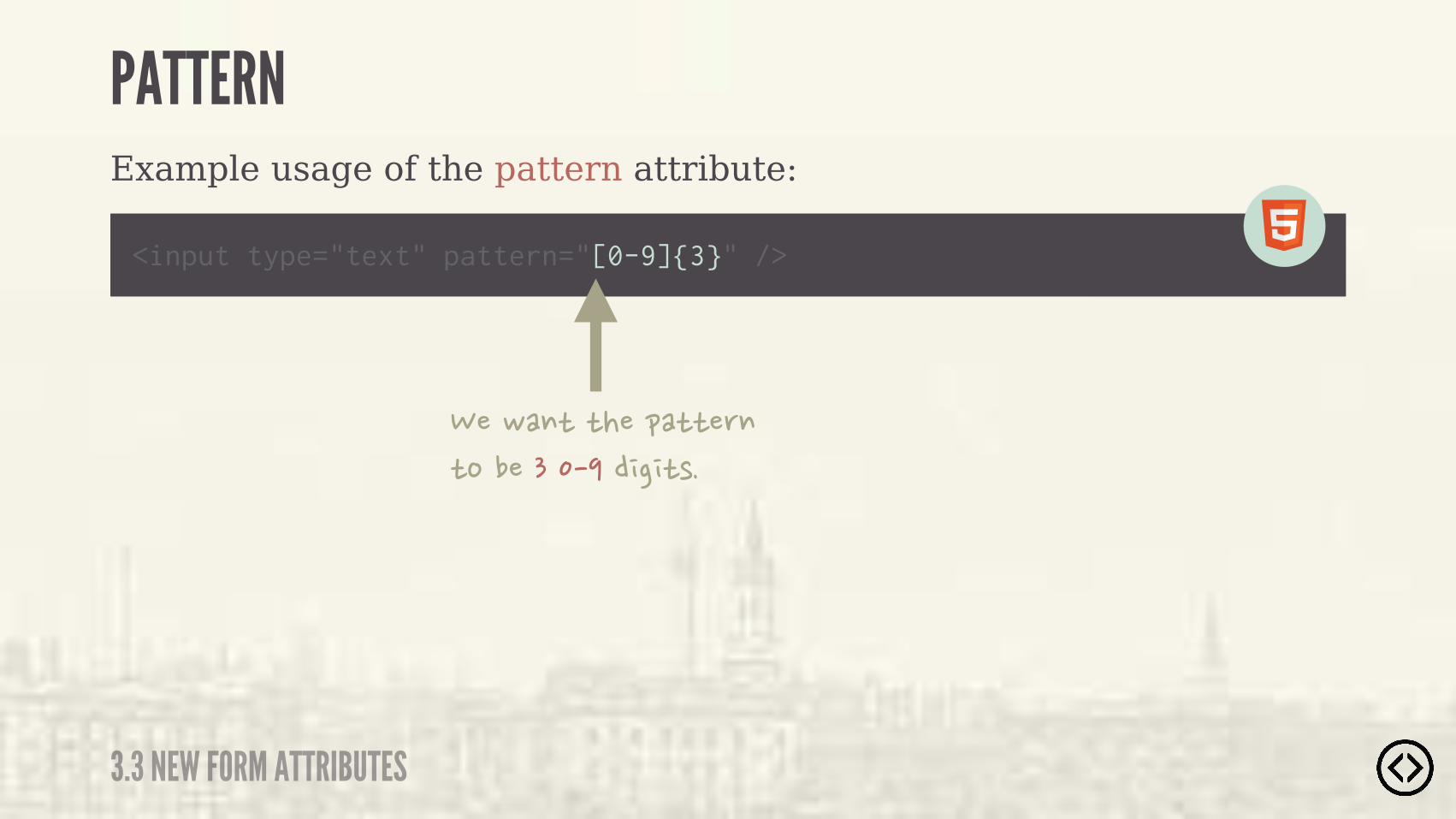
The pattern attribute accepts a JavaScript regular expression that can be used to validate a form field to match the pattern.
3.3 NEW FORM ATTRIBUTES
PATTERN
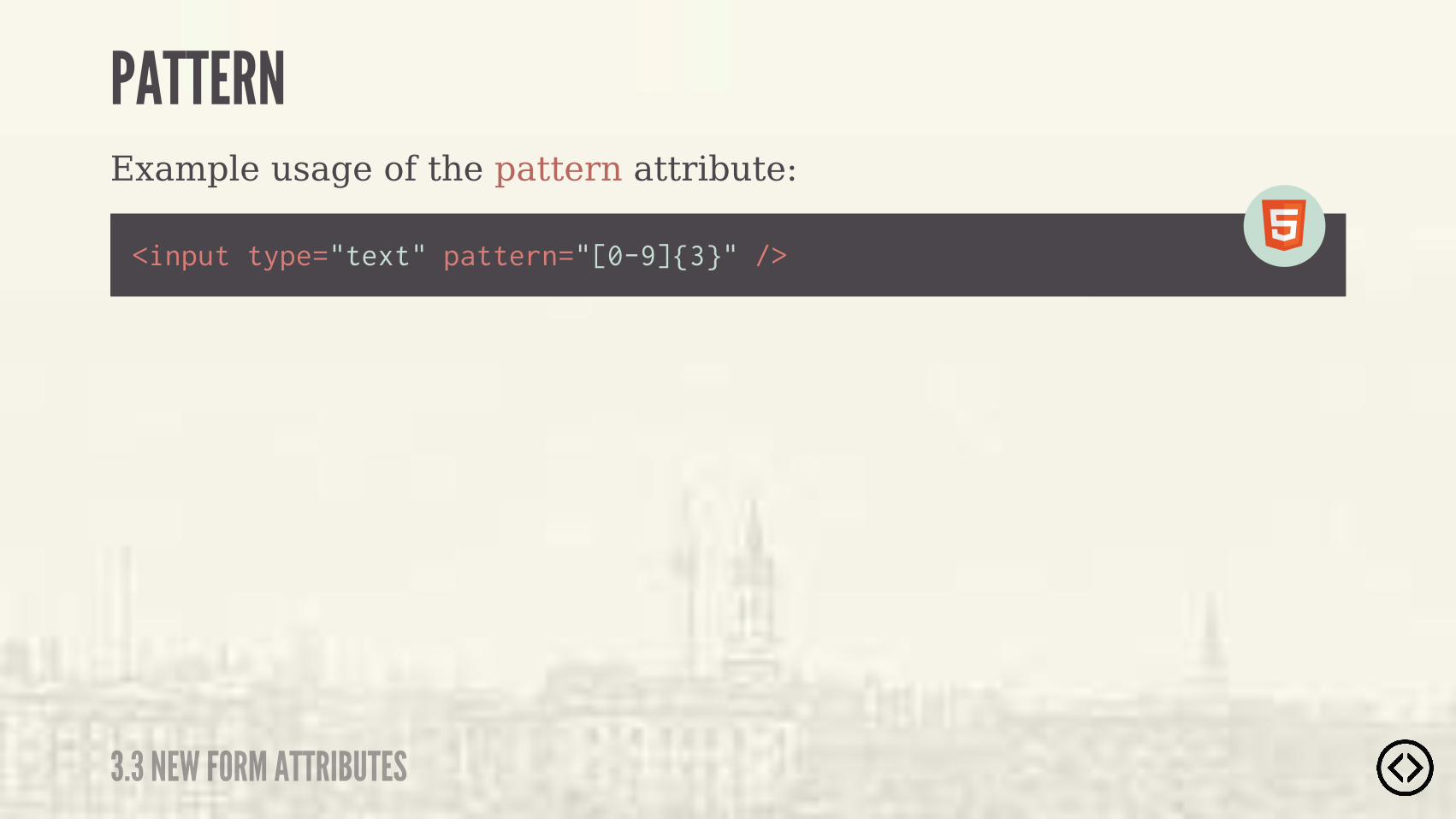
Example usage of the pattern attribute:
<input type="text" pattern="[0-9]{3}" />
3.3 NEW FORM ATTRIBUTES
PATTERN
Example usage of the pattern attribute:
<input type="text" pattern="[0-9]{3}" />
3.3 NEW FORM ATTRIBUTES
PATTERN
���! �������� �������������������������
Example usage of the pattern attribute:
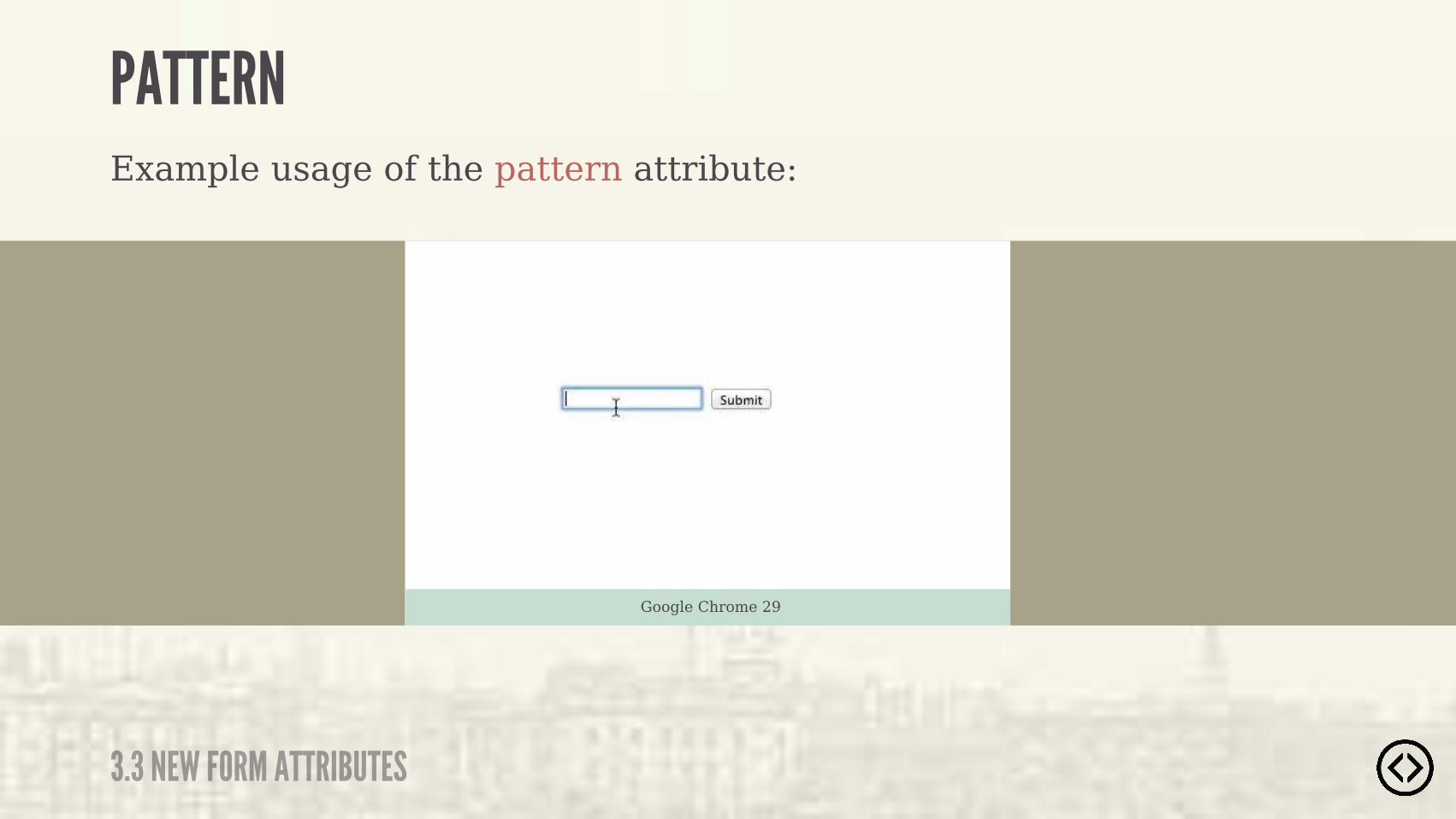
3.3 NEW FORM ATTRIBUTES
PATTERN
Google Chrome 29


Level 4 - CSS3 Styles

๏ Border Radius๏ Box Shadow๏ Text Shadow๏ Box Sizing
TABLE OF CONTENTS
LEVEL 4
๏ Multiple Backgrounds๏ Color๏ Opacity๏ Gradients

๏ Border Radius๏ Box Shadow๏ Text Shadow๏ Box Sizing๏ Multiple Backgrounds๏ Color๏ Opacity๏ Gradients
TABLE OF CONTENTS
LEVEL 4
The border-radius property applies rounded corners to borders.
BORDER RADIUS
4.1 BORDER RADIUS
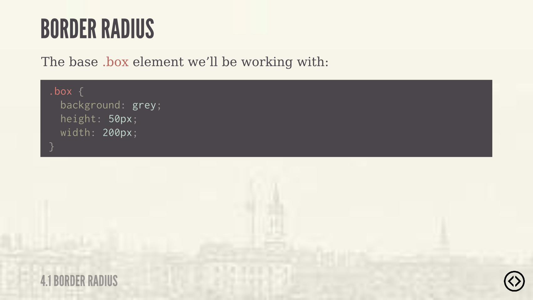
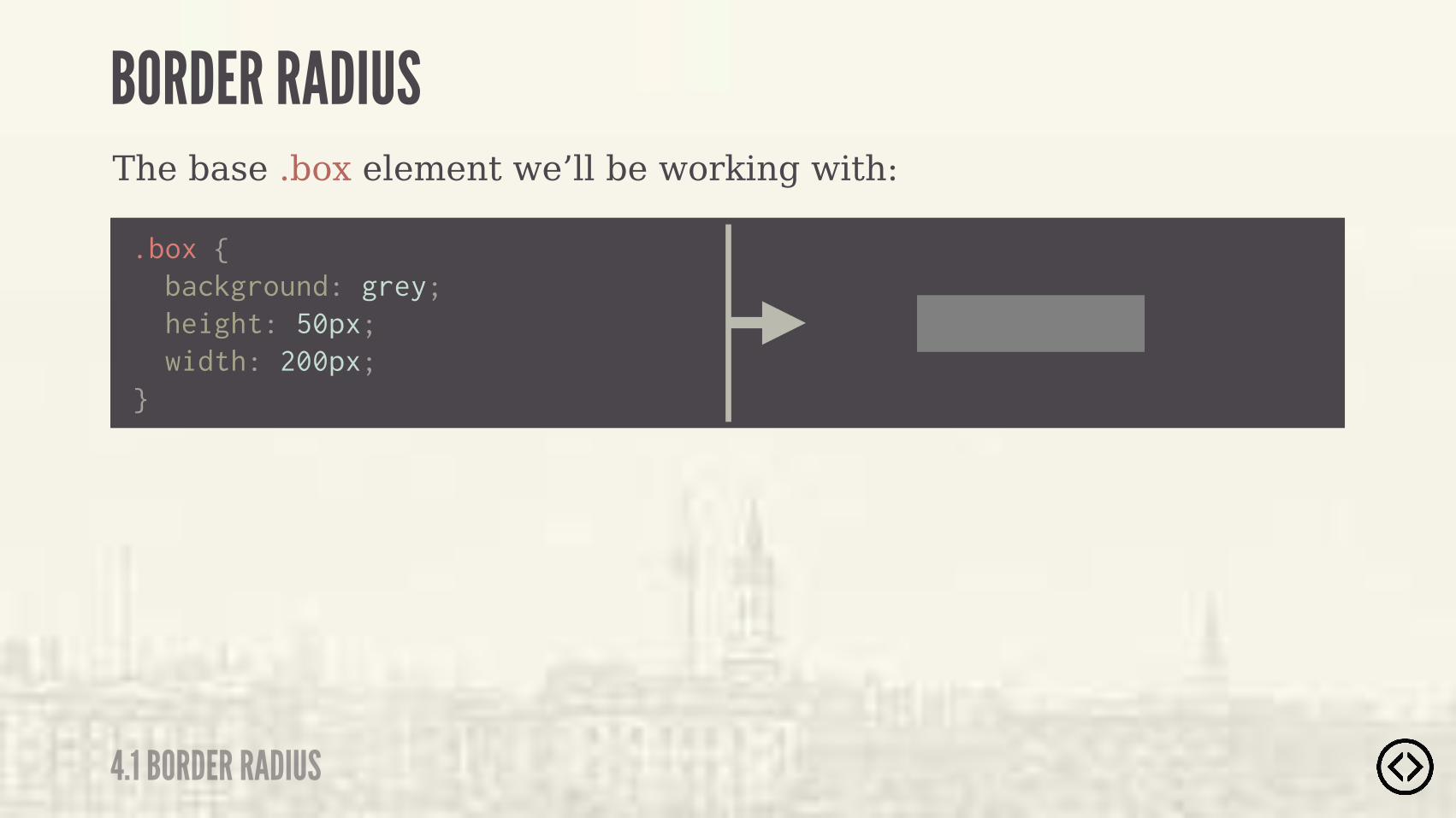
The base .box element we’ll be working with:
.box { background: grey; height: 50px; width: 200px;}
BORDER RADIUS
4.1 BORDER RADIUS
The base .box element we’ll be working with:
.box { background: grey; height: 50px; width: 200px;}
BORDER RADIUS
4.1 BORDER RADIUS
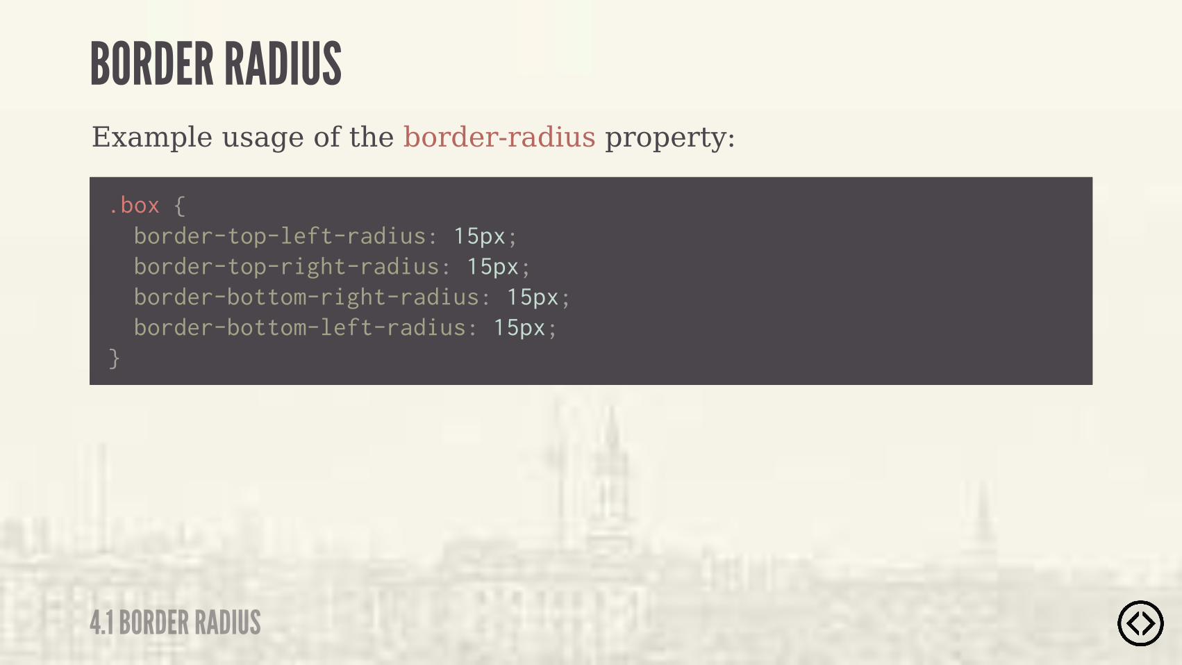
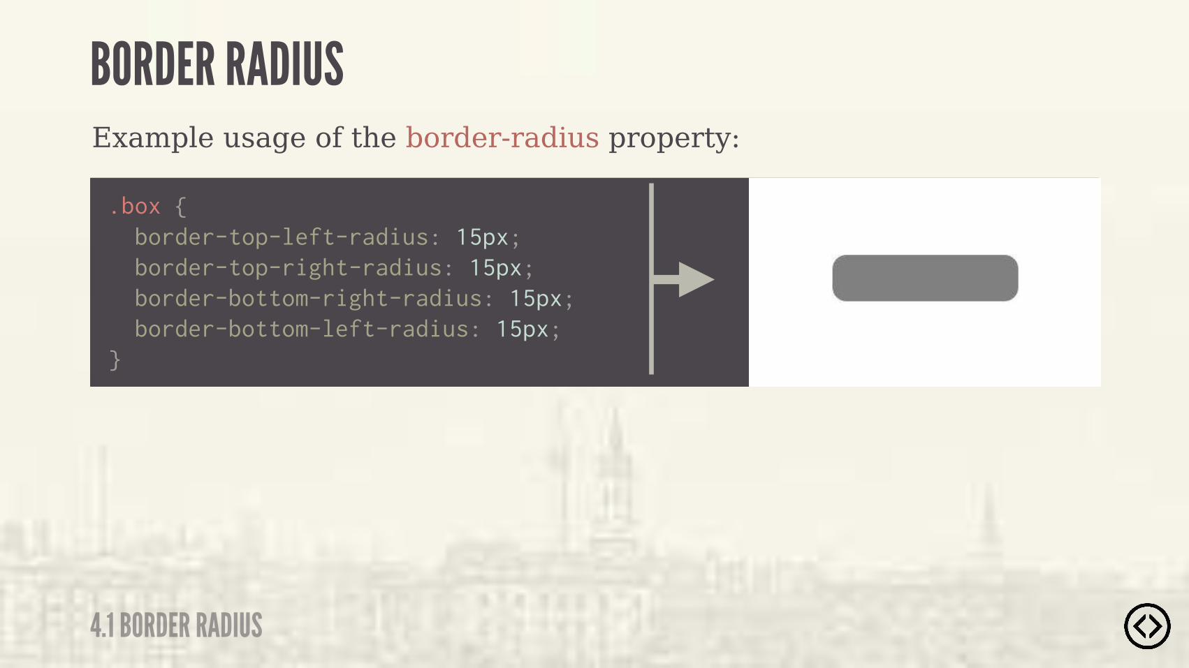
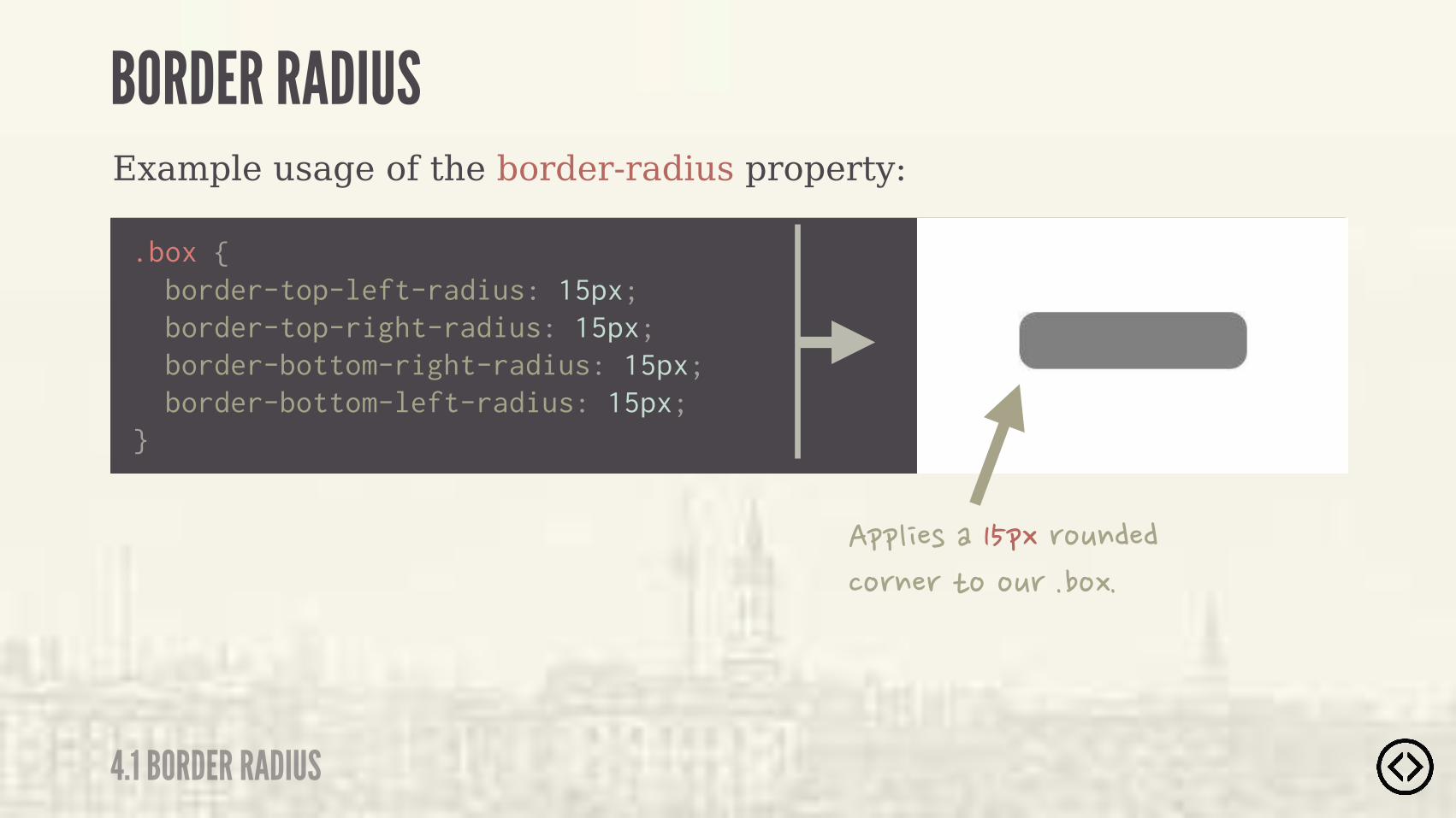
Example usage of the border-radius property:
.box {
}
border-top-left-radius: 15px; border-top-right-radius: 15px; border-bottom-right-radius: 15px; border-bottom-left-radius: 15px;
BORDER RADIUS
4.1 BORDER RADIUS
Example usage of the border-radius property:
.box {
}
border-top-left-radius: 15px; border-top-right-radius: 15px; border-bottom-right-radius: 15px; border-bottom-left-radius: 15px;
BORDER RADIUS
4.1 BORDER RADIUS
Example usage of the border-radius property:
.box {
}
border-top-left-radius: 15px; border-top-right-radius: 15px; border-bottom-right-radius: 15px; border-bottom-left-radius: 15px;
�&&" �)����&.�(%+$�����%($�(�*%�%+(���%.�
BORDER RADIUS
4.1 BORDER RADIUS

Example usage of the border-radius property:
.box {
} border-radius: 15px;
BORDER RADIUS
4.1 BORDER RADIUS

Example usage of the border-radius property:
.box {
} border-radius: 15px;
�����$�+)��*���)�%(*��$��&(%&�(*/�*%�)&�� �/��""�) ��)��*�%$���
BORDER RADIUS
4.1 BORDER RADIUS
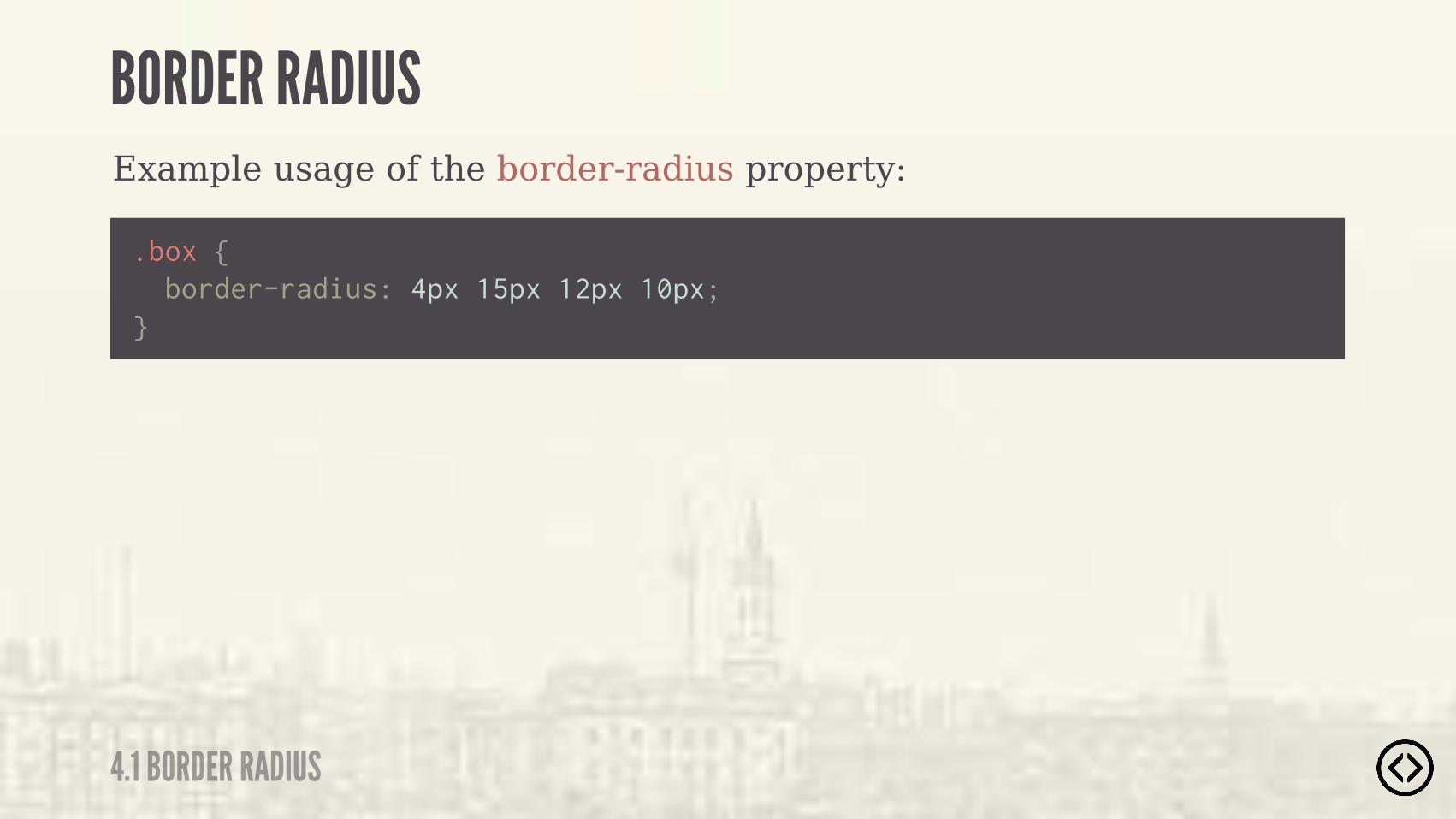
Example usage of the border-radius property:
.box {
} border-radius: 4px 15px 12px 10px;
BORDER RADIUS
4.1 BORDER RADIUS
Example usage of the border-radius property:
.box {
} border-radius: 4px 15px 12px 10px;
�����$�)&�� �/�������%(��(�(�� +)�,�"+�� $� , �+�""/���)�-�""�
BORDER RADIUS
4.1 BORDER RADIUS

Example usage of the border-radius property:
.box {
} border-radius: 4px 15px 12px 10px;
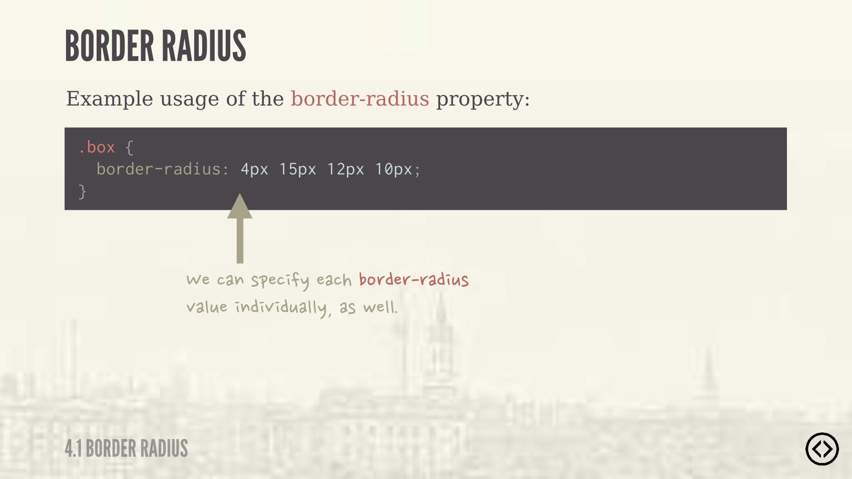
BORDER RADIUS
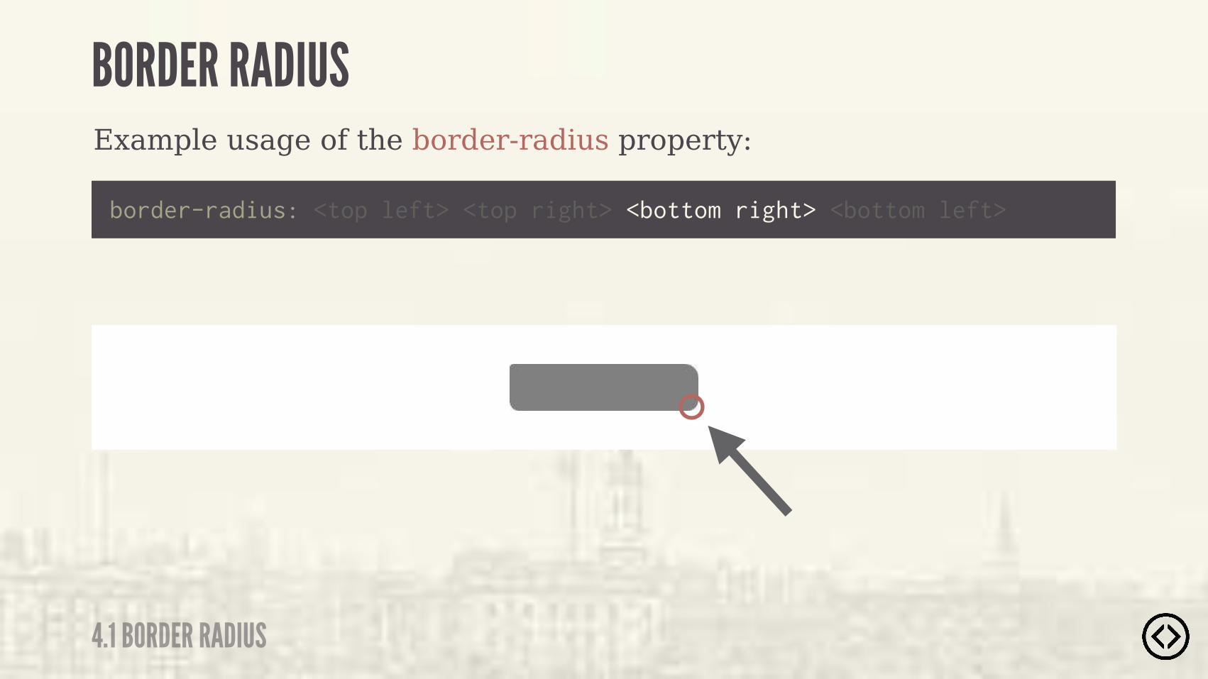
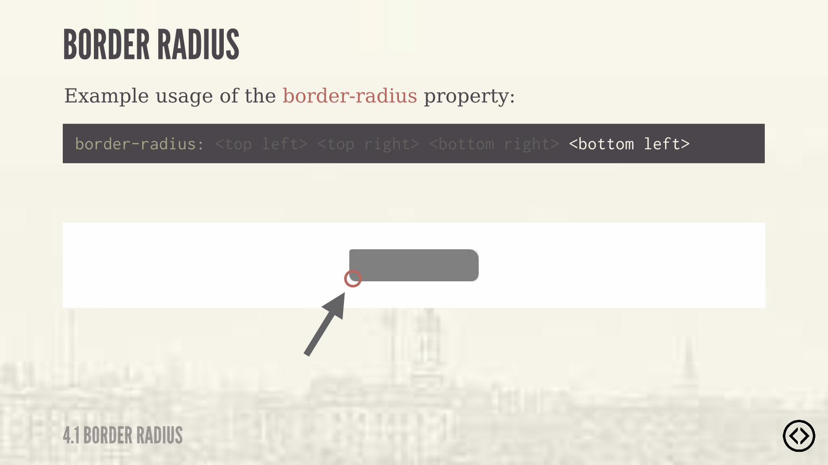
4.1 BORDER RADIUS

Example usage of the border-radius property:
border-radius: <top left> <top right> <bottom right> <bottom left>
BORDER RADIUS
4.1 BORDER RADIUS
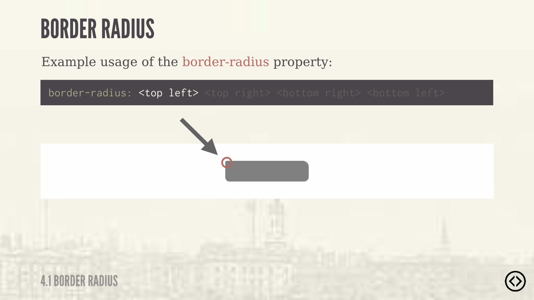
Example usage of the border-radius property:
border-radius: <top left> <top right> <bottom right> <bottom left>
BORDER RADIUS
4.1 BORDER RADIUS
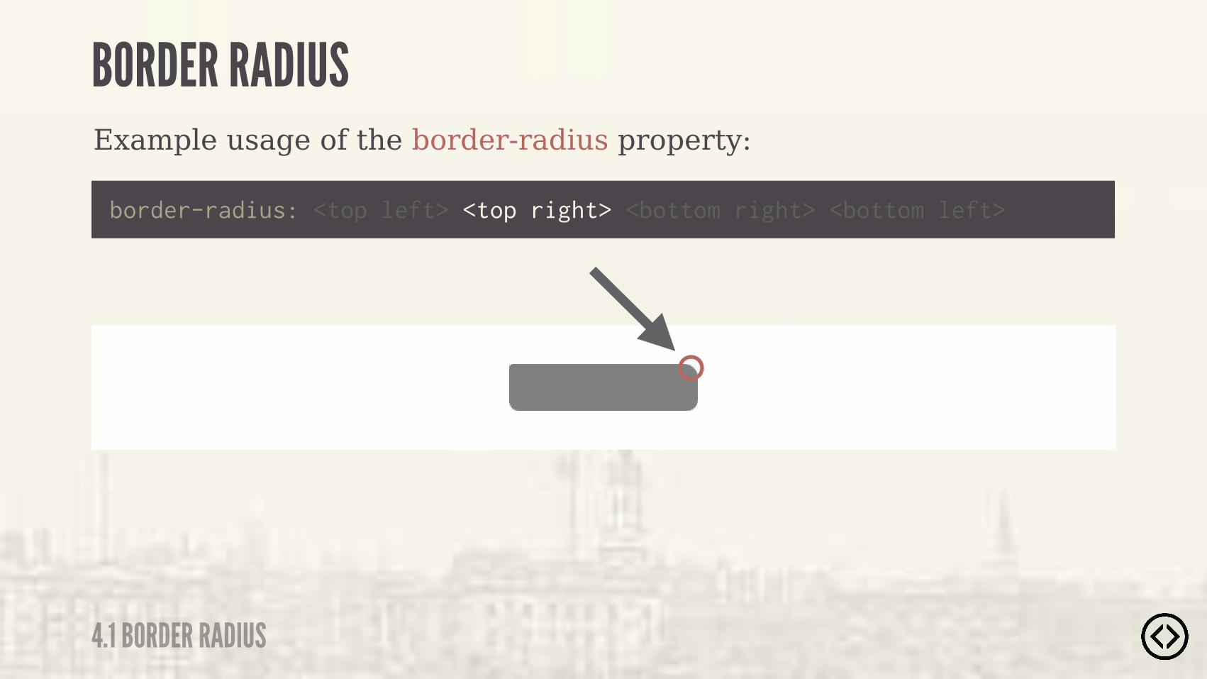
Example usage of the border-radius property:
border-radius: <top left> <top right> <bottom right> <bottom left>
BORDER RADIUS
4.1 BORDER RADIUS
Example usage of the border-radius property:
border-radius: <top left> <top right> <bottom right> <bottom left>
BORDER RADIUS
4.1 BORDER RADIUS
Example usage of the border-radius property:
border-radius: <top left> <top right> <bottom right> <bottom left>
BORDER RADIUS
4.1 BORDER RADIUS
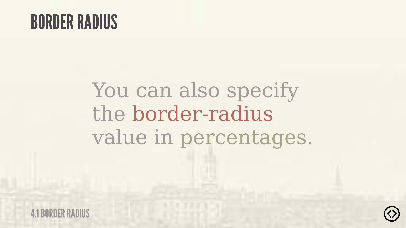
You can also specify the border-radius value in percentages.
BORDER RADIUS
4.1 BORDER RADIUS

Example usage of the border-radius property:
.box {
} border-radius: 50%;
BORDER RADIUS
4.1 BORDER RADIUS
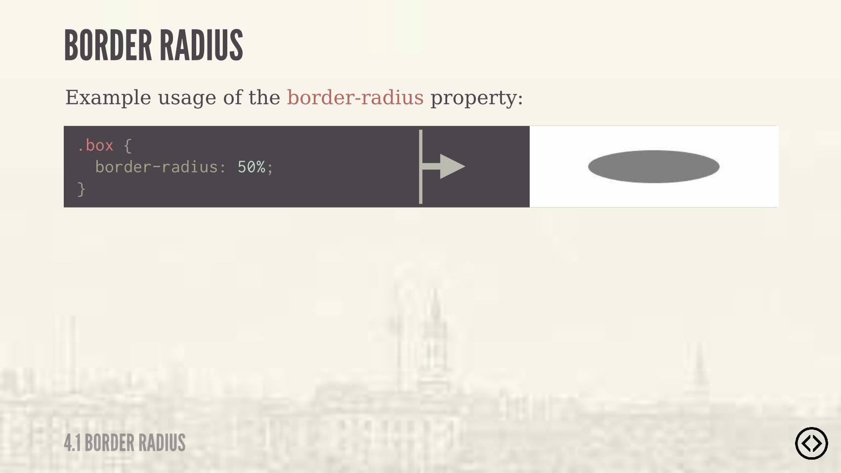
Example usage of the border-radius property:
.box {
} border-radius: 50%;
BORDER RADIUS
4.1 BORDER RADIUS

๏ Border Radius๏ Box Shadow๏ Text Shadow๏ Box Sizing
TABLE OF CONTENTS
LEVEL 4
๏ Multiple Backgrounds๏ Color๏ Opacity๏ Gradients

๏ Border Radius๏ Box Shadow๏ Text Shadow๏ Box Sizing๏ Multiple Backgrounds๏ Color๏ Opacity๏ Gradients
TABLE OF CONTENTS
LEVEL 4
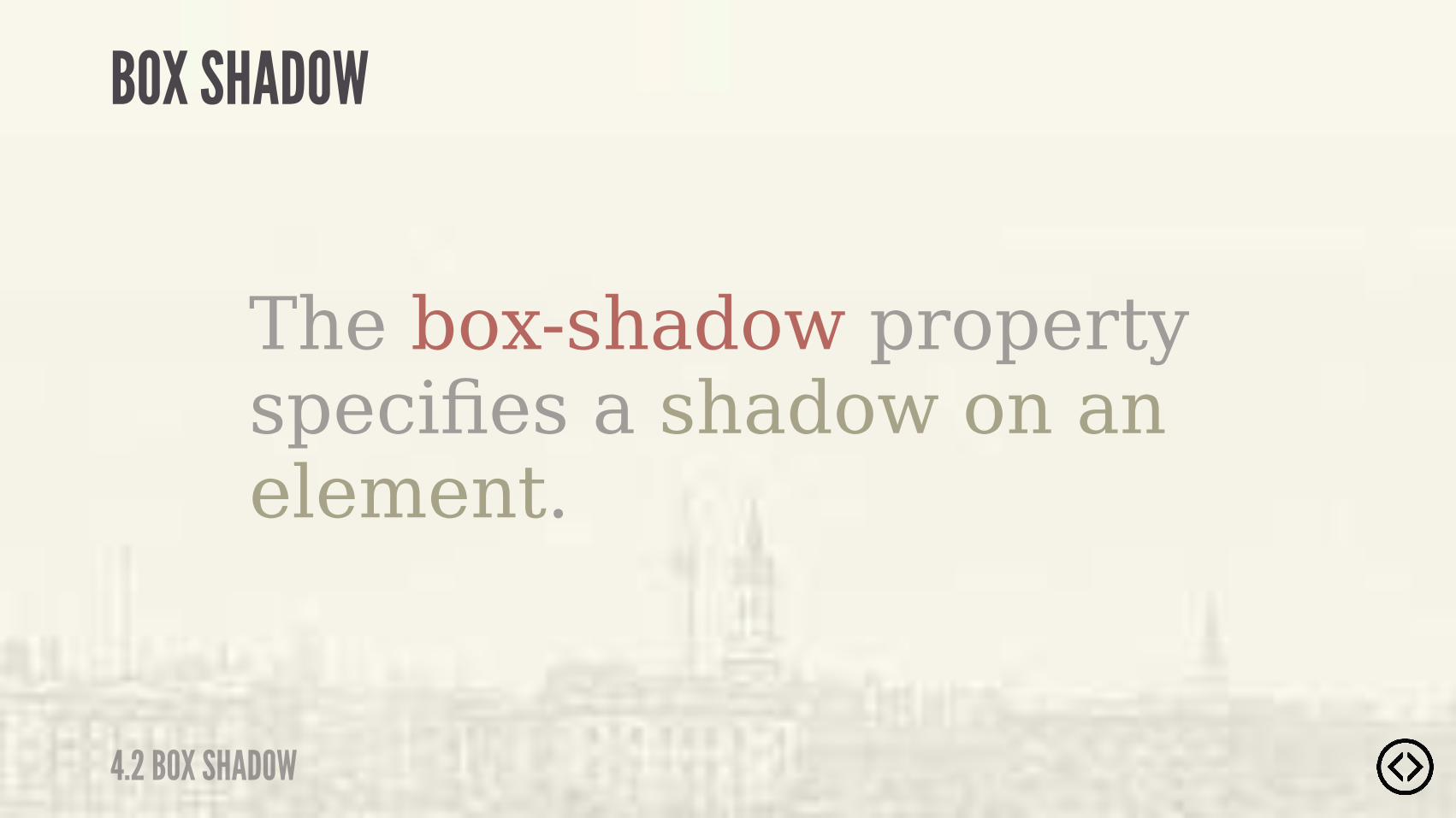
4.2 BOX SHADOW
BOX SHADOW
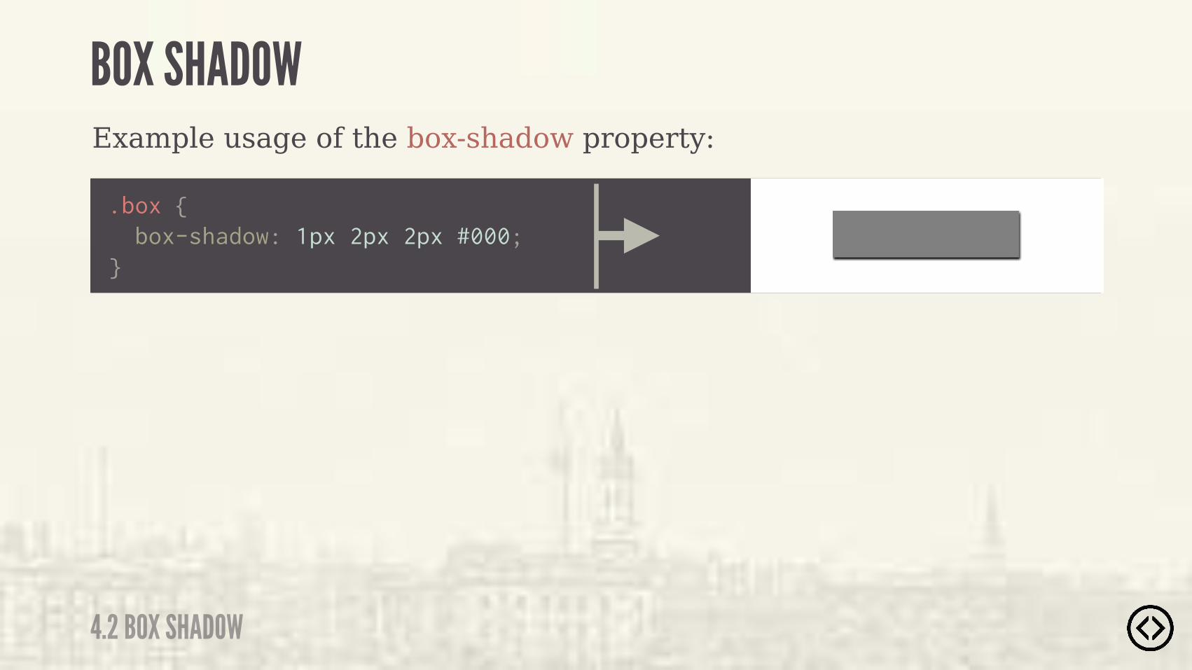
The box-shadow property specifies a shadow on an element.
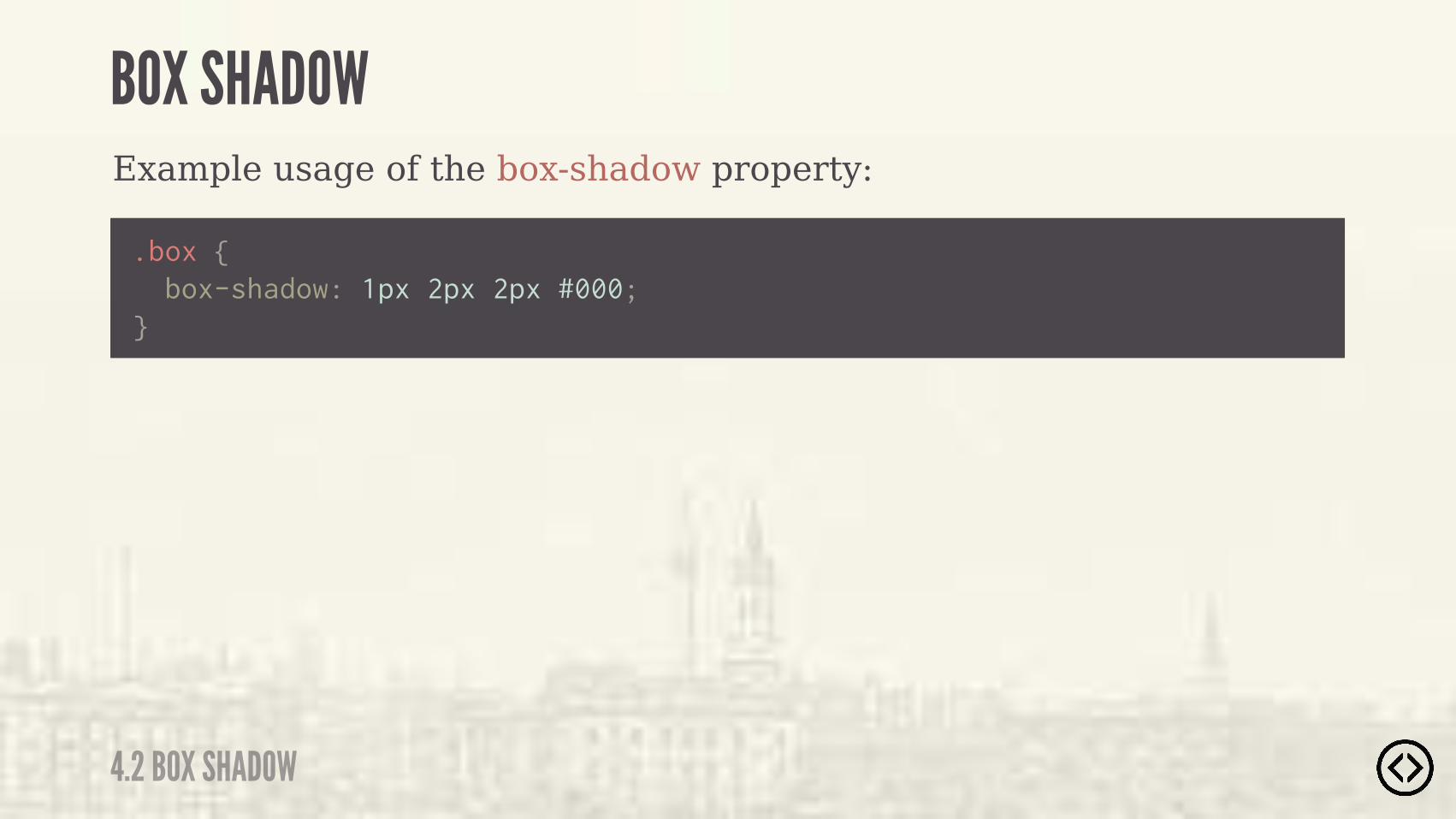
Example usage of the box-shadow property:
.box {
} box-shadow: 1px 2px 2px #000;
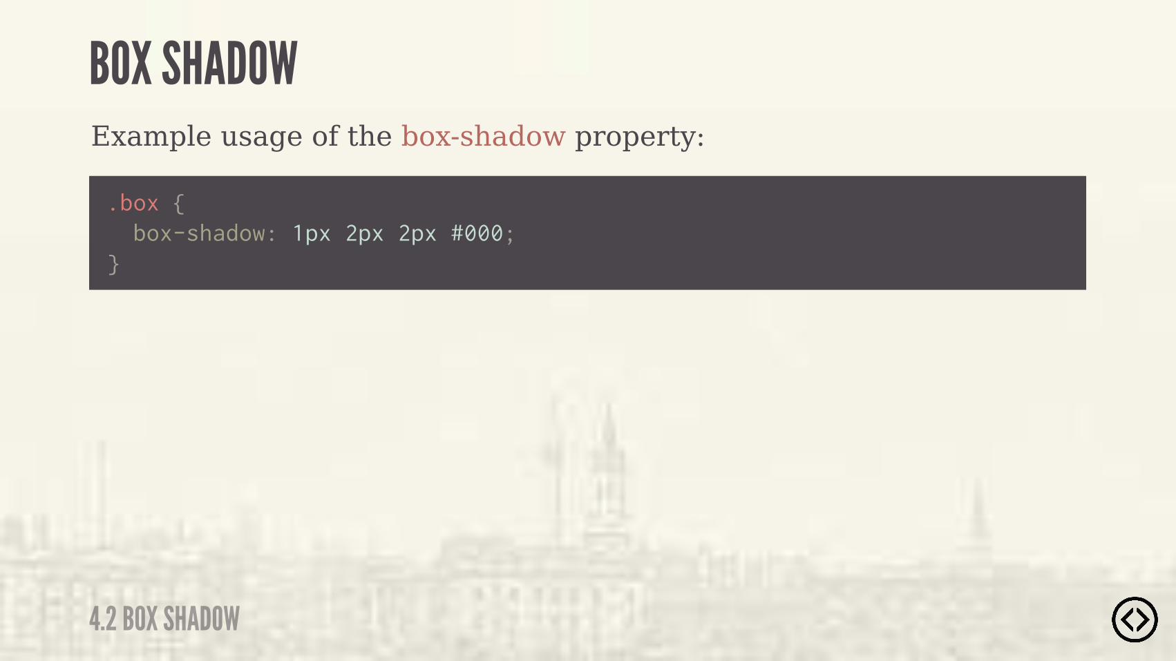
4.2 BOX SHADOW
BOX SHADOW

Example usage of the box-shadow property:
.box {
} box-shadow: 1px 2px 2px #000;
4.2 BOX SHADOW
BOX SHADOW
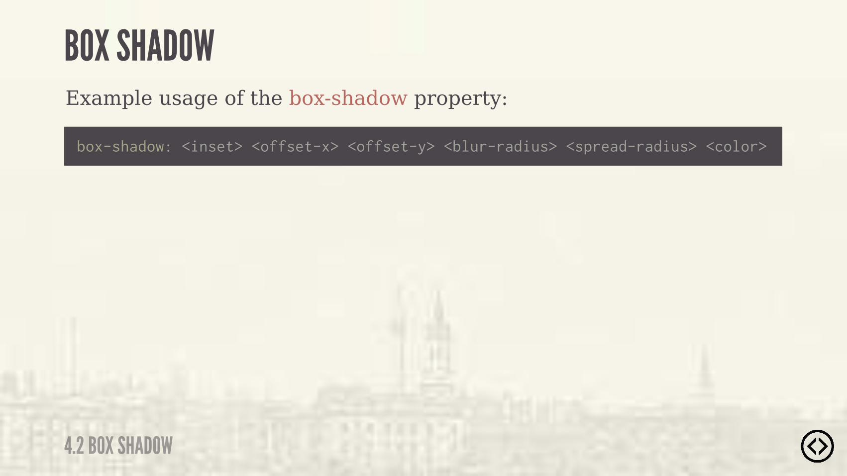
Example usage of the box-shadow property:
box-shadow: <inset> <offset-x> <offset-y> <blur-radius> <spread-radius> <color>
4.2 BOX SHADOW
BOX SHADOW
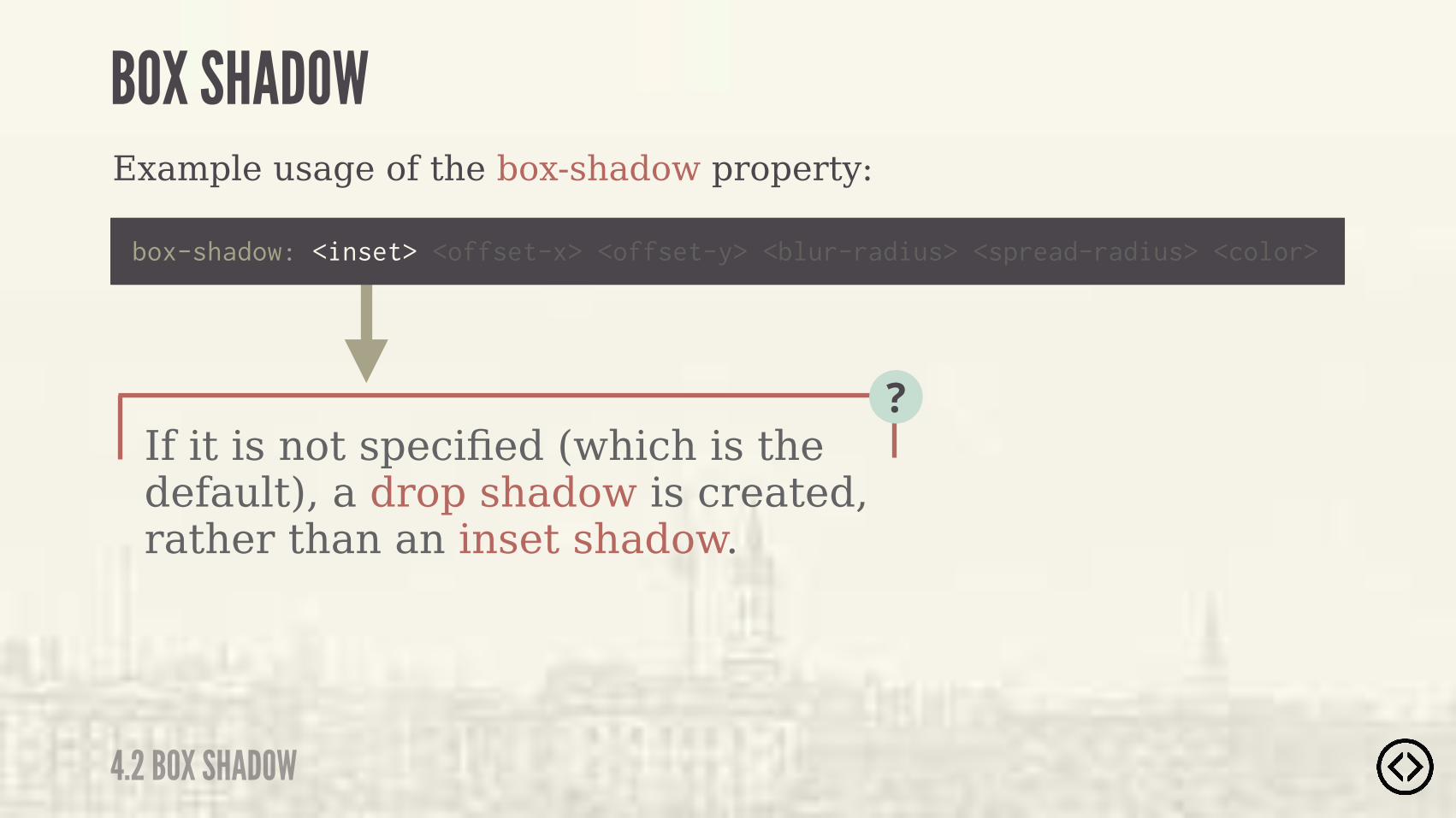
If it is not specified (which is the default), a drop shadow is created, rather than an inset shadow.
?
Example usage of the box-shadow property:
box-shadow: <inset> <offset-x> <offset-y> <blur-radius> <spread-radius> <color>
4.2 BOX SHADOW
BOX SHADOW
4.2 BOX SHADOW
BOX SHADOW
If it is not specified (which is the default), a drop shadow is created, rather than an inset shadow.
Example usage of the box-shadow property:
box-shadow: <inset> <offset-x> <offset-y> <blur-radius> <spread-radius> <color>
�� )� �%$���$%*�)�*��*�*���� ��" ��*����(�+#�$*� )�%&* %$�"�
?
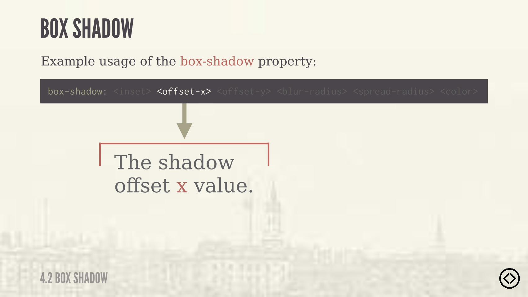
The shadow offset x value.
Example usage of the box-shadow property:
box-shadow: <inset> <offset-x> <offset-y> <blur-radius> <spread-radius> <color>
4.2 BOX SHADOW
BOX SHADOW
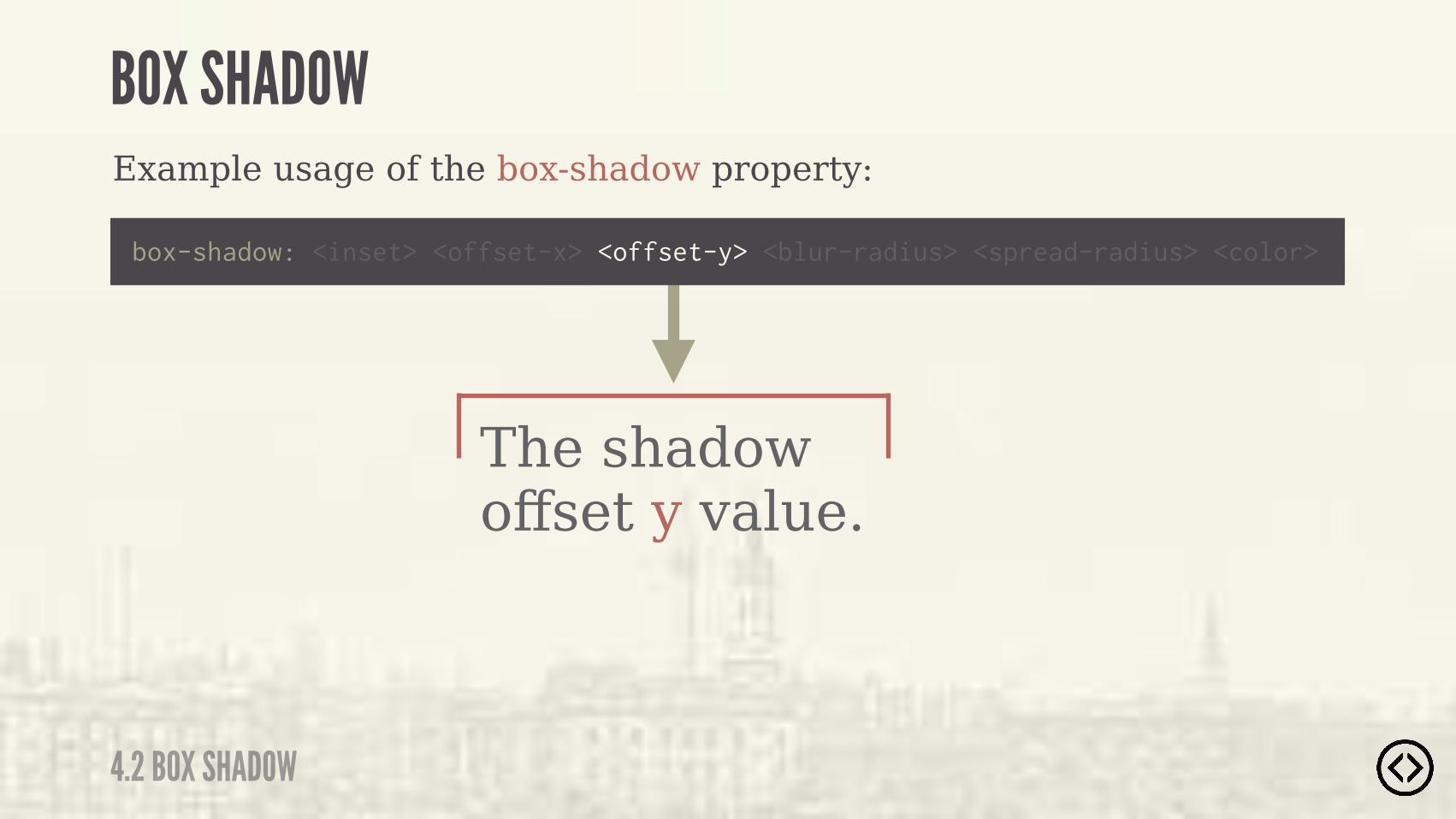
The shadow offset y value.
Example usage of the box-shadow property:
box-shadow: <inset> <offset-x> <offset-y> <blur-radius> <spread-radius> <color>
4.2 BOX SHADOW
BOX SHADOW

The blur-radius alters the blur amount of the shadow, causing it to become bigger and lighter (with a larger value).
?
Example usage of the box-shadow property:
box-shadow: <inset> <offset-x> <offset-y> <blur-radius> <spread-radius> <color>
4.2 BOX SHADOW
BOX SHADOW
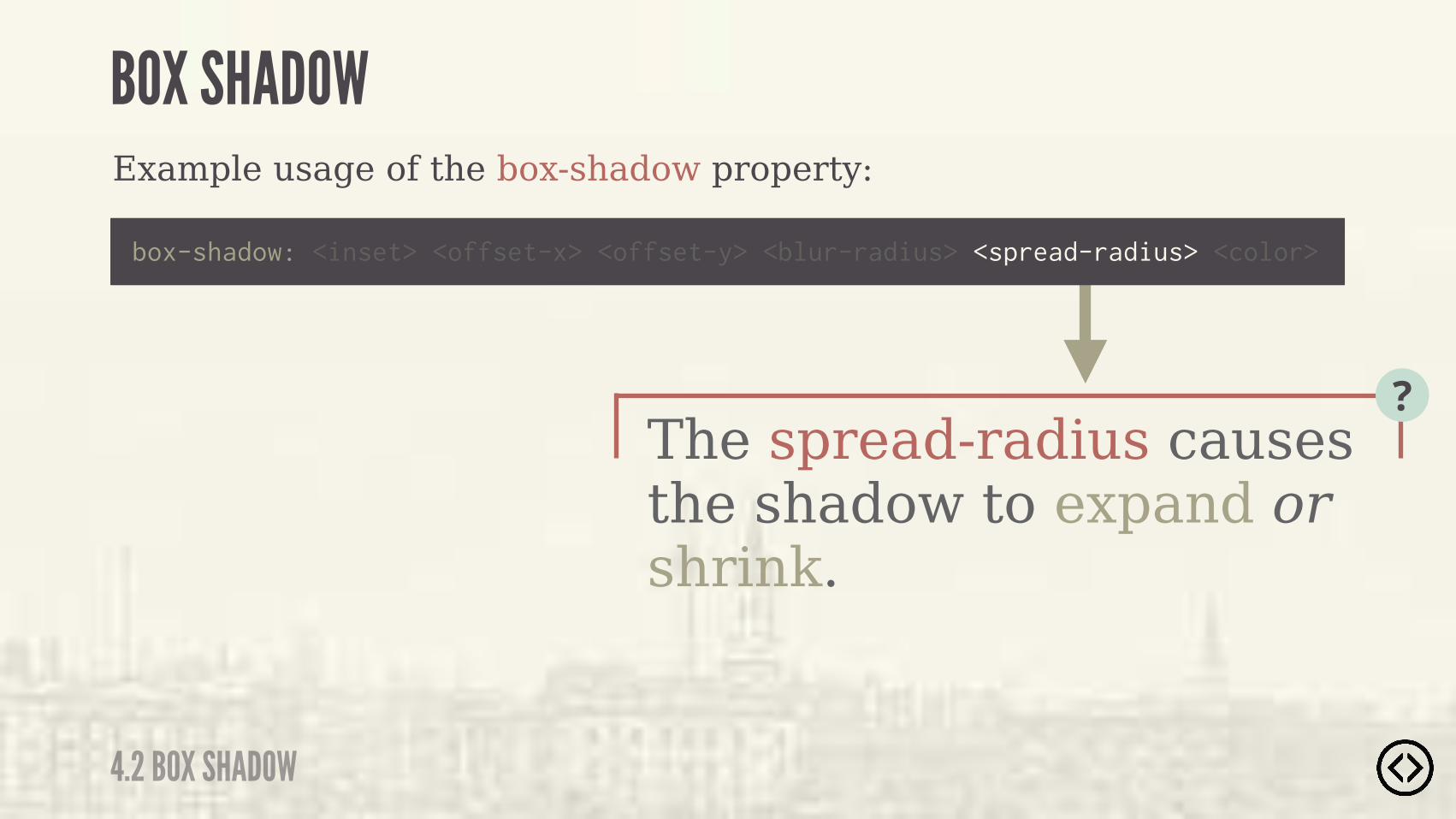
The spread-radius causes the shadow to expand or shrink.
?
Example usage of the box-shadow property:
box-shadow: <inset> <offset-x> <offset-y> <blur-radius> <spread-radius> <color>
4.2 BOX SHADOW
BOX SHADOW
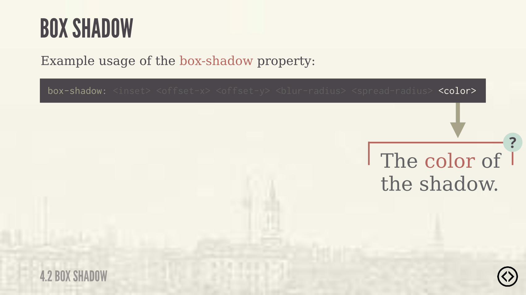
The color of the shadow.
?
Example usage of the box-shadow property:
box-shadow: <inset> <offset-x> <offset-y> <blur-radius> <spread-radius> <color>
4.2 BOX SHADOW
BOX SHADOW
Example usage of the box-shadow property:
.box {
} box-shadow: 1px 2px 2px #000;
4.2 BOX SHADOW
BOX SHADOW

Example usage of the box-shadow property:
.box {
} box-shadow: 1px 2px 2px #000;
No inset value is specified, so this is a drop shadow.
4.2 BOX SHADOW
BOX SHADOW
Example usage of the box-shadow property:
.box {
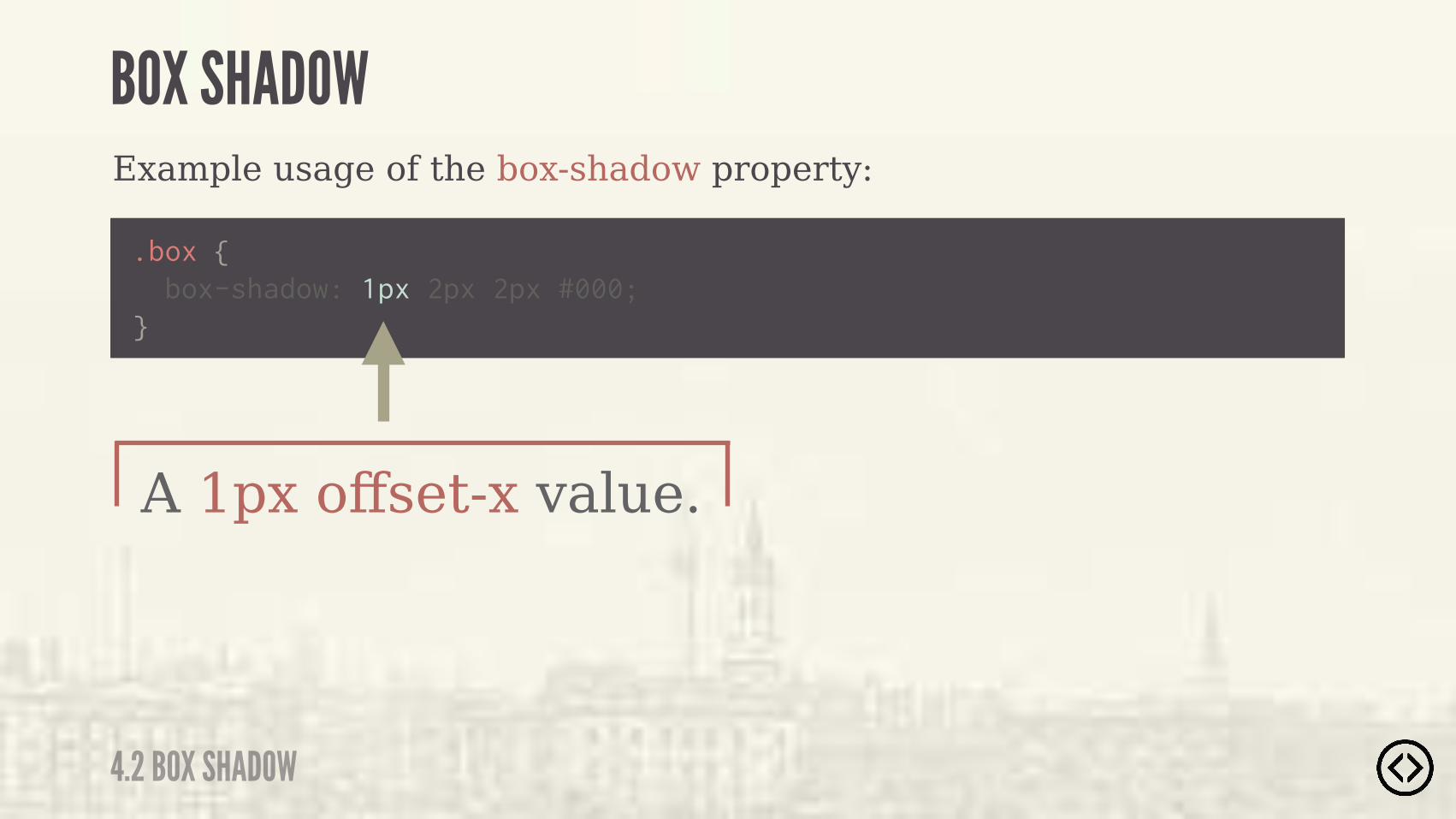
} box-shadow: 1px 2px 2px #000;
A 1px offset-x value.
4.2 BOX SHADOW
BOX SHADOW
Example usage of the box-shadow property:
.box {
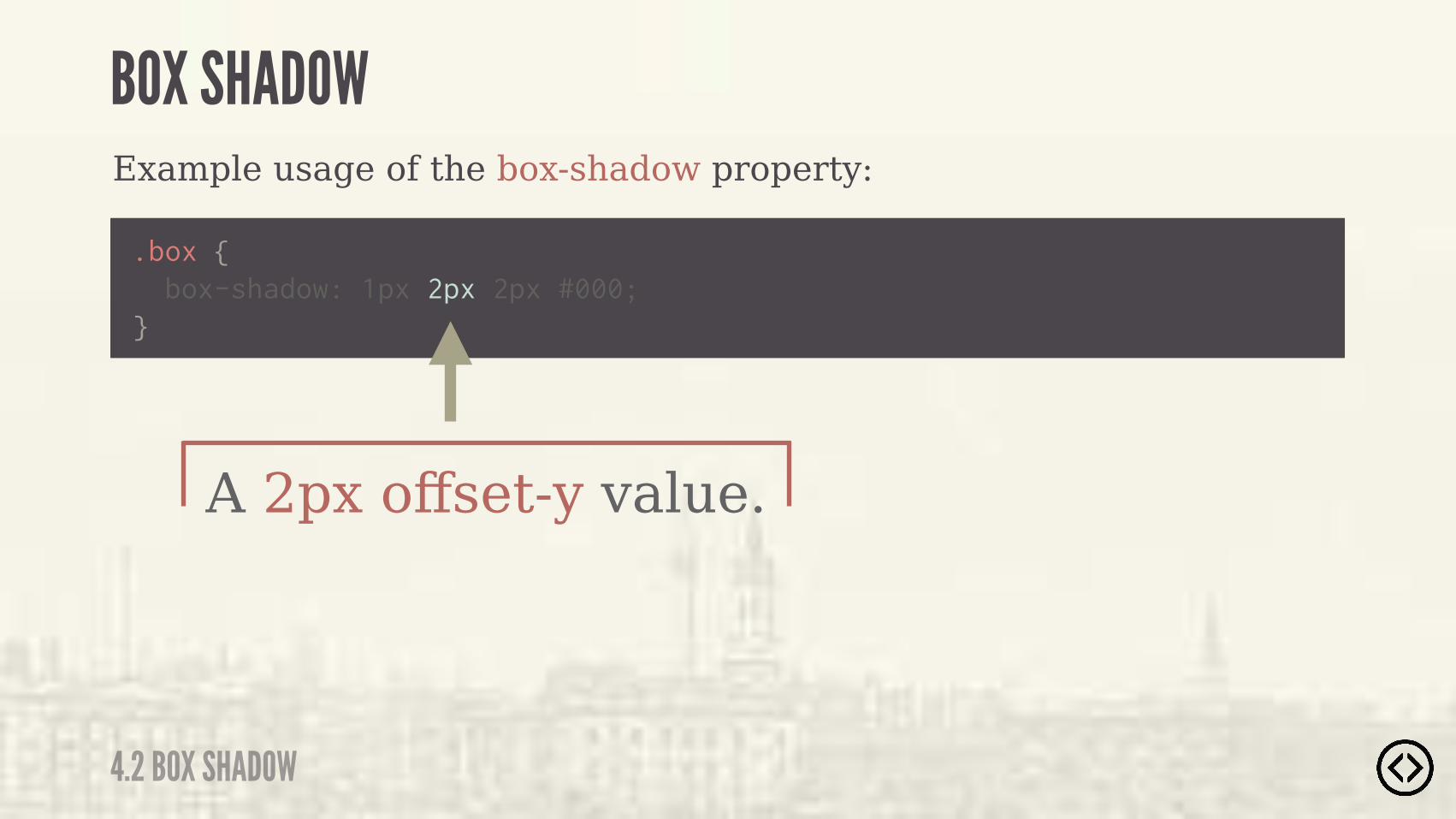
} box-shadow: 1px 2px 2px #000;
A 2px offset-y value.
4.2 BOX SHADOW
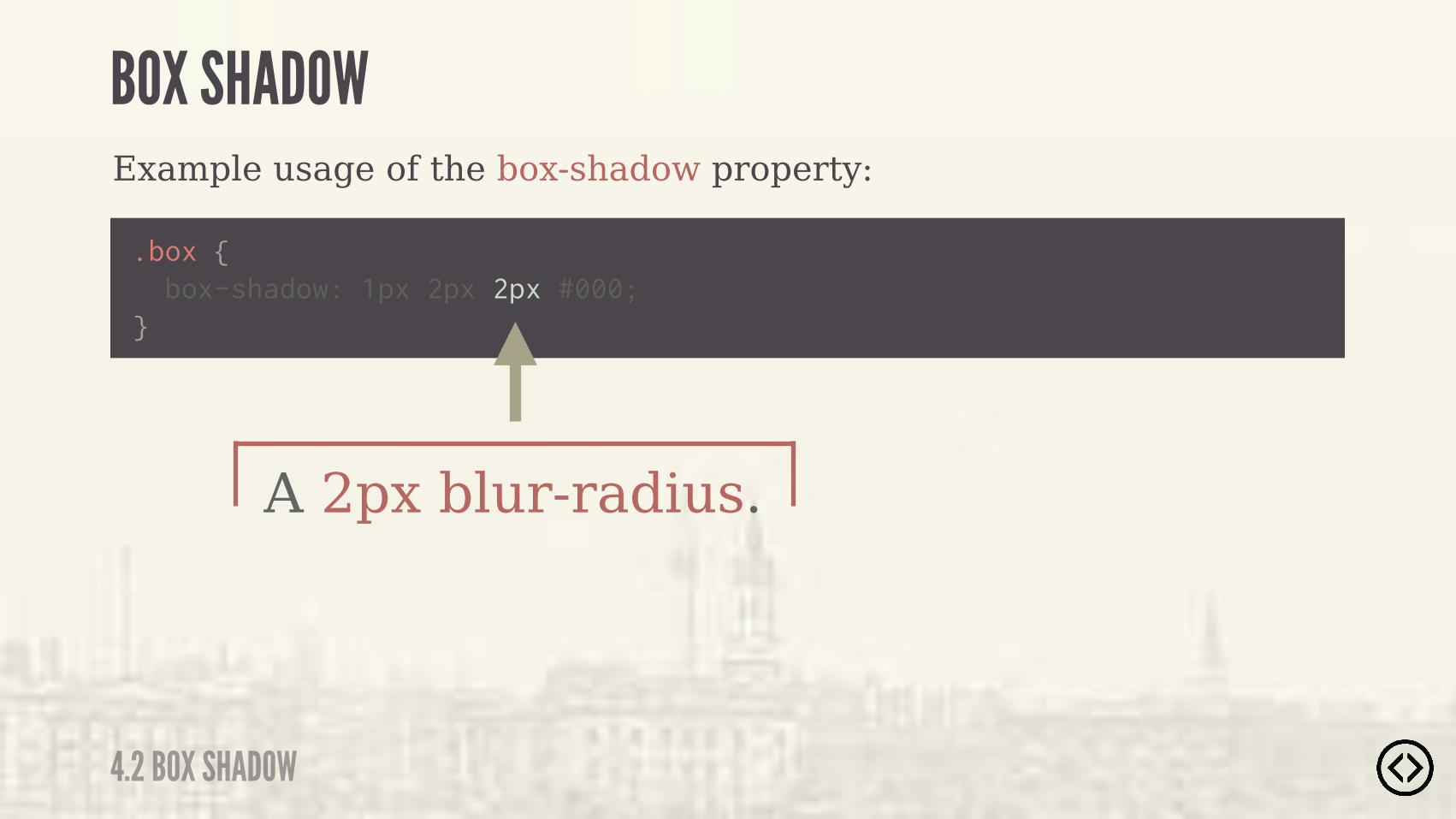
BOX SHADOW
.box {
} box-shadow: 1px 2px 2px #000;
A 2px blur-radius.
Example usage of the box-shadow property:
4.2 BOX SHADOW
BOX SHADOW
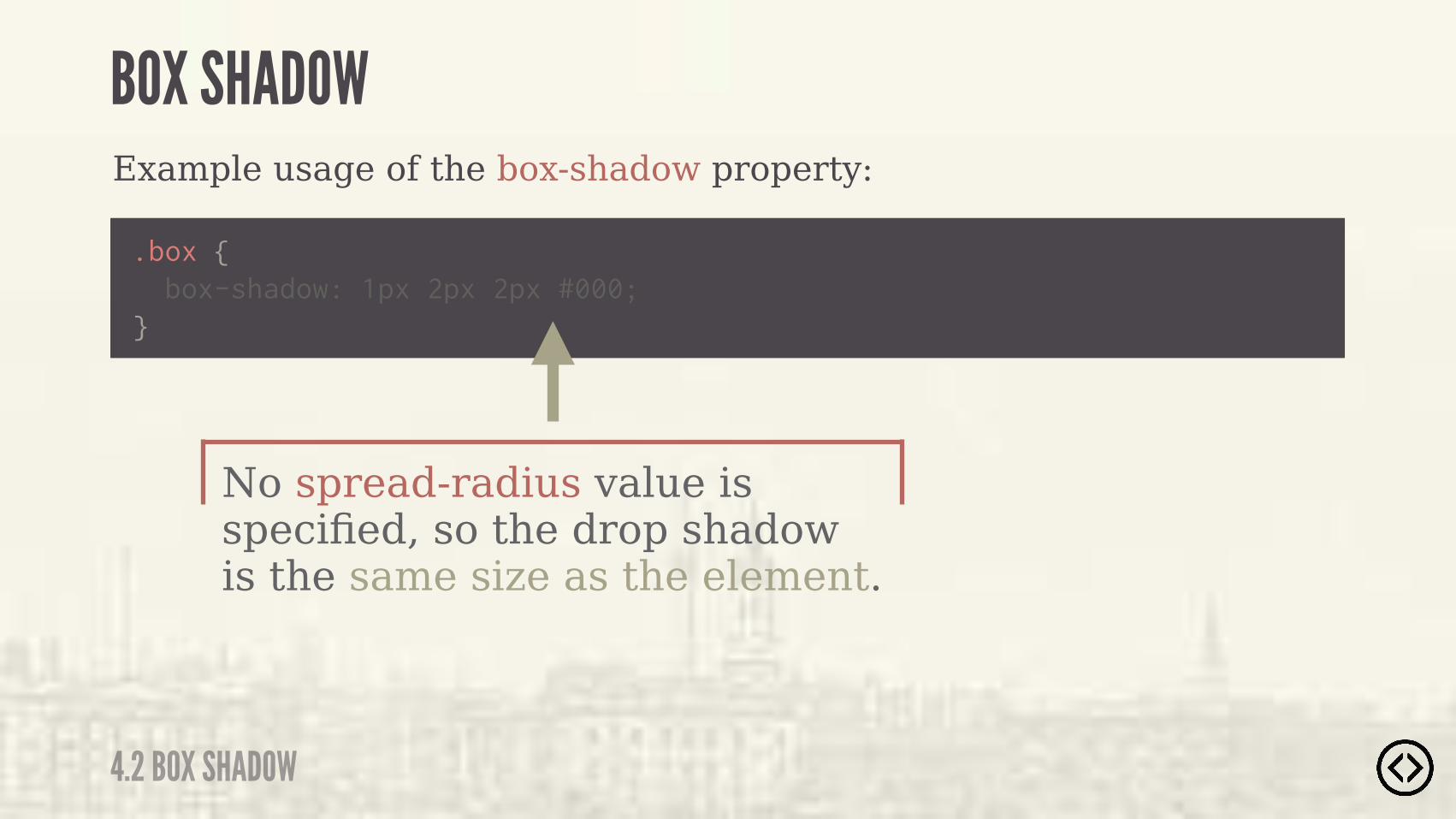
.box {
} box-shadow: 1px 2px 2px #000;
Example usage of the box-shadow property:
No spread-radius value is specified, so the drop shadow is the same size as the element.
4.2 BOX SHADOW
BOX SHADOW

.box {
} box-shadow: 1px 2px 2px #000;
Example usage of the box-shadow property:
The drop shadow color is black.
4.2 BOX SHADOW
BOX SHADOW
.box {
} box-shadow: 1px 2px 2px #000;
Example usage of the box-shadow property:
4.2 BOX SHADOW
BOX SHADOW
What if we wanted the blur-radius value to instead be the spread-radius?
4.2 BOX SHADOW
BOX SHADOW
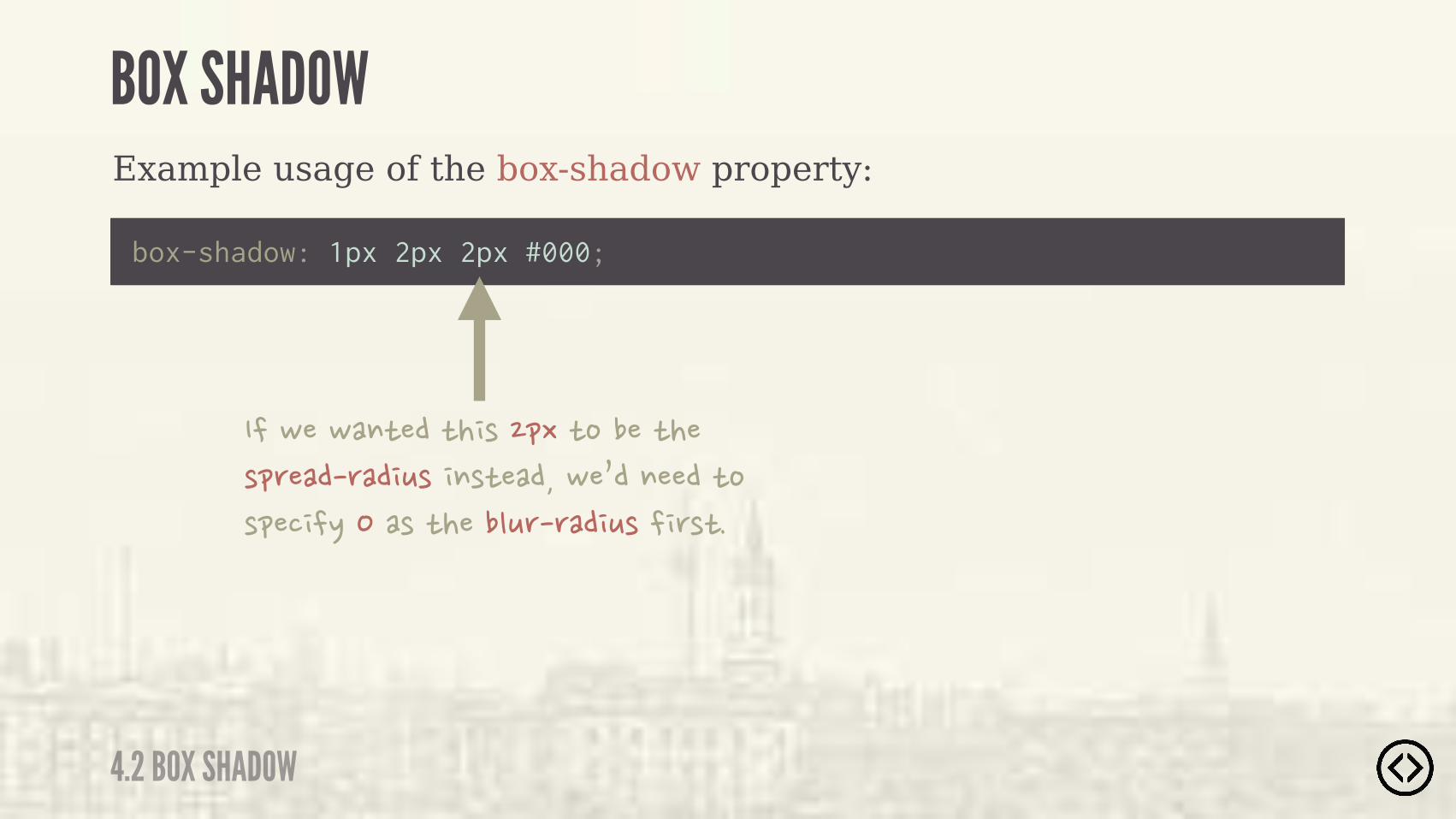
Example usage of the box-shadow property:
box-shadow: 1px 2px 2px #000;
4.2 BOX SHADOW
BOX SHADOW
���-��-�$*���*� )�&.�*%����*���)&(����(�� +)� $)*�����-�0��$����*%�)&�� �/����)�*����"+(�(�� +)�� ()*�
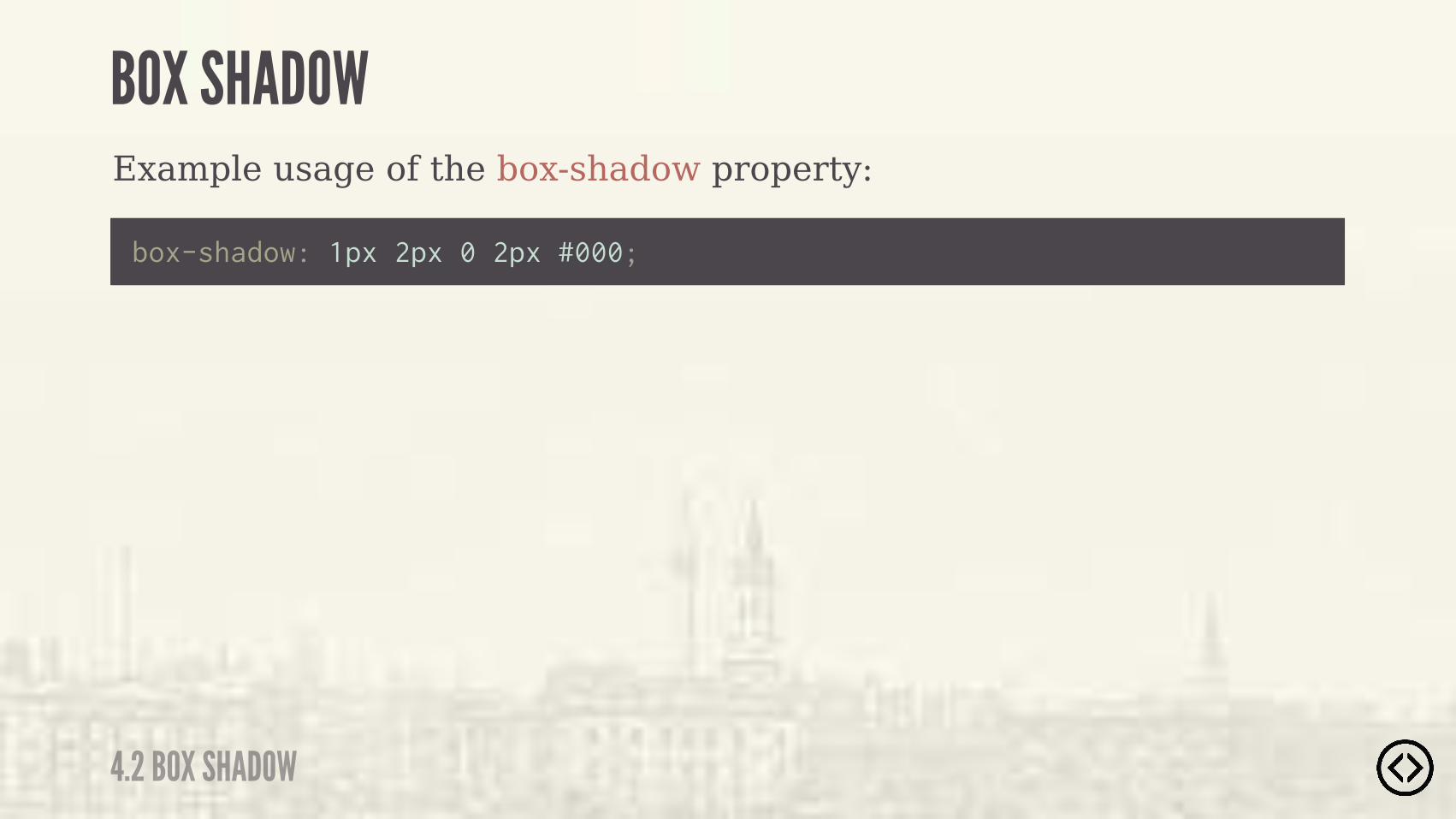
Example usage of the box-shadow property:
box-shadow: 1px 2px 0 2px #000;
4.2 BOX SHADOW
BOX SHADOW
Example usage of the box-shadow property:
box-shadow: 1px 2px 0 2px #000;
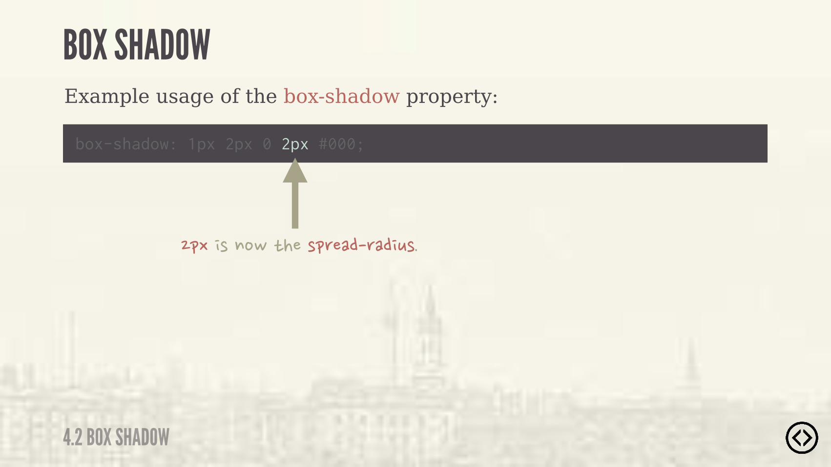
4.2 BOX SHADOW
BOX SHADOW
&.� )�$%-�*���)&(����(�� +)�
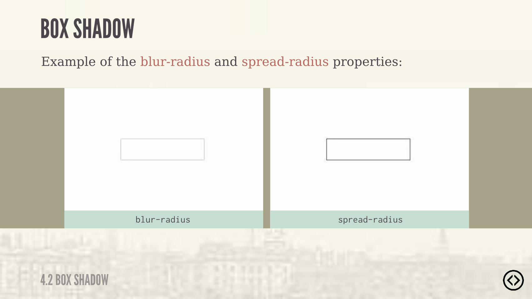
Example of the blur-radius and spread-radius properties:
4.2 BOX SHADOW
BOX SHADOW
blur-radius spread-radius
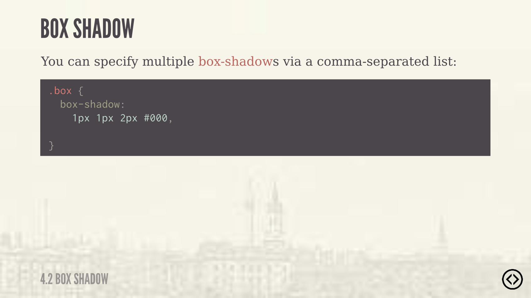
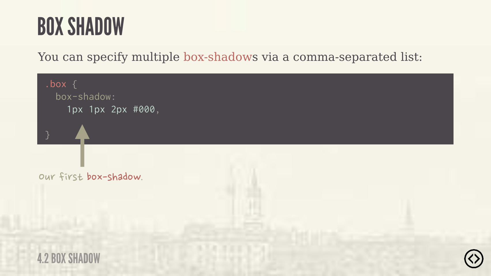
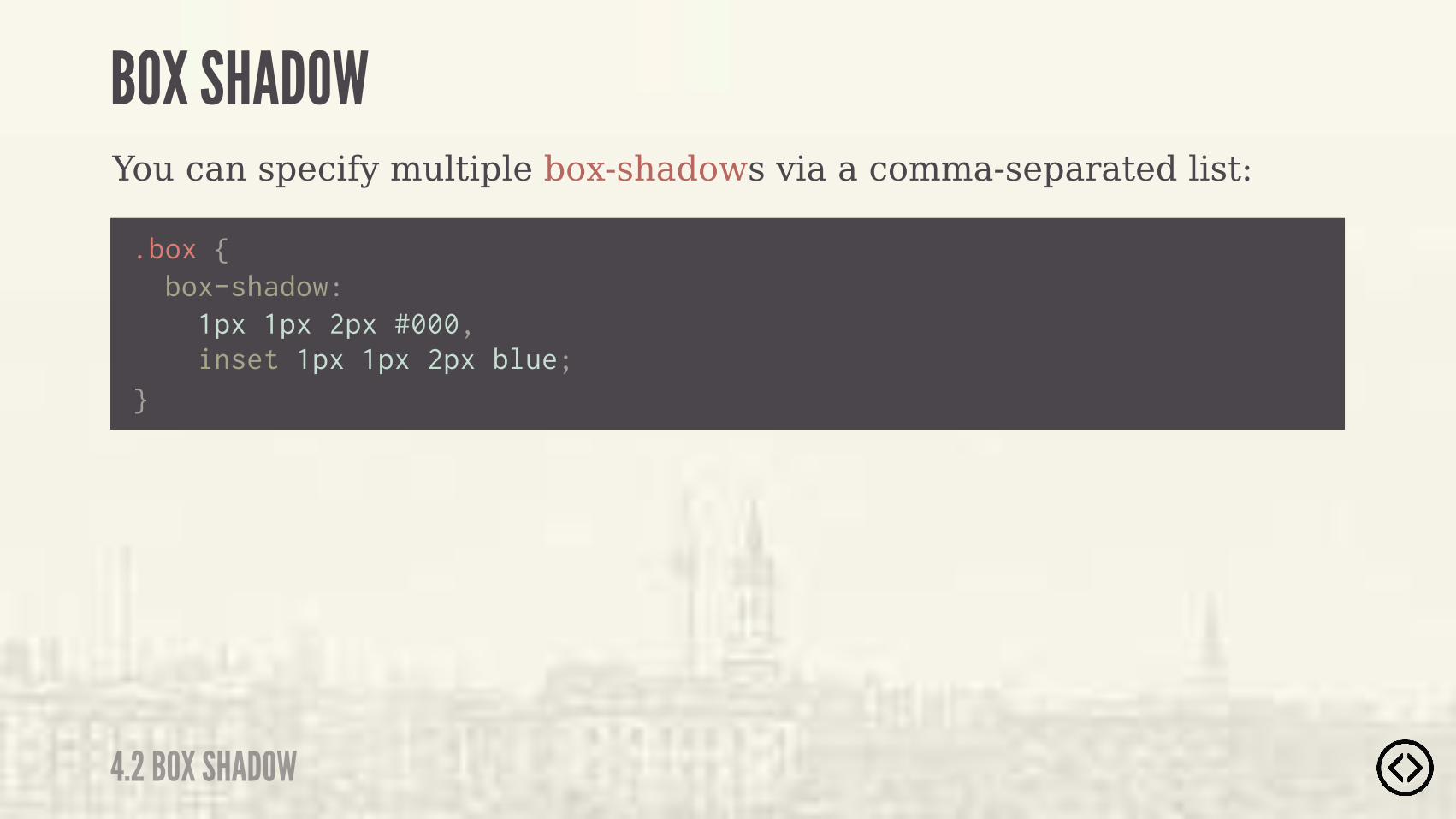
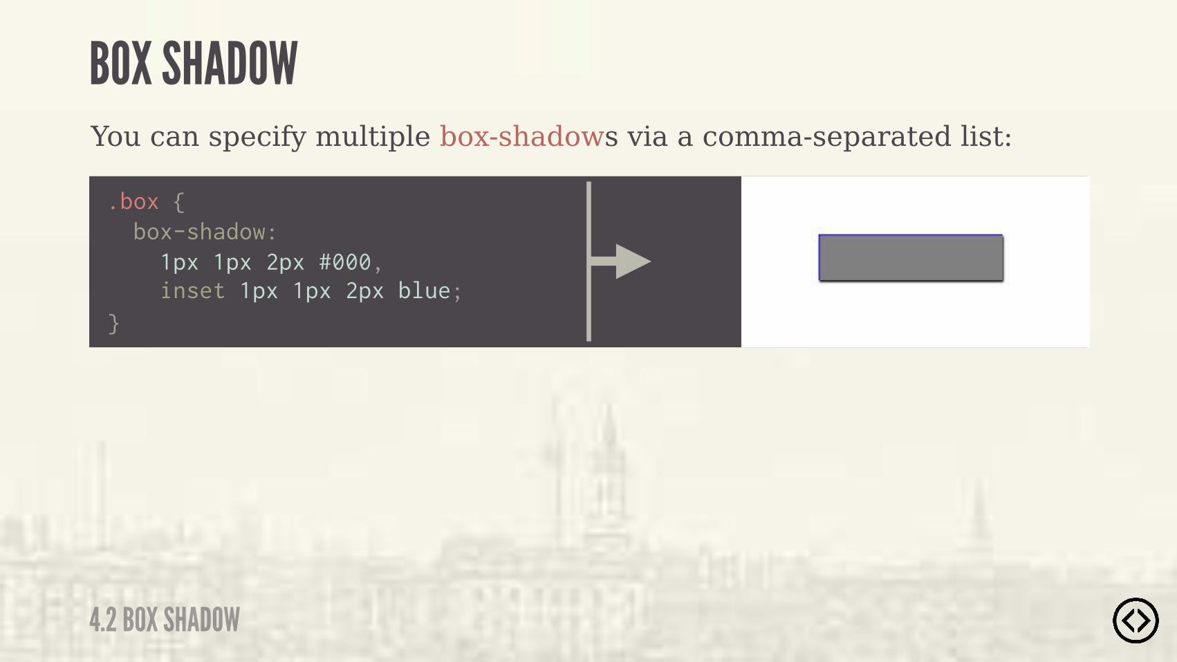
You can specify multiple box-shadows via a comma-separated list:
.box {
}
box-shadow: 1px 1px 2px #000,
4.2 BOX SHADOW
BOX SHADOW
You can specify multiple box-shadows via a comma-separated list:
.box {
}
box-shadow: 1px 1px 2px #000,
�+(�� ()*��%.�)���%-�
4.2 BOX SHADOW
BOX SHADOW
You can specify multiple box-shadows via a comma-separated list:
.box {
}
box-shadow: 1px 1px 2px #000, inset 1px 1px 2px blue;
4.2 BOX SHADOW
BOX SHADOW
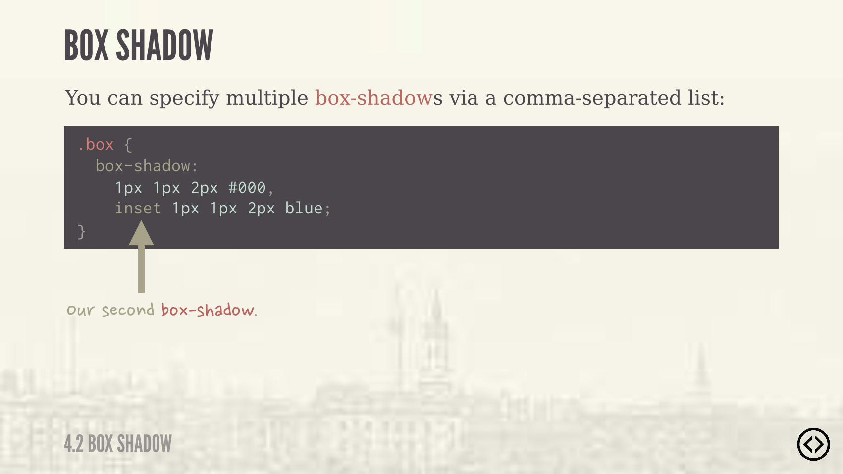
You can specify multiple box-shadows via a comma-separated list:
.box {
}
box-shadow: 1px 1px 2px #000, inset 1px 1px 2px blue;
�+(�)��%$���%.�)���%-�
4.2 BOX SHADOW
BOX SHADOW
You can specify multiple box-shadows via a comma-separated list:
.box {
}
box-shadow: 1px 1px 2px #000, inset 1px 1px 2px blue;
4.2 BOX SHADOW
BOX SHADOW
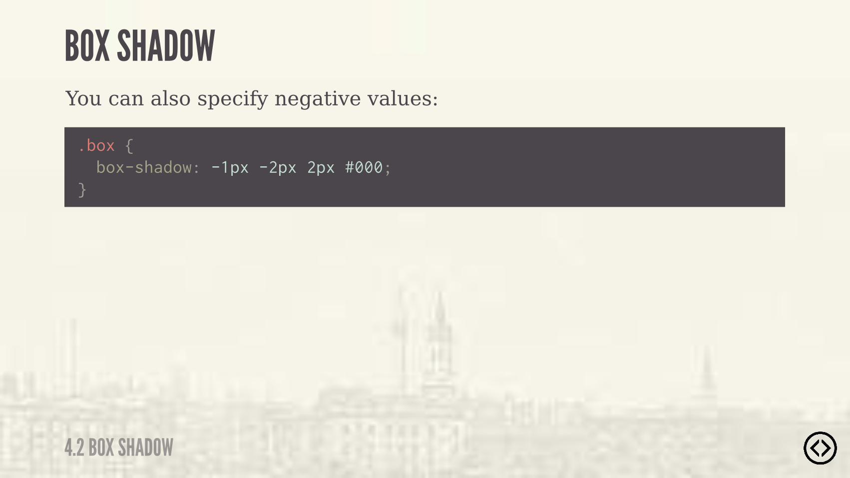
You can also specify negative values:
4.2 BOX SHADOW
BOX SHADOW
.box { } box-shadow: -1px -2px 2px #000;
.box { } box-shadow: -1px -2px 2px #000;
You can also specify negative values:
4.2 BOX SHADOW
BOX SHADOW

๏ Border Radius๏ Box Shadow๏ Text Shadow๏ Box Sizing
TABLE OF CONTENTS
LEVEL 4
๏ Multiple Backgrounds๏ Color๏ Opacity๏ Gradients

๏ Border Radius๏ Box Shadow๏ Text Shadow๏ Box Sizing๏ Multiple Backgrounds๏ Color๏ Opacity๏ Gradients
TABLE OF CONTENTS
LEVEL 4
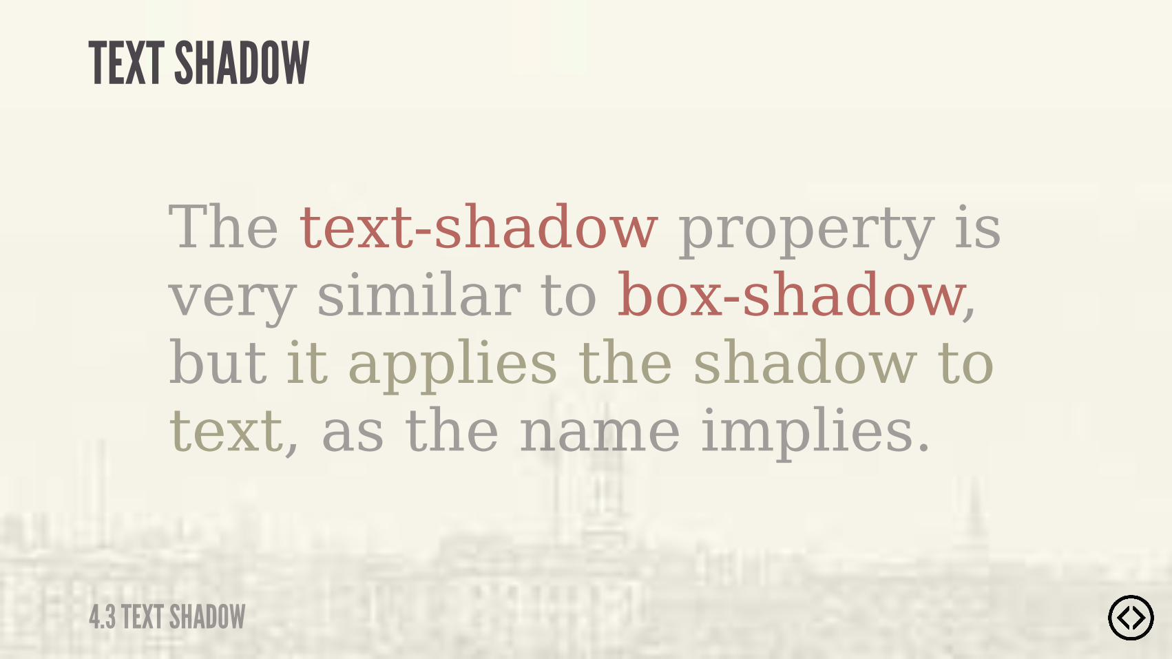
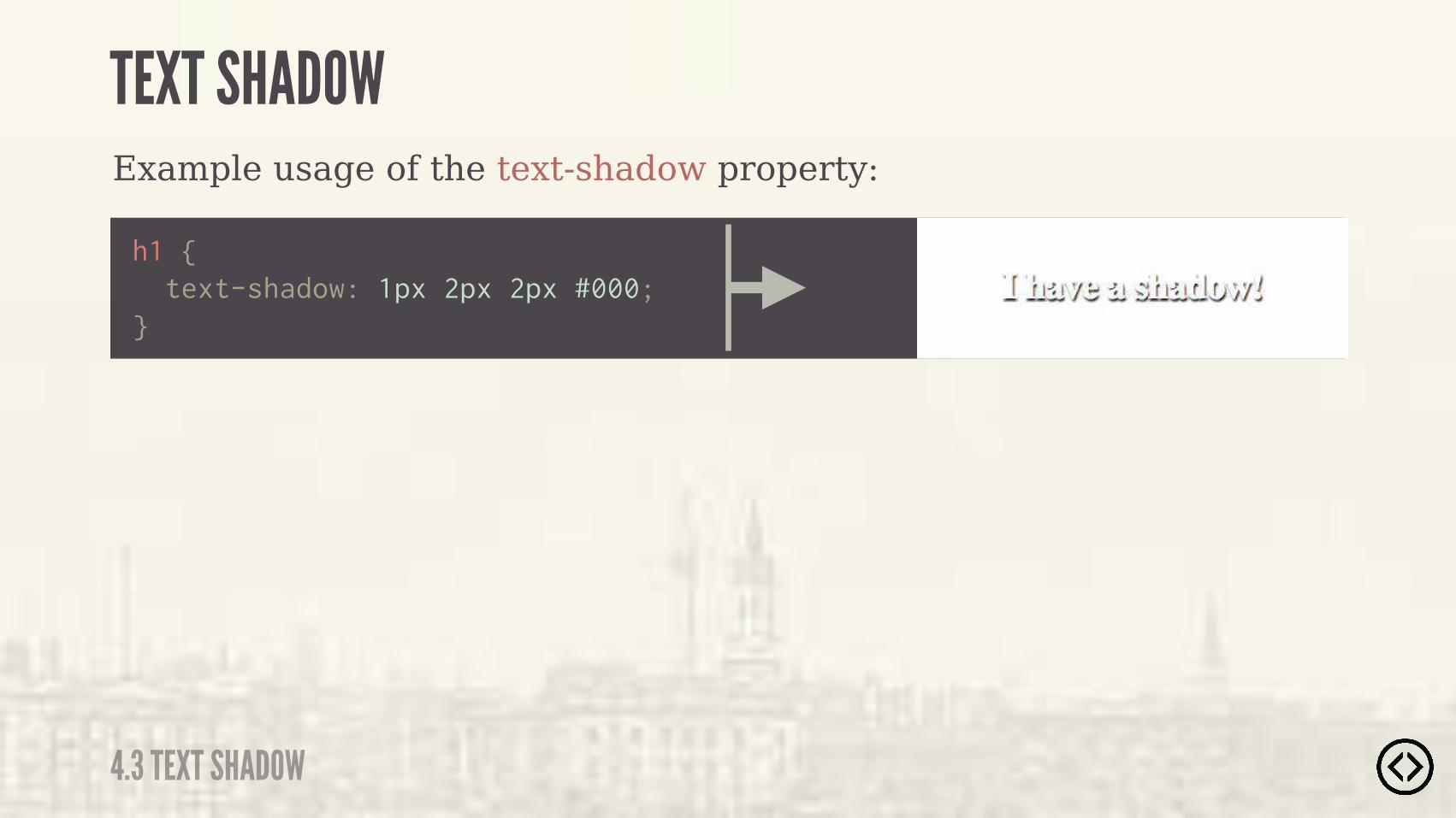
The text-shadow property is very similar to box-shadow, but it applies the shadow to text, as the name implies.
TEXT SHADOW
4.3 TEXT SHADOW
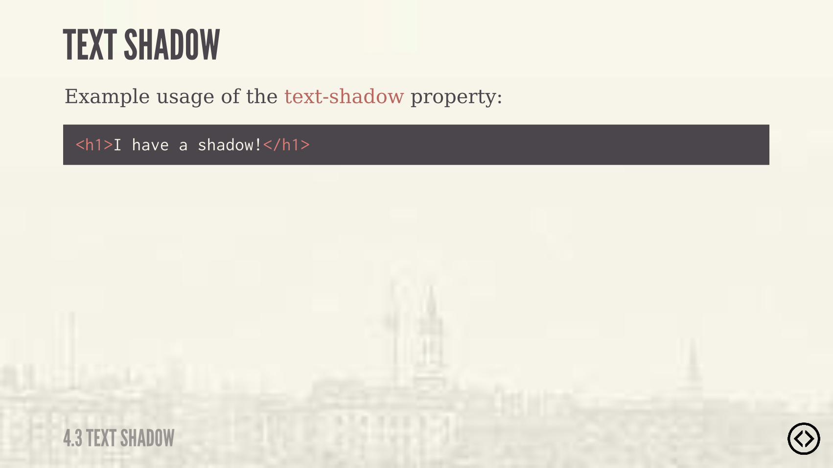
Example usage of the text-shadow property:
<h1>I have a shadow!</h1>
TEXT SHADOW
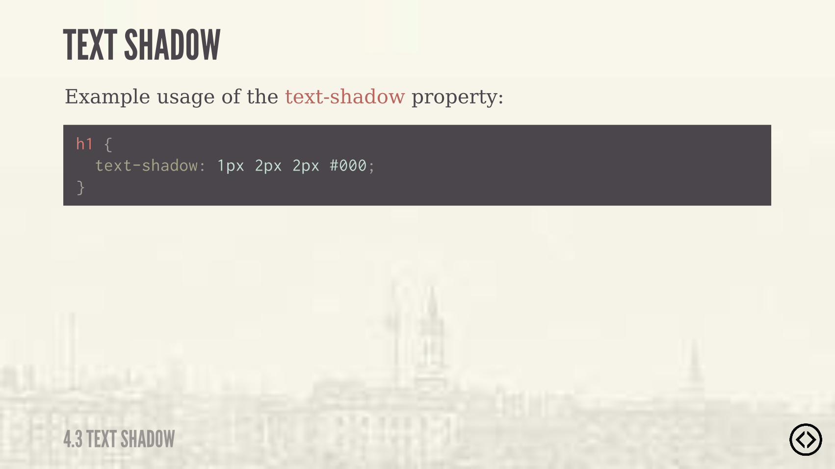
4.3 TEXT SHADOW

Example usage of the text-shadow property:
h1 { text-shadow: 1px 2px 2px #000;}
TEXT SHADOW
4.3 TEXT SHADOW

Example usage of the text-shadow property:
h1 { text-shadow: 1px 2px 2px #000;}
TEXT SHADOW
4.3 TEXT SHADOW

Example usage of the text-shadow property:
text-shadow: <offset-x> <offset-y> <blur-radius> <color>
TEXT SHADOW
4.3 TEXT SHADOW
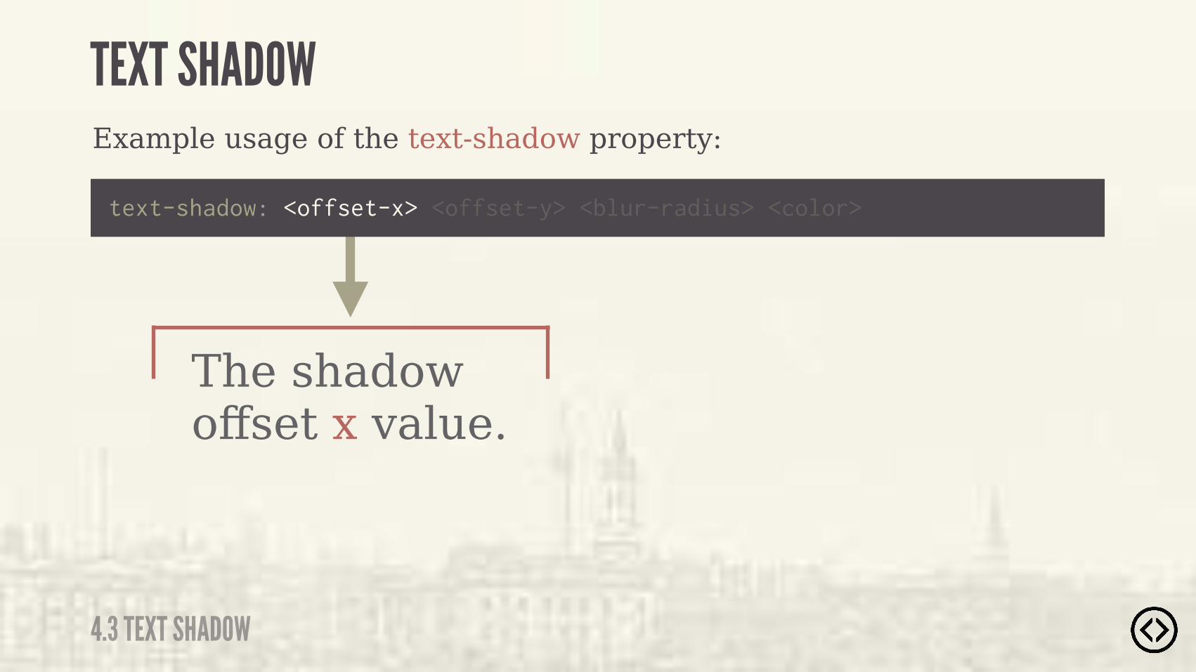
The shadow offset x value.
Example usage of the text-shadow property:
text-shadow: <offset-x> <offset-y> <blur-radius> <color>
TEXT SHADOW
4.3 TEXT SHADOW
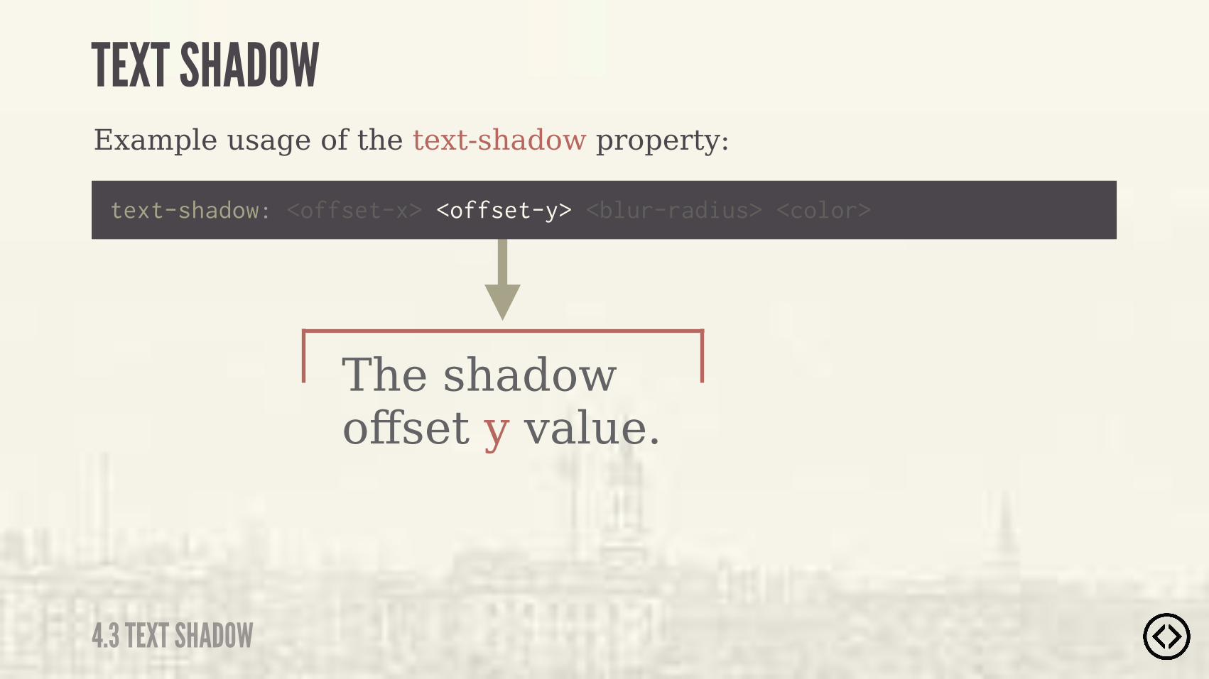
The shadow offset y value.
Example usage of the text-shadow property:
text-shadow: <offset-x> <offset-y> <blur-radius> <color>
TEXT SHADOW
4.3 TEXT SHADOW
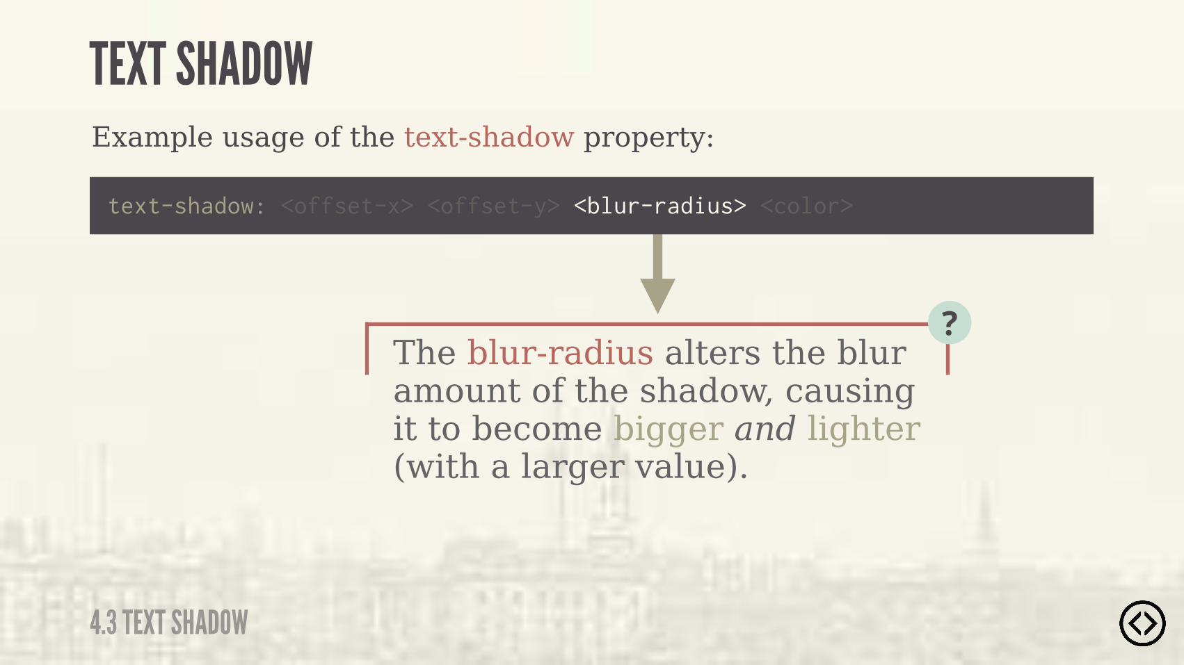
The blur-radius alters the blur amount of the shadow, causing it to become bigger and lighter (with a larger value).
?
Example usage of the text-shadow property:
text-shadow: <offset-x> <offset-y> <blur-radius> <color>
TEXT SHADOW
4.3 TEXT SHADOW
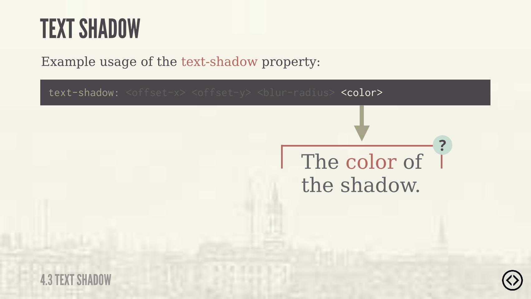
The color of the shadow.
?
Example usage of the text-shadow property:
text-shadow: <offset-x> <offset-y> <blur-radius> <color>
TEXT SHADOW
4.3 TEXT SHADOW
Example usage of the text-shadow property:
h1 { text-shadow: 1px 2px 2px #000;}
TEXT SHADOW
4.3 TEXT SHADOW

Example usage of the text-shadow property:
h1 { text-shadow: 1px 2px 2px #000;}
A 1px offset-x value.
TEXT SHADOW
4.3 TEXT SHADOW

Example usage of the text-shadow property:
h1 { text-shadow: 1px 2px 2px #000;}
A 2px offset-y value.
TEXT SHADOW
4.3 TEXT SHADOW
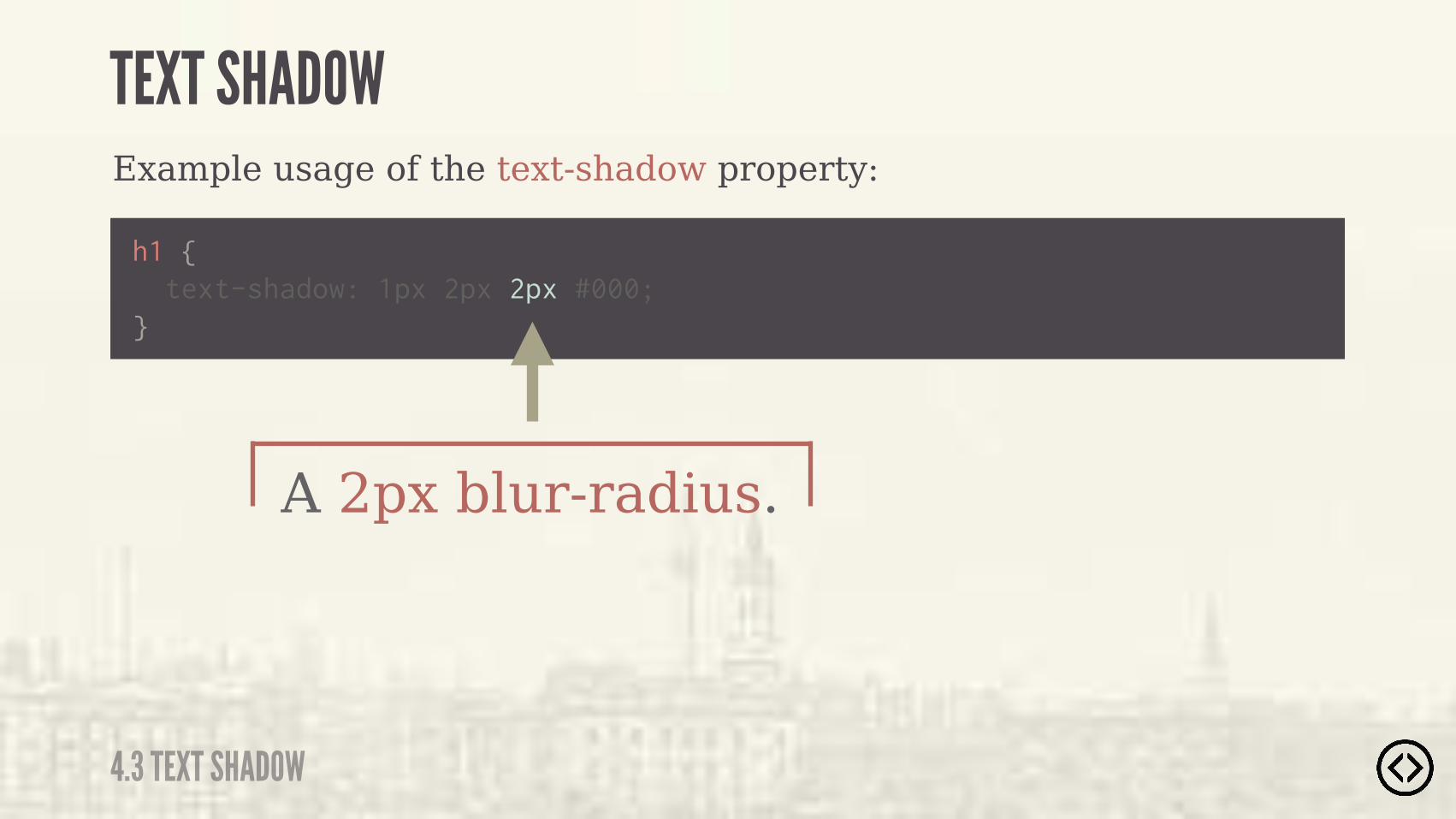
Example usage of the text-shadow property:
h1 { text-shadow: 1px 2px 2px #000;}
A 2px blur-radius.
TEXT SHADOW
4.3 TEXT SHADOW
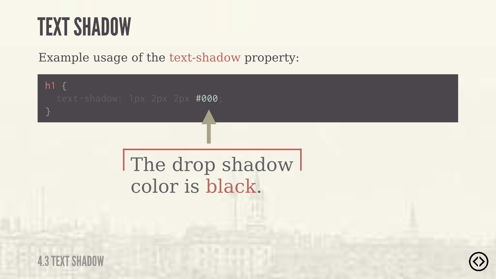
Example usage of the text-shadow property:
h1 { text-shadow: 1px 2px 2px #000;}
The drop shadow color is black.
TEXT SHADOW
4.3 TEXT SHADOW
Example usage of the text-shadow property:
h1 { text-shadow: 1px 2px 2px #000;}
TEXT SHADOW
4.3 TEXT SHADOW

๏ Border Radius๏ Box Shadow๏ Text Shadow๏ Box Sizing
TABLE OF CONTENTS
LEVEL 4
๏ Multiple Backgrounds๏ Color๏ Opacity๏ Gradients

๏ Border Radius๏ Box Shadow๏ Text Shadow๏ Box Sizing๏ Multiple Backgrounds๏ Color๏ Opacity๏ Gradients
TABLE OF CONTENTS
LEVEL 4
The box-sizing property is used to change the default CSS box model, which is used to calculate widths and heights of given elements.
BOX SIZING
4.4 BOX SIZING
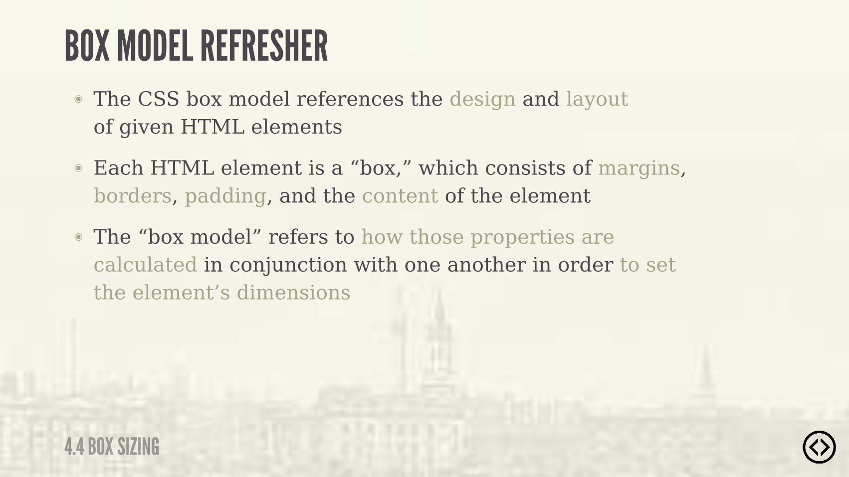
BOX MODEL REFRESHER๏ The CSS box model references the design and layout
of given HTML elements๏ Each HTML element is a “box,” which consists of margins,
borders, padding, and the content of the element๏ The “box model” refers to how those properties are
calculated in conjunction with one another in order to set the element’s dimensions
4.4 BOX SIZING
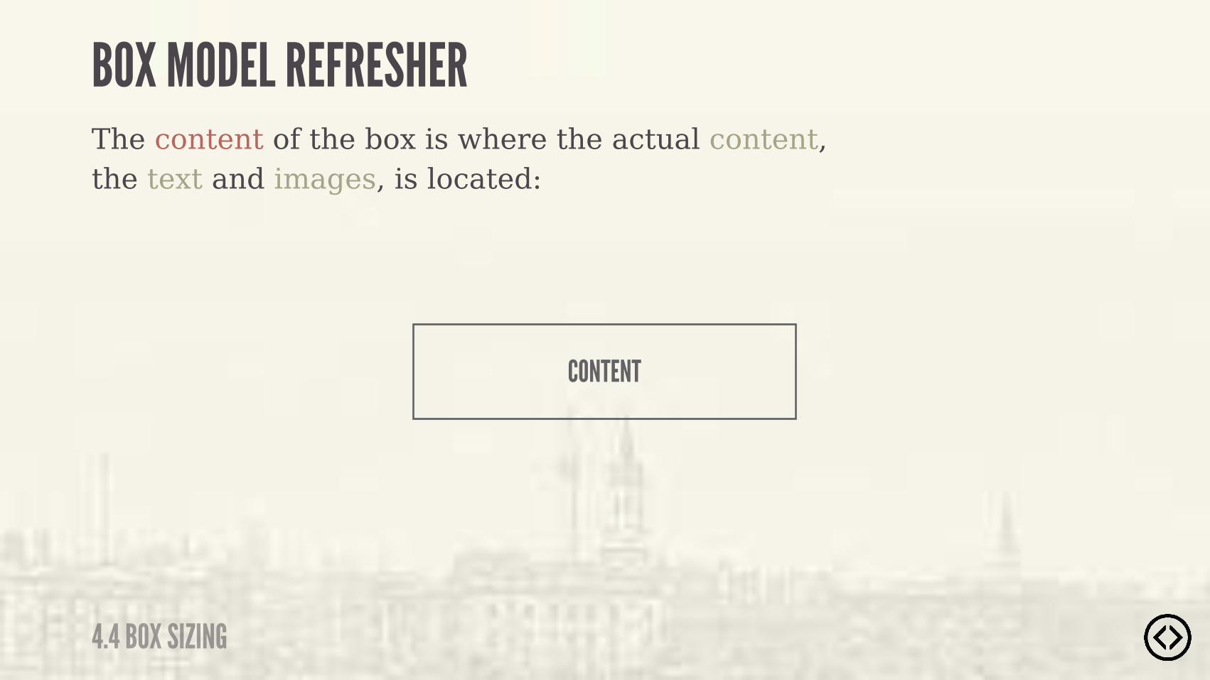
The content of the box is where the actual content, the text and images, is located:
CONTENT
BOX MODEL REFRESHER
4.4 BOX SIZING
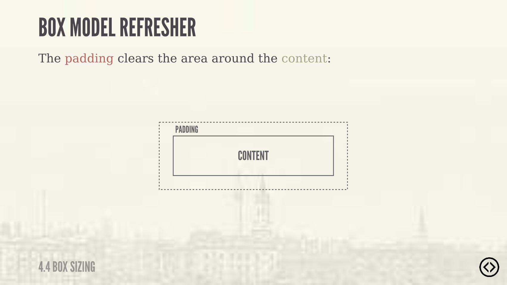
PADDING
The padding clears the area around the content:
BOX MODEL REFRESHER
4.4 BOX SIZING
CONTENT
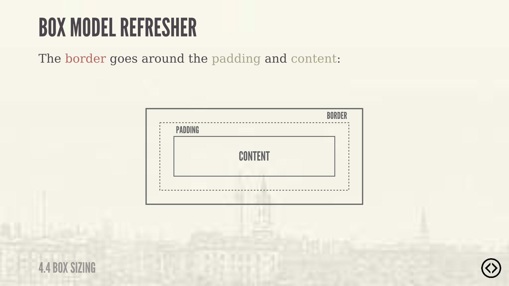
BORDER
The border goes around the padding and content:
BOX MODEL REFRESHER
4.4 BOX SIZING
CONTENT
PADDING
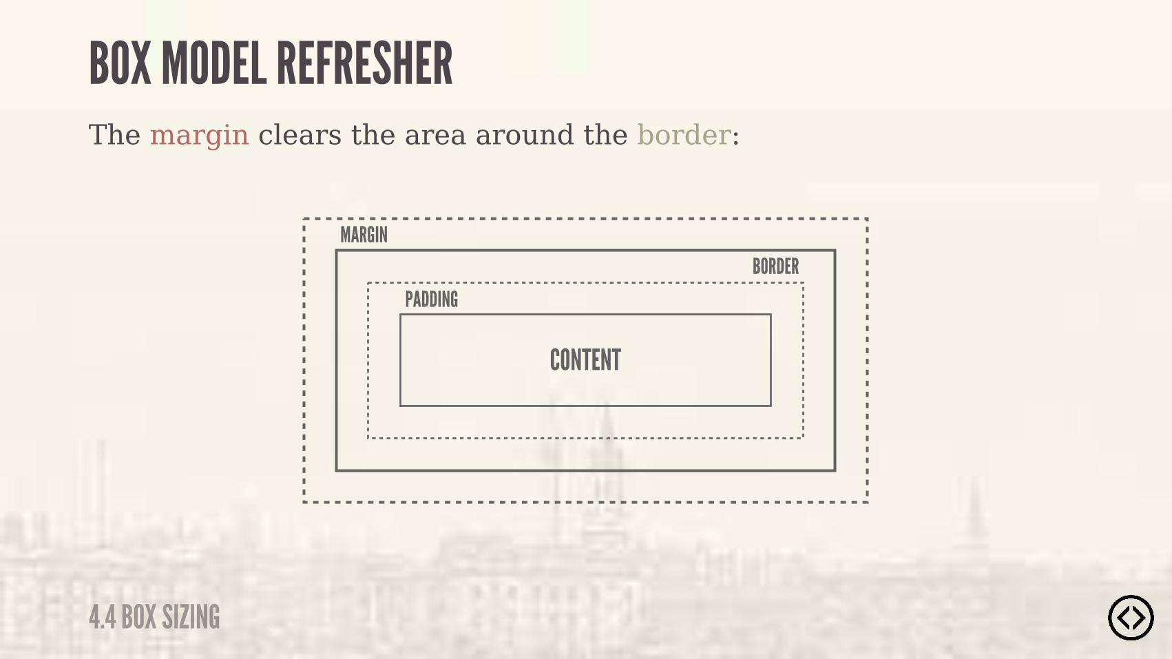
MARGIN
The margin clears the area around the border:
BOX MODEL REFRESHER
4.4 BOX SIZING
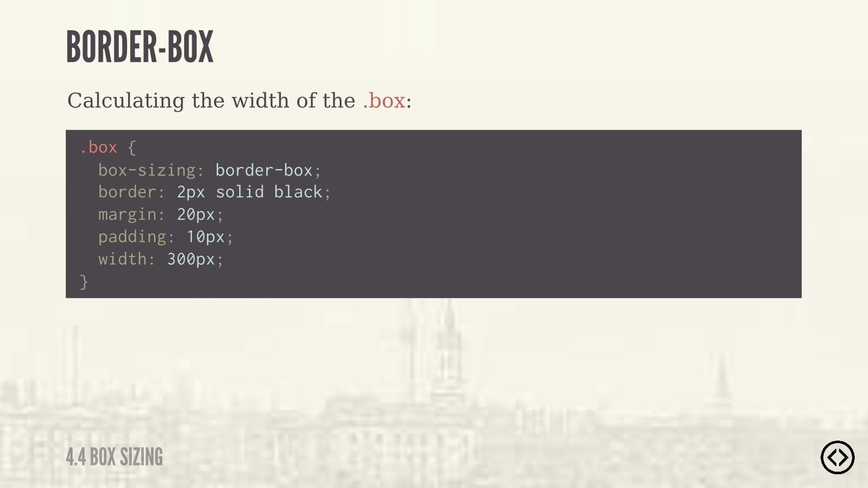
CONTENT
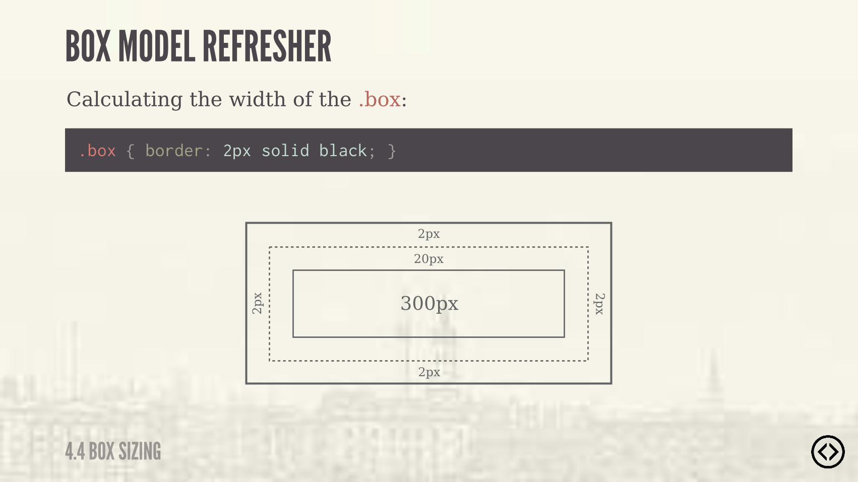
BORDERPADDING

Calculating the width of the .box:
.box { border: 2px solid black; margin: 20px; padding: 10px; width: 300px;}
BOX MODEL REFRESHER
4.4 BOX SIZING

Calculating the width of the .box:
300px
.box { width: 300px; }
BOX MODEL REFRESHER
4.4 BOX SIZING

300px
.box { padding: 10px; }
Calculating the width of the .box:
BOX MODEL REFRESHER
4.4 BOX SIZING
10px
10px
10px
10px

300px
.box { padding: 10px; }
Calculating the width of the .box:
BOX MODEL REFRESHER
4.4 BOX SIZING
20px
300px
20px
.box { border: 2px solid black; }
Calculating the width of the .box:
BOX MODEL REFRESHER
4.4 BOX SIZING
2px
2px2p
x 2px

300px
20px
.box { border: 2px solid black; }
Calculating the width of the .box:
BOX MODEL REFRESHER
4.4 BOX SIZING
4px

.box { margin: 20px; }
Calculating the width of the .box:
BOX MODEL REFRESHER
4.4 BOX SIZING
20px
4px20px
20px
20px
20px300px
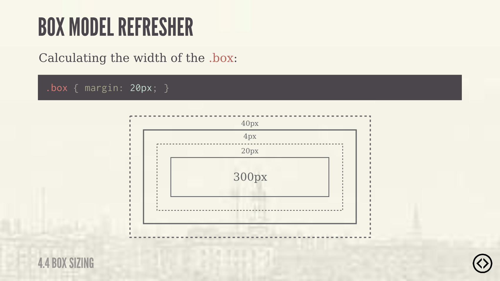
Calculating the width of the .box:
BOX MODEL REFRESHER
4.4 BOX SIZING
40px
20px
4px
.box { margin: 20px; }
300px
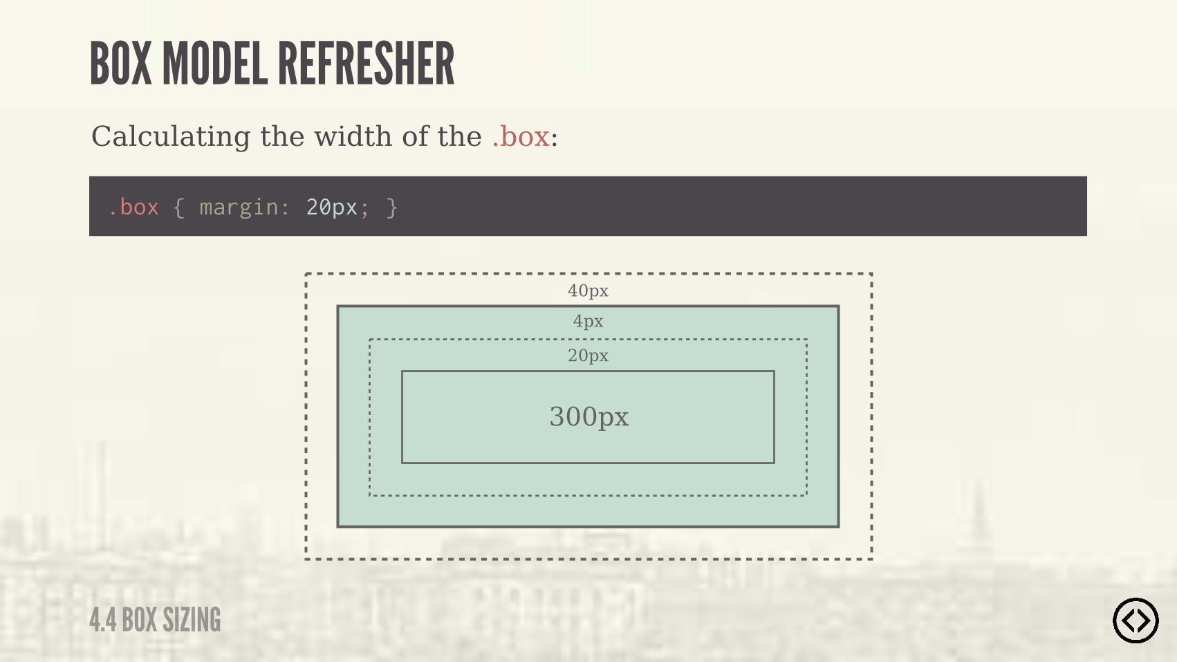
Calculating the width of the .box:
BOX MODEL REFRESHER
4.4 BOX SIZING
40px
20px
4px
.box { margin: 20px; }
300px
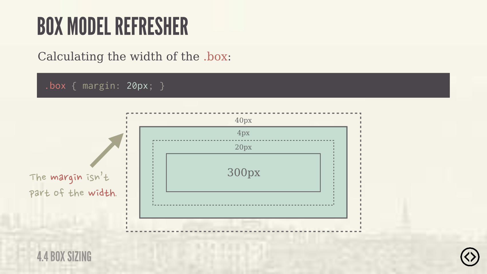
Calculating the width of the .box:
BOX MODEL REFRESHER
4.4 BOX SIZING
40px
20px
4px
.box { margin: 20px; }
300px����#�(� $� )$0*�&�(*�%��*���- �*��
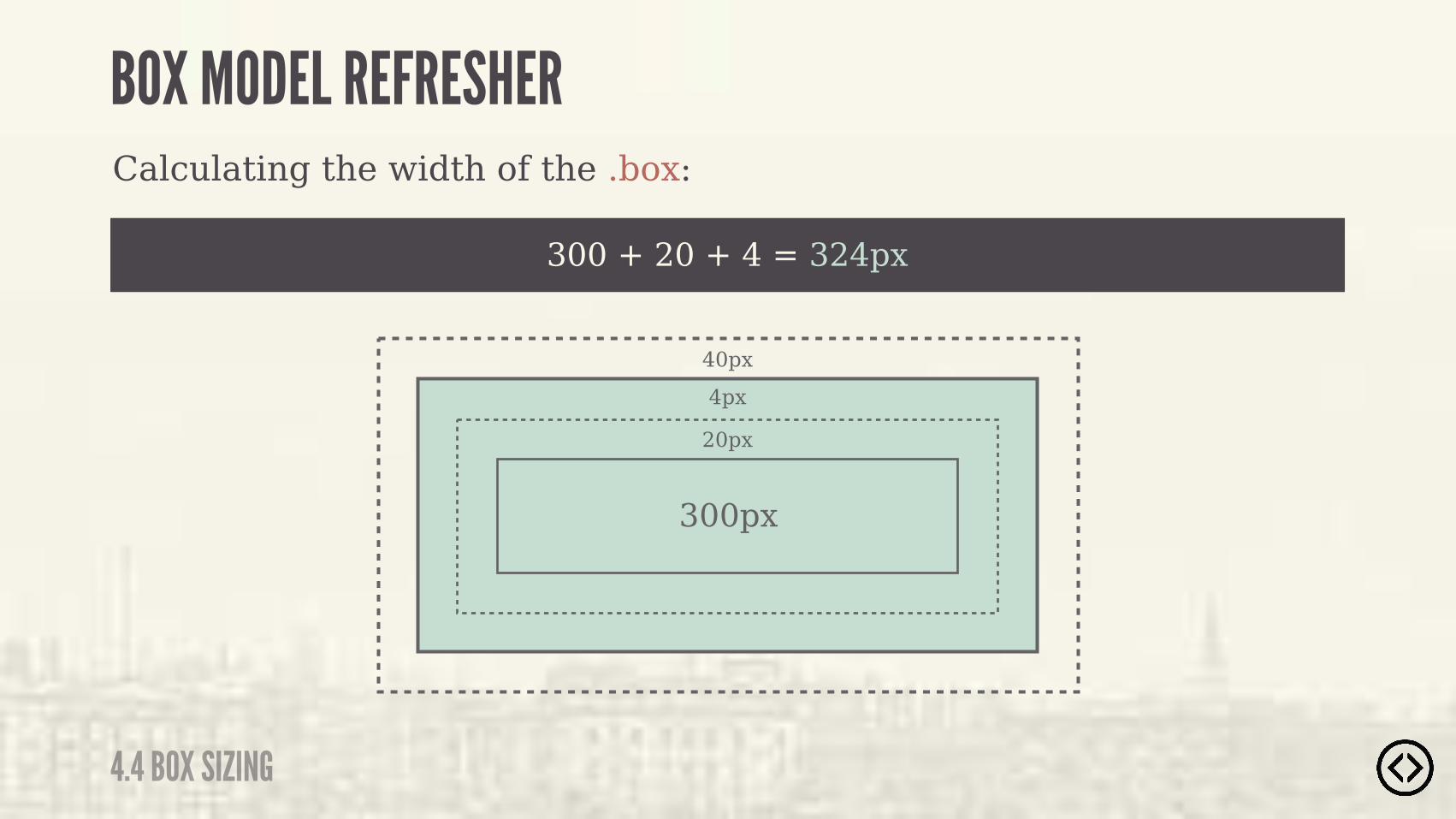
300 + 20 + 4 = 324px
Calculating the width of the .box:
BOX MODEL REFRESHER
4.4 BOX SIZING
40px
20px
4px
300px

The box-sizing property is used to change the default CSS box model, which is used to calculate widths and heights of given elements.
BOX SIZING
4.4 BOX SIZING

๏ content-box๏ padding-box๏ border-box
There are three different values for box-sizing:
BOX SIZING
4.4 BOX SIZING
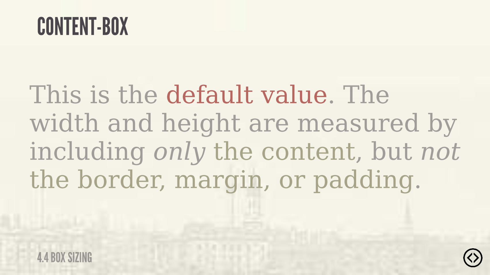
This is the default value. The width and height are measured by including only the content, but not the border, margin, or padding.
CONTENT-BOX
4.4 BOX SIZING

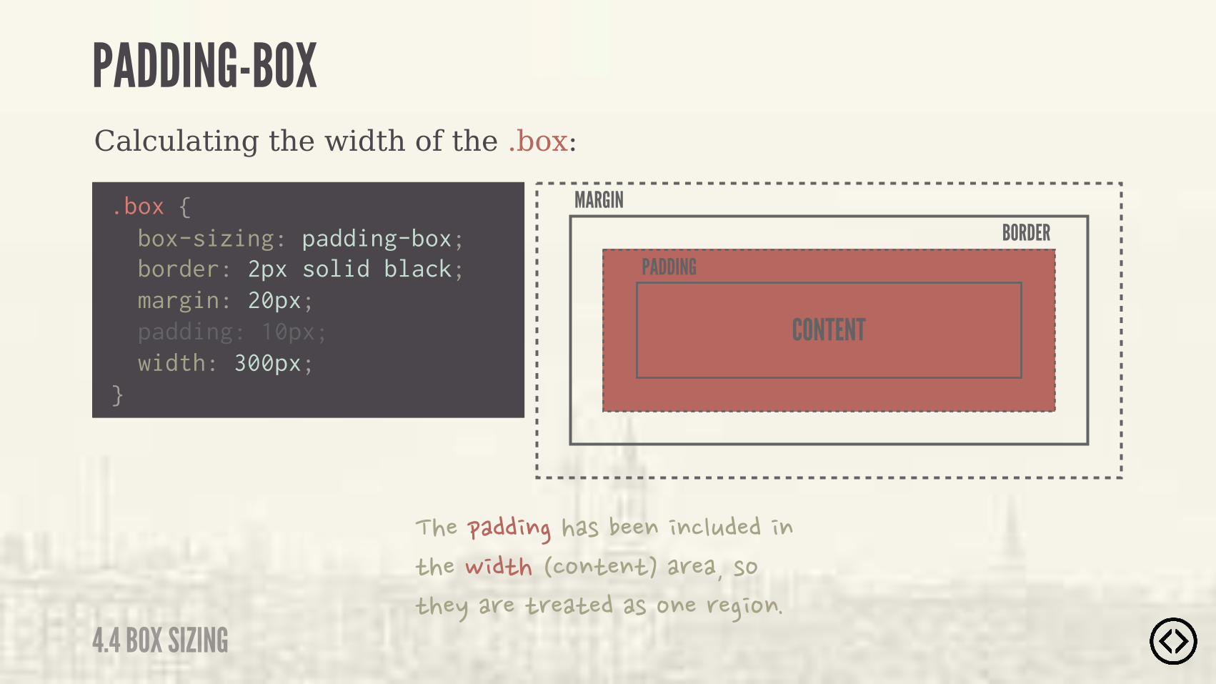
The width and height include the padding, but do not include the border or margin.
PADDING-BOX
4.4 BOX SIZING

Calculating the width of the .box:
.box {
border: 2px solid black; margin: 20px; padding: 10px; width: 300px;}
box-sizing: padding-box;
PADDING-BOX
4.4 BOX SIZING
Calculating the width of the .box:
.box {
border: 2px solid black; margin: 20px; padding: 10px; width: 300px;}
PADDING-BOX
4.4 BOX SIZING
box-sizing: padding-box;
MARGIN
CONTENT
BORDERPADDING
����&��� $����)����$� $�"+���� $�*���- �*����%$*�$*���(����)%�*��/��(��*(��*����)�%$��(�� %$�
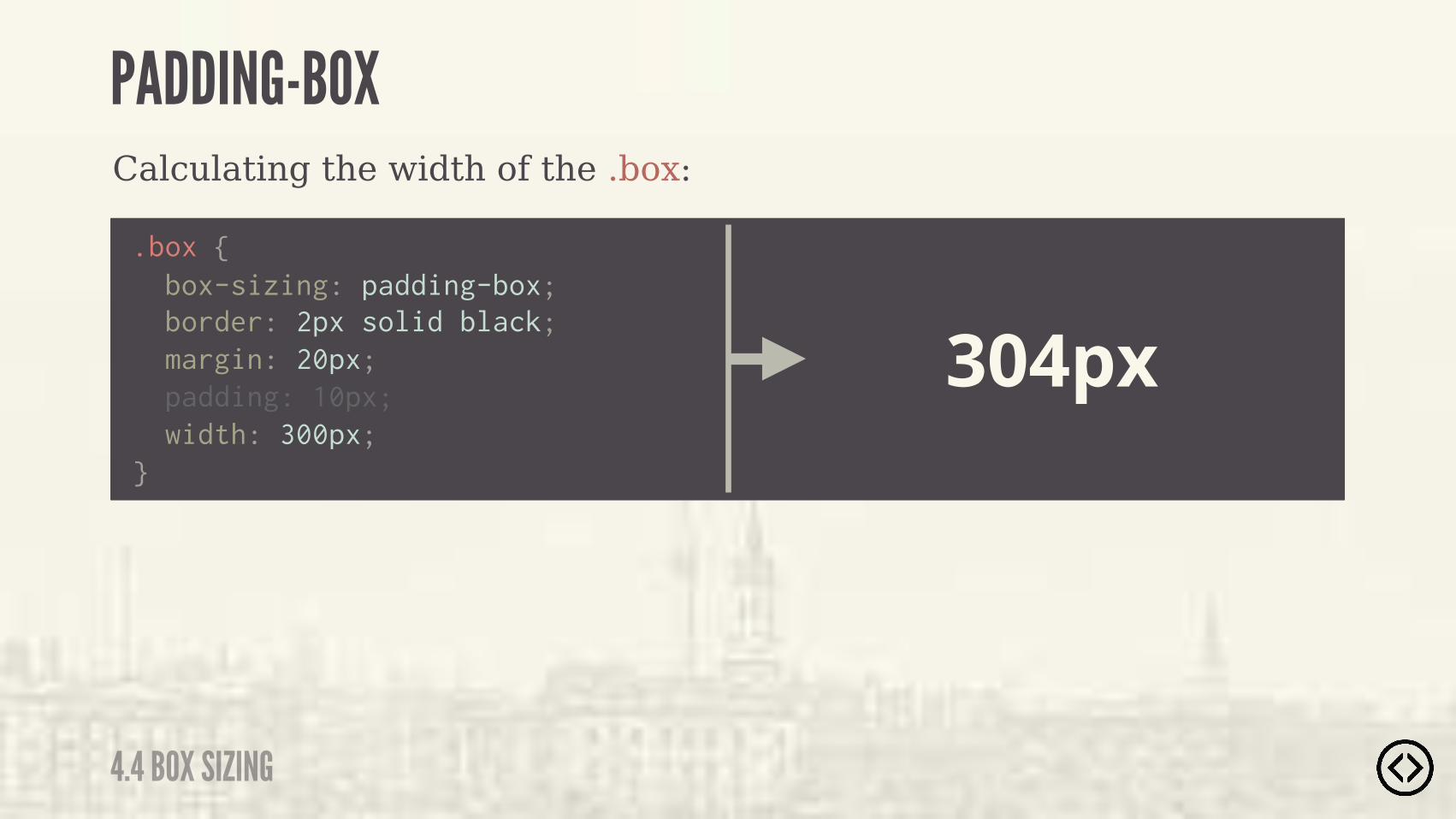
Calculating the width of the .box:
.box {
border: 2px solid black; margin: 20px; padding: 10px; width: 300px;}
304px
PADDING-BOX
4.4 BOX SIZING
box-sizing: padding-box;
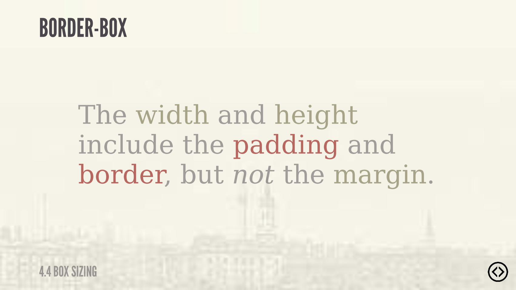
The width and height include the padding and border, but not the margin.
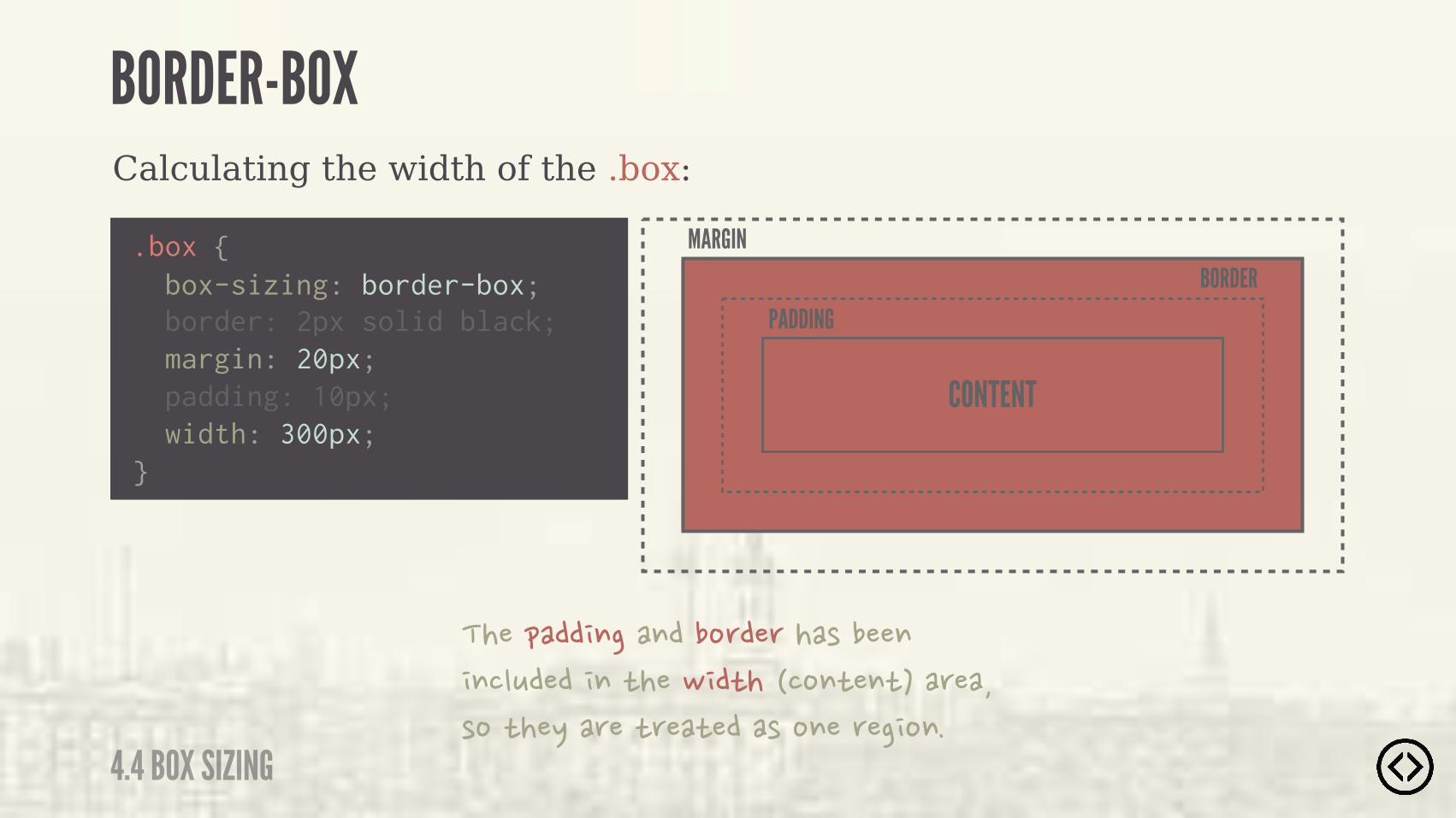
BORDER-BOX
4.4 BOX SIZING
Calculating the width of the .box:
.box {
border: 2px solid black; margin: 20px; padding: 10px; width: 300px;}
BORDER-BOX
4.4 BOX SIZING
box-sizing: border-box;
Calculating the width of the .box:
.box {
border: 2px solid black; margin: 20px; padding: 10px; width: 300px;}
BORDER-BOX
4.4 BOX SIZING
box-sizing: border-box;
MARGIN
CONTENT
BORDERPADDING
����&��� $���$���%(��(���)����$� $�"+���� $�*���- �*����%$*�$*���(����)%�*��/��(��*(��*����)�%$��(�� %$�
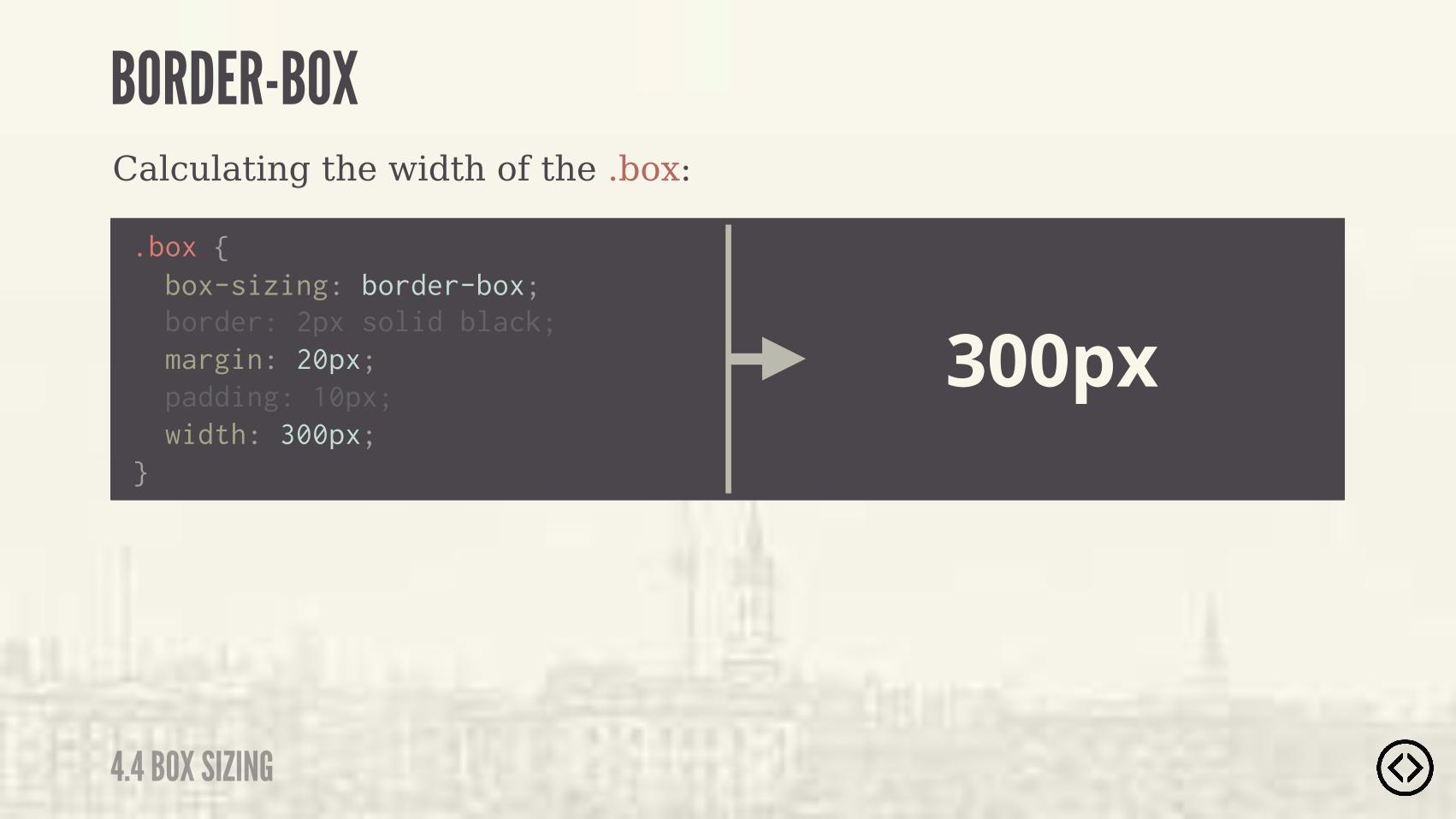
Calculating the width of the .box:
.box {
border: 2px solid black; margin: 20px; padding: 10px; width: 300px;}
300px
BORDER-BOX
4.4 BOX SIZING
box-sizing: border-box;


๏ Border Radius๏ Box Shadow๏ Text Shadow๏ Box Sizing
TABLE OF CONTENTS
LEVEL 4
๏ Multiple Backgrounds๏ Color๏ Opacity๏ Gradients

๏ Border Radius๏ Box Shadow๏ Text Shadow๏ Box Sizing๏ Multiple Backgrounds๏ Color๏ Opacity๏ Gradients
TABLE OF CONTENTS
LEVEL 4
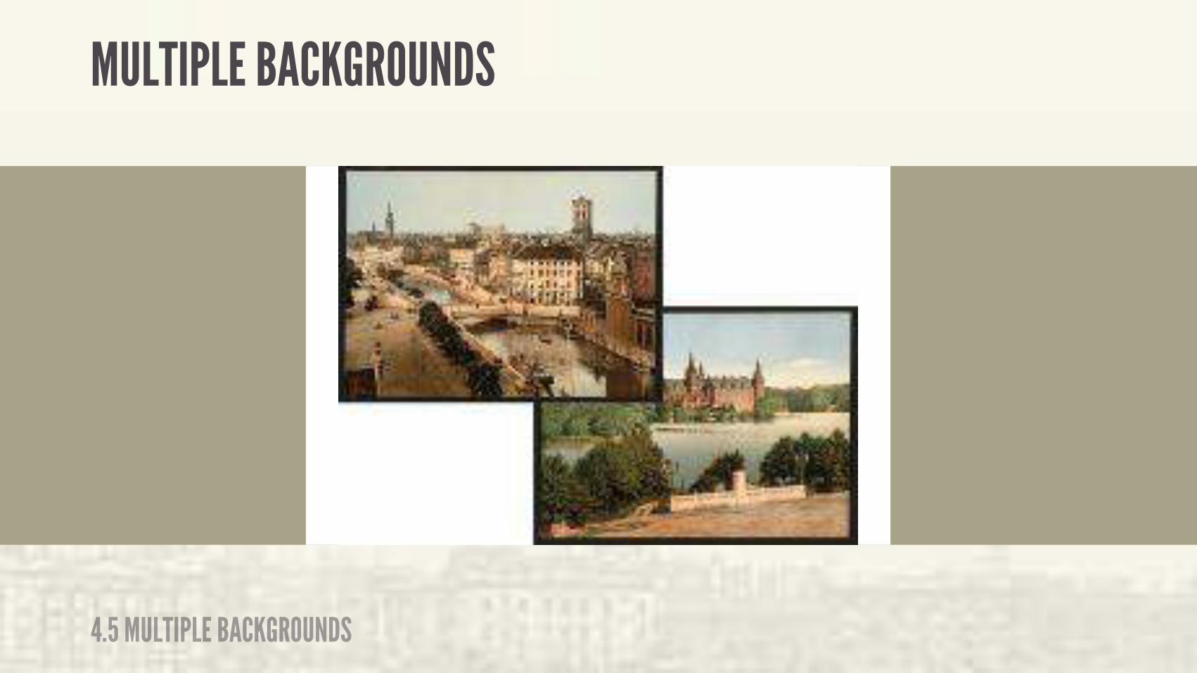
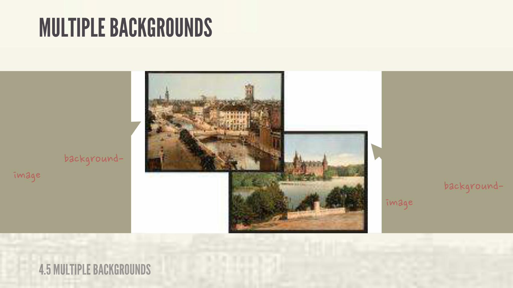
CSS3 allows you to apply multiple backgrounds to an element. They are stacked in the order in which you specify them.
MULTIPLE BACKGROUNDS
4.5 MULTIPLE BACKGROUNDS
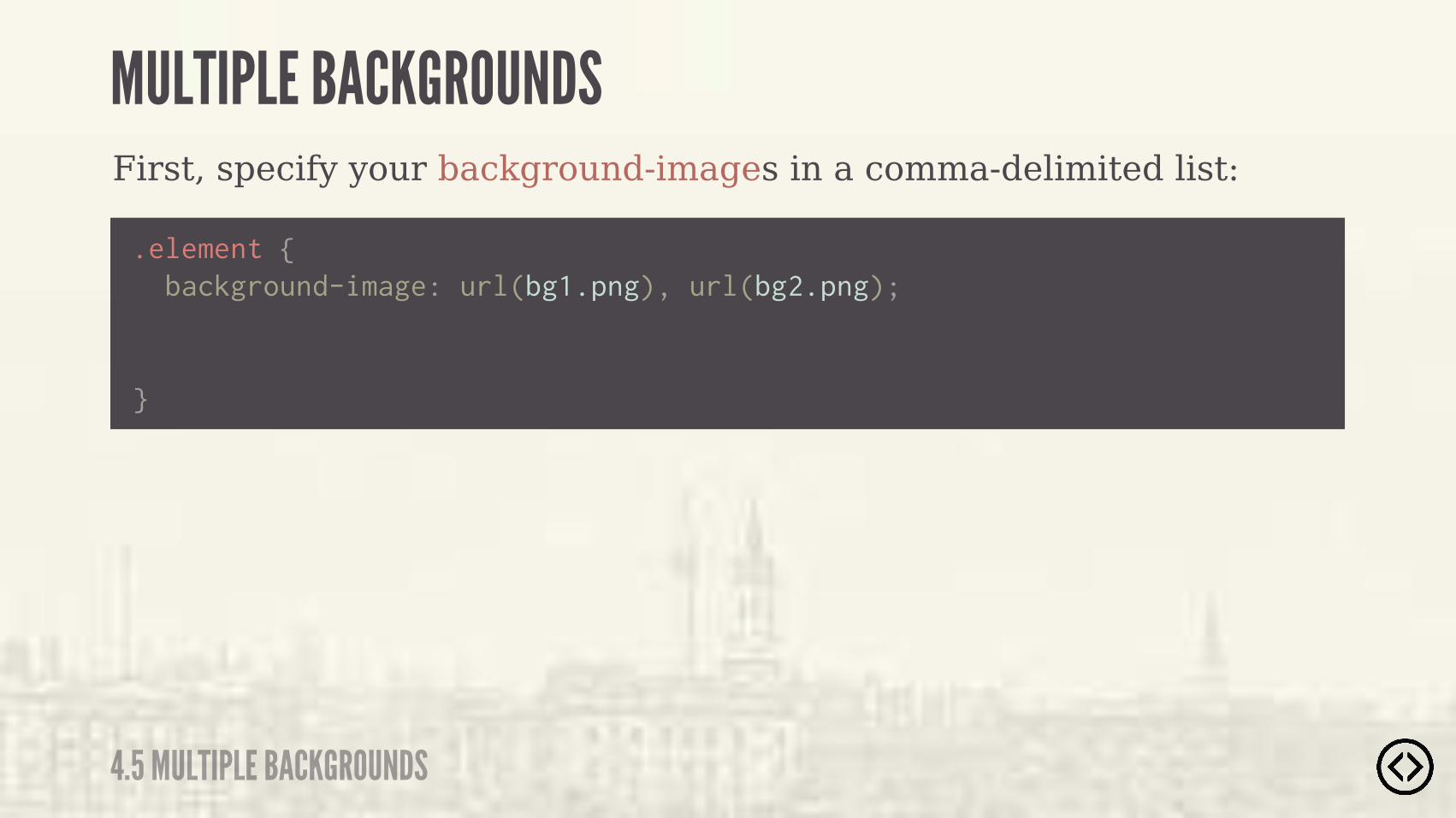
First, specify your background-images in a comma-delimited list:
.element { background-image: url(bg1.png), url(bg2.png);
}
MULTIPLE BACKGROUNDS
4.5 MULTIPLE BACKGROUNDS
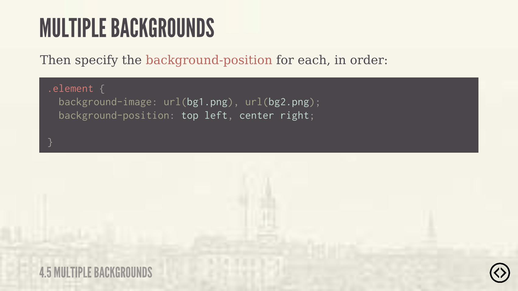
Then specify the background-position for each, in order:
.element { background-image: url(bg1.png), url(bg2.png);
}
background-position: top left, center right;
MULTIPLE BACKGROUNDS
4.5 MULTIPLE BACKGROUNDS
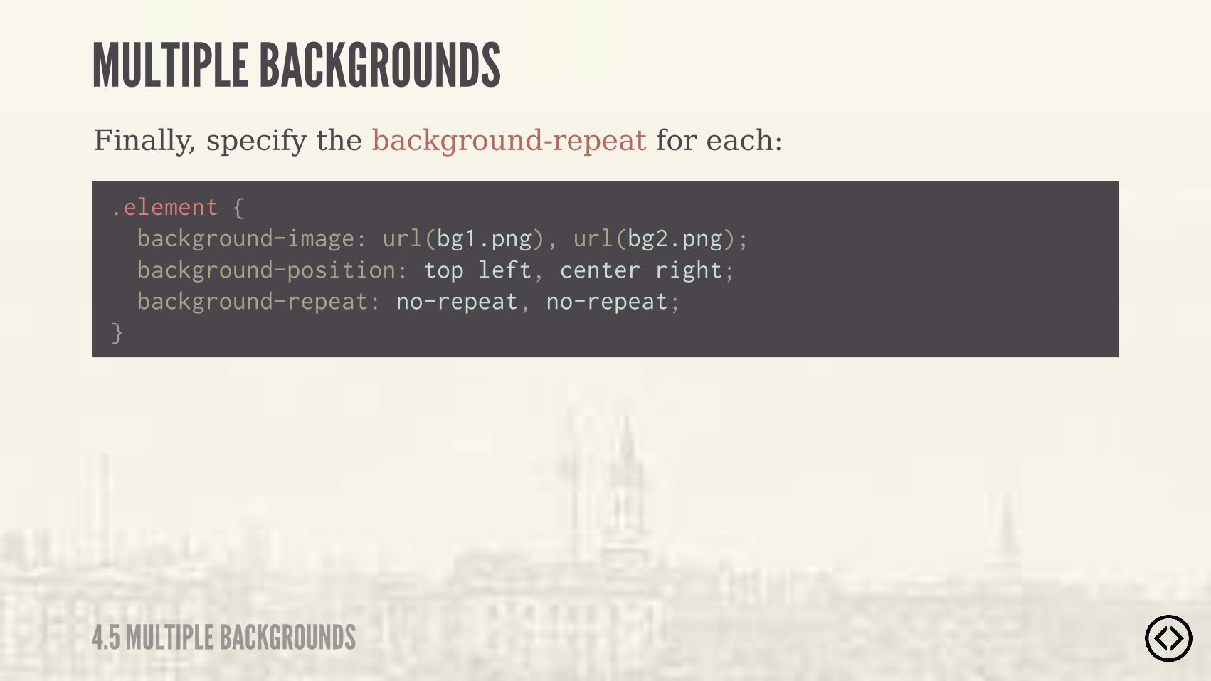
Finally, specify the background-repeat for each:
.element { background-image: url(bg1.png), url(bg2.png);
}
background-position: top left, center right; background-repeat: no-repeat, no-repeat;
MULTIPLE BACKGROUNDS
4.5 MULTIPLE BACKGROUNDS
MULTIPLE BACKGROUNDS
4.5 MULTIPLE BACKGROUNDS
MULTIPLE BACKGROUNDS
4.5 MULTIPLE BACKGROUNDS
����� ()*����!�(%+$�� #����-��)&�� � ���
����)��%$�����!�(%+$�� #����-��)&�� � ���

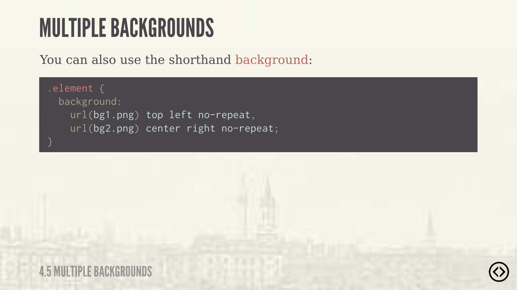
You can also use the shorthand background:
.element {
}
background: url(bg1.png) top left no-repeat,
MULTIPLE BACKGROUNDS
4.5 MULTIPLE BACKGROUNDS
You can also use the shorthand background:
.element {
}
background: url(bg1.png) top left no-repeat, url(bg2.png) center right no-repeat;
MULTIPLE BACKGROUNDS
4.5 MULTIPLE BACKGROUNDS

๏ Border Radius๏ Box Shadow๏ Text Shadow๏ Box Sizing
TABLE OF CONTENTS
LEVEL 4
๏ Multiple Backgrounds๏ Color๏ Opacity๏ Gradients
๏ Border Radius๏ Box Shadow๏ Text Shadow๏ Box Sizing๏ Multiple Backgrounds๏ Color๏ Opacity๏ Gradients
TABLE OF CONTENTS
LEVEL 4
๏ RGBa๏ HSLa
CSS3 provides multiple ways to work with color:
COLOR
4.6 COLOR
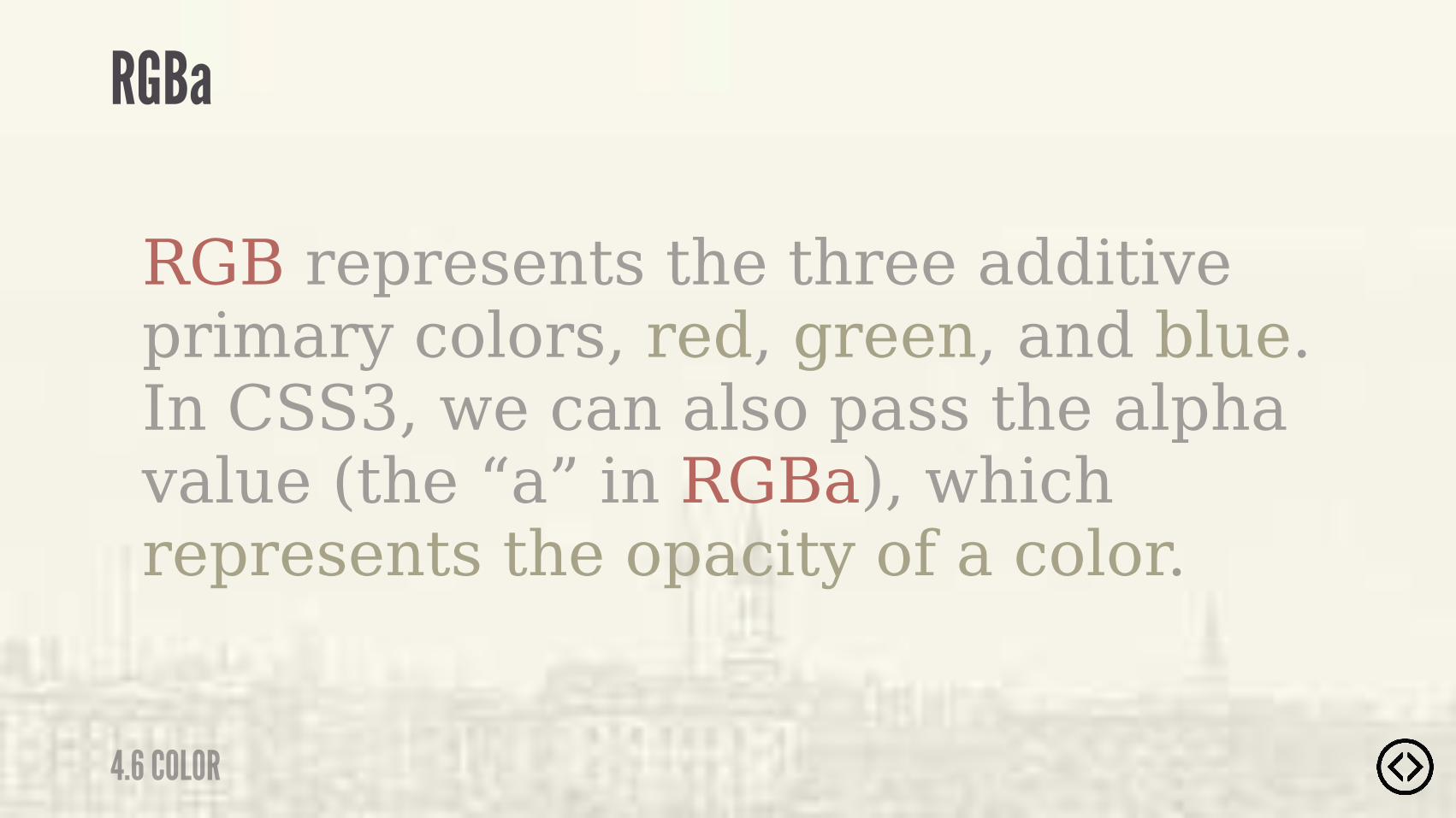
RGB represents the three additive primary colors, red, green, and blue. In CSS3, we can also pass the alpha value (the “a” in RGBa), which represents the opacity of a color.
RGBa
4.6 COLOR

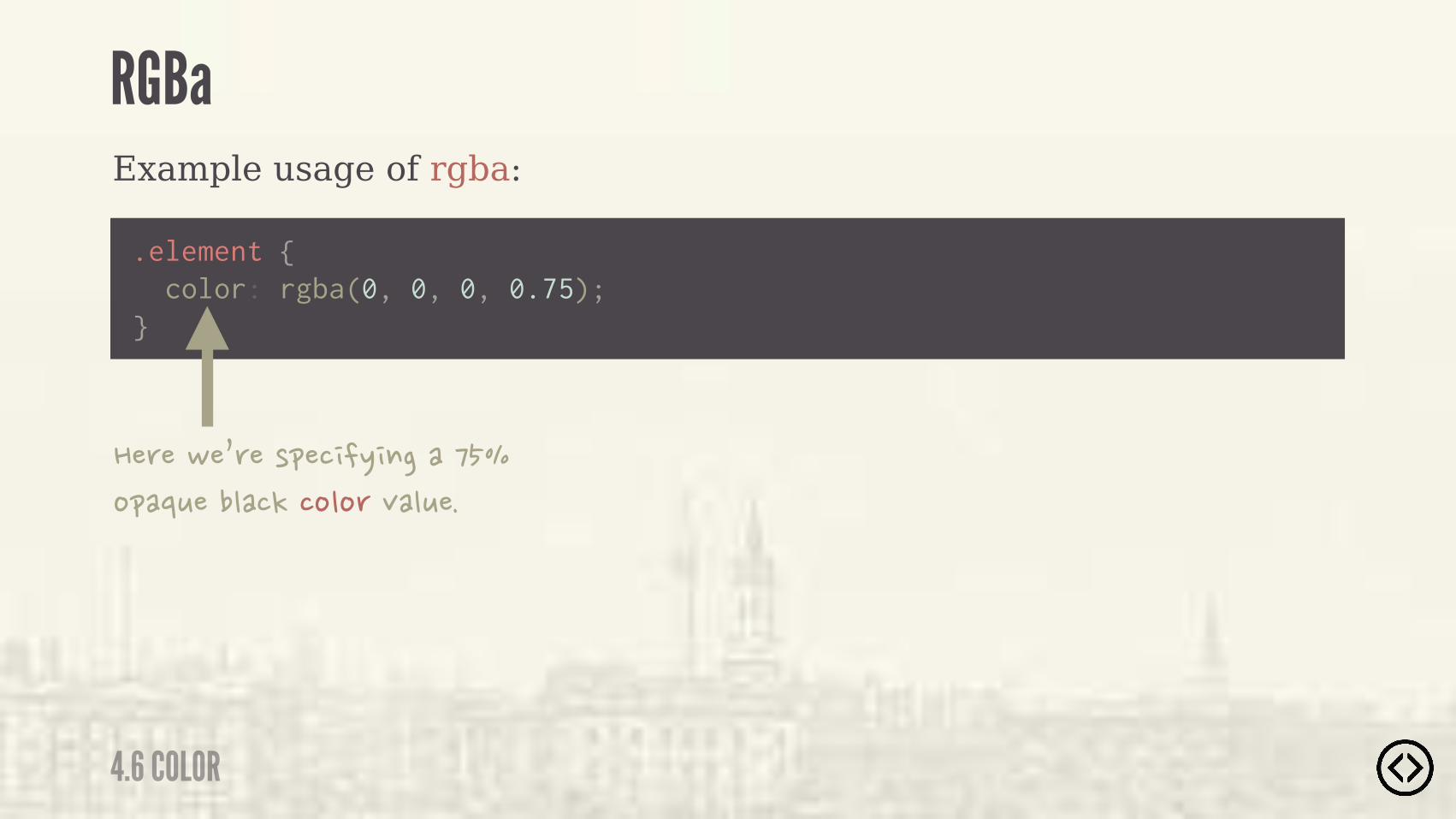
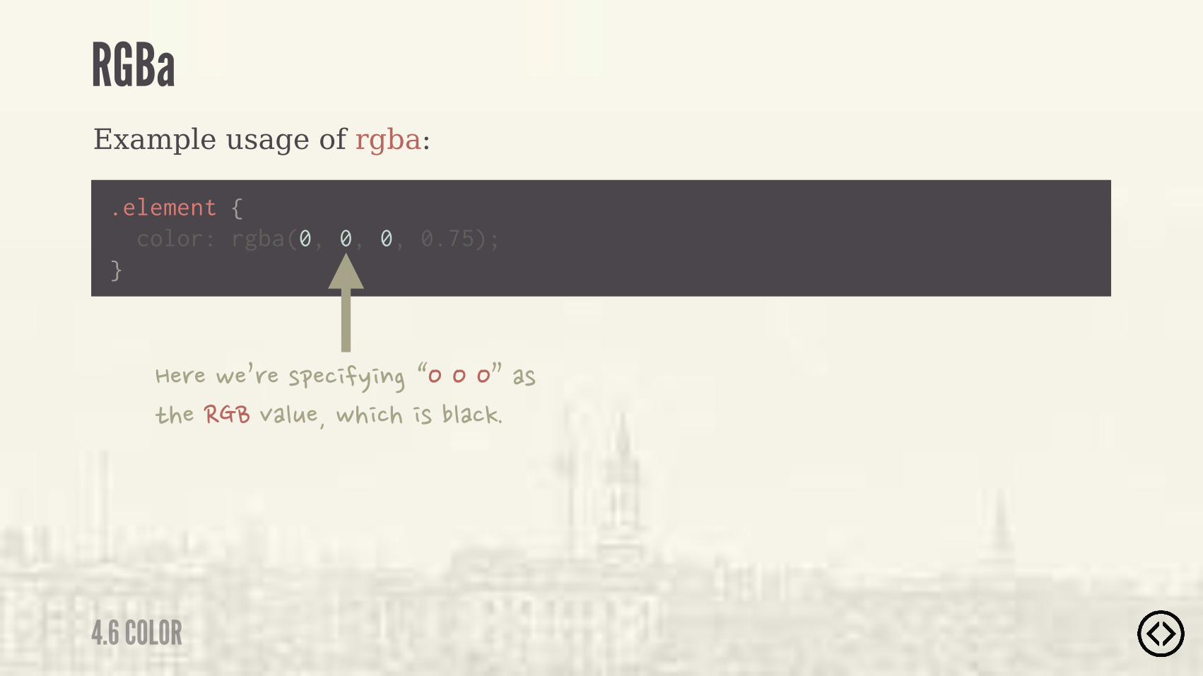
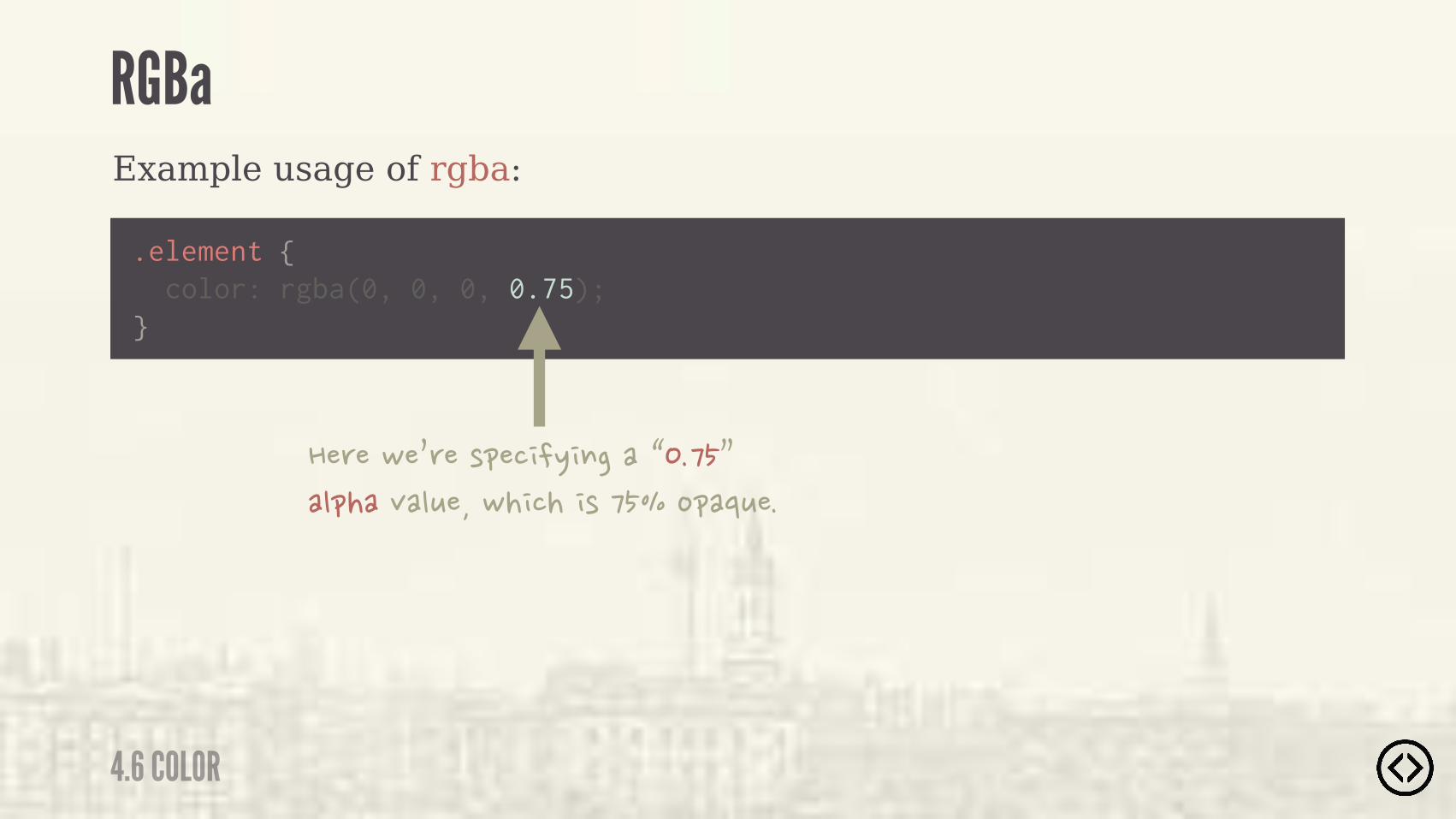
Example usage of rgba:
.element { color: rgba(0, 0, 0, 0.75);}
RGBa
4.6 COLOR
Example usage of rgba:
.element { color: rgba(0, 0, 0, 0.75);}
��(��-�0(��)&�� �/ $���� ���%&�'+���"��!��%"%(�,�"+��
RGBa
4.6 COLOR
Example usage of rgba:
.element { color: rgba(0, 0, 0, 0.75);}
��(��-�0(��)&�� �/ $��1�����2��)�*�������,�"+���-� ��� )��"��!�
RGBa
4.6 COLOR
Example usage of rgba:
.element { color: rgba(0, 0, 0, 0.75);}
��(��-�0(��)&�� �/ $����1�� �2��"&���,�"+���-� ��� )� ���%&�'+��
RGBa
4.6 COLOR
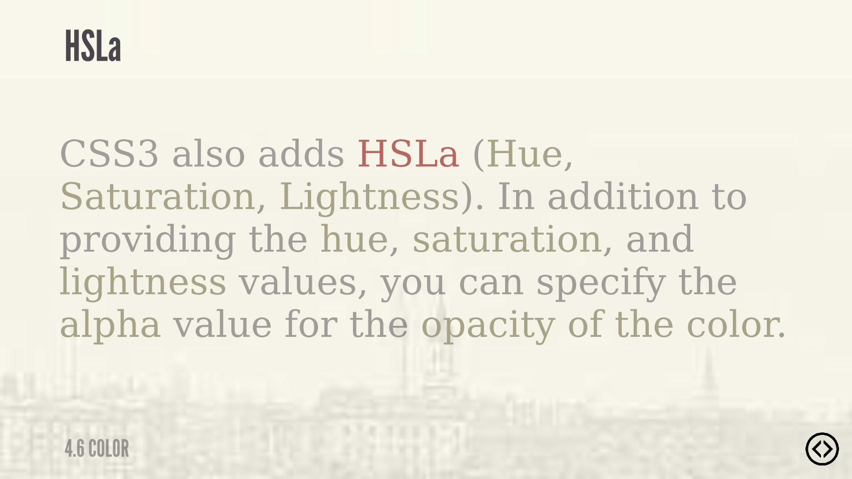
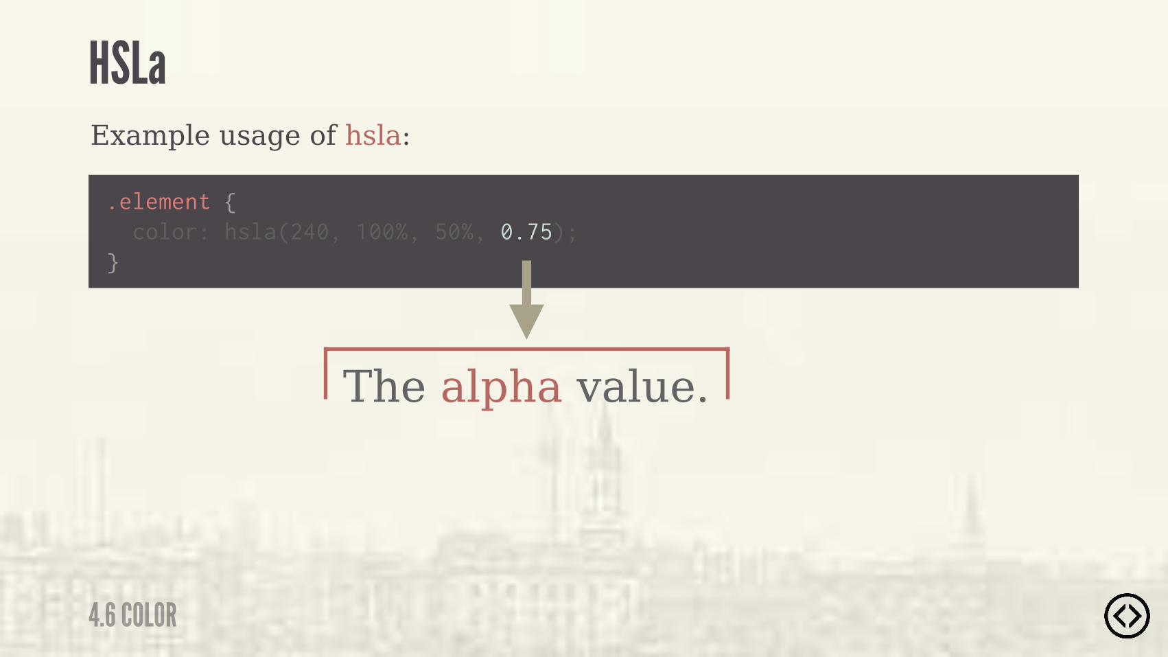
CSS3 also adds HSLa (Hue, Saturation, Lightness). In addition to providing the hue, saturation, and lightness values, you can specify the alpha value for the opacity of the color.
HSLa
4.6 COLOR
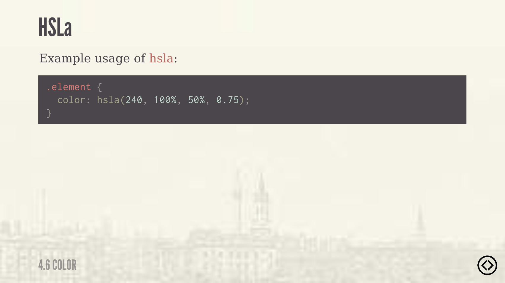
Example usage of hsla:
.element {
} color: hsla(240, 100%, 50%, 0.75);
HSLa
4.6 COLOR
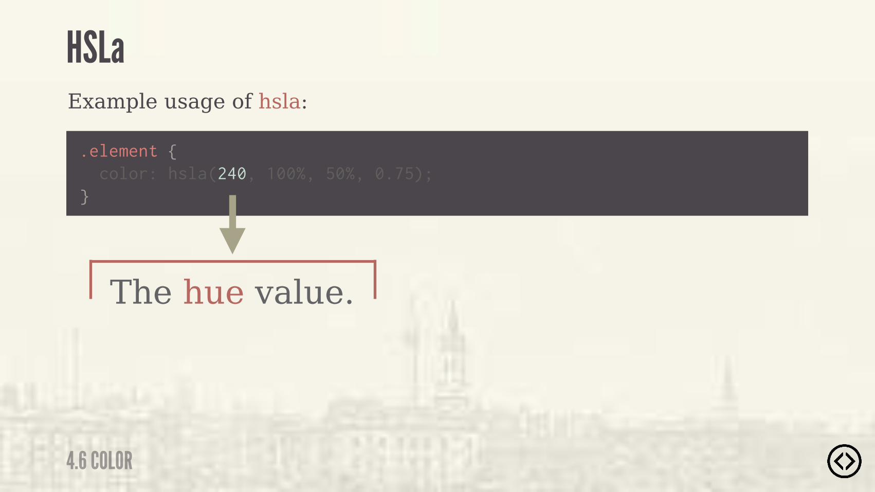
Example usage of hsla:
.element {
} color: hsla(240, 100%, 50%, 0.75);
The hue value.
HSLa
4.6 COLOR

Example usage of hsla:
.element {
} color: hsla(240, 100%, 50%, 0.75);
The saturation value.
HSLa
4.6 COLOR
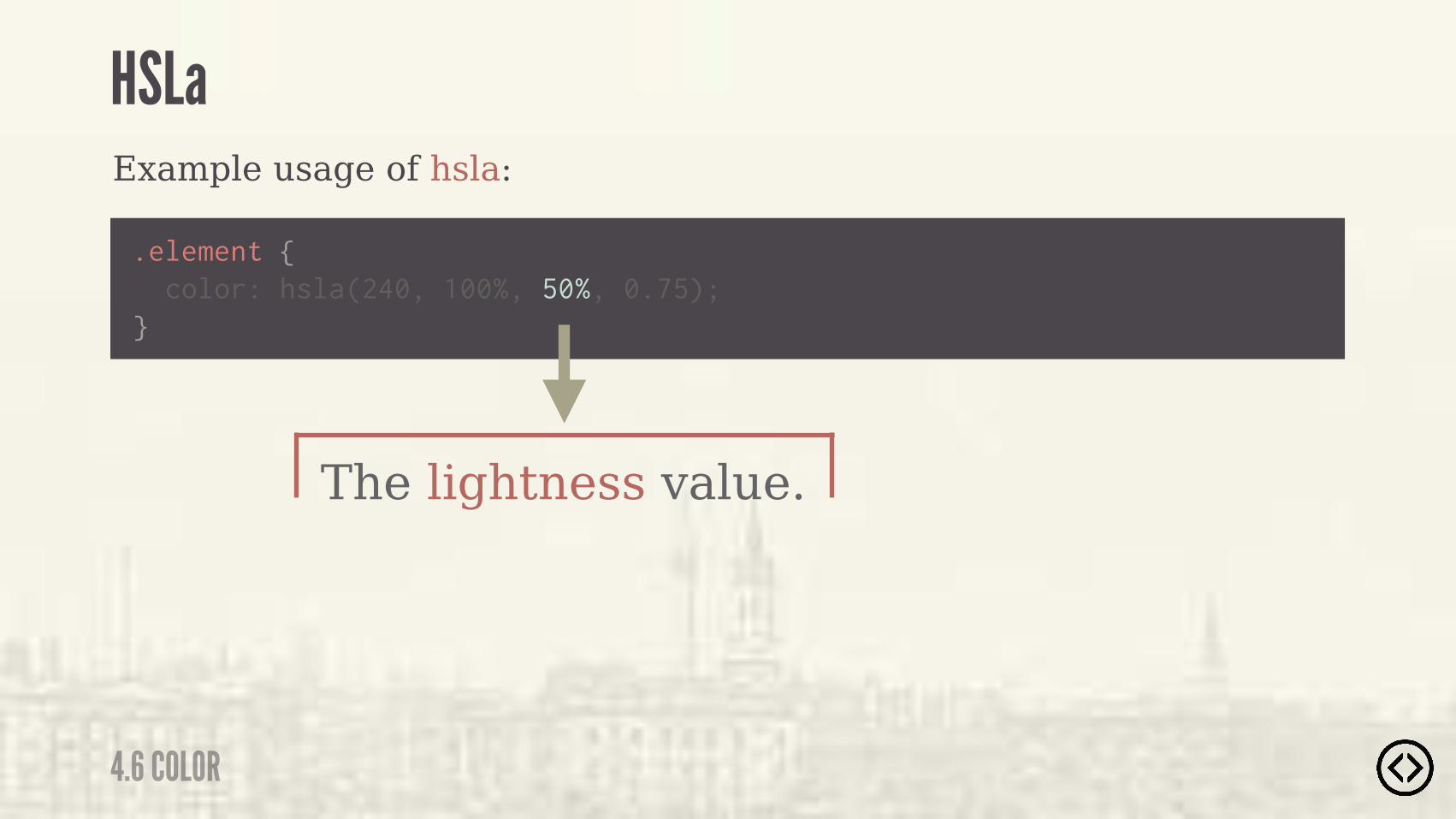
Example usage of hsla:
.element {
} color: hsla(240, 100%, 50%, 0.75);
The lightness value.
HSLa
4.6 COLOR
Example usage of hsla:
.element {
} color: hsla(240, 100%, 50%, 0.75);
The alpha value.
HSLa
4.6 COLOR
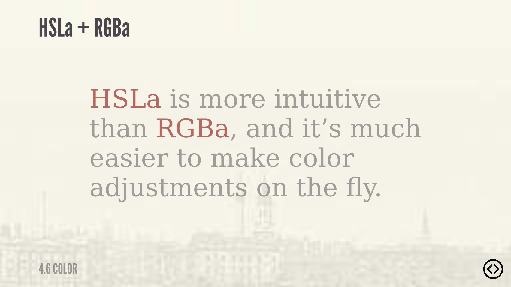
HSLa is more intuitive than RGBa, and it’s much easier to make color adjustments on the fly.
HSLa + RGBa
4.6 COLOR
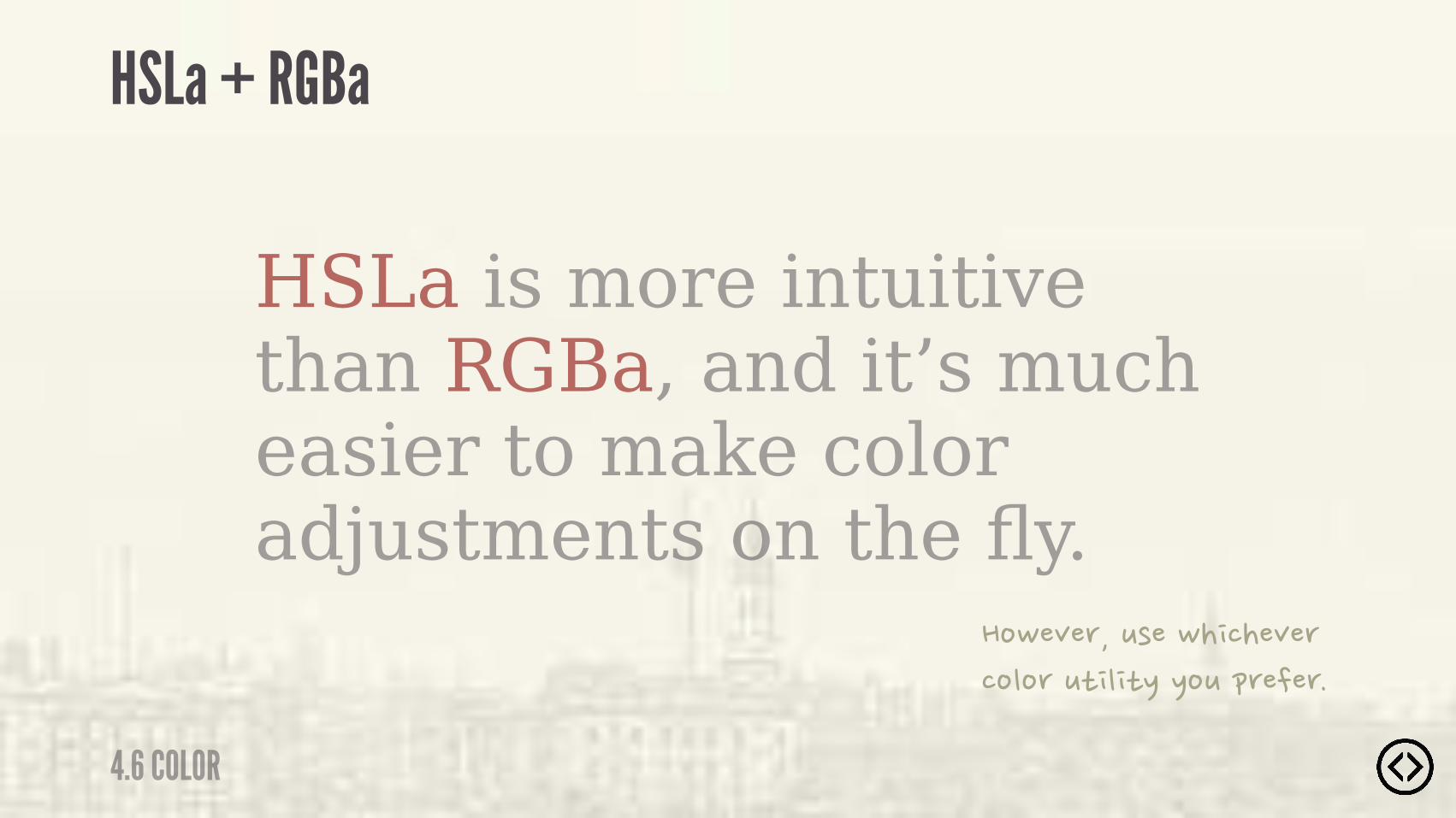
HSLa is more intuitive than RGBa, and it’s much easier to make color adjustments on the fly.
�%-�,�(��+)��-� ���,�(��%"%(�+* " */�/%+�&(���(�
HSLa + RGBa
4.6 COLOR

๏ Border Radius๏ Box Shadow๏ Text Shadow๏ Box Sizing
TABLE OF CONTENTS
LEVEL 4
๏ Multiple Backgrounds๏ Color๏ Opacity๏ Gradients

๏ Border Radius๏ Box Shadow๏ Text Shadow๏ Box Sizing๏ Multiple Backgrounds๏ Color๏ Opacity๏ Gradients
TABLE OF CONTENTS
LEVEL 4

4.7 OPACITY
OPACITY
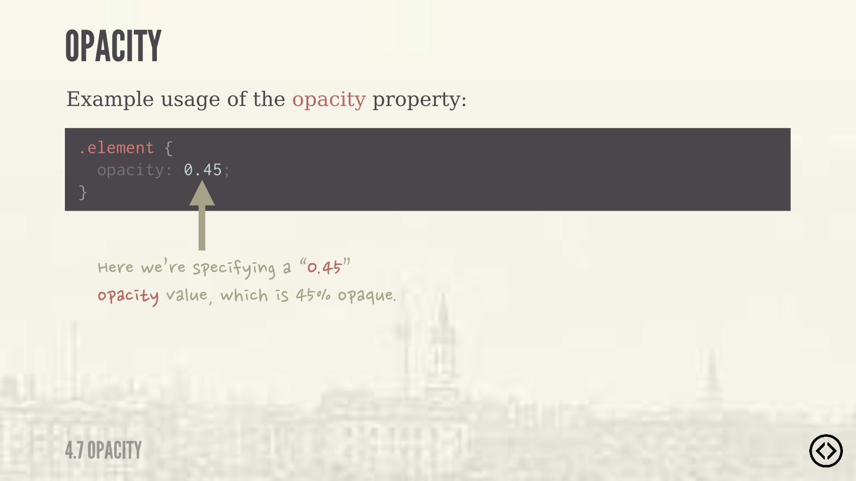
CSS3 allows you to specify the opacity of an element using the opacity property.
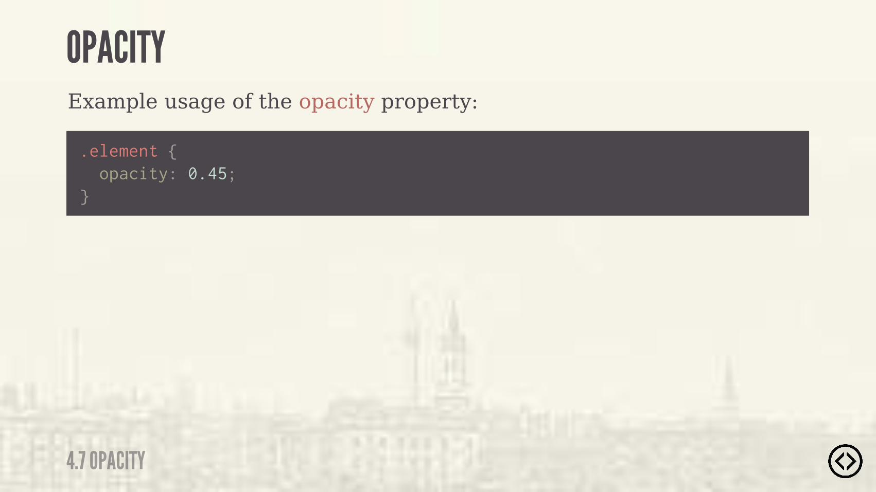
Example usage of the opacity property:
.element {
} opacity: 0.45;
4.7 OPACITY
OPACITY
Example usage of the opacity property:
.element {
} opacity: 0.45;
��(��-�0(��)&�� �/ $����1����2�%&�� */�,�"+���-� ��� )�����%&�'+��
4.7 OPACITY
OPACITY

Example output of the opacity property:
4.7 OPACITY
OPACITY

Example output of the opacity property:
4.7 OPACITY
OPACITY
4.7 OPACITY
OPACITY
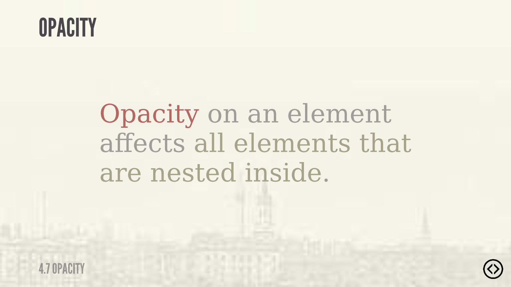
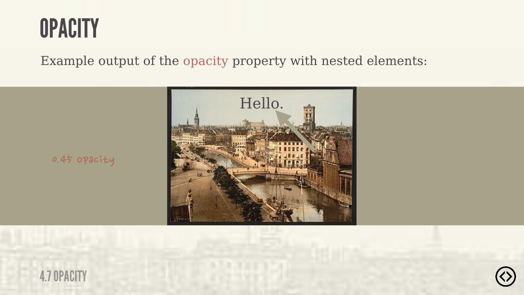
Opacity on an element affects all elements that are nested inside.
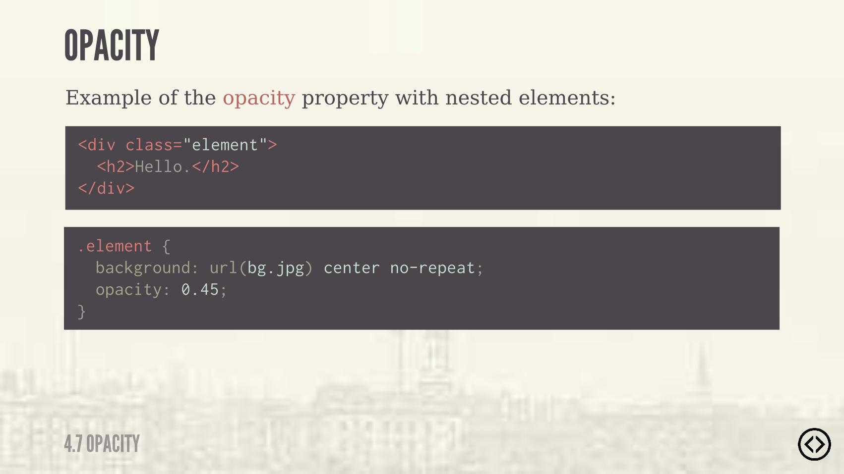
Example of the opacity property with nested elements:
4.7 OPACITY
OPACITY
<div class="element"> <h2>Hello.</h2></div>
.element { background: url(bg.jpg) center no-repeat; opacity: 0.45;}
4.7 OPACITY
OPACITY
Hello.
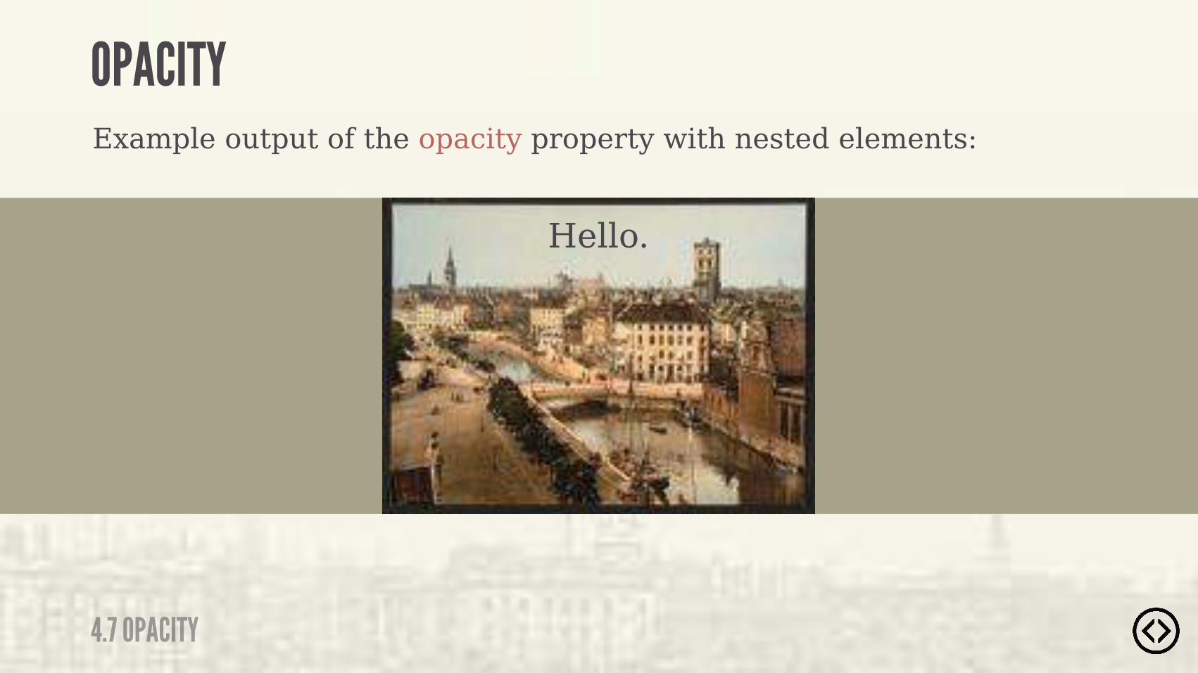
Example output of the opacity property with nested elements:

4.7 OPACITY
OPACITY
Hello.
Example output of the opacity property with nested elements:
4.7 OPACITY
OPACITY
Hello.
Example output of the opacity property with nested elements:
���������%&�� */�%$�*���"�#�$*������*)�*���*�.*�)�-�""��)�*��� #����

๏ Border Radius๏ Box Shadow๏ Text Shadow๏ Box Sizing
TABLE OF CONTENTS
LEVEL 4
๏ Multiple Backgrounds๏ Color๏ Opacity๏ Gradients

๏ Border Radius๏ Box Shadow๏ Text Shadow๏ Box Sizing๏ Multiple Backgrounds๏ Color๏ Opacity๏ Gradients
TABLE OF CONTENTS
LEVEL 4
4.8 GRADIENTS
GRADIENTS
CSS3 provides the ability to create gradients, smooth transitions between two or more colors.

๏ Linear gradients๏ Radial gradients
There are two types of gradients that browsers support:
4.8 GRADIENTS
GRADIENTS
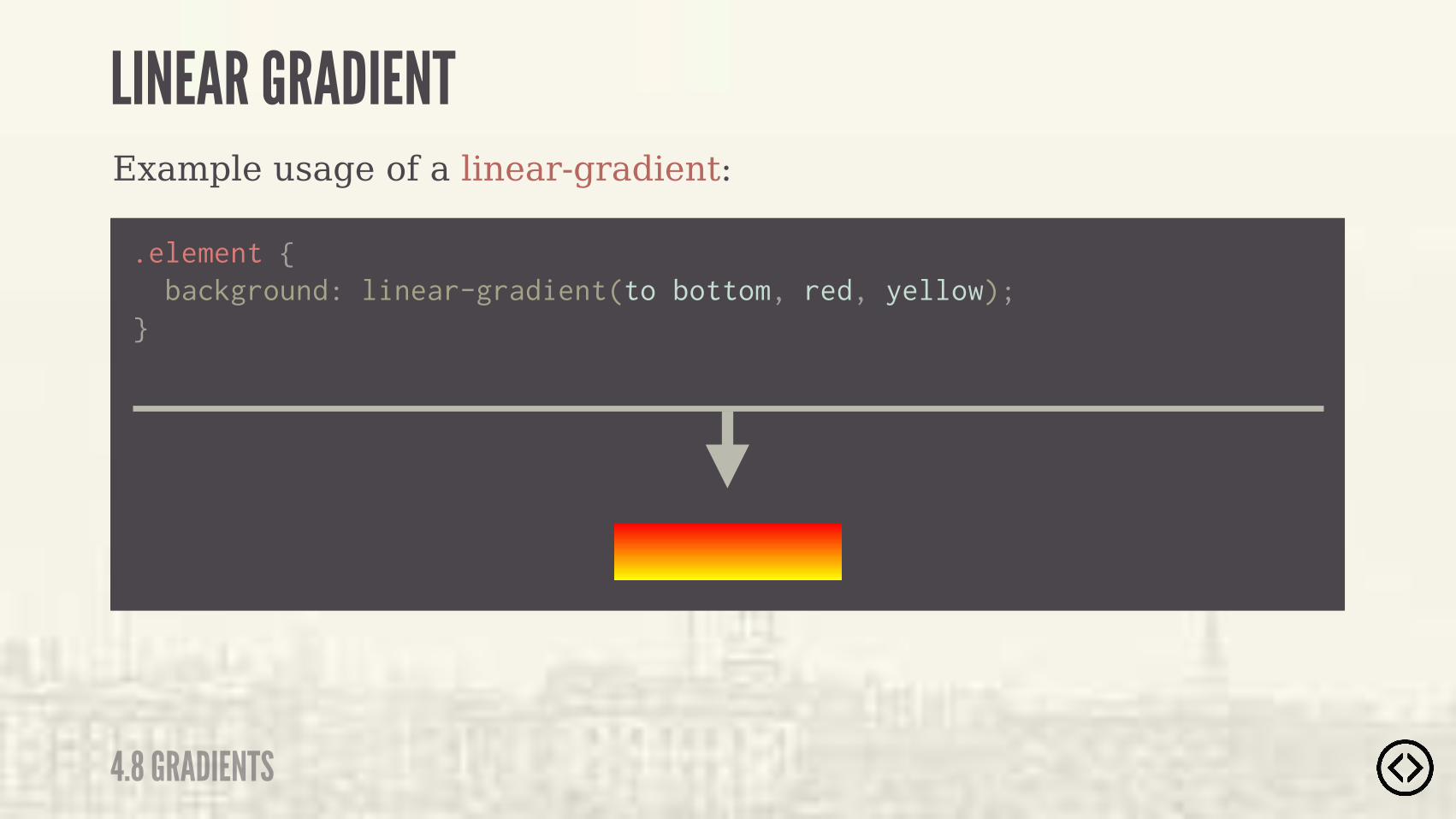
To create a linear gradient, we need to specify the starting point, the ending point, and optional stop-color points.
4.8 GRADIENTS
LINEAR GRADIENT
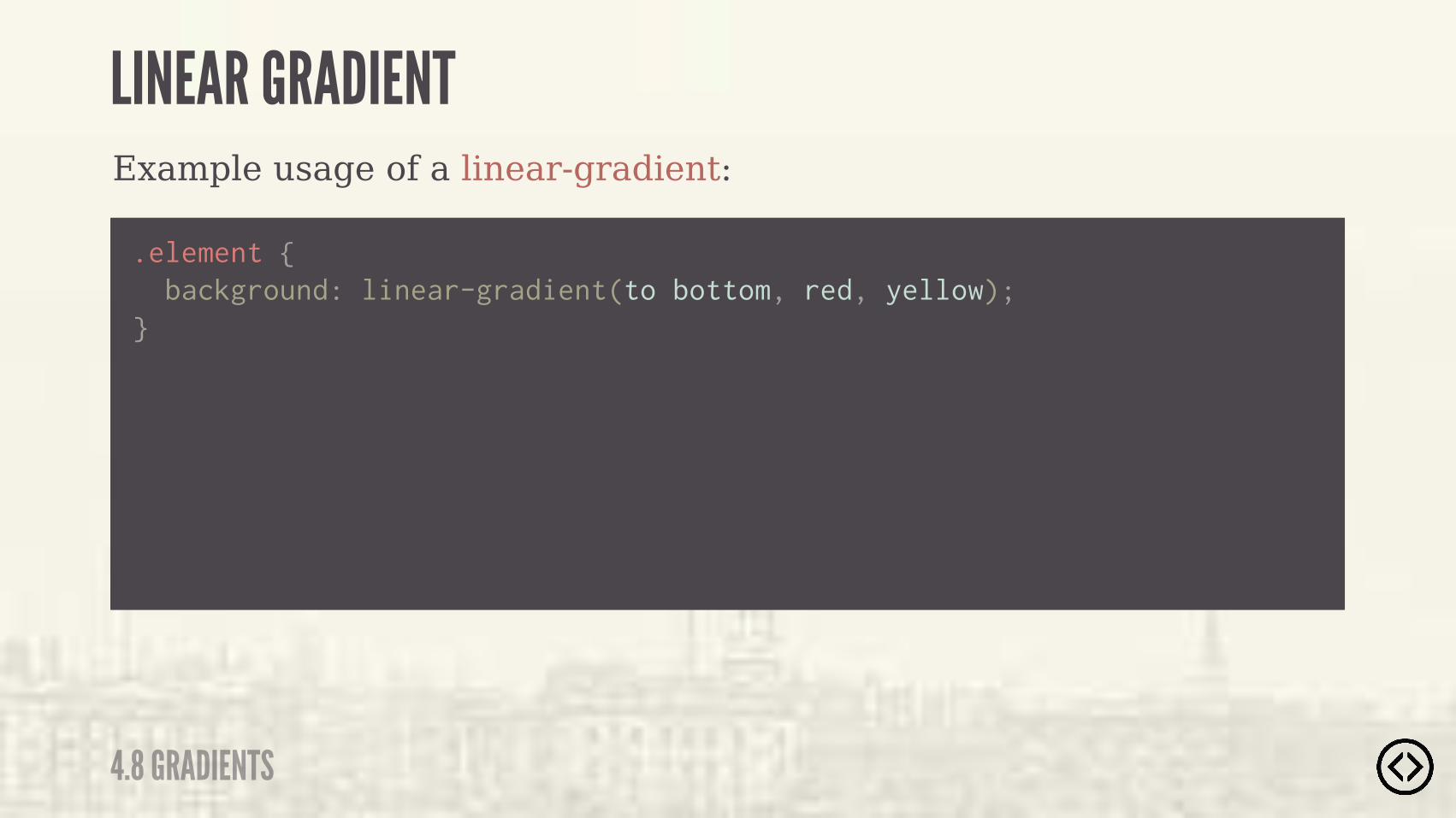
Example usage of a linear-gradient:
.element { background: linear-gradient(to bottom, red, yellow);}
4.8 GRADIENTS
LINEAR GRADIENT
Example usage of a linear-gradient:
.element { background: linear-gradient(to bottom, red, yellow);}
4.8 GRADIENTS
LINEAR GRADIENT
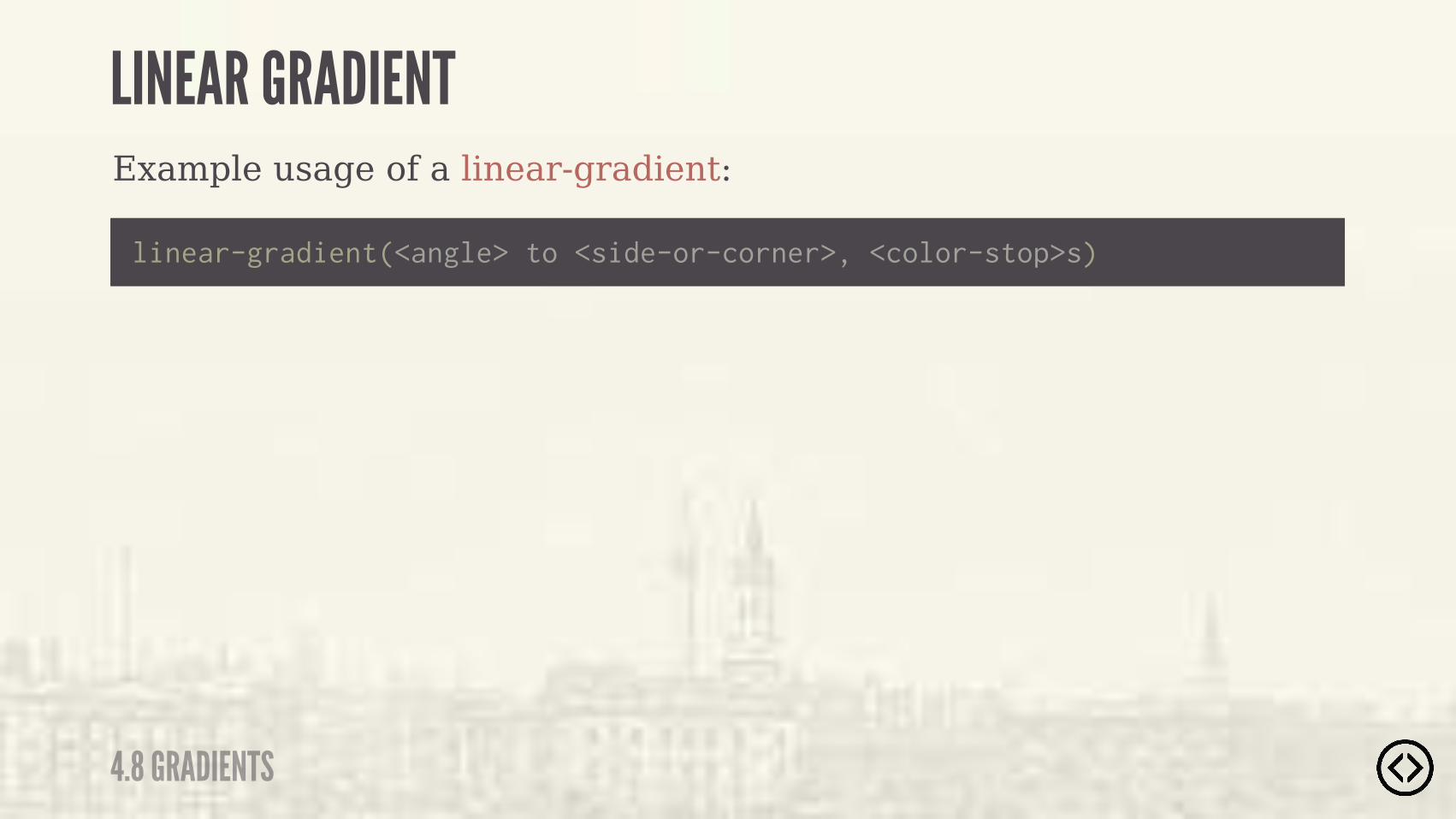
Example usage of a linear-gradient:
linear-gradient(<angle> to <side-or-corner>, <color-stop>s)
4.8 GRADIENTS
LINEAR GRADIENT

Example usage of a linear-gradient:
linear-gradient(<angle> to <side-or-corner>, <color-stop>s)
4.8 GRADIENTS
LINEAR GRADIENT
We can specify the direction through an angle or a keyword.
?
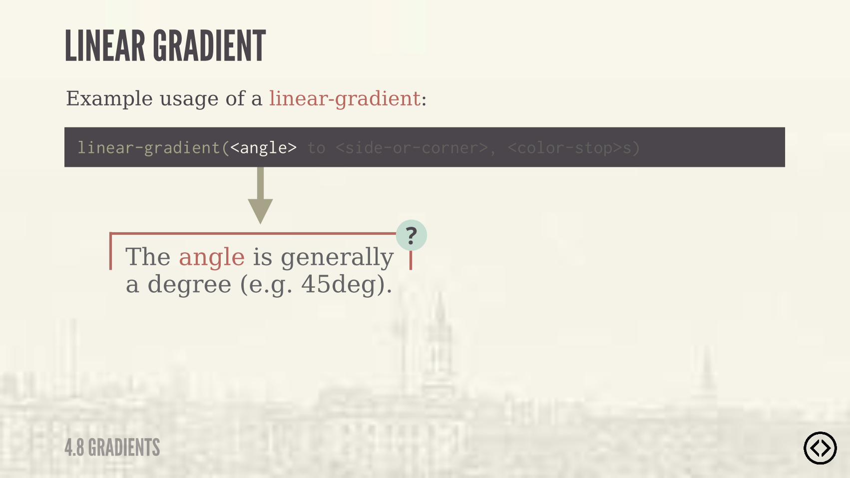
The angle is generally a degree (e.g. 45deg).
?
Example usage of a linear-gradient:
linear-gradient(<angle> to <side-or-corner>, <color-stop>s)
4.8 GRADIENTS
LINEAR GRADIENT
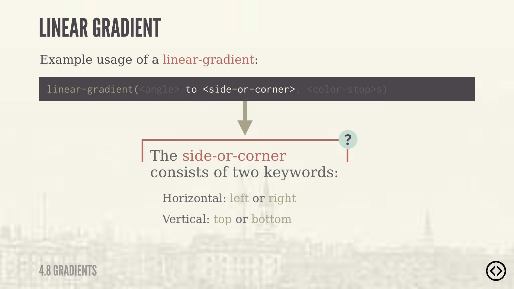
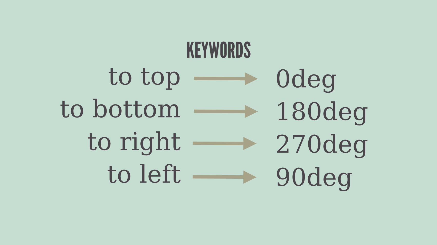
Horizontal: left or rightVertical: top or bottom
The side-or-corner consists of two keywords:
?
Example usage of a linear-gradient:
linear-gradient(<angle> to <side-or-corner>, <color-stop>s)
4.8 GRADIENTS
LINEAR GRADIENT

The color-stops consists of a color and an optional stop position, which can be either a percentage or length.
Example usage of a linear-gradient:
linear-gradient(<angle> to <side-or-corner>, <color-stop>s)
4.8 GRADIENTS
LINEAR GRADIENT

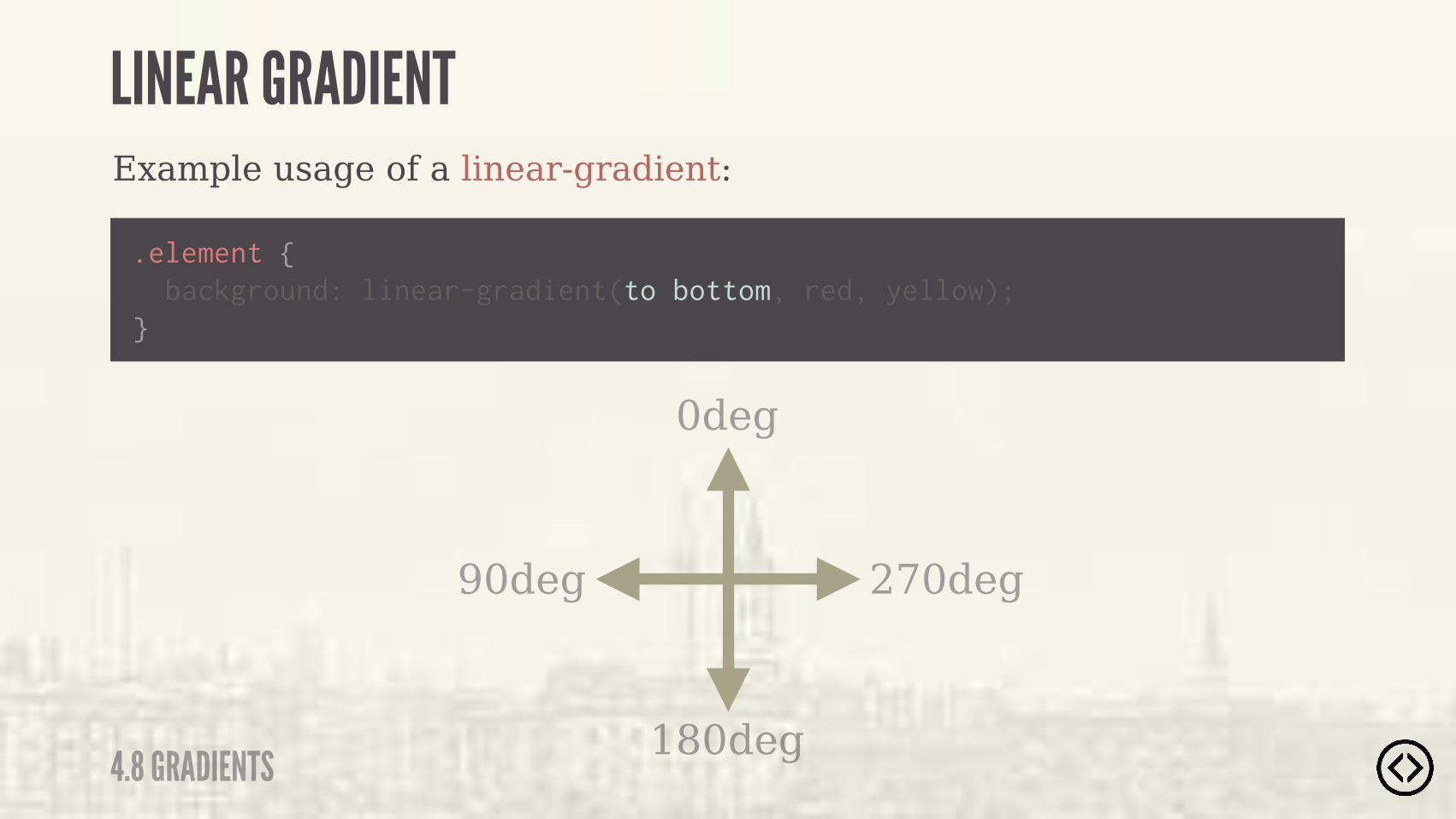
Example usage of a linear-gradient:
.element {
} background: linear-gradient(to bottom, red, yellow);
4.8 GRADIENTS
LINEAR GRADIENT

Example usage of a linear-gradient:
.element {
} background: linear-gradient(to bottom, red, yellow);
No angle is specified.
4.8 GRADIENTS
LINEAR GRADIENT

Example usage of a linear-gradient:
.element {
} background: linear-gradient(to bottom, red, yellow);
The side-or-corner is bottom, which makes the gradient go from the top to the bottom.
4.8 GRADIENTS
LINEAR GRADIENT
4.8 GRADIENTS
LINEAR GRADIENTExample usage of a linear-gradient:
.element {
} background: linear-gradient(to bottom, red, yellow);
The side-or-angle is bottom, which makes the gradient go from the top to the bottom.
to top 0degto bottom 180deg
to right 270degto left 90deg
KEYWORDS

Example usage of a linear-gradient:
.element {
} background: linear-gradient(to bottom, red, yellow);
�� )� )�*(�$)"�*��� $*%�������
4.8 GRADIENTS
LINEAR GRADIENT
Example usage of a linear-gradient:
.element {
} background: linear-gradient(to bottom, red, yellow);
4.8 GRADIENTS
LINEAR GRADIENT
180deg
0deg
270deg90deg
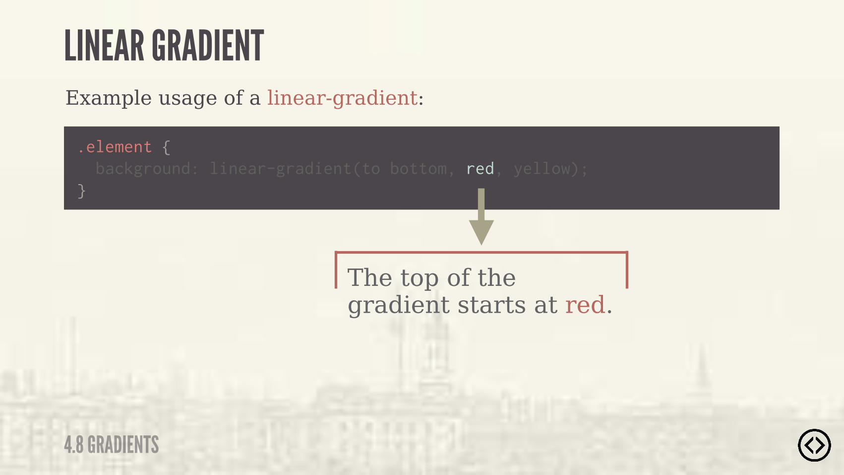
Example usage of a linear-gradient:
.element {
} background: linear-gradient(to bottom, red, yellow);
The top of the gradient starts at red.
4.8 GRADIENTS
LINEAR GRADIENT
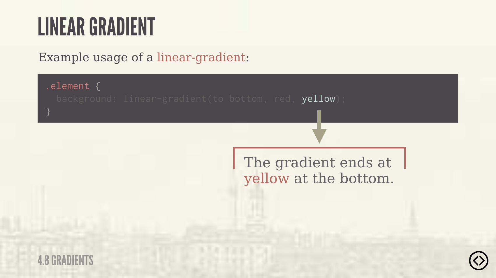
Example usage of a linear-gradient:
.element {
} background: linear-gradient(to bottom, red, yellow);
The gradient ends at yellow at the bottom.
4.8 GRADIENTS
LINEAR GRADIENT
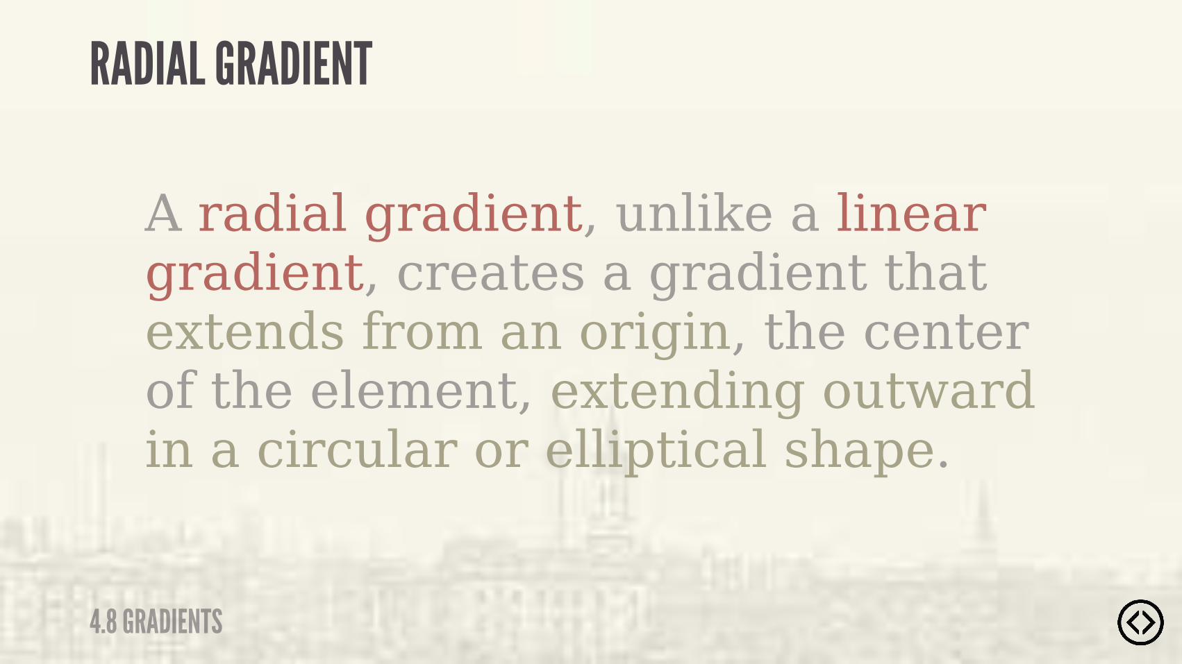
A radial gradient, unlike a linear gradient, creates a gradient that extends from an origin, the center of the element, extending outward in a circular or elliptical shape.
4.8 GRADIENTS
RADIAL GRADIENT
๏ The center๏ The ending shape contour and position๏ Color stops
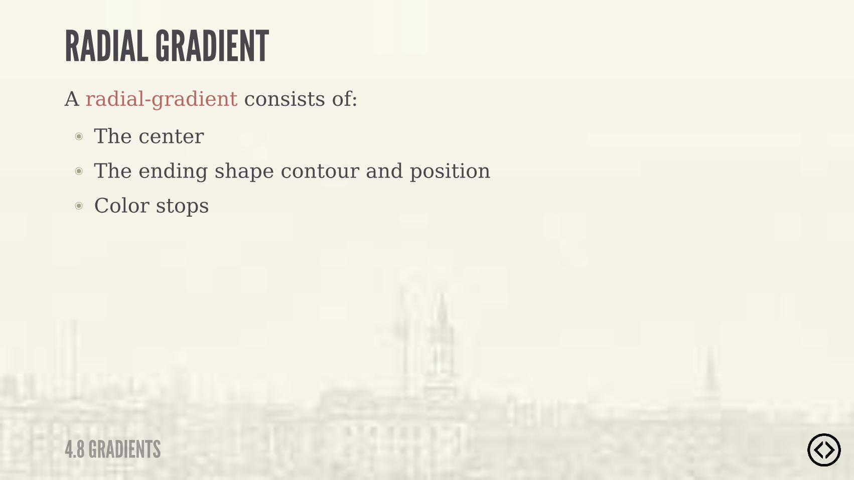
A radial-gradient consists of:
4.8 GRADIENTS
RADIAL GRADIENT
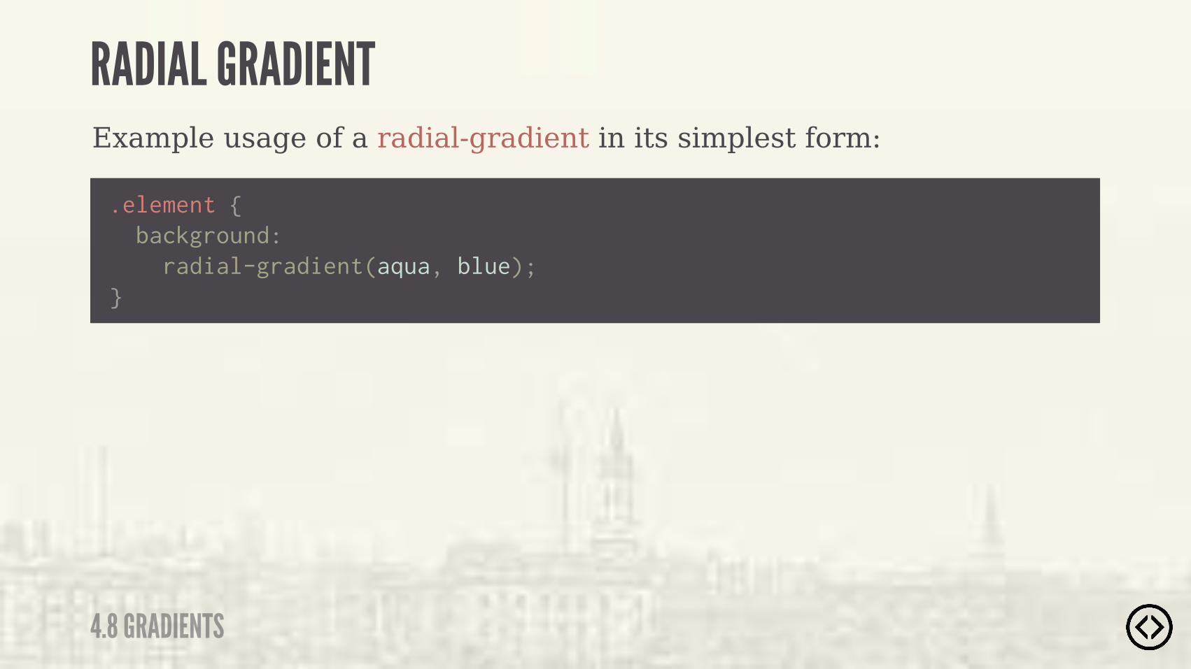
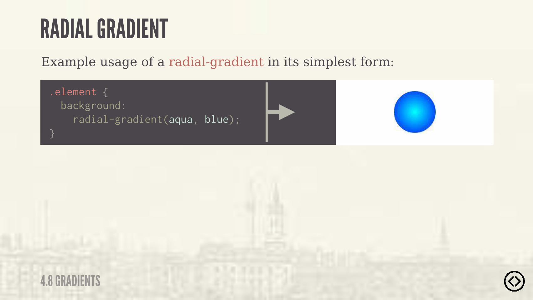
Example usage of a radial-gradient in its simplest form:
.element { background: radial-gradient(aqua, blue);}
4.8 GRADIENTS
RADIAL GRADIENT
Example usage of a radial-gradient in its simplest form:
.element { background: radial-gradient(aqua, blue);}
4.8 GRADIENTS
RADIAL GRADIENT

Example usage of a radial-gradient in its simplest form:
.element { background: radial-gradient(aqua, blue);}
�� )��(��*�)���*-%��%"%(��"" &* ��"��(�� �$*�*��*�(�� �*�)��(%#�*�����$*�(��/�����+"*�
4.8 GRADIENTS
RADIAL GRADIENT

Example usage of a radial-gradient:
4.8 GRADIENTS
RADIAL GRADIENT
radial-gradient(<shape> <size> at <position>, <color-stop>s)

Specify the shape or size of the gradient.
?
Example usage of a radial-gradient:
4.8 GRADIENTS
RADIAL GRADIENT
radial-gradient(<shape> <size> at <position>, <color-stop>s)
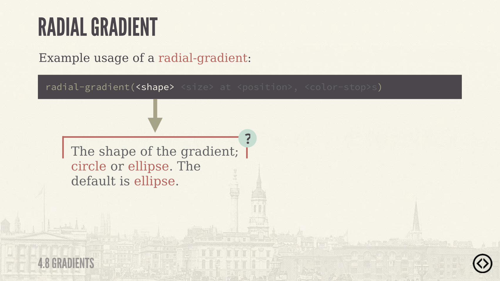
The shape of the gradient; circle or ellipse. The default is ellipse.
?
Example usage of a radial-gradient:
4.8 GRADIENTS
RADIAL GRADIENT
radial-gradient(<shape> <size> at <position>, <color-stop>s)
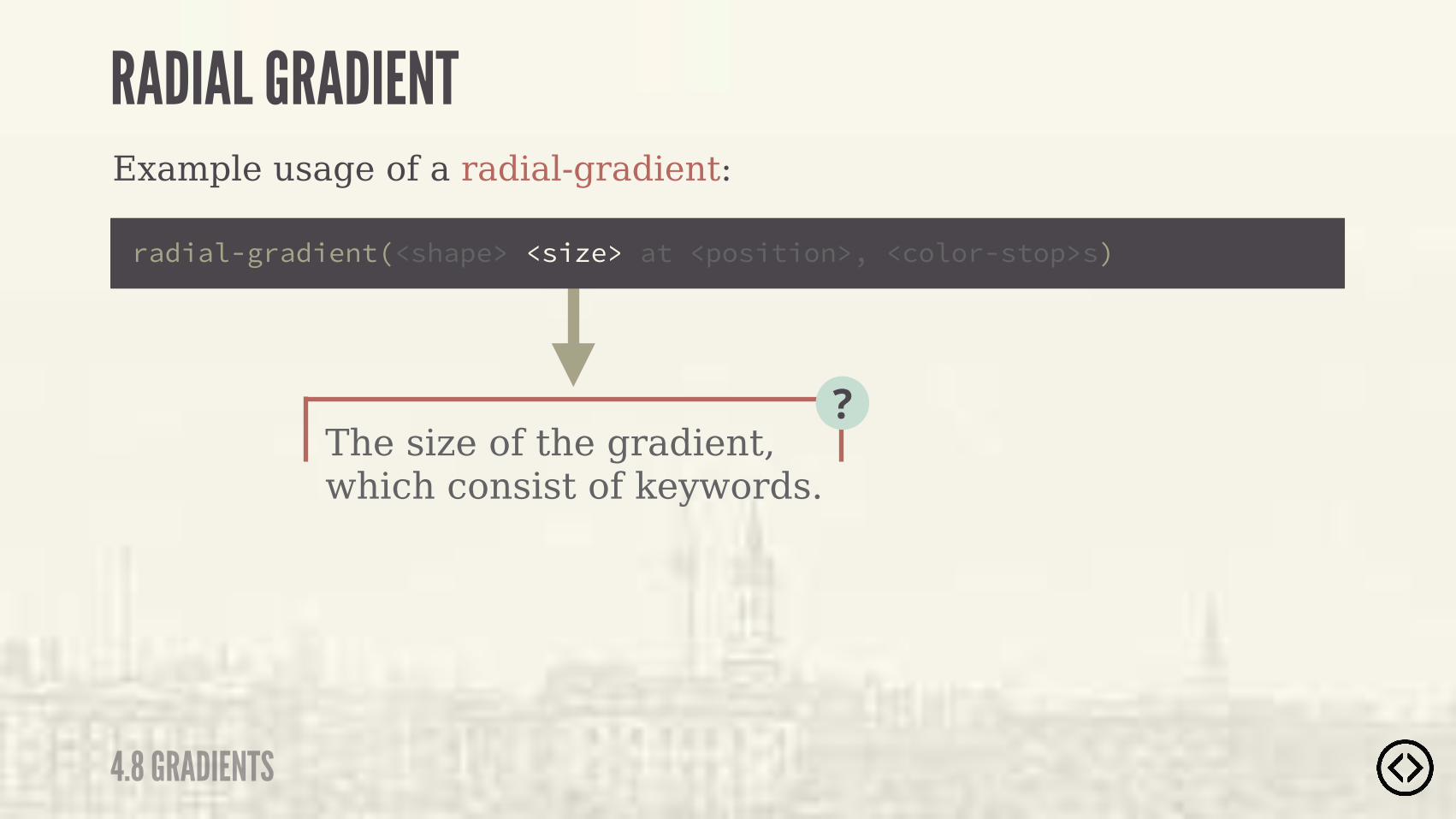
The size of the gradient, which consist of keywords.
?
Example usage of a radial-gradient:
radial-gradient(<shape> <size> at <position>, <color-stop>s)
4.8 GRADIENTS
RADIAL GRADIENT
The size of the gradient, which consist of keywords.
?
Example usage of a radial-gradient:
radial-gradient(<shape> <size> at <position>, <color-stop>s)
4.8 GRADIENTS
RADIAL GRADIENT
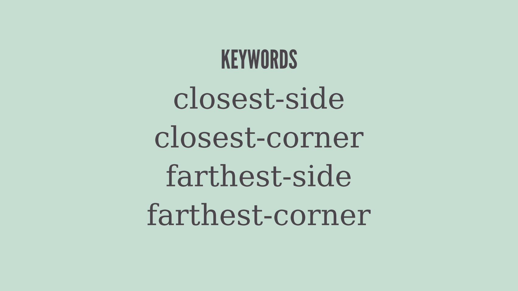
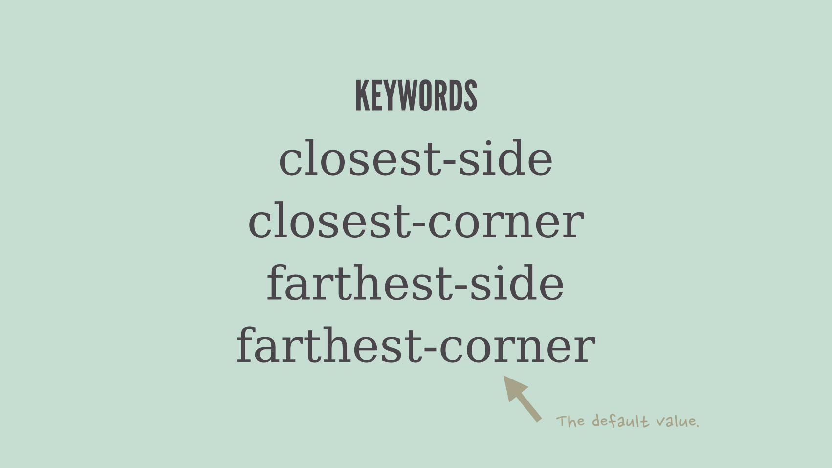
closest-sideclosest-cornerfarthest-side
farthest-corner
KEYWORDS
The size of the gradient, which consist of keywords.
?
Example usage of a radial-gradient:
radial-gradient(<shape> <size> at <position>, <color-stop>s)
4.8 GRADIENTS
RADIAL GRADIENT
closest-sideclosest-cornerfarthest-side
farthest-corner
KEYWORDS
��������+"*�,�"+��

The size can also be a length or percentage.
?
Example usage of a radial-gradient:
radial-gradient(<shape> <size> at <position>, <color-stop>s)
4.8 GRADIENTS
RADIAL GRADIENT
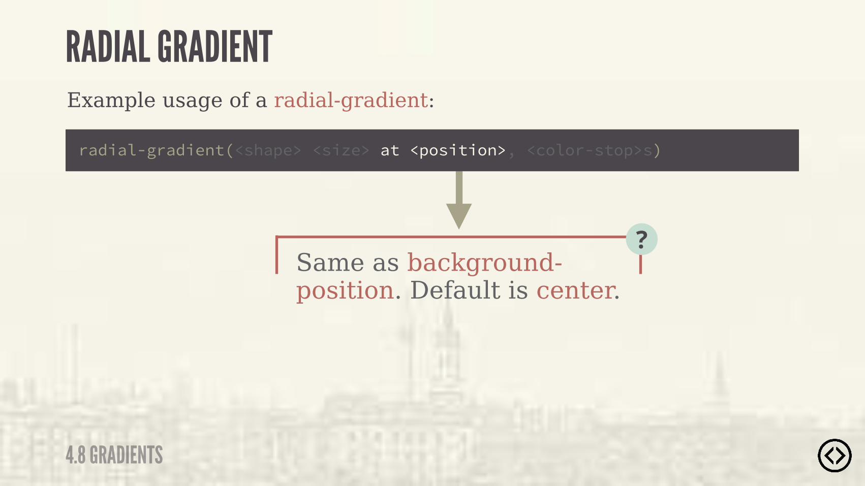
Same as background-position. Default is center.
?
Example usage of a radial-gradient:
4.8 GRADIENTS
RADIAL GRADIENT
radial-gradient(<shape> <size> at <position>, <color-stop>s)
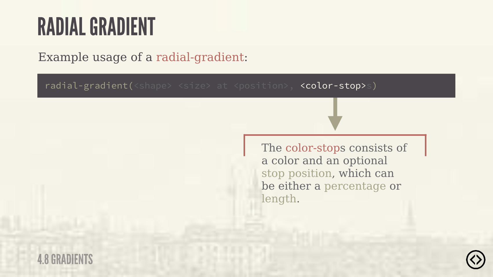
The color-stops consists of a color and an optional stop position, which can be either a percentage or length.
Example usage of a radial-gradient:
4.8 GRADIENTS
RADIAL GRADIENT
radial-gradient(<shape> <size> at <position>, <color-stop>s)
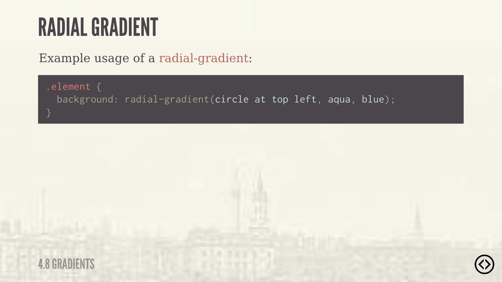
Example usage of a radial-gradient:
.element {
} background: radial-gradient(circle at top left, aqua, blue);
4.8 GRADIENTS
RADIAL GRADIENT
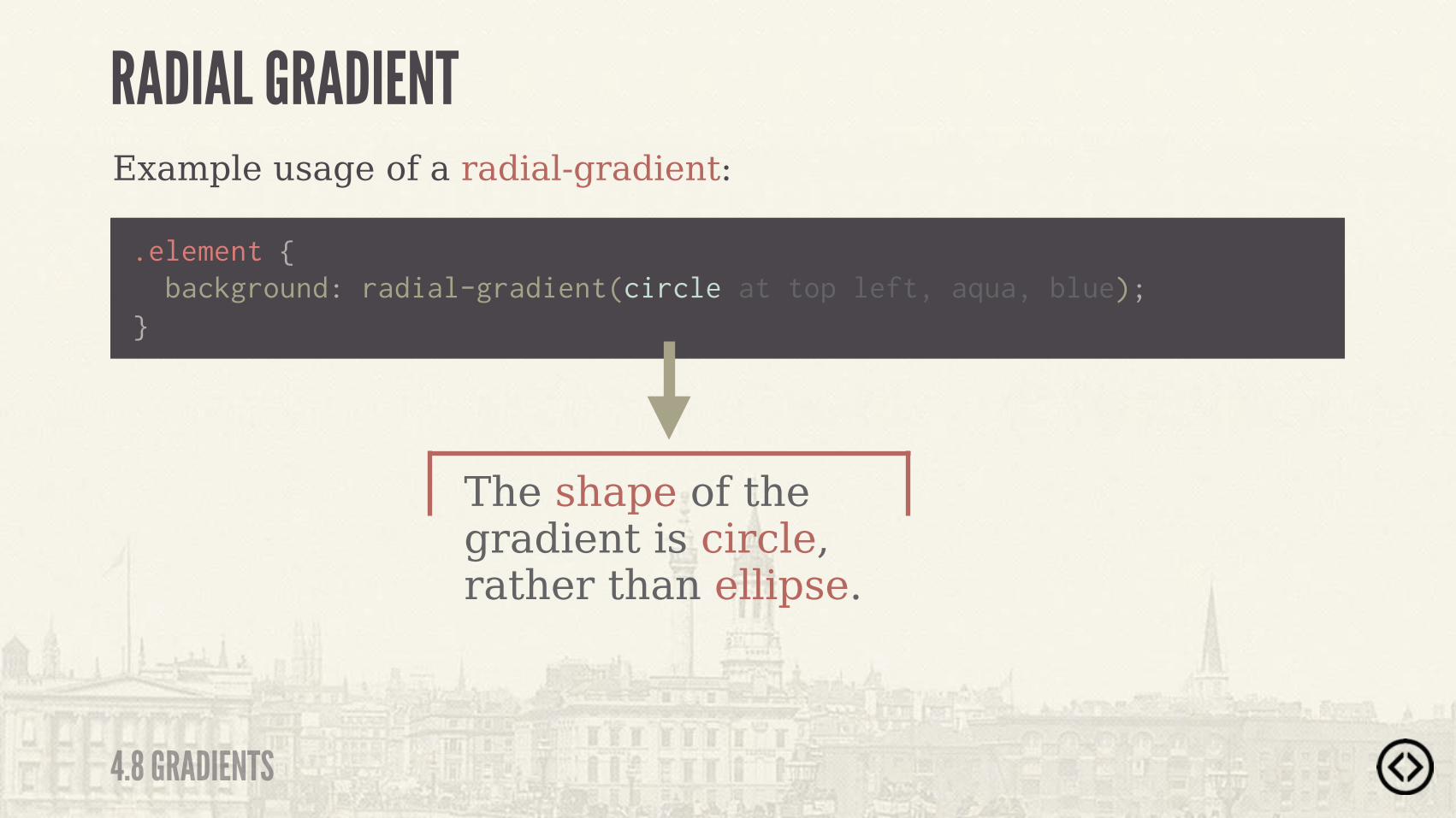
Example usage of a radial-gradient:
.element { !}
The shape of the gradient is circle, rather than ellipse.
4.8 GRADIENTS
RADIAL GRADIENT
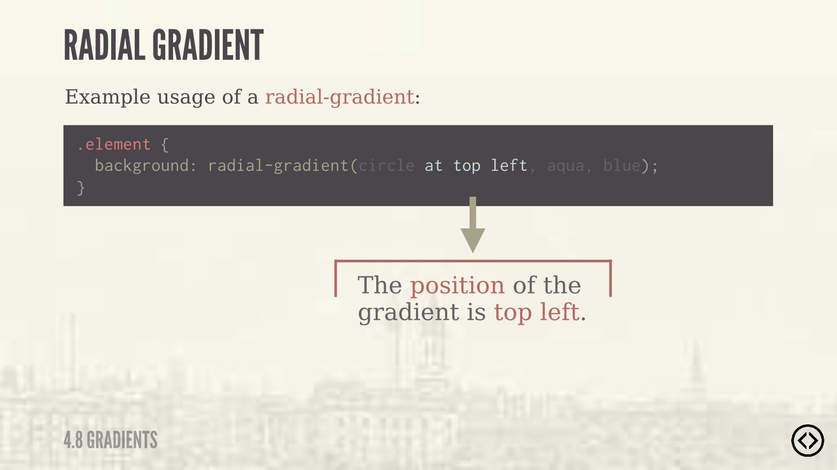
background: radial-gradient(circle at top left, aqua, blue);
Example usage of a radial-gradient:
.element {
}
The position of the gradient is top left.
4.8 GRADIENTS
RADIAL GRADIENT
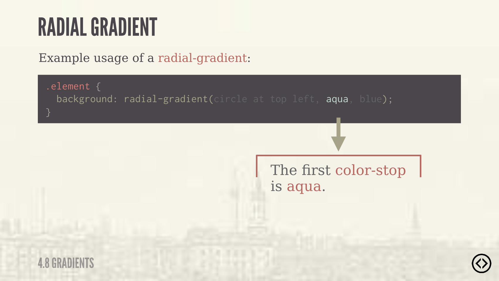
background: radial-gradient(circle at top left, aqua, blue);
Example usage of a radial-gradient:
.element {
}
The first color-stop is aqua.
4.8 GRADIENTS
RADIAL GRADIENT
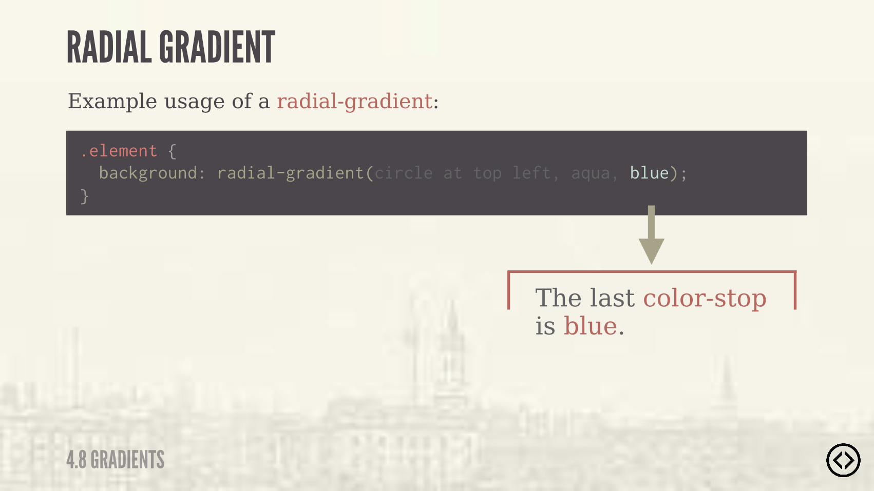
background: radial-gradient(circle at top left, aqua, blue);
Example usage of a radial-gradient:
.element {
}
The last color-stop is blue.
4.8 GRADIENTS
RADIAL GRADIENT
background: radial-gradient(circle at top left, aqua, blue);
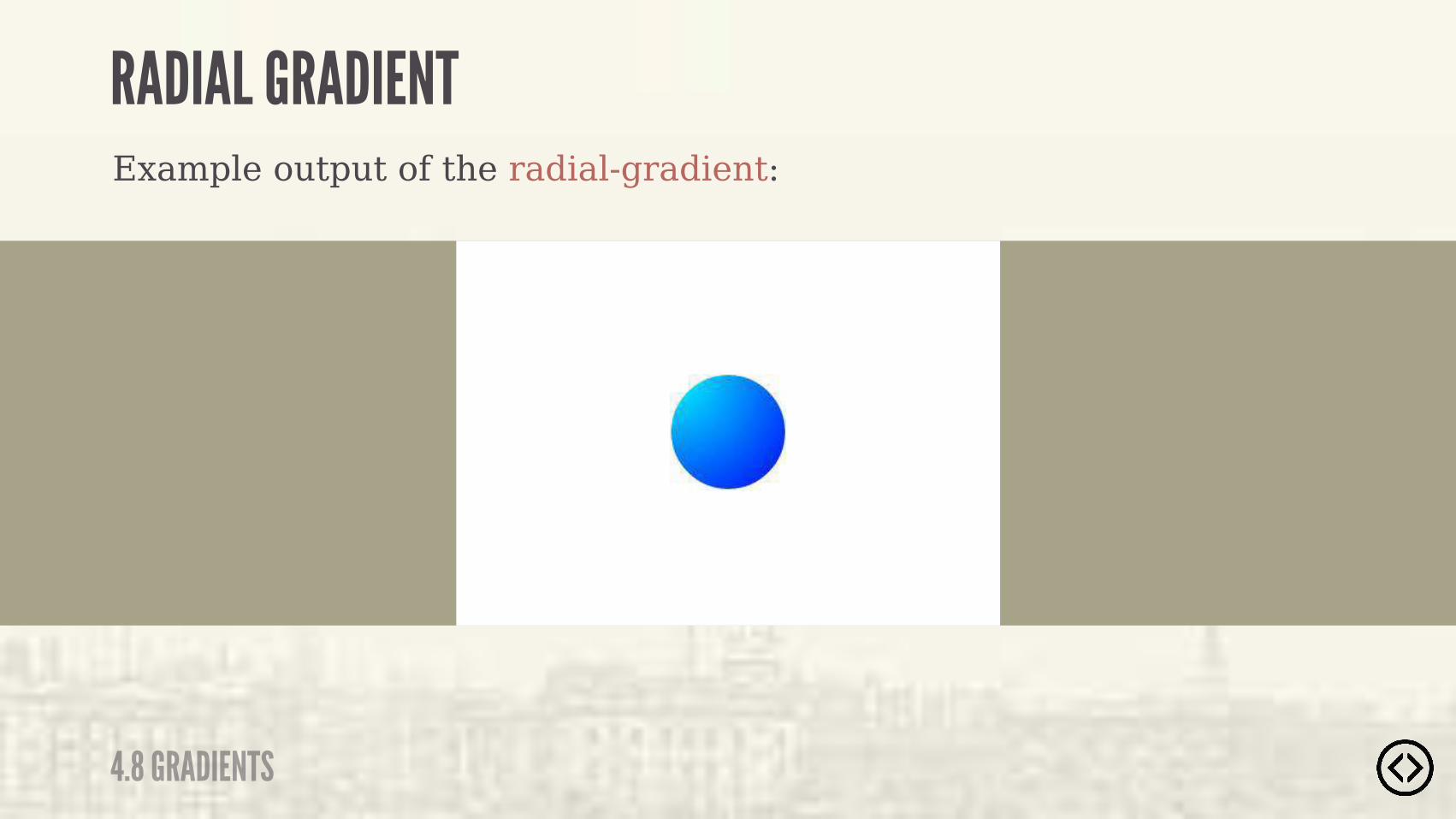
Example output of the radial-gradient:
4.8 GRADIENTS
RADIAL GRADIENT


Level 5 - Fonts & Interactions

๏ Transforms๏ Transitions
TABLE OF CONTENTS
LEVEL 5
๏ Progressive Enhancement
๏ Font Face

๏ Transforms๏ Transitions๏ Progressive Enhancement
๏ Font Face
TABLE OF CONTENTS
LEVEL 5
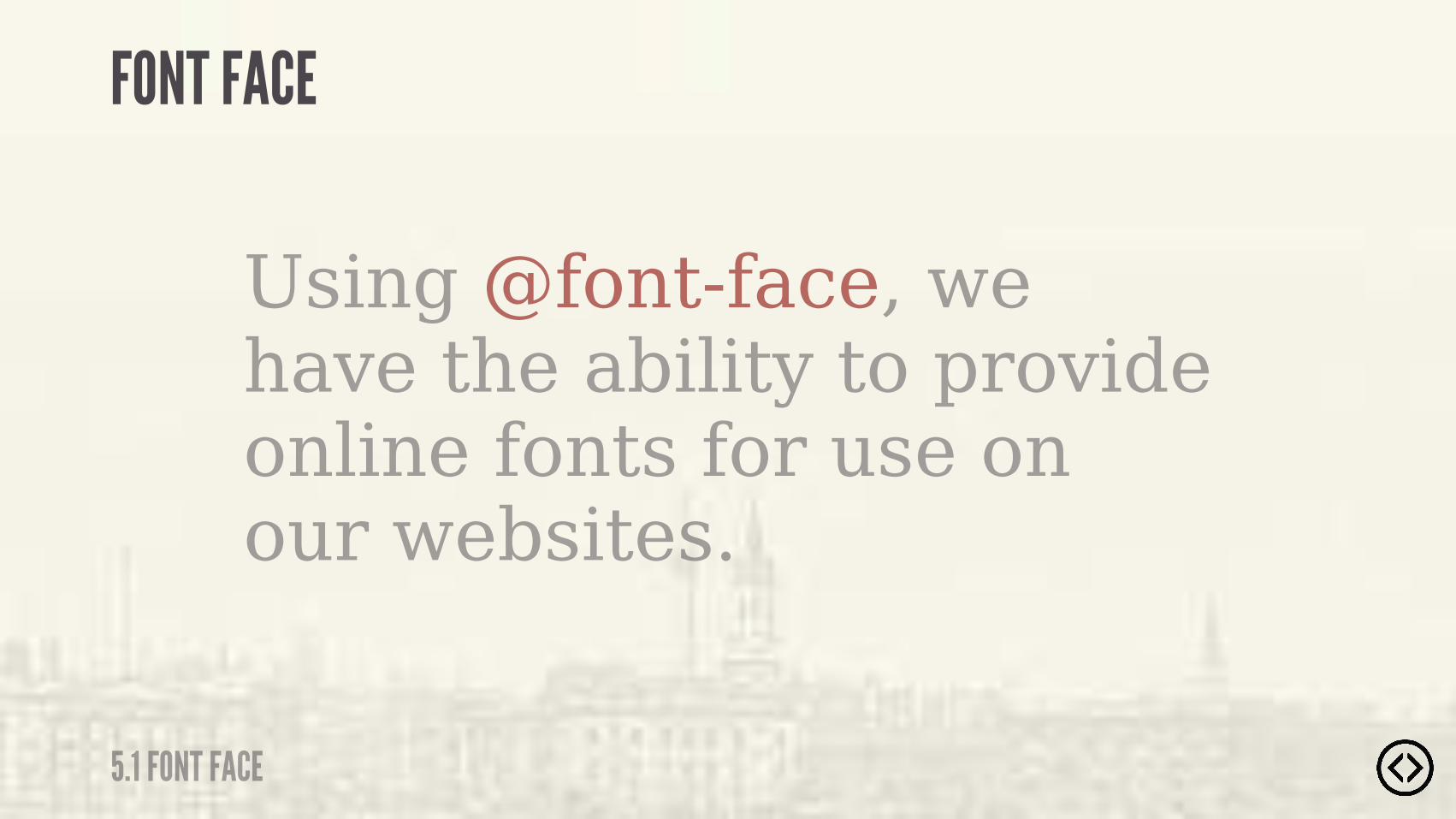
Using @font-face, we have the ability to provide online fonts for use on our websites.
FONT FACE
5.1 FONT FACE
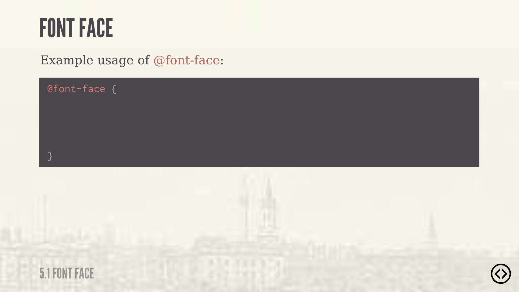
Example usage of @font-face:
@font-face {
}
FONT FACE
5.1 FONT FACE
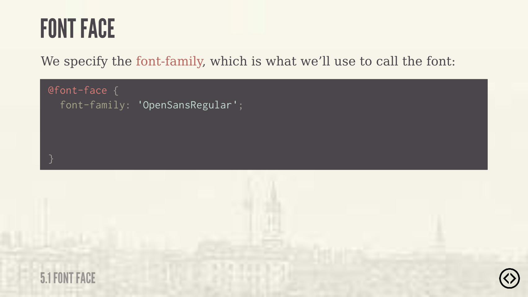
We specify the font-family, which is what we’ll use to call the font:
@font-face {
}
font-family: 'OpenSansRegular';
FONT FACE
5.1 FONT FACE
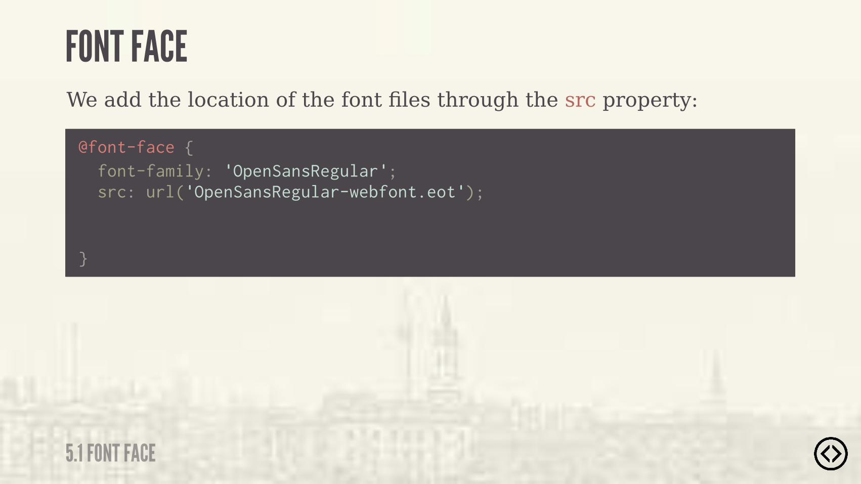
We add the location of the font files through the src property:
@font-face {
}
src: url('OpenSansRegular-webfont.eot'); font-family: 'OpenSansRegular';
FONT FACE
5.1 FONT FACE

We add the location of the font files through the src property:
��0""���+��)%�(&�� �.�#*") &"���%$)�).&�(��,� �����$�����������(���� ) %$�"�*'"��0(�)%�)���� "�(�
@font-face {
}
src: url('OpenSansRegular-webfont.eot'); font-family: 'OpenSansRegular';
FONT FACE
5.1 FONT FACE

We specify the font-style:
@font-face {
}
font-style: normal; src: url('OpenSansRegular-webfont.eot'); font-family: 'OpenSansRegular';
FONT FACE
5.1 FONT FACE
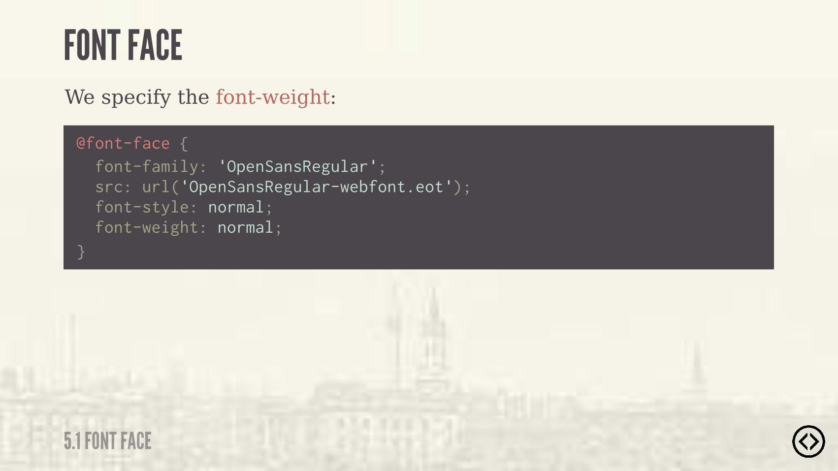
We specify the font-weight:
@font-face {
} font-weight: normal; font-style: normal; src: url('OpenSansRegular-webfont.eot'); font-family: 'OpenSansRegular';
FONT FACE
5.1 FONT FACE
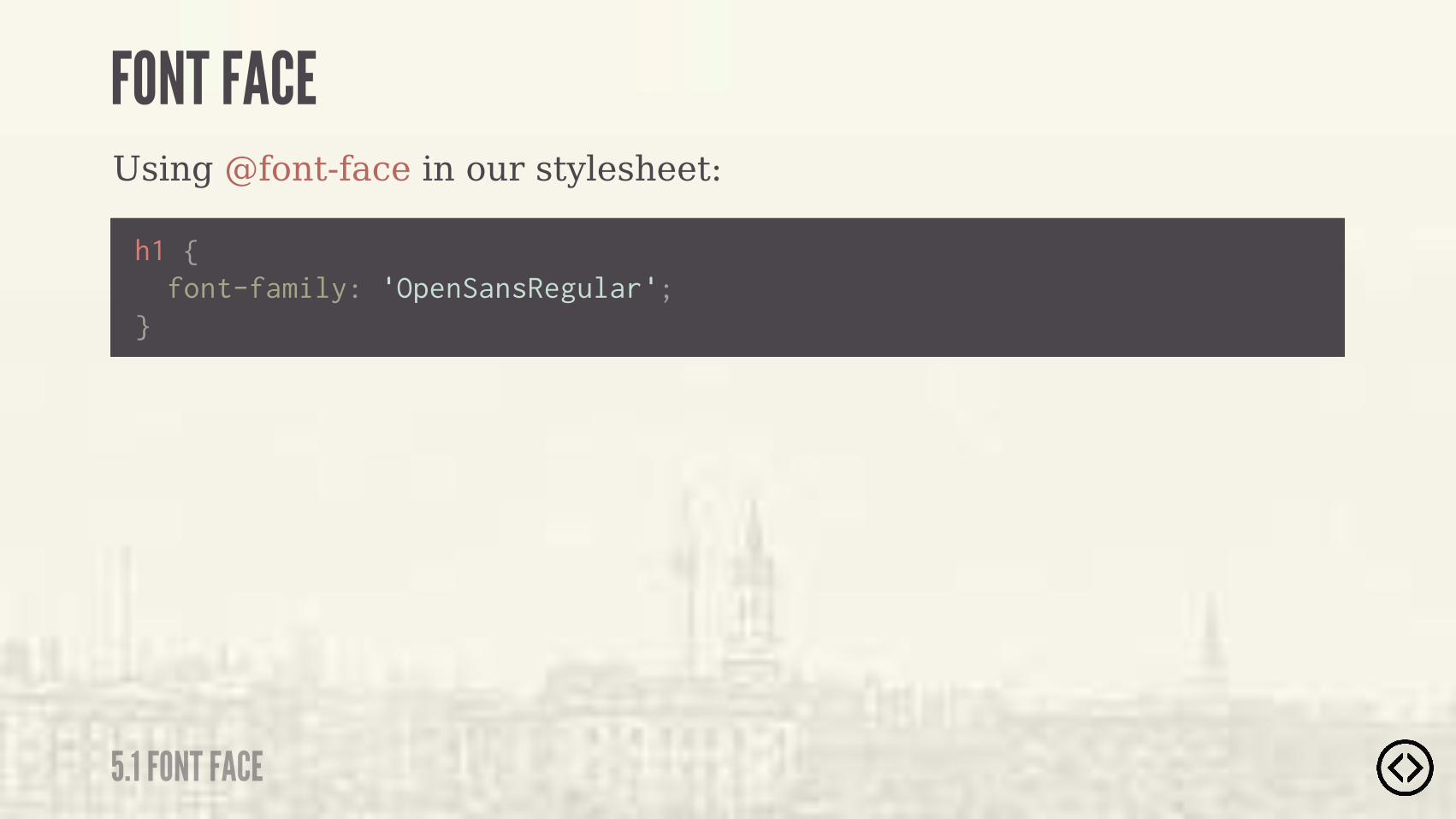
Using @font-face in our stylesheet:
h1 { font-family: 'OpenSansRegular';}
FONT FACE
5.1 FONT FACE
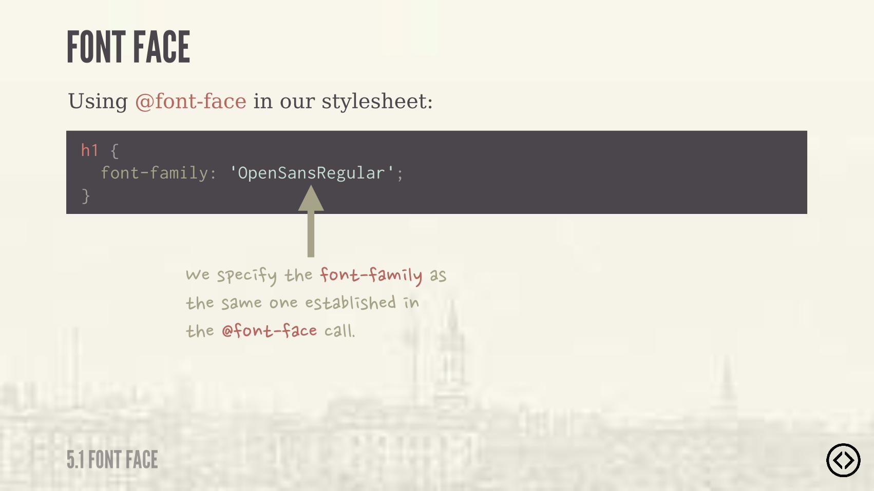
Using @font-face in our stylesheet:
���(&�� �.�)����%$)���# ".��(�)���(�#��%$���()��" (���� $�)��� �%$)��������""�
h1 { font-family: 'OpenSansRegular';}
FONT FACE
5.1 FONT FACE
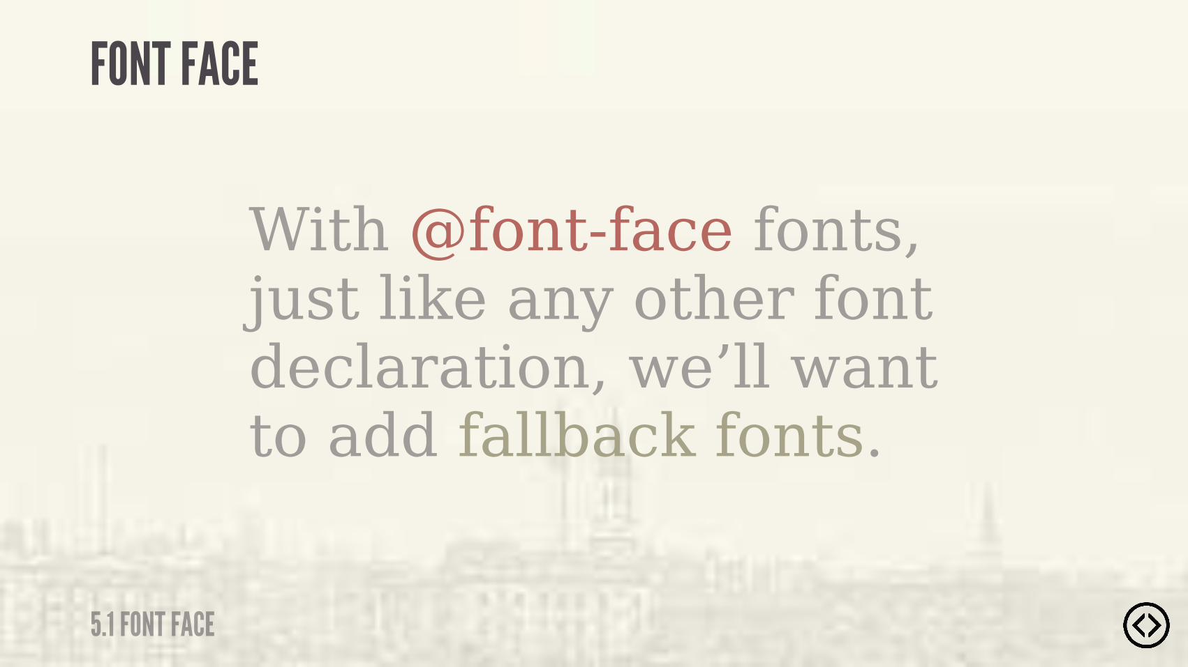
With @font-face fonts, just like any other font declaration, we’ll want to add fallback fonts.
FONT FACE
5.1 FONT FACE
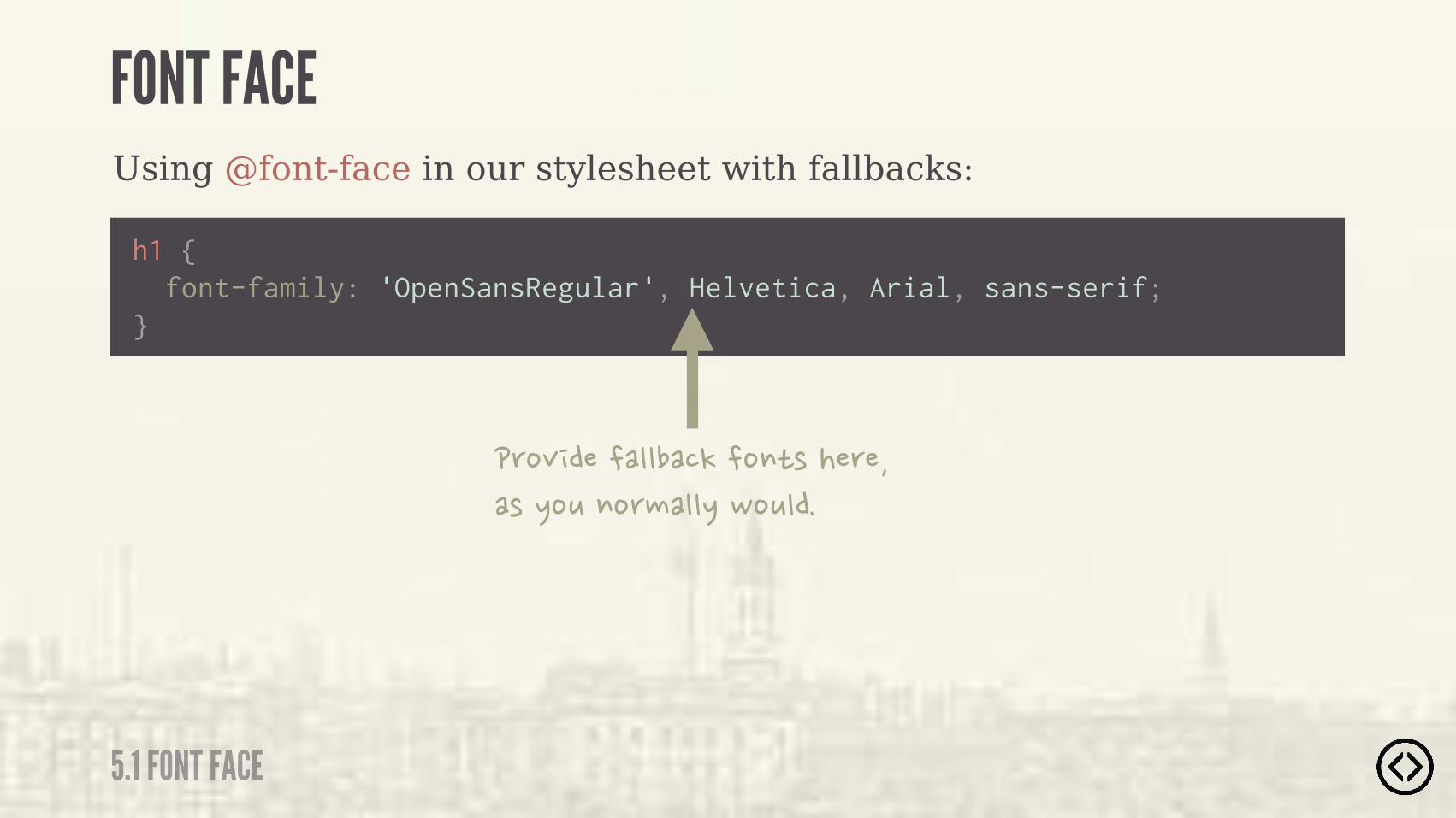
Using @font-face in our stylesheet with fallbacks:
�'%+ �����""���!��%$)(���'����(�.%*�$%'#�"".�,%*"��
h1 {
} font-family: 'OpenSansRegular', Helvetica, Arial, sans-serif;
FONT FACE
5.1 FONT FACE

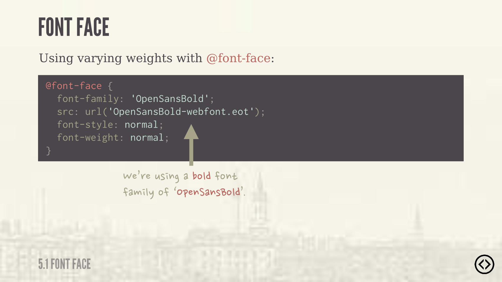
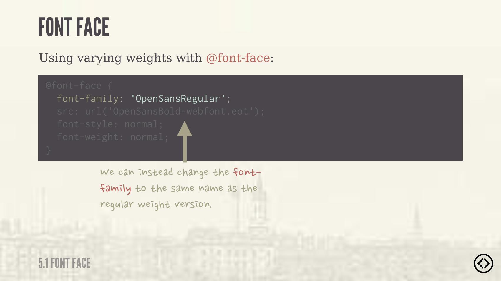
Using varying weights with @font-face:
FONT FACE
5.1 FONT FACE
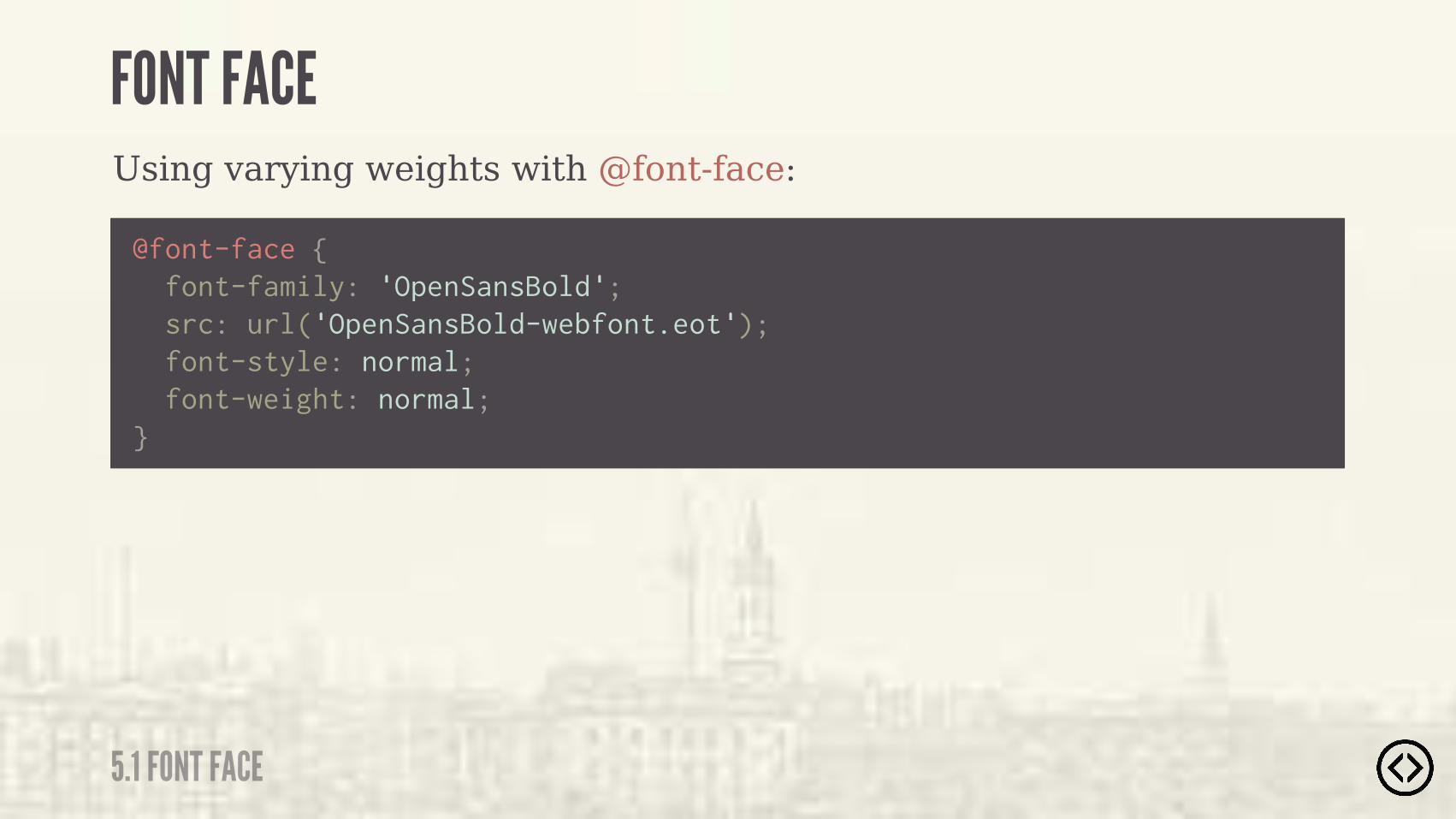
@font-face { font-family: 'OpenSansBold'; src: url('OpenSansBold-webfont.eot'); font-style: normal; font-weight: normal;}
Using varying weights with @font-face:
FONT FACE
5.1 FONT FACE
��0'��*( $�����%"���%$)���# ".�%��/�&�$��$(�%"�0�
@font-face { font-family: 'OpenSansBold'; src: url('OpenSansBold-webfont.eot'); font-style: normal; font-weight: normal;}
Using varying weights with @font-face:
FONT FACE
5.1 FONT FACE
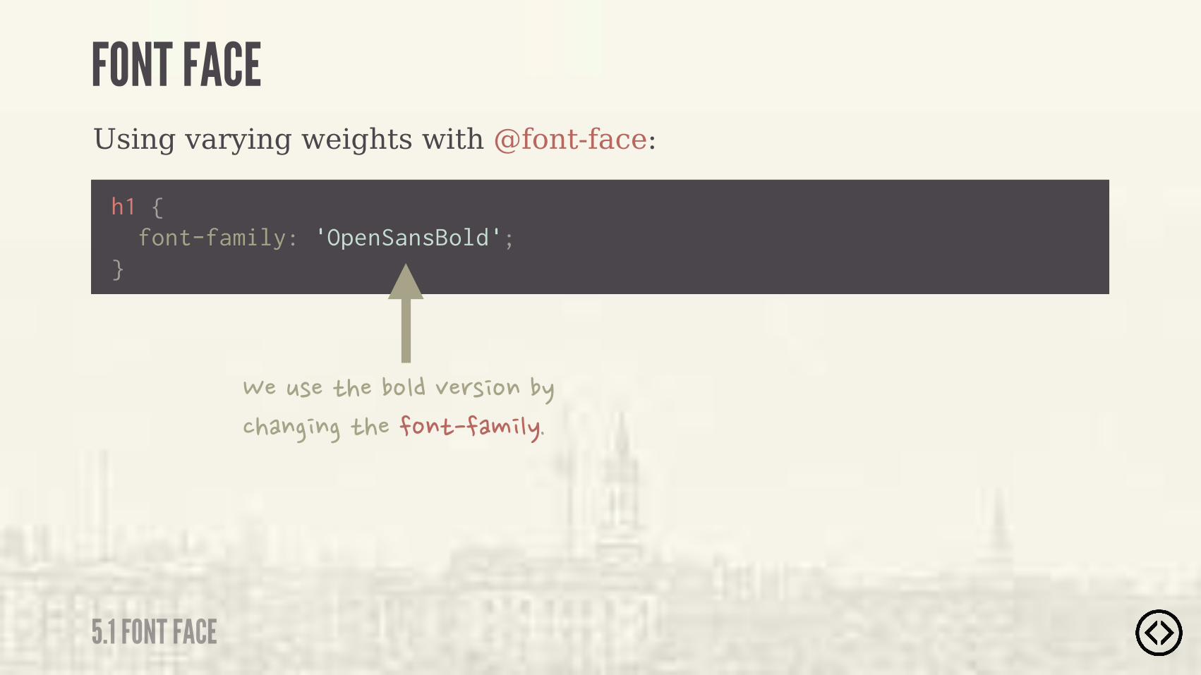
h1 { font-family: 'OpenSansBold';}
���*(��)����%"��+�'( %$��.����$� $��)����%$)���# ".�

We can alter the @font-face call in order to use the font-weight and font-style properties as usual.
FONT FACE
5.1 FONT FACE
Using varying weights with @font-face:
FONT FACE
5.1 FONT FACE
@font-face { font-family: 'OpenSansBold'; src: url('OpenSansBold-webfont.eot'); font-style: normal; font-weight: normal;}
Using varying weights with @font-face:
FONT FACE
5.1 FONT FACE
@font-face {
src: url('OpenSansBold-webfont.eot'); font-style: normal; font-weight: normal;}
�����$� $()�������$���)����%$)���# ".�)%�)���(�#��$�#���(�)���'��*"�'�,� ��)�+�'( %$�
font-family: 'OpenSansRegular';
Using varying weights with @font-face:
FONT FACE
5.1 FONT FACE
@font-face {
src: url('OpenSansBold-webfont.eot'); font-style: normal; font-weight: normal;}
���!��&�)���('��*'"���)���(�#�� $�%'��'�)%� $�"*���)����%"���%$)�,� ��)�
font-family: 'OpenSansRegular';
Using varying weights with @font-face:
FONT FACE
5.1 FONT FACE
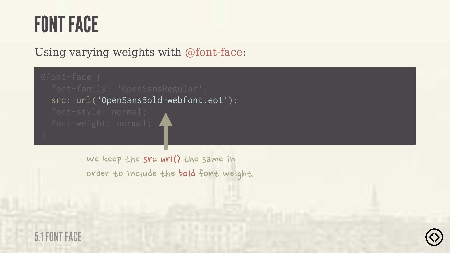
@font-face { font-family: 'OpenSansRegular'; src: url('OpenSansBold-webfont.eot'); font-style: normal;
}
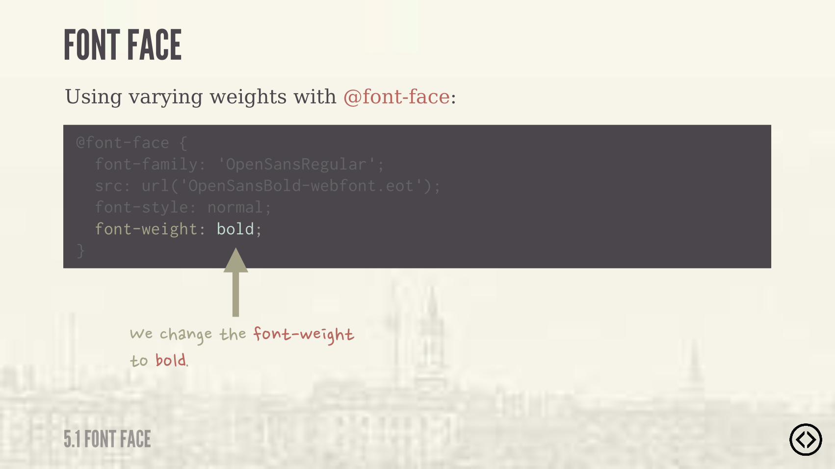
������$���)����%$)�,� ��)�)%��%"��
font-weight: bold;
Using varying weights with @font-face:
FONT FACE
5.1 FONT FACE
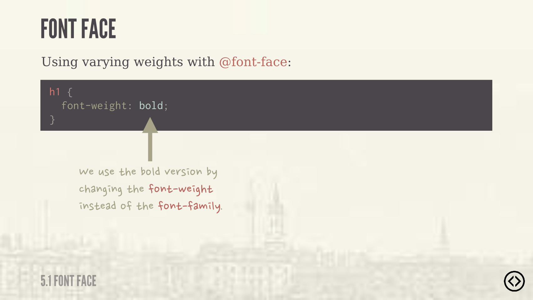
h1 { font-weight: bold;}
���*(��)����%"��+�'( %$��.����$� $��)����%$)�,� ��)� $()����%��)����%$)���# ".�

๏ Transforms๏ Transitions
TABLE OF CONTENTS
LEVEL 5
๏ Progressive Enhancement
๏ Font Face

๏ Transforms๏ Transitions๏ Progressive Enhancement
๏ Font Face
TABLE OF CONTENTS
LEVEL 5
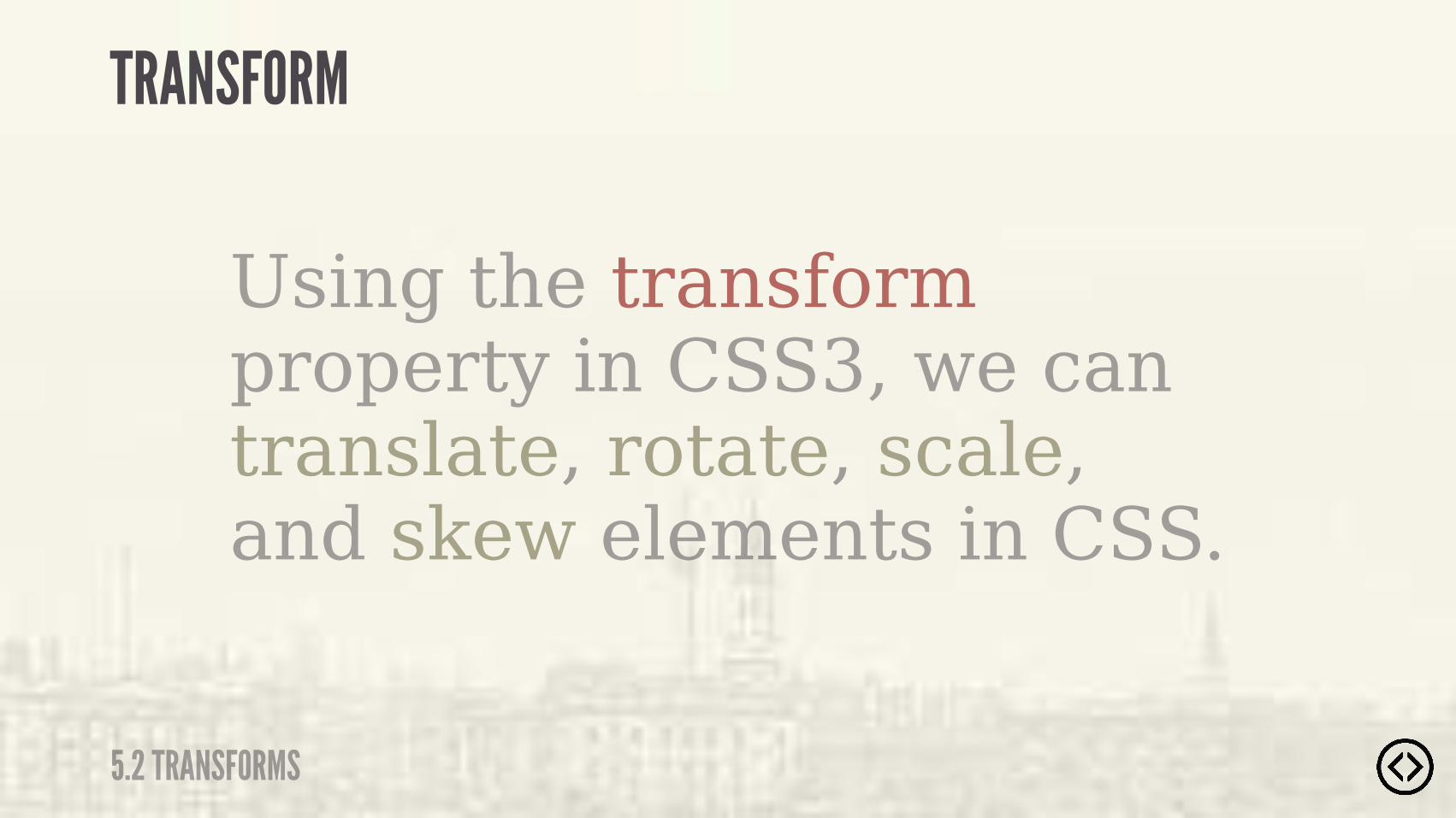
Using the transform property in CSS3, we can translate, rotate, scale, and skew elements in CSS.
TRANSFORM
5.2 TRANSFORMS
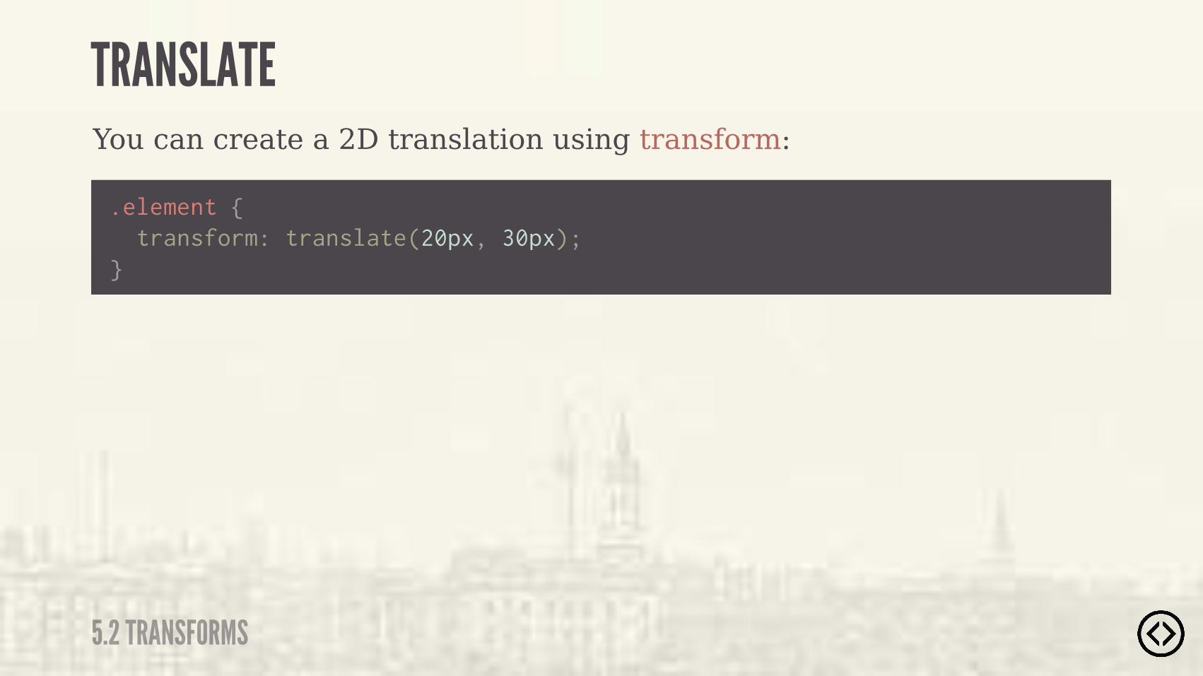
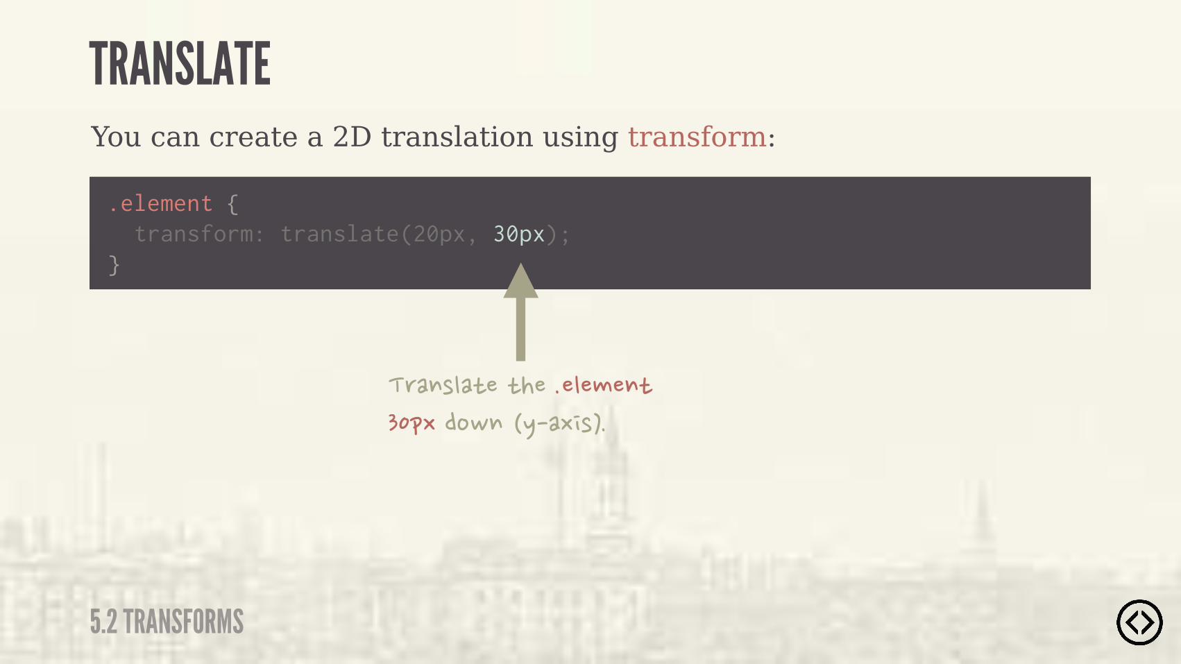
You can create a 2D translation using transform:
.element { transform: translate(20px, 30px);}
TRANSLATE
5.2 TRANSFORMS

You can create a 2D translation using transform:
.element { transform: translate(20px, 30px);}
�'�$("�)��)�����"�#�$)��&-�)%�)���' ��)��-��- (��
TRANSLATE
5.2 TRANSFORMS
You can create a 2D translation using transform:
.element { transform: translate(20px, 30px);}
�'�$("�)��)�����"�#�$)��&-��%,$��.��- (��
TRANSLATE
5.2 TRANSFORMS
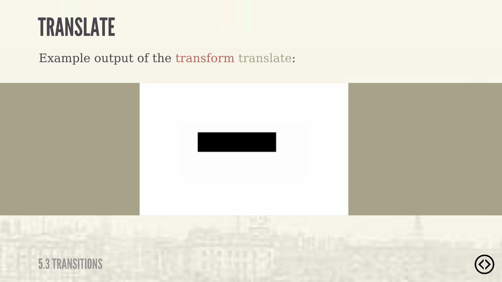
TRANSLATE
5.3 TRANSITIONS
Example output of the transform translate:

Example usage of a 2D translation using transform:
translate(<tx>, <ty>)
TRANSLATE
5.2 TRANSFORMS
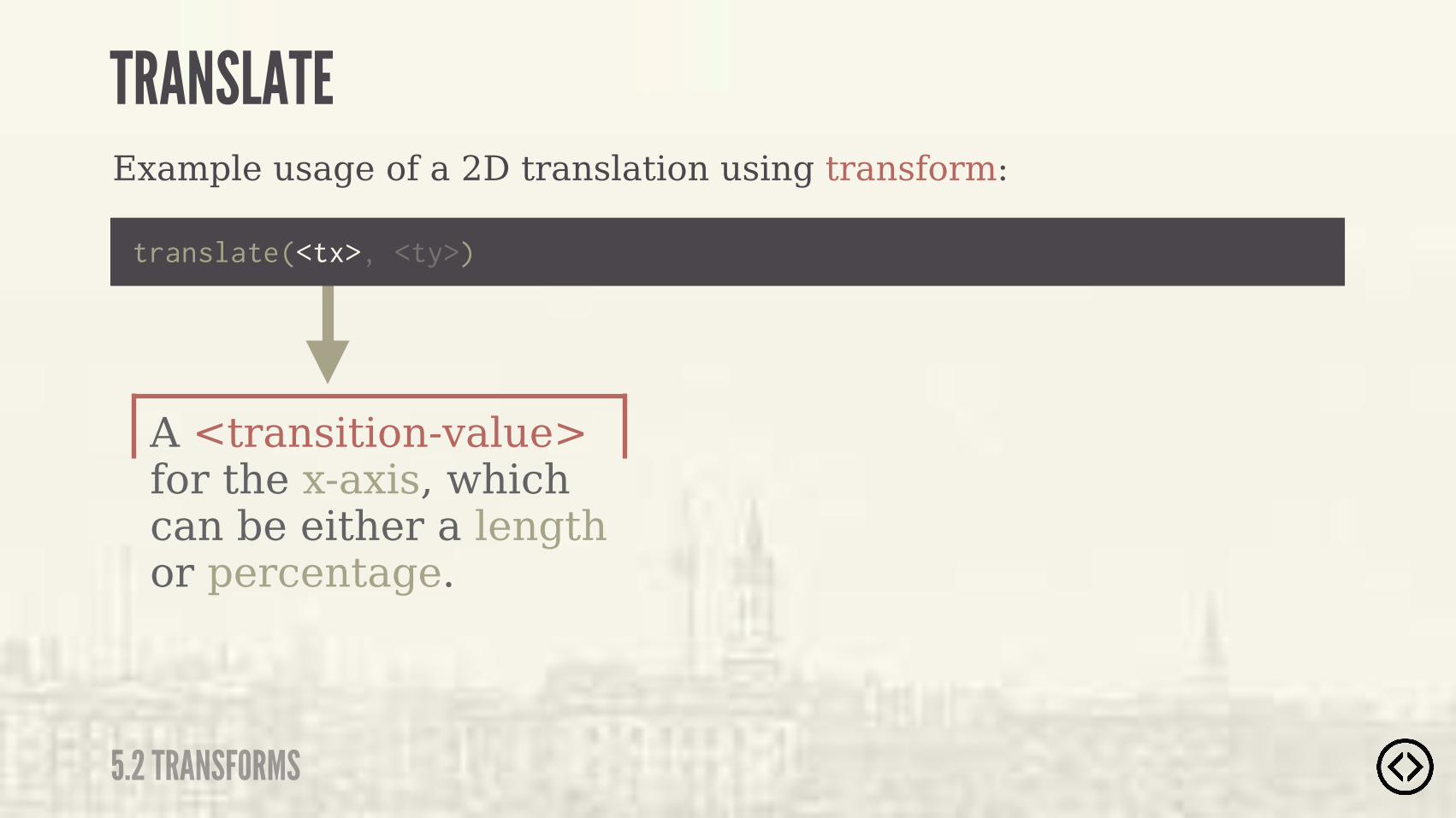
A <transition-value> for the x-axis, which can be either a length or percentage.
Example usage of a 2D translation using transform:
translate(<tx>, <ty>)
TRANSLATE
5.2 TRANSFORMS

A <transition-value> for the y-axis, which can be either a length or percentage. If not specified, the value is 0.
?
Example usage of a 2D translation using transform:
translate(<tx>, <ty>)
TRANSLATE
5.2 TRANSFORMS
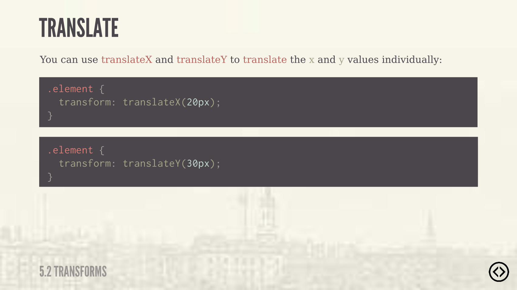
You can use translateX and translateY to translate the x and y values individually:
.element { transform: translateX(20px);}
.element { transform: translateY(30px);}
TRANSLATE
5.2 TRANSFORMS
You can use translateX and translateY to translate the x and y values individually:
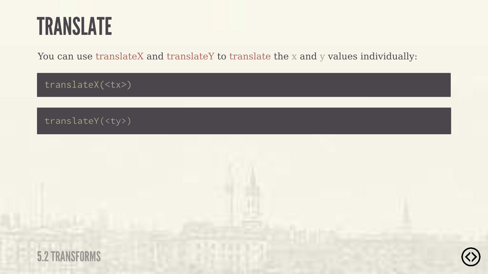
translateX(<tx>)
translateY(<ty>)
TRANSLATE
5.2 TRANSFORMS
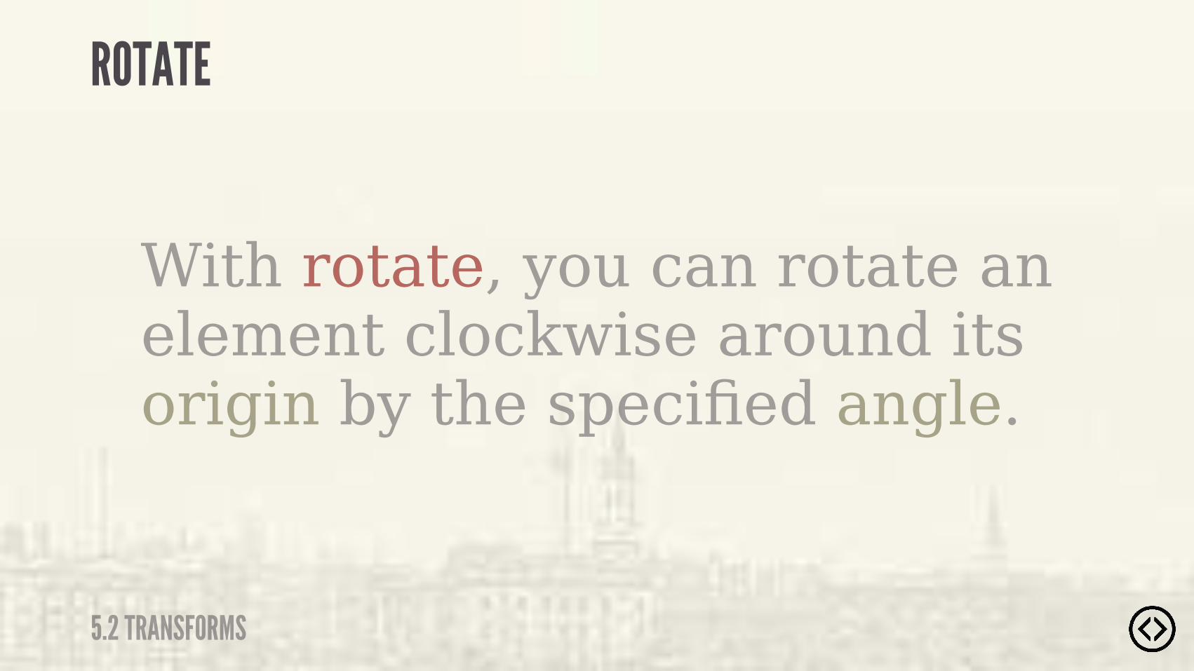
With rotate, you can rotate an element clockwise around its origin by the specified angle.
ROTATE
5.2 TRANSFORMS
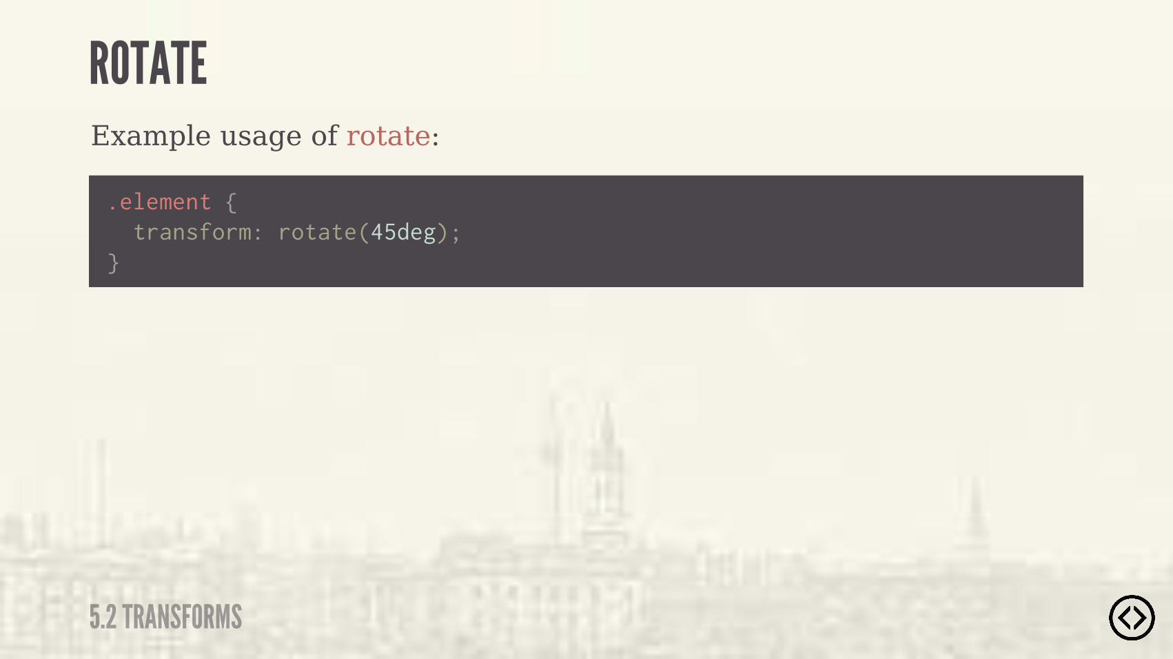
Example usage of rotate:
.element {
} transform: rotate(45deg);
ROTATE
5.2 TRANSFORMS
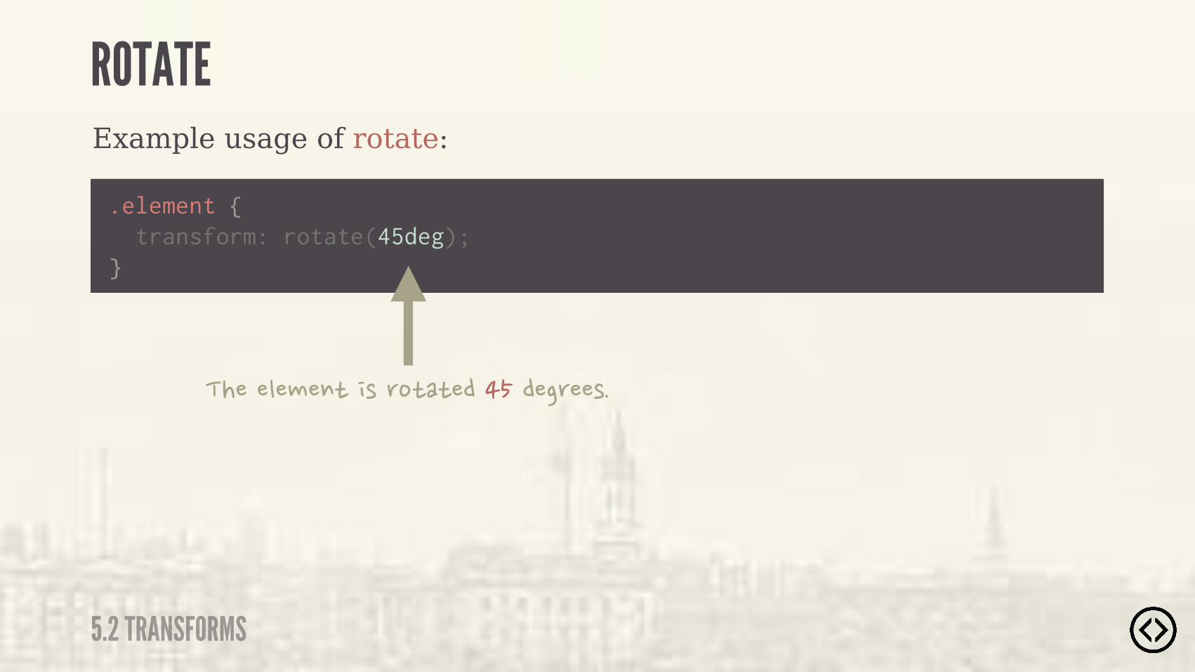
Example usage of rotate:
.element {
} transform: rotate(45deg);
�����"�#�$)� (�'%)�)���������'��(�
ROTATE
5.2 TRANSFORMS

ROTATE
5.3 TRANSITIONS
Example output of the transform rotate:

With scale, you can do a 2D scale by a specified unitless number:
.element {
} transform: scale(1.2);
SCALE
5.2 TRANSFORMS
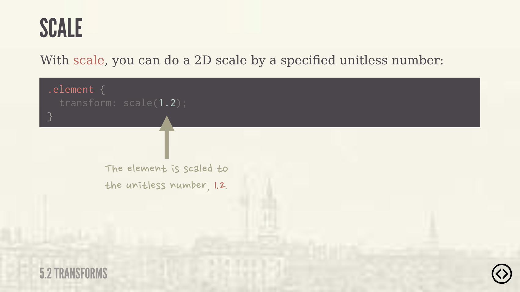
With scale, you can do a 2D scale by a specified unitless number:
.element {
} transform: scale(1.2);
�����"�#�$)� (�(��"���)%�)���*$ )"�((�$*#��'�����
SCALE
5.2 TRANSFORMS

SCALE
5.3 TRANSITIONS
Example output of the transform scale:
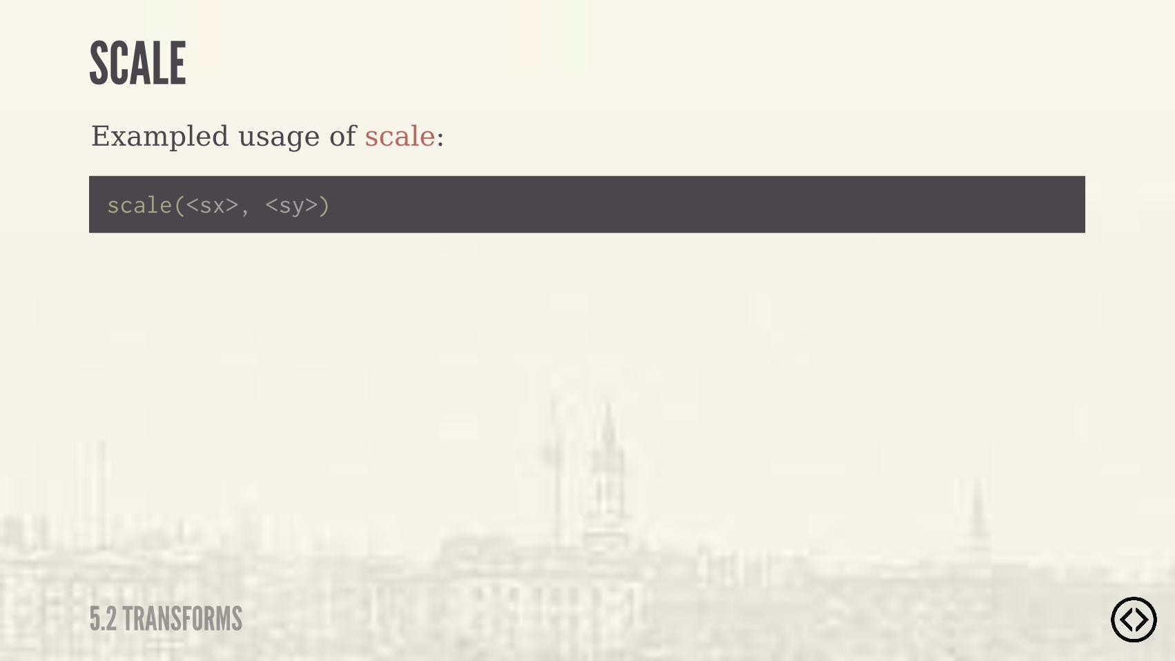
Exampled usage of scale:
scale(<sx>, <sy>)
SCALE
5.2 TRANSFORMS
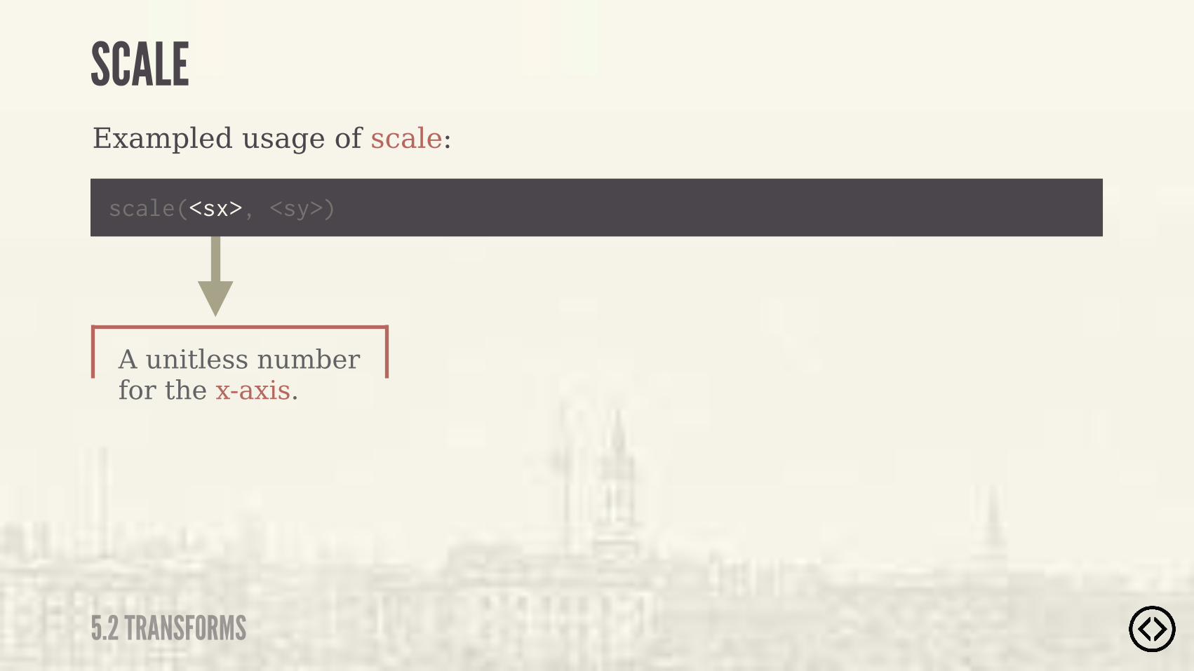
A unitless number for the x-axis.
Exampled usage of scale:
scale(<sx>, <sy>)
SCALE
5.2 TRANSFORMS
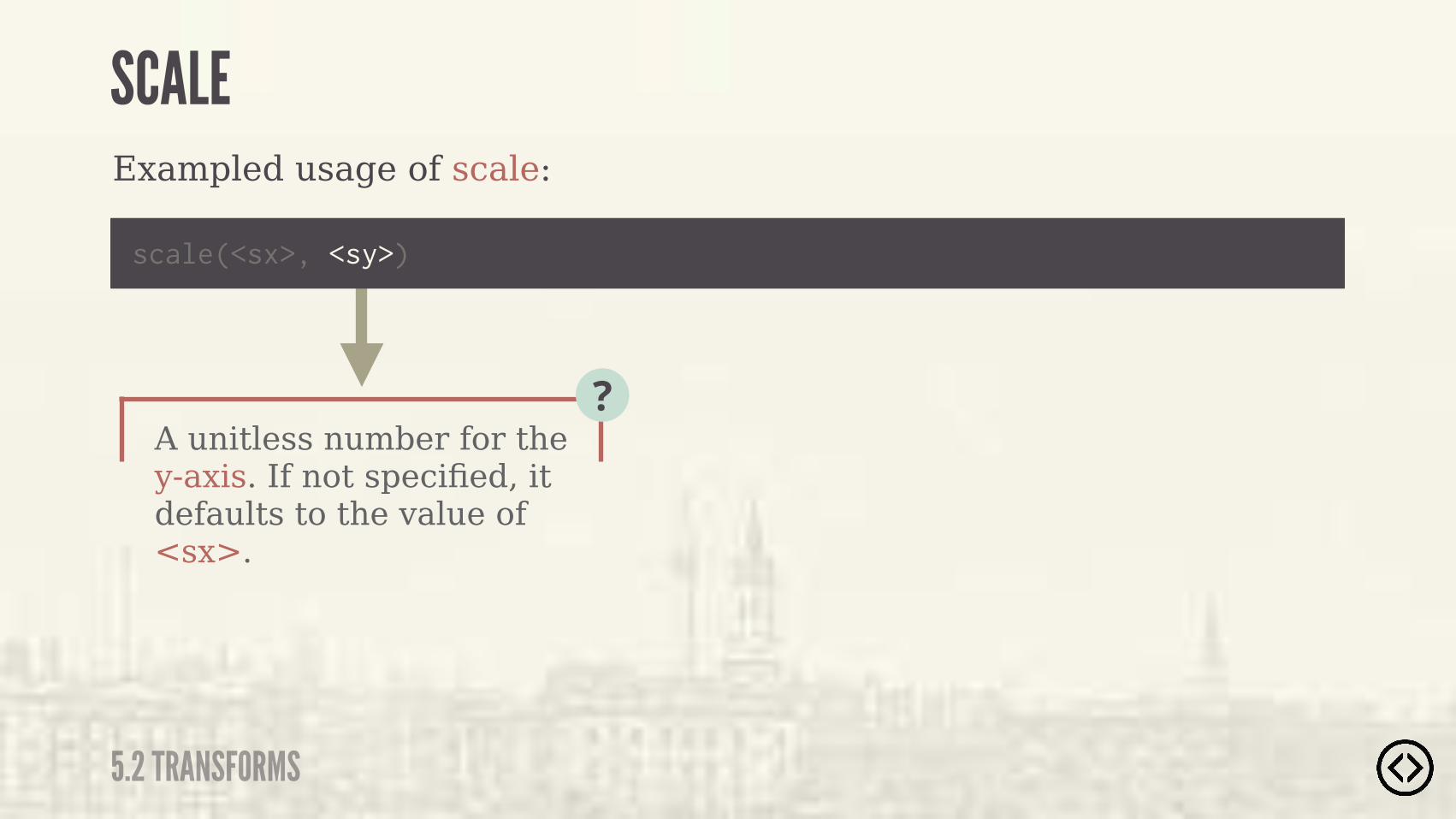
A unitless number for the y-axis. If not specified, it defaults to the value of <sx>.
?
Exampled usage of scale:
scale(<sx>, <sy>)
SCALE
5.2 TRANSFORMS
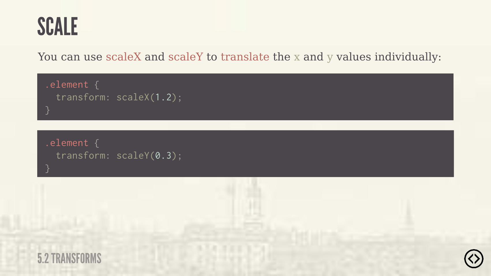
You can use scaleX and scaleY to translate the x and y values individually:
.element { transform: scaleX(1.2);}
.element { transform: scaleY(0.3);}
SCALE
5.2 TRANSFORMS
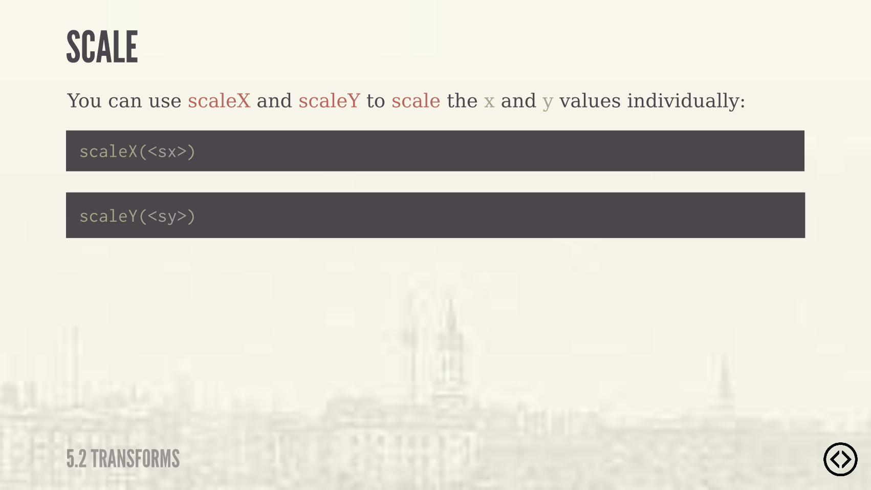
You can use scaleX and scaleY to scale the x and y values individually:
scaleX(<sx>)
scaleY(<sy>)
SCALE
5.2 TRANSFORMS
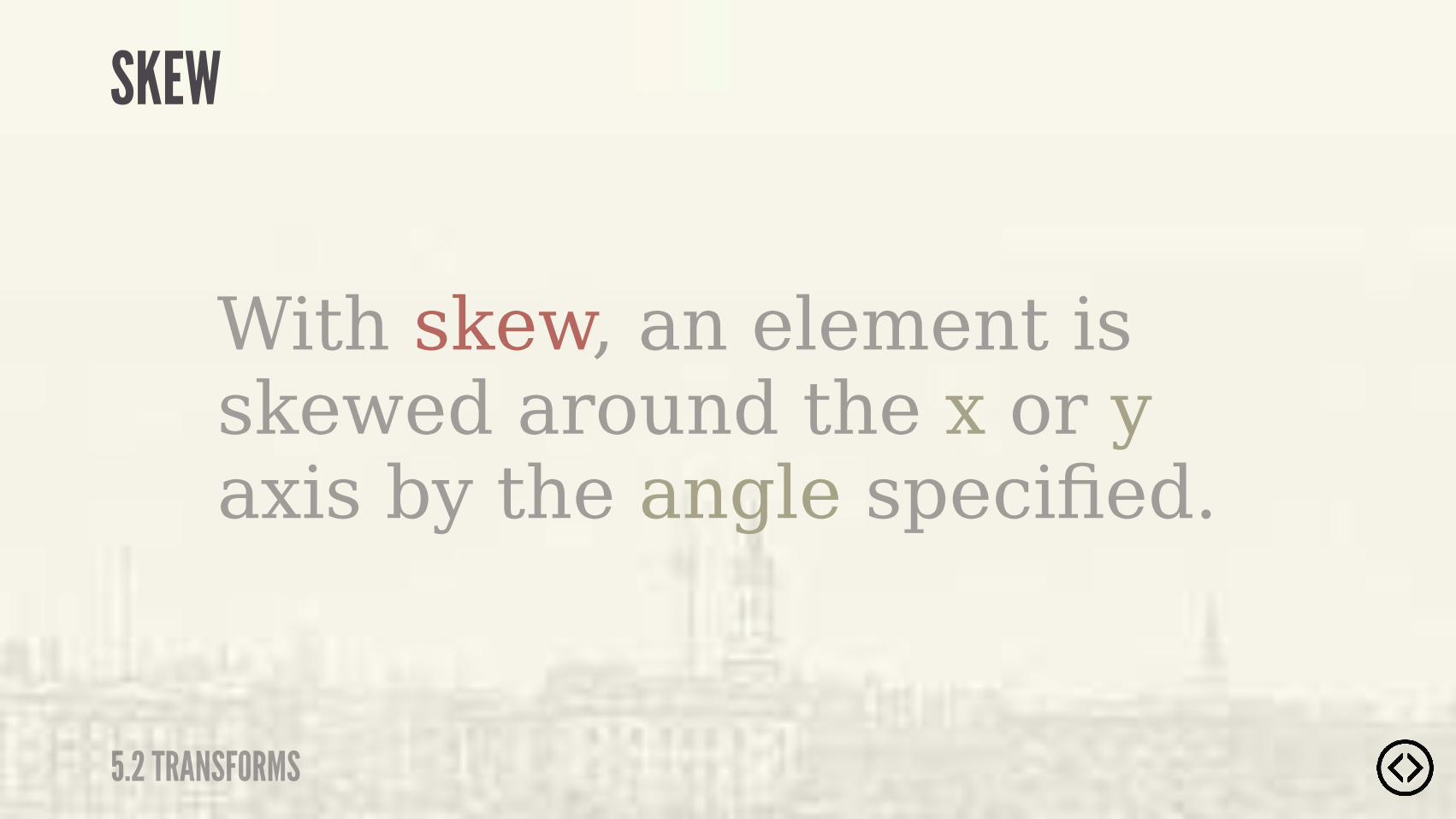
With skew, an element is skewed around the x or y axis by the angle specified.
SKEW
5.2 TRANSFORMS
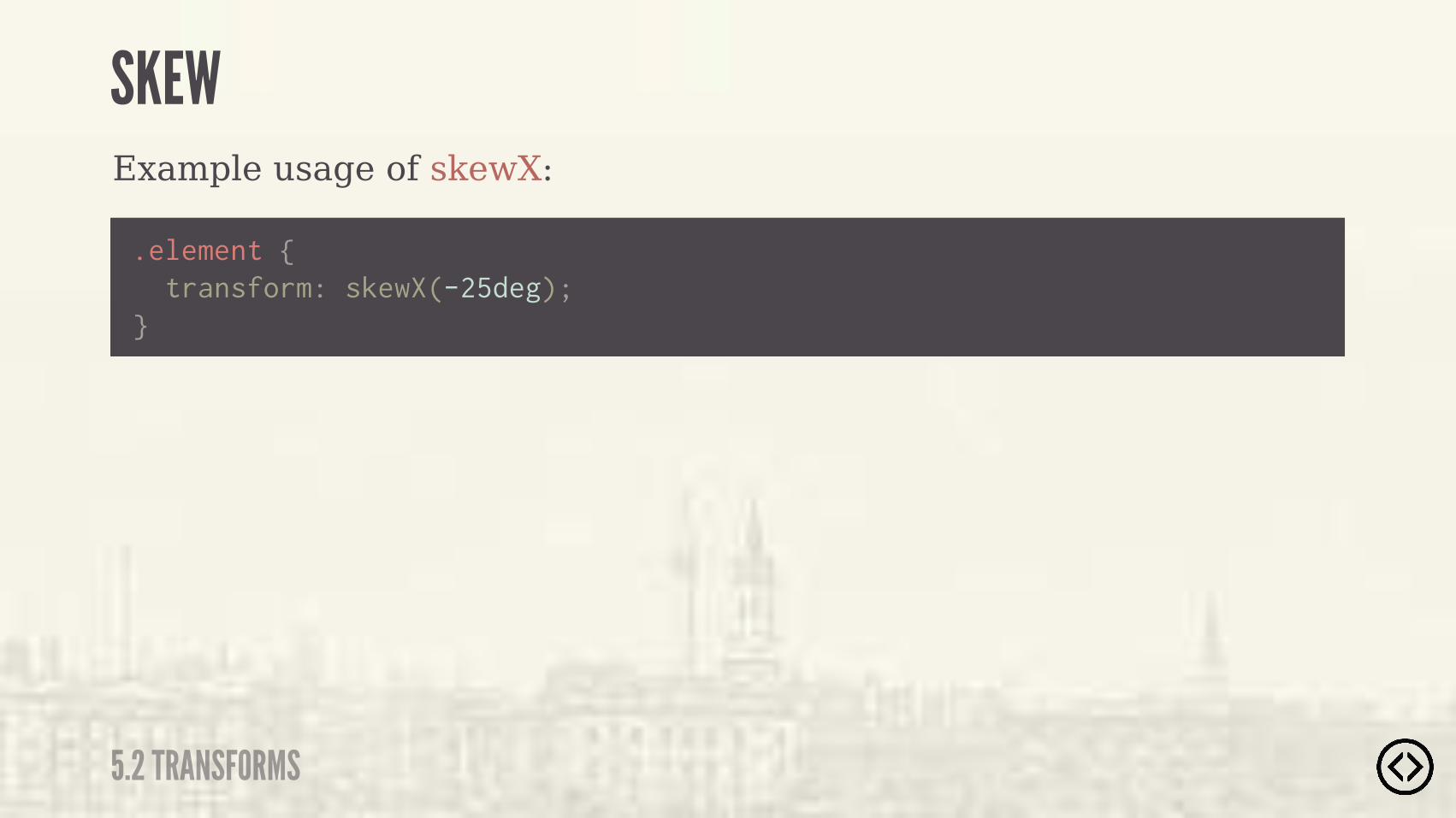
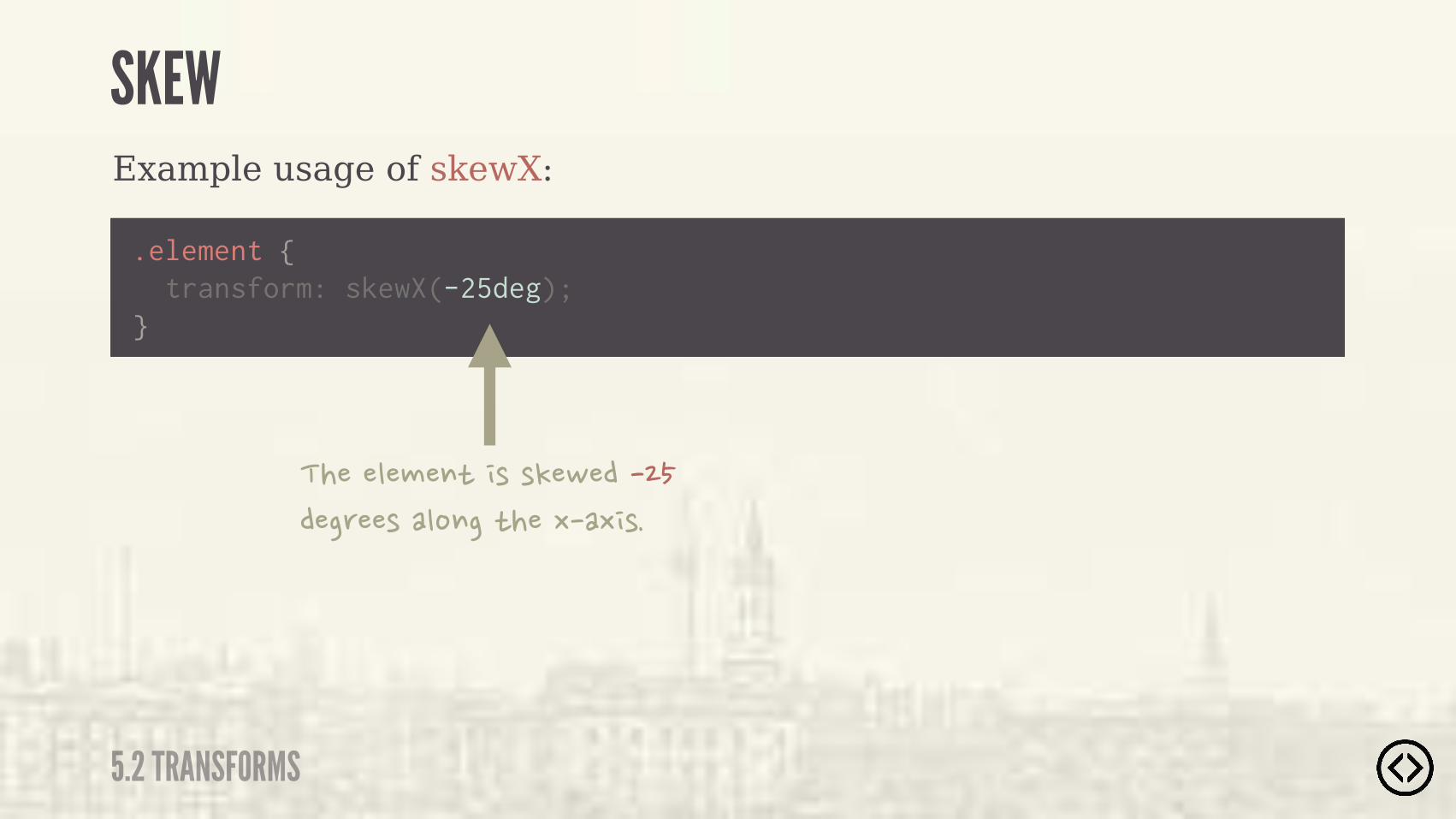
Example usage of skewX:
.element {
} transform: skewX(-25deg);
SKEW
5.2 TRANSFORMS
Example usage of skewX:
.element {
} transform: skewX(-25deg);
�����"�#�$)� (�(!�,���������'��(��"%$��)���-��- (�
SKEW
5.2 TRANSFORMS
SKEW
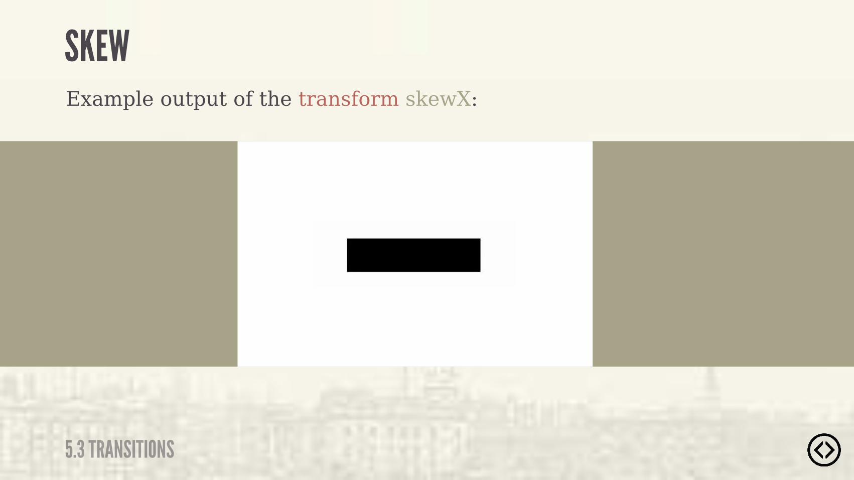
5.3 TRANSITIONS
Example output of the transform skewX:

Example usage of skewX:
skewX(<ax>)
SKEW
5.2 TRANSFORMS

An <angle> for the x-axis.
Example usage of skewX:
skewX(<ax>)
SKEW
5.2 TRANSFORMS
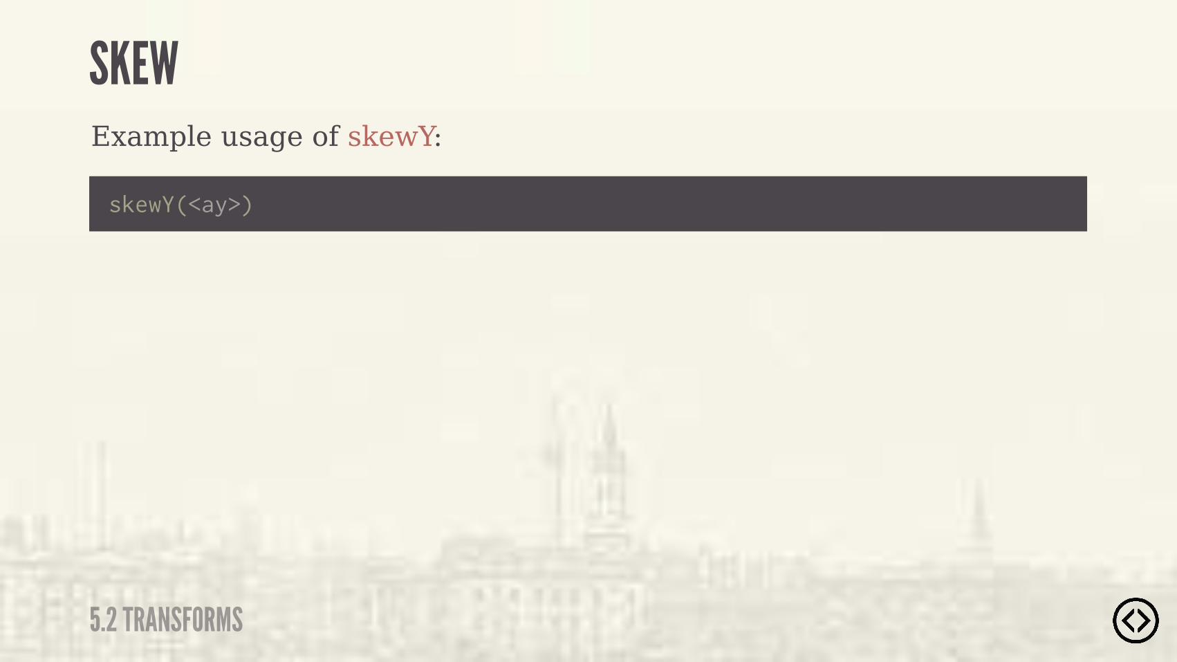
Example usage of skewY:
skewY(<ay>)
SKEW
5.2 TRANSFORMS
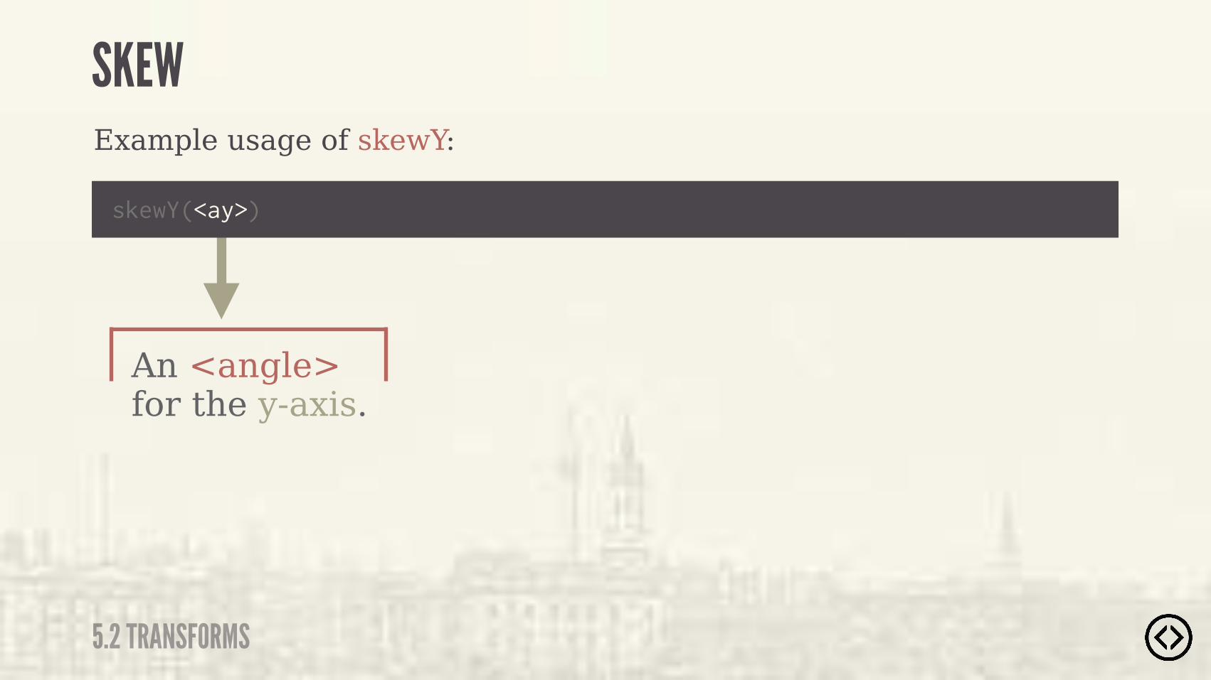
An <angle> for the y-axis.
Example usage of skewY:
skewY(<ay>)
SKEW
5.2 TRANSFORMS
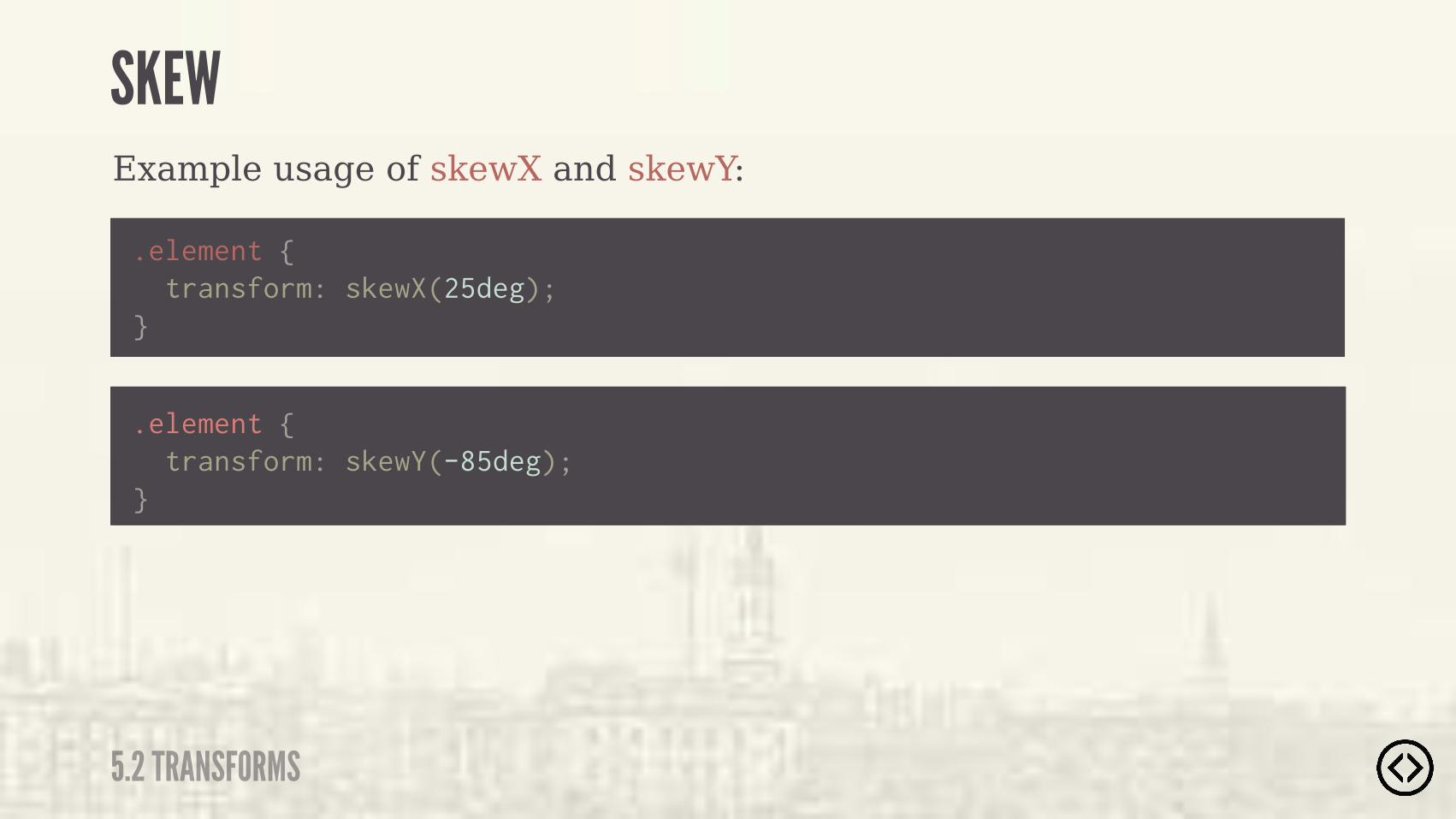
.element { transform: skewX(25deg);}
.element { transform: skewY(-85deg);}
Example usage of skewX and skewY:
SKEW
5.2 TRANSFORMS
SKEW
5.3 TRANSITIONS
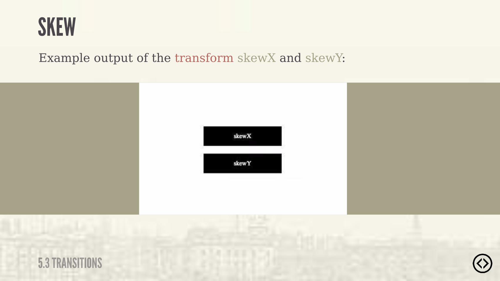
Example output of the transform skewX and skewY:

๏ Transforms๏ Transitions
TABLE OF CONTENTS
LEVEL 5
๏ Progressive Enhancement
๏ Font Face

๏ Transforms๏ Transitions๏ Progressive Enhancement
๏ Font Face
TABLE OF CONTENTS
LEVEL 5

CSS3 provides transitions, which allow you to transition between two states of a specified element.
TRANSITION
5.3 TRANSITIONS
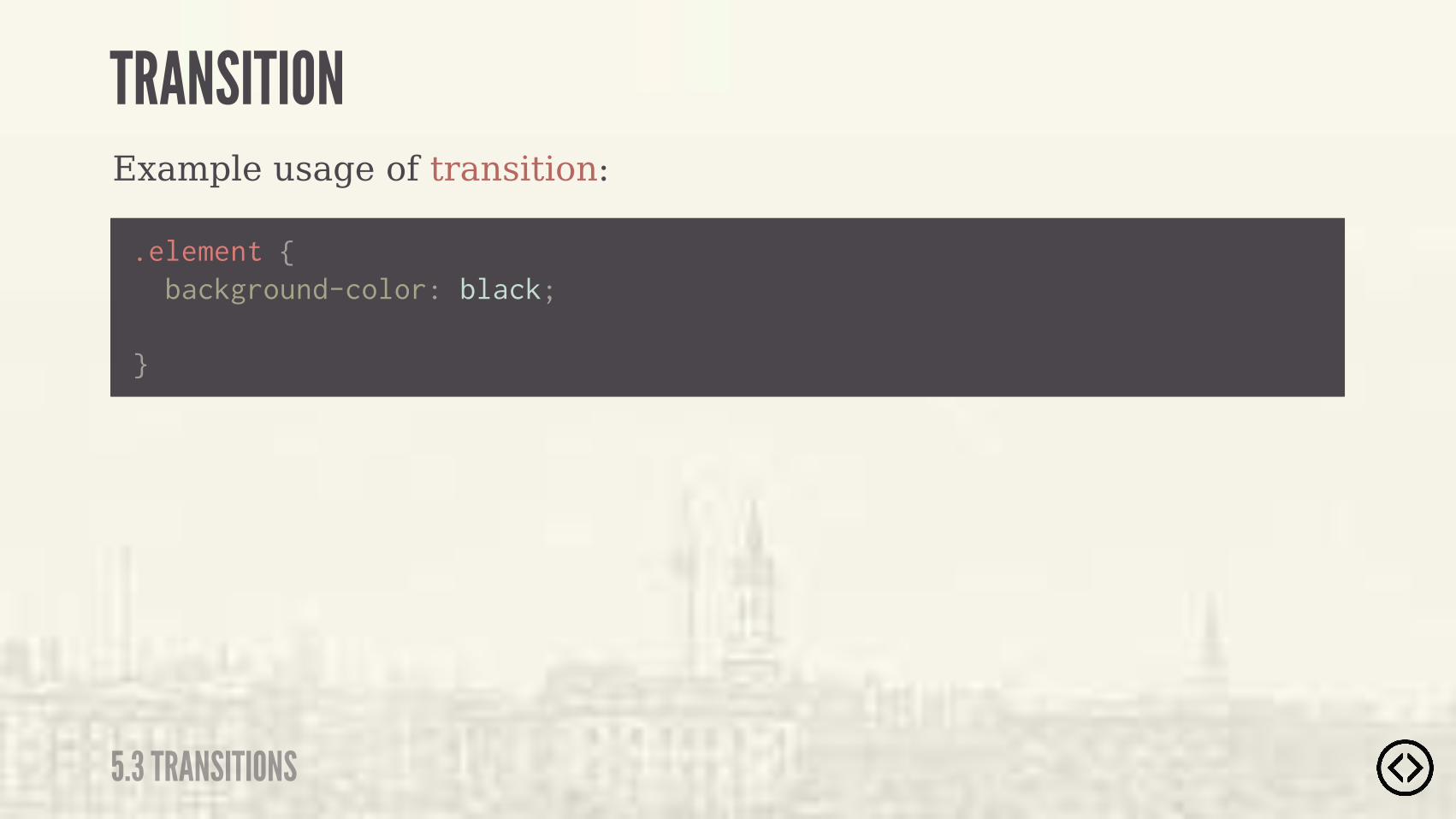
Example usage of transition:
.element {
}
background-color: black;
TRANSITION
5.3 TRANSITIONS
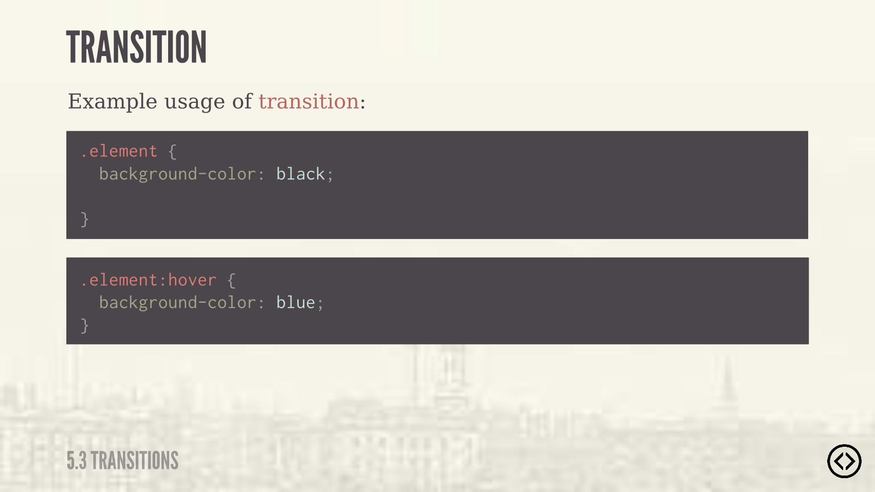
.element {
}
background-color: black;
Example usage of transition:
.element:hover { background-color: blue;}
TRANSITION
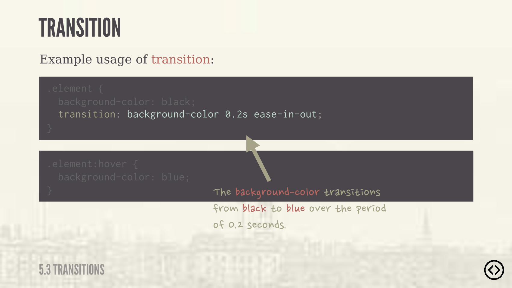
5.3 TRANSITIONS

Example usage of transition:
.element {
} transition: background-color 0.2s ease-in-out; background-color: black;
.element:hover { background-color: blue;}
TRANSITION
5.3 TRANSITIONS
Example usage of transition:
.element {
} transition: background-color 0.2s ease-in-out; background-color: black;
.element:hover { background-color: blue;} �������!�'%*$���%"%'�)'�$( ) %$(�
�'%#��"��!�)%��"*��%+�'�)���&�' %��%�����(��%$�(�
TRANSITION
5.3 TRANSITIONS

TRANSITION
5.3 TRANSITIONS
Example output of the transition:
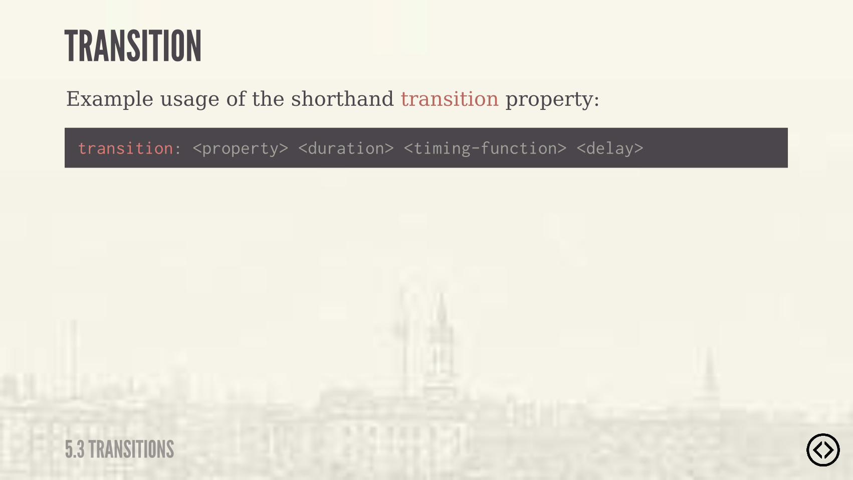
Example usage of the shorthand transition property:
transition: <property> <duration> <timing-function> <delay>
TRANSITION
5.3 TRANSITIONS
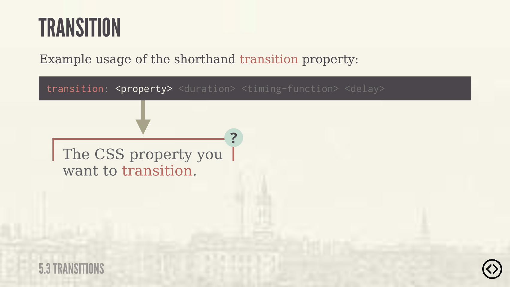
The CSS property you want to transition.
?
Example usage of the shorthand transition property:
transition: <property> <duration> <timing-function> <delay>
TRANSITION
5.3 TRANSITIONS
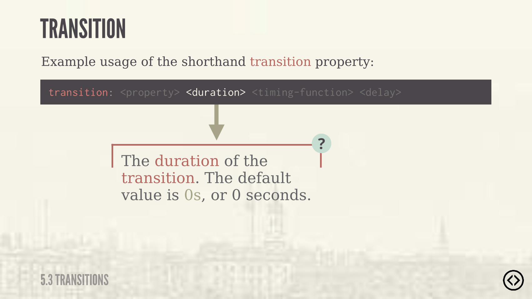
The duration of the transition. The default value is 0s, or 0 seconds.
?
Example usage of the shorthand transition property:
transition: <property> <duration> <timing-function> <delay>
TRANSITION
5.3 TRANSITIONS

Example usage of the shorthand transition property:
transition: <property> <duration> <timing-function> <delay>
TRANSITION
5.3 TRANSITIONS
The timing of the transition itself.
?

Example usage of the shorthand transition property:
transition: <property> <duration> <timing-function> <delay>
TRANSITION
5.3 TRANSITIONS
The timing of the transition itself.
?
TIMING-FUNCTIONS๏ ease๏ ease-in๏ ease-in-out๏ linear
๏ cubic-bezier๏ step-start๏ step-end๏ steps()
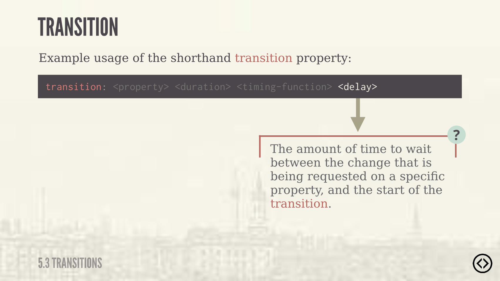
The amount of time to wait between the change that is being requested on a specific property, and the start of the transition.
?
Example usage of the shorthand transition property:
transition: <property> <duration> <timing-function> <delay>
TRANSITION
5.3 TRANSITIONS

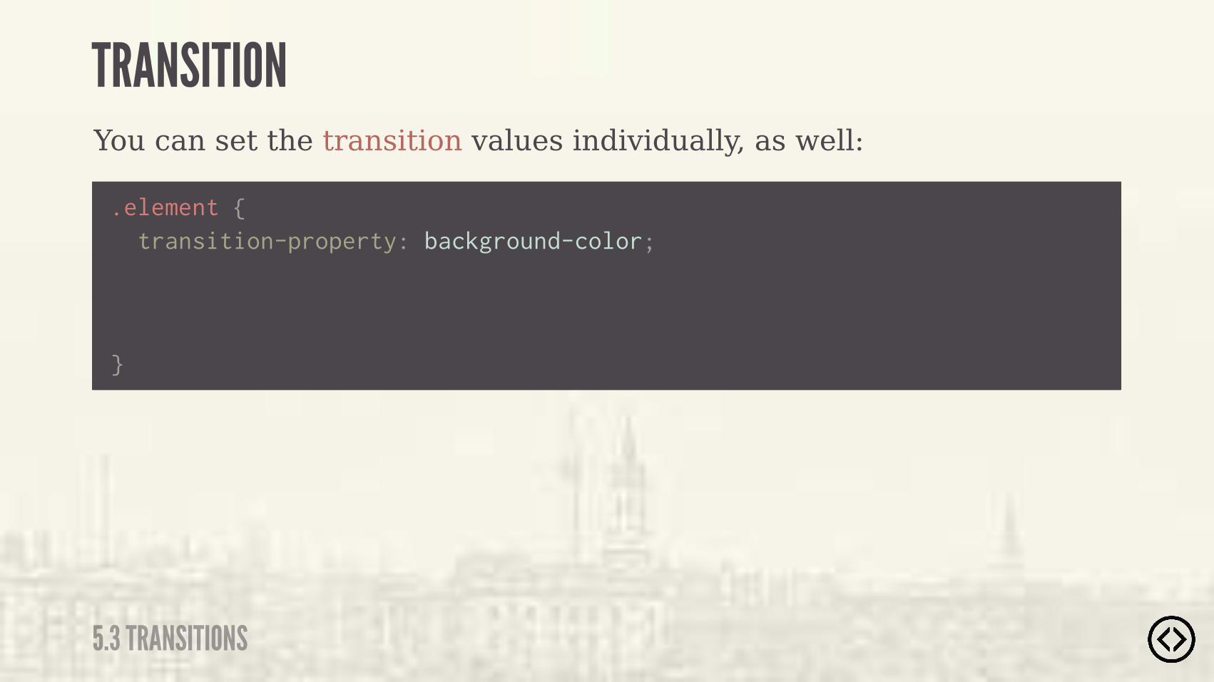
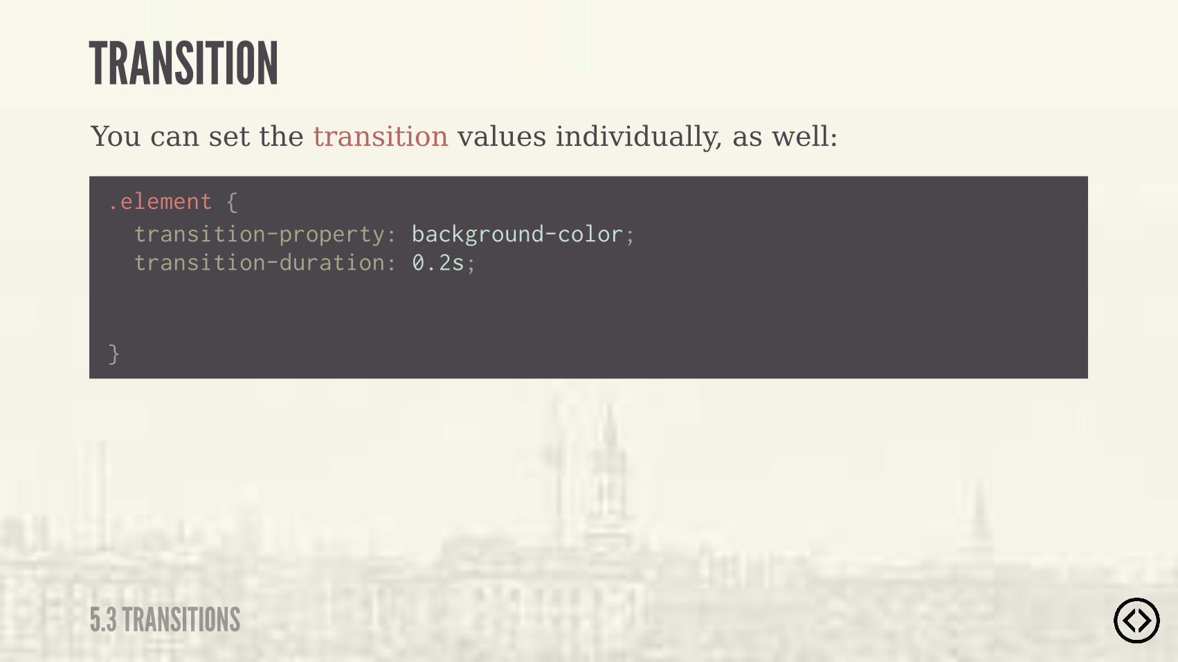
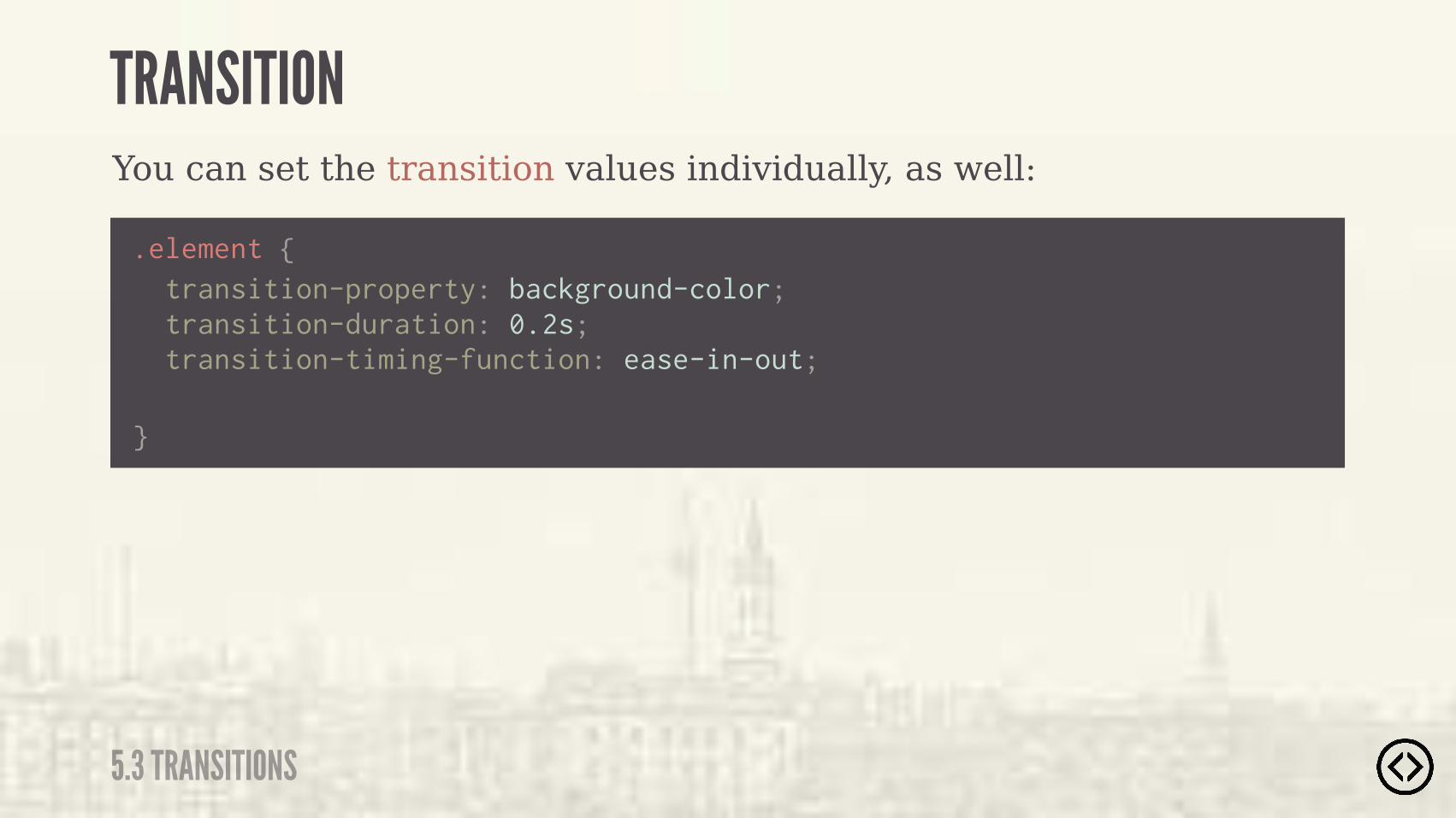
You can set the transition values individually, as well:
.element {
}
TRANSITION
5.3 TRANSITIONS
You can set the transition values individually, as well:
.element {
}
transition-property: background-color;
TRANSITION
5.3 TRANSITIONS
.element {
}
transition-duration: 0.2s; transition-property: background-color;
You can set the transition values individually, as well:
TRANSITION
5.3 TRANSITIONS
.element {
}
transition-timing-function: ease-in-out; transition-duration: 0.2s; transition-property: background-color;
You can set the transition values individually, as well:
TRANSITION
5.3 TRANSITIONS

.element {
} transition-delay: 0.1s; transition-timing-function: ease-in-out; transition-duration: 0.2s; transition-property: background-color;
You can set the transition values individually, as well:
TRANSITION
5.3 TRANSITIONS
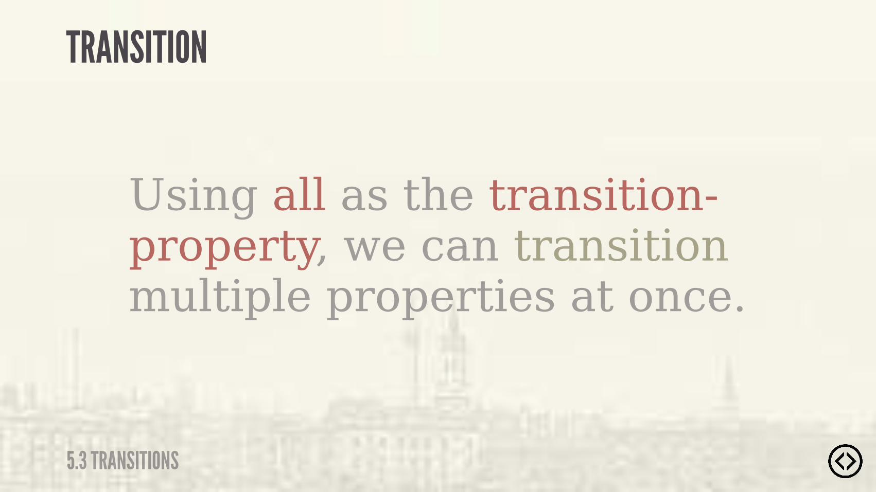
Using all as the transition-property, we can transition multiple properties at once.
TRANSITION
5.3 TRANSITIONS
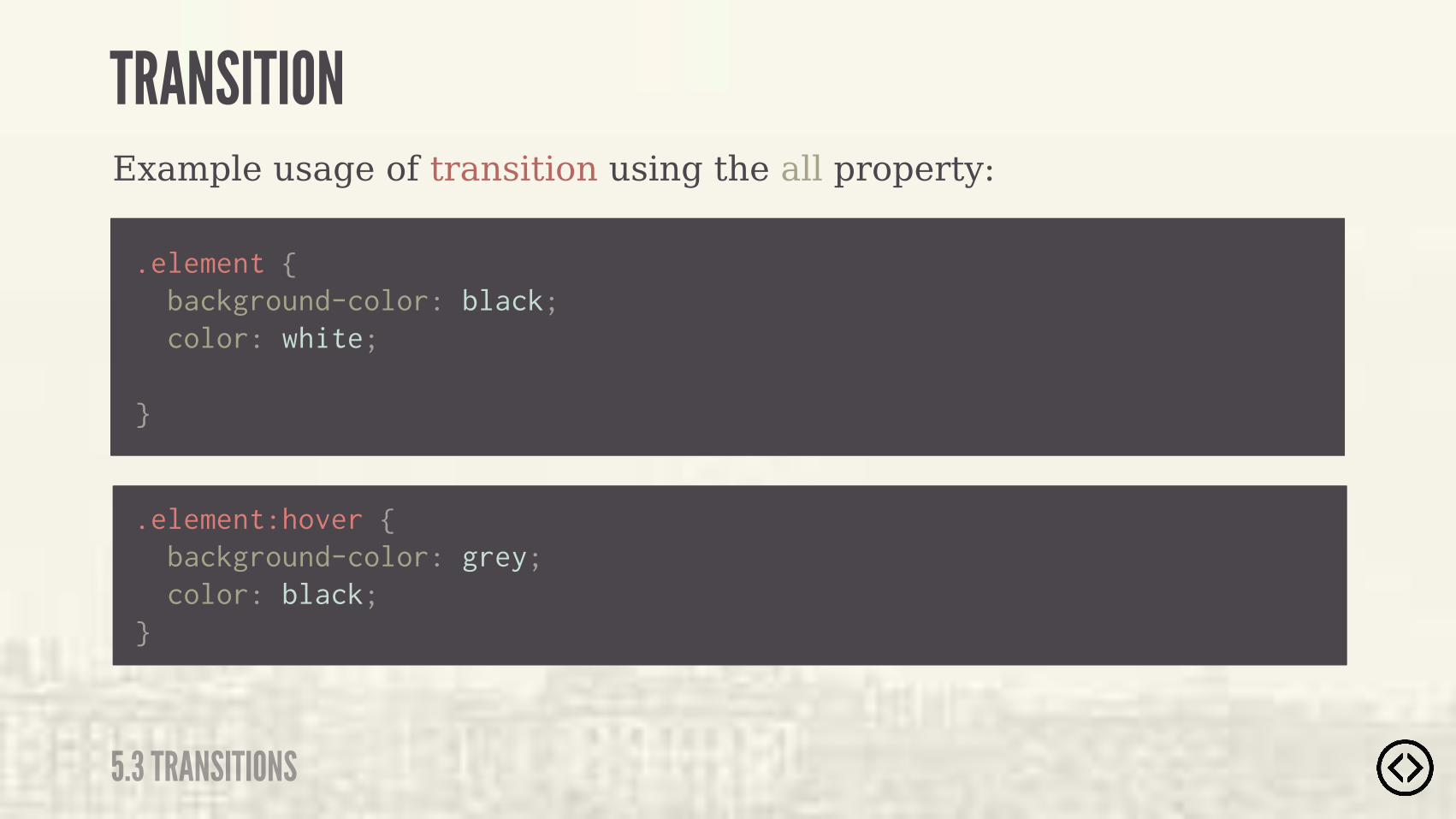
Example usage of transition using the all property:
TRANSITION
5.3 TRANSITIONS
.element { background-color: black; color: white;
}
.element:hover { background-color: grey; color: black;}

Example usage of transition using the all property:
TRANSITION
5.3 TRANSITIONS
.element { background-color: black; color: white;
}
.element:hover { background-color: grey; color: black;}
transition: all 0.2s ease-in-out;
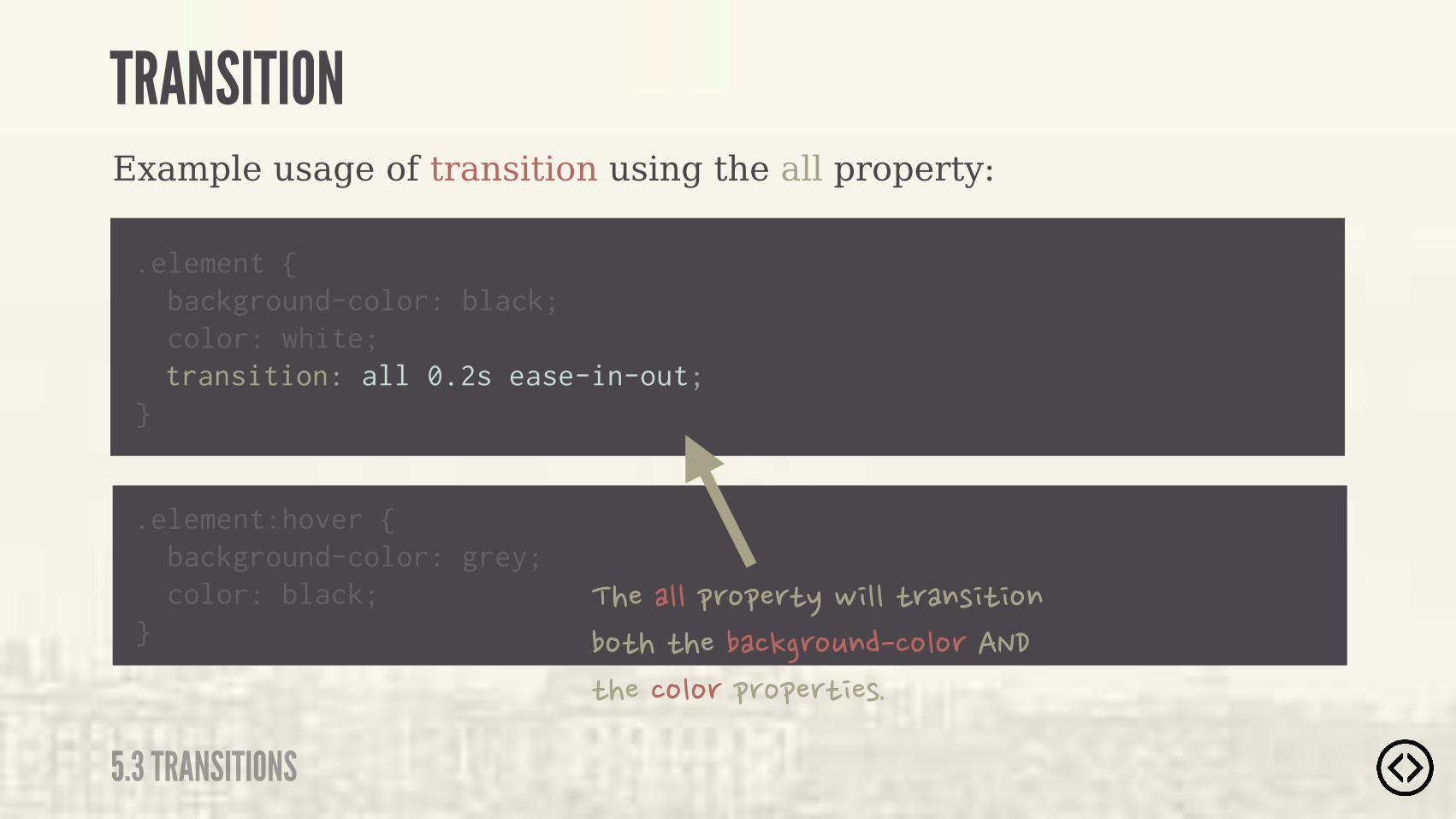
Example usage of transition using the all property:
TRANSITION
5.3 TRANSITIONS
.element { background-color: black; color: white;
}
.element:hover { background-color: grey; color: black;}
transition: all 0.2s ease-in-out;
�����""�&'%&�').�, ""�)'�$( ) %$��%)��)������!�'%*$���%"%'�����)����%"%'�&'%&�') �(�
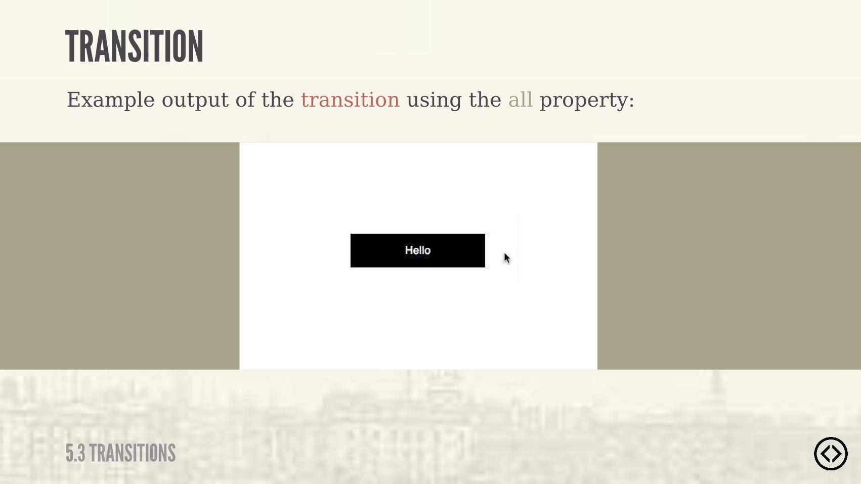
TRANSITION
5.3 TRANSITIONS
Example output of the transition using the all property:
๏ Transforms๏ Transitions
TABLE OF CONTENTS
LEVEL 5
๏ Progressive Enhancement
๏ Font Face

๏ Transforms๏ Transitions๏ Progressive Enhancement
๏ Font Face
TABLE OF CONTENTS
LEVEL 5
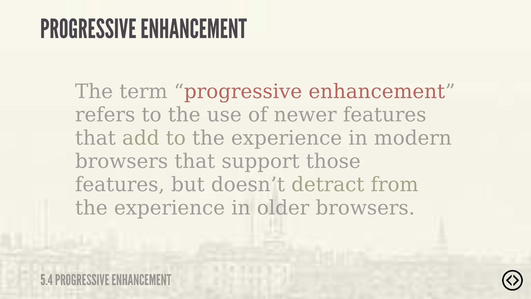
The term “progressive enhancement” refers to the use of newer features that add to the experience in modern browsers that support those features, but doesn’t detract from the experience in older browsers.
PROGRESSIVE ENHANCEMENT
5.4 PROGRESSIVE ENHANCEMENT
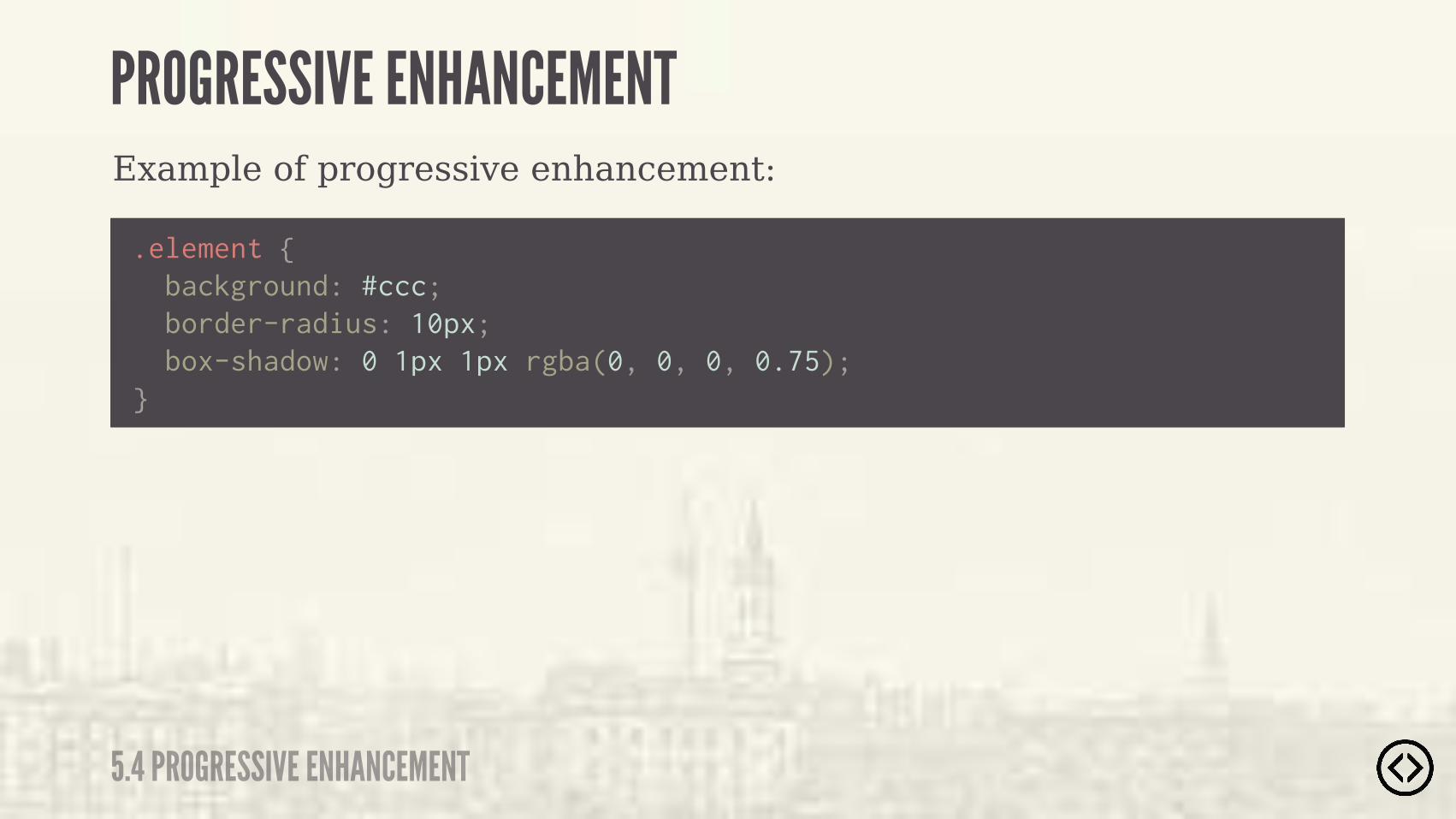
Example of progressive enhancement:
.element { background: #ccc; border-radius: 10px; box-shadow: 0 1px 1px rgba(0, 0, 0, 0.75);}
PROGRESSIVE ENHANCEMENT
5.4 PROGRESSIVE ENHANCEMENT
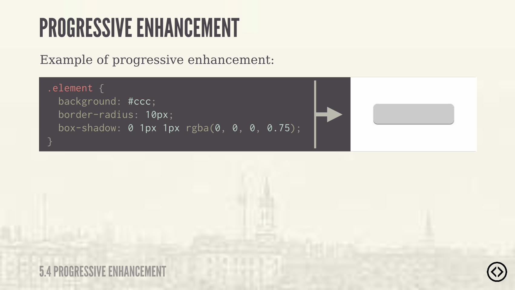
Example of progressive enhancement:
.element { background: #ccc; border-radius: 10px; box-shadow: 0 1px 1px rgba(0, 0, 0, 0.75);}
PROGRESSIVE ENHANCEMENT
5.4 PROGRESSIVE ENHANCEMENT
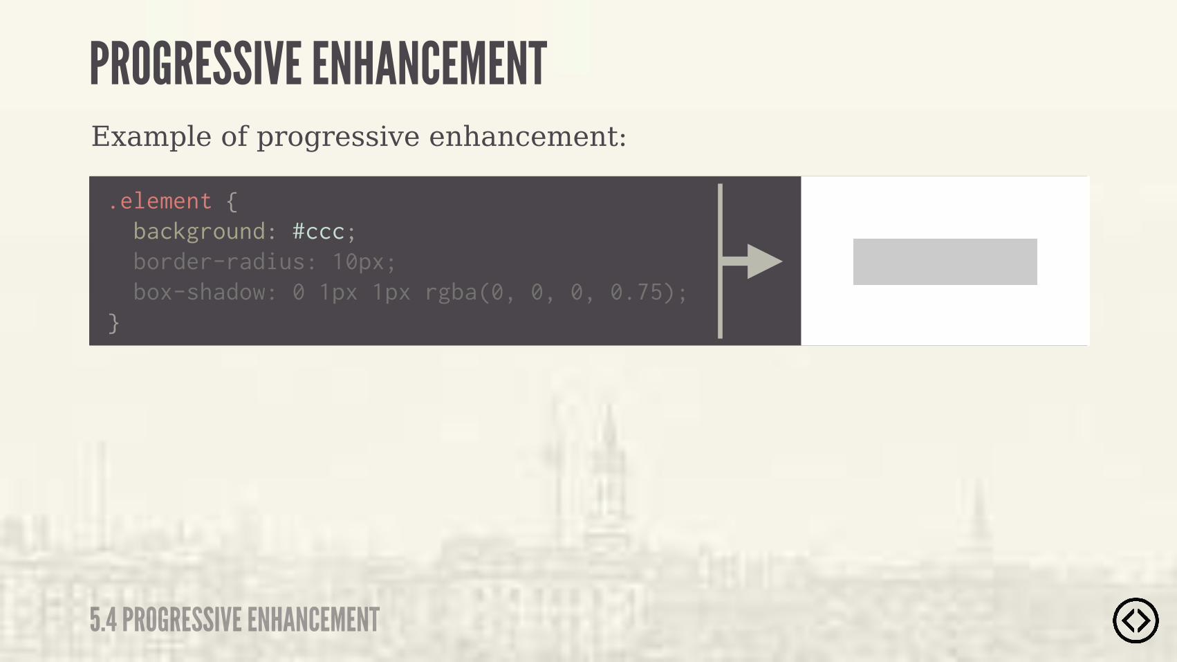
Example of progressive enhancement:
.element { background: #ccc; border-radius: 10px; box-shadow: 0 1px 1px rgba(0, 0, 0, 0.75);}
PROGRESSIVE ENHANCEMENT
5.4 PROGRESSIVE ENHANCEMENT
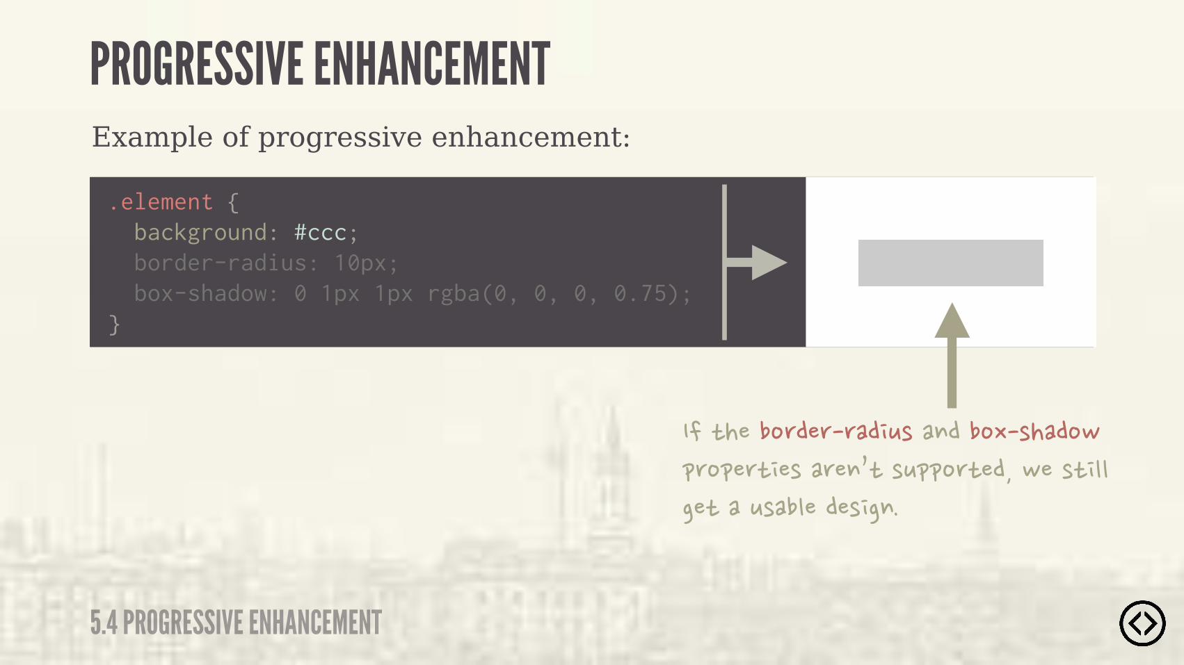
Example of progressive enhancement:
.element { background: #ccc; border-radius: 10px; box-shadow: 0 1px 1px rgba(0, 0, 0, 0.75);}
���)����%'��'�'�� *(��$���%-�(���%,�&'%&�') �(��'�$0)�(*&&%')����,��() ""���)���*(��"����( �$�
PROGRESSIVE ENHANCEMENT
5.4 PROGRESSIVE ENHANCEMENT


