From Looking to Making: An Introduction to Graphic Design
81
From Looking to Making: An Introduction to Graphic Design Ojus Doshi MFA Candidate Graphic Design | RISD [email protected] ojusdoshi.com
-
Upload
ojus-doshi -
Category
Design
-
view
404 -
download
4
Transcript of From Looking to Making: An Introduction to Graphic Design

From Looking to Making: An Introduction to Graphic Design
Ojus Doshi
MFA CandidateGraphic Design | RISD
ojusdoshi.com

Design: Making something bearable

FunctionalNew NYC Parking signs designed by
Michael Beirut at Pentagram

Visually pleasing

Design: A Problem Solving Methodology
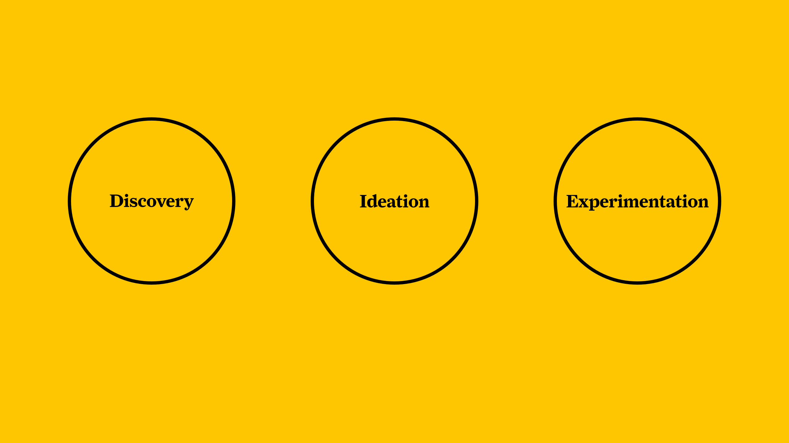
ExperimentationIdeationDiscovery

Human Centered Design
Involving a human being or members of the specific target
community involved in the production and testing of a
product as early as possible.

You can engineer a perfectly functioning machine, it’s
technically efficient and accomplishes all its goals—but
when a human in a certain situation goes to use it, may not
account for unique situations (because humans are
complex creatures).

What is Graphic Design?The arrangement of text and/or image to convey a message to many people at once.

A (Very) Brief History of Graphic Design: Rooted in Technology

Movable Type, The Printing Press,
and the Gutenberg Bible

Lithography


Camera and Photography

Photomontage

Personal Computer means that
broader audience has tools and
capabilities necessary to do what
was done with very technical
machinery in the past


A blend of everythingWhat is Graphic Design?

So how do I handle that?

Become an observer of everything.

Observer of CultureMusic, Politics, Sports, Language, Art

Observer of BehaviorHow people interact, operate, what they say and do

Observer of EnvironmentSurfaces, Flows of People, Natural Phenomenon

Observer of TechnologyAll devices, transportation, relationship to tools

How to Observe
Whimisical Rigorous

Doodling & Sketching
Photographing
Collecting
Walking Around

Literature Search & BookmarksLibrary, blogs, poetry, fiction, non-fiction, newspapers, magazines

Mapping*see also: Hugh Dubberly’sconcept mapshttp://www.dubberly.com/concept-maps

Mood BoardsEstablish a visual tone

Field ResearchSurvey your friends, colleagues, or others
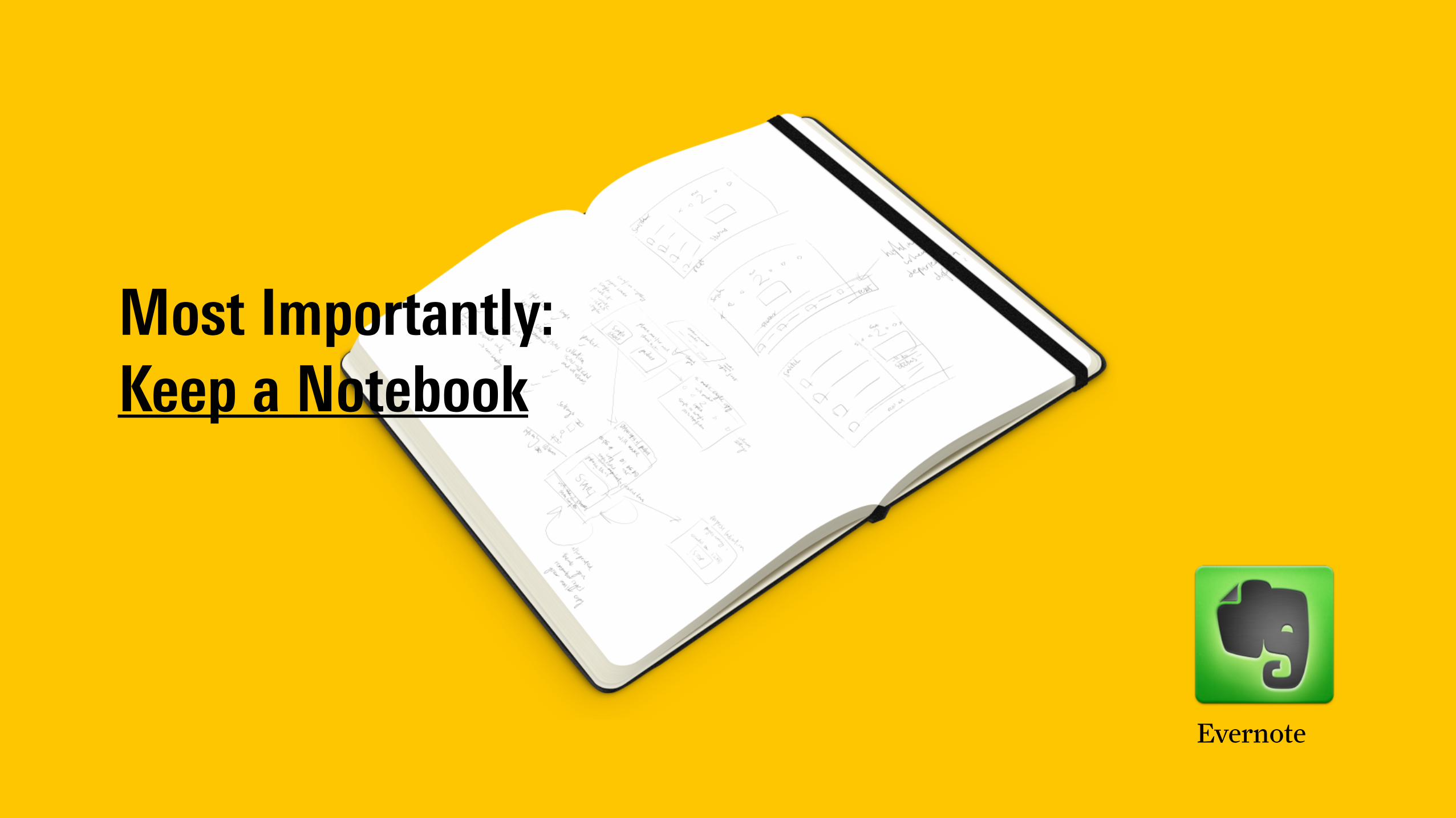
Most Importantly: Keep a Notebook
Evernote

Generating a Concept: What is a concept?It’s a larger, meaningful theme that connects all of what you try to make and all the visual output you generate. It is a glue, guide and aspect that often connects with your audience on an emotional level. It stems from the “content” of your message.

John BielenbergLiteracy poster
1997

1 + 1 = 3

Metaphor and SymbolismOne image used in place of another

Paul Sahre

CDC
If you’re living with HIV and not being safe, you could be living with a lot more.
Protect Yourself. Protect Others.
Printed in the USA, August 2007.
Washington Post

Word Play & Visual PunsMake ’em chuckle.

Chip Kiddbook cover

Chip Kiddbook cover

Visual ToneAll elements communicate a particular vibe or feeling.

Chip Kidd

More Examples: Green Patriot Posters

Frédérich Tacer Keo Pierron

Conceptual Phase: Let your imagination go wild! Generate Tons of Ideas!
1 2 3 4 5 6 7 8 9

Exercise5 minutes: observations or mind map
5 minutes: sketch 1 concept — pick your
craziest idea Name 123-456-7890

Culling PhaseLet go of ineffective ideas
1 2 3 4 5 6 7 8 9X X X X X X X

Visual Form: Some of Your Options

Print • Poster
• Book / Magazine
• Brochure, Pamplets, Flyers
• Billboards
• Postcards / Mailers
• Menus or Store Signage
• Packaging

Digital / Motion • Websites
• Mobile Apps
• Film and Animation

Mixed or non-traditional formats

Exhibitions and Installations

preventable.ca website: “we took over Vancouver’s much-loved sculpture “A-maze-ing Laughter” at English Bay. We dressed the sculpture in oversized orange lifejackets, along with a small sign that reminds people to have a word with themselves before thinking that drowning only happens to others.
Our intention: to change your attitude about safety on the water.”

Building Surfaces


Boostup.org was a campaign by Ad Council and visualized by ad agency Publicis Kaplan Thaler in 2010. Mission was to help high schoolers in tough neighborhoods graduate.
Integration of concept and visual form: giving students a boost, literally and figuratively, use of environment and everyday flow through space.


Theater Dance Performance

Board Games & Video Games “Zones has been designed as part of Public Health England’s (PHE) national youth health campaign. It encourages young people to think and talk about the health issues that affect them growing up, and help prepare them to make informed decisions.” http://campaigns.dh.gov.uk/2013/05/08/zones-board-game-now-available-for-youth-groups-and-clubs/

Comics, Cartoons

Deconstructing Visual Form
Contrast & Visual Hierarchy: What is Most Important
Composition and Organization: White Space, Arrangement, Grid
Emotion and Personality: Color, Typography, & Shape

Contrast andVisual Hierarchy
What is Most Important How to guide the eye
T T

Composition and OrganizationWhite Space, Arrangement, Grid

Emotion and PersonalityColor, Typography, and Shape
VROOOM
VanityBurgers

Contrast Color Metaphor
Eduardo Barrera — Mexico Unite for the Children (UNICEF)

Typographic Hierarchy
KYNE and Speak Up Africa — Africa United

CenterSymmetry
KYNE and Speak Up Africa — Africa United
1 is 2 manywhitehouse.gov
No More Campaign (with NFL)

Asymmetrical Composition
Kaplan Publicis Thaler — boostup.org

Asymmetry Concept
Jessica Svendsen and Adam VanDeusen — Yale Graphic Design

GridCropping Asymmetry Color
Just Get Tested RI

Color
KYNE and Speak Up Africa — Africa United

Typography
KYNE and Speak Up Africa — Africa United

Too much?
Ad Council

ResourcesGraphic Design Process Skolos + Wedell
Guide to Graphic DesignScott Santoro
Graphic Design for Nondesigners Tony Seddon, Jane Waterhouse, and Rick Landers
designobserver.com
AIGA
Graphic Design ThinkingEllen Lupton
A Kidd’s Guide to Graphic DesignChip Kidd
imageofthestudio.com