Frequency Distributions - University of Notre Damedgalvin1/10120/10120_S17/Topic14_8p...Frequency...
35
Frequency Distributions In this section, we look at ways to organize data in order to make it user friendly. We begin by presenting two data sets, from which, because of how the data is presented, it is difficult to obtain meaningful information. We will present ways to organize and present the data, from which meaningful summary information can be derived at a glance. Data Set 1 A random sample of 20 students were asked to estimate the average number of hours they spent per week studying outside of class. Also their eye color and the number of pets they owned was recorded. The results are given on the next page.
Transcript of Frequency Distributions - University of Notre Damedgalvin1/10120/10120_S17/Topic14_8p...Frequency...

Frequency Distributions
In this section, we look at ways to organize data in order tomake it user friendly. We begin by presenting two datasets, from which, because of how the data is presented, it isdifficult to obtain meaningful information. We will presentways to organize and present the data, from whichmeaningful summary information can be derived at aglance.
Data Set 1 A random sample of 20 students were askedto estimate the average number of hours they spent perweek studying outside of class. Also their eye color and thenumber of pets they owned was recorded. The results aregiven on the next page.

Frequency DistributionsStudent # Hours Studying Eye Color # Pets
Student 1 10 blue 1Student 2 7 brown 0Student 3 15 brown 3Student 4 20 green 1Student 5 40 blue 2Student 6 25 green 1Student 7 22 hazel 0Student 8 13 brown 5Student 9 12 gray 4Student 10 21 hazel 3Student 11 16 blue 1Student 12 22 green 1Student 13 25 brown 1Student 14 30 green 2Student 15 29 brown 0Student 16 25 green 4Student 17 27 gray 0Student 18 15 hazel 1Student 19 14 blue 2Student 20 17 brown 2

Frequency Distributions
Data Set 2: EPAGAS The Environmental ProtectionAgency (EPA) perform extensive tests on all new carmodels to determine their mileage ratings. The 25measurements given below represent the results of the teston a sample of size 25 of a new car model.
EPA mileage ratings on 25 cars
36.3 41.0 36.9 37.1 44.940.5 36.5 37.6 33.9 40.238.5 39.0 35.5 34.8 38.641.0 31.8 37.3 33.1 37.037.1 40.3 36.7 37.0 33.9

Frequency Table or Frequency Distribution
To construct a frequency table, we divide the observationsinto classes or categories. The number of observations ineach category is called the frequency of that category. AFrequency Table or Frequency Distribution is a tableshowing the categories next to their frequencies. Whendealing with Quantitative data (data that is numerical innature), the categories into which we group the data maybe defined as a range or an interval of numbers, such as0− 10 or they may be single outcomes (depending on thenature of the data). When dealing with Qualitative data(non-numerical data), the categories may be singleoutcomes or groups of outcomes. When grouping the datain categories, make sure that they are disjoint (to ensurethat observations do not fall into more than category) andthat every observation falls into one of the categories.

Frequency Table or Frequency DistributionExample: Data Set 1 Here are frequency distributionsfor the data on eye color and number of pets owned. (Notethat we lose some information from our original data set byseparating the data)
Eye Color # of Students(Category) ( Frequency)
Blue 4
Brown 6
Gray 2
Hazel 5
Green 3
Total 20
# Pets # of Students(Category) ( Frequency)
0 4
1 7
2 4
3 2
4 2
5 1
Total 20
Note that sum of frequencies = total number ofobservations, in this case number of students in our sample.

Relative Frequency
The relative frequency of a category is the frequency ofthat category (the number of observations that fall into thecategory) divided by the total number of observations:
Relative Frequency of Category i =
frequency of category i
total number of observations
We may wish to also/only record the relative frequencyof the classes (or outcomes) in our table.

Relative Frequency
Eye Color Proportion of Students(Category) ( Rel. Frequency)
Blue 0.20
Brown 0.30
Gray 0.10
Hazel 0.25
Green 0.15
Total 1.0
# Pets Proportion of Students(Category) ( Rel. Frequency)
0 0.20
1 0.35
2 0.20
3 0.10
4 0.10
5 0.05
Total 1.0

Choosing Categories
I When choosing categories, the categories shouldcover the entire range of observations, butshould not overlap. If the categories chosen areintervals one should specify what happens to data atthe end points of the intervals.
I For example if the categories are the intervals 0-10,10-20, 20-30, 30-40, 40-50. One should specify whichinterval 10 goes into, which interval 20 goes into, etc..It’s usual to use different brackets in interval notationto indicate whether the endpoint is included or not.The notation [0, 10) denotes the interval from 0 to 10where 0 is included in the interval but 10 is not.

Choosing CategoriesI Common sense should be used in forming categories.
Somewhere between 5 and 15 categories gives ameaningful picture that is easily processed.However if there are only 3 candidates for apresidential election and you conduct a poll todetermine who those polled will vote for, then it isnatural to choose 3 categories.
I To choose intervals as categories with quantitativedata, one might subtract the smallest observation fromthe largest and divide by the desired number ofintervals. This gives a rough idea of interval length.Then adjust it to a simpler (larger) number which isrelatively close to it, making intervals of the desiredlength where the first starts at a natural point lowerthan the minimum observation and the last ends at anatural point greater than the maximum observation.

Choosing Categories
I For example, if you data ranged from 1 to 29, and youwanted to create 6 categories as intervals of equallength. The length of each should be approximately29−16 ≈ 4.667. It is natural to use 6 intervals of length
5 in this case, with the first starting at 0 and the lastending at 30. If we decide to include the right endpoint and exclude the left end point for each interval,our intervals are :(0, 5], (5, 10], (10, 15], (15, 20], (20, 25], (25, 30].

Choosing CategoriesExample: Data set 2 Make a frequency distribution(table) for the data on mileage ratings using 5 intervals ofequal length. Include the left end point of each interval andomit the right end point.
Mileage # of cars(Category) ( Frequency)
[ , )
[ , )
[ , )
[ , )
[ , )
Total
EPA mileage ratings on 25 cars
36.3 41.0 36.9 37.1 44.940.5 36.5 37.6 33.9 40.238.5 39.0 35.5 34.8 38.641.0 31.8 37.3 33.1 37.037.1 40.3 36.7 37.0 33.9

Choosing CategoriesWe are told to divide the data into 5 intervals of equal length.
The smallest value in the data is 31.8 and the largest is 44.9
and44.9− 31.8
5= 2.62. If we start at 30.0 and use intervals of
length 3, 5 intervals later will end at 45.0 so we cover the data.
Mileage # of cars(Category) ( Frequency)
[30, 33 ) 1
[33, 36) 5
[36, 39 ) 12
[39, 42 ) 6
[42, 45 ) 1
Total 25
The value 39.0 goes in the in-terval [39, 42) NOT the inter-val [36, 39).

Choosing Categories
Example: Data set 1 Make a frequency distribution(table) for the data on the estimated average number ofhours spent studying in data set 1, using 7 intervals ofequal length. Include the left end point of each interval andomit the right end point.
We are told to divide the data into 7 intervals of equallength. The smallest value in the data is 7 and the largest
is 40. Since40− 7
7≈ 4.7, it makes sense to use intervals of
length 5. Starting at 5, we will end at 40. Since we have avalue of 40 and we have agreed to omit right-hand endpoints, this does not quite work. If we start with 6 we willbe OK.

Choosing CategoriesHours Studying # of students
(Category) ( Frequency)
[6, 11 ) 2
[11, 16 ) 5
[16, 21 ) 3
[21, 26 ) 6
[26, 31 ) 3
[31, 36 ) 0
[36, 41 ) 1
Total 20

If we started with 5 and used 8 intervals:Hours Studying # of students
(Category) ( Frequency)
[5, 10 ) 1
[10, 15 ) 4
[15, 20 ) 4
[20, 25 ) 4
[25, 30 ) 5
[30, 35 ) 1
[35, 40 ) 0
[40, 45 ) 1
Total 20

Representing Qualitative data graphicallyPie Chart One way to present our qualitative datagraphically is using a Pie Chart. The pie is represented bya circle (Spanning 3600). The size of the pie slicerepresenting each category is proportional to the relativefrequency of the category. The angle that the slice makesat the center is also proportional to the relative frequencyof the category; in fact the angle for a given category isgiven by:
category angle at the center =
relative frequency category× 3600.
The pie chart should always adhere to the area principle.That is the proportion of the area of the pie devoted to anycategory is the same as the proportion of the data that liesin that category. This principle is commonly violated toalter perception and subtly promote a particular point ofview (see end of slides).

Representing Qualitative data graphically
Example 1 Here is the data on eye color from data set 1in a pie chart.

My favourite pie chart
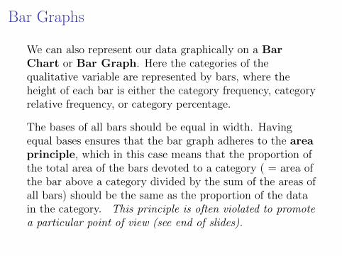
Bar Graphs
We can also represent our data graphically on a BarChart or Bar Graph. Here the categories of thequalitative variable are represented by bars, where theheight of each bar is either the category frequency, categoryrelative frequency, or category percentage.
The bases of all bars should be equal in width. Havingequal bases ensures that the bar graph adheres to the areaprinciple, which in this case means that the proportion ofthe total area of the bars devoted to a category ( = area ofthe bar above a category divided by the sum of the areas ofall bars) should be the same as the proportion of the datain the category. This principle is often violated to promotea particular point of view (see end of slides).

Bar Graphs

Representing Quantitative data using a Histogram
Histograms A histogram is a bar chart in which eachbar represents a category and its height represents eitherthe frequency, relative frequency (proportion) or percentagein that category.If a variable can only take on a finite number of values (orthe values can be listed in an infinite sequence) the variableis said to be discrete.
For example the number of pets in Data set 1 was adiscrete variable and each value formed a category of itsown. In this case, each bar in the histogram is centeredover the number corresponding to the category and all barshave equal width of 1 unit (see next slide).

Representing Quantitative data using a Histogram

Representing Quantitative data using a Histogram
If a variable can take all values in some interval, it is calleda continuous variable. If our data consists of observationsof a continuous variable, such as that in data set 2, thecategories used for our histogram should be intervals ofequal length (to adhere to the area principle) formed in amanner similar to that described above for frequencytables. The bases of the bars in our histogram arecomprised of these categories of equal length and theirheights represent either the frequency, relative frequency orpercentage in each category. Because it is difficult to tellfrom the histogram alone which endpoints are included inthe categories, we adopt the convention that the categories(intervals) include the left endpoint but not the rightendpoint.

Representing Quantitative data using a Histogram
Example Construct a histogram for the data in data set 2on EPA mileage ratings, using the categories used above inthe frequency table. Use the frequency of observations ineach category to define the height of the bars.Mileage # of cars
(Category) ( Frequency)
[ , )
[ , )
[ , )
[ , )
[ , )
Total

Representing Quantitative data using a Histogram
On the left is the frequency data from above.
Hours Studying # of students(Category) ( Frequency)
[6, 11 ) 2
[11, 16 ) 5
[16, 21 ) 3
[21, 26 ) 6
[26, 31 ) 3
[31, 36 ) 0
[36, 41 ) 1
Total 20

Changing the width of the categories
For large data sets one can get a finer description of thedata, by decreasing the width of the class intervals on thehistogram. The following Histograms are for the same setof data, recording the duration (in minutes) of eruptions ofthe Old Faithful Geyser in Yellowstone National Park.
01/07/2008 06:34 PMHistogram Applet
Page 2 of 2http://www.amstat.org/publications/jse/v6n3/applets/Histogram.html
Return to West and Ogden Paper | Return to Table of Contents | Return to the JSE Home Page

Stem and Leaf Display
Another graphical display presenting a compact picture ofthe data is given by a stem and leaf plot.
To construct a Stem and Leaf plot
I Separate each measurement into a stem and a leaf –generally the leaf consists of exactly one digit (the lastone) and the stem consists of 1 or more digits.
e.g.: 734 stem = 73, leaf=4
2.345 stem = 2.34, leaf=5.
Sometimes the decimal is left out of the stem but a note isadded on how to read each value. For the 2.345example we would state that 234|5 should be read as 2.345.

Stem and Leaf Display
Sometimes, when the observed values have manydigits, it may be helpful either to round the numbers(round 2.345 to 2.35, with stem=2.3, leaf=5) or truncate(or dropping) digits (truncate 2.345 to 2.34).
I Write out the stems in order increasing vertically (fromtop to bottom) and draw a line to the right of thestems.
I Attach each leaf to the appropriate stem.
I Arrange the leaves in increasing order (from left toright).

Stem and Leaf DisplayExample Make a Stem and Leaf Plot for the data on theaverage number of hours spent studying per week given inData Set 1.
10, 7, 15, 20, 40, 25, 22, 13, 12, 21
16, 22, 25, 30, 29, 25, 27, 15, 14, 17
All are data points are 2 digit integers and the tens digitgoes from 0 to 4.
0 71 0 2 3 4 5 5 6 72 0 2 3 4 5 5 6 7 93 04 0

Extras : How to Lie with statistics
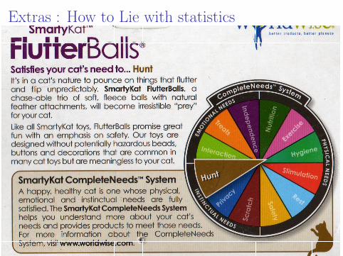
Example This (faux) pie chart, shows the needs of a cat,and comes from a box containing a cat toy. Note that the“categories” are not distinct and they use an explodingslice to distort the are for Hunting, which is the need ofyour cat that this particular toy is supposed to fulfill.
Extras : How to Lie with statistics

Extras : How to Lie with statisticsA subtle way to lie with statistics is to violate the arearule. The pie chart below is distorted to make the areas ofregions devoted to some categories proportionally largerthan they should be by stretching the pie into an ovalshape and adding a third dimension.
73492685_3d516242aa_m.jpg (JPEG Image, 240x198 pixels) http://static.flickr.com/35/73492685_3d516242aa_m.jpg
1 of 1 2/10/07 10:01 AM

Extras : How to Lie with statistics
Example Both of the following graphs represent the sameinformation. The graph on the left violates the areaprinciple by making the base of the bars (banknotes) ofunequal width.
•First •Prev •Next •Last •Go Back •Full Screen •Close •Quit
Is the bottom dollar note roughly half the size of the top one?
•First •Prev •Next •Last •Go Back •Full Screen •Close •Quit
0.0
0.2
0.4
0.6
0.8
1.0$1.00
94c
83c
64c
44c
1958 1963 1968 1973 1978Eisenhower Kennedy Johnson Nixon Carter
Purchasing Power of the Diminishing Dollar

Extras : How to Lie with statistics
Example All of the following graphs violate the areaprinciple by replacing the bars by irregular objects inaddition to making the bases of unequal length.
Chapter 4 --- 13
Example 4.4 How to Lie with Statistics
The bar graph that follows presents the total sales figures for three realtors. When the bars are replaced with pictures, often related to the topic of the graph, the graph is called a pictogram.
Realtor #1 Realtor #3Realtor #2
$2.05 million
$1.41 million
$0.9 million
Total
Sales
No. 1 No. 2 No. 3
Realtor
(a) How does the height of the home for Realtor 1 compare to that for Realtor 3?
(b) How does the area of the home for Realtor 1 compare to that for Realtor 3?
Solution (a) The height for Realtor 1 is just slightly over twice that of Realtor 3. The
heights are at the correct total sales levels. (b) To avoid distortion of the pictures, the area of the home for Realtor 1 is
more than four times the area of the home for Realtor 3.
What We’ve Learned: When you see a pictogram, be careful to interpret the
results appropriately, and do not allow the area of the pictures to mislead you.
!
02/10/2007 07:43 PMGoogle Image Result for http://lilt.ilstu.edu/gmklass/pos138/datadisplay/sections/charts/3%20graphic%20data_files/image016.jpg
Page 2 of 30file:///Users/apilking/Desktop/cows.html
a number (actually, in the case of a scatterplot, two numbers). It is the job of the chart’s text to
tell the reader just what each of those numbers represents.
Designing good charts, however, presents more challenges than tabular display as it draws on
the talents of both the scientist and the artist. You have to know and understand your data, but
you also need a good sense of how the reader will visualize the chart’s graphical elements.
Two problems arise in charting that are less common when data are displayed in tables. Poor
choices, or deliberately deceptive, choices in graphic design can provide a distorted picture of
numbers and relationships they represent. A more common problem is that charts are often
designed in ways that hide what the data might tell us, or that distract the reader from quickly
discerning the meaning of the evidence presented in the chart. Each of these problems is
illustrated in the two classic texts on data presentation: Darrell Huff’s How to Lie with Statistics
(1994) and Edward Tufte’s The Visual Display of Quantitative Information (1983).
Huff’s little paperback, first published in 1954 and reissued many times thereafter, condemned
graphical representations of data that “lied”. Here, the two numbers, one 3 times the magnitude
of the other, are represented by two cows, one 27 times larger than the other, resulting in a Lie
Factor of 9.
Figure 1: Graphical distortion of data
SOURCE: Darrell Huff. 1993. How to Lie
with Statistics WW Norton & Co, 72.
Here the figure depicts the increase in the number of milk cows in the United States, from 8
million in 1860 to twenty five million in 1936. The larger cow is thus represented as three
times the height the 1860 cow. But she is also three times as wide, thus taking up nine times the
area of the page. Moreover the graphic is a depiction of a three dimensional figure: when we
take the depth of the cow into account, she is twenty seven times larger in 1936. Later, Tufte
developed the “Lie Factor”: a numerical measure of the data distortion. Here, representing a
numbers that 3 times different in magnitude with images that a 27 times different in size
Google Image Result for http://lilt.ilstu.edu/gmklass/pos138/datadis... http://images.google.com/imgres?imgurl=http://lilt.ilstu.edu/gmklas...
1 of 1 2/10/07 7:35 PM
See full-size image.
lilt.ilstu.edu/.../image016.jpg504 x 389 pixels - 27kImage may be scaled down and subject to copyright.
Remove Frame
Image Results »
Below is the image in its original context on the page: lilt.ilstu.edu/.../sections/goodcharts.htm