frbclev_econtrends_200903.pdf
29
In is Issue Inflation and Prices January Price Statistics Financial Markets, Money, and Monetary Policy e Yield Curve, February 2009 e Impact of Credit Easing So Far International Markets Renminbi 101 Economic Activity and Labor Markets Economic Projections from the January FOMC Meeting e U.S. Auto Industry e Recent Increase in the Volatility of Economic Indicators e Latest S&P Case-Shiller Home Price Indexes Real GDP: Fourth-Quarter 2008 Preliminary Estimate e Employment Situation Regional Activity Fourth District Employment Conditions Banking and Financial Institutions FDIC Funds March 2009 (February 13, 2009 to March 12, 2009)
Transcript of frbclev_econtrends_200903.pdf

In Th is IssueInfl ation and Prices
January Price Statistics Financial Markets, Money, and Monetary Policy
Th e Yield Curve, February 2009Th e Impact of Credit Easing So Far
International MarketsRenminbi 101
Economic Activity and Labor MarketsEconomic Projections from the January FOMC MeetingTh e U.S. Auto IndustryTh e Recent Increase in the Volatility of Economic IndicatorsTh e Latest S&P Case-Shiller Home Price IndexesReal GDP: Fourth-Quarter 2008 Preliminary EstimateTh e Employment Situation
Regional ActivityFourth District Employment Conditions
Banking and Financial InstitutionsFDIC Funds
March 2009(February 13, 2009 to March 12, 2009)

2Federal Reserve Bank of Cleveland, Economic Trends | March 2009
January Price Statistics Percent change, last 1mo.a 3mo.a 6mo.a 12mo. 5yr.a
2007 average
Consumer Price Index All items 3.4 −8.4 −5.8 0.0 2.7 0.3 Less food and energy 2.1 0.9 1.0 1.7 2.2 1.8 Medianb 2.7 2.0 2.4 2.7 2.8 2.9 16% trimmed meanb 2.0 1.0 1.1 2.5 2.6 2.7
Producer Price Index Finished goods 10.4 −13.3 −13.0 3.2 0.2 0.2
Less food and energy 5.0 2.9 4.0 4.2 2.5 4.3 a. Annualized.b. Calculated by the Federal Reserve Bank of Cleveland.Sources: U.S. Department of Labor, Bureau of Labor Statistics; and Federal Reserve Bank of Cleveland.
Infl ation and PricesJanuary Price Statistics
02.26.09by Brent Meyer
Th e CPI rose at an annualized rate of 3.4 percent in January, reversing course after three consecutive monthly declines and outpacing all of its longer-term trends. Energy prices increased for the fi rst time in six months, rising 22.9 percent (annualized rate), though much of that increase was driven by a rise in motor fuel (up 85.6 percent annualized rate). Household energy prices continued their downtrend (−10.6 percent). Th e CPI excluding food and energy (core CPI) rose 2.1 percent dur-ing the month, compared to an annualized growth rate of 0.9 percent over the three months prior. Th e Federal Reserve Bank of Cleveland’s measures of underlying infl ation trends, the median CPI and the 16 percent trimmed-mean CPI, increased 2.7 percent and 2.0 percent, respectively.
Producer prices reversed course as well, with the Producer Price Index (PPI) rising 10.4 percent (annualized rate) in January after its fi fth consecu-tive decrease. January’s increase was led by a 55.1 percent jump in the prices of energy goods, fol-lowing a 68.3 percent decrease in December. Th e PPI excluding food and energy (core PPI) increased 5.0 percent during the month, compared to a 2.9 percent increase in December and a 4.2 percent gain over the past 12 months. Further back on the line of production, core intermediate goods prices continued to decline—albeit at a slower rate—falling 12.2 percent. Core crude goods prices actu-ally posted a slight increase after fi ve consecutive monthly decreases, rising 1.1 percent in January.
Th e price-change distribution was about as close to a “normal” distribution that we have seen in quite some time. Only 29 percent of the index (by ex-penditure weight) exhibited price changes less than 1.0 percent, compared to 48 percent in December. On the other end of the price-change distribution, 47 percent of the index increased at rates exceed-ing 3.0 percent, much closer to the 10-year average of 44 percent than in December, when only 25 percent of the index rose at rates greater than 3.0
0
5
10
15
20
25
30
35
40
<0 0 to 1 1 to 2 2 to 3 3 to 4 4 to 5 >5
Weighted frequency
CPI Component Price Change Distributions
January 20092007 average
Source: Bureau of Labor Statistics.
Annualized monthly percentage change
2008 average
0
1
2
3
4
5
6
1998 2000 2002 2004 2006 2008
12-month percent change
Core CPI
Median CPIa
16% trimmed-mean CPIa
CPI
CPI, Core CPI, and Trimmed-Mean CPI Measures
a. Calculated by the Federal Reserve Bank of Cleveland.Sources: U.S. Department of Labor, Bureau of Labor Statistics, Federal Rerserve Bank of Cleveland.

3Federal Reserve Bank of Cleveland, Economic Trends | March 2009
percent.
Th at said, there were a couple of odd occurrences in this month’s report. Th e price index for new vehicles increased 3.4 percent after fi ve consecutive decreases. Moreover, leased car and truck prices jumped 29.5 percent in January after being rela-tively stable for a few months. Also, some apparel prices jumped during the month. Men’s and boy’s apparel prices jumped 20.3 percent, while infants’ and toddlers’apparel prices rose 5.9 percent. Th ese price moves should explain away some of the curi-ous strength that was exhibited in their respective categories in January’s retail sales report.
Th e longer-term trend (12-month percent change) in the CPI ticked down 0.1 percentage point to 0.0 percent in January, its lowest reading since August of 1995. However, the 12-month growth rate in the median and trimmed-mean measures stand at 2.7 percent and 2.5 percent, respectively. Also, over the past 12 months the core CPI has risen 1.7 percent.
Th e consensus estimate from the Blue Chip panel of forecasters is for consumer prices to continue to decrease in the fi rst quarter of 2009, though the near-term outlook seems to be relatively uncertain given the 5.9 percentage point disparity between the top-10 average and the bottom-ten average. However, by the beginning of 2010, the consensus estimate is for the CPI to increase at an annualized rate of 1.9 percent, and the diff erence between the top-10 average and the bottom-10 average shrinks to 2.5 percentage points.
-10
-8
-6
-4
-2
0
2
4
6
8
Q1 Q2 Q3 Q4 Q1 Q2 Q3 Q4 Q1 Q2 Q3 Q4 Q1 Q2 Q3 Q4
Annualized quarterly percent change
Consumer Price Index Forecast
Source: Blue Chip Economic Indicators, February 2009; Bureau of Economic Analysis.
2007 20092008
Blue Chip consensus forecast
2010
Top-10 average
Bottom-10 average

4Federal Reserve Bank of Cleveland, Economic Trends | March 2009
Financial Markets, Money, and Monetary PolicyTh e Yield Curve, February 2009
02.20.09by Joseph G. Haubrich and Kent Cherny
In the midst of all the depressing news about the economy, the yield curve still might provide a slice of optimism. Th e yield curve has gotten steeper since last month, with long rates rising more than short rates, and the diff erence between them re-mains strongly positive.
Th is diff erence, the slope of the yield curve, has achieved some notoriety as a simple forecaster of economic growth. Th e rule of thumb is that an inverted yield curve (short rates above long rates) indicates a recession in about a year, and yield curve inversions have preceded each of the last seven recessions (as defi ned by the NBER). In particular, the yield curve inverted in August 2006, a bit more than a year before the current recession started in December, 2007. Th ere have been two notable false positives: an inversion in late 1966 and a very fl at curve in late 1998.
More generally, a fl at curve indicates weak growth, and conversely, a steep curve indicates strong growth. One measure of slope, the spread between 10-year Treasury bonds and 3-month Treasury bills, bears out this relation, particularly when real GDP growth is lagged a year to line up growth with the spread that predicts it.
Since last month, the 3-month rate edged up from a tiny 0.11 percent to a still low 0.30 percent (for the week ending February 13). Th e 10-year rate increased from 2.67 percent to 2.88. Th is increased the slope to 258 basis points, up from January’s 237 basis points, but down a bit from December’s.
Th e fl ight to quality, the zero bound, and the turmoil in the fi nancial markets may impact the reliability of the yield curve as an indicator, but projecting forward using past values of the spread and GDP growth suggests that real GDP will grow at about a 3.3 percent rate over the next year. Th is remains on the high side of other forecasts, many of which are predicting reductions in real GDP.
Ten-year minus three-monthyield s pread
R eal G DP growth(year-to-year percent change)
-4
-2
0
2
4
6
8
10
12
1953 1963 1973 1983 1993 2003
Percent
Yield Spread and Real GDP Growth
Note: Shaded bars represent recessions.Sources: Bureau of Economic Analysis; Federal Reserve Board.
2
-4
-2
0
2
4
6
8
10
12
1953 1963 1973 1983 1993 2003
Percent
Ten-year minus three-month yield s pread
One year lagged real G DP growth(year-over-year percent change)
Yield Spread and One-Year Lagged Real GDP Growth
Sources: Department of Commerce; Bureau of Economic Analysis; Board of Governors of the Federal Reserve Board.
3
-2
-1
0
1
2
3
4
5
6
2002 2003 2004 2005 2006 2007 2008 2009 2010
Percent
Ten-year minus three-month yield s pread
R eal G DP growth(year-to-year percent change)
P redicted G DP growth
Predicted GDP Growth and Yield Spread
Sources: Department of Commerce; Bureau of Economic Analysis; Board of Governors of the Federal Reserve Board, author’s calculations.

5Federal Reserve Bank of Cleveland, Economic Trends | March 2009
While such an approach predicts when growth is above or below average, it does not do so well in predicting the actual number, especially in the case of recessions. Th us it is sometimes preferable to focus on using the yield curve to predict a discrete event: whether or not the economy is in recession. Looking at that relationship, the expected chance of the economy being in a recession next February stands at 0.98 percent, down slightly from January’s 1.11 percent.
Th e probability of recession coming out of the yield curve is very low, and may seem strange in the midst of recent fi nancial news, but one aspect of those concerns has been the fl ight to quality, which lowers Treasury yields. Furthermore, both the federal funds target rate and the discount rate have remained low, which tends to result in a steep yield curve. Remember that the forecast is for where the economy will be in a year, not where it is now, and consider that in the spring of 2007, the yield curve was predicting a 40 percent chance of a recession in 2008, something that looked out of step with other forecasters at the time.
To compare the 0.97 percent to what some other economists are predicting, head on over to the Wall Street Journal survey.
Of course, it might not be advisable to take this number quite so literally, for two reasons. (Not even counting Paul Krugman’s concerns). First, this probability is itself subject to error, as is the case with all statistical estimates. Second, other researchers have postulated that the underlying determinants of the yield spread today are materi-ally diff erent from the determinants that generated yield spreads during prior decades. Diff erences could arise from changes in international capital fl ows and infl ation expectations, for example.
Th e bottom line is that yield curves contain impor-tant information for business cycle analysis, but, like other indicators, should be interpreted with caution. For more detail on these and other issues related to using the yield curve to predict reces-sions, see the Commentary “Does the Yield Curve Signal Recession? “
0
10
20
30
40
50
60
70
80
90
100
1960 1966 1972 1978 1984 1990 1996 2002 2008
Percent
Forecas t
P robability ofreces s ion
Probability of Recession Based on the Yield Spread
Note: Estimated using probit model; Shaded bars indicate recessions.Sources: Department of Commerce; Bureau of Economic Analysis; Board of Governors of the Federal Reserve Board, author’s calculations.
To read more on other forecasts:http://www.econbrowser.com/archives/2008/11/gdp_mean_estima.html
For the Wall Street Journal survey:http://online.wsj.com/article/SB123445757254678091.html
For Paul Krugman’s column:http://krugman.blogs.nytimes.com/2008/12/27/the-yield-curve-wonkish/
“Does the Yield Curve Yield Signal Recession?,” by Joseph G. Haubrich. 2006. Federal Reserve Bank of Cleveland, Economic Commentary is available at:http://www.clevelandfed.org/Research/Commentary/2006/0415.pdf

6Federal Reserve Bank of Cleveland, Economic Trends | March 2009
Financial Markets, Money and Monetary PolicyTh e Impact of Credit Easing So Far
03.10.09by John Carlson and Sarah Wakefi eld
Although credit market conditions have improved some in recent weeks, liquidity strains remain. Ac-cordingly, monetary policy continues to focus on restoring fi nancial stability. In a recentEconomic Trends article we describe a framework for un-derstanding the new policy tools that have been created and employed by the Federal Reserve to support credit markets and restore their function-ing. Th ese tools, as Chairman Bernanke has point-ed out, enable the Fed to respond aggressively to the crisis even though the federal funds rate stands near zero.
One common feature of the new tools is that “Th ey all make use of the asset side of the Federal Re-serve’s balance sheet. Th at is, each involves the Fed’s authorities to extend credit or purchase securities.” In this way, the Fed can supplement its traditional monetary policy tools by changing the mix of the fi nancial assets it holds, stimulating specifi c trou-bled markets in the process. Chairman Bernanke calls the approach “credit-easing.” (Our website provides data on each of the new tools.)
While many new, seemingly diverse credit-easing tools have been introduced, Bernanke divides them into three groups: lending to fi nancial institutions, providing liquidity to key credit markets, and pur-chasing longer-term securities. Most of the tools are an extension of the Fed’s traditional role as lender of last resort, the purpose of which is to ensure that healthy fi nancial institutions have access to suffi -cient short-term credit, particularly during times of fi nancial stress. Th e use of each of the new lending facilities is monitored by analysts to assess whether conditions in the corresponding private markets are improving.
Lending to Financial Institutions
Lending to fi nancial institutions represents the largest share of the credit-easing tools, accounting for 58 percent of the Federal Reserve’s portfolio as
0200400600800
100012001400160018002000220024002600
6/07 9/07 12/07 3/08 6/08 9/08 12/08 3/09
Billions of dollars
Credit Easing Policy Tools
Lending to financial institutions
Providing liquidity to key credit markets
Traditional security holdings
Longer-term security purchases
Note: Traditional security holdings is equal to securities held outright, less securities lent to dealers, less longer-term securities.Source: Federal Reserve Board.

7Federal Reserve Bank of Cleveland, Economic Trends | March 2009
of March 2009. Th is class of tools is most closely related to the Federal Reserve’s lender-of-last-resort responsibility. Th e category includes repurchase agreements, primary credit, foreign currency swaps, the Term Auction Facility (TAF), the Primary Deal-er Credit Facility (PDCF), securities lent to dealers (including the Term Securities Lending Facility or TSLF), and credit extended to AIG.
After peaking in late December, lending to fi nan-cial institutions dropped substantially, largely as a consequence of a decline foreign currency swaps. Currency swap lines provide foreign central banks with dollars, which they can use to supply liquid-ity to credit markets in their jurisdictions that are based on dollars. Th e decline in currency swaps indicates that dollar liquidity conditions abroad have improved.
Providing Liquidity to Key Credit Markets
Providing liquidity to key credit markets, represent-ing the second-largest share of the credit-easing policy tools, currently accounts for 17 percent of the Fed’s balance sheet. Of the diff erent programs in this category, the Asset-Backed Commercial Pa-per/ Money Market Mutual Fund Facility (ABCP/MMF) is perhaps the furthest along in accomplish-ing the restoration of a key credit market. Th is facility was created to help restore confi dence in money market funds at the peak of the fi nancial crisis in September. Th e facility appears to be work-ing well, as money funds are growing—a sign of increased confi dence in this instrument.
Th e net portfolio holdings of the Commercial Paper Funding Facility (CPFF) continue to decline, leaving it well off its peak of $351 billion in late January. After the collapse of Lehman Brothers, the term commercial paper market essentially shut down. Creditworthy issuers could obtain funds only over very short terms and at extremely high rates of interest.
Th e CPFF was created to allow the Fed to acquire new, private issues of tier-1 (highest quality) com-mercial paper with maturities of 90 days. Th e facility thus provided some assurance to potential issuers of commercial paper that the market would remain a reliable source of funding over terms of
0
200
400
600
800
1000
1200
1400
1600
1/07 5/07 9/07 1/08 5/08 9/08 1/09
Billions of dollars
Lending to Financial Institutions
Repurchase agreements
Source: Federal Reserve Board
Primary, secondary, and seasonal creditOther assets
Other credit extensions and AIG
Term auction facility
Primary dealer credit
Securities lent to dealers and TSLF
Currency swaps
0
100
200
300
400
500
600
1/07 5/07 9/07 1/08 5/08 9/08 1/09
Billions of dollars
Providing Liquidity to Key Credit Markets
Source: Federal Reserve Board.
Maiden Lane
ABCP/MMF
Maiden Lane III
CPFF
Maiden Lane II

8Federal Reserve Bank of Cleveland, Economic Trends | March 2009
several months, thereby reducing the risk that is-suers would not be able to roll over their debt if funding needs persisted.
Th e issuance of very short-term paper dropped dramatically with the new source of longer-term funding and stayed low as the longer-term issues held began to roll over in late January. About 60 percent of the paper held by the CPFF was reissued by the CPFF, indicating some continued market impairment. Moreover, some of maturing paper was neither rolled over in the CPFF nor issued to the market. Issuers that did not reissue to the CPFF or place commercial paper in the market employed several alternative funding strategies, including prefunding earlier in the month, issuing Temporary Lending Guarantee Program (TLGP) debt, fund-ing through intercompany loans, or retiring paper as fi rms reduced their short-term funding needs.
While issuers’ reduced reliance on the facility is a positive signal, money markets have not demon-strated suffi cient risk tolerance to absorb a sub-stantial quantity of paper. Numerous challenges to issuers in securing term fi nancing in the commer-cial paper market indicate that the market remains unreliable. Only the most reputable issuers were able to place paper at desired rates and maturities, while most struggling institutions and the conduits for asset-backed commercial paper could only place in the overnight to two-week range, as investors were reluctant to take on additional credit risk.
Despite concerns of rate spikes due to an oversup-ply of paper in late January, average rates did not widen. Nevertheless, rate spreads over risk-free term rates like the overnight index swap rate (OIS) seem to indicate the continuing, though lessened, need for support from the CPFF.
Purchasing Longer-Term Securities
In addition to lending to fi nancial institutions and providing liquidity directly to key fi nancial markets, the Federal Reserve employed a third set of policy tools aimed at improving conditions in private credit markets. Th ese tools involve the pur-chase of long-term securities in these markets.
In January 2009, the Federal Reserve began pur-
020406080
100120140160180200220240
7/08 8/08 9/08 10/08 11/08 12/08 1/09 2/09 3/09
Billions of dollars
Commercial Paper Issuance by Term
Source: Federal Reserve Board.
81+ days
1-4 days
5-9 days
10-80 days
First rollCPFF launch
Top Tier 1 Month CP-OIS Spreads
-1
0
1
2
3
4
5
6
1/08 4/08 7/08 10/08 9/09
Source: Federal Reserve Board, Bloomberg.
Percent
Nonfinancial
A2/P2
Asset-backed
Financial
CPFF launchFirst roll

9Federal Reserve Bank of Cleveland, Economic Trends | March 2009
chasing mortgage-backed securities. Purchases up to $100 billion in government-sponsored-enterprise (GSE) obligations and $500 billion in non-GSE mortgage-backed securities are expected to take place over several quarters. Th e mortgage market has responded favorably to the Federal Reserve’s program. Indeed, immediately after the announce-ment of the intended purchases, mortgage rates fell and have stayed low.
Over the past year or so, the Federal Reserve has introduced a number of new tools for dealing with the fi nancial crisis. Increasing market attention has been given to these instruments, especially after the federal funds rate reached its lower bound. While it is too early to judge the overall eff ectiveness of cred-it easing, conditions in many fi nancial markets have improved to near-normal levels. Given the great uncertainty surrounding the state of the economy, it is critical that credit markets be given the support necessary to continue to function.
To read the original credit easing Economic Trends article:http://www.clevelandfed.org/research/trends/2009/0209/02monpol.cfm
For the Federal Reserve Bank of Cleveland’s credit easing policy tools website:http://www.clevelandfed.org/research/data/credit_easing/index.cfm
To read more on the Temporary Liquidity Guarantee Program:http://www.fdic.gov/regulations/resources/tlgp/index.html
0102030405060708090
100110120
6/08 7/08 8/08 9/08 10/08 11/08 12/08 1/09 2/09 3/09
Billions of dollars
Buying Longer-Term Securities
Source: Federal Reserve Board
Mortgage-backedsecurities
Federalagency debt securities

10Federal Reserve Bank of Cleveland, Economic Trends | March 2009
International MarketsRenminbi 101
03.04.09by Owen F. Humpage and Michael Shenk
China manages the renminbi-dollar exchange rate closely. Between mid-1995 and July 2005, the People’s Bank of China pegged the renminbi at approximately 8.3 per U.S. dollar. Since then, the People’s Bank has loosened its reigns, allowing the renminbi to appreciate to 6.8 per dollar. Many people claim, however, that China still manipulates the rate in an unfair bid to encourage large trade surpluses with the United States and to attract hefty infl ows of investment funds. Such claims are not strictly correct. Nevertheless, China has never given the exchange-rate-adjustment mechanism free reign.
Th e above-mentioned exchange rates—called nomi-nal in econ speak—have little to do with trade. What matters more than the nominal renminbi-dollar rate for China’s long-term competitive advantage vis-à-vis the United States is the real renminbi-dollar rate. Basically, a real renminbi-dollar exchange rate incorporates the infl ation rates of both China and the United States in its calculation. Between 1995 and 1998, the renminbi appreciated on a real basis against the dollar, despite a fi xed nominal peg, because China’s infl ation rate exceeded the U.S. infl ation rate. Between 1998 and 2004, however, the situation reversed. Th e renminbi depreciated against the dollar on a real basis, as infl ation in China fell below infl ation in the United States. Since 2004, and especially since China eliminated the peg, the renminbi has again appreciated against the dollar on a real basis.
While countries can control a nominal exchange rate fairly easily, managing a real exchange rate is a whole other—and diffi cult—ballgame. If, as the claim against China asserts, a country sets the nominal rate to gain a trade and investment advan-tage, infl ation should eventually result and off set any temporary gain that the nominal exchange rate provided.
Th is process has unfolded to some degree in China.
-5
0
5
10
15
20
25
30
1991 1993 1995 1997 1999 2001 2003 2005 2007
Inflation Rates12-month percent change
China
U.S.
Source: International Monetary Fund, International Financial Statistics, January 2009.
5.0
5.5
6.0
6.5
7.0
7.5
8.0
8.5
9.0
1992 1994 1996 1998 2000 2002 2004 2006 2008
Renminbi-Dollar Exchange RateRenminbi per U.S. dollar
Nominal
Real
Renminbi appreciationRenminbi depreciation
Source: International Monetary Fund, International Financial Statistics, January 2009.

11Federal Reserve Bank of Cleveland, Economic Trends | March 2009
China limits the ability of its residents to reinvest the dollars that they acquire through trade and investment. Instead of being permitted to invest as many of these dollars as they choose outside of the country, they must exchange most of them with the People’s Bank for renminbi. Th e strategy has contributed to China’s acquisition of a huge offi cial portfolio of dollar assets.
When Chinese residents exchange dollars for renminbi, the renminbi monetary base—a narrow measure of money—expands. For many years this was not a problem. China’s economy grew quickly, and the expanding monetary base accommodated that growth. If anything, money growth seemed too slow between 1998 and 2003 when prices in China frequently fell. By 2003, however, China’s reserve accumulation started to accelerate, and infl ation began warming up.
In 2003, the People’s Bank started to off set—or sterilize—the expansionary eff ects of its offi cial reserve accumulation on its monetary base by sell-ing renminbi bonds to the banking system. Th e bond sales drained away part of the renminbis cre-ated when the People’s Bank bought dollars. Since then, the People’s Bank has sterilized nearly one-half of the eff ect of its reserve accumulation on the monetary base. Undertaking sterilization to limit the infl ation caused by an accumulation of dollar reserves, however, is tantamount to limiting the real appreciation of the renminbi against the dollar.
Complaining about China’s nominal exchange-rate choice seems unfair; it is not important for trade. Criticizing China’s controls on fi nancial fl ows and its persistent sterilization is another matter. Th ese actions can aff ect the country’s trading position.
0.0
0.5
1.0
1.5
2.0
2.5
3.0
3.5
4.0
4.5
5.0
2003 2004 2005 2006 2007 2008
Sterilization of Reserve FlowsTrillions of renminbi
Four-quarter change in monetary baseFour-quarter change in foreign exchange reserves
Source: International Monetary Fund, International Financial Statistics, January 2009.

12Federal Reserve Bank of Cleveland, Economic Trends | March 2009
Economic ActivityEconomic Projections from the January FOMC Meeting
02.18.09by Brent Meyer
Th e economic projections of the FOMC (Federal Open Market Committee) are released in conjunc-tion with the meeting minutes four times a year (January, April, June, and October). Th e projec-tions are made by the participants of the FOMC meeting and are based on all pertinent information available at the time, each participant’s assumptions about the economic factors aff ecting the outlook, and each participant’s view of appropriate monetary policy. “Appropriate monetary policy,” according to the press release for the January 2009 meeting, “is defi ned as the future policy that, based on current information, is deemed most likely to foster out-comes for economic activity and infl ation that best satisfy the participant’s interpretation of the Federal Reserve’s dual objectives of maximum employment and price stability.”
Economic conditions between the release of the October and January projections have deterio-rated considerably. Th e credit crisis intensifi ed, the employment situation darkened, the NBER announced that we are indeed offi cially in a reces-sion, and virtually every indicator of economic health worsened. At its October 2008 meeting, the FOMC cut the federal funds rate target by 50 basis points, lowering it to 1.5 percent. By December, the Committee had slashed the target rate to a range of 0.0 percent to 0.25 percent and embarked on an aggressive and unprecedented path of mon-etary policy called “credit-easing.”
Th e weaker near-term outlook is refl ected in the FOMC’s projections for economic growth in 2009. Th e Committee’s central tendency is now for the economy to contract in 2009 between −0.5 percent and −1.3 percent, compared to October’s central tendency of −0.2 percent to 1.1 percent. Even more striking is the fact that the most optimistic projec-tion (the top end of the range) in 2009 is for real GDP to eke out a 0.2 percent gain.
FOMC Projections: Real GDPAnnualized percent change
-3
-2
-1
0
1
2
3
4
5
6
2009 Forecast 2010 Forecast 2011 Forecast
Source: Federal Reserve Board.
Central tendency
Range
JanuaryOctober
4
5
6
7
8
9
10
2009 Forecast 2010 Forecast 2011 Forecast
FOMC Projections: Unemployment RatePercent
Source: Federal Reserve Board.
Centraltendency
Range
JanuaryOctober
-1
-0.5
0
0.5
1
1.5
2
2.5
2009 Forecast 2010 Forecast 2011 Forecast
FOMC Projections: PCE InflationAnnualized percent change
Source: Federal Reserve Board.
Central tendency
Range
JanuaryOctober

13Federal Reserve Bank of Cleveland, Economic Trends | March 2009
Th e central view is for aggregate output to decline throughout the fi rst half of the year, likely driven by further declines in consumer spending, as individu-als struggle with labor market weakness, tight credit markets, and deteriorating asset prices. Meeting participants also anticipated some form of fi scal stimulus as well as other measures that would help support a return to normally functioning credit markets. At the time the projections were gener-ated, however, the details of such measures were not complete. Now that they are known, further revisions may result, but these will be refl ected in the next forecast period. Furthermore, most of the participants regarded the uncertainty around this forecast to be greater than historical norms and judged the risks to growth to be weighted to the downside.
Nonfarm payrolls have been slashed by roughly 1.8 million in the past three months (November, December, and January), and the Committee now expects labor market weakness to continue throughout 2009. Refl ecting the speed at which the employment situation has deteriorated, the low end of the range in January’s projections for unemploy-ment rose to 8.0 percent from October’s projec-tions, equal to the Committee’s most pessimistic forecast in October. Most participants now expect that the unemployment rate will rise to between 8.5 percent and 8.8 percent in 2009, and given that most participants’ projections for economic growth are not appreciably above the longer-run trend, the unemployment rate is expected only to decline slightly in 2010. Even “absent further shocks,” most participants judge that the unemployment rate will remain stubbornly above its “longer-run sustainable rate” through 2011.
After reaching a 17-year high in July 2008, the 12-month growth rate in the CPI fell to 0.1 percent in December 2008, driven in large part by rapidly de-creasing energy and commodity prices. According to the minutes of the December FOMC meeting, the speed of the price declines came as somewhat of a surprise to the meeting participants, prompting them to further revise down their projections for near-term infl ation. Moreover, expected weakness in consumer spending and a substantial amount of resource slack that will be generated from the
0
0.5
1
1.5
2
2.5
2009 Forecast 2010 Forecast 2011 Forecast
FOMC Projections: Core PCE InflationAnnualized percent change
Source: Federal Reserve Board
Centraltendency
Range
JanuaryOctober
FOMC: Longer-Run Projections Central
tendency RangeReal GDP growth 2.0 1.1Unemployment rate 2.6 1.0Total PCE infl ation 2.4 −0.3 Source: Federal Reserve Board.

14Federal Reserve Bank of Cleveland, Economic Trends | March 2009
near-term decrease in aggregate output is serving to dampen participants’ projections of price pressures throughout the forecast period.
It is clear that uncertainty surrounding the infl ation projections has increased. Th e January projections of PCE infl ation for 2011 range from 0.2 percent to 2.1 percent, compared to 0.8 percent to 1.8 percent in October. Also, the range on core PCE infl ation widened to 0.0 percent to 1.8 percent in the January projections. In the minutes of January’s FOMC meeting, the participants noted that the uncertainty in their infl ation projections was higher than historical norms, and that some of that uncer-tainty was due to the uncertain paths of commodity and energy prices, which in turn were due to the increasingly unclear prospects for global growth.
Th ere was some disagreement about the balance of infl ation risks, as the minutes indicate that a “slight majority” assessed the risks as balances, while the remainder viewed them to the downside. Th at said, the uncertainty surrounding the participants’ infl ation projections is most likely coupled to the elevated uncertainty surrounding their output growth projections.
Th ere is an interesting innovation in the release of January’s minutes, and that is the inclusion of a longer-run forecast (5-6 years out). Th e central tendency of the participants’ projections is for the longer-run trend in real GDP to increase between 2.5 percent and 2.7 percent and the unemployment rate to fall to between 4.8 percent and 5.0 percent. Also, the FOMC meeting participants judge that total PCE infl ation will range between 1.5 percent and 2.0 percent, with a central tendency of 1.7 per-cent to 2.0 percent in the longer run. Th ese fore-casts are made with the assumptions of “appropriate monetary policy” and no further economic shocks. Accordingly, the estimates can be viewed as what the participants assume for longer-run sustainable economic growth and unemployment, as well as an infl ation rate that is consistent with price stability.
For the Board of Governors’ press release for the January 2009 meeting:http://www.clevelandfed.org/research/trends/2009/0309/01ecoact.cfm.
15Federal Reserve Bank of Cleveland, Economic Trends | March 2009
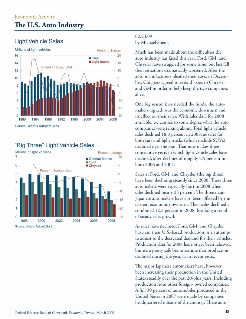
Economic ActivityTh e U.S. Auto Industry
02.23.09by Michael Shenk
Much has been made about the diffi culties the auto industry has faced this year. Ford, GM, and Chrysler have struggled for some time, but last fall their situations dramatically worsened. After the auto manufacturers pleaded their cases in Decem-ber, Congress agreed to extend loans to Chrysler and GM in order to help keep the two companies alive.
One big reason they needed the funds, the auto-makers argued, was the economic downturn and its eff ect on their sales. With sales data for 2008 available, we can see to some degree what the auto companies were talking about. Total light vehicle sales declined 18.0 percent in 2008, as sales for both cars and light trucks (which include SUVs) declined over the year. Th at now makes three consecutive years in which light vehicle sales have declined, after declines of roughly 2.5 percent in both 2006 and 2007.
Sales at Ford, GM, and Chrysler (the big three) have been declining steadily since 2000. Th ese three automakers were especially hurt in 2008 when sales declined nearly 25 percent. Th e three major Japanese automakers have also been aff ected by the current economic downturn. Th eir sales declined a combined 12.3 percent in 2008, breaking a trend of steady sales growth.
As sales have declined, Ford, GM, and Chrysler have cut their U.S.-based production in an attempt to adjust to the decreased demand for their vehicles. Production data for 2008 has not yet been released, but it’s a pretty safe bet to assume that production declined during the year, as in recent years.
Th e major Japanese automakers have, however, been increasing their production in the United States steadily over the past 20-plus years. Including production from other foreign- owned companies. A full 30 percent of automobiles produced in the United States in 2007 were made by companies headquartered outside of the country. Th ese auto-
0
2
4
6
8
10
12
14
16
1980 1984 1988 1992 1996 2000 2004 2008-20
-15
-10
-5
0
5
10
15
20
Millions of light vehicles
Source: Ward’s AutoInfoBank.
Light trucksCars
Light Vehicle Sales
Percent change, total
Percent change
0
1
2
3
4
5
6
7
1998 2000 2002 2004 2006 2008-25
-20
-15
-10
-5
0
5
10Millions of light vehicles
Source: Ward’s AutoInfoBank.
“Big Three” Light Vehicle Sales
FordGeneral Motors
Chrysler
Percent change
Percent change, total

16Federal Reserve Bank of Cleveland, Economic Trends | March 2009
mobiles are not just assembled in the United States, they are also most often built from parts made by U.S. companies. Th e use of parts manufactured in the U.S. by foreign-based brands has led many people to reconsider what exactly constitutes an “American” car. In some cases, the domestic content of foreign-based models is actually higher than that of their U.S.-based rivals.
Even with the increased production of foreign nameplates on U.S. soil, a signifi cant portion of U.S. light vehicle sales are still imported. In 2008 just over 25 percent of all light vehicles sold in the United States were produced outside of North America. Th e recent run up in this series isn’t pri-marily related to an increase in the number of ve-hicle imported, though that fi gure has increased in recent years, but more so to a decline in domestic production, as the big three have been restructuring and trying to cut their production capacity.
0
2
4
6
8
10
12
14
1985 1988 1991 1994 1997 2000 2003 20060
5
10
15
20
25
30
35Millions of vehicles
Notes: Includes trucks; Production data from the joint venture between Toyota and GM can not be disaggregated and was excluded in all calculations.Source: Ward’s AutoInfoBank
“Japanese three”“Big three”
U.S. Production
Foreign based companies share
Share of total production
0
2
4
6
8
10
12
14
16
1980 1984 1988 1992 1996 2000 2004 20080
5
10
15
20
25
30
35
40Millions of light vehicles
Source: Ward’s AutoInfoBank.
ImportsDomestically produced
Light Vehicle Sales
Imports share
Share of total sales
0.0
0.5
1.0
1.5
2.0
2.5
3.0
1998 2000 2002 2004 2006 2008-15
-10
-5
0
5
10
15Millions of light vehicles
Source: Ward’s AutoInfoBank.
“Japanese Three” Light Vehicle Sales
HondaToyota
NissanPercent change, total
Percent change

17Federal Reserve Bank of Cleveland, Economic Trends | March 2009
Economic ActivityTh e Recent Increase in the Volatility of Economic Indicators
02.27.09by Kyle Fee and Filippo Occhino
In recent months, we have seen a staggering in-crease in stock market volatility. One popular mea-sure of market volatility, the Chicago Board Op-tions Exchange’s Volatility Index (VIX), jumped to 62.6 in November 2008, higher than it’s ever been. Th e VIX is computed from the S&P500 stock index option prices, and higher numbers imply that investors expect more volatile movements in the S&P index in the near term. (Numbers correspond to the annualized percentage point change expected over the next 30 days). Th e index has since dropped to 44.7 for January 2009, but this is still very high.
Is there a corresponding increase in volatility of macroeconomic variables? To answer this question, we focused on four main economic indicators, GDP growth, employment growth, productivity growth, and infl ation. We obtained their volatili-ties by calculating their deviations from long-run trends. When an indicator is far from its long-run trend, regardless of whether it is above or below, its volatility is higher. More precisely, we computed the current volatility of an indicator as a weighted average of its past volatility and its deviation from its historic mean (in the case of GDP, employment, and productivity) or its two-year moving average (in the case of infl ation).
Plotting the growth rate of GDP and its volatility from 1950 to the present, we can easily see what is commonly referred to as the “great moderation,” the long-run decrease in the volatility of GDP growth (and other variables) that started in the 1980s. Averaging 2.0 percent during the 1950–1984 period, the volatility of GDP growth fell to 0.9 percent after 1984. A variety of explanations for the great moderation have been proposed, includ-ing a change in the structure of the economy due to advances in information technology, increased resil-ience of the economy to oil shocks, increased access to fi nancial markets, changes in fi nancial market regulation, improvements in the conduct of mon-etary policy, a reduction in the size of domestic and
0
10
20
30
40
50
60
70
1990 1992 1994 1996 1998 2000 2002 2004 2006 2008
CBOE Volatility Index (VIX)Index
Notes: Shaded bars indicate recessions; The dashed red line indicates the onset of the current recession.Source: Wall Street Journal.
-15
-12
-9
-6
-3
0
3
6
9
0
2
4
6
8
10
1950 1955 1960 1965 1970 1975 1980 1985 1990 1995 2000 2005
Real GDPPercent Percent
Volatility
Growth rate
Notes: Shaded bars indicate recessions. The dashed red line indicates the onset of the current recession. Volatility is computed using deviations of the GDP growth rate from a constant mean and a GARCH (1,1) with a 0.729 first-order serial correlation.Sources: Bureau of Economic Analysis; authors’ calculations.

18Federal Reserve Bank of Cleveland, Economic Trends | March 2009
international shocks (see “Why has output become less volatile” and “Th e Great Moderation: Good Luck, Good Policy, or Less Oil Dependence?”).
Our graph shows that the volatility of GDP growth has increased during the current recession. How-ever, volatility also increased during the 1991 and 2001 recessions. As we will see, the volatility of other economic indicators also exhibits this cycli-cal pattern, increasing during recessions and then falling back. Indeed, the asymmetry of the business cycle may account for part of the increase in mea-sured volatility during recessions. Because expan-sions last longer than contractions, the historic mean of a variable lies closer to the values it reaches during expansions. As a result, deviations of the variable from its mean are larger during contrac-tions than during expansions. Taking this cyclical pattern into account, there is no evidence of a long-run increase in the volatility of GDP growth.
Th e chart at left shows the similar pattern followed by the volatility of nonfarm payroll employment growth. Note that the severity of the current reces-sion is refl ected in that the latest spike in volatility is already higher than those of the previous two recessions.
While labor productivity growth also shows clear evidence of participating in the great moderation, it does not exhibit the same cyclical pattern as GDP growth and employment growth. Consequently, it should not be surprising that its volatility shows absolutely no sign of increasing in this downturn.
Infl ation volatility spiked recently to a level surpass-ing the peaks reached during the 1970s. Th e recent high level of volatility is due to very low readings of infl ation (even defl ation) rather than high levels of infl ation, as was the case during the 1970s. It is hard to judge how much of the recent increase in infl ation volatility can be attributed to cyclical factors. First, the pattern of cyclical volatility is less pronounced in the case of infl ation. Also, after its sizeable decrease during the 1980s, infl ation volatil-ity has drifted up since the late 1990s.
In summary, the volatility of most macroeconomic variables has recently increased. Except for the case of infl ation, the high levels of volatility seem to be
-15
-12
-9
-6
-3
0
3
6
9
0
1
2
3
4
5
6
7
8
9
10
1950 1955 1960 1965 1970 1975 1980 1985 1990 1995 2000 2005
Nonfarm Payroll EmploymentPercent Percent
Volatility
Growth rate
Notes: Shaded bars indicate recessions. The dashed red line indicates the onset of the current recession. Volatility is computed using deviations of the employment growth rate from a constant mean and a GARCH (1,1) with a 0.9 first-order serial correlation. Sources: Bureau of Labor Statistics; authors’ calculations.
-10
-8
-6
-4
-2
0
2
4
6
8
0
1
2
3
4
5
6
1950 1955 1960 1965 1970 1975 1980 1985 1990 1995 2000 2005
Labor ProductivityPercent
Volatility
Growth rate
Notes: Shaded bars indicate recessions. The dashed red line indicates the onset of the current recession. Volatility is computed using deviations of the productivity growth rate from a constant mean and a GARCH (1,1) with a 0.9 first-order serial correlation.Sources: Bureau of Bureau of Labor Statistics; authors’ calculations.
Percent
-20
-16
-12
-8
-4
0
4
8
12
0
2
4
6
8
10
12
14
1950 1955 1960 1965 1970 1975 1980 1985 1990 1995 2000 2005
Consumer Price IndexPercent Percent
Volatility
Inflation rate
Notes: Shaded bars indicate recessions. The dashed red line indicates the onset of the current recession. Volatility is computed using deviations of the inflation rate from a two-year moving average and a GARCH (1,1) with a 0.9 first-order serial correlation.Sources: Bureau of Labor Statistics; authors’ calculations.

19Federal Reserve Bank of Cleveland, Economic Trends | March 2009
mainly due to cyclical factors, and there seems to be no evidence of any long-run increase in volatility.
“Why Has Output Become Less Volatile?” by Bharat Trehan. Federal Rerserve Bank of San Francisco Economic Letter Number 2005-24, September 16, 2005.
“The Great Moderation: Good Luck, Good Policy, or Less Oil Dependence?” by Andrea Pescatori. Federal Reserve Bank of Cleveland, Economic Commentary, March 2008. <http://www.cleve-landfed.org/Research/commentary/2008/0308.cfm>
Economic ActivityTh e Latest S&P Case-Shiller Housing Price Indexes
03.02.09by Paul W. Bauer and Michael Shenk
Declining U.S. home prices led the way into the current worldwide economic crisis, and one sign that the crisis is abating will be when these prices begin to stabilize. More stable home prices would indicate that prices are at a point where buyers can be found and that credit is available.
Th e December 2008 S&P Case-Shiller Home Price Indexes (released February 24, 2009) off ered no evidence that this is happening yet. Over the past year, the 20-city index fell 18.5 percent and the 10-city index fell 19.2 percent. Th e seasonally adjusted annualized rate of declines for December were 21.3 percent and 19.8 percent, respectively.
Th e only Fourth District region tracked by the Case-Shiller indexes is the Cleveland-Elyria-Mentor metropolitan statistical area (MSA), which includes at least portions of Cuyahoga, Geauga, Lake, Lo-rain, and Medina counties. Over the past year, the decline in Cleveland home prices, 6.1 percent, was smaller than in every other MSA included in the indexes except for two, Dallas (down 4.2 percent) and Denver (down 4.0 percent).
Cleveland’s aggregate index masks some extreme volatility in its lowest housing tier (homes valued under $116, 639 in November of 2008). In 2008 the index for this particular tier saw annualized monthly percent changes of 223.6 percent, 104.5 percent, 75 percent, -83.1 percent, and -82.9 percent. Th e absolute value of the index’s annual-

20Federal Reserve Bank of Cleveland, Economic Trends | March 2009
50
70
90
110
130
150
170
190
210
230
1987 1989 1991 1993 1995 1997 1999 2001 2003 2005 2007 2009
Index, January 2000 = 100
Source: S&P, Fiserv, and MacroMarkets, LLC.
10-city index
20-city index
Case-Shiller Home Price Indexes
405060708090
100110120130140
1987 1990 1993 1996 1999 2002 2005 2008
Index, January 2000 = 100
Low tier(<$116,639)
Middle tier($119,392–$185,939)
High tier(>$185,939)
Overall
Source: S&P, Fiserv, and MacroMarkets, LLC.
Case-Shiller Tiered Home-Price Indexes: Cleveland
0.0
0.5
1.0
1.5
2.0
2.5
3.0
3.5
1987 1990 1993 1996 1999 2002 2005 2008
Thousands of units
Source: S&P, Fiserv, and MacroMarkets, LLC.
Case-Shiller Sale-Pair Counts: Cleveland
ized growth rate has been less than 20 percent only twice in the past 12 months. In fact, Cleveland’s tiered-price indexes were not even included in the latest report because they were considered too sta-tistically unreliable. A footnote stated, “After review of the data the standard errors were deemed too large and the December numbers were not believed to be reliable at this time and therefore will not be published.”
What is the source of this volatility? It is probably a consequence of the number of observations the indexes have to work with. If there are too few, averages from period to period can vary a lot. Th ese numbers do look unusually low for Cleveland over the past year.
Case-Shiller indexes are constructed by comparing the sales prices of a single-family homes with their previous sales prices. Th e two prices constitute a matched “pair.” In December 2008, there were only 554 pairs in Cleveland for all three tiers. Th is fi gure is not only low compared to other cities tracked by the indexes, it is the lowest fi gure in the whole history of the Cleveland series, which goes back to January 1987. What is also clear is that sale-pair counts were abnormally low and somewhat damped during the past business cycle. (As in most cities, Cleveland home sales are highly seasonal, slowing during the school year and winter.) Th is past sum-mer’s peak did not even rise to a more normal year’s trough, and the amplitude is sharply stunted.
Th e sale-pair counts for the top-10 and top-20 city indexes show a similar pattern. In addition to being seasonal, counts in both indexes show a downward trend and a decline, albeit more modest, in ampli-tude. But importantly from a statistical perspective, none of the other cities have as few pair counts as Cleveland. Th e next lowest, Charlotte, has over twice as many at 1,257. Statistically, a larger sample enables tighter bounds to be put on the estimates of the housing price index.
Why are sale-pair counts down? First, the housing market is weak, so there are not that many home transactions of any type. Th en, only a subset of transactions is used to calculate the indexes. Only arm’s-length transactions, where both the buyer and seller acted in their own best economic interest, and

21Federal Reserve Bank of Cleveland, Economic Trends | March 2009
repeat sales transactions for existing, single-family homes are selected. Filtering excludes property transfers between family members and the repos-session of properties by mortgage lenders at the beginning of foreclosure proceedings. Any subse-quent sales by those lenders are included, however. Th e data are also fi ltered to exclude homes that have had substantial physical changes (either major renovations or signifi cant material damage).
Many of the Cleveland transactions are not arm’s-length. Over the past 12 months, 26.9 percent were foreclosures, according to the real-estate-informa-tion website Zillow. Th e fi gure for December is not available, but the National Association of Realtors reports that for the nation as a whole, 45 percent of December sales were foreclosure-related or other-wise distressed. Th e fi gure for Cleveland’s lowest tier is likely higher than for Cleveland overall, as it was the lowest tier that was hardest hit by delin-quencies from subprime loans.
Th e bottom line is that match-pair house-price indexes like S&P Case-Shiller can provide valuable information about how house prices have changed over time. However, extra care must be taken in in-terpreting these indexes when the sales-pair counts fall to such abnormally low levels.
0
20
40
60
80
100
120
140
160
180
200
1987 1990 1993 1996 1999 2002 2005 2008
Thousands of units
10-city index
20-city index
Source: S&P, Fiserv, and MacroMarkets, LLC.
Case-Shiller Sale-Pair Counts

22Federal Reserve Bank of Cleveland, Economic Trends | March 2009
Economic ActivityReal GDP: Fourth-Quarter 2008 Preliminary Estimate
03.06.09by Brent Meyer
Real GDP was revised down by 2.5 percentage points to −6.2 percent (annualized rate) in the fourth quarter of 2008, according to the prelimi-nary release by the Bureau of Economic Analysis. For context, the average revision without regard to sign from the advance to preliminary estimate is 0.5 percentage point. If the current estimate holds, it will be the sharpest quarterly decrease between the two releases since the fi rst quarter of 1982.
On a year-over-year basis, real GDP slipped into the red for the fi rst time since the 1990 recession, falling to −0.8 percent. Th e only major component that contributed to real GDP growth was govern-ment spending, which increased only 1.6 percent. (Other major components are consumption, gross investment, and exports net of imports).
Th e preliminary release contained fairly widespread downward revisions, though the largest adjust-ments came from private inventories and exports. Th e change in private inventories was revised down from an addition of $6.2 billion to a subtraction of $19.9 billion, accounting for 1.2 percentage points in the downward adjustment to real GDP growth.
Exports were revised down to −23.6 percent from −19.8 percent in the advance estimate, pulling down growth by an additional 0.6 percentage point—the deepest contraction in exports since the fourth quarter of 1971.
Th e growth rate in personal consumption fell to −4.3 percent from the advance release’s −3.5 per-cent, subtracting an additional 0.5 percentage point from real GDP growth (−3.0 percentage point in total). On a year-over-year basis, consumption is down 1.5 percent, its slowest growth rate since the third quarter of 1951.
Real residential investment was revised up from −23.6 percent in the advance release to −22.2 percent (adding 0.1 percentage point to growth), though business fi xed investment was revised down
Real GDP and Components, 2008:Q4 Preliminary Estimate
Annualized percent change, last: Quarterly change (billions of 2000$) Quarter Four quarters
Real GDP −187.4 −6.2 −0.8Personal consumption −90.7 −4.3 −1.5 Durables −71.5 −22.1 −11.4 Nondurables −56.9 −9.2 −3.4Services 16.8 1.4 1.1Business fi xed investment −81.8 −21.0 −5.0 Equipment −85.8 −28.8 −11.2 Structures −5.3 −5.9 7.3Residential investment −21.5 −22.2 −19.3Government spending 8.2 1.6 3.3 National defense 4.3 3.2 8.8Net exports −19.8 — — Exports −101.3 −23.6 −1.8 Imports 81.5 −16.0 −7.1Private inventories −19.9 — —
Source: Bureau of Economic Analysis.
-4
-3
-2
-1
0
1
2
3
4
Contribution to Percent Change in Real GDP Percentage points
Personalconsumption
Businessfixedinvestment
Residentialinvestment
Change ininventories
Exports
Imports
Governmentspending
Source: Bureau of Economic Analysis.
2008:Q4 advance estimate2008:Q4 preliminary estimate

23Federal Reserve Bank of Cleveland, Economic Trends | March 2009
slightly, subtracting an additional 0.2 percentage point from total output.
Th e majority of economists on the Blue Chip panel again revised down their annual estimates for real GDP in 2009 and 2010, and, as of the fi rst week of February, expect a fi rst-quarter decrease of 4.9 per-cent. Next month will likely be no diff erent, given the relatively large downward revision to output. Th at said, the consensus viewpoint is for the reces-sion to end by midyear (even the average of the 10 most pessimistic respondents is for positive GDP growth by the fourth quarter of 2009).
One of the adverse outcomes of the fi nancial crisis has been a lack of credit, which has depressed con-sumer spending. Some analysts have suggested the situation might spark a reversal in the trend toward increasing consumption and the return of higher savings rates.
Personal consumption expenditures as a share of GDP rose from an average of roughly 63 percent during the 1970s and 1980s to a peak of 70.9 percent in the second quarter of 2008. During the second half of 2008, consumption’s share of GDP fell 1.0 percentage point from the peak.
Th e personal savings rate, which had been hover-ing near 10 percent during the 1970s and 1980s, actually fell negative during the height of the recent housing price “bubble.” In the fourth quarter of 2008, savings increased to 3.2 percent and, in the most recent monthly reading, jumped to 5.0 per-cent in January.
Obviously, no one knows whether this trend will continue and whether the savings rate will increase to levels seen during the latter half of the twentieth century. However, if the decrease in the savings rate was a rational response to perceived wealth increas-es tied to house-price appreciation, then it stands to reason that as long as house prices continue to fall, the savings rate should increase.
-7
-5
-3
-1
1
3
5
Q1 Q2 Q3 Q4 Q1 Q2 Q3 Q4 Q1 Q2 Q3 Q4 Q1 Q2 Q3 Q4
Annualized quarterly percent change
Real GDP Growth
Source: Blue Chip Economic Indicators, February 2009; Bureau of Economic Analysis.
2007 20092008 2010
Final estimateAdvance estimate
Blue Chip consensus forecastPreliminary estimate
60
64
68
72
-5
0
5
10
15
1970 1973 1977 1981 1984 1988 1991 1995 1999 2002 2006
Percent
Consumption and Savings
Source: Bureau of Economic Analysis.
Percent
Percent of disposable income
Percent of GDP

24Federal Reserve Bank of Cleveland, Economic Trends | March 2009
Economic ActivityTh e Employment Situation, February 2009
03.10.09by Yoonsoo Lee and Beth Mowry
Th e labor market lost 651,000 jobs in February, meeting expectations and bringing the total tally of losses since the start of the recession to 4.4 million. Downward revisions increased December and Janu-ary declines by 104,000 and 57,000, respectively. Additionally, the unemployment rate increased by half of a percentage point, to 8.1 percent.
Payroll losses characterized every part of the econo-my, with the lone exceptions of the education and healthcare and government sectors. Th e diff usion index of employment change currently sits at 23.8, meaning only 23.8 percent of industries are increas-ing employment. Th is is up slightly from January’s reading of 23.2 but still considerably lower than most months this past year, and lower than the average reading of 38 during the 2001 recession. Goods-producing jobs declined by 276,000, and service-providing jobs declined by 375,000. Within goods, losses were split between construction (−104,000) and manufacturing (−168,000). Resi-dential and nonresidential construction suff ered about equally.
On the services side, the trade, transportation, and utilities sector shed 124,000 jobs last month, with transportation taking the largest hit (−44,900) in this category. Truck transportation was responsible for 33,400 of those losses, making February the worst month on record for the industry since April 1994.
Financial activities lost 44,000 jobs in February, comparable to the losses of recent months. Janu-ary’s report was offi cially the sector’s worst perfor-mance to date. Information payrolls declined by 15,000, and leisure and hospitality declined by 33,000. Professional business services had the worst month on record (−180,000), owing largely to loss-es in temporary help services (−77,700). Education and health services added 26,000 jobs last month, although the health side was responsible for all the additions (30,400). Education employment, which
-800-700-600-500-400-300-200-100
0100200300
Average Nonfarm Employment Change Change, thousands of jobs
RevisedPrevious estimate
Source: Bureau of Labor Statistics.2008
2007 2008 Q2 DecQ4Q3 Jan Feb2006

25Federal Reserve Bank of Cleveland, Economic Trends | March 2009
has mostly risen throughout the current downturn, declined by 4,200. Th e government sector added a modest 9,000 jobs, continuing its mostly positive employment trend.
Labor Market ConditionsAverage monthly change (thousands of employees, NAICS)
2006 2007 2008 February 2009Payroll employment 178 96 −257 −651
Goods-producing 5 −34 −126 −276Construction 15 −16 −57 −104
Heavy and civil engineering 3 0 −6 −5.2 Residentiala −5 −23 −35 −51.1 Nonresidentialb 16 6 −16 −48 Manufacturing −14 −22 −73 −168 Durable goods −4 −16 −54 −132 Nondurable goods −10 −5 −19 −36 Service-providing 173 130 −131 −375 Retail trade 3 14 −44 39.5 Financial activitiesc 9 −10 −19 −44 PBSd 45 25 −63 −180 Temporary help services 2 −7 −44 −77.7 Education and health services 39 43 43 26 Leisure and hospitality 33 2 −21 −33 Government 17 24 14 9 Local educational services 6 8 1 13.4
Average for period (percent) Civilian unemployment rate 4.6 4.6 5.8 8.1
a. Includes construction of residential buildings and residential specialty trade contractors.b. Includes construction of nonresidential buildings and nonresidential specialty trade contractors.c. Includes the fi nance, insurance, and real estate sector and the rental and leasing sector.d. PBS is professional business services (professional, scientifi c, and technical services, management of companies and enterprises, administrative and support, and waste management and remediation services.Source: Bureau of Labor Statistics.
Private sector employment payrolls dropped 660,000 jobs last month, roughly similar to activity in December and January. Th e magnitude of losses in the past three months has been higher than twice the greatest monthly losses of the 2001 recession. Finding larger declines in private employment would require looking all the way back to the late 1940s and mid-1950s.
Private Sector Employment Growth
-700
-500
-300
-100
100
300
2000 2001 2002 2003 2004 2005 2006 2007 2008
Three-month moving averageMonthly change
Source: Bureau of Labor Statistics.
Thousands of jobs

26Federal Reserve Bank of Cleveland, Economic Trends | March 2009
Regional ActivityFourth District Employment Conditions
02.18.09by Kyle Fee
Th e District’s unemployment rate jumped 0.3 percentage point to 7.4 percent for the month of December. Th e increase in the unemployment rate refl ects an increase of the number of people unem-ployed (4.7 percent) and a decrease in the number of people employed (−0.5 percent). Th e District’s unemployment rate was higher than the nation’s (by 0.2 percentage point), as it has been since early 2004. However, the gap between the two has nar-rowed over the past year as the current recession has continued. Since this time last year, the District’s unemployment rate has increased 2.0 percentage points, while the nation’s has increased 2.3 percent-age points.
Unemployment rates diff er considerably across counties in the Fourth District. Of the 169 coun-ties that make up the District, 50 had an unem-ployment rate below the national average in De-cember and 119 counties had rate higher than the national average. Th ere were 32 District counties reporting double-digit unemployment rates, while 9 counties had an unemployment rate below 6.0 percent. Rural Appalachian counties continue to experience higher levels of unemployment, as do counties along the Ohio-Michigan border.
Th e distribution of unemployment rates among Fourth District counties ranges from 5.2 percent to 13.1 percent, with a median county unemployment rate of 8.0 percent. Counties in Fourth District West Virginia and Pennsylvania generally populate the lower half of the distribution, while Fourth Dis-trict Kentucky and Ohio counties are dominant in the upper half. Th ese county-level patterns are re-fl ected in statewide unemployment rates. Th e states of Ohio and Kentucky both have unemployment rates of 7.8 percent, compared to Pennsylvania’s 6.7 percent and West Virginia’s 4.9 percent.
Th e distribution of changes in unemployment rates from December 2007 to December 2009 shows that the median county unemployment rate in-
3
4
5
6
7
8
1990 1992 1994 1996 1998 2000 2002 2004 2006 2008
Percent
Fourth Districta
United States
Unemployment Rates
a. Seasonally adjusted using the Census Bureau’s X-11 procedure.Note: Shaded bars represent recessions. Some data reflect revised inputs, reestimation, and new statewide controls. For more information, see http://www.bls.gov/lau/launews1.htm.Sources: U.S. Department of Labor and Bureau of Labor Statistics.
5.2% - 6.5%6.6% - 7.5%7.6% - 8.5%8.6% - 9.5%9.6% - 10.5%10.6% - 13.1%
County Unemployment Rates
Note: Data are seasonally adjusted using the Census Bureau’s X-11 procedure. Sources: U.S. Department of Labor and Bureau of Labor Statistics.
U.S. unemployment rate = 7.2%
3456789
1011121314
PercentCounty Unemployment Rates
Note: Data are seasonally adjusted using the Census Bureau’s X-11 procedure.Sources: U.S. Department of Labor and Bureau of Labor Statistics.
County
OhioKentucky
PennsylvaniaWest Virginia
Median unemployment rate = 8.0%

27Federal Reserve Bank of Cleveland, Economic Trends | March 2009
creased 2.0 percentage points. Year over year, 55 percent of Fourth District Kentucky counties and 56 percent of the counties in Ohio experienced un-employment rate increases in excess of 2.0 percent-age points. However, Fourth District Kentucky and West Virginia have actually seen some county un-employment rates fall over the same period. Fourth District Pennsylvania saw unemployment rate increases ranging from 1.0 percent to 3.3 percent.
Mapping the changes in county unemployment rates highlights the dispersion of unemployment rate changes across Fourth District counties. Over the past year, northwest Ohio has experienced signifi cant increases in unemployment rates across all counties. Counties along the Ohio-Kentucky border have also seen unemployment rates increase considerably.
-2
-1
0
1
2
3
4
5
6
Percentage points
Note: Data are seasonally adjusted using the Census Bureau’s X-11 procedure.Sources: U.S. Department of Labor and Bureau of Labor Statistics.
County
Median unemployment uate change = 2.0%
Change in County Unemployment Rates:December 2007–December 2008
OhioKentucky
PennsylvaniaWest Virginia
-1.0% - 0.0%0.1% - 1.0%1.1% - 2.0%2.1% - 3.0%3.1% - 5.2%
Change in County Unemployment Rates:December 2007– December 2008
Note: Data are seasonally adjusted using the Census Bureau’s X-11 procedure.Sources: U.S. Department of Labor, Bureau of Labor Statistics.
U.S. unemployment rate change = 2.3%

28Federal Reserve Bank of Cleveland, Economic Trends | March 2009
Banking and Financial InstitutionsFDIC Funds
03.10.09by Joseph Haubrich, Kent Cherny, and Saeed Za-man
Th e Federal Deposit Insurance Corporation (FDIC) recently released its fourth-quarter bank-ing summary, giving us the opportunity to exam-ine trends in the FDIC-insured banking industry during 2008. Total deposits at insured institutions rose 10.9 percent to $4.76 trillion from 2007 to 2008. Most of this increase in deposits took place in the third and fourth quarters of 2008, when the fi nancial crisis hit its full stride and widespread risk aversion led to an increase in deposit holdings.
Th e Deposit Insurance Fund (DIF) ratio took a tremendous hit in 2008, as 25 insured institutions failed and were placed in receivership by the FDIC. Since deposits have also increased dramatically, the DIF ratio—now at 0.40 percent of insured deposits—has fallen further. In order to replenish the DIF, the FDIC recently agreed to increase pre-miums on insured banks, and lawmakers have also proposed to increase the established credit line that the FDIC has with the Treasury Department. Th e FDIC targets a DIF ratio of at least 1.15 percent of total insured deposits.
In response to bank-funding diffi culties and de-positor concerns, the FDIC last year instituted the Temporary Liquidity Guarantee Program (TLGP), which would, for a fee, insure fi nancial institu-tions’ non-interest-bearing transaction deposits and eligible senior unsecured debt. Because these programs are funded and cushioned by their service fees, they do not rely on the DIF.
Th e 25 depository institutions that failed and were placed into receivership by the FDIC in 2008 are more than double the number of banks that failed in 2002. Th at year had the highest number of failures (11) in the 12 years preceding 2008. Furthermore, the bank failures of 1995-2007 were predominantly small institutions with assets in the hundreds of millions of dollars (see chart). Howev-er, the failure of banks as large as IndyMac pushed
1,600
2,000
2,400
2,800
3,200
3,600
4,000
4,400
4,800
5,200
1995 1997 1999 2001 2003 2005 2007
Billions of dollars
Source: Federal Deposit Insurance Corporation, Quarterly Banking Profile, Fourth Quarter 2008.
FDIC-Insured Deposits
0.00
0.25
0.50
0.75
1.00
1.25
1.50
1.75
2.00
1995 1997 1999 2001 2003 2005 2007
Percent of insured deposits
Source: Federal Deposit Insurance Corporation, Quarterly Banking Profile, Fourth Quarter 2008.
Fund Reserve Ratio
Targets

29Federal Reserve Bank of Cleveland, Economic Trends | March 2009
Economic Trends is published by the Research Department of the Federal Reserve Bank of Cleveland.
Views stated in Economic Trends are those of individuals in the Research Department and not necessarily those of the Fed-eral Reserve Bank of Cleveland or of the Board of Governors of the Federal Reserve System. Materials may be reprinted provided that the source is credited.
If you’d like to subscribe to a free e-mail service that tells you when Trends is updated, please send an empty email mes-sage to [email protected]. No commands in either the subject header or message body are required.
ISSN 0748-2922
the total assets of failed banks in 2008 to $372 bil-lion, up from $2.3 billion in 2007. In many cases the FDIC was able to fi nd existing depository insti-tutions that would take over the deposits of failed banks and, in some cases, some portion of balance sheet assets.
Th e number of troubled institutions also increased sharply in 2008. A total of 252 banks with total assets of $159 billion were on the FDIC’s “problem list,” up from 76 institutions with $22 billion in assets during 2007. So far, 2009 has seen 17 banks closed in less than three months.
0
3
6
9
12
15
18
21
24
27
1995 1998 2001 2004 20070
50
100
150
200
250
300
350
400Number of institutions
Source: Federal Deposit Insurance Corporation, Quarterly Banking Profile, Fourth Quarter 2008.
Failed InstitutionsTotal assets, billions of dollars
020406080
100120140160180200220240260280
1995 1997 1999 2001 2003 2005 20070
20
40
60
80
100
120
140
160
180Number of institutions
Source: Federal Deposit Insurance Corporation, Quarterly Banking Profile, Fourth Quarter 2008.
Problem InstitutionsTotal assets, billions of dollars
To read more on the Temporary Liquidity Guarantee Program:http://www.fdic.gov/regulations/resources/tlgp/index.html