
FRAMEWORK FOR A SMART PROCESS DATA ANALYTICS …
17
FRAMEWORK FOR A SMART PROCESS DATA ANALYTICS PLATFORM Wenkai Hu 1 , Sirish L. Shah* 2 and Tongwen Chen 1 1 Department of Electrical & Computer Engineering, University of Alberta 2 Department of Chemical & Material Engineering, University of Alberta Edmonton, AB, Canada T6G 1H9 Abstract The fusion of information from disparate sources of data is the key step in devising strategies for a smart analytics platform. In the context of the application of analytics in the process industry, this paper provides a framework for seamless integration of information from process and alarm databases complimented with process connectivity information. The discovery of information from such diverse data sources can be subsequently used for process and performance monitoring including alarm rationalization, root cause diagnosis of process faults, hazard and operability analysis, safe and optimal process operation. The utility of the proposed framework is illustrated by several successful industrial case studies. Keywords Analytics, big data, performance monitoring, process monitoring, alarm systems, process data analytics, fault detection and diagnosis. Introduction 1 Process data analytic methods rely on the notion of sensor fusion whereby data from many sensors and alarm tags are combined with process information, such as physical connectivity of process units, to give a holistic picture of health of an integrated plant. The discovery and learning from process and alarm data refer to a set of tools and techniques for modeling and understanding of complex data sets. Such data sets generally include normal numerical (or non-categorical) data but should also take into account categorical (or non- numerical or qualitative) data from Alarm and Event (A&E) logs combined with process connectivity or topology information. The later refers to the capture of material flow streams in process units as well as information flow-paths in the process due to control loops. This is particularly useful when one is analyzing data from highly integrated This work was supported by the Natural Sciences and Engineering Research Council of Canada. * To whom all correspondence should be addressed ([email protected]). processes to understand propagation of process faults as would be required in HAZard and OPerability (HAZOP) analysis for safe process operation. Highly interconnected process plants are now a norm and the analysis of root causes of process abnormality including predictive risk analysis is non-trivial. It is the extraction of information from the seamless fusion of process data, alarm and event data and process connectivity that should form the backbone of a viable process data analytics platform. This paper focuses on an attempt to create such a platform. This idea of information fusion in the context of process data analytics is depicted in Figure 1. For efficient and informative analytics, data analysis is ideally carried out in the temporal as well as spectral domains, on a multitude and NOT singular sensor signals to detect process abnormality, ideally in a predictive mode. With the explosion of applications of analytics in diverse areas (such as aircraft engine prognosis, medicine, sports, finance, insurance, social sciences and the advertising industry) statistical learning skills are in high demand. The emphasis in this study is on tools and techniques that help in the process of understanding data and discovering information that would lead to predictive monitoring and
Transcript of FRAMEWORK FOR A SMART PROCESS DATA ANALYTICS …

FRAMEWORK FOR A SMART PROCESS DATA
ANALYTICS PLATFORM
Wenkai Hu1, Sirish L. Shah*2 and Tongwen Chen1
1 Department of Electrical & Computer Engineering, University of Alberta 2 Department of Chemical & Material Engineering, University of Alberta
Edmonton, AB, Canada T6G 1H9
Abstract
The fusion of information from disparate sources of data is the key step in devising strategies for a smart
analytics platform. In the context of the application of analytics in the process industry, this paper
provides a framework for seamless integration of information from process and alarm databases
complimented with process connectivity information. The discovery of information from such diverse
data sources can be subsequently used for process and performance monitoring including alarm
rationalization, root cause diagnosis of process faults, hazard and operability analysis, safe and optimal
process operation. The utility of the proposed framework is illustrated by several successful industrial
case studies.
Keywords
Analytics, big data, performance monitoring, process monitoring, alarm systems, process data analytics,
fault detection and diagnosis.
Introduction1
Process data analytic methods rely on the notion of
sensor fusion whereby data from many sensors and alarm
tags are combined with process information, such as
physical connectivity of process units, to give a holistic
picture of health of an integrated plant.
The discovery and learning from process and alarm
data refer to a set of tools and techniques for modeling and
understanding of complex data sets. Such data sets
generally include normal numerical (or non-categorical)
data but should also take into account categorical (or non-
numerical or qualitative) data from Alarm and Event (A&E)
logs combined with process connectivity or topology
information. The later refers to the capture of material flow
streams in process units as well as information flow-paths
in the process due to control loops. This is particularly
useful when one is analyzing data from highly integrated
This work was supported by the Natural Sciences and Engineering
Research Council of Canada. * To whom all correspondence should be addressed
processes to understand propagation of process faults as
would be required in HAZard and OPerability (HAZOP)
analysis for safe process operation. Highly interconnected
process plants are now a norm and the analysis of root
causes of process abnormality including predictive risk
analysis is non-trivial. It is the extraction of information
from the seamless fusion of process data, alarm and event
data and process connectivity that should form the
backbone of a viable process data analytics platform. This
paper focuses on an attempt to create such a platform. This
idea of information fusion in the context of process data
analytics is depicted in Figure 1.
For efficient and informative analytics, data analysis is
ideally carried out in the temporal as well as spectral
domains, on a multitude and NOT singular sensor signals
to detect process abnormality, ideally in a predictive mode.
With the explosion of applications of analytics in diverse
areas (such as aircraft engine prognosis, medicine, sports,
finance, insurance, social sciences and the advertising
industry) statistical learning skills are in high demand. The
emphasis in this study is on tools and techniques that help
in the process of understanding data and discovering
information that would lead to predictive monitoring and

diagnosis of process faults, alarm rationalization and safe
and optimal process operation.
Typical process data analytic methods require the
execution of following steps:
1) Data quality assessment, such as outlier detection,
data normalization, and noise filtering;
2) Data visualization and segmentation;
3) Process and performance monitoring including root
cause detection of faults;
4) Alarm data analysis;
5) Data-based process topology discovery and
validation.
Figure 1. Ingredients of a smart process data analytics platform to enable seamless fusion of
information from process and alarm data combined with process connectivity information.
The focus of this paper is to introduce a framework for
a smart analytics platform supported by industrial case
studies to demonstrate the practical utility of such a tool. In
this vein this paper is organized as follows: First, main
features of this data analytics platform are introduced in
detail, including several functional modules, such as the
alarm data analysis, alarm system design, process data
analysis, and causality inference. To demonstrate the utility
of these functional modules, several case studies involving
real industrial data are presented. The concluding remarks
are given in the last section.
Framework for a Data Analytics Platform
A comprehensive platform should integrate a variety
of basic statistical functions as well as advanced analytical
features, which are powerful and insightful in analyzing
either continuous-valued process data or binary-valued
alarm data as well as additional categorical data. The
proposed analytics platform consists of a data loading
section and four functional modules as shown in Figure 2.
“Data Loading” imports, reorganizes, merges, or exports
alarm data and/or process data. The functional module
“Alarm Data Analysis” provides analytic and reporting
functions to analyze and visualize alarm data. The
remaining three functional modules are based on process
data. The “Alarm Configuration Analysis” module designs
univariate alarm systems for specific process variables.
The “Process Data Analysis” module visualizes and
analyzes process data from either time or frequency
perspective. The “Connectivity & Causality Analysis”
module uncovers correlations and causal relations between
process variables. In addition, a data summary section
displays the basic information of loaded alarm data and/or
process data. Details and features in each functional
module are presented in the following subsections. The
framework allows merging of process and alarm data, and
gives exploratory as well as analytical insights in the
extraction of information from such data.
Figure 2. Functional modules for a process data analytics toolbox.
Data Loading
“Data Loading” is the first highlighted part in Figure 2.
It has six functions that can fulfill different functions
related to data loading, including alarm data loading,
process data loading, data exporting, preprocessed data
loading, data matching, and data clearing. The descriptions
of these functions are listed in Table 1.
Table 1. Tasks in “Data Loading”.
Function Task
Load Alarm Data
Load alarm data from an Excel file with structured data format.
Load Process Data
Load process data from an Excel file with structured data format.
Load Preprocessed Data
Load alarm and/or process data from a MATLAB data file with a reorganized data format.
Merge Data Associate the tags of process variables with their corresponding alarm tags.
Export Export the alarm data and/or process data as a MATLAB data file with a reorganized data format.
Clear Clear alarm and/or process data.
①
② ③
④ ⑤

To import alarm historian data to the platform, an
Alarm & Event (A&E) log file in Microsoft Excel format
is needed. Databases from various vendor systems can be
exported into this toolbox by first converting them into
Excel files. Several requirements on the log file should be
satisfied: (1) Each row should reflect one event message;
(2) each column should be a certain field of event
messages; (3) the same column in all the sheets of the log
file should represent the same field. A typical A&E log
usually consists of configuration attributes, e.g., the tag
name, alarm identifier, priority and location, and realtime
messages such as alarm occurrences (ALM), return-to-
normal instants (RTN), and their time stamps (Izadi et al.
2010; Kondaveeti et al. 2012). Among these attributes and
messages, the following pieces are key and necessary: time
stamp, tag name, tag identifier, and message type. They
may have different field headers in the data archived from
different vendor systems, but usually all of these four
pieces of information are provided. In addition to this, the
priority and unit information are optional for the data
loading depending on whether the two pieces of
information are archived or not. An example of A&E log
in Excel format is shown in Figure 3. The four mandatory
attributes and two optional attributes are highlighted by red
and blue dashed rectangles, respectively.
Figure 3. An example of A&E log.
To import historical process data to the platform, files
that store historical measurements of process variables in
Microsoft Excel format are needed. Process data has
totally different format compared to alarm data. Several
requirements on the Excel files should be satisfied: (1) The
first column should be time stamps of the sampling instants;
(2) the following columns store the historical values of
process variables at these sampling instants. If the time
stamp information is not available, an Excel file without
the time stamp column is also acceptable. The log file of
process data has a much simpler structure compared with
the A&E log, and usually includes three parts, namely, tag
names, measurements, and time stamps. An example of a
process data stream is presented in Figure 4. The tag
names, measurements, and time stamps are highlighted by
green, blue, and red dashed rectangles, respectively.
Once the alarm and/or process data are loaded, the
platform will reorganize them in a format that can be easily
processed by the analytical functions. Exporting data
before closing the platform is recommended, since it is
much less time-consuming to import the preprocessed data
in .mat format than to import the raw data stored in Excel,
especially for subsequent analysis. If both the alarm data
and process data are loaded, then all the process variables
that have observations during the time-window of the
alarm dataset are listed. Macros can be created to associate
alarm tags with a listed process variable. Some basic
information about the data set is shown in the information
section at the bottom left corner of Figure 2. It shows the
directories of the alarm data and process data files,
respectively. Alarm historian duration, average alarm rate,
number of alarm tags, number of process tags, and number
of process tags that have been matched to alarm tags are
also provided if available.
Figure 4. An example of process data.
Alarm Data Analysis
This functional module provides a variety of functions
for the analysis of alarm data, including basic statistical
features, such as the reporting of top bad actors,
calculation of average/peak alarm rates, and OPerator
Acknowledgement Analysis (OPAA), advanced data
analytics, such as the Run Length Distribution & Delay
Timer Analysis (RLD&DTA), Chattering Index (CI),
Oscillating Alarm Analysis (OAA), Alarm Flood Analysis
(AFA), Causality Inference for Alarms (CIA), and Mode-
Dependent Alarm Analysis (MDAA), plus powerful
visualization plots, such as the High Density Alarm Plot
(HDAP), Alarm Burst Plot (ABP) and Alarm Similarity
Color Map (ASCM). This functional part is helpful for
issuing weekly or monthly assessments/recommendations
of alarm management. But it is not merely a simple Key
Performance Indicator (KPI) calculator as it has many
advanced features that can help in alarm rationalization.
The descriptions of these functions are listed in Table 2.
To observe top bad actors and visualize changes of
KPIs, HDAP and ABP can be used. A High Density Alarm
Plot (HDAP) is useful for visualizing large amounts of
alarm data over a selected period (Kondaveeti et al. 2012).
It displays alarm counts for top bad actors using a color
map and provides an overall picture of alarm data without
getting into details of each alarm variable. Using a sliding
time window of 10 minutes, the peak alarm rate is
calculated along with time and can be visualized using a
line graph, namely, the Alarm Burst Plot (ABP) (Hollifield
& Habibi 2011).
Correlated alarms are referred to as alarms occurring
within a short time period of each other. They could be
either redundant or overlapping in indicating the same
abnormality. Therefore, the detection and quantification of

correlated alarms are important. Based on the alarm
correlations, redundant alarms can be removed and related
alarms can be grouped. A variety of methods have been
developed and demonstrated to be effective using
industrial case studies (Noda et al. 2011; Kondaveeti et al.
2012; Yang et al. 2013; Hu et al. 2015). In this functional
part, the correlation metrics are visualized by an Alarm
Similarity Color Map (ASCM), where correlated alarms
are clustered, and thus can be easily identified (Kondaveeti
et al. 2012; Yang et al. 2012).
Table 2. Functions in “Alarm Data Analysis”.
Function Task
HDAP Visualize alarm data over a selected time period using a high density color map.
RL&DTA Design on/off delay timers based on run length distributions.
CI Detect chattering alarms and calculate chattering indices.
ABP Calculate and visualize the peak alarm rate.
OAA Discover alarms caused by process oscillations.
ASCM Detect correlated alarms and visualize their similarity indices using a color map.
AFA Analyze alarm floods, including identification, comparison, and clustering of alarm floods.
OPAA Analyze the operator acknowledgement, including the acknowledgement rate and response time.
CIA Detect causal relations between alarm variables.
MDAA Detect mode-dependent nuisance alarms.
Chattering alarms are major contributors of alarm
overloading. According to ANSI/ISA-18.2 (2009), any
alarm occurring more than 3 times over a 60 seconds
period is likely to be chattering. To identify chattering
alarms and quantify their severities, a Chattering Index (CI)
was developed based on Run Length Distribution (RLD)
(Nagoosi et al. 2011; Kondaveeti et al. 2013). CI takes
values between 0 and 1, with a value closer to 1
corresponding to a more serious chattering problem. To
reduce chattering alarms, delay timers are effective tools
(Kondaveeti et al. 2013; Wang & Chen, 2013 & 2014).
Kondaveeti et al. (2013) and Adnan et al. (2013) provided
effective ways for the design of delay-timers, which is
available in RL&DTA.
An oscillating alarm is a special case of chattering or
repeating alarms, which is caused by oscillatory processes.
An oscillating alarm, as identified by periodicity in the
alarm tag, is an indication of some underlying process
oscillation. The oscillating alarms can be easily detected
offline using the method in (Cheng 2013) and online using
the method in (Wang & Chen 2013). Specifically, the
offline method, namely OAA, is incorporated in this
platform, to detect oscillating alarms based on the
periodicity in alarm states.
Alarm floods typically arise during a situation when a
process abnormality propagates leading to triggering of a
large number of annunciated alarms over a short period
that often exceeds the operator’s ability to respond in a
timely manner to mitigate the fault(s). An alarm flood is
said to be raised when the number of annunciated alarms
reaches 10 alarms over a 10 minutes period per operator,
and be cleared when the number drops below 5 alarms
over a 10 minutes period (ISA-18.2 2009; EEMUA-191
2013; IEC 2014). Alarm floods are common in alarm
systems and have various negative effects (Nimmo 2005;
Timms 2009; Beebe et al. 2013). To analyze alarm floods,
AFA functions enable analysis in two steps. First, alarm
floods are identified from historical alarm data and
highlighted in an alarm burst plot. Second, alarm floods
are compared in pairwise using sequence alignment
algorithms, such as Dynamic Time Warping (DTW)
(Müller 2007; Ahmed et al. 2013), modified Smith
Waterman (SW) algorithm (Smith & Waterman 1981;
Cheng et al. 2013a), and BLAST-like algorithm (Altschul
et al. 1990; Hu et al. 2016a). Furthermore, sequence
patterns of alarm floods can be found using a multiple
sequence alignment algorithm in (Lai & Chen 2015).
To identify abnormality propagation paths and assist
in the root cause detection, the CIA function provides a
practical way to detect causal relations between alarms.
Based on the detection results, users are able to make a
more reliable judgement on how an abnormality
propagates from one alarm to another and relate it to
experiences from similar abnormal events in the past (Hu
et al. 2016b). In this way the alarm flood event clustering
analysis allows one to develop a canonical fingerprint of
common faults that trigger an alarm flood and also identify
appropriate corrective actions that need to be taken to
mitigate the abnormality rapidly.
To analyze the interactions between alarms and
operator responses, the OPAA and MDAA functions have
been developed. The OPAA includes three plots to
visualize the alarm states and operator acknowledgements
(Ack’s) in a high density color map, compare the alarm
count and Ack’s count for each unique alarm using a bar
chart, and show the response time for acknowledging an
alarm using a boxplot. The MDAA function discovers the
association rules of mode-dependent alarms from A&E
logs, where both the alarm data and operator actions
should be available. The results can be used to assist in
configuring state-based alarming strategies. Moreover,
another advanced technique to analyze the interaction
between alarms and operator responses is process
discovery of operational procedures (Hu et al. 2016c). The
results can be used to provide decision supports by
analyzing operator actions from historical data.
In addition to the above analytical functions, reporting
functions are also useful. Table 3 lists three reporting

functions, including the Bad Actor List, Performance
Calculator, and Bad Actor Comparison. A bad actor list
contains statistical results of alarm data. It does not only
indicate top bad actors, but also tells distributions of alarm
priorities, alarm identifiers, and unit areas. Performance
Calculator gives results of how many alarms can be
reduced by applying delay timers to bad actors and
suppressing specified nuisance alarms. Bad Actor
Comparison compares the bad actor list of the loaded
alarm historian with another one for the same alarm system
but at a different time period, thus allowing audit checks to
determine if implemented changes have helped.
Table 3. Report Functions in “Alarm Data Analysis”.
Report Function Task
Bad Actor List
Generate Excel reports of basic statistical information of alarms by top bad actors, alarm identifiers, alarm priorities, and locations.
Performance Calculator
Generate Excel reports of alarm reduction by simulating the implementation of delay-timers and alarm suppression techniques.
Bad Actor Comparison
Generate Excel reports of changes of alarm count for each alarm variable during two different time periods.
Alarm Configuration Analysis
This functional part is used to simulate the
configuration of alarm systems for univariate process
signals, as is the current practice in industry. Techniques,
such as filters, delay timers, and deadbands, are provided.
Moreover, there are several ways to determine alarm limits.
The user can manually define them, set a certain alarm rate,
select the maximum or minimum historical value, or make
the platform find an optimal limit automatically. The
platform then can calculate, display, and compare the
design results based on different techniques. The
descriptions of these functions for alarm configuration are
listed in Table 4.
Filters are used to reduce noises from process signals.
As a result, the process data during normal and abnormal
situations will be easily separated, which is an effective
way to minimize false and missed alarms. Six commonly
used industrial filters are provided, including the moving
average filter, moving variance filter, moving norm filter,
rank order filter, low pass filter, and Exponentially
Weighted Moving Average (EWMA) filter. The
mathematical principles of these filters can be found in
(Izadi et al. 2009; Cheng et al. 2013b). In contrast to filters,
delay timers work on alarm signals rather than process
signals. Two types of delay timers are provided, namely,
the off-delay timer and on-delay timer. The off-delay timer
reduces chattering alarms by delaying return-to-normal
instants while the on-delay timer reduces chattering alarms
or removes fleeting alarms by delaying alarm occurrences.
The principle and design of delay timers can be found in
(Adnan et al. 2011; Adnan et al. 2013). Adding a deadband
is another widely used technique in industry. This requires
two different alarm limits for the raising and clearing of
alarms (Adnan et al. 2011). Chattering alarms caused by
noise can be effectively reduced by deadbands.
Table 4. Functions in “Alarm Configuration Analysis”.
Function Task
Filter
Moving Average
Reduce noises, remove bad data, or modify statistical distributions of process signals.
Moving Variance
Moving Norm
Rank Order
Low Pass
EWMA
Delay Timer
Off-Delay Timer Reduce chattering or fleeting alarms by delaying alarm raising or clearing instants. On-Delay Timer
Deadband
Reduce false or missed alarms by applying different thresholds for alarm raising and clearing.
Alarm Limit Optimization Optimize high or low alarm limit automatically.
To design the above techniques, three performance
specifications are used commonly, including the False
Alarm Rate (FAR), Missed Alarm Rate (MAR) and
Averaged Alarm Delay (AAD). FAR and MAR measure
the accuracy in detecting abnormal situations, and AAD
denotes the alarm latency (Adnan et al. 2011; Xu et al.
2012). However, tradeoff exists between FAR and MAR. It
is impossible to reduce FAR and MAR simultaneously, by
just adjusting the alarm limit. Thus, filters, delay timers,
and deadbands can be applied to improve the performance
of alarm systems. A Receiver Operating Characteristic
(ROC) curve is provided to visualize the tradeoff between
FAR and MAR, for the design of alarm systems.
Process Data Analysis
This functional module provides a variety of
techniques to analyze and visualize process signals from
different perspectives of view. Prior to analysis of process
data, data preprocessing is usually required. Four
commonly used data preprocessing techniques are
incorporated in the platform, including data detrending,
data smoothing, data normalization, and outlier removal.
The descriptions of these data preprocessing functions are
listed in Table 5.
The data analytical functions are classified into two
groups as listed in Table 6. The analytical functions and
visualization plots for univariate process signals include

time trend, frequency spectrum, power spectrum density,
and spectrogram, and those for multivariate process signals
include high density plots, parallel coordinate plots, scatter
matrices, spectral envelopes, and temporal and spectral
Principle Components Analysis (PCA and SPCA).
Table 5. Preprocessing Functions for Process Signals.
Function Task
Detrend Data Make the mean of the process signals be zero.
Data Smoothing Remove the noise from process signals using a band filter.
Data Normalization Normalize process signals.
Remove Outliers Detect and remove outliers.
Table 6. Functions to Analyze and Visualize Process Signals.
Type Function
Univariate
Time trend
Frequency spectrum
Power spectrum density
Spectrogram
Multivariate
High density plot
Parallel coordinate
Scatter matrix
Spectral envelope
PCA and Spectral PCA
Among the univariate plots, the frequency spectrum
and power spectrum density are in frequency domain, and
the spectrogram is in the time-frequency or wavelet
domain. A spectrogram plot is a 2 dimensional colormap
that can reflect both the temporal and spectral information
simultaneously for a single process variable. High density
plots visualize the plots of a multitude of process variables
in a compact form, namely, in a single plot. Parallel
coordinate plots and scatter matrices are commonly used to
visualize multivariate process signals, so that the relations
between process variables can be easily observed. PCA is a
commonly used technique to analyze large multivariate
datasets (Jolliffe 2002). It reduces data dimensionality and
distills important information based on the dependencies
between process variables. Spectral envelopes (Stoffer
1999; Stoffer et al. 2000) and spectral PCA (Thornhill et al.
2002) are effective in analyzing the spectral behavior of
process signals, the results of which could help to diagnose
plant oscillations (Jiang et al. 2007, Tangirala et al. 2007).
In addition, the platform also provides functions to
visualize process signals and their associated alarm signals
in a single plot, and to calculate statistical values, such as
the mean, median, variance, compression factor, and
quantization factor. The latter functions are particularly
useful for assessing data quality.
Connectivity and Causality Analysis
An often overlooked part of analytics is causation
analysis. While this information is available in a Piping
and Instrumentation Diagrams (P&ID), the connectivity or
causality information is not always up to-date and not
easily available in mathematical forms. This data-based
functional part is used to detect correlations and causal
relations between process variables to capture material and
information flow paths in the process. Four functions are
provided, including the correlation coefficient, spectral
correlation, Granger causality, and Transfer Entropy (TE).
The calculated correlations and causal relations are
visualized using correlation color maps, and Signed
Directed Graphs (Yang et al. 2010). Table 7 describes the
functionalities and capacities of these functions.
Table 7. Functions in “Connectivity and Causality Analysis”.
Function Task
Correlation Coefficient
Detect correlations between process signals and visualize the results using a correlation color map.
Spectral Correlation
Detect the correlations between power spectrums of process signals and visualize the results using a correlation color map.
Granger Causality
Detect causal relations between process signals and visualize the results using a signed directed graph. This method is fast, but only effective for linear processes.
Transfer Entropy
Detect causal relations between process signals and visualize the results using a signed directed graph. This method is effective for either linear or nonlinear processes, but quite computational burdensome.
Correlation coefficient is calculated by assuming a
certain time lag between two time series. Accordingly, the
real correlation between two process variables is achieved
as the absolute maximum value of correlation coefficients
(Welch 1974; Yang et al. 2012). Spectral correlation is a
specific application of correlation coefficient to the power
spectrums of process signals (Tangirala et al. 2005). It
indicates the similarities in the spectral ‘shapes’ of all
signals; for example, this can reveal all process variables
that are oscillating at the same frequency.
However, correlation does not indicate a causal
relation. The directions of interactions between process
variables are usually unknown from correlations. To detect

how process variables influence each other and how
abnormalities propagate through processes, causality
inference is effective. There are a variety of causality
inference techniques based on different resources (Chiang
& Braatz 2003; Thambirajah et al. 2009; Jiang et al. 2009;
Schleburg et al. 2013; Yang et al. 2014). The techniques,
namely, Granger causality and transfer entropy provided in
this platform are based on process history. Granger
causality was first proposed by Granger in 1969, based on
two assumptions: (1) the cause occurs before the effect; (2)
the cause contains information about the effect that is
unique (Granger 1969). However, this method only works
for linear processes. By contrast, the transfer entropy
method is effective for both linear and nonlinear processes
(Schreiber 2000; Kaiser & Schreiber 2002; Bauer et al.
2007). Furthermore, Direct Transfer Entropy (DTE) can be
used to find direct dependencies between process variables
(Duan et al. 2013). To circumvent the assumptions of
stationary processes and Gaussian distributions, a Trasfer
0-Entropy (T0E) was proposed (Nair 2013; Duan et al.
2015).
Case Studies for Alarm Data Analytics
This section illustrates the application of alarm data
analytics of the smart platform based on case studies
involving real industrial A&E data sets.
Analysis of Bad Actors and Removal of Nuisance Alarms
The alarm data used in this case study was collected
from an oil plant over a time period of 10 days. Totally,
173 unique alarms were found to occur with an average of
8.5 alarms over a 10 minutes period, which was much
higher than the benchmark threshold of an efficient alarm
system, namely, 1 alarm over 10 minutes. To explore why
this alarm system had such a high alarm rate over the
selected time period, the alarm data analytical functions of
this smart platform are applied.
Time (Bins, each bin = 10 mins)
High Density Alarm Plot
15-Aug 8PM 17-Aug 8PM 19-Aug 9PM 21-Aug 10PM 23-Aug 11PM 25-Aug 11PM
Tag102.CFN
Tag192.FAILED
Tag101.CFN
Tag108.LOW
Tag119.IOF
Tag48.LOW
Tag197.HIGH
Tag96.IOF
Tag50.LOW
Tag106.IOF
Tag103.CFN
Tag120.IOF
Tag57.IOF
Tag162.CFN
Tag64.COMM
Tag60.IOF
Tag53.LOW
Tag46.LOW
Tag98.IOF
Tag198.IOF1
16
31
45
60
75
Figure 5. High density alarm plot.
Figure 5 shows a high density alarm plot of the top 20
bad actors over the selected time period of 10 days. This
figure contains 864,000 bits of alarm data for each of the
20 tags. The color bar denotes the number of alarms in
each 10 min time bin. The red and orange colors indicate
high alarm rates, implying chattering or repeating alarms.
It is obvious that “Tag102.CFN” and “Tag101.CFN” were
likely chattering over some short time periods, and
“Tag192.FAILED” kept repeating for the whole time
period. Moreover, it can be seen that two alarms,
“Tag64.COMM” and “Tag60.IOF”, were annunciated
almost simultaneously in the first two days of the selected
time period. Around 11pm on Aug. 23rd, there was a high
chance that most top bad actors occurred, implying a plant
upset around this time instant.
Figure 6 shows an alarm similarity color map of the
top 20 bad actors. Alarm tags are clustered based on their
correlations. The darker color of a block indicates a higher
correlation between alarms. The diagonal of the map
consists of 1’s (black squares), indicating the highest
correlations of alarm tags with themselves. In this case
study, only one pair of alarms was found to be correlated,
namely, “Tag64.COMM” and “Tag60.IOF”. The
correlation value was 0.9, indicating a strong relation.
Alarm Similarity Color Map
Tag192.FAILED
Tag102.CFN
Tag101.CFN
Tag197.HIGH
Tag108.LOW
Tag60.IOF
Tag64.COMM
Tag119.IOF
Tag98.IOF
Tag48.LOW
Tag53.LOW
Tag50.LOW
Tag120.IOF
Tag162.CFN
Tag198.IOF
Tag46.LOW
Tag106.IOF
Tag96.IOF
Tag57.IOF
Tag103.CFN
0
0.2
0.4
0.6
0.8
1
Figure 6. Alarm similarity color map.
Figure 7 displays the chattering indices of the top 20
bad actors using red bars. The green line denotes the
threshold of chattering alarms based on ANSI/ISA-18.2
(2009) standard (no more than 3 alarms over a 60 second
period). Any chattering index that exceeds this threshold
indicates a chattering alarm. Among these bad actors, 7
alarms were determined to have chattering problems. To
design delay timers for these chattering alarms, the run
length distribution is used. Figure 8 shows an example of
designing off-delay timer for the topmost bad actor
“Tag102.CFN”. The red curve indicates the alarm count
that can be reduced by implementing an off-delay timer
with the value of the delay timer on the horizontal axis. For
instance, an off-delay timer of 10 sec reduces 82% of the
alarm occurrences. The off-delay timer turns the chattering
alarms into standing alarms. Accordingly, the alarm count
was reduced from 4856 to 875 over 10 days.

0 0.05 0.1 0.15 0.2 0.25 0.3 0.35 0.4
Tag198.IOF
Tag98.IOF
Tag46.LOW
Tag53.LOW
Tag60.IOF
Tag64.COMM
Tag162.CFN
Tag57.IOF
Tag120.IOF
Tag103.CFN
Tag106.IOF
Tag50.LOW
Tag96.IOF
Tag197.HIGH
Tag48.LOW
Tag119.IOF
Tag108.LOW
Tag101.CFN
Tag192.FAILED
Tag102.CFN
Chattering Index using Inverse Weighting
Chattering index
Figure 7. Chattering indices of top bad actors.
0 10 20 30 40 50 600
1000
2000
RT
N t
o A
LM
run L
ength
dis
trib
ution
Run length (s)
Tag102.CFN
0 10 20 30 40 50 600
0.5
1
X: 10
Y: 0.82
Ala
rm c
ount
reduction b
y o
ff d
ela
y t
imer
Figure 8. Design of off-delay timer based on the run length distribution.
In the same manner, the types and values of delay
timers were recommended for all the seven chattering
alarm tags as shown in Table 8. It is noteworthy that small
off-delay timers were very effective in reducing most
chattering instants for these alarm tags. By applying the
recommended off-delay timers, the average alarm rate can
be reduced to 4.7 alarms over 10 minutes, which is 45%
lower than the original alarm rate, namely, 8.5 alarms per
10 minutes.
Table 8. Recommendations for setting of delay timers.
Alarm Tag Type of
delay-timer
Length of
delay-timer(sec
)
No. of
alarms reduced
Percentag
e of alarms
reduced
Tag102.CFN Off-delay 10 3981 82%
Tag101.CFN Off-delay 10 856 79%
Tag108.LOW Off-delay 10 408 77%
Tag96.IOF Off-delay 8 156 91%
Tag103.CFN Off-delay 8 141 96%
Tag98.IOF Off-delay 10 65 73%
Tag198.IOF Off-delay 2 76 87%
Identification, Comparison and Clustering of Alarm
Floods
This subsection illustrates the functions of alarm flood
analysis, including the identification, comparison, and
clustering of alarm floods. The same alarm data set in the
previous subsection is used here. Based on benchmark
thresholds of occurrence and clearing of an alarm flood
(ISA-18.2 2009; EEMUA-191 2013; IEC 2014), alarm
floods were easily identified using an alarm burst plot
shown in Figure 9. The black line indicates the threshold of
identifying the occurrence of an alarm flood, namely 10
alarms over 10 minutes. The alarm floods are highlighted
by blue blocks. It can be seen that this plant was in the
alarm flood situation for a considerable time period.
15-Aug 8 PM 18-Aug 8 AM 20-Aug 9 PM 23-Aug 10 AM 25-Aug 11 PM0
10
20
30
40
50
60
70
80
ala
rms/1
0m
in
Figure 9. Alarm burst plot for raw alarm data.
Figure 10 shows the alarm burst plot for the alarm data
with chattering alarms reduced using a uniform off-delay-
timer (40 sec) applied to all alarm tags. It can be seen that
significant reduction was achieved by applying the off-
delay-timer. Originally, there were 66 alarm floods in
Figure 9 and they occurred for almost 25.4% of the entire
time period of 10 days. After applying the off-delay timer,
there were only 38 alarm floods left and they occurred
during 6.4% of this time period. Having removed the
chattering alarms, these alarm floods can be considered as
true alarm floods, requiring further analysis, so as to
prevent the occurrence of the same root cause.
15-Aug 8 PM 18-Aug 8 AM 20-Aug 9 PM 23-Aug 10 AM 25-Aug 11 PM0
5
10
15
20
25
30
35
40
45
ala
rms/1
0m
in
Figure 10. Alarm burst plot for alarm data with chattering alarms reduced.

To detect frequent alarm sequences of the 38 alarm
floods, sequence alignment algorithms are used. The
similarity indices for all pairs of alarm floods are
calculated and shown as a similarity color map in Figure
11, where similar alarm floods are clustered. The vertical
and horizontal axes display the event number of the 38
alarm floods. A smaller event number index refers to an
earlier occurrence in time. The color bar at the right side of
the cluster map indicates the strength of similarity indices.
The diagonal of the color map represents the similarity
between each alarm flood event and itself, and is naturally
1. Cluster using Agglomerative Hierarchical Cluster Tree
4 6 5 2 3 1 2126323433371214131522313035232425 72918 8 161711272836 9 10193820
465231
21263234333712141315223130352324257
29188
1617112728369
10193820
0
0.1
0.2
0.3
0.4
0.5
0.6
0.7
0.8
0.9
1
Figure 11. Similarity color map of clustered alarm floods.
To show how similar alarm floods resemble each other,
an example is given in Figure 12. The No. 12 and No. 14
alarm floods (as highlighted in the red rectangle in Figure
11) were found to be very similar. Figure 12 presents the
sequence alignment between the two alarm floods. It can
be seen that they share a long sequence of common alarms.
According to their time stamps, this may indicate that the
abnormality causing No. 12 alarm flood had not been well
solved, and thus appeared again in the afternoon of the
same day, causing No. 14 alarm flood.
Causality Inference Using Alarm Data
This subsection illustrates the alarm data based
causality inference technique. The alarm data was
collected from a hydrogen plant over 3.5 days. Totally,
288 unique alarms were found from the A&E log. The
causal relations between each pair of alarms are detected
by applying the TE based causality inference. Six alarm
signals are selected to demonstrate the causality inference
technique. The historical data samples of the six alarm tags
are shown in Figure 13. Over the selected time period, the
six alarm signals were annunciated 653, 242, 242, 242,
219, and 106 times, respectively. More detailed results of
this case study appear in (Hu et al. 2016b).
Figure 12. Sequence alignment between two similar alarm flood sequences.
Normal
Alarm
Tag1
Normal
Alarm
Tag2
Normal
Alarm
Tag3
Normal
Alarm
Tag4
Normal
Alarm
Tag5
0.5 1 1.5 2 2.5 3
x 105
Normal
Alarm
Tag6
Time(s)
Figure 13. Alarm signals over 3.5 days.
By setting a maximum value of the time lag (100 sec
in this case study), the Normalized Transfer Entropies
(NTEs) under different time delays between each pair of
alarm signals were calculated and shown in Figure 14. The

maximum values of NTEs are regarded as the causal
strengths.
Figure 14. Trends of transfer entropies versus time lags.
Meanwhile, significance thresholds are calculated
from Monte Carlo tests using the method in (Hu et al.
2016b). The maximum NTEs and their corresponding
significance thresholds (in brackets) are given in Table 9.
Table 9. Maximum NTEs and significance thresholds.
Tag1 Tag2 Tag3 Tag4 Tag5 Tag6
Tag1 0.258
(0.016) 0.258
(0.015) 0.258
(0.016) 0.129
(0.015) 0.012
(0.022)
Tag2 0.0003 (0.013)
1
(0.001) 1
(0.001) 0.434
(0.014) 0.008
(0.019)
Tag3 0.001
(0.013) 0.0001 (0.014)
1
(0.001) 0.434
(0.014) 0.008
(0.018)
Tag4 0.0011
(0.013)
0.0001
(0.014)
0.0001
(0.014)
0.434
(0.014)
0.008
(0.020)
Tag5 0.0004 (0.012)
0.0004 (0.013)
0.0005 (0.013)
0.0005 (0.013)
0.009
(0.017)
Tag6 0.007
(0.009) 0.006
(0.009) 0.006
(0.009) 0.006
(0.009) 0.005
(0.010)
Based on Table 9, the causal relations are found
between alarms with NTEs larger than the significance
thresholds. As a result, a causal map describing the
information flow paths is drawn in Figure 15.
Figure 15. Causal map of information flow paths.
Causal relations between two variables can be direct
or indirect if mediated by an intermediate variable. It is
therefore important to be able to differentiate between such
relations as has been done in (Hu et al. 2016b). The
Normalized Direct Transfer Entropies (NDTEs) are
calculated for alarm pairs with causal relations in Figure 15.
By comparing the NDTEs with the corresponding
significance thresholds, indirect causalities are found and
excluded. Accordingly, a causal map describing all direct
information flow paths is shown in Figure 16. This
conclusion is consistent with the process knowledge
presented in (Hu et al. 2016b).
Figure 16. Causal map of direct information flow paths.
Case Studies for Alarm Configuration Analysis
This section illustrates the techniques for the design of
univariate alarm systems in the functional part “Alarm
Configuration Analysis” of the smart platform. An example
is given based on the process signal shown in Figure 17. In
the foremost step, the normal and abnormal parts of the
process signal are specified as the blue and red sections in
Figure 17.
Figure 17. Normal (blue) and abnormal (red) parts of a process signal.
Assuming the original high alarm limit to be 1 (HAL
=1), alarms are generated as the vertical red lines in the left
plot of Figure 18. The distributions of normal data and
abnormal data are shown in the right plot of Figure 18. As
a result, there are 793 alarm occurrences. The FAR and
MAR rates are 1.22% and 14.36%, respectively.
Figure 18. Original setting with HAL=1.
In the first design scenario, the high alarm limit is
redesigned using an optimization function. The optimal
alarm limit for this process signal is 0.72. The alarm signal

is generated and shown in the left plot of Figure 19. As a
result, the number of alarm occurrences is reduced to 579.
The FAR and MAR rates are 3.00% and 1.80%. Compared
with the original setting, the FAR rate is increased slightly
while the MAR is reduced significantly.
Figure 19. Design scenario with an optimized alarm limit.
In the second design scenario, an off delay timer of 7
samples is used based on the original setting (HAL=1).
This off-delay timer is very effective in reducing chattering
alarms. The alarm signal with chattering alarms reduced is
shown in the left plot of Figure 20. It can be seen that there
is almost no alarm occurrence in the abnormal part of the
process signal. The total number of alarm occurrences is
reduced to 183. The MAR decreases to 0.03%, which is a
significant reduction compared to the original setting.
However, the FAR grows to 6.69% at the same time.
Figure 20. Design scenario with an off-delay timer.
In the third design scenario, a moving average filter of
10 samples is used. Compared with the original setting and
the previous design scenarios, the normal and abnormal
parts of the process signal are more separated, as shown in
the right plot of Figure 21. With the original alarm limit
(HAL=1), there are only 35 alarm occurrences in Figure 21.
The FAR and MAR are 0 and 1.77%, respectively. The
two metrics are much lower than those in the original
setting.
Figure 21. Design scenario with a moving average filter.
To visualize the tradeoff between FAR and MAR in
the design of alarm system, a ROC curve is drawn in
Figure 22. The dark and light blue curves are the ROC
curves for the design scenario with a filter and the original
setting. The high alarm limits for the two cases are set the
same. It is obvious that the ROC based on the application
of a filter is much closer to the origin, indicating better
alarm system design.
Figure 22. ROC curves.
Case Studies for Process Data Analytics
This section illustrates the application of process data
analytics of this smart platform using case studies
involving real industrial process data.
Detection of root cause of plant-wide oscillations
This subsection considers the application of fusing
process data and process connectivity information to detect
and locate the root-cause of plant-wide oscillations using
process data analytical methods.
Detection and diagnosis of plant-wide disturbances is
an important issue in many process industries (Qin 1998,
Desborough & Miller 2001). Thornhill and HÄagglund
(1997) used zero-crossings of the control error signal to
calculate integral absolute error (IAE) in order to detect
oscillations in a control loop. This method has poor
performance in the cases of noisy error signals. Miao and
Seborg (1999) suggested a method based on the auto-
correlation function to detect excessively oscillatory
feedback loops. The auto-covariance function (ACF) of a
signal was utilized in Thornhill et al. (2003a) to detect
oscillation(s) present in a signal. This method needs a
minimum of five cycles in the auto-covariance function to
detect oscillation, which is often hard to obtain,
particularly in the case of long oscillations (e.g., an
oscillation with a period of 400 samples). Although the
data set can be down sampled, down sampling may
introduce aliasing in the data. Thornhill et al. (2002) have
also proposed Spectral Principal Component Analysis
(SPCA) to detect oscillations and categorize the variables

having similar oscillations. This method does not provide
any diagnosis of the root cause of the oscillations which is
generally the main objective of the exercise.
A more efficient procedure based on the spectral
envelope method for detection and diagnosis of plant-wide
oscillations was proposed by Jiang et al. (2007). The
spectral envelope method is a frequency domain technique
that was originally introduced by Stoffer et al. (1993) to
explore the periodic nature in time series. The idea is to
assign numerical values to each of the categories followed
by a spectral analysis of the resulting discrete-valued time
series. Later McDougall et al. (1997) extended the concept
of spectral envelope to real-valued series. In exploring the
periodic nature of a real-valued series, one can do spectral
analysis of not only the original series, but also
transformed series. The key idea in McDougall et al.
(1997) was to select optimal transformations of a real-
valued series that emphasize any periodic nature in the
frequency domain.
Figure 23. P&ID of the distillation plant of Eastman Chemical Company.
0 1000 2000 3000 4000 5000
PC1.PV
FC3.PV
LC1.PV
FC1.PV
FC4.PV
TC1.PV
FC6.PV
PC2.PV
LC3.PV
FC5.PV
LC2.PV
FC8.PV
TC2.PV
FC7.PV
PC1.OP
FC3.OP
LC1.OP
FC1.OP
FC4.OP
TC1.OP
FC6.OP
PC2.OP
LC3.OP
FC5.OP
High Density Time Trend
Samples
Tags
0 1000 2000 3000 4000 5000
LC2.OP
FC8.OP
TC2.OP
FC7.OP
TI1.PV
TI2.PV
FI1.PV
PI1.PV
TI5.PV
TI4.PV
TI6.PV
FI5.PV
TI3.PV
FI4.PV
TI8.PV
TI7.PV
PI2.PV
FI3.PV
LI1.PV
FC3.SP
FC1.SP
FC6.SP
FC5.SP
FC8.SP
High Density Time Trend
Samples
Tags
Figure 24. High density time trends.
In this case study, the process data was collected from
a distillation plant of Eastman Chemical Company, USA
(Thornhill et al. 2003b). The Piping and Instrumentation
Diagram (P&ID) of this plant is shown in Figure 23. The
collected data has 48 process variables and 5040
observations sampled at the 20 sec interval. The high
density plots of time trends and power spectra of these
process variables are shown in Figures 24 and 25,
respectively. It can be seen from Figure 25 that many
peaks appear in the power spectra, which indicates the
presence and propagation of plant-wide oscillations in
many variables.
10-3
10-2
10-1
PC1.PV
FC3.PV
LC1.PV
FC1.PV
FC4.PV
TC1.PV
FC6.PV
PC2.PV
LC3.PV
FC5.PV
LC2.PV
FC8.PV
TC2.PV
FC7.PV
PC1.OP
FC3.OP
LC1.OP
FC1.OP
FC4.OP
TC1.OP
FC6.OP
PC2.OP
LC3.OP
FC5.OP
High Density Power Spectra
Frequency (Cycles/sample)
Tags
10-3
10-2
10-1
LC2.OP
FC8.OP
TC2.OP
FC7.OP
TI1.PV
TI2.PV
FI1.PV
PI1.PV
TI5.PV
TI4.PV
TI6.PV
FI5.PV
TI3.PV
FI4.PV
TI8.PV
TI7.PV
PI2.PV
FI3.PV
LI1.PV
FC3.SP
FC1.SP
FC6.SP
FC5.SP
FC8.SP
High Density Power Spectra
Frequency (Cycles/sample)
Tags
Figure 25. High density power spectra.
'TC1.OP''FC5.SP''FC5.PV''FI5.PV''TI7.PV'
'LC1.PV''FC1.PV''LC1.OP''FC1.SP''TC1.PV''TI4.PV''TI5.PV'
'LC2.PV''LC2.OP''FI3.PV'
'FC8.PV''TC2.OP''FC8.SP''FC8.OP''TC2.PV''FI4.PV''TI8.PV'
'FC5.OP''PI2.PV'
'PC2.OP''FC1.OP''FC7.PV''FC7.OP''FC3.PV''PC1.OP''FC3.SP''FC3.OP''PI1.PV''TI2.PV''LI1.PV'
'FC6.OP''TI3.PV'
'FC4.OP''TI1.PV'
'FC4.PV''FI1.PV'
'PC1.PV''FC6.PV''LC3.OP''FC6.SP''LC3.PV''PC2.PV'
'TI6.PV'
Power Spectral Correlation Map
-1
-0.8
-0.6
-0.4
-0.2
0
0.2
0.4
0.6
0.8
1
Figure 26. Power spectral correlation map.
To analyze plant oscillations, the power spectral
correlations are first calculated and shown as a power
spectral correlation color map in Figure 26, where process
variables with similar power spectra are clustered. The
color bar on the right side of the color map indicates the
strength of correlation. The red and orange colors indicate
strong correlations and the green color indicates a weak
correlation. The diagonal of the color map represents the

correlation between one variable and itself. Based on
Figure 26, it is easy to identify all process variables that
share the same oscillating feature. These would include
Process Variables (PVs) as well as the corresponding
Manipulative Variables (MVs). If necessary, the MVs can
be omitted to obtain a short-list of all oscillating PVs.
In this case study the spectral envelope method is used
to diagnose the plant oscillation. Figure 27 shows the
calculated spectral envelope, where a clear peak is
observed at the frequency of 0.003175 cycles per sample,
which was the frequency of concern for plant engineers.
10-3
10-2
10-1
2000
4000
6000
8000
10000
12000
14000
16000
X: 0.003175
Y: 9706
Spectr
al E
nvelo
pe,
( )
Frequency,
Spectral Envelope
Figure 27. Spectral envelope.
The Chi-squared test statistics of the 48 process
variables at the oscillation frequency of 0.003175 cycles
per sample are calculated and shown using a bar chart in
Figure 28. The red dashed line denotes the significance
threshold of 13.82 at the significance level of 0.001. As a
result, the process variables with Chi-squared values larger
than this threshold are identified to be oscillating at the
frequency of 0.003175 cycles per sample.
0
500
1000
1500
2000
2500
3000Chi-Square Test Statistics
Tag Index
'PC
1.P
V'
'FC
3.P
V'
'LC
1.P
V'
'FC
1.P
V'
'FC
4.P
V'
'TC
1.P
V'
'FC
6.P
V'
'PC
2.P
V'
'LC
3.P
V'
'FC
5.P
V'
'LC
2.P
V'
'FC
8.P
V'
'TC
2.P
V'
'FC
7.P
V'
'PC
1.O
P'
'FC
3.O
P'
'LC
1.O
P'
'FC
1.O
P'
'FC
4.O
P'
'TC
1.O
P'
'FC
6.O
P'
'PC
2.O
P'
'LC
3.O
P'
'FC
5.O
P'
'LC
2.O
P'
'FC
8.O
P'
'TC
2.O
P'
'FC
7.O
P'
'TI1
.PV
''T
I2.P
V'
'FI1
.PV
''P
I1.P
V'
'TI5
.PV
''T
I4.P
V'
'TI6
.PV
''F
I5.P
V'
'TI3
.PV
''F
I4.P
V'
'TI8
.PV
''T
I7.P
V'
'PI2
.PV
''F
I3.P
V'
'LI1
.PV
''F
C3.S
P'
'FC
1.S
P'
'FC
6.S
P'
'FC
5.S
P'
'FC
8.S
P'
Figure 28. Chi-squared test statistics.
Figure 29 shows the Oscillation Contribution Indices
(OCIs) of the 48 process variables at the oscillation
frequency of 0.003175 cycles per sample. The red dashed
line denotes the OCI threshold of 1. Variables that have
OCIs larger than 1 are regarded as root cause candidates.
Among these variables, “LC2.PV” and “LC2.OP” have the
largest OCIs, indicating the loop associated to tag “LC2”
contributes most to the spectral envelope at the frequency
of 0.003175 cycles per sample. Thus, this particular loop
should be examined as the first root cause candidate.
0
0.2
0.4
0.6
0.8
1
1.2
1.4
1.6
1.8Oscillation Contribution Index
Tag Index
'PC
1.P
V'
'FC
3.P
V'
'LC
1.P
V'
'FC
1.P
V'
'FC
4.P
V'
'TC
1.P
V'
'FC
6.P
V'
'PC
2.P
V'
'LC
3.P
V'
'FC
5.P
V'
'LC
2.P
V'
'FC
8.P
V'
'TC
2.P
V'
'FC
7.P
V'
'PC
1.O
P'
'FC
3.O
P'
'LC
1.O
P'
'FC
1.O
P'
'FC
4.O
P'
'TC
1.O
P'
'FC
6.O
P'
'PC
2.O
P'
'LC
3.O
P'
'FC
5.O
P'
'LC
2.O
P'
'FC
8.O
P'
'TC
2.O
P'
'FC
7.O
P'
'TI1
.PV
''T
I2.P
V'
'FI1
.PV
''P
I1.P
V'
'TI5
.PV
''T
I4.P
V'
'TI6
.PV
''F
I5.P
V'
'TI3
.PV
''F
I4.P
V'
'TI8
.PV
''T
I7.P
V'
'PI2
.PV
''F
I3.P
V'
'LI1
.PV
''F
C3.S
P'
'FC
1.S
P'
'FC
6.S
P'
'FC
5.S
P'
'FC
8.S
P'
Figure 29. Oscillation contribution indices.
Figure 30 shows the scatter plot between “LC2.PV”
and “LC2.OP”. The elliptical pattern indicates a valve
stiction, that caused limit cycles in the loop and then
propagated to many other variables. Based on a plant test,
there indeed existed a 4% stiction in the valve. Thus, this
was exactly the root-cause of the plant-wide oscillations.
This root cause was also validated by the connectivity
analysis (Jiang et al. 2009).
41.5 42 42.5 43 43.5 44 44.56
7
8
9
10
11
12
13
'LC2.PV'
'LC
2.O
P'
Figure 30. Scatter plot between “LC2.PV” and “LC2.OP”.
Process Connectivity Analysis
This subsection illustrates root cause diagnosis of
plant-wide oscillations based on process connectivity
information. The process data and connectivity diagram
were collected from a process plant operated by Mitsubishi
Chemical Corporation (MCC), Japan (Jiang et al. 2009).
The process flow diagraph of this plant is shown in Figure
31. Taking the controllers as nodes and connecting them
based on their direct interactions, a control loop diagraph
is identified as the lines with red arrows in Figure 31.
Using the spectral envelope method in (Jiang et al. 2007),
process oscillations were detected in 19 of the 28 loops.
Furthermore to diagnose the cause of these plant-wide
oscillations, the analytical method based connectivity
information is used.
Figure 31. Process flow diagram of the MCC plant.
Based on direct interactions in Figure 31, an
adjacency matrix is built and shown in Figure 32.
Furthermore, a control reachability matrix from the
adjacency matrix is built and shown in Figure 33. The 19
oscillatory process variables are highlighted in blue in
Figure 33.
Figure 32. Adjacency matrix.
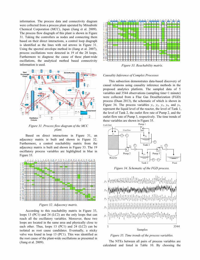
According to this reachability matrix in Figure 33,
loops 13 (PC1) and 24 (LC2) are the only loops that can
reach all the oscillatory variables. Moreover, these two
loops are located in the same area and physically close to
each other. Thus, loops 13 (PC1) and 24 (LC2) can be
isolated as root cause candidates. Eventually, a sticky
valve was found in loop 13 (PC1). This was identified as
the root cause of the plant-wide oscillations as presented in
(Jiang et al. 2009).
Figure 33. Reachability matrix.
Causality Inference of Complex Processes
This subsection demonstrates data-based discovery of
causal relations using causality inference methods in the
proposed analytics platform. The sampled data of 5
variables and 3544 observations (sampling time=1 minute)
were collected from a Flue Gas Desulfurization (FGD)
process (Duan 2013), the schematic of which is shown in
Figure 34. The process variables y1, y2, y3, y4, and y5,
represent the liquid level of the reactor, the level of Tank 1,
the level of Tank 2, the outlet flow rate of Pump 2, and the
outlet flow rate of Pump 3, respectively. The time trends of
these variables are shown in Figure 35.
Figure 34. Schematic of the FGD process.
Figure 35. Time trends of the process variables.
The NTEs between all pairs of process variables are
calculated and listed in Table 10. By choosing the

threshold as 0.02, the causal relations are found as those
with NTEs larger than 0.02 (Duan et al. 2013). As a result,
the information flow paths are identified and represented
using a signed directed graph in Figure 36. This figure also
includes bidirectional connectivity as detected by the
application of transfer entropy method. In many cases,
bidirectional connectivity is due to the presence of material
flow paths as well as feedback control loops.
Table 10. NTEs between process variables.
y1 y2 y3 y4 y5
y1 0.001 0.089 0.177 0.014
y2 0.131 0.117 0.154 0.010
y3 0.078 0.005 0.008 0.105
y4 0.128 0.005 0.095 0.019
y5 0.016 0.001 0.130 0.012
Figure 36. Information flow paths based on NTEs.
It is also important to know if the detected causal
relations are direct or indirect. To achieve this, the NDTEs
are calculated step by step. For example, in the first step,
the NDTE from y1 to y3 based on y2 and y4 is calculated to
be 0.024 in Table 11. The value is small, indicating no
direct causality from y1 to y3. Thus, the path from y1 to y3 is
pruned in step 1 in Figure 37. Analogously, other indirect
causalities are confirmed. In this case the causality from y2
to y1 is confirmed to be direct.
Table 11. NDTE between each pair of process variables with causal relations.
Step Relation Intermediate variables NDTE
1 y1 → y3 y2, y4 0.024
2 y3 → y1 y2, y4 0.023
3 y2 → y1 y4 0.425
4 y2→ y4 y1 0.025
5 y2 → y3 y1, y4 0.021
Figure 37. Exclusion of the indirect causalities based on the calculation of NDTEs.
Eventually, the direct information flow paths are
detected and shown as a signed directed graph in Figure 38.
The result is confirmed to be correct according to (Duan et
al. 2013). By highlighting these information flow paths in
Figure 39, it is clear how the process variables affect each
other. Based on this, the propagation of abnormalities can
be easily identified. The red arrows in Figure 38
correspond to feedback loops as validated in Figure 39.
Figure 38. Direct Information flow paths based on NDTEs in Table 11.
Figure 39. Information flow paths in the FGD process.
Conclusions
To improve process monitoring and alarm
management in process industries, a smart platform for the
alarm and process data analytics has been developed. The
smart platform consists of a “Data Loading” section and
four functional modules. Specifically, “Alarm Data
Analysis” helps to detect and remove nuisance alarms,
identify and cluster alarm floods, discover causal relations,
and find mode-dependent alarms. “Alarm Configuration
Analysis” provides a variety of techniques for design of
better alarm systems. “Process Data Analysis” analyzes
and visualizes the process data from different perspectives.
“Connectivity & Causality Analysis” uncovers causal
relations between process variables. This paper has
introduced the major features in each functional module of
the platform, and illustrates the effectiveness and
practicability of these features using case studies involving
real industrial data. According to the application results,
this framework has illustrated the value in fusing
information from disparate data sources and in this respect

the proposed platform is comprehensive in functionalities
and powerful in providing insightful conclusions.
The development of new features is ongoing so as to
enhance the practical utility of the smart platform. One
promising future work is the process discovery of operator
actions in response to alarm notifications. The pattern
extracted from the A&E log is supposed to provide
decision support for operators. A preliminary work can be
found in (Hu et al. 2016c). Another promising direction is
the root cause analysis of alarm floods. In alarm flood
situations, operators may fail to identify the root causes
and miss the critical alarms, which is the main reason of
many accidents (Wang et al. 2016). Thus, if the root causes
of alarm floods can be quickly identified in an on-line
manner then the operator would be able to confidently
handle critical alarms and make correct responses.
References
Adnan, N.A., Izadi, I., & Chen, T. (2011). On expected detection delays for alarm systems with deadbands and delay-timers. Journal of Process Control, 21, 1318-1331.
Adnan, N.A., Cheng, Y., Izadi, I., & Chen, T. (2013). Study of generalized delay-timers in alarm configuration. Journal of Process Control, 23(3), 382-395.
Ahmed, K., Izadi, I., Chen, T., Joe, D., & Burton, T. (2013). Similarity analysis of industrial alarm flood data. IEEE Transactions on Automation Science and Engineering, 10, 452-457.
Altschul, S. F., Gish, W., Miller, W., Myers, E. W., & Lipman, D. J. (1990). Basic local alignment search tool. Journal of Molecular Biology, 215, 403–410.
Bauer, M., Cox, J. W., Caveness, M. H., Downs, J. J., & Thornhill, N. F. (2007). Finding the direction of disturbance propagation in a chemical process using transfer entropy. IEEE Trans. Control Systems Technology, 15(1), 12-21.
Beebe, D., Ferrer, S., & Logerot, D. (2013). The connection of peak alarm rates to plant incidents and what you can do to minimize. Process Safety Progress, 32(1), 72-77.
Cheng, Y., Izadi, I., & Chen, T. (2013a). Pattern matching of alarm flood sequences by a modified Smith-Waterman algorithm. Chemical Engineering Research and Design, 91, 1085-1094.
Cheng, Y., Izadi, I., & Chen, T. (2013b). Optimal alarm signal processing: filter design and performance analysis. IEEE Transactions on Automation Science and Engineering, 10, 446-451.
Cheng, Y. (2013). Data-driven Techniques on Alarm System Analysis and Improvement. Doctoral Thesis, University
of Alberta. Chiang, L. H., & Braatz, R. D. (2003). Process monitoring using
causal map and multivariate statistics: fault detection and identification. Chemometrics and Intelligent Laboratory Systems, 65(2), 159-178.
Desborough, L. and R. Miller (2001). Increasing customer value of industrial control performance monitoring - honeywell's experience. In Proc. of CPC VI. Tuscon, Arizona. 172-192.
Duan, P., Yang, F., Chen, T., & Shah, S. L. (2013). Direct causality detection via the transfer entropy approach. IEEE Trans. Control Systems Technology, 21(6), 2052-2066.
Duan, P., Yang, F., Shah, S.L., & Chen, T. (2015). Transfer zero-entropy and its application for capturing cause and
effect relationship between variables. IEEE Trans. Control Systems Technology, 23(3), 855-867.
EEMUA (Engineering Equipment and Materials Users' Association) (2013). Alarm Systems: A Guide to Design, Management and Procurement, Edition 3. London: EEMUA Publication 191.
Granger, C. W. (1969). Investigating causal relations by econometric models and cross-spectral methods. Econometrica: Journal of the Econometric Society, 424-438.
Hollifield, B., & Habibi, E. (2011). Alarm Management: A Comprehensuve Guide. Research Traingle Park, NC: ISA.
Hu, W., Wang, J., & Chen, T. (2015). A new method to detect and quantify correlated alarms with occurrence delays. Computers & Chemical Engineering, 80, 189-198.
Hu, W., Wang, J., & Chen, T. (2016a). A local alignment approach to similarity analysis of industrial alarm flood sequences. Control Engineering Practice, 55, 13-25
Hu, W., Wang, J., Chen, T., & Shah, S. L. (2016b). Cause and effect analysis of industrial alarm signals using modified transfer entropies. Control Engineering Practice, under review.
Hu, W., Ahmad W. A., Chen, T., & Shah, S. L. (2016c). Process discovery of operator actions in response to univariate alarms. In DYCOPS-CAB2016, 1026-1031.
IEC (International Electrotechnical Commission) (2014). Management of Alarm Systems for the Process Industries. IEC 62682.
ISA (International Society of Automation) (2009). Management of Alarm Systems for the Process Industries. North Carolina: ISA 18.02.
Izadi, I., Shah, S.L., Shook, D. S., Kondaveeti, S.R., & Chen, T. (2009). A Framework for Optimal Design of Alarm Systems. In proceedings of the 7th IFAC SAFEPROCESS, Barcelona, Spain.
Izadi, I., Shah, S. L., & Chen, T. (2010). Effective resource utilization for alarm management. The 49th IEEE Conference on Decision and Control (CDC2010), 6803-6808.
Jiang, H., Patwardhan, R., & Shah, S. L. (2009). Root cause diagnosis of plant-wide oscillations using the concept of adjacency matrix. J. Process Control, 19(8), 1347-1354.
Jiang, H., Choudhury, M. S., & Shah, S. L. (2007). Detection and diagnosis of plant-wide oscillations from industrial data using the spectral envelope method. J. Process Control, 17(2), 143-155.
Jolliffe, I. (2002). Principal component analysis. John Wiley & Sons, Ltd.
Kaiser, A., & Schreiber, T. (2002). Information transfer in continuous processes. Physica D: Nonlinear Phenomena, 166(1), 43-62.
Kondaveeti, S.R., Izadi, I., Shah, S.L., Black, T., & Chen, T. (2012). Graphical tools for routine assessment of industrial alarm systems. Computers and Chemical Engineering, 46, 39-47.
Kondaveeti, S. R., Izadi, I., Shah, S. L., Shook, D. S., Kadali, R., & Chen, T. (2013). Quantification of alarm chatter based on run length distributions. Chemical Engineering Research and Design, 91, 2550-2558.
Lai, S., & Chen, T. (2015). A method for pattern mining in multiple alarm flood sequences. Chemical Engineering Research and Design, in press.
McDougall, A.J., D.S. Stoffer & D.E. Tyler (1997). Optimal transformations and the spectral envelop for real-valued time series. Journal of Statistical Planning and Inference 57, 195-214.

Miao, T., & Seborg, D. E. (1999). Automatic detection of excessively oscillatory feedback control loops. In Proc. of IEEE international Conference on Control Applications, 359-364.
Müller, M. (2007). Dynamic time warping, in Information Retrieval for Music and Motion. New York: Springer-Verlag, ch. 4, 69–82.
Naghoosi, E., Izadi, I., & Chen, T. (2011). Estimation of alarm chattering. Journal of Process Control, 21, 1243-1249.
Nair, G. N. (2013). A nonstochastic information theory for communication and state estimation. IEEE Trans. Automatic Control, 58(6), 1497-1510.
Nimmo, I. (2005). Rescue your plant from alarm overload. Chemical Processing, 28–33.
Noda, M., Higuchi, F., Takai, T., & Nishitani, H. (2011). Event correlation analysis for alarm system rationalization. Asia-Pacific Journal of Chemical Engineering, 6(3), 497-502.
Qin, S.J. (1998). Control performance monitoring - a review and assessment. Computer and Chemical Engineering, 23,
173-186. Schleburg, M., Christiansen, L., Thornhill, N. F., & Fay, A.
(2013). A combined analysis of plant connectivity and alarm logs to reduce the number of alerts in an automation system. J. Process Control, 23(6), 839-851.
Schreiber, T. (2000). Measuring information transfer. Physical Review Letters, 85(2), 461.
Smith, T. F., & Waterman, M. S. (1981). Identification of common molecular subsequences. Journal of Molecular Biology, 147, 195–197.
Stoffer, David S. (1999). Detecting common signals in multiple time series using the spectral envelope. Journal of the American Statistical Association, 94, 1341-1356.
Stoffer, David S., David E. Tyler & Andrew J. McDougall (1993). Spectral analysis for categorical time series: Scaling and spectral envelope. Biometrika, 80, 611-622.
Stoffer, David S., Tyler, David E. & Wendt, David A. (2000). The spectral envelope and its applications. Statistical Science, 15, 224-253.
Tangirala, A. K., Kanodia, J., & Shah, S. L. (2007). Non-negative matrix factorization for detection and diagnosis of plantwide oscillations. Industrial & engineering chemistry research, 46(3), 801-817.
Tangirala, A. K., Shah, S. L., & Thornhill, N. F. (2005). PSCMAP: A new tool for plant-wide oscillation detection. Journal of Process Control, 15(8), 931-941.
Thambirajah, J., Benabbas, L., Bauer, M., & Thornhill, N. F. (2009). Cause-and-effect analysis in chemical processes utilizing XML, plant connectivity and quantitative process history. Computers & Chemical Engineering, 33(2), 503-512.
Thornhill, N. F., Huang, B., & Zhang, H. (2003a). Detection of multiple oscillations in control loops. Journal of Process Control, 13(1), 91-100.
Thornhill, N. F., Cox, J. W., & Paulonis, M. A. (2003b). Diagnosis of plant-wide oscillation through data-driven analysis and process understanding. Control Engineering Practice, 11(12), 1481-1490.
Thornhill, N. F., & Hägglund, T. (1997). Detection and diagnosis of oscillation in control loops. Control Engineering Practice, 5(10), 1343-1354.
Thornhill, N.F., Shah, S.L., Huang, B., & Vishnubhotla, A. (2002). Spectral principal component analysis of dynamic process data. Control Engineering Practice, 10, 833–846.
Timms, C. (2009). Hazards equal trips or alarms or both. Process Safety and Environmental Protection, 87, 3–13.
Wang, J., & Chen, T. (2013). An online method for detection and reduction of chattering alarms due to oscillation. Computers and Chemical Engineering, 54, 140-150.
Wang, J., & Chen, T. (2014). An online method to remove chattering and repeating alarms based on alarm durations and intervals. Computers and Chemical Engineering, 67, 43-52.
Wang, J., Yang, F., Chen, T., & Shah, S.L. (2016). An Overview of Industrial Alarm Systems: Main Causes for Alarm Overloading, Research Status, and Open Problems. IEEE Transactions on Automation Science and Engineering, 13(2), 1045-1061.
Welch, L. (1974). Lower bounds on the maximum cross correlation of signals (Corresp.). IEEE Transactions on Information theory, 20(3), 397-399.
Xu, J., Wang, J., Izadi, I., & Chen, T. (2012). Performance assessment and design for univariate alarm systems based on FAR, MAR, and AAD. IEEE Transactions on Automation Science and Engineering, 9, 296-307.
Yang, F., Duan, P., Shah, S. L., & Chen, T. (2014). Capturing Connectivity and Causality in Complex Industrial Processes. Springer Science & Business Media.
Yang, F., Xiao, D., & Shah, S. L. (2010).Qualitative fault detection and hazard analysis based on signed directed graphs for large-scale complex systems. Fault Detection. INTECH Open Access Publisher.
Yang, F., Shah, S.L., Xiao, D., & Chen, T. (2012). Improved correlation analysis and visualization of industrial alarm data. ISA Transactions, 51, 499-506.
Yang, Z., Wang, J., & Chen, T. (2013). Detection of correlated alarms based on similarity coefficients of binary data. IEEE Transactions on Automation Science and Engineering, 10, 1014-1025.