Forms and Functions: Visualization as a...
20
2 Forms and Functions: Visualization as a Technology The usefulness of a graph can be evaluated only in the context of the type of data, the questions the designer wants the readers to answer, and the nature of the audience. —Stephen M. Kosslyn e fact that an information graphic is designed to help us complete certain intellectual tasks is what distinguishes it from fine art. Rather than serving as a means for the artist to express her inner world and feelings, an infographic or visualization strives for objectivity, precision and functionality, as well as beauty. In short: e function constrains the form. In this chapter I will explore this idea and its usefulness for infographics and visualization, starting with the original phrase “form follows function,” and the critiques and iterations it has undergone over time. e original idea remains 02_TFA_r2.indd 25 6/25/12 12:50 AM
Transcript of Forms and Functions: Visualization as a...

2
Forms and Functions: Visualization as a Technology
The usefulness of a graph can be evaluated only in the context of the type
of data, the questions the designer wants the readers to answer, and the
nature of the audience.
—Stephen M. Kosslyn
The fact that an information graphic is designed to help us complete certain intellectual tasks is what distinguishes it from fine art. Rather than serving as a means for the artist to express her inner world and feelings, an infographic or visualization strives for objectivity, precision and functionality, as well as beauty. In short:
The function constrains the form.
In this chapter I will explore this idea and its usefulness for infographics and visualization, starting with the original phrase “form follows function,” and the critiques and iterations it has undergone over time. The original idea remains
02_TFA_r2.indd 25 6/25/12 12:50 AM
the same, but these iterations contribute to a more nuanced understanding of what the relationship between forms and functions entails.
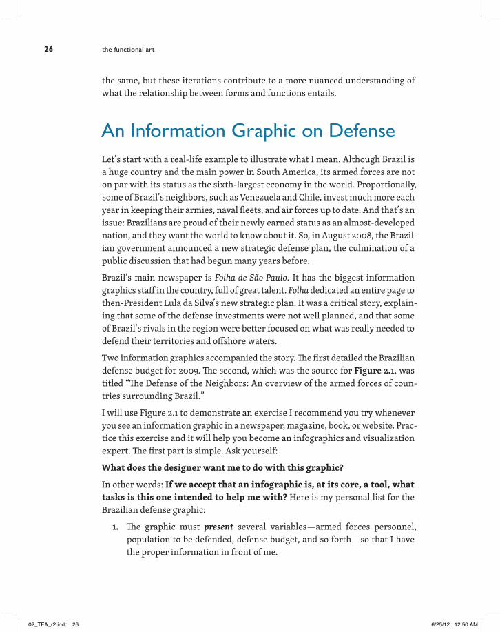
An Information Graphic on DefenseLet’s start with a real-life example to illustrate what I mean. Although Brazil is a huge country and the main power in South America, its armed forces are not on par with its status as the sixth-largest economy in the world. Proportionally, some of Brazil’s neighbors, such as Venezuela and Chile, invest much more each year in keeping their armies, naval fleets, and air forces up to date. And that’s an issue: Brazilians are proud of their newly earned status as an almost-developed nation, and they want the world to know about it. So, in August 2008, the Brazil-ian government announced a new strategic defense plan, the culmination of a public discussion that had begun many years before.
Brazil’s main newspaper is Folha de São Paulo. It has the biggest information graphics staff in the country, full of great talent. Folha dedicated an entire page to then-President Lula da Silva’s new strategic plan. It was a critical story, explain-ing that some of the defense investments were not well planned, and that some of Brazil’s rivals in the region were better focused on what was really needed to defend their territories and offshore waters.
Two information graphics accompanied the story. The first detailed the Brazilian defense budget for 2009. The second, which was the source for Figure 2.1, was titled “The Defense of the Neighbors: An overview of the armed forces of coun-tries surrounding Brazil.”
I will use Figure 2.1 to demonstrate an exercise I recommend you try whenever you see an information graphic in a newspaper, magazine, book, or website. Prac-tice this exercise and it will help you become an infographics and visualization expert. The first part is simple. Ask yourself:
What does the designer want me to do with this graphic?
In other words: If we accept that an infographic is, at its core, a tool, what tasks is this one intended to help me with? Here is my personal list for the Brazilian defense graphic:
1. The graphic must present several variables—armed forces personnel, population to be defended, defense budget, and so forth—so that I have the proper information in front of me.
the functional art26
02_TFA_r2.indd 26 6/25/12 12:50 AM

$7.1444.2
$0.9213.7
$4.616.3
$1.228.6
$
DEFENSE IN SOUTH AMERICA
2.626
$21.69.1
Sources:Folha de São Paulo,Brazilian Center
for Strategic Studies
Prospects: Colombia will improve its armed forces in the next few years. It will invest 30 billion dollars to buy Brazilian fighters, Russian tanks, and Spanish propelled rockets
Prospects: Brazil will finish building 250 Leopard tanks, and keep modernizing its F-5 fighters. It will also buy nondisclosed number of combat planes
Prospects: Venezuela will keep buying Russian vehicles, such as Sukhoi fighters and armored
gunships. It will also buy several Kilo class submarines.
Prospects: Bolivia will not make significant investments in
the near future
Prospects: Argentina has announced that it will
modernize its fleet of tanks
Prospects: Chile will buy several A310 planes and
Leopard tanks
Prospects: Peru will invest in an upgrade of its airforce
Prospects: Ecuador will not make significant investments in
the near future
BRAZIL
VENEZUELA
COLOMBIA
ECUADOR
BOLIVIA
ARGENTINA
CHILE
PERU
An overview of the armed forces ofcountries around Brazil
367.9
$21.6190
57
Population(millions of people)
Defense budget(billions of dollars)
$
Size of armed forces(thousands)
65
46,1
$2.0540.3
76
115
254.2
114
Figure 2.1 A portrait of the power balance in South America.
2 · forms and functions: visualization as a technology 27
02_TFA_r2.indd 27 6/25/12 12:50 AM

2. It should allow comparisons. At a glance, I should be able to tell which country has the biggest and the smallest army, is more or less populated, or invests more heavily or lightly in its military.
3. It should help me organize countries, from the biggest to the smallest, based on the variables and the comparisons.
4. It should make correlations evident to me. For instance, are population and size of defense forces directly and perfectly proportional?
Of those four possible tasks—present, compare, organize, correlate—the graphic accomplishes just one satisfactorily. It presents tons of variables and values. But it doesn’t show them in proportion to one another. This makes it impossible for readers to dig into the data.
Imagine you’re a concerned Brazilian patriot. Your first impulse will probably be to compare your country with Venezuela and Argentina, Brazil’s main com-mercial and strategic rivals in the region. See how difficult this operation is? If you want to compare, say, population, you will have to read all the numbers, memorize them, and then organize them in your head. The same thing happens when you try to compare the countries’ defense budgets.
You need a pretty powerful memory to do that. From a functional standpoint, there’s little difference between this graphic and a simple table. The graphic may be prettier, but it still makes you work too hard to extract basic meanings.
There’s something else: Does the map need to be the main visual element in the composition? I doubt it. Using so much real estate for the map suggests that the main goal of the graphic is to show where Brazil’s neighboring countries are—and likely most or all of Folha de São Paulo’s readers know that already.
To be fair in my remarks, I know that a single Folha de São Paulo designer had just two hours to produce this infographic after obtaining the data from a reporter. That’s how things work in newspapers. Turnaround times for breaking-news projects are tight. Still, I believe that the graphic could have been greatly improved with 10 or 15 minutes of planning.
Here’s where the second part of our exercise begins.
What Shape Should My Data Have?
Once we have listed the goals our graphic should help accomplish, it’s time to consider what shape the numbers should adopt.
the functional art28
02_TFA_r2.indd 28 6/25/12 12:50 AM
albertocairo
Sticky Note
Can we write "relationships"? Correlations is also correct, but relationships somehow sounds friendlier in the context of this introductory part. not as scary as "correlations"
albertocairo
Highlight

Let’s start with the comparison. As originally published, the infographic doesn’t make our lives easy. The numbers are there, but populations and budgets are not visually represented. Comparing the figures mentally—which is what we are forcing readers to do if they want to get an idea of the proportional sizes of those variables in different countries—is too hard.
Military personnel are represented by tiny silhouettes, each equivalent to 1,000 soldiers. But in the original, the symbols are useless because the bars formed by the little soldiers do not sit on the same horizontal axis. This makes comparisons more difficult than they should. See how much easier things are if we place the columns of soldiers side by side, as shown in Figure 2.2.
Brazil Colombia Venezuela Peru Argentina Chile Ecuador Bolivia
367.9
254.2
76 65 57 46,1115 114
Figure 2.2 Simply placing the bars on the same horizontal axis allows you to make more accurate comparisons.
If you accept that bars facilitate comparison better than other ways of encoding the variables, let’s represent the countries’ military personnel as bars and orga-nize them from biggest to smallest amounts. In Figure 2.3 you can see the result: Readers can now easily identify the winners and losers in the South American arms race (I’m being a bit hyperbolic), a task that required far more cognitive energy in the original Folha de São Paulo graphic.
At this point we face a challenge. It would seem Brazil will be the winner in all of the rankings, because the bigger the population a country has, the bigger its military forces and heftier its defense budget will be. But is this relationship perfectly proportional? In other words, if population is n times bigger in one country than in another, will armed forces also be n times larger?
This question is related to the fourth task, correlation among variables. The bars in the previous figure don’t address that goal. That is because they encode absolute figures.
2 · forms and functions: visualization as a technology 29
02_TFA_r2.indd 29 6/25/12 12:50 AM
albertocairo
Sticky Note
Is "military personnel" plural?
albertocairo
Highlight
ARMED FORCES(Thousands of people)
Brazil
Colombia
Venezuela
Peru
Argentina
Chile
Ecuador
Bolivia
367.9
254.2
115.0
114.0
76.0
65.0
57.1
46.1
POPULATION(Millions of people)
Brazil
Colombia
Argentina
Peru
Venezuela
Chile
Ecuador
Bolivia
190.0
44.2
40.3
28.6
26.0
16.3
13.7
9.1
DEFENSE BUDGET(Billions of US$ a year)
Brazil
Colombia
Chile
Venezuela
Argentina
Peru
Ecuador
Bolivia
21.6
7.1
4.6
2.6
2,1
1.2
0.9
0.2
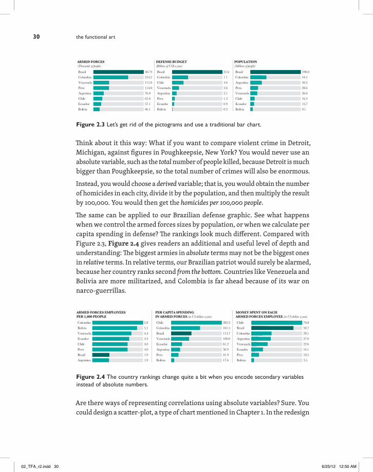
Figure 2.3 Let’s get rid of the pictograms and use a traditional bar chart.
Think about it this way: What if you want to compare violent crime in Detroit, Michigan, against figures in Poughkeepsie, New York? You would never use an absolute variable, such as the total number of people killed, because Detroit is much bigger than Poughkeepsie, so the total number of crimes will also be enormous.
Instead, you would choose a derived variable; that is, you would obtain the number of homicides in each city, divide it by the population, and then multiply the result by 100,000. You would then get the homicides per 100,000 people.
The same can be applied to our Brazilian defense graphic. See what happens when we control the armed forces sizes by population, or when we calculate per capita spending in defense? The rankings look much different. Compared with Figure 2.3, Figure 2.4 gives readers an additional and useful level of depth and understanding: The biggest armies in absolute terms may not be the biggest ones in relative terms. In relative terms, our Brazilian patriot would surely be alarmed, because her country ranks second from the bottom. Countries like Venezuela and Bolivia are more militarized, and Colombia is far ahead because of its war on narco-guerrillas.
Colombia
Bolivia
Venezuela
Ecuador
Chile
Peru
Brazil
Argentina
5.8
5.1
4.4
4.2
4.0
4.0
1.9
1.9
Chile
Brazil
Colombia
Argentina
Venezuela
Ecuador
Peru
Bolivia
70.8
58.7
28.1
27.0
22.6
16.1
10.5
PER CAPITA SPENDINGIN ARMED FORCES (in US dollars a year)
Chile
Colombia
Brazil
Venezuela
Ecuador
Argentina
Peru
Bolivia
282.2
161.5
113.7
100.0
61.2
50.9
41.9
17.6
ARMED FORCES EMPLOYEESPER 1,000 PEOPLE
MONEY SPENT ON EACHARMED FORCES EMPLOYEE (in US dollars a year)
3.5
Figure 2.4 The country rankings change quite a bit when you encode secondary variables instead of absolute numbers.
Are there ways of representing correlations using absolute variables? Sure. You could design a scatter-plot, a type of chart mentioned in Chapter 1. In the redesign
the functional art30
02_TFA_r2.indd 30 6/25/12 12:50 AM

I put together after thinking about Folha de São Paulo’s original graphic (Figure 2.5), I included another version titled, “A different look at the data.” If this were a real project, I would not have done this because it tells essentially the same story as the two sets of bar charts, but it illustrates an important point: In most cases, there is not just one way of encoding a particular set of data properly. You may have more than one option, but your goal must be always to think first about what kinds of questions readers are more likely to want answered by your infographic.
VENEZUELAwill keep buying Russian vehicles, suchas Sukhoi fighters and armored gunships. It will also buy several Kilo class submarines.
COLOMBIAwill improve its armed forces in the next few years. It will invest 30 billion dollars to buy Brazilian fighters, Russian tanks, and Spanish propelled rockets
ECUADORwill not make significant investments in the near future
PERUwill invest in an upgrade of itsair force
CHILEwill buy several A310 planes and Leopard tanks
BRASILwill finish building a 250 Leopard tanks force, and keep modernizing its F-5 fighters. It will also buy an nondisclosed number of combat planes
BOLIVIAwill not make significant investments in the near future
ARGENTINAhas announced that it will modernize its fleet of tanks and fighters
Future investmentsA different look at the data
ARMED FORCES EMPL
OYEES
POPULATION (Millions of people)
50 100 150 2000
50
100
150
200
250
300
350
400
Brazil
Colombia
Venezuela
Peru
Argentina
Ecuador
Bolivia
Chile
25
10
5
1
Size of circles is proportional to the defense budget(millions of dollarsper year)
This is a ‘trend line’.The closer the circles are to thisline, the more correlated thevariables are
SOURCES: FOLHA DE SÃO PAULO, BRAZILIAN CENTER FOR STRATEGIC STUDIES
Colombia
Bolivia
Venezuela
Ecuador
Chile
Peru
Brazil
Argentina
5.8
5.1
4.4
4.2
4.0
4.0
1.9
1.9
Chile
Brazil
Colombia
Argentina
Venezuela
Ecuador
Peru
Bolivia
70.8
58.7
28.1
27.0
22.6
16.1
10.5
PER CAPITA SPENDINGIN ARMED FORCES (in US dollars a year)
Chile
Colombia
Brazil
Venezuela
Ecuador
Argentina
Peru
Bolivia
282.2
161.5
113.7
100.0
61.2
50.9
41.9
17.6
ARMED FORCES EMPLOYEESPER 1,000 PEOPLE
MONEY SPENT ON EACH ARMEDFORCES EMPLOYEE (in US dollars a year)
3.5
---but not in relative terms
ARMED FORCES(Thousands of people)
Brazil
Colombia
Venezuela
Peru
Argentina
Chile
Ecuador
Bolivia
367.9
254.2
115.0
114.0
76.0
65.0
57.1
46.1
POPULATION(Millions of people)
Brazil
Colombia
Argentina
Peru
Venezuela
Chile
Ecuador
Bolivia
190.0
44.2
40.3
28.6
26.0
16.3
13.7
9.1
DEFENSE BUDGET(Billions of US$ a year)
Brazil
Colombia
Chile
Venezuela
Argentina
Peru
Ecuador
Bolivia
21.6
7.1
4.6
2.6
2,1
1.2
0.9
0.2
An overview of the armed forces of countries around Brazil
THE DEFENSE OF THE NEIGHBORS
Brazil has the strongest armed forces in South America in absolute terms---
Figure 2.5 A different take on the defense infographic.
2 · forms and functions: visualization as a technology 31
02_TFA_r2.indd 31 6/25/12 12:50 AM

The Origins of “Form Follows Function”
The maxim “form follows function” was born in 1896 when the American archi-tect Louis Sullivan wrote an article titled, “The Tall Office Building Artistically Considered.” In it, Sullivan discussed the needs of the occupants of big office buildings, which had begun to proliferate at the end of the nineteenth century. The most widely cited paragraph is:
All things in nature have a shape, that is to say, a form, an outward sem-blance, that tells us what they are, that distinguishes them from ourselves and from each other. Unfailing in nature these shapes express the inner life, the native quality of the animal, tree, bird, fish, that they present to us; they are so characteristic, so recognizable, that we say, simply, it is “natural” it should be so (…) It is the pervading law of all things organic and inorganic, of all things physical and metaphysical, of all things human and all things superhuman, of all true manifestations of the head, of the heart, of the soul, that the life is recognizable in its expression, that form ever follows function. This is the law.1
Those highlighted words were defining for twentieth-century architecture and had an enormous influence on contemporary masters, either because they em-braced them (the Bauhaus school), or because they rejected them or introduced their own nuances (Frank Lloyd Wright). Some of the most renowned ideas of luminaries like Le Corbusier, who defined a house as “a machine for living in,” connect directly to Sullivan.
Today, we interpret Sullivan’s idea as a call to center any design, regardless of its nature—a building, a tool, a software program—on the user. However, that was not exactly what Sullivan had in mind when he wrote his article. His “function” is not a goal in the sense of a task that the tool is designed to help achieve, but rather, an intrinsic property of both artificial and natural entities, a kind of es-sence. According to Sullivan, the form of a thing is a clue to its nature.
The fact that we misinterpret Sullivan is one of those fortunate paradoxes that make history colorful. Taken in a literal sense, the original paragraph includes several fallacies worth discussing before we can understand the relationship between form and function in visualization.
1 Louis Sullivan, “The Tall Office Building Artistically Considered,” Lippincott’s Magazine, March, 1896, accessed Feb. 11, 2012, http://academics.triton.edu/faculty/fheitzman/tallofficebuilding.html.
the functional art32
02_TFA_r2.indd 32 6/25/12 12:50 AM

Consider this: All things in nature have a shape …, an outward semblance, that tells us what they are …. Unfailing in nature these shapes express the inner life, the native quality of the animal, tree, bird, fish, that they present to us.
If you remember something from your high school biology classes, you’ll under-stand why this is appealing at first but ultimately absurd. If we follow Sullivan’s rationale, we could hypothesize, as pre-modern thinkers did, that fishes and dolphins belong to the same animal order, because the shapes of their bodies are pretty much identical. Or we could say that hippopotami are cousins of elephants and rhinoceros, since all three share features such as thick legs and bodies, and tons of body fat under hard skins. But, as always happens in science, evidence (in this case, genetics) contradicts appearances. The hippopotamus descended from whales that evolved to return from the sea to the land.2 Never trust your intuitions without testing them.
Even in the world of technology, the idea that the shape of an object is unequivo-cally connected to its functions is not valid. True, a spoon is concave and solid so no liquid can fall through it, so one can deduce that we can use it to bring liquid food to our mouths. But what about an iPod? Does the shape of its central wheel naturally suggest the way it should be used? Hardly. In this case, the connection between form and function must be learned. It is in reflections such as these that we see that Sullivan’s law cannot be strictly applied.
More about Functions in Nature
Another problem with Sullivan’s law is that the sentence “form follows function” indicates that the relationship between the two components is unidirectional. At first this seems intuitive. After all, what are a couple of feather-covered wings for, if not for flying? If wings have evolved, it must be because some animals felt the need to flee from predators or to reach fruits growing on treetops.
The problem is that the world doesn’t work that way. A species doesn’t feel a need first (the function) and then develop an organ to fulfill it (the form). If you’ve ever had this kind of thought—some people still do—you’ve fallen prey to what is known as the Lamarckian Fallacy.
Jean-Baptiste Lamarck, who lived between the nineteenth and twentieth centuries, was one of the first scientists to describe the mechanism that guides evolution. In his time, evidence existed linking living species to usually extinct ancestors,
2 Carl Zimmer, At the Water’s Edge (New York: Touchstone, 1999).
2 · forms and functions: visualization as a technology 33
02_TFA_r2.indd 33 6/25/12 12:50 AM
albertocairo
Highlight
albertocairo
Sticky Note
"develops", right? Species is singular?

who in turn were heirs of even older ancestors, and so on, in a chain dating to the beginning of time. What Lamarck and other scientists had not discovered was the hidden logic of this phenomenon, the underlying force that leads one animal or vegetable to become a completely different one given enough time.
Lamarck proposed a scientific theory called “inheritance of acquired character-istics.” To understand it, let’s consider giraffes, a descendant of ancient creatures that supposedly were similar to modern antelopes. How did the giraffe evolve its long neck?
According to Lamarckian logic, thousands and thousands of years ago, some an-telopes felt the need to feed on tree leaves beyond the reach of their mandibles. They began stretching their necks to get them. As a consequence, they were born with slightly longer necks than the previous generation. But this is like saying that if I start doing heavy bodybuilding today and become a clone of Sylvester Stallone, my kids will be born with steel muscles. To the followers of Lamarckism, form literally follows function. The former pushes the latter.
Thanks to Charles Darwin, though, we now know that evolution doesn’t work that way. Darwin’s On the Origin of Species was published in 1859 and offered an alternative to Lamarck’s hypothesis. The force that moves evolution forward is not the acquisition of characteristics and skills inherited by kin, but the natural selection of traits that help an organism survive in its environment. What Dar-win did was to invert Lamarck’s logic: Function doesn’t determine form. In fact, in many cases, the opposite is true.
First, let’s be clear about what Darwin meant by natural selection. Back to our friend the giraffe, a Darwinian narrative of its origin might run like this:3 Many generations ago, the ancestors of the giraffe lived in grasslands and forests and fed on vegetation. Every time a new calf was born, it could have a neck that was slightly longer or shorter than its parents because of tiny mutations in its DNA (Darwin didn’t know about DNA, but it doesn’t matter; he did know that children look very much like their parents.) This is called variation.
In a particular moment in time—maybe because a drought made grass scarce, or because some pre-giraffe families moved to savannahs where food was difficult to find—having a slightly longer neck than your kin suddenly became an advantage. You could feed on tree leaves that were far from the ground.
3 The giraffe story has not been confirmed but is plausible. See “On the origin, evolution and phy-logeny of giraffes Giraffa camelopardalis,” by G. Mitchell and J. D. Skinner, Transactions of the Royal Society South Africa, 58 (1), 2003, pp. 51-72. Accessed Feb. 11, 2012 from http://www.bringyou.to/GiraffeEvolution.pdf.
the functional art34
02_TFA_r2.indd 34 6/25/12 12:50 AM

The pre-giraffes that had longer necks tended to live longer and have better health (on average) than their congeners. They also reproduced more and passed the longer-neck gene mutations to their offspring. Successive mutations leading to even longer necks may have given subsequent generations an even bigger competitive advantage, in a fortuitous circle.
In other words, the need to reach higher every day (the function) didn’t force the development of longer necks (the form). Longer necks were the result of random genetic mutations that were nonrandomly filtered (that is, selected) by the envi-ronment. In nature, then, relationships between forms and functions are much more complex than what Sullivan thought.
Another factor also counters the idea of a cause-effect relationship between functions and forms. Remember our question, “What are a couple of feather-covered wings for, if not for flying?” Well, wings were certainly not for flying at first. Birds descended from dinosaurs that began to evolve feathers not for flight, but for maintaining body temperature and attracting mates. The functions of feathers—that is, their competitive advantages—were to keep their owner warm and make the creature more handsome.
But evolution eventually crossed paths with another possible function: to control the movement of air around the feathered extremities, which allowed a primi-tive form of gliding. This is an example of what paleontologist Stephen Jay Gould called exaptation, by which a trait that evolves in response to an environmental challenge is used for an entirely different purpose (flying).4
Exaptations are common in technology as well. The Internet could be analyzed as an exaptation. Designed to enhance communication between scientists, it ended up being adopted by the public as a virtual world that facilitates many kinds of human sharing. Guttenberg’s printing press was based on technologies previously used to crush grapes and make wine. The original function of presses was to crush grapes, and their form was well suited to that function. It just hap-pened that someone eventually saw that the form of those machines could have an entirely different function.5
Cases such as these help us understand that the relationship between forms and functions is bidirectional. Form doesn’t always follow function; in many cases, the function follows a form that previously followed another unrelated function. It is
4 Stephen Jay Gould and Elisabeth Vrba, “Exaptation – A Missing Term in the Science of Form, Paleontology,” 8(1), Winter, 1982, 4-15. 5 Steven Johnson, Where Good Ideas Come From: The Natural History of Innovation (New York: Penguin Group, 2010).
2 · forms and functions: visualization as a technology 35
02_TFA_r2.indd 35 6/25/12 12:50 AM
easy to imagine one of our ancestors, hundreds of thousands of years ago, walk-ing through the woods and finding a sharp triangular rock. Our ancestor picks up the rock and notices that it perfectly fits the palm of his hand. What is the function of that form? None, until our ancestor sees a goal that matches what the rock’s shape suggests: It may be used for cutting fur, flesh, and bone. Nature becomes technology through the eyes and mind of an intelligent agent.
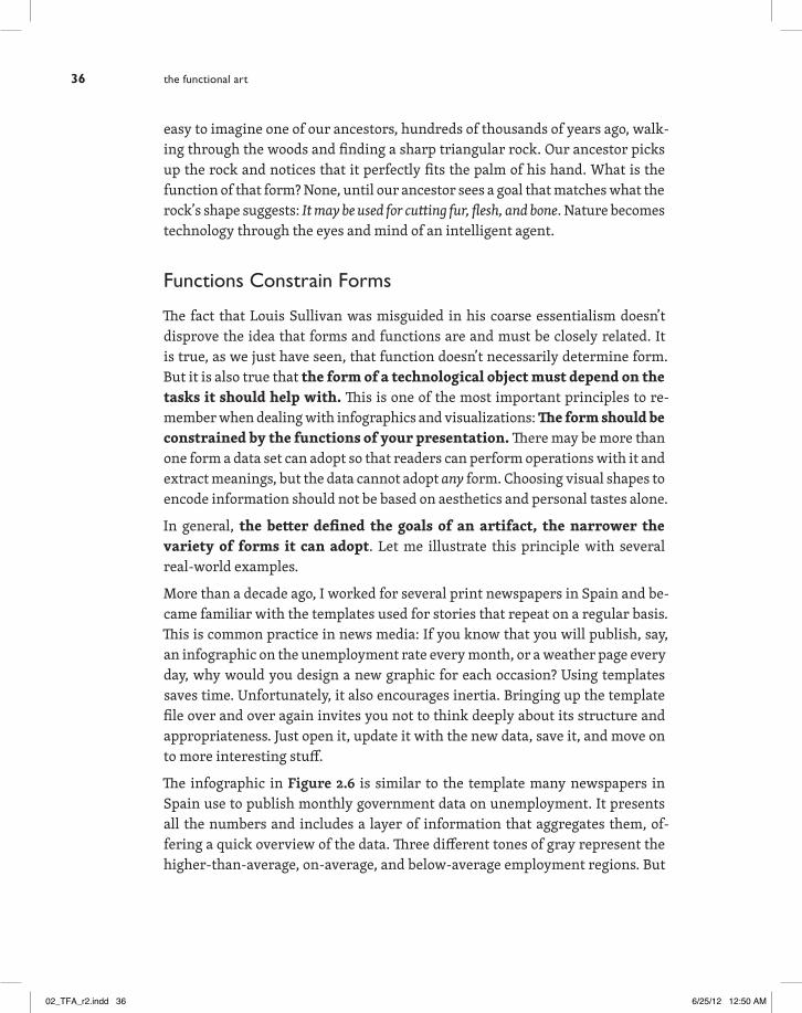
Functions Constrain Forms
The fact that Louis Sullivan was misguided in his coarse essentialism doesn’t disprove the idea that forms and functions are and must be closely related. It is true, as we just have seen, that function doesn’t necessarily determine form. But it is also true that the form of a technological object must depend on the tasks it should help with. This is one of the most important principles to re-member when dealing with infographics and visualizations: The form should be constrained by the functions of your presentation. There may be more than one form a data set can adopt so that readers can perform operations with it and extract meanings, but the data cannot adopt any form. Choosing visual shapes to encode information should not be based on aesthetics and personal tastes alone.
In general, the better defined the goals of an artifact, the narrower the variety of forms it can adopt. Let me illustrate this principle with several real-world examples.
More than a decade ago, I worked for several print newspapers in Spain and be-came familiar with the templates used for stories that repeat on a regular basis. This is common practice in news media: If you know that you will publish, say, an infographic on the unemployment rate every month, or a weather page every day, why would you design a new graphic for each occasion? Using templates saves time. Unfortunately, it also encourages inertia. Bringing up the template file over and over again invites you not to think deeply about its structure and appropriateness. Just open it, update it with the new data, save it, and move on to more interesting stuff.
The infographic in Figure 2.6 is similar to the template many newspapers in Spain use to publish monthly government data on unemployment. It presents all the numbers and includes a layer of information that aggregates them, of-fering a quick overview of the data. Three different tones of gray represent the higher-than-average, on-average, and below-average employment regions. But
the functional art36
02_TFA_r2.indd 36 6/25/12 12:50 AM

let’s apply a little question-based critique to test it. Try to answer these questions in less than five seconds each:
1. In which region has unemployment grown the most?
2. In which one has it dropped the most?
3. Has the unemployment change been bigger in Madrid, La Rioja, or Canarias?
4. Has unemployment dropped more in Extremadura, Andalucía, or Baleares?
Likely, you can’t do it. I did not ask myself such questions when I was designing these kinds of graphics, but I do now. My perspective has changed. I no longer think like a designer, but like a reader. And, as a reader, those are the kinds of answers that I want to get using this kind of tool.
Galicia-0.39
Madrid+2.33
Extremadura-1.86
Canarias+3.42
Andalucía-0.30
Castilla-La Mancha+1.78
Ceuta+1.81
Melilla+1.93
Castillay León+0.77
Asturias-0.82
Cantabria+0.54
País Vasco+0.84
Navarra
Baleares-4.27
ComunidadValenciana+2.08
Murcia+1.78
Aragón
Cataluña+1.39
Unemploymentrates by region(in October)
+0.82% (average)
+0.83% a +3.42%
+0.82% a -4.27%
La Rioja+1.02
+0.39 +2.48
Percentage changecompared to previous month
Figure 2.6 A type of graphic very common in Spanish newspapers: the monthly unemploy-ment rate change.
The challenge of this graphic is similar to the one we analyzed in the first pages of this chapter. Here’s what happens when you try to complete any of the opera-tions above:
1. Your eyes look for the numbers mentioned in the question.
2. Your brain memorizes them.
3. Your brain organizes the numbers from biggest to smallest (or vice versa).
4. Your brain compares the reorganized numbers.
FYI, yeah, leading is larger on this page due to the forced vertical justification of the text block (per the design).
2 · forms and functions: visualization as a technology 37
02_TFA_r2.indd 37 6/25/12 12:50 AM
albertocairo
Sticky Note
I'm fine with that!

That’s too much work. If we know that readers are likely to look for how their own region fits into the big picture, why not anticipate it? Figure 2.7 represents exactly the same data, but offers more options to explore them.
Again, the map: Is it necessary? Perhaps. In this case, the geographical location of the regions may be relevant, as it shows that unemployment is getting worse in the southeast of Spain.
Average: +0.82
CanariasAragónMadridC. ValencianaMelillaCeutaMurciaC.-La ManchaCataluñaLa RiojaPaís VascoC. y LeónCantabriaNavarraAndalucíaGaliciaAsturiasExtremaduraBaleares
Aboveaverage
Belowaverage
+3.42+2.48+2.33+2.08+1.93+1.81+1.78+1.78+1.39+1.02+0.84+0.77+0.54+0.39-0.30-0.39-0.82-1.86-4.27
Unemploymentrates by region(in October)Percentage changecompared to previous month
Figure 2.7 This variation of the unemployment rate graphic allows you to compare and rank Spain’s regions.
In an interview with Technical Communication Quarterly in 2004, Edward Tufte, arguably the most influential theoretician in visualization and information de-sign (which he prefers to call analytical design), defined the relationship between form and function succinctly:
Effective analytic designs entail turning thinking principles into seeing principles. So, if the thinking task is to understand causality, the task calls for a design principle: “Show causality.” If a thinking task is to answer a question and compare it with alternatives, the design principle is: “Show comparisons.” The point is that analytical designs are not to be decided on their convenience to the user or necessarily their readability or what psycholo-gists or decorators think about them; rather, design architectures should be decided on how the architecture assists analytical thinking about evidence.6
6 Mark Zachary and Charlotte Thralls, “An Interview with Edward Tufte,” Technical Communica-tion Quarterly, 2004, 13(4), 447-462. Accessed Feb. 11, 2012 at http://www.edwardtufte.com/tufte/s15427625tcq1304_5.pdf.
the functional art38
02_TFA_r2.indd 38 6/25/12 12:50 AM

Clear enough. But this idea is not as obvious as it should be, as the previous ex-amples prove. A simple Google search on infographics will return thousands of links to projects in which the designer didn’t choose graphic forms according to how well they assist thinking, but because they looked cool, innovative, or funny. Designers who don’t develop the crucial skill of asking themselves, “What is my graphic for?” are easy victims of fashion. No fashion plague is more prevalent as I write this book than the bubble.
The Bubble Plague
The overuse of bubble charts in news media is a good example of how infograph-ics departments can become more worried about how their projects look than with how they work. When I give presentations, I often use charts like the one in Figure 2.8, which I made up based on a real project by Bloomberg News.
MorganStanley
UBS CreditSuisse
GoldmanSachs
Santander Citigroup JP Morgan HBSC
11675
100116
255
165215
3527 35 64
1985
97
RBS DeutscheBank
CréditAgricole
SociétéGénérale
Barclays BNPParibas
Unicredit
4.610.3 17 26 7.4 32.5 26
49
120
76 67 80 91108 93
January 2007In billions of dollars Source: BloombergJanuary 2009
Market Capitalization of the World’s Biggest Banks
16
Figure 2.8 Banks as shrinking bubbles. How appropriate. This example is inspired by an article by Stephen Few: “Our Irresistible Fascination with All Things Circular”: http://www.perceptualedge.com/articles/visual_business_intelligence/our_fascination_with_all_things_circular.pdf
When I ask the audience for their reaction to the graphic, the answer usually is, “I don’t see a problem. It is clear that the value of all banks in the chart fell dramatically during the 2007–2008 economic meltdown.” I agree; that’s what I see as well. Immediately, I show a different slide, Figure 2.9, and ask, “If you know that Société Générale’s market capitalization was $80 billion in 2007, how much was it in 2009?” (Try to answer the question without looking at Figure 2.8.)
2 · forms and functions: visualization as a technology 39
02_TFA_r2.indd 39 6/25/12 12:50 AM

Billions of dollars Source: Bloomberg
Market Capitalizationof Société Générale
January 2007
January 2009
Figure 2.9 The first bubble represents $80 billion. What per-centage of that does the second bubble represents? Half, perhaps?
According to my informal records, more than 70 percent of attendees guess that the answers slightly more than $40 billion. In other words, they see the smaller bubble as being half the size of the bigger one.
Then I switch to Figure 2.10 and tell them that the length of the bars display exactly the same numbers as the areas of the bubbles. This figure makes it clear that the value of Société Générale in 2009 was around one third of what it was in 2007. The surprised looks I get when they see this are a lot of fun.
Billions of dollars Source: Bloomberg
Market Capitalizationof Société Générale
January2007
January2009
Figure 2.10 Our friend, the bar chart, comes to the rescue.
Why do so many people overestimate the number for 2009 in the bubble chart? Because the human brain is not good at calculating surface sizes. It is much bet-ter at comparing a single dimension such as length or height. As we’ll see in the second section of this book, the brain is also a hopelessly lazy machine. When faced with the question of whether that bear running toward you is big enough to pose a threat, the brain doesn’t waste time or energy analyzing if the bear is tall and wide. Seeing if it’s just tall is good enough. In Figure 2.11, what you want your readers to compare (the areas) is on the left; what they actually compare (the diameters) is on the right.
the functional art40
02_TFA_r2.indd 40 6/25/12 12:50 AM
albertocairo
Highlight
albertocairo
Sticky Note
"the answer is"
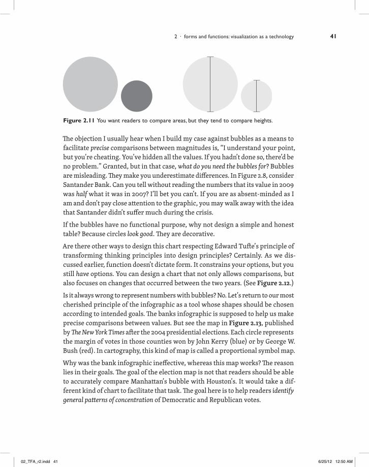
Figure 2.11 You want readers to compare areas, but they tend to compare heights.
The objection I usually hear when I build my case against bubbles as a means to facilitate precise comparisons between magnitudes is, “I understand your point, but you’re cheating. You’ve hidden all the values. If you hadn’t done so, there’d be no problem.” Granted, but in that case, what do you need the bubbles for? Bubbles are misleading. They make you underestimate differences. In Figure 2.8, consider Santander Bank. Can you tell without reading the numbers that its value in 2009 was half what it was in 2007? I’ll bet you can’t. If you are as absent-minded as I am and don’t pay close attention to the graphic, you may walk away with the idea that Santander didn’t suffer much during the crisis.
If the bubbles have no functional purpose, why not design a simple and honest table? Because circles look good. They are decorative.
Are there other ways to design this chart respecting Edward Tufte’s principle of transforming thinking principles into design principles? Certainly. As we dis-cussed earlier, function doesn’t dictate form. It constrains your options, but you still have options. You can design a chart that not only allows comparisons, but also focuses on changes that occurred between the two years. (See Figure 2.12.)
Is it always wrong to represent numbers with bubbles? No. Let’s return to our most cherished principle of the infographic as a tool whose shapes should be chosen according to intended goals. The banks infographic is supposed to help us make precise comparisons between values. But see the map in Figure 2.13, published by The New York Times after the 2004 presidential elections. Each circle represents the margin of votes in those counties won by John Kerry (blue) or by George W. Bush (red). In cartography, this kind of map is called a proportional symbol map.
Why was the bank infographic ineffective, whereas this map works? The reason lies in their goals. The goal of the election map is not that readers should be able to accurately compare Manhattan’s bubble with Houston’s. It would take a dif-ferent kind of chart to facilitate that task. The goal here is to help readers identify general patterns of concentration of Democratic and Republican votes.
2 · forms and functions: visualization as a technology 41
02_TFA_r2.indd 41 6/25/12 12:50 AM

0
January 2009Billions of dollars Source: BloombergJanuary 2007
Market Capitalization of the World’s Biggest Banks
16.0
-67.3%49.0
Morgan Stanley
-86.4%10.3 76.0
Deutsche Bank
-74.6%17.0 67.0
Crédit Agricole
-67.5%26.0 80.0
Société Générale
-91.9%7.4 91.0
Barclays
32.5 108.0BNP Paribas
-69.9%
26.0 93.0Unicredit
-72.0%
116.035.0UBS
-69.8%
75.027.0
Goldman Sachs
-64.0%
100.035.0-65.0%
Credit Suisse
116.064.0Santander
-44.8%
255.019.0Citigroup
-92.5%
165.085.0JP Morgan
-48.5%
-96.2%4.6 120.0
RBS
215.097.0HBSC
-54.9%
Figure 2.12 A chart that represents change.
the functional art42
02_TFA_r2.indd 42 6/25/12 12:50 AM

Figure 2.13 A proportional symbol map is appropriate when your goal is to visualize the big picture. It allows you to perceive general patterns and trends.
More Flexible Than It Seems
I don’t want you to leave this chapter with the impression that choosing the right graphic forms for each story is an easy task. It is tempting to propose rock-solid rules—if you want to show change through time, use a time-series chart; if you need to compare, use a bar chart; or to display correlation, use a scatter-plot—because some of these rules make good common sense. There is even evidence supporting the use of certain kinds of charts for particular goals. (See Figure 2.14.)
But reality is complex, and hard-and-fast rules can transform sound advice into immovable law. Exceptions and nuances can arise with the particularities of each project. What is really important is to remember that no matter how creative and innovative you wish to be in your graphics and visualizations, the first thing you must do, before you put a finger on the computer keyboard, is ask yourself what users are likely to try to do with your tool.
2 · forms and functions: visualization as a technology 43
02_TFA_r2.indd 43 6/25/12 12:50 AM

Billions of dollars Billions of dollars
Billions MarketValue2007
Profits in 2007
Market Capitalizationof Société Générale
Market Value of theFour Biggest Banks
The Bigger the Bank,the Bigger Its Profit
January2007
January2009
January2008
26
80
120
255300
200
100
5 10 15
165
215
Citigroup HBSC JPMorgan RBS
JPMorgan
RBS
HBSC
Citigroup
Billions of dollars
Figure 2.14 Three very common kinds of charts.
the functional art44
02_TFA_r2.indd 44 6/25/12 12:50 AM


![ZS44/28.6 | ZS44/30Standardized Headset Identification System [ S.H.I.S. ] EXAMPLES HEAD-TuBE BORE-TOP HEAD-TuBE BORE-BOTTOM STEM-CLAMP DIAMETER CROWN-RACE SEAT DIAMETER NOTES ec34/28.6](https://static.fdocuments.us/doc/165x107/5f715a69cc01632f604ce2f8/zs44286-zs4430-standardized-headset-identiication-system-shis-examples.jpg)