Fluela
12
Flüela Corporate Identity Guidelines Book
description
Identity Guideline Book
Transcript of Fluela

Flüela
Flüela
Flüela
Flüela
Flüela
FlüelaFlüe
laCorporate Identity
Guidelines Book
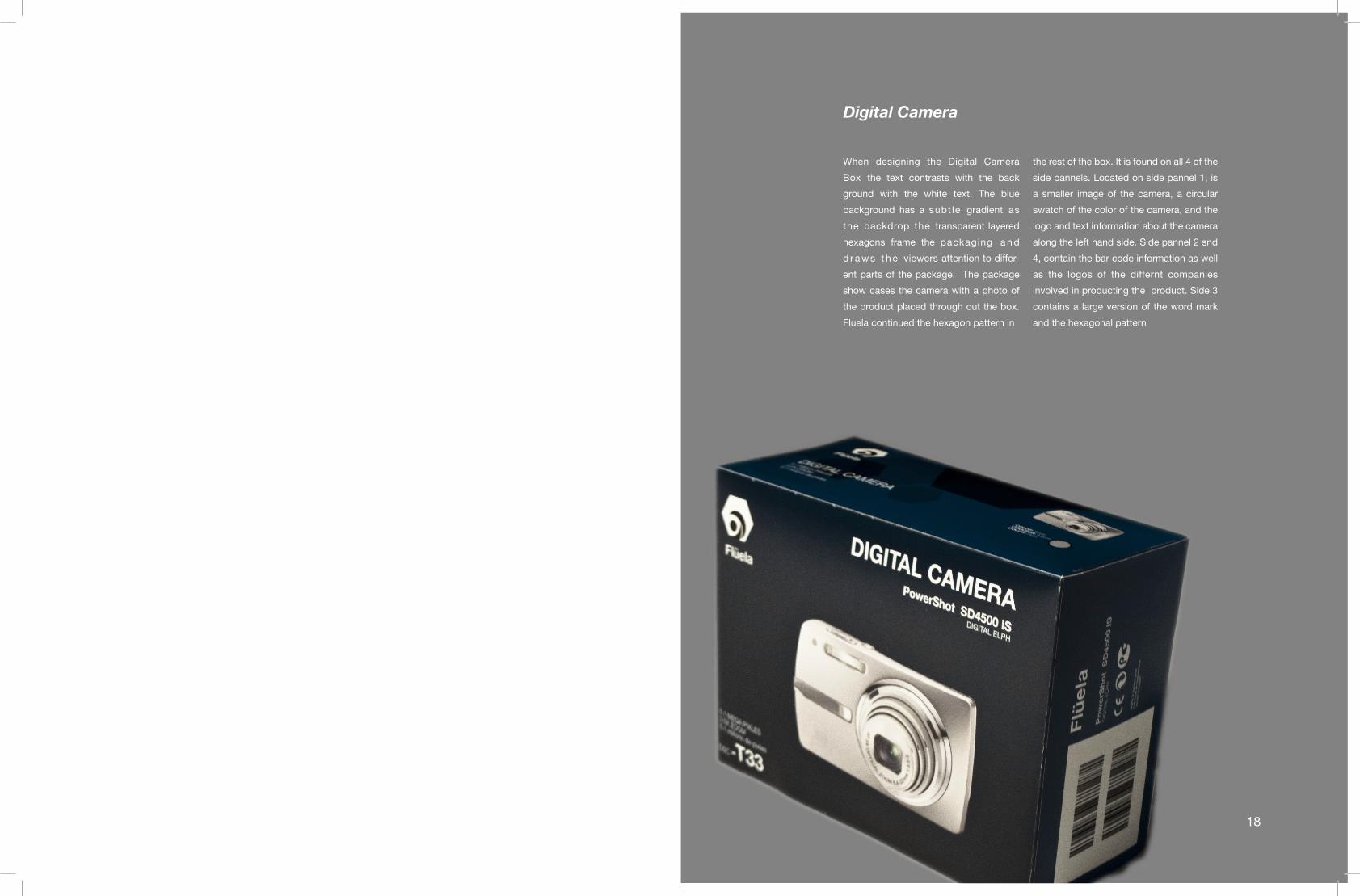
Digital Camera
the rest of the box. It is found on all 4 of the
side pannels. Located on side pannel 1, is
a smaller image of the camera, a circular
swatch of the color of the camera, and the
logo and text information about the camera
along the left hand side. Side pannel 2 snd
4, contain the bar code information as well
as the logos of the differnt companies
involved in producting the product. Side 3
contains a large version of the word mark
and the hexagonal pattern
18
When designing the Digital Camera
Box the text contrasts with the back
ground with the white text. The blue
background has a subt le gradient as
the backdrop the transparent layered
hexagons frame the packaging a n d
d r a w s t h e viewers attention to differ-
ent parts of the package. The package
show cases the camera with a photo of
the product placed through out the box.
Fluela continued the hexagon pattern in

UV Filter
When designing the UV filer the text contrasts with the
background with the white text. The blue background
has a subtle gradient as the back drop the transpar-
ent layered hexagons frame the packaging and draws
the viewers attention to different parts of the package.
When re creating the UV Filter be sure to place the
white text “UV Filter” in the lower right hand corner.
The signature “Fluela” is rotated and placed on a large
scale vertically. The logo is located in white in the up-
per right corner. Create the shape to reflect the dimen-
sions of the box. The from U shaped cover should be
white. The back of the package should be black.
FLUELA Corporate IdentityGuideline Book
Table of Contents
Identity Standards Concept 1
Logo 2
Incorrect Usage 3
Color Specifications 5
Typography 6
StationeryLetter Head 9
Envelope 9
Business Card 9
Corporate Literature 11
PackagingMemory Card 15
Lens Cloth 15
Lens Box 15
UV Filter 17
Digital Camera 18

Memory Card
Lens Cloth
i. When designing the memory card the text contrasts with
the background with the white text. The blue background has a
subtle gradient as the back drop the transparent layered hexa-
gons frame the packaging and draws the viewers attention to
different parts of the package. The signature “Fluela” is rotated
and placed on a large scale vertically. All of the important text is
right aligned and found along the right side of the package. The
logo is located in the right hand corner.
iii. When designing the lens cloth the text contrasts with the
background with the white text. The blue background has a
subtle gradient as the back drop the transparent layered hexa-
gons frame the packaging and draws the viewers attention to
different parts of the package. The signature “Fluela” is rotated
and placed on a large scale vertically.
Lens Box
ii. Fluelas lens box for the SLR camera is in a hexagonal
shaped box to mirror the shape of the logo. It has six sides,
it uses the dark blue background with the layered hexagonal
patter. The top of the box has a white dominate version of the
logo. The logo is located in the upper right hand of every other
panel. The important text is located alogn the bottom of the
box. The top of the box has two tabs that fold into the box.
Packaging
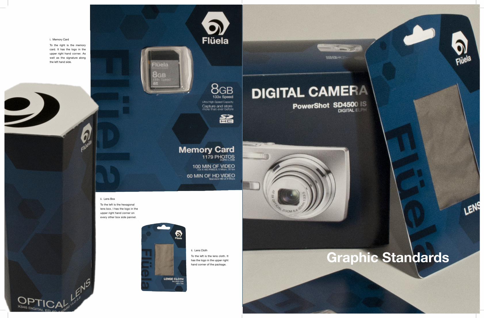
ii. Lens Box
To the left is the hexagonal
lens box. I has the logo in the
upper right hand corner on
every other box side pannel.
ii. Lens Cloth
To the left is the lens cloth. It
has the logo in the upper right
hand corner of the package.
i. Memory Card
To the right is the memory
card. It has the logo in the
upper right hand corner. As
well as the signature along
the left hand side.
Graphic Standards
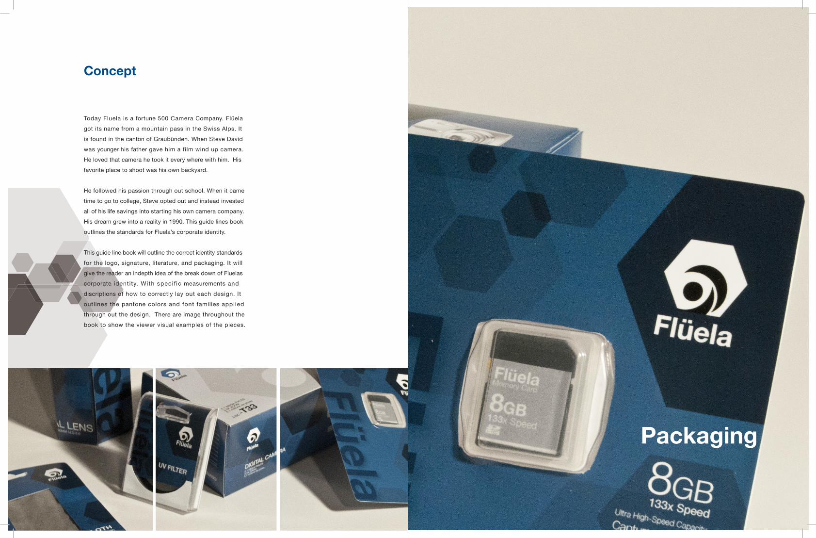
Concept
Today Fluela is a fortune 500 Camera Company. Flüela
got its name from a mountain pass in the Swiss Alps. It
is found in the canton of Graubünden. When Steve David
was younger his father gave him a film wind up camera.
He loved that camera he took it every where with him. His
favorite place to shoot was his own backyard.
He followed his passion through out school. When it came
time to go to college, Steve opted out and instead invested
all of his life savings into starting his own camera company.
His dream grew into a reality in 1990. This guide lines book
outlines the standards for Fluela’s corporate identity.
This guide line book will outline the correct identity standards
for the logo, signature, literature, and packaging. It will
give the reader an indepth idea of the break down of Fluelas
corporate identity. With specif ic measurements and
discriptions of how to correctly lay out each design. It
outlines the pantone colors and font families applied
through out the design. There are image throughout the
book to show the viewer visual examples of the pieces.
12
Packaging

2
The concept for the logo was to create
a mark that represented both the organic
feel of nature and photography while still
embracing the industrial aspects of the
camera. Creating a new spin on the shutter
of a camera through the new form of the
hexagon. Showing the clean cut corporate
feel of the company. On the left is the
black and white application of the logo.
On the right is the classic application of
the Fluela Signature on white background.
Flüela
Flüela
There are two correct ways
to configure the Fluela Logo.
One is the standard vertical
alignment created with the
logo directly on top of the
signature. Located above.
The “l’s” are directly aligned
under the bottom left and
right points of the hexagon.
The “F” and a suspend out
below the hexagon.
The hexagon is 4 times the
height of the signature. The
second variation of the logo
emphasizes the signature
instead of the logo. Located
to the left. The logo is the
same height as the text.
The logo is situated to the
right of the “l” and directly
above the “a”.
Logo
Flüela
x 7 x 1/2 x x x
x
2 x
2 x
x1/2 x
x 3 x 3 x 5 x x x 3 x 3 x 5 x x
x
x
3 x
4 x
4 x
x
x
3 x
4 x
4 x

3
Incorrect Usage
Flüela
Flüela
There are only two correct ways to arrange the logo, there
are many incorrect ways to configure the logo. These next two
pages will outline the incorrect ways to display the logo.
The logo is never allowed to be altered from its specific
outline. See pages 1 and 2 for specific correct horizontal
and vertical alignment.
This page out lines the incorrect layout of the logo dominant
configurations. With the larger version of the logo on top of the
signature. The type face must always be Helvetica Neue Bold.
While the logo and text alignment and placing are correct the
affects added to the logo are not acceptable in keeping with
Fluela’s corporate Identity.
A. Is not acceptable for two reasons. One: the logo must
be in tact. The logo in a has an inner drop shadow with in
the white shutter and circle. It creates the illusion that the blue
logo is a cut out with a shadow behind it. Two: the signature in
Fluela is in the incorrect typeface. The typeface must always
remain Helvetica Neue Bold. Logo A is in Century Gothic,
no other san serif is acceptable to use within the signature.
B. Does not work for two reasons. One: because it has an
outer drop shadow. You can never alter the original logo
By adding a drop shadow to the inner originally white areas
of the logo you create the illusion that they are raised and
floating above the hexagon. Two: because the inner color of the
logo can not change. The inside shutter and lens must always
remain the color of the background. On a white background
they must be white, on a darker background the reverse occurs
and they must be dark.
C. Is unacceptable again for two reasons. One: hexagon color
can never change. The only to approved colors are white and
blue. Two: the inner elements have a embossed bevel
effect on them. The designer is never allowed to alter the inner
elements in any way including beveling.
A. This is incorrect because the
white shutter and center circle
have an inner drop shadow.
B. This is incorrect because the
white shutter and center circle
have a drop shadow on them.
C. This is incorrect because the
white shutter and center circle
have a bevel and edge applied.
Fluela Grid System
.5 in .5 in 1 in 1.5 in 1 in .8 in 1.6 in 1.6 in
1 in
1 in
2 in
3 in
2 in
1 in
.3 in
.7 in

11
Literature Specifics
Here are Fluelas specifications for there
corporate publication. This guide book
is designed in keeping with the identity of
Fluela. It uses the colors, supporting visual
graphics and typeface that is carried out
through out the brand identity.
To the right is the grid system used through
out the book. Everey piece of content in
the book must follow one of the lines of
the grid. The left margin is .5 inch. The top
margin is 1 inch. The right margin is 1.6
inches and the bottom margin is 1 inch. All
text must touch at least one or more grid
line. The font size is 9pt. They type face
is Helvetica Neue Regular. The letting is
15pts. The Kerning varies per type line.
The colors used in this book are white,
black, blue and various shades of grey. All
text is left aligned and manually justified.
Page numbers are located .3 of an inch
below the bottom margin. They are directly
following the left margin guide line.
4
F luela F
lüe
la
D. Is wrong for two reasons. One: it is incorrectly aligned
vertically. You can notcenter align the signature is a cascading
downward fashion. Two: It is incorrect to configure the
signature in a serif typeface in any way.
E. Is incorrect for two reasons. One: you can not rotate the
word mark and display it on its side with the logo placed on
top. Two: You can not to distrort the proporions of the logo and
compress it vertically or horizontaly.
F. Is incorrect for two reasons. One: you can’t rotate the word
mark and the logo. Two: You also can not compress the logo.
G. Does not work because of two reasons. One: the logo and
signature and not change size freely. Two: You can not change
the colors of the gradient or add a drop shadow the either the
logo or the signature of Fluelas Corporate Logo.
Flü
ela
Flü
ela
G.
This is incorrect because of
the arrangment of the logo
and signature vertically.
F.
This is incorrect because of
the arrangment of the logo
and signature vertically.
E.
This is incorrect because of
the arrangment of the logo
and signature vertically.
D.
This is incorrect because of
the arrangment of the logo
and signature vertically.

5
Color Specifications
Pantone Color: Black C
C= 100% Y= 100%M= 100% K= 100%
The colors of the Fluela image reflect the corporate, luxury feel
of the brand. The shades of blue and transparence add depth
to the packaging as well as the stationary. The 4 main colors of
Fluela are achieved through transparent layers of hexagons and
colors. Of the 4 pantone colors 3 are blue and one is black. The
shades of blue range from a lighter blue to gradually darker blues.
All of the colors are achieved through layering levels of varying
opacity on top of eachother. The bottom blues are used in a
gradient to achieve the blue color found through out Fluelas
Identity. By layering black hexagon of varying transparency
youcreate the Fluela pattern. That pattern makes up Fluelas
supporting graphics. It is found throughout all of Fluelas Camera
packaging to create depth and layers like a photograph. All of
the text on the packagin is white to contrast the background.
Pantone Color: 2767 C
C= 75% Y= 67%M= 68% K= 95%
Pantone Color: 2757 C
C= 100% Y= 0%M= 58% K= 68%
Pantone Color: 2787 C
C= 100% Y= 0%M= 58% K= 32%
Flüela
Badenerstrasse 370, Halle 3 CH-8004 Zürich Switzerland 456-374-8934 [email protected]
Flüela
Badenerstrasse 370, Halle 3 CH-8004 Zürich Switzerland
.6 in 4.7 in
2.3 in.9 in
.4 in
.9 in
1.1 in
6.5 in
1.8 in
.3 in
1.5 in 1.5 in5.5 in

9
Business CardLetter Head
When Fluela developed its stationary system it wanted
to continue over the idea of the layering and depth like
within a photograph. When applied to the stationary
system they took a lighter touch and used a more
transparent hexagons. With the white background on
the envelope and the letter head the hexagons have
a airery graceful feel while still being corporate and
professional. The letter head continues the hexagonal
patter in the upper right hand corner of the page.
It fades to more transparent hexagons to completely
transparent. The logo in the upper left is in black and
white to make it pop off of the page. With the address
and contact information on the bottom. The typable
area box has standard 1.5 inch margins. It uses the
default settings to add convience for the office staff
and Fluela employees. In your signature at the end you
must quote one of Fluelas company values.
The business card is a double sided card.
The back side alludes to the packaging with
the blue background. The front keeps it plain
and simple with all of the text all aligned to
the left. With the logo in the upper right hand.
The envelope has the same qualities as the
letter head, it again balances the hexagonal
pattern on a transparent background. The
logo is to the left and the address is aligned
with the top of the Logo. With the hexagonal
patter to the right of the address. The pattern
flows in from the right and frams in the
address. The pattern draws your eye there.
Envelope
Steven David 456-374-8934Badenerstrasse 370, Halle 3 CH-8004 Zürich Switzerland [email protected]
Flüela
Steven David 456-374-8934Badenerstrasse 370, Halle 3 CH-8004 Zürich Switzerland [email protected]
Flüela
Stationery System
.7 in
2.6 in
.2 in
1.3 in
.7 in
.2 in
.2 in
.2 in
.2 in1 in
.2 in
.7 in.8 in
.6 in
1.4 in
6
Typography
Helvetica: BoldA B C D E F G H I J K L MN O P Q R S T U V W X Y Z a b c d e f g h i j k l m n o p q r s t u v w x y z
Because Fluela is based off of the Swiss and International
Typographic Style Fluela uses the font family of Helvetia
Neue. Fluela utilizes 3 main weights, bold, regular, and
light. size, kerning and letting vary throughout Fluela.
Helvetica: RegularA B C D E F G H I J K L MN O P Q R S T U V W X Y Z a b c d e f g h i j k l m n o p q r s t u v w x y z
Helvetica: LightA B C D E F G H I J K L MN O P Q R S T U V W X Y Z a b c d e f g h i j k l m n o p q r s t u v w x y z

8
Stationery System