Five Centurie< of German Fraktur by Walden Font · When Fraktur was developed, most German-language...
20
Five Centurie< of German Fraktur by Walden Font
Transcript of Five Centurie< of German Fraktur by Walden Font · When Fraktur was developed, most German-language...

Five Centurie< of German Fraktur
by Walden Font

German Fraktur represents one of the mostinteresting families of typefaces in the history of
printing. Few types have had such a turbulenthistory, and even fewer have been alter-
nately praised and despised throughouttheir history. Only recently has Frakturbeen rediscovered for what it is: a beau-tiful way of putting words into writtenform. Walden Font is proud to pres-ent, for the first time, an edition of 18classic Fraktur and German Scriptfonts from five centuries for use on
your home computer. This booklet describes the history of each font andprovides you with samples for its use. Also included are the standard typeset-ting instructions for Fraktur ligatures and the special characters of theGutenberg Bibelschrift.
We hope you find the Gutenberg Press to be an entertaining andeducational publishing tool. We certainly welcome your comments and sug-gestions. You will find information on how to contact us at the end of thisbooklet.
Verehrter Frakturfreund!
Wir hoffen mit unserer "“Gutenberg Pre%e”" zur Wiederbelebung der Fraktur=schriften - ohne jedweden politis#en Nebengedanken - beizutragen. Leider verbietenun< die hohen Produktion<kosten eine Deutsche Version diese< Be=nu@erhandbüchlein< herau<zugeben, Sie werden aber den Deutschen Text auf denProgrammdisketten finden. Bitte lesen Sie die “liesmich”" Datei für weitereInformationen. Wir freuen un< auch über Ihre Kommentare und Anregungen.Kontaktinformationen sind am Ende diese< Büchlein< angegeben.
Johanne< Gutenberg 1455
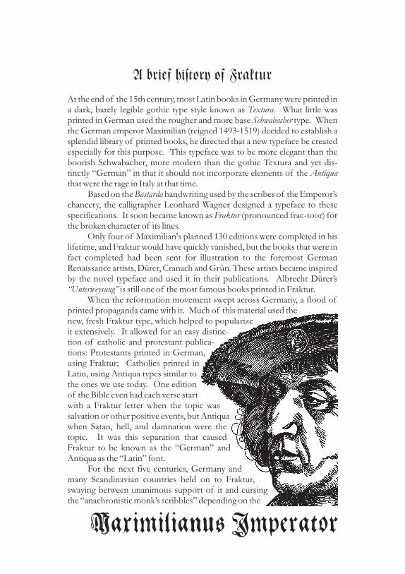
A brief history of Fraktur
At the end of the 15th century, most Latin books in Germany were printed ina dark, barely legible gothic type style known as . What little wasprinted in German used the rougher and more base type. Whenthe German emperor Maximilian (reigned 1493-1519) decided to establish asplendid library of printed books, he directed that a new typeface be createdespecially for this purpose. This typeface was to be more elegant than theboorish Schwabacher, more modern than the gothic Textura and yet dis-tinctly “German” in that it should not incorporate elements of thethat were the rage in Italy at that time.
Based on the handwriting used by the scribes of the Emperor’schancery, the calligrapher Leonhard Wagner designed a typeface to thesespecifications. It soon became known as (pronounced frac-toor) forthe broken character of its lines.
Only four of Maximilian's planned 130 editions were completed in hislifetime, and Fraktur would have quickly vanished, but the books that were infact completed had been sent for illustration to the foremost GermanRenaissance artists, Dürer, Cranach and Grün. These artists became inspiredby the novel typeface and used it in their publications. Albrecht Dürer’s
is still one of the most famous books printed in Fraktur.When the reformation movement swept across Germany, a flood of
printed propaganda came with it. Much of this material used thenew, fresh Fraktur type, which helped to popularizeit extensively. It allowed for an easy distinc-tion of catholic protestant publica-tions: Protestants printed in German,using Fraktur; Catholics printed inLatin, using Antiqua types similar tothe ones we use today. One editionof the Bible even had each verse startwith a Fraktur letter when the topic wassalvation or other positive events, but Antiquawhen Satan, hell, and damnation were thetopic. It was this separation that causedFraktur to be known as the “German” andAntiqua as the “Latin” font.
For the next five centuries, Germany andmany Scandinavian countries held on to Fraktur,swaying between unanimous support of it and cursingthe “anachronistic monk’s scribbles” depending on the
TexturaSchwabacher
Antiqua
Bastarda
Fraktur
“Unterweysung”
and
Maximilianu< Imperator

current level of national sentiment. Most works intended for a general audi-ence continued to be printed this way well into the 20th century, while booksof a more scientific nature used the “learned” Latin type. In the meantime,most other European countries adopted Antiqua, and still use it to this day.
After World War I, Fraktur gradually went out of style as Germansociety became more cosmopolitan and open to international influences.Of course, the Nazis put an end to that when they rose to power in 1933. Allthings German were glorified, and Fraktur was declared the only “Aryan”type. Many pseudo-Fraktur and Gothic fonts were created then, most dis-playing the harsh spirit of the “New Germany” and all of them stiff andugly.
It is ironic to learn that it was Hitler himself who finally terminatedFraktur printing. By January 1941, Germany had conquered most ofEurope, and the German type had become a communications barrier withthe new “vassals”. Fraktur was replaced by the standard Antiqua. In a typi-cal ideological about-face, Hitler declared Fraktur to be “Un-German” and“of Jewish origin”, and so it was officially abolished. Hitler’s order directedall newspapers and publishing houses to switch to Antiqua at the earliestpracticable date. This was an economic impossibility for many printers, sothe decree didn’t have any profound effect until late in the war. The alliedforces naturally couldn’t have agreed more with Hitler on the legibility issueand promptly ordered the regulation to remain in effect.
Following the war, German printers and type designers looked for newdirections that were not reminiscent of Germany’s militarist past, and even-tually developed a style similar to the Bauhaus designs of the 1920’s.
During the next forty years, Fraktur became associated closely andsolely with the Third Reich. Fraktur became “Nazi-print”. This image wasenforced by many movies, documentaries, books and articles, and it provesalmost impossible to correct today. Nonetheless, printers and type designersare carefully pulling the old treasures back into the light and hope to freethem of political connotations.We hope that our little bundle of 18 fonts contributes to that end, we cor-dially invite you to enjoy this new, old, beautiful way of putting thoughts onpaper.

The Font<
Gutenberg BibelschriftOnly in today’s age of capitalism and high technology are we able to appreci-ate not only the artistic value of Johannes Gutenberg’s work, but also theimmense business acumen and vision that this man possessed. At a timewhen laboriously handwritten books fetched astronomical sums in the mar-ket, Gutenberg conceived of a method to mass-produce books of equalquality, thus opening up a true goldmine. For the twenty years it took him todevelop the art of printing, Gutenberg never lost his vision, overcameimmense technical and financial difficulties, and finally produced books ofsuch a technical and artistic quality that they cannot be duplicated by today’sprinters. How soon we started to take the art of printing for granted is shownby the fact that Gutenberg was quickly forgotten after his death. Our entireknowledge of the man and his life is derived from a handful of legal docu-ments, most of which were destroyed in a 19th century fire. The only monu-ment to the man Johannes Gutenberg is the one he built himself: his 42-lineBible.
The Gutenberg Bibelschrift font is an accurate rendition of thetype developed and used by Gutenberg for his 42-line Bible. His aim was toimitate the beautiful, but hard to read Textura calligraphy then used for mostbooks. To that end, he had to render not only the letters of the alphabet, butalso a great number of common ligatures and abbreviations. To strengthenthe impression of original handwriting, he also cast several slightly differentversions for each letter, so that his entire font consisted of 290 types. Wehave reproduced the most common version of the alphabet, as well as theligatures and abbreviations used. The original font had no numerals.Whatever numbering was required was added in red ink after printing wascompleted.
When Fraktur was developed, most German-language publications wereprinted using a form of Schwabacher type. This font evolved from thebastarda scripts that were widely used at the time. Schwabacher types areeasily distinguished from Fraktur fonts by the rounded stems of such lettersas “o” and “d”. The Schwabacher font has a bold and original character, itcomplements the Renaissance woodcuts of Dürer, Cranach and many otherartists. Being a very ornamental font, it is suitable for decorative printing, orto augment calligraphic work.
Alte Schwabacher

Wittenberg SchwabacherBy the time Martin Luther completed his German translation of the Bible,printing had been a flourishing industry for over eighty years. It is thereforeno surprise that the found fertile ground; hundreds of thou-sands of copies were sold, the original printer could not satisfy the demandand a good number of pirated copies appeared. All these Bibles were printedin some form of Schwabacher; our Wittenberg version comes closest to theoriginal font.
The first of Emperor Maximilian’s magnificent books was a prayer book, 10copies printed on parchment. It was for this book that the first Fraktur fontwas commissioned because all other available types were either too commonor too antiquated. This Fraktur was based on drawings by Leonhard Wagner.The punches were cut by Johann Schönsperger, who also printed the prayerbooks. The finished copies were then given to noted Renaissance artists forillustration. The result were books of such high artistic quality and excellentworkmanship that they stand up to Gutenberg’s 42-line Bibles.
One of Maximilian’s most ambitious printing projects was a glorification ofhis voyage west to wed Mary of Burgundy. The romanticized account of thisadventure was lavishly layed out in the epic . The typeface forthis book was probably designed by Vinzenz Rockner, the Emperor’s per-sonal secretary. Theuerdank is an almost “modern” Fraktur and forms thebase for many subsequent designs. Note that the printed letters of the origi-nal were embellished further by adding ornamental lines in various colors byhand.
The founder of the famous Luther foundry in Frankfurt is said to havestarted his business with borrowed punches for the Coelnisch CurrentFraktur. This font is an excellent choice for headlines and titles and is bestused sparingly at sizes above 30 points. It works well with the Theuerdank orGebetbuch Fraktur as text fonts, but also provides a nice contrast when usedwith the Luther Fraktur.
“Biblia Deutsch”
“Theuerdank”
Gebetbuch Fraktur
Theuerdank Fraktur
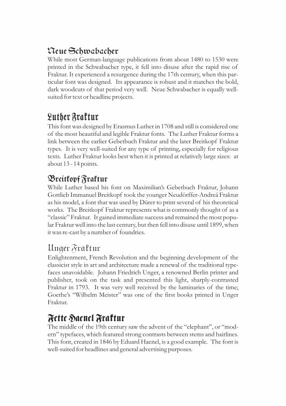
Neue SchwabacherWhile most German-language publications from about 1480 to 1530 wereprinted in the Schwabacher type, it fell into disuse after the rapid rise ofFraktur. It experienced a resurgence during the 17th century, when this par-ticular font was designed. Its appearance is robust and it matches the bold,dark woodcuts of that period very well. Neue Schwabacher is equally well-suited for text or headline projects.
This font was designed by Erasmus Luther in 1708 and still is considered oneof the most beautiful and legible Fraktur fonts. The Luther Fraktur forms alink between the earlier Gebetbuch Fraktur and the later Breitkopf Frakturtypes. It is very well-suited for any type of printing, especially for religioustexts. Luther Fraktur looks best when it is printed at relatively large sizes: atabout 13 - 14 points.
While Luther based his font on Maximilian’s Gebetbuch Fraktur, JohannGottlieb Immanuel Breitkopf took the younger Neudörffer-Andreä Frakturas his model, a font that was used by Dürer to print several of his theoreticalworks. The Breitkopf Fraktur represents what is commonly thought of as a“classic” Fraktur. It gained immediate success and remained the most popu-lar Fraktur well into the last century, but then fell into disuse until 1899, whenit was re-cast by a number of foundries.
Enlightenment, French Revolution and the beginning development of theclassicist style in art and architecture made a renewal of the traditional type-faces unavoidable. Johann Friedrich Unger, a renowned Berlin printer andpublisher, took on the task and presented this light, sharply-contrastedFraktur in 1793. It was very well received by the luminaries of the time;Goethe’s “Wilhelm Meister” was one of the first books printed in UngerFraktur.
The middle of the 19th century saw the advent of the “elephant”, or “mod-ern” typefaces, which featured strong contrasts between stems and hairlines.This font, created in 1846 by Eduard Haenel, is a good example. The font iswell-suited for headlines and general advertising purposes.
Luther Fraktur
Breitkopf Fraktur
Unger Fraktur
Fette Haenel Fraktur
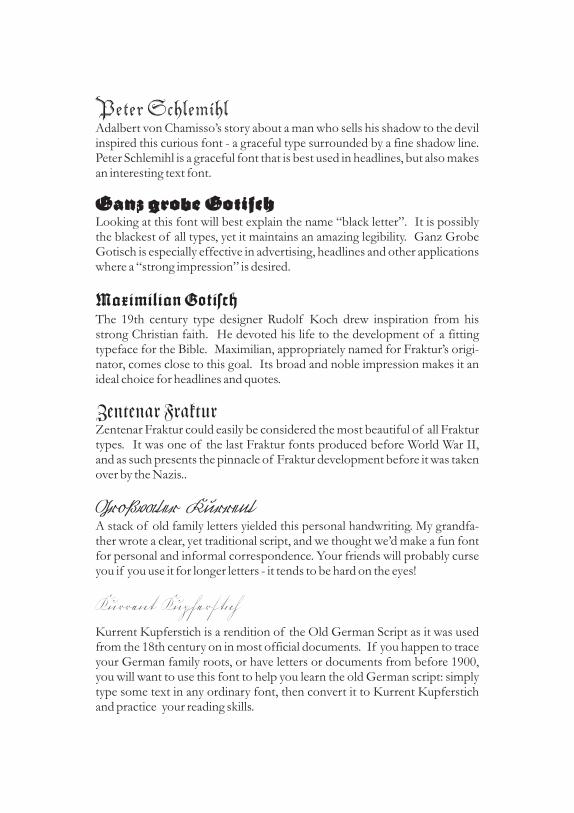
Peter SchlemihlAdalbert von Chamisso’s story about a man who sells his shadow to the devilinspired this curious font - a graceful type surrounded by a fine shadow line.Peter Schlemihl is a graceful font that is best used in headlines, but also makesan interesting text font.
Looking at this font will best explain the name “black letter”. It is possiblythe blackest of all types, yet it maintains an amazing legibility. Ganz GrobeGotisch is especially effective in advertising, headlines and other applicationswhere a “strong impression” is desired.
The 19th century type designer Rudolf Koch drew inspiration from hisstrong Christian faith. He devoted his life to the development of a fittingtypeface for the Bible. Maximilian, appropriately named for Fraktur’s origi-nator, comes close to this goal. Its broad and noble impression makes it anideal choice for headlines and quotes.
Zentenar Fraktur could easily be considered the most beautiful of all Frakturtypes. It was one of the last Fraktur fonts produced before World War II,and as such presents the pinnacle of Fraktur development before it was takenover by the Nazis..
A stack of old family letters yielded this personal handwriting. My grandfa-ther wrote a clear, yet traditional script, and we thought we’d make a fun fontfor personal and informal correspondence. Your friends will probably curseyou if you use it for longer letters - it tends to be hard on the eyes!
Kurrent Kupferstich is a rendition of the Old German Script as it was usedfrom the 18th century on in most official documents. If you happen to traceyour German family roots, or have letters or documents from before 1900,you will want to use this font to help you learn the old German script: simplytype some text in any ordinary font, then convert it to Kurrent Kupferstichand practice your reading skills.
Ganz grobe Gotisch
Maximilian Gotisch
Zentenar Fraktur
Großvater Kurrent
Kurrent Kupfers>tich
Frankfurt, den 14ten Mai 1886
Lieb|e Emma!D>eine >reizend>en >liebev>ollen Zeilen >v>om
28ten April >erford>ern >ras>che Erw>id>erung, >de+>s>ie >haben >mich >s>o >entzückt, >daß >ich >mich >am>lieb|en >gleich >nach Empfang zur Beantw>ortung>hinges>etzt hätte; >da >e< >aber 11 Uhr Abend><>war >und >ich >grad>e >au>< >dem Theater >kam,>noch >kein Abend>essen >genommen >hatte, >ließ ich>lieber >da>< V>ergnügen >bi< >heute >bleiben.
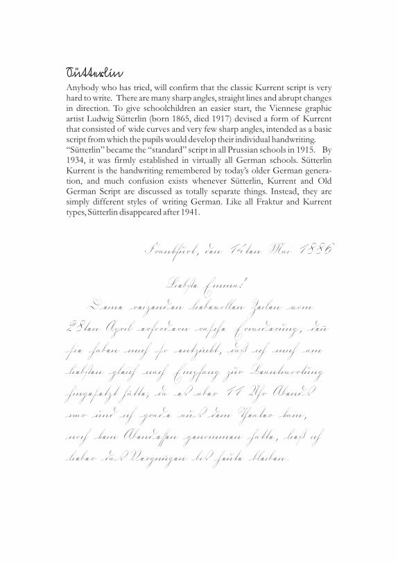
S>ütterlin
Anybody who has tried, will confirm that the classic Kurrent script is veryhard to write. There are many sharp angles, straight lines and abrupt changesin direction. To give schoolchildren an easier start, the Viennese graphicartist Ludwig Sütterlin (born 1865, died 1917) devised a form of Kurrentthat consisted of wide curves and very few sharp angles, intended as a basicscript from which the pupils would develop their individual handwriting.“Sütterlin” became the “standard” script in all Prussian schools in 1915. By1934, it was firmly established in virtually all German schools. SütterlinKurrent is the handwriting remembered by today’s older German genera-tion, and much confusion exists whenever Sütterlin, Kurrent and OldGerman Script are discussed as totally separate things. Instead, they aresimply different styles of writing German. Like all Fraktur and Kurrenttypes, Sütterlin disappeared after 1941.
A Word about Orthograpy
Rule< for Setting Fraktur Type
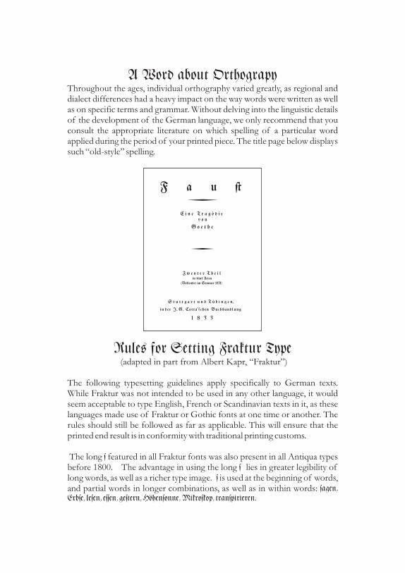
Throughout the ages, individual orthography varied greatly, as regional anddialect differences had a heavy impact on the way words were written as wellas on specific terms and grammar. Without delving into the linguistic detailsof the development of the German language, we only recommend that youconsult the appropriate literature on which spelling of a particular wordapplied during the period of your printed piece. The title page below displayssuch “old-style” spelling.
(adapted in part from Albert Kapr, “Fraktur”)
The following typesetting guidelines apply specifically to German texts.While Fraktur was not intended to be used in any other language, it wouldseem acceptable to type English, French or Scandinavian texts in it, as theselanguages made use of Fraktur or Gothic fonts at one time or another. Therules should still be followed as far as applicable. This will ensure that theprinted end result is in conformity with traditional printing customs.
The long featured in all Fraktur fonts was also present in all Antiqua typesbefore 1800. The advantage in using the long lies in greater legibility oflong words, as well as a richer type image. is used at the beginning of words,and partial words in longer combinations, as well as in within words:
ss
ssagen,
Erbse, lesen, essen, gestern, Höhensonne, Mikroskop, transpirieren.
F a u |
E i n e T r a g ö d i ev o n
G o e t h e
Z w e y t e r T h e i lin fünf Acten
(Vollendet im Sommer 1831)
S t u t t g a r t u n d T ü b i n g e n,
in der J. G. Cotta ’schen Buchhandlung
1 8 3 3

If a word is hyphenated, the remains: Likewise, if a word ends in anapostrophe, the remains:
Combined words that drop the ‘e’ also use theAbbreviations retain the as well:
The round or ending is used at the end of words and partial words, and atthe end of syllables derived from foreign terms:
also occurs at the end of syllables in rarecombinations such as (but )
(but ) There is no the proper forms areeither
Ligatures (joined letters) improve the flow of printed Fraktur. The follow-ing ligatures are available in most fonts of the Gutenberg Press:
is placed at the end of words ending, or about to end in Ligatures areused whenever the applicable pair of letters falls into a syllable. Combinedwords do not use ligatures: butnot
Bold and Italicized fonts are rare in Fraktur printing, and even those availabledon’t look quite right. Skewing Fraktur electronically creates unsatisfactoryresults as well. Legibility considerations prohibit setting in capital letters.
For centuries, printers got around this problem by capitalizing only the firsttwo letters of an emphasized word: However, thismethod disappeared at the close of the 18th century and should only be usedto reproduce printed matter from before that time. The only traditionallycorrect solutions are and It is important to note that allligatures except and are split when text is spread. Alternately, differ-ent fonts such as the Schwabacher can be used to emphasize:
Lastly, the words to be emphasized maybe set one or two points larger than the base type:
.
Complete sentences in foreign languages must be set in Antiqua; the sameapplies to words and phrases that have not yet found their way into theGerman language: va banque, en gros. The same is true of capital acro-nyms: CDU, FDP, SPD.
s Mes=ser.s lass’ .
s: Verwechslung, erlesne.s Vers.=Ges.
<die<, Hä<chen, au<trinken,
Ordnung<liebe, Di<pen<, I<chia<. <<d, <k, <m, <n, <w: Dre<den, Arabe<ke, ri<kant, obskur ,
Mo<kau Min<k , Wi<mut, Klau<ner. <<;s<, <s, ss or ß
# $ ~ [{_ }%^ ß| @. ß s<.
do#, Ru$, ho~en, ver[lzt, {ach, o_, Wa%er, A|, Ka@eauffordern, Schilfinsel, Schnupftuch.
Ich bin der HErr, dein GOtt.
bold s p r e a d t e x t.ch, ck, tz, ß
Beispiel eineral< Auszeichnung<schrift.
Beispiel eineral< Auszeichnung
Schwabacher
Vergrößerung

~ ~ ff ligature ä 0228 a-umlaut
@ @ tz ligature ö 0246 o-umlaut
# # ch ligature ü 0252 u-umlaut
$ $ ck ligature Ä 0196 A-umlaut
% % ss ligature Ö 0214 O-umlaut
{ { fl ligature Ü 0220 U-umlaut
} } si ligature { [ fi ligature
] ] sf ligature | | st ligature
_ _ ft ligature ß 0223 double s
< < ending s > > free joint
Several fonts do not feature certain letters because they were not used at thetime: Gebetbuch Fraktur was used to print Latin, it therefore does not con-tain “u” and “w”. Many fonts designed before 1900 have no J. We haveprovided the appropriate characters for ease of use, but the purists among usshould refrain from their use.
The handwriting fonts demand special attention with regards to the correctspacing of individual letters. While some letter combinations require extraspacing; others do not. We therefore have provided a free joint that can beused where extra spacing is appropriate.
Ligature< and Special Character<To provide easy access to the most commonly used ligatures and specialcharacters, we have assigned them to keys not generally used in Frakturprinting. Umlauts were assigned to specific ANSI codes, because theycorrespond to particular keys on a German keyboard. To produce charactersusing the ANSI code, you need to press and hold the ALT key and type thecode on the number pad while continuing to hold the ALT key down. Whenyou let go of the ALT key, the character appears. The following chart pro-vides a reference.
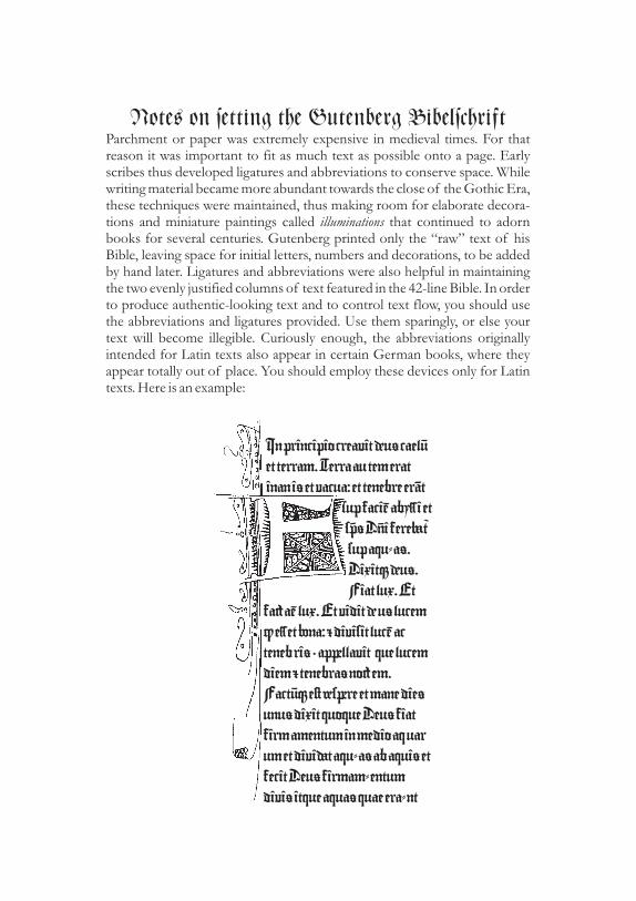
Note< on setting the Gutenberg BibelschriftParchment or paper was extremely expensive in medieval times. For thatreason it was important to fit as much text as possible onto a page. Earlyscribes thus developed ligatures and abbreviations to conserve space. Whilewriting material became more abundant towards the close of the Gothic Era,these techniques were maintained, thus making room for elaborate decora-tions and miniature paintings called that continued to adornbooks for several centuries. Gutenberg printed only the “raw” text of hisBible, leaving space for initial letters, numbers and decorations, to be addedby hand later. Ligatures and abbreviations were also helpful in maintainingthe two evenly justified columns of text featured in the 42-line Bible. In orderto produce authentic-looking text and to control text flow, you should usethe abbreviations and ligatures provided. Use them sparingly, or else yourtext will become illegible. Curiously enough, the abbreviations originallyintended for Latin texts also appear in certain German books, where theyappear totally out of place. You should employ these devices only for Latintexts. Here is an example:
illuminations
InprincipiocreavitÑu<caelÈet terram.Terraautemeratinani<etvacua:et tenebre er†t
supfacišaby%iets¢<DÒifere™±supaqu=a<.DixitÇÑu<.Fiat lux.Et
faÉašlux.EtviditÑu<lucemÙe%et §na:Údivisit lucšacteneb ri<,apŒllavit quelucemdiemÚtenebra<noÉem.FactÈÇe|ÖsŒreetmanedie<unu<dixitquoqueDeu<fiatfirmamentuminmedioaquarumetdiviÍtaqu=a<abaqui<etfecitDeu<firmam=entumdivi<itqueaqua<quaeera=nt

† 0134 am, an ¯ 0175 gi à 0195 quam, quan
Š 0138 ar ³ 0179 gra Ç 0199 que
™ 153 ba · 0183 ha Ë 0203 que, quod
Ÿ 0159 be » 0187 he Ï 0207 qui
¤ 0164 bet ¿ 0191 im, in, min Ô 0212 quo
§ 0167 bo Æ 0198 el, il, les, ul Ù 0217 quod
® 0174 cha Ê 0202 mm, mn Ý 0221 quoque
² 0178 che Î 0206 an ‰ 0137 r
¶ 0182 cho Ò 0210 nn, omin ˜ 0215 re
º 0186 co Ø 0216 ao œ 0156 rum
½ 0189 com Ü 0220 io, on £ 0163 s
Á 0193 cra, cri ˆ 0136 pa ¦ 0166 ser
Å 0197 cri Œ 0140 oe ± 0177 ta
É 0201 ct › 0155 per µ 0181 ter, tur
Í 0205 da ¢ 0162 præ ¹ 0185 th
Ñ 0209 de ¥ 0165 po ü 0252 ua, ue
× 0215 dem © 0169 pp, pop Ä 0196 uer, ver
Û 0219 den « 0171 ppe È 0200 um, un
‡ 0135 do ° 0176 pre, pri Ì 0204 us
‹ 0139 nd ´ 0180 pri Ð 0208 va
š 0154 em,en,est ¸ 0184 pro Ö 0214 ve
¡ 0161 er, re ¼ 0188 prop Ú 0218 et
ª 0170 ffl À 0192 qua, qui
Gutenberg had to account for slight variations in a scribe’s handwriting tocreate the illusion of a handwritten book. He therefore created severalpunches for each letter. Including ligatures and other symbols, his typeseteventually contained 290 characters. The chart below shows the availablespecial characters, the ASCII code, and for which combination of letters theywere used.
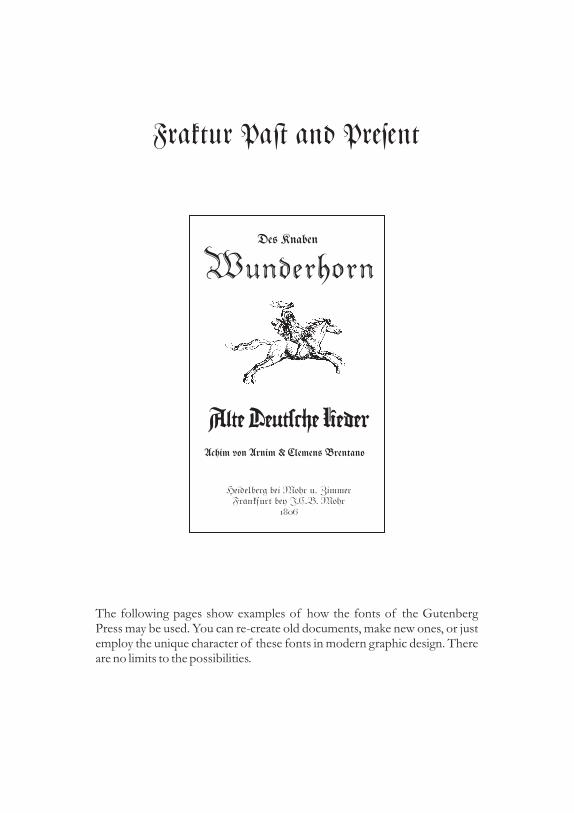
Fraktur Pa| and Present
The following pages show examples of how the fonts of the GutenbergPress may be used. You can re-create old documents, make new ones, or justemploy the unique character of these fonts in modern graphic design. Thereare no limits to the possibilities.
De< Knaben
Alte Deutsche LiederAchim von Arnim & Clemen< Brentano
Heidelberg bei Mohr u. ZimmerFrankfurt bey J.C.B. Mohr
1806
Wunderhorn

Am Anfang s#uf GOtt Hymmelund Erde/Und die Erde war wü|und leer, und e< war [n|er auf der
Tie~e; und der Gei| GOtte< s#webte au~dem Wa%er/Und Gott spra#: E< werdeLi#t/Und e< ward Li#t/Und GOttsah/daß da< Li#t gut war/Da s#ied Gottda< Li#t von der Fin|erni< und nannteda< Li#t Tag und die Fin|erni< Na#t.Da ward au< Abend und Morgen der er|eTag.Und GOtt spra#: E< werde eine Fe|ezwis#en den Wa%ern/die da s#eidezwis#en den Wa%ern/Da ma#te GOttdie Fe|e und s#ied da< Wa%er unter derFe|e von dem Wa%er über der Fe|e/Und e< ges#ah so/Und GOtt nannte dieFe|e Himmel/Da ward au< Abend undMorgen der zweite Tag.

Nac
hC
hoi|
igeb
urt/
1513
.Jar
Adi
1.May
hat
man
dem
gros
<mec
h-ti
gste
nK
önig
Em
anue
lvon
Por
tuga
l/ge
nL
ysab
ona
au<
Indi
apr
acht
/ain
solc
hleb
endi
gT
hier
,da<
nen
nen
sie
Rhi
noc
eru<
/D
asis
thi
em
ital
lsein
erge
stal
tA
bcon
terf
ect.
E<
hat
einfa
rbw
ieein
gepf
reck
elte
schi
ldkr
ot/
und
ist
von
dick
ensc
halen
uber
legt
sehr
fest
/und
ist
inde
rgr
ö<al
<de
rH
eilffan
dt/
aber
nid
eric
hter
von
bayn
enun
dsehr
weh
rhaf
ftig
e<ha
tein
scha
rffs
tarc
kH
orn
vorn
auff
der
Nas
sen/
da<
begu
ndt
e<zu
we@
enw
oe<
bey
Ste
ynen
ist/
da<
daein
Sieg
Thi
eris
t/de
<H
eilfa
ndt
enT
odfe
yndt
.Der
Heil
ffan
dtfü
rcht
<fa
stub
el/de
nw
oe<
Ihn
anko
mpt
/so
lauf
ftI
hmda
<T
hir
mit
dem
Kop
ffzw
ische
ndi
efor
dern
bayn
/un
dre
ist
den
Heil
ffan
ten
unte
nam
bauc
hau
ff/un
der
wür
get
ihn/
de<
mag
ersi
chnic
hter
weh
ren.D
ann
da<
Thi
eris
tal
soge
wap
net
da<
ihm
der
Jeil
ffan
denic
ht<
thun
kann/
Sie
sage
nau
ch/
da<de
rR
hinoc
eru<
/Sch
nell
/fra
yeig
/un
dau
chL
usti
g/sey.

Bla<musikMeier’<
OriginalBayrische
Your Authentic German Band Since 1962Weddings - Oktoberfests - Events
Baltimore, MD (410) 555-5555
zum VolkstanzNovember 3, 6:00 p.m.
at the
Edelweiß-Halle
Thi< coming Saturday, April 12th, the e|ate of the lateMr. E. G. Bundenbach will be sold at A u c t i o n,
at the Park Hotel, 50 Main Street.
The e|ate contain< many valuable antique<, old and rarebook<, autograph<, |amp<, coin<, and other paper
collectible<.
Admi%ion i< free. R. S. V. P 212.555.5555
A u c t i o n
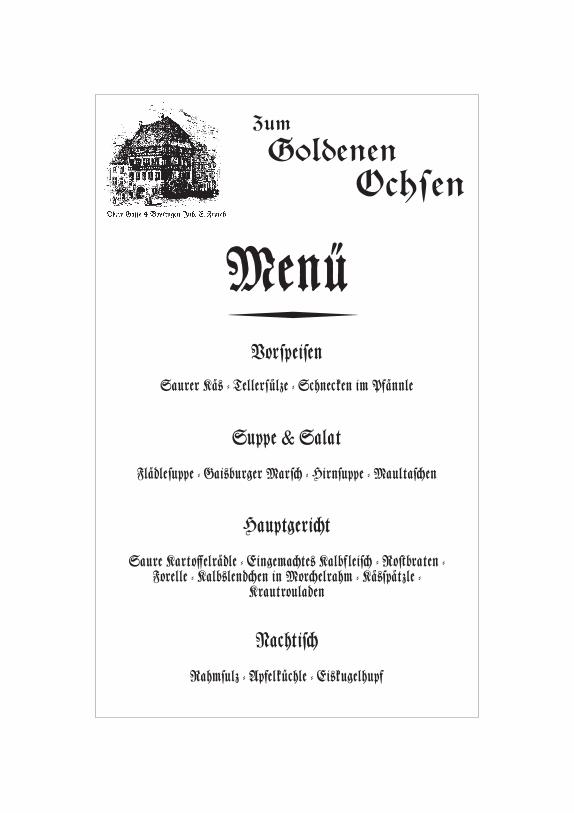
Zum
GoldenenOchsen
Obere Gasse 4 Bopfingen Inh. E. Frasch
MenüVorspeisen
Saurer Kä< - Tellersülze = Schnecken im Pfännle
Suppe & Salat
Flädlesuppe = Gai<burger Mars# = Hirnsuppe = Maultas#en
Hauptgeri#t
Saure Karto~elrädle = Eingema#te< Kalbfleis# - Ro|braten =Forelle = Kalb<lend#en in Mor#elrahm = Kä<spätzle =
Krautrouladen
Nachtis#
Rahmsulz = Apfelküchle = Ei<kugelhupf

© 1997 Walden Font. All Rights reserved. No portion of thismanual may be reproduced without prior written permission by
Walden Font.
We worked hard to provide you with a quality product, and wehope you enjoy it. Using a copy of this product without having
paid for it is piracy. If we catch you, we’ll sue - trust us.
Contacting Walden Font
Walden FontP.O. Box 871
Winchester, MA 01890
Phone: (781) 932-0518Orders only: (800) 519-4575
FAX: (781) 932-0518
It contains additional documentation, technical support files,product information and updates as well as information aboutWalden Pond and Henry David Thoreau. You can also write e-mail to [email protected] We will be happy torespond.
Please visit our website at www.waldenfont.com
© 1997 Walden Font. All rights reserved. No portion of this manual maybe reproduced without prior written permission by Walden Font.
We worked hard to provide you with a quality product, and we hope youenjoy it. Using a copy of this product without having paid for it, is piracy.
If we catch you, we’ll sue - trust us.