Finding the “odd one out” Memory color effects and the ...
14
Contents lists available at ScienceDirect Cognition journal homepage: www.elsevier.com/locate/cognit Original Articles Finding the “odd one out”: Memory color effects and the logic of appearance J.J. Valenti, Chaz Firestone ⁎ Johns Hopkins University, United States ARTICLE INFO Keywords: Memory color Color perception Top-down effects Cognitive penetrability Modularity ABSTRACT Can what we know change what we see? A line of research stretching back nearly a century suggests that knowing an object’s canonical color can alter its visual appearance, such that objectively gray bananas appear to be tinged with yellow, and objectively orange hearts appear redder than they really are. Such “memory color” effects have constituted the strongest and most complete evidence that basic sensory processing can be pene- trated by higher-level knowledge, and have contributed to theories of object perception in psychology, neu- roscience, and philosophy. Are such phenomena truly perceptual? Or could they instead reflect shifts in judg- ments and responses without altering online color perception? Here, we take a novel approach to this question by exploiting a “logic” that is inherent in visual processing but that higher-level cognition often cannot follow. In four experiments spanning both classical and contemporary work, we exhaust the predictions of memory color theories, by exploring scenarios where memory color accounts generate tortuous and difficult-to-grasp hy- potheses that should nevertheless be easily accommodated by visual processing. We show that such conditions eliminate or even reverse memory color effects in ways unaccounted-for by their underlying theories—especially in a novel “odd one out” paradigm that may help distinguish visual appearance from higher-level judgment in a powerful and general way. We suggest that prior knowledge can influence color judgments in real and robust ways, but that such influences may not truly reflect changes in visual appearance per se. We further discuss the general utility of this approach for isolating perception from judgment, both for memory color effects and be- yond. 1. Introduction What we see can change what we believe—but can what we believe change what we see? In contrast to a traditional “modular” view of perception, recent work has suggested that higher-level cognitive states can reach down into visual processing and change how the world ap- pears to us. For example, it has been reported that recalling unethical behavior can change the perceived brightness of a room (Banerjee, Chatterjee, & Sinha, 2012), that impressive or powerful people appear larger (Duguid & Goncalo, 2012; Masters, Poolton, & van der Kamp, 2010), and that frightening objects appear closer (Harber, Yeung, & Iacovelli, 2011). Such work goes beyond the more widely accepted notion that higher-level expectations can modulate attention, eye movements, or object categorization (Bar, 2004; Malcolm, Nuthmann, & Schyns, 2014); instead, the force of these results is their claim to directly alter the way a given object looks to us, at the level of basic visual properties such as color, size, or distance. The ground-shaking consequences implied by these claims have made them extremely influential, but they have also attracted skepti- cism for the same reasons, on at least three general fronts. First, the studies used to motivate these claims are often “one-off” results rather than integrated parts of a broader literature: With rare exceptions (e.g., Dunning & Balcetis, 2013; Proffitt, 2006; Witt, 2011; but see also Durgin, DeWald, Lechich, Li, & Ontiveros, 2011; Firestone, 2013a), many of these claims draw from only one source of evidence, use only one sort of task, and have rarely been replicated or extended by other researchers and laboratories. Second, these studies frequently arise from outside the field of vision science, and as a result may overlook certain controls expected of perception studies, such as matching sti- muli on important low-level properties (e.g., Harber et al., 2011; van Ulzen, Semin, Oudejans, & Beek, 2008). Third, many of these claims are theoretically puzzling and even implausibly maladaptive. For example, given the degree to which visual processing relies on representing a scene’s lighting conditions, it would seem odd at best (and actively unhelpful at worst) for the mind to adjust a room’s perceived brightness when the perceiver has recently recalled an unethical vs. ethical action (Banerjee et al., 2012)—an effect that has no clear adaptive function and that could even mislead perceivers about their visual environment. These and other concerns have motivated reviewers of this literature to ask whether there is truly any evidence that cognition can penetrate https://doi.org/10.1016/j.cognition.2019.04.003 Received 5 December 2018; Received in revised form 3 April 2019; Accepted 3 April 2019 ⁎ Corresponding author at: Department of Psychological & Brain Sciences, Johns Hopkins University, 3400 N Charles St, Baltimore, MD 21218, United States. E-mail address: [email protected] (C. Firestone). Cognition 191 (2019) 103934 0010-0277/ © 2019 Published by Elsevier B.V. T
Transcript of Finding the “odd one out” Memory color effects and the ...
Contents lists available at ScienceDirect
Cognition
journal homepage: www.elsevier.com/locate/cognit
Original Articles
Finding the “odd one out”: Memory color effects and the logic of appearance
J.J. Valenti, Chaz Firestone⁎
Johns Hopkins University, United States
A R T I C L E I N F O
Keywords:Memory colorColor perceptionTop-down effectsCognitive penetrabilityModularity
A B S T R A C T
Can what we know change what we see? A line of research stretching back nearly a century suggests thatknowing an object’s canonical color can alter its visual appearance, such that objectively gray bananas appear tobe tinged with yellow, and objectively orange hearts appear redder than they really are. Such “memory color”effects have constituted the strongest and most complete evidence that basic sensory processing can be pene-trated by higher-level knowledge, and have contributed to theories of object perception in psychology, neu-roscience, and philosophy. Are such phenomena truly perceptual? Or could they instead reflect shifts in judg-ments and responses without altering online color perception? Here, we take a novel approach to this questionby exploiting a “logic” that is inherent in visual processing but that higher-level cognition often cannot follow. Infour experiments spanning both classical and contemporary work, we exhaust the predictions of memory colortheories, by exploring scenarios where memory color accounts generate tortuous and difficult-to-grasp hy-potheses that should nevertheless be easily accommodated by visual processing. We show that such conditionseliminate or even reverse memory color effects in ways unaccounted-for by their underlying theories—especiallyin a novel “odd one out” paradigm that may help distinguish visual appearance from higher-level judgment in apowerful and general way. We suggest that prior knowledge can influence color judgments in real and robustways, but that such influences may not truly reflect changes in visual appearance per se. We further discuss thegeneral utility of this approach for isolating perception from judgment, both for memory color effects and be-yond.
1. Introduction
What we see can change what we believe—but can what we believechange what we see? In contrast to a traditional “modular” view ofperception, recent work has suggested that higher-level cognitive statescan reach down into visual processing and change how the world ap-pears to us. For example, it has been reported that recalling unethicalbehavior can change the perceived brightness of a room (Banerjee,Chatterjee, & Sinha, 2012), that impressive or powerful people appearlarger (Duguid & Goncalo, 2012; Masters, Poolton, & van der Kamp,2010), and that frightening objects appear closer (Harber, Yeung, &Iacovelli, 2011). Such work goes beyond the more widely acceptednotion that higher-level expectations can modulate attention, eyemovements, or object categorization (Bar, 2004; Malcolm, Nuthmann,& Schyns, 2014); instead, the force of these results is their claim todirectly alter the way a given object looks to us, at the level of basicvisual properties such as color, size, or distance.
The ground-shaking consequences implied by these claims havemade them extremely influential, but they have also attracted skepti-cism for the same reasons, on at least three general fronts. First, the
studies used to motivate these claims are often “one-off” results ratherthan integrated parts of a broader literature: With rare exceptions (e.g.,Dunning & Balcetis, 2013; Proffitt, 2006; Witt, 2011; but see alsoDurgin, DeWald, Lechich, Li, & Ontiveros, 2011; Firestone, 2013a),many of these claims draw from only one source of evidence, use onlyone sort of task, and have rarely been replicated or extended by otherresearchers and laboratories. Second, these studies frequently arisefrom outside the field of vision science, and as a result may overlookcertain controls expected of perception studies, such as matching sti-muli on important low-level properties (e.g., Harber et al., 2011; vanUlzen, Semin, Oudejans, & Beek, 2008). Third, many of these claims aretheoretically puzzling and even implausibly maladaptive. For example,given the degree to which visual processing relies on representing ascene’s lighting conditions, it would seem odd at best (and activelyunhelpful at worst) for the mind to adjust a room’s perceived brightnesswhen the perceiver has recently recalled an unethical vs. ethical action(Banerjee et al., 2012)—an effect that has no clear adaptive functionand that could even mislead perceivers about their visual environment.These and other concerns have motivated reviewers of this literature toask whether there is truly any evidence that cognition can penetrate
https://doi.org/10.1016/j.cognition.2019.04.003Received 5 December 2018; Received in revised form 3 April 2019; Accepted 3 April 2019
⁎ Corresponding author at: Department of Psychological & Brain Sciences, Johns Hopkins University, 3400 N Charles St, Baltimore, MD 21218, United States.E-mail address: [email protected] (C. Firestone).
Cognition 191 (2019) 103934
0010-0277/ © 2019 Published by Elsevier B.V.
T

visual perception (Firestone & Scholl, 2016; Lammers, de Haan, &Pinto, 2017; Machery, 2015; for more classical discussions of mod-ularity and cognitive impenetrability, see Fodor, 1983; Pylyshyn,1999).
1.1. The highest-hanging fruit
In the entire literature on top-down effects of cognition on percep-tion, one class of findings stands apart in straightforwardly overcomingmany of the above weaknesses: a collection of results known as“memory color” effects. Memory color effects are said to occur whenone’s prior belief about the color of an object changes the color oneactually experiences that object to be. For example, an orange-red heartmay appear redder than it really is (Delk & Fillenbaum, 1965), or a graybanana may appear tinged with yellow (Hansen, Olkkonen, Walter, &Gegenfurtner, 2006; Olkkonen, Hansen, & Gegenfurtner, 2008), be-cause the perceiver knows the objects’ canonical colors (Fig. 1).
Memory color effects withstand many of the criticisms raisedagainst other alleged top-down effects of cognition on perception. First,they have been observed for nearly a century and have been replicatedin various ways since their initial discovery (e.g., Adams, 1923; Bannert& Bartels, 2013; Bruner, Postman, & Rodrigues, 1951; Delk &Fillenbaum, 1965; Duncker, 1939; Hansen et al., 2006; Lupyan, 2015b;White & Montgomery, 1976; Witzel, 2016; for a review, see Adeyefa-Olasupo & Flombaum, 2018). Second, though some classical memorycolor effects may have had methodological shortcomings by today’sstandards, the research program has been revived by modern visionscience laboratories that pay careful attention to many importantmethodological details, including various controls for the stimuli usedin the experiments, the manner in which the measurements are taken,and experimenter bias (e.g., Hansen et al., 2006; Olkkonen et al., 2008;Witzel, Valkova, Hansen, & Gegenfurtner, 2011; Witzel, 2016). Third,the findings make sense in a way that so many other alleged top-downeffects on perception do not: If the perceiver knows something aboutthe typical color of an object, then incorporating that prior informationinto the visual system’s computation of that object’s color doesn’t seemso unreasonable (and may perhaps be consistent with ‘Bayesian’ normsof inference; Witzel, Olkkonen, & Gegenfurtner, 2018).
For these reasons and others, the memory color effect is consideredby many researchers to be among the most promising candidates for agenuine top-down effect of cognition on perception. Indeed, effects ofknowledge on color appearance have played a central role in recentarguments for the cognitive penetrability of perception (e.g.,Macpherson, 2012; Newen & Vetter, 2017; Vetter & Newen, 2014),have helped to motivate new perspectives on cognitive architecturemore generally (e.g., Barsalou, 2008; Lupyan, 2015a), and have evenappeared in popular perception textbooks (e.g., Goldstein & Brockmole,2016; Schwartz & Krantz, 2017).
1.2. A seed of doubt?
At the same time that memory color effects have been so robust andinfluential, there is also reason to wonder whether they truly reflectchanges in perception—how an object looks, per se—vs. changes insubjects’ behavioral responses, which may occur without altering whatis actually seen. In other words, might it be possible that subjects giveresponses that are in line with memory color theories, even if they don’tliterally see objects as having those colors? In particular, one mightdoubt a perceptual interpretation of these effects for at least threereasons:
1.2.1. Effect sizesFirst, memory color effects are surprisingly large—so large that they
should be subjectively apparent even when casually viewing the ex-perimental stimuli (as in Fig. 1a, where memory color theory predictsthat the gray banana shown there should look yellow to you, the reader,right now). For example, many modern studies of memory color effectsmeasure their presence using the method of “achromatic adjustment”,whereby subjects adjust a stimulus’s color until it appears to be aneutral gray (e.g., Hansen et al., 2006; Lupyan, 2015b; Olkkonen et al.,2008; Witzel et al., 2011). In the case of a yellow banana, for example,subjects in fact make the banana a bit blue—with the idea being that thevisual system is independently adding some extra yellow to the image’sperceived color, such that the banana image must be objectively blue(yellow’s opponent color) in order to cancel out the extra yellow andthereby appear gray to the subject. What is striking about such effects isjust how much color subjects add to the images: In the original studies,the effects were as high as 13% relative to the images’ typical colorsettings (with a mean of 8%; Hansen et al., 2006), and follow-up workhas adjusted this value even higher, estimating the memory color effectfor grayscale photographs of bananas to be 22% (Olkkonen et al.,2008). This essentially implies that an objectively gray banana shouldappear to be 22% as colorful as a real-life, naturally colored yellowbanana. Hansen et al. note that a finding of this magnitude “amounts toan effect that is approximately three to five times above the threshold ofdiscrimination” (p.1368); but on reflection this seems like a problem,because an effect of this size just does not comport with the subjectiveexperience of seeing a gray banana—which, fairly plainly, looks gray(as in Fig. 1a). In other words, speaking purely subjectively, gray ba-nanas just don’t look yellow to the degree suggested by memory colorstudies. (For a more sustained treatment of the role of phenomenologyin evaluating top-down effects, see Firestone & Scholl, 2015a.)
1.2.2. Conflicting mechanismsSecond, there may be inconsistencies across memory color studies as
to their underlying mechanisms—in particular, as to whether memorycolor effects are driven by explicit higher-level beliefs or instead bylow-level statistical associations between shapes and colors. For ex-ample, it has been reported that blurring a fruit image reduces itsmemory color effect even when subjects still know the fruit’s identity(Olkkonen et al., 2008). This suggests a fairly low-level learning me-chanism for memory color effects, since even when the subject’s high-level knowledge is preserved (i.e., even when the subject still knowsthey are viewing a banana), the blurring procedure reduces the memorycolor effect (see Olkkonen et al., 2008, for a more detailed interpreta-tion of this finding along these lines). At the same time, however, thelargest memory color effects of all are typically observed for brandedobjects with very generic shapes, where the effect seems to be driven byexactly the sort of higher-level knowledge that earlier studies seemed tohave ruled out. For example, a simple disk does not produce a memorycolor effect on its own; but when the disk is branded with the logo forNivea (a popular brand of skin lotion with dark blue containers), a largememory color effect occurs, such that the additional writing on thesurface of the tin reportedly causes the whole tin to appear blue (Witzelet al., 2011). This result suggests a higher-level source of memory color
Fig. 1. Schematic illustration (and exaggeration) of memory color effects. (A)Objectively gray bananas may appear tinged with yellow. (B) Hearts may ap-pear redder than they really are.
J.J. Valenti and C. Firestone Cognition 191 (2019) 103934
2

effects (what those researchers call “object knowledge”), since arounded tin is a very generic shape, and it’s only the addition ofmeaningful writing that now produces a large memory color effect.Though these somewhat conflicting patterns do not by themselves un-dermine the relevant studies, they may well be a reason to seek alter-native explanations for many of these effects.
1.2.3. Unconstrained tasksThird, the vast majority of contemporary memory color studies use
tasks that rely on the subjects’ pre-existing notions of where “gray” andother colors are located in color space, in a potentially problematicway. For example, rather than show subjects a gray object and ask themwhether a gray banana looks like that, most memory color studies showsubjects a colored banana and ask subjects to make it gray, leaving it tothe subjects themselves to determine the gray standard on their own.This open-ended design may be especially susceptible to biases injudgments and responses, especially since there are usually no coun-termeasures in place to prevent subjects from inferring the purpose ofthese studies (which, given their designs, plainly concern the connec-tion between familiar objects and their typical colors). Just like anycolor term, “gray” does not correspond to a single point in color space,but instead to a continuous region within that space: As one discovers ina paint store, for example, many different colors answer to “gray”, in-cluding not only dark grays and light grays but also warm grays andcool grays, which have other hues mixed in but are still accepted asinstances of “gray”. Just as asking a subject to adjust something to be“red” leaves open the precise shade of red they should choose—andeven gives the subject leeway to choose different reds for differentobjects depending on each object’s canonical red—asking a subject tomake something “gray” permits the subject to choose a different grayfor different objects, or to use different strategies for different objects,even if all such objects are perceived identically (and even if that sub-ject’s own subjective gray standard is measured in advance). Indeed,one distinct possibility is that subjects who adjust bananas to be a bitblue do so because their strategy is to stay a safe distance away from theobject’s canonical color—as if thinking, “Let me make certain there’s noteven a speck of yellow in this banana”—and so tend to overshoot towardsthat color’s opponent (here, blue). In other words, if subjects wish tomake a banana look gray, and in so doing make a special effort to avoidyellowish grays, then a banana might elicit a bluish estimate for stra-tegic reasons (“let me reduce yellow a bit more, just to be safe”) rather thanbecause of how the banana visually appears.1 (For discussion of a si-milar worry, see Zeimbekis, 2013.)
Of course, these issues do not by themselves show that memorycolor effects are not perceptual, and they certainly do not underminethe reality or robustness of such effects. But they do raise the question:
Might such effects not reflect how a given object visually appears in themoment, but instead how the subject responds in certain experimentalconditions?
1.3. Separating seeing from thinking through the “logic of appearance”
How could we distinguish biases in perception from biases in post-perceptual judgment? Our approach here is to take advantage of a kindof “logic” that is automatically employed by visual processing (Rock,1983) but that operates more slowly and less reliably (if at all) inhigher-level cognition. In particular, truly perceptual phenomena ty-pically arise not only in reports about the stimuli undergoing thosephenomena, but also in our experience of how those stimuli relate toother objects and events in the environment.
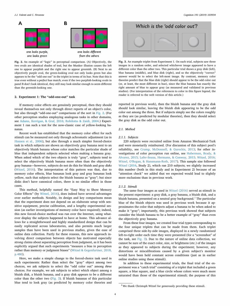
For example, ask yourself: “If a teal object had its color moveroughly half the distance towards red in color space, and another tealobject had its color move roughly half the distance towards green, andthey both appeared beside a light purple object, which of the threeobjects would look the most different from the other two?” While youfind yourself working through this problem in your head, look at Fig. 2to see the answer for yourself. Fig. 2a shows two objectively identicalteal ovals (center) whose appearance has been altered by the Munkerillusion: The oval on the left looks purplish, and the oval on the rightlooks greenish—and if subjects were asked to explicitly report thecolors of these ovals, they would surely say so. Additionally, however,the same sort of effect can be revealed by comparison: When the twoovals appear next to an objectively purple oval (Fig. 2b), the greenish-looking oval now looks different from the other two. If you were askedto identify the “odd color out” from the display, you could easily pointto the rightmost, greenish-looking oval.
Notice that this straightforward experience of one object standingout from the rest reflects a kind of “logical” relationship amongotherwise-basic perceptual processes: First, multiple stimuli undergothe Munker illusion, in which a stimulus is assimilated to the color of itsforeground; then, the stimuli that now carry these illusory colors areeach compared to one another and to a third stimulus, which looks as itdoes for independent reasons; finally, one of these pairwise compar-isons comes out “same” while two of them come out “different”, re-sulting in one object standing out from the rest. When reading theriddle-like question that began the previous paragraph, one finds one-self laboring through this logic, as if slowly and tentatively solving apuzzle; but that same logic is implemented flawlessly and near-in-stantaneously in visual processing, as you can see in Fig. 2b.
Crucially for our purposes here, the “odd one out” judgment you canmake in Fig. 2b does not require you to actually name the color that theobjects are. Indeed, a distinct advantage of this approach is that one canobtain evidence that the illusion is working without ever asking whichcolor the objects appear to be; given the logic of these comparisons, allthat is required is a judgment about which object looks most differentfrom the others.
1.4. The present studies: The logic of appearance in memory color effects
Here, we exploit this perceptual logic for the case of memory coloreffects. Rather than ask subjects to report the colors they see, and ratherthan make subjects apply a pre-conceived color standard, we showsubjects sets of objects that have or don’t have canonical colors, and weask subjects to identify similarities and differences between them.Experiments 1 and 2 apply this multi-step logic of comparison to con-temporary memory color effects discovered in recent years, whileExperiments 3 and 4 explore classical memory color effects from themiddle of the last century. In all cases, we ask whether such effectspersist when their underlying theories make predictions that would bedifficult for subjects to follow or provide strategic answers for.
In other words, we ask: Do memory color effects obey the logic ofappearance?
1 Indeed, if subjects take this approach to the achromatic adjustment task,then this might even explain why memory color effects revealed by that taskhave typically been stronger for colors on the daylight axis (e.g., blues andyellows) than for other colors, especially reds (e.g., a strawberry image inOlkkonen et al., 2008; though see Delk & Fillenbaum, 1965, who do findmemory color effects for red objects). Since color discrimination is poorer alongthe blue-yellow daylight axis (Pearce, Crichton, Mackiewicz, Finlayson, &Hurlbert, 2014), it may be easier to discriminate purely achromatic gray from aslightly greenish gray than it is to discriminate purely achromatic gray from aslightly bluish gray. In that case, subjects who are asked to make a banana“gray” are able to stray relatively far into blue territory while still judging theblue-gray sample to be acceptably gray; by contrast, subjects who are asked tomake a strawberry “gray” will tolerate only just a bit of green in the sample,because anything more would be easily noticed. The relative weakness or ab-sence of memory color effects for red objects has sometimes been taken asevidence for their perceptual nature (e.g., Block, 2016); but in fact, even thisfairly specific pattern of results can still be explained by biased responding,once other baseline aspects of perceptual discrimination are taken into account(in particular, baseline differences in the discriminability of different colors).
J.J. Valenti and C. Firestone Cognition 191 (2019) 103934
3
2. Experiment 1: The “odd-one-out” task
If memory color effects are genuinely perceptual, then they shouldreveal themselves not only through direct reports of an object’s color,but also through “odd-one-out” comparisons of the sort in Fig. 2. (Forother perception studies employing analogous tasks in other domains,see Adams, Kerrigan, & Graf, 2016; Robilotto & Zaidi, 2004.) Experi-ment 1 ran such a test for the now-classic case of yellow-looking ba-nanas.
Recent work has established that the memory color effect for suchstimuli can be measured not only through achromatic adjustment (as inHansen et al., 2006), but also through a much simpler forced-choicetask in which subjects are shown an objectively gray banana next to anobjectively bluish banana whose color matches the particular shade ofblue that independent subjects selected when making a banana gray.When asked which of the two objects is truly “gray”, subjects tend toselect the objectively bluish banana more often than the objectivelygray banana—however, subjects do not do this for bluish and gray disks(Witzel, 2016). The interpretation of this pattern was that, due tomemory color effects, blue bananas look gray and gray bananas lookyellow, such that subjects select the bluish banana as “gray”; but sincedisks don’t have canonical colors, there is no similar effect in thosecases.
This method, helpfully named the “Easy Way to Show MemoryColor Effects” (by Witzel, 2016), does indeed have several advantagesover earlier methods. Notably, its design and key comparisons meanthat the experiment does not depend on an elaborate setup with sen-sitive equipment, precise calibration, and a lengthy experimental ses-sion (as earlier investigations of memory color have required); indeed,this new forced-choice method was run over the Internet, using what-ever display the subjects happened to have at home. This advance al-lows for a straightforward and highly standardized design that can beeasily replicated across laboratories, and also permits much largersamples than have been used in previous studies, given the ease ofonline data collection. Partly for these reasons, this new approach in-volving direct comparison between objects has motivated especiallystrong claims about separating perception from judgment, as it has beenexplicitly argued that such experiments “measure a bias in perceptionrather than memory or judgment biases” (Witzel & Gegenfurtner, 2018,p.480).
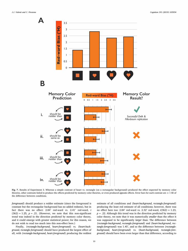
Here, we make a simple change to the forced-choice task used insuch experiments: Rather than select the “gray” object among twochoices, we ask subjects to select the “odd color out” among threechoices. For example, we ask subjects to select which object among abluish disk, a bluish banana, and a gray disk appears to be a differentcolor than the other two (Fig. 3). If bluish bananas of this particularblue tend to look gray (as predicted by memory color theories and
reported in previous work), then the bluish banana and the gray diskshould look similar, leaving the bluish disk appearing to be the oddcolor out among the three. But if subjects simply see the colors roughlyas they are (as predicted by modular theories), then they should selectthe gray disk as the odd color out.
2.1. Method
2.1.1. Subjects220 subjects were recruited online from Amazon Mechanical-Turk
and were monetarily reimbursed. (For discussion of this subject pool’sreliability, see Crump, McDonnell, & Gureckis, 2013; for other in-vestigations of color perception run online, see Haberman, Brady, &Alvarez, 2015; Lafer-Sousa, Hermann, & Conway, 2015; Witzel, 2016;Witzel, O’Regan, & Hansmann-Roth, 2017). This sample size followedWitzel (2016, Study 2), which ran 210 subjects; we slightly increasedthis number (both in this study and in Experiment 2) because of an“attention check” we added that we expected would lead to slightlymore exclusions than in previous work.
2.1.2. StimuliThe same four images as used in Witzel (2016) served as stimuli in
the present experiment: a gray disk, a gray banana, a bluish disk, and abluish banana, presented on a neutral gray background.2 The particularblue of the bluish objects was used in previous work because it ap-proximates the color that subjects adjust a banana to be when asked tomake it “gray”; importantly, this previous work showed that subjectsconsider the bluish banana to be a better example of “gray” than eventhe objectively gray banana.
From these four images, we created four trial types corresponding tothe four unique triplets that can be made from them. Each tripletcomprised three side-by-side images, displayed in a newly randomizedleft-to-right order each time they were presented (for a “screenshot” ofthe task, see Fig. 3). Due to the nature of online data collection, wecannot be sure of the exact color, size, or brightness (etc.) of the imagesas they appeared to subjects during the experiment; however, anydistortions or miscalibrations caused by a given subject’s monitorwould have been held constant across conditions (just as in earlieronline studies using these stimuli).
In addition to these experimental trials, the final trial of the ex-periment was a “catch trial” consisting of a triplet that included a greensquare, a blue square, and a blue circle whose colors were much moresaturated than those of the experimental stimuli; the purpose of this
Fig. 2. An example of “logic” in perceptual comparison. (A) Objectively, thetwo ovals are identical shades of teal, but the Munker illusion causes the leftone to appear purplish and the right one to appear greenish. (B) Next to anobjectively purple oval, the green-looking oval not only looks green but alsoappears to be the “odd one out” in the triplet in terms of its hue. Note that this istrue even without a perfect hue match; even if the two purplish-looking ovals inpanel B don’t look identical, they still may look similar enough to seem differentthan the greenish-looking one.
Fig. 3. An example triplet from Experiment 1. On each trial, subjects saw threeimages in a random order, and selected whichever image appeared to have adifferent color than the other two. This particular trial shows a gray disk (left),blue banana (middle), and blue disk (right), and so the objectively “correct”answer would be to select the left-most image. By contrast, memory colortheories predict that the blue disk (right) should appear to be the odd color out(or, at least, the most different in hue), since the blue banana has exactly theright amount of blue to appear gray (as measured and validated in previousstudies). (For interpretation of the references to color in this figure legend, thereader is referred to the web version of this article.)
2 We thank Christoph Witzel for generously providing these stimuli.
J.J. Valenti and C. Firestone Cognition 191 (2019) 103934
4

relatively “easy” trial was to ensure that the subjects understood thetask and were paying attention (since the correct answer was obviouslythe green square).
2.1.3. ProcedureSubjects were first shown an instruction page which informed them
that they would see three objects on each of many subsequent pages,and that they should “judge which one looks to be a slightly differentcolor from the other two, by clicking on that object.” The instructionpage also showed subjects an “easy” practice triplet that included a(much more saturated) blue circle, yellow square, and yellow circle;subjects were told, for this example, that they “should select the bluecircle, since it is a different color from the other two objects”, but alsothat “the real experiment will be much harder than this, though! Thecolors will be very hard to tell apart, so look closely.”
In the experiment itself, subjects completed the odd-color-out task10 times for each of the four trial types, for a total of 40 experimentaltrials; the trials appeared in blocks of four (one for each of the four trialtypes), with the trial order randomized within each block. The relativeposition of each individual image within the triplet (i.e. left, middle, orright) was randomly chosen for each trial. Subjects could only advanceto the next trial after clicking on one of the three images displayed.There was no time limit on responses. After making a selection, all ofthe images disappeared from the screen, followed by a 2000ms intervalbefore the next trial’s images appeared.
After all 40 experimental trials, the “catch” trial appeared; this waslater used as an exclusion criterion to ensure that subjects understoodthe task.
Readers can experience the task for themselves at http://perceptionresearch.org/bananas.
2.2. Results and discussion
21 subjects were excluded either for failing to provide a completedataset (4/220) or for failing to correctly answer the “catch” question(17/220), leaving 199 subjects with usable data. However, none of theresults reported here depended on these exclusions (i.e. all of the effectsbelow remain statistically reliable, in the same direction, even withoutexcluding these subjects).
For each triplet type, we can consider the prediction made by thememory color view (according to which blue bananas appear gray, andgray bananas appear yellow) and the prediction made by the “modular”view (according to which color knowledge does not affect color ap-pearance), and compare the data to those predictions.3 To foreshadowthe general pattern, every triplet yielded the result predicted by themodular view, and none of them yielded the result predicted by thememory color view (Fig. 4).
For the triplet consisting of {gray disk, bluish banana, bluish disk},memory color theory predicts that the blue banana should appear gray,and thus that subjects should pick the bluish disk as the odd color out;by contrast, the modular view predicts that subjects should pick thegray disk as the odd color out, since the bluish banana should looksimilar to the equally blue disk (Fig. 4a). In fact, 68.9% of subjectsselected the gray disk as the odd color out (the choice consistent withthe modular view), and only 1.4% of subjects selected the blue disk as
the odd color out (the choice consistent with memory color), χ2(2,N= 148)=102.32, p < .001; the remaining 29.7% of subjects se-lected the bluish banana as the odd color out, which is predicted byneither view. (Given the subtlety of the differences in color for theseimages, we suspect that subjects who couldn’t detect a meaningfuldifference in color between the three images simply defaulted topicking the odd shape out, which in this triplet was the bluish banana.Another possibility is that, being unable to detect any difference in hue,subjects considered the difference in shading of this third object to be arelevant difference in “color”, and so chose it for that reason. As is clearbelow, other conditions reveal a similar odd-shape-out pattern.)
For the triplet consisting of {bluish banana, gray disk, gray banana},memory color theory predicts that the blue banana should appear gray(like the gray disk), and the gray banana should appear yellow, andthus that subjects should pick the yellow-looking gray banana as theodd color out; by contrast, the modular view predicts that subjectsshould pick the bluish banana as the odd color out, since the gray ba-nana should look similar to the equally gray disk, and the bluish bananashould look blue. In fact, 64.8% of subjects selected the bluish bananaas the odd color out (the choice consistent with the modular view), andonly 4.1% of subjects selected the gray banana as the odd color out (thechoice consistent with memory color); χ2(2, N= 148)=82.52,p < .001. The remaining 31.1% of subjects selected the gray disk as theodd color out, which is predicted by neither view and is again con-sistent with deferring to an “odd shape out” strategy.
For the triplet consisting of {bluish disk, gray banana, gray disk},memory color theory predicts that the objects should appear to be threedifferent colors—the gray banana should appear yellow, the gray diskshould appear gray, and the bluish disk should appear blue—and thusthat there should be no salient “odd color out”; in that case, any optionshould perhaps be equally likely as another. By contrast, the modularview straightforwardly predicts that subjects should pick the bluish diskas the odd color out, since the other two objects are gray. In fact, therewas a salient odd color out: 69.6% of subjects selected the bluish disk asthe odd color out (the choice consistent with the modular view),whereas 0 subjects selected the blue banana as the odd color out, and30.4% of subjects selected the gray banana as the odd color out; χ2(2,N= 148)=108.20, p < .001.
For the triplet consisting of {gray banana, bluish disk, bluish banana},memory color theory predicts that the objects should appear to be threedifferent colors—the gray banana should appear yellow, the bluishbanana should appear gray, and the bluish disk should appearblue—and thus that there should be no salient “odd color out”; in thatcase, any option should perhaps be equally likely as another. By con-trast, the modular view straightforwardly predicts that subjects shouldpick the gray banana as the odd color out, since the other two objectsare blue. In fact, there was a salient odd color out as indicated bysubjects’ responses: 68.9% of subjects selected the gray banana as theodd color out (the choice consistent with the modular view), whereas0.7% of subjects selected the blue banana as the odd color out, and31.4% of subjects selected the bluish banana as the odd color out; χ2(2,N= 148)=104.06, p < .001.
In other words, across these four triplets, subjects’ responses alwaysfavored the modular account and never favored the memory color ac-count, even when memory color theories made clear predictions aboutwhich objects should look different than the others in a given triplet.
Indeed, even if the memory color effects in our study somehowvaried in strength relative to previous studies (even though we used thesame stimuli as Witzel, 2016, under closely matched conditions), it isstriking just how unpopular the memory color theory’s predicted “odd-one-out” was for subjects. For example, suppose that for the tripletconsisting of {gray disk, bluish banana, bluish disk} (shown in Fig. 4a), itturned out that the memory color effect was somehow weaker than inprevious work, such that the bluish banana was perceptually biasedonly halfway towards achromatic gray, rather than completely towardsachromatic gray as in previous studies. Even then, memory color
3 Given that there were 10 repetitions of each triplet, it was possible forsubjects to respond inconsistently across repetitions, which may have been amarker of low engagement on the part of the subject; to ensure that random orunthoughtful responses did not contaminate the results, we considered re-sponses only from those subjects who consistently selected the same triplet-member a majority of the time across repetitions (i.e., greater than 5 times outof 10 opportunities). This left 148 subjects (from the original 199). Once again,however, none of the results depended on such exclusions: All of the contrastsand inferential statistics reported here remain statistically significant evenwhen these subjects are not excluded.
J.J. Valenti and C. Firestone Cognition 191 (2019) 103934
5

theories should predict that the gray disk and bluish disk should bechosen roughly equally often, and that the bluish banana should bechosen least often (since it would be most perceptually similar to theother two images); but this pattern was not observed either—instead,subjects just behaved as though they saw the relative coloring accu-rately and without distortion.
Overall, we took these general patterns of results as initial evidencethat memory color effects fail to obey the “logic” expected of bona fideperceptual effects.
3. Experiment 2: “Where were the bananas?”
Experiment 1 suggested that subjects fail to respond according tothe memory color theory in cases with clear predictions about whichobjects should look similar and which should look different. However,one possibility is that our task caused subjects to focus too closely onthe particular colors of certain pixels on the display, and perhapsthereby fail to represent the images as objects with known colors. Thiscould undermine the validity of the results, since it is critical to memorycolor effects that subjects represent canonically colored objects as thoseobjects—i.e., that they are representing the banana as a banana whileviewing it.
Fig. 4. Results from Experiment 1. (A) Subjects accurately identified a gray disk as the “odd color out”, even though memory color theories predict that the blue diskshould be perceived as the odd color out (because the blue banana should appear gray). (B) Across all trial types, the most popular selection was always the perceivedodd color out predicted by a modular view, and never the perceived odd color out predicted by memory color theory. (For interpretation of the references to color inthis figure legend, the reader is referred to the web version of this article.)
J.J. Valenti and C. Firestone Cognition 191 (2019) 103934
6

To give memory color effects the best chance of revealing them-selves in this task, Experiment 2 included a secondary task after eachodd-color-out judgment, in which the objects disappeared from thescreen and subjects had to identify the locations of all the bananaimages that had been present a moment earlier. Since the images wereno longer on the display during this secondary task, accurate perfor-mance on it required subjects to have earlier noticed which objectswere bananas and which weren’t (or, at least, to have encoded theirshapes in some way, rather than just the colors of a few pixels). Thisencouraged subjects to represent the bananas as bananas while makingcolor judgments about them, since subjects knew at the time of viewingthe stimuli that they would later have to report the locations of thebananas from memory.4 This experiment also served as a replication ofExperiment 1 (and otherwise proceeded in exactly the same way), toensure the reliability of the relevant patterns.
3.1. Method
This experiment was identical to Experiment 1 except as follows. Anew group of 250 subjects participated. (We conservatively increasedthe sample size because of an additional exclusion criterion related tothe secondary task.) After making each odd-color-out judgment, theimages disappeared and were replaced 500ms later by three emptyboxes in the same locations as the trial images. Subjects were asked“Where were the bananas?”, and could click as many or as few of theboxes as they liked; when they were satisfied with their answer, sub-jects clicked a button labeled “I’ve chosen the banana(s)”, after whichthe boxes disappeared for 2000ms and were then replaced by theimages for the next trial (Fig. 5).
To ensure that we only analyzed data from subjects who were re-presenting the bananas as bananas, we excluded any subject who failedto perform above 90% accuracy across all of the “Where were the ba-nanas?” trials; this resulted in the additional exclusion of 7 subjects(2.8% of the total sample).
3.2. Results and discussion
Every finding from Experiment 1 was replicated in Experiment 2.For the triplet consisting of {gray disk, bluish banana, bluish disk},
73.9% of subjects selected the gray disk as the odd color out (the choiceconsistent with the modular view), and only 2.5% of subjects selectedthe blue disk as the odd color out (the choice consistent with memorycolor).
For the triplet consisting of {bluish banana, gray disk, gray banana},70.8% of subjects selected the bluish banana as the odd color out (thechoice consistent with the modular view), and only 5.0% of subjectsselected the gray banana as the odd color out (the choice consistentwith memory color).
For the triplet consisting of {bluish disk, gray banana, gray disk},75.8% of subjects selected the blue disk as the odd color out (the choiceconsistent with the modular view); memory color predicts that all threeobjects should appear different colors, and thus that any option shouldbe as likely a response as any other.
For the triplet consisting of {gray banana, bluish disk, bluish banana},73.9% of subjects selected the gray banana as the odd color out (thechoice consistent with the modular view); memory color predicts thatall three objects should appear different colors, and thus that any optionshould be as likely a response as any other.
In other words, every triplet showed the pattern predicted by themodular view, and none of them showed the pattern predicted by thememory color view, even among subjects who were actively re-presenting the bananas as bananas. Indeed, if anything, these patternswere stronger here than in Experiment 1, despite the increased focus on
the bananas’ identities.This result further suggests that memory color effects do not obey
the “logic” expected of genuine perceptual effects, and instead behaveexactly as they should if they are simply perceived without this sort ofdistortion. For example, if bluish bananas truly look gray, then theyshould resemble gray disks (recall that blue shade used here was spe-cifically chosen by memory color researchers to match the shade thatsubjects choose for a banana to be “gray”); however, we found theopposite pattern—subjects’ answers were least consistent with thememory color theory, and most consistent with the traditional viewthat blue objects look blue and gray objects look gray, no matter thesubject’s knowledge about their canonical colors.
4. Experiment 3: Perceptual logic in classical memory color effects
The previous experiments explored a new way to study alleged ef-fects of knowledge on perception, by asking whether memory coloreffects obey a “logic” that should be expected of genuinely perceptualphenomena. In focusing on the strongest and most recent work onmemory color effects, however, these studies dealt with only one sort ofstimulus, and only one sort of claim. How generally can this strategy beapplied?
To answer this question, Experiment 3 turned from contemporarywork on memory color effects to the classical investigations that in-spired this more recent work—in particular, a report from the middle ofthe last century that heart-shapes appear redder than identically co-lored shapes that don’t have strong color associations (Delk &Fillenbaum, 1965). In that study, subjects viewed shapes cut out oforange-red cardboard, which appeared against a color-adjustablebackground. The subjects’ task was to adjust the background to matchthe color of the presented shape (by giving instructions to an experi-menter), and the results showed that subjects selected a redder back-ground for the heart than they did for shapes without canonical colors(e.g., circles, triangles, or rectangles).
On one hand, this earlier result may seem weaker than more recentmemory color work, in that the study relied on methods that seemespecially prone to bias: For example, the experimenters themselvesoperated the dials that adjusted the background’s color, which couldhave contaminated the results in favor of the experimenters’ hypotheses(Gilder & Heerey, 2018). At the same time, one relative strength ofthese studies is that they involved matching the colors of two stimuli,rather than adjusting one stimulus to some internal standard (cf. theachromatic adjustment method of Hansen et al., 2006). As noted ear-lier, relying on the subject’s own notions of such color categories canpose problems for isolating perceptual effects per se, given the con-textual flexibility of such subjectively defined color standards. Percep-tual matching tasks such as these may also be less susceptible to al-ternative explanations based on differences in memory rather thanperception (Cooper, Sterling, Bacon, & Bridgeman, 2012; Firestone &Scholl, 2015b), since they involve affirming the similarity of two cur-rently visible stimuli. In light of these factors, and in light also of thisclassic study’s prominence in contemporary debates over cognitive (im)penetrability (Brogaard & Gatzia, 2017; Deroy, 2013; Gatzia, 2017;Gross, Chaisilprungraung, Kaplan, Menendez, & Flombaum, 2014;Macpherson, 2012; Stokes, in press; Vetter & Newen, 2014; Zeimbekis,2013), we asked whether this phenomenon might also be susceptible toa test of perceptual “logic”.
4.1. El Greco, juiced-up
Our study in this vein is a variant on the “El Greco fallacy”—anepisode from art history that has also become a technique for separatingperception from judgment (Firestone, 2013b; Firestone & Scholl, 2014;Martin, Sackur, Anlló, Naish, & Dienes, 2016). El Greco famouslypainted figures that were unusually elongated, and it was once theo-rized that this reflected a distortion in the Spanish renaissance artist’s4 We thank Molly O'Rourke-Friel for a comment that inspired this design.
J.J. Valenti and C. Firestone Cognition 191 (2019) 103934
7

vision due to unusually severe astigmatism, which was said to verticallyblur his perception of the world. However, if El Greco truly experienceda vertically stretched-out world, then he would also have experienced avertically stretched-out canvas, and the distortions would have ‘can-celed out’. So, whether or not El Greco had astigmatism, that couldn’texplain the distortions in his paintings. For perception research, themoral is the same: If an alleged effect is truly perceptual, and if the‘equipment’ used to measure this effect it itself similarly susceptible tothe manipulation, then the effect should disappear when the manip-ulation is applied to both the stimulus and the measuring equipment.
Here, we develop an even stronger and more comprehensive versionof the El Greco fallacy than has been used in previous research, to askwhether classical memory color effects obey the “logic” of perception:We run four conditions of the original Delk & Fillenbaum study, ratherthan two, corresponding to all possible pairs of backgrounds and fore-grounds made up of hearts and rectangles. In other words, subjects notonly saw hearts and rectangles on rectangle-shaped backgrounds (as inthe original study), but also hearts and rectangles on heart-shapedbackgrounds5 (Fig. 6).
The shape of the background itself is relevant because, if hearts lookredder than rectangles, then heart-shaped backgrounds should them-selves appear redder than rectangle-shaped backgrounds, and subjects’color matching judgments should incorporate this distortion too.However, while memory color theories make clear and strong predic-tions about such cases, those predictions can be difficult to quickly andreliably wrap one’s mind around. For example, try to quickly determinehow estimates for an orange-red rectangle on a heart-shaped back-ground should differ from estimates for an orange-red heart on a rec-tangle-shaped background. Memory color theory is committed to just asstrong a prediction about such a case as it is in the original case, but wemay find ourselves struggling to immediately and confidently articulatethis prediction. (The answer is that a rectangle on a heart-shapedbackground should produce an objectively more orange estimate than aheart on a rectangle-shaped background, in part owing to the extraredness present in the adjustable background.) Indeed, for each of thepairwise comparisons between these conditions, the memory colortheory makes an equally strong prediction; the present experiment ex-hausts these predictions and asks whether they are confirmed.
4.2. Method
4.2.1. Subjects400 subjects were recruited online from Amazon Mechanical-Turk
and were monetarily reimbursed.
4.2.2. StimuliThe stimuli in this experiment consisted of either a love-heart shape
or a rectangle, both appearing in a red-orange fill with a thin blackoutline. The precise shapes and colors used in the original Delk andFillenbaum study were either unknown or difficult to reproduce on acomputer monitor; however, we chose a conventional love-heart shapefor the heart, and we chose an orange-red color for the foregroundshapes corresponding to RGB(242, 59, 13), or its equivalent HSV(12°,95%, 95%). This color is naturally judged as an example of “red”—and
Fig. 5. Design of Experiment 2. After picking theodd color out from the display, subjects wereasked to recall the locations of the banana(s) thathad been on the screen. This required subjects tofocus on the identity of the objects while makingtheir initial choice, thereby encouraging subjectsto represent the banana images as bananas.
Fig. 6. Design of Experiment 3. (A) Subjects saw a shape on a color-adjustablebackground, and estimated its color by continuously adjusting the color of thebackground shape to match the color of the foreground shape. (B) The four trialtypes included a rectangle on a rectangular background, a heart on a rectan-gular background, a rectangle on a heart-shaped background, and a heart on aheart-shaped background.
5 We thank Eli Shupe for a comment that inspired this design. Gross et al.(2014) also take a similar approach.
J.J. Valenti and C. Firestone Cognition 191 (2019) 103934
8

is often called “orange red” in web color guides—but still leaves roomin the red-ward direction of the color space. (In HSV color space, red isconventionally located at 0°, and orange is conventionally located at30°; our sample was located at 12°.) The background against whichthese shapes appeared was either a larger rectangle, or a larger versionof the same heart shape. As earlier, the nature of online data collectionmeans that we cannot be sure of the exact color, size, or brightness(etc.) of the images as they appeared during the experiment; however,any distortions or miscalibrations caused by a given subject’s monitorwould have been held constant across conditions (just as in previouswork studying memory color effects online; Witzel, 2016).
4.2.3. ProcedureSubjects were instructed to “adjust the color of the background until
it looks the same as the color of the object in the middle”, and theycompleted one trial of each of four trial types, corresponding to the fourpairs of foreground and background shapes: {rectangle-background,rectangle-foreground}, {rectangle-background, heart-foreground}, {heart-background, rectangle-foreground}, {heart-background, heart-foreground}(Fig. 6). The trials appeared in a newly randomized order for eachsubject.
On each trial, the background began colored in black, and subjectsclicked a button to reveal a color palette through which they couldnavigate using their cursor; as the cursor moved through the space, thebackground’s color changed to match the cursor’s location in the colorspace. Subjects clicked a button to indicate that they were satisfied withthe match, at which point the next trial appeared.
Readers can experience the task for themselves at http://perceptionresearch.org/hearts.
4.3. Results and discussion
Following previous work (Gross et al., 2014), we analyzed responsesin terms of the degree-difference in hue within the HSV color space,which allows the analysis to collapse over differences in saturation orbrightness and instead isolate the “redness” vs. “orangeness” of re-sponses. The degree-value of a given color response represents its an-gular position within a cylindrical color space: 0° is red, 60° is yellow,120° is green, etc.
Given the sensitivity of color matching to extreme values (where asingle “random” response by a single subject can throw off dozens orhundreds of subtle responses by other subjects), we excluded any sub-ject whose response on any trial was more than 60° away from theobject’s true color; this is equivalent to answering that a deeply blueobject is pink, or a purely red object is yellow, and so would seem toindicate a lack of engagement or understanding on the part of thesubject. We also excluded any subject who failed to contribute a com-plete dataset. This left 363 subjects of the original 400. (We also usedthese exact same exclusion criteria in a replication experiment; seeExperiment 4.)
The results of all four conditions appear together in Fig. 7a, and areplotted as the bias in hue toward red from the foreground image’s truehue (which was 12° in every condition).6 Below, we consider the var-ious pairwise comparisons that are possible between these conditions,and whether the memory color prediction was in fact observed.
4.3.1. Replication of Delk and FillenbaumWe first examined the effect from the original Delk and Fillenbaum
study, which had found that hearts are judged as redder than familiar
shapes that don’t have strong color associations; in our experiment, thiswas equivalent to the {rectangle-background, heart-foreground} vs. {rec-tangle-background, rectangle-foreground} contrast (Fig. 7b, comparison i).We successfully replicated this effect: In our sample too, subjects ad-justed the background rectangle to be redder when the foreground wasa heart than when the foreground was a square: 2.84° red-ward vs.1.39° red-ward, t(362)= 4.17, p < .001. Though this effect is rathersmall in terms of raw degrees of hue, this result establishes the relia-bility of Delk and Fillenbaum’s original finding—and indeed this maybe the first study in several decades to do so. Color estimates for heartstruly are redder than estimates for identically colored squares.
4.3.2. Exhausting the predictions of memory color theoriesIs this effect truly perceptual? Having established the reliability of
the key rectangle vs. heart contrast, we can now examine other con-trasts about which the memory color theories make equally strongpredictions. For example, consider the contrast between {heart-back-ground, heart-foreground} and {rectangle-background, rectangle-fore-ground} (Fig. 7b, comparison ii): In both cases, a given foregroundshape is matched to an identical background shape, and so there shouldbe no effect of the shapes’ identities; if hearts appear redder than rec-tangles, then both the foreground heart and the background heartshould appear redder, and the effects should cancel out, since the mindwould also have added some extra redness to the background heart.However, we did observe an effect between these two conditions:Subjects judged a heart to be redder than a rectangle even when thebackground of the heart was itself a heart: 2.41° red-ward vs. 1.39° red-ward, t(362)= 2.82, p= .005. This pattern exemplifies the character-istic “El Greco fallacy” result; if hearts truly look redder, then thereshould have been no difference between these two cases.
Importantly, however, the design of this experiment permits evenmore comprehensive and powerful tests of the memory color theory’spredictions. Even beyond the “El Greco” pattern, we can consider othercontrasts—for example, the contrast between {rectangle-background,rectangle-foreground} and {heart-background, rectangle-foreground}(Fig. 7b, comparison iii). Here, with the foreground shape held con-stant, subjects should adjust the heart-shaped background to be moreorange (i.e., less red) than the rectangle-shaped background, to accountfor the added redness that the mind allegedly adds to hearts. However,we did not observe this effect, and indeed if anything we observed theopposite effect: Subjects adjusted the background to be redder in the{heart-background, rectangle-foreground} condition than in the {rec-tangle-background, rectangle-foreground} condition: 2.32° red-ward vs.1.39° red-ward, t(362)= 2.12, p= .03—the reverse of the memorycolor prediction. (Note that it is not particularly crucial that this “op-posite” effect be statistically significant; the key result is simply that itfails to differ in the other direction.) This result is perhaps even morepowerful evidence against a perceptual interpretation than the cano-nical “El Greco”-style result, because it is a minimal pair with the ori-ginal Delk and Fillenbaum (1965) result: Switching the heart from theforeground to the background should produce the opposite of the ori-ginal effect, but it does not.
Consider further the contrast between {heart-background, heart-foreground} and {heart-background, rectangle-foreground} (Fig. 7b, com-parison iv); this contrast should behave exactly like the original Delkand Fillenbaum contrast of {rectangle-background, rectangle-foreground}vs. {rectangle-background, heart-foreground}, with a redder estimate forthe foreground heart than for the foreground rectangle—since thebackground is held constant across both conditions, and only theforeground shape has changed. However, there was no effect in thiscase—2.41° red-ward vs. 2.32° red-ward, t(362)= 0.24,p > .80—even though we had indeed observed a robust effect in the{rectangle-background, rectangle-foreground} vs. {rectangle-background,heart-foreground} case.
We can also consider {rectangle-background, heart-foreground} vs.{heart-background, heart-foreground}; here, {rectangle-background, heart-
6 To determine the mean H value of subjects’ color settings, rather than thered-ward bias we report here, you could subtract the values in Fig. 7a from 12°;for example, for the {rectangle-background, rectangle-foreground} condition, thered-ward bias was 1.39°, which means subjects set the background to anaverage H value of 12°− 1.39° = 10.61°.
J.J. Valenti and C. Firestone Cognition 191 (2019) 103934
9
foreground} should produce a redder estimate (since the foreground isconstant but the rectangular background has no added redness), but infact there was no effect: 2.84° red-ward vs. 2.41° red-ward, t(362)= 1.25, p= .21. (However, we note that this non-significanttrend was indeed in the direction predicted by memory color theory,and it could emerge with greater statistical power; for this reason, wedo not wish to read too much into this non-effect here.)
Finally, {rectangle-background, heart-foreground} vs. {heart-back-ground, rectangle-foreground} should have produced the largest effect ofall, with {rectangle-background, heart-foreground} producing the reddest
estimate of all conditions and {heart-background, rectangle-foreground}producing the least red estimate of all conditions; however, there wasno effect here too: 2.84° red-ward vs. 2.32° red-ward, t(362)= 1.23,p= .22. Although this trend was in the direction predicted by memorycolor theory, we note that it was numerically smaller than the effect itwas supposed to be significantly larger than: The difference between{rectangle-background, rectangle-foreground} and {heart-background, rec-tangle-foreground} was 1.45°, and so the difference between {rectangle-background, heart-foreground} vs. {heart-background, rectangle-fore-ground} should have been even larger than that difference, according to
Fig. 7. Results of Experiment 3. Whereas a simple contrast of heart vs. rectangle (on a rectangular background) produced the effect expected by memory colortheories, other contrasts failed to produce the effects predicted by memory color theories, or even produced opposite effects. Error bars for each contrast are± 1 SE ofthe difference between conditions.
J.J. Valenti and C. Firestone Cognition 191 (2019) 103934
10
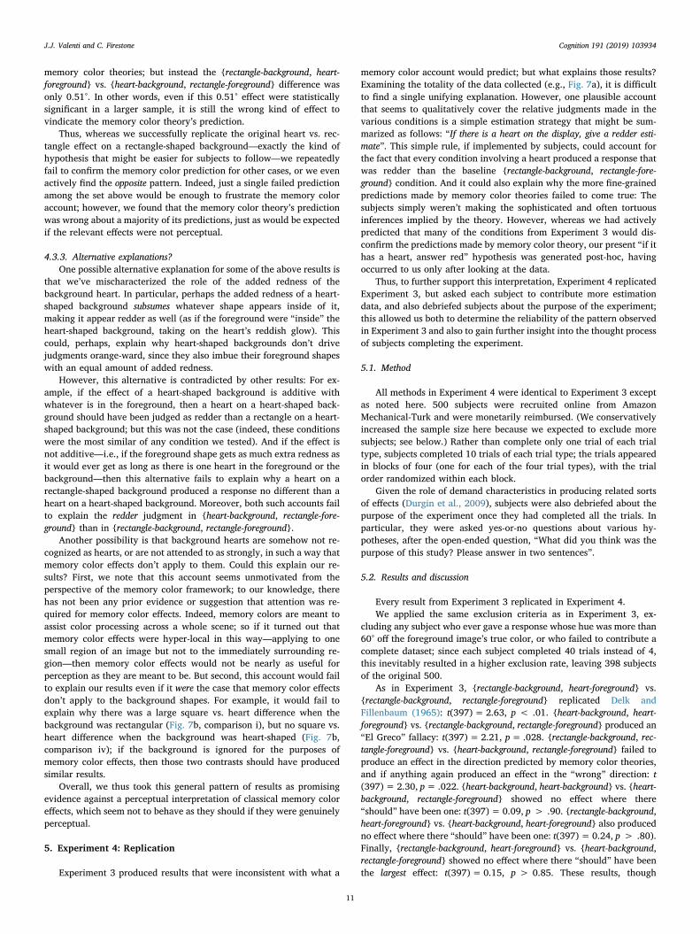
memory color theories; but instead the {rectangle-background, heart-foreground} vs. {heart-background, rectangle-foreground} difference wasonly 0.51°. In other words, even if this 0.51° effect were statisticallysignificant in a larger sample, it is still the wrong kind of effect tovindicate the memory color theory’s prediction.
Thus, whereas we successfully replicate the original heart vs. rec-tangle effect on a rectangle-shaped background—exactly the kind ofhypothesis that might be easier for subjects to follow—we repeatedlyfail to confirm the memory color prediction for other cases, or we evenactively find the opposite pattern. Indeed, just a single failed predictionamong the set above would be enough to frustrate the memory coloraccount; however, we found that the memory color theory’s predictionwas wrong about a majority of its predictions, just as would be expectedif the relevant effects were not perceptual.
4.3.3. Alternative explanations?One possible alternative explanation for some of the above results is
that we’ve mischaracterized the role of the added redness of thebackground heart. In particular, perhaps the added redness of a heart-shaped background subsumes whatever shape appears inside of it,making it appear redder as well (as if the foreground were “inside” theheart-shaped background, taking on the heart’s reddish glow). Thiscould, perhaps, explain why heart-shaped backgrounds don’t drivejudgments orange-ward, since they also imbue their foreground shapeswith an equal amount of added redness.
However, this alternative is contradicted by other results: For ex-ample, if the effect of a heart-shaped background is additive withwhatever is in the foreground, then a heart on a heart-shaped back-ground should have been judged as redder than a rectangle on a heart-shaped background; but this was not the case (indeed, these conditionswere the most similar of any condition we tested). And if the effect isnot additive—i.e., if the foreground shape gets as much extra redness asit would ever get as long as there is one heart in the foreground or thebackground—then this alternative fails to explain why a heart on arectangle-shaped background produced a response no different than aheart on a heart-shaped background. Moreover, both such accounts failto explain the redder judgment in {heart-background, rectangle-fore-ground} than in {rectangle-background, rectangle-foreground}.
Another possibility is that background hearts are somehow not re-cognized as hearts, or are not attended to as strongly, in such a way thatmemory color effects don’t apply to them. Could this explain our re-sults? First, we note that this account seems unmotivated from theperspective of the memory color framework; to our knowledge, therehas not been any prior evidence or suggestion that attention was re-quired for memory color effects. Indeed, memory colors are meant toassist color processing across a whole scene; so if it turned out thatmemory color effects were hyper-local in this way—applying to onesmall region of an image but not to the immediately surrounding re-gion—then memory color effects would not be nearly as useful forperception as they are meant to be. But second, this account would failto explain our results even if it were the case that memory color effectsdon’t apply to the background shapes. For example, it would fail toexplain why there was a large square vs. heart difference when thebackground was rectangular (Fig. 7b, comparison i), but no square vs.heart difference when the background was heart-shaped (Fig. 7b,comparison iv); if the background is ignored for the purposes ofmemory color effects, then those two contrasts should have producedsimilar results.
Overall, we thus took this general pattern of results as promisingevidence against a perceptual interpretation of classical memory coloreffects, which seem not to behave as they should if they were genuinelyperceptual.
5. Experiment 4: Replication
Experiment 3 produced results that were inconsistent with what a
memory color account would predict; but what explains those results?Examining the totality of the data collected (e.g., Fig. 7a), it is difficultto find a single unifying explanation. However, one plausible accountthat seems to qualitatively cover the relative judgments made in thevarious conditions is a simple estimation strategy that might be sum-marized as follows: “If there is a heart on the display, give a redder esti-mate”. This simple rule, if implemented by subjects, could account forthe fact that every condition involving a heart produced a response thatwas redder than the baseline {rectangle-background, rectangle-fore-ground} condition. And it could also explain why the more fine-grainedpredictions made by memory color theories failed to come true: Thesubjects simply weren’t making the sophisticated and often tortuousinferences implied by the theory. However, whereas we had activelypredicted that many of the conditions from Experiment 3 would dis-confirm the predictions made by memory color theory, our present “if ithas a heart, answer red” hypothesis was generated post-hoc, havingoccurred to us only after looking at the data.
Thus, to further support this interpretation, Experiment 4 replicatedExperiment 3, but asked each subject to contribute more estimationdata, and also debriefed subjects about the purpose of the experiment;this allowed us both to determine the reliability of the pattern observedin Experiment 3 and also to gain further insight into the thought processof subjects completing the experiment.
5.1. Method
All methods in Experiment 4 were identical to Experiment 3 exceptas noted here. 500 subjects were recruited online from AmazonMechanical-Turk and were monetarily reimbursed. (We conservativelyincreased the sample size here because we expected to exclude moresubjects; see below.) Rather than complete only one trial of each trialtype, subjects completed 10 trials of each trial type; the trials appearedin blocks of four (one for each of the four trial types), with the trialorder randomized within each block.
Given the role of demand characteristics in producing related sortsof effects (Durgin et al., 2009), subjects were also debriefed about thepurpose of the experiment once they had completed all the trials. Inparticular, they were asked yes-or-no questions about various hy-potheses, after the open-ended question, “What did you think was thepurpose of this study? Please answer in two sentences”.
5.2. Results and discussion
Every result from Experiment 3 replicated in Experiment 4.We applied the same exclusion criteria as in Experiment 3, ex-
cluding any subject who ever gave a response whose hue was more than60° off the foreground image’s true color, or who failed to contribute acomplete dataset; since each subject completed 40 trials instead of 4,this inevitably resulted in a higher exclusion rate, leaving 398 subjectsof the original 500.
As in Experiment 3, {rectangle-background, heart-foreground} vs.{rectangle-background, rectangle-foreground} replicated Delk andFillenbaum (1965): t(397)= 2.63, p < .01. {heart-background, heart-foreground} vs. {rectangle-background, rectangle-foreground} produced an“El Greco” fallacy: t(397)= 2.21, p= .028. {rectangle-background, rec-tangle-foreground} vs. {heart-background, rectangle-foreground} failed toproduce an effect in the direction predicted by memory color theories,and if anything again produced an effect in the “wrong” direction: t(397)= 2.30, p= .022. {heart-background, heart-background} vs. {heart-background, rectangle-foreground} showed no effect where there“should” have been one: t(397)= 0.09, p > .90. {rectangle-background,heart-foreground} vs. {heart-background, heart-foreground} also producedno effect where there “should” have been one: t(397)= 0.24, p > .80).Finally, {rectangle-background, heart-foreground} vs. {heart-background,rectangle-foreground} showed no effect where there “should” have beenthe largest effect: t(397)= 0.15, p > 0.85. These results, though
J.J. Valenti and C. Firestone Cognition 191 (2019) 103934
11

overall weaker in magnitude, confirmed the pattern of results fromExperiment 3.
5.2.1. Subjects’ hypothesesThe present results were also consistent with an estimation strategy
that connects the presence of a heart with redder estimates. InExperiment 4, only the condition without a heart in it—{rectangle-background, rectangle-foreground}—had an estimate that was less redthan any other condition (though, again, other comparisons could re-veal reliable alternative effects with larger samples).
This account is also consistent with responses given by subjectswhen asked about the purpose of the study. Though we do not attempt asystematic coding and analysis of these open-ended responses here, wenote anecdotally that many subjects explicitly articulated Delk andFillenbaum’s original hypothesis, with striking clarity, when simplyasked in an open-ended way what they thought the experiment wastesting. For example:
“maybe people tend to put the heart a little more red”“To see if the shape of the object changed our perceptions of the color ofit”“If you associated red with the heart shaped item, even if the color wasmore orange”“To see how peoples perceptions of color changes with shapes. Maybepeople see hearts as a darker red.”“I think this study was about how shapes affect color perception.”“To see if people make the heart shapes more red colored even if they aremore orange in hue.”“If the shape affected the color choice. Like maybe I see hearts as morered.”“It was maybe about shape and how we perceive its color. For examplewe usually instinctively think red when we see a heart.”“If it's a heart you're more likely to choose a more red color. If it's asquare, you'd pick more orange.”“Maybe to see if the shape affected the color choice”“I think the purpose of the study was to see whether shapes affect colorperception, maybe”“You probably were looking to see a relationship between color matchingand the type of shape.”“to see if i would rate hearts as more red in color”
Taken together, these results imply that memory color effects of thissort may not reflect changes in visual appearance: Not only do theseeffects fail to obey various “logical” constraints, but there are availableexplanations of the effects in terms of strategic or compliant respondingby subjects.
6. General discussion
Does knowing an object’s typical color change its color appearance?Whereas a long-standing research tradition suggests that it does, weextended such claims to new scenarios and circumstances where theunderlying theories make strong and specific predictions that arenevertheless tortuous and difficult to grasp. Across new experimentsspanning classical and contemporary work, we found that such sce-narios fail to produce the effects expected by memory color theorie-s—and often produce the opposite effects. Instead, all such results im-plied that subjects simply saw the objects’ colors in a mannerundistorted by their beliefs or prior knowledge, and that any distortedresponses that did arise could be readily explained by strategic orcompliant responding.
These results may bear on discussions in unusually diverse fields. Invision science, memory color effects have been studied not only asphenomena unto themselves, but also contributors to color constancyand other core processes of color perception (Witzel & Gegenfurtner,2018; Witzel & Hansen, 2015). Although our results do not entail—andwe do not argue—that color appearance cannot be affected by this sort
of color knowledge, we contend that pre-existing data, tasks, and sti-muli fail to settle the issue, such that more work would be required toshow that color knowledge plays this kind of active role in color per-ception. (For different notions of how higher-level cognition might in-teract with color perception, see Webster & Kay, 2012, and Winaweret al., 2007, both of whom also use sets of colored objects but in ratherdifferent designs.) Beyond this, though, these findings reach furtherinto cognitive science more generally, where memory color effects havebeen near the center of broader disputes over the cognitive (im)pe-netrability of perception (Lammers et al., 2017; Lupyan, 2015a; Vetter& Newen, 2014)—and even to philosophy, where the influence ofhigher-level cognition on color perception is discussed not only withrespect to the relationship between cognition and perception (Deroy,2013; Gatzia, 2017; Macpherson, 2012; Zeimbekis, 2013) but also therational formation of perceptual beliefs (Siegel, 2012), and even thenature of aesthetic experience (Stokes, 2014). Indeed, philosophicaldiscussions of memory color effects are often particularly concerned, aswe are here, with the question of whether memory color effects occur atthe level of perceptual phenomenology per se; our results address thisquestion directly and suggest reasons not to accept such claims giventhe available evidence.
6.1. Generally applicable
Beyond the particular implications of the present results, we notefurther that the experimental design strategy employed here is perfectlygeneral, and could be applied to many other alleged cases of top-downeffects on visual appearance. Just as a yellow-distorted blue objectshould look more similar to gray objects than to blue objects, an objectthat allegedly appears darker, larger, or closer due to cognitive factorsshould also show the same pattern.
For example, if positive words truly appear bright and negativewords truly appear dark (Meier, Robinson, Crawford, & Ahlvers, 2007),then perhaps a positive word presented next to both (a) a neutral wordof the same brightness, and (b) a neutral word that is objectivelybrighter, should appear to resemble the brighter word, and thus theequally bright neutral word should stand out as differently bright. Ifdartboards truly look larger after a subject hits them with darts (Cañal-Bruland, Pijpers, & Oudejans, 2010), then a recently hit dartboardpresented next to both (a) an un-hit dartboard of the same size, and (b)an un-hit dartboard that is objectively larger, should appear to resemblethe larger dartboard object in size, such that the equally sized un-hitdartboard should stand out as different in size. If objects truly lookcloser when they are desired (Balcetis & Dunning, 2010), then a desiredobject presented near (a) a neutral object of the same distance, and (b) aneutral object that is objectively closer, should resemble the closerobject in distance, and the equally distant neutral object should standout as different in distance (so too with other reported spatial distor-tions; Caparos, Fortier-St-Pierre, Gosselin, Blanchette, & Brisson, 2015;Fini, Brass, & Committeri, 2015; Harber et al., 2011). Any of thesefindings would strengthen the case for those alleged top-down effects ofcognition on perception (though there may of course be other pitfallslurking in the background; Firestone, 2013a; Firestone & Scholl, 2016).
Indeed, this strategy is applicable even outside questions of howcognition does or does not affect perception: As exemplified by thecolor illusion in Fig. 2, just about any effect on appearance can bestudied using “odd one out” tasks of this sort.
6.2. Generally interpretable
Another notable property of the present strategy—and in particularof the “odd one out” task explored in Experiments 1–2—is that the datait yields are interpretable in an unusually broad and powerful way. Oneunfortunate but often necessary feature of many investigations of top-down effects on perception—and indeed of many studies in psychologyas a whole—is that statistically significant “positive” effects are
J.J. Valenti and C. Firestone Cognition 191 (2019) 103934
12
typically easier to interpret than “null” effects (cf. Gallistel, 2009). Forexample, if a study finds that wearing a heavy backpack makes hillslook steeper (a la Bhalla & Proffitt, 1999), one might tentatively con-clude that a real effect is present; but if you don’t find this result, youmight attribute such a failure to other factors, such as a lack of statis-tical power or a failure to properly apply the manipulation. Indeed, thisissue can even afflict strategies such as the “El Greco fallacy” (Firestone& Scholl, 2014) to at least some degree: If you find an effect in an “ElGreco” condition, you may infer that a given effect may not be per-ceptual; but if you don’t obtain that result, some other factor couldagain be the culprit (including even statistical power, as perhaps wasthe case in Gross et al., 2014, who report a study similar in spirit to ourExperiment 3 but who fail to replicate the general Delk and Fillenbaumresult in a sample of 25 subjects).
By contrast, the data from the “odd-color-out” task used here areinterpretable on multiple outcomes, since they can produce statisticallyreliable results both for or against the relevant theory. For example,consider the {gray disk, bluish banana, bluish disk} triplet fromExperiment 1, where memory color theory predicts that the blue ba-nana should appear gray (and thus that subjects should pick the bluishdisk as the odd color out), and where a modular view predicts that thebluish banana should look similar to the equally blue disk (and sosubjects should pick the gray disk as the odd color out). Either of thesetwo contrary predictions could be positively supported by a statisticallyreliable preference to choose one object over another: If subjects pickthe blue disk as the odd color out, then that result actively supportsmemory color theory; but if subjects pick the gray disk as the odd colorout (as occurred in our studies), then that result actively opposesmemory color theory and supports the modular view. (Perhaps the onlyhard-to-interpret result would be completely noisy or random re-sponding.) This is a relative strength of this strategy over previous in-vestigations of perception vs. judgment (including Firestone & Scholl,2014, 2015c), and it makes “odd one out” tasks a promising strategy forthe durable challenge of separating perception from post-perceptualjudgments and responses (Goldstone, de Leeuw, & Landy, 2015; Witt,Taylor, Sugovic, & Wixted, 2015), including even in domains that gobeyond questions of modularity and cognitive impenetrability.
7. Conclusions
How can we separate what we see from what we judge? Thoughexperimentally distinguishing perception from judgment is often diffi-cult, here we have explored one such way, relying on the “logic” that isobeyed by perception but followed only inconsistently or unreliably byhigher-level reasoning. This strategy takes seriously the underlyingclaims of the relevant theories, and simply exhausts their predictions bytesting them in more varied scenarios. We suggest that these results notonly recast extant claims about how knowledge does or does not affectperception (here, of color), but also point toward a new and broadlyapplicable strategy for investigating visual appearance.
Acknowledgements
For comments on previous drafts, we thank Bart Anderson, JacobBeck, David Delijani, Steven Gross, and Maria Olkkonen; for discussion,we thank members of seminars, reading groups, and lab meetings atJohns Hopkins, UMass-Amherst, UNSW, Yale, and York.
Data availability
All data and materials supporting the experiments in this paper areavailable at https://osf.io/9tebu/.
References
Adams, G. K. (1923). An experimental study of memory color and related phenomena.
The American Journal of Psychology, 34, 359–407.Adams, W. J., Kerrigan, I. S., & Graf, E. W. (2016). Touch influences perceived gloss.
Scientific Reports, 6, 21866.Adeyefa-Olasupo, I., & Flombaum, J. I. (2018). Tutorial review: Evidence for the memory
color effect, 1923–2016. PsyArXiv.Balcetis, E., & Dunning, D. (2010). Wishful seeing: More desired objects are seen as closer.
Psychological Science, 21, 147–152.Banerjee, P., Chatterjee, P., & Sinha, J. (2012). Is it light or dark? Recalling moral be-
havior changes perception of brightness. Psychological Science, 23, 407–409.Bannert, M. M., & Bartels, A. (2013). Decoding the yellow of a gray banana. Current
Biology, 23, 2268–2272.Bar, M. (2004). Visual objects in context. Nature Reviews. Neuroscience, 5, 617–629.Barsalou, L. W. (2008). Grounded cognition. Annual Review of Psychology, 59, 617–645.Bhalla, M., & Proffitt, D. R. (1999). Visual-motor recalibration in geographical slant
perception. Journal of Experimental Psychology: Human Perception and Performance, 25,1076–1096.
Block, N. (2016). Tweaking the concepts of perception and cognition. Behavioral and BrainSciences, 39, e232.
Brogaard, B., & Gatzia, D. E. (2017). Is color experience cognitively penetrable? Topics inCognitive Science, 9, 193–214.
Bruner, J. S., Postman, L., & Rodrigues, J. (1951). Expectation and the perception ofcolor. The American Journal of Psychology, 64, 216–227.
Cañal-Bruland, R., Pijpers, J. R. R., & Oudejans, R. R. D. (2010). The influence of anxietyon action-specific perception. Anxiety, Stress & Coping, 23, 353–361.
Caparos, S., Fortier-St-Pierre, S., Gosselin, J., Blanchette, I., & Brisson, B. (2015). The treeto the left, the forest to the right: Political attitude and perceptual bias. Cognition,134, 155–164.
Cooper, A. D., Sterling, C. P., Bacon, M. P., & Bridgeman, B. (2012). Does action affectperception or memory? Vision Research, 62, 235–240.
Crump, M. J. C., McDonnell, J. V., & Gureckis, T. M. (2013). Evaluating Amazon'sMechanical Turk as a tool for experimental behavioral research. PLoS ONE, 8,e57410.
Delk, J. L., & Fillenbaum, S. (1965). Differences in perceived color as a function ofcharacteristic color. The American Journal of Psychology, 78, 290–293.
Deroy, O. (2013). Object-sensitivity versus cognitive penetrability of perception.Philosophical Studies, 162, 87–107.
Duguid, M. M., & Goncalo, J. A. (2012). Living large: The powerful overestimate theirown height. Psychological Science, 23, 36–40.
Duncker, K. (1939). The influence of past experience upon perceptual properties. TheAmerican Journal of Psychology, 52, 255.
Dunning, D., & Balcetis, E. (2013). Wishful seeing: How preferences shape visual per-ception. Current Directions in Psychological Science, 22, 33–37.
Durgin, F. H., Baird, J. A., Greenburg, M., Russell, R., Shaughnessy, K., & Waymouth, S.(2009). Who is being deceived? The experimental demands of wearing a backpack.Psychonomic Bulletin & Review, 16, 964–969.
Durgin, F. H., DeWald, D., Lechich, S., Li, Z., & Ontiveros, Z. (2011). Action and moti-vation: Measuring perception or strategies? Psychonomic Bulletin & Review, 18,1077–1082.
Fini, C., Brass, M., & Committeri, G. (2015). Social scaling of extrapersonal space: Targetobjects are judged as closer when the reference frame is a human agent with availablemovement potentialities. Cognition, 134, 50–56.
Firestone, C. (2013a). How “paternalistic” is spatial perception? Why wearing a heavybackpack doesn’t—and couldn’t—make hills look steeper. Perspectives on PsychologicalScience, 8, 455–473.
Firestone, C. (2013b). On the origin and status of the “El Greco fallacy”. Perception, 42,672–674.
Firestone, C., & Scholl, B. J. (2014). “Top-down” effects where none should be found: TheEl Greco fallacy in perception research. Psychological Science, 25, 38–46.
Firestone, C., & Scholl, B. J. (2015a). Can you experience “top-down” effects on per-ception? The case of race categories and perceived lightness. Psychonomic Bulletin &Review, 22, 694–700.
Firestone, C., & Scholl, B. J. (2015b). Enhanced visual awareness for morality and pa-jamas? Perception vs. memory in “top-down” effects. Cognition, 136, 409–416.
Firestone, C., & Scholl, B. J. (2015c). When do ratings implicate perception versusjudgment? The “overgeneralization test” for top-down effects. Visual Cognition, 23,1217–1226.
Firestone, C., & Scholl, B. J. (2016). Cognition does not affect perception: Evaluating theevidence for “top-down” effects. Behavioral and Brain Sciences, e229, 1–77.
Fodor, J. A. (1983). The modularity of mind: An essay on faculty psychology. Cambridge,MA: MIT Press.
Gallistel, C. R. (2009). The importance of proving the null. Psychological Review, 116,439–453.
Gatzia, D. E. (2017). Cognitive penetration and memory colour effects. Erkenntnis, 81,1–23.
Gilder, T. S. E., & Heerey, E. A. (2018). The role of experimenter belief in social priming.Psychological Science, 29, 403–417.
Goldstein, E. B., & Brockmole, J. (2016). Sensation and perception. Cengage Learning.Goldstone, R. L., de Leeuw, J. R., & Landy, D. H. (2015). Fitting perception in and to
cognition. Cognition, 135, 24–29.Gross, S., Chaisilprungraung, T., Kaplan, E., Menendez, J. A., & Flombaum, J. (2014).
Problems for the purported cognitive penetration of perceptual color experience andMacpherson’s proposed mechanism. Baltic International Yearbook of Cognition, Logicand Communication, 9.
Haberman, J., Brady, T. F., & Alvarez, G. A. (2015). Individual differences in ensembleperception reveal multiple, independent levels of ensemble representation. Journal ofExperimental Psychology: General, 144, 432–446.
J.J. Valenti and C. Firestone Cognition 191 (2019) 103934
13
Hansen, T., Olkkonen, M., Walter, S., & Gegenfurtner, K. R. (2006). Memory modulatescolor appearance. Nature Neuroscience, 9, 1367–1368.
Harber, K. D., Yeung, D., & Iacovelli, A. (2011). Psychosocial resources, threat, and theperception of distance and height: Support for the resources and perception model.Emotion, 11, 1080–1090.
Lafer-Sousa, R., Hermann, K. L., & Conway, B. R. (2015). Striking individual differences incolor perception uncovered by “the dress” photograph. Current Biology, 25,R545–R546.
Lammers, N. A., de Haan, E. H., & Pinto, Y. (2017). No evidence of narrowly definedcognitive penetrability in unambiguous vision. Frontiers in Psychology, 8, 2042.
Lupyan, G. (2015a). Cognitive penetrability of perception in the age of prediction:Predictive systems are penetrable systems. Review of Philosophy and Psychology, 6,547–569.
Lupyan, G. (2015b). Object knowledge changes visual appearance: Semantic effects oncolor afterimages. Acta Psychologica, 161, 117–130.
Machery, E. (2015). Cognitive penetrability: A no-progress report. In J. Zeimbekis, & A.Raftopoulos (Eds.). The cognitive penetrability of perception: New philosophical per-spectives. Oxford University Press.
Macpherson, F. (2012). Cognitive penetration of colour experience: Rethinking the issuein light of an indirect mechanism. Philosophy and Phenomenological Research, 84,24–62.
Malcolm, G. L., Nuthmann, A., & Schyns, P. G. (2014). Beyond gist: Strategic and in-cremental information accumulation for scene categorization. Psychological Science,25, 1087–1097.
Martin, J.-R., Sackur, J., Anlló, H., Naish, P., & Dienes, Z. (2016). Perceiving time dif-ferences when you should not: Applying the El Greco fallacy to hypnotic time dis-tortions. Frontiers in Psychology, 7, 433.
Masters, R., Poolton, J., & van der Kamp, J. (2010). Regard and perceptions of size insoccer: Better is bigger. Perception, 39, 1290–1295.
Meier, B. P., Robinson, M. D., Crawford, L. E., & Ahlvers, W. J. (2007). When “light” and“dark” thoughts become light and dark responses: Affect biases brightness judgments.Emotion, 7, 366–376.
Newen, A., & Vetter, P. (2017). Why cognitive penetration of our perceptual experience isstill the most plausible account. Consciousness and Cognition, 47, 26–37.
Olkkonen, M., Hansen, T., & Gegenfurtner, K. R. (2008). Color appearance of familiarobjects: Effects of object shape, texture, and illumination changes. Journal of Vision,8(13), 1–16.
Pearce, B., Crichton, S., Mackiewicz, M., Finlayson, G. D., & Hurlbert, A. (2014).Chromatic illumination discrimination ability reveals that human colour constancy isoptimised for Blue Daylight Illuminations. PLoS ONE, 9, e87989.
Proffitt, D. R. (2006). Embodied perception and the economy of action. Perspectives on
Psychological Science, 1, 110–122.Pylyshyn, Z. W. (1999). Is vision continuous with cognition? The case for cognitive im-
penetrability of visual perception. Behavioral and Brain Sciences, 22, 341–365.Robilotto, R., & Zaidi, Q. (2004). Limits of lightness identification for real objects under
natural viewing conditions. Journal of Vision, 4, 779–797.Rock, I. (1983). The logic of perception. MIT Press.Schwartz, B. L., & Krantz, J. H. (2017). Sensation and perception. Sage Publications.Siegel, S. (2012). Cognitive penetrability and perceptual justification. Noûs, 46, 201–222.Stokes, D. (2014). Cognitive penetration and the perception of art. Dialectica, 68, 1–34.Stokes, D. (2019). Cognitive penetration and the perception of colour. In D. Brown, & F.
Macpherson (Eds.). Routledge handbook of philosophy of colourRoutledge (in press).van Ulzen, N. R., Semin, G. R., Oudejans, R. R. D., & Beek, P. J. (2008). Affective stimulus
properties influence size perception and the Ebbinghaus illusion. PsychologicalResearch Psychologische Forschung, 72, 304–310.
Vetter, P., & Newen, A. (2014). Varieties of cognitive penetration in visual perception.Consciousness and Cognition, 27, 62–75.
Webster, M. A., & Kay, P. (2012). Color categories and color appearance. Cognition, 122,375–392.
White, C. W., & Montgomery, D. A. (1976). Memory colors in afterimages: A bicentennialdemonstration. Perception & Psychophysics, 19, 371–374.
Winawer, J., Witthoft, N., Frank, M. C., Wu, L., Wade, A. R., & Boroditsky, L. (2007).Russian blues reveal effects of language on color discrimination. Proceedings of theNational Academy of Sciences, 104, 7780–7785.
Witt, J. K. (2011). Action’s effect on perception. Current Directions in Psychological Science,20, 201–206.
Witt, J. K., Taylor, J. E. T., Sugovic, M., & Wixted, J. T. (2015). Signal detection measurescannot distinguish perceptual biases from response biases. Perception, 44, 289–300.
Witzel, C. (2016). An easy way to show memory color effects. i-Perception, 7.Witzel, C., & Gegenfurtner, K. R. (2018). Color perception: Objects, constancy, and ca-
tegories. Annual Review of Vision Science, 4, 475–499.Witzel, C., & Hansen, T. (2015). Memory effects on colour perception. In A. J. Elliot, M. D.
Fairchild, & A. Franklin (Eds.). Handbook of color psychology. Cambridge, UK:Cambridge University Press.
Witzel, C., O’Regan, J. K., & Hansmann-Roth, S. (2017). The dress and individual dif-ferences in the perception of surface properties. Vision Research, 141, 76–94.
Witzel, C., Olkkonen, M., & Gegenfurtner, K. R. (2018). A Bayesian model of the memorycolour effect. i-Perception, 9, 1–16.
Witzel, C., Valkova, H., Hansen, T., & Gegenfurtner, K. R. (2011). Object knowledgemodulates colour appearance. i-Perception, 2, 13–49.
Zeimbekis, J. (2013). Color and cognitive penetrability. Philosophical Studies, 165,167–175.
J.J. Valenti and C. Firestone Cognition 191 (2019) 103934
14


![Luebeck/Niemeyer/Praeger: Finding involutions in finite Lie type … · 2008-12-23 · Finding involutions in finite Lie type groups of odd characteristic ... Chapter 1] or the book](https://static.fdocuments.us/doc/165x107/5f7006e076b114651f597e72/luebeckniemeyerpraeger-finding-involutions-in-finite-lie-type-2008-12-23-finding.jpg)