Final Project Process Book Joy Whiting
8
Colors Show Process Book Joy Whiting Student: Joy Whiting GRA-101 15EW2 Year: 2016 Project Title: Radiolab Colors Show Poster
description
Â
Transcript of Final Project Process Book Joy Whiting

Colors ShowProcess Book
Joy Whiting
Student:Joy Whiting
GRA-10115EW2
Year:2016
Project Title
:
Radiolab Colors Show Poste
r

Design Brief
Design BriefSheerJoy Designs
Project title: Radio Lab – Colors PosterClient: RadiolabDesigner: Joy Whiting, SheerJoy DesignsOrigination date: 12/5/15First draft due date: 12/20/15Project final due date: 1/24/16
DetailsWhat specifically needs to be created? Radiolab is looking for an engaging, esthetically pleasing movie-style poster effectively drawing a genuine interest in the Radiolab show through the Season 10 | Episode 13 show, “Colors”.Who is the target audience? The target audience of the poster is naturally curious people who may or may not have heard of Radiolab and who would be intrigued by Radiolab’s radio shows discussing science, philosophy, and human experience in a fun, fresh, new way.What does the audience know about the organization? The audience may or may not know that Radiolab is a nationwide radio show available on over 500 stations, however they should be familiar with the concept of similar radio shows.What takeaway or image is desired for the audience to understand? The audience should walk away from the poster understanding that Radiolab is an exciting, intriguing radio show with interesting, engaging broadcasts about subjects such as the philosophies and science surrounding color.How will the design communicate that image/takeaway? The final image/takeaway will use color, rhythm, balance, scale, font, and design to communicate the concepts of Radiolab’s aura during the show “Colors”.Who is the competition? Competition consists of other radio shows and radio podcasts seeking Radiolab’s potential audience’s following. These include the following radio programs: » Here & Now » On Being » Science Friday » Weekend All Things Considered » The Limits of Science » Minds, Science and Metaphysics » Big Picture ScienceWhat are the major flaws in the current design? There are many major flaws in the current design including: » Lack of cohesive design » Distracting lines and focal points » Hard to read fonts, font sizes, and font colors » Non-esthetically pleasing colors » Elements of poster that extend beyond the bleed area » Lack of balance » Uneven rhythm » Non-resemblance to movie poster in designHow will you fix these flaws? Joy Whiting of SheerJoy Designs will work to bring the elements of the poster together into a cohesive design by redesigning the poster to have lines and focal points pointing to pertinent information, clear, distinguishable text, bright, colorful, pleasing environment colors, and clear bleed areas with esthetically pleasing balance and rhythm. The final design will better mirror the aura of Radiolab’s Color episode in genre resembling a radio or television or movie poster today.Copy points: Our world is saturated in color, from soft hues to violent stains. How does something so intangible pack such a visceral punch? This hour, in the name of science and poetry, Jad and Robert tear the rainbow to pieces. To what extent is color a physical thing in the physical world, and to what extent is it created in our minds? We start with Sir Isaac Newton, who was so eager to solve this very mystery, he stuck a knife in his eye to pinpoint the answer. Then, we meet a sea creature that sees a rainbow way beyond anything humans can experience, and we track down a woman who we're pretty sure can see thousands (maybe even millions) more colors than the rest of us. And we end with an age-old question, that, it turns out, never even occurred to most humans until very recently: why is the sky blue?Call to action: Find Radiolab on your local station or listen to Radiolab radio podcasts at www.radiolab.org.
SpecificationsCMYK 11-in. x 17-in. 300-dpi Contact: [email protected]
1

Thumbnail Sketches2
Rough Drafts
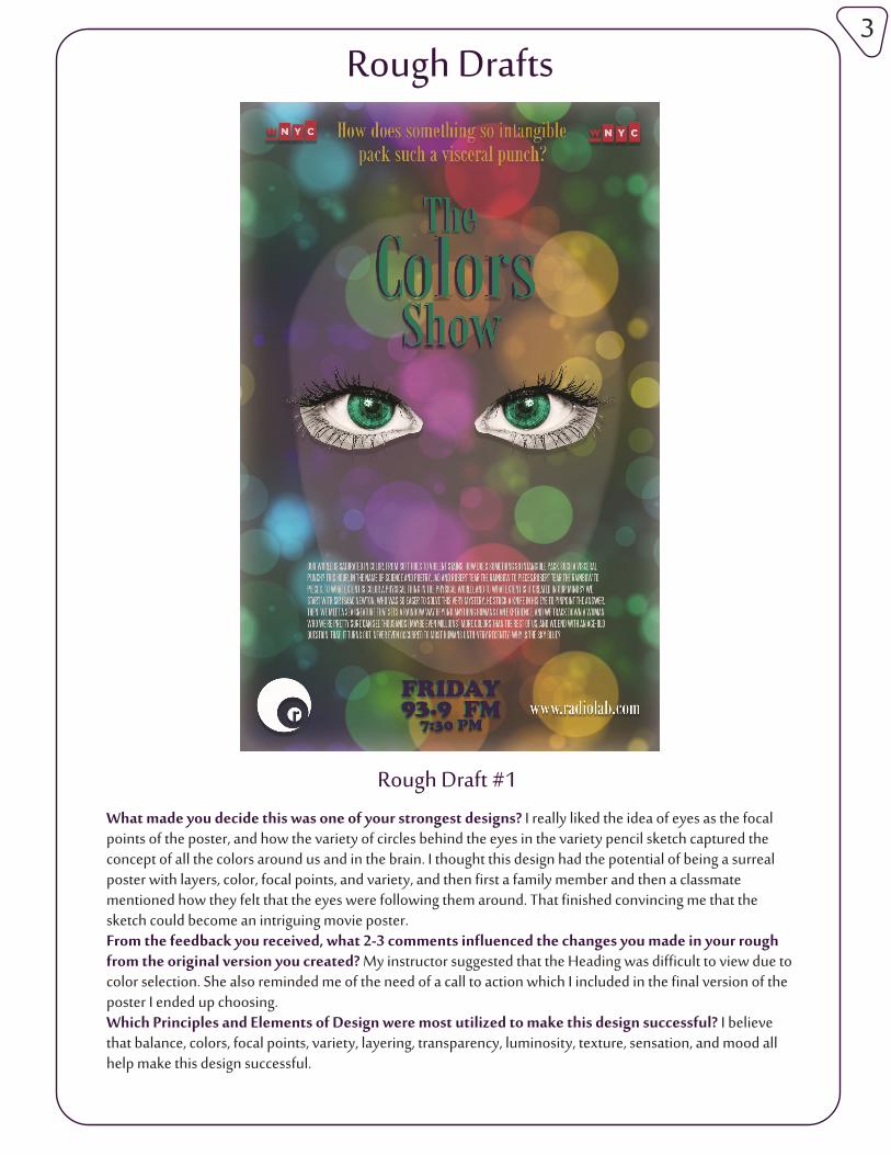
Rough Draft #1What made you decide this was one of your strongest designs? I really liked the idea of eyes as the focal points of the poster, and how the variety of circles behind the eyes in the variety pencil sketch captured the concept of all the colors around us and in the brain. I thought this design had the potential of being a surreal poster with layers, color, focal points, and variety, and then first a family member and then a classmate mentioned how they felt that the eyes were following them around. That finished convincing me that the sketch could become an intriguing movie poster.From the feedback you received, what 2-3 comments influenced the changes you made in your rough from the original version you created? My instructor suggested that the Heading was difficult to view due to color selection. She also reminded me of the need of a call to action which I included in the final version of the poster I ended up choosing.Which Principles and Elements of Design were most utilized to make this design successful? I believe that balance, colors, focal points, variety, layering, transparency, luminosity, texture, sensation, and mood all help make this design successful.
3

Rough Drafts
Rough Draft #2
What made you decide this was one of your strongest designs? I felt from the first that the single focal point of the bomb with its explosive connotations sitting on a rainbow that is being ripped apart was a power-ful expression. When family members and classmates glanced at my sketches, this was the design they almost always commented on first; it was obvious that the design had caught their attention.From the feedback you received, what 2-3 comments influenced the changes you made in your rough from the original version you created? My instructor suggested that the Heading was difficult to view due to color selection. She also reminded me of the need of a call to action which I included in the final version of the poster I ended up choosing.Which Principles and Elements of Design were most utilized to make this design successful? I believe that balance, colors, lines, focal points, planes, variety, layering, illusion of depth & space, illusion of motion, transparency, luminosity, texture, and sensation all help make this design successful.
4

Rough Drafts
Rough Draft #1
What made you decide this was one of your strongest designs? I felt that of all the sketches, this design best embodied the idea of the show (“rippin’ the rainbow a new one” and “tear[ing] the rainbow to pieces”) while still being relevant and making sense to the vast majority of the poster’s viewers: those that have never heard the show. Those giving me feedback tended to like this design as besides being intriguing from a line, focal point, and illusion of motion standpoint, it was obvious what the hands were doing.From the feedback you received, what 2-3 comments influenced the changes you made in your rough from the original version you created? My instructor suggested that the word “Colors” be changed to all caps to make it stand out. She also recommended rearranging some elements, adding a call to action, adjust-ing the vibrancy/saturation/levels of the imagery, and adding a drop shadow to the rainbow. I used all this advice when converting this rough draft to the final product.Which Principles and Elements of Design were most utilized to make this design successful? I believe that balance, colors, lines, focal points, planes, layering, illusion of depth & space, illusion of motion, luminosi-ty, texture, saturation, composition, and sensation all help make this design successful.
5
Final Image
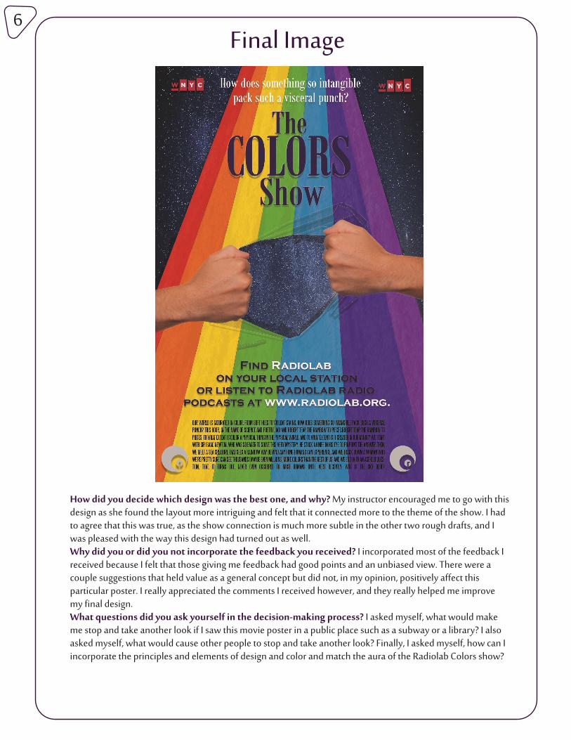
How did you decide which design was the best one, and why? My instructor encouraged me to go with this design as she found the layout more intriguing and felt that it connected more to the theme of the show. I had to agree that this was true, as the show connection is much more subtle in the other two rough drafts, and I was pleased with the way this design had turned out as well.Why did you or did you not incorporate the feedback you received? I incorporated most of the feedback I received because I felt that those giving me feedback had good points and an unbiased view. There were a couple suggestions that held value as a general concept but did not, in my opinion, positively affect this particular poster. I really appreciated the comments I received however, and they really helped me improve my final design.What questions did you ask yourself in the decision-making process? I asked myself, what would make me stop and take another look if I saw this movie poster in a public place such as a subway or a library? I also asked myself, what would cause other people to stop and take another look? Finally, I asked myself, how can I incorporate the principles and elements of design and color and match the aura of the Radiolab Colors show?
6

Final Conclusion
Original Final ImageHow did you improve upon what was originally supplied? Overall, by starting over and creating a poster that better mirrors the Radiolab Colors show aura and movie poster culture, I believe that the final poster is more attention grabbing, more intriguing, better laid out, and easier to read and comprehend than the original poster. I believe that the final poster also makes better use of balance, colors, lines, focal points, planes, layering, illusion of depth & space, illusion of motion, luminosity, texture, saturation, composition, and sensation. Which principles and elements of design are best utilized for greatest impact? Type: The type is balanced and uses size and font hierarchy for emphasis. The fonts chosen reflect what you might find on a movie poster. Color: Due to the nature of the poster, a full spectrum of colors is included. A cool luminosity background brings a fresh feeling to the picture. The warm and cool colors are torn apart at the center of the poster furthering the effect of the poster. Hierarchy: The large hole in the rainbow, the all-caps “Colors”, the large title-like heading, the medium sized tagline and call to action, and the minuscule credits text copy points are all examples of hierarchy. Emphasis: The torn hole in the rainbow makes a compelling action/focal point. Lines lead the eyes from the hole to the poster’s title which is emphasized by an all-caps “colors”. The pyramid-like call to action mirroring the narrowing of the rainbow stripe also point to the hole in the rainbow and “The Colors Show”. Movement and balance: The lines and illusion of depth creates a pathway for the eyes to follow. The rainbow’s strained wrinkles and clenched fists creates a sensation of pent up illusion of motion. The rainbow is symmetrical creating balance. The text is centered, and the two fists balance each other as well.How did the movie poster genre translate into this project? Movie poster-esque font types and elements were intentionally arranged on a movie poster style canvas. The almost surreal feel of a movie poster was kept in mind through all stages of the project.Which formal designs translated well or not at all? In the end, I did not end up translating any design elements from the original poster, except the logos. Even these received filters to better fit into the design.
7


![Giovanni Allevi - Joy [BOOK]](https://static.fdocuments.us/doc/165x107/55cf8f6b550346703b9c3433/giovanni-allevi-joy-book-56786cb56e6f6.jpg)