Final images
19
Front covers
Transcript of Final images

Front covers

My intentions where to get a crisp image that is suitable for teenagers. I chose this image to use as it was suitable for use in my clothes front cover. I like the image because it is fully in focus and has the right framing, the lighting is also nice as it shows detail.
It fits my theme as she has a casual pose. She is a teenager as this caters to my target audience of teenagers. I feel as if it fits the teenage life style genre as it is casual and has accessories such as wrist bands.

The final outcome fulfilled my intentions as it shows a nice pose and is suitable for teenagers.I feel as if the grey background and the black outline on the text allows the image and words to stand out. I also have everything necessary for a magazine as it shows the barcode, mast head, main image and cover lines.
It also caters to both male and female as none of the cover lines are directed towards one gender. I have also not used any colours that are stereotypically directed to one gender either

My intentions for this image was to showcase the hat and have good lighting so it is easy to see.I felt as if this image was what I needed for my hats front cover as it fulfilled all of my intentions. The image has nice lighting, the background allows the model to stand out. The hat is also very bright so it acts as a focal point.
The model has a relaxed pose and is smiling, this caters to the teenage audience as it is friendly.
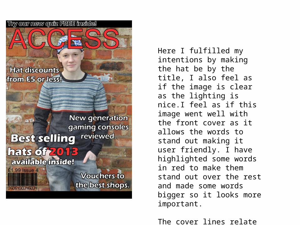
Here I fulfilled my intentions by making the hat be by the title, I also feel as if the image is clear as the lighting is nice.I feel as if this image went well with the front cover as it allows the words to stand out making it user friendly. I have highlighted some words in red to make them stand out over the rest and made some words bigger so it looks more important.
The cover lines relate to my theme as some of them are about hats. It caters to both genders as the theme (hats) is not specifically for one gender.

My intentions for this image was to showcase the ear phones to show off the theme, I also wanted a casual pose as it caters to the target audience of teenagers. His pose is casual and relaxed with a smile, this is because the magazine genre is teenage lifestyle so this will cater to the target audience.
The image is also bright so it is clear and easy to see.

This front cover fulfilled my intentions as it showcases the earphones and the model has a nice facial expression catering to the target audience. It clearly shows the cover lines as they are outlined in black with some words highlighted in red to keep the colour theme.
I used banners for advertisements, I planned to do this at the beginning and I am happy with the outcome, I had to change it from my original plans. The font is easily readable so it caters to the target audience. This magazine is for both genders and I make this clear by not having colours or accessories that are stereotypical for one gender.

My intentions for this image was to have the coat framed in the middle of the image and to have nice lighting so that it is easy to see detail and the coat. This image worked well for me as it show cased the coat as the theme is ‘winter’. I wanted the image to be bright and for the model to have a friendly smile, I felt as if I got all of these. The pose is casual this is because it is a teenage lifestyle magazine.
I wanted the coat to be in the middle of the image and clear, I felt as if this image has that.
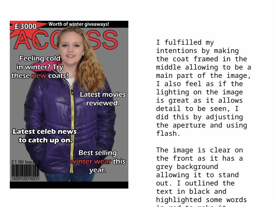
I fulfilled my intentions by making the coat framed in the middle allowing to be a main part of the image, I also feel as if the lighting on the image is great as it allows detail to be seen, I did this by adjusting the aperture and using flash.
The image is clear on the front as it has a grey background allowing it to stand out. I outlined the text in black and highlighted some words in red to make it easier to read for the audience.

Fashion Spread

My intentions for this image was to capture depth of field, nice lighting and for the model to have a good pose. All of these features would appeal to the target audience as it would help showcase the clothes.
I fulfilled these intentions by using manual focus to get the depth of field, I also adjusted the aperture and shutter speed to get the right lighting. I feel as if his pose is casual allowing the focus to be on the clothes. My theme is smart and this was made evident by the clothes he was wearing.

I fulfilled my intentions here by making the depth of field obvious, I did this by using manual focus. The lighting is also nice as it is not too bright making the audience strain to see it.
To keep a constancy to all of my photos I added an orange glow over them making them all look part of the same shoot.
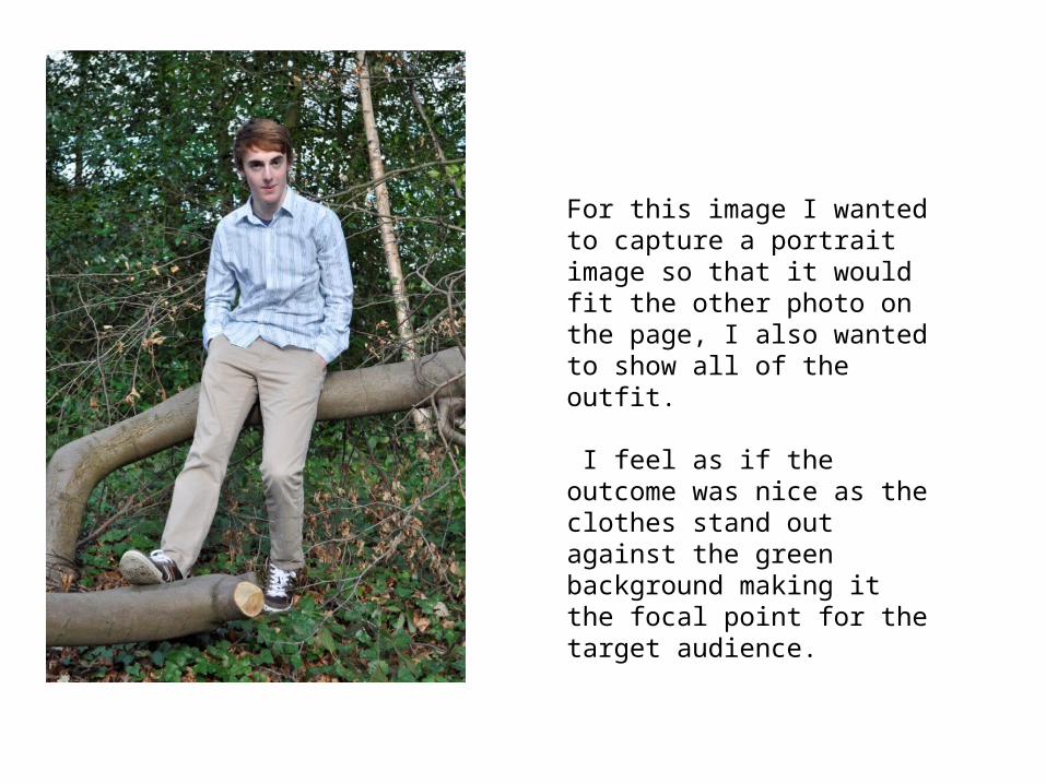
For this image I wanted to capture a portrait image so that it would fit the other photo on the page, I also wanted to show all of the outfit.
I feel as if the outcome was nice as the clothes stand out against the green background making it the focal point for the target audience.

I fulfilled my intentions as this image suits a double page spread and perfectly showcases the whole outfit. This image is a also crisp allowing it to be seen easily by the target audience.
The image on the left is the second shot, my intentions where to keep the orange theme and to have it on a double page with the third image. I felt as if this image worked as it did keep the theme.
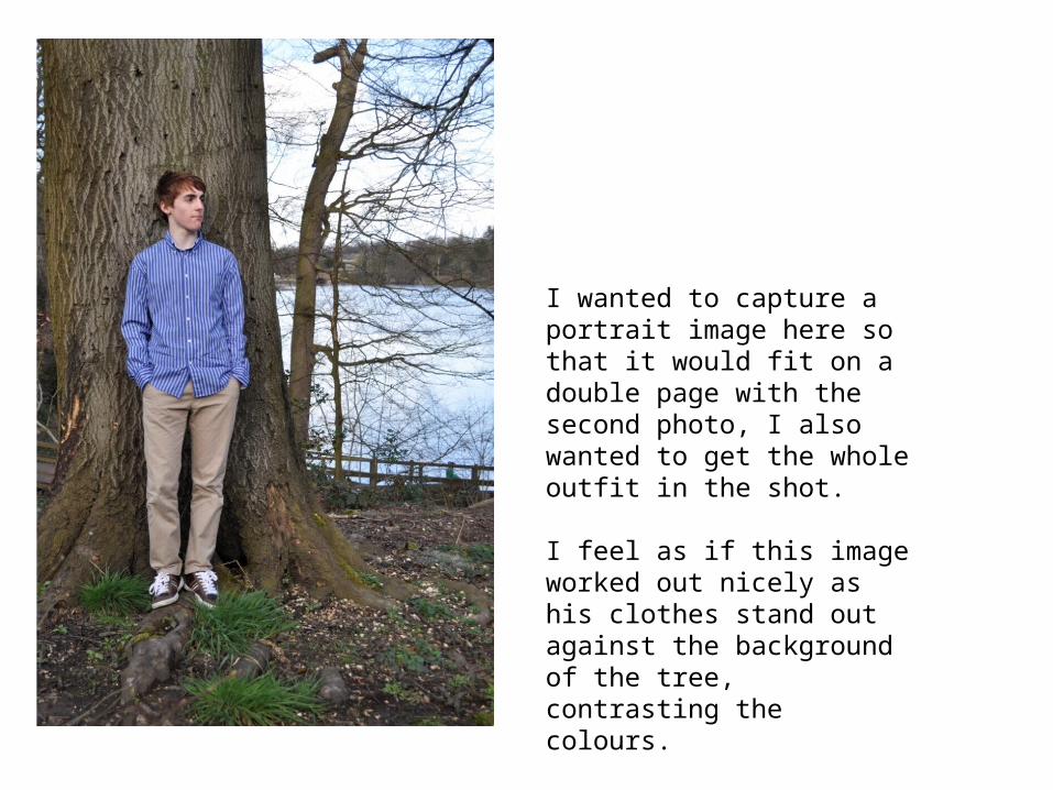
I wanted to capture a portrait image here so that it would fit on a double page with the second photo, I also wanted to get the whole outfit in the shot.
I feel as if this image worked out nicely as his clothes stand out against the background of the tree, contrasting the colours.

This fulfilled my intention as it is a portrait image allowing the clothes to be framed well.
The image on the right is the third shot, my intentions where to keep the orange theme and to have it on a double page with the second image. I also wanted to create a happy meaning through the edit and I think the colours allow this to happen.

My intentions for this photo where to have depth of field to allow the clothes to stand out over the background. I also wanted bright lighting so the audience can see the image clearly. I like the outcome as the focal point is on the model.

I fullfilled my intentions as I showed off the strong depth of field allowing him to stand out over the water rippling in the background.
Since the lighting was bright on some points of his shirt I adjusted the brightness on Photoshop to make it easier to see.

Fashion SpreadAll of the fashion spread images work together as the clothes all follow the same theme. I also used a lot of the same editing techniques in each photo for example the orange and white overlay is on each image making them look part of a set. I kept the same font running through all of the images to keep the theme.
The images work well with my magazine front covers as they all showcase the clothing and keep a similar theme running through the whole shoot. My theme was Smart, my model was dressed smartly and all of the photographs where taken in a natural environment contrasting the clothes. Using the same background and editing techniques allows the images to work very well in a set.