february 1989 Vol. 5, No. 1
8
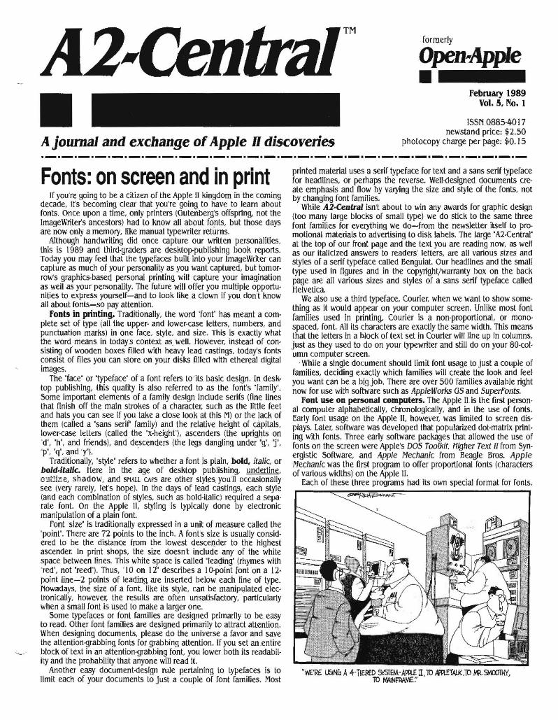
formerly Open-Apple • february 1989 Vol. 5, No. 1 ISSN 0885-4017 newstand price: $2.50 A journal and exchange of Apple H discoveries photocopy charge per page: $0.15 ._._._.-._._._.-._._._._._._._._.-._._._._._._._._._.-._.- Fonts: on screen and in print If you ' re going to be a citizen of the Apple II kingdom in the coming decade, it's becoming clear that you're going. to have to learn about fonts. Once upon a time, only printers (Gutenberg's offspring. not the ImageWriter's ancestors) had to know all about fonts, but those days are now only a memory, like manual typewriter returns. Although handwriting did once capture our written personiliities, this is 1989 and third·graders are desktop-publishing book reporls. Today you may feel that the typefaces built into your Image Writer can capture as much of your personality as you want captured, but tomor· row's graphics-based personal printing will capture your imagin.tion as well as your personalily. The future will offer you multiple opportu· nlties to express yourself-and to look like a clown if you don't know all about fonts-so pay attention. fonts in printing. Traditionally, the word 'font' has meant a com· plete set of type (all the upper· and lower-case letters, numbers, and punctuation marks) in one face, style, and size. This is exactly what the word meanS in today's context as, well. However , instead of con- sisting of wooden boxes filled with heavy lead castings, today's fonts consist of files you can store on your disks filled with ethereal digital images. The ' face' or 'typeface' ofa font refers to its basic design. In desk· top publishing, this quality is also referred to as the font's 'famil y' . Some important elements of a family design include serifs (fine lines thai finish off the main strokes of a character , such as the little feet and hats you can see If you take a close look at this M) or the lack of them ( called a 'sans serir family) and the relative height of capitals, lower·case letters (called the 'x·height' ), ascenders (the uprights on 'd', 'h', and friendS), and descenders (the legs dangling under 'g:, 1 ', 'p', 'q', and 'y' ). . Traditionally, 'style' refers to whether a font is plain, bold, italic. or bold·italic. Here in the age of desktop publishing, undedine o!1t1iI!Le, shadow, and SMALL CAPS are other styles_ you 'll occasionally see (very rarely, let's hope). In the days of lead castings, each style (and each combination of styles, such as bold·italic) required a sepa· rate font. On the Apple II, styling is typically done by electronic manipulation of a plain font. Font 'size' is traditionally expressed in a unit of measure called the 'point'. There are n points 10 the inch. A fonl's sJze is usually consid· ered to be the distance from the lowest descender to the highesl ascender. In print shops, the size doesn't include any of the while space between lines. This white space is called 'leading' (rhymes with 'red', not ·reed·). Thus, ' 10 on 12' describes a 10·point font on a 12· point line-2 points of leading are Inserted below each line of type. Nowadays, the size of a font. like its slyle, can be manipulated elec· tronically, however, the results are often unsatisfactory, particularly when a small font is used to make a larger one. Some typefaces or font families are designed primarily to be easy to read. Other font families are designed primarily to attract attention. When designing documents, please do the universe a favor and save the attention-grabbing fonts for grabbing attention . If you set an entire block of text in an attention-grabbing font. you lower both its readabil· ityand the prohability that anyone will read It. Another easy document-design rule pertaining to typefaces Is to limit each of your documents to just a couple of font families. Most printed material uses a serif typeface for text and a sans sertf typeface for headlines, Or perhaps the reverse. Weli-deslglled documents cre· ate emphasis and flow by varying the size and style of the f onts, not by changing font families. While A2·Central isnt about to win any awards for graphic design (too many large blocks of smali type) we do stick to the. same three font families for everything we do-from the newsletter Itself to pro- motional materials to advertising to disk labels. The large 'A2·Central' at the top of our front page and the text you are reading now: as well as our italicized answers" to readers' letters, are all vanous sizes and styles of a serif typeface calied Benguiat. Our headlines and the smali type used in figures and in the copyright/warranty box on the back page are all various sizes and styles of a sans serif typeface called Helvetica. We also use a third typeface, Courier, when we want to show some· thing as it would appear on your computer screen. Unlike most font families used in printing, Courier is a non'proportionaL or mono- spaced, [ant. All its characters are exactly the same width. This means that the letters in a block of text set in Courier will line up in columns, just as they used to do on your typewriter and still do on your 80·col· urnn computer screen. . . While a single document should limit font usage to Just a couple of families, deciding exactly which families will create the look and feel you want can be a big JOb. There are over 500 families available right now for use with software such as AppleWorks as and Superfonts. Font use on pel50nai computers, The Apple l!.is the first person· al computer alphabetically, chronologically, and in the use of fonts. Early font usage on the Apple II, however, was limited to scre en dis· plays. Later , software was developed that popularized dot·matrlx print· ing with fonts. Three early software packages that allowed the use of fonts on the screen Apple's DOS Toolkit. lfigher Tex/II from Syn· ergistic Software, and Apple 11e chanic from Beagle Bros. Apple Mechanic was the first program to offer proportional fonts (characters of various widths) on the Apple Ii. Each of these three programs had its own special format for fonts.
Transcript of february 1989 Vol. 5, No. 1
formerly
Open-Apple • february 1989
Vol. 5, No. 1
ISSN 0885-4017 newstand price: $2.50
A journal and exchange of Apple H discoveries photocopy charge per page: $0.15 ._._._.-._._._.-._._._._._._._._.-._._._._._._._._._.-._.-Fonts: on screen and in print
If you're going to be a citizen of the Apple II kingdom in the coming decade, it's becoming clear that you're going. to have to learn about fonts. Once upon a time, only printers (Gutenberg's offspring. not the ImageWriter's ancestors) had to know all about fonts, but those days are now only a memory, like manual typewriter returns.
Although handwriting did once capture our written personiliities, this is 1989 and third·graders are desktop-publishing book reporls. Today you may feel that the typefaces built into your Image Writer can capture as much of your personality as you want captured, but tomor· row's graphics-based personal printing will capture your imagin.tion as well as your personalily. The future will offer you multiple opportu· nlties to express yourself-and to look like a clown if you don't know all about fonts-so pay attention.
fonts in printing. Traditionally, the word 'font' has meant a com· plete set of type (all the upper· and lower-case letters, numbers, and punctuation marks) in one face, style, and size. This is exactly what the word meanS in today's context as, well. However, instead of consisting of wooden boxes filled with heavy lead castings, today's fonts consist of files you can store on your disks filled with ethereal digital images.
The 'face' or 'typeface' ofa font refers to its basic design. In desk· top publishing, this quality is also referred to as the font's 'family' . Some important elements of a family design include serifs (fine lines thai finish off the main strokes of a character, such as the little feet and hats you can see If you take a close look at this M) or the lack of them (called a 'sans serir family) and the relative height of capitals, lower·case letters (called the 'x·height'), ascenders (the uprights on 'd', 'h', and friendS), and descenders (the legs dangling under 'g:, 1', 'p', 'q', and 'y'). .
Traditionally, 'style' refers to whether a font is plain, bold, italic. or bold·italic. Here in the age of desktop publishing, undedine o!1t1iI!Le, shadow, and SMALL CAPS are other styles_ you 'll occasionally see (very rarely, let's hope). In the days of lead castings, each style (and each combination of styles, such as bold·italic) required a sepa· rate font. On the Apple II, styling is typically done by electronic manipulation of a plain font.
Font 'size' is traditionally expressed in a unit of measure called the 'point'. There are n points 10 the inch. A fonl's sJze is usually consid· ered to be the distance from the lowest descender to the highesl ascender. In print shops, the size doesn't include any of the while space between lines. This white space is called 'leading' (rhymes with 'red', not ·reed·). Thus, ' 10 on 12' describes a 10·point font on a 12· point line-2 points of leading are Inserted below each line of type. Nowadays, the size of a font. like its slyle, can be manipulated elec· tronically, however, the results are often unsatisfactory, particularly when a small font is used to make a larger one.
Some typefaces or font families are designed primarily to be easy to read. Other font families are designed primarily to attract attention. When designing documents, please do the universe a favor and save the attention-grabbing fonts for grabbing attention . If you set an entire block of text in an attention-grabbing font. you lower both its readabil· ityand the prohability that anyone will read It.
Another easy document-design rule pertaining to typefaces Is to limit each of your documents to just a couple of font families. Most
printed material uses a serif typeface for text and a sans sertf typeface for headlines, Or perhaps the reverse. Weli-deslglled documents cre· ate emphasis and flow by varying the size and style of the fonts, not by changing font families.
While A2·Central isnt about to win any awards for graphic design (too many large blocks of smali type) we do stick to the. same three font families for everything we do-from the newsletter Itself to promotional materials to advertising to disk labels. The large 'A2·Central' at the top of our front page and the text you are reading now: as well as our italicized answers" to readers' letters, are all vanous sizes and styles of a serif typeface calied Benguiat. Our headlines and the smali type used in figures and in the copyright/warranty box on the back page are all various sizes and styles of a sans serif typeface called Helvetica.
We also use a third typeface, Courier, when we want to show some· thing as it would appear on your computer screen. Unlike most font families used in printing, Courier is a non'proportionaL or monospaced, [ant. All its characters are exactly the same width. This means that the letters in a block of text set in Courier will line up in columns, just as they used to do on your typewriter and still do on your 80·col· urnn computer screen. .
. While a single document should limit font usage to Just a couple of families, deciding exactly which families will create the look and feel you want can be a big JOb. There are over 500 families available right now for use with software such as AppleWorks as and Superfonts.
Font use on pel50nai computers, The Apple l!.is the first person· al computer alphabetically, chronologically, and in the use of fonts. Early font usage on the Apple II, however, was limited to screen dis· plays. Later, software was developed that popularized dot·matrlx print· ing with fonts. Three early software packages that allowed the use of fonts on the screen wer~ Apple's DOS Toolkit. lfigher Tex/II from Syn· ergistic Software, and Apple 11echanic from Beagle Bros. Apple Mechanic was the first program to offer proportional fonts (characters of various widths) on the Apple Ii.
Each of these three programs had its own special format for fonts.

5.2 A2·Centra/
This lack of standardization quickly became the standard. Publishers of later programs that allowed printing with fonts, such as Data Trans· forms with Frintrix and fontrix and Springboard with Newsrool!J; .ea,h designed its own unique font format. Broderbund, the exemplar among publishers who make users' lives miserable through copy protection ~nd non·standardization, again led the pack by developing . two unique font formals, one for Print Shop and another for Print Shop as,
Fortunately, with the advent of the Apple IIgs, Apple· created ahd documented a standard font format. The formal is based on the for· mat of Macintosh fonts, only it's better. Not only all non·Br0derbund IIgs programs, such as AppleWorks as, but also lIe/ llcfllgs pr69rams such as Beagle Bros Superfonts and TimeWOJ1<'s Publish /t!, use the new format (or a slight variation).
A font clearinghouse. Because of the movement in the Apple II community to a single font format. and because of the extreme con· fusion in the Macintosh community about fonts, we recruited a sub· scriber and GEnie user with a large collection of and interest in fonts, Mark T. Collins from Waukesha, Wisc" to create an A2·Central Font Clearinghouse On GEnie, What Collins is trying to do is bring togeth· er a large library of public domainngs fonts that are bug·free and compatible with each other,
Weve put a lot of Collins' work on this month's A2·Centra/ disk. Including his shareware font editor, caJJed font Dottor. We've also induded a nice selection of public domain fonts, samples of fonts, programs related to fonts, and two AppleWorks data basemes that list the speCifications of the fonts currently in the GEnie clearinghouse collection,
While I'm mighty proud of the work Collins has done for us on GEnie, there are other sources of public domain IIgs fonls you should be aware of. The other national online services, of course, Include many font files in their libraries, as do most user groups, TechAlliance (formerly Apple Co-<>p, 290 SW 43rd St. Renton, WA 98055) has sev' eral public domain font disks available for $3,00 + .50 each, Beverly Cadieux, 3103 Lake Stream Dr" Kingwood, Texas 77339 has put together a set of six 3.5 disks with about 500 font files that she will send you for $30,00 + $3.50,
In addition to public domain fonls, shareware and commercial fonts have been developed for the Macintosh and some of these are in the process of being converted to Apple II format. The only com· mercial fonls originally developed under the lIgs-standard that I'm aware of were published by StyleWare. However, since Claris pur· chased StyleWare that product has been In limbo,
TimeWorks also sells a font disk for Publish It! These fonls follow the IIgs standard except for one small detail-they have a file type of $F7 rather than the standard $C8, To use standard IIgs fonts with Publish It! you have to change the flietype to $F7. To use Publish II! fonts with sorrware that fallows the standard, you have to change the fiJetype to $C8. You can do this using disk zap sorrware if you know what you're doing, Or you can do it with a public domain program sent to us by William Olsen of Riverside, Calif. The program is in our library on GEnie in a file called CHANGE,FONT.FILETYPE,BQY and it's on this month's A2·Central disk in a file called CHG.FNT.FILETYP.
At one time StyleWare also advertised that it would publish a font editor for JIgs-style fonts so that each of us could create new fonls or modify existing ones. However, that product didn't make it to market Beagle Bros is working on a font editor, but it Isn't expected to be ready until later in 1989, At this time, the only JIgs font editor we're awareof is Collins' font Doclor,
Aspects of fonts. Neither computer monitors nor dot·matrix print· ers are able to display fully-formed characters, What they do display is very small dais, or 'pixels'. The essence of a fonl Oie is a deSCription of which pixels are foreground (or 'on') and which background (or 'orr) for each character in the font. If pixels, moniters, and sheels of paper were always perfectly square, life would be fair. But they're not and it Isn't.
While traditional printing·press printing uses what we consider fully· formed characters, pixels aren't alien to the print shop, Photographs are reproduced by 'screening' them, which converls each photograph into a matrix of pixels, The term 'resolution' refers to the density of the pixel matrix, The smaller each pixel is, the more of them a printer can cram into a unit of space, And the more of them that get packed in, the more ' information' there is and the better looking the graphic.
Vol. 4, No. 12
A typical printed photograph i)as between 120 and 150 multi·shade pixels per inch both horizontally and.vertically, An ImageWriter, on the other 'hand; I)as 72, 80, 96, 107, 120, 136, 144, or 160 blaCk/white dais p'er inch horizontallY .and either 72 or 144 dais per inch yertical· Iy,. Even though the Image Writer, at 144 x 144, can match the resolu· tlon ' of '!c printed photograph, its lack of multi·shade dais means it can't match the look of printed output.
While lhe Apple II was first with fonts, the Macintosh was the first computer to use. thellgs·standard fpm format. It' will be helpful -believe me'-:'if we look at the Madntosh a few minutes to under~ stand how we got .where we are tod'ay,
For years the · Maclntosh was sold only with a built·in monitor and all Macintosh monitors were exactly the same size (a little small), When 'a Macintosh is properly adjusted, its active screen area is 18 centimeters wide by 12 centimeters high-a ratio of 1.5. Meanwhile, lhe pixel resolution of the monilor is 5 t 2 wide by 342 high, Manipu, late these numbers mathematically for awhile and you'll find that the Macintosh screen has a resolution of 72 pixels·per·inch bolh vertically and horizontally, Macintosh screen pixels are exactly one printer's point wide by one printers point high.
One or the design goals of the Macintosh was to creale a com· puter that could display on its screen what it would print on ils print· er-what you see is what you get, or WYSIWYG (wizzy·wig), The goal was met not only in terms of fidelity to the proportions of the material on the screen, but in terms of fidelity to its exact size, The Macintosh screen displays a 72 x 72 pixel·per·inch matrix and the Image Writer duplicates thai matrix exactly.
(Well, sort of. lawn Jour 'consistent·interface' Macintosh programs. Most of them have a standard item under the 'File' menu called 'Page Setup'. HacPain/, which prints at either 72 x 72 (·prtnt Draft') or 144 x 144 (,Print Final') lacks the standard Page Setup choice, AppleLink Industriai Edition prints using the Image Writers text characters and althOugh Page Setup appears in ils File men.u, It's never selectable, Quark XPress, my desktop publlshlng program, and HacWrile both have a selectable Page Setup, Among the items in the Page Setup dia· log box for the ImageWriter (Page Setup dialog box contenls vary depending on what kind of printer you are using) is a goodie called 'Tall Adjusted', When Tall Adjusted is selected (the default in Quark XPress), you get 72 x 72 (Quality. Faster in the Print dialog box) or 144 .. x 144 (Quality.Best in the Print dialog box) square Image Writer pixels per inch. When Tall Adjusted is not selected (the default in HacWrile), you get 80 x 72 (Faster) or 160 x t44 (Best) slightly·tall pixels per inch. If you import a perfect circle from HacPainl into a document and print the document with Tall Adjusted off, you get an ellipse. I suspect HacWrile has a Tall·Adjusted-<>ff default so that it naturally takes advantage of the Image Writers maximum resolution (160 x t44) but I'm not at all sure this is reason enough to contami· nate the Mac's otherwise perfecl wlzzy·wig design (notice that when you flip the Page Setup to Tall Adjusted in HacWrite the ruler'S inch measuremenls are exact (if your active screen image is the specified 18 centimeters horizontally), while with Tall Adjusted off they're not), While we're on the subject, 'Best' quality printing on the Macintosh gives you four times more resolution than 'Faster'. When Best is selected, the Macintosh automatically looks around for a font twice as big as the one being printed. If it finds one, it uses it to increase the resolution,of the printed output. This trick increases sharpness with· out .changing the printed font size. Beagle Bros' Superfonts does the same thing and can match Macintosh output exactly on an Apple JI (it even has a Tall Adjusted toggiej, but you don't get to see what your printed page will look like while you're editing it.)
When we ljIIk about printing fonls on paper or displaying fonts on the 'Macintosh monitor, we can talk about pixels-per·inch. When we move to talking.aboutApple /I monitors, however, the per.inch can· cept drifls into the rasters, That's because Apple 11 monitors come in a wide variety of sizes, yet they all display the same number of pixels horizontally and vertically, A '9·inch' monitor has smaller, denser pix· els than a ' 19·lnch' monitor, but they both have exactly the same number of pixels in total. The number of pixels per·inch depends on the size of the monitor and becomes fairly meaningiess, The variety of monitor sizes also makes it very difficult to have any kind of fidelity between the size of an image on lhe screen and the size of that image when it is printed, To accomplish that kind of fidelity you'd have to

January 1989
make sure that evel)'one had the same size screen (as Apple did with the Macintosh).
Furthermore, the ratio between the height and width of the screen image depends on the position of those small adjustment knobs hid· den on the back or inside most monitors. The standard aspect·ratio for Apple II monitors (and for television screens) is 4 units wide by 3 units high, a ratio of 1.333 (not the 3 x 2, 1.5 ratio of the MaCintosh). However. by turning the adjusting knobs, most monitors can be set across a relativety wide aspect·ratio range. I suspect vel)' few of you have monitors that have been adjusted so that the aspect ratio of the active screen area is exactly 1.333. This lack of standard adjustment makes it virtually impossible to have any kind of fidelity between the vertical·horizontal proportions of an image on the screen and the pro· portions of the image when it's printed. EveI)' day, Apple II users draw perfect circles on their monitors and then print eggs. NOW you know why.
lbe problems created by the variety of monitor sizes and aspect ratios in the Apple IJ kingdom, however, pale compared to the problems created by the fact that the Apple II has more horizontal resolu· tion than the Macintosh, but far less' vertical resolution. The two graphics modes usually used when lIgs-standard fonts are displayed on the Appte II screen are double·high'resolution, which has 560 pix· els across and 192 up and down, and 640·modesuper·high-resolu· tion, which has 640 pixels across and 200 vertically. Notice that both double·high.res and 640·mode super·high·res have more horizontal resolution than the Macintosh (560 and 640 compared to 512). The limitation of Apple II graphics is the vertical resolution-just a littte more than half that of the MacintOSh (192 and 200 compared to 342).
(The big limitation of Macintosh graphics, on the other hand, has been the lack of color. A monitor's ability to do color, its vertical resolution, and its cost are all related to one another. In the Apple II we have a computer that can do color work on relatively inexpensive monitors, but with limited vertical resolution.:.The original Macintosh could sque.eze a lot of vertical resolution onto a relatively inexpensive monitor, but it coutdn't do color. Apple added color capability to Its Macintosh II without giving up any vertical resolution, but for the price of that machine's color monitor and video card you can get Apple's limited·resolution IIgs color monitor and have the IIgs itself thrown in for free.) ,
Ab, but what does all this screen·resolution mumbo·jumbo have to do with fonts? The simple truth is that almost all of the llgs fonts avaitable today were originally <1esigned using the square pixels of the Macintosh. By fiddling with the vertical· and horizontal·slze knobs on the back of your Apple II's monitor (Apple's own monitors don't have horizontal·size knobs, but some others do), you 'can also get square pixels on an Apple II. However, square pixels are only possible in standard·high·res (aim for an aspect ratio of 1.46) .. In the more com· manly-used double·high·res and 640-super·high-res' modes, pixels are tall and skinny-usually a little more than twice as high as wide-no matter how much you fiddle with the adjustment knobs.
When fonts designed for the square pixels of the Macintosh are displayed using the tall, skinny pixels on an Apple II. the once well'proportioned characters become tall and skinny, too. (Characters that originally looked tall and skinny on the Macintosh nearly disappear on the llgs.) With any given font you can actually get a few more charac· ters across the screen on a Apple II than on a Macintosh because of the additional horizontal resolution. However, you can only get about half as many lines on the screen. And those half·as-many lines get stretched vertically so that they touch Doth the top and bottom of the active screen area. That's why we have those tall, skinny characters and pixels.
And it all boils down to this: you are sitting in a warm computer room. You have a document on the screen in front of you. The document uses a font originally designed for the Macintosh. You see tall. skinny characters: You want to print this document. But do you want your printed output to duplicate exadly what you see on your screen (like the Macintosh) or do you want your printed output to have well· proportioned characters (like the Macintosh)? What a dilemma. .
If you own the standard IIgs-issue AppleColor RGB Monitor and want your printed output to look exactly like what you see on your screen (a typical wish when using drawing programs, for example), start by turning the knobs on the back of your monitor until your aspect ratio is about 1.44. According to the manual that comes with
A2-Cenual .5,3
that monitor, the active display area is adjusted at the factol)' to 20 centimeters wide by IS centimeters high (the expected ratio of 1.33). My own ·monitors unadjustable width is only about 19.5 centimeters, so I've set the height to 19.5/1.44 or about 13.5 centimeters. Perfec· tion would be an active display area 20.3 centimeters wide by 14.1 centimeters tall . Mathematically this works out to 80 pixels per inch horizontally and 36 pixels per inch vertically-exacUy the resolution the IIgs uses when printing on the Image Writer. Thus, if you can adjust your monitor's active display area to these dimensions, what you get on paper can exactly match what you see on the screen.
Howevet to turn "can" into "does" you have to understand three options you get in the IIgs Page Setup and Print dialog boxes. Like righteous Macintosh software, desktop software on the IIgs includes Page Setup and Print choices in the file menu. The three critical options are:
Orientation. Page Setup gives you an Orientation choice of Portrait or Landscape. Portrait is what we'd normally call "normal'; Landscape is what we'd normally call "sideways'. To ,get exactly 80 x 36 pixels per Inch on an ImageWriter you need to select Portrait. Because of the limitations of the ImageWriter when you turn it on its side, Landscape printing Is done at 72 x 40 pixels per inch, which creates slightly shorter, fatter characters. •
AspeCt ratio. Also hidden away In the Page Setup dialog box is an essential item called 'Vertical Sizing'. To create an exact duplicate or what you see on your screen on your pnnter, you must set Vertical Sizing to normal. But if you are printing clever documents using fonts, you probably don't really want to print those tall, skinny charac· ters you see on your screen, do you Bobo? To print text with [ants in their 'correct' ("'acWrite's 80 x 72) proportions, you must set Verti· cal Sizing to condensed, Like the Macintosh's Tall Adjusted toggle, Vertical Sizing nips between exactly what you see on your screen (nor· mal) and better·looking text (condensed). There is no Tall Adjusted toggle on the IIgs, just as there is no Vertical Sizing toggle on the Mac· intosh.
Resolution. finally, the IIgs Print dialog box lets you select between 'Better Text' or 'Better Color. If you select 'Better Text', the IIgs will look around for a double·sized font and print 160 x 72 pixels per inch (normal) or 160 x 144 (condensed)-the equivalent of the Best Quali· ty selection on the Macintosh. (If the selected font isn't exactly double the height and wid'tli of the original, wave good:bye to wizzy·wig.)
The following table summarizes all this and a bit more:
IIqs printiDq resolutions in pixels per inch
Screen in E40"1lOde
portrait orilD.tation better color better text
noIDa1 80 • 36 160. i2 condensed 80 • 12 160 • U4
Serlan in 320-mode
portrait orientation better color better ten
40 • 36 80. 12 40.12 80.l44
landscape ori.8ntation better color bette, text
72.40 l44.80 12.80111.160
landscape. orienta.tion better color bittar text
36 x 40 72, 80 36 x 80 72 d60
Many subscribers have mentioned bow slowly GS/OS programs print. It appears to me that the reason is that the GS/OS ImageWriter printer driver always makes the ImageWiiter print at its maximum hor· izontal resolution of 160 dots per inch. If the size of the pixeUo be printed is larger than that, GS/OS will pflnt several 160 dpi dots per pixel. for example, you can See in the above laDle that 640-rnode portrait orientation -in Better Color has a pixel resolution of 40 x 36~ However, GS/OS actually has the ImageWriter print 8 dots (160 x 72) of various cyan, magenta, and yellow ' combinations to create that pixel. While 'Better Text' on the IIgs is equivalent to "Best Quality' on the Macintosh, 'Better Color' is not equivalent to the Mac's ' fastei Quality". Once again, we find ourselves sacrificing something In com· parison to the Macintosh (this time it's speed) in order to gain color.
The llgs Print Manager uses multi-<lot pixels with B.etter Cplor even if you don't have .a color ribbon. If you do have a color ribbon, be sure to check lhe Color square in the lower·left comer of the Print dia· log Dox. If you print In Better Color Dut don·t have Color selected, the

5.4 A2·Central
Print Manager tries to do gray·scaling with black dots rather than full· color magenta-cyan-yellow mixes.
font anatomy. Now that you understand all the various ways that a font can be printed, let's look at an adual font file.
A IIgs font file has four major parts. The first is the header, which contains all kinds of interesting information about the font. The sec· ond is the strike, which contains the pixel images of the characters in the font. The third is the location table, which has an entry for each character in the font. The entry points to the character's pixel position in the strike. The fourth is the offset/width table, which tells how each character is to be placed relative to the current 'character origin' or 'pen position' and how wide each character is. First we'll look at the strike and at the tables, then we'll come back and investigate the header.
lbe font strike. Two of the details we'll find in the header are a pOinter to the start of the font strike and the strike's row width. The strike is just a very long sequence of bits in bytes, but conceptually the first bunch of bits in the strike represents the top row of pixels for
Figure 16-29 Part of a font strike
all the characters, the second bunch the second row, and so on. The number of bits in a bunch for any particular font is the row. width. The characters in the strike are all pushed together with no spaces between them, so once you get the rows lined up, the strike looks like Figure 16·29, which is unabashedly stolen from the QuickDraw II chapter of Apple's Apple JIgs Toolbox Reference, Volume 2.
Each row of the strike is padded on the right end with enough extra bits to make the row width end on a 'word' boundary (a 'word' is two bytes). Not every possible ASCII code has to have an image in the strike. The header includes the ASCII code of the first (firstChiJIj and last (lastChar) characters in the strike; characters outside this range are defined as 'missing'. (Character codes can range from 0 through 255, however, the ASCII standard only defines the codes from 0 thor· ough 127 and Apple has no recommendation other than to look at existing fonts for 128·255.) Characters within the firstChar-lastChar range can also be 'missing,' as we'll see in a moment. Immediately afier the pixel image of lastChar in the font strike (at lastChar + 1) is an extra character that is used in the place of a1l missing characters. Apple calls this character the 'missing symbol' and has made it a required element in the font strike (even if there aren't any missing characters). Usually it's either an empty box or an inverse question mark, but sometimes a designer's copyright is crammed in here.
lbe location table. The location table is an array of bytes with a two·byte (one-word) entry for each character code from firstChar to lastChar + 2. The entry holds the distance, in pixels, from the begin· ning of each row of the strike to the lefi edge of the character's image.
To find the width of a character's image, subtract the location-table entry for the character in question from the location·table entry for the following character. The difference is called the 'image width'. If the character has no pixels at alL such as the space character or a control code, the image width can be zero (but it cmi't be negative). For this scheme to work, the location table has to have an entry for lastChar +2. This entry must point to the pixel just to the right of the 'missing symbol', which is the same thing as holding the total length of the font strike in pixels (ignoring any word·boundary padding).
lbe offset/width table, Like the location table, the offset/width table is an array of bytes with a two-byte entry for each character code from firstChar to lastchar + 2. If the two bytes for a character hold $FFFF, that character is missing from the font. OthelWise the first byte of each entry holds the 'character width: in pixels; the second byte holds the offset. Both the width and offset can range from 0 to 254 pixels (not 255. because of the need for $FFFF). ..
Vol, 4, No, 12
The width is the distance. in pixels. that the 'character origin' should be moved (to the right only) after the character is drawn. Some characters, such as SPACE, will have a positive character·width (the charader origin moves to the right when' the charader is typed) but a zero image-width (no pixels in the character image). Other characters. such as accent marks, may have a positive image'width (a pixel image) but a zero character-width (the accent mark is drawn but the origin isn't moved 50 that the next character typed will appear under the accent). Other characters, such as control characters, will have both image- and character-widths set to zero.
The offset tells QuickDraw how to position the character with respect to the character origin. Characters can start either to the right or to the left of the character origin. Since the offset is always a onebyte positive number, however, we need an imaginary point somewhere to the left of the character Origin to start the offset from. This is provided in the header by an entry called kerni'1ax. which is the maximum distance, in pixels, from the left·most edge of the left-most character in the font to the character origin. If kerni'1ax is negative, that left-most edge lies to the left of the character origin; if zero, on the character origin; if positive (unlikely), to the right of the character ori· gin. To figure out where to position a character image, QuickDraw adds the character's offset to Kerni'1ax. If the resulting number is neg· ative, the left edge of the character lies that many pixels to the left of the origin; if zero on the Origin; if positive that many pixels to the right of the origin.
Figures 16-26 and 16-27 show a couple of sample characters from an imaginary font. Notice that all the lines and points that things are measured from lie between pixels. The image width has to do with the number of pixels in the character. 5 for the y, 7 for the 'f; the character width has to do with how far the character origin is moved, 7 for both the y and the 'f. If, in this imaginary font. kerni'1ax was -2, the offset of the 'y' would be 2 and of the 'f', I.
lbe beader, The header of a IIgs font consists of three distinct parts. The first part holds the name of the font. The second part is the llgs header, The third part is the i'1acintash header.
The very first byte of a font file tells how many characters are in the font name. The following bytes spell out that name. The llgs header begins immediately after that. The first two bytes of the IIgs header tell how far it is from there to the Macintosh header.
The Macintosh part of the header, as well as the strike, location table, and offset/width table, are exactly like those in a Macintosh font except for one detail: the high- and low-order bytes of two-byte
Character width
1m' -.. . '~"~'l L.i ., ___ '' ", Fool . • : Charoct." height
- :-- _1___ rectongle _ .. / i ~,_ '"' __ _ Char~~ ! "; I - - Descenllone~
Figura 16·26 Choroctgr width
Character with no kerning
FIgur8 16-27 CharactGr karning left
integers are reversed. This doesn't apply to the font strike, but the two bytes in every other word in the Macintosh font need to be flipflopped. The origin of Ihis requirement isn'! perversity. but Ihe forward-thinking architecture of the Apple II's microprocessor.
The first two bytes of the Macintosh section of the font are the Macintosh 'font type: which is ignored in the Apple II kingdom. The next two bytes are the ASClI code of the first defined character, fjrstChar. The next two are the ASCII code of lastChar. The next two are widi'1ax. the character width (in terms of origin movement) of the
January 1989
widest character in the fonl. The next two are kernMax. The next two are the 'negative of descent', which I'll talk abo~t more in a moment.
If you took all the characters in a font and typed them one on top of another with all their characler origins In the same place, you 'd have a black mess. 'The smallest reclangle completely enclosing this mess is called the font rectangle', according to Apple's toolbox manu· al. The next two bytes give the width of the. font rectangle, in pixels. The next two give lhe height of the font rectangle.
The next two bytes give the distance, in words, from this field in the header to the beginning of the offset/width table. To get the distance from here to the beginning of the location lable, you must sub· tract 2 • (lastChar· firs/Char + 3) from the offset/width lable distance.
The next two bytes hold the fonl's ascent, the number of pixels from lhe font's base line to lhe top of the font rectangle. The next lwo bytes hold the font's descent. the number of pixels from lhe fonl's base line to the bottom of the font reclangle. And yes, ascent + descent must always be equal to the height of the font rectangle. The next two bytes hold the recommendedkading (number of blank pixel rows between the lowest row of one line of characters and the highest row of the following line) for this font. Applications may either use or ignore this value. The 'negative of descenr, disregarded earlier, seems to be disregard able. There's little relationship from font to font in the number stored here. Some have ·descent. some ·ascent. and some some other number.
The next two bytes give the width of each row in the font strike, in words. The next byte is the start of the strike. The length of the strike is the row·width mulUplied by lhe height of the font rectangle. The location table follows lhe strike, and the offset/width table is at the end of the font file. . The ITgs part of the header adds several pieces of information
that were le~ out of the Macintosh header. As mentioned earlier, after the embedded font name comes a·two-byte offset. in words, from this ' field to the Macintosh part of the header. In the current version of the ' Ilgs font format (version 1.1 ), this field holds a 6. Apple may expand the lIgs font header in the future to add additional information. Soft· ware that uses this field to find the Macintosh pari of the header, how· ever, will be totally compatible with any future versions of the lIgs font format. .
The next two bytes of the IIgs header hOld the foht's family num· ber. All fonts in the same family (i.e" all Geneva fonts or all Helvetica fonts) should have the same number here. On the Macintosh, one byte of the ' font type' is used for the family number and the other is used for fonl style (plain, bold, italic, etc.). This means only. 256 fami· Iy IDs are available on the Macintosh, but there have been far more font families than that for years already. Overlapping fonl IDs are a real problem in the Macintosh world. Here in the Apple II kingdom, on the other hand, we have 65,536 available IDs. It's importanl that all the fonts you use have matching IDs if they are in the same family and u",que IDs if they are in different families. If they don't, the print manager can get mixed up and use the wrong font.
One of the major reasons we started the A2·Central font Clear· inghou.., on GEnie was to keep our kingdom's font IDs organized. Apple Developer Technical Support doesn't assign IDs to individual fonts .. Instead, it assigns ranges of numbers to companies or groups who dlstnbute fonts. The groups, In turn, can assign numbers within their range to individual font families as they choose. Table I is a list of ID assignments as of mid.January 1989. The A2·CentraJ font Clearinghouse. for example, has been assigned 2,048 font·family 10 numbers between $7COO and $83ff,
While most of the assigned ranges have gone to commercial com· panies, we ·intend to reassign the numbers in our range to fonts designed by individuals. You can get your own font ID number from us simply by designing a new font family and allowing us to put it in our libraI)'. We accept either public domain or shareware fonts.
One inleresting bit of information about a font family is whether it is designed 10 be displayed at the I'!acintosh square pixel 1: I ratio or at the IIgs. tall·skinny pixel 11:5 ratio. While condensed printing solves the tall·skinny character problem when you're printing I: I fonts, pro· grams that are screen-oriented rather than paper-<>rienled need some fonts th~t are designed to look fat and happy on the screen. We're tl)" Ing to gIve new I: 1 fonts family numbers below $8000 (32767) and new I 1:5 fonts family numbers of $8000 and above. Of existing fonts, most of Publish It!'s fonts and a few of Styleware's are 11:5.
A2·CentraJ 5.5
lab1. 1: App1. I1gs ront r .. ily Number As,ignMnts,January 1989
DECIMAL IIEl
- 1: 1 Ratio (Macintosh fowt fonts ) -
O· 121 00- 11 Apple', Macintosh font. 128- 255 80· EF vendor Macintosh foots 240· 255· ro· IT also ,sed by Sty1 .. "" (Clari,) 256- 991 100- 3Dr -reserved for futureassignMnt-992· 1055 3EO' 120 • ... igned to Sty1eware (Claris)
1056- 8191 421-U'FF -reserved for future auiqn.ent-B192- Bill 2000-20lF · ... ignO<1 to uwown vendor 8U8-27903 2100-6CPr -reserved for future aasiqnment-
21904-2B159 6D00'6D1'F • ... igned to wno .. vendor 28160-31743 6EOO-7Bn' -reservid for future assignMnt-31111:32255 lCOO-1DFF GI'.oie A2-Central-llev I1gs rwli .. -1:1 Ratio 32256-32161 noD· 1m GEni. AHentraHlacintosh Conversions
- 11 :5 Ratio (610 SBR fomat fonts ) •
3216B·33191 BOOO·S3IT G:ni. Al'Cont,al-llew 119' Fwli .. -11:5 Ratio 33192·65219 SIOO'Fm -resorved for futuro ... Ignment-65280-65535 ITOO·ml Apple 's 119' Fonts
The third two-byte word in the IIgs section of the font header denotes the font's style. The algorithms used to electronically change plain fonts into bold, italic, and so on don't work well with some fonts. The style byte allows the IIgs to have prestyled fonts. Fonts that are prestyled are not styled further-for example, if you have a prestyled italic font and italic checked in your Style menu, the italic font isn't italicized a second time electronically. It could still have bold' or other styles added, however. The meaning of the bits is shown in the following table:
Meaninq of bits in the font style byte:
16513210 o O· I I I I Bold (Pl.in=o11 bits 0)
r ... rved I I I Italic I I Under1ino I Outlin. Shadow
Only the low-order byte of the style word has any meaning. A 'I ' bit means the style has been applied. A byte value of zero means ptain style. The bits are cumutative, for example, $00 II . means bold·shad· ow. On the I1gs, underline requires a descent of a least. three pixels. That's why the lIgs system font, Shaston 8, won't underline.
The fourth two-byte word in lhe IIgs section of the header gives the point size. On the ' Macintosh, point size is given as part of the file name. Since Macintosh screen pixels are, in fact, exactly one printer's paint high, one would expect Macintosh fonts to be given 'sizes' exactly equal to their font height in pixels. But when you examine the headers of a number of fonts, you find that this is the exception rather than the rute. In some cases, it appears that the font size was set equal to the ascent. which, While non·standard, does have at least some meaning.
In the majority of ' fonts, however, there is little relationship between 'point size' and the actual pixel height of the font. for exam· pie, our library's cotlection of fonts claiming to be 9 point actually have pixel heights ranging from 5 to 14, with stops at all pixel heights m b~tween . fonts claiming to be 24 point have actual pixel heights rangmg from 13 to 40 and beyond. While there is some poinl·size meaning within families (a 24 point Shmoe is almost always about twice as big as a 12 point Shmoe), between families there is a1mosl none.
Even within families, fonts that are billed as exactly twice the size of smaller fonts are often a few pixels off. If you select a high-quaJity prmUng mode that looks around for a double·point·size font, your entire document can be reformatted when the double-size font Isn't really double size. Because of the mlsh·mash of point sizes we've inherited from the Macintosh, what you see may not be what you get at all. The· lack of relationship between stated point sizes and the actual pixel height of fonts is detrimental to the mental health of our community.
The fifth two·byte word in the IIgs section of the header gives the version number of the font formal. All fonts that have the 6·word IIgs
5.6 A2·eelltra/ Vol. 4, No. 12
header discussed here should have $0 101 (v 1.11 stored in this word. The sixth and last two-byte word in the IIgs section of the header
gives the 'font bounds rectangle extent'. This is the farthest possible horizontal distance (right or left) from the character origin to any pixel that can be altered by drawing in any character in the font. If this value is smaller than it should be, QuicilDraw II can overwrite memo· ry localions that don't belong to it and create all kinds of havoc This value must always be equal to or greater than both kemMax and widMax (the largest character width in terms of origin movement). If any character in a font kerns to the right of the most distant new character origin, this value will be larger than widMax.
Miscellanea .C<Jmputer Systems l'IeW5, 'The Newsweekly for the Computer and
Systems Integration Business', lead off its year·end issue with a list of things that didn't change at all in 1988. At the top of the Jist was:
THt; APPLE II: No matter how many new Apple Ills, Lisas, and Macintoshes the company introduces, no matter how many times experts predict its demise, Apple's classic Apple II continues to flourish. It's worse than crabgrass!
In addition to the problems with point size and extent we've just discussed, there are a number of other bugs lurking in font files. For example, some fonts have entirely blank rows of pixels at the top or bottom of the font. This ' forced leading' is against the rules. others have impossibly large kemMax and widMax values.
From the WaIl Street Jouma/'s "Business Bulletin·, December IS, 1988:
COMPUTER SALES stay strong despite a predicted slowdown, remilers say. The big buyers: small and medium businesses, as well as people who want computers (or the home ....
One of the primary tools I've used to learn all this is the Apple· Works data base file Mark Collins constructed that contains all the header information from the fonts in our dearinghouse. First he wrote a program that dug the values out of the headers and put them in a text file. then he converted that file into an AppleWorks data base file. This file is available on this month's disk and in our library on GEnie. You can use it to find out, for example, the true pixel height of a font. You can use it to find out how many font sizes are available in a family and Whether the larger fonts are really exactly double the
And from Apple's 1988 Annual Report:
size of smaller fonts. . That's all I know about fonts so far. I expect to learn more as the
months go by and our font clearinghouse grows. Meanwhile, if you're lOOking for exactly the right font to catch your personality on paper, you know where to look.
Our Apple JI product (amily continues to be the most popular choice in Ihe primary and middle schools, with an installed base over two million strong .... Though we think o( Apple II computers primarily in relation to schools, we (ound in 1988 that many (ami· lies and small businesses are also buying the Apple IIgs, beGluse o( its all·around strengths as a personal computer. Not only can the JIgs run more educational software than any other personal com· puter, il can also run general productivity software-eveI}1hing from word processing and home finance to small·business accounting.
Apple's December Dealer Service rlotice reminded dealers that
Ask (ortell)
Uncle DOS
Subscriber Tom Weishaar of Overland Park, /{ansas called in a correction to my statement in the January issue, last paragraph on page 4.94, that AppleWorks 2.1 will 'use as much memory as you have' on standard·slot memory cards. In fact, Weishaar said at the end of a long day o( troubleshooting that (allowed a system reconfiguration, AppleWorks 2. J immedi· ately crashes if you have a standard-slot. card with more than two-megabytes on H-even if there's less than 2 megabytes o( (ree space. As soon as AppleWorks sees all that memory it hangs with its tongue drooping out.
GS/OS parallel driver I'd given up hope of ever being able to print
anything from a SYSI6 program on my parallel Epson FX-8S connected to a SLOTBUSTER II card in my IIgs. Even the new paraliel driver that comes with as/os bit the dust.
It turns out that the driver does an ID byte check of the parallel card. Randy Carlstrum at RC Systems, the company that makes the Slot· Buster, solved the problem. Bload PARALLEL. CARD,A$2000,T$BB and check $22FD. The Original value is $ t4. Change it to $31 for the
SlotBuster II. Since the SlotBuster emulates the Super Serial card, this may work for other Super Serial card look-a-Iikes too.
Tuckerman Moss . Orinda, calif.
When I got my copy of GS/OS I was very excited about the parallel printer driver. I thought my tWQ..year wait was over and I could finally use my Apple Dot-Matrix Printer and Apple Parallel card with these. great new IIgs programs. However, aJl I got was a message say· ing that the driver didn't recognize Apple's own parallel card. 1 paid over $1.300 canadian in 1983 for this printer and card and believe there must be an alternative other than selling it o~f for $200 and buying an ImageWriter. .
Lee Luker Brandon; Man.
I don 't know (or sure, but I. suspect Apple's driver can be made- to work with any parallel card that follows the Advanced finn ware Protocol (also known as 'Pascal I. I '; see " "Control· Ilnterface) s(tandards): October 1987, page 3.65 and 'Using the Advanced Interface,' Jan·
. uary 1988, page 3.921 by patching the ID byte routine.
Apple's own parallel card doesn 'l (ollow this protocol, however. I( I was positive that the Apple Dot Matrix printer could emulate all the necessary Image Writer functions "0 think it can) I'd recommend c[Janging parallel cards and keeping your DMP."Remember, however, that it prints more .slowly than an Image Writer and people are already aghast at how long it takes to print on the ImageWriter using the as/os drivers.
Some stuff about Siders I just had to replace the power supply in my
10 meg Sider I. I found the I'S-ASTEC from JOR Micro Devices was a perfect fit electrically and physically and it only cost $25 as compared to
$150 from First Class Pe~pherals. Craig Pelerson
Santa Monica, calif.
I have an older 10 meg Sider that first boots DOS 3.3 and then loads and runs ProOOS 16, Now I want to use GS/OS. What options do I have other than buying a new hard drive?
Rich Katz Los Angeles, calif.
You can get an . all·ProDOS ROM (or your Sider Controller card (or $59.95 pIUS shipping (rom Advanced Technical services. P.O. ·/lox 9204/.3, Norcross, OA 30092 404-441·3322 (OEnie email address. is sTfVE.PARK). You'll have to reformat the Sider after installing the ROM. You'll get one large ProDOs volume that 05/ 05 is com(ortable with.
Some stuff about SCSI The Apple SCSI card seems to be incompati
ble with hard d~ves that use the Adaptec SCSI controller. The card has no problem talking to the drive. I can read and write blocks to any partition. But if you ask the card for the status of t~e partitions, even numbered partitions are ok while odd numbered partitions return status byte $00. I also have a SCSI card made by C.M.5 .. II has no problem talking to the drive, but my drive is larger than 64 meg. which is the limit of the CM.S. card, so I am interested in using the Apple card to get the full capacity of the drive.
Jock Cooper Gallatin, Tenn.
After reading 'An introduction to SCSI" in your December issue (page 4.85). I was still confused as to whether the Apple SCSI card would work prope~y with my drive. I have a C.M,S. SD20/A2S (stackable). So I decided to get one and try it. I'm pleased to say that it works nawlessly. The aS/OS thermometer works correctly. The Get Info bullon in

January 1989 A2·Central 5.7
part 341-0437, Rev A is the current ROM chip for the Apple II SCSI card, that it's required for 05/05, and that customers should get free upgrades. Apple 's ProFile interiace card also needs a new ROM to run as/os. This one· is part 341·0299, Rev B, and is also part of a free upgrade program. Apple has also provided dealers with a new system diagnostic disk for the Apple IIgs (v3.1) that can identify RAM chips that aren't 'CAS before RAS: as required by that computer. Apple 's previous diagnostic programs didn't test for this and failed to Identify this not infrequent cause of ghostly problems.
In the envelope with ibis month's newsletter you'll find our annual Index rather than a product catalog, so I'm going to squeeze in what's new at A2,Central this month right here.
Two new Apple lI·related books have just been published. Brady Books has Programming the Apple lIgs in Assembly Language by David Eyes and Ron Lichty. Eyes and Lichty also wrote what many consider to be the Bible of the microprocessor in the 11gs. Program· ming the 65816. their new book is $29.95; if you order from us our item code is 55-005.
Timeworks .bas released rub/ish It 2, a more advanced ver.;ion of Its original desktop publishing program for the Apple lie, lie, and IIgs. -The advanced version allows larger documents by including support for extended memory cards, can print on all PostScript printer.;, can use Print Shop-compalible graphics, and has several additional features not found in the original program, The original ver.;ion is still being sold for $99.95, however. The new version is $129.95. Upgrades for registered user.; oi the original Publish If! are available for $30 from Tlmeworks, 444 Lake Cook Road, Deerfield. IL 60015, 312·948·9200.
Addison-Wesley is about to [elease Using AppleWorks as, by Doug Brown. Brown was a member of the AppleWorks as documentation team. His book's discussion of each module of AppleWorks as includes a description of basic features, shortcuts, and sample appli· cations. This book is $19.95; if you order from us our item code is AW-027.
Cirtech has raised the prices of its memory cards that use 256K ·RAM chips, which continue to be difficult to find. We'll sell our current stock of cards and stick by the prices in last month's c.atalog till February 28, but expect to see some price increases after that.
as/os tips: you can't boot GS/OS by executing the PRODOS- me on a as/os system disk. It has to be a power-on or three·finger.salute reboot. If the finder's constant Clicking on 5.25 and unlDlsk 3.5 drives bother.; you (its looking to see if you've switched disks). 'open up your SYSTEM folder, then your DRtVER folder. and click on the ptly-. er for the disk that's bothering you, Then press open·apple-!" (Get Info). In the lower-right corner of the information dialog box is an 'inactivate' selection. An 'inactivate box' appears for anything in your DRIVERS, DESK.AceS. or SYSTEM. SETUP subdirectones, but you have to reboot as/os to get your new selection to take effect.
We're taking over Kan ..... City's Avila CoUege campus on the weekend of July 21·22-23 for an A2·CentraI Developer Confer· enu. For one slightly extravagant fee .you'll get a conference teeming
. with Apple II hardware and software developer.;, all your meals. .and-if you're at the head of the line-free dormitory accommoda· tions. Apple has already committed to send us some engineers. evan· gelists, and support types and to throw a party, so plan now on com· ing to KC this summer. More details next month.
Advanced Disk (Jtilities returns 'SCSI. I ' instead of ·DEV.I· as before. And the partition button is no longer dimmed.
Ron Kunkel Machesney park, III
I'm writing to add to December's discussion of generic hard drives for the Apple II. I buill my own SCSI drive and have pertinent information on my BBS.
I ordered a Seagate ST277N 65 meg drive mechanism from Nard Drives International (1208 E Broadway Rd, '110, Tempe. A2 85282. 602-784-1038. 800·234·D/SK) for $449, a beau· tiful case with 30 watt power supply. fan. and all cables from Tulin Corp (2393 Qume Drive, San Jose, CA 95t31 408-432·9025) for $tt9 and a CM.S. SCSI card from CDA Computer (I CDA Plaza. P.O. Box 533. califon, NJ 07830, 201·832-9004, 801J.526·5313) for $1/5. Hard Drives In~emational also offers smaller capacity SCSI Seagate drives for $319 (20 meg) and $419 (40 meg).
The 5eagate ST277N consumes approximately U watts of power. The Tulln case can hold two drives and its .30 watt power supply is more than sufficient to power two drives. Although cheaper cases c.an be had, then usually don't come with all the necessary hardware, such as cables. which may be difficult to find otherwise.
The Seagate ST277N mechanism is what CM.S. used in my CM.S. SD60 A2S drive. I selected their card rather than Apple's because I was concerned with compatibility with my existing C.M.S. drive.
Anyone wishing to enter the world of SCSI hard drives would do well to build their own at considerable savings. Construction is quite simple (if I can do it, anyone can). The drive mechanism attaches to the bottom plate of the case with four screws. One of the two plugs from the power supply connects to the back of the drive mechanism, as does the cable from the 05-25 connectors on the back of the case. A cable
coming from the drive plugs into the power..()n light on the case. And the top of the case is reattached using three screws. That's ,all there Is to building it. Total construction time was about 10 minutes for the flr.;t one I built, five minutes for the second ... and that included a two minute coffee break.
If anyone needs more help, they can contact me on my bulletin board. The Washington Towne Crier (201-689·3649. 300/ 1200/2400) and I'd be glad to assist.
Dr. Kenneth Buchholz Washington. N.J.
Back in December, page 4.86. last para· graph in the first column, I said that CM.S. SCSI cards don't work with certain other cards in the computer. CM.S. has discovered that the source of the ' problem was a patch of defective Mitsubishi chips. The bad chip is the biggest chlp·on the card-CnS. will give you a free upgrade if you have a chip from the defec· tive .batch.
If you add a generic SCSI drive to yoursystern using an Apple SCSI card and you run 05/ 05. remember to use the Installer to add the SCSI driver to your System Disk. Until you do that, 05/ 05 won't recognize the 'drive.
Control Panel straightener My wife teaches biology at a school that uses
many Apple lis. One problem they are having with the '1195 is that they waste a lot of time trouble- shooting and correcting altered control panel settings. Is there a way to lock the control panel so that students can't change the settings?
Allan Seidel Olivetter, Mo.
You could play games wjth configuration programs that -might slow the students down, but any student worth his or her own computer wiJl quickly flfJure o'!t how to work around it.
The easiest solution is to boot the IIgs with option/control/ reset (this is the standard three-finger salute" but hold down the option key instead of open·apple.) This brings up a menu with four choices. 'Choose the second one. 'Set system standards and 60 hertz: This will reset the entire Ilgs control panel to nOr· mal (checkmarked) settings.
Rock around the clock If you use Apple's System Disk 3.2. keep the
ALARM. ClOCK NDA out of your SYSTEM/ DESK.ACes folder. With this NDA installed. your SYS 16 software wilt hang when you try to print.
If you use 05/05, keep the MENU. CLOCK file out of your SYSTEM/SYSTEM.5E11JP folder. This file, which inserts a clock into your menu bar, won't let you run your ProOOS 8 software but will drop you into the monitor or hang your computer each time ProDOS 8 starts.
Luigi Bruno Rome. Italy
Cassette in, sound out This machine language program will allow II
Plus and lie owner.; to use their Apples as tape players (for reasons unknown to me). Just connect the recorder to the cassette connector on the computer. put in a nIce cassette, press play. and run the program. Adjust the volume for best results. You will hear the tape through your Apple speaker. ·It works best with simple melodies. Here's the program:
6000: AD 60 CO WA $C060 6003: 30 FB 6005: AD 30 CO 600B: AD 10 CO 600B: 4e 00 60
BHI $6000 .(or -BPL-no difference I LDA $,~30 (any even nmtber of LDA $COlO LDA le010,1 "'" $6000
Ron Maimon Syracuse. N.Y.
What your program does is monitor the 'state· of the cassette input ($C060-it can be 'on ' or 'off). In one of those states it toggles

5.8 A2·Cenfral
the speaker output ($C030). tiere's ano/her program you should t/)':
6000 : AO 12 LOY I$l' 6002 : II OEY 600l : 00 ro B!II $6002 6005: IJ) 60 CO LOA !C060 6008 : 15 2F lOR $2F 600A: 10 FI .,t $6000 600C: IS 21 toR 12F
Crut9 ISO aicrosecord deloy by C<I\lllting down I
Get cassette i!lpL>t CClIIpan it to lAST if no change , restart
Input chaDqed. Fu A 600E: 85 2r S!A $21 store for LASt co.pare 601 0: AD 30 CO I.DA $COlO 'l'ickle lpeuer 6013: 4C 00 60 JMP $6000 start OVII
This code segment Comes from an article called 'Your Apple Can Talk', by Bob Sander· Ceder/of. which was published in the Novem· ber 1982 Apple Asoembly Une. Thfs code segment only toggles the speaker output when the state of the cassette Input changes. In the· Dry, it should provide a cleaner sound than your program, but I haven't actually tr/ed either one.
You can use a microphone as well as a cassette pJayer as your input device. Using the rest of the program from Apple Assembly Line, you can 'record' and 'playback' about /0 sec· onds worth of sound samples. The quality is scratchy and tow·fidelily compared to what can be done with sound on the JIgs, but it's an interesting place to begin a study of computergenerated sounds.
Option-key watchdog In your answer to January's 'Foreign Accents,
conr you mention the possibility of a desk
AZCentralm
• © Copyright 1989 by ,4'2·Cenual
Mc5t ~ilts reserved. M fJfIJVlITIS pi..tIi5tIed in A2-C..entr.ri art ptilIlC t.twMin a'Id "Wi te ctJpIed and ci&IrbJtad 'M:hotl dJatge. Aj:IpIe user ~ ;WI ~ Dh!!s INY OOt.aln pemissi3n III ~I a1i:ies!rom time» line by spocifIc 'IIITftn IlIQuesI.
Writt.n. 1MiIHd, and PtII*Sned I1f
Tom Weishaar with hElp Ifom: Dennis Dorns sa~y Dwytr Dianne PllMnberg Tom Vandefpool Steve Kelly Joyce Hammond Dean Esmay A2~.-li~ OpaJ·A.ppIe ltvw)'l J:i!nJaty. 1!1Bi--ms been pb
ished tI'O'I!I'tt sh::8.1aruaty 1985. \'okm.'II'DI.crices (1/1 u.s mIars: ainnal oeMl!y rdtJ:Ied at r1l iIij\m11 d'larye): S28 b I vu: S54 b 2 yeas.: S7810r ~ years. ~ bac.k 'l;sues n CUIfeI1Iy~ bS2taCt1: to.n::I, if1dexed ea· tions 01 Ot.r fils! rtYee I'OII.m!& are $14.95 eadL \klkrre!; ~ with 1M Jarll.laT)' Issue; 00 roo: lor me prU'd.me is irdI:ied 'Mth \tWl F8bn.Ia.ry Issue.
The /uillet! 01 each Issue 01 il2-Ge.trafis available on ~ . 5 disMi, <IJoog with a seltdiotl 01 fie best new public dori\al'l and sMrewa~ ~~s and pmgrar.lS, foI $84 a 'JW Inewsleller and dlskC!lriDned). Sirogl'6sksa:e$10.
Please sooj al' a:rresp:lrdeoce 10:
A2·Central P.O, Box 11250
Ove/land Park, Kansas 66207 U.S,A, il2..£'utb1d is 50Id ~ an unprcoleCed fOrrnallar yoo.J" convenience. You
all! &rIXiUf89Od!O rrakt b.tclc'l4' archival copi&s 01 easy·lD-Jead ertI;wged c:acEs b')'DUI own use W11t1out Charge. You mar al!ocopy A2<.utim 1a1 cl5:rIbu!ian II) olhefs. Thelistribution let Is 1Soenls per page per copy dis·
."""' WARRAHTY A!rI) UIIITATION OF UAB1UTY. t Wii/18II1 1luJ. mosI 01 the lrTlormalioro in il2-Ce_u.I Is usefI.' and co!l'lla, a/'JIougtl 0iYeI and mis· lakes alt irdt.Ced frtlm ~me to \lmt , usually unhtentionaly. Unsa'.is!iecl subscllbers ~ cancel I!leIr rubsa~Of1 al ii<iY time and receive a lui rel\Jl"Jd of their las! SI.tIscr.-1on payment. The unfilled pot1lon 01 any paij SI..Osa1JIion . be refunded aven 10 satisfied SII~ u,OOn request. MY L1A81UTY FOR EROORS .a.NO OMISSIONS IS lIMfiEO TO TH.S PUBUCATI(WS PURCHASE PRICE. In ~ case shaI t or mr con!rn:!ors bI! liable ler any fnod&nI aJ or consequentJai damages, oor /01' mY dam· ages In eXQlSli cllheiees paid by a ~I.
ISSN 088&4011 Genie mail: A2-CENTRAL Printed ... the U.S.A. 913-469~502
accessory beliIg an 'option·key watchdog' for programs that don't do it themselves. Our MECC Key Caps disk accessory, which you men· tion earlier in -the same paragraph, will also function this way. It allows using option, option· shift, and contrOl-key combinations to access any character in a fonl from within an application. As far as we know, It works with all appli· cations, including AppleWorks as, that doesn't use the option key for other purposes. For those that are alTeady using the option key, you can use the MECC Key Caps desk accessory to type the character and then cut or copy it to the
dipboard and paste it into the application. As you noted, MtCC Key caps is induded
with the purchase of our Calendar Crafter program and will be induded with our other IIgs products in the future.
Paul R. Wenker MECC Technical Services
St Paul, 'Minn.
65802 & No-Slot Clock I recenUy put a 65802 in my lie and found
only one Incompatibility problem. The software that came with the No-Slo! Clock would no longer recognize the clock or even confirm that it exists,
l1as anyone else confronted the problem? Is there a solution?
Someone out lhere knows.
RAM chip choices
Frank Eddy Ogden, Utah
I have an Apple IIgs with an Apple memory expansion card and am considering expanding it to accomodate AppleWorks as and other programs that require at teast 1.25 mflJ5 of RAM.
In making a choice of which card to buy, one of the most difficult choices is whether to purc~~se a card that uses 256~ or 1 meg chips. I'd appreciate your thoughis on which is the better ch"olc;:e based both on price and continued availability. I'd also appr~ciale your thoughts on when the best time might be to buy additional RAM given currenl trends.
Scott Lorigan Ell< Grove, Calif.
My opinion Is that you sho"ld be buying cards that use I ·meg Chips. On a' per-mega· byte basis, these chips are already cheaper than 2561{ Chips, and I expect the gap to widen from now on. The 256K chips are getting hard· er and harder to find. The I -meg cards are far more expandable, are cooler, use le55 power and should be more reliable.
The 'best time' to buy is when you need them. I expecl the price of I-meg chips to start going down within a few months, but the drop will be gradual . They'll alway. be cheaper tomorrow, but if you always wait till then to
Vol. 4, 1\'0. 12
buy, you'll never get any.
Pascal and 3.5.disks I am unable to transfer/copy Pascat files from
5.25 disks to 3.55. After copying, it gives me the message UNBOOTABLE DlS~ when the copy is booted.
R. Naidu Te l\auwhata. New Zealand
Assuming you are USing Apple Pascal l. 3 (earlier versions don't support 3.5 disks), first fonnal your 3.5 with the Pascal 1.3 Formalter utility. If you fonnat It with Apple's System Utili· ties or most other formatting programs, the disk won't boot After formatting, copy your Pascalliles to the 3.5 using the Pasca/l'l/er.
Source for Curriculum Guides Please send more informaUon on Apple's
Curriculum Software Guides, which you mentioned in Decem~e(s Open·"pple (page 4.85). I am particularly interested in the Foreign lan· guage ~. I 2 volume.
Richard Melpignano Bellingham, Mass.
Those books are published by Apple itself and are consequently available only from Apple d~a/ers who care enough to stock them. If your dealer doesn't call directory assistance jn a few large cities near you until you find Apple's regional sales office. Then ask them for the name of a dealer that stocks the books.
lam is back Here's an update to 'ligs missing CALL· I 44'
in your August 1987 issue, page 3.53-CALL -144 is alive and well in the ROM version 01 of the IIgs. In fact, It is officially documented by Apple as 'MONZ4' at the top of page 256 of Apple 1105 firmware Reference.
However, the Lam routine still doesn't wOTk if you use $D9C6 as the 'return to Applesoft' address. You have recommended this address in the past ('Picking Up Applesoft: February 1985. page 1.12; 'A charming difference: March 1985, page 1.23) because on classic Apples it wor1< from within Appleson subrou· tines.
On the IIgs, you have to use $0702 (or $0823, which jumps to $0702) as the return address. This means Lam is back, but not from within SUbroutines. The Lam routine will also crash if you run the BASIC program after setting a non· zero bank In the monitor. Prefixing the $0300 with a bank byte fixes this problem.
Here, for example, is lam a'ia llashmarek (March 1986, page 2. I 5) modified so it will run on the IIg':.
10 : RlJ( Laa l' 11 hsbuei./F.otIDins (IIql)
100 BU.L$ = CHR$ (7f 110 C$ < ' 00/ 0300:20 7B DD 20 00 !6 _11 10 00
Bl 5' 09 80 99 00 Ole! CA 00 F5 12 0186 II Ie 10 IT N 0ll'6 :00 03 H 07D2G'
200 PRINT BZLL$ ;"Stut ,": REM Standard I.a. no FOR 1 = l!O L!li (C$) :
PalE SUI! , ASCIMlO$(l, I I)!l21 : !iEX! : PO<E 12, I : CALL · 141
220 PRrNT BELL$ : REM ~ alia !asl'&uek 210 • C$ 240 PRm BELLI 250 FJU)
Bill Robbins Osaka, Japan
--,