Extension task
11
Extension Task Making the Double Page Spread
Transcript of Extension task

Extension Task
Making the Double Page Spread
DesignHeader
IntroductionSub-head
Sub-head
Sub-head
TextColumn
TextColumn
TextColumn
TextColumn
TextColumn
TextColumn
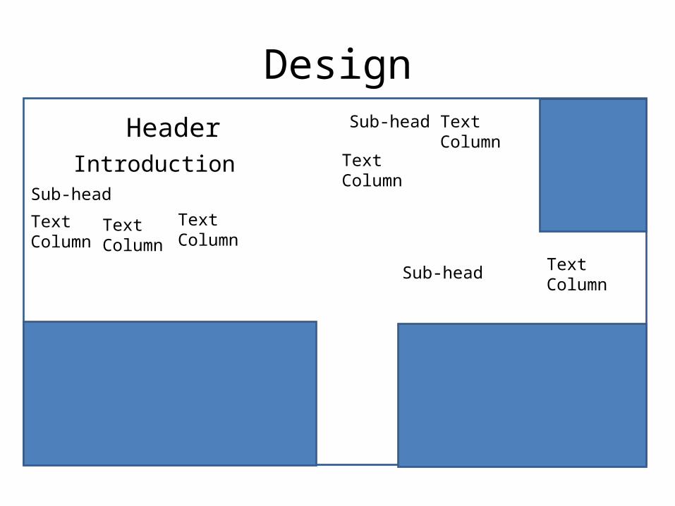
Design Justification and Explanation
• The text is in columns as most Double Page Spreads use this as the basic layout of their pages, so mine using them makes my magazine appear more professional and more realistic.
• There is a higher photo to text ratio as this makes the text appear less daunting and the whole article easier and more pleasant to read and look at.
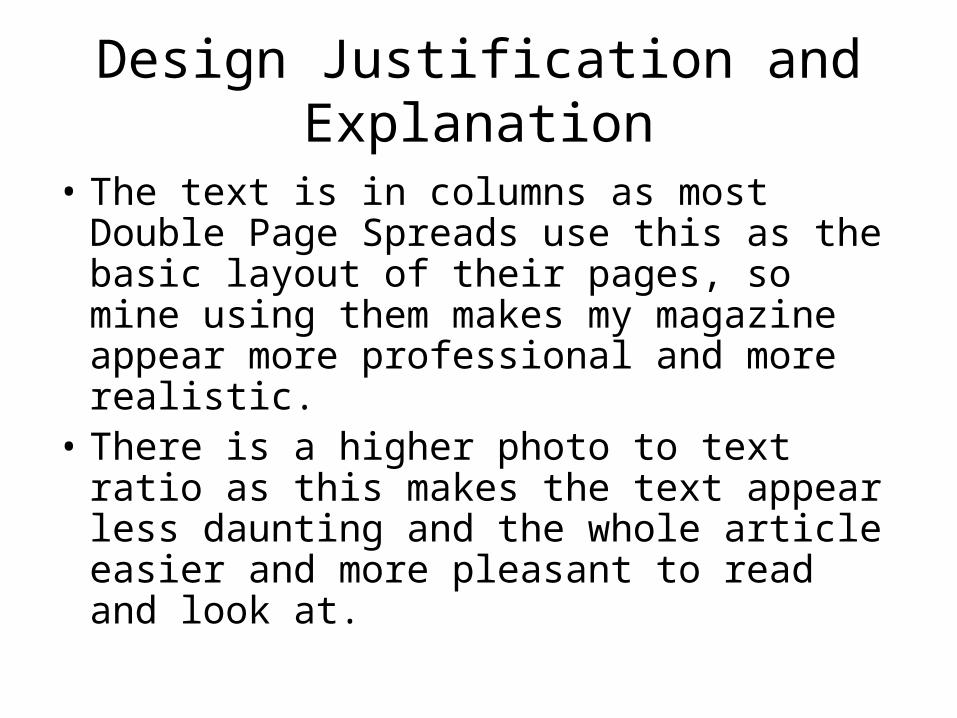
Making the DPS- Heading
Justification
• The heading is in a Courier New font as this is the font used to write scripts. This gives my article a more behind the scenes feel, matching what my extension task needs to achieve and meet.
• This also helps the audience feel more involved with the production of the music video as this is a production font. It creates a relationship.
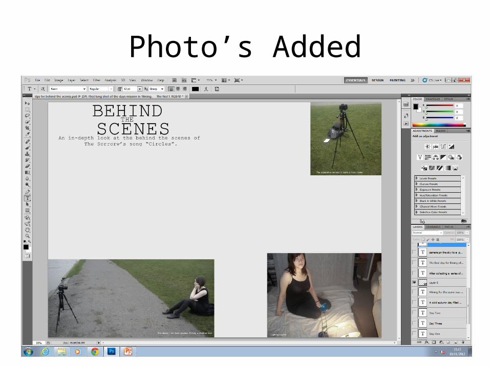
Photo’s Added
Justification
• A higher ratio of text to photo is used to make the article appear less daunting and more approachable to read.
• I have selected these photo’s as they give the most in-sight into the production. One photo shows the equipment required to make the video, whilst others show key shots or lighting requirements being achieved and met.
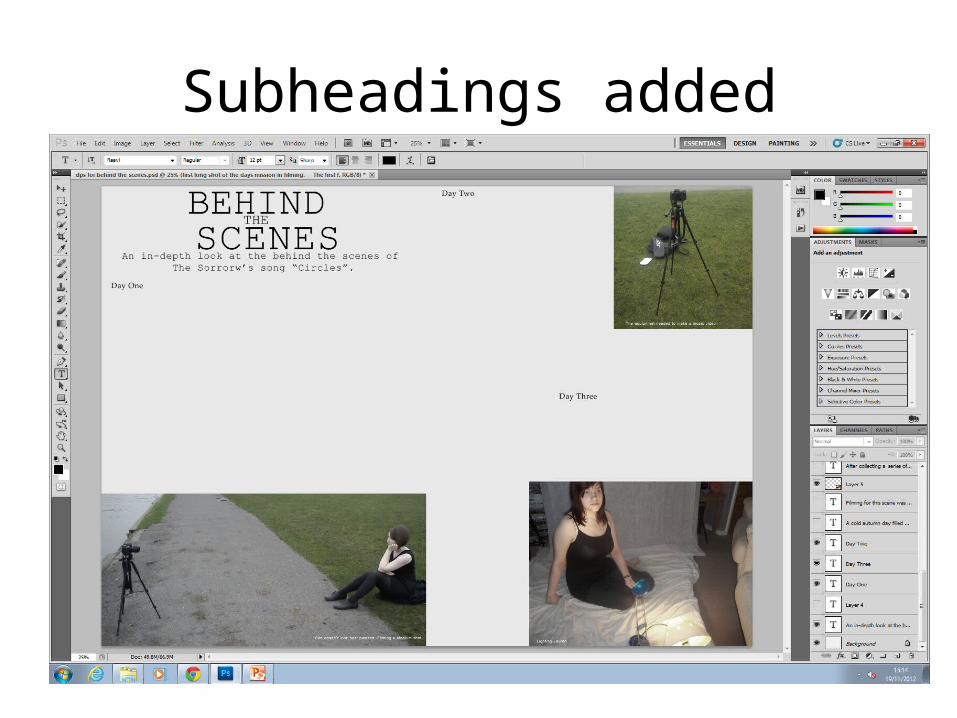
Subheadings added
Justification
• I have added subheadings to break up the text more and make it more appealing and approachable to read.
• It also helps separate filming days allowing more insight into the production to be achieved and met.

Text Added
Justification
• The text is in columns as this is what real magazines do, making mine look more professional.
• A different font type is being used to the subheadings to make the subheadings stand out more and make them more noticeable.