Existing Magazine Mastheads
5
Existing Mastheads Janakan LOGANATHAN
-
Upload
itsjanakan -
Category
Education
-
view
108 -
download
1
Transcript of Existing Magazine Mastheads
Existing Mastheads
Janakan LOGANATHAN

NME
The logo ‘NME’ uses the colour red and this is used to symbolize that its their company logo so
the colour red in the name helps the audiences to remember what this magazine looks like. The red
being used in this name is very light and is always used with white as it is a perfect
combination. This could have been done to symbolize happiness, love and celebration. NME could have used these colours because they focus a lot of the indie music which trends to be full of
happiness and love. The name is written in capitals and in bold font to stand out to the
audiences when they look from a far distance. The front being used here is very simple and pain, this could have been done so that the
magazine covers have a wide range of audiences.

Kerrang!
The masthead conveys the musical genre for the magazine which is rock. The typography uses only a
black font against a white background. The black conveys the rock genre as it has connotations of
rock/punk followers as they are usually stereotypically dressed in this colour. The white font contrasts the black ground which makes the masthead stand out
and thus appeal to the target demographic as Kerrang! Is aimed at individuals, who stereotypically
are determined to be different. As well as this, the masthead is big, bold and loud. This compliments the
rock genre of the magazine as their music is the connotations of intensity as it is associated with being
played loud and involving a lot of shouting. This is complimented by the thin slits throughout the word
which has connotations of being broken which would be associated with being depressed, which punks/emos (target audiences) are usually
stereotyped for.
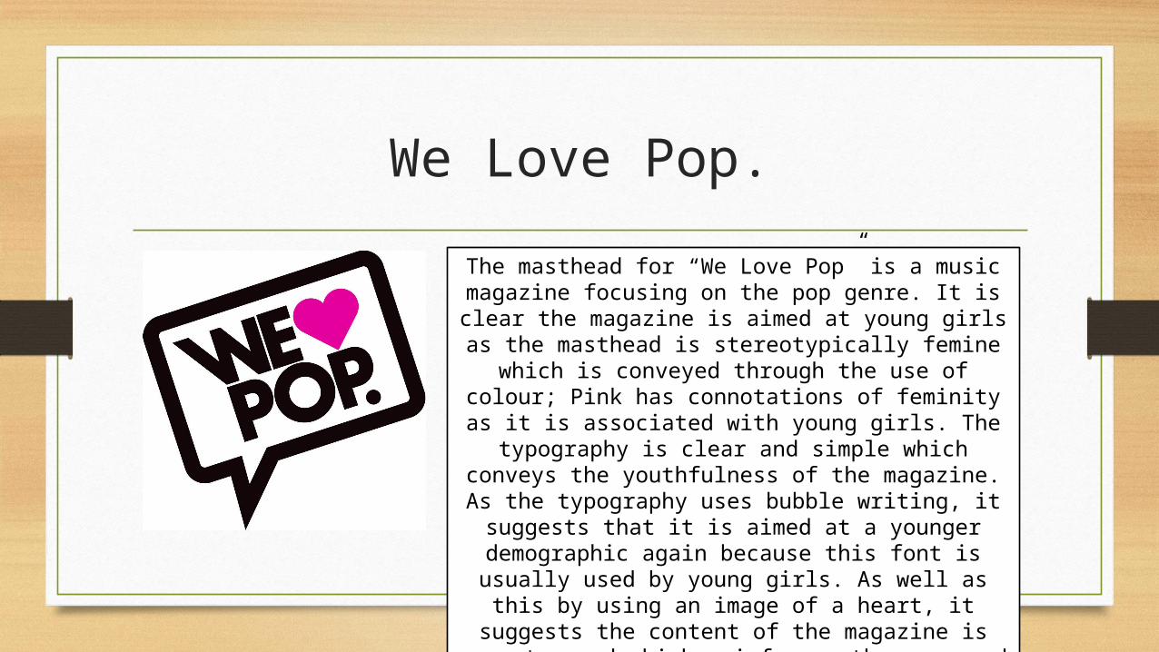
We Love Pop.
The masthead for “We Love Pop” is a music magazine focusing on the pop genre. It is clear
the magazine is aimed at young girls as the masthead is stereotypically femine which is
conveyed through the use of colour; Pink has connotations of feminity as it is associated with young girls. The typography is clear and simple
which conveys the youthfulness of the magazine. As the typography uses bubble writing, it
suggests that it is aimed at a younger demographic again because this font is usually used by young girls. As well as this by using an image of a heart, it suggests the content of the magazine is easy to read which reinforces the
uses and gratifications theory and would appeal to the audiences as they would use the magazine
as an escapism.

Top of the Pop
Here is the masthead for “Top of the pops” magazine which focuses on the pop genre of music. The masthead
has used very vibrant and eccentric colours so it is immediately clear that the magazine is aimed at young
people. The colours also represent the genre of pop as it is usually very upbeat and dance like music. The yellow
‘bubble writing’ typography is outlined by a shade of pink which also colours the spiral of circles behind the
masthead. These look like speakers which reinforce the music elements of the magazine as well as being
associated with loud music. The yellow has connotations of happiness as it is associated with sunshine, whilst the pink is very female orientated which reinforces the audiences
of stereotypical, young girls. The typography is very futuristic, particularly how the “s” has been crated. The text creates an instantly recognisable masthead for the
magazine whilst suggesting to the audience that by reading this magazine, you can stay ahead of all the latest
pop songs. This reinforces the uses and gratifications theory that people read magazines to find out new
information, whilst also appealing to an audience of mainstreamers.