Evaluation q2
9
QUESTION 2 How does your media product represent particular social products?
-
Upload
phoebeconnie -
Category
Marketing
-
view
43 -
download
0
Transcript of Evaluation q2

QUESTION 2 How does your media product represent particular social products?

SHOT TYPESFirstly a main shot I used was an eye line shot as I found that this was a common Convention in music magazines. I featured the eye line shot in my models becauseI felt it created a personal relationship between the featured artist and audience, Which incorporates [Uses and Grat]. Finally with the models being shot at eye linethis concept also engages with the reader and catches their attention by standing outAnd looking at them face to face.

MAGAZINES THAT FEATURE EYE LINE SHOTS:
Above are some examples of magazines that also use this convention, to engageWith readers. [From left to right]: NME, Q and CLASH.
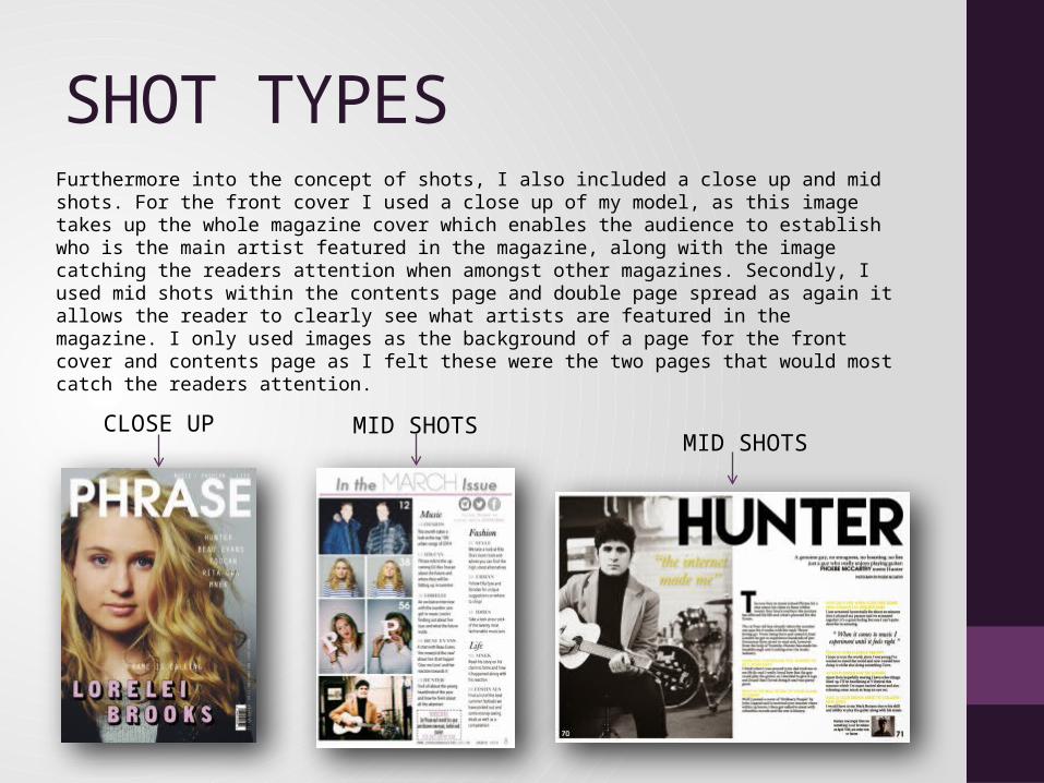
SHOT TYPES Furthermore into the concept of shots, I also included a close up and mid shots. For the front cover I used a close up of my model, as this image takes up the whole magazine cover which enables the audience to establish who is the main artist featured in the magazine, along with the image catching the readers attention when amongst other magazines. Secondly, I used mid shots within the contents page and double page spread as again it allows the reader to clearly see what artists are featured in the magazine. I only used images as the background of a page for the front cover and contents page as I felt these were the two pages that would most catch the readers attention.
CLOSE UP MID SHOTSMID SHOTS

Magazines that feature close up and mid shots:

IMAGE LAYOUTFRONT COVER: For my front cover image I played around with where my image would be placed, at first I used the continuous convention of situating my image in the centre of the page however did this not look right as some of the text blocked the models face and ruined the image. From this I decided to move the image slightly to the left, I felt this worked as no text blocked the image as well as this being a unique convention that I developed. I felt this would appeal to my social group as it is different and unique which normally appeals to an audience buying in the ‘urban’ genre of magazines.
CONTENTS PAGE: For my contents page I decided to situate my images in a cuboid shape, all separate from one another. I got this idea from magazines such as Q and NME as they like to create a pin board look to their contents page. Another platform I gained this idea from was Instagram the well known social media site, the way images are displayed on the app are perceived as polaroid pictures, I incorporated this into my cuboid shape layout. I felt this would appeal strongly to my audience as my social group of 17-25 year olds are the main users of Instagram and would make a link to the site and my page, engaging them to read the magazine.
DOUBLE PAGE SPREAD: For my double page spread I used a clear layout, of using the continuous convention of placing the image on the left hand page. I made the image black and white also to depict a modern and unique image. I felt that clear layout appeal to my target audience mostly, as myself being in that age group and asking my piers we all agreed that a clear layout appeals to us most instead of a busy, overlapping design which is mostly seen in child magazines such as ‘Top of the pops’.

Other magazines that use this layout:
FRONT COVER
I could not find a magazineThat uses left positioning However this was the closest Magazine cover I could fine to mine.
Q magazine, contents Page using the snapShot, cuboid shapeFor images.
NME double page spreadUsing the image on the Left hand page- clear Layout.
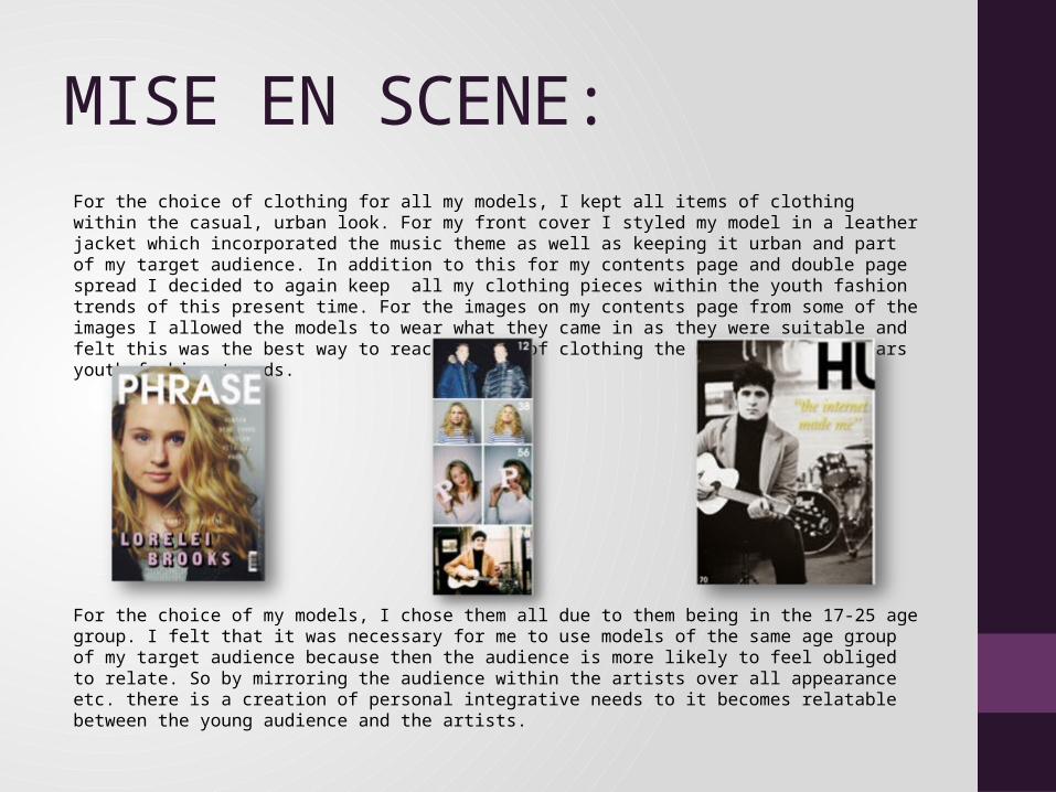
MISE EN SCENE:For the choice of clothing for all my models, I kept all items of clothing within the casual, urban look. For my front cover I styled my model in a leather jacket which incorporated the music theme as well as keeping it urban and part of my target audience. In addition to this for my contents page and double page spread I decided to again keep all my clothing pieces within the youth fashion trends of this present time. For the images on my contents page from some of the images I allowed the models to wear what they came in as they were suitable and felt this was the best way to reach my aim of clothing the models in this years youth fashion trends.
For the choice of my models, I chose them all due to them being in the 17-25 age group. I felt that it was necessary for me to use models of the same age group of my target audience because then the audience is more likely to feel obliged to relate. So by mirroring the audience within the artists over all appearance etc. there is a creation of personal integrative needs to it becomes relatable between the young audience and the artists.

IDEOLOGY As a final representation, my production done the following. Mulvey’s theory is present within my construction, however I could argue that my production goes against and for the theory, for example my male model in my double page spread breaks the stereotype, as he is dressed in smart clothes which is stereotypically not seen to be worn by teenagers generally. This makes the image to be pluralistic as it goes against the stereotype. In addition to this the Laura Mulvey theory is simply portraying that the male is stereotypically perceived as the subject whereas the woman is perceived as the object, this is where the ‘male gaze’ comes in, to depict how people have been conditioned to look at the two genders in media this way. Relating this theory to my construction, my male model for the double page spread is a subject as people do not look at him to objectify him as a person, they perceive the male as the main feature of the page. However with my female model for my front cover she could arguably also be the subject which goes against Mulveys theory, as she is not dressed in provocative clothing and is featured on a female magazine, so generally males would not choose out a female targeted ,magazine and perceive my model as an object. However on the other hand, I could argue that my model is for Mulvey’s theory as she is a pretty girl and her whole face, takes up the background of the page, standing out. Along with this make up and Photoshop has been used, so arguably my image could be seen by males as my model stands out as she is a good looking women, which would suggest that males would objectify my model.