Evaluation q2
4
How effective is the combination of your main product and ancillary texts? As a group we think our three media texts work very well together and complement each other and there are many aspects which help our three media text work well together. One reason why our three media texts work well together is due to our consistency when making our three media texts. An example of where our three media texts are consistent is in the colours, lighting and use of shadows. As you can clearly see in this example both our teaser poster and magazine cover cleverly use colours like black white and grey and they also use shadows to portray a sense of loneliness which reflects our overall theme. Also we used a lot of low key lighting to keep the consistency of using no bright colours throughout our campaign. Using no bright
Transcript of Evaluation q2

How effective is the combination of your main product and ancillary texts?
As a group we think our three media texts work very well together and complement each other and there are many aspects which help our three media text work well together. One reason why our three media texts work well together is due to our consistency when making our three media texts. An example of where our three media texts are consistent is in the colours, lighting and use of shadows.
As you can clearly see in this example both our teaser poster and magazine cover cleverly use colours like black white and grey and they also use shadows to portray a sense of loneliness which reflects our overall theme.
Also we used a lot of low key lighting to keep the consistency of using no bright colours throughout our campaign. Using no bright colours was effective to our campaign because it reflects the mood of our idea as it is not a happy subject which bright colours would portray.

Also to keep our consistency between our three media text we used the same font where possible. Here are prints screens from our teaser trailer and a section of our teaser poster in order to show clearly the consistency in the text we used which was called Daniel which we found on the photo editing sight Ribbet. The reason we were unable to use this text on our magazine cover is because we tried to make a Sight and Sound cover and this text is not the type found on Sight and Sound magazine covers. The text we used has a handwritten look to it which we felt fitted in with the overall theme of our idea.
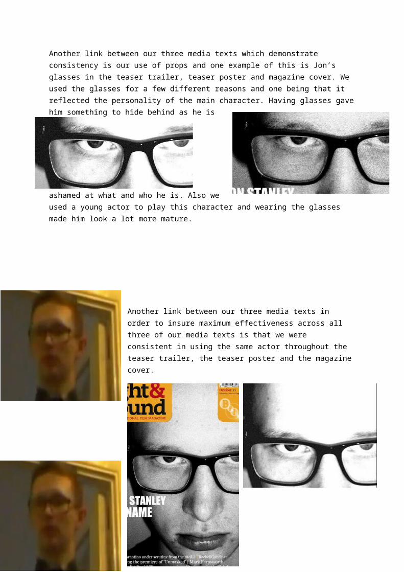
Another link between our three media texts which demonstrate consistency is our use of props and one example of this is Jon’s glasses in the teaser trailer, teaser poster and magazine cover. We used the glasses for a few different reasons and one being that it reflected the personality of the main character. Having glasses gave him something to hide behind as he is ashamed at what and who he is. Also we used a young actor to play this character and wearing the glasses made him look a lot more mature.
Another link between our three media texts in order to insure maximum effectiveness across all three of our media texts is that we were consistent in using the same actor throughout the teaser trailer, the teaser poster and the magazine cover.