Evaluation Q2
7
Magazine Evaluation Sophie White
-
Upload
sophie-white -
Category
Design
-
view
16 -
download
0
Transcript of Evaluation Q2

Magazine Evaluation Sophie White
Question 2 • A) How do the images you have used in your
magazine represent certain focus groups?
I have completed 3 main photo shoots and will talk through each one individually . They have 3 different purposes in the magazine.
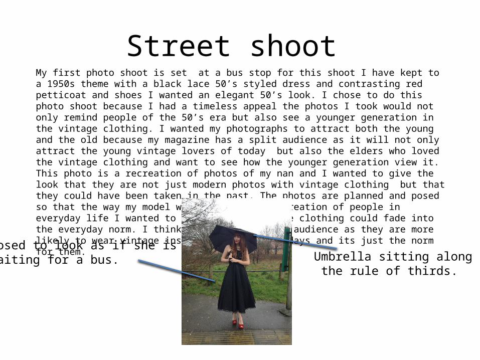
Street shoot My first photo shoot is set at a bus stop for this shoot I have kept to a 1950s theme with a black lace 50’s styled dress and contrasting red petticoat and shoes I wanted an elegant 50’s look. I chose to do this photo shoot because I had a timeless appeal the photos I took would not only remind people of the 50’s era but also see a younger generation in the vintage clothing. I wanted my photographs to attract both the young and the old because my magazine has a split audience as it will not only attract the young vintage lovers of today but also the elders who loved the vintage clothing and want to see how the younger generation view it. This photo is a recreation of photos of my nan and I wanted to give the look that they are not just modern photos with vintage clothing but that they could have been taken in the past. The photos are planned and posed so that the way my model was standing was recreation of people in everyday life I wanted to show how the vintage clothing could fade into the everyday norm. I think this appeals to my audience as they are more likely to wear vintage inspired outfits most days and its just the norm for them.
Umbrella sitting along the rule of thirds.
Posed to look as if she isWaiting for a bus.

30’s shoot My second shoot was more mystical, my model wore a 1930’s styled dress set in an old country lane. I used this photo shoot to demonstrate the fun of vintage as it is a way to dress up and become like our ancestors. This shoot was more posed then the street shoot as it was used more to display the vintage look including the dress. I think this attracts a younger audience who are used to posed magazine covers that show the fashion. This shoot gives the vintage look that is wearable to festivals and this is mostly attractive to the younger audiences.
I liked the look of this picturesque background.
I tried to use the leading lines Of the lane
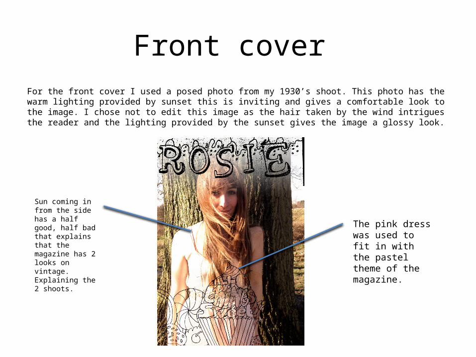
Front cover For the front cover I used a posed photo from my 1930’s shoot. This photo has the warm lighting provided by sunset this is inviting and gives a comfortable look to the image. I chose not to edit this image as the hair taken by the wind intrigues the reader and the lighting provided by the sunset gives the image a glossy look.
Sun coming in from the side has a half good, half bad that explains that the magazine has 2 looks on vintage. Explaining the 2 shoots.
The pink dress was used to fit in with the pastel theme of the magazine.

On the streetThe last of photo shoots were taken on the go when getting inspiration for articles such as Lining a vintage life and Too expensive. These photos were taken to explain what I was writing about within the articles. I used these to assist the readers through the articles because my target audience is young I wanted to keep their attention but not undermine them with helpful imagery. These images did not feature people but instead the items of vintage clothing. I did not edit these images but I would now as it did not give the glossy look I was going for. Although unedited they did fit with the theme of a scrapbook layout.
Image of unnamed shop fromToo expensive article
Should of edited lighting.

Editing images
I did not edit many of my photos as my magazine was looks like a scrapbook. I thought that the unedited look achieved this overall as it was like it had came straight out of a film camera and then stuck on to a page.