![Evaluation: [Music Magazine]](https://static.fdocuments.us/doc/165x107/54b34a1c4a795942708b4603/evaluation-music-magazine-5584a7eceda98.jpg)
Evaluation of My Music Magazine
40
Evaluation of My Music Magazine Called VOLUME
-
Upload
ozgealtinok -
Category
Education
-
view
189 -
download
1
Transcript of Evaluation of My Music Magazine

Evaluation of My Music Magazine
Called
VOLUME
In what ways does your media product use, develop or challenge forms and
conventions of real media products?
When we started this project, we were asked to look at the main
conventions of some magazines. I decided to look at VIBE and NME
and realised that the magazines did have some conventions that would
match my magazine. But I also realised that there were also some
conventions that I would like to challenge in order to give my magazine
the unique touch in order to attract more consumers.


I chose to make the Masthead bright and eye-catching in order to catch the consumers attention.
I decided to use one of the main conventions of the NME magazine “angle of gaze” in order to make it seem like the model is focusing on the reader.
I chose to the medium close up of the model which is just enough to reveal the facial impressions of the artist.
I chose to make the name of the artist bold and placed it on the black part of the picture in order to bring out the name even more.
I chose a volume icon which represents the title of the magazine. I went against a convention of the NME magazine as they like their title plain and simple, but I wanted my magazine to have a unique touch to it.
I located the plug on a bold circle background, I also made the “WIN” text as larger compared to the other text which would attract the consumers.
I chose to put a “pull quote” from the article on the front cover as I think it will jump out to the customers and make them curious to read the article.
I listed the top RnB and Hip-Hop artists as featuring artists in order to cater for other individuals.
my typical reader profile is a fan of Beyonce and has a passion for fashion. So I wanted to cater for my reader profile as well as others.
I used Vibe magazines conventions of presenting a Bar code because I think it gives this unique sense to the magazine.
I decided to put a distribution companies logo on the front cover of the magazine; by doing this I went against the conventions of magazines.

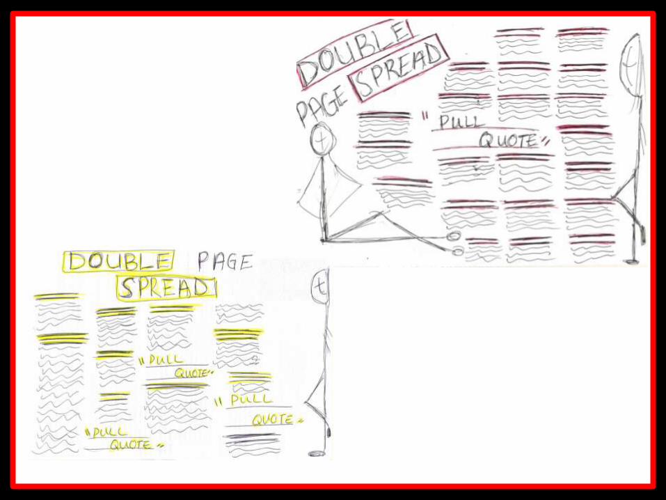
I originally wanted to use this layout for my contents page but I personally think
that the contents page above looks a bit like a poster rather then a contents
page.

I did not use the NME contents page as a conventions source but I did use some of the titles and a bit of the layout.

I used the icon to continue the theme of the magazine.
I placed the BOLD masthead of the contents at the front of a plain background which will make the masthead look bolder and eye catching. I used the same phone as the front cover of the magazine which again shows continuity.
I used the NME conventions of the headings of the columns. There is a colour block underneath each heading-this ensures that the headings will be outlined for the audience and attracts their attention with the bold choice of colour.
I used big and bold numbers so that the readers can find what they are looking for quicker. The big numbers also makes it easier
for the readers to read and see .
I linked the picture of the article and the actual article together by placing the page number on the picture. This will help the readers find the page quicker by seeing the representation of that article which is the artists. This is also a convention of the NME magazine which I wanted to use.
The artists picture that I used on my contents page had to wear something different compared to the front cover. This is a main convention of many music magazines. This enabled my magazine to look realistic.
This is not normally placed on the contents page but I decided to challenge this convention by placing it on the contents page. Social media is a main selling point of many magazines as they make sure that their magazine caters for everyone as not everyone is able to buy a magazine but most people have internet.
For the article titles I made them bold and Red. This made them stand out and eye-catching to the rest of the writing below them.
At first I was going to put the Facebook and the twitter icon on their rather then putting the whole name but then I realised that some people may not be
familiar with the icons.
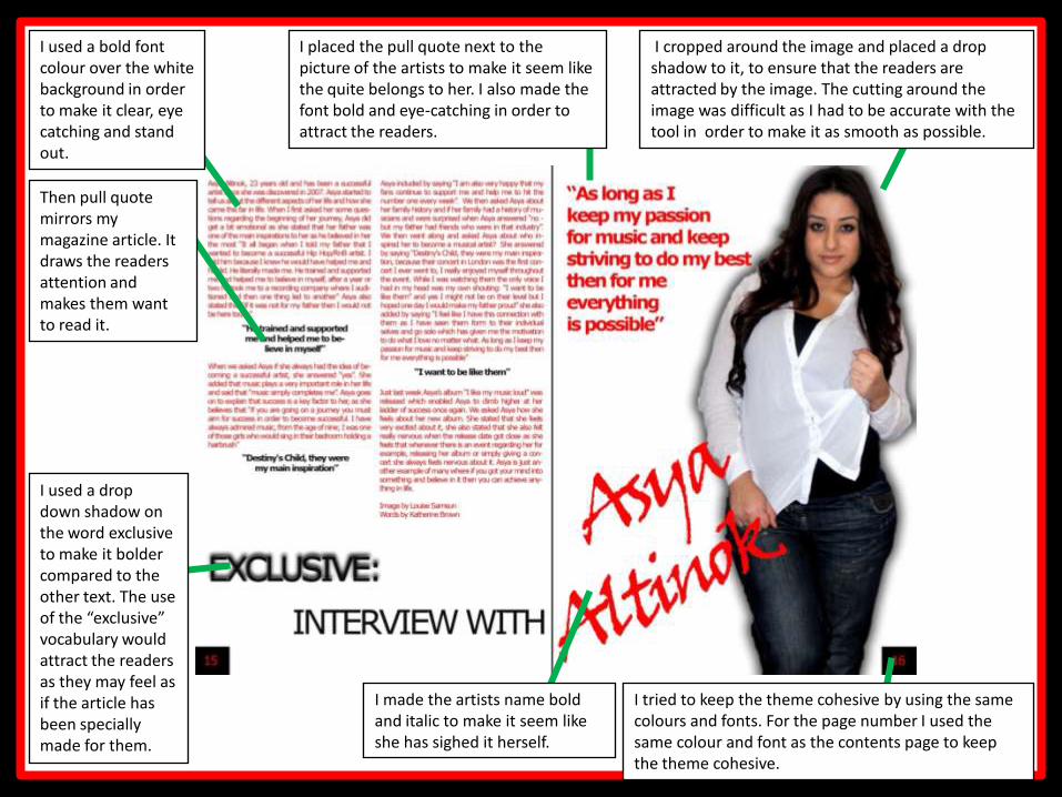
I made the artists name bold and italic to make it seem like she has sighed it herself.
I used a bold font colour over the white background in order to make it clear, eye catching and stand out.
I placed the pull quote next to the picture of the artists to make it seem like the quite belongs to her. I also made the font bold and eye-catching in order to attract the readers.
I used a drop down shadow on the word exclusive to make it bolder compared to the other text. The use of the “exclusive” vocabulary would attract the readers as they may feel as if the article has been specially made for them.
Then pull quote mirrors my magazine article. It draws the readers attention and makes them want to read it.
I tried to keep the theme cohesive by using the same colours and fonts. For the page number I used the same colour and font as the contents page to keep the theme cohesive.
I cropped around the image and placed a drop shadow to it, to ensure that the readers are attracted by the image. The cutting around the image was difficult as I had to be accurate with the tool in order to make it as smooth as possible.

How does your media product represent particular social groups?
My magazine is aimed at both sexes aged between 16 and 20

Ideal representations of women?The Ideal connotations of women suggested that they were powerless,
gentle, did not come before men and were only seen good for cleaning and
reproduction.
Recently, as time has changed and moved on, the connotations and
expectations of women have also changed. Women now have their own
power and independence where they can work and have qualifications.
They all have equal rights now due to the Sex Discrimination Act.
Old Representations of womenNew Representations of women

Ideal representations of men?The ideal connotations of men suggest that they had power over women,
they were all Macho, strong, healthy. They were only seen doing man like
jobs. But now in the 21st century the connotations of men have changed too.
They are see to be at the same level as women., they are also seen to have
the same qualifications and jobs as women.
Old Representations of men New Representations of men

Below are some images of young males and females
(social groups) that my magazine represents.

http://www.youtube.com/watch?v=AP6ps5CxgVk&safe=active
http://www.youtube.com/watch?v=-zvbDkVkD0Y&feature=related&safe=active

My magazine represents social groups
who are at the age of 20 or younger. It
represents young people who are
confident, independent and
hardworking.
I used a model who falls in the age
group but also who is confident in
herself and I thought that if I use her
then she might be able to represent
her confidence within the pictures and
she did. I used the colour scheme of
white, black and red which are all bold
colours. These colours could also
work on their own because they are
bold and eye-catching. This again
represents confidence.

I wanted my articles to represent
young people again. I chose articles
that I would be interested in myself as
I fall in the age group myself. The
model on the contents again has this
confident. The articles are linked to
young peoples likes and looked up
artists.

I wanted to challenge some of the negative connotations of young people in
my media products. For example, I wanted to make my article on my
double page spread as a successful article where readers can be inspired
by the article. I also wanted this article to challenge some of the negative
thought of young people.

What kind of media institution might distribute your media product and
why?

Bauer distribution company is apart of the Bauer media group which is Europe's biggest privately owned publishing group. The Bauer company is a worldwide known distribution company which offers 300 magazines in 15 different countries which included TV, Radio station and online. I think Bauer could distribute my product as firstly they are a “multi-platform UK based” Company. I think this will benefit my product as they don’t only distribute hard copy but they also distribute via radio stations and also over the net.As the Bauer company has distributed successful music magazine like ‘Q’ and ‘Kerrange’ which has a similar audience as my magazine I think my media product would really benefit from the company as the company is experience already in the distributing music magazines.
Who would be the audience for
your media product?
And
How did you attract/address your
audience?

My media product was a Hip-Hop/RnB based music magazine, I did already know a lot about the genre but I still had to research into it deeper, develop ideas
deeper. Throughout the whole production of my magazine I had to think about the genre and my target audience and how I can apply my idea to them, this was one
of the reasons why I carried out a lot of peer feedback sessions.

Age and Gender
Before I did the planning and research I wanted my magazine to cater for the age groups of 14-30 but then I realised that this age group was to broad which will be hard for me to cater for. So I narrowed my age group down to ages between 16-
20. I chose this age group because the people around me and myself fall into this age group so I thought getting the information will be a lot easier and accurate as it
is a primary source.
From the begging I wanted my to magazine to be for both genders; males and
females as I feel that it is a large market where my magazine would sell, On the
other hand as my target audience are students they might not be able to afford it.

People that are within that age
group of 14-20 usually admire
people who are successful.
I think the listed featuring artists will
attract my audience if they are
interested in the Hip-Hop/RnB genre
as the artists which are listed are
mostly the most successful ones.
Most young people are also
interested in freebies, I think this plug
will attract my target audience as it is
a free giveaway.
When I did my questionnaire for my
market research the majority of the
people I asked fell into my age group
of 16-20. the respondents told me inn
my questionnaire what to do and
what not to do.

16-20 Year Olds
A typical reader:- Likes going to concert and gigs.- Likes to spend time with friends- Likes to follow fashion- They are fans of the top RnB and Hip-Hop artists
I attracted my media audience
my revolving my magazine
around the things that age
group might like.
Another attraction point is
social media: a lot of people
that fall under the age group of
16-20 are likely to use social
media to socialise as it is one
of the recent and successful
socialising sites which is in the
trend.
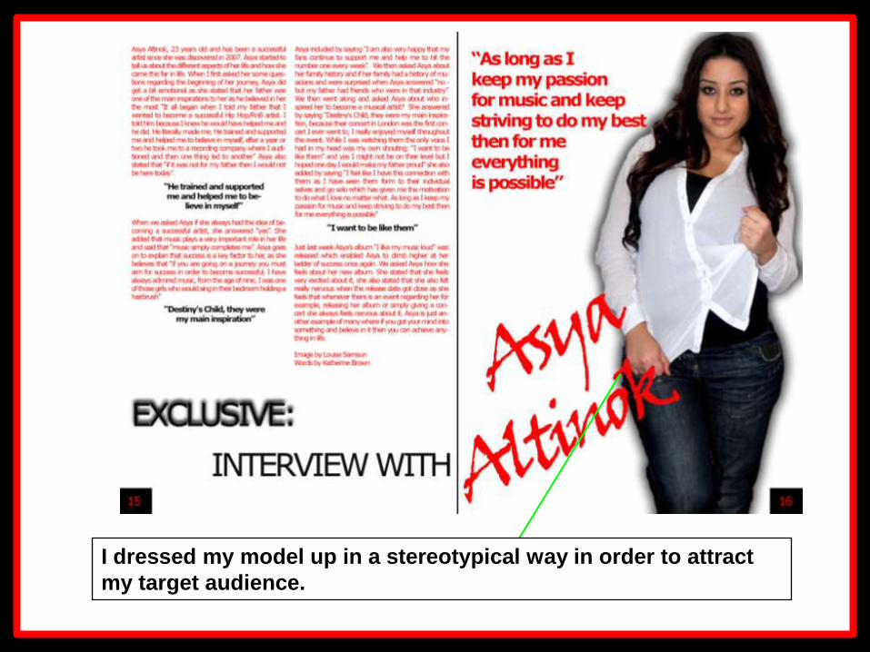
I dressed my model up in a stereotypical way in order to attract
my target audience.

What have you learnt about
technologies from the process of
constructing this product?

During the production of my media
product I used a variety of
technologies, I have learnt a lot about
those technologies. The technologies
that I have used has really helped me
in producing my work.

Below is a list of the technologies that I used in the making of my media
product.
SLR camera
Digital Camera
Scanner
Adobe Photoshop
Internet Explore
Blogger
Microsoft Word
Slide share
Microsoft PowerPoint

SLR CameraI used the SLR camera to take pictures
for my magazine which was really
helpful. Because it was a digital camera
rather than a traditional camera I was
able to see the images instantly this
gave me an option of keeping the
pictures or not; this also gave me a
chance to see if the pictures where
coming out the way I had planed, if not I
was able to change the angle of the
camera for it to best suite the my plan.
Due to the large amount of space the
memory card of the camera has I was
able to take many photos at different
angles which gave me a lot to work with.

Adobe PhotoshopAdobe Photoshop is a picture programme that
enables me to edit photos. It was one of the
most useful technologies that I had used
throughout the development of my music
magazine. It helped me to present ,y images in
a creative way that I could not have done
before. For example for my double page
spread, I placed two images on the page I
added some effects on the images, Photoshop
helped me to see how these images could look
on the double page spread.
Photoshop also helped me to crop the image
on the right.

Internet ExplorerInternet explorer was really helpful because I
was able to find my secondary research from
the net.
I was able to look at the forms and conventions
of the magazines and apply this to my
magazine.
Internet explorer also enabled me to document
the work that I have done onto my blog which
was helpful when it came to the evaluate as I
was able to look back at my work and record
my progress.
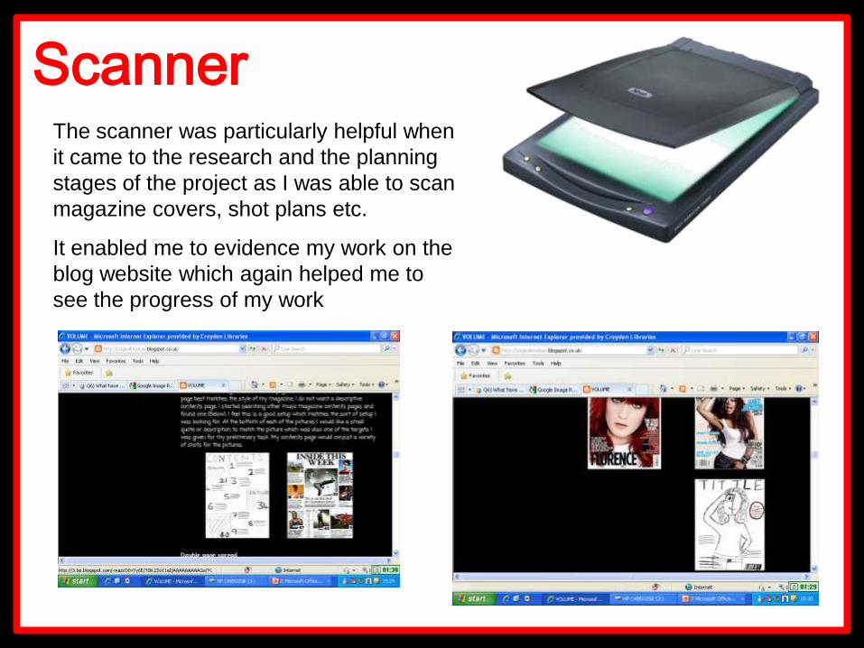
ScannerThe scanner was particularly helpful when
it came to the research and the planning
stages of the project as I was able to scan
magazine covers, shot plans etc.
It enabled me to evidence my work on the
blog website which again helped me to
see the progress of my work

Microsoft Word
Microsoft word has
enabled me to draft my
double page spread
article and blog posts
to see if they make
sense on the word
document before I
uploaded it on to my
blog.
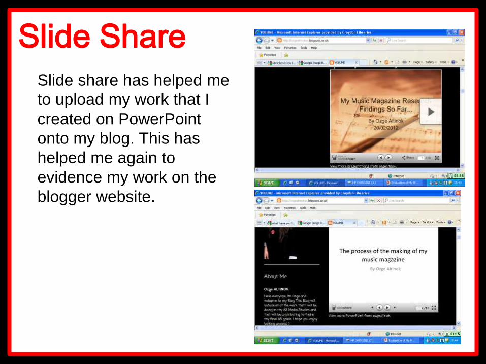
Slide Share
Slide share has helped me
to upload my work that I
created on PowerPoint
onto my blog. This has
helped me again to
evidence my work on the
blogger website.

iPhoneI used the iPhone recorder to record
the feedback for my magazine. The
handheld was easy to use as I was
able to take the video, but when it
came to uploading the file it was
difficult as I was not able to simply
copy and paste the file on to my
PowerPoint presentation. I had to
convert the file into a WMV file which
took around 45 minutes. And then I
placed the converted files into
‘premier’ which is a video making
programme.

Looking back at your preliminary
task, what do you feel you have
learnt in the progression from it to
the full product?


I think I have definitely improved my skills compared to my preliminary task as I feel I am
confident in working with technologies like SLR cameras, Photoshop and blogger. I think my
researching skills have also improved over the year as I feel that now I know a lot of research
methods and varieties.