
Evaluating Multi-Dimensional Visualizations for ...
10
Evaluating Multi-Dimensional Visualizations for Understanding Fuzzy Clusters Ying Zhao, Feng Luo, Minghui Chen, Yingchao Wang, Jiazhi Xia, Fangfang Zhou, Yunhai Wang, Yi Chen and Wei Chen Abstract—Fuzzy clustering assigns a probability of membership for a datum to a cluster, which veritably reflects real-world clustering scenarios but significantly increases the complexity of understanding fuzzy clusters. Many studies have demonstrated that visualization techniques for multi-dimensional data are beneficial to understand fuzzy clusters. However, no empirical evidence exists on the effectiveness and efficiency of these visualization techniques in solving analytical tasks featured by fuzzy clusters. In this paper, we conduct a controlled experiment to evaluate the ability of fuzzy clusters analysis to use four multi-dimensional visualization techniques, namely, parallel coordinate plot, scatterplot matrix, principal component analysis, and Radviz. First, we define the analytical tasks and their representative questions specific to fuzzy clusters analysis. Then, we design objective questionnaires to compare the accuracy, time, and satisfaction in using the four techniques to solve the questions. We also design subjective questionnaires to collect the experience of the volunteers with the four techniques in terms of ease of use, informativeness, and helpfulness. With a complete experiment process and a detailed result analysis, we test against four hypotheses that are formulated on the basis of our experience, and provide instructive guidance for analysts in selecting appropriate and efficient visualization techniques to analyze fuzzy clusters. Index Terms—Evaluation, multi-dimensional visualization, fuzzy clustering, parallel coordinate plot, scatterplot matrix, principal component analysis, radviz 1 I NTRODUCTION Fuzzy clustering [8, 22], which is also known as soft clustering, accepts the fact that clusters in data are usually not completely well separated and assigns a membership degree (MD) between 0 and 1 for each datum to every cluster. Traditional hard clustering sorts a datum into a specific cluster without considering uncertainty. Therefore, fuzzy clustering is more practical than traditional hard clustering for many real-world scenarios, such as medical diagnosis [40], weather forecasting [9], and online music services [41]. Fuzzy clusters can be expressed as a MD matrix in which rows and columns describe data items and clusters, respectively. A cell indicates the MD of a datum to a cluster. When the matrix contains numer- ous data items and a plurality of clusters, it would become complex multi-dimensional data, which makes obtaining insights from the fuzzy clusters challenging for analysts. Many studies have demonstrated that visualization techniques for multi-dimensional data are significantly beneficial to understand fuzzy clusters [1, 5, 12]. With the assistance of interpretable and interactive methods, analysts are able to explore the answers of a series of complex analysis questions [17, 36, 50, 63]. For example, what is the clustering structure of a fuzzy clustering result? What mutual relationships exist between the clusters of interest? Is a clustering result acceptable? Empirically, one visualization technique performs well only on a particular analysis task [16, 24, 34, 37]. Therefore, evaluating the ability of multi-dimensional visualization techniques is essential to provide practical guidelines that can help analysts in selecting the appropriate • Ying Zhao, Feng Luo, Minghui Chen, Yingchao Wang, Jiazhi Xia and Fangfang Zhou are with Central South University. E-mail: {zhaoying,luofeng365,minghui,0903150322,xiajiazhi,zff}@csu.edu.cn. • Yunhai Wang is with Shandong University. E-mail: [email protected] • Yi Chen is with Beijing Technology and Business University. E-mail: [email protected] • Wei Chen is with State Key Lab of CAD & CG, Zhejiang University. E-mail: [email protected]. • Jiazhi Xia and Wei Chen are corresponding authors. Manuscript received xx xxx. 201x; accepted xx xxx. 201x. Date of Publication xx xxx. 201x; date of current version xx xxx. 201x. For information on obtaining reprints of this article, please send e-mail to: [email protected]. Digital Object Identifier: xx.xxxx/TVCG.201x.xxxxxxx techniques when faced with various analysis tasks. To our knowledge, no previous work has evaluated the ability of the techniques to support the tasks involved in analyzing fuzzy clusters. Most existing approaches are qualitative studies that examine general tasks for multi-dimensional data analysis, such as value retrieval [32, 58], class separability [24, 31], and correlation judgment [34, 53]. Although these general tasks are also required in fuzzy clusters analysis, many special tasks featured by fuzzy clusters are entirely different. To address this research gap, we conduct a controlled experiment to evaluate multi-dimensional visualization techniques in analyzing fuzzy clusters. First, we carefully select four classic multi-dimensional visualization techniques, namely, parallel coordinate plot (PCP), scat- terplot matrix (SPM), principal component analysis (PCA), and radial coordinate visualization (Radviz). Then, we divide the four techniques into two categories: lossy and lossless, and design consistent visual encodings and interactions to evaluate them with uniform comparisons. To guide our experiment design, we carefully define the analytical tasks specific to fuzzy clusters analysis, expand the tasks into representative questions, and formulate four hypotheses on the basis of our experience in practicing the four techniques. Seven datasets that are frequently used in fuzzy clustering are se- lected as experiment data. Fifteen graduate students with diverse aca- demic backgrounds are recruited as experiment subjects. We design objective questionnaires to present the tasks that the volunteers have to solve, and observe the accuracy and time of the volunteers using the four techniques to complete the tasks. We also design subjective questionnaires to collect the subjective experience of the volunteers. After preparing the experiment data, volunteers, and equipment, we design a complete experiment process, including volunteer training, formal experiment, and interview. We record two objective metrics (i. e., accuracy and time) and four subjective metrics (i. e., satisfaction, ease of use, informativeness, and helpfulness) as experiment results, and perform a comprehensive sta- tistical analysis using Shapiro-Wilk, non-parametric Friedman, and Tukey’s HSD tests. The analysis results of the two objective metrics and the satisfaction measured with the objective questionnaires suggest that one hypothesis is fully confirmed, but the others are only partially confirmed. The analysis results of the other three subjective metrics measured with the subjective questionnaires indicate which visualiza- tion technique has the best overall usability when performing the tasks. After synthesizing all the analysis results, we summarize the ability of
Transcript of Evaluating Multi-Dimensional Visualizations for ...

Evaluating Multi-Dimensional Visualizations forUnderstanding Fuzzy Clusters
Ying Zhao, Feng Luo, Minghui Chen, Yingchao Wang, Jiazhi Xia,Fangfang Zhou, Yunhai Wang, Yi Chen and Wei Chen
Abstract—Fuzzy clustering assigns a probability of membership for a datum to a cluster, which veritably reflects real-world clusteringscenarios but significantly increases the complexity of understanding fuzzy clusters. Many studies have demonstrated that visualizationtechniques for multi-dimensional data are beneficial to understand fuzzy clusters. However, no empirical evidence exists on theeffectiveness and efficiency of these visualization techniques in solving analytical tasks featured by fuzzy clusters. In this paper, weconduct a controlled experiment to evaluate the ability of fuzzy clusters analysis to use four multi-dimensional visualization techniques,namely, parallel coordinate plot, scatterplot matrix, principal component analysis, and Radviz. First, we define the analytical tasks andtheir representative questions specific to fuzzy clusters analysis. Then, we design objective questionnaires to compare the accuracy,time, and satisfaction in using the four techniques to solve the questions. We also design subjective questionnaires to collect theexperience of the volunteers with the four techniques in terms of ease of use, informativeness, and helpfulness. With a completeexperiment process and a detailed result analysis, we test against four hypotheses that are formulated on the basis of our experience,and provide instructive guidance for analysts in selecting appropriate and efficient visualization techniques to analyze fuzzy clusters.
Index Terms—Evaluation, multi-dimensional visualization, fuzzy clustering, parallel coordinate plot, scatterplot matrix, principalcomponent analysis, radviz
1 INTRODUCTION
Fuzzy clustering [8,22], which is also known as soft clustering, acceptsthe fact that clusters in data are usually not completely well separatedand assigns a membership degree (MD) between 0 and 1 for each datumto every cluster. Traditional hard clustering sorts a datum into a specificcluster without considering uncertainty. Therefore, fuzzy clusteringis more practical than traditional hard clustering for many real-worldscenarios, such as medical diagnosis [40], weather forecasting [9], andonline music services [41].
Fuzzy clusters can be expressed as a MD matrix in which rows andcolumns describe data items and clusters, respectively. A cell indicatesthe MD of a datum to a cluster. When the matrix contains numer-ous data items and a plurality of clusters, it would become complexmulti-dimensional data, which makes obtaining insights from the fuzzyclusters challenging for analysts. Many studies have demonstrated thatvisualization techniques for multi-dimensional data are significantlybeneficial to understand fuzzy clusters [1, 5, 12]. With the assistance ofinterpretable and interactive methods, analysts are able to explore theanswers of a series of complex analysis questions [17, 36, 50, 63]. Forexample, what is the clustering structure of a fuzzy clustering result?What mutual relationships exist between the clusters of interest? Is aclustering result acceptable?
Empirically, one visualization technique performs well only on aparticular analysis task [16,24,34,37]. Therefore, evaluating the abilityof multi-dimensional visualization techniques is essential to providepractical guidelines that can help analysts in selecting the appropriate
• Ying Zhao, Feng Luo, Minghui Chen, Yingchao Wang, Jiazhi Xia andFangfang Zhou are with Central South University. E-mail:{zhaoying,luofeng365,minghui,0903150322,xiajiazhi,zff}@csu.edu.cn.
• Yunhai Wang is with Shandong University. E-mail:[email protected]
• Yi Chen is with Beijing Technology and Business University. E-mail:[email protected]
• Wei Chen is with State Key Lab of CAD & CG, Zhejiang University. E-mail:[email protected].
• Jiazhi Xia and Wei Chen are corresponding authors.
Manuscript received xx xxx. 201x; accepted xx xxx. 201x. Date of Publicationxx xxx. 201x; date of current version xx xxx. 201x. For information onobtaining reprints of this article, please send e-mail to: [email protected] Object Identifier: xx.xxxx/TVCG.201x.xxxxxxx
techniques when faced with various analysis tasks. To our knowledge,no previous work has evaluated the ability of the techniques to supportthe tasks involved in analyzing fuzzy clusters. Most existing approachesare qualitative studies that examine general tasks for multi-dimensionaldata analysis, such as value retrieval [32,58], class separability [24,31],and correlation judgment [34, 53]. Although these general tasks arealso required in fuzzy clusters analysis, many special tasks featured byfuzzy clusters are entirely different.
To address this research gap, we conduct a controlled experimentto evaluate multi-dimensional visualization techniques in analyzingfuzzy clusters. First, we carefully select four classic multi-dimensionalvisualization techniques, namely, parallel coordinate plot (PCP), scat-terplot matrix (SPM), principal component analysis (PCA), and radialcoordinate visualization (Radviz). Then, we divide the four techniquesinto two categories: lossy and lossless, and design consistent visualencodings and interactions to evaluate them with uniform comparisons.To guide our experiment design, we carefully define the analytical tasksspecific to fuzzy clusters analysis, expand the tasks into representativequestions, and formulate four hypotheses on the basis of our experiencein practicing the four techniques.
Seven datasets that are frequently used in fuzzy clustering are se-lected as experiment data. Fifteen graduate students with diverse aca-demic backgrounds are recruited as experiment subjects. We designobjective questionnaires to present the tasks that the volunteers haveto solve, and observe the accuracy and time of the volunteers usingthe four techniques to complete the tasks. We also design subjectivequestionnaires to collect the subjective experience of the volunteers.After preparing the experiment data, volunteers, and equipment, wedesign a complete experiment process, including volunteer training,formal experiment, and interview.
We record two objective metrics (i. e., accuracy and time) and foursubjective metrics (i. e., satisfaction, ease of use, informativeness, andhelpfulness) as experiment results, and perform a comprehensive sta-tistical analysis using Shapiro-Wilk, non-parametric Friedman, andTukey’s HSD tests. The analysis results of the two objective metricsand the satisfaction measured with the objective questionnaires suggestthat one hypothesis is fully confirmed, but the others are only partiallyconfirmed. The analysis results of the other three subjective metricsmeasured with the subjective questionnaires indicate which visualiza-tion technique has the best overall usability when performing the tasks.After synthesizing all the analysis results, we summarize the ability of
the four techniques to support our defined tasks and questions. Finally,we discuss the experience we gained from the experiment and presentthe limitations of this evaluation and further directions.
2 RELATED WORK
2.1 Visualization of Fuzzy Clustering Analysis
Many fuzzy clustering algorithms have been developed ever sincethe concepts of fuzzy sets and fuzzy partition were first proposed byZadeh [62] and Ruspini [47]. Fuzzy c-means clustering algorithm(FCM) [6] is the most widely known algorithm because of its simpledesign and easy conversion into an optimization problem. In this work,we use the FCM algorithm to generate fuzzy clusters for our evaluation.The FCM assigns a probability of membership for each datum to eachcluster, which reflects the fuzzy relations among data items and clusters.However, this feature increases the complexity of understanding theclustering result. Klawonn et al. [30] pointed out that multi-dimensionalvisualization can facilitate the interpretation and understanding of theresult. From then on, a variety of techniques have been proposed toanalyze fuzzy clusters visually and interactively.
Multi-dimensional visualization techniques, which are based on di-mensionality reduction (DR) methods, are frequently used to generatean observable overview of fuzzy clusters. Mao and Jain [38] utilizedPCA to map a fuzzy clustering result onto a 2D plane while preservingthe distances between pairwise data items and to assist analysts in per-ceiving the similarities between data items. Abonyi and Babuska [1]proposed a modified fuzzy sammon mapping (FSM) that preserves thedistances between data items and cluster centers instead of pairwisedata items, which associates data items with clusters presented to an-alysts. Sharko et al. [50, 51] discovered that Radviz has advantagesin visualizing fuzzy clusters because the position of a data item inRadviz can directly indicate its membership distribution to all clus-ters. Hoppner and Klawonn [25] combined MDS with spheres to helpanalysts in observing the correlation of cluster memberships. Ruedaand Zhang [46] proposed a novel method that maps data items intoan irregular hyper-tetrahedron to reflect inter-cluster relationships in aspatial manner.
DR-based visualization inevitably results in the loss of information.To avoid information loss, some researchers proposed lossless visual-ization techniques to present the complete information of fuzzy clusters.Berthold and Hall [5] visualized a fuzzy clustering result in PCP toenable analysts to investigate the membership distributions of clustersintuitively. Gasch and Eisen [21] employed a heatmap to visualizethe sorted membership matrix of a fuzzy clustering result to help an-alysts discover similarities between clusters as correctly as possible.On the basis of the design of SPM, Cao et al. [7, 35] presented a noveltechnique called UnTangle Map, which weaves an interactive mesh oftriangle-style scatterplots and is suitable for analyzing fuzzy similaritiesand correlations among clusters.
All the above approaches have their own technical strengths in fuzzyclusters analysis. To our knowledge, no previous work has systemati-cally evaluated their strengths and weaknesses. Therefore, this workselects PCA and Radviz from the above DR-based techniques andPCP and SPM from the obove lossless techniques as representatives toperform an evaluation.
2.2 Evaluation of Multi-dimensional Visualization
A number of visualization techniques are used to visualize multi-dimensional data. Keim and Kriegel [29] classified these techniquesinto six categories. Most of the techniques that are used for fuzzy clus-ters analysis belong to the first category, namely, geometric projection.The four popular techniques that belong to this category are used inthe evaluation and divided into two groups, namely, lossy (PCA andRadviz) and lossless (PCP and SPM).
Visualizing multi-dimensional data on a 2D/3D plane/space is aninherently ill-posed problem; thus, no single method has no drawbacks.Researchers have gradually realized the importance of comparing andevaluating different techniques. For example, for the lossy approaches,Sedlmair et al. [49] explored the performance of four frequently used
DR methods on class separability, and Rubio-Sanchez et al. [45] com-pared two classic radial projection techniques (i. e. Radviz and starcoordinates) on their mapping mechanisms and layout performances.For the lossless techniques, Holten and Wijk [24] evaluated the timeand correctness performances of nine PCP variations for cluster identi-fication, and Li et al. [34] compared the effectiveness of PCP and SPMfor correlation judgment.
In addition to comparing multi-dimensional visualization techniquesfrom a technical standpoint, evaluations that involve real-world appli-cation scenarios are important. These evaluations, along with payingattention to the immediate needs of the actual users and reducing ab-stract technical comparisons, aim to provide practical guides that helpusers select the most appropriate technique when faced with an analysistask. A few evaluation studies have been conducted in real-world sce-narios. Dimara et al. [14] rigorously evaluated the ability of PCP, SPM,and tabular visualizations to support decision making while selectingholiday travel packages as its application scenario. Marghescu [39]investigated various multi-dimensional visualization techniques withrespect to their effectiveness in solving the problem of financial com-petitor benchmarking. Rzezniczak [48] examined many techniques toobtain the best technique in facilitating disease recognition based onreference to medical patterns and data of patient’s condition. This workfocuses on the scenario of fuzzy clusters analysis. This is considered anew scenario different from the above scenario-based evaluations.
As stated in Section 2.1, a number of works have presented theirmethods of visualizing multi-dimensional fuzzy-clustered data. Someof them provided evaluations in explaining the pros and cons of theirproposed methods. Abonyi and Babuska [1] compared the clustervalidity performance of FSM and PCA. Cao et al. [7] conducted abrief evaluation to illustrate the advantages of UnTangle Map on PCP,SPM, and PCA. However, such evaluations often tend to only examineseveral analysis tasks that can highlight the outstanding features oftheir proposed methods. So far, no study has conducted systematicalevaluation followed by carefully summarized analysis tasks controlledunder rigorous experimental settings to understand fuzzy clusters.
3 TECHNIQUE DESIGN
We focus on four visualization techniques, namely, PCP, SPM, PCA,and Radviz. The technique selection is mainly based on three principles:(1) Universality, the candidates must be popular in multi-dimensionaldata visualization and fuzzy clusters analysis. All the four selected tech-niques are very common multi-dimensional visualization techniquesand have appeared in the literatures related to fuzzy clusters analysis;(2) Diversity, the candidates must cover the lossy and lossless tech-niques introduced in Section 2.1 to expand the diversity of techniques.Among the four selected techniques, PCA and Radviz are represen-tatives of lossy techniques, while PCP and SPM are representativesof lossless techniques; (3) Comparability, the candidates of the samecategory should have distinct strategies for embedding data in a 2Dplane. In terms of our choice, PCA and Radviz have entirely distinctmulti-dimensional data projection strategies, and the visual mappingsof PCP and SPM are also quite different.
3.1 Data ModelWe use the FCM algorithm proposed by Bezdek et al. [6] to generatefuzzy clusters data (CData) from the original data (OData). OData andCData can be described as matrices. In the OData matrix, each rowand column represent a data item and an original dimension (ODim),respectively. In the CData matrix, each row represents a data item,but each column represents a cluster (CDim). The value of each cellindicates the MD to which a specific data item belongs to a certaincluster. The FCM algorithm has two initialization parameters, namely,m for controlling the extent of cluster overlap and c for identifying thenumber of target clusters. The parameter m is kept consistent for allexamined datasets, and c equals the ground truth.
3.2 Visual EncodingsUsing various encodings in different visualizations may result in con-fusion or misinterpretation among volunteers [44]. In this study, we

Figure 1. Four evaluated visualization techniques and three provided interactions: (a) PCP with range selecting interaction; (b) SPM with rangeselecting interaction; (c) PCA with hovering interaction; (d) Radviz with color encoding option.
attempt to design consistent visual encodings for all the four techniquesas much as possible.
PCP: We use the conventional visual encodings of PCP [26], asshown in Figure 1(a). Each vertical axis represents a CDim. All axesare arranged in parallel. Each polyline represents a data item. Theposition of a polyline on each axis is proportional to its MD for thatCDim.
SPM: We use the generalized SPM developed by Cleveland [10], asshown in Figure 1(b). It assigns CDims to vertical axes and displaysall possible pairwise CDims with multiple scatterplots. Data items aredrawn as dots in the Cartesian spaces defined by CDims.
PCA: We use the PCA proposed by Jollife [28] to project the multi-dimensional CData into a 2D plane where a dot represents a data item,as shown in Figure 1(c). Conventional PCA projection fails to provideany CDim-related visual information. A pentagram is added to thecenter of each cluster to be consistent with the other three visualizations.The position of the cluster center is obtained in the original data spaceand then projected to the 2D plane.
Radviz: We use the original Radviz proposed by Hoffman et al. [23],as shown in Figure 1(d). Each anchor, represented by a pentagram onthe circumference, represents a CDim. Each dot in the circle representsa data item, and all the data items are mapped into the circle accordingto the spring forces from the anchors.
In addition to the above basic visual encodings, other consistentvisual designs are found in all the visualizations. First, the default colorof the dots in SPM, PCA, and Radviz is gray, with a default opacityof 0.4 and a diameter of 8 pixels. The default color and opacity ofpolylines in PC are the same as those of the other visualizations, except
for a width of 2 pixels. Second, CDims share the same colors and labels,such as C1, C2, and C3, in all the visualizations. We obtain the orderof CDims based on the similarities among them [3, 42, 61] to reducevisual clutter and keep the order consistent in PCP, SPM, and Radviz.Lastly, all the visualizations have the same visible area (2400×1800)because a fair comparison requires that all techniques occupy the samespace.
3.3 Interactions
Interactions play important roles in visual analysis. In the evaluation,volunteers will struggle to complete some analytical tasks without anyinteraction. We thus discreetly provide three basic interactions andensure that the interactions can reveal uniform information in all thefour techniques.
Range selection: This interaction helps volunteers focus on a subsetof selected data items. In PCP, it is performed by brushing one or moreaxes. In SPM, Radviz, and PCA, volunteers can execute and adjust arectangle brush. In SPM, brushing can be carried out in any scatterplot,and the effects will appear simultaneously on all scatterplots. Theopacity of the selected data items will change from the default 0.4 to 1,the color will change from gray to red, and the number will be displayedon the control panel side, as shown in Figure 1(a) and Figure 1(b).
Hovering: Hovering over a data item (polyline in PCP or dot inSPM, PCA, and Radviz) will trigger a tooltip, which presents its de-tailed information, such as ID and all MDs, as shown in Figure 1(c).Meanwhile, the data item will be highlighted with opacity changingfrom 0.4 to 1 and a doubled size (width of polyline or diameter of dot).

Table 1. Analytical tasks and representative questions.
Tasks Questions
Dat
a-or
ient
edTa
sks
T1. Information recognition
of a data item
Q1. Membership information of a data item: What are the maximum and minimum
MDs of a given data item?
Q2. Stability of a data item: Is a given data item stable?
(PS: If a data item belongs to one cluster with a dominant high MD, then it is stable;
otherwise, it is unstable.)
T2. Information recognition
of a data group
Q3. Stability of a data group: Are more stable data items than unstable data items
presented in a given data group?
Clu
ster
-ori
ente
dTa
sks
T3. Information recognition
of a single cluster
Q4. Membership information of a single cluster: What are the maximum and
minimum MDs of a given cluster?
T4. Information recognition
of a cluster group
Q5. Dominant cluster: Does a dominant cluster exist in a fuzzy clustering result?
(PS: According to the maximum MD principle, if the number of data items
partitioned into a cluster is significantly greater than that of other clusters, then the
cluster is a dominant cluster.)
Q6. Similarities between clusters: Given multiple clusters, do they have similar
membership distributions?
Q7. Correlations between clusters: Given multiple clusters, do they have positive
correlations?
(PS: If the membership degrees of most data items belonging to two clusters increase
or decrease simultaneously, then the two clusters have a positive correlation.)
Hovering over a dot in one scatterplot of SPM will highlight all dotsthat represent the same data item in the other scatterplots.
Color encoding option: This interaction is only permitted whenvolunteers are completing the specific question T4-Q5 which is definedin Section 4.1. If this option is triggered, then the color of all the dataitems will turn into the colors of corresponding CDims according tothe maximum MD principle, as shown in Figure 1(d). The maximumMD principle is a strategy that is commonly used to convert soft clus-tering result into hard clustering result [33]. More specifically, whendividing a data item that belongs to multiple clusters into one cluster,this principle states that the data item should be divided into the clusterthat corresponds to the maximum MD of the data item.
4 TASKS AND HYPOTHESES
4.1 Task Definition
Various application scenarios have the requirement of understandingfuzzy clusters. For example, online music providers would like to knowthe music preferences of their customers so as to provide greater person-alization services. Generally, people have different music preferences.Some like jazz only, and others may like jazz and pop with differentdegrees. This can be considered as a kind of fuzzy clusters wheredifferent music types are clusters and the customers are data items. Theproviders are supposed to utilize visualizations to facilitate the analysisof such fuzzy clusters. They would like to find the answers of somespecific queries, such as which types of music are more popular thanothers, whether the preferences of a particular customer or a groupof customers are clear, and which groups of customers have similarpreferences.
We have not found a well-defined list of analytical tasks specificto fuzzy clusters visualization. To determine the analytical tasks,we first surveyed the user needs of interpreting and understandingfuzzy clusters, as well as the task taxonomies constructed for multi-dimensional visualization and visual analytics via literature research[2, 15, 54, 57, 59, 60]. Then, we conducted pilot experiments to obtain atentative list of the analytical tasks. By working closely with a data min-ing expert, we refined and confirmed the tentative task list repeatedlyand set up the completed tasks shown in Table 1.
The tasks are divided into two categories, namely, cluster- and data-oriented tasks. Each category involves two specific tasks for identifyinginformation from two perspectives, namely, a single object (data itemor cluster) and a group of objects (data items or clusters). To facil-itate our questionnaire design, we further extend the four tasks intosome representative questions. For a single data item (T1), we mainlyexamine whether volunteers can identify its maximum and minimumMDs and its stability when using a visualization technique. For thetask of a group of data items (T2), we focus on comparing the numberof stable and unstable data items. For a single cluster (T3), we onlyidentify its maximum and minimum MDs. As for a group of clusters(T4), volunteers are asked to answer whether a dominant cluster existsin a fuzzy clustering result and whether multiple given clusters havesimilar membership distributions and positive correlations.
4.2 Hypotheses DefinitionWe expect to find the right techniques from the four visualizationtechniques for the above tasks/questions. To guide the design andanalysis of our experiments, we formulated four hypotheses based onour experience in practicing the four techniques.
H1: Lossless techniques will perform better in terms of accuracythan lossy techniques within the group of questions (Q1, Q4, Q6, Q7).We formulate this hypothesis because both lossless visualizations (PCPand SPM) provide graphical axes. We believe that graphical axes canfacilitate the identification of the maximum and minimum MDs of agiven data item (Q1) or cluster (Q4) and depict the MD distribution ofall the data items of each cluster (Q6). Furthermore, the comparativeviews defined by pairwise axes in PCP and SPM make identifyingcluster correlations (Q7) convenient for volunteers.
H2: Radviz will outperform the other three techniques within thegroup of questions (Q2 and Q3) in terms of accuracy, time, and sat-isfaction. The radial spring-based projection model [23] of Radvizcan gather stable data items near relevant dimension anchors. We thusbelieve that Radviz facilitates the stability determination of data items.
H3: Lossy techniques will perform better in terms of time andsatisfaction than lossless techniques within Q5. Data items are coloredaccording to the maximum MD principle to answer Q5. Thus, theperformance comparison is translated to whether the visualizations can

clearly present colored data items. Empirically, lossless approachestend to produce higher visual clutter than lossy ones, thereby causingvolunteers to suffer from more cognitive load.
H4: The volunteers who specialize in visualization will performthe best in terms of accuracy and time in all tasks. The basis forthis hypothesis is the idea that the volunteers with a visualizationbackground are more familiar with the four visualization techniquesand more skilled in manipulating the provided interactions than thevolunteers with other backgrounds.
5 EXPERIMENT DESIGN
The evaluation of this study aims to explore the performance of thefour visualization techniques (PCP, SPM, PCA, and Radviz) in ana-lyzing fuzzy clusters. Thus, a within-subject design is selected withindependent variables of the four visualization techniques, five datasets,and seven questions. Each volunteer was assigned all the four visual-ization techniques and any two datasets, so they had to undergo theexperiment under 56 (4×2×7) conditions. The order of datasets andvisualization techniques was randomized to mitigate learning and fa-tigue effects. The measured dependent variables included two objectivemetrics, namely, accuracy (percentage) and time (seconds), and foursubjective metrics (seven-point Likert scale), namely, satisfaction, easeof use, informativeness, and helpfulness.
5.1 Data and QuestionnaireWe initially gathered 20 frequently used datasets in fuzzy clustering.Each of them has been used in a case study in at least one relevantliterature. Then, we selected seven datasets from the 20 candidates forevaluation, as shown in Table 2. Our data selection is mainly based ontwo principles. The first is to select data with moderate sizes becausea large data size will cause visual scalability issues and a small datasize will be straightforward. Hence, we selected the datasets with 3to 10 CDims and 100 to 3,000 data items. The second principle is toconstruct the chosen datasets with dissimilar fuzzy clustering structures.For example, we reserved the Glass dataset but disregarded the Ecolidataset because their clustering results present similar polygon-styleclustering structures.
For each selected dataset, we provided two types of questionnaires.The first type is an objective questionnaire, which includes seven ques-tions described in Section 4.1. All questions were presented in theorder of simple to complex to better prepare volunteers for the difficulttasks at the end. We provided four objective questionnaires, whichcorrespond to the four visualization techniques for each dataset.
The details of objective questions were preset with the representativeitems or clusters selected from the data to ensure that volunteers canobserve the typical clustering characteristics of the data. Take theobjective questionnaire of Radviz and the Iris dataset as an example.We specified two data items with completely different stabilities forQ1 and Q2: unstable data item A and stable data item B, as shownin Figure 2, and required volunteers to identify the maximum andminimum MDs and stabilities of the two data items. As the threeclusters of the Iris dataset have two types of MD distributions, namely,decline and concave, we assigned a decline cluster C1 and a concavecluster C3 for Q4, and asked volunteers to identify the maximumand minimum MDs of the two clusters. We specified the consistentdata items and clusters for the four objective questionnaires of the Irisdataset.
The second type of questionnaire is a subjective questionnaire withthree statements for each technique: (1) “I think this visualizationis easy to use;” (2) “I think this visualization is informative;” (3) “Ithink this visualization is helpful.” These three statements correspondto three technical usability metrics: ease of use, informativeness andhelpfulness, which are commonly and widely used in the evaluationcommunity [14, 52, 55]. The above two types of questionnaires areprovided in the appendix with the Iris dataset as the example.
5.2 Participants and ApparatusWe recruited 15 volunteers (eight males and seven females) as the ex-periment subjects. All volunteers are not color blind and have normal
Table 2. Datasets used for evaluation.
Datasets Data Items Dimensions Clusters
Iris [4], (for training) 150 4 3
Glass [4] 214 9 6
Dermatology [4] 259 34 6
Heart Disease [4], (for training) 303 14 5
Synthetic [18] 750 12 4
Concrete [4] 1030 9 4
Pendigits [4] 2498 63 10
Figure 2. Illustration of selecting two representative data items of the Irisdataset to design the details of objective questions.
or corrected-to-normal vision. Their age ranges from 20 to 27 (with anaverage of 25). In addition, they are all graduate students affiliated withthe school of information science and engineering in a university andhave diverse academic backgrounds. Five volunteers have a data visu-alization background, five volunteers have a data mining background,and the other five volunteers come from other majors.
All experiments were conducted on a 27.2-inch Dell OptiPlex 7040desktop with a 3.4 GHz Intel i7 processor, 8 GB of RAM, and a screenresolution of 3840× 2160. A standard wired mouse and keyboardwere connected to the desktop to enable the volunteers to interact withexperimental software and input their answers.
5.3 Experiment Procedure
The purpose and procedure of the study were explained at the beginningof the experiment. All the volunteers were asked to fill in their basicpersonal information (name, gender, age, and major). Subsequently,the test supervisor explained the visualization techniques, datasets, andquestionnaires to the volunteers and demonstrated all the interactions.After ensuring that the volunteers understood all the visualization tech-niques and questionnaires correctly, we took two datasets (the fuzzyclustering results of the Iris and Heart Disease datasets) that are notrelated to the formal experiment as training datasets. We used thetwo datasets to help the volunteers become familiar with the wholeprocedure, including the use of the four visualization techniques andanswering questions. The volunteers were told to use a keyboard ormouse to input or select their answers to each question.
The formal experiment was conducted after the volunteers had mas-tered the visualization techniques and familiarized themselves with thequestionnaires. Each volunteer needed to use two datasets and fourvisualization techniques to finish two rounds of experiments, and onlyone dataset was used in one round. During each round of experiment,we first assigned a dataset and a visualization technique to a volunteerrandomly and took out the objective questionnaire that corresponded
to the dataset and the visualization technique. Prior to completingan objective question, the volunteers were asked to read the questioncarefully. Then, the volunteers pressed the “Start” button to turn ona timer and started solving a question. After the volunteers obtainedtheir answers, they pressed the “Stop” button to shut down the timerand gave the answers. After answering the question, the volunteersmust rate their satisfactions with the use of this technique in solvingthis question on a seven-point Likert scale ranging from 7 (stronglysatisfied) to 1 (strongly dissatisfied). Afterwards, the volunteers pressedthe “Next” button to start a new question. No strict time limits wereimposed during the experiment. After using a visualization techniqueto complete the objective questionnaire, the volunteers were allowed torest to avoid fatigue. Later, we assigned another technique and relevantobjective questionnaire randomly. Immediately after the volunteersexamined all the four techniques, they were provided with a subjectivequestionnaire and were asked to rate how they agreed with the threestatements in the subjective questionnaire based on a seven-point Likertscale ranging from 7 (strongly agree) to 1 (strongly disagree). Then, allthe volunteers were required to rest for at least two hours before theystarted the other round of experiment. Once the volunteers had com-pleted both rounds of experiments, they were encouraged to state theirproblems and feelings as much as possible. In the formal experiment,we randomized the order of datasets and visualization techniques. Wealso ensured that each dataset was used six times and each visualizationtechnique was used 30 times.
5.4 Analysis Approach
We fully recorded two objective metrics and four subjective metrics asexperiment results. Accuracy and time were measured for each questionin the objective questionnaires. We used these two objective metricsto observe the efficiency of each visualization technique in completingeach question. Satisfaction was measured to disclose the volunteers’preferences of each visualization when completing each question. Wethus asked the volunteers to rate their satisfactions when they completedeach question in the objective questionnaires to accurately and timelyrecord their emotions. Ease of use, informativeness and helpfulnesswere measured with the subjective questionnaires to reveal the overallusability of techniques. We utilized a box plot to mark the outliers whenthe value of each metric was beyond two standard deviations (upperbound and lower bound). In accordance with standard procedure, theoutliers were replaced with medians.
When analyzing experiment results, we first used the Shapiro-Wilktest to examine the normality and found that all results did not followthe normal distributions (p < 0.05). Thus, we used a non-parametricFriedman test instead of ANOVA test to examine whether the fourvisualization techniques have significant differences in the six metrics[13, 43]. If significant differences were found, then we conductedTukey’s HSD test for pairwise comparison of any two techniques. Allthe tests were performed under the standard significance level p = 0.05to determine the statistical significance of the experiment results. In thepairwise comparison, we applied Bonferroni correction to adjust thesignificance level. On the basis of the pairwise comparison results, wecould rank the four techniques in terms of the six metrics and furtherinvestigate why significant differences between them exist.
6 EXPERIMENT RESULTS
This section describes the analysis of the experiment results measuredwith the objective and subjective questionnaires.
6.1 Hypothesis and Objective Questionnaire Analysis
The results measured with the objective questionnaires are shown inFigure 3, Figure 4, and Figure 5. By using the results, we first testagainst the four hypotheses and then summarize our findings from theperspectives of analytical tasks and techniques.
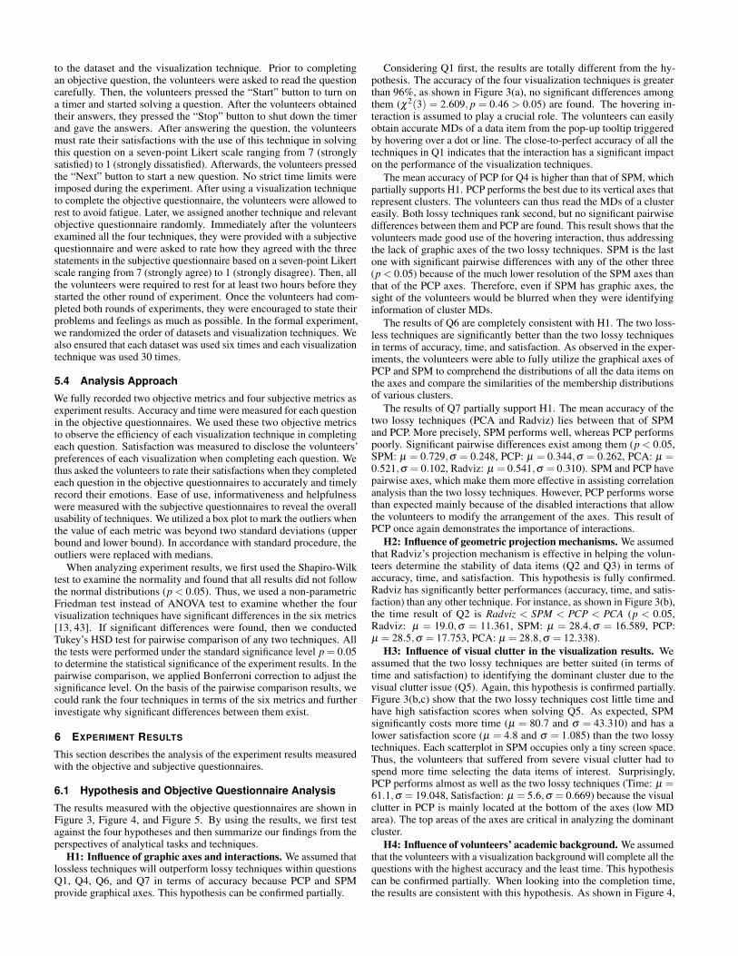
H1: Influence of graphic axes and interactions. We assumed thatlossless techniques will outperform lossy techniques within questionsQ1, Q4, Q6, and Q7 in terms of accuracy because PCP and SPMprovide graphical axes. This hypothesis can be confirmed partially.
Considering Q1 first, the results are totally different from the hy-pothesis. The accuracy of the four visualization techniques is greaterthan 96%, as shown in Figure 3(a), no significant differences amongthem (χ2(3) = 2.609, p = 0.46 > 0.05) are found. The hovering in-teraction is assumed to play a crucial role. The volunteers can easilyobtain accurate MDs of a data item from the pop-up tooltip triggeredby hovering over a dot or line. The close-to-perfect accuracy of all thetechniques in Q1 indicates that the interaction has a significant impacton the performance of the visualization techniques.
The mean accuracy of PCP for Q4 is higher than that of SPM, whichpartially supports H1. PCP performs the best due to its vertical axes thatrepresent clusters. The volunteers can thus read the MDs of a clustereasily. Both lossy techniques rank second, but no significant pairwisedifferences between them and PCP are found. This result shows that thevolunteers made good use of the hovering interaction, thus addressingthe lack of graphic axes of the two lossy techniques. SPM is the lastone with significant pairwise differences with any of the other three(p < 0.05) because of the much lower resolution of the SPM axes thanthat of the PCP axes. Therefore, even if SPM has graphic axes, thesight of the volunteers would be blurred when they were identifyinginformation of cluster MDs.
The results of Q6 are completely consistent with H1. The two loss-less techniques are significantly better than the two lossy techniquesin terms of accuracy, time, and satisfaction. As observed in the exper-iments, the volunteers were able to fully utilize the graphical axes ofPCP and SPM to comprehend the distributions of all the data items onthe axes and compare the similarities of the membership distributionsof various clusters.
The results of Q7 partially support H1. The mean accuracy of thetwo lossy techniques (PCA and Radviz) lies between that of SPMand PCP. More precisely, SPM performs well, whereas PCP performspoorly. Significant pairwise differences exist among them (p < 0.05,SPM: µ = 0.729,σ = 0.248, PCP: µ = 0.344,σ = 0.262, PCA: µ =0.521,σ = 0.102, Radviz: µ = 0.541,σ = 0.310). SPM and PCP havepairwise axes, which make them more effective in assisting correlationanalysis than the two lossy techniques. However, PCP performs worsethan expected mainly because of the disabled interactions that allowthe volunteers to modify the arrangement of the axes. This result ofPCP once again demonstrates the importance of interactions.
H2: Influence of geometric projection mechanisms. We assumedthat Radviz’s projection mechanism is effective in helping the volun-teers determine the stability of data items (Q2 and Q3) in terms ofaccuracy, time, and satisfaction. This hypothesis is fully confirmed.Radviz has significantly better performances (accuracy, time, and satis-faction) than any other technique. For instance, as shown in Figure 3(b),the time result of Q2 is Radviz < SPM < PCP < PCA (p < 0.05,Radviz: µ = 19.0,σ = 11.361, SPM: µ = 28.4,σ = 16.589, PCP:µ = 28.5,σ = 17.753, PCA: µ = 28.8,σ = 12.338).
H3: Influence of visual clutter in the visualization results. Weassumed that the two lossy techniques are better suited (in terms oftime and satisfaction) to identifying the dominant cluster due to thevisual clutter issue (Q5). Again, this hypothesis is confirmed partially.Figure 3(b,c) show that the two lossy techniques cost little time andhave high satisfaction scores when solving Q5. As expected, SPMsignificantly costs more time (µ = 80.7 and σ = 43.310) and has alower satisfaction score (µ = 4.8 and σ = 1.085) than the two lossytechniques. Each scatterplot in SPM occupies only a tiny screen space.Thus, the volunteers that suffered from severe visual clutter had tospend more time selecting the data items of interest. Surprisingly,PCP performs almost as well as the two lossy techniques (Time: µ =61.1,σ = 19.048, Satisfaction: µ = 5.6,σ = 0.669) because the visualclutter in PCP is mainly located at the bottom of the axes (low MDarea). The top areas of the axes are critical in analyzing the dominantcluster.
H4: Influence of volunteers’ academic background. We assumedthat the volunteers with a visualization background will complete all thequestions with the highest accuracy and the least time. This hypothesiscan be confirmed partially. When looking into the completion time,the results are consistent with this hypothesis. As shown in Figure 4,

PCP SPM PCA Radviz PCP SPM PCA Radviz PCP SPM PCA Radviz
Q1 97.3% 97.9% 96.3% 98.3% Q1 22.6 20.6 15.2 14.8 Q1 6.4 6.5 6.7 6.8
Q2 68.3% 67.5% 66.7% 89.2% Q2 28.5 28.4 28.8 19.0 Q2 5.9 5.8 5.9 6.5
Q3 65.6% 66.7% 63.3% 86.7% Q3 97.8 96.9 95.4 66.5 Q3 5.1 5.0 5.2 6.2
Q4 83.3% 64.2% 78.3% 82.5% Q4 32.5 30.6 47.7 39.6 Q4 6.1 6.0 5.4 5.4
Q5 76.7% 75.0% 80.0% 81.7% Q5 61.1 80.7 48.0 47.1 Q5 5.6 4.8 5.5 5.6
Q6 70.5% 69.5% 50.0% 54.6% Q6 40.1 54.1 66.4 65.6 Q6 5.4 5.3 4.2 4.5
Q7 34.4% 72.9% 52.1% 54.1% Q7 130.3 60.3 98.1 95.5 Q7 4.9 5.4 3.7 3.7
Accuracy (percentage) Time (seconds) Satisfaction (seven-point Likert scale)
(a) (b) (c)
Figure 3. Results of mean accuracy (a), mean time (b), and mean satisfaction score (c) in solving each question with the four visualization techniques.Colors indicate groups of no significant pairwise differences, with the winners shown in dark blue, losers in gray, and the ones in between in light blue.Taking Q7 in (a) as an example, the four fields have various colors that reflect the significant differences; the dark blue SPM is the winner, and thegray PCP is the loser, whereas the fields of PCA and Radviz are light blue, which indicates that they are in between and that no significant differenceexists between them.
Figure 4. Results of the mean time of the volunteers with different aca-demic backgrounds. Different colors indicate that there are significantdifferences among corresponding groups. The volunteers with a visu-alization background or a data mining background have a significantadvantage over the volunteers with no background, while no significantdifference exists between the former two groups of volunteers.
the volunteers with a visualization background spend the shortest time(µ = 33.0,σ = 26.290), followed by the volunteers with a data miningbackground (µ = 34.5,σ = 28.902), and those without any relevantbackground spend the longest time (µ = 38.7,σ = 32.252). As shownin Figure 5, contrary to time, the volunteers with a visualization back-ground gain the lowest accuracy, the volunteers with no backgroundare in between, and the volunteers with a data mining background rankthe first. We observed in the experiments that the volunteers with avisualization background were skilled in using interactions and they feltconfident in their answers so had not repeatedly verified the answers,whereas the volunteers with a data mining background were interestedin exploring the data. One of the volunteers with a visualization back-ground said, “I’m familiar with this and I don’t need to look at thescreen over and over again.” while one volunteer with a data miningbackground stated, “It is a little hard to finish all the tasks in a shorttime, but it’s great to explore the data interactively through the system.”
On the basis of the overall objective questionnaire results, Radvizperforms the best among the four techniques. In the three aspectsof accuracy, time, and satisfaction, Radviz appears in the top-rankedgroup 11 out of 21 times, followed by PCP and SPM, both of whichappear in the top-ranked group 7 out of 21 times. PCA obtains theworst performance, appearing in the top-ranked group only 5 out of 21times. For Q1, the four techniques perform almost as well in terms of
Figure 5. Results of the mean accuracy of the volunteers with differentacademic backgrounds. Different colors indicate that there are signifi-cant differences among corresponding groups. The volunteers with adata mining background or no background have a significant advantageover the volunteers with a visualization background, while no significantdifference exists between the former two groups of volunteers.
accuracy with the assistance of the interactions. However, the two lossytechniques require a shorter time and obtain a higher satisfaction scorethan the two lossless techniques. As for Q2 and Q3, Radviz remarkablyoutperforms the other three techniques under various accuracy, time,and satisfaction conditions. For Q4, PCA, Radviz, and PCP are similarin accuracy, but PCA and Radviz are slightly worse among the threetechniques in terms of time and satisfaction. When it comes to Q5, nosignificant differences in terms of accuracy are found among the fourtechniques. SPM requires the longest time and has the lowest satisfac-tion score among all the techniques. For Q6, the two lossless techniquesoutperform the two lossy techniques significantly in terms of accuracy,time, and satisfaction. As for Q7, SPM obtains the highest accuracywith shorter time and better satisfaction than the other techniques.
6.2 Subjective Questionnaire Analysis
Figure 6 shows the ratings of the four visualization techniques with re-gard to the ease of use, informativeness, and helpfulness. Tukey’sHSD test reveals the four visualization techniques with differentranks on the three metrics. PCP (µ = 5.2,σ = 1.440) and Radviz(µ = 4.7,σ = 1.557) are better than SPM (µ = 3.8,σ = 1.633) andPCA (µ = 3.7,σ = 1.688) for the ease of use ratings. The two losslesstechniques (PCP: µ = 5.5,σ = 1.196, SPM: µ = 5.2,σ = 1.289) sig-nificantly outperform the two lossy techniques (Radviz: µ = 4.6,σ =
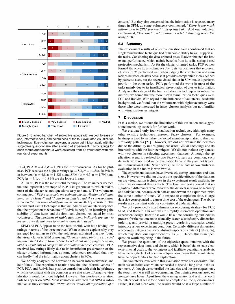
Figure 6. Stacked bar chart of subjective ratings with respect to ease ofuse, informativeness, and helpfulness of the four evaluated visualizationtechniques. Each volunteer answered a seven-point Likert scale with thesubjective questionnaire after a round of experiment. Thirty ratings foreach metric and technique were collected from 15 volunteers with tworounds of experiments.
1.194, PCA:µ = 4.2,σ = 1.591) for informativeness. As for helpful-ness, PCP receives the highest ratings (µ = 5.3,σ = 1.484), Radviz isin between (µ = 4.8,σ = 1.821), and SPM (µ = 4.5,σ = 1.796) andPCA (µ = 4.1,σ = 1.814) are the lowest in rank.
All in all, PCP is the most useful technique. The volunteers deemedthat the important advantage of PCP is its graphic axes, which makesmost of the cluster-related questions easy to handle. The volunteerscommented, “PCP’s axes help me estimate the distribution of all dataitems on a cluster” and “I can immediately read the correspondingvalue on the axis when identifying the maximum MD of a cluster”. Thesecond most useful technique is Radviz. Almost all volunteers reportedthat the projection mechanism of Radviz is helpful in identifying thestability of data items and the dominant cluster. As stated by mostvolunteers, “The positions of stable data items in Radviz are easy tolocate, so we do not need to examine many data items”.
SPM and PCA appear to be the least useful, with both having lowratings in terms of the three metrics. When asked to explain why theyassigned low ratings to SPM, the volunteers explained that they foundthe visual clutter in SPM annoying, “So many data points are crowdedtogether that I don’t know where to set about analyzing”, “For me,SPM is useful only to compare the correlations between clusters”. PCAreceived low ratings likely due to its insufficient presentation of thecluster-oriented information, as some volunteers remarked that theycan hardly find the information about clusters in PCA.
We briefly analyzed the correlation between informativeness andhelpfulness. The experiment results show that the informativeness ofPCP, PCA and Radviz has positive correlation with their helpfulness,which is consistent with the common sense that more informative visu-alizations would be more helpful. However, this positive correlationfails to appear on SPM. Most volunteers admitted that SPM is infor-mative, as they commented, “SPM shows almost all information of a
dataset.” But they also concerned that the information is repeated manytimes in SPM, as some volunteers commented, “There is too muchinformation in SPM you need to keep track of.” And one volunteeremphasized, “The similar information is a bit distracting when I’musing SPM.”
6.3 SummaryThe experiment results of objective questionnaires confirmed that nosingle visualization technique had remarkable ability to well support allthe tasks. Considering the data-oriented tasks, Radviz obtained the bestoverall performance, which mainly benefits from its radial spring-basedprojection mechanism. As for the cluster-oriented tasks, PCP outper-formed the other three techniques due to its vertical axes that representclusters. SPM performed well when judging the correlations and simi-larities between clusters because it provides comparative views definedby pairwise axes, but the severe visual clutter in SPM made it performpoorly in the other tasks. PCA performed the worst in most of thetasks mainly due to its insufficient presentation of cluster information.Analyzing the ratings of the four visualization techniques in subjectivemetrics, we found that the more useful visualization techniques werePCP and Radviz. With regard to the influence of volunteers’ academicbackground, we found that the volunteers with higher accuracy werethose who were interested in fuzzy clusters analysis but not familiarwith visualization techniques.
7 DISCUSSION
In this section, we discuss the limitations of this evaluation and suggestsome interesting aspects for further work.
We evaluated only four visualization techniques, although manyother existing techniques represent fuzzy clusters. For example,heatmap is used to visualize the sorted membership matrix to discoversimilarity patterns [21]. However, we did not evaluate the heatmapdue to the difficulty in designing consistent visual encodings and itsinteractions with the four techniques. We did not include any datasetwith two clusters in selecting experiment datasets. Although the ap-plication scenarios related to two fuzzy clusters are common, suchdatasets were not used in the evaluation because they are not typicalmulti-dimensional data. Nevertheless, the use of data of two clusters inevaluation in the future is worthwhile.
The experiment datasets have diverse clustering structures and datasizes. However, we did not discuss the specific effects of the datasetson the visualization techniques in the experiment result analysis; in-stead, we examined these effects. The Friedman test showed that nosignificant differences were found for the datasets in terms of accuracyand satisfaction, because each dataset underwent the experiment withthe same number of times. With respect to completion time, a largedata size corresponded to a great time cost of the techniques. The aboveresults are consistent with our conventional understanding.
We only provided a fixed dimension reordering strategy for PCP,SPM, and Radviz. Our aim was to simplify interactive operation andexperiment design, because it would be a time-consuming and tediousprocess for the volunteers to manually search a satisfactory dimensionordering, and providing multiple preset reordering strategies wouldintroduce a new experiment condition. Certainly, different dimensionreordering strategies can reveal distinct aspects of a dataset [19, 27, 56],which may affect our experiment results [20]. Hence, this is an openquestion worth exploring in the future.
We preset the questions of the objective questionnaires with therepresentative data items and clusters, which is beneficial to state clearexperimental goals to the volunteers and facilitate quantitative analysis.Nonetheless, the lack of open-ended questions means that the volunteershave no opportunities for free exploration.
The volunteers involved in this evaluation were not extensive. Themain reason is that each volunteer needed to spend a long time in the ex-periment. Although we controlled the data size and the preset questions,the experiment was still time-consuming. Our training session lasted onaverage three hours. Apart from the training session and rest time, eachvolunteer took at least four hours to complete all the questionnaires.Hence, it is not clear what the results would be if a large number of

volunteers participate in the experiment. Although our analysis resultswith regard to prior knowledge is similar to that of Dasgupta et al. [11],it is still not convincing. We hope to have an opportunity to conductexperiments involving a wider range of volunteers in the future.
Our experiment result analysis was performed on a range of metrics,which may be related. For example, the completion time should berelevant to the accuracy of the answers. However, the result analysiswas based on a single metric analysis without revealing such relation-ship. The result analysis related to the interactions indicated that theinteractions played an important role in reducing the performance dif-ferences among the techniques in solving the questions. However, wedid not further analyze how performance differences would changewith regard to whether the interactions were used or not. Discussingmore interaction techniques and evaluating their impact are interestingtopics that should be further explored. The four tasks we consideredin this study do not cover all user queries in fuzzy clusters analysis.For example, the entire evaluation did not involve a comparison of twofuzzy clustering results. We plan to explore more tasks to better addressthe majority of user goals.
8 CONCLUSION
In this work, we conducted a controlled experiment to evaluate multi-dimensional visualization techniques in analyzing fuzzy clusters. Fourmulti-dimensional visualization techniques were evaluated, namely,PCP, SPM, PCA and Radviz, which are commonly used in both generalmulti-dimensional data analysis and fuzzy clusters analysis. We firstdefined analytical tasks and representative questions specific to fuzzyclusters analysis. We then designed objective questionnaires to comparethe accuracy, time, and satisfaction in using the four techniques tosolve the questions. We also designed subjective questionnaires tocollect the experience of the volunteers with the four techniques interms of ease of use, informativeness, and helpfulness.With a completeexperiment process and a detailed result analysis, we provide instructiveguidance for analysts in selecting appropriate and efficient visualizationtechniques to analyze fuzzy clusters. This work also suggests somedirections for further research on the evaluation of multi-dimensionalvisualizations for understanding fuzzy clusters. Moreover, we believethis work will motivate the visualization and visual analytics communityto pay urgent attention to evaluation studies involving various real-world application scenarios.
ACKNOWLEDGMENTS
We wish to thank the reviewers for their thoughtful comments, the vol-unteers for their active involvement, and Wei Huang and Yang Shi forthe fruitful discussions. This work is supported by the National ScienceFoundation of China (No. 61672538, 61772315 and 61772456), theOpen Project Program of the State Key Lab of CAD&CG, ZhejiangUniversity (No. A1812), the Open Research Fund of Beijing Key Lab-oratory of Big Data Technology for Food Safety, Beijing Technologyand Business University (No. BKBD-2018KF08).
REFERENCES
[1] J. Abonyi and R. Babuska. Fuzzsam-visualization of fuzzy clusteringresults by modified sammon mapping. In Proceedings of the IEEE Inter-national Conference on Fuzzy Systems, pp. 365–370. IEEE, 2004. doi: 10.1109/fuzzy.2004.1375750
[2] R. Amar, J. Eagan, and J. Stasko. Low-level components of analytic activ-ity in information visualization. In Proceedings of the IEEE Symposium onInformation Visualization, pp. 111–117. IEEE, 2005. doi: 10.1109/infovis.2005.24
[3] M. Ankerst, S. Berchtold, and D. Keim. Similarity clustering of dimen-sions for an enhanced visualization of multidimensional data. In Pro-ceedings of the IEEE Symposium on Information Visualization, pp. 52–60.IEEE, 1998. doi: 10.1109/infvis.1998.729559
[4] A. Asuncion and D. Newman. Uci machine learning repository. http://archive.ics.uci.edu/ml/datasets.html, 2007.
[5] M. R. Berthold and L. O. Hall. Visualizing fuzzy points in parallel coordi-nates. IEEE Transactions on Fuzzy Systems, 11(3):369–374, 2003. doi:10.1109/tfuzz.2003.812696
[6] J. C. Bezdek, R. Ehrlich, and W. Full. Fcm: the fuzzy c-means clusteringalgorithm. Computers and Geosciences, 10(2-3):191–203, 1984. doi: 10.1016/0098-3004(84)90020-7
[7] N. Cao, Y.-R. Lin, and D. Gotz. Untangle map: visual analysis of proba-bilistic multi-label data. IEEE Transactions on Visualization and ComputerGraphics, 22(2):1149–1163, 2016. doi: 10.1109/tvcg.2015.2424878
[8] M.-S. Chen and S.-W. Wang. Fuzzy clustering analysis for optimizingfuzzy membership functions. Fuzzy Sets and Systems, 103(2):239–254,1999. doi: 10.1016/s0165-0114(98)00224-3
[9] S.-M. Chen and Y.-C. Chang. Multi-variable fuzzy forecasting basedon fuzzy clustering and fuzzy rule interpolation techniques. InformationSciences, 180(24):4772–4783, 2010. doi: 10.1016/j.ins.2010.08.026
[10] W. S. Cleveland. Visualizing data. Hobart Press, 1993.[11] A. Dasgupta, S. Burrows, K. Han, and P. J. Rasch. Empirical analysis of
the subjective impressions and objective measures of domain scientists’visual analytic judgments. In Proceedings of the 2017 CHI Conference onHuman Factors in Computing Systems, pp. 1193–1204. ACM, 2017. doi:10.1145/3025453.3025882
[12] J. V. De Oliveira and W. Pedrycz. Advances in fuzzy clustering and itsapplications. John Wiley and Sons, 2007.
[13] J. Demsar. Statistical comparisons of classifiers over multiple data sets.Journal of Machine learning research, 7(1):1–30, 2006.
[14] E. Dimara, A. Bezerianos, and P. Dragicevic. Conceptual and method-ological issues in evaluating multidimensional visualizations for decisionsupport. IEEE Transactions on Visualization and Computer Graphics,24(1):749–759, 2018. doi: 10.1109/tvcg.2017.2745138
[15] R. Etemadpour, L. Linsen, C. Crick, and A. Forbes. A user-centric taxon-omy for multidimensional data projection tasks. In Proceedings of the In-ternational Conference on Information Visualization Theory and Applica-tions, pp. 51–62. SCITEPRESS, 2015. doi: 10.5220/0005313400510062
[16] R. Etemadpour, R. Motta, J. G. de Souza Paiva, R. Minghim, M. C. F.de Oliveira, and L. Linsen. Perception-based evaluation of projectionmethods for multidimensional data visualization. IEEE Transactionson Visualization and Computer Graphics, 21(1):81–94, 2015. doi: 10.1109/tvcg.2014.2330617
[17] B. Feil, B. Balasko, and J. Abonyi. Visualization of fuzzy clusters byfuzzy sammon mapping projection: application to the analysis of phasespace trajectories. Soft Computing, 11(5):479–488, 2007. doi: 10.1007/s00500-006-0111-5
[18] B. J. Ferdosi, H. Buddelmeijer, S. Trager, M. H. F. Wilkinson, and J. B.T. M. Roerdink. Finding and visualizing relevant subspaces for clusteringhigh-dimensional astronomical data using connected morphological oper-ators. In Proceedings of the IEEE Symposium on Visual Analytics Scienceand Technology, pp. 35–42. IEEE, 2010. doi: 10.1109/vast.2010.5652450
[19] B. J. Ferdosi and J. B. Roerdink. Visualizing high-dimensional structuresby dimension ordering and filtering using subspace analysis. In Proceed-ings of Computer Graphics Forum, vol. 30, pp. 1121–1130. Wiley, 2011.doi: 10.1111/j.1467-8659.2011.01961.x
[20] M. Friendly and E. Kwan. Effect ordering for data displays. Computationalstatistics & data analysis, 43(4):509–539, 2003. doi: 10.1016/s0167-9473(02)00290-6
[21] A. P. Gasch and M. B. Eisen. Exploring the conditional coregulation ofyeast gene expression through fuzzy k-means clustering. Genome Biology,3(11):1–22, 2002. doi: 10.1186/gb-2002-3-11-research0059
[22] R. Hammah and J. Curran. Fuzzy cluster algorithm for the automaticidentification of joint sets. International Journal of Rock Mechanics andMining Sciences, 35(7):889–905, 1998. doi: 10.1016/s0148-9062(98)00011-4
[23] P. Hoffman, G. Grinstein, K. Marx, I. Grosse, and E. Stanley. Dna visualand analytic data mining. In Proceedings of the IEEE Visualization, pp.437–441. IEEE, 1997. doi: 10.1109/visual.1997.663916
[24] D. Holten and J. J. Van Wijk. Evaluation of cluster identification perfor-mance for different pcp variants. Computer Graphics Forum, 29(3):793–802, 2010. doi: 10.1111/j.1467-8659.2009.01666.x
[25] F. Hoppner and F. Klawonn. Visualising clusters in high-dimensionaldata sets by intersecting spheres. In Proceedings of the InternationalSymposium on Evolving Fuzzy Systems, pp. 106–111. IEEE, 2006. doi: 10.1109/isefs.2006.251180
[26] A. Inselberg. Parallel coordinates: visualization, exploration and classi-fication of high-dimensional data. In Proceedings of Handbook of DataVisualization, pp. 643–680. Springer, 2008. doi: 10.1007/978-3-540-33037-0 25
[27] S. Johansson and J. Johansson. Interactive dimensionality reduction

through user-defined combinations of quality metrics. IEEE Transac-tions on Visualization and Computer Graphics, 15(6):993–1000, 2009.doi: 10.1109/tvcg.2009.153
[28] I. T. Jolliffe. Principal component analysis and factor analysis. In Pro-ceedings of Principal component analysis, pp. 115–128. Springer, 1986.doi: 10.1007/978-1-4757-1904-8 7
[29] D. A. Keim and H.-P. Kriegel. Visualization techniques for mining largedatabases: a comparison. IEEE Transactions on Knowledge and DataEngineering, 8(6):923–938, 1996. doi: 10.1109/69.553159
[30] F. Klawonn, V. Chekhtman, and E. Janz. Visual inspection of fuzzyclustering results. In Proceedings of Advances in Soft Computing, pp.65–76. CRC, 2003. doi: 10.1007/978-1-4471-3744-3 7
[31] A. Konig, O. Bulmahn, and M. Glesner. Systematic methods for multi-variate data visualization and numerical assessment of class separabilityand overlap in automated visual industrial quality control. In Proceedingsof the British Machine Vision Conference 1994, pp. 1–10. British MachineVision Association, 1994. doi: 10.5244/c.8.19
[32] X. Kuang, H. Zhang, S. Zhao, and M. J. McGuffin. Tracing tuples acrossdimensions: a comparison of scatterplots and parallel coordinate plots.Computer Graphics Forum, 31(3pt4):1365–1374, 2012. doi: 10.1111/j.1467-8659.2012.03129.x
[33] L. C. Leung and D. Cao. On consistency and ranking of alternatives infuzzy ahp. European Journal of Operational Research, 124(1):102–113,2000. doi: 10.1016/s0377-2217(99)00118-6
[34] J. Li, J.-B. Martens, and J. J. Van Wijk. Judging correlation from scatter-plots and parallel coordinate plots. Information Visualization, 9(1):13–30,2010. doi: 10.1057/palgrave.ivs.9500179
[35] Y. R. Lin, N. Cao, D. Gotz, and L. Lu. Untangle: visual mining for datawith uncertain multi-labels via triangle map. In Proceedings of the IEEEInternational Conference on Data Mining, pp. 340–349. IEEE, 2015. doi:10.1109/icdm.2014.24
[36] M. Liu, J. Shi, Z. Li, C. Li, J. Zhu, and S. Liu. Towards better analysis ofdeep convolutional neural networks. IEEE Transactions on Visualizationand Computer Graphics, 23(1):91–100, 2016. doi: 10.1109/TVCG.2016.2598831
[37] S. Liu, W. Cui, Y. Wu, and M. Liu. A survey on information visualization:recent advances and challenges. The Visual Computer, 30(12):1373–1393,2014. doi: 10.1007/s00371-013-0892-3
[38] J. Mao and A. K. Jain. Artificial neural networks for feature extractionand multivariate data projection. IEEE Transactions on Neural Networks,6(2):296–317, 1995. doi: 10.1109/72.363467
[39] D. Marghescu. Multi-dimensional data visualization techniques for ex-ploring financial performance data. In Proceddings of the 13th AmericasConference on Information Systems, p. 509. AMCIS, 2007.
[40] F. Masulli and A. Schenone. A fuzzy clustering based segmentationsystem as support to diagnosis in medical imaging. Artificial IntelligenceIn Medicine, 16(2):129–147, 1999. doi: 10.1016/s0933-3657(98)00069-4
[41] M. Ozer. User segmentation of online music services using fuzzy cluster-ing. Omega, 29(2):193–206, 2001. doi: 10.1016/s0305-0483(00)00042-6
[42] W. Peng, M. O. Ward, and E. A. Rundensteiner. Clutter reduction in multi-dimensional data visualization using dimension reordering. In Proceedingsof the IEEE Symposium on Information Visualization, pp. 89–96. IEEE,2004. doi: 10.1109/infvis.2004.15
[43] J. Pizarro, E. Guerrero, and P. L. Galindo. Multiple comparison proceduresapplied to model selection. Neurocomputing, 48(1-4):155–173, 2002. doi:10.1016/s0925-2312(01)00653-1
[44] Z. Qu and J. Hullman. Keeping multiple views consistent: constraints,validations, and exceptions in visualization authoring. IEEE Transactionson Visualization and Computer Graphics, 24(1):468–477, 2018. doi: 10.1109/tvcg.2017.2744198
[45] M. Rubio-Sanchez, L. Raya, F. Diaz, and A. Sanchez. A comparative studybetween radviz and star coordinates. IEEE Transactions on Visualizationand Computer Graphics, 22(1):619–628, 2016. doi: 10.1109/tvcg.2015.2467324
[46] L. Rueda and Y. Zhang. Geometric visualization of clusters obtained fromfuzzy clustering algorithms. Pattern Recognition, 39(8):1415–1429, 2006.doi: 10.1016/j.patcog.2006.02.006
[47] E. H. Ruspini. A new approach to clustering. Information and Control,15(1):22–32, 1969. doi: 10.1016/S0019-9958(69)90591-9
[48] T. Rzezniczak. Visual analysis techniques for medical diagnosis support.Computer Science and Mathematical Modelling, 2(2):33–41, 2015. doi:10.5604/15084183.1197450
[49] M. Sedlmair, T. Munzner, and M. Tory. Empirical guidance on scatter-
plot and dimension reduction technique choices. IEEE Transactions onVisualization and Computer Graphics, 19(12):2634–2643, 2013. doi: 10.1109/tvcg.2013.153
[50] J. Sharko and G. Grinstein. Visualizing fuzzy clusters using radviz. InProceedings of the 13th International Conference on Information Visuali-sation, pp. 307–316. IEEE, 2009. doi: 10.1109/iv.2009.74
[51] J. Sharko, G. Grinstein, and K. A. Marx. Vectorized radviz and its applica-tion to multiple cluster datasets. IEEE Transactions on Visualization andComputer Graphics, 14(6):1444–1427, 2008. doi: 10.1109/tvcg.2008.173
[52] Y. Shi, C. Bryan, S. Bhamidipati, Y. Zhao, Y. Zhang, and K.-L. Ma.Meetingvis: Visual narratives to assist in recalling meeting context andcontent. IEEE Transactions on Visualization and Computer Graphics,24(6):1918–1929, 2018. doi: 10.1109/tvcg.2018.2816203
[53] J. Soo Yi, R. Melton, J. Stasko, and J. A. Jacko. Dust & magnet: multi-variate information visualization using a magnet metaphor. Informationvisualization, 4(4):239–256, 2005. doi: 10.1057/palgrave.ivs.9500099
[54] E. R. A. Valiati, M. S. Pimenta, and C. M. D. S. Freitas. A taxonomy oftasks for guiding the evaluation of multidimensional visualizations. InProceedings of the 2006 AVI Workshop on Beyond Time and Errors: NovelEvaluation Methods for Information Visualization, pp. 1–6. ACM, 2006.doi: 10.1145/1168149.1168169
[55] Y. Wang, L. Gou, A. Xu, M. X. Zhou, H. Yang, and H. Badenes. Veilme:An interactive visualization tool for privacy configuration of using per-sonality traits. In Proceedings of the 33rd Annual ACM Conference onHuman Factors in Computing Systems, pp. 817–826. ACM, 2015. doi: 10.1145/2702123.2702293
[56] E. J. Wegman. Hyperdimensional data analysis using parallel coordinates.Journal of the American Statistical Association, 85(411):664–675, 1990.doi: 10.2307/2290001
[57] S. Wehrend and C. Lewis. A problem-oriented classification of visu-alization techniques. In Proceedings of the First IEEE Conference onVisualization, pp. 139–143. IEEE, 1990. doi: 10.1109/visual.1990.146375
[58] C. Williamson and B. Shneiderman. The dynamic homefinder: Evaluat-ing dynamic queries in a real-estate information exploration system. InProceedings of the 15th Annual International ACM SIGIR Conferenceon Research and Development, pp. 338–346. ACM, 1992. doi: 10.1145/133160.133216
[59] J. Xia, F. Ye, W. Chen, Y. Wang, W. Chen, Y. Ma, and A. K. Tung.LDSScanner: Exploratory analysis of low-dimensional structures in high-dimensional datasets. IEEE Transactions on Visualization and ComputerGraphics, 24(1):236–245, 2018. doi: 10.1109/tvcg.2017.2744098
[60] C. Xie, W. Zhong, and K. Mueller. A visual analytics approach forcategorical joint distribution reconstruction from marginal projections.IEEE Transactions on Visualization and Computer Graphics, 23(1):51–60,2017. doi: 10.1109/tvcg.2016.2598479
[61] J. Yang, W. Peng, M. Ward, and E. Rundensteiner. Interactive hierar-chical dimension ordering, spacing and filtering for exploration of highdimensional datasets. In Proceedings of IEEE Symposium on Informa-tion Visualization, pp. 105–112. IEEE, 2003. doi: 10.1109/infvis.2003.1249015
[62] L. A. Zadeh. Fuzzy sets. In Proceedings of the Fuzzy Sets, Fuzzy Logicand Fuzzy Systems, pp. 394–432. World Scientific, 1996. doi: 10.1142/9789814261302 0021
[63] F. Zhou, W. Huang, Y. Zhao, Y. Shi, X. Liang, and X. Fan. ENTVis: Avisual analytic tool for entropy-based network traffic anomaly detection.IEEE Computer Graphics and Applications, 35(6):42–50, 2015. doi: 10.1109/mcg.2015.97