EuroIA Rome 2012 - currybet.net · EuroIA Rome 2012 Written by Martin Belam Published by Emblem...
28
Transcript of EuroIA Rome 2012 - currybet.net · EuroIA Rome 2012 Written by Martin Belam Published by Emblem...

EuroIA Rome 2012Written by Martin Belam
Published by Emblem Digital Consulting Ltd, September 2012
All rights reserved. No part of this ebook may be reproduced or utilised in any form or by any means, electronic or mechanical, including photocopying, recording or by any information storage and retrieval system, without permission in writing.
[email protected]@currybet.netfacebook.com/currybet
Cover star: #94A3AE
“The dirty magnet” - Gerry McGovern 4
“Helping businesses to tackle a ‘wicked problem’: Getting profits from CX Design” - Peter J. Bogaards 6
“Process & People” - Birgit Geiberger & Peter Boersma 8
“An agronomist’s unexpected path to UX Design” - Raffaella Roviglioni 10
“Responsive IA: IA in the touchscreen era” - Martin Belam 12
“‘Stupid bloody system!’: Bad IA in the workplace” - Jonas Söderström 18
“On beauty” - Andrea Resmini & Eric Reiss 20
“RITE: Testing and a business driver” - Jim Kalbach & Carola Weller 21
Building a coupon app for iPhone - Hermann Hofstetter & Gregor Urech 23
“Micro IA and content that travels” - Sara Wachter-Boettcher 25
“What am I curious about?” - Stephen P. Anderson 27
Thanks and acknowledgements 28
EuroIA 2013 28
“The dirty magnet” - Gerry McGovern
“One thing I’ve learnt from working on the web: Often the things that we think work, don’t work. And the things we think won’t work, do work.” - Gerry McGovern, EuroIA
Gerry was talking about giving users what looked like an irritating over-complicated survey, where they have to rate the five most important things they want to do on a website. At first glance it looks like nobody would ever fill in the form, but wherever they’ve tried it, it is great for sorting out what Gerry terms the “top tasks”. A relatively small amount of tasks always have a huge demand, and vastly outweigh the votes for what Gerry calls “tiny tasks”.
The “dirty magnets” in the title of Gerry’s talk were a type of navigation that pulls people away from where they really wanted to go, because it falsely drew them away with a vague promise. It happens, he says, because in any organisation everyone has loads of tasks that need doing. A small number dominate, but there are hundreds of “tiny tasks” disrupting the most important things. Sometimes these “tiny tasks” even get elevated to “top task” status because they get supported by senior managers who think they are really important thing for customers to do.
In a great IA, Gerry says, a link says “This is what I am”, but equally it also says “This is what I’m not.”
He illustrated his point with a great set of mock-ups of road signs, where a really simple choice at a junction becomes an information overload nightmare as more elements are added included such unhelpful terms as “Frequently visited cities”. The trouble is, he said, “we keep adding these little elements to try and fix the problems we should have addressed in the first place” in the primary navigation. If you’ve added a “Most popular” section to your homepage, you’ve admitted that the other stuff isn’t popular and is wasting space.
Gerry argues that people always assess an architecture with a specific task in mind - giving the example of trying to update his MX records at an anti-spam website. The primary navigation categories of “Learn more”, “FAQ” and “Support” hinted that they might help. But they didn’t. Very frustrating for the customer.
How do we get away from the dirty magnet?
Gerry’s survey technique was one answer. It allowed the organisation to really hone the main tasks in the navigation around the primary things that users wanted to do. Gerry also believed in the value of a content cull. He cited an example of Liverpool Council in the UK, who reduced their content pages from 4,000 to 7,00. They got four complaints from the public, and lots of complaints from inside the organisation. Customer satisfaction improved, in fact Gerry suggested that “deleting about 80% of your content leads to a 100% increase in sales and conversions, because content gets in the way of conversion” - of course, like effective advertising spend, the trick is to know which 80%...
Gerry argued that classical advertising is in retreat on the modern web. If you put a search for “New York Dublin flight” into Google, he said, then you are the advertiser. We need to respond to the customer’s ad that they have put on the web. The model of advertising for awareness, distracting, or changing your mind is shot on the web. When was the last time

you went on the web to buy flights between New York and Dublin, and ended up buying golf clubs?
Gerry also had a great quote about the diminishing value of the homepage, and the kind of elements we tend to continue to design for them:
“We keep doing big banners on our homepages because someone in the 1970s was trained to design billboards for the highway, and we think we can get attention that way.”
“Helping businesses to tackle a ‘wicked problem’: Getting profits from CX Design” - Peter J. Bogaards
Peter was discussing “wicked problems”. The phrase “wicked problem” was coined by Horst Rittel, who identified these characteristics:
* Every time you meet a “wicked problem” it is unique.* There is no final problem formulation.* It is a symptom of another “higher” problem.* You never can say “done”.* There are only “good” or “bad” solutions - not “true” or “false”.* There is no defined list of “moves” to a solution.* Every time you talk to someone, you get a different explanation of what the problem is.* No solution has a definite scientific test.* Designers are responsible for their actions, and the impact they have on the business.
Peter then referenced Mary Meeker’s State of the Internet 2012 report. She identified 50 areas of life and business that have been completely transformed by digital disruption, and predicted more ahead. He noted that she had also predicted “an unprecedented focus on technology and design” in the coming years, which ought to prick up the ears of an UXer or IA.
Some of the rules of business are immutable though. The drivers that lead to profit are:
* Increase revenue* Decrease cost* Increase customer satisfaction
You have to be able to convince the business that your design solution meets one of these goals. Peter pointed out that digital disruption means a lot of new customer touch-points have emerged, so a company has to focus on more and more and more interactions and designs.
But, Peter worries, business and design are in separate universes - business is a very analytical sphere, but design thinking is different.
Business talks about the past - “prove your solution worked in the past, and we can do it again” - but designers work in the future - they “imagine what might happen”.
One of the attributes of “design thinking” is being comfortable with admitting you don’t know the right solution.
Businesses are not always comfortable with that.
The field of “customer experience” is getting traction in business, but finds it hard to deliver solutions because of the silos and the hierarchies of businesses. Forrester has identified six disciplines that businesses with good “customer experience” excel in, which include customer understanding, measurement and governance.
One of the main problems to getting it to work within a business is the social complexity of the organisation itself. Illustrated with the teamwork of a football team, Peter says teams
have to come to a shared understanding of what their problem is. For the designer, the role is changing from simply designing “things” to becoming a “facilitator” for this shared understanding.
Peter said it is his belief that in a large organisations you have to become systematic in all kinds of ways - “a systematic way of thinking and a systematic way of doing” - so each time something occurs that looks the same, you don’t need to think about the process to reach the solution. Taking the car industry, he pointed out there is a lot of creativity, but within the scope of a defined part of the product development process.
He argued that visual communication is the best way to get concepts and ideas across, and that you should sketch, sketch, sketch and prototype, prototype, prototype. Prototypes give all stakeholders a chance to look at the solution or touchpoint being created.
He recommended people look at Nathan Curtis’ “Creating a UX Design Library” poster.
One of the questions afterwards was what happens when you do a great design with “Lorem ipsum”, but the great content never arrives. Peter compared this to being a football team with the goalkeeper arriving late to the field - you finish with a team, but you will definitely have lost.
Pressed on the differences between CX and UX, Peter said at the moment it simply came down to “the communities”. He urged us to contribute to CX where we saw the opportunity. “We have to get familiar with them” in the business universe.
In passing, Peter also mentioned “Super-wicked problems” like global pollution, where the characteristics are that time is running out, there is no central authority, and the ones who caused the problem are also expected to solve the problem. Thankfully, whilst UXers often end up on projects addressing “wicked problems”, we generally escape having to design solutions to the “super-wicked”...
“Process & People” - Birgit Geiberger & Peter Boersma
“I like computers and databases more than people” - Peter Boersma
For someone who opened his talk with that statement, Peter was all about empathy for other people in the business. He stated that user-centred design alone is not enough to get great products made, because you will have to deal with other people in the business who won’t have UCD as their top goal. He identified three types in particular.
The business manager
These people will control your budget and resources.You don’t have to wear a suit but you need to be able to speak their language. He pointed to Geoffrey Moore’s elevator pitch template, which helps you explain to the business why you want to improve the user experience or build a new product:
For (target customers) who are dissatisfied with (the current market alternative), our product is a (new product category) that provides (key problem-solving capability). Unlike (the product alternative), our product (describe the key product features).
Peter cautioned that you will be measured by the number you choose to be measured by. If you estimate you will design 15 complex wireframes, then during the course of the project you discover you need 20, the business manager will want to know why that increased. Instead he recommended choosing a metric you want to be measured by.
Why do business people decide to spend money? Because there’s a treasure hidden in the landscape - more money - and your solution can help them get there.
He also, slightly cheekily I think, said show them slides with Apple products, because you can make pretty much any point (i.e. look at the development over time, look at the ecosytem, look at a product range) and everybody knows that Apple is really successful.
The strategy person
Strategy people know their brand inside-out. Peter showed a series of increasingly boastful adverts in a South African car magazine, to the point where Bentley stepped in with an ad that epitomised their brand - a rich looking guy in a leather chair giving everybody else the finger. He suggested that strategy people will really know their enemy, and so your design solutions need to make sure you are correctly positioning the brand against them.
The product manager
Peter had some great suggestions as to how IAs and UXers can help the product managers they work with. Helping them sort the easy changes from the hard, and the quick wins from the quality are useful skills to have. I always think it helps a UXer to have a sound technical background and understanding to do this sort of thing.
Roadmaps were another thing we could help with. Not in the sense of “next week we build x”, “next month we build y”, “six months we build z”, but more in a sense of dividing all the UX improvements you want to do into different types, e.g. “easy of use” or “accessibility”.

Then make sure with each release you are addressing at least one issue in each of these categories. Over time this really drives forwards the overall UX of a product or service.
Social styles model
Birgit looked at some of the ways that understanding how people work helps you produce great products by building better teams and improving communications. She explained the “Social styles model” developed by psychologist David Merrill. He found that people display consistent behaviours in their verbal, vocal and visual communication clues, and people can consistently describe them.
Social styles are behavioural patterns that others can observe, for example whether I say “I want” or “I would like”, or whether you say “I” or “We” in a conversation. It tells someone a lot about the mental state of that person. People can be plotted into having one of four dominant styles. The axes of the chart are from “open” to “guarded” on one side, and from “indirect” to “direct” on the other. The combinations of these qualities mean that people can be basically defined as amiable, analytical, expressive or as a “driver”. “Open” people are more “people oriented”, “guarded” people tend to be task oriented.
You can get frustrated when people have a different communication style to your dominant one - for example asking yourself “why is this person making small talk about their family when I just want to get to the facts of thing x?” - but the key take-away from Birgit was that she urged us always to assume good intentions. If you get to a point where communication doesn’t work, there is a good chance it is down to a clash of communication styles, not bad faith.
“An agronomist’s unexpected path to UX Design” - Raffaella Roviglioni
Raffaella talked about how some of the work she had done as an agronomist on projects in Senegal prepared her for life in the UX world. One of these key lessons was to be aware of cultural issues when carrying out research. In questions afterwards, Raffaella had suggested that training for an agriculture related role in Italy had made her one of the few women in a male-dominated conservative area of life, but in Senegal she was the only one who was able to interview women during field trips, because of their cultural conservatism about men and women interacting.
She said that in Senegal she had very much valued the services of someone who was so much more than a mere translator, but who helped her with context and history. This, she said, contrasts with UX projects, where often we work on having very short timescales to get to grips with a client’s problem before we need to start researching and proposing solutions. Look to find your cultural translator in any business you find yourself working in.
Over time she had learned about the difference between having “a script” and “a plan”. When she was first doing interviews in the field, she said she was “obsessed” with following the script, and got frustrated with people when they meandered off into their own unique story-telling path. Later she realised that this was how you got the best research - by letting people talk, and by knowing your research plan so well that you could adapt and follow the flow of information that they were giving you. Often, she said, people want to tell their stories but don’t know how - as a researcher you need to enable them to find their voice.
Raffaella also made the point that the “formal study” is not the whole thing. Sometimes the relief at ending an “interview” will be the trigger that causes someone to disclose something really interesting and vital.
And look for serendipity in research. It was Raffaella’s justified fear of poisonous snakes in Senegal that led her to seek refuge on a high platform. She ended up sharing it for several nights with the village elder which, she said, was “an incredible and inspiring exchange of ideas”.
She also had a great story about getting junk data. After weeks of carefully jotting down the measurements from an evaporation pan, she spotted one of the workers washing their shirt in it, invalidating all the data. Focus on your formal studies by all means, she said, but don’t be blind to everything else that happens around it.
She recommended Ken Robinson’s books. He talks about the magic moment when you discover the fusion of what it is you love and what it is you are good at, where our work becomes our play. Raffaella said she couldn’t imagine doing anything where she didn’t feel like she was having an impact on people’s lives, whether that was in the field in Senegal, or as a UX designer.
In questions afterwards Jan Jursa made the observation that when we are hiring UXers, often we ask for something ridiculous like ten years experience in responsive design, but we don’t pay much attention to what people did before. Gerry McGovern added an anecdote about seeing a Googler with a t-shirt saying “Get out of the building” - saying that

one of the rarest and most valuable UX skills was that ability to get out of the organisational mindset, and to get into the thinking of real life users.
“Responsive IA: IA in the touchscreen era” - Martin Belam
I thought I’d start with Punch and Judy. It is appropriate to Rome, as Punch’s origins are in Italy.
Essentially a puppet show for children, in the UK Punch is a weird mixture of hero and anti-hero. He beats his wife, throws the baby down the stairs, gets arrested, escapes jail, then in an inexplicable plot twist he saves some sausages from a crocodile. Finally the devil comes to drag him to hell, and the audience are encouraged to be on Punch’s side. To me: a horrifying mix of domestic abuse and religious imagery. To my daughter: the best fun ever. She absolutely loved the first Punch and Judy show she saw, and pestered me for days “Daddy! Daddy! Do a muppet show! Do Punch and Judy!”
Being a geek, I naturally immediately wondered if there was an app for that. And of course there is a Punch and Judy app in the iTunes store, with listings of shows from a particular festival, image galleries and a history of Punch. Exactly what I wanted, so I downloaded it. The first thing it did was ask for my location. I didn’t know the app, or the makers, or what it wanted to do with the location, so I said no. I got to the app’s home screen, and tapped on the “History” navigation. Uh-oh, a dialogue box “You have to let this app know your location”. The same with anything else I tried to access. So, reluctantly, I thought “Oh well, I’ll give it permission”
I could not find a way to do so.
Tapping every single tappable thing in the app just bought up the dialogue box. I couldn’t believe they’d developed an app with no return path from initially saying no to location data, or that Apple had let that through the app store review process. So I tried the app listing in the general settings of the phone. I tapped everything that looked even remotely tappable. Eventually I gave up.
And I took it personally.
Why?
Because touchscreen devices are personal.
Because to be tactile is to be human.
Because I’d wanted to share it with my daughter, and rekindle the magical smile on her face when she was watching Punch and Judy for the first time.
We are incredibly attached to our touchscreen devices. I read a survey once [which I can’t now find to cite the exact figure] that said something like 90% of Europeans are always within a metre of their mobile phone, i.e. they carry it with them all day, and then pop it on their bedside at night. And people use them all the time, to do all sorts of things. It isn’t all about running for the bus.
OK, sometimes it is about running for the bus.
It feels like for all of my adult life people have been promising that next year will be the breakthrough year for mobile. I got really excited the first time I heard this. Which was
probably 2002. I even taught myself WML so I could start building my own mini-pages for the mini-web I could now get on my phone. I wrote a script that scraped BBC RSS feeds to deliver a personalised headline feed. Because I wanted to snack on the news whilst running for a bus - I was a walking mobile use case cliché.
Now we are just as likely to be using our phone at home, precisely because it is in our pocket all the time, rather then the desktop computer over across the room. Amy Buckner and Pamela Walshe gave a talk at UPA in Atlanta about how Wells Fargo got people to take pictures of where they used their mobile banking application - and discovered that a significant proportion of them were within reach of a computer where they could have opted to use a more fully featured desktop version.
People love their touchscreen and mobile devices, and the statistics from the London 2012 Olympics suggest we really have finally reached a place where mobile is “the next big thing” According to a fantastic set of slides published by the head of new media for the Games in London Alex Balfour, 60% of people who visited london2012.com during the Olympics did so from a mobile device. They can’t all have been running for buses.
And now we expect touch everywhere. My daughter expects to be able to pinch and zoom photos on any device, because she has seen it work on the iPhone. And I never looked more like a tourist in Rome for my EuroIA visit than when I was repeatedly jabbing my fat English fingers at the screen of the Metro ticket machine, oblivious to the ATM-style buttons set beside it.
These devices worry publishers. They have introduced a whole new set of intermediaries in the market, not just in the form of telcos or app ecosystems like iTunes or Google Play, but in allowing organisations like the IOC or the British Olympic Team to reach consumers directly on a device that is always on, and always in their pocket. People fiddle with their phones whilst consuming other media, diminishing the already scare amount of attention they have available for traditional publishers and broadcasters. Most successful apps do one thing, and do it really well, but publishers often can’t resist the temptation to try and provide mobile, small screen and touchscreen services that showcase the breadth of what they do - leading to cluttered and difficult interfaces, and products that lack consumer appeal.
Responsive has changed the way I work.
Working on projects that require responsive design to target the small screen has changed some of the ways I’ve worked over the last couple of years, and I wanted to share some of that.
Prioritise your use cases.
Firstly, I’ve learned to try and prioritise use cases ruthlessly. Take a typical hotel desktop website homepage, it probably has a form to allow you to make a booking, some links to help you if you have a booking, some glamourous photos in case you are thinking about making a booking, and some info if you are trying to hire it for a conference or a wedding. Plus a search box, some flags of different countries, loads of links put in by the lawyers, a city travel guide, and so on and so on.
Design it for mobile, and I’d probably be inclined to have one big fat button at the top that says “I’ve already made a booking”, to direct people off to a whole other IA serving those
use cases, so that each page is able to really concentrate on one core task or one core audience.
The thing is, once you start to think responsively, you begin to wonder why you wouldn’t have that really easy visible path off to manage your booking on the desktop. Why bury those use cases behind registration and sign in? Once you’ve simplified for one platform, the temptation is to simplify for all platforms.
Prototype. Prototype. Prototype.
Secondly, I’ve learned to love prototypes.
For a start, users can touch prototypes on devices, get that tactile feel for them, in a way that sketches and wireframes don’t allow for.
I swear by HTML prototypes now. Twitter Bootstrap is your friend. If you are a UXer or an IA and can’t code any HTML or CSS, then put this essay down and go and learn that instead of reading this. I always feel that designing web pages when you don’t know how to put them together is akin to designing cars when you can’t drive. Sure, you can do it, but you’ll never really appreciate what is easy and what is hard to build, what is elegant, and what feels good.
Twitter Bootstrap let’s you get started really quickly with a solid grid, and decent enough styling, and the responsive version comes for free.
OK, so a responsive version comes for free. The “simple marketing or informational website” demo gives you a couple of responsive versions from the same set of code. You’ll almost certainly want to tweak it, but using the responsive basis of Bootstrap gets you a lot of the way there much faster than producing mock-ups for lots of different screen sizes and orientations.
The first time I really used it in earnest was when I was doing a two-day design and rebuild spike on the Guardian’s Facebook app with a couple of developers. Having wrestled the Bootstrap CSS into a shape that looked like the app, I produced something like 35 prototype pages of different bits of the app and different bits of functionality in a few hours. I think it was the most productive I’d been for years, and I swore I would never work any other way again.
How to wrestle the CSS to look like the app?
Well, Chrome’s Inspect Element is also your friend. We all know that developers are lazy in the good way, which means that they make shortcuts for everything. Look at a webpage in Google Chrome. Select some text from a bit of the page you like the look of. Get the right-click or context menu, and click “Inspect element”. Expand the panel in the bottom right corner that says “Computed style”. Et voila! The exact CSS you need to make something look like that, which you can easily add to the default Twitter Bootstrap CSS file.
Getting the fidelity of prototypes is important. I found that by building pages that looked enough like the final product at the Guardian I avoided both the trap of giving editorial staff things that looked full of placeholders that were difficult to grasp, and avoided it looking like I was trying to do final visual designs. A typical prototype, like these ideas for changes to Guardian Comment articles, looked enough like the site to be recognisable, but not so
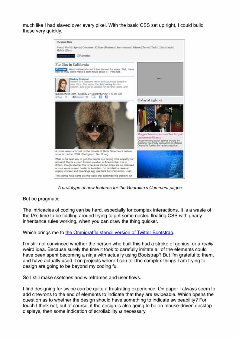
much like I had slaved over every pixel. With the basic CSS set up right, I could build these very quickly.
A prototype of new features for the Guardian’s Comment pages
But be pragmatic.
The intricacies of coding can be hard, especially for complex interactions. It is a waste of the IA’s time to be fiddling around trying to get some nested floating CSS with gnarly inheritance rules working, when you can draw the thing quicker.
Which brings me to the Omnigraffle stencil version of Twitter Bootstrap.
I’m still not convinced whether the person who built this had a stroke of genius, or a really weird idea. Because surely the time it took to carefully imitate all of the elements could have been spent becoming a ninja with actually using Bootstrap? But I’m grateful to them, and have actually used it on projects where I can tell the complex things I am trying to design are going to be beyond my coding fu.
So I still make sketches and wireframes and user flows.
I find designing for swipe can be quite a frustrating experience. On paper I always seem to add chevrons to the end of elements to indicate that they are swipeable. Which opens the question as to whether the design should have something to indicate swipeability? For touch I think not, but of course, if the design is also going to be on mouse-driven desktop displays, then some indication of scrollability is necessary.
This issue can get especially vexed if you do classical usability testing on a product. Mark Porter and Andy Brockie did a fantastic job of designing a truly beautiful reading experience for the Guardian iPad app. But one detail really annoys me. Because a few people in user testing didn’t discover the ability to swipe side-to-side between articles, the solution was deemed to be two tiny chevrons indicating the possibility of movement. It really does strike me as odd that just because a couple of people out of a small sample, introduced to a product for the first time, didn’t use one of the features, that every single user gets the chevrons on every single article they ever read for ever. Imagine if they’d user tested bound printed books as they replaced the scroll. We’d have ended up with little “Please turn me over” labels on every page.
Do as little as possible.
When I’m approaching a responsive project I try to design as few screens as possible. I’m aware this isn’t always possible, especially if you are out-sourcing development, but for me the conversations about the general principles of layout with designers and developers are more important than producing reams of documentation. I’ll usually start by setting out a navigation framework for different sizes and orientations, and then focus on design interactions for the small screen. For pages that will have a lot of content, I try to design the hierarchy of content divorced from screen-size or orientation, and let the visual design work flow from that.
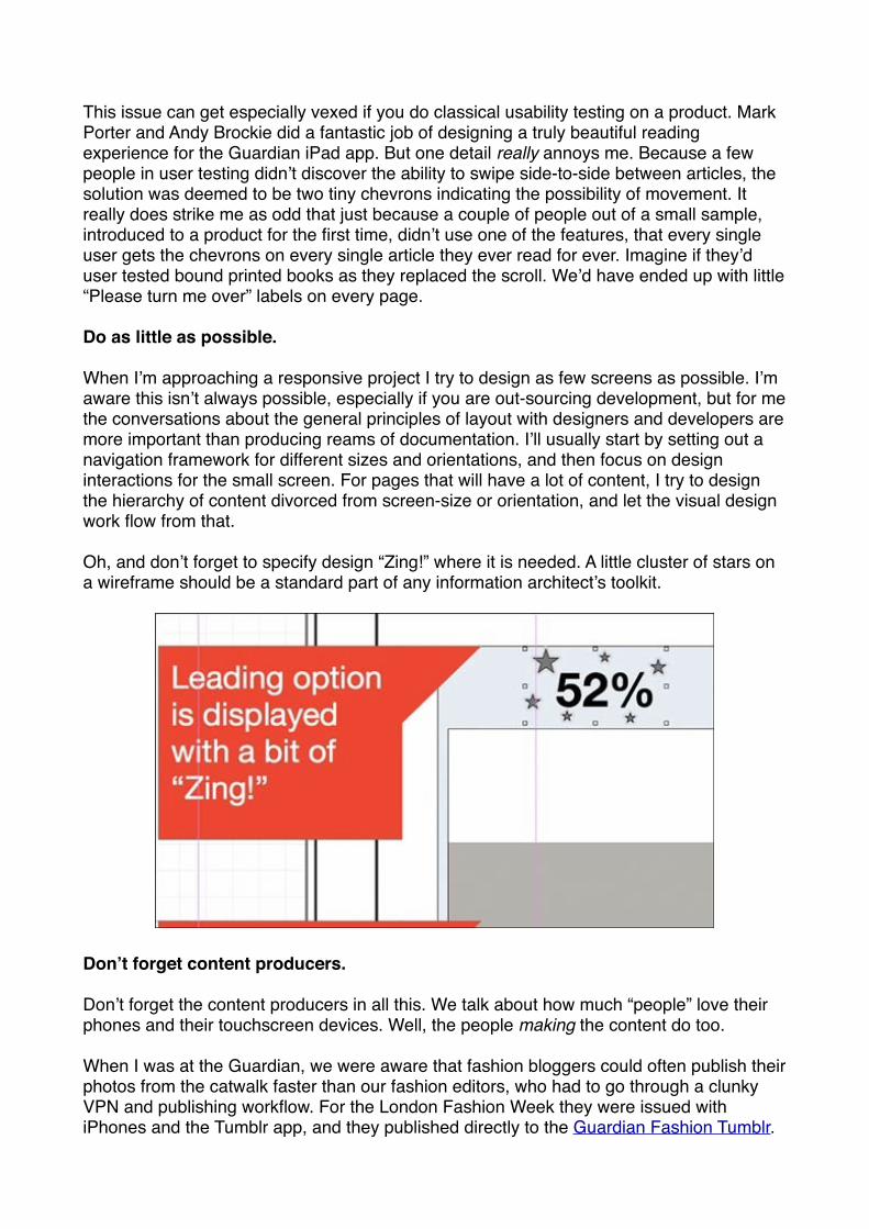
Oh, and don’t forget to specify design “Zing!” where it is needed. A little cluster of stars on a wireframe should be a standard part of any information architect’s toolkit.
Don’t forget content producers.
Don’t forget the content producers in all this. We talk about how much “people” love their phones and their touchscreen devices. Well, the people making the content do too.
When I was at the Guardian, we were aware that fashion bloggers could often publish their photos from the catwalk faster than our fashion editors, who had to go through a clunky VPN and publishing workflow. For the London Fashion Week they were issued with iPhones and the Tumblr app, and they published directly to the Guardian Fashion Tumblr.
Dan Catt built widgets that pulled the Tumblr content into the main site, and so we used that path, and touchscreen publishing, to circumvent the limitations of the CMS.
On a rebuild of the live blogging CMS, the developers built the journalist interface using Twitter Bootstrap. It meant having standards compliant code that worked cross-browser, and cross-device. Seeing the product manager Sharath Bulusu be able to pull the “one more thing” trick of “it already works on phones and iPads” about the new CMS was a joy to behold.
Know your devices
I really urge IAs to use as many different mobile and tablet devices as possible.
Let’s be honest - designers tend to love Apple. If you only use iOS, it isn’t unreasonable to position some kind of back function in the top left of the screen like a lot of apps. but that isn’t a natural place for it for Windows Phone and Android users.
When working on projects designing specifically for those platforms, I always tried to use one of the machines as my day-to-day phone for a while, to get a feel for what seems natural on the device. How else can you judge whether a design is well integrated or not?
The back button, search, and the way social services are integrated are three areas that differ greatly across these platforms. A HTML5 one-size-fits-all future needs to think a little bit harder about the hardware buttons on various devices, as well as getting excited about be able to share a common codebase across them.
Is responsive design appropriate for everything?
On stage at EuroIA we had a swear jar for anyone trying to “define the damn thing”, or anyone saying “it depends”. I had to put money in at this point.
Is responsive design appropriate for everything?
Well, it depends.
If you are building an enterprise tool that people are only going to use at their desks, then no. If your transaction is so complex that it simply can’t be achieved in a tiny amount of pixels, then no.
But ask me if responsive IA is appropriate for everything? Well then I’m all for it.
The discipline of imagining how every project could be configured for the small screen is in some ways incredibly liberating. It helps you focus on your core proposition. It allows you to concentrate on the key tasks the user needs to achieve quickly, rather than get distracted by supporting “tiny tasks” and edge use cases. It makes you consider how your pages and services will appear in the hands of someone with a touchscreen device. It helps you make good stuff.
“‘Stupid bloody system!’: Bad IA in the workplace” - Jonas Söderström
“Didn’t we create the machines to do the work for us? Are we doing the work for the machines?” - Jonas Söderström, EuroIA
Jonas Söderström was talking about how technology has transformed the role of a type of care nurse in Sweden. A typical employee has a schedule dictated down to the minute of how long it takes to travel between elderly patients’ homes, how long to feed them, how long to make their beds. Every action has to be confirmed electronically to a central management database, which presumably measures efficiency and reports wonderful figures back to politicians. But all compassion in the job is lost. How do you tell a machine that patient B just seemed down today and so I spent two minutes longer with her?
Jonas started his talk with some very bleak statistics about the workforce in Sweden, and some slides illustrating some common usability issues with enterprise software - for example the text on a form over-writing the space where you are supposed to put in the answer. Reminding me that even Apple can make this mistake - just ask Karen McGrane about the text on the “Download” button in iTunes.
Jonas said that between 1996 and 2003 reported levels of “stress and severe psychological pressure at work” had more than doubled in Sweden. Since the country had been coming out of a recession, you would have expected the exact opposite. One possible cause is the rise of use of technology in the workplace. Jonas pointed out that if you worked in an office in the very early nineties, you might have had email. In 2012, one supermarket he works with has over thirty IT systems in use, from purchasing stock to issuing customer coupons. Sweden now has 1 million people working in front of computers for 8 hours a day, and it is estimated they spend a third of their time in physical contact with technology.
His talk, and the book it is based on, are his call to arms to make things better.
He gave one example, of a system used to update the user manuals that go with trucks. To change the value of a figure from 7.5 to 9.5 in one of the manuals took an incredible 18 separate procedures, all of which consisted of multiple steps. Jonas put up a screen of disheartening quotes from real workers, saying things like “I used to be a good writer” and “It’s all about taming the system”.
I couldn’t help but be reminded of the number of journalists I’ve seen disillusioned by the way the news industry has forced them down a path of effectively filling in database entry forms to file copy.
Jonas showed a brilliant “life hack” to a system designed to manage restaurant reservations. The screen displayed an Excel-style view of who was booked for which table or when, and the head waiter crossed people off with a marker on the screen rather than do the data entry procedure to update the system. For a simple reason, he or she could do that whilst maintaining eye contact and a human welcome to customers, not ask them to wait whilst they wrestled with a computer system. Here’s the original blog post about this story.
Asking whose fault this all was, Jonas resisted the temptation to blame “the nerds” - they are, he said in his experience, quite keen to make things better. That is definitely true in my experience of a lot of developers. Showing them video of users struggling with a system, or getting them to sit in on usability sessions will often unlock their inner UXer.
Jonas had a significant point to make about traditional user testing though. It is based around testing consumer products, where watching a few people for an hour each is good enough. Jonas doesn’t think that cuts it in the workplace - he suggested that whole teams need to watch someone do their job for two whole days before they can design for them. I certainly agree that it is difficult to design work systems, even when you have done observation. I designed the Guardian moderation system based on observations of the moderators at work, and tried to incorporate some of the workarounds they had developed using Google Docs into the system. Within a few weeks of launch, they had to develop more workarounds, because I hadn’t captured everything they needed to do in all of their working days and hours.
“On beauty” - Andrea Resmini & Eric Reiss
Not since Joe Muggs turned up at London IA and started talking about “Dancing to architecture” have I faced a session as unbloggable as that delivered last night at EuroIA by Andrea Resmini and Eric Reiss. Taking turns to accompany each other on the piano, silent-movie style, they delivered a visual essay on the nature of beauty and what IAs should do about it - which doesn’t really work without either the visuals or the soundtrack. In fact, I did consider whether I needed to embed some auto-playing WAV or MIDI file into this page.
Their premise - such as I understood it - was that Marcus Vitruvius Pollio had set the standard for architectural beauty, based on the proportions of the human body, in classical Roman times, but the loss of his book De Architectura contributed to the darker ages of European history. The rediscovery of these truths by the Franks sparked a renaissance in European design and appreciation of aesthetics.
They were concerned that we might be living through a similar dark age, where the values of usability, ease of use, and familiarity have trumped the idea of beauty in digital and real world services. Eric showed pictures of various clothes stores like Gap and H&M who have all adopted a very similar style. It may be effective for selling clothes, was Eric’s point, but if you took away the branding above the door, none of the stores have any personality or individuality remaining. The same is true of their websites.
Eric stressed that “design patterns” were not “designs” by showing silhouettes of classical architecture contrasted with modern cities, which illustrated that though the fundamental design pattern under-pinning them was the same, the content was very different. A series of images of water jugs manufactured over a period of forty or so years showed how design and personality could be very different, whilst functionality and the overall pattern were maintained.
There was then a slight detour whilst Eric pointed out that Jessica Biel’s fingernails matched her shoes, a fact that had been over-looked by a fashion editor, who just thought they looked “nice”, whereas the innate pattern-matching genes of the IA would have spotted the connection instantly.
The pair wondered if web design today is not in the same place that car design was in the 1910s. The basic pattern was established, but lots of things that we now consider to be very important in the design of a car - safety features, fuel consumption - were not factors that interested the industry or consumers at all. What are the equivalent things that we will worry about digital services in the future, that just aren’t on our radar now?
Erm...I think that was it, anyway. As I said, unbloggable.
“RITE: Testing and a business driver” - Jim Kalbach & Carola Weller
James and Carola gave everyone green and red voting cards to get us to answer questions in the audience, and pretty quickly established that we thought, on the whole, we were reasonable UX designers, and that, on the whole, the web has bad UX. “How could this be?” James asked.
One reason, he said, might be because UX designers are not always involved in every project on the web. And even in the projects that we’ve worked on, often we feel we’ve done our best, but what actually comes out the other side is not a great user experience. James argued that we feel boxed in and constrained by time, money, resources, and technology. We feel we sometimes can’t do our best. And then we cry about it, and we like to complain about our situations at work, and we come to conferences like EuroIA to be with like-minded people and share our war stories.
If we understand that a great UX doesn’t necessarily follow from great UX design alone, then we have to accept that the solution must be more than just saying that the rest of the businesses “doesn’t get it”. James says that we have total focus on our products, but we need to have focus on working within an organisation too. Carola then went on to explain how the RITE methodology had helped them improve their product development process.
Standing for Rapid Iteration and Testing, RITE is based on a very quick turnaround of testing data into product changes. Typically you might spend some time making a design, and then run two days of user testing sessions. After a couple of weeks a lengthy user testing report with recommendations for changes lands on your desk. Carola described this as “alibi testing” - it doesn’t tell you much, but it reassures you that you won’t die if you launch this project.
RITE condenses this process into a few days. On day one you test, with everybody in the project observing, on day two you iterate the design, on day three you test again, on day four you iterate the design, on day five you test, and on day six you have an improved product with stakeholder input. Bingo!
Crucially, Carola explained, all key stakeholders have to be there for the testing. They note everything down during the day on post-its. During the debrief, print-outs of all the screens being tested are on the wall, and people put the post-its they made during the session onto the screenshots at the appropriate place. You very, very quickly see where the major problems are. People can also use different colour post-its to indicate the severity of the problem. Carola explained that the whole process actually becomes very exciting, can get the whole team energised, and senior managers start turning up because they hear that this exciting thing is happening.
On the downside, it does put an awful lot of pressure on the designers to deliver screens for the next day’s testing. In the case study James and Carola were exploring, they were aided by having an additional design resource available in the US, and the time difference meant that some of the updated screens appeared in the morning “as if by magic” as the team over the Atlantic helped out.
Carola also explained a social side effect - having that many people with different job roles from different parts of the business with a focus on just one product for a couple of days

stimulates all kinds of conversations that might otherwise have never taken place. She recommended a couple of tips to help that along. Firstly everyone should wear name badges - some people are just bad at remembering names, and having the badges removes that social inhibition about having got someone’s name wrong. Secondly, take everyone to lunch away from the sessions in a restaurant, and make sure it is a little walk in the fresh air to give everyone a good break and a chance to just chit-chat along the way.
Here is a blog post that James has previously written on the topic which has some good resource links in it: “RITE testing is about team engagement”.
Building a coupon app for iPhone - Hermann Hofstetter & Gregor Urech
Hermann & Gregor started by explaining a bit about the traditional couponing space, which is very complex. I remember trying to design the check-out flows for the Sony Connect store and having to factor in all manner of discount and promotional vouchers. Nightmare. Coupons typically involve absolute discounts, relative discounts, time limitations or geographic limitations, and are restricted to one coupon per person. Typically they have been in print - and the physical format restricts them to one time use, since the retailer takes the piece of paper out of circulation.
SMS couponing has been going in in Switzerland for a few years, and has proved to be a business success. You get a code on your phone, remember to tell the cashier when you are paying, and then enter the code into the payment machine. Hermann & Gregor quoted a study by electrical goods retailer Mediamarkt that claimed coupon promotions gave a 50% better ROI than other promotional marketing means. The idea of having a couponing app was driven by making that even more profitable, by using push notifications instead of the more expensive SMS.
I suddenly had one of those flashes when I realised that yet another chunk of display advertising - putting physical coupons in physical paper - is probably going to disappear from newspapers, and wondered why none of us had built some grand affiliate couponing “thing” to keep that revenue spend in our vertical.
The case study was a fairly traditional user-centred design project. They started with some requirements and did some - their words - “scribbling”, then showed the scribbles to customers and stakeholders in a round of testing to refine the idea. The finalised the concept, and went into using Axure to prototype.
When they tested the prototype, at the time the version of Axure they were using had some limitations when used on the iPhone, and so they incorporated into the test a warm-up exercise to teach the user to do two-fingered scrolling rather than the native one finger version. There were also some issues about running the tests on a slow development server, and of course the weirdly intrusive nature of watching people touch their phones. Hermann & Gregor were actually using the DIY Mecanno rig that had been demoed by Belén Barros Pena and Bernard Tyers at EuroIA 2010 when I dubbed them the MacGyvers of mobile usability testing.
Hermann & Gregor made the fatal mistake at this point of trying to do a live tech demo in front of a large audience, which of course failed. I had a similar experience during my workshop on Thursday when placehold.it was down, breaking all the prototypes I wanted to show, and one of the things I wanted to demo from the Guardian was giving me a 502 Bad Gateway message. Never work with children, animals, or live tech demos.
One thing that became clear with the couponing app is that however they designed it, they were still hitting a point where a human being has to read off a number from one device, and key it into another. That looks like it surely has to be an interim solution - because computers are very good at swapping numbers from one place to another if you let them. The elephant in the room was the timeframe for widespread NFC technology being introduced. In the meantime, of course, if the interim solution is delivering a 50% ROI on marketing spend, well that sounds like a pretty good interim to me.
Before showing the user-testing footage they explained two things. Firstly Switzerland has very high penetration of smartphones, and the iPhone in particular. This means, they think, that there are many more people with the devices who you wouldn’t usually consider to be first movers with tech than in other demographic samples.
Secondly, they debated how closely they should keep their design to Apple’s guidelines, in the end opting to, because, they assumed, they would get a more usable app out at the end. In fact they uncovered some issues with Apple’s own usability guidelines - particularly with the placement of the segmented control. This doesn’t surprise me hugely. I tend to think that if you are having to use the segmented control at all, you are probably already struggling to present a simple view of complex information, let alone provide the controls to manipulate it. The testing also found that people don’t discover features that can only be accessed by gesture - in this example shaking the phone would have taken users to their list of favourite coupons, but nobody tried it.
You can view Hermann Hofstetter & Gregor Urech’s original slides on SlideShare.
“Micro IA and content that travels” - Sara Wachter-Boettcher
“Information architecture gets hard when you are dealing with lots of things. And it gets infinitely hard when you are dealing with lots of things that have to appear in lots of ways.” - Sara Wachter-Boettcher
Sara gave a great overview of why IAs should care more about content. She posed the question “How does content travel?”
Too often we expect it to appear across a wealth of devices and screens and services, but we’ve managed to get it stuck as great big unstructured blobs in pages, making it impossible to re-use. We also, she reminded us, need content that travels across languages and cultural barriers, and we want to have content that serves everybody, regardless of how they access it.
Sara suggested that a lot of the traditional IA tools like site maps with hierarchy, wireframes based around desk top views, and content audits are no longer enough.
She illustrated this with a great case study which she described as “learning the hard way”. In 2009 she worked on a project to re-develop a state tourism site for Arizona. It should have been a brilliant project, but it was ultimately frustrating, she said.
After launch, she’d look at the page for an interesting town like Flagstaff, and find random events listed, canned copy, unrelated links, and a smattering of manual tags. The page wasn’t useful for planning an itinerary, and worse, because Sara had spent months auditing the content, she knew it wasn’t telling people about the amazing Americana on Route 66 that passed by the town, the haunted places to stay, or the great local cuisine scene, even though those articles existed.
Things got even worse when a mobile site was built the year after. They took a sample of the content and slurped it into a separate database, so that, for example, you could only find one restaurant listed in the town. Eventually they took the step of putting a page in front of the mobile site which offered a choice between the mobile version, the “full” site, or “forget this digital malarky, we’ll just post you a printed guide”. Since the organisation actually got measured on how many guides they distributed, they were quite happy when people did that.
The solution was to put more structure into the content, and rebuild the CMS so that content was modelled around the relationships between entities, rather than just as a series of articles. So cities have restaurants and attractions that belong to them or are near to them.
A CMS redesign with more boxes to fill in can be a frustrating experience for the content producer if you can’t see the value it generates, but that certainly wasn’t the case here. Rule-sets on the front-end meant that related content really worked, for example, if a city had a national park within an n mile radius of the town, those details would get added to the page. It meant pages began to sell the city they were about, with content that made sense, and which was useful for the tourist.
Incidentally, it is very easy to get mired in debates about what is content strategy and what is IA, but personally I welcome anyone coming to the party with a determination to make
better digital services, regardless of their job title or discipline. Unless it includes the words “ninja” or “rock star” of course.
Personally, I don’t always see much new in content strategy presentations or the deliverables shown, but then I have to remember that I have usually worked in businesses who are all about content, where content is the product. There are a host of websites and digital services out there being built by companies for whom being a publisher or a repository of content is a relatively new development, who sorely lack or under-value these editorial, IA and content skills. That’s why I thought Sara’s talk was so powerful, because the case study really showed how getting to grips with the structure of content could make a difference for the end user.
She herself said this isn’t a problem for one group of people to tackle, but it is a solvable problem. It isn’t new. It’s IA, brought to the micro level. There is, she explained, more pressure on content than ever before - we expect it to do more, go further, and be more re-usable. Digital content has gone from “we’d like this to be usable” to mission critical for a lot of businesses.
She suggested that IAs needed to re-visit the traditional idea of the content audit, and add some extra dimensions. With a type of content you need to understand what is secondary, what is incidental, what is the core element that makes it meaningful. This wasn’t just about chucking everything into a database, but was a really human process, where people mould the content an organisation is going to publish. If you don’t want your content to be useful, why publish it at all?
Sara’s book - “Content everywhere” - will be published later this year by Rosenfeld Media.
“What am I curious about?” - Stephen P. Anderson
The conference was rounded off with a closing plenary by Stephen P. Anderson, author of “Seductive Interaction Design”, talking about curiosity.
I’ll start at the end. Stephen finished his talk with a run through of Walt Disney’s early career. It is easy now to view Disney the company as a schmaltzy over-sentimental juggernaut, who have turned the scarce magic of those early animations into a relentless merchandise and cash-extraction-from-parents machine. Especially if you are a parent.
But Stephen reminded us of Walt himself. A man who tirelessly looked for “the next big thing”, and bet the farm several times on an expensive innovation, whether that was moving to cartoons with synchronised sound, embedding live action inside an animation, or attempting the full length movie of Snow White. It made for a reminder of how often creativity and business innovation can go hand-in-hand if there is the vision to allow it to happen.
Along the way he had shown us a dazzling array of gadgets, gizmos and Kickstarter projects that are the creations of enthusiasts and makers. Highlights included the tattoo that measures your blood sugar level if you are diabetic, or the amazing device from MIT that allows you to sample colours and patterns from the real world and then digitally paint with them. He suggested that the emergence of much cheaper 3D printers, like the Form One, was only going to accelerate the creation of this strata of innovative manufacturing.
He said that being good at UX was fundamentally about being curious. “Tamed problems” like registration and sign in can be solved by design patterns, and become a commodity service. “Wicked problems” need “a curious mind”. Stephen suggested that right now we can charge a lot for UX work and basically be charging for implementing design patterns. But this situation won’t last forever. When he takes on projects, he looks at what makes him curious about the potential work, and what he wants to discover by doing it. That helps him pick the right projects and the right clients.
Stephen’s ultimate message was to ask the crowd what would they like to know more about by the time EuroIA 2013 in Edinburgh rolls around? He mentioned the book “The Medici Effect” by Frans Johansson, which talks about how melding different arts, crafts and sciences together potentially unleashes a new wave of creative ideas as they cross-pollinate. Stephen’s plea was for everyone in the room to ask “What am I curious about?” and then act on the answer.
He said the reason we should be curious is because when we get our qualifications and work in one discipline, the bits‘n’pieces we have to make new ideas are like having Lego bricks of only one size and colour. By gaining Lego bricks of different sizes and colours to work with, we can put together much more varied ideas. He talked about a two-day workshop where geneticists, developers and designers got together to look at different ways of designing and displaying the vast amount of data about human DNA that is collected. The different approaches taken by the devs and the designers meant that by the end of the event, the scientists were discovering new patterns and connections that they had never imagined possible, because the data had been visualised in a different way.
In the end, Stephen said it doesn’t matter what you are curious about - whether it is artisan cheese or medieval literature - the act of being curious will help you be a better UXer.
Thanks and acknowledgements
Thanks to my friends on the EuroIA committee for making the event possible: Sylvie Daumal, Dick Hill, James Kalbach, Wiesław Kotecki, Judit Ponya, Eric Reiss, Andrea Resmini and Luca Rosati, and to all the speakers who gave their time to help share their knowledge with our community.
EuroIA 2013
EuroIA 2013 will be in Edinburgh, 26-28 September
euroia.org - @euroia
EuroIA scrapbook at euroia.tumblr.com