Ernst & Young case study: usability for intranets.
51
Ernst & Young case study: usability for intranets
-
Upload
homer-craig -
Category
Documents
-
view
237 -
download
0
Transcript of Ernst & Young case study: usability for intranets.

Ernst & Young case study: usability for intranets

Page 2
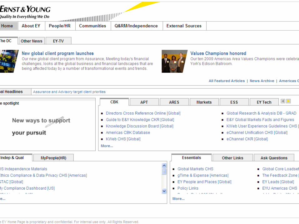
Ernst & Young environment overview
► Member firms comprise 144,000 people in 140 countries► Core services of audit, tax, transaction and advisory ► Diverse business units► Numerous service offerings within each unit► Hundreds of communities (geographic areas, industries,
sectors, service lines, account teams, etc.)► Constantly changing and growing► Mobile and remote

What should a home page
framework for a global
organization look like?
And how do we figure it out?

The influence
Page 5
Current starting point

Page 6
The Future State of Knowledge influence

Page 7
EY Home Page survey
► Short survey to assess opinions on content and features on the EY Home Page► Surveyed random 5% of user population from each country with
the EY Home Page► 12% response rate► Representative sample of areas
► Users find task-focused parts of the home page valuable► Users want to see more work on:
► Search► People ► Accounts

Page 8
567,461
237,63791,84159,549
38,520
35,988
32,588
6,269
2,169
1,619
1,652
6,481
262,022
496,297

Page 9
Metrics analysis conclusion
► People use home page to do their jobs► “Stretching” to get to information

Page 10
Why “stretching”?
► Users scan web pages according to F-pattern
► Uncertainty on whether F-pattern is intuitively what people do or whether existing website standards force people to follow F-pattern
http://www.useit.com/eyetracking/

Page 11
Most-used zones are outside the F-pattern

Eating our “dog food”

Page 13
Usability principles
► Also reviewed usability principles against current EY Home Page► Numerous tabs and sections on current home page► Items hidden behind tabs► A lot of room for just two columns of content► Asked:
► Why are “big ticket” and frequently used items not in sweet spot
► What will increase the visibility of News and Communication?

The goal

Speech to conversation


Page 17
Key differentiators of Enterprise 1.0 vs. Enterprise 2.0
Enterprise 1.0 Enterprise 2.0
Context snapshot Based upon actual context
Purposed for time frame Purposed in real-time
Generalized approach Meets the users’ needs
Segmented Hyper-segmented
Periodic Continuous

The plan

Page 19
Our process to find some answers
► Wanted to work in short iterations► Designed three prototypes (two evolutionary, one
revolutionary) ► Tested them to create factual evidence and solid data
points► Summarized conclusions and moved to next round
► Ran focus groups – slanted toward the under-35 crowd – to produce generational, aspirational conclusions

Page 20
The work

Page 22
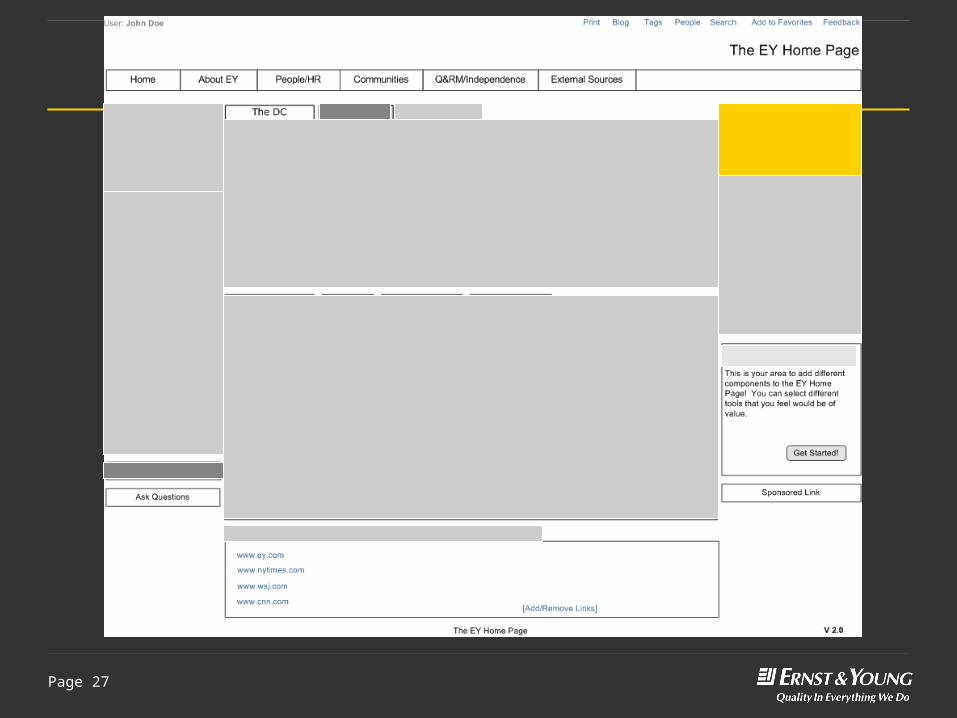
Round 1: evolutionary process
► Took evolutionary design approach► Majority of changes based on analysis of usage,
feedback and usability; in line with an iterative design process
► Wireframes were not radical departure from current EY Home Page
► Tested design with eight people

Page 23
Building our prototypes
► Didn’t have much time to get concepts wireframed and tested
► Used Visio wireframes for testing► Each screen had few hotspots; tasks aimed at seeing if
users could interact with particular sections► Ended design session, built tasks and started testing our
concepts
Did he really just say Visio?
PrototypingTodd Zaki Warfel
Paper PrototypingCarol Snyder
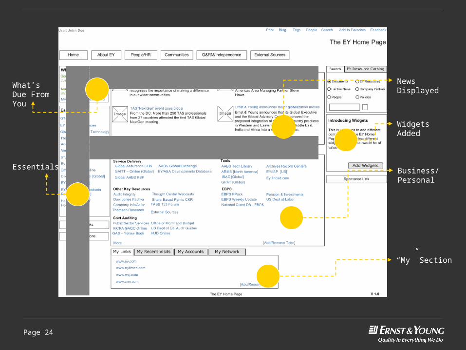
News Displayed
Widgets Added
Business/Personal
“My” Section
What’s Due From You
Essentials
Page 25
Round 1: what worked vs. what still needed help
► Several components worked well► Small design cycle – pointed out what worked well to
stakeholders and didn’t worry about those items for Round 2
► Instead, concentrated on items that users struggled with in Round 1

Page 26
Round 1: what didn’t work
► Other Links – invisible► My Accounts tab – couldn’t be found
► When found, was deemed useful and interesting► EY Resource Catalog – difficult to find► Widget label
► Loved the concept, hated the name► "Widgets is an obnoxious term that is used in accounting courses." ► "I don’t know what would be in that box.“
► EY-TV label – doesn’t mean much to participants► "Its not clear what EY-TV means. I think thought center webcasts
& podcasts would be a better name than EY-TV.“► Other News label – duplicative and lost
Page 28
Round 2: wrap-up
► Task times dropped significantly► Task-completion percentage increased► Evolutionary design► Introduced personalization► Great design to begin process of socializing with
stakeholders

Focus Groups


Page 31
Results of focus groups
► Applications► What’s Due From You linked to
Feedback Zone and GT&E► A & A headline► ARMS► Performance Link► SMART► Info Zone
► Improvements► Better search► Want targeted information► Hard-to-find applications
► Activities► Project tabs with links
► Customization► Customize to make simple► Links to projects► Ability to remove/add buckets► Customize page layout► Allow updates
► Clutter► Important items buried in tabs► What’s Due From You doesn’t work
Overarching conclusion: Users want more applications related to their work. This round of testing and focus groups confirmed the users’ task-based approach to the EY Home Page.

Page 32
Round 3 ideas
► Blend findings from all testing into innovative design with different approach compared to current EY Home Page design
► Give users option to customize their home page► Incorporate more widgets and personalization aspects► Customize the layout and the content
► Remove tabs ► Expose content so open for scanning► Users can scroll through the content quickly► Large headings improve scanning and identification of sections
► Use of space “below the fold”

There is no “fold”

Page 34
Round 3 approach
► Created higher fidelity mock-up based on previous two designs
► Created with HTML and Ajax to give feel of interaction► Used script.aculo.us library and smattering of Yahoo UI► Users could get sense of how things would work but
didn’t have to go to extreme lengths to build ► Features enabled
► Drag and drop for building custom look and feel► Checking flight status► Checking work schedules► Expanding hidden or collapsed sections

Page 35
Round 3: closer look at what we changed

Page 36
Round 3: News section
► All news items are exposed and are not behind tabs► Content could change on a daily basis► Archive links could exist below sections

Page 37
Round 3: sections opened up
Twisties removed and category content exposed
Service lines and sectors can be surfaced and not in tabs

Page 38
Round 3 - customization
► Concept of customization is core of prototype► Participants given task of setting up EY Home
Page with sections they wanted► Crucial piece may be use of examples or even
templates to show possibilities► Customers slightly adverse to change, but some
hand-holding goes long way
“A few things can help, some explanation like ‘what is this?’”

Page 39
Round 3: customization screen
Participants had ability to customize home page content they felt they needed to perform their jobs efficiently

Page 40
Round 3: personalized page
My Accounts at the top
Personal Productivity Tools• Flight Status• My Stocks• ARMS• RSS News• Weather• My Network (added later)
Industry and Essentials

Page 41
0
20
40
60
80
100
120
Round 1 Round 2 Round 3
Avg % complete
Avg Time in seconds
Task completion rates and times
► Trends validated approach
► Improvement after each iteration

The conclusions

Page 43
Conclusions and learning about this test
► People are interested in 2.0 applications► People would use real-time applications► Practitioner is ready for the home page to be conversation► Names are important ► EY Home Page should be task-focused, not silo-focused ► Longer, more open page will improve user experience► Room for customization if it doesn’t become basket for all
eggs

Page 44
Conclusions about iteration testing
► Got prototype in front of users quickly► Made design decisions based on user feedback for
subsequent rounds► Made tangible progress to show to stakeholders► Had couple design ideas that provided strong data points
for future builds

Epilogue

So what happened?


Page 48
But there is a light at the end of the tunnel

One more thing
“We bear in mind that the object being worked on is going to be ridden in, sat upon, looked at, talked into, activated, operated, or in some other way used by people individually or en masse.
When the point of contact between the product and the people becomes a point of friction, then the industrial designer has failed.”
Henry Dreyfuss – Designing for People

Page 51
About Ernst & Young
Ernst & Young is a global leader in assurance, tax, transaction and advisory services. Worldwide, our 144,000 people are united by our shared values and an unwavering commitment to quality. We make a difference by helping our people, our clients and our wider communities achieve their potential.
For more information please visit www.ey.com.
Ernst & Young refers to the global organization of member firms of Ernst & Young Global Limited, each of which is a separate legal entity. Ernst & Young Global Limited, a UK company limited by guarantee, does not provide services to clients.
© 2009 Ernst & Young LLP.All Rights Reserved.
In line with Ernst & Young’s commitment to minimize its impact on the environment, this document has been printed on paper with a high recycled content.
This publication contains information in summary form and is therefore intended for general guidance only. It is not intended to be a substitute for detailed research or the exercise of professional judgment. Neither EYGM Limited nor any other member of the global Ernst & Young organization can accept any responsibility for loss occasioned to any person acting or refraining from action as a result of any material in this publication. On any specific matter, reference should be made to the appropriate advisor.
Ernst & YoungAssurance | Tax | Transactions | Advisory