EPCGI 2017 - 24ºEncontro Português de Computação Gráfica e ... · Despite the importance of...
8
Information Visualization: Conceptualizing New Paths For Filtering and Navigate in Scientific Knowledge Objects Bruno Miguel Azevedo Centro ALGORITMI, University of Minho Guimarães, Portugal [email protected] Jorge Oliveira e Sá Centro ALGORITMI, University of Minho Guimarães, Portugal [email protected] Ana Alice Baptista Centro ALGORITMI, University of Minho Guimarães, Portugal [email protected] Pedro Branco Centro ALGORITMI, University of Minho Guimarães, Portugal [email protected] Abstract— More than 6,849.32 new research journal articles are published every day! Who has time to read every article or document that’s relevant to their research? Access to the right and relevant information is paramount for scientific discoveries. Filtering relevant information has become a fundamental challenge in the actual scientific deluge panorama. As information glut grows ever worse, understanding and visualizing the science social behavior may become our only hope for handling a growing deluge of scientific information. It is therefore fundamental to analyze and interactively visualize the science social space. This paper theoretically conceptualizes an approach aimed at the filtering and navigation of relevant Scientific Knowledge Objects (SKOs) based on a symbiosis between different sub-disciplines domains. We present two main contributions, a comparison among several projects with some relevant use of information visualization in scholarly scientific navigation; and an architecture which will be in line with the most recent international standards and good practices for Open Data, especially those related to Linked Open Data capable to perform an innovative information visualization of relevant SKOs. These contributions are relevant to scholarly and to practitioner’s communities and to who want to access and navigate in relevant SKOs. Keywords—Scholarly Communication; Architecture; Open Data; Linked Open Data; Altmetrics. I. INTRODUCTION Over 2.5 million scientific articles are published annually, totaling 6,849.32 per day in 2015 [1]. Thus, the mere identification of the most relevant scientific articles in a particular topic is increasingly difficult due to the existing interfaces returning massive lists of results. The bibliographic citation metric is a widespread practice and an important measure of credibility. The citation ranking is a tool that allow to measure the relevance of scientific articles by the number (frequency) of citations [2] [3], [4]. In this sense, the Science Citation Index allows measuring the impact factor of one scientific article, based on the cumulative value of citations. This means that the importance of a scientific article is determined collectively by the research community [2]. The bibliographic references section and the authors of a scientific article are key elements that allow, empirically, to verify the existence of hierarchical and network structures. In mapping science landscape, large parts of quantitative studies (e.g. scientometrics, bibliometrics) are characterized by the analysis of scientific citation flows, which are based not only in the reference/citation between publications, but also, in co- authoring publications, including collaborative structures between researchers [5] [6]. In fact, science quantitative analysis are mainly defined by the number of written papers, number of authors of a paper, number of researchers involved, the existence and extent of a network of researchers, and degree of cluster [7]. This paper takes a broader approach, considering not only scientific articles, but also a variety of Scientific Knowledge Objects (SKOs) such as articles, theses, patents, reports, among others. Following this approach, the number of citations proves insufficient to find relevant articles that specifically match the researcher specific topic It is recognized that researchers are not merely producers of knowledge, but social actors who play a preponderant role in the discovery and filtering scientific knowledge in their day-to- day lives. Researchers currently share experiences with peers using social web platforms when they read, comment on, and/or evaluate SKOs. This social media data provides an important basis for capturing various usage metrics, also called altmetrics (e.g., downloads, clicks, tweets, likes, recommendations, among others), these altmetrics can be collected to measure the credibility of SKOs [8]. In this paper, the researcher has two roles, despite its interchangeability: - we see researchers not as mere authors but as social 978-1-5386-2080-9/17/$31.00 ©2017 IEEE 85
Transcript of EPCGI 2017 - 24ºEncontro Português de Computação Gráfica e ... · Despite the importance of...

Information Visualization: Conceptualizing New Paths For Filtering and Navigate in Scientific Knowledge Objects
Bruno Miguel Azevedo
Centro ALGORITMI, University of Minho Guimarães, Portugal
Jorge Oliveira e Sá
Centro ALGORITMI, University of Minho Guimarães, Portugal [email protected]
Ana Alice Baptista
Centro ALGORITMI, University of Minho Guimarães, Portugal
Pedro Branco
Centro ALGORITMI, University of Minho Guimarães, Portugal
Abstract— More than 6,849.32 new research journal articles
are published every day! Who has time to read every article or
document that’s relevant to their research? Access to the right
and relevant information is paramount for scientific discoveries.
Filtering relevant information has become a fundamental
challenge in the actual scientific deluge panorama. As
information glut grows ever worse, understanding and
visualizing the science social behavior may become our only hope
for handling a growing deluge of scientific information. It is
therefore fundamental to analyze and interactively visualize the
science social space. This paper theoretically conceptualizes an
approach aimed at the filtering and navigation of relevant
Scientific Knowledge Objects (SKOs) based on a symbiosis
between different sub-disciplines domains. We present two main
contributions, a comparison among several projects with some
relevant use of information visualization in scholarly scientific
navigation; and an architecture which will be in line with the
most recent international standards and good practices for Open
Data, especially those related to Linked Open Data capable to
perform an innovative information visualization of relevant
SKOs. These contributions are relevant to scholarly and to
practitioner’s communities and to who want to access and
navigate in relevant SKOs.
Keywords—Scholarly Communication; Architecture; Open
Data; Linked Open Data; Altmetrics.
I. INTRODUCTION
Over 2.5 million scientific articles are published annually, totaling 6,849.32 per day in 2015 [1]. Thus, the mere identification of the most relevant scientific articles in a particular topic is increasingly difficult due to the existing interfaces returning massive lists of results.
The bibliographic citation metric is a widespread practice and an important measure of credibility. The citation ranking is a tool that allow to measure the relevance of scientific articles by the number (frequency) of citations [2] [3], [4]. In this sense, the Science Citation Index allows measuring the impact
factor of one scientific article, based on the cumulative value of citations. This means that the importance of a scientific article is determined collectively by the research community [2].
The bibliographic references section and the authors of a scientific article are key elements that allow, empirically, to verify the existence of hierarchical and network structures. In mapping science landscape, large parts of quantitative studies (e.g. scientometrics, bibliometrics) are characterized by the analysis of scientific citation flows, which are based not only in the reference/citation between publications, but also, in co-authoring publications, including collaborative structures between researchers [5] [6]. In fact, science quantitative analysis are mainly defined by the number of written papers, number of authors of a paper, number of researchers involved, the existence and extent of a network of researchers, and degree of cluster [7].
This paper takes a broader approach, considering not only scientific articles, but also a variety of Scientific Knowledge Objects (SKOs) such as articles, theses, patents, reports, among others. Following this approach, the number of citations proves insufficient to find relevant articles that specifically match the researcher specific topic
It is recognized that researchers are not merely producers of knowledge, but social actors who play a preponderant role in the discovery and filtering scientific knowledge in their day-to-day lives. Researchers currently share experiences with peers using social web platforms when they read, comment on, and/or evaluate SKOs. This social media data provides an important basis for capturing various usage metrics, also called altmetrics (e.g., downloads, clicks, tweets, likes, recommendations, among others), these altmetrics can be collected to measure the credibility of SKOs [8].
In this paper, the researcher has two roles, despite its interchangeability:
- we see researchers not as mere authors but as social
978-1-5386-2080-9/17/$31.00 ©2017 IEEE
85

actors that played prominent roles in discovering and filtering relevant SKOs when sharing his experience
- through the discussing, reading, assessing, commenting scientific knowledge objects with peers;
- researchers who want to explore new scientific knowledge domains, to obtain fast and relevant results through the use of filters and by using information visualization techniques to navigate in structures of relations of scientific information.
- Our pretension is collecting altmetrics and through information visualization techniques supporting the fast access to relevant SKOs. Thus, there are two different moments:
- collect scientific social media data when the researcher shares with scientific community his investigation process experiences behavioral; and
- visualization and navigation of the relational structures that occurs among researchers, SKOs, knowledge domains, disciplines and subdisciplines topics.
The use of Social Network Analysis Theory applied to vast amounts of usage data is an innovation in the scientometrics domain. It will open ground for several innovative trials and experiments aligned with the Swarm Theory and that will provide relevant feedback to the community. This implies that if the user of the open networked communities’ shares “what he knows and how he feels” it will enable the knowledge extraction and the creation of new opportunities and insights [10].
We will use a research methodological framework, i.e. a variant of Design Science Research, denominated Design Science Behavior Research [11]. The design-science paradigm seeks to extend the researcher capabilities by creating new and innovative artifacts, i.e., information visualization techniques to navigate in the scientific information relational structures. We, also, include the behavioral science paradigm to develop and verify theories that takes advantage of social behavior of the researcher when sharing, commenting, assessing and blogging SKOs.
This paper presents a research in progress and includes two main contributions:
1. through a literature review a relevant comparison among several projects with some relevant use of information visualization in scholarly scientific navigation; and
2. a proposed architecture to information visualization, i.e., to filter and navigate in the scientific information structures.
These contributions are relevant to researcher’s and to practitioner’s communities, because they want to access to relevant SKOs.
The structure followed in the paper is: Related Work and Short Case Study Analysis section will identify and describe several approaches to visualize information; the proposed
Architecture and Information Visualization section will present a possible architecture to design the artifact and describe some visualization techniques more adequate to navigate and visualize relational structures of scientific information; finally, Discussions and Future Work section are presented.
II. RELATED WORK
Considering the scientific knowledge problematic deluge, researchers spends large amounts of time in the literature review process. Despite scientific digital libraries and its search engines provide fast access to stored knowledge objects there is a lack of support for filtering, normally they retrieve large lists of results.
The design of interfaces and the application of information visualization techniques to access and filter digital library scientific knowledge objects is an unexplored challenging territory and there are few approaches and usability tests [12, 13].
The visualization/interfaces used in digital libraries are characterized by three types of approaches [12]:
- search and browsing to provide a comprehension of the interrelation between the retrieved documents, and search refinement;
- provide an overview perspective of knowledge objects stored in digital libraries and a simplification of the browsing process;
- interfaces aimed to the visualization of the interactive activities of the user to evaluate and improve the user interaction and usage, among other concerns.
In the timeline of interfaces/platforms aimed at the visualization and filter of the science landscape, there are some examples that are important to highlight: GTOC [14]; GRIDL [15]; Envision [16]; Antarcti.ca System Inc.’s Visual Map [12]; Citiviz [17]; Active Graph [18]; Result Maps [19]; VIDLS [20].
It is important to underline that the interfaces analysis covers the three scenarios, whether integrated together or applied individually.
The case study analysis covers two type of approaches that distinguish the visualization of scientific literature [21]: node-link diagram analysis, the visualization of knowledge networks/science topology (e.g. citation, co-authoring relationships); the visualization of multiple facets of scientific literature (e.g. authors, publication years, number of clicks, downloads) or visualization interfaces to support the literature review/filter process.
The objective of this section is to provide a brief analysis about major reference interfaces/platforms, aimed to the visualization of scientific knowledge networks, sensemaking and filtering, social classification and tagging of contents. The scope of this point is defined by 2D interactive tools/interfaces. Considering the main goal of the equated hypothesis and the different approaches analyzed, the techniques and strategies adopted provide fundamental clues to the conceptualization of new paths to interact and visualize the science landscape.
86 EPCGI 2017, Guimaraes, Portugal, 12-13 outubro 2017
Despite the importance of the approaches we refer next, they are not well suited to make sense and filter the science information structure around a specific sub-discipline knowledge domain and its topics [21]. Thus, the following interfaces highlighted are:
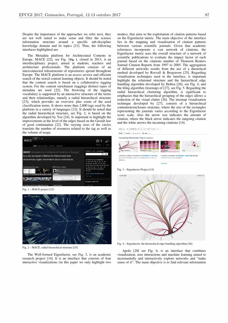
The Metadata platform for Architectural Contents in Europe, MACE [22], see Fig. 1Fig. 1, closed in 2013, is an interdisciplinary project, aimed at students, teachers and architecture professionals. The platform consists of an interconnected infrastructure of repositories spread throughout Europe. The MACE platform is an access service and efficient search of the stored content learning objects. It should be noted that the content search is based on a collaborative tagging system. For the content enrichment (tagging) distinct types of metadata are used [22]. The browsing of the tagging vocabulary is supported by an interactive structure of the terms and their relationships, namely a radial hierarchical structure [23], which provides an overview plus zoom of the used classification terms. It shows more than 2,800 tags used by the platform in a variety of languages [23]. It should be noted that the radial hierarchical structure, see Fig. 2, is based on the algorithm developed by Yee [24]. Is important to highlight the improvements at the level of the edges based on the Gestalt law of good continuation [22]. The varying sizes of the circles translate the number of resources related to the tag as well as the volume of usage.
Fig. 1 – MACE project [22]
Fig. 2 – MACE, radial hierarchical structure [24]
The Well-formed Eigenfactor, see Fig. 3, is an academic research project [14]. It is an interface that consists of four interactive visualizations (in this paper we only highlight two
modes), that aims to the exploitation of citation patterns based on the Eigenfactor metric. The main objective of the interface lies in the mapping and visualization of citation patterns between various scientific journals. Given that academic references incorporate a vast network of citations, the Eigenfactor metric uses the overall structure of a network of scientific publications to evaluate the impact factor of each journal based on the citations number of Thomson Reuters Journal Citation Reports from 1997 to 2005. The aggregation of different networks results from the use of a theoretical method developed by Rosvall & Bergstrom [25]. Regarding visualization techniques used in the interface, is important highlight the relational structure and the hierarchical edge bundling algorithm developed by Holten [26], see Fig. 4, and the tiling algorithm (treemap) of [27], see Fig. 5. Regarding the radial hierarchical clustering algorithm, is significant to emphasize that the hierarchical grouping of the edges allows a reduction of the visual clutter [26]. The treemap visualization technique developed by [27], consists of a hierarchical contention/enclosure structure, where the size of the rectangles representing the journals varies according to the Eigenfactor score scale. Also the arrow size indicates the amount of citation, where the black arrow indicates the outgoing citation and the white arrows the incoming citations [14].
Fig. 3 – Eigenfactor Project [14]
Fig. 4 – Eigenfactor, the hierarchical edge bundling algorithm [26]
Apolo [28] see Fig. 6, is an interface that combines visualization, user interactions and machine learning aimed to incrementally and interactively explore networks and “make sense of it”. The main objective is to find relevant information
EPCGI 2017, Guimaraes, Portugal, 12-13 outubro 2017 87

based on machine learning method called Belief Propagation, i.e., message passing algorithm over link structures, to infer which information objects may be relevant for the researcher. The aim is to support personalized sensemaking according to the researcher purposes. It is based in theories of sensemaking, that is a process characterized by the depiction of the information space. Therefore, goes beyond graph exploration by enable researchers to construct visualize and expand representations of relations between informational objects. Namely, the construction of a mental model that connects the researcher interests to a new knowledge domain to comprehend and expand it. The goal is to provide the development of external representations of the researcher internal model to support sensemaking in large networks. However, goes beyond exploration, allowing researchers to express, create and increment their mental models in a bottom-up approach.
Fig. 5 – Eigenfactor - tiling algorithm (treemap)
Fig. 6 – Apolo project [29]
Regarding to the visualization and exploration, the objective is to help researcher’s build-up their own landscapes of information. It is important to highlight that the structures of the expanded nodes changes according to the user interaction instead of assuming the same expanded nodes for all users. The interface is composed by three configuration panels aimed at the reduction of the visual clutter and visualization readability enhancing, filter to show all types of nodes (starred, annotated, pinned, selected and hidden) and grouping where the researcher can manage several options. The visualization space
is where the researcher interacts and constructs personalized representations. It uses a dataset from google scholar (83.000 articles and 150,000 citations) based on an approach to mine all articles within a three-degree relation from the main article (node). The process starts with a single node (black node), and with the ten most relevant articles determined by the belief propagation algorithm. The articles are represented by circles where the size is proportional to the citation count. Is important to underline the possibility to interactively distribute the articles. The central white dot represents that the circles are pinned. There is also the possibility to apply the filter features already described. The article relevance and its belongness to a group is determined by the algorithm according to the saturation value. New added articles, which are based on the citation rank metric, are vertical distributed (list). The Apolo rank-in-place feature is better than the force direct algorithm to the sensemaking process because it allows to rank local subsets of articles by their computed relevance, e.g., rank by year, citation count [28].
The Apolo interface allows an exploration and sensemaking user-driven process rather than data-driven. This means that the structure of the data works as a support to the researcher metal model and not the opposite. There is an exploration process guided by the construction of the researcher metal model. The researcher arranges his own nodes in contrast to the force-directed layout algorithm, which place the nodes taking into account the distribution of the nodes and edges in order to minimize the occlusion of nodes and edges.
The Citeology: Visualizing Paper Genealogy [15], see Fig. 7, is an interactive display aimed to the representation of the relationships between scientific papers, based on a sample of 11,699 citations between 3,502 scientific papers published between 1982 and 2010 at two series of conferences by the Association for Computing Machinery Conference on Human Factors in Computing Systems (ACM CHI) and User Interface Software and Technology (UIST). The relational structure represents the genealogy of the selected paper, where the blue branches establishes the connections to the descendant papers and the red branches establishes the connections to the ancestor papers. The lines connecting nearby generations are thicker and opaque, and for distant generations the line is thinner and transparent [15].
PaperQuest is a visualization prototype tool to support the literature review process to display articles based on the user interest, see Fig. 8. It states that a crucial process in the literature process is to filter the most relevant articles aimed to the specific domain of interest of the researcher [21]. The literature review process is a space subdivided by the following subspaces: the core, defined by the articles read in order to understand the field; the fringe which are the articles referenced by the core articles; the unknown that is the articles deluge; and the to read list, which is the articles selected from the fringe [21].
The article relevance is determined by three quantitative metrics with different scales: the number of internal citations supported by the used dataset, namely from the CHI and UIST conferences; number of external citation from Google Scholar, and a connectedness measure. The relevance algorithm
88 EPCGI 2017, Guimaraes, Portugal, 12-13 outubro 2017
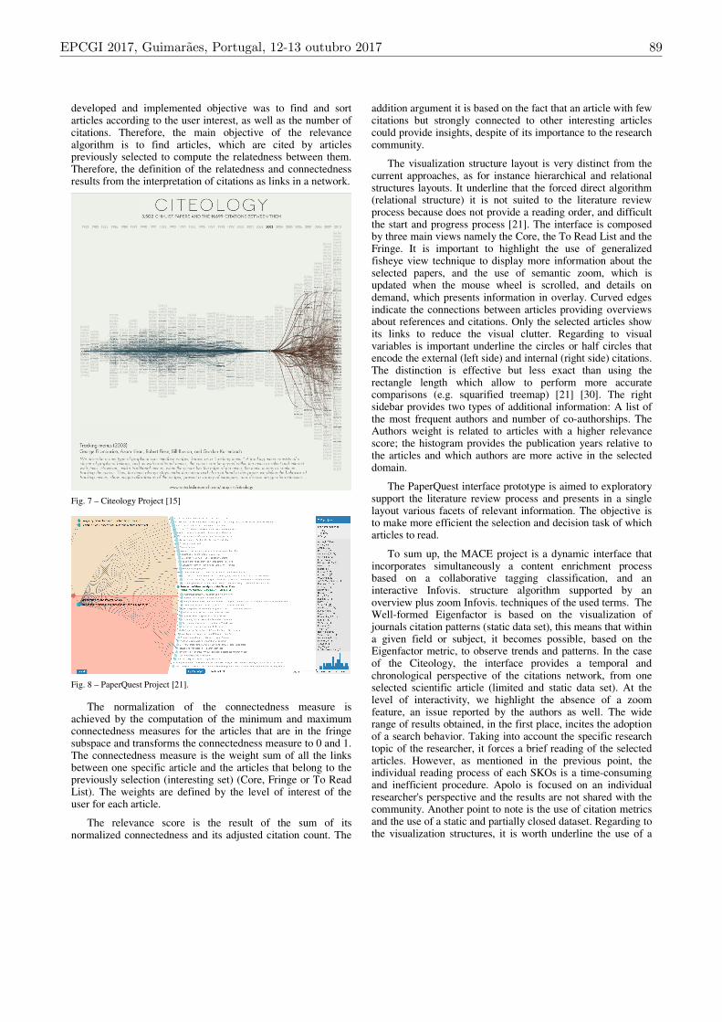
developed and implemented objective was to find and sort articles according to the user interest, as well as the number of citations. Therefore, the main objective of the relevance algorithm is to find articles, which are cited by articles previously selected to compute the relatedness between them. Therefore, the definition of the relatedness and connectedness results from the interpretation of citations as links in a network.
Fig. 7 – Citeology Project [15]
Fig. 8 – PaperQuest Project [21].
The normalization of the connectedness measure is achieved by the computation of the minimum and maximum connectedness measures for the articles that are in the fringe subspace and transforms the connectedness measure to 0 and 1. The connectedness measure is the weight sum of all the links between one specific article and the articles that belong to the previously selection (interesting set) (Core, Fringe or To Read List). The weights are defined by the level of interest of the user for each article.
The relevance score is the result of the sum of its normalized connectedness and its adjusted citation count. The
addition argument it is based on the fact that an article with few citations but strongly connected to other interesting articles could provide insights, despite of its importance to the research community.
The visualization structure layout is very distinct from the current approaches, as for instance hierarchical and relational structures layouts. It underline that the forced direct algorithm (relational structure) it is not suited to the literature review process because does not provide a reading order, and difficult the start and progress process [21]. The interface is composed by three main views namely the Core, the To Read List and the Fringe. It is important to highlight the use of generalized fisheye view technique to display more information about the selected papers, and the use of semantic zoom, which is updated when the mouse wheel is scrolled, and details on demand, which presents information in overlay. Curved edges indicate the connections between articles providing overviews about references and citations. Only the selected articles show its links to reduce the visual clutter. Regarding to visual variables is important underline the circles or half circles that encode the external (left side) and internal (right side) citations. The distinction is effective but less exact than using the rectangle length which allow to perform more accurate comparisons (e.g. squarified treemap) [21] [30]. The right sidebar provides two types of additional information: A list of the most frequent authors and number of co-authorships. The Authors weight is related to articles with a higher relevance score; the histogram provides the publication years relative to the articles and which authors are more active in the selected domain.
The PaperQuest interface prototype is aimed to exploratory support the literature review process and presents in a single layout various facets of relevant information. The objective is to make more efficient the selection and decision task of which articles to read.
To sum up, the MACE project is a dynamic interface that incorporates simultaneously a content enrichment process based on a collaborative tagging classification, and an interactive Infovis. structure algorithm supported by an overview plus zoom Infovis. techniques of the used terms. The Well-formed Eigenfactor is based on the visualization of journals citation patterns (static data set), this means that within a given field or subject, it becomes possible, based on the Eigenfactor metric, to observe trends and patterns. In the case of the Citeology, the interface provides a temporal and chronological perspective of the citations network, from one selected scientific article (limited and static data set). At the level of interactivity, we highlight the absence of a zoom feature, an issue reported by the authors as well. The wide range of results obtained, in the first place, incites the adoption of a search behavior. Taking into account the specific research topic of the researcher, it forces a brief reading of the selected articles. However, as mentioned in the previous point, the individual reading process of each SKOs is a time-consuming and inefficient procedure. Apolo is focused on an individual researcher's perspective and the results are not shared with the community. Another point to note is the use of citation metrics and the use of a static and partially closed dataset. Regarding to the visualization structures, it is worth underline the use of a
EPCGI 2017, Guimaraes, Portugal, 12-13 outubro 2017 89

unconventional relational structure layout that allows a reduction of the visual clutter because it can be constructed and organized by the user. That relational structure reflects the mental model of the researcher regarding the topics of a discipline or subdiscipline of the knowledge domain. However, the categorization of the topics of knowledge reflect an ontological ambiguity which is not a solution for a more targeted/find approach. PaperQuest is a tool oriented to the literature review process based on a previous researcher selection (seed article). It is also focused on an individual researcher's perspective and the results of his research are not shared with the community. In relation to the visualization structure, an unconventional layout is used, and is important to underline that it does not fit into the conventional defined categories of visualization structures. After selecting the seed article, relations between one article and the dataset are established. The provided connections act like shortcuts to possible relevant articles. However, it is a time-consuming solution process because the researcher equally must read to filter the most relevant articles that fit in his specific knowledge topic. In the Table I, a list of main characteristics of each project are listed, the green shows the project cover the characteristic, the red shows the project fails to cover the characteristic.
TABLE I - TABLE STYLES
Projects
Characteristics
Mace
Well-
Formed
Eigenfactor
Apolo Citeology Paper
Quest
Interactive
Data Set
Metrics
InfoVis. Techniques
InfoVis. Structures
InfoVis.
Algorithms
Collaborative
Tagging
Classification
Machine Learning
Algorithms
III. ARCHITECTURE AND INFORMATION VISUALIZATION
We propose an innovative architecture, see Fig. 9, that through monitoring agents will collect social media data from various sources, e.g. Mendely, ResearchGate, Academia.edu, IEEE Xplorer, Twitter, among others, and extract, transform
and load these data to a repository. All data is transformed in accordance with Linked Open Data (LOD), i.e. LOD is data with context (metadata) so that it can be correctly interpreted, used and reused. The data will be stored in a repository in accordance with Resource Definition Framework (RDF) also called triplestores. The RDF data will be persisted in, e.g., graph database or triplestore repository [31]. The RDF data stored in triplestores repositories can be queried with SPARQL, that allows querying RDF data, i.e., triple patterns. Finally, the data will be visualized with information visualization techniques.
The LOD community leaders are the W3C and the DCMI with their standards, such as the RDF suite of specifications [32] and the DCMI Metadata Terms [33]. One of the most known commercial efforts is schema.org, led by Google [34].
These data can be denominated Big Data, because these data are conforming with the 3 V’s of Big Data, i.e., volume, variety and velocity. The volume is considerable because we are collecting data produced by researchers in social web platforms. These data show variety, because some data are unstructured or semi-structured, like comments, tweeters, evaluations, bloggings, among others and to process these unstructured data we will use data mining techniques, e.g., sentiment analysis. The last characteristic velocity is not crucial, but is important to refresh the data in a brief period.
Fig. 9 - Proposed Architecture
90 EPCGI 2017, Guimaraes, Portugal, 12-13 outubro 2017

This architecture will be in line with the most recent international standards and good practices for Open Data, especially those related to Linked Open Data (LOD), i.e., the source data will be conforming with LOD, and this architecture will be denominated Linked Open Big Data Mining (LOBDM), everything will be OPEN at all stages of the project, as it is advocated by the Open Science movement. Designing a LOBDM based solution architecture that ensures data interoperability, data accessibility, data integration and data analytics with full alignment with the Open Movement in line with Open Science, according to the latest International Standardization activities and with European guidance on interoperability [35].
The equated conceptualization adopted in this work/paper cover an interface design, i.e., information architecture, hierarchies, buttons, information visualization interaction techniques aimed at smooth navigation and transitions among scholarly relational structures between SKOs, knowledge domains, knowledge disciplines and subdisciplines. The objective is to portrait a considerable experience patterns to provide fast capability of filtering and navigation in the most relevant SKOs objects to all communities that pretend explore it. The main community is the scholarly, but this architecture is also directed to practitioner’s community as also to organizations and general users that want to explore SKOs.
To understand, depict and navigate in the social science information landscape is important to design an information visualization interface. However, the first step is to understand the information architecture. In this sense hierarchies and networks are the basic structures of information [2]. Therefore, Network Structures like the circular convergence graph, see Fig. 4, Hierarchical Structures like Hierarchical Radial Layout, see Fig. 2 and Treemaps, see Fig. 5, allows in an organized structure layout interactively depict the complex social science space. The goal is the representation of the relations among researchers and his contributions, the knowledge objects, knowledge domains, disciplines, sub-disciplines and new topics.
Other approaches will be considered, studied, implemented and tested, as for instance the force directed algorithm layout, where similar nodes are in close spatial proximity [36]. This algorithm is aimed at the visualization of the network topology, e.g. depict the evolution of a discipline; another similar network structure is the Sankey diagram, i.e, Alluvial diagram [37], which allow the visualization of the magnitude of flow between nodes [38]; or the use of Temporal structures, e.g., Timelines, to provide an understanding of the temporal distribution of the data sets, growth and decay rates, patterns, trends or bursts [36] [38].
IV. DISCUSSIONS AND FUTURE WORK
We present in this paper an architecture to collect social media data from several sources, these data are consistent with the characteristics of Big Data, so the architecture need to follow Big Data characteristics. The data will be transformed with Data Mining algorithms and stored in a RDF repository, i.e., a triplestore database (NoSQL database). These data will
be available to be visualized with interactive information visualization techniques.
This architecture is compliant with Open Data and all the data will be openly available as LOD. We denominated this Open Data solution as Linked Open Big Data Mining (LOBDM). To the best of our knowledge design an architecture based in LOBDM is innovative and there are few architectures to combine information visualization techniques applied to digital libraries/repositories and there are no evidences that they have been fully integrated, and none of the current altmetrics services or databases makes all their data openly available as LOBDM.
In the literature review process, some information visualization projects are identified. Despite the objectives of the analyzed projects, they are not well suited for explore SKOs, in which only a small subset of SKOs is relevant to the researcher. Since the previous cases provide solutions for viewing patterns and trends, specifically interfaces aimed for the visualization of scientific network knowledge structures based on impact factor of a journal, e.g., in the case of the Well Formed Eigenfactor, PaperQuest, Apolo interfaces share a common objective and addresses the problematic but in distinct approaches. Although there are some approaches that provide important techniques they are not aimed to scholarly communication. In a general way, these projects do not cover the equated approach, which is the wisdom of the crowds (e.g. MACE) and the interactive access to relevant SKOs.
Nevertheless, they provide important clues and techniques to explore to information visualization.
To future work, we propose to:
- identify and evaluate social media data to be combined with Data Mining algorithms to determine SKOs relevance;
- select the web social sources of social media data and identify the mechanisms of collecting these data from the sources selected;
- implement the LOBDM architecture with adequate technologies to test the components in terms of integration and interoperability issues;
- design information visualization interfaces and select techniques to filter and navigate SKOs;
- study and explore the information visualization algorithms/structures.
ACKNOWLEDGMENT
This work has been supported by COMPETE: POCI-01-0145-FEDER-007043 and FCT – Fundação para a Ciência e Tecnologia within the Project Scope: UID/CEC/00319/2013.
REFERENCES
[1] M. M. Ware, Mark, “The STM Report: An overview of scientific and scholarly journal publishing,” 2015. .
[2] A. Wright, Glut: Mastering Information through the Ages. Cornell University Press, 2008.
EPCGI 2017, Guimaraes, Portugal, 12-13 outubro 2017 91

[3] E. Garfield, “Citation indexes for science. A new dimension in documentation through association of ideas,” Int. J. Epidemiol., vol. 35, no. 5, pp. 1123–1127, 2006.
[4] E. Garfield, “Citation Indexes for Science: A New Dimension in Documentation through Association of Ideas,” Science, vol. 122, no. 3159, pp. 108–111, Jul. 1955.
[5] C. L. Staudt, “Analysis of scientific collaboration networks: social factors, evolution, and topical clustering,” University of the State of Baden-Wuerttemberg, 2011.
[6] K. Borner and D. E. Polley, Visual insights : a practical guide
to making sense of data. . [7] M. E. J. Newman, “Scientific collaboration networks. Network
construction and fundamental results,” Phys. Rev. E, vol. 64, no. 1, p. 16131, Jun. 2001.
[8] Altmetrics.com, “What are altmetrics?” [Online]. Available: https://www.altmetric.com/about-altmetrics/what-are-altmetrics. [Accessed: 23-May-2017].
[9] L. Bornmann, “Alternative metrics in scientometrics: A meta-analysis of research into three altmetrics,” Scientometrics, vol. 103, no. 3, pp. 1123–1144, 2015.
[10] H. Rheingold, Smart mobs : the next social revolution. Perseus Pub, 2003.
[11] A. R. Hevner, S. T. March, J. Park, and S. Ram, “Design Science in Information Systems Research,” MIS Q., vol. 28, no. 1, pp. 75–105, 2004.
[12] K. Börner, C. Chen, K. Borner, and C. Chen, “Visual Interfaces to Digital Libraries: Motivation, Utilization, and Socio-technical Challenges,” in Visual Interfaces to Digital Libraries, Springer, 2002, pp. 1–9.
[13] P. A. G. García, D. Martín-Moncunill, S. Sánchez-Alonso, and A. F. García, “A usability study of taxonomy visualisation user interfaces in digital repositories,” Online Inf. Rev., vol. 38, no. 2, pp. 284–304, Feb. 2014.
[14] M. Stefaner, M. Rosvall, and C. Bergstrom, “well-formed.eigenfactor,” in ACM SIGGRAPH 2009 Art Gallery on
- SIGGRAPH ’09, 2009, p. 1. [15] J. Matejka, T. Grossman, and G. Fitzmaurice, “Citeology:
visualizing paper genealogy,” in Proceedings of the 2012 ACM
annual conference extended abstracts on Human Factors in
Computing Systems Extended Abstracts - CHI EA ’12, 2012, p. 181.
[16] M. Dork, N. H. Riche, G. Ramos, and S. Dumais, “PivotPaths: Strolling through Faceted Information Spaces,” IEEE Trans.
Vis. Comput. Graph., vol. 18, no. 12, pp. 2709–2718, Dec. 2012.
[17] N. Kampanya, R. Shen, S. Kim, C. North, and E. a Fox, “Citiviz: A Visual User Interface to the CITIDEL System,” in 8th European Conference on Digital Libraries, vol. 3232, 2004, pp. 122–133.
[18] L. Marks, J. A. T. Hussell, T. M. McMahon, and R. E. Luce, “ActiveGraph: A digital library visualization tool,” Int. J. Digit.
Libr., vol. 5, no. 1, pp. 57–69, Mar. 2005. [19] E. Clarkson, K. Desai, and J. Foley, “ResultMaps:
Visualization for Search Interfaces,” IEEE Trans. Vis. Comput.
Graph., vol. 15, no. 6, pp. 1057–1064, Nov. 2009. [20] B. Kim, J. Scott, and S. Kim, “Exploring Digital Libraries
through Visual Interfaces,” in Digital Libraries - Methods and
Applications, InTech, 2011. [21] A. Ponsard, F. Escalona, and T. Munzner, “PaperQuest,” in
Proceedings of the 2016 CHI Conference Extended Abstracts
on Human Factors in Computing Systems - CHI EA ’16, 2016, pp. 2264–2271.
[22] M. Stefaner et al., “MACE: Connecting and enriching repositories for architectural learning,” in Browsing
Architecture: Metadata and Beyond, 2008, pp. 22–49. [23] M. Lima, Visual Complexity: Mapping Patterns of Information.
Princeton Architectural Press, 2011. [24] K.-P. Yee, D. Fisher, R. Dhamija, and M. Hearst, “Animated
exploration of dynamic graphs with radial layout,” in IEEE
Symposium on Information Visualization, 2001. INFOVIS
2001., 2001, pp. 43–50. [25] M. Rosvall and C. T. Bergstrom, “Maps of random walks on
complex networks reveal community structure,” Proc. Natl.
Acad. Sci., vol. 105, no. 4, pp. 1118–1123, Jan. 2008. [26] D. Holten, “Hierarchical Edge Bundles: Visualization of
Adjacency Relations in Hierarchical Data,” IEEE Trans. Vis.
Comput. Graph., vol. 12, no. 5, pp. 741–748, Sep. 2006. [27] B. Johnson and B. Shneiderman, “Tree-maps: a space-filling
approach to the visualization of hierarchical information structures,” in Proceeding Visualization ’91, 1991, pp. 284–291.
[28] D. Horng, P. Chau, A. Kittur, J. I. Hong, and C. Faloutsos, “Apolo : Making Sense of Large Network Data by Combining Rich User Interaction and Machine Learning,” Mach. Learn., vol. 46, pp. 167–176, 2011.
[29] D. H. Chau, A. Kittur, J. I. Hong, and C. Faloutsos, “Apolo,” in Proceedings of the 2011 annual conference on Human factors
in computing systems - CHI ’11, 2011, vol. 46, p. 167. [30] B. Azevedo, H. Silva, and R. Tortosa, “Harnessing User ’ s
Knowledge In The Construction Of Rating Flows : The Design Of A Collaborative System Applied To Academic Repositories,” in 6th International Forum of Design as a
Process: Systems & Design Beyond Processes And Thinking, 2016, pp. 780–792.
[31] T. Berners-Lee, “Linked Data - Design Issues,” 2009. [Online]. Available: https://www.w3.org/DesignIssues/LinkedData.html. [Accessed: 13-Jun-2017].
[32] W3C, “RDF Current Status.” [Online]. Available: https://www.w3.org/standards/techs/rdf#w3c_al. [Accessed: 23-May-2017].
[33] DCMI, “DCMI Metadata Terms.” [Online]. Available: http://dublincore.org/documents/dcmi-terms. [Accessed: 23-May-2017].
[34] Schema.org, “No Title.” [Online]. Available: http://schema.org. [Accessed: 17-Nov-2011].
[35] EIRA, “Interoperability Solutions | Joinup.” [Online]. Available: https://joinup.ec.europa.eu/asset/eia/asset_release/all. [Accessed: 23-May-2017].
[36] K. Borner and D. E. Polley, Visual insights : a practical guide
to making sense of data. 2014. [37] M. Rosvall and C. T. Bergstrom, “Mapping Change in Large
Networks,” PLoS One, vol. 5, no. 1, p. e8694, Jan. 2010. [38] I. Meirelles, Design for Information: An Introduction to the
Histories, Theories, and Best Practices Behind Effective
Information Visualizations. Rockport Publishers, 2013.
92 EPCGI 2017, Guimaraes, Portugal, 12-13 outubro 2017