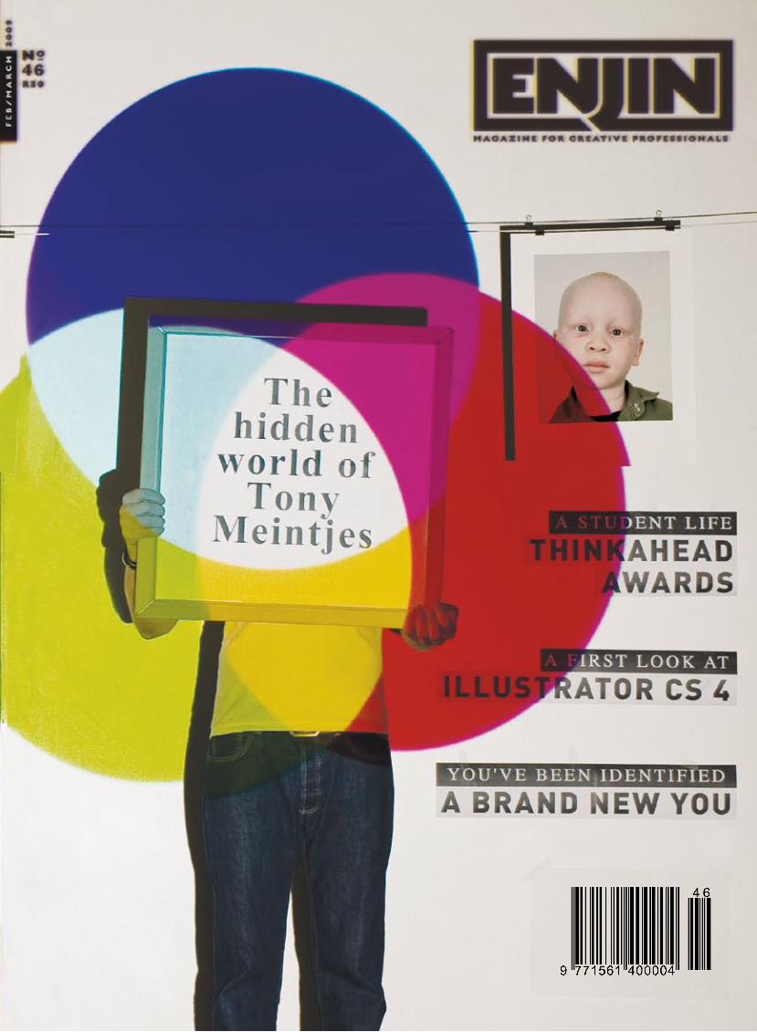
ENJIN Magazine Issue 46
48
ENJIN 22 1 NEws_
-
Upload
softmachine-media -
Category
Documents
-
view
233 -
download
1
description
ENJIN Magazine – the only illustrated print magazine dedicated to professional visual communication in South Africa. It deals with issues affecting us on all the frontlines where design meets advertising – whether professional or marginal, kitsch or refined, dull or quick-witted, we swoop down on it and publish it in all its blazing technicolour glory. Loved and respected by professional designers as well as advertisers and students, the magazine is now available for download in various digital formats. Added features in the digital editions include interactive advertisements, hyperlinks, video and audio feeds, as well as Showcase and Submit sections where readers can nominate or submit content for publication on the website or in the magazine.
Transcript of ENJIN Magazine Issue 46
E N J I N 2 2 1
N E w s _
26005_C Vale_ENGIN_310x440p.indd 1 1/7/09 4:33:04 PM
26005_C Vale_ENGIN_310x440p.indd 1 1/7/09 4:33:04 PM
the current downturn in the economy spells trouble for the print publishing industry – as
some industry analysts have been prediciting for a while. With titles closing left and right, and others migrating to a digital platform, it is perhaps an opportune time to consider the true value of the printed page – and to reevaluate the relationship publishers and agencies have with consumers.It is sometimes easy to forget that printing is a craft – and to remind us of this is master printmaker and photographer Tony Meintjes – a stalwart of the local graphic arts scene. Tony has been around the block a few times – he was one of the frontrunners of the move to digital photography in the mid-to late-nineties. Given the move by some publishers to a digital platform, it is somewhat ironic that printmaking has become an even more specialised craft.Other articles of interest in this issue include a piece by Herman Manson on how consumers relate to brands. It makes sense to think of brands in terms of relationships, i.e., that one forms brand relationships as you would interpersonal relationships. This demystifies the role of the creative agency somewhat – but not too much. Another point of interest is the move to Cape Town of the Loerie Awards – a timely move as the future of the awards in Margate were always in doubt.And perhaps, as you read the magazine, reflect on what it means to hold it, to sniff and fold it, to read it from the front or back. Enjoy.
PUBLISHERUndo Media
EDITORGregor Naudé
ART DIRECTION/DESIGNFrancois Smit/QUBA
COVER DESIGNDisturbance
CONTRIBUTING WRITERSJustin Cloete, Sean O’Toole, Herman Manson, Sarah Beswick
CONTACT DETAILSTel (084) 445-5067; Fax (086) 563-2380; E-mail [email protected]
ADVERTISING SALES(084) 445-5067; [email protected]
SUBSCRIPTION QUERIESTel (084) 445-5067; E-mail [email protected]
!Enjin Magazine is printed in South Africa and published bi-monthly by Undo Media, PO Box 91938, Auckland Park, 2006. Cover printed on Sappi Triple Green Silk 240gsm; text printed on Sappi Triple Green Silk 130gsm. Printed Computer-to-Plate. Thermal imaging plates supplied by Antalis South Africa. Distributed by Prestige Bulk Mailers, Kya Sand. Printed by Seriti Printing. The title ‘Enjin’ and logotype are registered tradmarks. Neither this publication nor any part thereof may be reproduced by any means without the express written permis-sion of the publisher. Enjin is an independent magazine, not affiliated with any company. The views expressed in this publication are not necessarily those of the publishers.!-
magic fingers
u n domedia
02 U P F R O N TENJIN 46
X
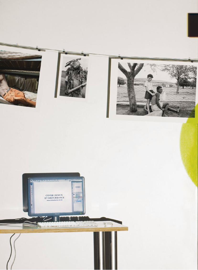
Cover Design by Disturbance
con
tents
*b
etw
ee
n th
e s
he
ets
ENJIN
PRINT!
e d ’ s n o t e 02 Ed-cetera g o o d h e a v e n s 05 Sean O'Toole
o u t p u t 06 Arty bins
a d n a t i o n 08 ArtVespa winners '08 10 Design Indaba '09
11 Sappi promotes communication
c o v e r 12 Tony Meintjes' hidden world
b r a n d 18 You've been identified!
c o v e r 21 Zeta Micro
i m p r i n t 22 Laser Impressions t h i n k 24 Sale! Sale! p l a k 26 Lego-ver
p r o c e s s 28 Illustrator CS4
t o o l s 32 Apple iLife '09 34 HP Z3200 36 G-Technologies r e v i e w Corel Painter 11
b o o k s 40 Loeries Annual
o p i n i o n 42 Scary monsters
d e a d m e d i a 45 Sound barrier
Sean O'Toole
User of the Oxford English Dictionary
ENjiN: Do you use a computer?
Every damn day, as in seven days a week.
ENjiN: Do you want to?
My girlfriend has taught me to distinguish between “need” and “want”.
ENjiN: Are you sure?
Yes, I like her a lot.
ENjiN: Were you born at the right time?
Yes.
ENjiN: Why do you think so?
It’s just an intuition, I could be wrong.
ENjiN: What do computers do?
Make you crouch in front of a rectangular screen.
ENjiN: Where are computers from?
I just checked by turning my laptop over: “Designed by Apple California. Assembled in China”. You can discount the first part.
ENjiN: What do they cost?
The price of a feature in Empire or Maverick. Damn, looks like I'm not upgrading for a while.
ENjiN: Can you run a computer off a car battery?
Doubtlessly. I run mine off a hole in the wall.
ENjiN: What is the most important part of a computer?
The OFF button.
ENjiN: What do you use a keyboard for?
Love letters.
ENjiN: Are computers good for the earth?
That’s not a question, just plain ignorance.
ENjiN: Should everyone have a computer?
Ideally, yes, practically, no, ecologically, for damn sure no.
ENjiN: Do girls like computers?
Check out Facebook for the answer to that.
ENjiN: Was that a stupid question?
It ranks alongside those men in whiskers who once sniggered at suffragettes.
ENjiN: Do you have children?
No.
ENjiN: Do you think your child should have a computer?
No.
ENjiN: What does the government do with their computers?
Send 419 scam emails to the IMF and World Bank.
ENjiN: Will a computer ever be able to do your job?
Writing involves intuition and love; computers record their execution.
ENjiN: How do you feel about our eventual redundancy/uselessness?
An ATM short-changed me recently. You try tell that to a @£$%ing computer. I’ve dealt with four humans trying to correct our supposed redundancy.
ENjiN: What will there be left for the working class to earn money with in 200 years’ time?
Have you seen Wall-E?.
ENjiN: Have you ever met a systems manager?
No.
ENjiN: Do you like your system manager?
I kept wondering what his point was.
ENjiN: Would you like a GPS?
"There must be some way out of here," said the joker to the thief…
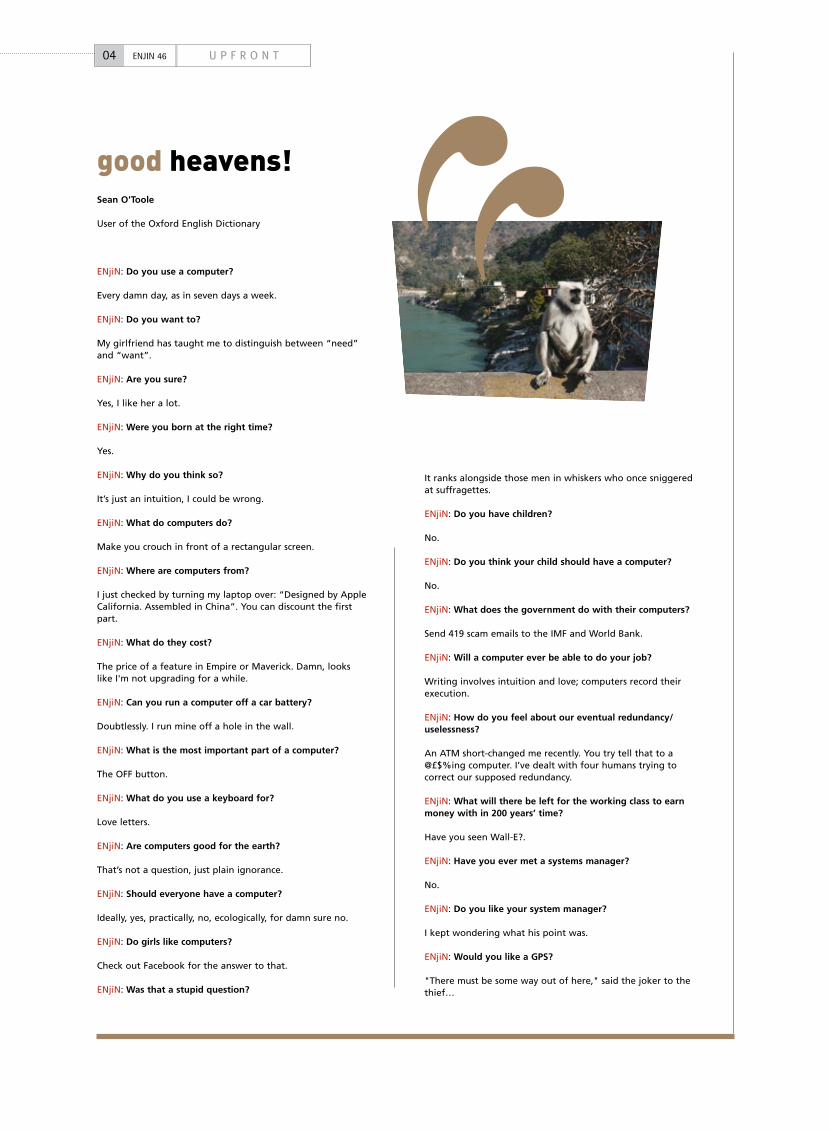
good heavens!
04 U P F R O N TENJIN 46
www.syntechsa.co.za
Syntech SA Distributed by :
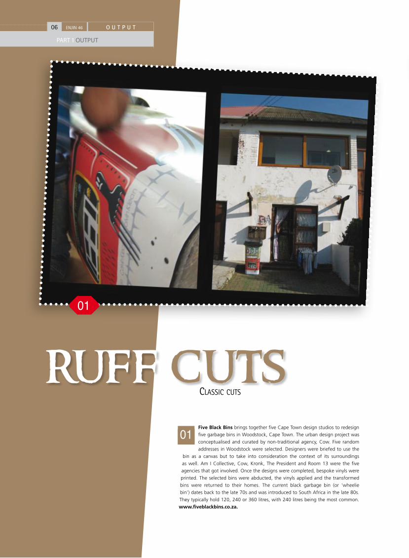
Five Black Bins brings together five Cape Town design studios to redesign
five garbage bins in Woodstock, Cape Town. The urban design project was
conceptualised and curated by non-traditional agency, Cow. Five random
addresses in Woodstock were selected. Designers were briefed to use the
bin as a canvas but to take into consideration the context of its surroundings
as well. Am I Collective, Cow, Kronk, The President and Room 13 were the five
agencies that got involved. Once the designs were completed, bespoke vinyls were
printed. The selected bins were abducted, the vinyls applied and the transformed
bins were returned to their homes. The current black garbage bin (or 'wheelie
bin') dates back to the late 70s and was introduced to South Africa in the late 80s.
They typically hold 120, 240 or 360 litres, with 240 litres being the most common.
www.fiveblackbins.co.za.
ruff cuts01
ClassiC Cuts
06 O U T P U TENJIN 46
PART 1 OUTPUT
01
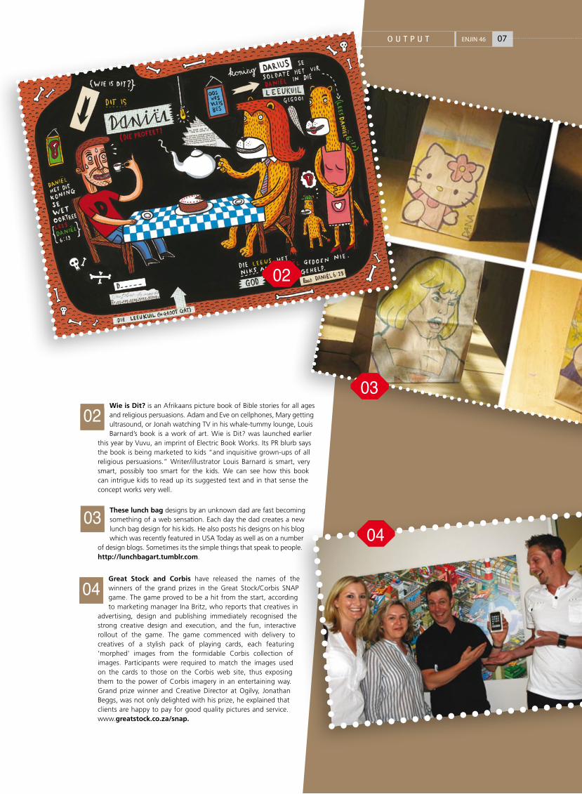
Wie is Dit? is an Afrikaans picture book of Bible stories for all ages and religious persuasions. Adam and Eve on cellphones, Mary getting ultrasound, or Jonah watching TV in his whale-tummy lounge, Louis Barnard’s book is a work of art. Wie is Dit? was launched earlier
this year by Vuvu, an imprint of Electric Book Works. Its PR blurb says the book is being marketed to kids “and inquisitive grown-ups of all religious persuasions.” Writer/illustrator Louis Barnard is smart, very smart, possibly too smart for the kids. We can see how this book can intrigue kids to read up its suggested text and in that sense the concept works very well.
These lunch bag designs by an unknown dad are fast becoming something of a web sensation. Each day the dad creates a new lunch bag design for his kids. He also posts his designs on his blog which was recently featured in USA Today as well as on a number
of design blogs. Sometimes its the simple things that speak to people. http://lunchbagart.tumblr.com.
Great Stock and Corbis have released the names of the winners of the grand prizes in the Great Stock/Corbis SNAP game. The game proved to be a hit from the start, according to marketing manager Ina Britz, who reports that creatives in
advertising, design and publishing immediately recognised the strong creative design and execution, and the fun, interactive rollout of the game. The game commenced with delivery to creatives of a stylish pack of playing cards, each featuring ‘morphed' images from the formidable Corbis collection of images. Participants were required to match the images used on the cards to those on the Corbis web site, thus exposing them to the power of Corbis imagery in an entertaining way. Grand prize winner and Creative Director at Ogilvy, Jonathan Beggs, was not only delighted with his prize, he explained that clients are happy to pay for good quality pictures and service. www.greatstock.co.za/snap.
02
0304
03
04
07O U T P U T ENJIN 46
02
08 A D N A T I O NENJIN 46
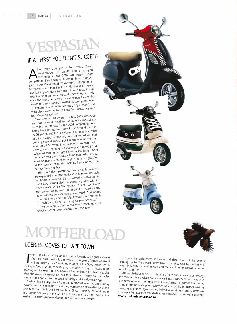
iF at FiRst YOu DON't suCCEEDvespasianA
fter three attempts in four years, David
Newenhuizen of BandC Group scooped
first prize in the 2009 Art Vespa design
competition. David scooted home on his customised
LX 150 Art Vespa titled, "Extravert Schitzophrenia-
Nymphomanic" that has been his dream for years.
The judging was done by a team from Piaggio in Italy
and the winners were selcted anonymously. Only
once the top three entries were selected were the
names of the designers revealed. Second place went
to Jeanene Van Zyl with her entry "Sjoe shoe" and
third place went to Pieter Janse Van Rensburg with
his "Vespa Aquarium".
David entered Art Vespa in 2006, 2007 and 2009
and due to work deadline pressure he missed the
extended cut off date for the 2008 competition. And
here’s the amazing part. David won second place in
2006 and in 2007. “The Vespa is a great first prize
and I’ve always wanted one. And let me tell you that
coming second sucks! But I thought what the hell
and turned Art Vespa into an annual campaign, with
new versions coming out every year,” David joked.
When asked if he thought his Art Vespa designs have
improved over the years David said that he has always
done his best to enter simple yet strong designs. And
as the number of entries increased year on year he
had to “raise the bar”.
His never-give-up-attitude has certainly paid off.
He explained that “the schitzo” in him was not able
to choose a colour and after wavering between red
and black, red and black, he eventually went with the
neutral black. While “the extravert” in him went with
the look-at-me-hot-red. So he put it all together and
now both his personalities are satisfied. And what’s
more on a Vespa he can “zip through the traffic with
no inhibitions, all while driving his passions wild.”
The winning Art Vespa and two runners-up were
unveiled at the Design Indaba in Cape Town.
The 31st edition of the annual Loerie Awards will signal a depart from its usual timetable and venue – this year's festival weekend will run from 25 - 27 September 2009 at the Good Hope Centre in Cape Town. With Yom Kippur, the Jewish Day of Atonement, starting on the evening of Sunday 27 September, it has been decided that the awards ceremonies will take place on Friday and Saturday nights – as opposed to the usual Saturday and Sunday evenings.“While this is a departure from the traditional Saturday and Sunday awards, we were not able to host the awards on an alternative weekend and feel that this is the best solution. Since Thursday 24 September is a public holiday, people will be able to travel to Cape Town a day earlier,” explains Andrew Human, md of the Loerie Awards.
Despite the differences in venue and date, none of the events leading up to the awards have been changed. Call for entries will begin in March and end in May, and there will be no increase in entry or admission fees.Although the Loerie Awards is famed for its annual awards ceremony, the company has evolved and expanded into a variety of initiatives with the intention of nurturing talent in the industry. It publishes the Loeries Annual, the ultimate peer-review handbook of the industry’s leading campaigns, brands, agencies and individuals each year, and Migrate – a twice-yearly magazine dedicated to the celebration of creative inspiration. www.theloerieawards.co.za.
lOERiEs MOVEs tO CaPE tOWN
motherload
tHE WHO's WHO OF WORlD DEsiGN
10 A D N A T I O NENJIN 46
desig-nation
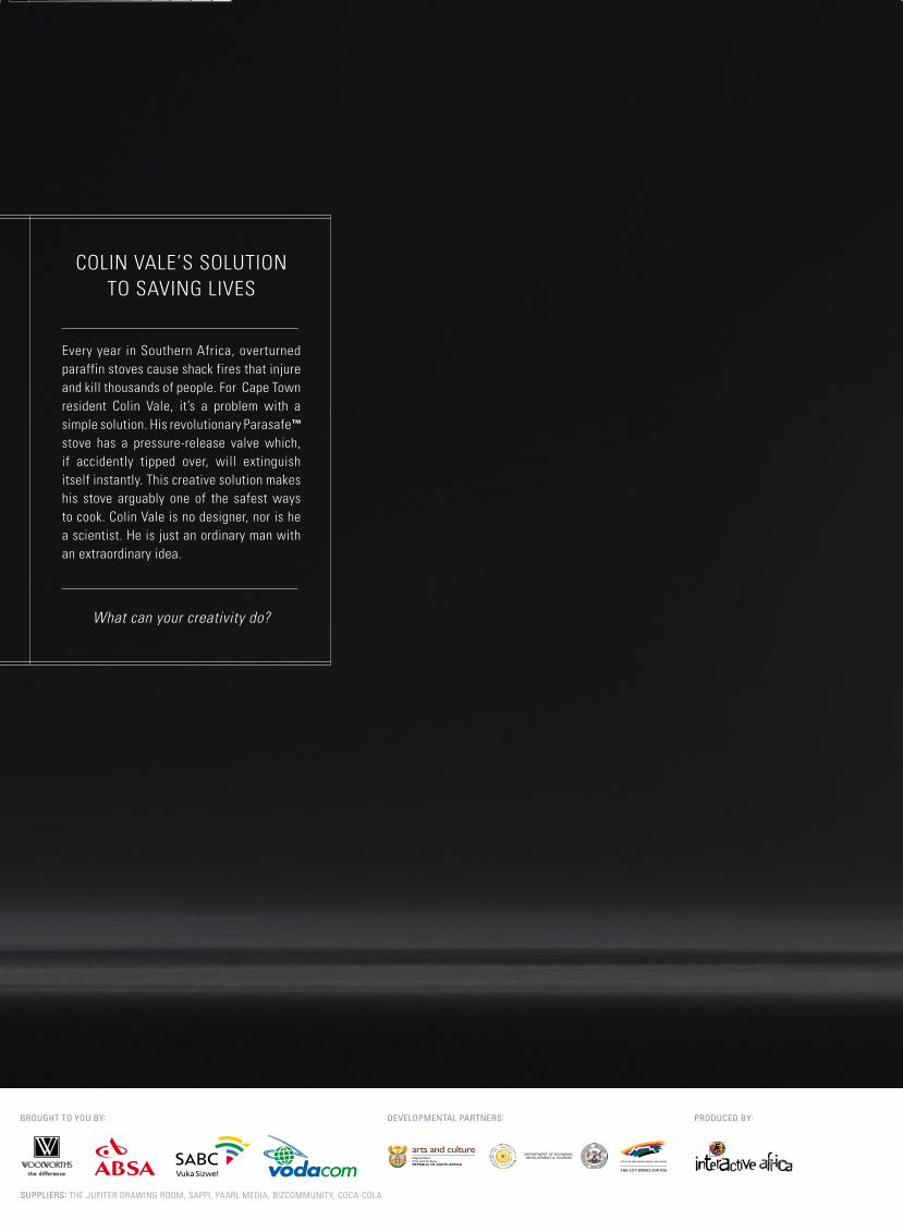
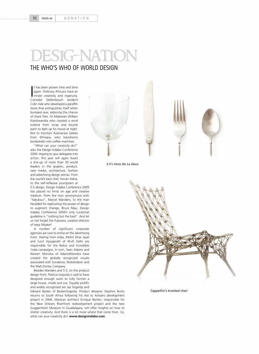
It has been proven time and time again: Ordinary Africans have an innate creativity and ingenuity.
Consider Stellenbosch resident Colin Vale who developed a paraffin stove that extinguishes itself when bumped over, reducing the chance of shack fires. Or Malawian William Kamkwamba who created a wind turbine from scrap and bicycle parts to light up his house at night. Not to mention Azemeraw Zeleke from Ethiopia, who transforms bombshells into coffee machines.
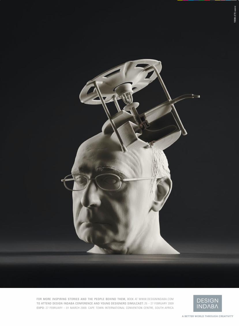
“What can your creativity do?” asks the Design Indaba Conference 2009. Hoping to spur delegates into action, this year will again boast a line-up of more than 30 world leaders in the graphic, product, new media, architecture, fashion and advertising design arenas. From the world’s best chef, Ferran Adrià, to the self-reflexive youngsters at 5.5 design, Design Indaba Conference 2009 has placed no limits on age and creative medium. From the man synonymous with “fabulous”, Marcel Wanders, to the man heralded for explicating the power of design to augment change, Bruce Mau. Design Indaba Conference 2009’s only curatorial guideline is “nothing but the best”. And let us not forget Dai Fujiwara, creative director of Issey Miyake!
A number of significant corporate agencies are sure to entice on the advertising front. Hailing from India, Mohit Dhar Jayal and Sunil Vysyaprath of W+K Delhi are responsible for the Nokia and Incredible !ndia campaigns. In turn, Sean Adams and Noreen Morioka of AdamsMorioka have created the globally recognised visuals associated with Sundance, Nickelodeon and the Walt Disney Company.
Besides Wanders and 5.5, on the product design front, Patricia Urquiola is said to have designed enough work to fully furnish a large house, inside and out. Equally prolific and widely recognised are Jay Osgerby and Edward Barber of BarberOsgerby. Product designer Stephen Burks returns to South Africa following his Aid to Artisans development project in 2006. Mexican architect Enrique Norten, responsible for the New Orleans Riverfront redevelopment project and the new Guggenheim Museum in Guadalajara, will offer insights on how to shelter creativity. And there is a lot more where that came from. So, what can your creativity do? www.designindaba.com.
5.5's Vices De La Deco
Cappellini's knotted chair
11A D N A T I O N ENJIN 46
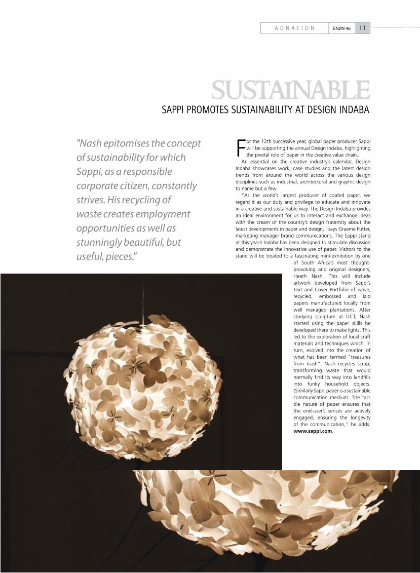
For the 12th successive year, global paper producer Sappi will be supporting the annual Design Indaba, highlighting the pivotal role of paper in the creative value chain.
An essential on the creative industry’s calendar, Design Indaba showcases work, case studies and the latest design trends from around the world across the various design disciplines such as industrial, architectural and graphic design to name but a few.
“As the world’s largest producer of coated paper, we regard it as our duty and privilege to educate and innovate in a creative and sustainable way. The Design Indaba provides an ideal environment for us to interact and exchange ideas with the cream of the country’s design fraternity about the latest developments in paper and design,” says Graeme Futter, marketing manager brand communications. The Sappi stand at this year’s Indaba has been designed to stimulate discussion and demonstrate the innovative use of paper. Visitors to the stand will be treated to a fascinating mini-exhibition by one
of South Africa’s most thought-provoking and original designers, Heath Nash. This will include artwork developed from Sappi’s Text and Cover Portfolio of wove, recycled, embossed and laid papers manufactured locally from well managed plantations. After studying sculpture at UCT, Nash started using the paper skills he developed there to make lights. This led to the exploration of local craft materials and techniques which, in turn, evolved into the creation of what has been termed “treasures from trash”. Nash recycles scrap, transforming waste that would normally find its way into landfills into funky household objects. tSimilarly Sappi paper is a sustainable communication medium. The tac-tile nature of paper ensures that the end-user’s senses are actively engaged, ensuring the longevity of the communication,” he adds. www.sappi.com.
saPPi PROMOtEs sustaiNaBilitY at DEsiGN iNDaBa
sustainable"Nash epitomises the concept of sustainability for which Sappi, as a responsible corporate citizen, constantly strives. His recycling of waste creates employment opportunities as well as stunningly beautiful, but useful, pieces."
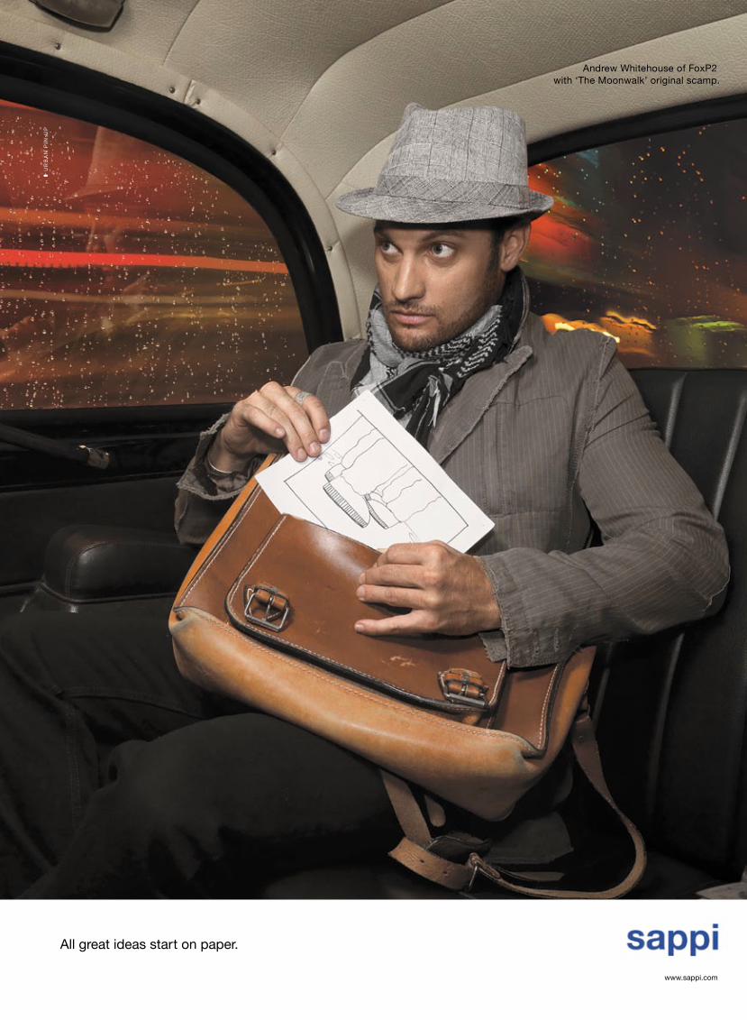
Tony Meintjes lives and works down a quiet suburban street,
a cul-de-sac situated very close to Cape Town’s big cricket
stadium, right next to the railway line that shuttles off to the
other side of the peninsula, to Muizenberg and beyond. Entering his
studio, which trades under the name Southern Editions, one would be
excused for thinking this retired advertising photographer, now in his
early fifties, an art collector. He is, if only by default.
The walls of Meintjes’ retrofitted semi, located at the opposite
end of the apartment complex where he eats, watches television and
sleeps every night, are filled with photographs. A striking photo of
a young girl with pallid skin hangs right by the entrance. She has
albinism, which simply means she has an absence of pigment in her
skin and hair, nothing more. The portrait is by Pieter Hugo.
Entering the open-plan lounge, Meintjes’ photo collection
represents the only clutter in an otherwise neatly ordered workspace.
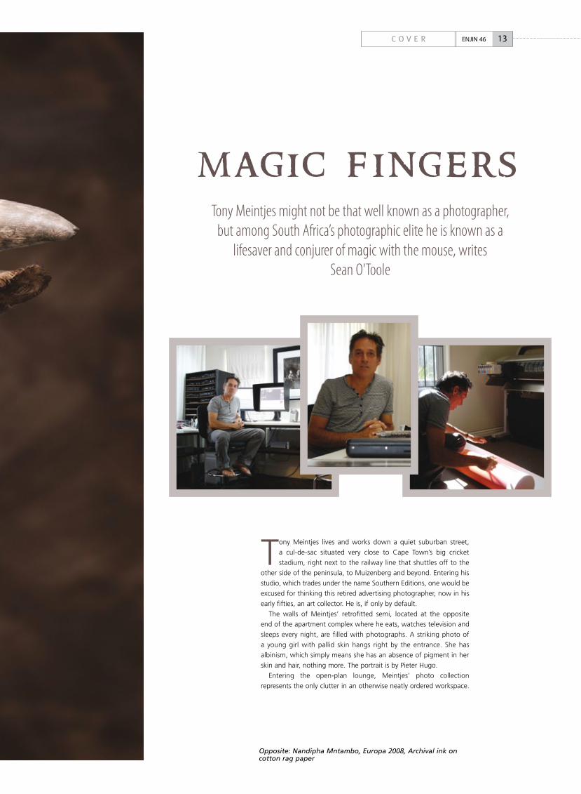
Tony Meintjes might not be that well known as a photographer, but among South Africa’s photographic elite he is known as a
lifesaver and conjurer of magic with the mouse, writes Sean O'Toole
13C O V E R ENJIN 46
m ag ic f ing e rs
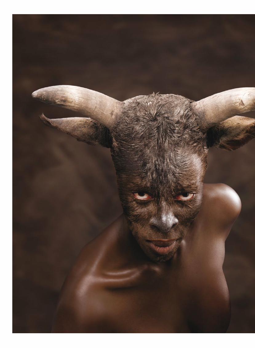
Opposite: Nandipha Mntambo, Europa 2008, Archival ink on cotton rag paper
Three Macs and a PC are spread out across the room,
on workstations to the right and left. In an adjacent
room on the right, in what would have been the
parking garage had the house not been customised
by its previous owner, are two large Epson printers.
One is printing a colour job for artist Berni Searle,
the other a nostalgic series of black-and-white
photographs of Boksburg, taken by photographer
David Goldblatt in the early 1980s.
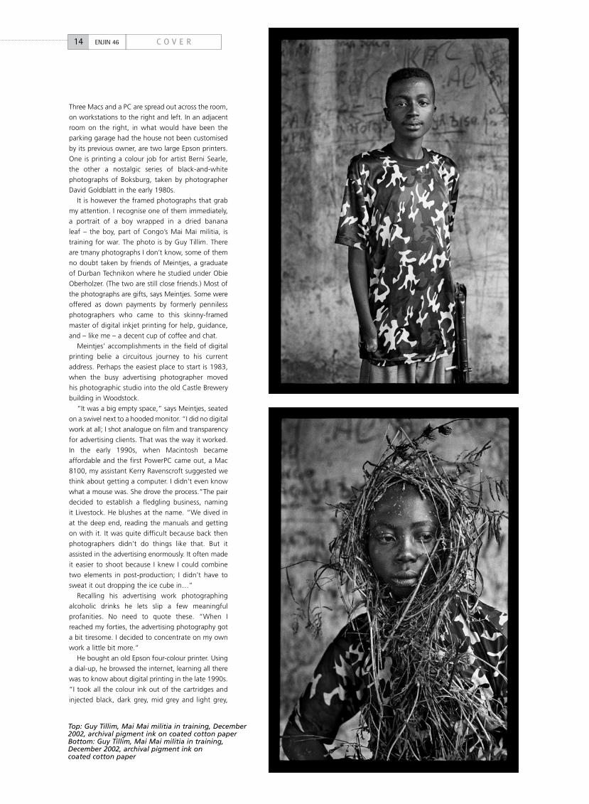
It is however the framed photographs that grab
my attention. I recognise one of them immediately,
a portrait of a boy wrapped in a dried banana
leaf – the boy, part of Congo’s Mai Mai militia, is
training for war. The photo is by Guy Tillim. There
are tmany photographs I don’t know, some of them
no doubt taken by friends of Meintjes, a graduate
of Durban Technikon where he studied under Obie
Oberholzer. (The two are still close friends.) Most of
the photographs are gifts, says Meintjes. Some were
offered as down payments by formerly penniless
photographers who came to this skinny-framed
master of digital inkjet printing for help, guidance,
and – like me – a decent cup of coffee and chat.
Meintjes’ accomplishments in the field of digital
printing belie a circuitous journey to his current
address. Perhaps the easiest place to start is 1983,
when the busy advertising photographer moved
his photographic studio into the old Castle Brewery
building in Woodstock.
“It was a big empty space,” says Meintjes, seated
on a swivel next to a hooded monitor. “I did no digital
work at all; I shot analogue on film and transparency
for advertising clients. That was the way it worked.
In the early 1990s, when Macintosh became
affordable and the first PowerPC came out, a Mac
8100, my assistant Kerry Ravenscroft suggested we
think about getting a computer. I didn’t even know
what a mouse was. She drove the process.”The pair
decided to establish a fledgling business, naming
it Livestock. He blushes at the name. “We dived in
at the deep end, reading the manuals and getting
on with it. It was quite difficult because back then
photographers didn’t do things like that. But it
assisted in the advertising enormously. It often made
it easier to shoot because I knew I could combine
two elements in post-production; I didn’t have to
sweat it out dropping the ice cube in…”
Recalling his advertising work photographing
alcoholic drinks he lets slip a few meaningful
profanities. No need to quote these. “When I
reached my forties, the advertising photography got
a bit tiresome. I decided to concentrate on my own
work a little bit more.”
He bought an old Epson four-colour printer. Using
a dial-up, he browsed the internet, learning all there
was to know about digital printing in the late 1990s.
“I took all the colour ink out of the cartridges and
injected black, dark grey, mid grey and light grey,
14 C O V E RENJIN 46
Top: Guy Tillim, Mai Mai militia in training, December 2002, archival pigment ink on coated cotton paperBottom: Guy Tillim, Mai Mai militia in training, December 2002, archival pigment ink on coated cotton paper
and also downloaded some software that allowed
you to print pictures using these inks.”
The outcome of these early experiments was an
incredibly dense black print. He points to a work
hanging on one of the walls, an early photomontage
by Jane Alexander, the reclusive Cape Town sculptor
and photographer who is the featured artist at this
year’s Joburg Art Fair.
Still at the bottom of a steep learning curve,
Meintjes was unaware of the archival issues that
came with printing artworks. At that stage, less
than a decade ago, archival inks for digital printing
were still a pipedream. There was also no Wilhelm
Imaging Research, the company that publishes brand
name-specific permanence data for desktop and
large-format inkjet printers and other digital printing
devices. As a result, Meintjes ended up poking
about blindly in the dark, inadvertently backing the
wrong horse. He recalls the dye-based inks he first
used, saying they gave “the most incredible, vibrant
colours, which were supposed to last 30 years,
according to the company who published their
own test results.” After a stern call from a client
whose print had changed colour six months after
its purchase, Meintjes learnt things the hard way.
He had to recall all his prints, change ink suppliers,
and re-print his early jobs, sometimes reframing the
prints, all at his own expense.
When Epson finally launched its UltraChrome
high-density pigment inks, Meintjes’ business was
poised to flourish. I ask him to walk me through a
typical job, presuming it starts with a photographer
bringing in a digital raw file. For raw processing,
Meintjes says he prefers using Capture One Pro.
The software was suggested to him by a long-time
acquaintance, photographer Jacques de Villiers, and
he claims does a superior job to the free plug-ins
packaged into the Photoshop suite.
“I’ll process the image and get it into a TIFF file
format and then, using Photoshop of course, do any
manipulation that is required. On the printing side,
I would say how you build the profile is they key to
the quality of the print. Building a printing profile is
really a process of deciding how the ink is going to
be separated into cyan, magenta, yellow and black,
and what kind of black you are going to generate.
“Remember, all digital shooters shoot RGB. In
fact, I scan RGB, so a conversion needs to take place.
Printers do not print RGB, they print with four inks,
nowadays up to 11 inks. So that conversion is critical.
The black that is generated from the RGB, which
doesn’t exist – it is interpolated – can be adjusted
when you make the profile. It can be a long black,
short black, wide black or narrow black. That makes
quite a difference with digital pictures. I usually
have two profiles, depending if it is a analogue or
digital print, generally to hide things like noise in the
picture.”
15C O V E R ENJIN 46
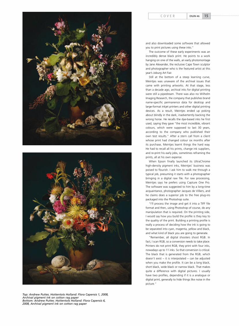
Top: Andrew Putter, Hottentots Holland: Flora Capensis 1, 2008, Archival pigment ink on cotton rag paperBottom: Andrew Putter, Hottentots Holland: Flora Capensis 6, 2008, Archival pigment ink on cotton rag paper
16 C O V E RENJIN 46
Techie stuff dispensed with, I ask Meintjes
how much of himself he inserts into a
finished print? After all, he is a photographer.
Not so long ago he presented a solo body of
work at Cape Town’s 34Long Gallery, large-
format colour prints showing urban and rural
landscapes.
“It depends how digitally literate the
photographer is,” he replies. “Over the
years that has changed. In the beginning
lots of photographers who came to me were
shooting analogue, needed scans, and didn’t
know that much about the treatment they
could give, what they could inject. I would
suggest things, and they would either go
along with it, or not like it. With Pieter Hugo’s
hyena pictures, also his albino pictures, there
was a treatment: slightly de-saturated,
contrast up. It was a particular formula we
followed that he liked.”
Given his history of trial and error, and
mindful too of the routine amongst Cape
Town’s homeless who ritually scour suburban
dustbins on garbage collection day, I ask how
many rejects he produces. I might be tempted
to line-up by his dustbin. “Well, fortunately
now, not many. It used to be 20%, which
was quite expensive.” He further dashes my
hopes by adding that any current work that
is rejected gets torn, folded and destroyed.
Damn!
_Sean O’Toole is editor of Art South
Africa and writes a weekly photo
column for Sunday Times. He has on
occasion been spotted digging in
dustbins near the homes of famous
artists
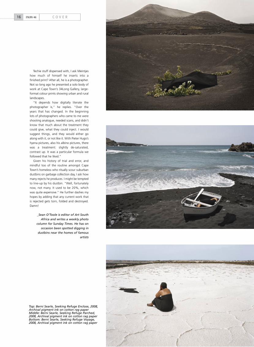
Top: Berni Searle, Seeking Refuge Enclose, 2008, Archival pigment ink on cotton rag paperMiddle: Berni Searle, Seeking Refuge Parched, 2008, Archival pigment ink on cotton rag paperBottom: Berni Searle, Seeking Refuge Voyage, 2008, Archival pigment ink on cotton rag paper
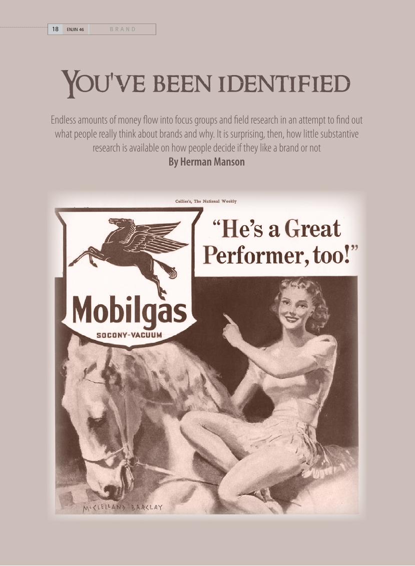
You've been identifiedEndless amounts of money flow into focus groups and field research in an attempt to find out
what people really think about brands and why. It is surprising, then, how little substantive research is available on how people decide if they like a brand or not
By Herman Manson
18 B R A N DENJIN 46
What we really want to know is: what
parameters do consumers use to recognise
a corporate identity, and what influences
our perception of that identity? It seems that the
answer, in short, is everything.
We have relationships with a company or
product much like we do with people, argues Mary
Weisnewski, principal of Kite Inc. What influences
these relationships? Everything: “what they look like,
how they act, how they make us feel, if they do what
they say, whether they are consistent, and whether
they are authentic – all the tangibles and intangibles
that influence all relationships”, says Weisnewski.
“There are no neutrals – every interaction at every
touch point will dilute or strengthen perceptions.”
For Mike Freedman, a partner at consultancy
Freedthinkers, the meaning of a corporate identity flows
from a blend of promise, personality and performance.
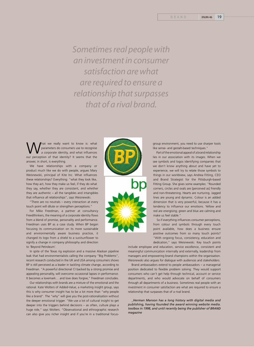
Freedman uses BP as a case study. When BP began
focusing its communication on its more sustainable
and environmentally aware business practice, it
changed its logo from a shield to a sun/sunflower to
signify a change in company philosophy and direction
to ‘Beyond Petroleum’.
In spite of the Texas rig explosion and a massive Alaskan pipeline
leak that had environmentalists calling the company “Big Problems”,
recent research conducted in the UK and USA among consumers shows
BP is still perceived as a leader in tackling climate change, according to
Freedman. “A powerful directional CI backed by a strong promise and
appealing personality, will overcome occasional lapses in performance.
It becomes a lovemark… and love does forgive,” Freedman concludes.
Our relationships with brands are a mixture of the emotional and the
rational. Kate Wolters of Added-Value, a marketing insight group, says
this is why consumer insight has to be a lot more than “why people
like a brand”. The “why” will give you the post-rationalisation without
the deeper emotional trigger. “We use a lot of cultural insight to get
deeper into the triggers behind decisions – as often, culture plays a
huge role,” says Wolters. “Observational and ethnographic research
can also give you richer insight and if you’re in a traditional focus-
group environment, you need to use sharper tools
like sense- and gestalt-based techniques.”
Part of the emotional appeal of a brand relationship
lies in our association with its images. When we
see symbols and logos identifying companies that
we don’t know anything about and have yet to
experience, we will try to relate those symbols to
things in our worldview, says Andrea Fitting, CEO
and Brand Strategist for the Pittsburgh-based
Fitting Group. She gives some examples: “Rounded
corners, circles and ovals are [perceived as] friendly
and non-threatening. Hearts are nurturing. Jagged
lines are young and dynamic. Colour is an added
dimension that is very powerful, because it has a
tendency to influence our emotions. Yellow and
red are energising; green and blue are calming and
make us feel stable.”
So if everything influences consumer perceptions,
from colour and symbols through every touch
point available, how does a business ensure
positive outcomes from so many touch points?
“With ongoing focus, consistency, education and
dedication,” says Weisnewski. Key touch points
include employee and education, service excellence, consistent and
meaningful communication internally and externally, leadership from
managers and empowering brand champions within the organisation.
Weisnewski also argues for dialogue with audiences and stakeholders.
Brand ambassadors extend to people ambassadors – a managerial
position dedicated to flexible problem solving. They would support
consumers who can’t get help through technical, account or service
departments, and who would advocate on behalf of consumers
through all departments of a business. Sometimes real people with an
investment in consumer satisfaction are what are required to ensure a
relationship that surpasses that of a rival brand.
_Herman Manson has a long history with digital media and publishing, having founded the award winning website media.toolbox in 1998, and until recently being the publisher of BRAND magazine
19B R A N D ENJIN 46
Sometimes real people with an investment in consumer
satisfaction are what are required to ensure a
relationship that surpasses that of a rival brand.
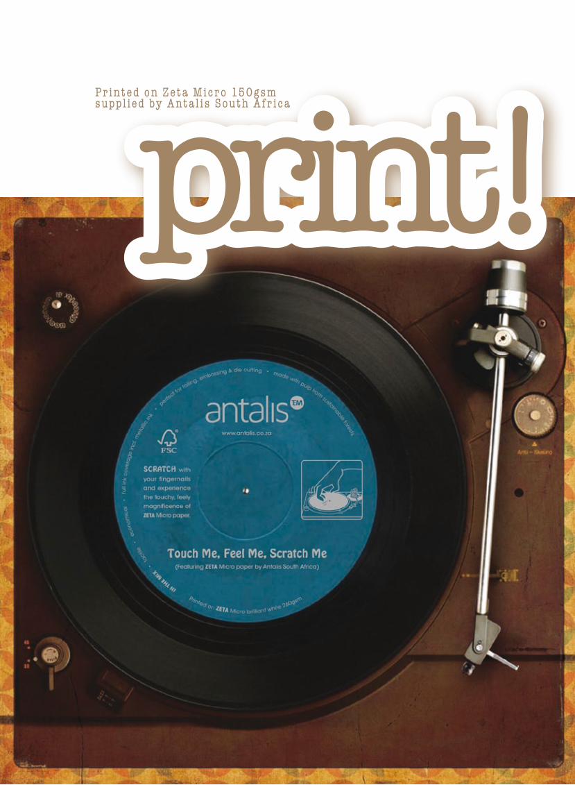
print!Printed on Zeta Micro 150gsm suppl ied by Anta l is South Afr ica
Zeta Micro, featured on our Print! cover this month, is a new tactile finish from Antalis South Africa
which forms part of an existing range boasting beautiful finishes in smooth, linen and ripple. The entire Zeta range has recently been awarded the coveted FSC (Forestry Stewardship Council) accreditation. To celebrate the launch, Antalis South Africa has decided to produce three mailers targeted primarily at the printing and design communities. Agency Bittersuite was briefed to come up with a mailer concept to inform and inspire designers and printers to use Zeta Micro, while at the same time reminding them of the existing range. The first mailer went out in February. Says Gareth Howard, creative director at Bittersuite, “In order to draw attention to its unique ‘touchy-feely’ texture – which reminded us of an old vinyl record – we designed our own 'record' and printed it on Zeta Micro. The track title Touch me, Feel me, Scratch me encourages consumers to interact with the paper and feel the unique texture for themselves. This also serves to give the brand a playful, edgy tone. Zeta Micro is perfect for extra finishes such as foiling, embossing and die cutting – and in this instance we chose to showcase how foiling reacts to the paper."The designer was Saskia de Jong. If you have not received your mailer, please contact your Antalis South Africa representative or e-mail [email protected].
zeta micro
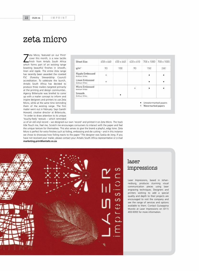
Laser Impressions, based in Johan-nesburg, produces stunning visual communication pieces using laser engraving techniques. Designers and printers wishing to add a special quality and depth to their projects are encouraged to visit the company and see the range of services and options available to them. Contact Guiseppina Murolo at Laser Impressions on (011) 493-9393 for more information.
22 I M P R I N TENJIN 46
laser impressions
COLOR COPY 100 g/m2 120 g/m2 200 g/m2 250 g/m2
A4 (210 x 297mm) • • • •
A3 (297 x 420mm) • • • •
Johannesburg+27 11 688 6000
Pretoria+27 12 379 0060
Cape Town+27 21 959 9600
Port Elizabeth+27 41 486 2020
Durban+27 31 714 4000
Pietermaritzburg+27 33 386 1078
Bloemfontein+27 51 447 8681
Botswana+267 391 2139
Color Copy Advert-Enjin.indd 1 2/24/09 11:32:22 AM
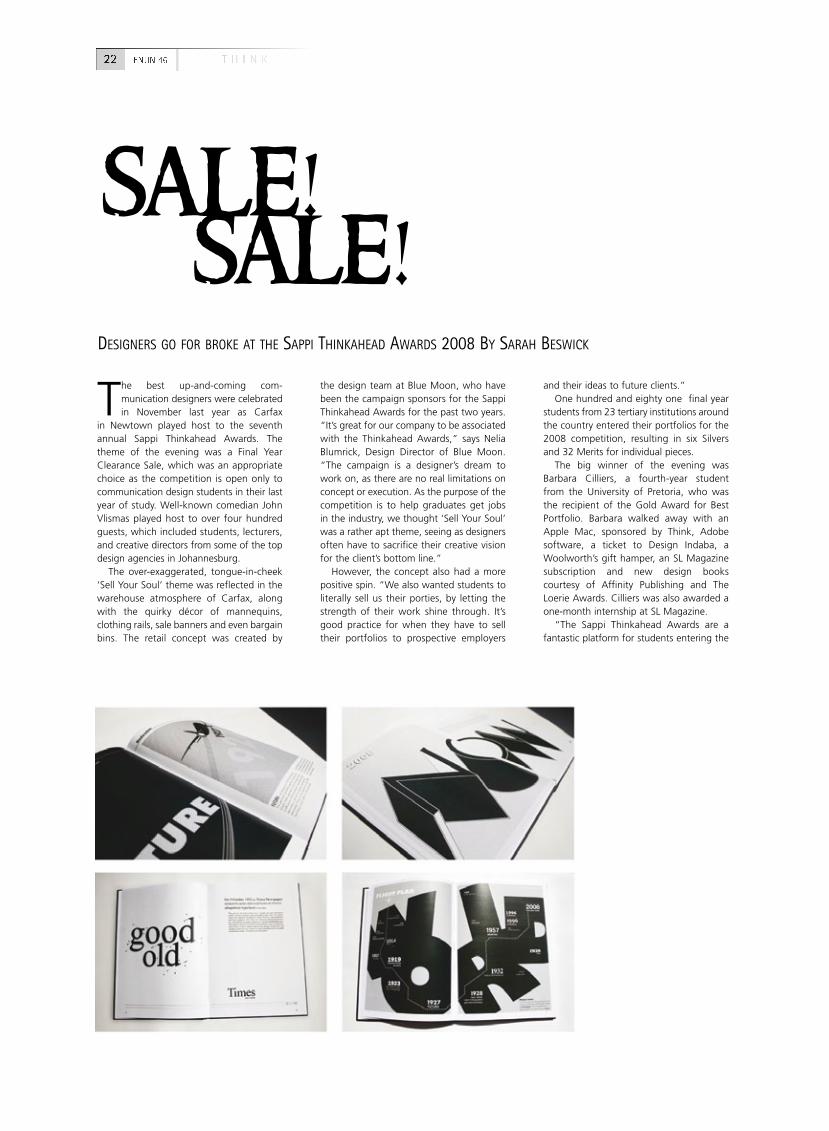
The best up-and-coming com-munication designers were celebrated in November last year as Carfax
in Newtown played host to the seventh annual Sappi Thinkahead Awards. The theme of the evening was a Final Year Clearance Sale, which was an appropriate choice as the competition is open only to communication design students in their last year of study. Well-known comedian John Vlismas played host to over four hundred guests, which included students, lecturers, and creative directors from some of the top design agencies in Johannesburg.
The over-exaggerated, tongue-in-cheek ‘Sell Your Soul’ theme was reflected in the warehouse atmosphere of Carfax, along with the quirky décor of mannequins, clothing rails, sale banners and even bargain bins. The retail concept was created by
the design team at Blue Moon, who have been the campaign sponsors for the Sappi Thinkahead Awards for the past two years. “It’s great for our company to be associated with the Thinkahead Awards,” says Nelia Blumrick, Design Director of Blue Moon. “The campaign is a designer’s dream to work on, as there are no real limitations on concept or execution. As the purpose of the competition is to help graduates get jobs in the industry, we thought ‘Sell Your Soul’ was a rather apt theme, seeing as designers often have to sacrifice their creative vision for the client’s bottom line.”
However, the concept also had a more positive spin. “We also wanted students to literally sell us their porties, by letting the strength of their work shine through. It’s good practice for when they have to sell their portfolios to prospective employers
and their ideas to future clients.”One hundred and eighty one final year
students from 23 tertiary institutions around the country entered their portfolios for the 2008 competition, resulting in six Silvers and 32 Merits for individual pieces.
The big winner of the evening was Barbara Cilliers, a fourth-year student from the University of Pretoria, who was the recipient of the Gold Award for Best Portfolio. Barbara walked away with an Apple Mac, sponsored by Think, Adobe software, a ticket to Design Indaba, a Woolworth’s gift hamper, an SL Magazine subscription and new design books courtesy of Affinity Publishing and The Loerie Awards. Cilliers was also awarded a one-month internship at SL Magazine.
“The Sappi Thinkahead Awards are a fantastic platform for students entering the
sale! sale!DEsiGNERs GO FOR BROkE at tHE saPPi tHiNkaHEaD aWaRDs 2008 BY saRaH BEsWiCk
22 T H I N KENJIN 46
25T H I N K ENJIN 46
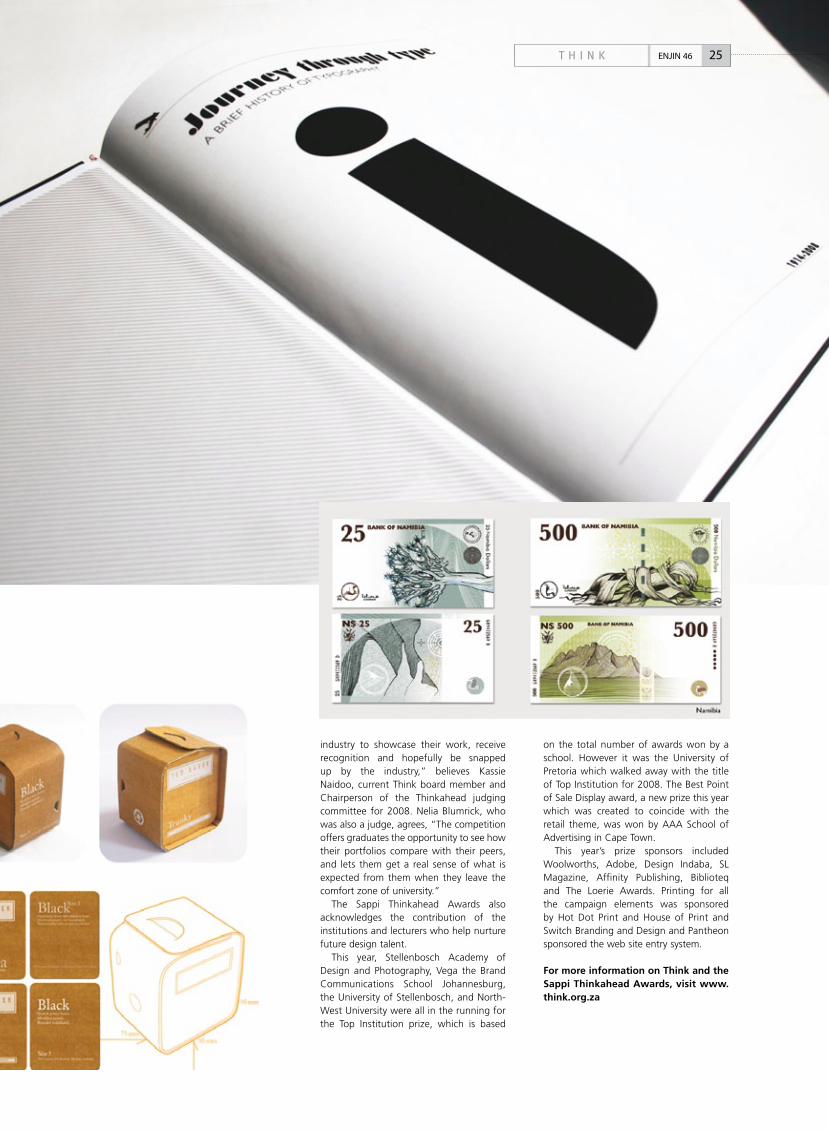
industry to showcase their work, receive recognition and hopefully be snapped up by the industry,” believes Kassie Naidoo, current Think board member and Chairperson of the Thinkahead judging committee for 2008. Nelia Blumrick, who was also a judge, agrees, “The competition offers graduates the opportunity to see how their portfolios compare with their peers, and lets them get a real sense of what is expected from them when they leave the comfort zone of university.”
The Sappi Thinkahead Awards also acknowledges the contribution of the institutions and lecturers who help nurture future design talent.
This year, Stellenbosch Academy of Design and Photography, Vega the Brand Communications School Johannesburg, the University of Stellenbosch, and North-West University were all in the running for the Top Institution prize, which is based
on the total number of awards won by a school. However it was the University of Pretoria which walked away with the title of Top Institution for 2008. The Best Point of Sale Display award, a new prize this year which was created to coincide with the retail theme, was won by AAA School of Advertising in Cape Town.
This year’s prize sponsors included Woolworths, Adobe, Design Indaba, SL Magazine, Affinity Publishing, Biblioteq and The Loerie Awards. Printing for all the campaign elements was sponsored by Hot Dot Print and House of Print and Switch Branding and Design and Pantheon sponsored the web site entry system.
For more information on Think and the Sappi Thinkahead Awards, visit www.think.org.za
P l a k b o o k26 P L A K ENJIN 46 57
L e g o - ve r 27P L A K ENJIN 46
Adobe Illustrator was first developed for the Apple Macintosh in 1985 as a logical commercialization of
Adobe's in-house font development software and PostScript file format. In many ways, Illustrator's release was a gamble. The Macintosh did not have high market share, the only printer that could output Illustrator documents was Apple's own LaserWriter (which was very new and expensive), and the drawing paradigm of Bézier curves was novel to the mainstream user.
Not only did the Macintosh show only monochrome graphics, but display options were basically limited to its built-in 9-inch monitor. Due to these display limitations, Illustrator was a driving force in the development of larger monitors for the Macintosh. Illustrator was a dependable, capable product, however, and its relatively low learning curve let users quickly appreciate that the new Bézier curve paradigm which Illustrator employed was not only better, but finally solved the problem of imprecision previously experienced using existing programs like MacDraw. Illustrator 1.0 was quickly replaced by 1.1, which enjoyed widespread use.
The next version, in a novel versioning scheme, was named version 88 to match the year of release. Although Adobe developed Illustrator primarily for the Apple Macintosh during its first decade, it sporadically supported other platforms including versions for NeXT, Silicon Graphics and Sun Solaris platforms during the 1990s, but these were discontinued due to poor market acceptance.
The first version of Illustrator for Microsoft Windows, version 2.0, was released in 1989, but was a disappointing flop. With true ports of the Macintosh versions to Windows starting with version 7 in 1997, designers could finally standardize on Illustrator across different platforms. With the rise of the Internet, Illustrator was enhanced to support Web publishing, rasterization previewing, PDF, and SVG – additions welcomed by users worldwide. As part of a larger acquisition drive, Adobe bought Macromedia during 2005.
This was, historically speaking, an interesting turn of events on multiple levels. Adobe had acquired Aldus, the makers of Freehand during the 90s. They had then sold Freehand to Macromedia a short while later. When the latest Adobe-Macromedia deal took place, Adobe found itself with two specialist illustration packages in its stable, its own Illustrator and Macromedia’s Freehand. The
decision was then made to discontinue further development on Freehand.
Adobe Illustrator CS4 (version 12) is the fourth generation of the application, heralding brand new features and many improvements. New features include the ability to create basic 3D objects and the new Multiple Artboards feature which allows the artist to create multiple versions of the same piece of work within a single document. Released in October 2008, the new version promises to attract a much wider user base, partly due to the concerted development efforts which continue at Adobe, and due to the discontinuation of Freehand.
_David Whitehouse is
director at DepthVFX
28 P R O C E S SENJIN 46
PART 3 PROCESS
Hold down the Option key (Windows: Alt)
and click on the pop-up menu at the bottom
of your Illustrator artwork window. You'll find
some fun options added to the normal list.
We like the set of eyes that follow your cursor
around the screen as you work. You can also
choose moon phases, mouse clicks, Illustrator
units sold, a random number, or the number
of shopping days 'til Christmas. The item at
the top of this list was inspired by Mordy
Golding who worked at Adobe as product
manager for Illustrator 10 and Illustrator CS.
Press CTRL, ALT and click on the Venus picture
on the top of the toolbar. The credit screen
comes up and all the developers names are
anagrammed!
lekker keystrokes!
[ i l l u s t r a t o r ] s o l v e d t h e p r o b l e m o f i m p r e c i s i o n p r e v i o u s l y e x p e r i e n c e d u s i n g e x i s t i n g p r o g r a m s l i k e m a c d r a w.
WitH tHE RElEasE OF illustRatOR Cs4, DaViD WHitEHOusE takEs us BaCk tO tHE BEGiNNiNG
a history of illustrator
29P R O C E S S ENJIN 46
i'm lovin' ittHREE DEsiGNERs MOtiVatE WHY tHEY usE illustRatOR
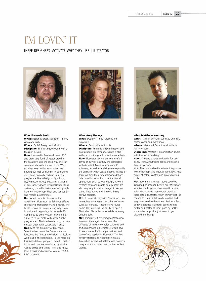
Who: Francois SmitWhat: Designer, artist, illustrator – print, video and web.Where: QUBA Design and MotionDiscipline: Fine Art background with a focus on design.How: I worked in Freehand from 1992, and grew very fond of vector drawing, the scalability and the crisp way one can communicate with line and form. We switched over to Illustrator when we bought our first CS bundle. In publishing, everything normally ends up in a base programme like Indesign or Quark and lately most of us use Illustrator as a kind of emergency device when InDesign stops delivering. I use Illustrator succesfully with Indesign, Photoshop, Flash and various 3D and motion programmesHot: Apart from its obvious vector capabilities, Illustrator has fabulous effects, like tracing, transparency and brushes. The latest version has come a long way drom its awkward beginnings in the early 90s. Compared to other vector software it is a breeze to integrate with other Adobe programmes. The interface is busy, but can be kept clean with collapsable menus. Not: Miss the simplicity of Freehand. Selection tools complex. Various simple functions like "Paste into/inside" difficult to work out in the beginning. To see more on this lively debate, google "I hate Illustrator". In the end I do feel comforted by all the Adobe extras and family filters and know I will always find a way to solve a "£*@& this" moment.
Who: Amy HarveyWhat: Designer – both graphic and broadcastWhere: Depth VFX in RivoniaDiscipline: Primarily a 3D animation and post-production company, Depth is also skilled at motion graphics and visual effects.How: Illustrator vectors are very useful in terms of 3D work as they are compatible with Autodesk Maya, our primary 3D software, as well as enabling me to provide the animators with useable paths, instead of them wasting their time retracing designs. I also use Illustrator for more traditional applications such as logo design, as work remains crisp and usable on any scale. It’s also very easy to make changes to vector-based illustrations and artwork, being always editable.Hot: Its compatibility with Photoshop is an immediate advantage over other software such as Freehand. A feature I’ve found particularly useful is the ability to open a Photoshop file in Illustrator while retaining editable text.Not: I find myself returning to Photoshop time and time again because of the difficulty of making complex coloured and textured images in Illustrator. I would love to see more of Photoshop’s features and ease-of-use applied to Illustrator. This has already started and hopefully hints at a time when Adobe will release one powerful programme that combines the best of both worlds.
Who: Matthew KearneyWhat: I am an animator (both 2d and 3d), editor, coder and many more!Where: Masters & Savant Worldwide in Johannesburg.Discipline: Masters is an animation studio with the focus on design.How: Creating shapes and paths for use in 3d, redrawing/tracing logos and graphic items as vectors.Hot: The standardised interface, integration with other apps and intuitive workflow. Also excellent colour control and great drawing tools.Not: Too many palettes – tools could be simplified or grouped better. An easier/more intuitive masking workflow would be nice.Why: Having used many other drawing tools before Illustrator, when I finally got the chance to use it, it felt really intuitive and easy compared to the others. Besides a few dodgy upgrades, Illustrator seems to get better and better as times goes by, unlike some other apps that just seem to get bloated and buggy.
30 P R O C E S SENJIN 46
NEW IN ILLUSTRATOR CS4
Multiple artboardsCreate files containing up to 100 artboards of varying sizes and display them any way you want — overlapping, side by side, or stacked. Save, export, and print artboards independently or together. Save a selected range or all artboards as a multipage PDF file.
transparency in gradientsDefine the opacity of any individual colour stop in a gradient. Reveal underlying objects and images, and create rich colour and texture mixes using multiple layers, knockouts and cover-up fades.
blob brush toolSketch with a brush that generates a single clean vector shape, even when strokes overlap. Draw naturally, using the Blob Brush tool together with the Eraser and Smooth tools.
gradients exposedInteract with gradients right on your object. Set gradient angle, position, and elliptical dimensions. Add and edit colours using sliders — all with immediate feedback where you work.
integration and deliveryCollaborate with your team, work across products, and deliver almost anywhere thanks to integrated tools and extensive format support. Confidently design for print, interactive experiences, motion effects and more.
enhanced user experienceStay in the creative groove thanks to interface improvements that include on-object controls. Interact with tools smoothly, and increase your efficiency using new timesaving features and shortcuts.
in-panel appearance editingEdit object characteristics directly in the Appearance panel, eliminating the need to open fill, stroke or effects panels. Work with shared attributes and control display for faster rendering.
refined graphic stylesCombine styles for unique effects and increased efficiency, and apply styles without disturbing an object's existing appearance. Enjoy new thumbnail previews and an expanded library of prebuilt styles.
clipping Masks deMystifiedWork with masks more easily by viewing only the clipped area of your objects during editing. Take advantage of Isolation Mode, and use Edit Clipping Path for even more control.
separations previewAvoid colour output surprises such as unexpected spot colours, unwanted overprinting, overprints that don't overprint, white overprinting and CMYK blacks in text and placed files.
©20
08 A
dobe
Sys
tem
s In
corp
orat
ed. A
ll rig
hts
rese
rved
. Ado
be, t
he A
dobe
logo
, an
d Cr
eativ
e Su
ite a
re e
ither
regi
ster
ed tr
adem
arks
or t
rade
mar
ks o
f Ado
be S
yste
ms
Inco
rpor
ated
in th
e U
nite
d St
ates
and
/or o
ther
cou
ntrie
s.
Ideas are impatient. That’s why the new Adobe® Creative Suite® 4 Master Collection provides advanced
integration features that eliminate steps and enable you to collaborate more effi ciently. You’ll spend less time waiting and
more time creating as you turn your ideas into amazing print, web, video, interactive, and mobile pieces. Find your shortcut
to brilliant at www.adobe.com/mea/purchase
John
ny K
elly
’s Sh
ortc
ut to
Bril
liant
www.adobe.com/mea
enjin2009.indd 1 2009/02/12 10:41 AM
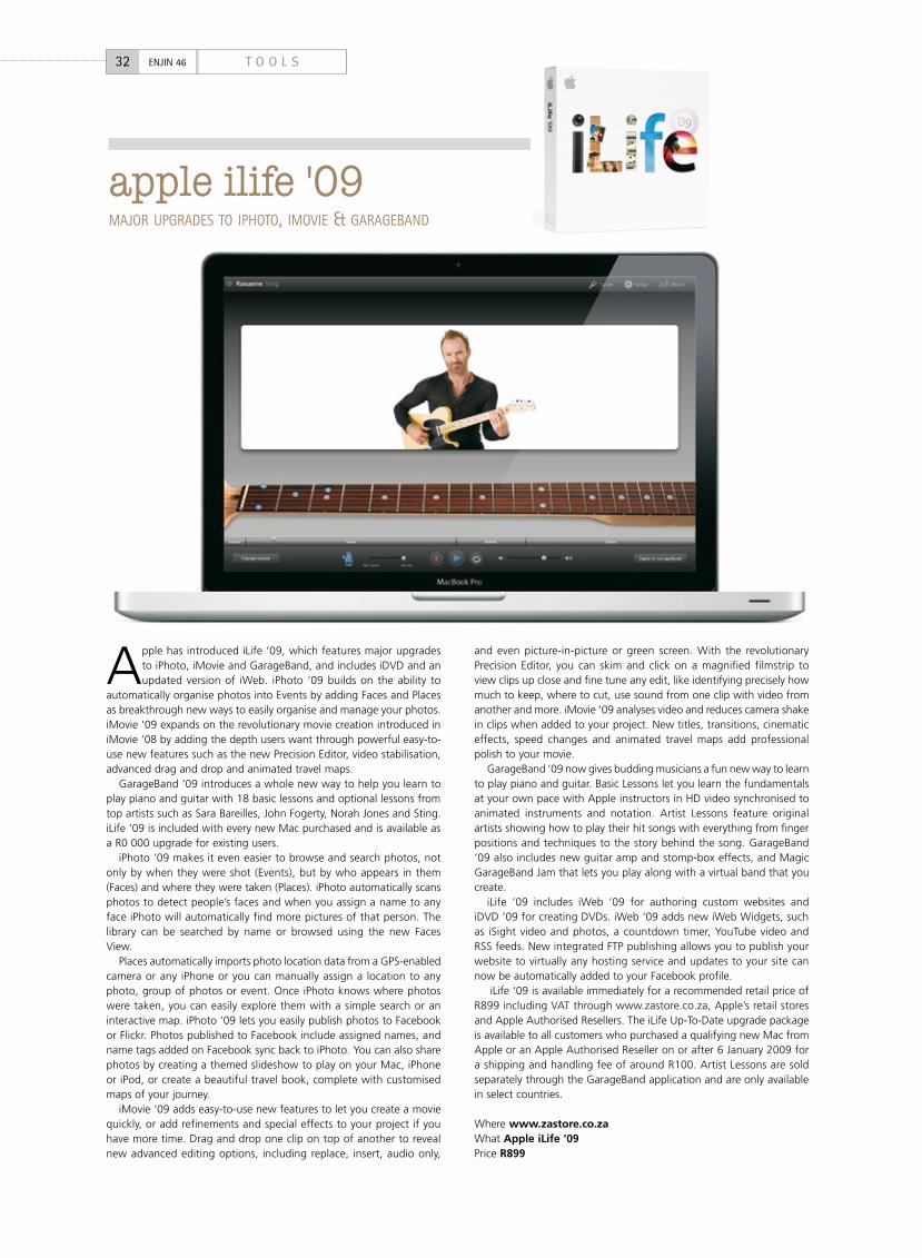
apple ilife '09MajOR uPGRaDEs tO iPHOtO, iMOViE & GaRaGEBaND
Apple has introduced iLife ‘09, which features major upgrades to iPhoto, iMovie and GarageBand, and includes iDVD and an updated version of iWeb. iPhoto ‘09 builds on the ability to
automatically organise photos into Events by adding Faces and Places as breakthrough new ways to easily organise and manage your photos. iMovie ‘09 expands on the revolutionary movie creation introduced in iMovie ‘08 by adding the depth users want through powerful easy-to-use new features such as the new Precision Editor, video stabilisation, advanced drag and drop and animated travel maps.
GarageBand ‘09 introduces a whole new way to help you learn to play piano and guitar with 18 basic lessons and optional lessons from top artists such as Sara Bareilles, John Fogerty, Norah Jones and Sting. iLife ‘09 is included with every new Mac purchased and is available as a R0 000 upgrade for existing users.
iPhoto ‘09 makes it even easier to browse and search photos, not only by when they were shot (Events), but by who appears in them (Faces) and where they were taken (Places). iPhoto automatically scans photos to detect people’s faces and when you assign a name to any face iPhoto will automatically find more pictures of that person. The library can be searched by name or browsed using the new Faces View.
Places automatically imports photo location data from a GPS-enabled camera or any iPhone or you can manually assign a location to any photo, group of photos or event. Once iPhoto knows where photos were taken, you can easily explore them with a simple search or an interactive map. iPhoto ‘09 lets you easily publish photos to Facebook or Flickr. Photos published to Facebook include assigned names, and name tags added on Facebook sync back to iPhoto. You can also share photos by creating a themed slideshow to play on your Mac, iPhone or iPod, or create a beautiful travel book, complete with customised maps of your journey.
iMovie ‘09 adds easy-to-use new features to let you create a movie quickly, or add refinements and special effects to your project if you have more time. Drag and drop one clip on top of another to reveal new advanced editing options, including replace, insert, audio only,
and even picture-in-picture or green screen. With the revolutionary Precision Editor, you can skim and click on a magnified filmstrip to view clips up close and fine tune any edit, like identifying precisely how much to keep, where to cut, use sound from one clip with video from another and more. iMovie ‘09 analyses video and reduces camera shake in clips when added to your project. New titles, transitions, cinematic effects, speed changes and animated travel maps add professional polish to your movie.
GarageBand ‘09 now gives budding musicians a fun new way to learn to play piano and guitar. Basic Lessons let you learn the fundamentals at your own pace with Apple instructors in HD video synchronised to animated instruments and notation. Artist Lessons feature original artists showing how to play their hit songs with everything from finger positions and techniques to the story behind the song. GarageBand ‘09 also includes new guitar amp and stomp-box effects, and Magic GarageBand Jam that lets you play along with a virtual band that you create.
iLife ‘09 includes iWeb ‘09 for authoring custom websites and iDVD ‘09 for creating DVDs. iWeb ‘09 adds new iWeb Widgets, such as iSight video and photos, a countdown timer, YouTube video and RSS feeds. New integrated FTP publishing allows you to publish your website to virtually any hosting service and updates to your site can now be automatically added to your Facebook profile.
iLife ‘09 is available immediately for a recommended retail price of R899 including VAT through www.zastore.co.za, Apple’s retail stores and Apple Authorised Resellers. The iLife Up-To-Date upgrade package is available to all customers who purchased a qualifying new Mac from Apple or an Apple Authorised Reseller on or after 6 January 2009 for a shipping and handling fee of around R100. Artist Lessons are sold separately through the GarageBand application and are only available in select countries.
Where www.zastore.co.zaWhat Apple iLife '09Price R899
32 T O O L SENJIN 46
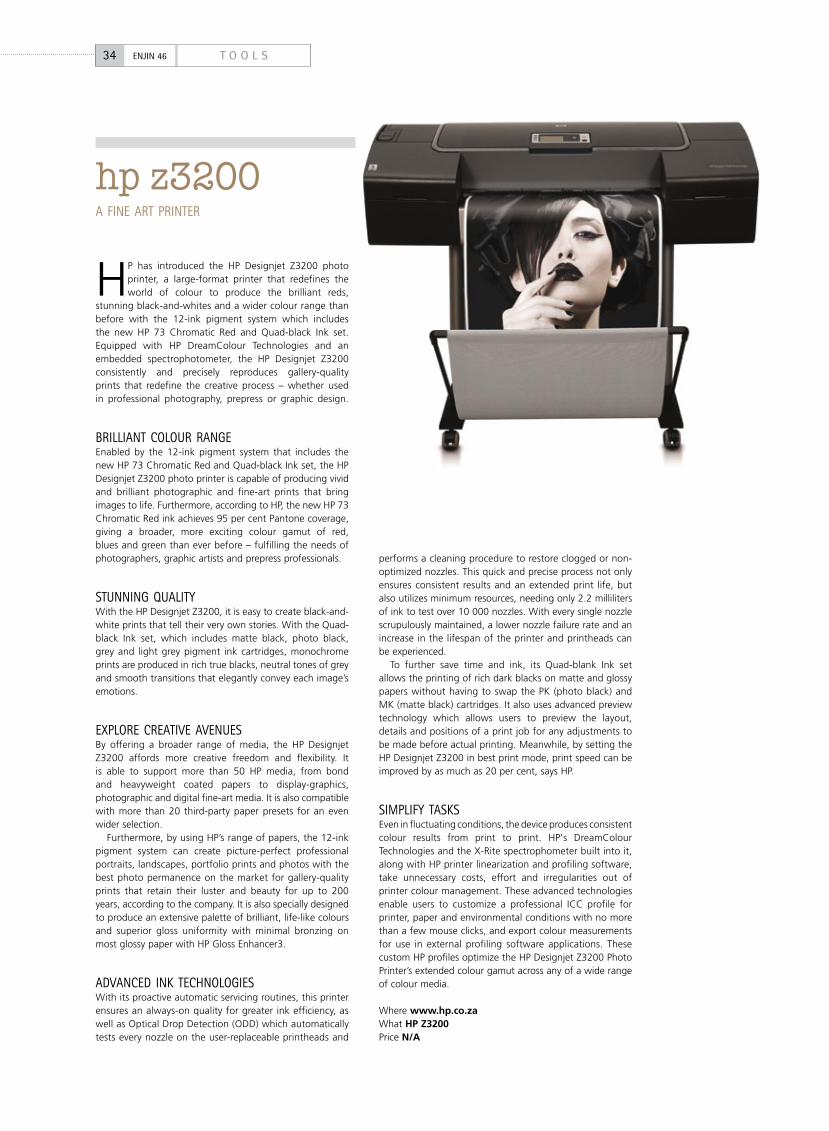
HP has introduced the HP Designjet Z3200 photo printer, a large-format printer that redefines the world of colour to produce the brilliant reds,
stunning black-and-whites and a wider colour range than before with the 12-ink pigment system which includes the new HP 73 Chromatic Red and Quad-black Ink set. Equipped with HP DreamColour Technologies and an embedded spectrophotometer, the HP Designjet Z3200 consistently and precisely reproduces gallery-quality prints that redefine the creative process – whether used in professional photography, prepress or graphic design.
BRilliaNt COlOuR RaNGEEnabled by the 12-ink pigment system that includes the new HP 73 Chromatic Red and Quad-black Ink set, the HP Designjet Z3200 photo printer is capable of producing vivid and brilliant photographic and fine-art prints that bring images to life. Furthermore, according to HP, the new HP 73 Chromatic Red ink achieves 95 per cent Pantone coverage, giving a broader, more exciting colour gamut of red, blues and green than ever before – fulfilling the needs of photographers, graphic artists and prepress professionals.
stuNNiNG qualitYWith the HP Designjet Z3200, it is easy to create black-and-white prints that tell their very own stories. With the Quad-black Ink set, which includes matte black, photo black, grey and light grey pigment ink cartridges, monochrome prints are produced in rich true blacks, neutral tones of grey and smooth transitions that elegantly convey each image’s emotions.
ExPlORE CREatiVE aVENuEsBy offering a broader range of media, the HP Designjet Z3200 affords more creative freedom and flexibility. It is able to support more than 50 HP media, from bond and heavyweight coated papers to display-graphics, photographic and digital fine-art media. It is also compatible with more than 20 third-party paper presets for an even wider selection.
Furthermore, by using HP’s range of papers, the 12-ink pigment system can create picture-perfect professional portraits, landscapes, portfolio prints and photos with the best photo permanence on the market for gallery-quality prints that retain their luster and beauty for up to 200 years, according to the company. It is also specially designed to produce an extensive palette of brilliant, life-like colours and superior gloss uniformity with minimal bronzing on most glossy paper with HP Gloss Enhancer3.
aDVaNCED iNk tECHNOlOGiEsWith its proactive automatic servicing routines, this printer ensures an always-on quality for greater ink efficiency, as well as Optical Drop Detection (ODD) which automatically tests every nozzle on the user-replaceable printheads and
performs a cleaning procedure to restore clogged or non-optimized nozzles. This quick and precise process not only ensures consistent results and an extended print life, but also utilizes minimum resources, needing only 2.2 milliliters of ink to test over 10 000 nozzles. With every single nozzle scrupulously maintained, a lower nozzle failure rate and an increase in the lifespan of the printer and printheads can be experienced.
To further save time and ink, its Quad-blank Ink set allows the printing of rich dark blacks on matte and glossy papers without having to swap the PK (photo black) and MK (matte black) cartridges. It also uses advanced preview technology which allows users to preview the layout, details and positions of a print job for any adjustments to be made before actual printing. Meanwhile, by setting the HP Designjet Z3200 in best print mode, print speed can be improved by as much as 20 per cent, says HP.
siMPliFY tasksEven in fluctuating conditions, the device produces consistent colour results from print to print. HP's DreamColour Technologies and the X-Rite spectrophometer built into it, along with HP printer linearization and profiling software, take unnecessary costs, effort and irregularities out of printer colour management. These advanced technologies enable users to customize a professional ICC profile for printer, paper and environmental conditions with no more than a few mouse clicks, and export colour measurements for use in external profiling software applications. These custom HP profiles optimize the HP Designjet Z3200 Photo Printer’s extended colour gamut across any of a wide range of colour media.
Where www.hp.co.zaWhat HP Z3200Price N/A
hp z3200a FiNE aRt PRiNtER
34 T O O L SENJIN 46
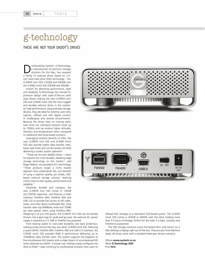
Distributed by Syntech, G-Technology, a manufacturer of premium storage solutions for the Mac, has revealed
a family of external drives based on 2.5-inch solid state drive (SSD) technology – the G-DRIVE mini SSD (120GB and 500GB) and the G-RAID mini2 SSD (250GB and 500GB).
Known for delivering performance, style and reliability, G-Technology has married its premium design with state-of-the-art solid state drives, making the new G-DRIVE mini SSD and G-RAID mini2 SSD the most rugged and durable external drives in the market. As high-performance, plug-and-play storage devices, they are ideal for extreme users who capture, offload and edit digital content in challenging and remote environments. Because the drives have no moving parts, each drive can withstand extreme shock up to 1500Gs and can endure higher altitudes, vibration and temperatures when compared to traditional hard drive-based solutions.
Leveraging inherent benefits of SSDs, the new G-DRIVE mini SSD and G-RAID mini2 SSD also provide higher data transfer rates, lower seek times and use less power, all while delivering a cooler, quieter operation.
“These are not your daddy’s drives – unless he requires the most durable, bleeding-edge storage technology on the market,” said Roger Mabon, vice president of G-Technology. “These products target a niche market segment that understands the cost benefits of using a superior quality, yet simple, SSD-based external storage solution. Nothing comes close to their quality, performance and reliability.”
Extremely durable and compact, the new G-DRIVE mini SSD comes in 120GB and 500GB capacities, and features a triple interface (FireWire 800, FireWire 400 and USB 2.0) to provide fast access to HD video, audio, and other dense multimedia files. Data transfer rates top 60MB/sec write and 75MB/sec read speeds when using FireWire 800. Weighing in at just 250 grams, the G-DRIVE mini SSD can be literally thrown into a gear bag for grab-and-go ease. No external AC power supply is required as it is USB or FireWire bus-powered.
From blazing speed to rock-solid durability and data protection, nothing comes close to the new, two-drive, G-RAID mini2 SSD. Featuring a quad eSATA, FireWire 800, FireWire 400 and USB 2.0 interface, the G-RAID mini2 SSD provides RAID 0 performance delivering up to 195MB/sec data transfer rates. The system supports the playback of five simultaneous HQ streams and a single stream of uncompressed HD when attached via eSATA. A simple user interface easily configures the drive to RAID 1 data mirroring for professional shooters who want to
offload their footage to a redundant SSD-based system. The G-RAID mini2 SSD comes in 250GB or 500GB, with the latter holding more than 5.5 hours of footage. Perfect for the road, it is light, compact and FireWire bus-powered.
The SSD storage solutions come formatted HFS+ and mount on a Mac desktop or laptop right out of the box. They are also Time Machine ready. All drives come with a standard three-year factory warranty.
Where www.syntech.co.zaWhat G-Technology SDDPrice N/A
36 T O O L SENJIN 46
g-technologytHEsE aRE NOt YOuR DaDDY's DRiVEs
08 08
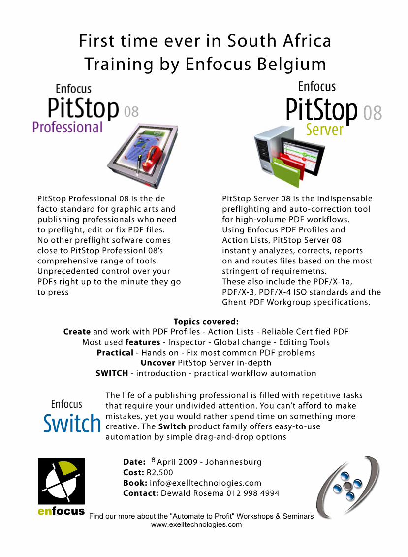
First time ever in South AfricaTraining by Enfocus Belgium
PitStop Professional 08 is the de facto standard for graphic arts and publishing professionals who need to preflight, edit or fix PDF files. No other preflight sofware comes close to PitStop Professionl 08’s comprehensive range of tools. Unprecedented control over your PDFs right up to the minute they go to press
PitStop Server 08 is the indispensable preflighting and auto-correction tool for high-volume PDF workflows.Using Enfocus PDF Profiles and Action Lists, PitStop Server 08 instantly analyzes, corrects, reports on and routes files based on the most stringent of requiremetns.These also include the PDF/X-1a, PDF/X-3, PDF/X-4 ISO standards and the Ghent PDF Workgroup specifications.
Topics covered:Create and work with PDF Profiles - Action Lists - Reliable Certified PDF
Most used features - Inspector - Global change - Editing ToolsPractical - Hands on - Fix most common PDF problems
Uncover PitStop Server in-depthSWITCH - introduction - practical workflow automation
Date: April 2009 - JohannesburgCost: R2,500Book: [email protected]: Dewald Rosema 012 998 4994
The life of a publishing professional is filled with repetitive tasks that require your undivided attention. You can’t afford to make mistakes, yet you would rather spend time on something more creative. The Switch product family offers easy-to-use automation by simple drag-and-drop options
Find our more about the "Automate to Profit" Workshops & Seminarswww.exelltechnologies.com
8
38 R E V I E WENJIN 46
Painter 11 is the newest edition of Corel’s fantastic painting and illustration software. With more than
40 new and enhanced features, Painter 11 (R5 995) provides one of the most approachable painting tools available. Painter is actually a raster-based digital art application that simulates as accurately as possible the appearance and behaviour of traditional media associated with drawing, painting and printmaking. It is intended to be used in real-time by professional digital artists as a functional creative tool, but it’s also great fun for aspiring artists getting involved in digital art.
You should be aware that another version, Corel Painter Essentials, is a less complex version of Painter designed for casual users. Multimedia tutorials, a more intuitive workspace, additional automated tasks and emphasis on photo retouching are some of the features included to appeal to beginners. Painter and Painter Essentials share much of the same underlying code, and have many of the same tools and functions. For professional artists Essentials offers fewer tools and variants, and considerably less control.
The software offers a wide range of traditional artists’ materials and tools. With the aid of a graphics tablet you are able to reproduce the effect of physical painting and drawing media. There are also a few non-traditional items such as the Image Hose,
pattern pens, F/X, Distortion and Artist tools to allow beginners to use or for applying less conventional effects to an image. Indeed, Painter 11 offers some of the most advanced painting and natural media tools available. For instance, new pressure-sensitive brushes allow hand and brush to fluidly work as one, producing brushstrokes that ooze texture and precision. The RealBristle tool now encompasses hard or dry tools, including chalks, coloured pencils, pastels and even Conté crayons. So, faster strokes produce thinner lines. Conversely, the velocity control puts down more ink with slower strokes. Also new is support for tablet tilt, which adjusts the width of a brush stroke or pencil line depending on the angle at which you hold the pen.
In essence, Painter works in much the same way as the brushes in Photoshop with similar support for pressure sensitive tablets. However, Painter also emulates the visual characteristics of traditional mediums such as oil paint, pastel sticks, charcoal, felt pens, and so on, on various textured surfaces. New tools let you create and customise brushes and media variants to your precise specifications, including artistic media, hard media brushes and selection tools. Furthermore, enhanced brushes perform up to 30% faster than in previous versions, making this the fastest, most responsive version of Painter yet.
Another neat feature is the ability
to experiment with colour theory and composition much faster than in a traditional environment, and without the toxins and mess. With the option to undo brushstrokes and other effects, this digital art studio provides the ability to experiment in an unlimited capacity, giving you the confidence to explore a wide variety of artistic techniques. New colour management improves colour recognition when importing files from other applications – such as Corel’s Paint Shop Pro Photo and Adobe’s Photoshop – and individual colour profiles per document create greater colour accuracy for each file. Painter now not only lets you save a colour profile along with a file, but also recognises colour profiles associated with Photoshop files. Painter now supports PNG (portable network graphics) files – finally!
Painter 11 is not revolutionary, but a well-tuned update, yet is still an invaluable artist’s tool. Its target market obviously means it won’t appeal to everyone, especially as it can’t compete with photo editing package such as Paint Shop Pro Photo or Photoshop, but it is brilliant for graphic artists, illustrators and fine artists. The only possible downside is that a digital tablet is all but a prerequisite, which means further expense to an already relatively expensive application.
Where www.directservices.co.zaWhat Corel Painter 11Price R5 995
painter 11still a GREat PaCkaGE
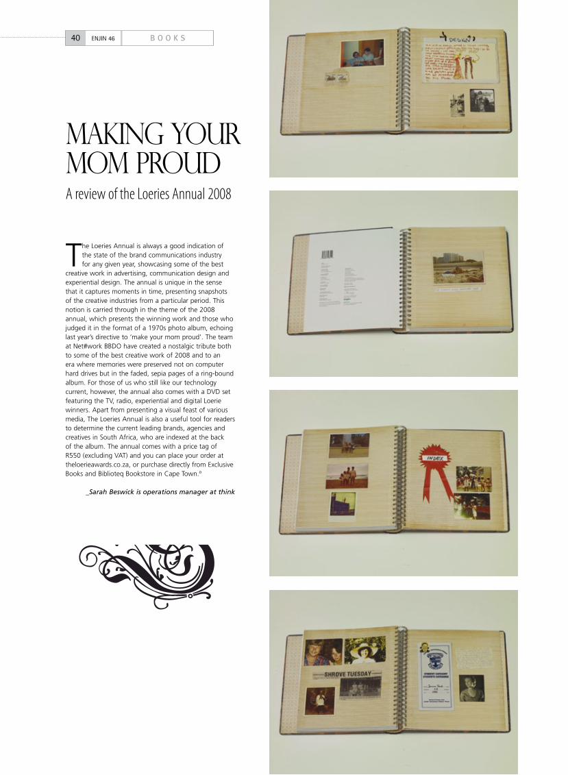
A review of the Loeries Annual 2008
makING your mom proud
The Loeries Annual is always a good indication of the state of the brand communications industry for any given year, showcasing some of the best
creative work in advertising, communication design and experiential design. The annual is unique in the sense that it captures moments in time, presenting snapshots of the creative industries from a particular period. This notion is carried through in the theme of the 2008 annual, which presents the winning work and those who judged it in the format of a 1970s photo album, echoing last year’s directive to ‘make your mom proud’. The team at Net#work BBDO have created a nostalgic tribute both to some of the best creative work of 2008 and to an era where memories were preserved not on computer hard drives but in the faded, sepia pages of a ring-bound album. For those of us who still like our technology current, however, the annual also comes with a DVD set featuring the TV, radio, experiential and digital Loerie winners. Apart from presenting a visual feast of various media, The Loeries Annual is also a useful tool for readers to determine the current leading brands, agencies and creatives in South Africa, who are indexed at the back of the album. The annual comes with a price tag of R550 (excluding VAT) and you can place your order at theloerieawards.co.za, or purchase directly from Exclusive Books and Biblioteq Bookstore in Cape Town.º
_Sarah Beswick is operations manager at think
40 B O O K SENJIN 46
learn photography
Pretoria: 959 pretorius Street, arcadia, pretoria. tel (012) 342-4770/1 email: [email protected]: 72 Concorde rd east, Bedfordview, Johannesburg. tel (011) 455-1225 email: [email protected]: 444 Jan Smuts Drive, Johannesburg. tel (011) 521-4600 email: [email protected]: no.5 Sookhay place, University road, Derby Downs, Westville. tel (031) 266-2595 email: [email protected] Town: Cnr De Smidt & Somerset Street, green point. tel (021) 425-7591 email: [email protected]
Our part-time, short learning programmes are designed
for those students who wish to learn more about
photography as a hobby. Classes are presented after
hours during the week or on Saturday mornings. an
extensive range of programmes, starting at beginners
level, enable you to learn at a pace that best suits you.
advanced programmes covering a range of photographic
disciplines are presented throughout the year.
Programmes are fun and packed with information.
www.photocollege.co.za www.vegaschool.com
The National College of Photography is part of Vega The Brand Communications School, a division of The Independent Institution of Education (Pty) Ltd, Reg. no. 1987/004754/07, which is registered with the Department of Education as a private higher education institution under the Higher Education Act, 1997, Registration certificate no. 2007/HE07/002.
Joburg - pretoria - Durban - Cape town
42 O P I N I O NENJIN 46
scary monsters iNVENtiNG MONstERs iN a tiME OF FEaR BY justiN ClOEtE
Jewish folklore tells of animated beings called golems, constructed from clay or other inanimate substances, and given the semblance of life through mystical incantations. Tales of these creatures
appear throughout the Jewish histories, even as recently as the late 16th century, when rabbi Judah Loew ben Bezalel constructed one to protect the Jewish community of Prague from persecution – to violently convincing effect, it would seem from the narratives.
Similar stories pop up all over the place. To mention one that’s familiar: Mary Shelley’s Dr Frankenstein constructed a creature from the parts of dead people and brought it to life, setting about all manner of unmanageable consequences. And don’t forget Pinocchio, who has quite a lot in common with Dr Frank’s poor monster, if you think about it. Whether these things can actually be animated and controlled by powerful mystics is a fascinating thought, but even more interesting, to me, is the metaphorical significance of this myth to us – to we who dabble in the dangerous and unpredictable Art of supplementary human identity construction (SHIC), otherwise known as brand advertising. If you haven’t heard of SHIC, it’s because I just made it up, but the idea behind it matters, so stick around while I try to explain.
No doubt, there are hundreds of moral notions to be drawn from golem-type stories, but the one intriguing parallel that strikes me as most important is that our identity as individuals is artificially cobbled together.
We identify ourselves – decide who we are – through things that are not us. Don’t believe me? Who are you, then? The creative with the red fringe who sits near Grant's office? The only female techie in the building? The guy with four kids who still drives a convertible car? To what extent do these descriptors actually describe who we really are? The true answer is, not at all. (How many bits of information does it take to make a “true” description?)
Most of us don't know how to understand ourselves except through these attachments. We assemble ourselves like Frankenstein's monster out of bits of stuff we gather as we go along – I have a hand-bag-sized dog, or a big car, or a really scary t-shirt, or a particular hairstyle, or a masters degree and a rare Metallica poster... Your family heritage, your gender, your school, your nationality and your number of friends on Facebook are equally useless signifiers of who You are.
Call to mind the last brand advertisement you worked on. What missing part of the audience’s sense of self were you appealing to? If your ad was for a food brand, perhaps you were offering another “good mother badge” to add to her identity-construct. If it was for a
luxury car, you probably offered him an “alpha-male status” badge for him to glue to his creation of a more powerful self-image.
Whether the right convenience meal actually makes her a better mother is neither here nor there. Heck, maybe it actually does. More to the point is that her “good mom” identity is a golem. She’s built it bit by bit and given it the illusion of real life.
There’s an intriguing detail within the golem myth that is worth mentioning here. In order to animate the clay creature, the Hebrew word emet is inscribed on its forehead. Emet means “truth”. The philosophical implication I read there is that the “life” of our identity-constructs lies in their similarity to reality – the more fantastical is your “image”, the less useful it is to you. And how’s this: when the mystic removes the “truth” by rubbing away the “e”, what’s left is the word met, which means “death”; of course the golem then stops working.
If you agree that we have an influence on who or what people understand themselves to be, now is a good time to point them to something positive. It’s hectic out there, in many people’s experience, and they are clamouring for nice, reassuring stuff to identify with.
So rather than using purchase motivators like fear, risk or standing out from the crowd, consider safety, pride, patriotism, compassion and loyalty. Take a leaf out of Obama’s book and exhort people to believe “they can”, rather than “they must”.
Remember that brands are people too. Even the little ones are pre-constructed identity-parts for sale. Ego-Lego, if you like. In terms of the golem metaphor, we worry far too much about what the thing (brand) looks like rather than how it behaves. Let’s staple a giant arm on it to make it strong and then some dove wings to make it benevolent, and then cover it in green leaves so people think its good for the environment… but when it rampages through the atmosphere spewing filth, no-one’s going to fall for the colour. Your golem only has to stand on me once to create an irredeemable impression, so spend your time teaching it to tread purposefully, rather than dressing it in the most fashionable clothes, and perhaps then I’ll take it for the “person” you intend, and maybe even make it a friend (on Facebook or otherwise).
So whether you’re in the business of creating brand identities or just using them for SHIC, take a moment to consider the effect that will ripple outwards into the ether. I’m sure we can get more people smiling through the alchemy in which we dabble daily.
_Justin Cloete is keen on matters of identity, and is strategic planning director at Draftfcb Johannesburg on weekdays. Often
he changes his hair on weekends
"There are hundreds of moral notions to be drawn from golem-type stories, but the one intriguing parallel that strikes me as most important is that our identity as individuals is artificially cobbled together."
1108_1Thread
to advertise on these pages, e-mail [email protected]
SubScription rateS
Six issues r170 ( incl) Twelve issues r290 ( incl)
Subscr ipt ions star t wi th next avai lable issue
plea Se tick the appropriate box
I wish to pay by cheque made payable to Undo Media
I wish to pay by E lect ronic Transfer
banki ng detailSUndo Media , ABSA Melvi l le
account number 4055586968 branch code 632005
Your details
Name
address
City
Post Code
Mobile
Post to Enjin magazine, PO Box 91938, Auckland Park, 2006Or call our subscription hotline on (084) 445-5067E-mail [email protected] Fax (086) 563-2380
www.enjin.co.za
Subscribeto
Haibo! it's too cheap
EMODM - Enjin Museum of Dead Media
Page contributions and comments:
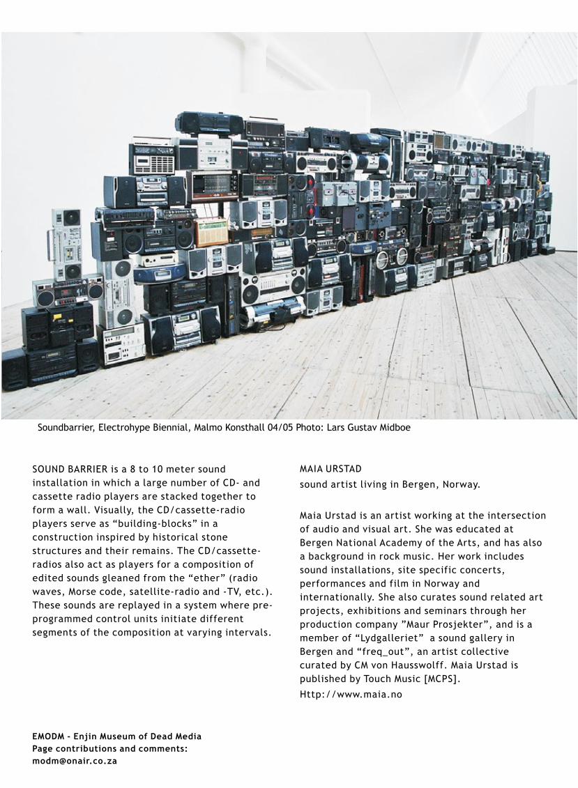
SOUND BARRIER is a 8 to 10 meter sound
installation in which a large number of CD- and
cassette radio players are stacked together to
form a wall. Visually, the CD/cassette-radio
players serve as “building-blocks” in a
construction inspired by historical stone
structures and their remains. The CD/cassette-
radios also act as players for a composition of
edited sounds gleaned from the “ether” (radio
waves, Morse code, satellite-radio and -TV, etc.).
These sounds are replayed in a system where pre-
programmed control units initiate different
segments of the composition at varying intervals.
MAIA URSTAD
sound artist living in Bergen, Norway.
Maia Urstad is an artist working at the intersection
of audio and visual art. She was educated at
Bergen National Academy of the Arts, and has also
a background in rock music. Her work includes
sound installations, site specific concerts,
performances and film in Norway and
internationally. She also curates sound related art
projects, exhibitions and seminars through her
production company ”Maur Prosjekter”, and is a
member of “Lydgalleriet” a sound gallery in
Bergen and “freq_out”, an artist collective
curated by CM von Hausswolff. Maia Urstad is
published by Touch Music [MCPS].
Http://www.maia.no
Soundbarrier, Electrohype Biennial, Malmo Konsthall 04/05 Photo: Lars Gustav Midboe