Emma walker masthead font styles - template
7
Masthead Font Styles Name: Emma Walker Candidate Number: 1252
-
Upload
ewalker1252 -
Category
Education
-
view
274 -
download
0
Transcript of Emma walker masthead font styles - template

Masthead Font Styles
Name: Emma WalkerCandidate Number: 1252
Masthead Font Styles
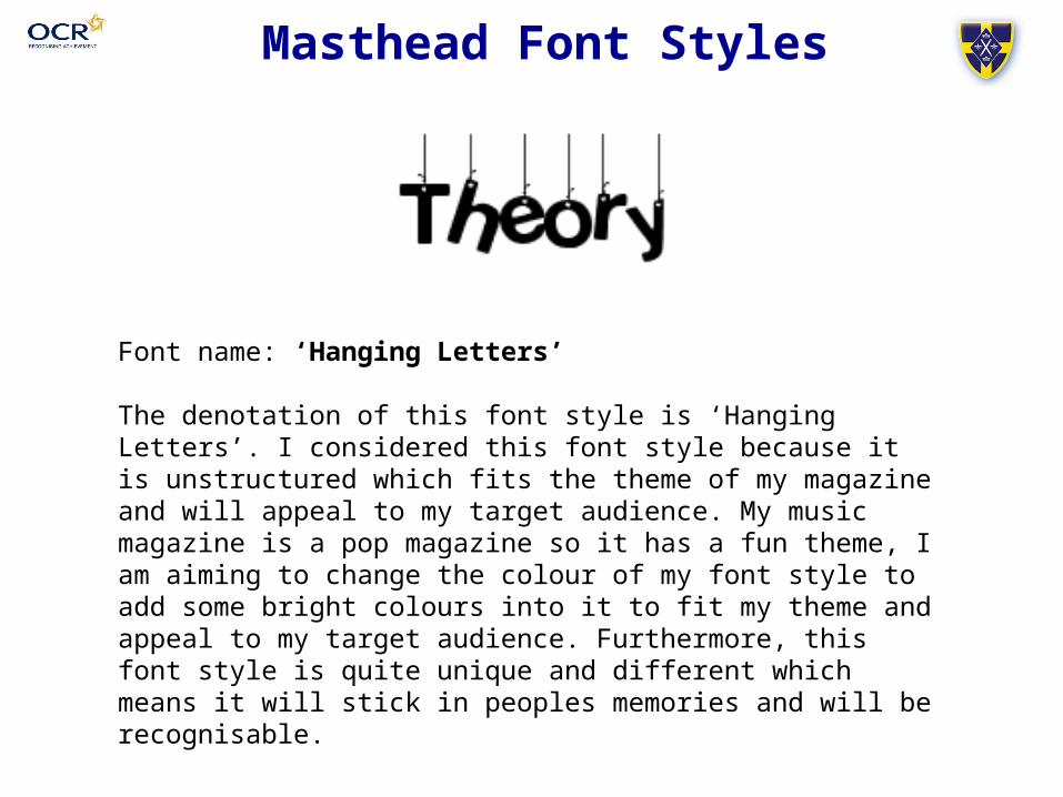
Font name: ‘Hanging Letters’
The denotation of this font style is ‘Hanging Letters’. I considered this font style because it is unstructured which fits the theme of my magazine and will appeal to my target audience. My music magazine is a pop magazine so it has a fun theme, I am aiming to change the colour of my font style to add some bright colours into it to fit my theme and appeal to my target audience. Furthermore, this font style is quite unique and different which means it will stick in peoples memories and will be recognisable.
Masthead Font Styles
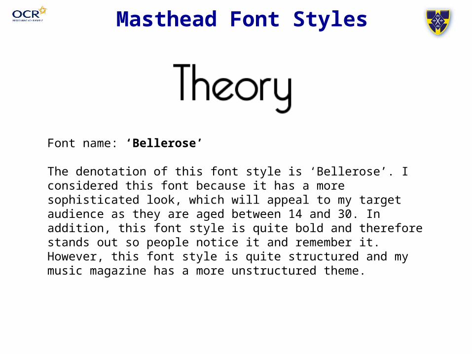
Font name: ‘Bellerose’
The denotation of this font style is ‘Bellerose’. I considered this font because it has a more sophisticated look, which will appeal to my target audience as they are aged between 14 and 30. In addition, this font style is quite bold and therefore stands out so people notice it and remember it. However, this font style is quite structured and my music magazine has a more unstructured theme.
Masthead Font Styles
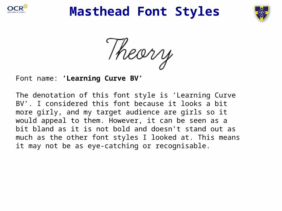
Font name: ‘Learning Curve BV’
The denotation of this font style is ‘Learning Curve BV’. I considered this font because it looks a bit more girly, and my target audience are girls so it would appeal to them. However, it can be seen as a bit bland as it is not bold and doesn’t stand out as much as the other font styles I looked at. This means it may not be as eye-catching or recognisable.
Masthead Font Styles
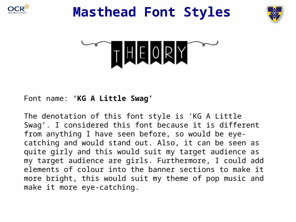
Font name: ‘KG A Little Swag’
The denotation of this font style is ‘KG A Little Swag’. I considered this font because it is different from anything I have seen before, so would be eye-catching and would stand out. Also, it can be seen as quite girly and this would suit my target audience as my target audience are girls. Furthermore, I could add elements of colour into the banner sections to make it more bright, this would suit my theme of pop music and make it more eye-catching.
Masthead Font Styles
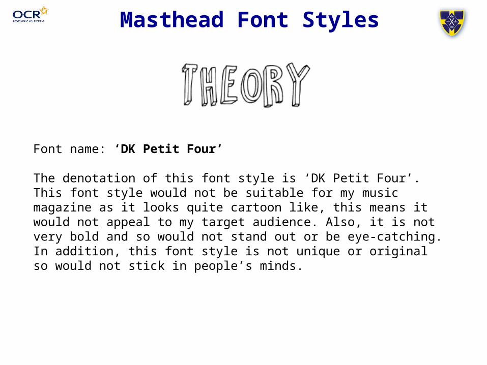
Font name: ‘DK Petit Four’
The denotation of this font style is ‘DK Petit Four’. This font style would not be suitable for my music magazine as it looks quite cartoon like, this means it would not appeal to my target audience. Also, it is not very bold and so would not stand out or be eye-catching. In addition, this font style is not unique or original so would not stick in people’s minds.
Masthead Font Styles
Final Font Style
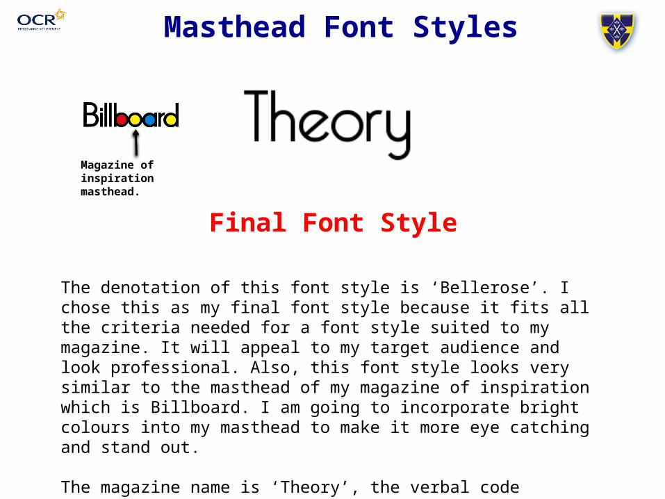
The denotation of this font style is ‘Bellerose’. I chose this as my final font style because it fits all the criteria needed for a font style suited to my magazine. It will appeal to my target audience and look professional. Also, this font style looks very similar to the masthead of my magazine of inspiration which is Billboard. I am going to incorporate bright colours into my masthead to make it more eye catching and stand out.
The magazine name is ‘Theory’, the verbal code ‘Theory’ connotes the idea of an artist working on a new project. Therefore this links very well with a music magazine.
Magazine of inspiration masthead.