Effective Poster Design for Academic Conferences
28
Effective Poster Design for Academic Conferences Mary Lee Eggart Cartographic Section — 430 Howe-Russell-Kniffen Department of Geography & Anthropology Louisiana State University 578-6248 [email protected]
Transcript of Effective Poster Design for Academic Conferences

Effective Poster Design for
Academic Conferences
Mary Lee Eggart Cartographic Section — 430 Howe-Russell-Kniffen
Department of Geography & Anthropology
Louisiana State University
578-6248

A Scientific Poster
• communicates your research at a
conference.
• is a visual presentation of information.
– It should not simply reproduce your written paper
at poster size.
• should be understandable to the viewer
without verbal explanation.

Know Your Audience
• Distracted academics walking through
a crowded, noisy room

• In 3 seconds, a viewer decides whether to approach your poster or leave.
– Subject must be clearly understandable from at least 10 feet away.
– Use a statement, photograph, or diagram as a focal point to attract attention.
Know Your Audience

Know Your Audience
• In the next 30 seconds, the viewer decides if your content is worthy of further exploration.
– Provide a clear flow of information from introduction to conclusion.
– Focus on major findings—do not try to include everything you know.
– Text should be concise enough to be read in under 10 minutes.

Organize Your Information • Title, Author(s) and affiliation(s)
• Abstract: include only if required by the conference
• Introduction: a brief but important overview to secure the viewer’s attention
• Problem: concise statement of the problem
• Materials and Methods: brief description of the processes and procedures
• Results: outcomes, findings, data
• Conclusion: summary, discussion of significance and relevance of results, a few easily remembered key conclusions, possible future research
• References
• Acknowledgments
• Contact Information

Design Your Poster
• Determine final overall size:
– Find out the maximum size allowed by the
conference.
– Find out the maximum size the printer can
produce (e.g. CADGIS lab can print 36” wide by
any length, LSU Graphic Services can print 48”
wide by any length).
– Find out the maximum size your software
can produce (e.g. PowerPoint maximum page
size is 56” x 56”).
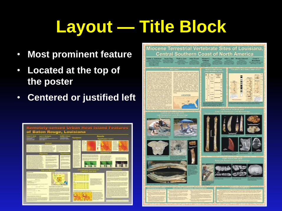
Layout — Title Block
• Most prominent feature
• Located at the top of
the poster
• Centered or justified left

Layout — Body of Poster
• Landscape-oriented layout
– Often best to visually divide space into 2 or more columns
(do not have to be equal width) which are read left to right.

Layout — Body of Poster
• Landscape-oriented layout
– Often best to visually divide space into 2 or more columns
(do not have to be equal width) which are read left to right.
Photo by
Rowan
Barrett

Layout — Body of Poster
• Portrait-
oriented layout
– Read top to
bottom

Layout — Body of Poster
• Alignment:
– The eye looks for edges — align and size text blocks,
headings, figures, etc. consistently
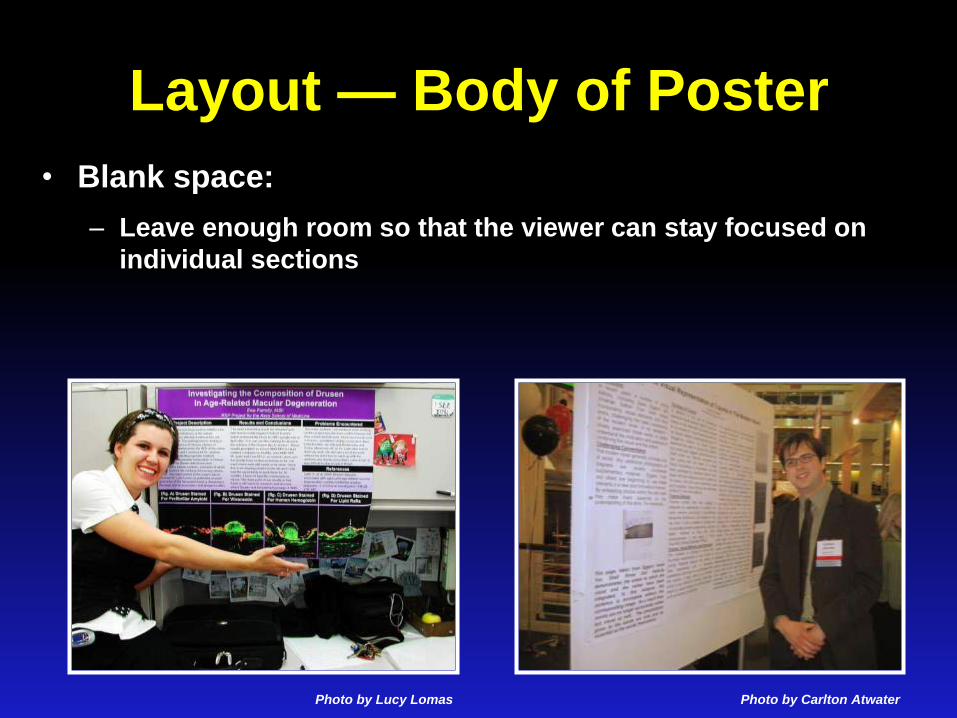
Layout — Body of Poster
• Blank space:
– Leave enough room so that the viewer can stay focused on
individual sections
Photo by Lucy Lomas Photo by Carlton Atwater

Color
• Should
– highlight or emphasize
– separate and define sections
– associate related information
• Should not
– compete with the information
– overwhelm the viewer
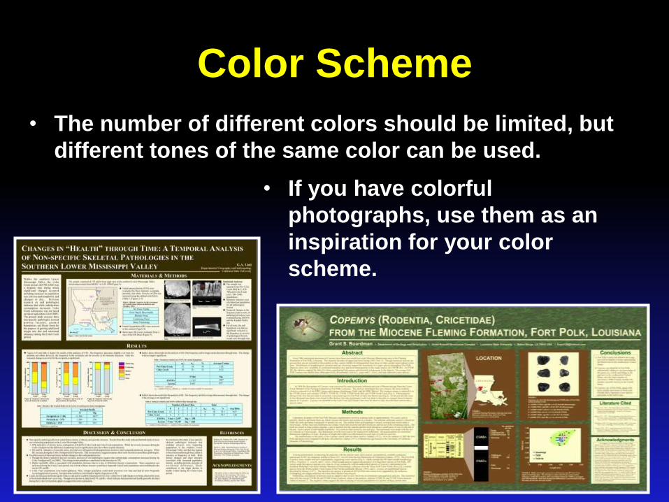
Color Scheme
• The number of different colors should be limited, but
different tones of the same color can be used.
• If you have colorful
photographs, use them as an
inspiration for your color
scheme.

Background
• Keep the background in the back!
– Use cool and/or muted colors
– Avoid bright, warm colors
Photo by Nicole Barker

Background
• Keep the background in the back!
– Use cool and/or muted colors
– Avoid bright, warm colors
• Background may be
– A solid color

Background
• Keep the background in the back!
– Use cool and/or muted colors
– Avoid bright, warm colors
• Background may be
– A solid color
– A gradient

Background
• Keep the background in the back!
– Use cool and/or muted colors
– Avoid bright, warm colors
• Background may be
– A solid color
– A gradient
– A texture

Background
• Keep the background in the back!
– Use cool and/or muted colors
– Avoid bright, warm colors
• Background may be
– A solid color
– A gradient
– A texture
– A photograph

Figures
• No figures should be smaller than
5” x 7”.
• All figures should have captions.
• Photographs
– At least 300 dpi at final size
– Avoid web captures—they are usually of low
resolution
– Crop photos to highlight the important feature
– Put a thin outline around photos to help them
stand out from the background
– Consider removing background from photo
where possible.

Figures • Graphs
– Don’t just accept the default
colors and layout of your
graphing program—match
your color scheme.
– Avoid 3-D graphs—they are
very hard to interpret.

Images
• Public Domain images do not require attribution, but it is good practice to attribute anyway. (Usually a work enters the public domain 70 years after the death of creator—but there are
exceptions. Some creators designate works to be in the public domain during their lifetime.)
• Creative Commons images permit reproduction as long as proper attribution is given. (Available through Flickr, free stock photos archives)
• Royalty/Subscription images provide high quality images for a single image fee or membership—expensive! (iStockphoto, Jupiter Images, Getty Images)
• Copyright Protected images can be used under the fair use doctrine for educational purposes including as
part of a display or presentation at professional symposia. Proper attribution
should be given.

• Sites to obtain copyright-free images to use in your poster:
– Morgue File - probably the best single source of free photos.
– Wikimedia Commons - archive of free multimedia content submitted by Wikipedia users.
– http://www.loc.gov/pictures/ Library of Congress Prints & Photographs online (not all are copyright-free)
– Education Image Gallery. Free images from the Getty collection.
– Google Images using the 'usage rights' filter.
– Flickr Creative Commons - an index of all Flickr images for which the owner has specified a Creative Commons license (which usually means you can use it)
– FreeFoto.com. A collection of free photographs for private non-commercial use.
– Image*After - large, free photo collection, with images free for any use.
– The Creative Commons search allows you to search Google, Yahoo, Flickr and other sites for material that is licensed under the Creative Commons - which usually means you can use it without charge in a non-commercial context.
– For more sources of images, see CLT's multimedia resources listing.
• Information about copyright protection and public domain images:
– http://www.copyright.gov/help/faq/faq/fairuse.html
– http://www.utsystem.edu/ogc/intellectualproperty/copypol2.htm
Images

Lettering • Title: at least 72 pt., bold preferred
• Section Headings: at least 48 pt., bold preferred
• Body Text: at least 24 pt.
• Avoid using all capital letters
• Use sans serif (Arial) for titles & headings
• Use serif (Times New Roman) for body text
• Use bulleted lists where possible instead of paragraphs
• Use italics instead of underlining
• White or light colored lettering is hard to read on a dark background when printed. Use black lettering instead on a light colored rectangle

Miscellaneous • Have a colleague evaluate your poster to make
sure it reads as smoothly as you think it does.
• Proofread carefully! Ask someone else to proofread it, too.
• Glossy or Matte paper?
• Glossy
• Better repro of photos
• Richer color
• Glare/reflected light can make poster hard to see at distance
• More expensive
• More durable
• Matte
• No glare/reflection
• Less expensive

References
• Advice on designing scientific posters
Colin Purrington, Department of Biology, Swarthmore College, PA
http://www.swarthmore.edu/NatSci/cpurrin1/posteradvice.htm
• Design of Scientific Posters
http://www.writing.engr.psu.edu/posters.html
• Poster Design Tips http://clt.lse.ac.uk/workshops-and-courses/Course-
resources/Poster-Design-Tips.php
• Effective Poster Design
http://www.soe.uoguelph.ca/webfiles/agalvez/poster/