Edit ISO 12647-3 AS 02June bv - SPOTPRESS · 2018-01-24 · modifications of ISO 12647-3:2013...
40
ISO 12647-3:2013 Quality standard for newspaper production
Transcript of Edit ISO 12647-3 AS 02June bv - SPOTPRESS · 2018-01-24 · modifications of ISO 12647-3:2013...

ISO 12647-3:2013Quality standard for newspaper production

WAN-IFRA tablet app
Read the report on tablet!Download the app today!
WAN-IFRA members and subscribers to our publi- cations can read this report and other WAN-IFRA reports for free on our new tablet app. The WAN-IFRA app (free to download) is available on iOS and Android.Simply search for WAN-IFRA in the stores.
What’s in the app
WAN-IFRA Reports
Targeted topical, global reports on the latest and emerging trends in the business
World News Publishing Focus
The bi-monthly magazine for the global industry’s top executives, featuring best-practise examples, profiles, case studies, interviews, technology and investment developments
Asian Newspaper Focus
The bi-monthly magazine focused on the developments of news publishing in the Asian-Pacific region, featuring CEO profiles, trade news, publisher visits and more
World News Publishing Focus Blog
The latest updates on the news publishing industry, focused on editorial, digital media, business strategy, productions and press freedom
WAN-IFRA video
The most recent video coverage of our events, executive interviews and more
Access
WAN-IFRA members and subscribers with a VALID LOG-IN can download all WAN-IFRA Reports and World News Publishing Focus for free. Asian Newspaper Focus is free for everyone.For more details, visit: www.wan-ifra.org/app-support
Or email: [email protected]

INTRODUCTION
Nowadays, every two minutes people take more photos than in the entire 19th century. Currently, it is as-sumed that 2.5 billion people around the world use a digital camera, most of them as part of a smartphone.
Digital colour creation has exploded with digital mobile technology and this reflects on the needs of processing digital colour for publishing. News media have to cope with a huge amount of data from count-less sources, which requires well organised colour management and data handling.
Advertisers create and deliver digital colour materials to many recipients like digital advertising platforms, television, glossy magazines, outdoor billboards and newspapers. Each advertising channel is based on another colour display technology and hence requires colour conversion to assure the best possible and best matching results on each platform. Colour manage-ment and colour space conversion is a daily require-ment and inherent tool of digital and print colour reproduction systems.
Print standardisation based on agreed internation-al norms like ISO 12647-3 has been a great success for newspaper printing worldwide. In conjunction with the development of “full colour printing” based on process colours (CMYK) replacing the old spot colour concept in newspaper production, the first ISO newspaper print standard was released in 1998 and improved over time.
Newspaper printers embraced the uniform interna-tional standard quickly as a matter of course since they were used to standardised and straight forward production. The implementation of the standard in real life has paid off in the years since then.
Newspaper production standards deliver clear and manageable guidelines for printers worldwide. Stan-dardisation became a great tool to create consistency across different print plants. It is a unique commu-nication platform between print buyers, ad agencies, prepress designers and printers. The WAN-IFRA International Newspaper Color Quality Club promotes standardized colour reproduction and is a tool in itself to implement and maintain control over reproduction processes within the value chain of newspaper colour production.
The WAN-IFRA generic newspaper ICC print profile meanwhile is part of hundreds of newspaper print specifications all over. It is included in many software packages that manage the digital production workflow and pre-flight the colour data delivered by different sources. The international norms make printing and print buying easier and lower the costs for printers and their customers by avoiding confusion and misunder-standings.
In January 2015, the WAN-IFRA World Printers Fo-rum Board decided to intensify working in the area of print standardisation in cooperation with newspaper printers worldwide. A new version of the newspaper ICC colour profile was developed and tested by the Swedish Graphic Companies’ Federation in cooper-ation with WAN-IFRA. This new version adapts the modifications of ISO 12647-3:2013 especially with regard to reduced total ink coverage.
Also, the World Printers Forum Board decided to up-date the WAN-IFRA report on “Revision of ISO 12647-3” (Special Report 2.37, 2005) accordingly. WAN-IFRA Research Manager Anand Srinivasan wrote this new WAN-IFRA report.
We present this report now to the newspaper print community in July 2015 and encourage readers to comment and discuss questions of newspaper print standardisation on the World Printers Forum website. The Online Forum has been established for the ex-change of information for everyone interested in ques-tions of newspaper production: http://forum.wan-ifra.org/forums/world-printers-online-forum.
MANFRED
WERFEL,DEPUTY CEO & EXECUTIVE DIRECTOR - GLOBAL EVENTS, WAN-IFRA
3ISO 12647-3:2013

>:
IMPRINTISO 12647-3:2013, QUALITY STANDARD FOR NEWSPAPER PRODUCTION
PUBLISHED BY:WAN-IFRARotfeder-Ring 1160327 Frankfurt, Germany
CEO: Vincent Peyrègne
DIRECTOR OF PUBLICATIONS: Dean Roper
WORLD PRINTERS FORUM EXECUTIVE DIRECTOR:Manfred Werfel
AUTHOR:Anand Srinivasan
EDITORIAL ASSISTANCE/COPY EDITING:Dean Roper, Brian Veseling, Anton Jolkovski
CONTACT INFO:[email protected]@[email protected]
4 WORLD PRINTERS FORUM

CONTENT
>:
CONTENTS:CHAPTER 1: WHY STANDARDISE? 7
CHAPTER 2: SCREEN DEFINITION & COLOUR SEPARATION 13
CHAPTER 3: PRINT PRODUCTION 19
CHAPTER 4: TONAL VALUE CURVE 25
CHAPTER 5: INTRODUCING THE NEW STANDARD 29
CHAPTER 6: QUALITY CONTROL MECHANISM 33
5ISO 12647-3:2013

ABOUT THE WORLD PRINTERS FORUMThe World Printers Forum within
WAN-IFRA aims to be the central point of the international news
media print community, including printers, materials suppliers and equipment manufac-turers for the print production value chain from prepress to press, product finishing and delivery.
It addresses all print related questions. Its objective is to encourage innovation and pro-ductivity as well as product development that can be instrumental for publishers to exploit future-oriented news media products. It promotes the power of print and the sustain-ability of print production.
The World Printers Forum has also launched an online forum, an exchange platform for discussing, informing and debating all topics related to newspaper production. The Forum is open to everyone and is free to use.
The online forum is an ideal exchange plat-form for newspaper production experts to voice their opinion, share technical knowl-edge and learn from other experts.
To join our network, go to
www.wan-ifra.org/wpf
6 WORLD PRINTERS FORUM

CHAPTER 1 - WHY STANDARDISE?
IS STANDARDISATION NECESSARY FOR A PRODUCT WITH SUCH A SHORT LIFE SPAN?
7ISO 12647-3:2013

Globally, we see a decline in the rev-enues that newspapers make from print. Advertisement revenues are
shrinking. Still, print accounts for 93 percent of newspaper revenues. Print is the unique selling point of a news publisher and is still very strong. Publishers should make the most of print. An attractive, high quality printed product is the key.
It can be argued that the lifespan of a news-paper is a few hours or at most a day. Why is print quality important for such a short lived product? It is true that readers do not spot or complain about many quality errors. However, for a reader, the clarity of pictures and advertisements are very important and over time, the readers develop an overall assessment about the quality of a newspaper. On the other hand, newspaper advertisers are very critical about quality errors. Unless a publisher provides an excellent reading and advertising experience, it is difficult to retain them. Bad reproduction results in loss of readers and many free “make-goods.” Therefore, there is a tremendous pressure on newspapers to standardise.
For a long time, there were only a few standards in the graphics industry. In the 19th century, it was still commonplace to have different type heights for hot-metal composition. It was not possible to exchange
type between printing plants. This situation meant that it was even necessary to build customised printing presses. However, these costs were willingly accepted in the hope of keeping competitors at bay. That this is so is illustrated by the fact that the question “to standardise or not?” is always answered in light of business interests, and not on the basis of purely technical considerations.
Since the mid-1990s, standardisation initiatives have been formed in a number of countries. WAN-IFRA (then IFRA) alone participated directly in such projects in Germany, the Netherlands, Spain, the United States, South America and India. All the aforementioned initiatives are modelled along the lines of the ISO 12647-3 interna-tional newspaper printing standard, which provides minimum quality requirement for newspaper production.
The ISO 12647-3 newspaper standard has been in existence for 16 years. The standard was first developed and introduced in 1998, when colour printing started becoming pop-ular in newspaper industry. Every five years, ISO standards are examined for possible revision to introduce improvements, take into account new technical developments and react to changed market needs. For this reason, the ISO Technical Committee 130 (TC 130), which is responsible for develop-
WHY STANDARDISE?
In the past 20 years, there has been a dramatic increase in colour printing in the newspaper industry. Black and white pages are becoming rare and many newspapers worldwide have increased their colour printing capacity and print in full colour. Having all pages in colour has become a fundamental feature of newspaper printing.
8 WORLD PRINTERS FORUM

ing graphic standards, revised the standard in 2005 and again in late 2013. This report aims to provide complete details about the actual revision and how a printer can implement the standard in the workplace.
A key point that is always debated is: Do newspaper printing plants want to distinguish themselves by printing quality or do they want to satisfy customer demands by guaranteeing a minimum standard of quality? There are many printers who believe they can print better than the minimum standards set by ISO 12647-3. While this may be true in a number of cases, the first aim of newspaper printers should be to im-prove colour printing with the help of the general stan-dard instead trying to print better than the standard. After mastering the standardisation process with ISO 12647-3, printers are free to better it.
What does the new ISO standard for newspaper printing bring?
The ISO 12647-3:2013 has made some significant revi-sions to the 2005 version of the standard.
The standard takes into account the latest market requirements in the industry. CTP has become a norm across the globe; run lengths of plates have improved; quality of newsprint has improved; 40 and 42 gsm newsprint are being used; Higher screen rulings and
FM screens are common; Improved newsprint are be-ing used to increase the colour gamut of newsprint. All these developments are addressed in the standard.
The important feature of the ISO 12647-3 standard is that it is flexible and suitable for all newspaper printers irrespective of the technology that is used. It provides a minimum specification and printers are free to better the minimum specification depending upon their technology. That is the reason WAN-IFRA has opened its Category 4 in International Newspaper Color Quality Club (INCQC) competition to newspa-pers who prefer to follow their own in-house standard. WAN-IFRA’s recommendation to those printers is to maintain a written document on the in-house stan-dard and maintain one standard for all the printing presses and plants.
WAN-IFRA endorses most of the new recommenda-tions.
A new ICC colour profile is also now available, devel-oped and tested by the Swedish Graphic Companies’ Federation (Grafiska Företagen) in cooperation with WAN-IFRA.
Therefore, it is high time to take a close look at the revised ISO 12647-3.
9ISO 12647-3:2013
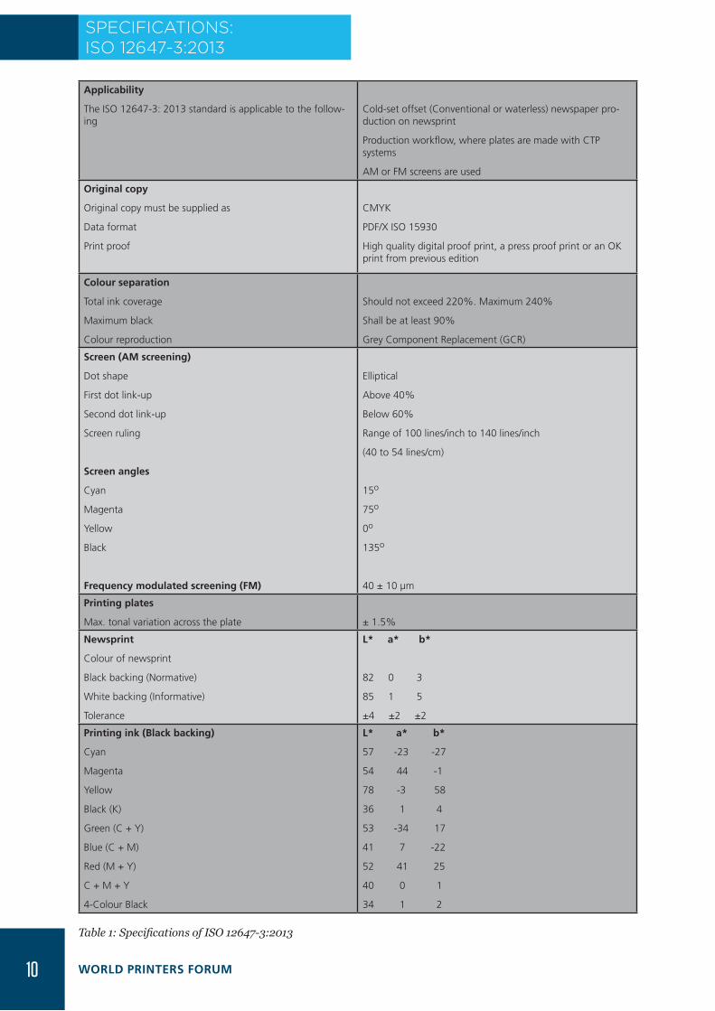
SPECIFICATIONS: ISO 12647-3:2013
Applicability
The ISO 12647-3: 2013 standard is applicable to the follow-ing
Cold-set offset (Conventional or waterless) newspaper pro-duction on newsprint
Production workflow, where plates are made with CTP systems
AM or FM screens are used
Original copy
Original copy must be supplied as
Data format
Print proof
CMYK
PDF/X ISO 15930
High quality digital proof print, a press proof print or an OK print from previous edition
Colour separation
Total ink coverage
Maximum black
Colour reproduction
Should not exceed 220%. Maximum 240%
Shall be at least 90%
Grey Component Replacement (GCR)
Screen (AM screening)
Dot shape
First dot link-up
Second dot link-up
Screen ruling
Screen angles
Cyan
Magenta
Yellow
Black
Frequency modulated screening (FM)
Elliptical
Above 40%
Below 60%
Range of 100 lines/inch to 140 lines/inch
(40 to 54 lines/cm)
15o
75o
0o
135o
40 ± 10 µm
Printing plates
Max. tonal variation across the plate ± 1.5%
Newsprint
Colour of newsprint
Black backing (Normative)
White backing (Informative)
Tolerance
L* a* b*
82 0 3
85 1 5
±4 ±2 ±2
Printing ink (Black backing)
Cyan
Magenta
Yellow
Black (K)
Green (C + Y)
Blue (C + M)
Red (M + Y)
C + M + Y
4-Colour Black
L* a* b*
57 -23 -27
54 44 -1
78 -3 58
36 1 4
53 -34 17
41 7 -22
52 41 25
40 0 1
34 1 2
Table 1: Specifications of ISO 12647-3:2013
10 WORLD PRINTERS FORUM

Tolerances in colour printing
Cyan
Magenta
Yellow
Black (K)
Green (C + Y)
Blue (C + M)
Red (M + Y)
Deviation ΔE1976 Variation ΔE1976
5 4
5 4
5 5
5 4
8 7
8 7
8 7
Printing
Printing sequence
Tonal range
Colour register error
CMYK or KCMY
3% till 95%
Maximum 200 microns
Dot gain for AM and FM screens
At nominal tone value of
10%
20%
30%
40%
50%
60%
70%
80%
90%
In %
11.1
19.0
23.9
26.2
26.0
23.8
19.8
14.3
7.6
Tolerances for dot gain
< 30%
30% to 60%
>60%
Mid-tone spread
Deviation tolerance Variation tolerance
in % in %
4 4
5 5
4 4
6 6
Densities (for information only)
Cyan
Magenta
Yellow
Black (K)
Status E
0.90
0.90
0.90
1.10
Grey balance combinations
WAN-IFRA recommends the combinations from 2005 stan-dard.
The stated CMY combined prints should produce a neutral grey in each case. The reference grey is determined by the paper and darkest black (220%).
Cyan Magenta Yellow
10% 8% 8 %
20% 16% 16%
30% 24% 24%
40% 33% 33%
50% 42% 42%
60% 52% 52%
Measuring conditions for colour: 45o/0o or 0o/45o, D50/2o, Black backingMeasuring conditions for density: Status E, Polarisation filter, Relative density, Black backing Mid-tone spread: The difference in dot gain between the colour with the highest dot gain and the colour with the lowest dot gain. Measured typically at 40%Recommended quality standard for ink: ISO 2846-2Recommended standard for newsprint: DIN 19306-4
11ISO 12647-3:2013

RESEARCH AND MATERIAL TESTING CENTRE
The One-stop Centre for Material Testing and Pressmen Training
Standardise your Newsprint and Newsink�� Newsprint�testing
�� Printability�testing
�� ISO�2846-2�conformance�study�of�newsink
Quality Evaluation Service�� Independent�and�regular�assessment�of�your�print�quality
�� Detailed�quality�evaluation�report�to�study�the�progress
Simulated Press Training
�� Train�your�staff�in�the�state-of-the-art�press�simulator�� 2x1,�4x1�and�4x2�press�configurations�� Customised�modules�for�beginners,�intermediate�and�advanced�users
Training and Consulting Solutions
�� Environmental�Management�� Building�new�printing�plants�� Press�acceptance�testing�� ISO�12647-3�standardisation�� Densitometry�� 3D�printing
Contact:�Anand Srinivasan�.�Tel:�+91.44.4211�0640�.�Fax:�+91.44.2254�2323�.�E-mail:�[email protected]�
www.wan-ifra.org/rmtc

CHAPTER 2: SCREEN DEFINITION & COLOUR SEPARATION
SPECIFICATIONS FOR AM & FM SCREENS
RESEARCH AND MATERIAL TESTING CENTRE
The One-stop Centre for Material Testing and Pressmen Training
Standardise your Newsprint and Newsink�� Newsprint�testing
�� Printability�testing
�� ISO�2846-2�conformance�study�of�newsink
Quality Evaluation Service�� Independent�and�regular�assessment�of�your�print�quality
�� Detailed�quality�evaluation�report�to�study�the�progress
Simulated Press Training
�� Train�your�staff�in�the�state-of-the-art�press�simulator�� 2x1,�4x1�and�4x2�press�configurations�� Customised�modules�for�beginners,�intermediate�and�advanced�users
Training and Consulting Solutions
�� Environmental�Management�� Building�new�printing�plants�� Press�acceptance�testing�� ISO�12647-3�standardisation�� Densitometry�� 3D�printing
Contact:�Anand Srinivasan�.�Tel:�+91.44.4211�0640�.�Fax:�+91.44.2254�2323�.�E-mail:�[email protected]�
www.wan-ifra.org/rmtc 13ISO 12647-3:2013

If it were possible to print grey tones, the world would be a different place. Un-fortunately, we can only print black (or
colour). In order to simulate all the required intermediate tones between the white of the paper and black of the solid, printers have always used a trick that fools the viewer into thinking that he sees intermediate tones. Fortunately, the human eye can barely dis-tinguish between fine lines or dots printed alongside one another. Therefore, viewed at a suitable distance of about 35 centimetres, printed screens are perceived as grey tones.
But because every attempted deception has its limits, there are continuous efforts to refine screen technology in printing and eliminate shortcomings. As a result, the topic of “screening” repeatedly causes waves in the industry. Recently, in India, we noticed many major newspapers shifting from Amplitude Modulated (AM) Screens to Frequency Modulated (FM) Screens and some news-papers started printing with high definition AM screen.
The ISO newspaper printing standard defines parameters for a standard screen-ing process, both AM and FM, which can be used by everyone.
AM Screening
Dot shape Ellipse
First dot link-up 40 percent
Second dot link-up 60 percent
Screen frequency 40 lines/cm to 54 lines/cm (100 lines/inch to 140 lines/inch)
Screen angle Cyan 15o
Magenta 75o
Yellow 0o
Black 135o
FM Screening dot size
40 µm ± 10 µm
Table 2: ISO 12647-3:2013 specification for screening
Dot shape with AM Screening
Why choose an elliptical dot and not the simple round dot that is preset in most RIPs as a default? At a 50 percent screen value, a round dot has a four-sided dot link-up with the adjacent dots; as the round dot becomes a square-shaped dot whose corners come
into contact with the adjacent dots at 50 percent.
The four-sided dot link-up results in a jump in the dot percentage, thereby causing disturbances in gradations such as in skin tones. To reduce the negative effect of the dot link-up, elliptical dots are used. Ellipse has two axis; a major axis and a minor axis thereby, has two-sided dot link-ups; the first at approximately 40 percent and the second at approximately 60 percent.
Picture 1: Four-sided and two-sided dot link-up in round and elliptical dots. The El-liptical dot is a moderate chain screen with the 1st dot link-up at 42.5 percent, 2nd dot link-up at 57.5 percent.
The elliptical dot can be selected in every RIP. In the case of the Harlequin RIP that is in widespread use, it is recommended to select the “Elliptical P” dot.
Screen ruling
The ISO 12647-3:2005 standard had specified only one screen frequency for AM screens i.e. 40 lines per centimetre (or 100 lines per inch). The choice of screen ruling depends primarily on the substrate that is used to print. Rougher paper surface needs coarse screen and smoother paper surface can take finer screens.
Over the years, the quality of newsprint has increased and screens up to 120 lines per inch can be easily printed. Many newspa-pers are also using improved newsprint and finer screens can be printed. For this reason, the latest revision of the standard specifies that printers can choose any screen ruling between 100 lines per inch and 140 lines per inch.
SCREEN DEFINITION & COLOUR SEPARATION
14 WORLD PRINTERS FORUM

For Frequency Modulated (FM) screens, the speci-fied size is 40 µm ± 10 µm. The choice of the dot size determines the smoothness of tones with FM screen. Different dot sizes should be carefully studied and the right one has to be selected depending upon the paper surface properties.
Screen angle
For AM screen, choice of screen angle is crucial to avoid unwanted dot patterns in print called “moiré.” For Elliptical dots, a graphical representation of rec-ommended screen angle is provided by the standard.
The differences in screen angles between the colours should be 60° to largely avoid moiré. Therefore, the recommendation is to set 0° for yellow, 15° for cyan, 75° for magenta and 135° for black. In case of the colours cyan, magenta and black (K), the difference between them is 60°. But because the circle does not permit a 60° interval for all four colours, the least visible colour (yellow) is put at an interval of 15° from cyan on the 0° axis. 0° is the easiest visible angle to human eye and yellow is the colour with least colour strength. Therefore, yellow fits perfectly at 0°. 45° or 135° is the least visible angle to human eye and black (K) is the most dominant colour in newspaper print-ing, which uses strong GCR. Hence, black is fixed at 45° (in case of round dots) or 135° (in case of elliptical dots). Cyan and magenta are placed in the remaining two slots.
Screen angles must be measured on the printed fin-ished product. This is of special importance when you change from broadsheet to tabloid production since in this case the page orientation changes as well by 90°. Some RIP settings call for an “inverted” way of think-ing when programming the angle, as they set out from the wrong-reading exposed negative film.
Why should the screen angle be 60° and not 30° as sometimes claimed? A 30° interval would be used in the case of a round dot with no major and minor axis. For example, with a round dot, a 0° and 90° angle would be identical. The situation is different with an elliptical dot, as this has a major and minor axis.
It is very important to correctly set the screen angle in the RIP. If this is not taken into account and the angle settings checked, the outcome will be highly visible moiré effects in the printed images.
Picture 2: Graphic of recommended screen angles for ellipse
Colour separation
Colour separation, i.e. the way in which a colour file is prepared for printing in CMYK, is dependent on the requirements of the printing process concerned and therefore differs for commercial offset, gravure, or newspaper printing.
All the requirements for colour separation for a par-ticular process are taken into account when producing a colour profile. Therefore, if a good standard profile is used, it is no longer necessary to worry about this aspect every time.
ISO 12647-3:2013 also defines the decisive benchmark values for the colour separation:
● Total ink coverage: should not exceed 220 percent; maximum 240 percent
● Maximum black (K), when the tone value sum ap-proaches the maximum limit: shall be at least 90 percent
● Composition of colour separation: GCR (Grey Component Replacement), which uses the black (K) colour for most of the grey composition within 4c colour files.
Total ink coverage
No printing process in the world allows the over-printing of cyan, magenta, yellow and black with 100 percent inking, which would correspond to a total ink coverage of 400 percent. Due to the nature of the materials concerned (ink and paper) as well as the method of drying, the total ink coverage is limited in every case. This is especially true of coldset newspaper printing, where the ink does not genuinely dry but only partially penetrates into the paper.
Y: 0º
C: 15º
M: 75ºK: 135º
15ISO 12647-3:2013
Excessive inking usually causes losses in quality that may only become apparent in the form of set-off and smearing and in the mailroom when the products are rolled-up. Therefore, it is essential to limit the total ink coverage. The ISO 12647-3:2013 standard specifies that for newspaper printing, the total ink sum should not exceed 220 percent. That means that no part of the image – not even the darkest – has more inking than 220 percent.
In the earlier standard, the recommendation for total ink coverage was 240 percent. As more and more newspaper printing plants are using lower gsm news-print (40 and 42 g/m2), there is a necessity to lower the ink coverage. This market requirement is taken into account by the standard.
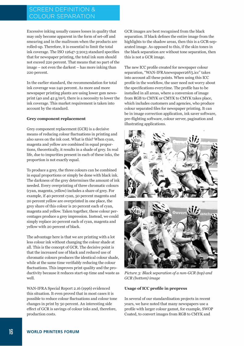
Grey component replacement
Grey component replacement (GCR) is a decisive means of reducing colour fluctuations in printing and also saves on the ink cost. What is this? When cyan, magenta and yellow are combined in equal propor-tions, theoretically, it results in a shade of grey. In real life, due to impurities present in each of these inks, the proportion is not exactly equal.
To produce a grey, the three colours can be combined in equal proportions or simply be done with black ink. The darkness of the grey determines the amount of ink needed. Every overprinting of three chromatic colours (cyan, magenta, yellow) includes a share of grey. For example, if 40 percent cyan, 50 percent magenta and 20 percent yellow are overprinted in one place, the grey share of this colour is 20 percent each of cyan, magenta and yellow. Taken together, these colour per-centages produce a grey impression. Instead, we could simply replace 20 percent each of cyan, magenta and yellow with 20 percent of black.
The advantage here is that we are printing with a lot less colour ink without changing the colour shade at all. This is the concept of GCR. The decisive point is that the increased use of black and reduced use of chromatic colours produces the identical colour shade, while at the same time verifiably reducing the colour fluctuations. This improves print quality and the pro-ductivity because it reduces start-up time and waste as well.
WAN-IFRA Special Report 2.16 (1996) evidenced this situation. It even proved that in most cases it is possible to reduce colour fluctuations and colour tone changes in print by 50 percent. An interesting side effect of GCR is savings of colour inks and, therefore, production costs.
GCR images are best recognised from the black separation. If black defines the entire image from the highlights to the shadow areas, then this is a GCR-sep-arated image. As opposed to this, if the skin tones in the black separation are without tone separation, then this is not a GCR image.
The new ICC profile created for newspaper colour separation, “WAN-IFRAnewspaper26V5.icc” takes into account all these points. When using this ICC profile in the workflow, the user need not worry about the specifications everytime. The profile has to be installed in all areas, where a conversion of image from RGB to CMYK or CMYK to CMYK takes place, which includes customers and agencies, who produce colour separated files for newspaper printing. It can be in image correction application, ink saver software, pre-flighting software, colour server, pagination and illustrating applications.
Picture 3: Black separation of a non-GCR (top) and GCR (bottom) image
Usage of ICC profile in prepress
In several of our standardisation projects in recent years, we have noted that many newspapers use a profile with larger colour gamut, for example, SWOP Coated, to convert images from RGB to CMYK and
SCREEN DEFINITION & COLOUR SEPARATION
16 WORLD PRINTERS FORUM

then use specialised software to optimise the images to newspaper production conditions. WAN-IFRA does not recommend such a procedure.
In most cases, the advertisement materials arrive from several different sources and often do not follow a specific standard. It is a common practice worldwide to optimise advertisements to newspaper production in the printing houses. However, the editorial pictures are processed by the publishers and there is no reason why the image has to be colour separated in a larger colour space and then optimise it to newspaper pro-duction in a second step.
Pictures that are printed on newsprint have to be colour separated with the ICC profile created specifi-cally for this printing condition (WAN-IFRAnewspa-per26v5.icc) by the colour correction operators and automatic image processing software. In such cases, any other software that would modify the colour num-bers is not expected to modify the editorial pictures. The advantage is that whatever the colour correction operators do to pictures, it goes true to the press. Bad pictures then become the responsibility of colour cor-rection operators and they get a chance to review their work and make improvements.
Further, the ISO newspaper profile is created with maximum GCR and it does not need further optimisa-tion for ink savings necessarily.
Remarks
Screening and colour separation are important steps in the reproduction process. Both depend greatly on the conditions of newspaper printing. The screen settings recommended by ISO 12647-3:2013 must be implemented in the Raster Image Processor (RIP). Care should be taken to implement the settings in all RIPs in a printing plant, remote printing locations and contract printers.
Colour separation parameters are carried out at the time of production of the colour profile. Using the standard profile automatically activates the pro-grammed settings.
17ISO 12647-3:2013

18 WORLD PRINTERS FORUM
CHAPTER 3 - PRINT PRODUCTION
SPECIFICATIONS FOR SOLID INK DENSITY, COLOUR SHADE, GREY BALANCE & COLOUR REGISTER
19ISO 12647-3:2013

Full colour has become a firmly estab-lished feature in newspapers. In recent years, investments have been directed
towards newspaper presses with full four-co-lour printing capacities. But full four-colour newspaper printing also means new chal-lenges, as the colour quality of newspapers must be able to compete with other print-ing processes and electronic media, which can produce a much broader colour range. Customers also demand that the desired colour is reached as far as possible and, in the case of nationwide ads, is consistent in all newspapers.
The only way to achieve this is to introduce standardisation at all companies involved. By working with standards, newspaper hous-es aim to obtain a common colour space.
Solid tinting/primary and secondary colours
● ISO 2846-2 is the ISO standard for cold-set offset inks and the standard specifies three parameters
● Primary colour shade: Cyan, magenta, yellow, black (K)
● Ink film thickness range in which the co-lour of the ink has to be produced
● Transparency
The standard intends to provide guidelines for ink manufacturers to produce stan-dardised process colour inks.
ISO 12647-3 shares the primary colour shade (CMYK) with ISO 2846-2 standard and ad-ditionally also specifies the secondary colour shade (RGB). The standard also specifies colour tolerances.
In comparison with the ISO 12647-3:2005, there are two major changes. The b* value of magenta is changed from “-2” to “-1”, mak-ing it more practical to achieve. Perhaps the most major change is that the tolerances for secondary colours have been made norma-tive. Printers have to achieve the secondary colour shades within the tolerance specified.
The printing process has so many variables that it does not allow target values to be reached exactly. For this reason, tolerance windows are specified and must be observed. Thus ΔE1976 tolerances are given for the pri-mary and secondary colour targets. The de-viation tolerance represents the permissible deviation of the OK sheet from the original copy, and the variation tolerance defines the permissible fluctuation around the OK sheet.
Apart from ΔE1976, the ISO standard has also introduced, for information, tolerances based on ΔE2000. The Delta ΔE1976 is a simple mathematical formula based on the
PRINT PRODUCTION
CIELAB Colour values ΔE1976 tolerances
L* a* b*
Black backing (white backing values in brackets) Deviation Variation
Cyan 57 (59) -23 (-24) -27 (-27) 5 4
Magenta 54 (56) 44 (48) -1 (1) 5 4
Yellow 78 (80) -3 (-1) 58 (62) 5 5
Black 36 (37) 1 (1) 4 (4) 5 4
Cyan + yellow 53 (55) -34 (-34) 17 (17) 8 7
Cyan + magenta 41 (42) 7 (7) -22 (-23) 8 7
Magenta + yellow 52(54) 41 (45) 25 (26) 8 7
Cyan + magenta + yellow
40 (40) 0 (0) 1 (0) - -
Four colour black (K 100%, C 52%, M 44%, Y 44%)
34 (35) 1 (0) 2 (2) - -
a) The values are measured on a dry printb) Measured with D50 illuminant, 2 degree observer, 45:0 or 0:45 geometry, no polarisation filterc) White backing values are for information only
Table 3: ISO 12647-3:2013 specification for primary and secondary colours and tolerances
20 WORLD PRINTERS FORUM

distance between two points with x, y, z (or L* a* b*) co-ordinates. It can be easily calculated with an excel sheet or simply in mind. The Delta ΔE2000 is consid-ered more accurate than the older formula but is com-plicated to calculate. For process control, we believe that a simpler formula is much more useful and easy to understand. Hence, we recommend printers to still use the Delta ΔE1976 formula, especially because ΔE1976 is the normative way according ISO 12647-3:2013 to be used for communication between printers and print buyers.
ΔE1976 = √(L1-L2)2 + (a1-a2)2 + (b1-b2)2
Note about deviation and variation tolerance
A deviation in this context means it is inherent in the process at that point of time and not in the scope of the printer to correct it during production.
For example, if the pigments used in the ink do not produce the exact required shade, then it is a devia-tion. A printer can only vary the densities during production. However, at the optimum density, the best produced shade will still deviate from the standard. ISO has provided a tolerance for such deviation.
During production, it is impossible for the printers to maintain the exact pre-defined density during the entire production run. Based on density fluctuations, the colour will also vary. This is variation and ISO has provided tolerance for such variations.
It is important to note that the deviation and variation tolerances provided by ISO are quite large. A printer has to aim to keep variations as low as possible and work with the ink manufacturers to keep the deviation as low as possible.
Paper shade influences the colour of the inks
When discussing colour of inks, it is important to note that paper shade plays a crucial role in the colours achieved. For this reason, ISO 12647-3 has specified the colour of paper as well.
L* a* b*
White backing 85 1 5
Black backing 82 0 3
Tolerance ± 4 ± 2 ± 2
Table 4: Specification for newsprint shade
In a laboratory experiment done at the WAN-IFRA Re-search and Material Testing Centre (RMTC), we noted
that a small change in L* value of the paper results in a huge change in the volume of the colour gamut produced in printing. Between a paper with L*78 and a paper with L*82.5, the difference in colour gamut volume is nearly 33 percent. Similarly between a paper with L*80 and a paper with L*82.5, the difference in colour gamut volume is 15 percent. Therefore, while testing the inks for their colours, it is important to se-lect a right paper. In this sense paper can be regarded as the “fifth colour.”
Picture 4: Colour gamut variation due to paper shade
Black or white measuring background?
A black backing is commonly used for measuring density and colours in process control. The reason for the black background is to eliminate the possible influence of reverse side printing on the measurement in the case of non-opaque substrates (like newsprint). The side-effect of using a black background is slight blackening or a green hue in the yellow.
Therefore, the black background is used for process control in the production run and a white background is used for other process steps, such as characterisa-tion data/profiles, etc.
Colour density and colour space fluctuations
In most cases, process control during production is based on density control. Using colour measurement as a process control method is difficult to implement in the press. The visualisation of L*a*b* colour space is complicated and to train printers to adjust inking based on L*a*b* measurement is a tough task.
On the other hand, understanding density is very easy. Therefore, for information, ISO 12647-3 has specified target densities for production.
21ISO 12647-3:2013

Inks Solid ink density
Cyan 0.90
Magenta 0.90
Yellow 0.90
Black 1.10
Status E, Black backing, polarised, relative to paper
Table 5: Density specification (For information only)
However, it is important to note that the density specification and the colourimetric specification do not match always. It is important for the printer to achieve the colourimetric specification.
The best method is to do a test run and print solids of all the four process colours at different densities. After the print is dried, L*a*b* values have to be measured at different densities and Delta E* calculated in compari-son with the specification. Then, a plot should be made with solid ink density (SID) in x-axis and Delta E* in Y axis. The density at which the best colour is produced has to be taken as the target density during produc-tion.
Picture 5: Solid ink density Vs. Delta E plot
The SID represents a gauge for the applied ink layer thickness for a fixed ink/substrate combination. Be-cause the ink layer thickness cannot be kept constant during the printing process, the bvdm/FOGRA news-paper standard has recommended a permissible den-sity tolerance for the production run of ± 0.1 since the late 1980s. Ink layer thickness fluctuations affect both the optical density and the primary colours, therefore the appearance of the various colours.
If a density tolerance of ± 0.1 (corresponding to about 10 percent of the absolute density value) is applied, the individual fluctuation tolerances of the solids will be in the region of 2 to 3 Delta E* units.
Colour differences are perceived as follows:
Delta E* = 1 to 3, barely visible
Delta E* = 3 to 6, featuring a small to medium differ-ence
Delta E* = above 6, major difference
For newspaper printing plants, this means an orienta-tion towards a density tolerance of ± 0.1, or 10 percent of the absolute density value to be on the safe side in a production run. It is important for printers to main-tain established SID across the entire width of the cylinder and across printing towers.
Grey balance
In four-colour newspaper printing, the colours are achieved by overprinting certain tone values of chro-matic inks and black (K). The resulting data produc-es the desired colour in standardised printing, for example, a colour planned as grey at the prepress stage will appear as grey. In this case, the grey balance of the reproduction is considered to be reached. But if the ratios of the cyan, magenta and yellow tone values are not maintained during production due to incorrect ink level, the colour balance is disturbed and a colour cast will be experienced.
The ISO standard has specified grey balance combina-tions for different tonal regions. Under standardised conditions, these combinations should result in visual grey in print.
It should be noted that we are not trying to achieve a perfect neutral grey. Historically, two different defini-tion of grey balance were available.
● The a* and b* value of the printed grey should match with the a* and b* value of the paper sub-strate.
● The a* and b* value of the printed grey should match with the a* and b* value of a half tone tint of single colour black, printed with similar L* value.
Combining these two, a third definition has been derived. In the colour space of a printing process, the white point is defined by the paper white and the black point is defined by the darkest black that can be print-ed, in our case, it is the maximum 4c black that can be achieved with a total ink coverage of 220 percent. If we connect the L*a*b* value of these two points, it denotes the grey axis of the colour space. From the grey axis, it is possible to calculate the a* and b* value correspond-
PRINT PRODUCTION
Density Vs. Delta E plot
0
2
4
6
8
10
0.60 0.70 0.80 0.90 1.00 1.10 1.20 1.30 1.40Solid Ink Density
DE
22 WORLD PRINTERS FORUM

ing to every L* value between the paper white and 4c Black. These calculated values would be the target for our grey balance.
To evaluate deviation of grey balance, first the L*a*b* value of the printed 3-colour grey combination is mea-sured. Based on the L* value of the measurement, the target is calculated. Then the deviation of grey balance is calculated between the target and the measured L*a*b* value. We refer to the thus-calculated colour difference as “Delta C* absolute.”
Delta C formula: √(a1-a2)2 + (b1-b2)2
Picture 6: Example for grey axis reference
The informative grey balance specification provides a great tool for process control. Although ISO has specified the Solid Ink Densities, it is difficult to use it as a tool on every page for process control. In each page, solid bars/circles have to be placed across the width of the page. Then, during production, the solid patches have to be measured meticulously to know the inking levels and then adjusted accordingly. In reality, it is a time consuming process. By the time, a printer finishes one round of measurement; thousands of copies would have been printed by the high-speed presses. Visually, these solid bars do not provide much
direction about the ink level.
In such a scenario, the grey bars are very helpful. They can be used as a visual target. If a grey patch is placed adjacent to a single colour black patch of similar tone, one can easily note even without measuring instru-ments but simply by visual control under standard lighting conditions whether the inks are balanced or not. Then adjustments can be done faster to achieve the right grey balance.
These patches can also be used for objective density measurements. How? One measurement in the 3-Co-lour grey patch with “All filters ON” in a densitometer provides an indication of the ink levels of all the three process colours.
After deriving the right Solid Ink Density for a paper and ink combination and achieving the right tone val-ue increase curve, a test run can be made with all the ISO specified grey combinations. The C, M, Y density measured in the grey patches (“All filters ON”) in such standardised conditions can be given as a target for the printers. Measuring the grey patches thus reduces the effort to one-third for the printers.
Table 6 provides the grey balance combinations specified in ISO 12647-3:2005 and ISO 12647-3:2013. We could see that there is a change in the specifica-tion. WAN-IFRA has used, with great success, the older grey balance combination for the past 9 years in various standardisation projects and also in the International Newspaper Color Quality Club (INCQC) competition. The combination has worked well and we do not see any compelling technical reasons to migrate to the new combinations.
Grey balance and tone value increase specification are related. Achieving grey balance depends, to a great deal, the difference in tone value increase between the three colourant process colours. If the tone value increase curve of each of the process colours is not similar, then grey balance will suffer.
ISO 12647-3:2005 ISO 12647-3:2013
Cyan Magenta Yellow Cyan Magenta Yellow
Gray 1 10% 8% 8% 10% 6.5% 6.9%
Gray 2 20% 16% 16% - - -
Gray 3 30% 24% 24% 30% 21.1% 21.4%
Gray 4 40% 33% 33% - - -
Gray 5 50% 42% 42% 50% 38.6% 38.9%
Gray 6 60% 52% 52% - - -
Table 6: Gray balance specification in ISO 12647-3:2005 and ISO 12647-3:2013
23ISO 12647-3:2013

Colour register
The ISO 12647-3:2005 specified a maximum allowed colour register error of 300 microns. It is now reduced to 200 microns in the 2013 revision. This is a signifi-cant change. In the thousands of measurements that we made for International Newspaper Color Quality Club competition, we found that most of the news-papers are able to achieve less than 200 microns and many are, in fact, able to achieve less than 100 microns in the WAN-IFRA Cuboid target.
However, it should also be noted that it is easy to achieve perfect register in one location and difficult to achieve it across the web and across all the printing towers. We also noted that when using lower gram-mage newsprint (42 or 40 g/m2), higher water during production causes severe fan-out and hence large register deviations across a printing cylinder. Colour register is a crucial factor for newspaper quality and it is important that printers quantify their register devia-tion and take corrective action if it exceeds tolerance.
Analogue tools like printed verniers can be used to quantify. Easier method would be to use a digital instrument like Techkon RMS.
Using improved newsprint for production
Due to market requirements, newspaper printers are using improved newsprint to print special sup-plements or advertisement features in the coldset printing process. As discussed earlier, brighter shade of paper results in larger colour gamut for the same amount of ink printed.
Using such improved newsprint, even only for the cov-er pages, makes the newspaper copy stand out at the point of sales. Advertisers are also happy because of brighter paper and brilliant colours. Since the paper is used to print in cold-set process, ISO has provided, for information, a basis for standardisation in the latest revision.
This basis can be used for process control and stan-dardising production in improved newsprint.
The specification for screen ruling is between 100 lpi and 150 lpi. For FM screen, 35 micron spot size is specified. Dot gain is not clearly specified in the standard. However, the 26 percent curve could be the target.
The specification for improved newsprint is only an indication and is not final nor even normative. For example, the L*a*b* value of green specified is lower in saturation compared with the specification for standard newsprint. This may not be true in actual production. Hence, printers have to use caution while using this specification.
PRINT PRODUCTION
CIELAB Colour Values Delta E*1976 tolerances
L* a* b*
Black backing (white backing values in brackets) Deviation Variation
Paper shade 86 (89) -1 (0) 2 (3)
Cyan 57 (58) -23 (-24) -34 (-35) 5 4
Magenta 54 (56) 49 (52) -1 (0) 5 4
Yellow 80 (83) -3 (-2) 64 (68) 5 5
Black 36 (36) 1 (2) 4 (5) 5 4
Cyan + Yellow 51 (53) -35 (-38) 12 (13) 8 7
Cyan + Magenta 40 (41) 6 (7) -24 (-27) 8 7
Magenta + Yellow 51(53) 46 (50) 24 (26) 8 7
Cyan + Magenta + Yellow
38 (39) 0 (0) 0 (0) - -
a) The values are measured in a dry printb) Measured with D50 illuminant, 2 degree observer, 45:0 or 0:45 geometry, no polarisation filterc) White backing values are for information only
Table 7: L*a*b* aim values for paper shade and ink colours for improved newsprint
24 WORLD PRINTERS FORUM

CHAPTER 4: TONAL VALUE CURVE
ACHIEVING THE 26% TONE VALUE INCREASE CURVE
25ISO 12647-3:2013

In the beginning of the 1990s, when work began on the ISO 12647-3 standard, and even in 1998 when the first final version
was published, film was still the most com-mon transport medium between advertising customer or publishing house and printing plant. It was widespread practice for agen-cies to send their ad to each newspaper on film. Therefore, the film was the medium of reference. The old ISO standard clearly specified the form in which the film had to be supplied: if the file contained a 50 percent solid, then the film also had to contain a solid of exactly 50 percent, measured by means of a densitometer. In addition, the minimum density for the shadow areas was defined.
In this way, it was simple to judge whether the film was ISO-conform or not. The further process was also exactly described in the old standard. If negative plates were used, the tone value increase at nominal 40 percent or 50 percent should be 33 percent in print. In the case of positive plates, tone value in-crease should not exceed 27 percent. In prac-tice, this lead to problems because, strictly speaking, the repro studio would not only have to clarify which newspaper requires positive or negative films but also process and separate the ad differently for the two aforementioned processes. Understandably, few agencies were able or willing to do this.
Another aspect makes any attempt to specify reference values for each individual process step appear less than desirable: no two films were exactly alike, and this principle applies also with regard to plates. In tests conducted by WAN-IFRA in the 1980s and 1990s, it emerged that, depending on the type of plate concerned, tone value increase can vary by up to 3–4 percent.
In 2005, when the standard was revised, films were already getting obsolete and CTP was becoming a norm. However, here two different plates behaved differently. CTP sil-ver and thermal plates reveal a nearly linear behaviour (50 percent from the file produce 50 percent on the plate), photopolymer plate have a tone value increase (50 percent from the file produce, for example, 55–60 percent on the plate).
But a look at the behaviour in print revealed yet another different result. Photopolymer
plates tend to lose some percentage in the dot size soon after impression starts and after linearisation has been realised on the plate (50 percent from the file produces 50 percent on the plate), it is then certainly possible that the photopolymer plate prints more “openly” than the thermal or silver plate. In addition, the different inks behave differently with one type of plate than with the next. Lastly, there are differences in the press construction, roller and pressure settings, etc., that influ-ence tone value increase decisively. Due to the large number of process components and their different effect on tone value increase, the ISO technical committee decided that it is unwise to attempt any standardisation of the individual process steps. Consequently, it was recommended to focus on the final result.
Therefore, it was proposed that irrespective of the process steps and equipment used, the tone value increase measured in the paper should follow a certain curve.
ISO proposed a tone value increase curve that specified tone value increase for all tonal regions from 10 percent till 90 percent. The curve was a “26 percent curve.” The maxi-mum tone value increase is at the mid-tones and it is 26 percent at 40 percent and 50 percent.
Why 26 percent?
Why not 0 percent, 22 percent, 28 percent, 30 percent or 33 percent? As is so often the case in standardisation projects, the result is based on compromises. In 2004, during the “QUIZ” (Quality Initiative Newspaper Production) standardisation project in Germany, many smaller newspapers working with CTP managed well with 22 percent and the larger newspapers that still used film and were more inclined towards working with 28 percent or 30 percent respectively. This was reflected also in the discussions within the ISO TC 130. Several countries opted for 22 percent, others for 30 percent or more. Therefore it was decided to go halfway and agree on 26 percent, with an exception for the United States of 30 percent at that time. Later the US representatives agreed to the 26 percent curve as well.
TONAL VALUE CURVE
26 WORLD PRINTERS FORUM

The latest ISO 12647-3:2013 revision has not made any major change to the 26 percent tone value increase curve. Rather, minor changes (in decimals) were made to smoothen the curve and create a polynomial equa-tion of the curve. The 30 percent curve is completely removed from the standard.
Printers, who already have implemented the older curve, need not make any changes in their RIP to carry out these minor changes.
Reference tone value (Data)
Tone value increase
0 0
5 6.0
10 11.1
20 19.0
30 23.9
40 26.2
50 26
60 23.8
70 19.8
80 14.3
90 7.6
95 3.9
100 0
Table 8: ISO TVI values for different tones
The standard includes the tolerance and mid-tone spread as further definitions in connection with tone value increase. The deviation and variation tolerance, at 5 percent in the mid-tones, is set rather high and it is comparatively simple to observe. The mid-tone spread is the problematical criteria in the standard. The difference in tone value increase of the colours cyan, magenta and yellow may not exceed 6 percent in the mid-tone. Therefore, when the curves of these colours are generated, they should not be more than 6 percent apart from each other.
Tone value (Data)
Deviation tolerance
Variation tolerance
OK print Production print
< 30% 4 4
30% to 60% 5 5
>60% 4 4
Mid-tone spread CMY
6 6
Table 9: Tone value increase tolerance and mid-tone spread
Picture 7: Shows the mid-tone spread between the three chromatic colours
It can occur that a different tone value increase is experienced between different process colours due to the press construction, pressure settings and ink viscosity. This must be balanced by suitable measures, e.g. different rubber blankets, different inks.
But how is this 26 tone value increase curve to be achieved? Unfortunately, this is a rather time-con-suming process that also involves a lot of measure-ments, but can be done with the assistance of the RIP software. Therefore, the objective now is no longer 50 percent = 50 percent on the plate, but 50 percent from the file should become 76 percent on the paper. The plate can have any – but repeatable – dot percentage.
In several of the standardisation project that WAN-IFRA has done, we have found that different tone value increase curves from one printing plant to another are common. Under such conditions, same advertisement or editorial pictures processed centrally will never print similarly in all the printing locations. It is important to implement one tone value increase curve in all the locations.
In order to implement the tone value increase curve, it is first necessary to measure the current parameters of the process chain. Do the individual process steps correspond to ISO recommendations? How high is the tone value increase in the platemaking process (partic-ularly with photopolymer plates)? What is the dot gain in the press? What is the difference between different process colours? What is the difference between differ-ent printing towers?
Then, improvements have to be done in each stage. The aim would be to make all the four process colours and all the towers have more or less similar tone value increase. Modifying the rheology of inks, different blankets, uniform pressure settings, similar paper types in all the towers, etc., can help in modifying the tone value increase.
Dot gain CMY
0
5
10
15
20
25
30
35
40
0 10 20 30 40 50 60 70 80 90 100
Tone value step in %
Dot
gai
n %
27ISO 12647-3:2013

Once all the improvements are done, the tone value increase in the press has to be ascertained and then brought to 26 percent curve. First, the plate is linear-ized with the aid of the RIP. Taking this linearisation, several printing tests are then carried out. “Several” means different printing towers on different days. Instead of test printing, simple half-tone wedges can be printed as part of regular edition for a defined period on several pages. These prints are then used to determine the press characteristics. By averaging the measured values, a typical tone value increase curve for the used press should emerge.
If the tone value increase curve in the mid-tone range shows, for example, only 22 percent instead of 26 percent, the curve must be raised by 4 percent in the RIP. In the Harlequin RIP, which is in widespread use at newspapers, this is possible by a combination of plate linearisation curve and two printing curves. One curve corresponds to the “intended press,” in this case the 26 percent ideal curve from the ISO standard and the “actual press,” the averaged values measured from the test prints.
After implementing the curves, the tone value increase in the press has to be constantly monitored with the aid of control elements and the curves in the RIP should be continually improved for maximum preci-sion.
The tone value increase curve and the ICC profile work together
It is important to note that the generic newspaper ICC colour profile “WAN-IFRAnewspaper26V5.icc” is created for a printing condition that has 26 percent tone value increase. It means that when an image is converted from RGB to CMYK, the ICC profile does a tone value increase compensation corresponding to 26 percent. If the press has lower or higher tone value in-crease, the image reproduction will not be predictable and will vary from what a colour correction operator envisages. The pictures will be lighter if the tone value increase is lower than 26 percent and darker if the tone value increase is higher than 26 percent.
To ensure that ad agencies and other customers are in a position to simply prepare printing data for the newspaper industry, it is important to provide this standard ICC profile to the agencies to prepare data for the newspaper. This makes it as simple as possible for the advertising customer.
In the final instance, standardisation always serves to simplify processes. The standard reduces the workload for newspaper operations and – even more important
– for their customers. The data is consistent and can be adapted in a less time-consuming process. This should help ensure that the newspaper continues to be attractive as an advertising carrier for the advertising agencies.
Should the tone value increase be lower?
In recent times, many newspapers opined that with good presses and CTP plates, the actual tone value increase that occurs in the press can be much lower than 26 percent. With lower than 26 percent, print-ers has to increase the dot percentages in the plate to achieve the ISO tone value increase curve. This is true in many cases.
A common perception is that when a printer raises the dot percentage in the plate, it seems like a good qual-ity production setup is made bad for the sake of ISO standards. In reality, it does not really matter, whether we are reducing or increasing the dot percentages in the plate. The ICC profile compensates for a 26 percent tone value increase and the press is maintained at 26 percent. The reproduction will be true to the original if both the areas are maintained.
As mentioned in the report earlier, any change to the standards are based on compromises and a consensus is needed from all involved parties to revise the speci-fication. Right now, the specification is 26 percent tone value increase and it matches the reality on average and for all print customers.
Tonal reproduction
It is important that printers are able to print highlight and shadow details. To control this point, ISO 12647-3 specifies that dot percentages from 3 percent till 95 percent in the original data file has to transfer to paper consistently and clearly. Printers may face problems in implementing this specification. Dots in 3 percent region tend to wear out and if the tone value increase curve is not maintained properly, 95 percent dots tend to close and become solid.
This specification raises an important question. When would a printer consider that the plate is weak and change it? As per the above specification, if the 3 per-cent dots in the plate disappear, the plate needs to be changed. Many newspapers print more than 100,000 copies with a single plate and this specification will be a challenge. We recommend newspapers to make a decision based on their judgement of the print qual-ity. Also, printers need to make a test with their own plates to find out the number of impressions they can make and still retain a 3 percent dot in the plate.
TONAL VALUE CURVE
28 WORLD PRINTERS FORUM
CHAPTER 5: INTRODUCING THE NEW STANDARD
STEP-BY-STEP METHODOLOGY TO IMPLEMENT THE STANDARD
29ISO 12647-3:2013
For printers attempting standardisa-tion, this article will try to provide a concrete recommendation for the
necessary preparatory steps.
Step 1: Quality control tools
Before implementation of the standard can be started, it should be ensured that all necessary measuring instruments and conditions for measurement are in place. A basic densitometer should be available at every press control desk in the printing plant. Although the density specifications in the standard are not binding, the density measurement gives the printer basic infor-mation about inking and is a solid tool for process control.
At least one advanced spectrophotometer with capacity to measure L*a*b* values and Delta E* colour deviation should be present per printing plant. The advanced equipment can be used by the plant in-charge or quality control executives to evaluate conformance to standardisation and do continuous im-provement of the implementation. For plate process control, a plate dot meter is manda-tory.
This usually means printers must be trained to use the equipment. A hand-held instru-ment is recommended here that can be used as a stand-alone device or connected to a computer.
After it has been ensured that all measuring equipment is on hand, it is then possible to begin to standardise the raw material – plate – print production process.
Step 2: Standardising raw materials
In any manufacturing process, the quality of the produced product depends primar-ily on the quality of raw materials. In our case, it is newsprint and ink. For newsprint, the main specification is the “newsshade.” Printers need to ensure that all the brands of newsprint that they use satisfy the shade requirement and are within the tolerance. Since other parameters are not specified, the German standard DIN 19306-4 can be taken as a reference point. The German standard specifies most printability and runnabil-ity parameters for newsprint like tensile
strength, tear resistance, surface roughness, porosity and grammage. All the newsprint brands could be tested for its conformance to DIN 19306-4 and standardised.
For inks, there is a clear quality standard in ISO 2846-2. All the ink brands used in the printing plant must be checked for confor-mance. Non-conformity has to be informed to the suppliers and corrected. After estab-lishing the conformance of raw materials, it will be a good idea to periodically check the materials for conformance.
Step 3: Implementing the standard in the RIP
Setting the RIP to ISO standard recom-mendation is an easy part. For AM screen, ISO 12647-3 has provided clear cut recom-mendations for dot shape and screen angles. The tricky part then is the selection of screen ruling and output resolution in CTP, where ISO specifies a range and not a clear cut recommendation.
The choice of screen ruling depends primar-ily on the paper surface properties. Finer screen can be selected if the paper surface is smooth. Paper quality has improved overall and most newsprint today can take more than 100 lpi screen ruling. However, it is rec-ommended to do an extensive study before implementing a higher screen. For example, for a certain period of time, only pages of one edition or a supplement can be printed in higher screen and studied. A step wedge with tonal regions from 3 percent to 95 percent can be printed along with the edition to analyse the behaviour of highlights and shadow dots. Particularly, the reproduction of 3 percent and 5 percent dots in the print has to be studied.
For newspapers attempting standardisation for the first time, 100 lpi could be a good starting point. Higher screen ruling can be tried at a later point after achieving expertise in the standardisation process.
For FM screen, the choice of dot size again depends on the surface characteristics of pa-per. The ISO recommendation is 40 microns and could be from 30 to 50 microns. FM screen is tougher to implement. For smaller dots (like 30 to 50 microns), even a slight
INTRODUCING THE NEW STANDARD
30 WORLD PRINTERS FORUM

increase in diameter means a huge increase in its area in terms of percentage. Hence FM screen will have high dot gain and a steeper dot gain increase curve. Secondly, even slightest variation in density will have big differences in tone reproduction. Hence, we would recommend FM screen only for newspapers, that have mastered the standardisation process in AM screen.
The next part is fixing the exposing resolution. ISO recommends is 1270 dpi and suggests that the CTP resolution should be at least 1000 dpi. The CTP expos-ing resolution can be fixed with a simple thumb rule.
CTP exposing resolution = 16 x Screen ruling
We use 8 bit data in our image workflow. An 8 bit data can produce 256 grey levels. If we need to have all the 256 grey levels in the plate, then we need to expose the plate with a resolution of at least 16 times the screen ruling. For example, for 100 lpi screen ruling, we need to expose at about 1600 dpi to get all the 256 grey levels. Exposing at higher resolution is time consum-ing. That is why the recommendation is 1270 dpi. The Harlequin RIP, which is quite common in the newspa-per industry, has a feature to generate extra grey levels digitally. The same is true for many other RIP brands as well. This feature ensures reproduction of all tonal regions in the plate.
For FM screens, there is no such restriction in choos-ing exposing resolution. In any case, it is recommend-ed to use 1270 dpi for both AM and FM screen.
Step 4: CTP and processor standardisation and plate linearisation
The next step is plate linearization, preceded by fixing optimum laser exposure and maintaining proces-sor conditions as per the recommendations of plate manufacturer.
The plate must be exposed and developed in such a way as to make it suitable for use in long production runs (the target is 150,000 to 200,000 impressions). Once exposure and processor conditions are set as per plate manufacturer’s recommendation, a nine step wedge plate can be used to assess the dot reproduction by a CTP system.
The test plate contains simple 9 step wedges with dot percentages from 1 percent till 10 percent and 10 percent till 100 percent. The step wedges are placed in nine different locations in the plate. Measuring the step wedges will provide a clear idea about the dot reproduction in a CTP. The maximum difference allowed within a plate is ± 1.5 percent. Higher differ-
ences could be due to inconsistent laser exposure in different areas of the plate or inconsistent pre-heat temperatures or other processor parameters like brush pressures.
If there are multiple CTP units in the printing plant, then similar test have to be made in all the CTP units and the dot reproduction be studied. Since multiple linearization curves are not practically possible for dif-ferent CTP units in a printing centre, the dot reproduc-tion between the units should be as close as possible and should not exceed ± 1.5 percent.
Once the dot reproduction of all the CTP units is nearly identical, an average can be taken and the RIP calibrated for linearisation. With the Harlequin RIP, the Calibration Manager provides valuable assistance in plate linearisation. Firstly, an uncalibrated plate is exposed. The uncalibrated plate is measured and the measured values are just input into the RIP and named as a linear curve. When this curve is placed in the appropriate location, the RIP reads into it, under-stands the dot reproduction of the CTP and calibrates to achieve a linear plate. A calibrated plate can then be output. Now 50 percent from the file should measure 50 percent on the plate.
Step 5: Achieve 26 percent dot gain in the press
This is where the tough part starts. The dot gain of all the towers in a press has to be evaluated.
Do all printing towers behave identically? Is the dif-ferent dot gain between individual colours sufficiently close together (mid-tone spread)? Can using different ink, different rubber blankets or water additives bring the printing process closer to the specifications of the standard? Of course, all these points are quickly listed in theory, but in practice it represents a protracted ad-aptation process. Several test prints may be required. For a defined period, it may be useful to print control elements with the newspaper rather than expensive test runs.
The objective should be to approximate the standard as closely as possible with the available mechanical (e.g. rubber blanket, contact pressure, print sequence) and chemical means (e.g. ink, water additives). In doing so, the main focus should be on the following parameters (in order of priority): paper shade, colours of the primary (CMYK) and secondary (RGB) inks, densities, dot gain and grey balance
After the existing status has been recorded and all necessary measures taken, it is then time to establish
31ISO 12647-3:2013

the dot gain of the press. Another set of test runs has to be made and dot gain of all the colours and towers has to be measured. Ideally, if all the four colours and all the towers have same dot gain, we can then use a single calibration curve. In many cases, we have found that it is difficult to achieve. However, one calibration curve for each of the C, M, Y and K colours is quite possible.
Once averages have been done, we can communicate the existing / actual dot gain in the press and our intended dot gain (ISO provided 26 percent curve) to the RIP by means of Actual and Intended curve option in its Calibration manager. The RIP then uses the three curves – Linearisation curve, Actual curve and Intended curve – to calculate the required dot percent-ages in the plate and do the calibration.
After the calibration, a test print run should then be done to check the calibration. The main objective here is to establish whether the dot gain in print matches the ideal curve.
The intermediate result, such as tonal value on the plate, should be documented, as the adaptation via the three curves means linear results are no longer obtained on the plates. Therefore, 50 percent is no longer 50 percent on the plate, perhaps 48 percent or 54 percent, but on the printed paper it should be 76 percent, which corresponds to the standard.
These “uneven” values on the plate represent the new reference to be observed within the production plates. Finally for the printer, it does not matter what dot
percentages appear in the plate – as long as they are consistent – but only achieving 26 percent curve in the press matters.
At any point of time, if a new calibration is needed, lin-ear plates can be output by simply disabling the Actual and Intended curves in the calibration manager. After changeover, quality and calibration should be checked continuously. It should be kept in mind that different pressure settings, inks etc. can cause a difference in dot gain. All the changes should be observed, docu-mented, and the process adapted correspondingly.
If there is a change in the CTP or processor parameter, only the plate linearisation curve has to be adjusted and the CTP linearised. The press curves should not be touched.
Step 6: Implement the “WAN-IFRAnewspaper26V5.icc” profile
Since June 2015, a new ICC profile with revised Total Ink Coverage is available for download from the WAN-IFRA website. This profile should be used by the agen-cies, and for news photos.
Step 7: Implement a fool-proof quality control mechanism
Details in Chapter 6
INTRODUCING THE NEW STANDARD
Picture 8: Example of how RIP calibration helps in achieving 26 percent dot gain
32 WORLD PRINTERS FORUM

CHAPTER 6 - QUALITY CONTROL MECHANISM
IMPLEMENTING A FOOL-PROOF QUALITY CONTROL MECHANISM
33ISO 12647-3:2013

I. Ad data and proof print
Objectives Methods Frequency
Recommended is PDF/X in accordance with ISO 15930 as transfer data format.
Check of digital ads for sufficiency.
All used fonts and images must be integrated into the ad file.
If this is not the case, the data supplier must be contacted immediately.
Automatic proofing is possible via a suitable “preflight” software.
Automatic or manual replacement of missing fonts is possible only after consultation with the data supplier.
After every supply of digital data
Check of digital ads for typographic suitability for newspaper printing.
Lines must have a minimum thickness of 0.5 point.
Reverse type on a colour background should be semi-bold and at least 7 point large.
Negative lines on a colour background should have a minimum weight of 0.7 point.
Automatic line weight correction is possible with suitable “preflight” software.
Type size correction is only manually possible.
After every supply of digital data
Check of supplied CMYK colour data for suitability of use in newspapers.
Resolution should be greater or equal to the factor 1.5 of the screen ruling in print. Factor 2 is optimal.Example: min. 150 dpi with 40 L/cm screen (=100 lpi), optimal: 200 dpi.
Total CMYK ink coverage should not exceed 220 %.
According to ISO 12647-3, maximum black should be at least 90%. In practice, 100% can be recom-mended and achieved.
Check of supplied data sets using suitable “preflight” software; if possible, incl. automatic correction.
Automatic after every supply of digital colour data
Adaptation of supplied colour data (unknown CMYK, RGB) to newspaper printing conditions by means of standard ICC print profile in accordance with ISO 12647-3.
The standard colour profile is: WAN-IFRAnewspaper26v5.icc
After consultation with the data supplier, correc-tion of the supplied data is possible.
Automatic colour space conversion of supplied data sets by means of suitable “preflight” and/or image workflow software.
Depending on the used software, correction of the total ink coverage CMYK (target max. 220%) dot percentage can also be automated.
Manual conversion in Photoshop is also possible.
After every supply of digital colour data
Avoidance of multiple, loss-inducing compression of colour data (e.g. by JPEG).
Check before storing colour data.
For reasons of quality, multiple compressions should be avoided as far as possible. This can be done by converting early on to a loss-free data format (e.g. TIFF).
At the time of advertisement processing
Check of hard copy proofs for their suitability for newspaper printing.
Check on one of the control elements printed on the proof.
Colourimetric measurement and comparison of the measured data with the colour specifications of ISO 12647-3.
Recommendation: UGRA/FOGRA media wedge in the latest version.
After every supply of hard copy proofs
QUALITY CONTROL MECHANISM
34 WORLD PRINTERS FORUM

II. Editorial images
Objectives Methods Frequency
Check of supplied image data for suitability for use in newspapers.
Resolution should be greater or equal to the factor 1.5 of the screen ruling in print.
Example: min. 150 dpi with 40 L/cm screen (= 100 lpi), optimal: 200 dpi
Automatic check of supplied data sets by means of suitable software.
Automatic after every supply of digital image data
RGB data with embedded profile should be opened with the colour space that is defined in the profile (therefore do not convert into a different RGB!).
Automatic display of the attached profile when opening the image in Photoshop.
After every supply of digital colour data
Conversion of RGB data of unknown origin (without source profile) to a company-wide uniform RGB colour space.
Recommended in this case is the use of “sRGB” profile.
Automatic conversion possible with suitable software.
Automatic conversion when opening the image in Photoshop.
After every supply of digital colour data
Digital image processing and image optimisation.
Important parameters:• Grey balance (neutral tones)• Skin tones• Colour intensity (saturation)• Contrast• Tonal range• Detail reproduction
Automatic image processing and image optimi-sation possible with suitable software.
Alternative: Manual image processing and im-age optimisation in Photoshop.
Automatic after every supply of digital colour data
Digital “sharpening” of images for newspaper printing.
Sufficient sharpness should be guaranteed.
Slight over-sharpness on the monitor screen when viewed image in 50% size in order to produce a good effect in print.
In general, sharpness depends on the image, resolu-tion and size concerned.
Automatic sharpening of the image as required is possible using suitable software.
Manual sharpening in Photoshop with “un-sharp masking” function.
The following rules apply:”Pixel-Radius” always 1,”Threshold” as low as possible(image-dependent),”Strength” as high as possible(image-dependent).
Automatic after every supply of digital colour data
Colour separation of supplied colour data (usually in RGB) by means of standard ICC print profile.WAN-IFRAnewspaper26v5.icc
Total CMYK dot percentage should not exceed 220 %.
Maximum black should be at least 90%.Use of strong GCR.
In cases where the above standard profile is used, these parameters are applied already.
Automatic colour space conversion of sup-plied data sets using suitable image workflow software.
Manual conversion in Photoshop is also pos-sible.
After every supply of digital colour data
Avoidance of multiple, loss-inducing compression of colour data (e.g. by JPEG).
Check before storing colour data. For reasons of quality, multiple compressions should be avoided as far as possible.
Conversion of digital images to TIFF is not feasible.
Avoid opening, modifying and saving the im-ages many times.
At image processing
35ISO 12647-3:2013

III. Scanners, monitors and hard-copy proofing systems
Objectives Methods Frequency
Characterisation of the desktop colour scanners for purposes of optimal colour reproduction.
Production of scanner profiles by means of suitable IT8 target and software (free software available on the Internet)
Generic profile supplied by the scanner manu-facturer.
Quarterly
Resolution should be greater or equal to the factor 1.5 of the screen ruling in print. Factor 2 is optimal.
Example: Min. 150 dpi with 40 L/cm screen (= 100 lpi), optimal: 200 dpi.
Check the correct setting in the scanner soft-ware.
When scanning image data
Calibration and characterisation (monitor profile) of the colour monitors at image-processing, ad processing, design and pagination workplaces.
Following settings applyWhite point 5000 Kelvin (D50)Gamma 2.2Luminance 120 Cd/m2
Prevent reflections on the monitors.
Check the calibration and monitor profile by means of suitable calibration aids (colourim-eter/spectrophotometer plus corresponding software); if necessary, re-calibration and pro-duction of a new monitor profile.
The name of the monitor profile must always include the date of creation.
Use of black hood on the monitor to prevent light reflection on the screen.
Monthly
Characterisation of the proof printer to ensure the correct simulation of the colour printing result.
Production of proofing instrument profiles using suitable characterisation aids (IT8.7/3 output testform plus spectrophotometer plus corre-sponding software); if necessary, new produc-tion after a certain time.
Half-yearly; or more often, depending on proofing instrument technology
IV. Screening and resolution
Objectives Methods Frequency
Screen type in case of AM screening: moderate chain dot (depending on the software concerned, also described as “elliptical dot”).
Two dot link-ups at 40% and 60% on exposed plate (CTP).
Optical check of the corresponding screen setting on the basis of the first-exposed plate (magnifier, tube microscope) in the three-quar-ter tone range.
Weekly
Alternative screen type: Frequency-modulated screen with spot-sizes of 40μm ±10 μm
Optical check of the corresponding screen on the basis of the first-exposed plate (magnifier, tube microscope) in the three-quarter tone range.
Weekly
Alternative screen types: hybrid screen and other screen types with special-shaped dots; strongly manufacturer-dependent.
Optical check of the corresponding screen on the basis of the first-exposed plate (magnifier, tube microscope) in the three-quarter tone range.
Weekly
Imager resolution: 1270 dpi. Check the corresponding RIP setting and CTP setting.
Weekly
Screen frequency for moderate chain dot screen: 100 lpi to 140 lpi
Check the corresponding RIP setting. Check the first exposed plate.
Weekly
Screen angle for moderate chain dot screen:Yellow 0°Cyan 15°Magenta 75°Black (K) 135°
Measured on the printed product.
Check the corresponding RIP setting. Check the first-exposed plate (visual or screen angle measuring aids).
Weekly
QUALITY CONTROL MECHANISM
36 WORLD PRINTERS FORUM

V. Computer to Plate
Objectives Methods Frequency
The plate must be burned-out and developed in such a way as to make it suitable for use in long production runs (the target is 150,000 to 200,000 impressions).
Recommended is the use of the UGRA/FOGRA plate test wedge 1982: depending on the product concerned, a specific step of the half-tone wedge must still be completely exposed. The next step may no longer be completely exposed. This test is suitable only for negative-working plates. These are mainly CTP photo-polymer plates.
Check 3% dot reproduction in the progressive copies.
Daily before production start-up
Check 3% dot reproduction daily during production
Check the laser energy of the CTP imagers. Recommended is the optical evaluation of digital chessboard fields. Corresponding control elements are offered by CTP system suppliers (e.g. Agfa DigiControl).
Random plates during production
The tonal range on the plate should be at least 3% – 95%.
Measure a step wedge (e.g. tonal values 3% / 6% / 8% / 10% / 20% / 30% / 40% / 50% / 60% / 70% / 80% / 90% / 95% / 100%) using a suitable measuring instrument.
Such measuring instruments can be:Densitometers or spectrophotometers suitable for plate measurement (with the use of a ‘N’ factor).Dotmeters (CCD measuring devices).
Daily before production start-up
Dot values produced in CTP are controlled in the RIP.
The dot values produced by the CTP can differ from one case to another, depending upon the dot gain in the press. The objective is to obtain a total dot gain on press of 26% in all colours (CMYK). (Total dot gain = tonal value difference between file and printed result)
Once the required dot values for CTP has been defined, it should be achieved in narrow tolerances in daily production.
The aim should be to obtain a consistent and repro-ducible tonal transfer from the data set to the CTP plate with a tolerance of ± 1.5% at 40% or 50% nominal tonal value.
Measure a stepped wedge (e.g. tonal values 3% / 6% / 8% / 10% / 20% / 30% / 40% / 50% / 60 % / 70% / 80% / 90% / 95% / 100%) using a suitable measuring instrument.
The step wedge has to be RIPed with the current calibration and could be placed in the non-printing area of the plate.
Define the target values clearly to the plate making staff.
Deviations to be spotted and corrected by the QC staff from the reports generated by plate making staff.
Daily before production start-up
37ISO 12647-3:2013

VI. Print production
Objectives Methods Frequency
Colour register error in print should be less than or equal to 0.2 mm.
Tube microscope with integrated scale or Tech-kon RMS 910.
Daily during production (random samples)
Retain grey balance in print.Grey balance control with:Cyan 30 %Magenta 24 %Yellow 24 %ISO 12647-3:2005 recommendation. Percentages in the PDF/data set.
Use suitable control elements that are printed along with the product. Recommended is a grey bar or bullets.
The visual control must be done under standard light conditions (D50).
Objective evaluation could be done by QC staff by measuring the L*a*b* value of 3-colour grey, comparing it with the L*a*b* value of corresponding single colour black and Delta C calculated.
Measured Delta C should be ideally less than 2.
Density of the 3-colour grey could be measured with all filters “ON” in the densitometer and compared with the reference.
Daily during printing (random samples)
Density of solid CMYKCyan: 0.90 ± 0.1Magenta: 0.90 ± 0.1Yellow: 0.90 ± 0.1Black (K): 1.10 ± 0.1
Densitometers with suitable print control ele-ments. Density measurement in accordance with Status E, black background, relative to paper density, polarisation.
Daily during printing (random samples)
Colour of the paperL* 82 ± 4a* 0 ± 2b* 3 ± 2
Spectrophotometer, measure paper samples, 10 measurements with black background, calcula-tion of the average.
Random samples at the time of paper supply
Colour values of process colours Spectrophotometer/ Spectro-densitometer, measure on solids of primary colours C + M + Y + K and secondary colours R + G + B. Patches should have been run at pre-defined densities.
Measuring conditions in accordance with ISO 12647-3: geometry 45°/0°, 2° viewer, D50 illuminant, without polarisation filter, black measuring background.
Weekly during printing (random samples)
Colours L* a* b* DeviationDelta E*
VariationDelta E*
Cyan 57 -23 -27 5 4
Magenta 54 44 -1 5 4
Yellow 78 -3 58 5 5
Black 36 1 4 5 4
C + M 41 7 -22 8 7
C + Y 53 -34 17 8 7
M + Y 52 41 25 8 7
CMY 40 0 1 - -
CMYK 34 1 2 - -
Total dot gain in print run: 26% (at 40% or 50% nominal tonal value)
Dot gain tolerances in the print run:Deviation 5 %Variation 5 %Fluctuation range between CMYK: mid-tone spread 6 %
Densitometer.
Measure suitable print control elements 40% or 50% patches.
Control strip with 10%, 20%, 30%, 40%, 50%, 60%, 70%, 80%, 90%.
Weekly during printing (random samples)
Monthly evaluation in all towers
QUALITY CONTROL MECHANISM
38 WORLD PRINTERS FORUM

International Newspaper Color Quality Club 2016 - 2018Benchmark your newspaper color quality
�� Only�global�competition�that�judges�newspaper�color�quality
�� Winners�get�two�years�membership�to�this�exclusive�club
www.colorqualityclub.org
Sponsors

The World Association of Newspapers and News Publishers