Economic statistical design of nonparametric control charts · Je tiens avant tout a remercier le...
102
Economic statistical design of nonparametric control charts Promoteur : C´ edric Heuchenne Lecteurs : Yves Crama Alireza Faraz Travail de fin d’´ etudes pr´ esent´ e par Alejandro MARCOS ALVAREZ en vue de l’obtention du diplˆ ome de master en sciences de gestion, ` a finalit´ e sp´ ecialis´ ee en management g´ en´ eral (horaire d´ ecal´ e) Ann´ ee acad´ emique 2013/2014
Transcript of Economic statistical design of nonparametric control charts · Je tiens avant tout a remercier le...

Economic statistical design of
nonparametric control charts
Promoteur :Cedric Heuchenne
Lecteurs :Yves Crama
Alireza Faraz
Travail de fin d’etudes presente parAlejandro MARCOS ALVAREZ
en vue de l’obtention du diplome demaster en sciences de gestion, a finalitespecialisee en management general(horaire decale)Annee academique 2013/2014


Remerciements
Le travail de fin d’etudes marque en general la fin d’une epoque et une transition a venir. Ilest a la fois le signe de la fin de ces quelques annees d’etude qui ne furent pas de tout reposet du debut de nouvelles aventures et de nouvelles experiences que l’on pourra affronter plussereinement grace aux connaissances acquises. Un travail aussi consequent n’est pas le fruitdu labeur d’une seule personne. Par ce biais, je souhaiterais remercier toutes celles et ceuxqui m’ont permis de mener a bien cette tache.
Je tiens avant tout a remercier le Professeur Cedric Heuchenne d’avoir accepte d’etremon promoteur. Ses conseils aussi nombreux que precieux m’ont ete indispensables dans larealisation de ce travail. Qu’il me soit permis ici de le remercier pour sa disponibilite et sesremarques toujours constructives.
Je souhaite ensuite exprimer toute ma gratitude aux autres lecteurs pour la relecture dece document.
Finalement, je tiens a remercier ma famille et mes amis pour leur soutien et, tout simple-ment, pour leur presence a mes cotes en toutes circonstances.


CONTENTS
Contents
1 Introduction 1
2 Introduction to statistical process control 5
2.1 Variability in the processes . . . . . . . . . . . . . . . . . . . . . . . . . . . . 5
2.2 The magnificent seven . . . . . . . . . . . . . . . . . . . . . . . . . . . . . . . 8
2.2.1 The histogram . . . . . . . . . . . . . . . . . . . . . . . . . . . . . . . 8
2.2.2 The check sheet . . . . . . . . . . . . . . . . . . . . . . . . . . . . . . . 8
2.2.3 The Pareto chart . . . . . . . . . . . . . . . . . . . . . . . . . . . . . . 9
2.2.4 The cause-and-effect diagram . . . . . . . . . . . . . . . . . . . . . . . 9
2.2.5 The defect concentration diagram . . . . . . . . . . . . . . . . . . . . 10
2.2.6 The scatter diagram . . . . . . . . . . . . . . . . . . . . . . . . . . . . 10
3 Control charts 15
3.1 Preliminaries . . . . . . . . . . . . . . . . . . . . . . . . . . . . . . . . . . . . 15
3.1.1 Definition, basic mechanisms and assumptions . . . . . . . . . . . . . 16
3.1.2 A more detailed description of control charts mechanisms . . . . . . . 17
3.1.3 Performance analysis of control charts . . . . . . . . . . . . . . . . . . 18
3.1.4 Refinements in control charts . . . . . . . . . . . . . . . . . . . . . . . 19
3.2 Parametric control charts . . . . . . . . . . . . . . . . . . . . . . . . . . . . . 21
3.2.1 The x chart: a control chart for the mean . . . . . . . . . . . . . . . . 21
3.2.2 The R chart: a control chart for the variability . . . . . . . . . . . . . 22
3.3 Nonparametric control charts . . . . . . . . . . . . . . . . . . . . . . . . . . . 22
3.3.1 The SN chart . . . . . . . . . . . . . . . . . . . . . . . . . . . . . . . . 23
3.3.2 The SR chart . . . . . . . . . . . . . . . . . . . . . . . . . . . . . . . . 24
4 Designing control charts 27
4.1 Characteristics of the distribution of the quality characteristic . . . . . . . . . 27
4.2 Determining the main parameters of the control chart . . . . . . . . . . . . . 28
4.2.1 Heuristics . . . . . . . . . . . . . . . . . . . . . . . . . . . . . . . . . . 29
4.2.2 Economic design . . . . . . . . . . . . . . . . . . . . . . . . . . . . . . 30
4.2.3 Statistical design . . . . . . . . . . . . . . . . . . . . . . . . . . . . . . 32
4.2.4 Economic statistical design . . . . . . . . . . . . . . . . . . . . . . . . 33
5 Economic statistical design of nonparametric charts 35
5.1 Simple nonparametric economic statistical design . . . . . . . . . . . . . . . . 35
5.1.1 Type II error probability for the SN chart . . . . . . . . . . . . . . . . 36
i

CONTENTS
5.1.2 Type II error probability for the SR chart . . . . . . . . . . . . . . . . 385.2 Possible improvements of the method . . . . . . . . . . . . . . . . . . . . . . . 39
6 Experiments 41
6.1 Methodology and practical implementation details . . . . . . . . . . . . . . . 416.1.1 Step 1: the control chart . . . . . . . . . . . . . . . . . . . . . . . . . . 426.1.2 Step 2: the distribution of the quality characteristic . . . . . . . . . . 426.1.3 Step 3: characteristics of the distribution . . . . . . . . . . . . . . . . 436.1.4 Step 4: creating the ESD problem . . . . . . . . . . . . . . . . . . . . 436.1.5 Step 5: solving the ESD problem . . . . . . . . . . . . . . . . . . . . . 446.1.6 Step 6: control chart implementation . . . . . . . . . . . . . . . . . . . 446.1.7 Step 7: performing the experiments . . . . . . . . . . . . . . . . . . . 456.1.8 Step 8: analyzing the experimental results . . . . . . . . . . . . . . . . 45
6.2 Results summary . . . . . . . . . . . . . . . . . . . . . . . . . . . . . . . . . . 466.3 Discussion . . . . . . . . . . . . . . . . . . . . . . . . . . . . . . . . . . . . . . 55
6.3.1 General observations . . . . . . . . . . . . . . . . . . . . . . . . . . . . 556.3.2 Analysis of the experimental results . . . . . . . . . . . . . . . . . . . 56
7 Conclusions and future work 59
References 61
A Probability distributions and their parameters 63
B Experimental results 67
B.1 Experimental configurations . . . . . . . . . . . . . . . . . . . . . . . . . . . . 67B.2 Detailed experimental results . . . . . . . . . . . . . . . . . . . . . . . . . . . 72
ii

Chapter 1
Introduction
It is often critical to control and improve the quality of the products and processes of acompany. Indeed, the choice of a consumer for one product or another is more and moreinfluenced by the quality of the competing products (Montgomery, 2007). Quality control andquality improvement have thus become major concerns for the companies, as they constitutekey factors to success. This control and improve necessity is important for most companies,be they manufacturing, distributing or transportation companies, as well as healthcare orfinancial services providers.
There exist several ways to define, and consequently to control and evaluate, the qual-ity. A traditional definition of quality considers quality as a measure of ‘fitness for use’(Montgomery, 2007). This definition implies two facets of the quality: quality of design andquality of conformance. However, throughout the years, the first aspect slowly faded away,and the second became more important, leading to an approach of the quality where thecompliance with the specifications was prominent. A more modern definition states that‘quality is inversely proportional to variability ’ (Montgomery, 2007, p. 6). This definitionis motivated by the fact that the processes run by a company should ideally be stable andrepeatable, and should operate at some optimal predefined level. Indeed, any deviation fromthe optimal level, or any variability, will usually induce additional costs. The companies thusdesire to maintain their processes under control, and this implies that the process operatesunder little variability. This definition allows to express quality in monetary terms, which aremore easily understandable by everyone in the firm. In accordance with the modern definitionof quality, Montgomery (2007, p. 7) defined quality improvement (QI) as being ‘the reductionof variability in processes and products’.
Statistical process control (SPC), or statistical quality control, is a collection of problem-solving tools that uses statistical methods, among others, to reduce the variability required toachieve process stability. Other tools, such as design of experiments and acceptance sampling,are also useful to control and improve the quality, but will not be discussed here. SPC,design of experiments and acceptance sampling, constitute only the technical basis of qualityimprovement, and any QI initiative must be implemented as part of a larger improvementprogram in order to maximize its efficiency. Indeed, the success of quality improvementdoes not depend only on the correct use of SPC techniques. It must become part of theculture of the company, and has to drive the management system. It is really crucial for
1

CHAPTER 1. INTRODUCTION
the success of these techniques that the management is aware of its responsibility in the QIimplementation as a full and continuous task. Several improvement frameworks consideringthe quality improvement task as a whole have been developed throughout the years by severalresearchers and companies. As examples, we can cite the plan-do-check-act (PDCA) cyclepromoted by W. Edwards Deming, the total quality management (TQM) framework, or thesix-sigma framework developed by Motorola. In this work, we will only be interested in thetechnical aspects of SPC, and will not discuss larger QI frameworks.
In statistical process control, there exist seven tools that are of particular interest, andthat are often called the ‘magnificent seven’: the histogram, the check sheet, the Pareto chart,the cause-and-effect diagram, the defect concentration diagram, the scatter diagram and thecontrol chart. The first six tools are somewhat basic, though very powerful when all the toolsare used simultaneously. In this work, we will be interested in the more sophisticated controlchart, which is both more complex to understand and to set up, but which relies on soundmathematical principles. The strong mathematical foundation of the control charts, as wellas their simplicity of implementation and of use, probably explains the success of this tool asa key component of SPC.
Control charts offer a way to control whether a process operates under normal predefinedconditions or not. In the first case, the process is said to be ‘in-control’ (IC), while it is consid-ered to be ‘out-of-control’ (OC) in the latter. Control charts determine the state of a processfrom the observation of a variable, called quality characteristic, whose value is observed atsome time steps. This variable is assumed to be a random variable whose distribution isunknown in most cases. Traditionally, the control chart determines that the process is out-of-control, i.e. gives an out-of-control signal, when the output of a function computed from abunch of observations of the quality characteristic does not fall between acceptable bounds.
Control charts can be divided into two categories: the parametric and the nonparametriccharts. The parametric control charts make strong probabilistic assumptions on the variableto control. More specifically, these charts generally assume that the variable under controlfollows a predefined distribution. The nonparametric control charts, on the other hand,make weaker probabilistic assumptions. For example, they may assume that the distributionis symmetric. Parametric control charts usually offer a better control of the process whenthe distribution of the variable is the one that was assumed by the chart. However, whenthe variable follows a different distribution, the performances of the chart might deterioratedramatically. Because of their weaker assumptions, nonparametric charts are more robustthan their parametric counterparts to changes in the distribution, but this robustness isachieved at the expense of some loss in the performances when the distribution is perfectlyknown. The efficiency of a control chart is thus conditioned by how well the real distributionof the variable under control fits the probabilistic assumptions of the chart. Choosing acontrol chart that fits the distribution of the variable is thus of utmost importance in orderto efficiently control the process. The difficulty in choosing the type of control chart that isgoing to be used for an application follows from the lack of information that most of the timeaffects any process to control.
Besides their type (parametric or nonparametric), there exist a few parameters that arecommon to all control charts, and that must be determined in order to practically implementthem. In the beginning, the parameters were chosen based on some heuristics that wereknown to perform acceptably well in practice. Later on, more sophisticated methods were
2

designed to choose the good parameter values. These approaches are referred to as statisticaldesign and economic design. These methods find values of the parameters in such a waythat some statistical or cost guarantees are respectively ensured. Economic statistical design(ESD) is a method that combines both ideas in a single approach. ESD allows to find gooddesign parameters for a given control chart by minimizing the expected cost of operating theprocess, while imposing statistical constraints on the ability of the chart to detect qualitycharacteristic deviations from its optimal value.
When a control chart for a given application has to be implemented, the type of thecontrol chart must first be chosen according to the available a priori knowledge. However, thisknowledge might be scarce, incomplete, or wrong. In that case, choosing an inappropriateparametric control chart might result in very poor control performances. For this reason,when the available a priori knowledge is deemed unreliable, it is sometimes preferable to usenonparametric charts instead of parametric ones.
This work focuses on the study of the economic statistical design of nonparametric controlcharts with an application to a standard delivery chain process. To our knowledge, this is thefirst time that ESD is applied to nonparametric charts.
The remainder of this document is organized as follows. First, we give, in Chapter 2 andChapter 3, a brief introduction to statistical process control and to control charts, in orderto understand their basic principles. Chapter 4 is focused on the review of the most famouscontrol chart design techniques. Then, Chapter 5 explains the economic statistical design ofnonparametric control charts, which is the core of this work. Chapter 6 next describes in detailthe experiments that we have carried out to validate our method, and reports the obtainedresults, together with their analysis. Finally, Chapter 7 draws the general conclusions of thisreport and proposes some lines of future work.
3

CHAPTER 1. INTRODUCTION
4
Chapter 2
Introduction to statistical process
control
The processes run by a company should generally operate under little variability. Manu-factured parts of an engine are all expected to have the same dimensions. The passenger’sexperience aboard the plane of an airline is expected to be constant throughout the flights.It is desirable that the delivery chain of a company does not suffer from delays. If a partdoes not have the right dimensions, another one has to be used, or the faulty part must becorrected so that it fits into the rest of the engine. If a passenger does not have a meal becausetoo few dishes were taken on board, the passenger will not be satisfied and the airline mighthave to financially compensate for its error. Similarly, delays in delivery chains may oftenlead to financial compensations.
These examples show why companies desire that their processes are stable and reliablein order to minimize their costs and to maximize the quality of the provided services. Un-fortunately, no process can be perfectly stable, and no process can consistently provide thesame outputs. Because of this inevitable variability, control methods being able to effectivelydetect irregular behaviors are required in order to take correcting actions as soon as possible.If the errors occur often, understanding their causes and why these errors appear is importantin order to improve the processes to further reduce their variability.
Statistical process control (SPC) is a collection of tools that have been designed to controland improve the processes of a company. Some SPC tools are useful to control the processesin order to reduce their variability, while others are useful to understand how processes workand which causes can affect them in order to further improve the way processes operate.
The rest of this Chapter is organized as follows: we first present the causes for variabilityin the processes and then describe the basic tools of statistical process control.
2.1 Variability in the processes
As mentioned earlier, the desired output of a process should, in general, be stable. Thismeans that the value of the process output is expected to always be the same. This value can
5

CHAPTER 2. STATISTICAL PROCESS CONTROL
be called the optimal or target value. For example, it is clear in the manufacturing industrythat the produced parts are expected to all have the same dimensions, e.g. the diameter of acylindrical part. However, it is foolish to imagine that any process can be indefinitely stable.The consequence of the variability is that the output of any process is actually a randomvariable that takes its values around the target value. This random variable follows someprobability distribution that is, in most cases, unknown. Because the probability distributionof the output of a process is unknown, the simplest way to characterize the process variabilityis to use a mean and a standard deviation, where the mean is generally the desired targetvalue.
In the context of economy, the process variability was first studied by Shewhart (1931).He theorized that there exist mainly two types of variations that can affect a given process.In the rest of the section, a brief description is given of these two types of perturbations thatcan disturb the output of a process.
The first type was referred to by Shewhart (1931) as ‘chance causes of variation’, althoughsome authors prefer nowadays the term ‘common causes’ (Montgomery, 2007). Chance causesdesignate the natural variability that affects any process and that, no matter how well main-tained and how carefully thought the process is, will always be present. Because these causesare essentially unavoidable and part of any process, we will say that a process is in the statis-tical control state, or ‘in-control’ (IC), when the only causes that affect it are chance causes.The possible chance causes and their importance determine the in-control mean and in-controlstandard deviation of the process, respectively denoted µic and σic. These two values char-acterize the in-control distribution, which is the normal and acceptable distribution of theoutput of the process when it operates under optimal conditions.
Shewhart (1931) also identified ‘assignable causes of variation’, which are sometimes called‘special causes’ according to a more recent terminology (Montgomery, 2007). Those causesusually induce an intolerable level of variation that deteriorates process performances to anunacceptable level. The sources of assignable causes are many and depend on the processof interest. An assignable cause can affect the output of a process in several ways. It canfor example completely change the probability distribution of the process, i.e. the mean, thestandard deviation and the shape of the distribution. Or it can simply change either themean or the standard deviation (or both), without changing the shape of the distributionof the random variable. When assignable causes impact the variability of a process, we saythat the process is in an ‘out-of-control’ (OC) state, in which the distribution of the output ischaracterized by the out-of-control mean µoc and the out-of-control standard deviation σoc.
Figure 2.1 illustrates the probability distributions of the output of a process in severalcases. The upper left graph illustrates an in-control distribution of the output, while theupper right compares an in-control and an out-of-control distributions where the IC and OCstandard deviations are equal, but the means are different. In the lower graphs, the IC andOC standard deviations are different. The lower left graph shows the case where IC and OCmeans are equal, while the lower right compares the IC and OC distributions when both themeans and the standard deviations are different.
There is an important difference between the two types of causes. Chance causes are partof any process, and will always affect the process. They induce a level of variability that isacceptable due to their inevitable nature. Assignable causes, unlike chance causes, are, to
6

2.1. VARIABILITY IN THE PROCESSES
µic
In-control
µic µoc
Out-of-control: µic 6= µoc and σic = σoc
µic
Out-of-control: µic = µoc and σic 6= σoc
µic µoc
Out-of-control: µic 6= µoc and σic 6= σoc
Figure 2.1: In-control and out-of-control probability distributions of the output of a processin several cases. The in-control distribution is drawn in blue on the graphs, while the out-of-control distributions are drawn in red.
some extent, avoidable and revertible. In order to maintain an efficient process that operatesunder optimal conditions, it is thus important to detect and correct assignable causes as soonas possible. Detecting that an assignable cause occurred is one of the major goals of statisticalprocess control. Even if it is impossible to entirely eliminate the variability of a process, SPCoffers useful tools to reduce it as much as possible.
There exist different types of variability that can affect a process in a given state, say theIC state. The first type of variability is called stationary. This type of variability implies thatthe distribution of the process does not vary with time. More specifically, this implies thatthe process output varies around some predefined mean. In the stationary case, the successiveoutputs can still be either uncorrelated or autocorrelated. Uncorrelated here means that oneoutput is independent from the previous one, while autocorrelated indicates that successiveobservations are dependent. The first case is easier to analyze thanks to the independenceassumption. The other type of variability that can affect a process is called nonstationaryvariability, where the distribution of the process can change over time. This type of variabilityis usually more complicated to deal with. In this work, we will consider the simplest case ofstationary uncorrelated data.
7

CHAPTER 2. STATISTICAL PROCESS CONTROL
2.2 The magnificent seven
The so-called ‘magnificent seven’ are the main tools of SPC (Montgomery, 2007). The mag-nificent seven are: the histogram, the check sheet, the Pareto chart, the cause-and-effectdiagram, the defect concentration diagram, the scatter diagram and the control chart. Theseven tools together constitute a homogeneous framework for variability reduction and qualityimprovement.
The first six tools are quite simple to understand and to use, and we will briefly describethem here. The control chart is, on the other hand, a bit more subtle and, as it is moresophisticated, it is more interesting to study and necessitates more time to get used to. Thedescription of the control charts is left to the next chapter.
While control charts are mainly used to control a given process, they also provide usefulinformation for the understanding of the process and consequently for its improvement. Onthe other hand, the other six tools tend to be more useful when it comes to the analysis andunderstanding of the process in order to identify the most frequent or crucial errors.
Note that there exists another set of tools, called the ‘seven basic tools of quality’ (Imai,1986), that slightly differ from the magnificent seven. The seven basic tools do not containthe defect concentration diagram, but contain instead the flow chart. In this report, we onlydescribe the magnificent seven.
2.2.1 The histogram
A histogram (PMI, 2004) is a bar chart where each bar represents a variable and where theheight of the bar models the frequency of that variable. The histogram is an approximationof the real distribution of the variables. This graph can be used to identify the most frequenterrors. Figure 2.2 illustrates a histogram representing the frequency of the number of arrivalsper minute of a given process. This graph is just an illustration and does not represent a realprocess.
2.2.2 The check sheet
The check sheet (Montgomery, 2007) is a document that summarizes historical operationaldata. Basically, the check sheet takes the form of a table in which some operational datais reported. There exist different types of check sheets depending on what they are meantto be used for. For example, we can create a check sheet to quantify defects by their type,by their location or by their cause. What will be reported on the two axes depends on thedesired objective of the check sheet. Figure 2.3 illustrates a check sheet in the context ofmotor assembly where the defects are grouped by type.
The check sheet offers a broad view of operational data that facilitates the understandingof the process, and, more specifically, of the errors affecting it. However, in order for thecheck sheet to be as useful as possible in analyzing the errors of the process, any informationthat is important for the analysis must be reported on it. Such information is the type of
8

2.2. THE MAGNIFICENT SEVEN
Histogramofarrivals
Arrivals perminute
Frequency
0 2 4 6 8 10 12
05
10
15
Figure 2.2: Example of a histogram (WikimediaCommons, 2010c).
the collected data, the date, the analyst, the location, and any other information deemedimportant for the analysis.
2.2.3 The Pareto chart
A Pareto chart is a special histogram composed of bars and of a line, useful to easily visualizethe most frequent elements in a given set. The elements are represented by bars whose heightsare proportional to the frequencies of the elements associated with the bars. The bars areplotted on the graph by descending order in such a way that higher bars appear first. Theline represents the cumulative frequencies from the most frequent element until the last one.Such a graph can be used to visualize the frequency of defects in a given process and to easilyidentify the most frequent ones. Note that the most frequent defect might not be the mostimportant. Refinements of the graph are possible in order to take into account the relativeimportance of each defect. Figure 2.4 illustrates a Pareto chart in the context of the analysisof engine overheating causes.
2.2.4 The cause-and-effect diagram
When an error is detected, it is important to identify the potential causes that induced it. It isimportant both to correct the process in order to bring it back in-control, but also to improvethe process in the long term. The cause-and-effect diagram (Montgomery, 2007) is a formal
9

CHAPTER 2. STATISTICAL PROCESS CONTROL
Name of Data Recorder:
Location:
Data Collection Dates:
Sunday Monday Tuesday Wednesday Thursday Friday Saturday
Supplied parts rusted ||||||||| ||||| |||| || 20
Misaligned weld ||| || 5
Improper test procedure 0
Wrong part issued | || 3
Film on parts 0
Voids in casting |||| || 6
Incorrect dimensions || 2
Adhesive failure 0
Masking insufficient | 1
Spray failure ||||| 5
TOTAL 10 13 10 5 4
TOTAL
Dates
Defect Types/
Event Occurrence
Motor Assembly Check Sheet
Lester B. Rapp
Rochester, New York
1/17 - 1/23
Figure 2.3: Example of a check sheet in the case of motor assembly (WikimediaCommons,2010b).
tool that is used to identify the potential causes that produced a given error. The diagramis constructed by the team in charge of the quality improvement of the process, and requiresa good knowledge of the process of interest. Figure 2.5 illustrates a generic cause-and-effectdiagram.
2.2.5 The defect concentration diagram
The defect concentration diagram (Montgomery, 2007) consists in an image of the productshowing different perspectives of the object. When a defect is identified somewhere on theobject, it is reported on the defect concentration diagram at the location where it appearson the object. When this is done over a certain amount of units, patterns can be recognizedand the location of the defects might help to identify their causes.
Figure 2.6 shows an example of defect concentration diagram on a fridge. The red partsindicate the locations of the defect. From this example, there appears to be a flaw in the pro-cess because all the defects are found at the same location. This will be helpful to understandthe causes of the defects in order to repair them.
2.2.6 The scatter diagram
The scatter diagram (PMI, 2004) is a graphical tool that can reveal potential relationshipsbetween two variables, say x and y. The value of the two variables are collected in pairs duringseveral runs of the process. The result is a set of pairs (xi, yi) where i = 1 . . . n indicates whichrun of the process generated those values of the variables. The points (xi, yi) can then be
10

2.2. THE MAGNIFICENT SEVEN
31
20
8
5 4 3
0
10
20
30
40
50
60
70
Damaged radiatorcore
Faulty fans Faulty thermostat Loose fan belt Damaged fins Coolant leakage
Cause of engine overheating
Figure 2.4: Example of a Pareto chart in the case of engine overheating (WikimediaCommons,2013).
plotted on a graph. The shape of the plotted points indicate whether there is a possiblerelationship between the variables or not. However, one must be careful when analyzingthe scatter plots, because correlation does not automatically imply causality. Several othervariables might be involved in the causal relationship and the correlation observed betweenthe studied variables might be a result of a causal relationship between other variables.
Figure 2.7 illustrates a scatter diagram between the process input and a given characteris-tic. In this case, we observe a negative correlation between the input and the characteristic.However, as we mentioned earlier, this does not necessarily imply that an increase of theinput will decrease the value of the characteristic.
11

CHAPTER 2. STATISTICAL PROCESS CONTROL
Factors contributing to defectXXX
DefectXXX
Measurements
Environment
Materials
Methods
Personnel
Machines
Calibration
Microscopes
Inspectors
Alloys
Lubricants
Suppliers
Shifts
Training
Operators
Temperature
Humidity
Brake
Engager
Angle
Speed
Blade wear
Figure 2.5: Example of a generic cause-and-effect diagram (WikimediaCommons, 2010a).
Figure 2.6: Example of a defect concentration diagram on a fridge.
12

2.2. THE MAGNIFICENT SEVEN
0 5 10 15 20
94
96
98
100
102
Scatterplotforquality characteristic XXX
Process input
QualitycharacteristicXXX
Figure 2.7: Example of a generic scatter diagram (WikimediaCommons, 2010d).
13

CHAPTER 2. STATISTICAL PROCESS CONTROL
14

Chapter 3
Control charts
Control charts are statistical tools, first developed byWalter A. Shewhart, used to characterizewhether a process is in-control (Montgomery, 2007). They can be used in many differentways, although they are mainly applied to monitor on-line processes. This chapter focuses ontheir definition, their basic mechanisms, and the description of parametric and nonparametriccontrol charts.
3.1 Preliminaries
Control charts have been in use for many decades in many industries all around the world.The overall success of control charts can probably be best explained by their impact onproductivity improvement that follows from other reasons, some of which have been identifiedby Montgomery (2007).
1. Control charts are efficient at defect prevention. The control charts help maintain theprocess in-control as much as possible.
2. Control charts are efficient at avoiding unjustified process corrections. The controlcharts are very effective in separating the assignable causes from the chance causes thataffect any process.
3. Control charts give useful diagnostic information. The data reported on the chartgenerally conveys information about the causes that can hinder the performances of aprocess. This information can also give clues about how the process could be improved.
4. Control charts inform about process capability. The control charts provide informationabout many process characteristics that condition the capability of the process. Thisknowledge is very important in order to improve the process, and to better design theproducts as well as the processes themselves.
5. Control charts can be easily implemented with modern computers. Control charts arequite simple tools that, once understood, do not require a lot of efforts to be used. Con-sequently, the computations required to run a control chart can, in most applications,be performed in real time and on site on an ordinary personal computer.
15

CHAPTER 3. CONTROL CHARTS
3.1.1 Definition, basic mechanisms and assumptions
Montgomery (2007, p. 182) defines a control chart as a ‘graphical display of a quality char-acteristic that has been measured or computed from a sample versus the sample number ortime’.
This definition illustrates the basic principles of control charts. The goal of a control chartis to control the value of some quality characteristic, or feature, of a product or process overtime. In order to do so, the control chart requires that one collects samples of the output ofthe process at given moments. From each sample, a ‘statistic’, which is a value representingthe characteristic that we want to control, is computed and then plotted on the control chartversus the corresponding sample number or versus time. The evolution of the statistic overtime permits to check whether the process operates under acceptable conditions or not.
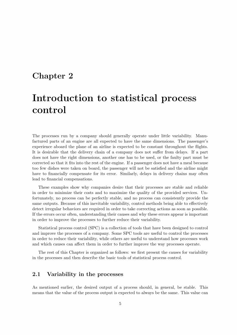
In the simplest case, there are three lines represented on a control chart. The ‘centralline’ (CL) represents the desired value of the quality characteristic when there is no variability.In an ideal world, where the process is not affected by any type of variability, every computedstatistic should fall on this line. As the world is imperfect, the ‘upper control limit’ (UCL) andthe ‘lower control limit’ (LCL) represent the in-control zone in which the process is assumedto operate under acceptable conditions. If one point falls outside these limits, this might bean indication that the process is out-of-control. When the process is determined to be out-of-control, the control chart raises a signal, or an alarm. Figure 3.1 illustrates a traditionalcontrol chart with a central line and upper and lower control limits.
One important assumption with traditional control charts is that the data collected bythe chart at successive samples is assumed to be stationary and uncorrelated. Some controlcharts are able to deal with autocorrelated data but will not be discussed here.
The samples taken at regular time intervals are central to control charts, and, as such,deserve some thinking. There exist typically two different sampling schemes. The first oneis called ‘snapshot sampling’, and consists in constructing each sample by taking outputs ofthe process that occurred at the same time, or as temporally close as possible. This samplingscheme gives, in a way, an instant picture of the process, hence its name. The problem withsuch an approach is that, if the process goes out-of-control and then returns to an in-controlstate between two samples, then the assignable cause will most likely not be detected. Thesecond sampling scheme, called ‘random sample’, is meant to detect such causes and consists intaking samples from the process over the entire sampling interval. However, random samplinggenerally increases the absolute values of the control limits, and detecting assignable causesmight become more difficult.
It is clear that one must be vigilant when taking samples. The way the process is sampledcan totally prevent the chart from detecting out-of-control behaviors, if the sampling schemehas not been thought carefully and if the characteristics of the process are not factored in.The concept of rational subgrouping (Montgomery, 2007) defines how a good sampling schemeshould behave. According to rational subgrouping, the samples should be taken in such away that the probability of assignable causes occurring between samples is maximized, whilethe probability of the same causes occurring within samples is minimized. Following thisprinciple to the letter would imply that snapshot sampling is the best sampling scheme, and
16
3.1. PRELIMINARIES
Sample or time
Computedstatistic
CL
UCL
LCL
Figure 3.1: Example of a traditional control chart.
that changing the sampling interval is the best way to deal with assignable causes that canhappen and then disappear between two consecutive samples.
3.1.2 A more detailed description of control charts mechanisms
In this section, we give a more formal and detailed description of how control charts actuallywork.
Assume an operator is controlling some quality characteristic x, i.e. some measure of theoutput of a process P, which is represented by a real number. Let C be a control chart usedby the operator to control if the values x remain in an acceptable range during the courseof the operations. The operator should proceed sequentially in order to utilize the controlchart1.
1. Increment the sampling counter i by 1.
2. From now on, add to the sample xi any observation xij of the quality characteristicmeasured from the output of the process, until the size of xi reaches n. In the end,the set xi is composed of n real valued numbers such that xi = (xi1, xi2, . . . , xin). Notethat the outputs should ideally be produced exactly at the same time, but, as it is mostlikely practically impossible, measures of consecutive outputs of the process may beadded to the sample and will be treated as if they had been generated simultaneouslyby the process.
3. Compute a statistic yi, which depends on the type of control chart, according to thefunction yi = fC (xi). A statistic is a number computed from a sample that synthesizesone or several characteristics of a given sample (Coladarci et al., 2010).
1We suppose here that the snapshot sampling scheme is used.
17

CHAPTER 3. CONTROL CHARTS
1. Take a sample2. Compute statistic
from sample3. Plot point on chart4. If required,
raise an alarm
h
Repeat steps 1 to 4
time
...
h
Figure 3.2: How does a control chart work ?
4. Plot the point (i; yi) on the control chart.
5. Raise a signal if yi ≥ UCL or yi ≤ LCL.
6. Wait some time and go back to step 1. The time difference between two steps 1 mustbe h, where h is usually called the sampling interval.
This sequential procedure is summarized in four steps in Figure 3.2. From its definition,we see directly that control charts are tools that are quite simple to use. However, theirbehavior is controlled by four main parameters whose values must be carefully chosen inorder to maximize the efficiency of the chart. These parameters are the sample size n, thesampling interval h, and the position of the control limits UCL and LCL. The values given tothe parameters influence differently the behavior of the control chart. For example, a largersample size generally makes it easier to detect small deviations.
The exact mechanisms of control charts depend on the existence of the control and warninglimits (see Section 3.1.4), and vary from one control chart to another. The function fC isusually fixed for a given control chart, and we discuss in Chapter 4 how the parameters canbe determined in order to maximize the chart efficiency.
3.1.3 Performance analysis of control charts
An interesting parallel can be drawn between control charts and hypothesis testing. Actually,the control chart can be seen as a test of the hypothesis that the process is in an in-controlstate. The null hypothesis H0 of a potential hypothesis test would be ‘the process is in-control’, while the alternative hypothesis H1 would be ‘the process is out-of-control’. If, fromthe analysis of the control chart, one concludes that the process is in-control, this is equivalentto failing to reject the null hypothesis. On the other hand, if the analysis of the control chartindicates that the process is out-of-control, this is equivalent, in terms of hypothesis testing,to rejecting the null hypothesis, and thus accepting the alternative hypothesis.
The parallel with hypothesis testing is useful for characterizing the performances of acontrol chart in terms of type I and type II errors. Indeed, concluding that the process is out-of-control, while it is actually in-control, is equivalent to a type I error in the hypothesis testingframework. Similarly, failing to detect that the process is actually out-of-control correspondsto a type II error. The type I and type II error probabilities, respectively denoted α and β,
18

3.1. PRELIMINARIES
are thus natural measures of the performances of control charts. These measures give insightabout how reliable the control chart is.
Another traditional measure to evaluate the performances of control charts is to use theconcept of average run length (ARL). The ARL represents the average number of samplesafter which a signal will be raised by the control chart. The average run length is computeddifferently depending on whether we want the in-control ARL, denoted ARLic, or the out-of-control ARL, ARLoc. The ARL values are given by
ARLic =1
α, (3.1)
ARLoc =1
1− β, (3.2)
where α and β represent the type I and type II errors, respectively. ARLic represents theaverage number of samples after which a signal will be raised by the chart, even though theprocess is in-control. ARLic thus indicates the average number of samples before a false alarm.A good control chart design will seek to maximize the value of ARLic in order to minimizethe number of false alarms. On the other hand, the ARLoc represents the average number ofsamples before a signal is raised by the chart when the process is out-of-control. In this case,a good design will try to minimize the value of ARLoc in such a way that assignable causesare detected as quickly as possible.
The ARL is expressed in number of samples. Comparing two control charts, or differentdesigns of a single control chart, with ARL makes no sense if their sampling intervals aredifferent. The average time to signal (ATS) is a measure that expresses the average amountof time after which a signal will be raised by the chart. The ATS, both for IC and OC states,can be computed from the ARL. It has a similar interpretation, and allows to compare chartshaving different sampling intervals. The ATS is given by
ATS = ARL× h. (3.3)
In a slightly different way, the performances of control charts can also be assessed inmonetary terms. Indeed, costs can usually be associated with most aspects of the process.For example, a cost can be defined when the process operates in the in-control and out-of-control states, the latter one being generally larger. Similarly, operations of investigatingalarms, be they legitimate or not, can be priced by the company. Because the cost is whatobviously matters most to the companies, the expected cost of operating the process is anothergood way to measure the performance of a control chart.
3.1.4 Refinements in control charts
In the beginning of this chapter, we have described how traditional control charts work. Otherrefinements can be implemented in order to better take into account the problem of interest.Some of them are discussed below.
19

CHAPTER 3. CONTROL CHARTS
One control limit
When a process deviates from its in-control values, there are two possible directions: thecontrolled quality characteristic can drift either to smaller or larger values. In cases wheredeviations are possible in one direction only or where one direction only is of interest, onepossible refinement is to use one control limit, instead of two. Then, only deviations in thegiven direction can be detected. This refinement makes the control chart easier to implementand to analyze since irrelevant items are removed from it.
Warning control limits
Rather than removing control limits as in the previous case, another possible refinementwould be to add other control limits, called ‘warning control limits’, somewhere between thecentral line and the upper and lower control limits. If one or a series of points fall between thewarning control limits and the outermost limits, the process might be out-of-control. Someactions might then be taken. For example, we could increase the sampling frequency or thesample size to faster collect more information. This type of control limits usually increasesthe sensitivity of the chart, i.e. the warning limits allow the control chart to signal an out-of-control state more quickly. This is achieved at the expense of an increase in the numberof false alarms. Another disadvantage of this type of chart is the increased effort required forits design since other control limits need to be determined.
Pattern analysis
Raising a signal when a point falls outside the control limits might not be enough to reducethe variability. Patterns in the plotted points are usually the sign that something goes wrongand should be corrected. The problem is then to recognize those interesting patterns that,when removed, would reduce the variability of the process. This is now a pattern recognitionproblem. Several rules of thumb were developed to take the patterns of the points in controlcharts into account. For example, two possible rules might be ‘eight successive points fallabove (or below) the central line’, and ‘a sequence of six points monotonically increasing (ordecreasing)’ (Montgomery, 2007).
Combining sensitizing rules
Traditionally, a signal is raised when one or more points fall outside the control limits UCL andLCL. The other rules using warning control limits and patter analysis are meant to boost thesensitivity of the chart so that the operators can react more quickly to an assignable causethat changed the process distribution. Another possible refinement is to combine severalsensitizing rules, as those described previously. Combining different sensitizing rules usuallydecreases the type II error, but, on the contrary, increases the type I error. These rulesmust therefore be used with caution to avoid degrading the performances of the chart by anexcessively high sensitivity. Furthermore, the combination of several rules generally makesthe chart harder to use, understand and analyze.
20

3.2. PARAMETRIC CONTROL CHARTS
3.2 Parametric control charts
We present in this section some control charts used to control the mean of a process and itsvariability around the mean. Usually, a control chart used to control the mean is associatedwith a control chart for the variability around the mean in order to detect different types ofassignable causes. We will present both types here, although only the chart for the mean willbe considered in the rest of this report.
The term parametric indicates that these control charts make assumptions on the dis-tribution that generates the data, i.e. the distribution of the quality characteristic. Theseassumptions usually ease the design of the chart, but may be wrong in some circumstances.We will see in the next section how this type of assumption can be avoided.
3.2.1 The x chart: a control chart for the mean
The ‘x control chart’ is a control chart that is traditionally used to control the mean ofa process. The x chart keeps track, in a sense, of the variability of the process betweenconsecutive samples, i.e. the variability of the process in the long term. It assumes that thequality characteristic whose mean we want to control is distributed according to a normaldistribution with mean µic and standard deviation σic. Let (xi1, xi2, . . . , xin) be the ith sampleof size n, then the statistic is computed according to
yi = fC (xi) = xi =xi1 + xi2 + . . . + xin
n, (3.4)
which is distributed according to a normal distribution of mean µic and standard deviationσics = σic√
n(Montgomery, 2007). This is convenient since it permits to derive theoretically the
value of α, corresponding to the type I error probability, for a given sample size n and givencontrol limits UCL and LCL :
α =1
2
[
1 + erf
(
LCL− µic
σics
√2
)]
+1
2
[
1− erf
(
UCL− µic
σics
√2
)]
, (3.5)
where this expression uses the cumulative distribution function of the normal distribution tocompute α.
The probability of type II errors can similarly be derived theoretically provided that theout-of-control mean µoc and standard deviation σoc are known, and that this OC state isunique. This means that, when the process goes out-of-control, the quality characteristic isdistributed according to a normal distribution with mean µoc and standard deviation σoc.Under this assumption, the type II error for a given sample size n and given control limitsUCL and LCL is :
β =1
2
[
1 + erf
(
UCL− µoc
σocs
√2
)]
− 1
2
[
1 + erf
(
LCL− µoc
σocs
√2
)]
, (3.6)
where σocs = σoc√
nis the standard deviation of a sample of size n drawn from a normal distri-
bution of standard deviation σoc.
21

CHAPTER 3. CONTROL CHARTS
3.2.2 The R chart: a control chart for the variability
The ‘R control chart’ is used to control the variability range of the quality characteristic.Unlike the x chart, the R chart watches the variability of the process in a given sample,i.e. its role is to evaluate the instantaneous variability of the process. Given a samplexi = (xi1, xi2, . . . , xin), the statistic of the R chart is computed as follows
yi = fC (xi) = Ri = maxj
xij −minj
xij, (3.7)
where Ri is called the range of the sample. The values of the mean and of the standarddeviation of the statistic R have been well known for a long time. Assuming that all xij areindependent identically distributed random variables, and that their cumulative distributionfunction is F (x), it can be shown that the mean and the variance of R for a sample of size nis given by:
µR =
∫ +∞
−∞
[
1− F(
x′)n −
(
1− F(
x′))n]
dx′, (3.8)
σ2R =
∫ +∞
−∞
∫ x′
n
−∞
[
1− F(
x′n)n −
(
1− F(
x′1))n −
(
F(
x′n)
− F(
x′1))n]
dx′1dx′n − µ2
R, (3.9)
where R = x′n − x′1, i.e. x′n represents the largest variable in the sample and x′1 the small-est (Tippett, 1925; Mardia, 1965). These equations are somewhat complicated, but someauthors tabulated the values of µR and σ2
R for several distributions and several values of n,see for example the work of Tippett (1925) or Montgomery (2007). Of course, computing thevalues of these integrals is no longer a major difficulty with modern computers.
Similarly to the x chart, these values can be used to determine the CL, LCL and UCL forthe R chart. One important difference is that, in this case, the distribution of the statistic R isnot normal, even if the x’s are normally distributed (Montgomery, 2007). The computed limitsare thus approximations of the real limits, and the practical results will reveal discrepancieswith the theory.
3.3 Nonparametric control charts
The basic assumption of the x chart is that the distribution of the quality characteristic isnormal. If we have evidence that this is not the case, and if the real distribution is known, itis possible to derive the x and R charts for the new distribution in the same way as for thenormal distribution. However, when the real distribution is unknown, or when it is simplytoo difficult to derive the optimal values for the control limits, it might be preferable to usenonparametric control charts (Woodall, 2000). Some practitioners think that the central limittheorem renders the development of nonparametric charts groundless (Chakraborti et al.,2001). However, this is not true for control charts based on non-average values, and for thosecharts that are used with samples of size one.
Nonparametric charts are formally defined as those control charts for which the distribu-tion of the run length when the process is in-control is the same, whatever the continuousdistribution of the quality characteristic (Chakraborti et al., 2001). Nonparametric charts,
22

3.3. NONPARAMETRIC CONTROL CHARTS
also called distribution-free charts, generally make weaker probabilistic assumptions aboutthe distribution of the quality characteristic than parametric charts. For example, no specialshape is assumed, but some properties, like symmetry of the distribution, may be required.Furthermore, nonparametric charts may control a different statistic than traditional charts.They are traditionally used to control the median or another percentile of the distribution.One advantage of using the median as statistic of a sample is that it is always defined for anydistribution, unlike the mean (Gibbons and Chakraborti, 2011).
In the remainder of the section, we will describe two famous nonparametric charts thatcan favorably replace parametric charts in some situations. Note that we consider here non-parametric charts that have control limits in only one direction, the upper direction, and thatwe denote by k the upper control limit, instead of UCL.
3.3.1 The SN chart
The ‘SN chart’ is based on the sign test, which is probably the simplest of nonparametric tests(Gibbons and Chakraborti, 2011). This test can be used to check statistical hypotheses aboutany quantile, and in particular the median, of any continuous distribution (Chakraborti et al.,2001). This test has a large variety of applications since it may be applied even if thedistribution is not symmetric.
Presentation of the statistic
In the case of the median, the statistic of the SN chart is computed as follows
yi = fC (xi) = SNθici =
n∑
j=1
sign (xij − θic) , (3.10)
where θic is the in-control median of the quality characteristic, and sign(·) is the sign functionthat returns -1, 0, or 1, when its argument is stricly less, equal, or greater than 0, respectively.If any other quantile other than the median is to be controlled, the value of θic has to bechanged in this formula for the in-control value of the quantile of interest.
Distribution of the statistic
There exists a relationship between the sign statistic SNθici and the ‘traditional’ sign statistic
defined by Kθici =
∑nj=1 1R+
0(xij − θic), where 1
R+0(·) is an indicator function that returns 1
if its argument is strictly positive, and 0 otherwise. The SNθici and Kθic
i statistics obey thefollowing linear relation
2Kθici = SNθic
i + n, (3.11)
that permits to compute the distribution of SNθici from that of Kθic
i . When the process is
in-control, the statistic Kθici is distributed according to a binomial distribution B (n, 0.5) so
that
PK
θici
[z| IC] =(
nz
)
(0.5)z(0.5)n−z , (3.12)
23

CHAPTER 3. CONTROL CHARTS
where PK
θici
[z| IC] represents the probability of Kθici being equal to z when the process is
in-control.
When the process is in-control, the distribution of the statistic SNθici to control the median
can be computed from (3.12). It is given by
PSN
θici
[z| IC] = PK
θici
[
z + n
2
∣
∣
∣
∣
IC
]
=n!
(
n+z2
)
!(
n−z2
)
!(0.5)(
n+z2 ) (0.5)(
n−z2 ) , (3.13)
where Equation (3.13) is valid as long as both n and z have the same parity. Note that, dueto the definition of SN, the distribution (3.13) is valid for any statistic SNθ′
i as long as themedian of the distribution of the observations xij is θ
′. In particular, this is true for θoc suchthat P
SNθici
[z| IC] = PSNθoc
i[z|OC].
Note that this distribution is correct as long as the probability of having a xij being exactlyequal to the median is null. In theory, this is a valid assumption for continuous distributions,but it might not be true in practical applications. In this case, some workarounds need to befound to ensure that the distribution is still valid, even if some values in the sample are equalto the median. Such strategies are not described here, but some of them can be found in thebook of Gibbons and Chakraborti (2011).
Type I and type II error probabilities
The probability of type I errors of the sign statistic SNθici for a control limit k can finally be
obtained by summing over the possible values that SNθici can take:
α =
n∑
z=k
PSN
θici
[z| IC] , (3.14)
where the sum is done over all z that have the same parity as n.
The type II error probability is unfortunately a bit more complicated to compute. Moreon this matter can be found in Section 5.1.
3.3.2 The SR chart
The ‘SR chart’ is based on the so-called Wilcoxon signed-rank statistic and is used to detectdrifts of a given location parameter, for instance the median or another quantile, from itsin-control value (Gibbons and Chakraborti, 2011). Unlike the SN chart, SR charts requirethat the distribution of the quality characteristic be symmetric.
Presentation of the statistic
When we are interested in controlling the deviations of the quality characteristic from itsmedian θic, the statistic of the SR chart (Chakraborti et al., 2011), called the Wilcoxon signed-
24

3.3. NONPARAMETRIC CONTROL CHARTS
rank statistic, is given by
yi = fC (xi) = SRθici =
n∑
j=1
sign (xij − θic)Rij, (3.15)
where Rij is the rank of xij − θic when the set (|xi1 − θic|, |xi1 − θic|, . . . , |xin − θic|) is sortedin ascending order. Similarly to the SN chart, we assume all xij to be different from themedian θic.
Distribution of the statistic
As for the SN chart, the SRθici statistic depends linearly on the simpler statistic Wθic
i =∑n
j=1 1R+0(xij − θic)Rij through the relation
SRθici = 2Wθic
i − n(n+ 1)
2, (3.16)
see (Chakraborti et al., 2011). When the process is in-control, the statistic Wθici is distributed
according to a recursively determinable probability distribution given by
PW
θici
[z| IC] = un(z)
2n, (3.17)
where un(z) represents the number of vectors c composed of zeros and ones such that the dotproduct of c with the vector composed of the integers {1, . . . , n} is equal to z (Wilcoxon et al.,1970; Gibbons and Chakraborti, 2011). The value of un(z) can be obtained through therecursive formula
un(z) = un−1(z − n) + un−1(z), (3.18)
which can be initialized for n = 2 with u2(0) = u2(1) = u2(2) = u2(3) = 1.
In the end, the probability distribution of SRθici can be found from that of Wθic
i with asimple transformation
PSR
θici
[z| IC] = PW
θici
[
z
2+
n(n+ 1)
4
∣
∣
∣
∣
IC
]
. (3.19)
Note that, due to the definition of the Wilcoxon signed rank statistic, the distribution (3.19)is valid for any SRθ′
i as long as the median of the symmetric distribution of the observationsxij is θ′. In particular, this is true for θoc such that P
SRθici
[z| IC] = PSRθoc
i[z|OC].
Type I and type II error probabilities
The probability of type I errors for a control limit k is given by
α =
n(n+1)2∑
z=k
PSR
θici
[z| IC] , (3.20)
where the sum is done over the z having the same parity as n(n+1)2 .
The type II error probability is slightly more complicated to compute. We refer the readerto Section 5.1 for more information on this issue.
25

CHAPTER 3. CONTROL CHARTS
26

Chapter 4
Designing control charts
In this chapter, we describe some methods that can be used to determine all the parameterswhose values must be known in order to practically implement a control chart. Among theseparameters, there are characteristics of the distribution of the quality characteristic, as wellas the three fundamental parameters of the control charts: the sample size, the samplinginterval and the control limit. We first explain in Section 4.1 how some characteristics ofthe distribution of the quality characteristic, such as the mean, the standard deviation andthe median, can be estimated from the process when they are unknown. Section 4.2 thendescribes the most common methods that are used to determine the sample size, the samplinginterval and the control limits for a given control chart.
Note that, from now on, we will only consider control charts for the mean or the medianwith one control limit only, the upper control limit, denoted by k in the remainder of thedocument. Indeed, we will assume that deviations of the quality characteristic towards largervalues are the only deviations that are harmful to the process.
4.1 Characteristics of the distribution of the quality charac-
teristic
In general, the mean µ, the standard deviation σ and the median θ, describing the distributionof the quality characteristic, are unknown. However, these characteristics must usually beknown in advance in order to determine the parameters k, n and h for a given control chart.In that case, only estimated values µ, σ and θ can be used to implement the chart. Typically,the procedure to estimate those parameters is to collect a certain number m of samples, eachcontaining nmeasures of the quality characteristic, and to infer estimates of the characteristicsfrom the collected data. This is usually done during a so-called phase I, whose goal is tofirst bring the process in-control and to estimate µ, σ and θ. The theory of estimation instatistics provides the useful tools to find µ, σ and θ. The estimators of the mean and of thestandard deviation are used in both x and R charts. As for the median, it is mainly used innonparametric charts such as the SN and the SR chart.
27

CHAPTER 4. DESIGNING CONTROL CHARTS
An estimator of the mean can be obtained by taking the empirical average of the empiricalaverages of each sample, i.e.
µ =x1 + x2 + . . .+ xm
m, (4.1)
with
xi =xi1 + xi2 + . . .+ xin
n. (4.2)
The estimator σ of the standard deviation is only slightly more tedious to compute:
σ =s1 + s2 + . . .+ sm
m
(
√
2
n− 1
Γ(
n2
)
Γ(
n−12
)
)−1
, (4.3)
with
si =
√
∑nj=1 (xij − xi)
2
n− 1, (4.4)
where the si represent the biased estimators of the standard deviations of each sample, andthe second factor of Equation (4.3) is a correction factor.
The median θ is the last characteristic of the distribution that we may want to approximate.The median estimator is obtained directly by taking the mean over the samples of the medianscomputed for each sample, i.e.
θ =θ′1 + θ′2 + . . . + θ′m
m, (4.5)
where
θ′i = median (xi1 + xi2 + . . . + xin) . (4.6)
Generally, the number m of samples used to estimate the parameters of the distribution isaround 20 to 25, and the number n of measures in each sample is small, often of the order of5 (Montgomery, 2007). These formulas can be used during the phase I to find an estimate ofthe characteristics of the distribution of the quality characteristic of interest. It is to be notedthat, though standard values might seem preferable to estimated ones, standard values mustbe used with caution, since there is no guarantee that the standard values actually reflect thein-control state of the process.
4.2 Determining the main parameters of the control chart
Once the mean, the standard deviation and the median of the distribution of the qualitycharacteristic are known, we can start looking into the problem of determining the valuesof the parameters k, n and h. A meaningful solution to this matter is usually impossible
28

4.2. DETERMINING THE MAIN PARAMETERS OF THE CONTROL CHART
to find without additional information about the distribution of the quality characteristic,such as its shape, as well as economic information about the process itself (Montgomery,2007). We present here two methods, namely the heuristic method and the statistical designmethod, that only exploit information from the distribution of the quality characteristic. Theother two described methods, namely economic and economic statistical design, make use ofeconomic information as well.
Since the focus of this report is the control of the mean/median of the process, we willfocus on these aspects in the design of the control charts, and will thus omit the detailsregarding the R charts and related.
Note that three of the methods that we describe will exhibit a direct dependence on theprobabilities of type I and type II errors, respectively denoted α and β. These probabilitiesdepend themselves on the parameters (k, n, h) of the chart. We will emphasize this dependencyby writing α(k, n, h) and β(k, n, h). Even if the probabilities of type I and type II errors ofthe studied control charts do not depend on the sampling interval h, it might be that theydepend on it for some other charts. For this reason, we explicitly allow α and β to dependon the three design parameters.
4.2.1 Heuristics
The historically first, simplest, and easiest way to determine the values of the parameters k,n and h is to use heuristic methods that have proved to work acceptably well in practice.These heuristics were first proposed by Shewhart (1931) for the x chart and are describedhere in this context. They consist mainly in using rules of thumb to determine the values ofthe parameters.
The x chart is meant to detect relatively large shifts in the process mean. In that case,rather small sample sizes of the order of n = 5 usually produce good results. When the shiftsto detect are smaller, larger samples sizes are required, and the number of observations in eachsample might be increased to n = 15 or 25, and even more (Montgomery, 2007). Choosing hand n is typically a problem of effort allocation. Indeed, the company usually has a limitedamount of resources that it is willing to devote to the sampling procedure. The two possiblechoices are either to take often small samples, or to take less larger samples. There is no apriori best decision, but the current practice in industry is biased towards smaller samplestaken at shorter time intervals (Montgomery, 2007). The final decision will also depend onthe process itself. For example, if the process produces many units per hour, it might bebetter to take samples very often. Indeed, if the sampling interval is too long, the processwill produce many defective products before the shift is detected.
With regard to the control limits, a common practice in the design of x charts is to use 3-sigma limits that consist in placing the control limits 3σs away from the center line. The valueof k is thus given by k = CL + 3σs. Note that ‘sigma’ here refers to the standard deviationof the statistic σs = σ√
n, and not to the standard deviation σ of the quality characteristic.
Multiplying the standard deviation by 3 is the standard design choice, but other multiplierscan be used if additional information is available. For example, if we know that false alarmsare really expensive to investigate, the designer might choose to push forward the limits andto place the control limit at 3.5-sigma instead. Similarly, if the search for assignable causes is
29

CHAPTER 4. DESIGNING CONTROL CHARTS
very cheap, it might be better to carry out a lot of them so that the process remains out-of-control as short a time period as possible. This might result in narrower control limits placedat 2.5-sigma, for example.
When the control limits are computed by adding to the center line a multiple of thestandard deviation of the sample, the limits are called r-sigma limits. Another way to specifythe limits, which in this case are called probability limits, is to choose a multiplier that inducesa given probability of type I errors. In this case, the type I error probability, i.e. the valueof α, is specified, and the value of r is then calculated to achieve the desired type I errorprobability. Note that, when there are both UCL and LCL, the traditional 3-sigma limitsinduce a probability of type I error of 0.0027, which has to be compared with the traditionalα = 0.002 that the advocates of the probability limits use. The difference between bothapproaches is thus rather tiny.
Note that both the sigma and the probability limits are computed with the underlyingassumption that the distribution of the quality characteristic follows a normal distribution.If it is not the case, the computed limits do not offer any guarantees on the probabilities oftype I and type II errors.
4.2.2 Economic design
The economic design approach dates back to the 1950s (Duncan, 1956). The method consistsin finding the main parameters of the chart (k, n, h) such that the expected cost of operatingthe process is minimized. We will describe here the cost model of Duncan (1956). Other costfunctions have later been developed, see e.g. the survey papers of Montgomery (1980) andVance (1983), but their thorough description is beyond the scope of this report.
Duncan’s model is based on the assumption that we can, in some way or another, pricedifferent aspects of the process, such as the cost per time unit of operating in-control, thecost per time unit of being out-of-control, and the cost of evaluating true and false alarms.In his framework, Duncan models the expected cost of operating the process per time unit.This cost per time unit is obtained by dividing the expected cost of a cycle by the expectedcycle time. In this context, a cycle is defined by four periods of time, which are: (1) the in-control period, (2) the time to signal the assignable cause, (3) the time to take and examinea sample, and (4) the time to identify and correct the assignable cause. The different periodsare illustrated in the Figure 4.1. An additional assumption of this model is that no assignablecause can occur during the sampling process.
When the process is first assumed to be in-control, the expected cycle time Texp(k, n, h) iscomposed of four components.
1. The mean time before an assignable cause occurs. The assignable causes are assumedto follow a Poisson process, and the time difference between two causes thus follows anexponential distribution of mean 1
λ , the mean time before an assignable cause is thus 1λ .
2. The adjusted average time to signal (AATS) (Faraz et al., 2013) is the expected amountof time between the occurrence of an assignable cause and a signal raised by the controlchart. It is composed of two components:
30

4.2. DETERMINING THE MAIN PARAMETERS OF THE CONTROL CHART
0 1 2 j j + 1 j + d
In-control Out-of-control
h τ nE TAATS
Figure 4.1: Expected cycle time Texp(k, n, h) and its components for the economic design ofcontrol charts.
(a) the expected time between the occurrence of an assignable cause and the next
sample, which is given by h − τ(h), where τ(h) = 1−exp(−λh)(1+λh)λ(1−exp(−λh)) is the average
amount of time after which an assignable cause occurs given that it occurs betweensamples j and j + 1;
(b) the expected amount of time, from the first sample after the occurrence of thecause, required by the chart to signal an out-of-control state, which is given byh (ARLoc(k, n, h) − 1) where ARLoc(k, n, h) =
11−β(k,n,h) .
3. The expected time to take a sample of n measurements and to interpret the results.The expected time to take and analyze one observation is denoted E, and the totalexpected time for the entirety of a sample of size n is thus nE.
4. The expected time to identify and correct the assignable cause, denoted by T .
In the end, the expected cycle time is given by
Texp(k, n, h) =1
λ+ h− τ(h) + h (ARLoc(k, n, h) − 1) + nE + T,
=1
λ− τ(h) + hARLoc(k, n, h) + nE + T,
=1
λ− τ(h) +
h
1− β(k, n, h)+ nE + T. (4.7)
Duncan’s model finds the optimal values of the parameters by minimizing the expectedcost per time unit of operating the process. We thus still need to compute the estimated costof the cycle. The expected cost Qexp(k, n, h) of the cycle is composed of three terms.
1. The expected cost of operating the process, when it is both in-control and out-of-control.This cost is given by C0
λ + C1 (hARLoc(k, n, h) − τ(h) + nE + T ), where C0 representsthe cost per time unit when the process is in-control, and C1 denotes the cost per unitof time when the process is out-of-control.
2. The expected cost of investigating both true and false alarms. This cost is given byWα(k, n, h) exp(−λh)
1−exp(−λh)+Y , whereW is the cost of investigating false alarms, α(k, n, h) isthe type I error probability, and Y is the cost of investigating a true alarm and repairingthe process.
31

CHAPTER 4. DESIGNING CONTROL CHARTS
3. The expected cost of sampling per cycle. This cost is given by
S
hTexp(k, n, h) =
S
h
(
1
λ− τ(h) +
h
1− β(k, n, h)+ nE + T
)
,
where S denotes the sampling cost per sample.
When all the terms are put together, the expected cost of a cycle is given by
Qexp(k, n, h) =C0
λ+ C1 (hARLoc(k, n, h)− τ(h) + nE + T )
+Wα(k, n, h)exp (−λh)
1 − exp (−λh)+ Y
+S
h
(
1
λ− τ(h) +
h
1− β(k, n, h)+ nE + T
)
, (4.8)
and the expected cost per time unit Cexp(k, n, h) is finally obtained by dividing the cost of acycle by the expected duration of the cycle
Cexp(k, n, h) =Qexp(k, n, h)
Texp(k, n, h). (4.9)
Economic design consists now in finding the values of the parameters (k∗, n∗, h∗) thatminimize the expected cost per time unit Cexp(k, n, h). This can be done by formulatingan optimization problem to minimize the nonlinear mixed-integer cost function Cexp(k, n, h).The optimization problem is as follows:
(k∗, n∗, h∗) = arg mink,n,h
Cexp(k, n, h) (4.10)
subject to h > nE,
k > 0,
n ∈ N+0 ,
h > 0,
where the constraint h > nE is added to make sure that the sampling interval is not shorterthan the amount of time needed to actually take and analyze a sample.
This optimization problem is rather hard to solve because it is both nonlinear and mixed-integer. We cannot expect to always find the infimum of the function. However, a localminimum will in general suffice.
4.2.3 Statistical design
Statistical design is a method that has been created to alleviate some of the identified problemsof economic design that was depicted in the previous section. Woodall (1985) identified twomajor problems of economic design. First, Woodall (1985) argues that the values of theparameters obtained through economic design are very sensitive to the shift in the mean.If the shift that actually occurs when the process goes out-of-control is a bit far from the
32
4.2. DETERMINING THE MAIN PARAMETERS OF THE CONTROL CHART
expected shift, the design parameters might not be optimal at all. Secondly, economic designconsiders only false alarms through their total cost which is summed to other costs, and thus,in a sense, averaged. This can result in a very small ARLic, and thus in an unreasonablenumber of false alarms, that induces more variability and reduces the faith in the controlprocedure (Woodall, 1985).
Woodall (1985) proposed a new design method, called ‘statistical design’, that is based onthe fact that the in-control ARL should ideally be lower bounded by some value, say Lic, andthat, similarly, the out-of-control ARL should be upper bounded by Loc. In mathematicalterms, these conditions are expressed as
ARLic(k, n, h) ≥ Lic, (4.11)
ARLoc(k, n, h) ≤ Loc. (4.12)
Because of the existing relationship between average run length and type I and type II errorprobabilities, the bounds (4.11) and (4.12) can be reformulated as
α(k, n, h) ≤ α0 =1
Lic, (4.13)
β(k, n, h) ≤ β0 = 1− 1
Loc. (4.14)
This last formulation highlights the fact that these bounds are heavily dependent on the(assumed) distribution of the quality characteristic. One must thus be careful when usingsuch design criteria because a mistake in the assumed distribution of the characteristic mayhave a great impact on the performance of the chart.
The previous bounds can usually not be used as is to determine the value of h. A simpleworkaround would consist in adding a constraint of the form
hARLoc(k, n, h) ≤ ATS0, (4.15)
where ATS0 is the desired average time to signal of the chart when the process goes out-of-control.
Designing a control chart according to the statistical design method thus consists in choos-ing appropriate values for k, n, and h, such that the above equations are satisfied.
4.2.4 Economic statistical design
The last design method that we present here combines the ideas of both economic and statis-tical design (Saniga, 1989). Indeed, both methods are not exempt from drawbacks. The flawsof economic design have been identified by Woodall (1985) who acknowledges that statisticaldesign has some shortcomings as well. One of them being that statistical design is not optimalin terms of operating costs (Woodall, 1985).
Saniga (1989) proposed an approach, called ‘economic statistical design’ (ESD), that com-bines the ideas of economic and statistical design in a single method. More specifically,economic statistical design consists in minimizing the expected operating cost per time unit,
33

CHAPTER 4. DESIGNING CONTROL CHARTS
such as in economic design, subject to additional statistical constraints, such as in statisticaldesign. This new problem can be formulated as
(k∗, n∗, h∗) = arg mink,n,h
Cexp(k, n, h) (4.16)
subject to h > nE,
α(k, n, h) ≤ α0,
β(k, n, h) ≤ β0,
k > 0,
n ∈ N+0 ,
h > 0,
which is a nonlinear mixed-integer optimization problem.
The advantage of economic statistical design is that its solution is actually a minimal costsolution for which statistical constraints are indeed satisfied. ESD is thus a method thatyields values of the parameters k, n, and h that are more robust than the previous ones. Theproblem of finding an optimal solution to (4.16) remains, since (4.16) is mixed-integer and,most likely, non-convex.
34

Chapter 5
Economic statistical design of
nonparametric control charts
This chapter focuses on the description of the economic statistical design (ESD) of nonpara-metric control charts, which is the main topic of this report.
Combining ESD and nonparametric charts is not difficult. It suffices to use, in the ESDproblem formulation described in (4.16), the functions α(k, n, h) and β(k, n, h) computing theprobabilities of the type I and type II errors for the nonparametric chart that we are planningto use. The main difficulty consists in determining those α and β functions.
Note that the dependency of α(k, n, h) and β(k, n, h) on the parameters of the chart ismade implicit here by simply writing α and β.
5.1 Simple approach to nonparametric economic statistical
design
We describe now the simple approach that we used to combine economic statistical designand nonparametric charts. The two nonparametric charts that we considered in this workshare the same limitation: it is hard to determine the probability of type II errors for a givencontrol limit. We show in this section how we got round that difficulty.
It is not possible to find exact expressions for both α and β in the case of nonparametriccharts. Indeed, the available in-control and out-of-control distributions characterize differentrandom variables. Furthermore, the simplest change of variables from the space of one randomvariable to the other is not exact and only gives bounds on the statistics. In this work, wecompute explicitly α and we use the variable bounds to show that β can be upper bounded bya function of α. Note that the opposite, i.e. computing exactly the value of β and boundingα, is possible as well.
35

CHAPTER 5. ECONOMIC STATISTICAL DESIGN OF NONPARAMETRIC CHARTS
5.1.1 Type II error probability for the SN chart
In the case of the SN chart, the type I error probability for a given control limit k′ can easilybe computed with Equation (3.14) as
α =n∑
z=k′
PSN
θici
[z| IC] , (5.1)
and the type II error probability corresponding to the same control limit k′ is given by
β =k′−1∑
z=−n
PSN
θici
[z|OC] , (5.2)
where SNθici is the statistic computed with in-control median θic. Unfortunately, the discrete
probability distribution PSN
θici
[z|OC] is unknown, and there is, to our knowledge, no way to
characterize it. This renders Equation (5.2) impossible to use, and other solutions have to befound to compute the β corresponding to control limit k′.
One possible workaround to compute the type II error probability is to use the out-of-control distribution of the statistic SNθoc
i . This distribution is known and is given by
PSNθoc
i[z|OC] =
n!(
n+z2
)
!(
n−z2
)
!(0.5)(
n+z2 ) (0.5)(
n−z2 ) , (5.3)
which is analogous to the probability distribution (3.13) in the in-control case. Using thedistribution (5.3), the type II error probability can be computed for a given control limit k′′
with
β =k′′−1∑
z=−n
PSNθoc
i[z|OC] . (5.4)
The difference between Equations (5.2) and (5.4) is that the distribution in Equation (5.4)is known, and can be computed. However, the problem with using the latter equation isthat it is defined for a random variable, namely SNθoc
i , that is different from the one used in
Equation (5.1), namely SNθici . Because the random variables are different in both equations,
a control limit for SNθici does not correspond to the same control limit for SNθoc
i . In otherwords, a single control limit cannot be used for both Equations (5.1) and (5.4). A possiblesolution to this issue is to find a function T that maps one value of SNθic
i to its correspondingSNθoc
i , i.e.
T(
SNθici
)
= SNθoci . (5.5)
The function T corresponds in a sense to a change of variable that transforms a value fromthe space of SNθic
i into the ‘corresponding’ value in the space of SNθoci . Because control limits
are special values that the statistics can take, the function T can be used on the control limitsas well to map a control limit k in one space to the other. Using this change of variable, the
36

5.1. SIMPLE APPROACH TO NONPARAMETRIC ECONOMIC STATISTICAL DESIGN
type I and type II error probabilities for a given control limit k′ can be written in terms ofknown distributions depending on a single variable, namely k′, such that
α =
n∑
z=k′
PSN
θici
[z| IC] , (5.6)
β =
k′′−1∑
z=−n
PSNθoc
i[z|OC] , (5.7)
where k′′ = T (k′) is the control limit corresponding to k′ in the space of SNθoci .
Unfortunately, it is not possible to find a function that gives precisely SNθoci in terms of
SNθici in general because the mapping depends on the sample and not only on SNθic
i . This isdue to the definition of the SN statistic that transforms the input space of the observationsinto a discrete space where the scale of the data does not play a role anymore. However, it ispossible to find a relation of the form
SNθoci ≤ SNθic
i , (5.8)
indicating that, in the worst case, SNθoci is equal to SNθic
i . The demonstration of this inequalityis given at the end of this section.
Introducing this inequality in the previous equations, we have
β =
k′′−1∑
z=−n
PSNθoc
i[z|OC] ≤
k′−1∑
z=−n
PSNθoc
i[z|OC] , (5.9)
since k′′ ≤ k′, and, given that PSN
θici
[z| IC] = PSNθoc
i[z|OC], we have
k′−1∑
z=−n
PSNθoc
i[z|OC] =
k′−1∑
z=−n
PSN
θici
[z| IC] (5.10)
= 1−n∑
z=k′
PSN
θici
[z| IC] (5.11)
= 1− α, (5.12)
which, when combined with (5.9), gives
β ≤ 1− α. (5.13)
Although we cannot compute the value of β exactly for a given control limit, Equation(5.13) indicates that it is possible to upper bound it by 1 − α. The bound is quite loose,and tighter bounds would of course be preferable. However, this bound is enough to be usedwithin economic statistical design.
Although the demonstration is quite trivial, we now demonstrate why Equation (5.8)always holds. Let (xi1, xi2, . . . , xin) be a random sample drawn from any distribution, and letθic and θoc be two values taken in the space of the observations such that θic ≤ θoc. Remember
37

CHAPTER 5. ECONOMIC STATISTICAL DESIGN OF NONPARAMETRIC CHARTS
that the probability for an observation xij to be equal to either θic or θoc is null. Let us splitthe sample into three subsets: Si, Ii and Gi. These subsets are defined by
Si = {xij | ∀j : xij < θic & xij < θoc} ,Ii = {xij | ∀j : xij > θic & xij < θoc} ,Gi = {xij | ∀j : xij > θic & xij > θoc} .
Then, the statistics SNθici and SNθoc
i are respectively given by
SNθici =
n∑
j=1
sign (xij − θic) = |Gi|+ |Ii| − |Si| , (5.14)
SNθoci =
n∑
j=1
sign (xij − θoc) = |Gi| − |Ii| − |Si| , (5.15)
where the operator |·| represents the cardinality of the set given in argument. IntroducingEquations (5.14) and (5.15) into Equation (5.8) proves the latter directly since the cardinalityof a set is always greater or equal to 0.
If the type II error is deemed more important than the type I error, we can still computeits exact probability and bound the value of α instead, but this requires to use the statisticSNθoc
i instead of SNθici to perform the tests. Actually, this amounts to creating an ‘inverse’
statistical hypothesis test with a null hypothesis being: ‘the process is out-of-control’.
5.1.2 Type II error probability for the SR chart
Similarly to the SN chart, the known in-control and out-of-control distributions of the SRchart characterize different statistics, which are computed differently. For the same reasons,it is not possible to find a single control limit for both α and β depending on the knowndistributions. However, the procedure that we applied for the SN chart can be used for theSR chart as well, to provide upper bounds on β. Applying the same procedure would lead to
α =
n(n+1)2∑
z=k
PSR
θici
[z| IC] , (5.16)
β ≤ 1− α, (5.17)
where k is the control limit. Proving that this is actually true requires the demonstration ofthe following inequality
SRθoci ≤ SRθic
i , (5.18)
that must hold for any random sample. The demonstration is as follows.
38

5.2. POSSIBLE IMPROVEMENTS OF THE METHOD
Let (xi1, xi2, . . . , xin) be a random sample drawn from any distribution, and let θic and θocbe two values taken in the space of the observations such that θic ≤ θoc. Remember that
SRθici =
n∑
j=1
sign (xij − θic)Rθicij , (5.19)
SRθoci =
n∑
j=1
sign (xij − θoc)Rθocij , (5.20)
where Rθicij and Rθoc
ij represent the ranks of the absolute values of the differences xij − θic andxij − θoc respectively. We now show that, for every term in the sums above, the following
relation holds : sign (xij − θoc)Rθocij ≤ sign (xij − θic)R
θicij . Indeed, three situations can be
encountered:
1. if xij < θic, then sign (xij − θic) = sign (xij − θoc) = −1, and Rθicij ≤ Rθoc
ij since|xij − θic| ≤ |xij − θoc|;
2. if xij > θoc, then sign (xij − θic) = sign (xij − θoc) = 1, andRθicij ≥ Rθoc
ij since |xij − θic| ≥|xij − θoc| ;
3. if θic < xij < θoc, then sign (xij − θic) = 1 and sign (xij − θoc) = −1, while the ranksremain positive.
Note that in the third case, the ranks of the observations can either increase or decrease.If the rank increases, then it means that the rank of one observation xij > θoc decreases.Likewise, if the rank decreases, then the rank of an observation belonging to the first casexij < θic increases.
In any case, all the terms in the sums obey the relation
sign (xij − θoc)Rθocij ≤ sign (xij − θic)R
θicij ,
thus proving Equation 5.18.
5.2 Possible improvements of the method
The main drawback of the approach proposed in the previous section is that the bound givenfor β is quite loose. Therefore, the statistical guarantees that we have on the probability oftype II errors are not very strong. Another consequence is that the expected cost is somewhatoverestimated and will not reflect the true cost faced during the operation of the process.
One possible improvement would be to determine the exact distribution of the statistic
SNθici when the process is out-of-control, i.e. the distribution P
[
SNθici = z
∣
∣
∣OC]
, but we do not
know whether this is even feasible. Possible solutions could use parameterized distributions,such as the normal one, to characterize the out-of-control distribution of the statistic, but thenonparametric aspect of the procedure would be lost.
Another possible improvement over our procedure could be to compute two different con-trol limits kic and koc, one for each statistic. Then, both statistics could be computed for
39

CHAPTER 5. ECONOMIC STATISTICAL DESIGN OF NONPARAMETRIC CHARTS
each sample and compared to their respective control limit:
SNθici
?≥ kic,
SNθoci
?≥ koc,
where the first and second tests ensure independently bounds on the probabilities of type Iand type II errors, respectively.
If the answer to both inequalities is yes, then there is strong evidence that the process isout-of-control. If both answers are no, then the process might be considered as in-control.The problematic situation arises when the tests disagree. If the first test indicates that theprocess is out-of-control, and the second one says that it is in-control, the final decision thatshould be taken is not clear. The problem then would be to find a single rule that combinesthe outputs of both tests such that their statistical guarantees are maintained.
40
Chapter 6
Experiments
The purpose of this chapter is to present the experiments that we performed to compareparametric and nonparametric charts in the framework of economic statistical design. Wefirst present the methodology of the experimental procedure in Section 6.1. Some importantresults are then reported in Section 6.2, which are then finally discussed in Section 6.3.
6.1 Methodology and practical implementation details
In order to compare parametric and nonparametric economic statistical designs, we adopt thefollowing framework.
1. Choose one control chart.
2. Choose one experimental configuration, i.e. a distribution type for the quality charac-teristic, and the values of the parameters of this distribution for both in-control andout-of-control states. The parameters values are chosen in such a way that the OCdistribution has a larger mean and median than the IC distribution.
3. Determine (by a closed form equation or through phase I estimation) the mean, standarddeviation and median of the chosen IC and OC distributions.
4. Create the ESD problem by using the α and β functions corresponding to the chosencontrol chart and the estimated/computed mean, standard deviation and median of theIC and OC distributions.
5. Solve the ESD problem, and find the optimal values (k∗, n∗, h∗).
6. Implement the chosen control chart with (k∗, n∗, h∗).
7. Simulate the process a certain number of times with the chosen experimental configu-ration. At the beginning of each simulation, the process starts in the IC state and isaffected by a certain number of assignable causes. The implemented chart is then usedto detect the occurrences of the cause in order to bring the process back in-control asquickly as possible.
8. Analyze the results of all simulated runs for this experimental configuration.
41

CHAPTER 6. EXPERIMENTS
The remainder of this section is focused on the technicalities of this experimental method-ology. More specifically, we discuss in detail the faced practical issues, the choice of theparameters, as well as other elements that are deemed important for a good understandingof the experiments.
6.1.1 Step 1: the control chart
The first step, which conditions most of the rest of the procedure, is to choose which controlchart we want to use. In this work, we consider only control charts for the mean or for themedian. Moreover, we consider only Shewhart type charts, i.e. charts that do not rely onhistory to take a decision but only on the current sample.
We will thus consider three types of charts, one parametric and two nonparametric charts.The famous x chart is the parametric chart that we will focus on. The SN and SR chartsare the studied nonparametric charts. A description of those parametric and nonparametriccharts is available in Section 3.2 and Section 3.3, respectively.
6.1.2 Step 2: the distribution of the quality characteristic
The point in using nonparametric charts is to render the whole procedure independent ofthe type of the distribution of the quality characteristic1. In this work, and in order tocompare the parametric and nonparametric procedures, we thus have to consider differenttypes of distributions. Besides the normal distribution, we have considered the Cauchy,Erlang, exponential, double exponential, and mixture of normals distributions.
The exponential and Erlang distributions have been chosen for their non-symmetric proba-bility density functions (pdf). The other distributions have been selected because prior workshowed that these distributions (especially the heavy tailed distributions) are good candi-dates to fault the x chart on non-normal distributions (see e.g. Bakir and Reynolds, 1979;Balakrishnan and Kocherlakota, 1986).
The thorough description of these distributions is beyond the scope of this report. However,we give in Tables A.1 and A.2, on pages 64 and 65 respectively, a brief digest of the importantaspects of each distribution, namely their parameters, the probability density function (pdf),the cumulative distribution function (cdf), and, if they exist, the closed form mean, standarddeviation, and median.
In our experiments, we considered several so-called experimental configurations. An ex-perimental configuration considers a single distribution type, both for the IC and OC states,according to which the quality characteristic will be distributed. We then determine the val-ues of the parameters of the chosen distribution for the IC and OC states so that the OCmean/median is larger than the IC one. The experimental configuration is thus defined bya distribution type and two sets of parameters that characterize, in the end, the IC and OCdistributions of the quality characteristic. The complete set of experimental configurationsis reported in Appendix B.1. For each distribution type, the experimental configurations arenumbered to be referred to more easily.
1Remember that the parametric control charts depend on the distribution type.
42

6.1. METHODOLOGY AND PRACTICAL IMPLEMENTATION DETAILS
6.1.3 Step 3: characteristics of the distribution
As mentioned earlier, some characteristics of the distribution such as the mean, the standarddeviation, and the median, are required in order to implement the control charts. Sometimes,those values can be computed directly from the parameters of the distributions. It is the casefor the normal, exponential, and double exponential distributions.
Some other times, it is not possible to theoretically compute these characteristics. Forinstance, the mean and the standard deviation of the Cauchy distribution are not defined.However, the x chart still requires some values to compute the probabilities of type I and typeII errors. As a result, we decided to estimate those values through the traditional method,even if these characteristics do not exist. In that case, we estimate the median as well, inorder to honestly compare the parametric and nonparametric charts. Indeed, it would havebeen unfair to compare a chart using estimated values with another chart using theoreticalvalues. Similarly, the median of the Erlang distribution is not available in a simple closedform. We thus use estimates of the mean, standard deviation and median within our controlcharts. The estimates of the characteristics of the distribution are computed through a phase Iapproach using 25 samples of size 5 (see Section 4.1).
The last case concerns the mixture of normals distribution. No simple closed form formulapermits to compute the value of the median from the parameters. However, the value that weuse is an estimate computed with a good precision from the cumulative distribution function.The value estimated with this method is assumed to be accurate enough and the theoreticalmean and standard deviation together with the estimated median are therefore used forall charts. Note that this procedure could be applied to the Erlang distribution as well.However, we decided not to do it in order to have two distributions for which parametershave to be estimated. This introduces into the results some additional variability that will beinteresting to analyze. Indeed, phase I parameter estimation has been identified as crucial tothe performance of control charts (Jensen et al., 2006), and developing robust methods arethus an important practical task.
The closed form formulas giving the mean, the standard deviation, and the median for thedistributions are provided in Appendix A.
6.1.4 Step 4: creating the ESD problem
Creating the ESD problem is very easy once the chart is chosen. Indeed, it suffices to introducethe α(k, n, h) and β(k, n, h) functions of the chosen control chart into Problem (4.16), and togive specific values to the parameters describing the cost model.
We decided to consider the problem studied by Faraz et al. (2013). They focus on adelivery chain process that has to be controlled. We re-use the same set of values that werepresented in their paper. This set is reported in Table 6.1.
Note that, for optimization purposes, we added bounds on the values that k, n, and h cantake. For example, the maximal value of n is 50. And the maximal value of h is 30. As forthe value of the control limit k, the maximum value that we allow depends on the controlchart. Adding these bounds on the parameters made the problem much easier to solve. This
43

CHAPTER 6. EXPERIMENTS
λ = 0.003 C0 = 3, 150 C1 = 29, 637W = 250 Y = 10, 375 S = 10E = 0.23 T = 0.62
Table 6.1: Parameters of the delivery chain process.
is due to the optimization mechanisms of the genetic algorithms that are used to optimizethe cost function.
We set the values of α0 and β0 to 0.1 and 0.99, respectively. These large values have beenchosen to make the problem easily solvable. Indeed, due to the combinatorial nature of theproblem, setting aggressive statistical constraints might prevent the optimization algorithmfrom finding a solution. In this first study, we decided to avoid such issues by choosing largevalues for α0 and β0. Furthermore, note that, because of the way the type II error probabilityis computed for the nonparametric charts, the following relation must hold: β0 ≥ 1− α0.
6.1.5 Step 5: solving the ESD problem
Problem (4.16) is a mixed-integer nonlinear problem. Solving such problems is not easy,and we must resort to special optimization techniques. This problem is solved with geneticalgorithms whose description is omitted here. For a deeper understanding of the mechanismsof genetic algorithms, see, for example, Faraz et al. (2013). We set the population size to 2,000and the maximum number of generations to 1,000. Other stopping criteria are also utilized bythe genetic algorithms to stop the optimization before the number of generations is exhausted.For instance, one of these criteria is to stop the optimization algorithm if no improvementhas been observed in the objective function after a certain number of generations. Because ofthe additional stopping criteria, the optimizations finished quite quickly in general and mostof the runs did not reach 1,000 generations.
Once the optimization terminates, the optimal values (k∗, n∗, h∗) of the parameters are col-lected to implement the control chart. Recall that these optimal values are most likely locallyoptimal, since the genetic algorithms have no guarantee to find the infimum of the function.Note that, in some rare cases, the optimization did not find any feasible solution. This willbe indicated in the results. In that situation, we will use the values (k, n, h) that minimizethe cost function even if the solution is not feasible, i.e. does not satisfy all constraints of theproblem.
6.1.6 Step 6: control chart implementation
The locally optimal values (k∗, n∗, h∗) of the parameters can now be used, together withother information about the distribution, to implement the control chart. In the case of thex chart, no additional information is required. In the case of the nonparametric charts, wemust provide the control chart with the median value of the quality characteristic. This haseither been computed directly from the parameters of the distribution, or estimated throughphase I estimation.
44

6.1. METHODOLOGY AND PRACTICAL IMPLEMENTATION DETAILS
6.1.7 Step 7: performing the experiments
Once the control chart is implemented, we can simulate the process with the chosen distri-butions of the quality characteristic. The arrival times of the assignable causes are drawnfrom an exponential distribution with parameter λ = 0.003. The problem first starts in-control, and we randomly generate the time of occurrence of the first assignable cause beforethe first in-control sample is taken. This time indicates after how long the process will goout-of-control. Before the state switches to out-of-control, all the samples are drawn from theIC distribution corresponding to the experimental configuration that we selected. For eachsample, the traditional procedure is applied: first compute the statistic, and then comparethe statistic to the control limit. If the computed statistic falls outside the limits, an out-of-control signal is raised. Of course, this corresponds to a false alarm, since the process isin-control.
After a certain amount of time, the switch occurs and the process goes out-of-control.In this state, the procedure is the same, except that the sample is drawn from the chosenOC distribution. Here, the number of false negatives corresponds to the number of samplesbetween the first sample after the process went out-of-control and the sample at which thechart gives an OC signal. After the OC signal, the process takes some time to be repairedand then goes back in-control. The procedure then starts all over again from an IC state.
A time horizon is fixed to avoid running the process for ever. This time horizon correspondsto 10, 000 time units. The number of samples is given by 10,000
h∗ . Once the time horizon isexhausted, the experimental run terminates and results about the states, false and true alarmsare collected in order to evaluate how well the chart performed for that particular experimentalconfiguration. This simulation procedure is applied repeatedly 1, 000 times in order to lateraverage the results obtained on each single run.
6.1.8 Step 8: analyzing the experimental results
Our analysis of the experiments is mostly focused on the cost of operating the process, and onthe observed type I and type II errors. Each of these three elements is computed for a givenexperimental run, and then averaged over all the runs corresponding to the same experimentalconfiguration, i.e. the same IC and OC distributions.
The cost is computed as follows. First, the total times that the process is in-control andout-of-control are computed, and multiplied by the cost of operating the process when it is in-control and out-of-control, respectively. The total sampling cost is computed by multiplyingthe sampling cost per time unit by the time horizon. Finally, the cost of false and true alarmsis added depending on how many times the chart raised them. The total cost computed inthat way is finally divided by the time horizon to obtain the cost per time unit.
The frequency of occurrence of false (resp. true) alarms can be easily computed by takingthe ratio of the number of false (resp. true) alarms by the number of states for which theprocess was in-control (resp. out-of-control).
45

CHAPTER 6. EXPERIMENTS
6.2 Results summary
In this section, we take a quick peek at some results summarized graphically. The entirety ofthe results is available in Appendix B.
The next figures illustrate the simulation results for each distribution and each experimen-tal configuration. The experimental configurations are referred to by a number that identifieseach configuration for a given distribution. For a complete description of the experimentalconfigurations, see Appendix B.1.
In the following figures, four performance measures are reported for each experimentalconfiguration and for each control chart. The first measure is the average cost per time unitobserved during the simulations. The second one represents the relative difference betweenthe true observed cost and the expected cost given by the model. If the average true cost ofthe simulations is denoted ct and the expected cost given by the model is ce, then the measurereported on the graph entitled ‘True vs. expected cost’ is given by ct−ce
ce. Finally, the last two
graphs show the frequency of occurrence, observed during the simulations, of false positives(false alarms) and false negatives, respectively.
The purpose of these graphs is to compare the economic statistical design of the threestudied control charts for different distributions and different experimental settings. Theresults illustrated on the figures allow a quick comparison between the three charts in severalexperimental configurations, and they show the differences that may exist between severalcontrol charts based on the distribution type and on its parameters.
46

6.2. RESULTS SUMMARY
1 2 3 4 5 6 7 8 9 10 11 12 13 14 15 16 17 18 19 200
1000
2000
3000
4000
Cost
1 2 3 4 5 6 7 8 9 10 11 12 13 14 15 16 17 18 19 20
-0.3
-0.2
-0.1
0
True vs. expected cost
1 2 3 4 5 6 7 8 9 10 11 12 13 14 15 16 17 18 19 200
0.02
0.04
0.06
0.08
0.1
FP rate
1 2 3 4 5 6 7 8 9 10 11 12 13 14 15 16 17 18 19 200
0.2
0.4
0.6
0.8
FN rate
Shewhart SN SR
Figure 6.1: Results for normal distribution.
47

CHAPTER 6. EXPERIMENTS
1 2 3 4 5 6 7 8 9 10 11 12 13 14 15 16 17 18 19 200
2000
4000
6000
8000
Cost
1 2 3 4 5 6 7 8 9 10 11 12 13 14 15 16 17 18 19 20
-0.8
-0.6
-0.4
-0.2
0
True vs. expected cost
1 2 3 4 5 6 7 8 9 10 11 12 13 14 15 16 17 18 19 200
0.05
0.1
0.15
0.2
FP rate
1 2 3 4 5 6 7 8 9 10 11 12 13 14 15 16 17 18 19 200
0.2
0.4
0.6
0.8
1FN rate
Shewhart SN SR
Figure 6.2: Results for Cauchy distribution.
48

6.2. RESULTS SUMMARY
1 2 3 4 5 6 7 8 9 10 11 12 13 14 15 16 17 18 19 200
1000
2000
3000
4000
Cost
1 2 3 4 5 6 7 8 9 10 11 12 13 14 15 16 17 18 19 20
-0.3
-0.2
-0.1
0
True vs. expected cost
1 2 3 4 5 6 7 8 9 10 11 12 13 14 15 16 17 18 19 200
0.05
0.1
0.15
FP rate
1 2 3 4 5 6 7 8 9 10 11 12 13 14 15 16 17 18 19 200
0.2
0.4
0.6
0.8
1
FN rate
Shewhart SN SR
Figure 6.3: Results for Erlang distribution.
49

CHAPTER 6. EXPERIMENTS
1 2 3 40
1000
2000
3000
4000
Cost
1 2 3 4
-0.3
-0.2
-0.1
0
True vs. expected cost
1 2 3 40
0.05
0.1
0.15
0.2
FP rate
1 2 3 40
0.2
0.4
0.6
0.8
1
FN rate
Shewhart SN SR
Figure 6.4: Results for exponential distribution.
50

6.2. RESULTS SUMMARY
1 2 3 4 5 6 7 8 9 10 11 12 13 14 15 16 17 18 19 200
1000
2000
3000
4000
Cost
1 2 3 4 5 6 7 8 9 10 11 12 13 14 15 16 17 18 19 20
-0.3
-0.2
-0.1
0
True vs. expected cost
1 2 3 4 5 6 7 8 9 10 11 12 13 14 15 16 17 18 19 200
0.02
0.04
0.06
0.08
0.1
FP rate
1 2 3 4 5 6 7 8 9 10 11 12 13 14 15 16 17 18 19 200
0.2
0.4
0.6
0.8
FN rate
Shewhart SN SR
Figure 6.5: Results for double exponential distribution.
51

CHAPTER 6. EXPERIMENTS
1 2 3 4 5 6 7 8 90
1000
2000
3000
4000
Cost
1 2 3 4 5 6 7 8 9
-0.3
-0.2
-0.1
0
True vs. expected cost
1 2 3 4 5 6 7 8 90
0.05
0.1
0.15
0.2FP rate
1 2 3 4 5 6 7 8 90
0.2
0.4
0.6
0.8
FN rate
Shewhart SN SR
Figure 6.6: Results for mixture of normals (µoc = 12.5, σ = 3) distribution.
52

6.2. RESULTS SUMMARY
1 2 3 4 5 6 7 8 90
1000
2000
3000
4000
Cost
1 2 3 4 5 6 7 8 9
-0.3
-0.2
-0.1
0
True vs. expected cost
1 2 3 4 5 6 7 8 90
0.05
0.1
0.15
0.2FP rate
1 2 3 4 5 6 7 8 90
0.2
0.4
0.6
0.8
1
FN rate
Shewhart SN SR
Figure 6.7: Results for mixture of normals (µoc = 12.5, σ = 5) distribution.
53

CHAPTER 6. EXPERIMENTS
1 2 3 4 5 6 7 8 90
1000
2000
3000
4000Cost
1 2 3 4 5 6 7 8 9
-0.3
-0.2
-0.1
0
True vs. expected cost
1 2 3 4 5 6 7 8 90
0.05
0.1
0.15
0.2FP rate
1 2 3 4 5 6 7 8 90
0.2
0.4
0.6
FN rate
Shewhart SN SR
Figure 6.8: Results for mixture of normals (µoc = 15, σ = 3) distribution.
54

6.3. DISCUSSION
6.3 Discussion
This section discusses some of the main elements that can be extracted from the results. Theanalysis carried out here is by no means exhaustive, and some interesting remarks might bemissing.
6.3.1 General observations
The general observations that are made here are inferred from the results tables that can befound in Appendix B.
The first remark that can be made from these tables is that the optimal values of the designparameters k, n, and h of the nonparametric charts do not depend neither on the distributiontype, nor on its parameters. On the other hand, the x chart shows a direct dependence onthe distribution parameters since every single experimental configuration leads to differentoptimal parameters (k∗, n∗, h∗). This is a strong advantage of the nonparametric charts sincethe optimization does not depend on any parameter of the process. This leads to two problemsin the case of x charts. First, this means that a given design of an x chart cannot be transposedto another process, unlike the nonparametric ones. Second, the efficiency of the ESD of xcharts might depend on unknown parameters that need to be estimated through a phase I.Approximations in this phase will thus propagate through the entire controlling procedureaffecting the control chart in an unpredictable manner. These effects can be observed for theCauchy and the Erlang distributions for which we decided to approximate the characteristicsof the distribution through a phase I. Although phase I estimation of the parameters doesnot influence the optimization in the nonparametric case, it does play a role in the onlinemonitoring phase (through the estimated in-control median).
The results tables also show that there exist some discrepancies between the expectedresults and the results obtained through the simulations. There are essentially two causes forthis.
First, the control charts usually make a certain number of assumptions on the distributionof the quality characteristic that they control. If these assumptions are not verified by thetrue distribution according to which the observations are drawn, then the performances ofthe chart will be affected. For example, the x chart assumes that the quality characteristicis distributed according to a normal distribution. Consequently, if the x chart is used tomonitor a quality characteristic that is distributed according to a non-normal distribution,then the performances of the chart will be affected by the non-normality. This is not the casefor the nonparametric charts since they do not assume normality. However, there might beother assumptions. For example, remember that the SR chart assumes that the distributionsare symmetric. For these charts, whenever the distribution violates the assumptions madeby the chart, the statistical guarantees offered by the economic statistical design do not holdanymore. This is the case for the x chart used on non-normal distributions, and for theSR chart used on non-symmetric distributions. On the other hand, the SN chart behavesas expected on all distributions, since the SN chart does not make any assumption aboutthe distribution of the quality characteristic. The results given in the tables in Appendix Billustrate this fact.
55

CHAPTER 6. EXPERIMENTS
The second source of errors arises from the phase I parameter estimation. All chartsare affected by this type of errors, although nonparametric charts tend to be less affectedby it because only the monitoring phase depends on the parameters of the distribution.Indeed, the parameters of the distribution do not play any role in the optimization problemfor the nonparametric charts. The estimated parameters are used only during phase II,i.e. when the control chart is actually used to monitor the process. On the other hand,these parameters are central to the optimization and may play a role during phase II forthe parametric control charts. This implies that an error in the estimated parameters willgenerally have a greater impact on the performances of the parametric charts than on theperformances of the nonparametric ones. The effect of phase I estimation can be observedfor the Cauchy and the Erlang distributions in the results tables. For example, the resultsof the SN chart for the Cauchy distribution show that there is a difference between the falsepositive rate computed from the experiments and the expected value of α given by model. Thisdiscrepancy between the experimental and theoretical results is due to parameters estimation.
6.3.2 Analysis of the experimental results
We move now to a more detailed study of the results. This analysis is best illustrated by theresults graphs of the previous section, although the same conclusions can be drawn from theresults tables.
Overall, the previous graphs show that all charts behave similarly in terms of operatingcosts. The cost difference between the x, the SN and the SR chart is, in most cases, negli-gible. The only exception to this is the Cauchy distribution for which certain configurations(especially the configurations with a large scale parameter and a small difference between thein-control and out-of-control location parameter) are much more costly for the x chart thanfor the others. The analysis of the average cost observed during the simulations does not in-dicate that one chart is really better than the others. The x chart sometimes performs betterthan the nonparametric ones, and the opposite is true as well. Although the x chart seemsto be slightly less expensive that the nonparametric charts in a greater number of situations,the difference is so small that a clear winner cannot be designated based on the analysis ofthe cost.
In the results graphs, the ‘True vs. expected cost’ graph shows the relative discrepanciesbetween the expected cost and the average cost observed during the simulations. Overall,the difference between both costs is quite small for the x chart, but much higher for thenonparametric charts. The difference in the case of the x chart is explained by the normalityassumption made by the chart which is of course not correct when the distribution is notnormal. However, there is still a slight difference in the normal case between the observedand expected costs. This is due to the simulation process that differs slightly from Duncan’smodel. Indeed, our simulations assume for simplicity that the exponential distribution modelsthe time interval between the last time the process has been repaired, and the next assignablecause. This introduces a small bias in the process that does not impact much the analysis.Note that, although it appears so, the observed cost is not always smaller than the expectedcost. For instance, the average experimental cost of the x chart is higher than the expectedcost when the distribution of the quality characteristic is an exponential. This is of coursean impractical situation since the true cost can identically vary in both directions around the
56

6.3. DISCUSSION
expected cost. On the other hand, the expected cost given by the model for the nonparametriccharts is always larger than the true observed cost (if the distribution satisfies the assumptionsof the charts). The expected cost is thus an upper bound for the true cost, while it is not thecase for the x chart. Indeed, since the value of β used for the economic statistical design is anupper bound, the expected cost computed by the model is an upper bound on the real cost aswell. The upper bound is always valid for the SN chart and it is valid for the SR chart whenthe distribution of the quality characteristic is symmetric. For the nonparametric charts, the‘True vs. expected cost’ illustrates the difference between the true and expected costs due tothe use of a bound on the type II error probability rather than the exact value. The resultsgraphs for the nonparametric charts show that the real cost is always 20 to 30% smaller thanthe expected cost. Because the bound on the value of β is quite loose, so is the bound on thetrue cost.
Similarly to the cost study, the analysis of the frequency of false positives and false neg-atives is not conclusive, and no clear hierarchy can be established for the control charts. Asexpected, the type I error probability is indeed equal to the theoretical value given by theeconomic statistical model, when the distribution matches the assumptions of the chart. Forthe x chart, this is the case for the normal distribution. This is true for all symmetric dis-tributions when the SR chart is used and it is always true for the SN chart (when there isno phase I estimation). As for the type II error probability, since only bounds are given forthe nonparametric charts, we can only verify that the true false negative rates indeed respectthe given bounds. The advantage of nonparametric charts is that the number of situationsin which the expected values of α and β given by the model match the experimental resultsis larger than for parametric charts. Thus, if the false positive and negative rates are a mainconcern, using nonparametric charts might be a wise choice, since parametric charts do notguarantee, in general, false positives nor false negatives rates.
The comparison of the three charts on all experimental configurations reveals that allcharts have strengths and weaknesses and that it is impossible to decide which chart is bettereven for a given distribution. Note that the analysis is made even more difficult by the factthat the type I and type II error probabilities are usually negatively correlated, which impliesthat it is generally not possible to find a chart that performs better than the other charts onboth criteria.
We believe that the most important outcome of this analysis is that the nonparametriccharts have the advantage over the x chart as far as the statistical guarantees are concerned.Indeed, the theoretical values given by the economic statistical model are the values that areindeed observed in practice for the nonparametric charts in most situations. This results fromthe weaker assumptions made by the nonparametric charts in comparison with the parametricones. This implies that, since the cost analysis is not conclusive to determine which controlchart is better, the use of nonparametric control charts might be justified when the statisticalproperties of the chart are crucial.
Finally, let us mention that this analysis is valid for the particular parameters of theprocess that we used here. If some costs, say the costs of investigating false alarms or theout-of-control operating costs, change, the results of the analysis might change dramaticallyas well. Consequently, it is hard to draw definitive general conclusions about the performancesof the parametric versus the nonparametric charts.
57

CHAPTER 6. EXPERIMENTS
58

Chapter 7
Conclusions and future work
In this work, we have applied the economic statistical design framework to nonparametriccontrol charts. To this end, we have developed bounds for the type II error probability, i.e.the false negatives rate, that have been used within the economic statistical design model.We implemented the optimization problem defining this model and used it to find the designparameters of nonparametric control charts. Later, we compared the behavior of the modelwith parametric and nonparametric charts on different probability distributions with differentvalues of the distribution parameters.
We then performed a brief analysis of the obtained results that emphasizes the differencesbetween the economic statistical design of parametric and nonparametric control charts. Inthis study, we also gave a number of advantages and shortcomings of both approaches so thatthe interested reader can make the best possible decision on which control chart it is betterto use for a given application.
One of the advantages of nonparametric economic statistical design is that the optimaldesign parameters are completely independent from the distribution type, and from the pa-rameters of the distribution. This renders the approach very robust when compared to tradi-tional parametric control charts. Moreover, this implies that a single efficient nonparametricdesign can generally be used in most situations with statistical guarantees on the type I errorprobability, i.e. the false positives rate.
The simulation results show that the economic statistical design of nonparametric controlcharts compares favorably with traditional methods. The average operating cost is roughlyequal to the one obtained when parametric charts are used. The main difference is that thestatistical guarantees offered by the economic statistical design are overall met with nonpara-metric charts, unlike parametric ones. This is a strong superiority over parametric chartssince statistical guarantees are usually one of the most important criteria in the design ofcontrol charts.
Another advantage of our approach is that very little process information is required toactually use the nonparametric chart. As a matter of fact, no information at all aboutthe process is needed during the optimization, and only the value of the in-control median isrequired when the process has to be controlled. This small amount of information demanded toapply the control chart is an advantage in some cases. However, when additional information is
59

CHAPTER 7. CONCLUSIONS AND FUTURE WORK
available, using this additional knowledge would probably greatly improve the efficiency of thecharts. This constitutes a promising research direction to further improve the performancesof economic statistical design of nonparametric control charts.
One of the main limitations of our approach is that the type II error probability is bounded,rather than computed exactly. Another possible research direction would be to determine adistribution that could be used to exactly compute the probability of having type II errors.This would clearly improve the method, by strengthening the statistical guarantees that thenonparametric charts offer. However, it is not clear whether finding such a distribution iseven feasible. If the exact determination of that distribution is impossible, allowing the out-of-control distribution to be parametric might be an acceptable tradeoff to tighten a bit thebound on the type II error probability. Of course, the nonparametric nature of the controlchart would then be lost.
So far, the nonparametric control charts that we used were univariate. Developing thesame economic statistical design framework for multivariate nonparametric control charts isanother very interesting line of future work that could find many applications in the industry.
60

References
Bakir, S. T. and Reynolds, Jr., M. R. (1979). A nonparametric procedure for process controlbased on within-group ranking. Technometrics, 21(2):175–183.
Balakrishnan, N. and Kocherlakota, S. (1986). Effects of nonnormality on x charts: Singleassignable cause model. Sankhya: The Indian Journal of Statistics, Series B, pages 439–444.
Chakraborti, S., Human, S. W., and Graham, M. A. (2011). Nonparametric (distribution-free) quality control charts. Methods and Applications of Statistics in Engineering, QualityControl, and the Physical Sciences, pages 298–329.
Chakraborti, S., Van der Laan, P., and Bakir, S. T. (2001). Nonparametric control charts:an overview and some results. Journal of Quality Technology, 33(3).
Coladarci, T., Cobb, C. D., Minium, E. W., and Clarke, R. C. (2010). Fundamentals ofstatistical reasoning in education. John Wiley & Sons.
Duncan, A. J. (1956). The economic design of x charts used to maintain current control of aprocess. Journal of the American Statistical Association, 51(274):228–242.
Faraz, A., Heuchenne, C., Saniga, E., and Foster, E. (2013). Monitoring delivery chains usingmultivariate control charts. European Journal of Operational Research, 228(1):282–289.
Gibbons, J. D. and Chakraborti, S. (2011). Nonparametric statistical inference. Springer.
Imai, M. (1986). Kaizen: The key to japan’s competitive success. New York, itd: McGraw-Hill.
Jensen, W. A., Jones-Farmer, L. A., Champ, C. W., and Woodall, W. H. (2006). Effects ofparameter estimation on control chart properties: a literature review. Journal of QualityTechnology, 38(4):349–364.
Mardia, K. V. (1965). Tippett’s formulas and other results on sample range and extremes.Annals of the Institute of Statistical Mathematics, 17(1):85–91.
Montgomery, D. C. (1980). The economic design of control charts: a review and literaturesurvey. Journal of Quality Technology, 12(2):75–87.
Montgomery, D. C. (2007). Introduction to statistical quality control. John Wiley & Sons.
PMI (2004). A Guide to the Project Management Body of Knowledge: (PMBOK Guide).Project Management Institute, Incorporated.
61

REFERENCES
Saniga, E. M. (1989). Economic statistical control-chart designs with an application to andr charts. Technometrics, 31(3):313–320.
Shewhart, W. A. (1931). Economic control of quality of manufactured product, volume 509.ASQ Quality Press.
Tippett, L. H. C. (1925). On the extreme individuals and the range of samples taken from anormal population. Biometrika, pages 364–387.
Vance, L. C. (1983). A bibliography of statistical quality-control chart techniques, 1970-1980.Journal of Quality Technology, 15(2):59–62.
WikimediaCommons (2010a). Cause and effect diagram for defect xxx.http://commons.wikimedia.org/wiki/File:Cause and effect diagram for defect XXX.svg.
WikimediaCommons (2010b). Check sheet for motor assembly.http://commons.wikimedia.org/wiki/File:Check sheet for motor assembly.svg.
WikimediaCommons (2010c). Histogram of arrivals per minute.http://commons.wikimedia.org/wiki/ File:Histogram of arrivals per minute.svg.
WikimediaCommons (2010d). Scatter diagram for qual-ity characteristic. http://commons.wikimedia.org/wiki/File:Scatter diagram for quality characteristic XXX.svg.
WikimediaCommons (2013). Pareto analysis. http://commons.wikimedia.org/wiki/File:Pareto analysis.svg.
Wilcoxon, F., Katti, S. K., and Wilcox, R. A. (1970). Critical values and probability lev-els for the wilcoxon rank sum test and the wilcoxon signed rank test. Selected tables inmathematical statistics, 1:171–259.
Woodall, W. H. (1985). The statistical design of quality control charts. The Statistician,pages 155–160.
Woodall, W. H. (2000). Controversies and contradictions in statistical process control. Journalof Quality Technology, 32(4):341–350.
62
Appendix A
Probability distributions and their
parameters
This appendix gives some useful information about the probability distributions that we usedin this work. The probability distributions are shown in Table A.1 and Table A.2.
We considered the following probability distributions: the normal, the Cauchy, the doubleexponential, the exponential, the Erlang, and the mixture of normals distributions.
The tables contain, for each distribution,
1. the parameters of the distribution and their acceptable range;
2. the probability density function, denoted pdf(x);
3. the cumulative distribution function, denoted cdf(x);
4. the mean, the standard deviation, and the median, when a simple closed form exists.
63

APPENDIX A. PROBABILITY DISTRIBUTIONS AND THEIR PARAMETERS
Normal parameters the mean µ ∈ R
the standard deviation σ ∈ (0;+∞)
pdf pdf(x) = 1σ√2π
exp− (x−µ)2
2σ2
cdf cdf(x) = 12
[
1 + erf(
x−µ
σ√2
)]
mean µ
standard deviation σ
median µ
Cauchy parameters the location θ ∈ R
the scale γ ∈ (0;+∞)
pdf pdf(x) = 1
πγ
[
1+(
x−θγ
)2]
cdf cdf(x) = 12 +
1π atan
(
x−θγ
)
mean undefined
standard deviation undefined
median θ
Erlang parameters the shape k ∈ N+0
the rate λ ∈ (0;+∞)
pdf pdf(x) = λkxk−1 exp(−λx)(k−1)!
cdf cdf(x) = 1−∑k−1n=0
1n! exp (−λx) (λx)n
mean kλ
standard deviation√kλ
median no simple closed form
Table A.1: Different distributions used in this work. Part 1.
64

Exponential parameters the rate λ ∈ (0;+∞)
pdf pdf(x) = λ exp (−λx)
cdf cdf(x) = 1− exp (−λx)
mean λ−1
standard deviation λ−1
median λ−1 ln 2
Double exponential parameters the location µ ∈ R
the scale b ∈ (0;+∞)
pdf pdf(x) = 12b exp
(
− |x−µ|b
)
cdf cdf(x) =
12 exp
(x−µb
)
if x < µ
1− 12 exp
(
−x−µb
)
if x ≥ µ
mean µ
standard deviation√2b
median µ
Mixture of normals parameters the mean µ1 ∈ R
the standard deviation σ1 ∈ (0;+∞)
the mixture weight p ∈ [0, 1]
the mixtures spacing a ∈ [0;+∞)
pdf pdf(x) = (1− p) 1σ1
√2π
exp− (x−µ1)2
2σ21
+p 1σ1
√2π
exp− (x−µ1−aσ1)2
2σ21
cdf cdf(x) = 1−p2
[
1 + erf(
x−µ1
σ1
√2
)]
+p2
[
1 + erf(
x−µ1−aσ1
σ1
√2
)]
mean µ1 + apσ1
standard deviation σ1√
1 + a2p (1− p)
median no simple closed form
Table A.2: Different distributions used in this work. Part 2.
65

APPENDIX A. PROBABILITY DISTRIBUTIONS AND THEIR PARAMETERS
66

Appendix B
Experimental results
B.1 Experimental configurations: parameters of the distribu-
tions
This section reports the different experimental configurations used to perform our experi-ments. For each distribution, each configuration is numbered for identification purposes.
The tables in this appendix give the values of the parameters of the distributions for theconsidered experimental configurations. The notation used for the parameters in these tablescorresponds to the one that has been used in the Appendix A. The following table indicateswhich table describes the experimental configurations of a given distribution.
Distribution Table #
Normal B.1Cauchy B.2Erlang B.3Exponential B.4Double exponential B.5Mixture of normals(µoc = 12.5, σ = 3)
B.6
Mixture of normals(µoc = 12.5, σ = 5)
B.7
Mixture of normals(µoc = 15, σ = 3)
B.8
Each table also contains the values of the mean, standard deviation, and median computedfor the given set of parameters, both for the in-control and out-of-control distributions. Notethat, in some cases, the values are not available. This is due, in the case of the Cauchydistribution, to the nonexistence of the mean nor of the standard deviation. In the case ofthe Erlang distribution, there exists no simple closed form for the median, and its value isthus omitted in the corresponding table. Note that the median could still be computed fromthe cumulative distribution function numerically.
67

APPENDIX B. EXPERIMENTAL RESULTS
Parameters In-control Out-of-control# µic σic µoc σoc mean std median mean std median1 10 1 12.5 1 10 1 10 12.5 1 12.52 10 2 12.5 2 10 2 10 12.5 2 12.53 10 3 12.5 3 10 3 10 12.5 3 12.54 10 4 12.5 4 10 4 10 12.5 4 12.55 10 5 12.5 5 10 5 10 12.5 5 12.5
6 10 1 15 1 10 1 10 15 1 157 10 2 15 2 10 2 10 15 2 158 10 3 15 3 10 3 10 15 3 159 10 4 15 4 10 4 10 15 4 15
10 10 5 15 5 10 5 10 15 5 15
11 10 1 17.5 1 10 1 10 17.5 1 17.512 10 2 17.5 2 10 2 10 17.5 2 17.513 10 3 17.5 3 10 3 10 17.5 3 17.514 10 4 17.5 4 10 4 10 17.5 4 17.515 10 5 17.5 5 10 5 10 17.5 5 17.5
16 10 1 20 1 10 1 10 20 1 2017 10 2 20 2 10 2 10 20 2 2018 10 3 20 3 10 3 10 20 3 2019 10 4 20 4 10 4 10 20 4 2020 10 5 20 5 10 5 10 20 5 20
Table B.1: Normal distribution. Description of the experimental configurations.
Parameters In-control Out-of-control# θic γic θoc γoc mean std median mean std median1 10 1 12.5 1 - - 10 - - 12.52 10 2 12.5 2 - - 10 - - 12.53 10 3 12.5 3 - - 10 - - 12.54 10 4 12.5 4 - - 10 - - 12.55 10 5 12.5 5 - - 10 - - 12.5
6 10 1 15 1 - - 10 - - 157 10 2 15 2 - - 10 - - 158 10 3 15 3 - - 10 - - 159 10 4 15 4 - - 10 - - 15
10 10 5 15 5 - - 10 - - 15
11 10 1 17.5 1 - - 10 - - 17.512 10 2 17.5 2 - - 10 - - 17.513 10 3 17.5 3 - - 10 - - 17.514 10 4 17.5 4 - - 10 - - 17.515 10 5 17.5 5 - - 10 - - 17.5
16 10 1 20 1 - - 10 - - 2017 10 2 20 2 - - 10 - - 2018 10 3 20 3 - - 10 - - 2019 10 4 20 4 - - 10 - - 2020 10 5 20 5 - - 10 - - 20
Table B.2: Cauchy distribution. Description of the experimental configurations.
68

B.1. EXPERIMENTAL CONFIGURATIONS
Parameters In-control Out-of-control# kic λic koc λoc mean std median mean std median1 100 10 156 12.49 10 1 - 12.49 1 -2 25 2.50 39 3.12 10 2 - 12.49 2 -3 11 1.11 17 1.37 9.95 3 - 12.37 3 -4 6 0.61 9 0.75 9.80 4 - 12 4 -5 4 0.40 6 0.49 10 5 - 12.25 5 -
6 100 10 225 15 10 1 - 15 1 -7 25 2.50 56 3.74 10 2 - 14.97 2 -8 11 1.11 25 1.67 9.95 3 - 15 3 -9 6 0.61 14 0.94 9.80 4 - 14.97 4 -
10 4 0.40 9 0.60 10 5 - 15 5 -
11 100 10 306 17.49 10 1 - 17.49 1 -12 25 2.50 76 4.36 10 2 - 17.44 2 -13 11 1.11 34 1.94 9.95 3 - 17.49 3 -14 6 0.61 19 1.09 9.80 4 - 17.44 4 -15 4 0.40 12 0.69 10 5 - 17.32 5 -
16 100 10 400 20 10 1 - 20 1 -17 25 2.50 100 5 10 2 - 20 2 -18 11 1.11 44 2.21 9.95 3 - 19.90 3 -19 6 0.61 25 1.25 9.80 4 - 20 4 -20 4 0.40 16 0.80 10 5 - 20 5 -
Table B.3: Erlang distribution. Description of the experimental configurations.
Parameters In-control Out-of-control# λic λoc mean std median mean std median1 1/10 1/12.5 10 10 10 ∗ ln 2 12.5 12.5 12.5 ∗ ln 22 1/10 1/15 10 10 10 ∗ ln 2 15 15 15 ∗ ln 23 1/10 1/17.5 10 10 10 ∗ ln 2 17.5 17.5 17.5 ∗ ln 24 1/10 1/20 10 10 10 ∗ ln 2 20 20 20 ∗ ln 2
Table B.4: Exponential distribution. Description of the experimental configurations.
69

APPENDIX B. EXPERIMENTAL RESULTS
Parameters In-control Out-of-control# µic bic µoc boc mean std median mean std median
1 10 1/√2 12.5 1/
√2 10 1 10 12.5 1 12.5
2 10 2/√2 12.5 2/
√2 10 2 10 12.5 2 12.5
3 10 3/√2 12.5 3/
√2 10 3 10 12.5 3 12.5
4 10 4/√2 12.5 4/
√2 10 4 10 12.5 4 12.5
5 10 5/√2 12.5 5/
√2 10 5 10 12.5 5 12.5
6 10 1/√2 15 1/
√2 10 1 10 15 1 15
7 10 2/√2 15 2/
√2 10 2 10 15 2 15
8 10 3/√2 15 3/
√2 10 3 10 15 3 15
9 10 4/√2 15 4/
√2 10 4 10 15 4 15
10 10 5/√2 15 5/
√2 10 5 10 15 5 15
11 10 1/√2 17.5 1/
√2 10 1 10 17.5 1 17.5
12 10 2/√2 17.5 2/
√2 10 2 10 17.5 2 17.5
13 10 3/√2 17.5 3/
√2 10 3 10 17.5 3 17.5
14 10 4/√2 17.5 4/
√2 10 4 10 17.5 4 17.5
15 10 5/√2 17.5 5/
√2 10 5 10 17.5 5 17.5
16 10 1/√2 20 1/
√2 10 1 10 20 1 20
17 10 2/√2 20 2/
√2 10 2 10 20 2 20
18 10 3/√2 20 3/
√2 10 3 10 20 3 20
19 10 4/√2 20 4/
√2 10 4 10 20 4 20
20 10 5/√2 20 5/
√2 10 5 10 20 5 20
Table B.5: Double exponential distribution. Description of the experimental configurations.
Parameters In-control Out-of-control# µ1−ic σ1−ic µ1−oc σ1−oc p a mean std median mean std median1 8.87 2.27 11.37 2.27 0.25 2 10 3 9.73 12.50 3 12.232 8.50 1.50 11 1.50 0.25 4 10 3 9.15 12.50 3 11.653 8.38 1.08 10.88 1.08 0.25 6 10 3 8.85 12.50 3 11.35
4 7.88 2.12 10.38 2.12 0.50 2 10 3 10 12.50 3 12.505 7.32 1.34 9.82 1.34 0.50 4 10 3 10 12.50 3 12.506 7.15 0.95 9.65 0.95 0.50 6 10 3 10 12.50 3 12.50
7 6.60 2.27 9.10 2.27 0.75 2 10 3 10.27 12.50 3 12.778 5.50 1.50 8 1.50 0.75 4 10 3 10.85 12.50 3 13.359 5.15 1.08 7.65 1.08 0.75 6 10 3 11.15 12.50 3 13.65
Table B.6: Mixture of normals distribution (µoc = 12.5, σ = 3). Description of the experi-mental configurations.
70

B.1. EXPERIMENTAL CONFIGURATIONS
Parameters In-control Out-of-control# µ1−ic σ1−ic µ1−oc σ1−oc p a mean std median mean std median1 8.11 3.78 10.61 3.78 0.25 2 10 5 9.56 12.50 5 12.062 7.50 2.50 10 2.50 0.25 4 10 5 8.58 12.50 5 11.083 7.31 1.80 9.81 1.80 0.25 6 10 5 8.08 12.50 5 10.58
4 6.46 3.54 8.96 3.54 0.50 2 10 5 10 12.50 5 12.505 5.53 2.24 8.03 2.24 0.50 4 10 5 10 12.50 5 12.506 5.26 1.58 7.76 1.58 0.50 6 10 5 10 12.50 5 12.50
7 4.33 3.78 6.83 3.78 0.75 2 10 5 10.44 12.50 5 12.948 2.50 2.50 5 2.50 0.75 4 10 5 11.42 12.50 5 13.929 1.92 1.80 4.42 1.80 0.75 6 10 5 11.92 12.50 5 14.42
Table B.7: Mixture of normals distribution (µoc = 12.5, σ = 5). Description of the experi-mental configurations.
Parameters In-control Out-of-control# µ1−ic σ1−ic µ1−oc σ1−oc p a mean std median mean std median1 8.87 2.27 13.87 2.27 0.25 2 10 3 9.73 15 3 14.732 8.50 1.50 13.50 1.50 0.25 4 10 3 9.15 15 3 14.153 8.38 1.08 13.38 1.08 0.25 6 10 3 8.85 15 3 13.85
4 7.88 2.12 12.88 2.12 0.50 2 10 3 10 15 3 155 7.32 1.34 12.32 1.34 0.50 4 10 3 10 15 3 156 7.15 0.95 12.15 0.95 0.50 6 10 3 10 15 3 15
7 6.60 2.27 11.60 2.27 0.75 2 10 3 10.27 15 3 15.278 5.50 1.50 10.50 1.50 0.75 4 10 3 10.85 15 3 15.859 5.15 1.08 10.15 1.08 0.75 6 10 3 11.15 15 3 16.15
Table B.8: Mixture of normals distribution (µoc = 15, σ = 3). Description of the experimentalconfigurations.
71

APPENDIX B. EXPERIMENTAL RESULTS
B.2 Detailed experimental results
This appendix reports the complete experimental results that we obtained during our exper-iments. Each line of the experimental results tables corresponds to an experimental configu-ration detailed in Appendix A.
The experimental procedure is split in two parts: the optimization part to find the optimalparameters k, n, and h; and the simulation part where the control chart is indeed implementedand used on a simulated process.
The results are presented in three different tables for each distribution type. The first tablegives the optimal values k∗, n∗, and h∗, found by the optimization algorithm to minimizethe expected cost of the model. The second table reports the expected values of α and βcorresponding to the optimal values (k∗, n∗, h∗) and compares those values to the real falsepositives and false negatives rates observed during the experiments. The third table showsthe discrepancies between the expected cost predicted by the model for the current value ofthe parameters and the truly experienced cost.
Table B.9 summarizes all the experimental results tables appearing in this appendixgrouped by distribution and result type.
Optimizationresults
Simulation resultsFP and FN rate
Simulation resultsExp. vs. true cost
Table # Page # Table # Page # Table # Page #
Normal B.10 73 B.11 74 B.12 75Cauchy B.13 76 B.14 77 B.15 78Erlang B.16 79 B.17 80 B.18 81Exponential B.19 82 B.20 83 B.21 84Double exponential B.22 85 B.23 86 B.24 87Mixture of normals(µoc = 12.5, σ = 3)
B.25 88 B.26 89 B.27 90
Mixture of normals(µoc = 12.5, σ = 5)
B.28 91 B.29 92 B.30 93
Mixture of normals(µoc = 15, σ = 3)
B.31 94 B.32 95 B.33 96
Table B.9: List of all tables containing experimental results by distribution type.
72

B.2.
DETAIL
ED
EXPERIM
ENTALRESULTS
Param. x SN SR# µoc σoc Opt k∗ n∗ h∗ Opt k∗ n∗ h∗ Opt k∗ n∗ h∗
1 12.5 1 ◦ 11.72 2 0.48 ◦ 3 4 0.92 ◦ 20 8 1.842 12.5 2 ◦ 12.4 2 0.46 ◦ 3 4 0.92 ◦ 20 8 1.843 12.5 3 ◦ 12.96 2 0.46 ◦ 3 4 0.92 ◦ 20 8 1.844 12.5 4 ◦ 13.62 2 0.46 ◦ 3 4 0.92 ◦ 20 8 1.845 12.5 5 ◦ 14.53 2 0.46 ◦ 3 4 0.92 ◦ 20 8 1.84
6 15 1 ◦ 13 1 0.5 ◦ 3 4 0.92 ◦ 20 8 1.847 15 2 ◦ 13.43 2 0.48 ◦ 3 4 0.92 ◦ 20 8 1.848 15 3 ◦ 14.17 2 0.46 ◦ 3 4 0.92 ◦ 20 8 1.849 15 4 ◦ 14.79 2 0.46 ◦ 3 4 0.92 ◦ 20 8 1.84
10 15 5 ◦ 15.37 2 0.46 ◦ 3 4 0.92 ◦ 20 8 1.84
11 17.5 1 ◦ 14.09 1 0.5 ◦ 3 4 0.92 ◦ 20 8 1.8412 17.5 2 ◦ 15.01 1 0.49 ◦ 3 4 0.92 ◦ 20 8 1.8413 17.5 3 ◦ 15.15 2 0.48 ◦ 3 4 0.92 ◦ 20 8 1.8414 17.5 4 ◦ 15.91 2 0.46 ◦ 3 4 0.92 ◦ 20 8 1.8415 17.5 5 ◦ 16.58 2 0.46 ◦ 3 4 0.92 ◦ 20 8 1.84
16 20 1 ◦ 15.25 1 0.5 ◦ 3 4 0.92 ◦ 20 8 1.8417 20 2 ◦ 16 1 0.5 ◦ 3 4 0.92 ◦ 20 8 1.8418 20 3 ◦ 17.06 1 0.47 ◦ 3 4 0.92 ◦ 20 8 1.8419 20 4 ◦ 16.86 2 0.48 ◦ 3 4 0.92 ◦ 20 8 1.8420 20 5 ◦ 17.65 2 0.46 ◦ 3 4 0.92 ◦ 20 8 1.84
Table B.10: Normal distribution. Results of the optimization of the economic statistical design for every considered control chart.This table gives the optimal values of k, n, and h, for every experimental configuration. The column ‘Opt’ indicates whether theoptimization algorithm found a feasible solution (◦), or not (×).
73

APPENDIX
B.EXPERIM
ENTALRESULTS
Param. x SN SR# µoc σoc α β FP FN α β FP FN α β FP FN1 12.5 1 0.008 0.134 0.008 (0.001) 0.134 (0.043) 0.062 0.938 0.063 (0.002) 0.024 (0.028) 0.098 0.902 0.098 (0.004) 0 (0.000)2 12.5 2 0.045 0.471 0.045 (0.001) 0.465 (0.057) 0.062 0.938 0.063 (0.002) 0.355 (0.074) 0.098 0.902 0.098 (0.004) 0.027 (0.029)3 12.5 3 0.081 0.586 0.081 (0.002) 0.581 (0.053) 0.062 0.938 0.063 (0.002) 0.587 (0.058) 0.098 0.902 0.098 (0.004) 0.192 (0.066)4 12.5 4 0.1 0.655 0.1 (0.002) 0.651 (0.042) 0.062 0.938 0.063 (0.002) 0.704 (0.048) 0.098 0.902 0.098 (0.004) 0.367 (0.072)5 12.5 5 0.1 0.717 0.1 (0.002) 0.714 (0.041) 0.062 0.938 0.063 (0.002) 0.763 (0.040) 0.098 0.902 0.098 (0.004) 0.491 (0.068)
6 15 1 0.001 0.023 0.001 (0.000) 0.023 (0.019) 0.062 0.938 0.063 (0.002) 0 (0.000) 0.098 0.902 0.098 (0.004) 0 (0.000)7 15 2 0.008 0.134 0.008 (0.001) 0.134 (0.043) 0.062 0.938 0.063 (0.002) 0.024 (0.028) 0.098 0.902 0.098 (0.004) 0 (0.000)8 15 3 0.025 0.347 0.025 (0.001) 0.342 (0.057) 0.062 0.938 0.063 (0.002) 0.173 (0.065) 0.098 0.902 0.098 (0.004) 0.002 (0.007)9 15 4 0.045 0.471 0.045 (0.001) 0.465 (0.057) 0.062 0.938 0.063 (0.002) 0.355 (0.074) 0.098 0.902 0.098 (0.004) 0.027 (0.029)
10 15 5 0.064 0.541 0.064 (0.002) 0.539 (0.050) 0.062 0.938 0.063 (0.002) 0.491 (0.066) 0.098 0.902 0.098 (0.004) 0.099 (0.052)
11 17.5 1 0 0 0 (0.000) 0 (0.002) 0.062 0.938 0.063 (0.002) 0 (0.000) 0.098 0.902 0.098 (0.004) 0 (0.000)12 17.5 2 0.006 0.107 0.006 (0.001) 0.107 (0.039) 0.062 0.938 0.063 (0.002) 0 (0.003) 0.098 0.902 0.098 (0.004) 0 (0.000)13 17.5 3 0.008 0.134 0.008 (0.001) 0.134 (0.043) 0.062 0.938 0.063 (0.002) 0.024 (0.028) 0.098 0.902 0.098 (0.004) 0 (0.000)14 17.5 4 0.018 0.287 0.018 (0.001) 0.287 (0.053) 0.062 0.938 0.063 (0.002) 0.116 (0.053) 0.098 0.902 0.098 (0.004) 0 (0.002)15 17.5 5 0.031 0.397 0.031 (0.001) 0.395 (0.056) 0.062 0.938 0.062 (0.002) 0.233 (0.069) 0.098 0.902 0.098 (0.004) 0.005 (0.012)
16 20 1 0 0 0 (0.000) 0 (0.000) 0.062 0.938 0.063 (0.002) 0 (0.000) 0.098 0.902 0.098 (0.004) 0 (0.000)17 20 2 0.001 0.023 0.001 (0.000) 0.023 (0.019) 0.062 0.938 0.063 (0.002) 0 (0.000) 0.098 0.902 0.098 (0.004) 0 (0.000)18 20 3 0.009 0.163 0.009 (0.001) 0.16 (0.045) 0.062 0.938 0.063 (0.002) 0.002 (0.008) 0.098 0.902 0.098 (0.004) 0 (0.000)19 20 4 0.008 0.134 0.008 (0.001) 0.134 (0.043) 0.062 0.938 0.063 (0.002) 0.024 (0.028) 0.098 0.902 0.098 (0.004) 0 (0.000)20 20 5 0.015 0.253 0.015 (0.001) 0.254 (0.051) 0.062 0.938 0.063 (0.002) 0.084 (0.047) 0.098 0.902 0.098 (0.004) 0 (0.001)
Table B.11: Normal distribution. Results of the simulation experiments where the expected probabilities of type I (α) and type II(β) errors are compared to the probabilities observed during the experiments. ‘FP’ represents the false positives rates (type I errors),and ‘FN’ represents the false negatives rates (type II errors) observed during the simulations. The values between brackets are thecorresponding standard deviations.
74

B.2.
DETAIL
ED
EXPERIM
ENTALRESULTS
Param. x SN SR# µoc σoc Exp. cost Cost Exp. cost Cost Exp. cost Cost
1 12.5 1 3,316.1 3,280.6 (19.9) 4,405.5 3,296.8 (21.7) 4,723.9 3,321.8 (28.6)2 12.5 2 3,363 3,326.1 (25.8) 4,405.5 3,334.4 (30.9) 4,723.9 3,325.1 (30.5)3 12.5 3 3,401.6 3,365.7 (29.0) 4,405.5 3,400.2 (48.6) 4,723.9 3,357.1 (37.2)4 12.5 4 3,428.9 3,394.3 (33.3) 4,405.5 3,468.7 (64.4) 4,723.9 3,406.1 (49.6)5 12.5 5 3,451.9 3,416.9 (41.2) 4,405.5 3,533.4 (81.8) 4,723.9 3,462.3 (66.0)
6 15 1 3,289.7 3,271 (19.1) 4,405.5 3,294.6 (21.5) 4,723.9 3,321.8 (28.6)7 15 2 3,316.1 3,280.6 (19.9) 4,405.5 3,296.8 (21.7) 4,723.9 3,321.8 (28.6)8 15 3 3,339.1 3,302.5 (22.8) 4,405.5 3,309.9 (25.9) 4,723.9 3,320.1 (27.8)9 15 4 3,363 3,326.1 (25.8) 4,405.5 3,334.4 (30.9) 4,723.9 3,325.1 (30.5)
10 15 5 3,384 3,347.7 (28.4) 4,405.5 3,367.9 (39.4) 4,723.9 3,334.6 (32.9)
11 17.5 1 3,288.2 3,268.5 (18.0) 4,405.5 3,294.6 (21.5) 4,723.9 3,321.8 (28.6)12 17.5 2 3,295.9 3,276.9 (19.1) 4,405.5 3,294.2 (21.4) 4,723.9 3,321.8 (28.6)13 17.5 3 3,316.1 3,280.6 (19.9) 4,405.5 3,296.8 (21.7) 4,723.9 3,321.8 (28.6)14 17.5 4 3,330.9 3,294.6 (21.1) 4,405.5 3,303.2 (23.0) 4,723.9 3,319.3 (28.1)15 17.5 5 3,347.2 3,310.3 (23.6) 4,405.5 3,317.9 (28.3) 4,723.9 3,321 (29.8)
16 20 1 3,288.1 3,269.1 (18.1) 4,405.5 3,294.6 (21.5) 4,723.9 3,321.8 (28.6)17 20 2 3,289.7 3,271 (19.1) 4,405.5 3,294.6 (21.5) 4,723.9 3,321.8 (28.6)18 20 3 3,300.4 3,281.4 (18.6) 4,405.5 3,293.3 (21.4) 4,723.9 3,321.8 (28.6)19 20 4 3,316.1 3,280.6 (19.9) 4,405.5 3,296.8 (21.7) 4,723.9 3,321.8 (28.6)20 20 5 3,326.9 3,290.8 (21.2) 4,405.5 3,300.4 (23.8) 4,723.9 3,320.7 (29.0)
Table B.12: Normal distribution. Results of the simulation experiments for every considered control chart. This table compares theexpected cost of operating the process given by the cost model and the actual average cost obtained during the experiments. Thevalues between brackets are the corresponding standard deviations.
75

APPENDIX
B.EXPERIM
ENTALRESULTS
Param. x SN SR# θoc γoc Opt k∗ n∗ h∗ Opt k∗ n∗ h∗ Opt k∗ n∗ h∗
1 12.5 1 ◦ 12.09 17 3.92 ◦ 3 4 0.92 ◦ 20 8 1.842 12.5 2 ◦ 12.62 50 11.5 ◦ 3 4 0.92 ◦ 20 8 1.843 12.5 3 × 14.48 44 28.88 ◦ 3 4 0.92 ◦ 20 8 1.844 12.5 4 × 15.24 50 18.88 ◦ 3 4 0.92 ◦ 20 8 1.845 12.5 5 × 16.54 50 13.78 ◦ 3 4 0.92 ◦ 20 8 1.84
6 15 1 ◦ 14.06 4 0.92 ◦ 3 4 0.92 ◦ 20 8 1.847 15 2 ◦ 14.18 17 3.92 ◦ 3 4 0.92 ◦ 20 8 1.848 15 3 ◦ 14.18 43 9.9 ◦ 3 4 0.92 ◦ 20 8 1.849 15 4 ◦ 15.24 50 11.5 ◦ 3 4 0.92 ◦ 20 8 1.84
10 15 5 ◦ 16.6 49 11.29 ◦ 3 4 0.92 ◦ 20 8 1.84
11 17.5 1 ◦ 15.71 3 0.69 ◦ 3 4 0.92 ◦ 20 8 1.8412 17.5 2 ◦ 16.72 6 1.38 ◦ 3 4 0.92 ◦ 20 8 1.8413 17.5 3 ◦ 16.27 17 3.92 ◦ 3 4 0.92 ◦ 20 8 1.8414 17.5 4 ◦ 16.41 31 7.18 ◦ 3 4 0.92 ◦ 20 8 1.8415 17.5 5 ◦ 16.54 50 11.5 ◦ 3 4 0.92 ◦ 20 8 1.84
16 20 1 ◦ 17.78 2 0.61 ◦ 3 4 0.92 ◦ 20 8 1.8417 20 2 ◦ 18.13 4 0.92 ◦ 3 4 0.92 ◦ 20 8 1.8418 20 3 ◦ 18.82 8 1.86 ◦ 3 4 0.92 ◦ 20 8 1.8419 20 4 ◦ 18.36 17 3.92 ◦ 3 4 0.92 ◦ 20 8 1.8420 20 5 ◦ 18.37 28 6.51 ◦ 3 4 0.92 ◦ 20 8 1.84
Table B.13: Cauchy distribution. Results of the optimization of the economic statistical design for every considered control chart.This table gives the optimal values of k, n, and h, for every experimental configuration. The column ‘Opt’ indicates whether theoptimization algorithm found a feasible solution (◦), or not (×).
76

B.2.
DETAIL
ED
EXPERIM
ENTALRESULTS
Param. x SN SR# θoc γoc α β FP FN α β FP FN α β FP FN1 12.5 1 0.1 0.395 0.142 (0.007) 0.368 (0.071) 0.062 0.938 0.044 (0.002) 0.41 (0.070) 0.098 0.902 0.065 (0.003) 0.182 (0.065)2 12.5 2 0.1 0.793 0.208 (0.014) 0.509 (0.067) 0.062 0.938 0.044 (0.002) 0.644 (0.054) 0.098 0.902 0.065 (0.003) 0.432 (0.070)3 12.5 3 0.08 0.989 0.188 (0.024) 0.679 (0.057) 0.062 0.938 0.044 (0.002) 0.761 (0.039) 0.098 0.902 0.065 (0.003) 0.603 (0.058)4 12.5 4 0.1 0.994 0.208 (0.019) 0.685 (0.054) 0.062 0.938 0.044 (0.002) 0.821 (0.031) 0.098 0.902 0.065 (0.003) 0.698 (0.050)5 12.5 5 0.1 0.998 0.208 (0.016) 0.709 (0.053) 0.062 0.938 0.044 (0.002) 0.856 (0.025) 0.098 0.902 0.065 (0.003) 0.758 (0.040)
6 15 1 0.1 0.297 0.077 (0.003) 0.25 (0.068) 0.062 0.938 0.044 (0.002) 0.226 (0.069) 0.098 0.902 0.066 (0.003) 0.059 (0.041)7 15 2 0.1 0.395 0.142 (0.007) 0.368 (0.071) 0.062 0.938 0.044 (0.002) 0.41 (0.070) 0.098 0.902 0.065 (0.003) 0.182 (0.065)8 15 3 0.1 0.47 0.198 (0.013) 0.407 (0.075) 0.062 0.938 0.044 (0.002) 0.548 (0.063) 0.098 0.902 0.065 (0.003) 0.313 (0.068)9 15 4 0.1 0.793 0.208 (0.014) 0.509 (0.067) 0.062 0.938 0.044 (0.002) 0.644 (0.054) 0.098 0.902 0.065 (0.003) 0.432 (0.070)
10 15 5 0.1 0.934 0.207 (0.014) 0.591 (0.061) 0.062 0.938 0.044 (0.002) 0.713 (0.045) 0.098 0.902 0.066 (0.003) 0.527 (0.065)
11 17.5 1 0.056 0.153 0.055 (0.002) 0.162 (0.063) 0.062 0.938 0.044 (0.002) 0.157 (0.058) 0.098 0.902 0.066 (0.003) 0.028 (0.030)12 17.5 2 0.1 0.444 0.092 (0.003) 0.372 (0.074) 0.062 0.938 0.044 (0.002) 0.3 (0.075) 0.098 0.902 0.065 (0.003) 0.094 (0.049)13 17.5 3 0.1 0.395 0.142 (0.007) 0.368 (0.071) 0.062 0.938 0.044 (0.002) 0.41 (0.070) 0.098 0.902 0.065 (0.003) 0.182 (0.065)14 17.5 4 0.1 0.474 0.178 (0.010) 0.406 (0.071) 0.062 0.938 0.044 (0.002) 0.507 (0.066) 0.098 0.902 0.065 (0.003) 0.271 (0.071)15 17.5 5 0.1 0.555 0.208 (0.014) 0.427 (0.070) 0.062 0.938 0.044 (0.002) 0.587 (0.059) 0.098 0.902 0.066 (0.003) 0.357 (0.071)
16 20 1 0.037 0.142 0.041 (0.002) 0.133 (0.042) 0.062 0.938 0.044 (0.002) 0.117 (0.056) 0.098 0.902 0.066 (0.003) 0.017 (0.023)17 20 2 0.1 0.297 0.077 (0.003) 0.25 (0.068) 0.062 0.938 0.044 (0.002) 0.226 (0.069) 0.098 0.902 0.066 (0.003) 0.059 (0.041)18 20 3 0.1 0.435 0.105 (0.004) 0.372 (0.072) 0.062 0.938 0.044 (0.002) 0.323 (0.072) 0.098 0.902 0.066 (0.003) 0.114 (0.053)19 20 4 0.1 0.395 0.142 (0.007) 0.368 (0.071) 0.062 0.938 0.044 (0.002) 0.41 (0.070) 0.098 0.902 0.065 (0.003) 0.182 (0.065)20 20 5 0.1 0.433 0.172 (0.010) 0.393 (0.071) 0.062 0.938 0.044 (0.002) 0.486 (0.069) 0.098 0.902 0.066 (0.003) 0.248 (0.069)
Table B.14: Cauchy distribution. Results of the simulation experiments where the expected probabilities of type I (α) and type II(β) errors are compared to the probabilities observed during the experiments. ‘FP’ represents the false positives rates (type I errors),and ‘FN’ represents the false negatives rates (type II errors) observed during the simulations. The values between brackets are thecorresponding standard deviations.
77
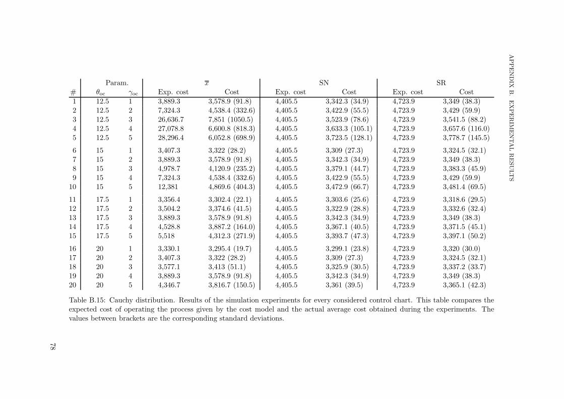
APPENDIX
B.EXPERIM
ENTALRESULTS
Param. x SN SR# θoc γoc Exp. cost Cost Exp. cost Cost Exp. cost Cost
1 12.5 1 3,889.3 3,578.9 (91.8) 4,405.5 3,342.3 (34.9) 4,723.9 3,349 (38.3)2 12.5 2 7,324.3 4,538.4 (332.6) 4,405.5 3,422.9 (55.5) 4,723.9 3,429 (59.9)3 12.5 3 26,636.7 7,851 (1050.5) 4,405.5 3,523.9 (78.6) 4,723.9 3,541.5 (88.2)4 12.5 4 27,078.8 6,600.8 (818.3) 4,405.5 3,633.3 (105.1) 4,723.9 3,657.6 (116.0)5 12.5 5 28,296.4 6,052.8 (698.9) 4,405.5 3,723.5 (128.1) 4,723.9 3,778.7 (145.5)
6 15 1 3,407.3 3,322 (28.2) 4,405.5 3,309 (27.3) 4,723.9 3,324.5 (32.1)7 15 2 3,889.3 3,578.9 (91.8) 4,405.5 3,342.3 (34.9) 4,723.9 3,349 (38.3)8 15 3 4,978.7 4,120.9 (235.2) 4,405.5 3,379.1 (44.7) 4,723.9 3,383.3 (45.9)9 15 4 7,324.3 4,538.4 (332.6) 4,405.5 3,422.9 (55.5) 4,723.9 3,429 (59.9)
10 15 5 12,381 4,869.6 (404.3) 4,405.5 3,472.9 (66.7) 4,723.9 3,481.4 (69.5)
11 17.5 1 3,356.4 3,302.4 (22.1) 4,405.5 3,303.6 (25.6) 4,723.9 3,318.6 (29.5)12 17.5 2 3,504.2 3,374.6 (41.5) 4,405.5 3,322.9 (28.8) 4,723.9 3,332.6 (32.4)13 17.5 3 3,889.3 3,578.9 (91.8) 4,405.5 3,342.3 (34.9) 4,723.9 3,349 (38.3)14 17.5 4 4,528.8 3,887.2 (164.0) 4,405.5 3,367.1 (40.5) 4,723.9 3,371.5 (45.1)15 17.5 5 5,518 4,312.3 (271.9) 4,405.5 3,393.7 (47.3) 4,723.9 3,397.1 (50.2)
16 20 1 3,330.1 3,295.4 (19.7) 4,405.5 3,299.1 (23.8) 4,723.9 3,320 (30.0)17 20 2 3,407.3 3,322 (28.2) 4,405.5 3,309 (27.3) 4,723.9 3,324.5 (32.1)18 20 3 3,577.1 3,413 (51.1) 4,405.5 3,325.9 (30.5) 4,723.9 3,337.2 (33.7)19 20 4 3,889.3 3,578.9 (91.8) 4,405.5 3,342.3 (34.9) 4,723.9 3,349 (38.3)20 20 5 4,346.7 3,816.7 (150.5) 4,405.5 3,361 (39.5) 4,723.9 3,365.1 (42.3)
Table B.15: Cauchy distribution. Results of the simulation experiments for every considered control chart. This table compares theexpected cost of operating the process given by the cost model and the actual average cost obtained during the experiments. Thevalues between brackets are the corresponding standard deviations.
78
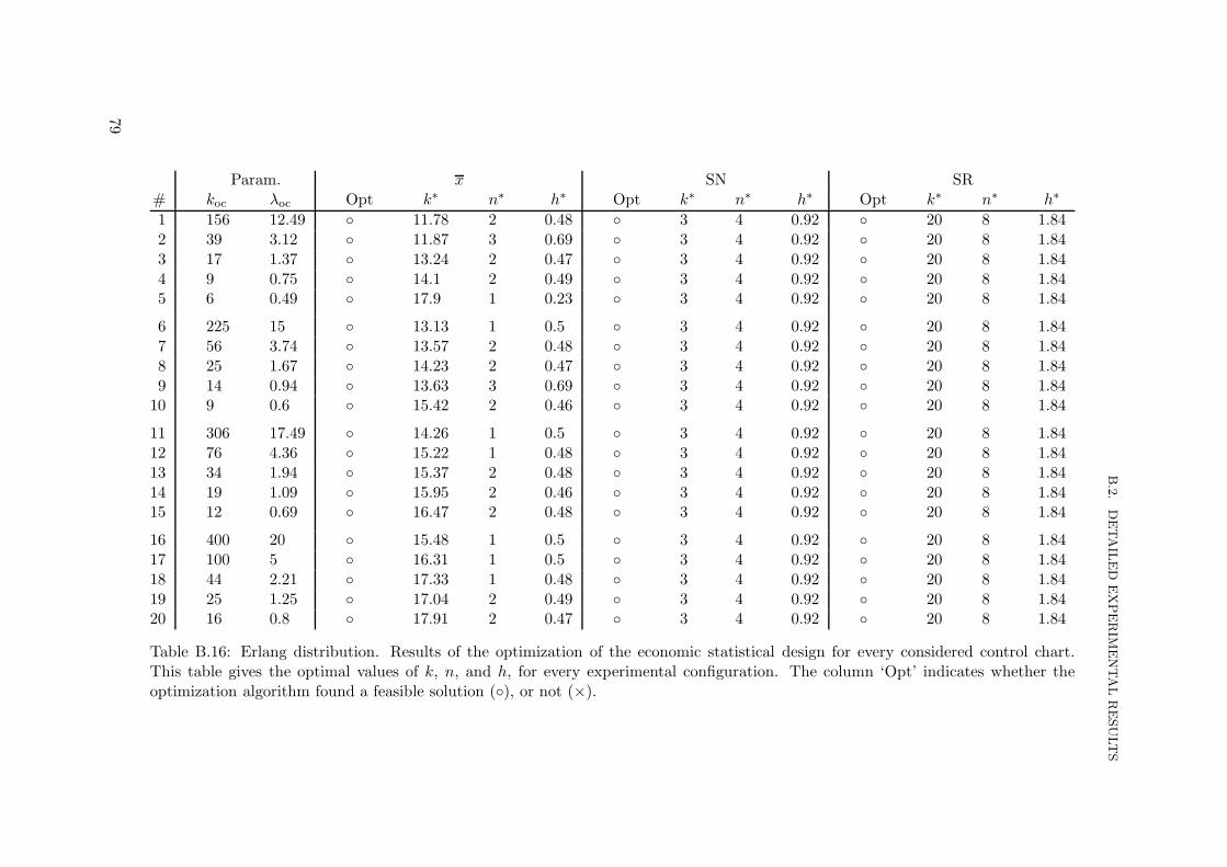
B.2.
DETAIL
ED
EXPERIM
ENTALRESULTS
Param. x SN SR# koc λoc Opt k∗ n∗ h∗ Opt k∗ n∗ h∗ Opt k∗ n∗ h∗
1 156 12.49 ◦ 11.78 2 0.48 ◦ 3 4 0.92 ◦ 20 8 1.842 39 3.12 ◦ 11.87 3 0.69 ◦ 3 4 0.92 ◦ 20 8 1.843 17 1.37 ◦ 13.24 2 0.47 ◦ 3 4 0.92 ◦ 20 8 1.844 9 0.75 ◦ 14.1 2 0.49 ◦ 3 4 0.92 ◦ 20 8 1.845 6 0.49 ◦ 17.9 1 0.23 ◦ 3 4 0.92 ◦ 20 8 1.84
6 225 15 ◦ 13.13 1 0.5 ◦ 3 4 0.92 ◦ 20 8 1.847 56 3.74 ◦ 13.57 2 0.48 ◦ 3 4 0.92 ◦ 20 8 1.848 25 1.67 ◦ 14.23 2 0.47 ◦ 3 4 0.92 ◦ 20 8 1.849 14 0.94 ◦ 13.63 3 0.69 ◦ 3 4 0.92 ◦ 20 8 1.84
10 9 0.6 ◦ 15.42 2 0.46 ◦ 3 4 0.92 ◦ 20 8 1.84
11 306 17.49 ◦ 14.26 1 0.5 ◦ 3 4 0.92 ◦ 20 8 1.8412 76 4.36 ◦ 15.22 1 0.48 ◦ 3 4 0.92 ◦ 20 8 1.8413 34 1.94 ◦ 15.37 2 0.48 ◦ 3 4 0.92 ◦ 20 8 1.8414 19 1.09 ◦ 15.95 2 0.46 ◦ 3 4 0.92 ◦ 20 8 1.8415 12 0.69 ◦ 16.47 2 0.48 ◦ 3 4 0.92 ◦ 20 8 1.84
16 400 20 ◦ 15.48 1 0.5 ◦ 3 4 0.92 ◦ 20 8 1.8417 100 5 ◦ 16.31 1 0.5 ◦ 3 4 0.92 ◦ 20 8 1.8418 44 2.21 ◦ 17.33 1 0.48 ◦ 3 4 0.92 ◦ 20 8 1.8419 25 1.25 ◦ 17.04 2 0.49 ◦ 3 4 0.92 ◦ 20 8 1.8420 16 0.8 ◦ 17.91 2 0.47 ◦ 3 4 0.92 ◦ 20 8 1.84
Table B.16: Erlang distribution. Results of the optimization of the economic statistical design for every considered control chart.This table gives the optimal values of k, n, and h, for every experimental configuration. The column ‘Opt’ indicates whether theoptimization algorithm found a feasible solution (◦), or not (×).
79

APPENDIX
B.EXPERIM
ENTALRESULTS
Param. x SN SR# koc λoc α β FP FN α β FP FN α β FP FN1 156 12.49 0.014 0.206 0.008 (0.001) 0.157 (0.046) 0.062 0.938 0.051 (0.002) 0.016 (0.023) 0.098 0.902 0.078 (0.004) 0 (0.000)2 39 3.12 0.091 0.374 0.059 (0.002) 0.294 (0.072) 0.062 0.938 0.056 (0.002) 0.317 (0.073) 0.098 0.902 0.093 (0.004) 0.014 (0.021)3 17 1.37 0.1 0.732 0.07 (0.002) 0.672 (0.044) 0.062 0.938 0.054 (0.002) 0.578 (0.059) 0.098 0.902 0.094 (0.004) 0.157 (0.060)4 9 0.75 0.1 0.83 0.075 (0.002) 0.778 (0.033) 0.062 0.938 0.071 (0.002) 0.675 (0.053) 0.098 0.902 0.145 (0.005) 0.271 (0.070)5 6 0.49 0.089 0.905 0.074 (0.001) 0.868 (0.021) 0.062 0.938 0.069 (0.003) 0.73 (0.046) 0.098 0.902 0.148 (0.005) 0.357 (0.071)
6 225 15 0.003 0.041 0.002 (0.000) 0.028 (0.022) 0.062 0.938 0.051 (0.002) 0 (0.000) 0.098 0.902 0.078 (0.004) 0 (0.000)7 56 3.74 0.015 0.205 0.01 (0.001) 0.159 (0.047) 0.062 0.938 0.056 (0.002) 0.01 (0.018) 0.098 0.902 0.093 (0.004) 0 (0.000)8 25 1.67 0.045 0.427 0.032 (0.001) 0.372 (0.057) 0.062 0.938 0.054 (0.002) 0.103 (0.056) 0.098 0.902 0.094 (0.004) 0 (0.002)9 14 0.94 0.083 0.348 0.059 (0.002) 0.287 (0.071) 0.062 0.938 0.071 (0.003) 0.188 (0.063) 0.098 0.902 0.145 (0.005) 0.002 (0.007)
10 9 0.6 0.1 0.617 0.076 (0.002) 0.572 (0.049) 0.062 0.938 0.069 (0.002) 0.333 (0.072) 0.098 0.902 0.148 (0.005) 0.015 (0.022)
11 306 17.49 0 0.001 0 (0.000) 0 (0.002) 0.062 0.938 0.051 (0.002) 0 (0.000) 0.098 0.902 0.078 (0.004) 0 (0.000)12 76 4.36 0.011 0.159 0.01 (0.001) 0.131 (0.043) 0.062 0.938 0.056 (0.002) 0 (0.001) 0.098 0.902 0.093 (0.004) 0 (0.000)13 34 1.94 0.015 0.201 0.012 (0.001) 0.16 (0.044) 0.062 0.938 0.054 (0.002) 0.005 (0.012) 0.098 0.902 0.094 (0.004) 0 (0.000)14 19 1.09 0.031 0.354 0.027 (0.001) 0.31 (0.053) 0.062 0.938 0.071 (0.003) 0.026 (0.028) 0.098 0.902 0.144 (0.005) 0 (0.000)15 12 0.69 0.061 0.468 0.049 (0.001) 0.425 (0.055) 0.062 0.938 0.069 (0.002) 0.098 (0.050) 0.098 0.902 0.148 (0.005) 0 (0.002)
16 400 20 0 0 0 (0.000) 0 (0.000) 0.062 0.938 0.051 (0.002) 0 (0.000) 0.098 0.902 0.078 (0.004) 0 (0.000)17 100 5 0.003 0.039 0.003 (0.000) 0.025 (0.021) 0.062 0.938 0.056 (0.002) 0 (0.000) 0.098 0.902 0.093 (0.004) 0 (0.000)18 44 2.21 0.017 0.227 0.017 (0.001) 0.196 (0.050) 0.062 0.938 0.054 (0.002) 0 (0.001) 0.098 0.902 0.094 (0.004) 0 (0.000)19 25 1.25 0.013 0.181 0.014 (0.001) 0.143 (0.044) 0.062 0.938 0.071 (0.002) 0.001 (0.007) 0.098 0.902 0.145 (0.005) 0 (0.000)20 16 0.8 0.028 0.329 0.026 (0.001) 0.286 (0.054) 0.062 0.938 0.069 (0.002) 0.012 (0.019) 0.098 0.902 0.148 (0.005) 0 (0.000)
Table B.17: Erlang distribution. Results of the simulation experiments where the expected probabilities of type I (α) and type II(β) errors are compared to the probabilities observed during the experiments. ‘FP’ represents the false positives rates (type I errors),and ‘FN’ represents the false negatives rates (type II errors) observed during the simulations. The values between brackets are thecorresponding standard deviations.
80

B.2.
DETAIL
ED
EXPERIM
ENTALRESULTS
Param. x SN SR# koc λoc Exp. cost Cost Exp. cost Cost Exp. cost Cost
1 156 12.49 3,323.4 3,282.4 (18.8) 4,405.5 3,292.4 (22.3) 4,723.9 3,318.6 (28.2)2 39 3.12 3,391.4 3,316.2 (24.6) 4,405.5 3,327.6 (30.2) 4,723.9 3,324.4 (29.5)3 17 1.37 3,459.5 3,385 (36.6) 4,405.5 3,394.9 (47.3) 4,723.9 3,348.2 (36.5)4 9 0.75 3,543.2 3,446.4 (51.6) 4,405.5 3,451.1 (59.8) 4,723.9 3,381.3 (42.5)5 6 0.49 3,568 3,485.8 (43.1) 4,405.5 3,494.4 (75.8) 4,723.9 3,409.8 (48.9)
6 225 15 3,291.2 3,271.5 (18.4) 4,405.5 3,290.3 (21.2) 4,723.9 3,319.8 (29.6)7 56 3.74 3,323.6 3,281.6 (19.5) 4,405.5 3,293.4 (20.9) 4,723.9 3,321 (28.6)8 25 1.67 3,357.6 3,309.1 (23.5) 4,405.5 3,301.9 (24.5) 4,723.9 3,322.3 (29.4)9 14 0.94 3,385 3,316.5 (24.3) 4,405.5 3,313.3 (24.9) 4,723.9 3,328.6 (28.8)
10 9 0.6 3,418.8 3,360.7 (29.8) 4,405.5 3,334.1 (30.9) 4,723.9 3,329.8 (29.0)
11 306 17.49 3,288.2 3,270 (19.4) 4,405.5 3,290.2 (21.7) 4,723.9 3,319.3 (29.3)12 76 4.36 3,301 3,279.6 (19.0) 4,405.5 3,292.5 (21.7) 4,723.9 3,319.4 (28.1)13 34 1.94 3,323.3 3,282.2 (19.1) 4,405.5 3,291.9 (21.2) 4,723.9 3,319.6 (28.9)14 19 1.09 3,343 3,300.8 (20.5) 4,405.5 3,297.6 (22.5) 4,723.9 3,327.1 (27.6)15 12 0.69 3,371.2 3,323.8 (25.7) 4,405.5 3,303.8 (23.0) 4,723.9 3,326.8 (28.6)
16 400 20 3,288.1 3,270.3 (18.3) 4,405.5 3,290.2 (21.7) 4,723.9 3,318.5 (28.3)17 100 5 3,291.1 3,273.7 (18.3) 4,405.5 3,293 (21.2) 4,723.9 3,318.5 (28.7)18 44 2.21 3,308 3,289 (19.8) 4,405.5 3,291.9 (21.8) 4,723.9 3,318 (27.2)19 25 1.25 3,321.7 3,283.3 (19.5) 4,405.5 3,296.2 (22.1) 4,723.9 3,326.2 (27.7)20 16 0.8 3,339.4 3,299.1 (21.3) 4,405.5 3,296.4 (22.3) 4,723.9 3,328.4 (30.2)
Table B.18: Erlang distribution. Results of the simulation experiments for every considered control chart. This table compares theexpected cost of operating the process given by the cost model and the actual average cost obtained during the experiments. Thevalues between brackets are the corresponding standard deviations.
81

APPENDIX
B.EXPERIM
ENTALRESULTS
Param. x SN SR# λoc Opt k∗ n∗ h∗ Opt k∗ n∗ h∗ Opt k∗ n∗ h∗
1 1/12.5 ◦ 23.13 1 0.31 ◦ 3 4 0.92 ◦ 20 8 1.842 1/15 ◦ 27.89 1 0.23 ◦ 3 4 0.92 ◦ 20 8 1.843 1/17.5 ◦ 30.1 1 0.23 ◦ 3 4 0.92 ◦ 20 8 1.844 1/20 ◦ 31.58 1 0.24 ◦ 3 4 0.92 ◦ 20 8 1.84
Table B.19: Exponential distribution. Results of the optimization of the economic statistical design for every considered control chart.This table gives the optimal values of k, n, and h, for every experimental configuration. The column ‘Opt’ indicates whether theoptimization algorithm found a feasible solution (◦), or not (×).
82

B.2.
DETAIL
ED
EXPERIM
ENTALRESULTS
Param. x SN SR# λoc α β FP FN α β FP FN α β FP FN1 1/12.5 0.095 0.802 0.099 (0.002) 0.838 (0.024) 0.062 0.938 0.062 (0.002) 0.888 (0.020) 0.098 0.902 0.174 (0.005) 0.661 (0.053)2 1/15 0.037 0.805 0.062 (0.001) 0.841 (0.023) 0.062 0.938 0.062 (0.002) 0.838 (0.029) 0.098 0.902 0.174 (0.005) 0.513 (0.067)3 1/17.5 0.022 0.764 0.049 (0.001) 0.818 (0.024) 0.062 0.938 0.062 (0.002) 0.789 (0.036) 0.098 0.902 0.174 (0.005) 0.394 (0.074)4 1/20 0.015 0.719 0.042 (0.001) 0.79 (0.029) 0.062 0.938 0.062 (0.002) 0.742 (0.043) 0.098 0.902 0.174 (0.005) 0.301 (0.071)
Table B.20: Exponential distribution. Results of the simulation experiments where the expected probabilities of type I (α) and type II(β) errors are compared to the probabilities observed during the experiments. ‘FP’ represents the false positives rates (type I errors),and ‘FN’ represents the false negatives rates (type II errors) observed during the simulations. The values between brackets are thecorresponding standard deviations.
83

APPENDIX
B.EXPERIM
ENTALRESULTS
Param. x SN SR# λoc Exp. cost Cost Exp. cost Cost Exp. cost Cost
1 1/12.5 3,467.6 3,483.1 (47.9) 4,405.5 3,871.7 (169.2) 4,723.9 3,618.5 (103.9)2 1/15 3,415.4 3,447.7 (38.0) 4,405.5 3,672.5 (116.5) 4,723.9 3,486 (68.7)3 1/17.5 3,383.7 3,417.9 (34.4) 4,405.5 3,570.1 (91.3) 4,723.9 3,424.8 (53.6)4 1/20 3,363.9 3,396.5 (33.0) 4,405.5 3,508.8 (75.5) 4,723.9 3,394.1 (45.6)
Table B.21: Exponential distribution. Results of the simulation experiments for every considered control chart. This table comparesthe expected cost of operating the process given by the cost model and the actual average cost obtained during the experiments. Thevalues between brackets are the corresponding standard deviations.
84

B.2.
DETAIL
ED
EXPERIM
ENTALRESULTS
Param. x SN SR# µoc boc Opt k∗ n∗ h∗ Opt k∗ n∗ h∗ Opt k∗ n∗ h∗
1 12.5 1/√2 ◦ 11.72 2 0.48 ◦ 3 4 0.92 ◦ 20 8 1.84
2 12.5 2/√2 ◦ 12.4 2 0.46 ◦ 3 4 0.92 ◦ 20 8 1.84
3 12.5 3/√2 ◦ 12.96 2 0.46 ◦ 3 4 0.92 ◦ 20 8 1.84
4 12.5 4/√2 ◦ 13.62 2 0.46 ◦ 3 4 0.92 ◦ 20 8 1.84
5 12.5 5/√2 ◦ 14.53 2 0.46 ◦ 3 4 0.92 ◦ 20 8 1.84
6 15 1/√2 ◦ 13 1 0.5 ◦ 3 4 0.92 ◦ 20 8 1.84
7 15 2/√2 ◦ 13.43 2 0.48 ◦ 3 4 0.92 ◦ 20 8 1.84
8 15 3/√2 ◦ 14.17 2 0.46 ◦ 3 4 0.92 ◦ 20 8 1.84
9 15 4/√2 ◦ 14.79 2 0.46 ◦ 3 4 0.92 ◦ 20 8 1.84
10 15 5/√2 ◦ 15.37 2 0.46 ◦ 3 4 0.92 ◦ 20 8 1.84
11 17.5 1/√2 ◦ 14.09 1 0.5 ◦ 3 4 0.92 ◦ 20 8 1.84
12 17.5 2/√2 ◦ 15.01 1 0.49 ◦ 3 4 0.92 ◦ 20 8 1.84
13 17.5 3/√2 ◦ 15.15 2 0.48 ◦ 3 4 0.92 ◦ 20 8 1.84
14 17.5 4/√2 ◦ 15.91 2 0.46 ◦ 3 4 0.92 ◦ 20 8 1.84
15 17.5 5/√2 ◦ 16.58 2 0.46 ◦ 3 4 0.92 ◦ 20 8 1.84
16 20 1/√2 ◦ 15.25 1 0.5 ◦ 3 4 0.92 ◦ 20 8 1.84
17 20 2/√2 ◦ 16 1 0.5 ◦ 3 4 0.92 ◦ 20 8 1.84
18 20 3/√2 ◦ 17.06 1 0.47 ◦ 3 4 0.92 ◦ 20 8 1.84
19 20 4/√2 ◦ 16.86 2 0.48 ◦ 3 4 0.92 ◦ 20 8 1.84
20 20 5/√2 ◦ 17.65 2 0.46 ◦ 3 4 0.92 ◦ 20 8 1.84
Table B.22: Double exponential distribution. Results of the optimization of the economic statistical design for every considered controlchart. This table gives the optimal values of k, n, and h, for every experimental configuration. The column ‘Opt’ indicates whetherthe optimization algorithm found a feasible solution (◦), or not (×).
85

APPENDIX
B.EXPERIM
ENTALRESULTS
Param. x SN SR# µoc boc α β FP FN α β FP FN α β FP FN
1 12.5 1/√2 0.008 0.134 0.013 (0.001) 0.116 (0.040) 0.062 0.938 0.063 (0.002) 0.055 (0.040) 0.098 0.902 0.098 (0.004) 0 (0.002)
2 12.5 2/√2 0.045 0.471 0.045 (0.001) 0.459 (0.057) 0.062 0.938 0.063 (0.002) 0.293 (0.073) 0.098 0.902 0.098 (0.004) 0.033 (0.032)
3 12.5 3/√2 0.081 0.586 0.073 (0.002) 0.602 (0.050) 0.062 0.938 0.063 (0.002) 0.481 (0.067) 0.098 0.902 0.098 (0.004) 0.149 (0.060)
4 12.5 4/√2 0.1 0.655 0.088 (0.002) 0.681 (0.044) 0.062 0.938 0.063 (0.002) 0.597 (0.060) 0.098 0.902 0.098 (0.004) 0.285 (0.074)
5 12.5 5/√2 0.1 0.717 0.088 (0.002) 0.748 (0.037) 0.062 0.938 0.063 (0.002) 0.672 (0.050) 0.098 0.902 0.098 (0.004) 0.399 (0.069)
6 15 1/√2 0.001 0.023 0.007 (0.001) 0.028 (0.022) 0.062 0.938 0.063 (0.002) 0.001 (0.006) 0.098 0.902 0.098 (0.004) 0 (0.000)
7 15 2/√2 0.008 0.134 0.013 (0.001) 0.116 (0.040) 0.062 0.938 0.063 (0.002) 0.055 (0.040) 0.098 0.902 0.098 (0.004) 0 (0.002)
8 15 3/√2 0.025 0.347 0.029 (0.001) 0.316 (0.054) 0.062 0.938 0.063 (0.002) 0.171 (0.063) 0.098 0.902 0.098 (0.004) 0.005 (0.013)
9 15 4/√2 0.045 0.471 0.045 (0.001) 0.459 (0.057) 0.062 0.938 0.063 (0.002) 0.293 (0.073) 0.098 0.902 0.098 (0.004) 0.033 (0.032)
10 15 5/√2 0.064 0.541 0.061 (0.002) 0.549 (0.049) 0.062 0.938 0.063 (0.002) 0.393 (0.069) 0.098 0.902 0.098 (0.004) 0.083 (0.049)
11 17.5 1/√2 0 0 0.002 (0.000) 0.004 (0.008) 0.062 0.938 0.063 (0.002) 0 (0.001) 0.098 0.902 0.098 (0.004) 0 (0.000)
12 17.5 2/√2 0.006 0.107 0.014 (0.001) 0.086 (0.035) 0.062 0.938 0.063 (0.002) 0.01 (0.018) 0.098 0.902 0.098 (0.004) 0 (0.000)
13 17.5 3/√2 0.008 0.134 0.013 (0.001) 0.116 (0.040) 0.062 0.938 0.063 (0.002) 0.055 (0.040) 0.098 0.902 0.098 (0.004) 0 (0.002)
14 17.5 4/√2 0.018 0.287 0.024 (0.001) 0.255 (0.053) 0.062 0.938 0.063 (0.002) 0.129 (0.059) 0.098 0.902 0.098 (0.004) 0.002 (0.008)
15 17.5 5/√2 0.031 0.397 0.035 (0.001) 0.368 (0.055) 0.062 0.938 0.063 (0.002) 0.214 (0.068) 0.098 0.902 0.098 (0.004) 0.011 (0.018)
16 20 1/√2 0 0 0 (0.000) 0.001 (0.003) 0.062 0.938 0.063 (0.002) 0 (0.000) 0.098 0.902 0.098 (0.004) 0 (0.000)
17 20 2/√2 0.001 0.023 0.007 (0.001) 0.028 (0.022) 0.062 0.938 0.063 (0.002) 0.001 (0.006) 0.098 0.902 0.098 (0.004) 0 (0.000)
18 20 3/√2 0.009 0.163 0.018 (0.001) 0.122 (0.040) 0.062 0.938 0.063 (0.002) 0.018 (0.024) 0.098 0.902 0.098 (0.004) 0 (0.000)
19 20 4/√2 0.008 0.134 0.013 (0.001) 0.116 (0.040) 0.062 0.938 0.063 (0.002) 0.055 (0.040) 0.098 0.902 0.098 (0.004) 0 (0.002)
20 20 5/√2 0.015 0.253 0.021 (0.001) 0.217 (0.050) 0.062 0.938 0.063 (0.002) 0.11 (0.055) 0.098 0.902 0.098 (0.004) 0.001 (0.007)
Table B.23: Double exponential distribution. Results of the simulation experiments where the expected probabilities of type I (α) andtype II (β) errors are compared to the probabilities observed during the experiments. ‘FP’ represents the false positives rates (typeI errors), and ‘FN’ represents the false negatives rates (type II errors) observed during the simulations. The values between bracketsare the corresponding standard deviations.
86

B.2.
DETAIL
ED
EXPERIM
ENTALRESULTS
Param. x SN SR# µoc boc Exp. cost Cost Exp. cost Cost Exp. cost Cost
1 12.5 1/√2 3,316.1 3,282.7 (18.4) 4,405.5 3,299.5 (23.4) 4,723.9 3,322.2 (29.0)
2 12.5 2/√2 3,363 3,324.7 (25.8) 4,405.5 3,325.2 (29.0) 4,723.9 3,326 (30.4)
3 12.5 3/√2 3,401.6 3,365 (30.9) 4,405.5 3,364.2 (37.4) 4,723.9 3,346.5 (34.9)
4 12.5 4/√2 3,428.9 3,394.1 (35.1) 4,405.5 3,406 (48.4) 4,723.9 3,379.6 (44.0)
5 12.5 5/√2 3,451.9 3,426.1 (42.5) 4,405.5 3,447.1 (60.7) 4,723.9 3,421 (53.6)
6 15 1/√2 3,289.7 3,274.5 (18.0) 4,405.5 3,293.5 (21.0) 4,723.9 3,321.2 (28.9)
7 15 2/√2 3,316.1 3,282.7 (18.4) 4,405.5 3,299.5 (23.4) 4,723.9 3,322.2 (29.0)
8 15 3/√2 3,339.1 3,301.7 (21.4) 4,405.5 3,309 (25.1) 4,723.9 3,321.8 (27.7)
9 15 4/√2 3,363 3,324.7 (25.8) 4,405.5 3,325.2 (29.0) 4,723.9 3,326 (30.4)
10 15 5/√2 3,384 3,346.4 (28.7) 4,405.5 3,343.2 (32.5) 4,723.9 3,335.1 (31.7)
11 17.5 1/√2 3,288.2 3,269.8 (18.5) 4,405.5 3,294.4 (21.6) 4,723.9 3,321.2 (28.9)
12 17.5 2/√2 3,295.9 3,281 (18.6) 4,405.5 3,296.5 (22.0) 4,723.9 3,321.2 (28.9)
13 17.5 3/√2 3,316.1 3,282.7 (18.4) 4,405.5 3,299.5 (23.4) 4,723.9 3,322.2 (29.0)
14 17.5 4/√2 3,330.9 3,296.1 (21.0) 4,405.5 3,305.1 (23.3) 4,723.9 3,322.2 (29.4)
15 17.5 5/√2 3,347.2 3,309.4 (22.1) 4,405.5 3,314.5 (26.5) 4,723.9 3,324 (28.6)
16 20 1/√2 3,288.1 3,270.2 (19.2) 4,405.5 3,294.4 (21.6) 4,723.9 3,321.2 (28.9)
17 20 2/√2 3,289.7 3,274.5 (18.0) 4,405.5 3,293.5 (21.0) 4,723.9 3,321.2 (28.9)
18 20 3/√2 3,300.4 3,284.4 (19.0) 4,405.5 3,295.7 (21.4) 4,723.9 3,321.2 (28.9)
19 20 4/√2 3,316.1 3,282.7 (18.4) 4,405.5 3,299.5 (23.4) 4,723.9 3,322.2 (29.0)
20 20 5/√2 3,326.9 3,292.8 (19.3) 4,405.5 3,303.2 (22.6) 4,723.9 3,319.4 (29.4)
Table B.24: Double exponential distribution. Results of the simulation experiments for every considered control chart. This tablecompares the expected cost of operating the process given by the cost model and the actual average cost obtained during theexperiments. The values between brackets are the corresponding standard deviations.
87

APPENDIX
B.EXPERIM
ENTALRESULTS
Param. x SN SR# p a Opt k∗ n∗ h∗ Opt k∗ n∗ h∗ Opt k∗ n∗ h∗
1 0.25 2 ◦ 12.96 2 0.46 ◦ 3 4 0.92 ◦ 20 8 1.842 0.25 4 ◦ 12.96 2 0.46 ◦ 3 4 0.92 ◦ 20 8 1.843 0.25 6 ◦ 12.96 2 0.46 ◦ 3 4 0.92 ◦ 20 8 1.84
4 0.5 2 ◦ 12.96 2 0.46 ◦ 3 4 0.92 ◦ 20 8 1.845 0.5 4 ◦ 12.96 2 0.46 ◦ 3 4 0.92 ◦ 20 8 1.846 0.5 6 ◦ 12.96 2 0.46 ◦ 3 4 0.92 ◦ 20 8 1.84
7 0.75 2 ◦ 12.96 2 0.46 ◦ 3 4 0.92 ◦ 20 8 1.848 0.75 4 ◦ 12.96 2 0.46 ◦ 3 4 0.92 ◦ 20 8 1.849 0.75 6 ◦ 12.96 2 0.46 ◦ 3 4 0.92 ◦ 20 8 1.84
Table B.25: Mixture of normals (µoc = 12.5, σ = 3) distribution. Results of the optimization of the economic statistical design forevery considered control chart. This table gives the optimal values of k, n, and h, for every experimental configuration. The column‘Opt’ indicates whether the optimization algorithm found a feasible solution (◦), or not (×).
88

B.2.
DETAIL
ED
EXPERIM
ENTALRESULTS
Param. x SN SR# p a α β FP FN α β FP FN α β FP FN1 0.25 2 0.081 0.586 0.089 (0.002) 0.595 (0.050) 0.062 0.938 0.062 (0.002) 0.539 (0.063) 0.098 0.902 0.117 (0.004) 0.121 (0.056)2 0.25 4 0.081 0.586 0.09 (0.002) 0.599 (0.049) 0.062 0.938 0.063 (0.002) 0.283 (0.072) 0.098 0.902 0.162 (0.005) 0.009 (0.018)3 0.25 6 0.081 0.586 0.077 (0.002) 0.58 (0.050) 0.062 0.938 0.063 (0.002) 0.085 (0.049) 0.098 0.902 0.167 (0.005) 0 (0.001)
4 0.5 2 0.081 0.586 0.084 (0.002) 0.581 (0.047) 0.062 0.938 0.063 (0.002) 0.627 (0.055) 0.098 0.902 0.098 (0.004) 0.203 (0.066)5 0.5 4 0.081 0.586 0.097 (0.002) 0.592 (0.048) 0.062 0.938 0.062 (0.002) 0.72 (0.044) 0.098 0.902 0.098 (0.004) 0.277 (0.070)6 0.5 6 0.081 0.586 0.108 (0.002) 0.623 (0.047) 0.062 0.938 0.063 (0.002) 0.781 (0.038) 0.098 0.902 0.098 (0.004) 0.363 (0.070)
7 0.75 2 0.081 0.586 0.074 (0.002) 0.563 (0.052) 0.062 0.938 0.062 (0.002) 0.632 (0.057) 0.098 0.902 0.082 (0.004) 0.267 (0.072)8 0.75 4 0.081 0.586 0.047 (0.001) 0.515 (0.053) 0.062 0.938 0.063 (0.002) 0.69 (0.047) 0.098 0.902 0.06 (0.003) 0.446 (0.071)9 0.75 6 0.081 0.586 0.022 (0.001) 0.469 (0.054) 0.062 0.938 0.062 (0.002) 0.679 (0.050) 0.098 0.902 0.059 (0.003) 0.552 (0.062)
Table B.26: Mixture of normals (µoc = 12.5, σ = 3) distribution. Results of the simulation experiments where the expected probabilitiesof type I (α) and type II (β) errors are compared to the probabilities observed during the experiments. ‘FP’ represents the false positivesrates (type I errors), and ‘FN’ represents the false negatives rates (type II errors) observed during the simulations. The values betweenbrackets are the corresponding standard deviations.
89

APPENDIX
B.EXPERIM
ENTALRESULTS
Param. x SN SR# p a Exp. cost Cost Exp. cost Cost Exp. cost Cost
1 0.25 2 3,401.6 3,371.3 (31.1) 4,405.5 3,379.8 (42.2) 4,723.9 3,343.5 (32.7)2 0.25 4 3,401.6 3,374.4 (29.3) 4,405.5 3,323.4 (28.6) 4,723.9 3,329.3 (29.9)3 0.25 6 3,401.6 3,362.9 (30.7) 4,405.5 3,300.5 (23.0) 4,723.9 3,329.9 (28.9)
4 0.5 2 3,401.6 3,365.6 (28.9) 4,405.5 3,418 (51.3) 4,723.9 3,358.8 (37.8)5 0.5 4 3,401.6 3,375.6 (29.7) 4,405.5 3,487.2 (68.3) 4,723.9 3,377.1 (43.3)6 0.5 6 3,401.6 3,388.3 (32.4) 4,405.5 3,558.5 (90.8) 4,723.9 3,405 (49.8)
7 0.75 2 3,401.6 3,357.9 (28.5) 4,405.5 3,423.2 (55.4) 4,723.9 3,375.3 (43.1)8 0.75 4 3,401.6 3,335.7 (28.1) 4,405.5 3,461.8 (63.2) 4,723.9 3,437.7 (59.0)9 0.75 6 3,401.6 3,315.2 (24.4) 4,405.5 3,453.1 (61.1) 4,723.9 3,497.2 (78.0)
Table B.27: Mixture of normals (µoc = 12.5, σ = 3) distribution. Results of the simulation experiments for every considered controlchart. This table compares the expected cost of operating the process given by the cost model and the actual average cost obtainedduring the experiments. The values between brackets are the corresponding standard deviations.
90

B.2.
DETAIL
ED
EXPERIM
ENTALRESULTS
Param. x SN SR# p a Opt k∗ n∗ h∗ Opt k∗ n∗ h∗ Opt k∗ n∗ h∗
1 0.25 2 ◦ 14.53 2 0.46 ◦ 3 4 0.92 ◦ 20 8 1.842 0.25 4 ◦ 14.53 2 0.46 ◦ 3 4 0.92 ◦ 20 8 1.843 0.25 6 ◦ 14.53 2 0.46 ◦ 3 4 0.92 ◦ 20 8 1.84
4 0.5 2 ◦ 14.53 2 0.46 ◦ 3 4 0.92 ◦ 20 8 1.845 0.5 4 ◦ 14.53 2 0.46 ◦ 3 4 0.92 ◦ 20 8 1.846 0.5 6 ◦ 14.53 2 0.46 ◦ 3 4 0.92 ◦ 20 8 1.84
7 0.75 2 ◦ 14.53 2 0.46 ◦ 3 4 0.92 ◦ 20 8 1.848 0.75 4 ◦ 14.53 2 0.46 ◦ 3 4 0.92 ◦ 20 8 1.849 0.75 6 ◦ 14.53 2 0.46 ◦ 3 4 0.92 ◦ 20 8 1.84
Table B.28: Mixture of normals (µoc = 12.5, σ = 5) distribution. Results of the optimization of the economic statistical design forevery considered control chart. This table gives the optimal values of k, n, and h, for every experimental configuration. The column‘Opt’ indicates whether the optimization algorithm found a feasible solution (◦), or not (×).
91

APPENDIX
B.EXPERIM
ENTALRESULTS
Param. x SN SR# p a α β FP FN α β FP FN α β FP FN1 0.25 2 0.1 0.717 0.107 (0.002) 0.72 (0.039) 0.062 0.938 0.062 (0.002) 0.747 (0.042) 0.098 0.902 0.117 (0.004) 0.421 (0.070)2 0.25 4 0.1 0.717 0.107 (0.002) 0.702 (0.041) 0.062 0.938 0.063 (0.002) 0.611 (0.059) 0.098 0.902 0.163 (0.005) 0.193 (0.064)3 0.25 6 0.1 0.717 0.09 (0.002) 0.67 (0.044) 0.062 0.938 0.063 (0.002) 0.41 (0.071) 0.098 0.902 0.167 (0.005) 0.042 (0.036)
4 0.5 2 0.1 0.717 0.104 (0.002) 0.706 (0.043) 0.062 0.938 0.063 (0.002) 0.792 (0.036) 0.098 0.902 0.098 (0.004) 0.513 (0.067)5 0.5 4 0.1 0.717 0.122 (0.002) 0.71 (0.041) 0.062 0.938 0.063 (0.002) 0.871 (0.022) 0.098 0.902 0.098 (0.004) 0.561 (0.062)6 0.5 6 0.1 0.717 0.144 (0.002) 0.732 (0.037) 0.062 0.938 0.062 (0.002) 0.913 (0.017) 0.098 0.902 0.098 (0.004) 0.603 (0.059)
7 0.75 2 0.1 0.717 0.094 (0.002) 0.7 (0.041) 0.062 0.938 0.062 (0.002) 0.779 (0.039) 0.098 0.902 0.082 (0.004) 0.562 (0.063)8 0.75 4 0.1 0.717 0.071 (0.002) 0.653 (0.045) 0.062 0.938 0.063 (0.002) 0.761 (0.039) 0.098 0.902 0.06 (0.003) 0.677 (0.050)9 0.75 6 0.1 0.717 0.042 (0.001) 0.603 (0.050) 0.062 0.938 0.063 (0.002) 0.718 (0.047) 0.098 0.902 0.059 (0.003) 0.675 (0.049)
Table B.29: Mixture of normals (µoc = 12.5, σ = 5) distribution. Results of the simulation experiments where the expected probabilitiesof type I (α) and type II (β) errors are compared to the probabilities observed during the experiments. ‘FP’ represents the false positivesrates (type I errors), and ‘FN’ represents the false negatives rates (type II errors) observed during the simulations. The values betweenbrackets are the corresponding standard deviations.
92

B.2.
DETAIL
ED
EXPERIM
ENTALRESULTS
Param. x SN SR# p a Exp. cost Cost Exp. cost Cost Exp. cost Cost
1 0.25 2 3,451.9 3,421.5 (39.9) 4,405.5 3,515.6 (79.4) 4,723.9 3,429.6 (56.2)2 0.25 4 3,451.9 3,416.1 (38.9) 4,405.5 3,413 (50.5) 4,723.9 3,363.7 (37.3)3 0.25 6 3,451.9 3,394.7 (35.8) 4,405.5 3,346.4 (33.9) 4,723.9 3,336.9 (28.5)
4 0.5 2 3,451.9 3,414.9 (40.2) 4,405.5 3,576.2 (90.6) 4,723.9 3,479.1 (70.0)5 0.5 4 3,451.9 3,427.8 (39.9) 4,405.5 3,789.2 (143.2) 4,723.9 3,509.1 (76.1)6 0.5 6 3,451.9 3,447.7 (43.8) 4,405.5 4,055.4 (217.8) 4,723.9 3,545 (86.5)
7 0.75 2 3,451.9 3,407.8 (38.2) 4,405.5 3,557.6 (87.1) 4,723.9 3,507.9 (77.4)8 0.75 4 3,451.9 3,380.6 (36.1) 4,405.5 3,530.1 (80.8) 4,723.9 3,628.8 (107.7)9 0.75 6 3,451.9 3,346.8 (32.2) 4,405.5 3,486.8 (71.6) 4,723.9 3,623.4 (105.3)
Table B.30: Mixture of normals (µoc = 12.5, σ = 5) distribution. Results of the simulation experiments for every considered controlchart. This table compares the expected cost of operating the process given by the cost model and the actual average cost obtainedduring the experiments. The values between brackets are the corresponding standard deviations.
93

APPENDIX
B.EXPERIM
ENTALRESULTS
Param. x SN SR# p a Opt k∗ n∗ h∗ Opt k∗ n∗ h∗ Opt k∗ n∗ h∗
1 0.25 2 ◦ 14.17 2 0.46 ◦ 3 4 0.92 ◦ 20 8 1.842 0.25 4 ◦ 14.17 2 0.46 ◦ 3 4 0.92 ◦ 20 8 1.843 0.25 6 ◦ 14.17 2 0.46 ◦ 3 4 0.92 ◦ 20 8 1.84
4 0.5 2 ◦ 14.17 2 0.46 ◦ 3 4 0.92 ◦ 20 8 1.845 0.5 4 ◦ 14.17 2 0.46 ◦ 3 4 0.92 ◦ 20 8 1.846 0.5 6 ◦ 14.17 2 0.46 ◦ 3 4 0.92 ◦ 20 8 1.84
7 0.75 2 ◦ 14.17 2 0.46 ◦ 3 4 0.92 ◦ 20 8 1.848 0.75 4 ◦ 14.17 2 0.46 ◦ 3 4 0.92 ◦ 20 8 1.849 0.75 6 ◦ 14.17 2 0.46 ◦ 3 4 0.92 ◦ 20 8 1.84
Table B.31: Mixture of normals (µoc = 15, σ = 3) distribution. Results of the optimization of the economic statistical design for everyconsidered control chart. This table gives the optimal values of k, n, and h, for every experimental configuration. The column ‘Opt’indicates whether the optimization algorithm found a feasible solution (◦), or not (×).
94
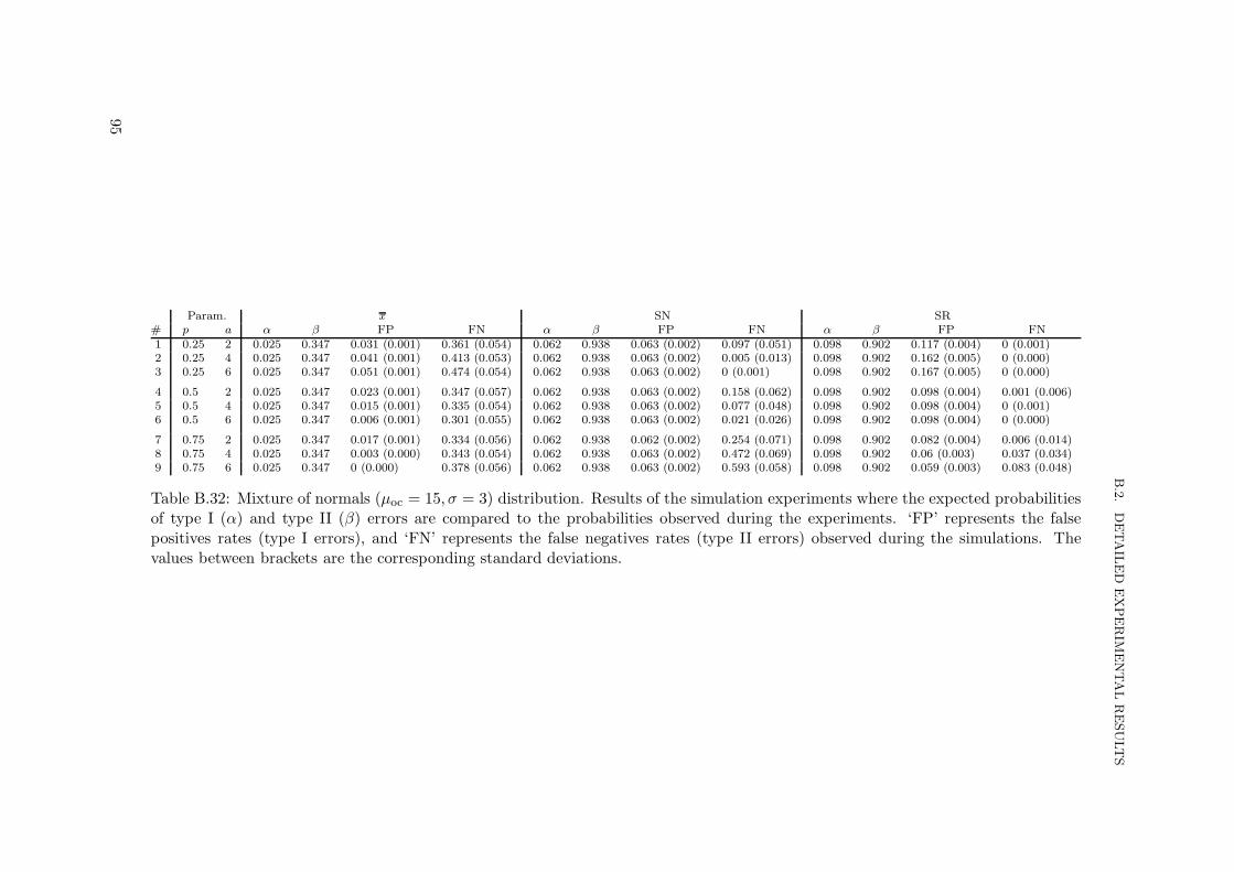
B.2.
DETAIL
ED
EXPERIM
ENTALRESULTS
Param. x SN SR# p a α β FP FN α β FP FN α β FP FN1 0.25 2 0.025 0.347 0.031 (0.001) 0.361 (0.054) 0.062 0.938 0.063 (0.002) 0.097 (0.051) 0.098 0.902 0.117 (0.004) 0 (0.001)2 0.25 4 0.025 0.347 0.041 (0.001) 0.413 (0.053) 0.062 0.938 0.063 (0.002) 0.005 (0.013) 0.098 0.902 0.162 (0.005) 0 (0.000)3 0.25 6 0.025 0.347 0.051 (0.001) 0.474 (0.054) 0.062 0.938 0.063 (0.002) 0 (0.001) 0.098 0.902 0.167 (0.005) 0 (0.000)
4 0.5 2 0.025 0.347 0.023 (0.001) 0.347 (0.057) 0.062 0.938 0.063 (0.002) 0.158 (0.062) 0.098 0.902 0.098 (0.004) 0.001 (0.006)5 0.5 4 0.025 0.347 0.015 (0.001) 0.335 (0.054) 0.062 0.938 0.063 (0.002) 0.077 (0.048) 0.098 0.902 0.098 (0.004) 0 (0.001)6 0.5 6 0.025 0.347 0.006 (0.001) 0.301 (0.055) 0.062 0.938 0.063 (0.002) 0.021 (0.026) 0.098 0.902 0.098 (0.004) 0 (0.000)
7 0.75 2 0.025 0.347 0.017 (0.001) 0.334 (0.056) 0.062 0.938 0.062 (0.002) 0.254 (0.071) 0.098 0.902 0.082 (0.004) 0.006 (0.014)8 0.75 4 0.025 0.347 0.003 (0.000) 0.343 (0.054) 0.062 0.938 0.063 (0.002) 0.472 (0.069) 0.098 0.902 0.06 (0.003) 0.037 (0.034)9 0.75 6 0.025 0.347 0 (0.000) 0.378 (0.056) 0.062 0.938 0.063 (0.002) 0.593 (0.058) 0.098 0.902 0.059 (0.003) 0.083 (0.048)
Table B.32: Mixture of normals (µoc = 15, σ = 3) distribution. Results of the simulation experiments where the expected probabilitiesof type I (α) and type II (β) errors are compared to the probabilities observed during the experiments. ‘FP’ represents the falsepositives rates (type I errors), and ‘FN’ represents the false negatives rates (type II errors) observed during the simulations. Thevalues between brackets are the corresponding standard deviations.
95

APPENDIX
B.EXPERIM
ENTALRESULTS
Param. x SN SR# p a Exp. cost Cost Exp. cost Cost Exp. cost Cost
1 0.25 2 3,339.1 3,307.1 (22.0) 4,405.5 3,301.4 (23.3) 4,723.9 3,323.1 (28.8)2 0.25 4 3,339.1 3,318.7 (23.2) 4,405.5 3,295.4 (22.9) 4,723.9 3,329.2 (28.9)3 0.25 6 3,339.1 3,330.8 (26.4) 4,405.5 3,294.4 (22.5) 4,723.9 3,329.9 (28.9)
4 0.5 2 3,339.1 3,302.7 (22.3) 4,405.5 3,308.4 (24.9) 4,723.9 3,321.4 (29.2)5 0.5 4 3,339.1 3,297.7 (21.6) 4,405.5 3,300 (23.5) 4,723.9 3,320.5 (28.9)6 0.5 6 3,339.1 3,288.5 (21.4) 4,405.5 3,297.4 (22.5) 4,723.9 3,320.5 (28.9)
7 0.75 2 3,339.1 3,298.4 (22.6) 4,405.5 3,320.6 (26.8) 4,723.9 3,318.4 (28.8)8 0.75 4 3,339.1 3,290.6 (22.4) 4,405.5 3,361.5 (36.1) 4,723.9 3,322.3 (30.1)9 0.75 6 3,339.1 3,292.2 (23.1) 4,405.5 3,402.2 (47.5) 4,723.9 3,329.2 (32.8)
Table B.33: Mixture of normals (µoc = 15, σ = 3) distribution. Results of the simulation experiments for every considered controlchart. This table compares the expected cost of operating the process given by the cost model and the actual average cost obtainedduring the experiments. The values between brackets are the corresponding standard deviations.
96