Echalk old v new
10
eChalk Old vs. New
-
Upload
lrmslibrary98 -
Category
Education
-
view
389 -
download
0
Transcript of Echalk old v new

eChalkOld vs. New

Current School Homepage Very “busy” Long (lots of scrolling to find what you need) Not streamlined Not readily viewed on phones and tablets
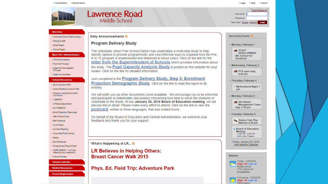
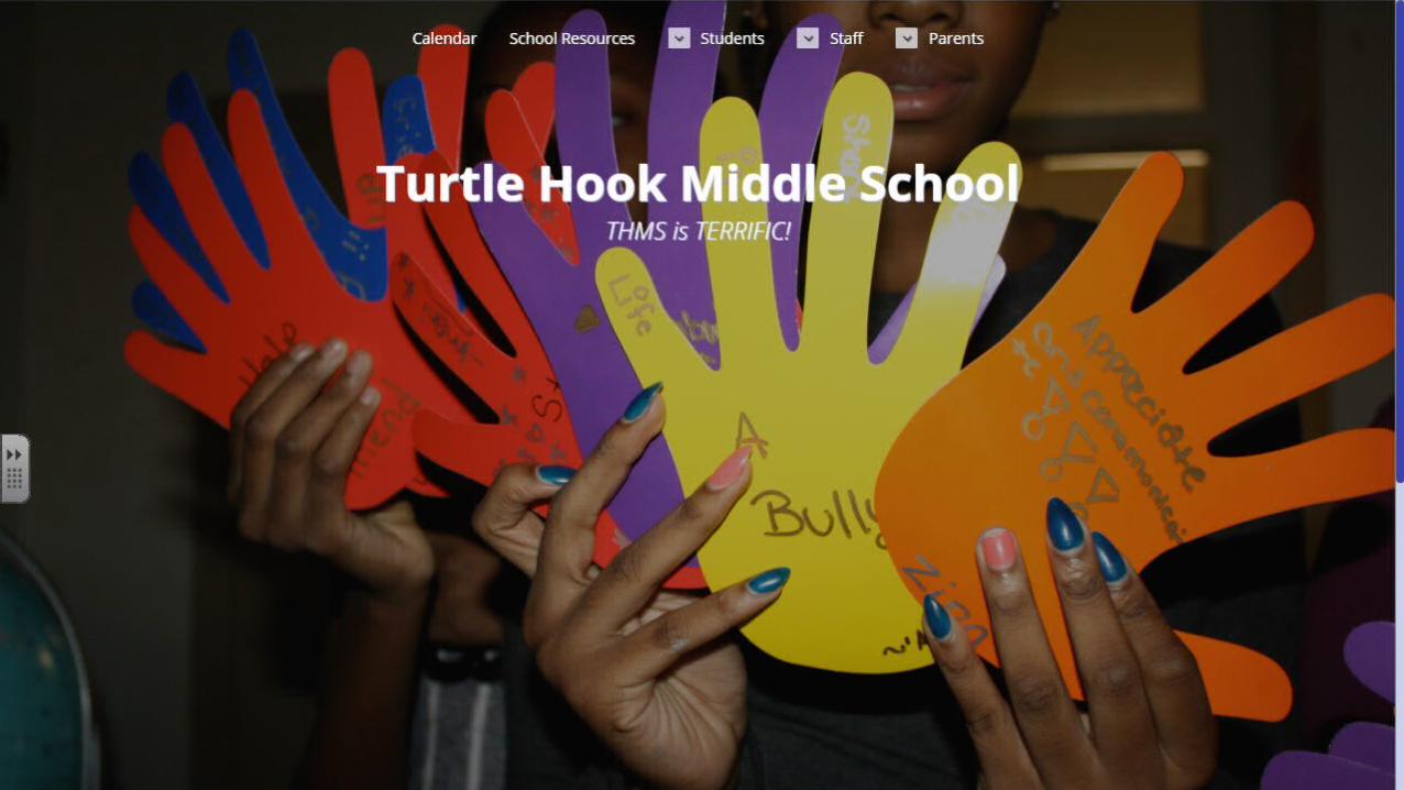
New School Homepage Compatible with all devices and PCs Much less scrolling needed Much more organized, streamlined, and
“neat” looking Webmasters (site managers) are working on
these updates now Here’s a work in progress…
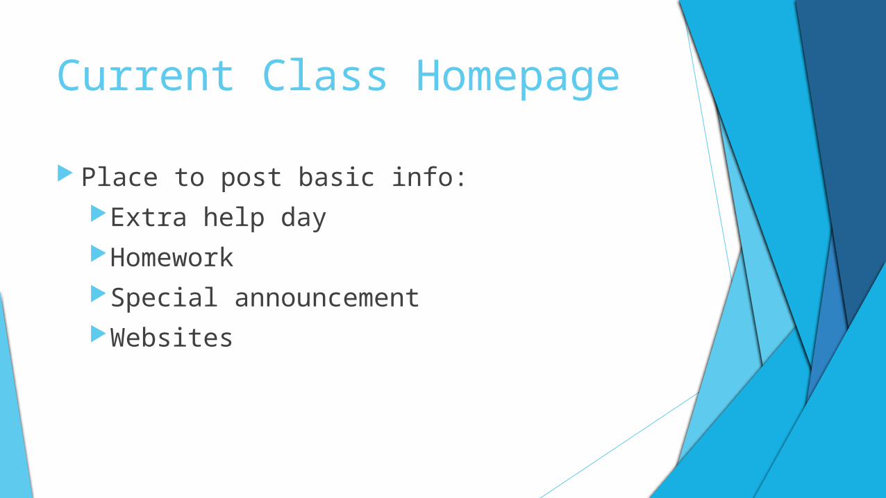
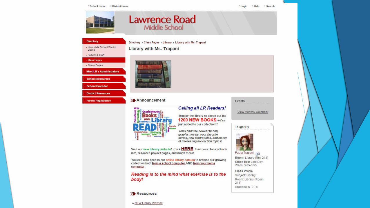
Current Class Homepage Place to post basic info:
Extra help dayHomeworkSpecial announcementWebsites

New Class Page Mirrors look and style of new school
homepages Much more organized, streamlined, and
contemporary looking Add info from “feeds” that we create “behind
the scenes”—calendar of homework/class events, announcements, videos and other multimedia, social media, and more.

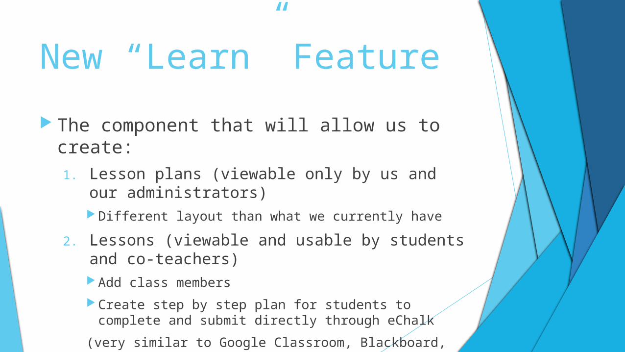
New “Learn” Feature The component that will allow us to create:
1. Lesson plans (viewable only by us and our administrators) Different layout than what we currently have
2. Lessons (viewable and usable by students and co-teachers) Add class members Create step by step plan for students to complete and
submit directly through eChalk(very similar to Google Classroom, Blackboard, and other lesson delivery systems)