E-Wallet, Digital Receipts and Personal Finance Management...
85
MSc Computer Science 2014/2015 Introduction to HCI: 06-21253 E-Wallet, Digital Receipts and Personal Finance Management App United Group 19: Divyjyot Saraon (dss412) Zihao Li (zxl399) Alan Cheng (alc446) Otar Magaldadze (oxm478) 1
Transcript of E-Wallet, Digital Receipts and Personal Finance Management...

MSc Computer Science 2014/2015
Introduction to HCI: 06-21253
E-Wallet, Digital Receipts and Personal FinanceManagement App United
Group 19:Divyjyot Saraon (dss412)
Zihao Li (zxl399)Alan Cheng (alc446)
Otar Magaldadze (oxm478)
1

Problem Statement
Over the past years, smart devices had risen from a mere trend to an integral part of our daily life. As such devices advance with new technological breakthroughs in both software design andhardware capabilities, developers are finding more innovative ways for users to complete day-to-day tasks, such as payment, or managing personal finance, etc.
In certain countries such as Japan, digital payment systems, or otherwise known as eWallet, had been introduced to popular usage since as early as 2004. (NTT DoCoMo, 2004) With the recent announcement of mobile payment capabilities from tech giants such as Google (Google Wallet, 2011) and Apple (Apple Pay, 2014), using smartphones to shop for daily necessities will foreseeably become a major global trend in the e-commerce industry.
As our shopping habit transforms, so too does the way we manage our finances. Before the appearance of smart devices, keeping record of personal spending would mean going through atime-consuming process of manually recording transactions using paper and storing the physical records for future references. On the other hand, with smart devices, the records wouldbe conveniently stored as digital data in an easily accessible medium, such as a finance management applications. While such software does help to reduce the time needed to retrieve records and organise information, the process of inputting raw data remain largely unchanged. Atypical user would still have to enter each record manually into the chosen software each time after they made a purchase or payment. Furthermore, the currently available applications focus solely on storing data, any other functionality or interaction with other applications are limited.
In light of such findings, this group aims to address the above issues with financial managementapps by designing a cross-platform application with added functionality which allows the user to effortlessly store purchase details while paying for the items using eWallet.
Literature Overview
Keeping track of personal finances is undoubtedly one of the most important aspects of many people’s day-to-day life. It might be a subject of great significance for individuals with relatively tight budgets (e.g. students). According to Save the Student (2014) “80% of students surveyed said that money worries are on their mind throughout university.”1 And while finance management issues are as old as trading itself, newly emerging means bring up previously totally inconceivable opportunities in terms of addressing the issues. On the other hand, researches show that managing personal finances become more and more difficult. Personal Finance Education Group (2013) studies convey that “60 percent of UK adults believe that managing money is more difficult now than it was 10 years ago”2. All this calls for a brand new and constantly evolving approaches for meeting the challenges of the dynamically progressing world. Contactless payment technology definitely has its say in this flow. Potential it bears in
2

itself is obvious. There was a 30% rise in total spend only during its first year of PayPass (MasterCardAdvisors 2012).3 And there we have Google Wallet and now the Apple Pay. This relatively new and fast growing novices of technology era suggest bidirectional perspectives from technical viewpoint. As you can exchange data with payment terminals with no effort whatsoever you can perfectly get, save and retrieve a precise info on what you have spent money on, where and how much per item. That’s exactly what individuals worrying about their finances are interested in at the end of a day: What have I spent money on today? The software world is replete with personal money management and budgeting tools and applications. But the best first step for budgeting your future expenditures is nothing but analysing past expenses. And an effective way of keeping track of these everyday expenses is what’s needed.
Available mobile payment
Osaifu-Keitai
Mobile payment services were first introduced in Japan as early as 2004. Commonly known to locals as “Osaifu-Keitai”, which literally translate to English as “Wallet Mobile”, Osaifu-Keitai refers to phones which are mobile payment enabled. Such devices are able to securely store various type of key data of the user such as their citizen identity data, membership cards, company key cards, etc, hence allowing users to gain a higher level of convenience.
By installing third-party applications from specific stores, owner of the device would be able to pay for items at the point-of-sales in store using their mobile device contactlessly. Public transport systems in Japan also adopted this payment method, allowing users to travel on trainsand buses simply by paying for fares with their phones, saving them the time and effort of having to physically buy a ticket.
This early system, while popular and easy to use, was not without flaws. One of which was the fact that the vast amount of personal data is tied to one specific phone. Should the phone be lost, or stolen, all data would be lost with it, hence creating a great inconvenience and a significant security risk. To remedy this flaw, some Osaifu-Keitai service providers offer a remotelocking service to its users. However, activating the lock would often mean having to contact theservice provider first, which can be time-consuming and allowing for a certain time window for those who possess the phone to access the data or participate in unlawful activities such as identity theft. Google Wallet
Google Wallet was introduced to the United States in 2011. Two years after its release, it was installed on over 5 million smartphones in the U.S. While its main feature was mobile payment, users of Google Wallet may also store loyalty cards, special offers and gift cards on their device.In addition to the mobile app, the Google Wallet Card was also introduced as an alternative way
3
of payment and money transfer. During a money transfer between two users, the amount sent would be stored in the card of the receiver, which the user then may choose to withdraw the amount from ATM’s or spend that amount using the card.
Although Google Wallet was promoted as an mobile payment system, it differed from Osaifu-Keitai in various different ways. Firstly, Google Wallet does not require the installation of third party apps to support its payment system, which greatly enhances the users experience by reducing the steps during initial set-up. Secondly, the Google Wallet app is tied to the user’s Google account rather than to a physical device. In case of accidental losses or damage, this configuration provides a higher level of insurance as the users may sign in to their account on a different smartphone with all their previous records and data intact. In case of theft, users may remotely lock their phones by signing in to the Google Wallet’s website.
Apple Pay
Apple Pay is the most recently released product reviewed in this report. Announced on September 2014, this service is largely similar to its competitors in terms of features. The client app named Passbook displays information such as credit card, gift cards, tickets, etc. However,Apple Pay is currently only available for iPhone 6 and iPhone 6 Plus. The reason for this restraint is due to the fact that Apple Pay utilizes a biometric authentication system where the user must register their fingerprint using an iPhone 6 or 6 Plus in order to use its payment features. In comparison to Google Wallet and Osaifu-Keitai, this configuration provides an added layer of protection against theft and fraud. Also differing from its competitors, Apple claims that no purchase information would be stored except for recent purchases.
PERSONAL FINANCE APPS
In the current market there are plenty applications that aim to help us manage our finance. We take three applications from the most popular ones as examples to analysis their features, advantages and disadvantages.
● Mint● Bill Guard● Spending Tracker
According to the Apple App Store, Mint has over 10 million users, been reward as PC Magazine Editor’s Choice(2011), Featured in ITunes App Starter Kit(2011), TIME Magazine’s 50 Best IPhone Apps 2011 and few more awards. This app views all the accounts that user sets, automatically pulls transactions form bank and third party (like PayPal), it also allows user put transactions manual to track cash spending, sets budget for each accounts and categorizes all the spending. Bill Guard pretty much did the same thing, but add one function called flag which is let user flag the suspicious transactions to warn other users, apparently you can also receive
4

the flag that from others. At last, Spending Tracker is the simple version of above two Apps, It only can allow user put all the transaction manually and organize them.In summary, all the main features are listed below:1. Pull transactions automatically2. Add transactions manually3. Organize transactions4. Set budget5. Share finance information with other users
After actually use those three Apps, you can tell they are good application based on the follow advantages:
1. Friendly user interface
Each of them has a clear user interface which is basically built on graphs and icons. That makesstarter of the application can easily to master it even do not know any finance at all.
2. Do help manage finance
By manage and organize all the transactions; it did give user an aspect to know how much and where you have spent. And give them second thought when they try to buy some things more.
3. Encourage people to manage their money
This advantages only for the applications that have share information functions, because with this feature, I do want use this application more frequently, knowing other people using the same App and give me warning about some bills somehow make me like this application.On the other hand, there are plenty reasons why those applications not be installed in everyone’s phone. The disadvantages are listed below:
1. Only pull part financial information and only financial information automatically
People need more information about where they spent money and what did they brought, for theabove applications, people only can get the amount, date, merchant of the bill. Sometimes, the merchant can be unknowing company’s name, in that case, people can’t even remember what did they do to cause this bill, It is annoying.
2. Do anything manually in technology era is against human naturePeople are lazy! We forget something sometime, put every single transaction by us is impossible and inaccuracy amount bothers people. Although, few people manage to pull this off,it’s still exhausting.
5

3. Too much complicate functions
Take Mint as example, they provide so much graphs on their web to help you analysis your finance situation, for most people, they just need general idea about how they spent money, too much information scares people and make them not want use it.
4. Complex setting
To truly master those applications, people need go through a lot of setting like set up every card’s number, account number, name, security number etc. After that there still tons of categorical classes you need set up.In conclusion, the best application for manage finance should be more simple to start with, and give more details about products people brought, manage those products to saving money. It also can be used in daily life not just when you want to know how much did you spent for some period in the past. Most important, should be simpler to use it.
DIGITAL RECEIPT APPs - Proximiant
Proximant is an app which allows users to capture a receipt from any transaction and beam the data to the user’s phone. The user may extract the data in the future for reference. Additionally, users may use their phone’s camera to scan a physical receipt, the app would automatically transform the image to text format. All digital receipts contains a barcode which may be used forfuture return/refunds at the specific stores.
One of the disadvantage of this app is that it is heavily reliant on niche systems offering digital receipt transfer. Therefore, do not fully solve integration of receipt with the payment process. Expenditure tracking is also limited and cumbersome in comparison to other personal finance apps. While it does allow users to assign categories to items, the process is time-consuming thecounter-intuitive. Additionally, this app require users to add other information like categories and retailer names in some instances, using up willpower, mental energy and time.
● Automatic sync with email to register digital receipts● Work seamlessly with stores offering digital receipts with tap-to-pay feature● Work with phone camera to store digital copy of paper receipt● Offer spending summaries and reports(monthly, annual)● Connect with retail stores to offer coupons and discounts based on spending history● The barcode on the digital receipt enables future return/information retrieval from retailer● Receipts stored in cloud/company database● More famous with small business owners● Valued by environmentalists.
6
● One Receipt uses OCR to scan photos of paper receipts to retrieve relevant information.However, Proximiant doesn’t.
Disadvantages :● Heavily reliant on niche systems offering digital receipt transfer. Therefore, do not fully
solve integration of receipt with the payment process.● Spending tracking limited. Not a replacement for personal finance apps. ● Both require the user to painstakingly label or tag receipts ● Also require user to add other information like categories and retailer names in some
instances, using up willpower, mental energy and time.
Analysis of users requirements
Personas (See next page)
7

8
Scenarios
1. Transfer money
During work this morning, Dave remembered he owed Jenny, his secretary, a small sum of money for helping him and his wife buy tickets for a show. When reminded of this, Jenny told Dave it would be good if he could transfer the amount to her bank account since she does not wish to carry too much cash with her. After receiving her account number, Dave returns to his seat and proceeded to transfer the money by login to his online bank portal.
While online banking had made transferring money electronically possible without having to visitthe banks, Dave still wishes for a smoother, faster process which can authenticate his identity without having to log into the bank’s system every single time. He would like a system that does all his financial transactions in one place and records it too. Preferably he would have liked to transfer the money at the very moment he met with Jenny, possibly even without needing her pin.
2. Having lunch with co-workers
At lunch time, Dave just finished his meal with three of his co-workers. As usual, they decided on splitting the bill. However, Dave always find this task to be more time-consuming and complicated than it should. Calculating the right amount, fumbling for change in his pocket and waiting for the card machine to authenticate his card. These tasks all seem too unnecessary, and usually end up with people paying more or less than they need to. Furthermore, he would like to record his spending on lunch so he could save time on calculatinghis expenses at the end of each month. Ideally, the perfect app would require every member to tap the electronic reader with their respective phones and receive a bill split evenly or a single paying member of the group to pay for the lunch and split the receipt into equal parts to electronically receive the money right after.
Being a man who appreciates efficiency, Dave wishes he could complete these tasks with one simple process. He wants a system which could allow him to pay the exact amount each time without using cash or card, even when splitting bills. He also would like the system to keep a record of how much money he spent, what he spent it on and when the transaction occurred. This system should also have an easy-to-use interface where he can see a concise breakdown on his spending history.
9

3. Paying for taxi fares after a night out
While he works hard as a professional during work and does his best to take care of his family, Dave does enjoy the occasional gatherings with his old friends. On such a night, Dave had agreed to meet up with a bunch of his friends at a fancy pub in the city. Since he knew he wouldbe drinking, he decided he would not drive but take a cab home afterwards.
After a fun night, and a few pints of beer later, Dave said goodbye to his friends to take a cab home. When the taxi arrived outside his house, Dave found his wallet from his back pocket and it took him several minutes before finding the right notes to give to the driver in the dark. The process was quite cumbersome since he was a bit tipsy and it was quite dark, except for the small light inside the cab that hardly helped.
Thinking back to this event later, Dave believed that in a similar situation, it would be helpful if there was a system which could allow him to pay for his taxi trip without having to handle notes and risk dropping anything important from his wallet.
(See next page)
10

11

Scenarios
1. Paying for stationary at the university
Stella has a project to work on and goes to the stationary shop on campus to get some pencils and sheets of paper. The place is packed as usual and she wants her payment procedure to be quick and smooth one, as she has spent a lot of time standing in the tiresome queue. Since the payment amount is not too big, Stella would ideally not want to handle coins and too many notes while carrying her books and bag. An app to automatically record her expenditure would also be ideal as she knows she’s going to forget about spending this money in the evening.
2. Buying cosmetics and clothes at the mall
Stella’s coursemates are going to have a party on Friday. She realises she will need some cosmetics and maybe a t-shirt to buy to get prepared for the party. She goes to the shop andas she is really concerned with her budget wants to keep track of all transactions in a consistentand interactive manner. She wants a payment system that allow her to pay for all these small item from various places in the mall in a convenient way, while setting a spending limit and recording them.
3. Night out with friends
While partying with friends at clubs she grabs a lot of cocktails and sometimes even gets so excited she buys drinks for friends, too. Next day when she is hungover, she has no clue exactlywhere she spent her money the previous night. She needs an app that sets a spending limit for special occasions like these. If she is carrying cash or her bank card, she is going to end up spending all the cash or over-spending on her card.
12

13

1. Paying for household/groceries
In many occasions, Mrs Jones needs to makes payment with credit or debit card like purchase the household which would be much easier with an e-wallet.
After registering with her bank card whenever she needs to make a payment in any store, the cashier will scan all the product she has bought. All she needs to do is take her phone, tap it to the receiver and enter the password or give her fingerprint. She can finish this operation with one hand so the other hand can hold her 1-year old baby. As this is a stressful situation while handling her baby, this minimal and easy process will make her shopping much easier.
After this, the payment will automatically appear on her phone and ask her the preferred method of the payment(credit/debit/paypal). In case she makes a mistake or have a second thought, she can cancel or select different method of payment. The phone reader will transfer the receipt page where she can see all the details of the products she has bought like price and vendor name. The process provides Mrs Jones a chance to change the category and review theproducts she has bought. If everything was right all she needs is tap the confirm button and the payment is done!
2. Managing and reviewing the groceries
As a good housewife and mother Mrs Jones likes everything in the house to be organized. A well structured finance management application can provide her the chance to do that. When she would like to review the groceries details, she can go to the calendar page, and all the expiry date of groceries will appear on the exactly date. She even can tap the alert icon to set an alert about something that is about to expire in the next few days so that she won’t waste anything.
Sometimes, the family finish the milk, and the milk expiry date is still on the calendar. She can tap into the date and swap the milk, and it will gives her two options, ‘delete’ and ‘finish’, If shechooses ‘delete’, it will just simply vanish, otherwise it will let her set a reminder for her to buy milk when she goes to shop next.
Her ideal app would provide more information about the products. When Mrs Jones taps on the ‘categories’ button, she can review all the products she has bought sorted by categories. If she wants to review a purchase such as a chair she bought, she can tap into the ‘household’ category, to see the details of the purchase, like the manufacturer and brand of the chair, the vendor and the date she bought it.
14

3. Viewing the summary of expenditure
Mrs Jones would like to know how much she spent last week. She can tap into the summary page where she can see a pie chart of the total money spent and percentages of it divided into categories. Moreover, she can swap it down to see how much she has spent on different categories. If she wants more details, she can tap the name of category to see more information. If she finds that she spent too much on a certain category, she can set a budget limit by tapping the relevant option.
Mrs Jones sometimes buys more items on impulse, so she can tap the budget limit option provided with the category summary view. On the limit option screen she can her budget limit, and set an alert for when she is about to cross it.
(See next page)
15

16

1. Buying the newspaper and lottery ticket
Mr Wenger has had his morning tea and goes for his morning walk. On the way, as per his daily routine, he stops at the convenience store to greet the owner, Gregg,who has become a familiarface over the years. Mr Wenger buys the local newspaper and a pair of lottery tickets.
He usually pays small amounts in change to prevent the coins from accumulating. He pays Gregg the change, waits for him to register the buy on the system and taps the electronic readerto receive the digital receipt of his purchase. It shows him the amount, store name method of payment and items bought. On this screen all he has to do is confirm that the transaction is recorded in the right category and has the right amount. So he will touch the screen once to confirm. He will touch it a second time only if he has to change the category, which is unlikely because this is a routine activity and the system will recognize this behaviour pattern. If there is anything wrong with the receipt, he will press cancel and ask Gregg to check for errors he mighthave made.
Additionally the barcode of the lottery ticket is saved as part of the receipt which Mr Wenger can use later to check if he has become a millionaire. This will reduce the amount of things he must carry back home to just read the newspaper. Mr Wenger prefers it this way. He wouldn’t want to read the newspaper on one of those iPad-things. Old school is how he likes it.
This encounter is very relaxed and part of his daily routine so he is in not in a stressful situation which might otherwise limit his ability to use the app.
2. Parking at the stadium
It’s matchday on Saturday and Mr Wenger is going to the stadium to support his local football team. The stadium’s capacity is 45,000 so there is quite a rush on matchdays. He has to park his car 5 mins away from the stadium. Mr Wenger rolls into the car park with his car. He is goingthrough a lot of emotions. He doesn’t like driving amongst huge crowds. He is anxious about theperformance of his team. He is eager to meet up with his friends and vent out his feelings regarding the new formation the team has been playing. Parking tickets are a necessary evil.
He approaches the ticket station, stops the car beside it and taps the phone at the electronic reader. The authentication screen asks for his biometrics(thumb fingerprint), he chooses the payment method on the next screen(bank account/cash). He taps it again to receive the parkingticket(barcode/number) on his phone, confirms and proceeds to watch the match. He can only use one hand and has to reach out to the ticket stand so being able to use the interface with one hand is necessary. He also wants to reduce the amount of times he has to touch the screen, which in this case is two.On the way back, he taps the phone on the checkout stand, it asks for his authentication and automatically exchanges the saved parking ticket information, deleting it in the process. Mr
17

Wenger only has to touch the screen once and he can now go to the pub to celebrate his team’svictory.
3. Checking lottery result and reviewing finances
Mr Wenger is relaxing on a Tuesday evening and watching TV. He is waiting to see if his lottery ticket brings him any luck. He would also like to review his finances while waiting for the programme to start. It is a relaxed environment, and he does not want too much hassle while viewing his spending during the last month. He is also a little excited and anxious about the lottery ticket. He knows he probably won’t win, but what if he does?
He opens the app to check his lottery ticket. The calendar screen shows up. He taps on Monday, which shows the purchase of the ticket. He taps it again to reveal the ticket details.Mr Wenger won’t be a millionaire today. With that reality check, he resumes to check his expenditure, back in the calendar/category view.
He wants to see how much money he has in his bank account and how much pension will be added to it next month, to reassure him about his security as an old man. He then wants to check how much money he has been spending this week and whether that extra round at the pub after the match was a bad idea. He checks the data visualization, but he wants the screen to be bigger, or the visualization to be big because he hates staring down at a small console. Hethen wants to check his monthly expenditure and how that relates to his incoming pension. He doesn’t recall spending 20 pounds last week at the mall, so he proceeds to check the individual items bought on that particular day. He remembers it was that antique replica sitting on his shelf.Once he is reassured of his balanced life, he closes the app and goes back to watching TV.
First Generation Prototypes
Prototype 1 (See next page)
18

19
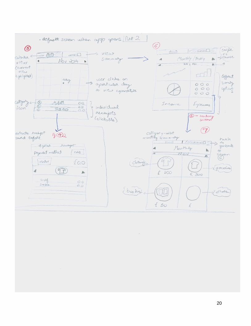
20

Heuristic Evaluation Suggestions
Visibility of system status
● While this prototype does attempt to communicate system status to user by utilizing loading animations, full screen loading page may not be the best option, as it may disorient the user by seemingly pulling them out of the system.
● Use transparency to display loading status while at the same time allowing user to bereminded of which part of the app they are at currently.
● Alternatively, use smaller but eye-catching loading icons/bars to communicate system status without disrupting the user’s experience.
Match between system and the real world
● While selecting payment method, user can actually see an image of a close imitation of the credit or debit cards, this setup would provide a higher level of familiarity,allowing users to more easily adapt to the application.
● May incorporate panning transition to assist user in navigation and better match real world.
User control and freedom
● This prototype does provide users with reasonable control while making purchases. However, while browsing through digital receipts, it may serve to provide the option to return to the previouspage
● Add return/escape options.● Add a menu bar near the top
of the screen and a slider menu to help user navigate more easily
Consistency and standards
● There were a significant level of consistency, as all error messagesand response buttons are shown and located in a unified format.
● The prototype maintained the same level of text to image ration throughout different screens.
● Although colours was not included in this prototype, it would be appropriate to select a colour palette and ensure all screens are of the same colour tone.
Error prevention
● While entering PIN on a touchscreen, this prototype does not show the user how many numbers are needed, or how many numbers had already been entered. It is possible for users to accidentally tap other numbers without knowing until the error message is displayed.
● Display a set of blank spaces and fill in each one as the user enters a number. This would prevent the user from forgetting whether he/she hadalready entered a number or not.
Recognition rather than
● Throughout the transaction process, the user is almost
21

recall constantly shown the total amountto pay for and items to be purchased on the screen. This helps reduce the amount of strain of the users memory.
● Showing an image of a card ratherthan just the name provides a visual cue to remind user of the card they have selected.
Flexibility and efficiency of use
● On the digital receipt screen, users were prompt to assign itemsto a category. However, in real world usage, users may not have the time to assign categories to each item while busy with carryingoff purchased items.
● Redesign the category assignment feature.
Aesthetic and minimalist design
● The use of icons instead of text is more aesthetically pleasing, however, should ensure icons chosen are easily understandable.
● Use icons which are easy to understand or provide users with an help options.
Help users recognize, diagnose, and recover from errors
● The error message designed allows user to choose different options suitable for different situations.
● Add return/escape options.
Help and documentation
● Help or documentation are absent in this prototype.
● Should consider including a “Help” button which provides users with relevant information.
Persona Scenario Evaluation Suggestion
Dave Whitman
1 ● The prototype has no feature thatenables Dave to transfer money to his secretary.
● The aim is to enable transfer through the app itself rather than the bank’s app or internet service. These features are missing in the prototype.
● Add such features in final product.
2 ● The prototype does not include the feature to split a payment intomultiple payees.
● Incorporate a feature in the app itself to splita particular payment or receipt into many parts and mark them
22

down for receiving payment from peers later.
● Or enable partial payment during the payment process by dividing the total into acertain number of equal/ unequal parts.
3 ● The large icon buttons would be easier to navigate despite the user being mildly drunk.
● Use different shades/tones of colours to differentiatebuttons for higher contrast.
Stella Garner
1 ● Being a proficient user of touchscreen devices, Stella would be able to navigate through this payment process with minimal effort.
2 ● The personal accounting featuresmeets most requirements, however the prototype does not have a budgeting function which allows user to set spending goals.
● Add feature in future releases.
3 ● This prototype will allow to Stella to see how much she spent on what items the night before. However, there were no features to limit her spending.
● Add feature in future releases.
Mrs Jones 1 ● This prototype addresses the issue effectively.
● Since most buttons designed are easy to locate and tap, Mrs Jones should not have trouble using this app while holding her baby.
2 ● The flow select category feature may cause delay while Mrs Jones is making purchases, as she simply does not have the time to assign categories to each item.
● Redesign the category assignment feature, may consider placing it after the purchase had been made.
3 ● Reviewing finances are relatively easy with multiple visual
23

breakdowns. ● As with previous scenario, the
app does not support budgeting feature.
Mr Wenger
1 ● This prototype does not provide means to record transactions made with cash.
● May incorporate features which allows users to receive digitalreceipts from cash payments.
2 ● Lacking feature to save parking tickets
● Add feature which allows the device to store additional information, such as barcodes or numeric codes.
3 ● This prototype does not appear to have features which receives external data such as lottery numbers.
● Adding external access points which takes users to the relevant website where applicable.
Prototype 2
Step 1:
User taps device on the cashier terminal at site. The software automatically gets started and an authentication screen appears. If the user has preconfigured option of fingerprint authentication,then they just touch it to access or otherwise enter password. Below screen assumes password authentication:
(See next page)
24

Step 2:
Authentication process shouldn't take long, but nevertheless:
If password or fingerprint wasn't authenticated a failure message appears for 2 seconds and theflow goes back to Step 1:
25

If the authentication is successful it proceeds to step 3:
Step 3:
A summary of the transaction appears for the user:
(See next page)
26

Step 4:
In this step a user is displayed a screen with their balances on different account from which theywill choose a payment method or they will have a chance to decline the transaction at this stage, as well.
27

If the user chooses an account with insufficient balance on it and presses proceed, a warning message is displayed and the screen goes back to screen above:
(See next page)
28

Otherwise if the transaction is successful it will inform the user about completion in Step 5:
Step 5:
Successful transaction.
29

Analytic part
Main menu of the application. Back button is assumed to be generic to the mobile operating system for following screens.
Transaction history window allows to view transactions in a table, giving an option to choose theperiod from calendar
30
Main Menu
Transaction History
Charts
Set Budget Goal
Budget Goal Progress
Transaction History
Period: 1/09/2014 – 1/11/2014 Filters

and also allowing to filter according to different parameters. Multiple selection in lists of parameters is also possible.
Charts
31
Transaction History
Period: 1/09/2014 – 1/11/2014 Filters
Filter transactions
Category: All
Vendor: All
Product: All
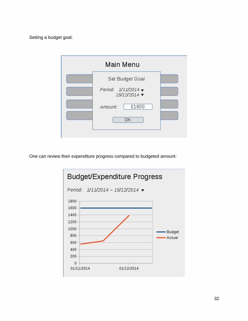
Setting a budget goal:
One can review their expenditure progress compared to budgeted amount:
32

The device can also be configured to notify the user when expenditures are reaching the budgeted amount with an arbitrary number.
Evaluation
Heuristic Evaluation Suggestions
Visibility of system status
● The prototype does a good job ofkeeping the user informed of the progress during the authentication and expenditure process. The loading screen, error messages and completion messages are justly placed.
● However, the are no options on these screens. There is also no loading screen when the transaction is taking place.
● Add a progress screen when the transaction is happening.
● Add option buttons for the user when a failure screen or completion screen is displayed.
Match between system and the real world
● The jargon used throughout the prototype matches the real world and is easily understandable by the users depicted in the personas.
● The button with the word “decline” can be substitutedby cancel since the user is cancelling a transaction and not declining anything from the vendor.
User control and freedom
● There is no flow to the app in the prototype.
● There is no exit or home button to return to the main menu in the finance management part of the prototype.
● The are no navigation buttons to move between screens.
● There is no button to go back or cancel while setting the budget goal.
● The drop-down menus to select the periods of dates and the filters are a good feature which can be used in the next prototype.
● Add a home button to the main menu.
● Add submit and cancel button to authentication screen.
● Add navigation buttons to enable user to move between screens.
● Add cancellation option while setting budget goals and other parameters.
● Utilize the period and filter setting options in the next prototype.
Consistency and standards
● The dates and labels are consistent throughout the app.
● The screen with the charts labels the x-axis as “Products”, whereasit is showing the expenditure by
● Correct x-axis label in the charts screen.
33

categories. this could confuse theuser.
Error prevention
● The prototype does not state what happens in case the user enters an invalid period for the expenditure summary.
● The user shouldn’t get an “insufficient funds” message if thecards screen displays the balance.
● What happens if the budget goal is bigger than the available budget?
● Add control feature on setting the time period.
● Add limit on the budget goal itself.
● Add feature that disables the user to select a card with insufficient balance.
● The digital receipt should come after the transaction has taken place and not before.
Recognition rather than recall
● The screen headings enable the user to remember which part of the app they are using.
● However, a lack of navigation buttons and menus makes it incredibly hard for the user to usethe app seamlessly.
● The consistent use of drop-down menus throughout the prototype is a good feature.
● Add navigation buttons/menu.
● Add home button.
Flexibility and efficiency of use
● It looks like the prototype automatically puts the purchases into categories, but it is not explicitly stated.
● Does the prototype highlight the most frequently used card during payment?
● Enable easy payment with most frequently used card.
● State how the category selection and suggestion works.
● The app could recommend budget goals as an accelerator.
Aesthetic and minimalist design
● The prototype is minimalistic. Thecolor is used only on selected screens.
● The drop-down menu’s disturb the aesthetic of the screens.
● The transaction history page is limited in it’s design and restricts the user’s review options to the time period option.
● Add color scheme in next generation prototype.
● Improve the use of drop-down menu’s. They shouldn’t overlap the information behind them if it is not blurred.
● Improve the design of the transaction history page to maximize user options.
Help users recognize, diagnose, and recover from errors
● The error message are sufficiently displayed.
● However, these do not enable theuser to redo the process or cancel.
● There is no option to review the
● Add option buttons for the user when a failure screen or completion screen is displayed.
● Add option to review payment accounts in case
34

bank account in case of failure of payment.
of failure.
Help and documentation
● There is no set-up process in the prototype.
● How are the users supposed to set-up their cards, passwords and other relevant details?
● Add the set-up and registration process for adding cards, accounts, and passwords.
Persona Scenario
Evaluation Suggestion
Dave Whitman
1 ● The prototype has no feature that enables Dave to transfer money to his secretary.
● The aim is to enable transfer through the app itself rather than the bank’s app or internet service. These features are missing in the prototype.
● Add money transferring features.
● Enable payment/transfer of money to a peer through the app itself.
2 ● The prototype does not include the feature to split a payment into multiple payees.
● Just like Scenario 1, the feature to transfer money or share a bill has not been incorporated.
● How will the app split a particular payment? Will the impetus lie with the vendor to split the bill into many bills?
● The prototype does successfully show the payment procedure and the digital receipt being recorded into the native finance management system.
● Incorporate a feature in the app itself to split a particularpayment or receipt into many parts and mark them down for receiving payment from peers later.
● Or enable partial payment during the payment processby dividing the total into a certain number of equal/ unequal parts.
3 ● Assuming that the taxi has ane-reader for the e-wallet system, this scenario is successfully addressed by thepayment system of the app prototype.
● Since Dave is tipsy or drunk, the payment procedure needsto have more error correction,
● Add a progress screen when the transaction is happening.
● Add option buttons for the user when a failure screen or completion screen is displayed.
● The digital receipt should come after the transaction
35

as he is more likely to make mistakes using the app.
has taken place and not before.
● The authentication(first screen) should have option buttons for confirm and cancel.
Stella Garner
1 ● This scenario is successfully addressed by the payment system of the app prototype.
● Similar improvements that have been suggested in scenario 3 for Dave Whitman.
2 ● This scenario too is addressed successfully with the budget goal feature.
● Improve the use of dialog box. It shouldn’t overlap the menu behind it if the menu is not blurred.
● Add limit on the budget goalitself through back-end development if it exceeds the amount available.
3 ● This scenario needs to be addressed by further developing the features enabling Stella to set budget goals in scenario 2. The budget goal option does enable a time period but could be improved through design.
● It is not clear if the budget goal stops a user from spending, displays a prompt or is just an indicator on the review graph.
● Enable setting budget goalsfor special occasions/single day in the finance management part of the app.
● Enable budget goals to prompt user not to spend when expenditure goes beyond the set limit.
Mrs Jones
1 ● This scenario is successfully addressed by the payment system of the app prototype.
● There needs to be more accelerators, since she will behandling her 1-year-old baby.
● Requires more error prevention since her attentionis divided and she is more susceptible to making an error.
● Enable easy payment with most frequently used card.
● Add option to review payment accounts in case of failure.
● Add a progress screen when the transaction is happening.
● Add option buttons for the user when a failure screen or completion screen is displayed.
● The digital receipt should come after the transaction has taken place and not before.
36

2 ● This scenario is partially addressed.
● The expenditure review is sufficient in looking over expenditure over a time period and according to categories.
● The prototype does not incorporate the feature to track grocery expiry dates.
● Tracking grocery expiry dates might not be a good idea since the app is focused on paying and expenditure tracking. It doesn’t need to be incorporated.
3 ● The transaction history page successfully provides a ‘filter’ option to review payments by different parameters.
● However, individual receipts that were saved aren’t accessible through any button.
● The charts are not interactive and do not offer more depth
● Add the option to review individual payments and their receipts, as saved during the payment process.
● Make the charts interactive, to enable user to view payments within a certain category.
● Retain the ‘filter’ option or incorporate into new design in next generation prototype.
Mr Wenger
1 ● This scenario is successfully addressed by the payment system of the app prototype.
● However, the digital receipt does not store the barcode oralternative unique informationfor returning items, or in this case checking whether Mr Wenger has won the lottery.
● Since he is an old man, there needs to be more error correction and visibility of system status.
● There is no option for paying in cash.
● More error correction as suggested earlier.
● Option buttons during the payment process.
● Add a progress screen when the transaction is happening.
● Incorporate option for paying in cash and receiving just the receipt.
2 ● There is no option for paying in cash.
● The prototype doesn’t have a feature to save parking ticketsand other tickets as receipts, which fails to address this scenario.
● Incorporate option for paying in cash and receiving just the receipt.
● Add feature for saving parking tickets and other tickets as digital receipts that can be used later for checking out, going to the cinema or travelling.
37

3 ● The prototype doesn’t have a feature to save parking ticketsand other tickets as receipts, which fails to fully address this scenario just like the last one.
● The drop-down menu’s may be too small and ambiguous for Mr Wenger to navigate.
● There is no exit or home button to return to the main menu in the finance management part of the prototype, which might confuse him.
● There are no navigation buttons between screens.
● He can’t look up single receipts.
● He cannot review his card details.
● Add feature for saving parking tickets and other tickets as digital receipts that can be used later for checking out, going to the cinema or travelling.
● Add the following buttons - home, exit, navigation buttons.
● Enable reviewing single purchases.
● Enable reviewing the registered cards.
Prototype 3
(See next page)
38

39

40

41

42

43

44

Evaluation
Heuristic Evaluation Suggestions
Visibility of system status
● Payment part is pretty straightforward and would be intuitive to the most of users. Progress of application is easily seen as well.
● However, while in the management part screens it might slightly confuse users whether where they are.
● Add an indication in finance management screens, probably, a title - “Finance Management”.
Match between system and the real world
● Payment screens pretty much resemble real world scenario and words used on them are easily understandable to an average user.
● N/A
User control and freedom
● Although the payment procedure is intrinsically simple and comprises up to 3 steps it’s,nevertheless, unclear what stage a user is able to cancel the process or go back to previous step.
● Pie chart screen gives you ability to choose a year and a month of spendings, but would be nice to be able to choose a particular day, too.
● Also, in the payment methods management screen one can obviously add methods/accounts, but it’s unclear whether one can remove a method from the list.
● It is not clear how does a user input it’s budget goal.
● Add back and cancel buttons in payment screens
● Add day of month input field.
● Also possibility to remove a method of payment from the list in settings would contribute to increased user control.
● Add means to insert budget goal amount.
Consistency and standards
● All the labels used throughout the prototype are consistent andunderstandable, used in a consistent way in all screens.
● N/A
Error prevention ● The prototype doesn’t state what happens if a user provides a method/account of payment which doesn’t have enough
● A mechanism for dealing with accounts/methods of payment that don’t
45

balance to cover the payment amount.
have enough balanceshould explicitly be implemented.
Recognition rather than recall
● Once again a payment procedure is pretty simple and straightforward, there is hardly ever anything to memorize for recurring usage.
● Management and analysis part is also simple in usage. Most of the dialog hierarchy is kept within one or two steps from top level.
● N/A
Flexibility and efficiency of use
● This prototype is good at achieving most of the declared goals. Though, as it seems that it’s possible to review and analyse data only on this device.
● Would be nice for flexibility to be able tosync and/or access data from other devices, and also export to portable formats. For instance to be able to analyse data on a wider screen on PC or laptop.
Aesthetic and minimalist design
● Most parts of the application is minimalistic and concise, but there is still a room for improvements, like simultaneous username and password input during authentication may generally considered unnecessary here.
● Pie chart screen also features a list of purchases and a budget progress check widget, which make this screen really overly packed.
● A brief PIN code protection would be enough instead of username plus password authentication.
● Purchase transactions and budget/expenditure check features should moved to separate two screensfrom pie chart screen.
Help users recognize, diagnose,and recover from errors
● If the user accidentally chooses a wong payment method, it is not likely that app provides means to revert that.
● A step to ask a user to confirm the payment method should be provided, possibly configurable optionally. And a means to revert the decision is also needed.
Help and ● The application is meant to be ● A brief list of features
46
documentation as simple as possible by design,so that users would orientate without reading some specific documentation, however a list offeatures with brief descriptions can be added to the application.
and short descriptions would berecommended for inclusion in application.
Persona Scenario Evaluation Suggestion
Dave Whitman
1 ● Money transfer feature isn’t considered in the prototype.
● Take into regard this scenario and implement the feature.
2 ● Device-to-device money transfer, as well as, payment receipt sharing isn’t implemented in this prototype.
● These features need to be implemented in following prototypes.
3 ● Assuming that a taxicab is connected to the e-payments infrastructure the scenario is essentially addressed by the prototype.
● No further suggestions other than pointed in heuristic evaluation for making authentication simpler and applying mechanisms for preventing and reversingmistakenly chosen payment method are applicable here.
Stella Garner
1 ● The prototype completely addresses user’s needs in this case.
● Same as above.
2 ● This scenario is also addressed, as she can use the app for payments as well as keeping track of her expenditures. But the big problem is the prototype doesn’t show how exactly would a user access the management part.
● An explicit statement needs to be made whether how users access the managementand analytic part of the application. If needed, a main menu, or an introductory home screen might be added.
3 ● She can easily check her spending history the next day or anytime later in the financemanagement part of the app. She also can set a budget limit alerting her when spendings reach the ceiling set.
● N/A
47
Mrs Jones 1 ● By most part the prototype meets her needs, with the exception that she won’t be able to cancel the transaction in case of mistake.
● The need in giving a user ability to go back and reselect payment type, which was also pointed out in the evaluation by heuristics.
2 ● The application addresses theissue in terms of reviewing past transactions, according to categories and partially according to dates as well.
● The alert for food expiry is also visible on the calendar as an exclamation mark.
● However, the reminder for buying fresh food isn’t implemented in the prototype.
● Addition of ability to choose a day of month in the transaction historyscreen, also pointed out in heuristic analysis.
● The alert for expiry feature should be more elaborate in future prototypes.
● Implement the food purchase reminder if theapplication is actually going to address this requirement, otherwise explicitly state the opposite.
3 ● The scenario is mainly addressed including expenditure budgeting feature.
● N/A
Mr Wenger
1 ● The prototype meets the purchase procedure requirements in most part, butdoesn’t have check for errors or cancellation features.
● Receiving a lottery ticket electronically isn’t addressed in the prototype.
● As stated in the user control evaluation in heuristic method above transaction cancellation and also error prevention mechanisms should be included in the next generation prototype.
● The feature of receiving electronic lottery ticket needs to be decided in the future prototypes and implemented, if it is confirmed.
2 ● The prototype solves the user’s need to make a quick payment at parking station, however requirement of the app to enter a username as well as a password, would be a hindering factor.
● Make authentication procedure briefer and asminimalistic as possible not to harm security issues.
48

3 ● The prototype would perfectlyallow Mr. Wenger to review his expenditures, including that particular purchase of a lottery ticket. The only thing ishe might find himself overwhelmed with the amountof details residing on one pie chart screen, which is the 3rd screen of management part of the application.
● However, on the other hand, means for inspecting the details of the ticket itself and checking the result of the gamble aren’t covered in here.
● Pie chart screen should be split into, most likely, 3 screens, containing transaction list and budget limit control mechanisms in separateones.
● The issue of the lack of providing detailed information of a purchased item, as well as, possibility of checking the lottery ticket outcome needs to be addressed and decided upon in upcoming prototypes.
In conclusion, we can say that the prototypes meet most of the goals for e-wallet payments andautomatic digital receipt, as well as storing transactions in a retrievable and convenient way in the form of a transaction history table or a pie chart for better analysis ability. They also provide budgeting and expenditure controlling mechanisms. However, they largely lack of the error prevention and cancellation features while making a purchase. Also a few points in terms of making the app more minimalistic and aesthetically elaborate are needed to be addressed.
Second Generation Prototype
(See next page)
49

50

51

52

53

54

55

56

57

58

59

60

61
62

63

64

65
66

67

68

69

70

71

72

73

Summarised Flowchart of the Screens
(See next page)
74

75

Evaluation
Heuristic Evaluation Suggestions
Visibility of system status
● The prototype does a good job of keeping the user informed of the progress during the authentication and expenditure process. The loading screen, error messages and completion messages are justly placed with the graphic being filled with colour as the process completes.
● However, there is no progressscreen when the user enters the pin. Only one for the biometric scan.
● What if the registration of a card takes longer than a few seconds?
● Add a progress status screen when pin is entered.
● Add progress status screen when card is being registered.
Match between system and the real world
● The jargon used throughout the prototype matches the realworld and is easily understandable by the users depicted in the personas.
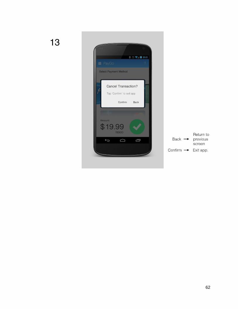
● On screen 13, the word ‘back’ indicates going back and successfully completing the payment whereas ‘confirm’ is indicating cancelling the payment. This might be confusing, especially for someof our scenarios.
● Replace options labelled ‘back’ and ‘confirm’ on screen 13 with ‘yes’ and ‘no’.
User control and freedom
● The is a natural flow to the app in the prototype.
● There is an adequate home button on the side menu.
● The two major navigation buttons ‘Calendar’ and ‘Chart’ aptly divide the finance management part of the app.
● Blurring background graphics is also effective in using features such as setting a date period.
● There is no exit or navigation button when adding an account. Add an option.
76

Consistency and standards
● The dates and labels are consistent throughout the app.
● On screen 13, the positive/affirmative action button ‘confirm’ is on the left and the negative action button‘back’ is on the right. While throughout the prototype, these are on the opposite side.
● Change the labels of these two buttons on screen 13 and swap their positions.
Error prevention ● The prototype has successfully implemented most of the error prevention features missing in the first generation prototypes.
● When deleting a card on screen 24m the prototype does not prompt the user for aconfirmation message.
● Add prompt when deleting a card.
Recognition rather than recall
● The screen headings and bluecolor scheme enable the user to remember which part of theapp they are using.
● The navigation throughout theprototype is very good.
● The colour scheme is also helpful in making users remember features of the app.Such as red buttons for cancellation and green for confirmation.
Flexibility and efficiency of use
● It looks like the prototype automatically puts the purchases into categories, butit is not explicitly stated.
● Does the prototype highlight the most frequently used card during payment?
● Enable easy payment with most frequently used card.
● State how the category selection and suggestion works.
Aesthetic and minimalist design
● The prototype is minimalistic. The color scheme is very effective and efficient in communicating the functionality of the app.
● The confirmation on screens 16 and 19 for payment and saved receipt respectively are too small. This might cause delay or confusion.
● Make the confirmations on screen 16 and 19 bigger.
77

Help users recognize, diagnose, and recover from errors
● The error message are sufficiently displayed.
● The updated error messages have the correct option buttons.
● It is not stated what the question mark on the various screens is supposed to do.
● Stated the functionality of the question mark on various screens.
Help and documentation
● There updated set-up processin the prototype is very good and makes up for the lack of the same in the first generation prototypes.
● Create a screen for the question mark with help documentation.
Persona Scenario Evaluation Suggestion
Dave Whitman
1 ● The prototype has no feature that enables Dave to transfer money to his secretary.
● The aim is to enable transfer through the app itself rather than the bank’sapp or internet service. These features are missing in the prototype.
● Add money transferringfeatures.
● Enable payment/transfer of money to a peer through the app itself.
2 ● The prototype does not include the feature to split a payment into multiple payees.
● Just like Scenario 1, the feature to transfer money or share a bill has not been incorporated.
● How will the app split a particular payment? Will the impetus lie with the vendor to split the bill into many bills?
● The prototype does successfully show the payment procedure and the digital receipt being recorded into the native finance management system.
● Incorporate a feature inthe app itself to split a particular payment or receipt into many parts and mark them down for receiving payment from peers later.
● Or enable partial payment during the payment process by dividing the total into a certain number of equal/ unequal parts.
78

3 ● Assuming that the taxi has an e-reader for the e-walletsystem, this scenario is successfully addressed by the payment system of the app prototype.
● Since Dave is tipsy or drunk, the payment procedure the enhanced error correction will help him make a payment on such an occasion.
● Add progress status screen after pin is entered.
Stella Garner
1 ● This scenario is successfully addressed by the payment system of the app prototype.
2 ● While the payment and recording features fulfill most of the criteria, the prototype is lacking a budget goal setting.
● Add budget goal feature.
3 ● This scenario needs to be addressed by further developing the features enabling Stella to set budget goals in scenario 2.Since the feature is absent, it needs to be added first.
● Add spending limit feature alongside budget goal feature that prompts user before spending if the set limit is reached.
Mrs Jones
1 ● This scenario is successfully addressed by the payment system of the app prototype.
● There needs to be more accelerators, since she willbe handling her 1-year-old baby.
● Enable easy payment with most frequently used card.
● There should be an accelerator so that the user doesn’t have to touch the blue button on screen 16 and then subsequently save the receipt on screen 17.
● Add a single button to combine the two step process above.
2 ● This scenario is partially addressed.
● The expenditure review is sufficient in looking over expenditure over a time
● Tracking grocery expirydates might not be a good idea since the app is focused on paying and expenditure
79

period and according to categories.
● The prototype does not incorporate the feature to track grocery expiry dates.
tracking. It doesn’t need to be incorporated.
3 ● The calendar view and the chart view are very good for reviewing expenditure.
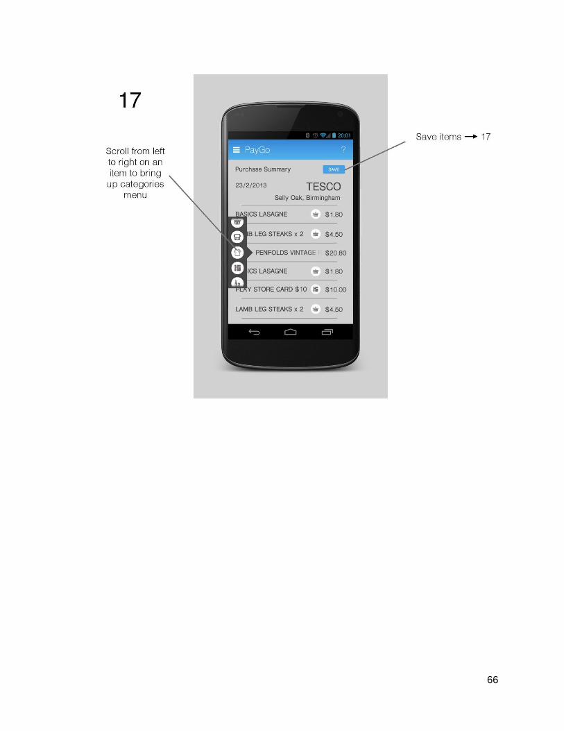
● Individual receipts for individual payments that were saved are now accessible as well.
● The charts are also now interactive and offer more depth.
● The prototype is lacking a budget limit feature.
● Add budget goal/limit feature.
● There should also be a feature to view how much balance a certaincard has left, preferablyon screen 25.
Mr Wenger
1 ● This scenario is successfully addressed by the payment system of the app prototype.
● However, the digital receiptdoes not store the barcodeor alternative unique information for returning items, or in this case checking whether Mr Wenger has won the lottery.
● There is no option for paying in cash.
● Add a progress screen when the pin is entered.
● Incorporate option for paying in cash and receiving just the receipt.
2 ● There is no option for paying in cash.
● The prototype doesn’t have a feature to save parking tickets and other tickets as receipts, which fails to address this scenario.
● Incorporate option for paying in cash and receiving just the receipt.
● Add feature for saving parking tickets and other tickets as digital receipts that can be used later for checking out, going to the cinema or travelling.
3 ● The expenditure review system works well even forsomeone as old as Mr Wenger.
● He can successfully check
● Add feature for saving parking tickets and other tickets as digital receipts that can be used later for checking
80

for an individual payment ifhe doesn’t remember making it and look up it’s receipt.
● There is no details about his bank accounts.
● The prototype doesn’t have a feature to save parking tickets and other tickets as receipts, which fails to fully address this scenario just like the last one.
● The confirmation messages might be too small for Mr Wenger to notice.
out, going to the cinema or travelling.
● Make the confirmation icons larger.
● Add feature to see cardbalance and bank account balance.
User Testing
Name: Scarlett ZhaoGender: FemaleAge: 21Occupation: Student
System Usability Scale:(Scale of 1 to 10, 1 = Strongly Disagree, 10 = Strongly Agree)
1. I think that I would like to use this system frequently10
2. I found the system unnecessarily complex2
3. I thought the system was easy to use 10
4. I think that I would need the support of a technical person to be able to use this system3
5. I found the various functions in this system were well integrated9
6. I thought there was too much inconsistency in this system2
7. I would imagine that most people would learn to use this system very quickly8
8. I found the system very cumbersome to use2
81

9. I felt very confident using the system8
10. I needed to learn a lot of things before I could get going with this system1
Comments:1. Should allow users to skip checking digital receipt and return to it later2. Should allow users to delete unnecessary receipts3. Should include function which locks phone if wrong pin number or wrong fingerprints
was input multiple times.
Informant: LeoAge:30Background: Businessman, use application to transfer money frequently and loyal to exactly application.
Feedback: Basically this app is easy and simple to use, but seems too simple to be secure. He would use it only for under 100 pounds transfer. The manage finance part did not seem attractive to him. Some functions like edit/delete the item’s category after payment is not visible to him, quote as “I won’t tap those button unless someone told me to.” But he will give it a shot ifhe saw this application in the app store.
System Usability Scale:Use point from 1-10 to scale (10 means Strongly agree)
1. I think that I would like to use this system frequently7 points
2. I found the system unnecessarily complex3 points
3. I thought the system was easy to use 10 points
4. I think that I would need the support of a technical person to be able to use this system1 point
5. I found the various functions in this system were well integrated7 points
6. I thought there was too much inconsistency in this system2 points
7. I would imagine that most people would learn to use this system very quickly8 points
8. I found the system very cumbersome to use5 points
9. I felt very confident using the system6 points
10. I needed to learn a lot of things before I could get going with this system
82

3 points
Informant: SimonAge:22Background: Student, master of gaming application, willing to explore on the application store.
Feedback: He thinks this application is cool and easy to use, kind of solve his problem of manage his personal daily spent. Basicly likes it. But if he saw this application in the app store he will be confuse about how to start the payment (he has no acknowledge of NFC) and the picture of handle the phone to the receiver still not clear to him. After all, he is willing to give it a try if he saw one.
System Usability Scale:Use point from 1-10 to scale (10 means Strongly agree)
1. I think that I would like to use this system frequently9 points
2. I found the system unnecessarily complex2 points
3. I thought the system was easy to use 9 points
4. I think that I would need the support of a technical person to be able to use this system1 point
5. I found the various functions in this system were well integrated7 points
6. I thought there was too much inconsistency in this system2 points
7. I would imagine that most people would learn to use this system very quickly9 points
8. I found the system very cumbersome to use3 points
9. I felt very confident using the system10 points
10. I needed to learn a lot of things before I could get going with this system1 points
83

Summary and conclusions
In summary, we could say that, as testing with users reveals it as well, this application is basically a needed one. As a result most of them answered that they would use this app frequently. Nevertheless, quite a few points need to be addressed in the future generations or whether it comes to be a final product, like, security should be reassured as some of the test users had concerns about that it seemed overly simple. It also could be that a parameter for daily limit of expenditures should be introduced. Mainly, the current prototype meets the goals set by project in most of its aspects. However, some minor to middle importance user interface issues will have to be worked on and elaborated before the release of a working prototype.
As of team, we all agree that we accomplished, more or less, an adequate job in terms of finding the ways and solutions to our initially stated problem. All of us contributed equally to work and we learnt much from this project as well as from each other. We tried to go back to previous topics and reconsider things, and improve them. We even agreed to redo the first round of low fidelity prototypes as we understood our initial work wasn't even close to what it should have been. Amidst the packed workload of the whole course, we tried to meet as often as we could to evaluate our ongoing progress. We wanted to make sure we employ as much tools as we could, including theoretical and practical ones. On the other hand we had difficulties in research for useful resources relevant to our work, mainly because the idea itself at present ispretty futuristic and is based on a very strong assumption that the backend infrastructure for digital receipts is already available. As it appears not much such ideas have gone around so far as there is quite a lack of discussion of this type of projects in the technical and academic literature. Nevertheless, this is what the team has managed to come up with.
84

References
1http :// www . savethestudent . org / money / student - money - survey - results . html #02http :// www . pfeg . org / about - us / news / new - research - shows - managing - our - personal - finances -getting - harder3http :// newsroom . mastercard . com / press - releases / new - mastercard - advisors - study - on -contactless - payments - shows - almost -30- lift - in - total - spend - within - first - year - of - adoption /
85