Dust: A Visualization Tool Supporting Parents’ School...
7
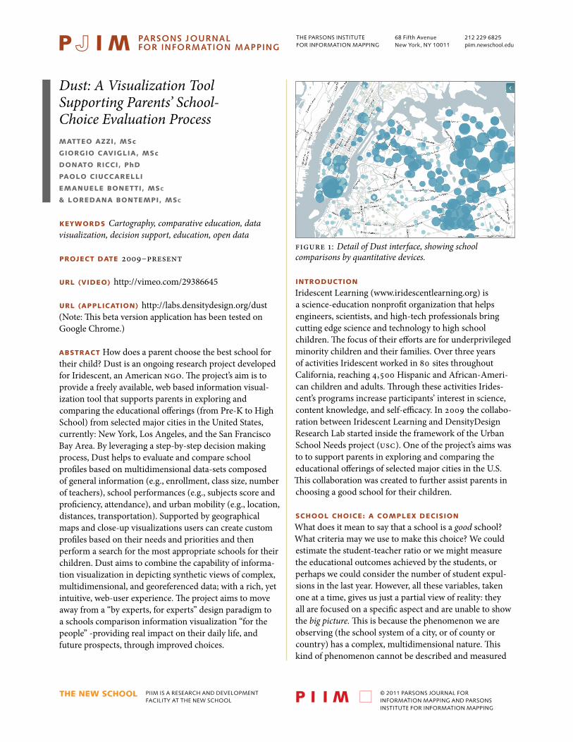
PIIM IS A RESEARCH AND DEVELOPMENT FACILITY AT THE NEW SCHOOL © 2011 PARSONS JOURNAL FOR INFORMATION MAPPING AND PARSONS INSTITUTE FOR INFORMATION MAPPING 68 Fifth Avenue New York, NY 10011 THE PARSONS INSTITUTE FOR INFORMATION MAPPING 212 229 6825 piim.newschool.edu KEYWORDS Cartography, comparative education, data visualization, decision support, education, open data PROJECT DATE 2009–present URL (VIDEO) http://vimeo.com/29386645 URL (APPLICATION) http://labs.densitydesign.org/dust (Note: is beta version application has been tested on Google Chrome.) ABSTRACT How does a parent choose the best school for their child? Dust is an ongoing research project developed for Iridescent, an American NGO. e project’s aim is to provide a freely available, web based information visual- ization tool that supports parents in exploring and comparing the educational offerings (from Pre-K to High School) from selected major cities in the United States, currently: New York, Los Angeles, and the San Francisco Bay Area. By leveraging a step-by-step decision making process, Dust helps to evaluate and compare school profiles based on multidimensional data-sets composed of general information (e.g., enrollment, class size, number of teachers), school performances (e.g., subjects score and proficiency, attendance), and urban mobility (e.g., location, distances, transportation). Supported by geographical maps and close-up visualizations users can create custom profiles based on their needs and priorities and then perform a search for the most appropriate schools for their children. Dust aims to combine the capability of informa- tion visualization in depicting synthetic views of complex, multidimensional, and georeferenced data; with a rich, yet intuitive, web-user experience. e project aims to move away from a “by experts, for experts” design paradigm to a schools comparison information visualization “for the people” -providing real impact on their daily life, and future prospects, through improved choices. Dust: A Visualization Tool Supporting Parents’ School- Choice Evaluation Process MATTEO AZZI, MSc GIORGIO CAVIGLIA, MSc DONATO RICCI, PhD PAOLO CIUCCARELLI EMANUELE BONETTI, MS C & LOREDANA BONTEMPI, MS C INTRODUCTION Iridescent Learning (www.iridescentlearning.org) is a science-education nonprofit organization that helps engineers, scientists, and high-tech professionals bring cutting edge science and technology to high school children. e focus of their efforts are for underprivileged minority children and their families. Over three years of activities Iridescent worked in 80 sites throughout California, reaching 4,500 Hispanic and African-Ameri- can children and adults. rough these activities Irides- cent’s programs increase participants’ interest in science, content knowledge, and self-efficacy. In 2009 the collabo- ration between Iridescent Learning and DensityDesign Research Lab started inside the framework of the Urban School Needs project (USC). One of the project’s aims was to to support parents in exploring and comparing the educational offerings of selected major cities in the U.S. is collaboration was created to further assist parents in choosing a good school for their children. SCHOOL CHOICE: A COMPLEX DECISION What does it mean to say that a school is a good school? What criteria may we use to make this choice? We could estimate the student-teacher ratio or we might measure the educational outcomes achieved by the students, or perhaps we could consider the number of student expul- sions in the last year. However, all these variables, taken one at a time, gives us just a partial view of reality: they all are focused on a specific aspect and are unable to show the big picture. is is because the phenomenon we are observing (the school system of a city, or of county or country) has a complex, multidimensional nature. is kind of phenomenon cannot be described and measured figure 1: Detail of Dust interface, showing school comparisons by quantitative devices.
Transcript of Dust: A Visualization Tool Supporting Parents’ School...
PIIM IS A RESEARCH AND DEVELOPMENT FACILITY AT THE NEW SCHOOL
© 2011 PARSONS JOURNAL FOR INFORMATION MAPPING AND PARSONS INSTITUTE FOR INFORMATION MAPPING
68 Fifth Avenue New York, NY 10011
THE PARSONS INSTITUTE FOR INFORMATION MAPPING
212 229 6825piim.newschool.edu
Keywords Cartography, comparative education, data visualization, decision support, education, open data
Project date 2009–present
UrL (Video) http://vimeo.com/29386645
UrL (aPPLication) http://labs.densitydesign.org/dust(Note: This beta version application has been tested on Google Chrome.)
abstract How does a parent choose the best school for their child? Dust is an ongoing research project developed for Iridescent, an American NGO. The project’s aim is to provide a freely available, web based information visual-ization tool that supports parents in exploring and comparing the educational offerings (from Pre-K to High School) from selected major cities in the United States, currently: New York, Los Angeles, and the San Francisco Bay Area. By leveraging a step-by-step decision making process, Dust helps to evaluate and compare school profiles based on multidimensional data-sets composed of general information (e.g., enrollment, class size, number of teachers), school performances (e.g., subjects score and proficiency, attendance), and urban mobility (e.g., location, distances, transportation). Supported by geographical maps and close-up visualizations users can create custom profiles based on their needs and priorities and then perform a search for the most appropriate schools for their children. Dust aims to combine the capability of informa-tion visualization in depicting synthetic views of complex, multidimensional, and georeferenced data; with a rich, yet intuitive, web-user experience. The project aims to move away from a “by experts, for experts” design paradigm to a schools comparison information visualization “for the people” -providing real impact on their daily life, and future prospects, through improved choices.
Dust: A Visualization ToolSupporting Parents’ School-Choice Evaluation Processmatteo azzi, msc
giorgio caVigLia, msc
donato ricci, Phd
PaoLo ciUccareLLi
emanUeLe bonetti, msc
& Loredana bontemPi, msc
introdUction Iridescent Learning (www.iridescentlearning.org) is a science-education nonprofit organization that helps engineers, scientists, and high-tech professionals bring cutting edge science and technology to high school children. The focus of their efforts are for underprivileged minority children and their families. Over three years of activities Iridescent worked in 80 sites throughout California, reaching 4,500 Hispanic and African-Ameri-can children and adults. Through these activities Irides-cent’s programs increase participants’ interest in science, content knowledge, and self-efficacy. In 2009 the collabo-ration between Iridescent Learning and DensityDesign Research Lab started inside the framework of the Urban School Needs project (USC). One of the project’s aims was to to support parents in exploring and comparing the educational offerings of selected major cities in the U.S. This collaboration was created to further assist parents in choosing a good school for their children.
schooL choice: a comPLex decision
What does it mean to say that a school is a good school? What criteria may we use to make this choice? We could estimate the student-teacher ratio or we might measure the educational outcomes achieved by the students, or perhaps we could consider the number of student expul-sions in the last year. However, all these variables, taken one at a time, gives us just a partial view of reality: they all are focused on a specific aspect and are unable to show the big picture. This is because the phenomenon we are observing (the school system of a city, or of county or country) has a complex, multidimensional nature. This kind of phenomenon cannot be described and measured
figure 1: Detail of Dust interface, showing school comparisons by quantitative devices.
Dust: a visualization tool supportingparents’ school-choice evaluation process
PARSONS JOURNAL FOR INFORMATION MAPPINGVOLUME I I I ISSUE 4, FALL 2011[PAGE 2]
© 2011 PARSONS JOURNAL FOR INFORMATION MAPPING AND PARSONS INSTITUTE FOR INFORMATION MAPPING
by a single dimension, instead it must be defined by a structure of variables related to each other. The goal of the Dust project is to relate these variables through a step-by-step process. Users can observe and compare schools according to a custom profile. In order to accomplish this task, the choice of the best school has been conceptualized as a Multi-Criteria Decision Making (MCDM) problem. These collective problems do not yield to a single “optimal” solution, instead it is necessary to use decision maker’s (i.e. parents) preferences to differentiate between solutions. In essence, Dust aims to implement a MCDM process through a visual interface, making it accessible and intuitive toward the purpose of school selection.
In general, a MCDM process is composed of four attributes: a) the alternatives, b) the criteria; c) the evaluation system; d) the results representing a satisfying trade-off between the criteria. The alternatives include the schools and the criteria that correspond to the variables for each school. Respecting the evaluation system a rating classification model has been chosen—this provides a range of satisfying results, not just the supposed best result. By adopting this system it is hoped that the user is encour-aged to further explore the set of good schools. This allows users to gain a deeper knowledge about a group of schools prior to reaching a final decision.
If a straight ranking classification was utilized the toolset would simply return an ordered list, determining the best school available. The risk of this is giving too much relevance to the results of the process, such a concrete list would preclude discussing alternatives or critically exploring possible options.
In a rating classification several steps have to be followed: a) setting the vetoes (or filters), such as the type of school or neighborhoods of interest (e.g. elementary or high school; Williamsburg or Upper East Side. etc.); b) set-ting the weights (the subjective importance) of the criteria; c) setting the range of value (levels) for each criteria to be put into either the good, sufficient, or bad categories; d) setting the profiles (the watershed between two categories); e) setting a level of concordance to determine in which profile a specific object (school) fits in. As final output all the schools can be arranged into three main ordered profiles (good, sufficient or bad).
homogeneoUs data
The MCDM process is based upon multidimensional data- sets. Even though finding information related to schools and education in the United States is relatively easy, especially due to the releases of open data, it is still difficult to obtain homogeneous data sets across different states and
associations. A complex mash-up of several data-sets has been created by Iridescent and Factual (the technical partner of the project). In fact, harvesting, cleaning, and preparing digital data for analysis has been a crucial task in the Dust project, in order to turn accessible open-data into effective data use (Gurstein 2011; King 2011).
The information taken into consideration in the actual version of the project is as follows: enrollment, graduation rate, Academic Performance Index (API), estimated class sizes, free lunch percentage, percentage of Asian students, percentage of African-American students, percentage of Hispanic students, percentage of white students, atten-dance rate, math scores, English scores, math proficiency rate, reading proficiency rate, Regents Math and Regents English (percentage of students who passed the state-wide exams with a score of 65 or above after four years of high school). Additionally, information related to transporta-tion and commutation time have been used during the decision process. Currently, data is available for the cities of New York, Los Angeles and San Francisco.
the VisUaLization
One of the aims of Dust is to exploit the capability of data visualization techniques to assist in exploring multidimen-sional data-sets. By combining visualization with the communicative objectives of formal design disciplines, Dust provides even non-experts with a flexible tool. The resulting visuals depict nuanced representations of the complex data composition they are observing. When visualization is utilized as a mere transcript or a transposi-tion of the data (from a numerical form to a graphical encoding) it may provide no new meaningful insights. Therefore, in dealing with multidimensional data, map-ping the numerical values alone is not always sufficient to gain new knowledge. Dust, however, implements the
“visualization as a transformation process” paradigm which highlights how visualization tools are always part of a communication process, where the user experience and the context are key, value-added, drivers of the design process (Masud et al. 2010).
This approach (combined visualization and communi-cation methods) redefines the purposes of data visualiza-tion. It also widens the potential user audience. While data visualization has been largely used for expert applications, there is a continued increase for less formally analytic
“casual information visualizations” (Pousman et. al. 2005). In this respect, Dust is primarily meant to support parents in the complex task of choosing the most appropriate school for their children. Of parallel interest, it also allows different kinds of users to freely explore the underlying

Dust: a visualization tool supportingparents’ school-choice evaluation process
PARSONS JOURNAL FOR INFORMATION MAPPINGVOLUME I I I ISSUE 4, FALL 2011[PAGE 3]
© 2011 PARSONS JOURNAL FOR INFORMATION MAPPING AND PARSONS INSTITUTE FOR INFORMATION MAPPING
tooLset descriPtion
Dust presents a pan-enabled and zoomable geographical map with an overlapping schools layer, one profiling panel, two tray panels, and a search field. While the position of each school on the map comes from its actual coordinates, the size and the color depend on two dimensions drawn from the data-set. The user can decide the dimensions to depict through a dropdown menu on the top-right tray panel. In this way three different dimensions of the data- set can be displayed simultaneously. Besides browsing the map, the user can also search a specific school, address, or point of interest by using the autocomplete search field. In case of a matching result, the map is centered on the found element.
As previously mentioned, Dust provides two modes of use: a free mode, where the user can freely navigate the map and select, compare, and search for schools; or a profiling mode where the user is guided through a step-by-step process in order to find the schools that could fit her specific needs. While the free mode has been designed for an open-ended exploration, the profiling mode has been conceived as a visual guide to perform a multi-criteria analysis. By using the profiling mode, a customized map
data-set. In fact, besides the closed step-by-step process designed specifically for parents’ needs, a further mode of use has been conceived to freely explore all the data dimensions, without an a priori point of view. This feature can be particularly useful for those who don’t have a specific task in mind but would like to observe and explore the whole school system and then drill down to accurate information for any single school.
Further, besides from a pragmatic visualizations (meant to support research and scientific reasoning) and artistic visualization (meant to be interpretive and expressive) (Kosara 2007) a speculative approach emerges from this framework (Tanyoung and DiSalvo 2010). Speculative visualization presents socially meaningful data to provoke viewers’ interpretation, to elicit discus-sions, and to envisage possible futures: its ultimate goal is promoting public engagement in social relevant issues (so, for example, journalists could create information visual-izations to support their reports or politicians or activist can use the visualization to mobilize public opinion, etc.).
figure 2: Welcoming screen for dust exhibiting comparative visual display on a pan-enabled, zoomable map.

Dust: a visualization tool supportingparents’ school-choice evaluation process
PARSONS JOURNAL FOR INFORMATION MAPPINGVOLUME I I I ISSUE 4, FALL 2011[PAGE 4]
© 2011 PARSONS JOURNAL FOR INFORMATION MAPPING AND PARSONS INSTITUTE FOR INFORMATION MAPPING
After this step, the user can start to weigh the variables according to their priorities. All the variables are clustered into three main groups, corresponding to three subsequent tabs: a) mobility: information related to transportation and commute time; b) general: the number of students, the class size, teacher per student, and other general information about the school; c) results: information related to students’ results or proficiency in topics such as Math or English. In the Mobility tab, the user can select the neighborhoods that they are interested in directly on the map. It is possible to set a maximum acceptable commute time—from the home location to the selected schools (figure 5).
will be drawn: the output is a restricted pool of schools arranged in ordered categories based on the implicit user evaluation: the good ones, the sufficient ones, and the bad ones. The main panel has different tabs representing each step of the guided process. At the beginning of the profil-ing process all the tabs, except the first one, are disabled—only after the user has accomplished a discrete step, are the following steps able to be unlocked (figure 3).
The first step asks the user to select a home location—this will be used as starting point to calculate the commute time. A marker will show the position of the place on the map. In the subsequent step the schools can be filtered by school grades (from Pre-K to High School). By check-ing or unchecking the grades, it is possible to include or exclude such grades from the profile. The map is imme-diately updated in order to reveal the effect of the grade filtering (figure 4).
In the general tab, the weight of the variables is determined by sorting the variables through a drag and drop feature: the more highly positioned in the list, the higher is the relevance for the user. Furthermore, for each variable it is possible to indicate an optimal range in which the variable applies (figure 6).
figure 3: The user is guided through the analysis steps stage-by-stage; here the user selects home location.
figure 4: After selecting location, the user selects the grade level of interest (from pre-K to High School).
figure 5: Once the schools are loaded users can filter results for specific areas of concern, such as, mobility, class size, and proficiency scores.
figure 6: After general considerations are requested and filtered, users can assign values to these factors—this allows for high levels of tuning and customized results of comparison.

Dust: a visualization tool supportingparents’ school-choice evaluation process
PARSONS JOURNAL FOR INFORMATION MAPPINGVOLUME I I I ISSUE 4, FALL 2011[PAGE 5]
© 2011 PARSONS JOURNAL FOR INFORMATION MAPPING AND PARSONS INSTITUTE FOR INFORMATION MAPPING
the selected schools. A radar graph exhibits, for each school, the values of the three built indexes (figure 9). All the variables contributing to the profile are displayed in bar charts (percentage-wise), and organized by their group. The user can now decide whether to modify the individual values in the tabs to update the visualization, or, alternatively, start a new search from the beginning.
technicaL considerations
Dust is a Web application developed in JavaScript (front-end) and Python (back-end and data management). With the introduction of HTML5 and CSS3, JavaScript has quickly emerged as one of the best ways to help render great-look-ing effects, animations, and Rich Internet Applications (RIAs). With browsers implementing more and more HTML5 features across platforms and devices developers are starting to integrate many of the new features and frameworks into their web apps, websites, and web designs. For these reasons, we believe that JavaScript is an optimal choice to build applications involving data visualization and rich user experiences.
Geo referenced data are displayed using Polymaps (www.polymaps.org), a library developed by SimpleGeo and Stamen Design to generate “slippy” maps in the style of Google Maps. The goal of Polymaps is to better support rich, large-scale data overlays on interactive maps by extending the tile metaphor to vector graphics. In addition to standard image tiles, Polymaps supports vector tiles rendered with Scalable Vector Graphics (SVG) that we use to render schools (through color dots) and neighborhood boundaries. The vector geometry is loaded as GeoJSON via asynchronous XMLHttpRequest. GeoJSON is an open format for encoding a different geographic data structures based on JavaScript Object Notation (JSON). GeoJSON
In the last tab users are asked to rank-weight the previous groups of variables (mobility, general and results) according to what is felt to be the most relevant. The user has to distribute a fixed total weight among the three groups by using a slider with multiple handles(figure 8).
The next tab, focused on school results (similar to the previous one), allows the user to establish the priorities among scores, proficiencies, and Regents and graduation rates. In this case, setting the optimal range is disabled, since the higher values in the exam/academic results are automatically considered as best (figure 7).
With all these factors applied the user can now explore the results of the multiple-criteria process. Only those schools that satisfy the criteria will be selected and shown on the map. Additionally, schools in the selected area but poorly matching the criteria will be displayed as grey dots. At the end of this process, a panel at the bottom of the page appears, providing a detailed comparison between
figure 7: As with the precious feature, users are able to customize results by establishing global priorities.
figure 8: Finally, another feature that tailors the weighting of results is a relevancy feature.
figure 9: Radar graphs are now generated to allow users to visualize the compared sequence of ratings in a manner that simple tables, or pages of numbers could not convey.

Dust: a visualization tool supportingparents’ school-choice evaluation process
PARSONS JOURNAL FOR INFORMATION MAPPINGVOLUME I I I ISSUE 4, FALL 2011[PAGE 6]
© 2011 PARSONS JOURNAL FOR INFORMATION MAPPING AND PARSONS INSTITUTE FOR INFORMATION MAPPING
allows geographic data to be stored in a human-readable way that is generally more compact than XML.
Maps data come from OpenStreetMap (OSM) (www.openstreetmap.org) while the tiles are sourced from CloudMade (www.cloudmade.com). OpenStreetMap is a collaborative project that creates and provides free geographic data created from portable GPS devices, aerial photography, and other free sources. Both rendered images and vector data-sets are available for download under Creative Commons license. Data from OSM are used by CloudMade, a company which produces geographic-relat-ed services. We used the MapEditor service by CloudMade to customize the aspect of the map layer. Thanks to this service it is possible to change almost every element on the map, such as the color or the dimension of streets, park areas, seas, rivers, etc.
Other visualization elements such as the radar graphs or the dynamic bar charts are created using D3 library (mbostock.github.com/d3) by Mike Bostock. Data-Driven Documents (D3) allows binding arbitrary data to a Docu-ment Object Model (a web page), applying data-driven transformations to the document. By using the same data it is possible to create an interactive SVG visualization with smooth transitions and interaction. With minimal over-head, D3 is extremely fast, supporting large data-sets and dynamic behaviors for interaction and animation.
UI controls are built with jQuery UI (www.jqueryui.com). jQuery UI is built on top of the jQuery JavaScript library, one of the most popular for building interactive web applications. jQuery UI provides abstractions for low-level interaction, facilitating the use of standard UI elements such as: tabs, buttons, dropdown menus, etc.Data is sourced from several open data repositories and has been collected on a Factual database (www.factual.com). In order to call Factual’s APIs and perform prelimi-nary data cleaning and analysis, a small back-end applica-tion has been developed using the Python Web framework Django (www.djangoproject.com). Data from Factual’s API come in JSON format and they have been converted into GeoJSON format in order to be used with Polymaps. This back-end allows the handling of data sources, selecting the variables to import and display in the front-end—and saving to different data profiles. Data related to geographi-cal distances and transportation are currently retrieved us-ing Google Transit API (http://www.google.com/landing/transit/). Open-source platforms, such as OpenTripPlan-ner, will be aken into consideration in next developments.
biograPhy
Matteo Azzi received his master’s degree in Communication Design in 2011. Currently Mr. Azzi serves as a researcher at the DensityDesign Lab. He specializes in the field of data and information visualization; Mr. Azzi’s interest has a heavy focus on the relationship between analog and digital environments within the interaction field.
Giorgio Caviglia has a master’s degree in Communication Design and is currently a PhD student in design at Politecnico di Milano. His research focuses on the study and the design of visualization tools for humanities and the social sciences disciplines. In 2008 he joined DensityDesign Lab. Currently, he is a teaching Assistant at the Politecnico di Milano and a visiting researcher for Stanford University.
Donato Ricci is a Senior Designer at DensityDesign Lab. In 2010 he earned a PhD degree summa cum laude in Industrial Design and Multimedia Communication at Politecnico di Milano with his dissertation “Seeing what they are saying: Diagrams for social complexity and controversies”. At DensityDesign Lab he carries out scientific research, design project fulfillment, and teaching activities in the field of visual epistemology. He is also Visiting Professor of Knowledge and Representation at the Universidade de Aveiro, Portugal.
Paolo Ciuccarelli is the founder and scientific coordinator of POLIteca, the Design Knowledge Centre of Politecnico di Milano. His research and publishing activities focus on the development of data, information and knowledge visualization tools and methods to support decision making processes in complex systems. In addition, Mr. Ciuccarelli serves as Associate Professor at Politecnico di Milano, teaching at the Faculty of Design in the Communication Design master degree. He has been visiting lecturer at Universidad de Malaga and The Royal Institute of Art (KKH, Stockholm).
Emanuele Bonetti is a graphic designer who earned his degree in Visual Communication Design at Politecnico di Milano. He worked in London before going to Rotterdam where he completed his master’s degree in Networked Media at the Piet Zwart Institute. He is a co-founder of parcodiyellowstone, a design collective. He pursues design with open source cultures, new media, and design ethics.

Dust: a visualization tool supportingparents’ school-choice evaluation process
PARSONS JOURNAL FOR INFORMATION MAPPINGVOLUME I I I ISSUE 4, FALL 2011[PAGE 7]
© 2011 PARSONS JOURNAL FOR INFORMATION MAPPING AND PARSONS INSTITUTE FOR INFORMATION MAPPING
Loredana Bontempi received her bachelor degree in Visual Communication Design from Politecnico di Milano. She is a co-founder of the design group parcodiyellowstone. Ms. Bontempi graduated with a master’s Degree in Media Design and Communication from the Piet Zwart Institute in Rotterdam. Loredana currently works in Italy where she is further developing work concentrating on free culture and media design ethics.
bibLiograPhy
Gurstein, Michael B. “Open data: Empowering the empowered or effective data use for everyone?” in First Monday. A Great Cities Initiative of the Univer-sity of Illinois at Chicago 16, no. 2 (2011).
King, Gary. “Ensuring the Data-Rich Future of the Social Sciences.” Science 331, no. 6018 (2011): 719–21.
Kosara, Robert. Visualization Criticism: The Missing Link Between Information Visualization and Art. 11th International Conference Information Visualization (IV), IEEE, 2007.
Masud, Luca, Francesca Valsecchi, Paolo Ciuccarelli, Donato Ricci, and Giorgio Caviglia. Data to Knowl-edge: Visualizations as Transformation Processes within the Data-Information-Knowledge Continuum. 14th International Conference Information Visualisa-tion (IV). IEEE, 2010.
Pousman, Zachary, John Stasko, and Michael Mateas. “Casual information visualization: depictions of data in everyday life.” IEEE transactions on visualization and computer graphics, 13, no. 6 (2007).
Tanyoung, Kim, and Carl DiSalvo. Speculative Visualization : A New Rhetoric for Communicating Public Concerns. Montreal: DRS2010 - Design & Complexity, 2010.