Double page spread analysis 2
6
DOUBLE PAGE SPREAD ANALYSIS
Transcript of Double page spread analysis 2

DOUBLE PAGE SPREAD ANALYSIS


HEADLINE• The headline of the article is also a pull quote. We know this because of the speech marks.
This is effective because the audience know that it is directly from Taylor Swift so they will want to read the article to find out more.
• The headline is in 3 different colours. They match the theme of the article. They are also feminine colours so the audience are reminded of Taylor’s feminine personality.
• The headline is in bold so it stands out against the rest of the article. The exclamation mark creates excitement and makes the audience want to read on. It is also in a script font, making it look handwritten. Also, the font used is very curved and this gives it a feminine feel, reminding the audience of Taylor’s femininity.
• The word “you” is direct address, so the audience feel like Taylor is talking directly to them. This makes the article more personal, and is encouraging them to read it.
• The headline also gives us an idea of some of the information the article will include.
• Above the headline is a header. This uses a buzz word-”exclusive”- and this will make the audience want to read it more as they will feel like they are part of a special group of people who get to read the article. However, this is quite an unusual place to put it and it could distract attention from the headline.
• The headline will appeal the audience as fans of Taylor Swift will know about her dating history and will want to find out the truth about who she may or may not be dating.
• The background of the headline is a range of different coloured hearts, implying the article will mention love.

IMAGES• The main image is a medium shot of Taylor Swift looking directly at the camera, and she
is slightly at an angle. This shows her confidence and also is a form of direct address. It will also grab the audience’s attention and make it more personal for them. She is slightly smiling and this will remind the audience of her friendly nature.
• Taylor is wearing a light purple top with a brown belt. This reminds us of her femininity and as it is not low cut, reminds us that she is modest. Her red lipstick confirms her femininity and confidence, and shows that she is brave and outgoing as red is a vibrant colour. She is wearing big hoop earrings, which are very feminine. Her hair is long and blonde, a common feminine trait.
• The smaller, related image on the left shows Taylor holding a spatula, with Kelly Osbourne next to her holding a plate of food. They are both looking at the camera and pulling shocked faces, showing their fun side. She is wearing red which once again confirms her confidence. The caption underneath says “Taylor often bakes with friends including Kelly Osbourne” This shows her more down to earth side, and so the audience will be able to relate to her because she is just like a normal person. Also, the audience now have and idea of what she does when she is not performing to all her fans.
• The other image below is a low angle shot of Taylor performing at a concert. This shows her power, and reflects how she is taking over the pop industry. She is being carried by two men, which may show that she is on top, and one of the most successful artists. Her costume is less girly than the other images and this shows that she can change her styles if she wants, meaning that she will be able to remain current and interesting to her fans. The caption says “Taylor’s already taken her latest tour all over the USA” This reminds the audience of just how successful she really is. Also, the members of the audience are trying to reach out and touch her, which could mean that since they have already connected with her through her music, they now want to make a physical connection.

BODY COPY• The main text is in the form of an interview. This is interesting for the audience
because they will get a direct insight into what Taylor thinks about different subjects, and she maybe able to confirm, or deny any rumours.
• An interview is also more personal, so the audience will also feel like they are with the interviewer while she is speaking to Taylor. With an interview it will make the news on Taylor’s love life more authentic, not hear-say.
• The questions are in purple and her answers are in black. This allows us to easily tell the difference between the questions and the answers. The questions also match the colour of the standfirst.
• The colour of the questions matches the colour scheme of the article, and this gives it a professional look.
• The mode of address is very relaxed, and this suggests a friendly, comfortable relationship between Taylor and the interviewer. This also allows us to feel at ease reading the article. For example, the reader says “woo-hoo”, and this is very informal and casual. In the article, Taylor Swift laughs, so we know that she is having fun in the interview, making us feel more comfortable.
• The font used is quite casual, making the article feel more casual, and almost like the magazine is having a chat with Taylor.
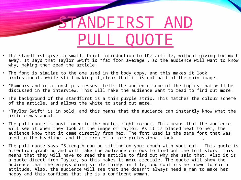
STANDFIRST AND PULL QUOTE
• The standfirst gives a small, brief introduction to the article, without giving too much away. It says that Taylor Swift is “far from average”, so the audience will want to know why, making them read the article.
• The font is similar to the one used in the body copy, and this makes it look professional, while still making it clear that it is not part of the main image.
• “Rumours and relationship stresses” tells the audience some of the topics that will be discussed in the interview. This will make the audience want to read to find out more.
• The background of the standfirst is a thin purple strip. This matches the colour scheme of the article, and allows the white to stand out more.
• ‘Taylor Swift’ is in bold, and this means that the audience can instantly know what the article was about.
• The pull quote is positioned in the bottom right corner. This means that the audience will see it when they look at the image of Taylor. As it is placed next to her, the audience know that it came directly from her. The font used is the same font that was used in the headline, and this creates a more professional look.
• The pull quote says “Strength can be sitting on your couch with your cat.” This quote is attention-grabbing and will make the audience curious to find out the full story. This means that they will have to read the article to find out why she said that. Also it is a quote direct from Taylor, so this makes it more credible. The quote will show the audience that she enjoys doing simple things in life, and confirms her down to earth attitude. Also, the audience will see that she doesn’t always need a man to make her happy and this confirms that she is a confident woman.
• The speech marks are in hot pink, and matches one of the colours used in the headline. This makes the article look more professional. The font colour is black so it stands out. The font also matches the font used in the headline, which creates a link, and improves the professional feel of the article.