F Chapters 1... · Web viewChapters 1 - 3 Activites 1 Activities 2 Homework Assignments 10 points...
87
Math 3307 Lecture Notes Perkowsky text May’13 Monday format Jan. 2015 Chapters 1 - 3 Activites 1 Activities 2 Homework Assignments 10 points each problem or part Homework 1 – 70 points Chapter 1 2, 4, 8 Chapter 2 2, 4, 6, 8 Homework 2 – 90 points Chapter 3 3, 4(b, e, f, h, j), 10, 12, 14 Homework style sheet and rules: Work on one side only; pdf it and upload it before the deadline on the calendar. 1
Transcript of F Chapters 1... · Web viewChapters 1 - 3 Activites 1 Activities 2 Homework Assignments 10 points...
Math 3307 Lecture Notes Perkowsky text May’13Monday format Jan. 2015
Chapters 1 - 3
Activites 1
Activities 2
Homework Assignments10 points each problem or part
Homework 1 – 70 points
Chapter 1 2, 4, 8
Chapter 2 2, 4, 6, 8
Homework 2 – 90 points
Chapter 3 3, 4(b, e, f, h, j), 10, 12, 14
Homework style sheet and rules:
Work on one side only; pdf it and upload it before the deadline on the calendar.
Work that is poorly scanned or illegible will be given a zero. This includes sideways or upside down scans!
Do NOT crowd the work, leave at least 3” between problems. Label the answers carefully so the grader can grade efficiently.
1
Chapter 1 Elements of Statistics
Let’s imagine that you have been hired to collect information on the workload and responsibilities of middle school teachers in the USA.
A. Where would you start?
Would you try to contact every middle school teacher in the country?
What would you do to get the data?
B. What types of information would you collect…how would you decide what is important to know in describing the areas of interest?
2
1.1 Getting started
ACTIVITIES 1 - Definition
Look in the book at the definition. How does it compare to yours?
Statistics:
Descriptive statistics
Definition and examples
Inferential statistics
Definition and examples
3
Descriptive Statistics Problems – by group!
DS1
Which of the following conclusions may be obtained from the following data by purely descriptive methods and which require generalizations?
A student in my Spring Pre-calculus class took 4 consecutive daily quizzes and got the following scores: 3, 8, 10, and 12.
a.) On only 1 day did he get less than 5 right.
b.) The student’s number correct increased on each successive quiz.
c.) The student got better at guessing what I was going to ask each day.
d.) On the last day the student copied his answers from his neighbor.
DS2
Smith and Jones are hairdressers. On a recent day, Smith cut the hair of 4 male clients and 2 female clients. While Jones cut hair on 3 males and 3 females.
a.) The amount of time it takes Smith and Jones to do a haircut is approximately the same.
b.) Smith always cuts hair on more males than females.
c.) The two always have the same number of clients per day.
d.) Over a week, Smith averages 6 clients a day.
4
ACTIVITES 1 DS3
More definitions: page 3 in the text
Variable
Data and Data Set
Raw data
Population/Sample
Population parameter
Population statistics
Sample statistics
5
Focus on understanding:
A local school district would like to conduct a survey to estimate the percentage of the registered voters in the district who would support a school bond levy (tax). To determine the level of support, the school board surveys 1,000 registered voters from their district. What are:
The population
The sample
The variable(s)
Raw data
Sample statistics
Population parameters
ACTIVITES – USING THE VOCABULARY
6
Sampling Techniques pages 4 - 7
Simple random sampling
***Graphing Calculators: Let’s generate a random sampleand talk about how to use it creatively.***
Systematic sampling
Convenience sampling
Cluster sampling
Stratified sampling
Bias in Data Collection page 9
IMPORTANT to know about or discover!
Classroom connection
Television stations, radio stations, and newspapers often predict the winners of important elections long before the votes are counted. They make these predictions based on polls.
A What factors might cause a prediction to be inaccurate?
B Political parties often conduct their own pre-election polls to find out what voters think about their campaign and their candidates. How might a political party bias such a poll?
7
1.2 Types of Data
Let’s come up with examples of the following:
Categorical/Qualitative Data
Numerical/Quantitative Data
Nominal Data page 12
Ordinal Data
Interval Data
Ratio Data
Discrete/Continuous
Chapter 1 summary:
OYO. Note: essay questions on the tests.
Example: In 3 paragraphs, compare and contrast 2 different types of data.
8
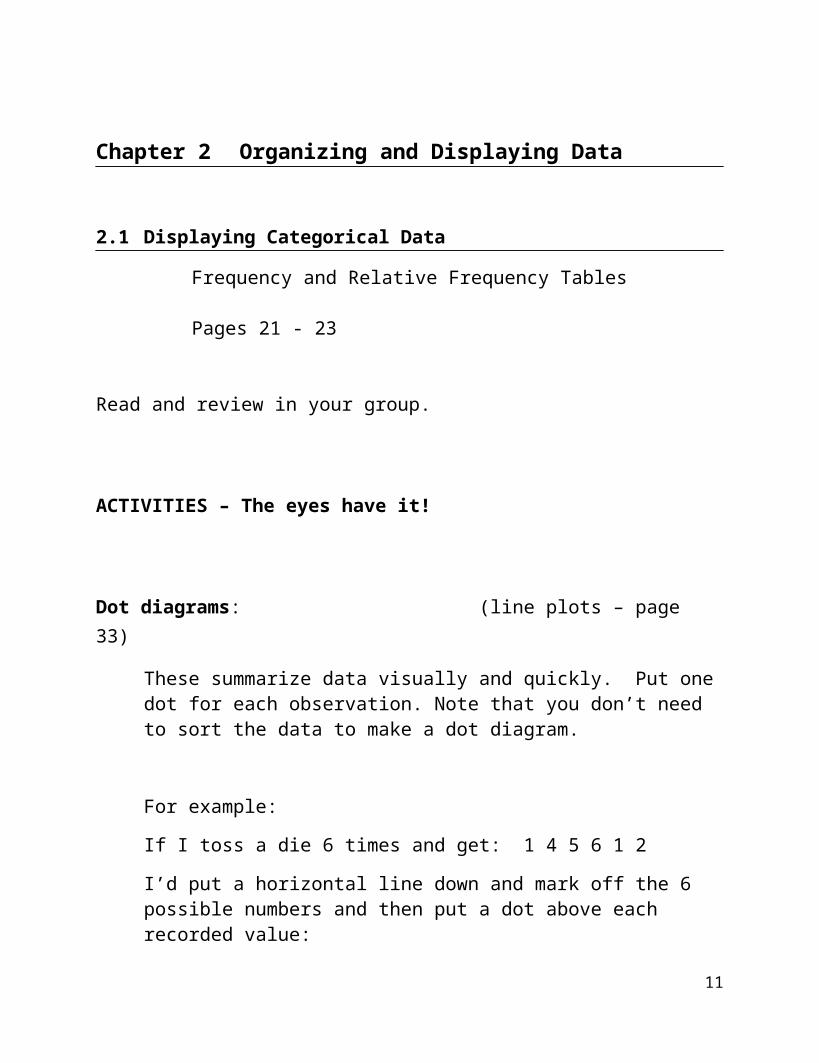
Chapter 2 Organizing and Displaying Data
2.1 Displaying Categorical Data
Frequency and Relative Frequency Tables
Pages 21 - 23
Read and review in your group.
ACTIVITIES – The eyes have it!
Dot diagrams: (line plots – page 33)
These summarize data visually and quickly. Put one dot for each observation. Note that you don’t need to sort the data to make a dot diagram.
For example:
If I toss a die 6 times and get: 1 4 5 6 1 2
I’d put a horizontal line down and mark off the 6 possible numbers and then put a dot above each recorded value:
9
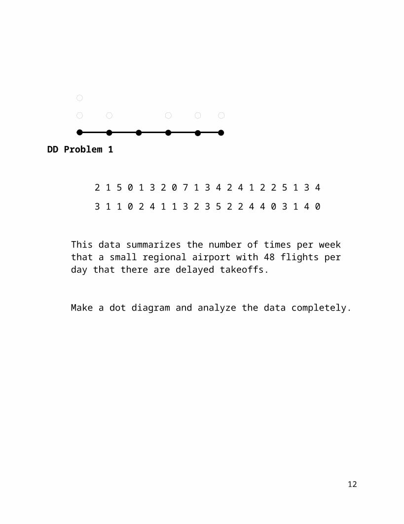
DD Problem 1
2 1 5 0 1 3 2 0 7 1 3 4 2 4 1 2 2 5 1 3 4
3 1 1 0 2 4 1 1 3 2 3 5 2 2 4 4 0 3 1 4 0
This data summarizes the number of times per week that a small regional airport with 48 flights per day that there are delayed takeoffs.
Make a dot diagram and analyze the data completely.
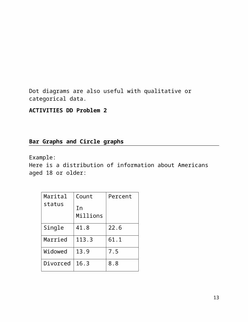
Dot diagrams are also useful with qualitative or categorical data.
ACTIVITIES DD Problem 2
10
Bar Graphs and Circle graphs
Example:Here is a distribution of information about Americans aged 18 or older:
Marital status
Count
In Millions
Percent
Single 41.8 22.6
Married 113.3 61.1
Widowed 13.9 7.5
Divorced 16.3 8.8
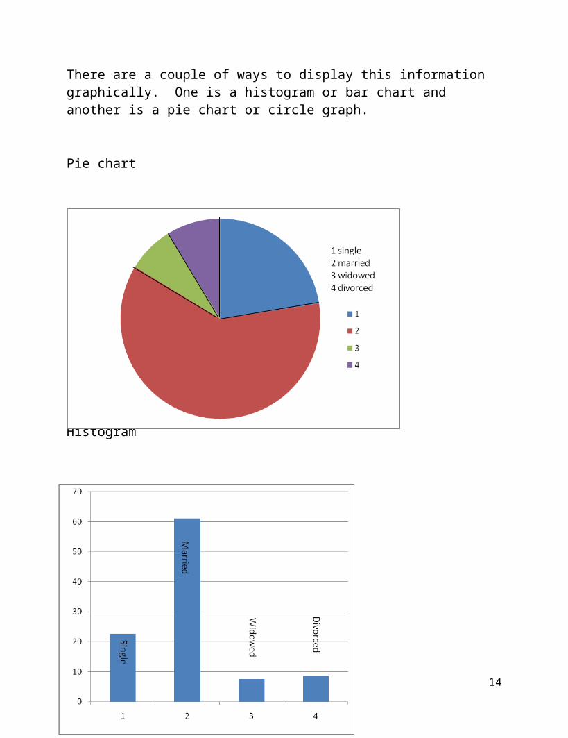
There are a couple of ways to display this information graphically. One is a histogram or bar chart and another is a pie chart or circle graph.
Pie chart
11
Histogram
Why was it important to use the percentages and not the raw counts in both representations?
See page 24 for a useful summary of which type of representation to use when.
12
2.2 Displaying Quantitative Data
Frequency and Relative Frequency Tables
The Rules page 26
Classes: upper limits, lower limits, class mark
Class boundaries
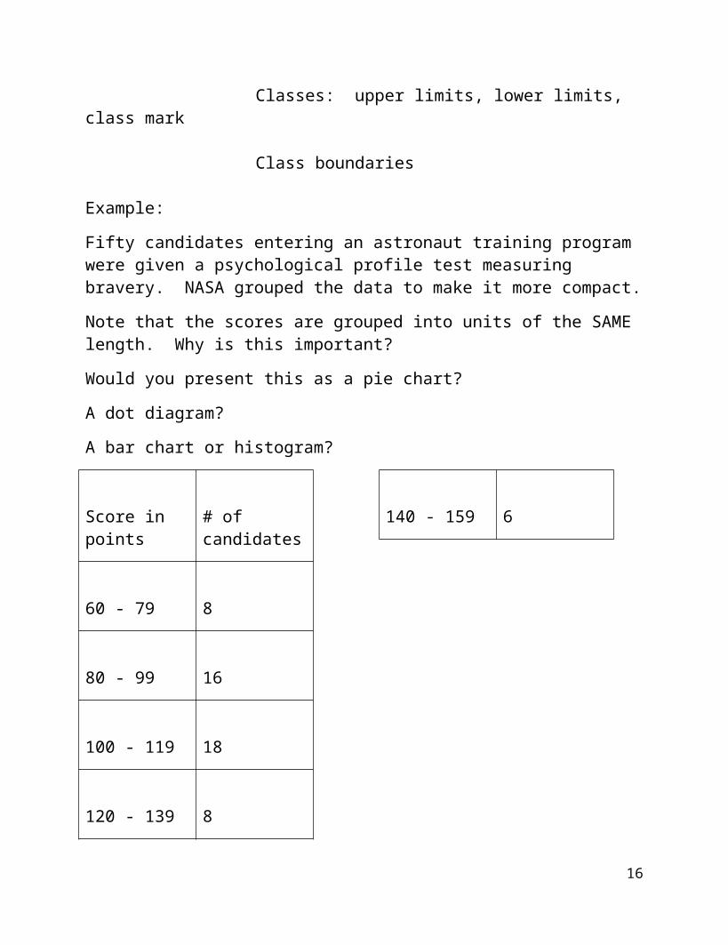
Example:
Fifty candidates entering an astronaut training program were given a psychological profile test measuring bravery. NASA grouped the data to make it more compact.
Note that the scores are grouped into units of the SAME length. Why is this important?
Would you present this as a pie chart?
A dot diagram?
A bar chart or histogram?
Score in points # of candidates
60 - 79 8
80 - 99 16
100 - 119 18
120 - 139 8
140 - 159 6
What do you think about the extreme values on the results?
13
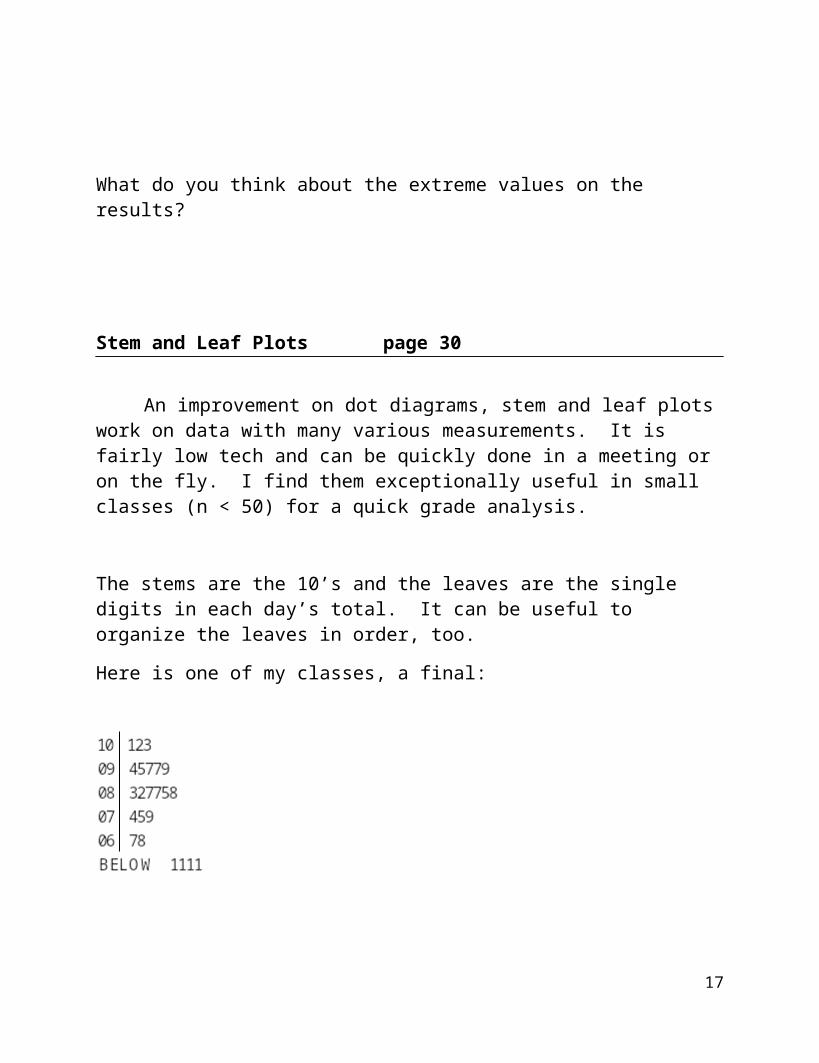
Stem and Leaf Plots page 30
An improvement on dot diagrams, stem and leaf plots work on data with many various measurements. It is fairly low tech and can be quickly done in a meeting or on the fly. I find them exceptionally useful in small classes (n < 50) for a quick grade analysis.
The stems are the 10’s and the leaves are the single digits in each day’s total. It can be useful to organize the leaves in order, too.
Here is one of my classes, a final:
Turn the page sideways (anti clockwise)…note the resemblance to a dot diagram! What does this tell you about my class?
Note that in each case, there was somebody pretty close to the next level.
What grade is “BELOW”?
Sometimes if the data is unusually condensed, you might split the stems making more rows rather than fewer rows.
14
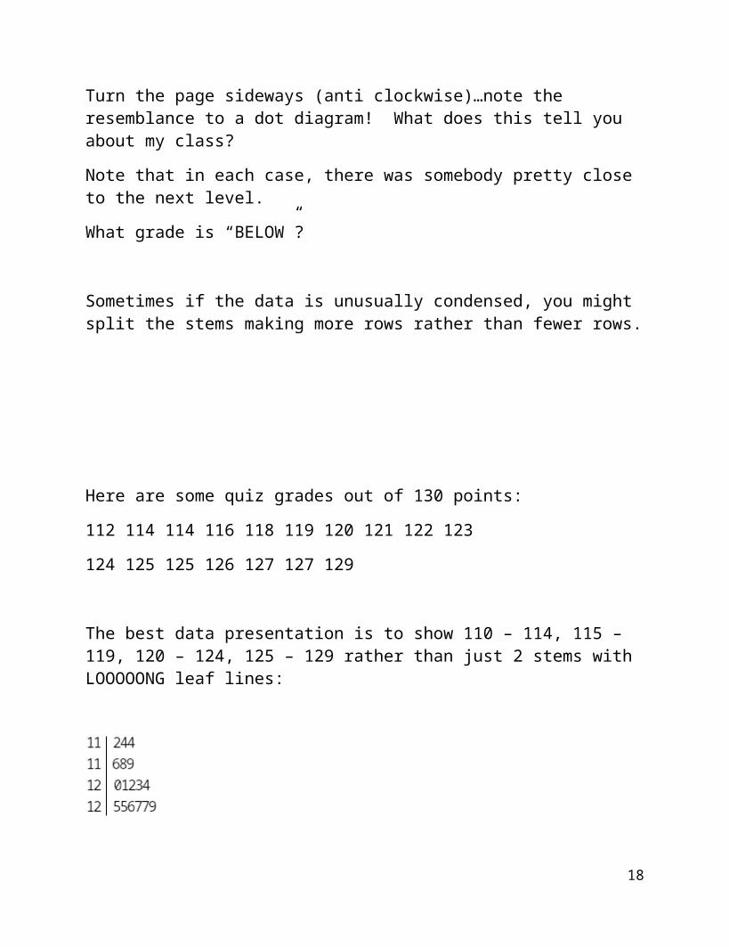
Here are some quiz grades out of 130 points:
112 114 114 116 118 119 120 121 122 123
124 125 125 126 127 127 129
The best data presentation is to show 110 – 114, 115 – 119, 120 – 124, 125 – 129 rather than just 2 stems with LOOOOONG leaf lines:
Note that the stems are now both a hundreds and a tens digit!
Count the data points off the stem and leaf diagram. Where is the median?
The 80th percentile?
15
SL Problem 1
A hotel has 85 rooms. In February of last year they had the following rental statistics:
75 79 37 57 60 64 35 73 62 81 43 72 78 54 69 75 78 49 59 80 58 76
52 49 42 62 81 77
Produce a stem and leaf plot of this data.
16
ACTIVITIES - SL Problem 2
17
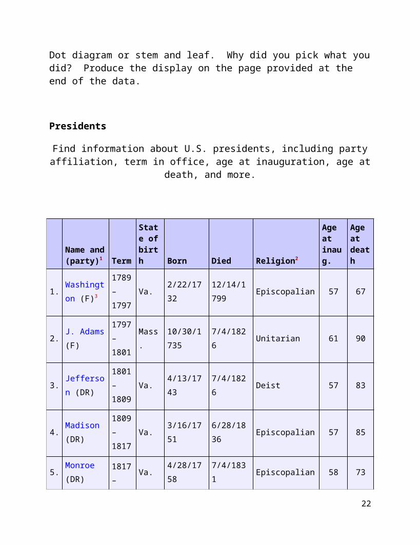
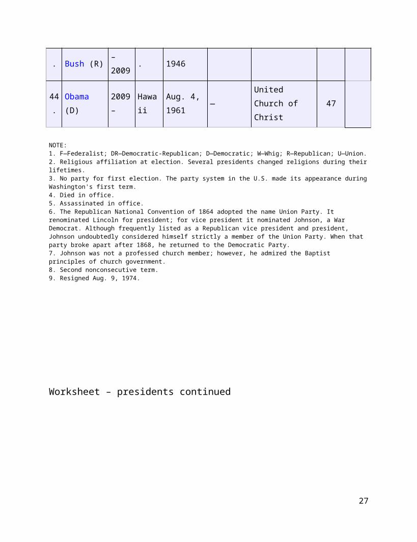
SL Problem 3
Decide which representation you’d like to use with this data to show the age of the presidents at inauguration. Dot diagram or stem and leaf. Why did you pick what you did? Produce the display on the page provided at the end of the data.
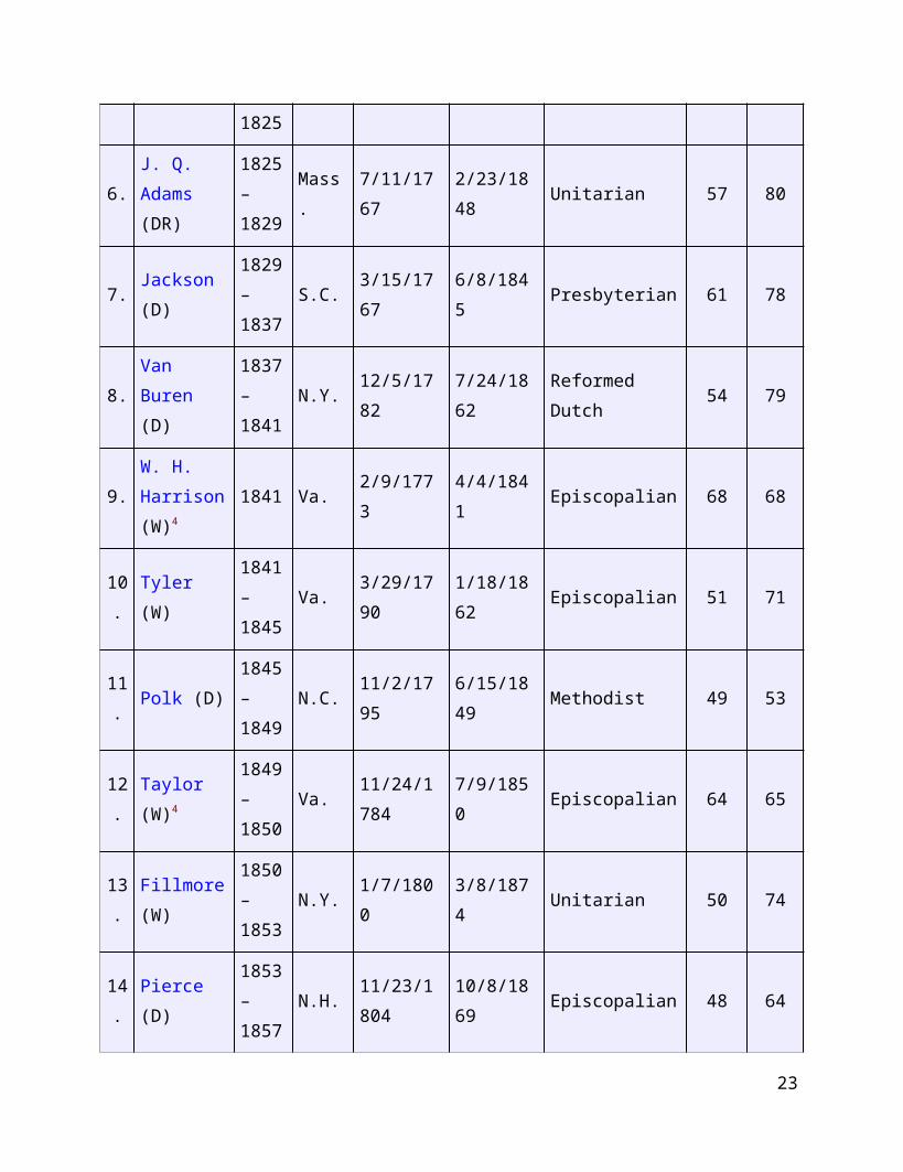
Presidents
Find information about U.S. presidents, including party affiliation, term in office, age at inauguration, age at death, and more.
Name and (party)1 Term
State ofbirth Born Died Religion2
Age atinaug.
Age atdeath
1.Washington (F)3
1789–1797
Va. 2/22/173212/14/1799
Episcopalian 57 67
2.J. Adams (F)
1797–1801
Mass.10/30/1735
7/4/1826 Unitarian 61 90
3.Jefferson (DR)
1801–1809
Va. 4/13/1743 7/4/1826 Deist 57 83
4.Madison (DR)
1809–1817
Va. 3/16/1751 6/28/1836 Episcopalian 57 85
5.Monroe (DR)
1817–1825
Va. 4/28/1758 7/4/1831 Episcopalian 58 73
6. J. Q. Adams
1825–
Mass. 7/11/1767 2/23/1848 Unitarian 57 80
18
(DR) 1829
7.Jackson (D)
1829–1837
S.C. 3/15/1767 6/8/1845 Presbyterian 61 78
8.Van Buren (D)
1837–1841
N.Y. 12/5/1782 7/24/1862 Reformed Dutch 54 79
9.W. H. Harrison (W)4
1841 Va. 2/9/1773 4/4/1841 Episcopalian 68 68
10.
Tyler (W)1841–1845
Va. 3/29/1790 1/18/1862 Episcopalian 51 71
11.
Polk (D)1845–1849
N.C. 11/2/1795 6/15/1849 Methodist 49 53
12.
Taylor (W)4
1849–1850
Va.11/24/1784
7/9/1850 Episcopalian 64 65
13.
Fillmore (W)
1850–1853
N.Y. 1/7/1800 3/8/1874 Unitarian 50 74
14.
Pierce (D)1853–1857
N.H.11/23/1804
10/8/1869 Episcopalian 48 64
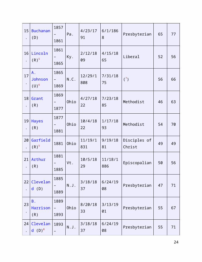
15.
Buchanan (D)
1857–1861
Pa. 4/23/1791 6/1/1868 Presbyterian 65 77
16.
Lincoln (R)5
1861–1865
Ky. 2/12/1809 4/15/1865 Liberal 52 56
17 A. Johnson 1865 N.C. 12/29/180 7/31/1875 (7) 56 66
19
. (U)6 –1869
8
18.
Grant (R)1869–1877
Ohio 4/27/1822 7/23/1885 Methodist 46 63
19.
Hayes (R)1877–1881
Ohio 10/4/1822 1/17/1893 Methodist 54 70
20.
Garfield (R)5 1881 Ohio
11/19/1831
9/19/1881Disciples of Christ
49 49
21.
Arthur (R)1881–1885
Vt. 10/5/182911/18/1886
Episcopalian 50 56
22.
Cleveland (D)
1885–1889
N.J. 3/18/1837 6/24/1908 Presbyterian 47 71
23.
B. Harrison (R)
1889–1893
Ohio 8/20/1833 3/13/1901 Presbyterian 55 67
24.
Cleveland (D)8
1893–1897
N.J. 3/18/1837 6/24/1908 Presbyterian 55 71
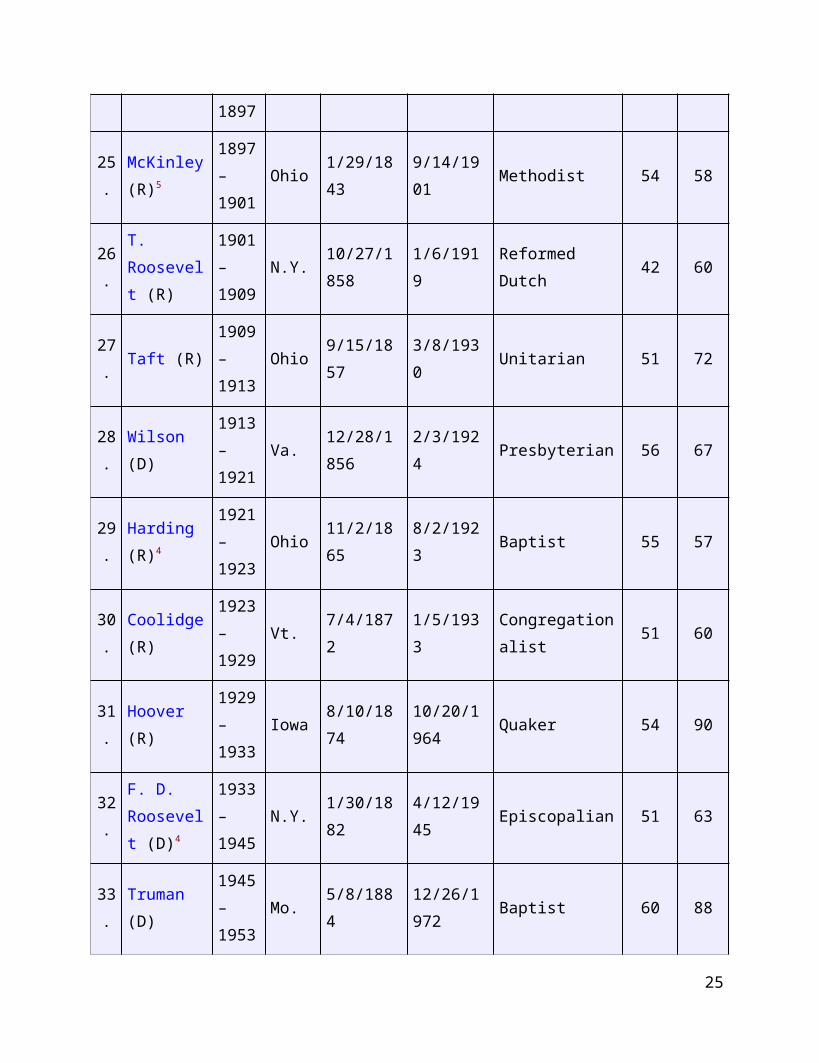
25.
McKinley (R)5
1897–1901
Ohio 1/29/1843 9/14/1901 Methodist 54 58
26.
T. Roosevelt (R)
1901–1909
N.Y.10/27/1858
1/6/1919 Reformed Dutch 42 60
27.
Taft (R)1909–1913
Ohio 9/15/1857 3/8/1930 Unitarian 51 72
28 Wilson (D) 1913 Va. 12/28/185 2/3/1924 Presbyterian 56 67
20
.–1921
6
29.
Harding (R)4
1921–1923
Ohio 11/2/1865 8/2/1923 Baptist 55 57
30.
Coolidge (R)
1923–1929
Vt. 7/4/1872 1/5/1933Congregationalist
51 60
31.
Hoover (R)1929–1933
Iowa 8/10/187410/20/1964
Quaker 54 90
32.
F. D. Roosevelt (D)4
1933–1945
N.Y. 1/30/1882 4/12/1945 Episcopalian 51 63
33.
Truman (D)
1945–1953
Mo. 5/8/188412/26/1972
Baptist 60 88
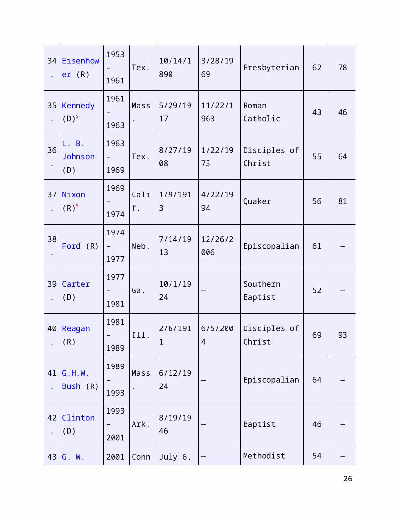
34.
Eisenhower (R)
1953–1961
Tex.10/14/1890
3/28/1969 Presbyterian 62 78
35.
Kennedy (D)5
1961–1963
Mass. 5/29/191711/22/1963
Roman Catholic 43 46
36.
L. B. Johnson (D)
1963–1969
Tex. 8/27/1908 1/22/1973Disciples of Christ
55 64
37.
Nixon (R)9
1969–1974
Calif. 1/9/1913 4/22/1994 Quaker 56 81
38.
Ford (R)1974–1977
Neb. 7/14/191312/26/2006
Episcopalian 61 —
21
39.
Carter (D)1977–1981
Ga. 10/1/1924 — Southern Baptist 52 —
40.
Reagan (R)
1981–1989
Ill. 2/6/1911 6/5/2004Disciples of Christ
69 93
41.
G.H.W. Bush (R)
1989–1993
Mass. 6/12/1924 — Episcopalian 64 —
42.
Clinton (D)1993–2001
Ark. 8/19/1946 — Baptist 46 —
43.
G. W. Bush (R)
2001–2009
Conn.July 6, 1946
— Methodist 54 —
44.
Obama (D)2009–
Hawaii
Aug. 4, 1961
—United Church of Christ
47
NOTE: 1. F—Federalist; DR—Democratic-Republican; D—Democratic; W—Whig; R—Republican; U—Union.2. Religious affiliation at election. Several presidents changed religions during their lifetimes.3. No party for first election. The party system in the U.S. made its appearance during Washington's first term.4. Died in office.5. Assassinated in office.6. The Republican National Convention of 1864 adopted the name Union Party. It renominated Lincoln for president; for vice president it nominated Johnson, a War Democrat. Although frequently listed as a Republican vice president and president, Johnson undoubtedly considered himself strictly a member of the Union Party. When that party broke apart after 1868, he returned to the Democratic Party.7. Johnson was not a professed church member; however, he admired the Baptist principles of church government.8. Second nonconsecutive term.9. Resigned Aug. 9, 1974.
Worksheet – presidents continued
22
What if we want to know: “Are we electing younger people than earlier in our history?” j Consider a time series*! Find this in your book and discuss why it might answer the question better than the preceding presentation
How could you present the categorical data? Party affliation, home state, religion…decide (without doing!) how you would present each type of categorical data.
*a chronological presentation with time on the x axis.
23
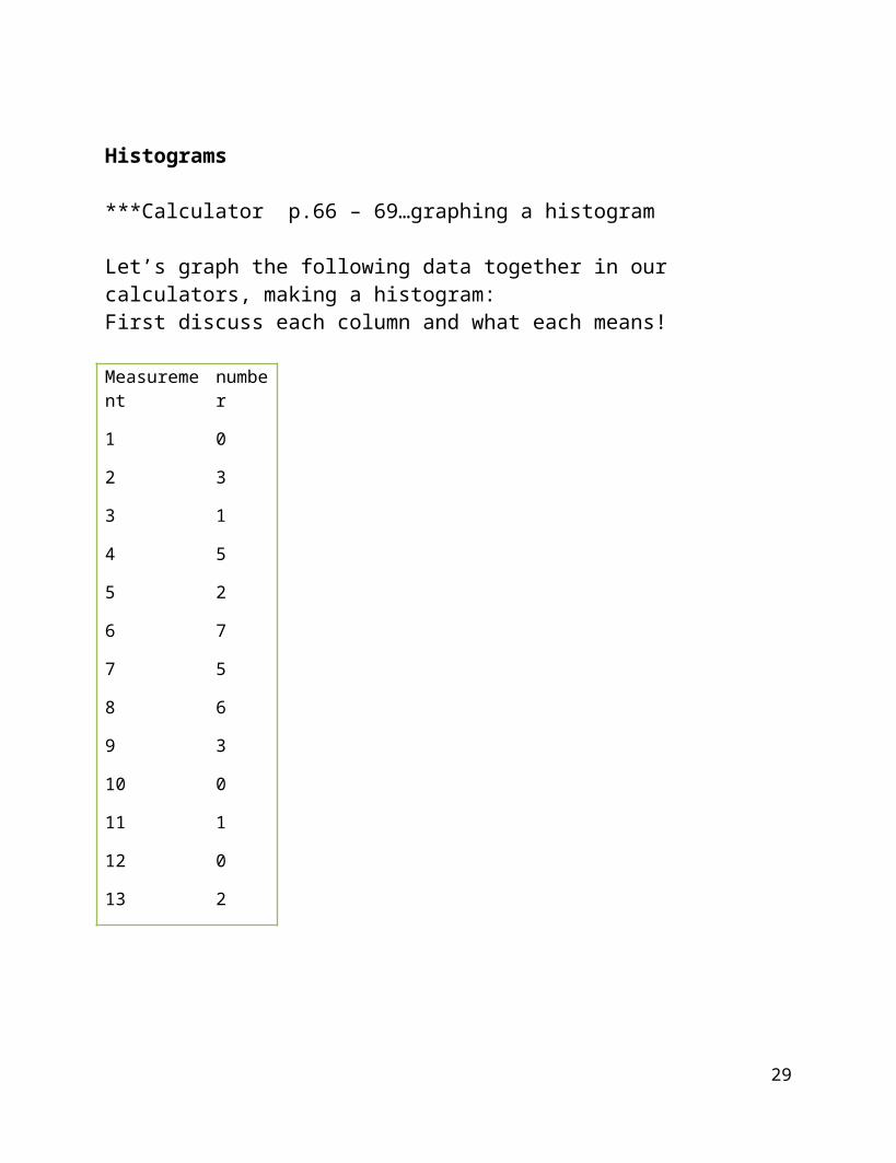
Histograms
***Calculator p.66 – 69…graphing a histogram
Let’s graph the following data together in our calculators, making a histogram:First discuss each column and what each means!
Measurement number
1 0
2 3
3 1
4 5
5 2
6 7
7 5
8
9
10
11
12
13
6
3
0
1
0
2
24
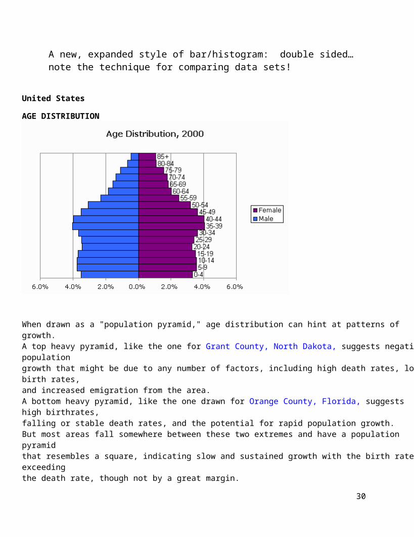
A new, expanded style of bar/histogram: double sided…note the technique for comparing data sets!
United States
AGE DISTRIBUTION
When drawn as a "population pyramid," age distribution can hint at patterns of growth.A top heavy pyramid, like the one for Grant County, North Dakota, suggests negative populationgrowth that might be due to any number of factors, including high death rates, low birth rates,and increased emigration from the area.A bottom heavy pyramid, like the one drawn for Orange County, Florida, suggests high birthrates,falling or stable death rates, and the potential for rapid population growth.But most areas fall somewhere between these two extremes and have a population pyramidthat resembles a square, indicating slow and sustained growth with the birth rate exceedingthe death rate, though not by a great margin.
Let’s talk about what we can see here in this pyramid.
25
Line Graphs page 35
Usually time is the horizontal axis. These are plotted just like graphing in algebra!
Now let’s look at page 36, the Classroom Connection illustration and talk about it.
26
2.3 Misleading graphs
Read it in class. Let’s discuss it together.
Not in the book, but good to know!
Simpson’s Paradox and Averages
We’ve already seen that averages can be misleading. There’s another way that they can mislead discovered and publicized by Dr. Simpson in the 1960’s. You need to be careful that the categories over which you are averaging are actually comparable!
Here’s an excerpt from STATS: Data and Models (ISBN 0-321-20054-3, Pearson) p. 24:
One famous example of Simpson’s Paradox arose during an investigation of admission rates for men and women at the University of California at Berkeley’s graduate schools. As reported in Science, about 45% of male applicants were admitted while only about 30% of female applicants got in. It looked like a clear case of discrimination. However, when the data were broken down by school (Engineering, Law, Medicine, etc.) it turned out that women were admitted at nearly the same or, in some cases, much higher rates than the men. How could this be?
27
Women applied in large numbers to schools with very low admissions rates (Law and Medicine, for example, admitted fewer than 10%). Men tended to apply to Engineering and Science. Those schools have admission rates above 50%. When the average was taken, the women had a lower overall rate but the average didn’t really make sense.
Often you need to check more closely into the categories within each variable to get the true picture.
Here’s the data on the graduate admissions from the 1975 issue of Science:
Males accepted/
applicants
Females accepted/
applicants
Program 1 511/825 89/108
Program 2 352/560 17/25
Program 3 137/407 132/375
Program 4 22/373 24/341
1022/2165 262/849
Let’s do some comparisons:
What are the overall averages? What are the averages within program categories?
28
ACTIVITIES – Simpson’s Paradox
Chapter 2 Summary
read on your own.
Here’s a sample test question:
Given these grades how will we check them out, compare and categorize?Show more than one way to do this.Discuss the benefits/problems with each way you present.
99, 79, 56, 98, 82, 71, 85, 92, 83, 75, 65, 94, 83
29
Chapter 3 Describing Data with Numbers
3.1 Measures of Center
These are the numbers that describe what is normal, usual, and in the middle or the center. These terms are very loose and need firming up mathematically, of course.
Mode
Median
Mean
Mode
One measure of central tendency is the Mode.
This is the number that occurs most frequently in a data set.
The data set doesn’t always have a mode – if each data point is a different number the set is mode-free. The mode is always a number in the data set, if there is one.
Some data sets have a mode; some are bi-modal or multimodal.
30
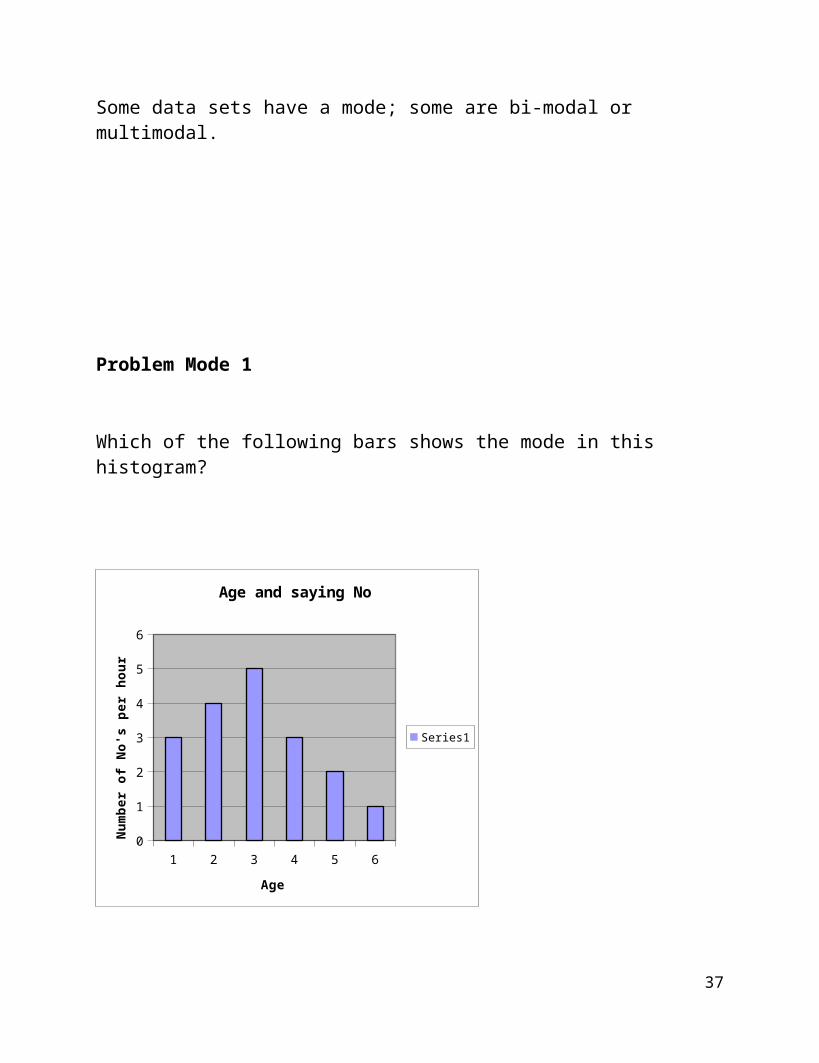
Problem Mode 1
Which of the following bars shows the mode in this histogram?
1 2 3 4 5 60
1
2
3
4
5
6
Age and saying No
Series1
Age
Num
ber
of N
o's
per
hour
31
Median
Another measure of central tendency is the Median:
The median is the value that is at the numerical middle of the data if there are an odd number of data points and they are arranged in order by size. It is the mean of the 2 middle data points if the number of data points is even and arranged in order by size.
The formula for finding the location of the median for n data points is 0.5(n + 1).
The process is to order the data and then find the measurement at that location.
Problem Median 1
Find the median location for
Data set A. n = 19 data points
Data set B. n = 52 data points
Is the measurement equal to it’s location number?
ACTIVITIES Median Problem 2
32
Problem Median 2
In golf the holes are rated for a recommended number of strokes needed to sink the golf ball into the hole. A score of par means the golfer used the recommended number, a birdie is one fewer than recommended, a bogey is one more than the recommended number, an eagle is 2 fewer strokes.
At a recent televised tournament, 7 golfers had the following scores, ranked alphabetically by last name: par, birdie, par, par, birdie, bogey, and eagle.
Where is the median score located? What is the median score?
33
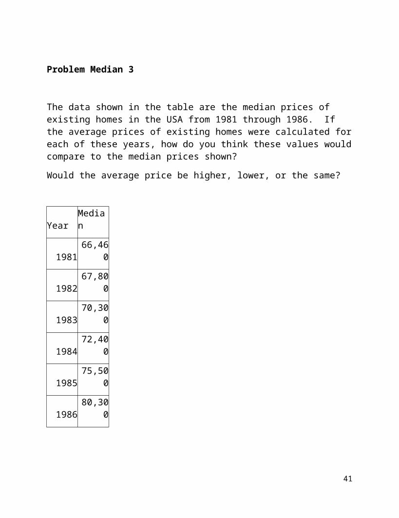
Problem Median 3
The data shown in the table are the median prices of existing homes in the USA from 1981 through 1986. If the average prices of existing homes were calculated for each of these years, how do you think these values would compare to the median prices shown?
Would the average price be higher, lower, or the same?
Year Median
1981 66,460
1982 67,800
1983 70,300
1984 72,400
1985 75,500
1986 80,300
34
Mean
The most popular measure of “centeredness” is the Mean(sometimes called the average).The mean of n numbers is the sum of the numbers divided by n. If you are working with a data set of measurements, the mean is denoted: .
There are some very cogent reasons for its popularity:
It can always be calculated and it’s easy to calculate.
It is unique: there is only ONE mean for a data set.
It uses EVERY data point; nothing is eliminated.
It doesn’t depend on chance or luck.
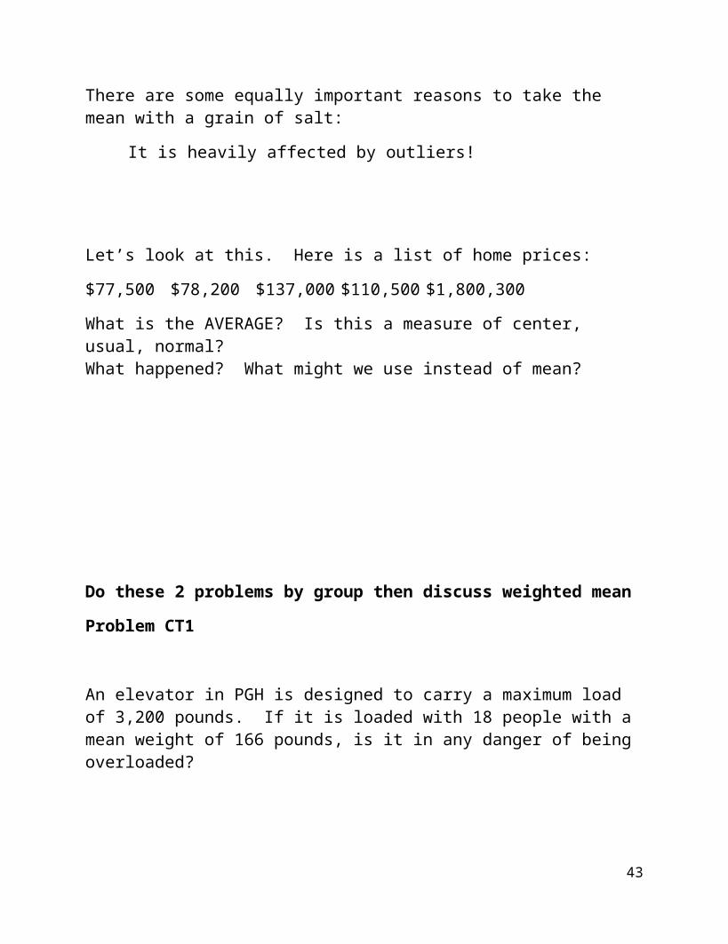
There are some equally important reasons to take the mean with a grain of salt:
It is heavily affected by outliers!
Let’s look at this. Here is a list of home prices:
$77,500 $78,200 $137,000 $110,500 $1,800,300
What is the AVERAGE? Is this a measure of center, usual, normal?What happened? What might we use instead of mean?
35
Do these 2 problems by group then discuss weighted mean
Problem CT1
An elevator in PGH is designed to carry a maximum load of 3,200 pounds. If it is loaded with 18 people with a mean weight of 166 pounds, is it in any danger of being overloaded?
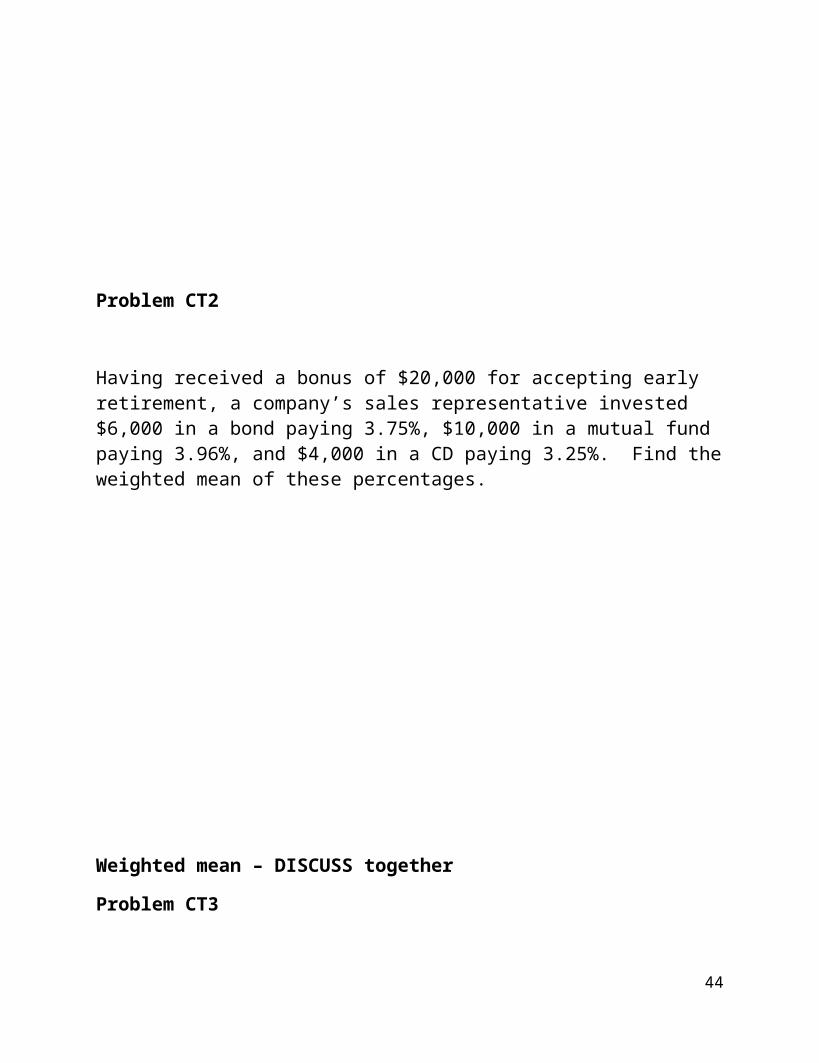
Problem CT2
Having received a bonus of $20,000 for accepting early retirement, a company’s sales representative invested $6,000 in a bond paying 3.75%, $10,000 in a mutual fund paying 3.96%, and $4,000 in a CD paying 3.25%. Find the weighted mean of these percentages.
36
Weighted mean – DISCUSS together
Problem CT3
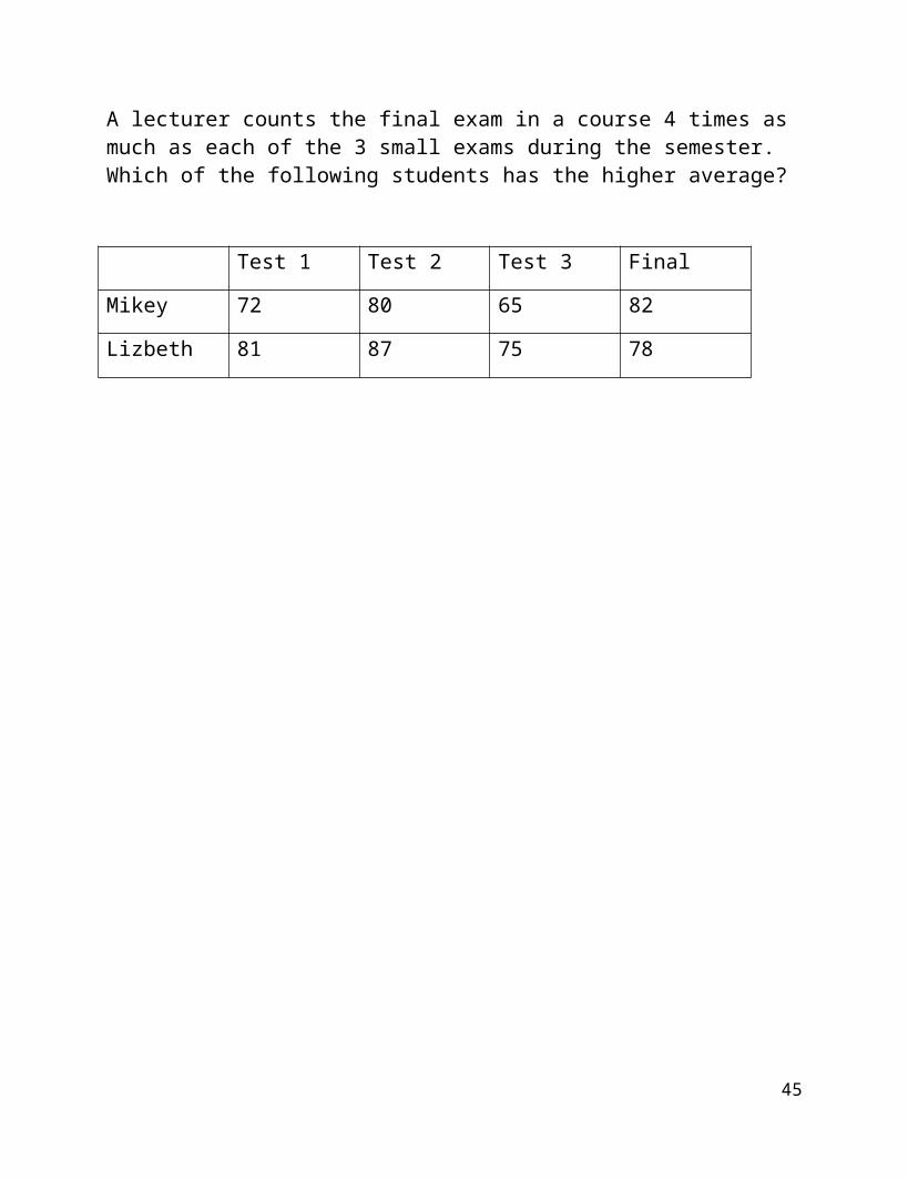
A lecturer counts the final exam in a course 4 times as much as each of the 3 small exams during the semester. Which of the following students has the higher average?
Test 1 Test 2 Test 3 Final
Mikey 72 80 65 82
Lizbeth 81 87 75 78
37
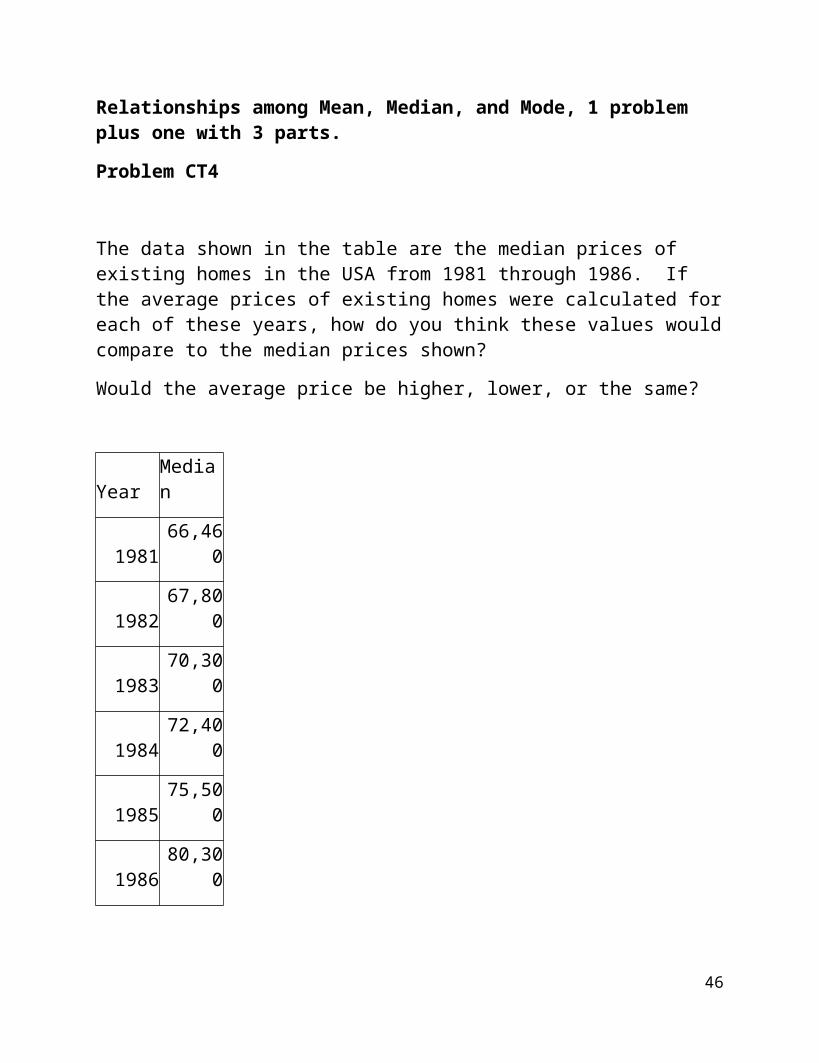
Relationships among Mean, Median, and Mode, 1 problem plus one with 3 parts.
Problem CT4
The data shown in the table are the median prices of existing homes in the USA from 1981 through 1986. If the average prices of existing homes were calculated for each of these years, how do you think these values would compare to the median prices shown?
Would the average price be higher, lower, or the same?
Year Median
1981 66,460
1982 67,800
1983 70,300
1984 72,400
1985 75,500
1986 80,300
38
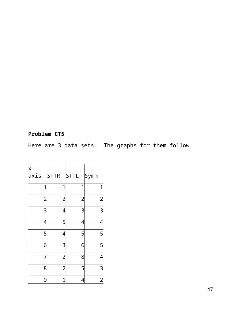
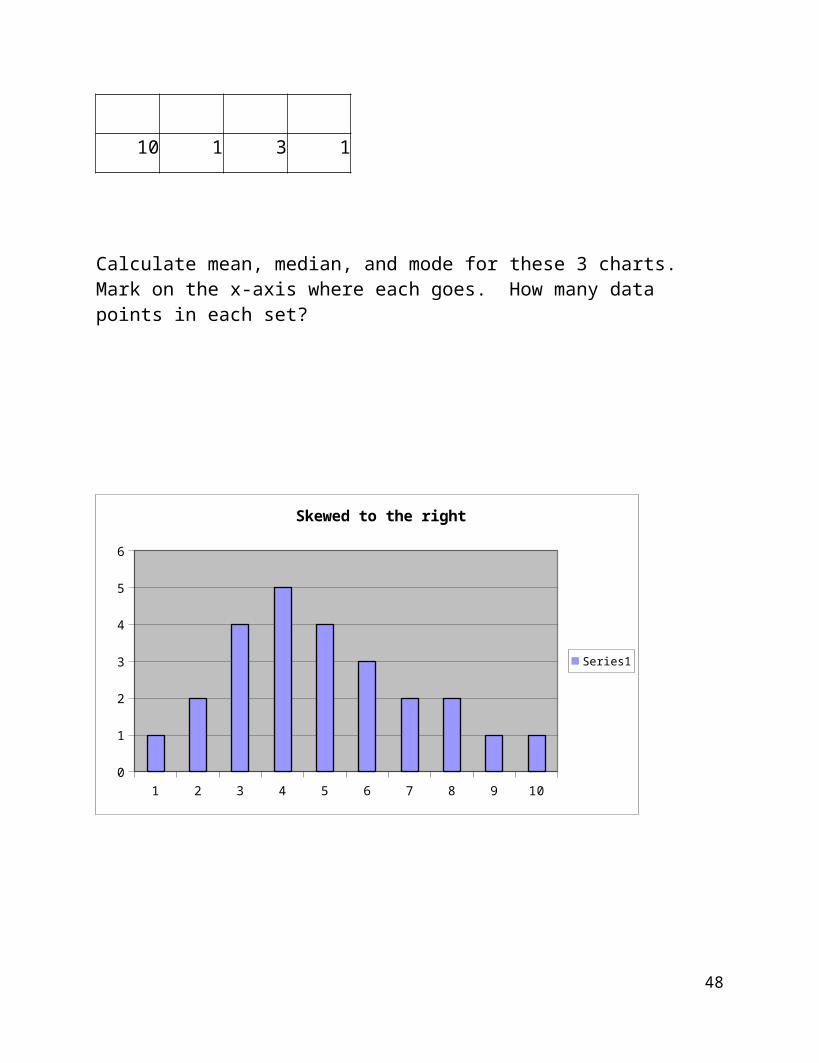
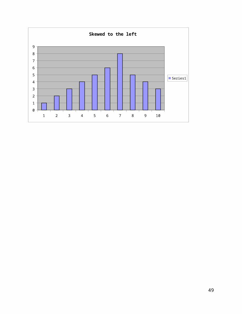
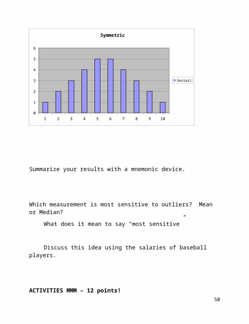
Problem CT5
Here are 3 data sets. The graphs for them follow.
x axis STTR STTL Symm
1 1 1 1
2 2 2 2
3 4 3 3
4 5 4 4
5 4 5 5
6 3 6 5
7 2 8 4
8 2 5 3
9 1 4 2
10 1 3 1
Calculate mean, median, and mode for these 3 charts. Mark on the x-axis where each goes. How many data points in each set?
39
1 2 3 4 5 6 7 8 9 100
1
2
3
4
5
6
Skewed to the right
Series1
1 2 3 4 5 6 7 8 9 100
1
2
3
4
5
6
7
8
9
Skewed to the left
Series1
40
1 2 3 4 5 6 7 8 9 100
1
2
3
4
5
6
Symmetric
Series1
Summarize your results with a mnemonic device.
Which measurement is most sensitive to outliers? Mean or Median?
What does it mean to say “most sensitive”
Discuss this idea using the salaries of baseball players.
ACTIVITIES MMM – 12 points!
41
3.2 Measures of Spread or Variability
Range Max - Min
***Graphing Calculator, page 60
Variance:
Mean deviation p. 58
The mean deviation is calculated by doing the following:
Calculate the mean.
Subract the mean from each data point. Take the absolute value of each difference.
Add up the positive differences.
Divide by n, the number of data points.
Standard deviation p. 60
Variance:
The standard deviation for a set of data is the square root of the variance.
***graphing calculator p. 61***
42
The sample variance is calculated by doing the following:
First calculate the sample mean,
then subtract the mean from each measurement individually and
square the answer.
Add up all the squares and divide by n 1.
Example:Given the following data points find the mean deviation and the standard deviationalong with the measures of central tendency. What is the range?Display the data…why did you choose what you did for the display?
5, 6, 9, 0, 1, 6, 11, 5
43
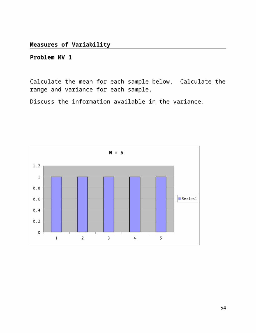
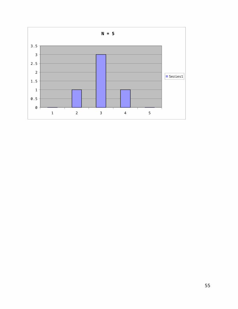
Measures of Variability
Problem MV 1
Calculate the mean for each sample below. Calculate the range and variance for each sample.
Discuss the information available in the variance.
1 2 3 4 50
0.2
0.4
0.6
0.8
1
1.2
N = 5
Series1
44
1 2 3 4 50
0.5
1
1.5
2
2.5
3
3.5
N = 5
Series1
45
ACTIVITES Problem MV 2
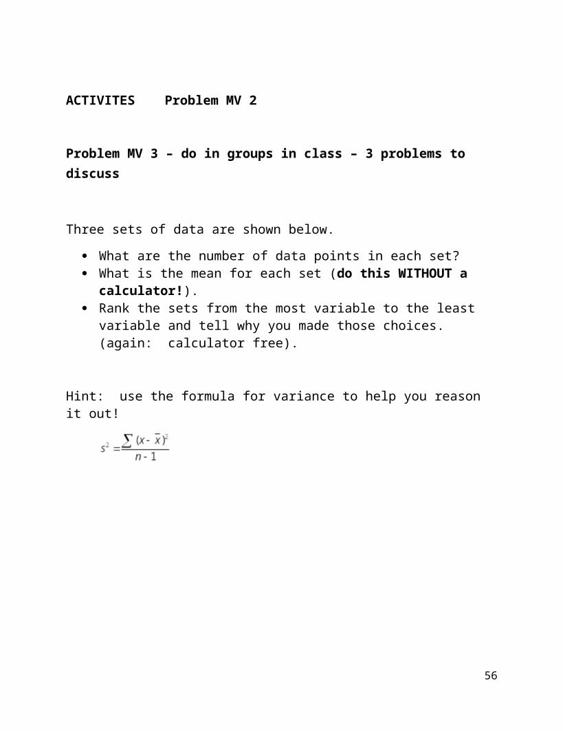
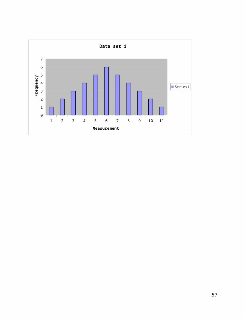
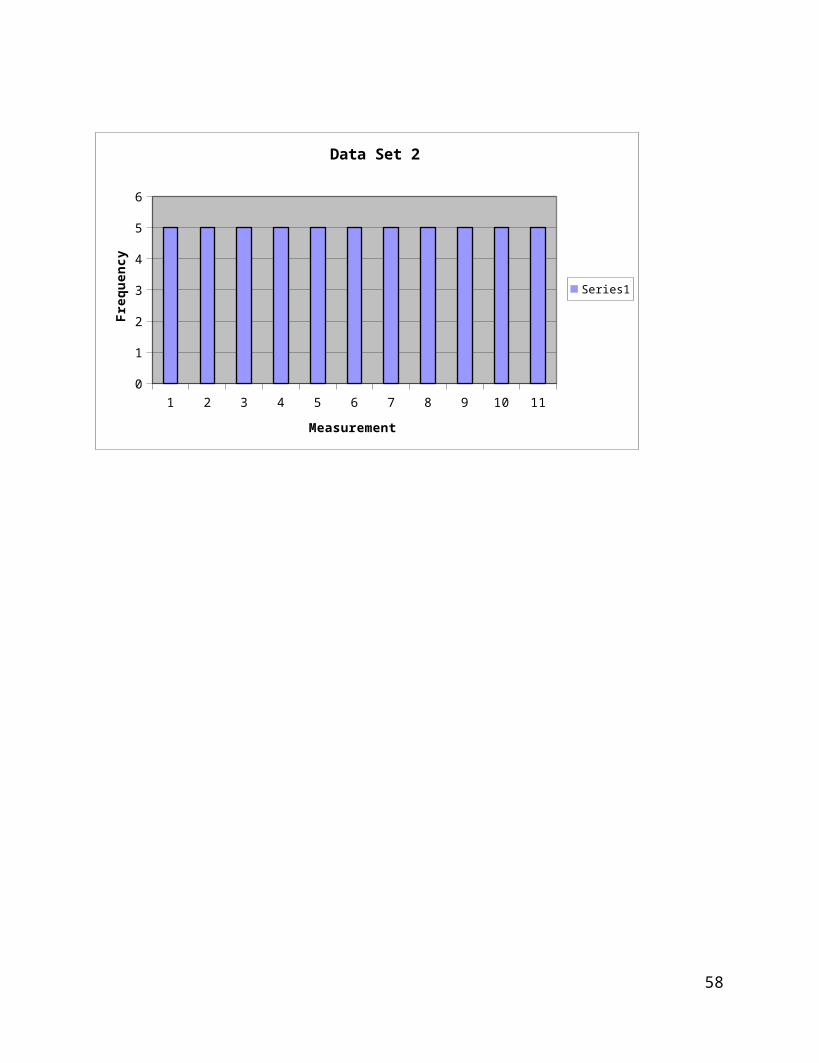
Problem MV 3 – do in groups in class – 3 problems to discuss
Three sets of data are shown below.
What are the number of data points in each set? What is the mean for each set (do this WITHOUT a calculator!). Rank the sets from the most variable to the least variable and tell why you
made those choices. (again: calculator free).
Hint: use the formula for variance to help you reason it out!
46
1 2 3 4 5 6 7 8 9 10 110
1
2
3
4
5
6
7
Data set 1
Series1
Measurement
Freq
uenc
y
47
1 2 3 4 5 6 7 8 9 10 110
1
2
3
4
5
6
Data Set 2
Series1
Measurement
Freq
uenc
y
48
1 2 3 4 5 6 7 8 9 10 110123456789
10
Data Set 3
Series1
Measurement
Freq
uenc
y
49
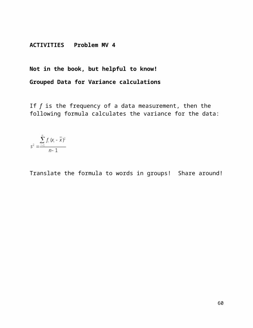
ACTIVITIES Problem MV 4
Not in the book, but helpful to know!
Grouped Data for Variance calculations
If f is the frequency of a data measurement, then the following formula calculates the variance for the data:
Translate the formula to words in groups! Share around!
50
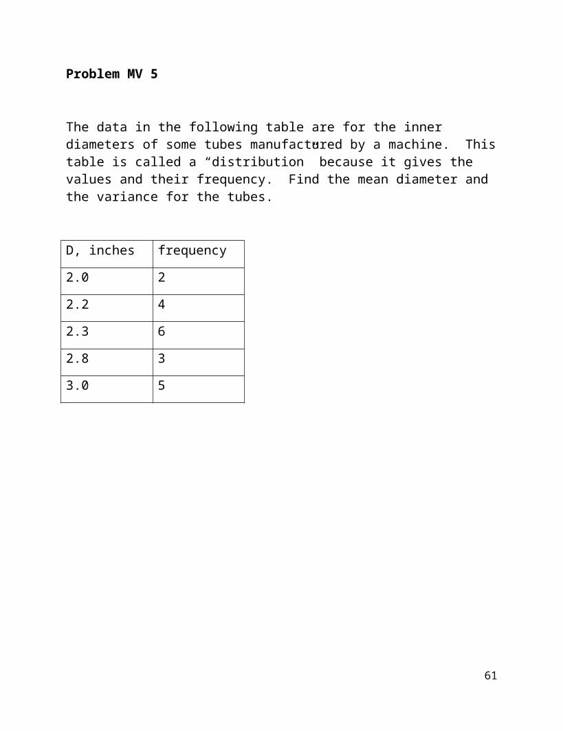
Problem MV 5
The data in the following table are for the inner diameters of some tubes manufactured by a machine. This table is called a “distribution” because it gives the values and their frequency. Find the mean diameter and the variance for the tubes.
D, inches frequency
2.0 2
2.2 4
2.3 6
2.8 3
3.0 5
51
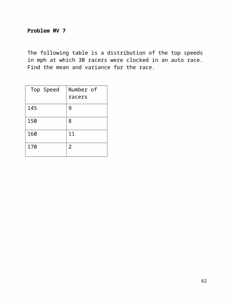
Problem MV 7
The following table is a distribution of the top speeds in mph at which 30 racers were clocked in an auto race. Find the mean and variance for the race.
Top Speed Number of racers
145 9
150 8
160 11
170 2
52

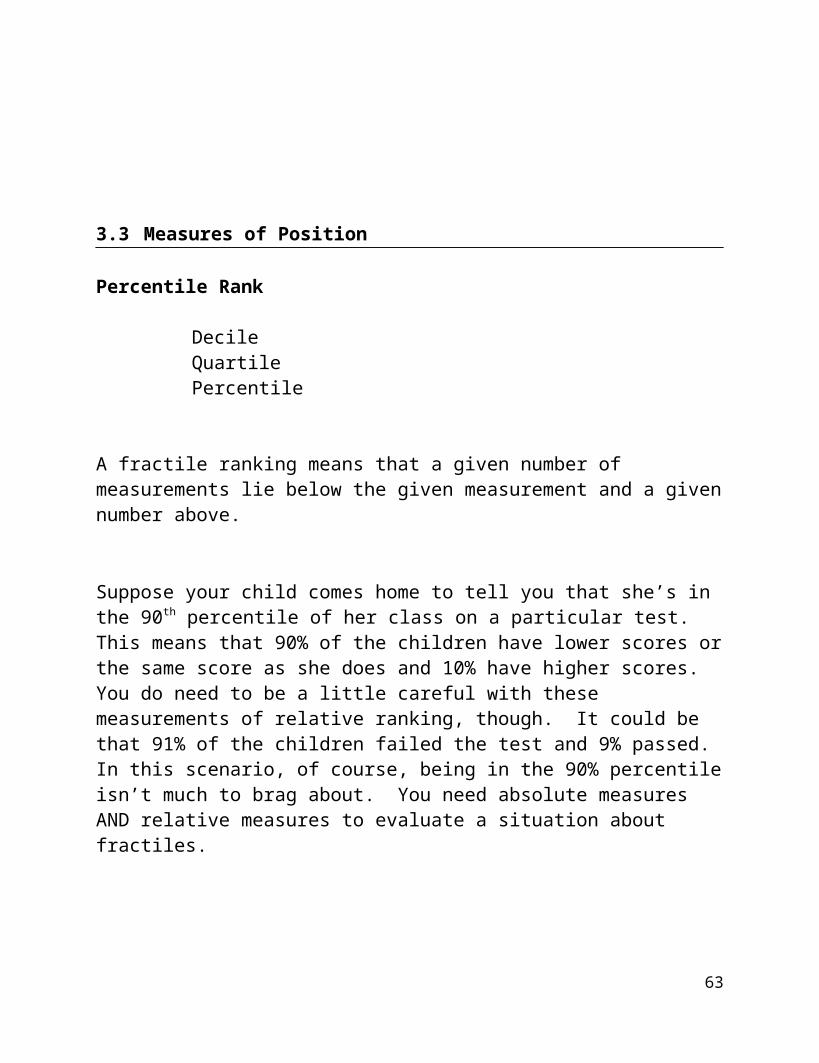
3.3 Measures of Position
Percentile Rank
DecileQuartilePercentile
A fractile ranking means that a given number of measurements lie below the given measurement and a given number above.
Suppose your child comes home to tell you that she’s in the 90th percentile of her class on a particular test. This means that 90% of the children have lower scores or the same score as she does and 10% have higher scores. You do need to be a little careful with these measurements of relative ranking, though. It could be that 91% of the children failed the test and 9% passed. In this scenario, of course, being in the 90% percentile isn’t much to brag about. You need absolute measures AND relative measures to evaluate a situation about fractiles.
Deciles divide the measurements into 10ths and quartiles divide the measurements into quarters. The median is both a decile and a quartile ranking.
Let’s look at quartiles:
Q1 is the median of all measurements less than the median of the data set.
Q3 is the median of all measurements greater than the median of the data set.
And deciles:
D1 is the measurement such that 90% of the measurements are BIGGER than it.
53
Problem FP 1
The following numbers are weekly lumber production (in million board feet) for a company in Oregon. Find the first quartile and the 90th percentile for the data.
390 406 447 410 370 338 410 320 359 392 315 480
54
Not in the book, but handy to know!Percentage change in a measurement:
The percent change in a measurement is often of interest to managers, doctors, and teachers. It is used as a measure of efficacy.
The calculation is
Suppose you have a student who was reading poorly – 15 words a minute. You train the student using your favorite method and test him again to find him reading 27 words a minute. The percent change is
which is 80%.
You would then report an 80% improvement in speed.
55
Problem PC 1
You’ve been looking at a sweater in the store but it costs $135 and that’s too much. BUT one day you go and check and it’s been marked down to $65…what is the percent change?
Problem PC2
A student has been working with a tutor on his math skills. His weekly quiz average was a 65% when he started with the help program.
His quizzes are 30 points each. During the program his weekly grades are
20, 23, 21, 28, 27, 29
What is the percent change in his average? Would you say that the tutoring helped?
ACTIVITIES – PERCENT CHANGE
56
The Empirical Rule page 71
Given a normal distribution (continuous, symmetric, mound-shaped)
68% of the data will lie inside 1 standard deviation from the mean95% of the data will lie inside 2 standard deviations from the mean99% of the data will lie inside 3 standard deviations from the mean
Let’s sketch this:
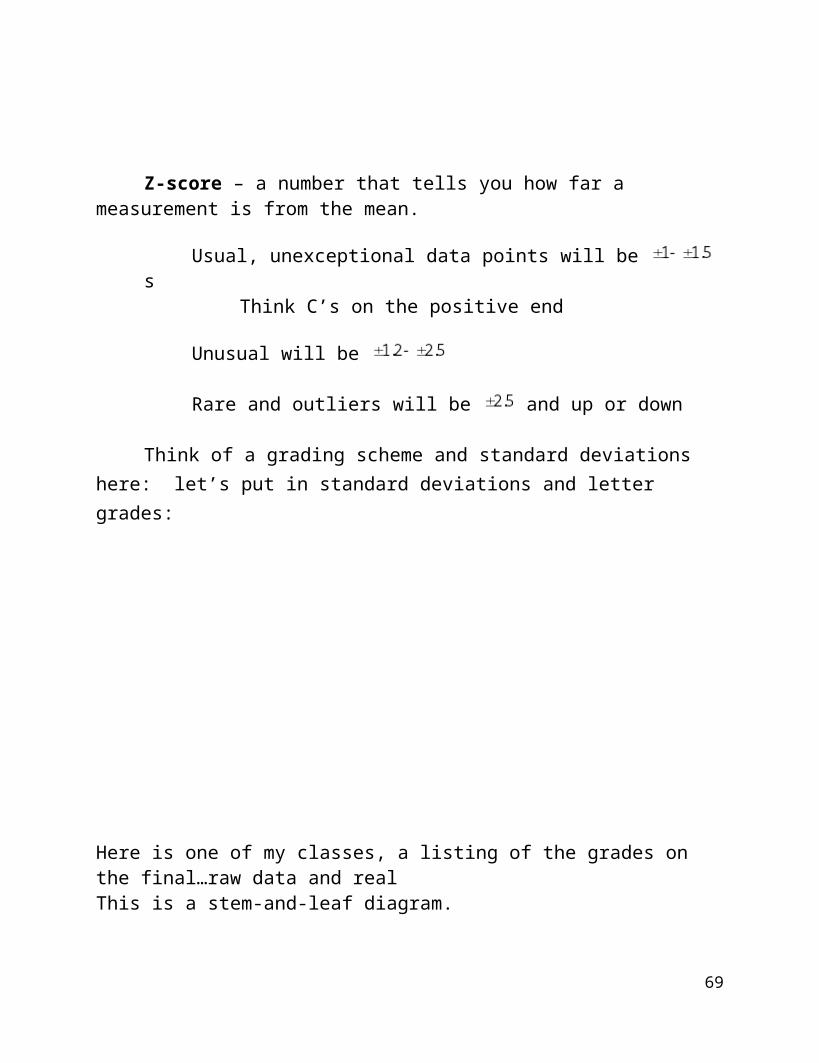
Z-score – a number that tells you how far a measurement is from the mean.
Usual, unexceptional data points will be sThink C’s on the positive end
Unusual will be
Rare and outliers will be and up or down
Think of a grading scheme and standard deviations here: let’s put in standard deviations and letter grades:
57
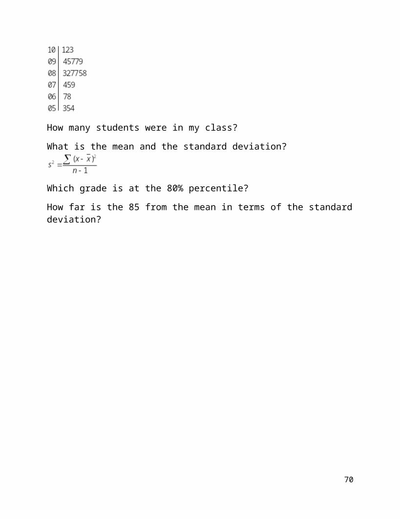
Here is one of my classes, a listing of the grades on the final…raw data and real This is a stem-and-leaf diagram.
How many students were in my class?
What is the mean and the standard deviation?
Which grade is at the 80% percentile?
How far is the 85 from the mean in terms of the standard deviation?
58
ZS Problem 1
If you have 2 students applying for entrance to a G&T program and you have room for only one, which one will you pick based on the following test information?
Gina got a 78 on a test with an average of 72 and a standard deviation of 5.
Mike got an 87 on a test with an average of 85 and standard deviation 1.5.
Who is the stronger student and how do you know?
59
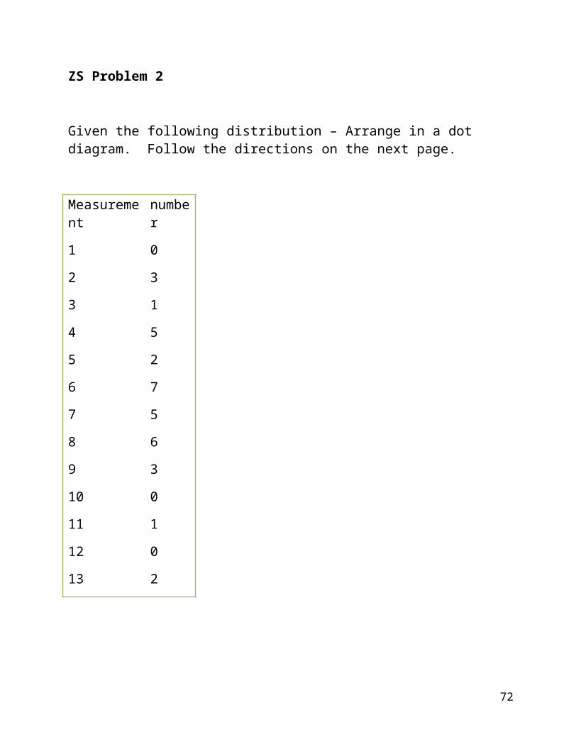
ZS Problem 2
Given the following distribution – Arrange in a dot diagram. Follow the directions on the next page.
Measurement
number
1 0
2 3
3 1
4 5
5 2
6 7
7 5
8
9
10
11
12
13
6
3
0
1
0
2
60
Discuss
the measures of central tendency
mean median mode
the measures of variability
range variance standard deviation
and give
the z score for the measurement 7.
Verify the Empirical Rule by making a dot or bar chart of the data and marking off where each of the standard deviations from the mean are with respect to the data points . ( s, 2s, 3s)
61
ZS Problem 3
The mean salary of the employees at a high school in Missouri is $28, 500 with a standard deviation of $2,100.
Discuss the Empirical Rule and who might fit where on a bar chart of employee salaries.
The state announces a flat raise of $500 per employee for the next year. Find the mean and standard deviation of the new salaries.
Who will benefit the most in a percentage change analysis?
62
ZS Problem 4
Given that the mean is 9.0 and the standard deviation is 1.4 on the data below, give the numbers of the 2,000 data points that should be within 1, 2, and 3 standard deviations of the mean. Then count the numbers that actually ARE within these bounds.
Value Frequency
0 1
1 2
2 4
3 8
4 20
5 35
6 60
7 120
8 25
9 500
10 1000
ACTIVITIES ZS PROBLEM 5
63
ZS Problem 6:
Analyze the following nuclear reactor data (@2010)
64

Work:
Some thoughts:
A histogram for the number per country?
Calculate the measures of center, the variability
Check the Empirical Rule?
An average output for each reactor?
A z-score for the USA, for China?
65
CountryIn operation Under construction
NumberElectr. net outputMW
NumberElectr. net outputMW
Argentina 2 935 1 692
Armenia 1 375 - -
Belgium 7 5,926 - -
Brazil 2 1,884 1 1,245
Bulgaria 2 1,906 2 1,906
Canada 18 12,569 - -
China
Mainland Taiwan
13
6
10,048
4,980
27
2
27,230
2,600Czech Republic 6 3,722 - -
Finland 4 2,716 1 1,600
France 58 63,130 1 1,600
Germany 17 20,490 - -
Hungary 4 1,889 - -
India 20 4,391 5 3,564
Iran - - 1 915
Japan 54 46,823 2 2,650
Korea, Republic 21 18,665 5 5,560
Mexico 2 1,300 - -
Netherlands 1 487 - -
Pakistan 2 425 1 300
Romania 2 1,300 - -
Russian Federation 32 22,693 11 9,153
Slovakian Republic 4 1,792 2 782
Slovenia 1 666 - -
South Africa 2 1,800 - -
Spain
ZS Problem 7
A rough estimate of the range is the mean +/ 2 standard deviations from the mean. Why is this true?
Could you use 3 sd? What would the difference be?
So you can ESTIMATE the standard deviation by taking the range and dividing by 4…let’s do this. It’s rough, but sometimes you just have to take what you can get!
If the range is 16 what is the estimate of the SD?
If the mean is 4 and the SD is 1.2 , what is an estimate of the range?
66
3.4 Box and Whisker Plots
are sometimes called “box plots”. They use the
Five Number Summary in a visual way:
Minimum value in the data setLower Quartile valueMedianUpper Quartile valueMaximum value
***Graphing Calculator, page 79
Definitions:Lower Quartile: Q1: the median of the values below the medianUpper Quartile: Q3: the median of the values above the median
It is possible to replace the minimum and maximum with prescribed values and have “outliers” marked.
Sketch: horizontal
67
IQR: Interquartile Range: is the difference between the upper quartile and the lower quartile. It is where the most “normal” measurements are.
Let’s look at page 75 and analyze the two data sets presented there!
68
Box plots are often used to compare data sets! It’s so easy to see how categories compare with them.
Constructing a box plot with specified “fences” and “outliers”as opposed to the Five Number Summary only
Put the data set in numerical order.Mark the Five Number Summary right on the list.Construct the box with Q1, the median, and Q3Find the length of the fences (upper and lower, Qx 1.5(IQR))Identify any data points that lie outside the fences and mark them *
BW1
Here is one of my classes, a listing of the grades on the final…raw data and real This is a stem-and-leaf diagram.
How many students were in my class?
What are the grades?
What is the Five Number Summary? The IQR?
What is the estimated SD? And the estimated z-score for 67?
69
Sketch the box and whisker plot! Were there any outliers? How do you know they’re outliers? Use the next page for this
70
BW1 continued
71
And another example, utilizing the comparison power of box and whisker plots:
Is in ACTIVITIES BW 2
Comparing several data sets with box and whisker plots.
A student designed an experiment to test the efficiency of 4 coffee containers from different manufacturers by pouring coffee at 180 into each container and then measuring the temperature difference after 30 minutes. She did the experiment 5 times – using different cups of the same type each time (she didn’t reuse any of the cups). So she used 20 cups total, 5 from each manufacturer.
The 5 number summary average temperature differences are in the table below
Min Q1 Median Q3 Max IQR
Cup 1 6F 6 83.25 14.25 18.5 8.25
Cup 2 0F 1 2 4.5 7 3.5
Cup 3 9F 11.5 14.25 21.75 24.5 10.25
Cup 4 6F 6.50 8.50 14.25 17.5 7.75
Compare the data. Which cup has the best heat retention property?
Each group in the room do one and then we’ll go the board and compare!
72
Chapter 3 Summary
OYO
Sample question:
Page 83 number 9, 13
73


![PES 1120: Homework assignment 1 [24 points] - uccs.edu · • Chapter 21, Problem 51 [2 points] • Chapter 22, ... • Chapter 22, Problem 49 [2 points] PES 1120: Homework assignment](https://static.fdocuments.us/doc/165x107/5b7fd33e7f8b9a35788cab17/pes-1120-homework-assignment-1-24-points-uccsedu-chapter-21-problem.jpg)