Divining Insights: Visual Analytics Through Cartomancy · of playing cards (such as Tarot cards)...
15
Divining Insights: Visual Analytics Through Cartomancy Andrew McNutt University of Chicago Chicago, IL 60637, USA [email protected] Michael Correll Tableau Research Seattle, WA 98103 [email protected] Anamaria Crisan Tableau Research Seattle, WA 98103 [email protected] Permission to make digital or hard copies of all or part of this work for personal or classroom use is granted without fee provided that copies are not made or distributed for profit or commercial advantage and that copies bear this notice and the full citation on the first page. Copyrights for components of this work owned by others than the author(s) must be honored. Abstracting with credit is permitted. To copy otherwise, or republish, to post on servers or to redistribute to lists, requires prior specific permission and/or a fee. Request permissions from [email protected]. Copyright held by the owner/author(s). Publication rights licensed to ACM. CHI Conference on Human Factors in Computing Systems Extended Abstracts, April 25–30, 2020, Honolulu, HI, USA ACM 978-1-4503-6819-3/20/04. https://doi.org/10.1145/3334480.3381814 Abstract Our interactions with data, visual analytics included, are in- creasingly shaped by automated or algorithmic systems. An open question is how to give analysts the tools to interpret these “automatic insights” while also inculcating critical en- gagement with algorithmic analysis. We present a system, Sortilège, that uses the metaphor of a Tarot card reading to provide an overview of automatically detected patterns in data in a way that is meant to encourage critique, reflection, and healthy skepticism. Author Keywords Visual analytics; information visualization; automated in- sights; divination CCS Concepts •Human-centered computing → Visualization systems and tools; Introduction An unsolved challenge in visual analytics is how to strike the proper balance between automated and manual explo- ration of data [22]. Automated methods based on statisti- cal modelling and machine learning can assist the analyst in sorting through large amounts of complex data, focus attention on what is important, and provide guidance for users without experience or expertise in analytics. These
Transcript of Divining Insights: Visual Analytics Through Cartomancy · of playing cards (such as Tarot cards)...

Divining Insights: Visual AnalyticsThrough Cartomancy
Andrew McNuttUniversity of ChicagoChicago, IL 60637, [email protected]
Michael CorrellTableau ResearchSeattle, WA [email protected]
Anamaria CrisanTableau ResearchSeattle, WA [email protected]
Permission to make digital or hard copies of all or part of this work for personal orclassroom use is granted without fee provided that copies are not made or distributedfor profit or commercial advantage and that copies bear this notice and the full citationon the first page. Copyrights for components of this work owned by others than theauthor(s) must be honored. Abstracting with credit is permitted. To copy otherwise, orrepublish, to post on servers or to redistribute to lists, requires prior specificpermission and/or a fee. Request permissions from [email protected].
Copyright held by the owner/author(s). Publication rights licensed to ACM.CHI Conference on Human Factors in Computing Systems Extended Abstracts, April25–30, 2020, Honolulu, HI, USAACM 978-1-4503-6819-3/20/04.https://doi.org/10.1145/3334480.3381814
AbstractOur interactions with data, visual analytics included, are in-creasingly shaped by automated or algorithmic systems. Anopen question is how to give analysts the tools to interpretthese “automatic insights” while also inculcating critical en-gagement with algorithmic analysis. We present a system,Sortilège, that uses the metaphor of a Tarot card reading toprovide an overview of automatically detected patterns indata in a way that is meant to encourage critique, reflection,and healthy skepticism.
Author KeywordsVisual analytics; information visualization; automated in-sights; divination
CCS Concepts•Human-centered computing → Visualization systemsand tools;
IntroductionAn unsolved challenge in visual analytics is how to strikethe proper balance between automated and manual explo-ration of data [22]. Automated methods based on statisti-cal modelling and machine learning can assist the analystin sorting through large amounts of complex data, focusattention on what is important, and provide guidance forusers without experience or expertise in analytics. These
methods, if taken to the extreme, promise the possibility ofautomatically generating “insights” from datasets [17, 43,50]: entirely automating the potentially tedious process ofexploratory data analysis. This promise comes with sev-eral dangers. Automated analysis methods can be opaqueand inscrutable: what the system is doing may be unclearor unverifiable. Automated methods can be brittle and bi-ased : these systems, by construction, lack context, history,or plain common sense about what things in the datasetare important. In the worst case, they can function as “p-hacking machines” [37] that highlight chance occurrences inthe dataset that are unlikely to generalize or replicate [53].Automated methods can promote a lack of skepticism orcritical thought : they often fail to communicate uncertaintyabout their findings [24] while at the same time appearing topresent unimpeachable facts. Lastly, automated analyticalmethods can discourage exploration or discovery by pre-senting a static list of insights, usually in some rank order,and so potentially avoiding analysis beyond the obvious,high-level trends in the data.
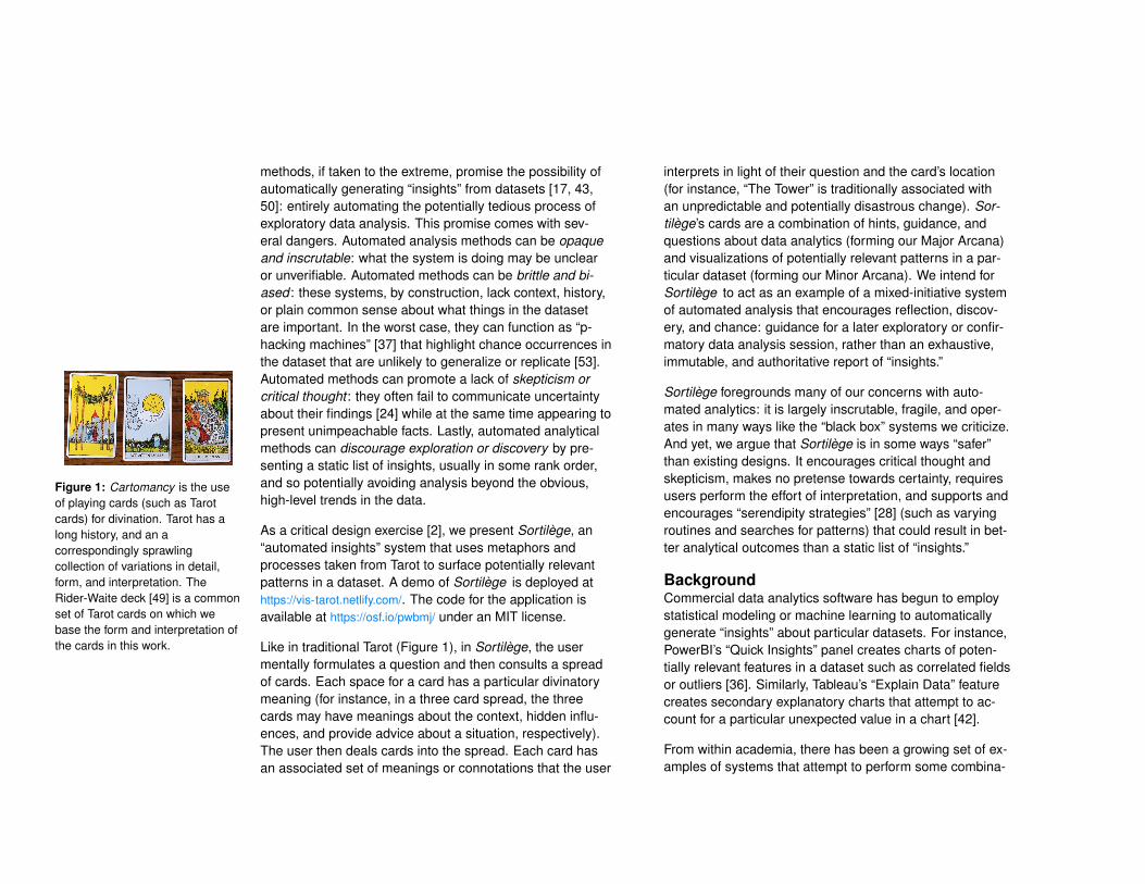
Figure 1: Cartomancy is the useof playing cards (such as Tarotcards) for divination. Tarot has along history, and an acorrespondingly sprawlingcollection of variations in detail,form, and interpretation. TheRider-Waite deck [49] is a commonset of Tarot cards on which webase the form and interpretation ofthe cards in this work.
As a critical design exercise [2], we present Sortilège, an“automated insights” system that uses metaphors andprocesses taken from Tarot to surface potentially relevantpatterns in a dataset. A demo of Sortilège is deployed athttps://vis-tarot.netlify.com/. The code for the application isavailable at https://osf.io/pwbmj/ under an MIT license.
Like in traditional Tarot (Figure 1), in Sortilège, the usermentally formulates a question and then consults a spreadof cards. Each space for a card has a particular divinatorymeaning (for instance, in a three card spread, the threecards may have meanings about the context, hidden influ-ences, and provide advice about a situation, respectively).The user then deals cards into the spread. Each card hasan associated set of meanings or connotations that the user
interprets in light of their question and the card’s location(for instance, “The Tower” is traditionally associated withan unpredictable and potentially disastrous change). Sor-tilège’s cards are a combination of hints, guidance, andquestions about data analytics (forming our Major Arcana)and visualizations of potentially relevant patterns in a par-ticular dataset (forming our Minor Arcana). We intend forSortilège to act as an example of a mixed-initiative systemof automated analysis that encourages reflection, discov-ery, and chance: guidance for a later exploratory or confir-matory data analysis session, rather than an exhaustive,immutable, and authoritative report of “insights.”
Sortilège foregrounds many of our concerns with auto-mated analytics: it is largely inscrutable, fragile, and oper-ates in many ways like the “black box” systems we criticize.And yet, we argue that Sortilège is in some ways “safer”than existing designs. It encourages critical thought andskepticism, makes no pretense towards certainty, requiresusers perform the effort of interpretation, and supports andencourages “serendipity strategies” [28] (such as varyingroutines and searches for patterns) that could result in bet-ter analytical outcomes than a static list of “insights.”
BackgroundCommercial data analytics software has begun to employstatistical modeling or machine learning to automaticallygenerate “insights” about particular datasets. For instance,PowerBI’s “Quick Insights” panel creates charts of poten-tially relevant features in a dataset such as correlated fieldsor outliers [36]. Similarly, Tableau’s “Explain Data” featurecreates secondary explanatory charts that attempt to ac-count for a particular unexpected value in a chart [42].
From within academia, there has been a growing set of ex-amples of systems that attempt to perform some combina-

tion of augmenting exploration of datasets with automati-cally generated charts [43], recommending potentially inter-esting charts in order to jumpstart an exploratory data anal-ysis session [52], or even entirely automating the processof visualizing noteworthy facts or patterns in a dataset [50](amongst many other potential tasks; see Ceneda et al. [9]and Collins et al. [10] for an overview).
The appeal of these automated or mixed-initiative approachesis obvious: they can dramatically reduce the expenditure oftime or the required statistical expertise necessary to dis-cover an important insight in the data. Even if the resultingautomatically generated charts are not immediately insight-ful, they can provide useful starting points or shortcuts fordeeper analysis. They can also function as safeguardsor sanity checks [12], alerting analysts to facts about theirdataset that they might have missed. And yet, these meth-ods have many potential shortcomings and dangers.
Critiques of Automated AnalyticsHeer [22] identifies designing for a useful mixture of au-tomation and agency as an emerging challenge in HCI,visual analytics (VA) included. Automated methods and rec-ommendation systems often fall short in this respect. Wehighlight here four ways in which automated analytics meth-ods and other “insight generation” tools can be problematic.
OpaqueThe methods by which charts are automatically generatedare often statistical “black boxes” that defy easy interpre-tation. For instance, both Data2Vis [15] and VizML [23]use neural nets to supply recommendations. Making neu-ral networks interpretable (or even what it means for suchmodels to be interpretable) is an open problem in machinelearning [27]. In the absence of information, the user mayblindly trust that system is offering good suggestions [29].Our increasing reliance on these uninterpretable (and so
un-auditable and unappealable) systems contributes to sys-tematic injustice and societal inequality [32, 33].
InflexibleAutomated analytics systems are often meant to be domain-agnostic, which means that they cannot adapt to the pecu-liarities of particular domains. Since the very definition ofan “insight” is complex and multifaceted [31], most systemsonly capture a small subset of such insights, using a hodge-podge of unrelated algorithms that may or may not matchhuman intuitions. For instance, many methods for auto-matically detecting outliers rely on distance from a centraltendency, and so may miss “interior” outliers that humansreadily notice [51].
This inflexibility extends to visualization types as well. Au-tomated analytics systems can only present the types ofcharts they have been designed to generate. For instance,Draco [30] is unable to suggest a pie chart (even in contextswhere one might be appropriate) because it operates overVega-Lite [39] which can not currently describe a pie chart.Many analytics systems present only a core set of simplis-tic charts, despite the expansive language of charts andgraphs for highlighting important aspects of data.
BrittleAutomated analytics systems make exhaustive searches ofthe data, surfacing charts that have been chosen in such away as to maximize a particular interest (such as surprise[46]). Without proper controls for false positives or otheraspects related to the multiple comparisons problem, thesesystems can act as “p-hacking machines” [37], surfacing“insights” of dubious quality [4]. Many, if not most, insightssurfaced from the unprincipled visual exploration of the datamay fail to generalize [53]. By taking all or most analyticalpaths simultaneously, the validation of any particular insightis difficult [18, 37]. Even if analyzed responsibly, many VA
systems fail to communicate uncertainty information [24],giving analysts little in the way of guidance for determiningthe strength or certainty surrounding what they have found.
DomineeringCharts are inherently rhetorical devices and carry a heavyrhetorical weight [25]. This often inspires users to trustcharts as true pictures of objective data [11, 19, 35]. Whensuch charts are presented in the context of recommenda-tions from “smart” statistical procedures, this can strengthenthe rhetorical impression of authority and veracity. This un-earned impression of objectivity and expertise—this priv-ileged “view from nowhere” [3]—can exacerbate theseweaknesses, as analysts may fail to properly vet chartspresented to them from a trusted recommender.
Similarly, automated analytics and recommendation sys-tems may fail to adapt to the analytical needs of the user,and enforce a particular path through the data. Exploratorydata analysis entails the ability to flexibly, iteratively, andoccasionally serendipitously [45] explore the data. By pre-senting the same “starting places” and the same suggestedanalyses each time, automated systems stifle this freedom.
Folk and Occult AlgorithmsModels and algorithms can be difficult to understand. Theyare often inherently complex, require specialized or esotericknowledge to build, or are intentionally obfuscated throughappeals to trade secrets or minimizing the complexity ofthe end-user experience. In the absence of a detailed un-derstanding of an algorithm, “folk theories” of algorithmicperformance arise [14]. These folk understandings extendalso to peoples’ understanding of data visualizations [35], inwhich skepticism concerning the source or veracity of datacan be swept aside by the sheer rhetorical force of a chartas an objective representation of truth [25].
With similar motivations to our work, Browne & Swift [8]construct a neural net whose outputs are interpreted via aritual séance, playing with the dual meanings of occult (asin hidden from explanation or examination, or as in mysti-cal or supernatural). Similarly, Lee et al. [26] use sibyllineobfuscation and occult symbology to present the results ofdiscourse analysis algorithms. While we do not deny thatSortilège shares these projects’ goal of drawing critical at-tention to the fact that many of the algorithms in which wehave invested a great deal of political, social, and economicpower are inexplicable to large audiences, we adopt occultpractices here for more positive reasons as well. Sultana etal. [44] remark that integrating occult practices into HCI canfunction as a way of widening the scope of our audience,and promoting re-examination of the epistemologies andpower structures that underlie our design work.
Our work bares a close resemblance to prior work on fur-thering creative projects. Eno’s Oblique Strategies [20]makes use of the randomness latent in a deck of ambiguous-but-provocative prompts as a mechanism for re-framing cre-ative projects. Börütecene & Buruk [5] make use of a Ouijaboard as a way to enrich the design process. Sengers et al.[41] push designers to promote skepticism and reflection intheir users through the form of their designs.
Our choice to rely on the trappings of Tarot (with its ele-ments of randomness, personal interpretations, and in-tentional ambiguity) locates our work within an emergingtrend that pushes back against traditional views of what avisualization system should support. For instance, Bradleyet al. [6] call for a “slow analytics” movement that may notpresent answers as quickly as possible, but has the ben-efit of increased human engagement and ownership overthe analysis process. Thudt et al. [45] and Alexander etal. [1] tout the benefits “serendipitous” visualization tools
that encourage potentially aimless or unguided explorationof datasets. Tarot, with its heavy reliance on human-driveninterpretation of stochastic systems, is in accord with bothof these emerging design directions for visual analytics.
SortilègeSortilège is a web-based skeuomorphic prototype that isintended to mimic the act of using Tarot cards for divination,but tuned to the process of investigating important proper-ties of a particular dataset as part of an initial step prior tomore in-depth visual analytics.
Context
ON
E CA
RD
ContextHidden
Influences Advice
THRE
E CA
RD
ContextHidden
Influences
Advice
Present
Challenges
FIV
E CA
RD
Future Goal
Context
Outcome
Mind
Environment
Influence
Present
Challenges
Past
CELT
ICCR
OSS
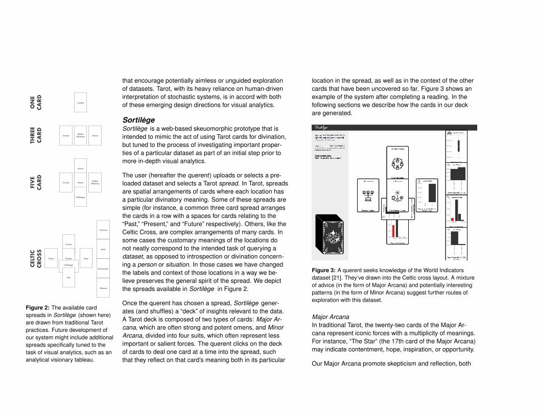
Figure 2: The available cardspreads in Sortilège (shown here)are drawn from traditional Tarotpractices. Future development ofour system might include additionalspreads specifically tuned to thetask of visual analytics, such as ananalytical visionary tableau.
The user (hereafter the querent) uploads or selects a pre-loaded dataset and selects a Tarot spread. In Tarot, spreadsare spatial arrangements of cards where each location hasa particular divinatory meaning. Some of these spreads aresimple (for instance, a common three card spread arrangesthe cards in a row with a spaces for cards relating to the“Past,” “Present,” and “Future” respectively). Others, like theCeltic Cross, are complex arrangements of many cards. Insome cases the customary meanings of the locations donot neatly correspond to the intended task of querying adataset, as opposed to introspection or divination concern-ing a person or situation. In those cases we have changedthe labels and context of those locations in a way we be-lieve preserves the general spirit of the spread. We depictthe spreads available in Sortilège in Figure 2.
Once the querent has chosen a spread, Sortilège gener-ates (and shuffles) a “deck” of insights relevant to the data.A Tarot deck is composed of two types of cards: Major Ar-cana, which are often strong and potent omens, and MinorArcana, divided into four suits, which often represent lessimportant or salient forces. The querent clicks on the deckof cards to deal one card at a time into the spread, suchthat they reflect on that card’s meaning both in its particular
location in the spread, as well as in the context of the othercards that have been uncovered so far. Figure 3 shows anexample of the system after completing a reading. In thefollowing sections we describe how the cards in our deckare generated.
Figure 3: A querent seeks knowledge of the World Indicatorsdataset [21]. They’ve drawn into the Celtic cross layout. A mixtureof advice (in the form of Major Arcana) and potentially interestingpatterns (in the form of Minor Arcana) suggest further routes ofexploration with this dataset.
Major ArcanaIn traditional Tarot, the twenty-two cards of the Major Ar-cana represent iconic forces with a multiplicity of meanings.For instance, “The Star” (the 17th card of the Major Arcana)may indicate contentment, hope, inspiration, or opportunity.
Our Major Arcana promote skepticism and reflection, both

Sortilège
Data set DAIRYGLANCE.CSVUpload (only csvs are supported)
No file chosenChoose File
Layout MAJOR ARCANAA simple way to see all of the major arcana inthe deck.
Reset current drawClick the deck to draw a card
Independence
XXII. The World
Have you considered the roleof seasonality or intrasample
correlation in your data?
Consistency
XXI. Judgement
Are you applying a consistentcriteria for analyzing your
results?
Representation
XX. The Sun
How representative is yourdata sample relative to the
population it was drawn from?
Missingness
XIX. The Moon
Have you considered whetherthere is missing data?
Causality
XVIII. The Star
Are you mistaking acorrelative relationship for a
causal one?
Chance
XVII. The Tower
Have you considered howlikely is it that these results are
due purely to chance?
Biases
XVI. The Devil
Have you considered potentialsources of bias in your data
collection?
Uncertainty
XV. Temperance
Do you know what theuncertainty is in these results?
AlternativesExplanations
XIV. Death
Have you consideredalternative interpretations of
these results?
Model Choices
XIII. The Hanged Man
Did you use deep learningwhen logistic regression would
have sufficed?
Quality
XII. Strength
Does your data have anyquality issues?
Reproducibility
XI. Wheel of Fortune
Could you reproduce theseresults at a later date?
Confounders
X. The Hermit
Have you accounted for thepresence of hidden
confounders in your data?
Validity
IX. Justice
Can you assess the internaland ecological validity of
these results?
Summarization
VIII. The Chariot
Is the level of aggregationdata aggregation
appropriate?
AttributeLinkages
VII. The Lovers
Did you consider thefunctional dependencies in
your data?
StatisticalAssumptions
VI. The Hierophant
Do you understand theassumptions made by the
statistical analysis?
The DomainExpert
V. The Emperor
Have you engaged a domainexpert to be sure youunderstand the data?
Sufficiency
IV. The Empress
Do you have enough data toarrive at a reasonable
conclusion?
Quorum
III. The High Priestess
Would others interpret thedata they same way you do?
The Analyst
II. The Magician
Did you seek advice from astatistical expert beforeanalyzing your data?
The Question
I. The Fool
Did you consider developing aspecific research question?
Figure 4: The cards constituting the Major Arcana in Sortilège . Each card provides a thematic interpretation of the traditional meaning of cardconsisting of a new name, an illustrative design, and a question designed to foster introspection and skepticism about the analysis process.
on any particular insight received from the data, but alsoin general on how the dataset is organized, collected, andused. Drawing on both common pitfalls in visual analytics(such as those laid out by Bresciani & Eppler [7]), as well
as ethical “checklists” for data science (such as those pro-posed by Patil et al. [34]), we created a set of potential con-cerns or forces that may be at play when analyzing data.As with similar efforts, such as the Control-Alt-Hack card
game [13], it is our hope that these questions and positionsare broad enough to be useful in many scenarios, but toalso encourage creative thought about how they might ap-ply to the specific situation in mind.
Figure 4 shows all of our Major Arcana. These cards askdirect questions to the querent following four themes of vi-sual analyses: the people involved in the analysis, the dataas an artifact, issues arising from models of the data, andissues arising from the analysis process itself. To wit, "TheSun" (the 20th card of the Major Arcana) asks the querentwho is counted, while "The Emperor" (the 5th card) promptsthem to consider who is doing the counting [11, 16].
Minor ArcanaIn traditional Tarot, the Minor Arcana are divided into foursuits. For instance, in the Rider-Waite deck [49] and manyothers decks, these suits are Wands, Cups, Pentacles, andSwords. Within each suit the cards have numbers, from theAce to the Page, Queen, and King of that suit in increasingorder of “strength.” As with the Major Arcana, each cardhas different customary meanings, with the difference thateach suit is often thought of as having thematic divinatoryproperties in common. For instance, traditional Sword cardsare often associated with problems, conflicts, and power.
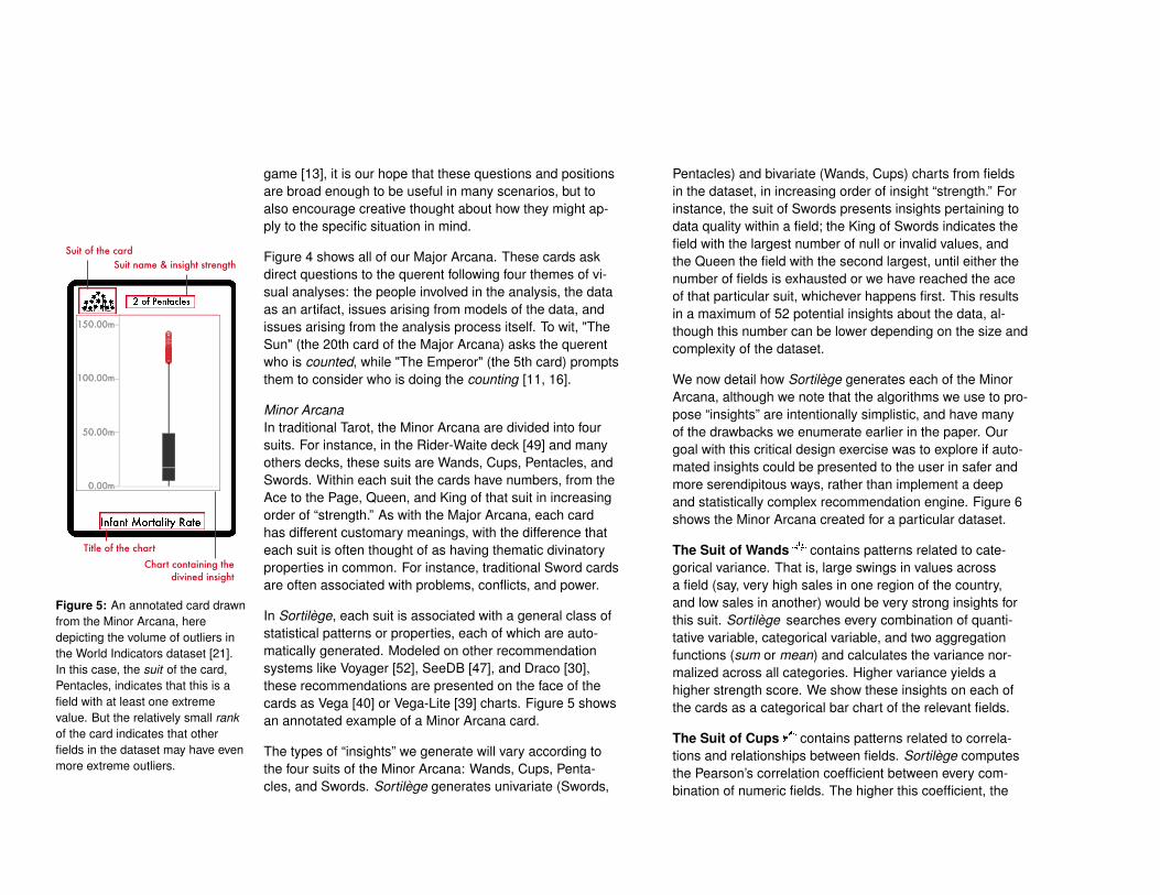
Suit of the card
Chart containing the divined insight
Title of the chart
Suit name & insight strength
Figure 5: An annotated card drawnfrom the Minor Arcana, heredepicting the volume of outliers inthe World Indicators dataset [21].In this case, the suit of the card,Pentacles, indicates that this is afield with at least one extremevalue. But the relatively small rankof the card indicates that otherfields in the dataset may have evenmore extreme outliers.
In Sortilège, each suit is associated with a general class ofstatistical patterns or properties, each of which are auto-matically generated. Modeled on other recommendationsystems like Voyager [52], SeeDB [47], and Draco [30],these recommendations are presented on the face of thecards as Vega [40] or Vega-Lite [39] charts. Figure 5 showsan annotated example of a Minor Arcana card.
The types of “insights” we generate will vary according tothe four suits of the Minor Arcana: Wands, Cups, Penta-cles, and Swords. Sortilège generates univariate (Swords,
Pentacles) and bivariate (Wands, Cups) charts from fieldsin the dataset, in increasing order of insight “strength.” Forinstance, the suit of Swords presents insights pertaining todata quality within a field; the King of Swords indicates thefield with the largest number of null or invalid values, andthe Queen the field with the second largest, until either thenumber of fields is exhausted or we have reached the aceof that particular suit, whichever happens first. This resultsin a maximum of 52 potential insights about the data, al-though this number can be lower depending on the size andcomplexity of the dataset.
We now detail how Sortilège generates each of the MinorArcana, although we note that the algorithms we use to pro-pose “insights” are intentionally simplistic, and have manyof the drawbacks we enumerate earlier in the paper. Ourgoal with this critical design exercise was to explore if auto-mated insights could be presented to the user in safer andmore serendipitous ways, rather than implement a deepand statistically complex recommendation engine. Figure 6shows the Minor Arcana created for a particular dataset.
The Suit of Wands contains patterns related to cate-gorical variance. That is, large swings in values acrossa field (say, very high sales in one region of the country,and low sales in another) would be very strong insights forthis suit. Sortilège searches every combination of quanti-tative variable, categorical variable, and two aggregationfunctions (sum or mean) and calculates the variance nor-malized across all categories. Higher variance yields ahigher strength score. We show these insights on each ofthe cards as a categorical bar chart of the relevant fields.
The Suit of Cups contains patterns related to correla-tions and relationships between fields. Sortilège computesthe Pearson’s correlation coefficient between every com-bination of numeric fields. The higher this coefficient, the

sum of "Is Guard"by "Is Center"
King of Wands
sum of "Is Center"by "Is Guard
Queen of Wands
mean of "Is Center"by "Is Guard"
Knight of Wands
mean of "Is Guard"by "Is Center"
Page of Wands
sum of "pg threeMade"by "Is Center"
10 of Wands
sum of "pg threeAttempted" by "Is Center"
9 of Wands
sum of "Is Guard"by "Is American"
8 of Wands
sum of "Pg Assists"by "Is American"
7 of Wands
sum of "Assist To Turnover"by "Is American"
6 of Wands
sum of "Pg Steals"by "Is American
5 of Wands
sum of "pg threeAttempted"by "Is American"
4 of Wands
mean of "pg threeMade"by "Is Center"
3 of Wands
sum of "pg threeMade"by "Is American
2 of Wands
sum of "Pg Threepoint Percentage" by "Is American"
Ace of Wands
“Pg Points” vs “pg fgMade”
King of Cups
“pg fgMade” vs “Pg Points”
Queen of Cups
“pg fgAttempted” vs “pg fgMade”
Knight of Cups
“pg fgMade” vs “pg fgAttempted”
Page of Cups
“pg ftAttempted” vs”pg ftMade”
10 of Cups
“pg ftMade” vs “pg ftAttempted”
9 of Cups
“pg threeMade” vs “pg threeAttempted”
8 of Cups
“pg threeAttempted” vs “pg threeMade”
7 of Cups
“pg fgAttempted” vs “Pg Points”
6 of Cups
“Pg Points” vs “pg fgAttempted”
5 of Cups
“Pg Minutes” vs “pg fgAttempted”
4 of Cups
“pg fgAttempted” vs “Pg Minutes”
3 of Cups
“pg ftMade” vs “pg Points”
2 of Cups
“Pg Points” vs “pg ftMade”
Ace of Cups
Assist To Turnover
King of Pentacles
Fg Percentage
Queen of Pentacles
Pg Blocks
Knight of Pentacles
Pg Steals
Page of Pentacles
Pg Assists
10 of Pentacles
Pg Threepoint Percentage
9 of Pentacles
pg ftMade
8 of Pentacles
pg ftAttempted
7 of Pentacles
pg Rebounds
6 of Pentacles
pg threeMade
5 of Pentacles
pg threeAttemped
4 of Pentacles
Pg Ft Percentage
3 of Pentacles
Pg Points
2 of Pentacles
pg fgAttempted
Ace of Pentacles
Pg Threepoint Percentage
King of Swords
Pg Ft Percentage
Queen of Swords
Assist To Turnover
Knight of Swords
Fg Percentage
Page of Swords
Figure 6: The cards of the Minor Arcana for a basketball statistics dataset. Sortilège only generate cards appropriate to the phenomenon thateach suit describes. For instance, as there were only four fields with missing data, we generate only four cards in the suit of Swords; the rest ofthe suit is indicated here as face down cards.
higher the strength score (although we exclude fields withperfect correlation, which are often, but not always, trivialre-codings or dependencies in the data). Each card in thissuit depicts a scatterplot of the two relevant fields.
The Suit of Pentacles contains patterns related to ex-treme or unexpected values within numeric fields. Sor-tilège computes the z-score of each value in each numericfield. The higher the maximum absolute value of z score ina particular field, the higher the strength score. Each mem-ber of this suit shows a boxplot of the relevant field.
The Suit of Swords contains patterns related to dataquality concerns. Sortilège computes the proportions ofrows in each field that are null, empty, or undefined. Thehigher the proportion of missing values, the higher thestrength score. Members of this suit render these issuesthrough a histogram of the relevant field.
Case StudyAs a proof of concept, one of the authors consulted a sim-ple three card spread in the context of the World Bank’s“World Indicators” [21] dataset (Figure 7). This dataset is
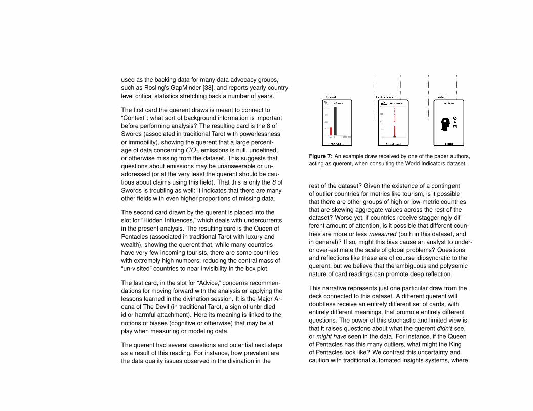
used as the backing data for many data advocacy groups,such as Rosling’s GapMinder [38], and reports yearly country-level critical statistics stretching back a number of years.
The first card the querent draws is meant to connect to“Context”: what sort of background information is importantbefore performing analysis? The resulting card is the 8 ofSwords (associated in traditional Tarot with powerlessnessor immobility), showing the querent that a large percent-age of data concerning CO2 emissions is null, undefined,or otherwise missing from the dataset. This suggests thatquestions about emissions may be unanswerable or un-addressed (or at the very least the querent should be cau-tious about claims using this field). That this is only the 8 ofSwords is troubling as well: it indicates that there are manyother fields with even higher proportions of missing data.
The second card drawn by the querent is placed into theslot for “Hidden Influences,” which deals with undercurrentsin the present analysis. The resulting card is the Queen ofPentacles (associated in traditional Tarot with luxury andwealth), showing the querent that, while many countrieshave very few incoming tourists, there are some countrieswith extremely high numbers, reducing the central mass of“un-visited” countries to near invisibility in the box plot.
The last card, in the slot for “Advice,” concerns recommen-dations for moving forward with the analysis or applying thelessons learned in the divination session. It is the Major Ar-cana of The Devil (in traditional Tarot, a sign of unbridledid or harmful attachment). Here its meaning is linked to thenotions of biases (cognitive or otherwise) that may be atplay when measuring or modeling data.
The querent had several questions and potential next stepsas a result of this reading. For instance, how prevalent arethe data quality issues observed in the divination in the
Figure 7: An example draw received by one of the paper authors,acting as querent, when consulting the World Indicators dataset.
rest of the dataset? Given the existence of a contingentof outlier countries for metrics like tourism, is it possiblethat there are other groups of high or low-metric countriesthat are skewing aggregate values across the rest of thedataset? Worse yet, if countries receive staggeringly dif-ferent amount of attention, is it possible that different coun-tries are more or less measured (both in this dataset, andin general)? If so, might this bias cause an analyst to under-or over-estimate the scale of global problems? Questionsand reflections like these are of course idiosyncratic to thequerent, but we believe that the ambiguous and polysemicnature of card readings can promote deep reflection.
This narrative represents just one particular draw from thedeck connected to this dataset. A different querent willdoubtless receive an entirely different set of cards, withentirely different meanings, that promote entirely differentquestions. The power of this stochastic and limited view isthat it raises questions about what the querent didn’t see,or might have seen in the data. For instance, if the Queenof Pentacles has this many outliers, what might the Kingof Pentacles look like? We contrast this uncertainty andcaution with traditional automated insights systems, where
the querent might be left with the impression that only theinsights that made it to the panel or the recommendationscreen are “important,” and the rest of the dataset largelymatches their expectations.
DiscussionAs with all critical design projects, we charge the reader toreflect on Sortilège as a provocation. For instance, what issafe or unsafe about automated analysis, and how can it bemade safer? What responsibilities as designers do we haveto transparently communicate to audiences with diverseareas of expertise? How can we design analytic systems tobuild up and build upon this expertise? How responsible arewe as designers when people use the analytical systemswe design come to erroneous conclusions?
The mystical black box we present with Sortilège is notfundamentally that much different from the technologicalblack box presented by conventional VA systems. Bothsystems have an element of blind trust. However, we be-lieve that conventional analytics systems go out of their wayto build authority and perceived accuracy through tacticslike suppressing uncertainty information [24] or using “AIwashing” [48] to convey unearned expertise or complexity.They are occult systems in the original meaning of the term:hidden knowledge. One cannot shy away from this occultnature in Sortilège. Similarly, by forcing a burden of inter-pretation and confabulation onto the querent, Sortilège cutsoff the easy excuse that generated insights are objective,neutral, or self-generating facts about the data. The humandeals the cards, creates their interpretations, and links themtogether. They are an active, rather than passive, partici-pant in the analysis process, random and arbitrary though itmight be at its heart.
Sortilège’s manifestation as a web app allows it the opti-mal flexibility to analyze datasets and mimics the digital-ephemerality of insights divined from conventional VA sys-tems. Unlike those systems however, if a dataset were ofparticular significance or importance then a material copyof the corresponding deck could be physicalized and asso-ciated rituals of analysis engaged. Instead of monitoring adashboard to assess key metrics, one could imagine per-forming a daily reading of a newly printed card deck.
ConclusionWe have described Sortilège, an automated visual insightsystem wrought in the medium of a Tarot deck. Our sys-tem allows users to explore their data through a traditionalor familiar set of charts, alongside a collection of reflec-tive prompts, that have been recontextualized and defa-miliarized through an occult lens. Our goal in employingthe occult is that users of this system are prompted by theform and design of our application to engage in the visualanalysis process with a greater skepticism and unshackledcuriosity. It is our hope that this critical reflection will carryover into analysts’ everyday analysis practices. Further, wehope that they will refrain from blindly trusting visualizationrecommendation and automated analysis systems, thatthey will think more carefully about the who-how-and-why oftheir data, and, at the very least, question their assumptionswhen working with data.
AcknowledgementsWe thank the divine hands of fate for having dealt us thecards that have allowed us to conduct this work, as well asour reviewers for their helpful readings and commentary.
REFERENCES[1] Eric Alexander, Joe Kohlmann, Robin Valenza,
Michael Witmore, and Michael Gleicher. 2014.

Serendip: Topic Model-Driven Visual Exploration ofText Corpora. In 2014 IEEE Conference on VisualAnalytics Science and Technology (VAST). IEEE,173–182. DOI:http://dx.doi.org/10.1109/VAST.2014.7042493
[2] Jeffrey Bardzell and Shaowen Bardzell. 2013. What is“Critical” about Critical Design?. In Proceedings of the2013 CHI Conference on Human Factors in ComputingSystems. ACM, 3297–3306. DOI:http://dx.doi.org/10.1145/2470654.2466451
[3] Shaowen Bardzell and Jeffrey Bardzell. 2011. Towardsa Feminist HCI Methodology: Social Science,Feminism, and HCI. In Proceedings of the SIGCHIconference on human factors in computing systems.675–684. DOI:http://dx.doi.org/10.1145/1978942
[4] Carsten Binnig, Lorenzo De Stefani, Tim Kraska, EliUpfal, Emanuel Zgraggen, and Zheguang Zhao. 2017.Toward Sustainable Insights, or Why Polygamy is Badfor You. In CIDR 2017, 8th Biennial Conference onInnovative Data Systems Research, Chaminade, CA,USA, January 8-11, 2017, Online Proceedings.www.cidrdb.org. http://cidrdb.org/cidr2017/papers/p56-binnig-cidr17.pdf
[5] Ahmet Börütecene and Oundefineduz ‘Oz’ Buruk.2019. Otherworld: Ouija Board as a Resource forDesign. In Proceedings of the Halfway to the FutureSymposium 2019 (HTTF 2019). Association forComputing Machinery, New York, NY, USA, ArticleArticle 4, 4 pages. DOI:http://dx.doi.org/10.1145/3363384.3363388
[6] Adam James Bradley, Victor Sawal, and ChristopherCollins. 2019. Approaching Humanities QuestionsUsing Slow Visual Search Interfaces. IEEE 4thWorkshop for Visualization and the Digital Humanities.
[7] Sabrina Bresciani and Martin J Eppler. 2015. ThePitfalls of Visual Representations: A Review andClassification of Common Errors Made WhileDesigning and Interpreting Visualizations. Sage Open5, 4 (2015). DOI:http://dx.doi.org/10.1177/2158244015611451
[8] Kieran Browne and Ben Swift. 2018. The Other Side:Algorithm as Ritual in Artificial Intelligence. InExtended Abstracts of the 2018 CHI Conference onHuman Factors in Computing Systems. ACM, alt11.https://doi.org/10.1145/3170427.3188404
[9] Davide Ceneda, Theresia Gschwandtner, ThorstenMay, Silvia Miksch, Hans-Jörg Schulz, Marc Streit, andChristian Tominski. 2016. Characterizing Guidance inVisual Analytics. IEEE Transactions on Visualizationand Computer Graphics 23, 1 (2016), 111–120. DOI:http://dx.doi.org/10.1109/TVCG.2016.2598468
[10] Christopher Collins, Natalia Andrienko, TobiasSchreck, Jing Yang, Jaegul Choo, Ulrich Engelke, AmitJena, and Tim Dwyer. 2018. Guidance in thehuman–machine analytics process. Visual Informatics2, 3 (2018), 166–180. DOI:http://dx.doi.org/10.1016/j.visinf.2018.09.003
[11] Michael Correll. 2019. Ethical Dimensions ofVisualization Research. In Proceedings of the 2019CHI Conference on Human Factors in ComputingSystems. ACM, 188. DOI:http://dx.doi.org/10.1145/3290605.3300418
[12] Michael Correll, Mingwei Li, Gordon L. Kindlmann, andCarlos Scheidegger. 2019. Looks Good To Me:Visualizations As Sanity Checks. IEEE Trans. Vis.Comput. Graph. 25, 1 (2019), 830–839. DOI:http://dx.doi.org/10.1109/TVCG.2018.2864907
[13] Tamara Denning, Adam Lerner, Adam Shostack, andTadayoshi Kohno. 2013. Control-Alt-Hack: The Designand Evaluation of a Card Game for Computer SecurityAwareness and Education. In Proceedings of the 2013ACM SIGSAC Conference on Computer &Communications Security (CCS ’13). Association forComputing Machinery, New York, NY, USA, 915–928.DOI:http://dx.doi.org/10.1145/2508859.2516753
[14] Michael A DeVito, Jeffrey T Hancock, Megan French,Jeremy Birnholtz, Judd Antin, Karrie Karahalios,Stephanie Tong, and Irina Shklovski. 2018. Thealgorithm and the user: How can HCI use layunderstandings of algorithmic systems?. In ExtendedAbstracts of the 2018 CHI Conference on HumanFactors in Computing Systems. ACM, panel04. DOI:http://dx.doi.org/10.1145/3170427.3188404
[15] Victor Dibia and Çagatay Demiralp. 2019. Data2Vis:Automatic Generation of Data Visualizations UsingSequence-to-Sequence Recurrent Neural Networks.IEEE Transactions on Visualization and ComputerGraphics 39, 5 (2019), 33–46. DOI:http://dx.doi.org/10.1109/MCG.2019.2924636
[16] Catherine D’Ignazio and Lauren Klein. 2016. FeministData Visualization. In IEEE VIS: Workshop onVisualization for the Digital Humanities (VIS4DH).
[17] Rui Ding, Shi Han, Yong Xu, Haidong Zhang, andDongmei Zhang. 2019. QuickInsights: Quick andAutomatic Discovery of Insights fromMulti-Dimensional Data. In Proceedings of the 2019International Conference on Management of Data.ACM, 317–332. DOI:http://dx.doi.org/10.1145/3299869.3314037
[18] Pierre Dragicevic, Yvonne Jansen, Abhraneel Sarma,Matthew Kay, and Fanny Chevalier. 2019. Increasingthe Transparency of Research Papers with ExplorableMultiverse Analyses. In Proceedings of the 2019 CHIConference on Human Factors in Computing Systems.ACM, 65. DOI:http://dx.doi.org/10.1145/3290605.3300295
[19] Johanna Drucker. 2012. Humanistic theory and digitalscholarship. Debates in the digital humanities (2012),85–95.
[20] Brian Eno and Peter Schmidt. 1975. ObliqueStrategies. Opal.(Limited edition, boxed set ofcards.)[rMAB] (1975).
[21] World Bank Group. 2019. World DevelopmentIndicators. http://datatopics.worldbank.org/world-development-indicators/. (2019).
[22] Jeffrey Heer. 2019. Agency plus automation:Designing artificial intelligence into interactivesystems. Proceedings of the National Academy ofSciences 116, 6 (2019), 1844–1850. DOI:http://dx.doi.org/10.1073/pnas.1807184115
[23] Kevin Hu, Michiel A Bakker, Stephen Li, Tim Kraska,and César Hidalgo. 2019. VizML: A Machine LearningApproach to Visualization Recommendation. InProceedings of the 2019 CHI Conference on HumanFactors in Computing Systems. ACM, 128. DOI:http://dx.doi.org/10.1145/3290605.3300358
[24] Jessica Hullman. 2020. Why Authors Don’t VisualizeUncertainty. IEEE transactions on visualization andcomputer graphics 26, 1 (2020), 130–139. DOI:http://dx.doi.org/10.1109/TVCG.2019.2934287

[25] Helen Kennedy, Rosemary Lucy Hill, Giorgia Aiello,and William Allen. 2016. The work that visualisationconventions do. Information, Communication & Society19, 6 (2016), 715–735. DOI:http://dx.doi.org/10.1080/1369118X.2016.1153126
[26] Joyce Lee, Sejal Popat, and Soravis Prakkamakul.2019. Exploring the “Magic” of Algorithmic Predictionswith Technology-Mediated Tarot Card Readings.https://www.ischool.berkeley.edu/projects/2019/exploring-magic-algorithmic-predictions, (2019).Accessed: 2020-01-03.
[27] Zachary C Lipton. 2018. The Mythos of ModelInterpretability. Commun. ACM 61, 10 (2018), 36–43.DOI:http://dx.doi.org/10.1145/3233231
[28] Stephann Makri, Ann Blandford, Mel Woods, SarahSharples, and Deborah Maxwell. 2014. “Making myown luck”: Serendipity Strategies and Howto SupportThem in Digital Information Environments. Journal ofthe Association for Information Science andTechnology 65, 11 (2014), 2179–2194. DOI:http://dx.doi.org/10.1002/asi.23200
[29] Andrew McNutt and Gordon Kindlmann. 2018. Lintingfor Visualization: Towards a Practical AutomatedVisualization Guidance System. In VisGuides: 2ndWorkshop on the Creation, Curation, Critique andConditioning of Principles and Guidelines inVisualization.
[30] Dominik Moritz, Chenglong Wang, Greg L Nelson,Halden Lin, Adam M Smith, Bill Howe, and JeffreyHeer. 2019. Formalizing Visualization DesignKnowledge as Constraints: Actionable and ExtensibleModels in Draco. IEEE Transactions on Visualization
and Computer Graphics 25, 1 (2019), 438–448. DOI:http://dx.doi.org/10.1109/TVCG.2018.2865240
[31] Chris North. 2006. Toward Measuring VisualizationInsight. IEEE computer graphics and applications 26, 3(2006), 6–9. DOI:http://dx.doi.org/10.1109/MCG.2006.70
[32] Cathy O’Neil. 2016. Weapons of Math Destruction:How Big Data Increases Inequality and Threatensdemocracy. Broadway Books.
[33] Frank Pasquale. 2015. The Black Box Society.Harvard University Press.
[34] DJ Patil, Hilary Mason, and Mike Loukides. 2018.Ethics and Data Science. O’Reilly Media, Inc.
[35] Evan M Peck, Sofia E Ayuso, and Omar El-Etr. 2019.Data is Personal: Attitudes and Perceptions of DataVisualization in Rural Pennsylvania. In Proceedings ofthe 2019 CHI Conference on Human Factors inComputing Systems. ACM, 244. DOI:http://dx.doi.org/10.1145/3290605.3300474
[36] Microsoft PowerBI. 2019. Generate data insightsautomatically with Power BI. https://docs.microsoft.com/en-us/power-bi/service-insights.(2019).
[37] Xiaoying Pu and Matthew Kay. 2018. The Garden ofForking Paths in Visualization: A Design Space forReliable Exploratory Visual Analytics: Position Paper.In IEEE VIS: Evaluation and Beyond-MethodologicalApproaches for Visualization (BELIV). IEEE, 37–45.DOI:http://dx.doi.org/10.1109/BELIV.2018.8634103
[38] Hans Rosling. 2009. GapMinder Foundation.http://www.gapminder.org. (2009).

[39] Arvind Satyanarayan, Dominik Moritz, KanitWongsuphasawat, and Jeffrey Heer. 2016. Vega-Lite:A Grammar of Interactive Graphics. IEEE Transactionson Visualization and Computer Graphics 23, 1 (2016),341–350. DOI:http://dx.doi.org/10.1109/TVCG.2016.2599030
[40] Arvind Satyanarayan, Ryan Russell, Jane Hoffswell,and Jeffrey Heer. 2015. Reactive Vega: A StreamingDataflow Architecture for Declarative InteractiveVisualization. IEEE Transactions on Visualization andComputer Graphics 22, 1 (2015), 659–668. DOI:http://dx.doi.org/10.1109/TVCG.2015.2467091
[41] Phoebe Sengers, Kirsten Boehner, Shay David, andJoseph’Jofish’ Kaye. 2005. Reflective Design. InProceedings of the 4th Decennial Conference onCritical Computing: Between Sense and Sensibility.ACM, 49–58. DOI:http://dx.doi.org/10.1145/1094562.1094569
[42] Tableau Software. 2019. Explain Data: AI-DrivenExplanations for Your Data. https://www.tableau.com/products/new-features/explain-data. (2019).
[43] Arjun Srinivasan, Steven M Drucker, Alex Endert, andJohn Stasko. 2018. Augmenting Visualizations withInteractive Data Facts to Facilitate Interpretation andCommunication. IEEE Transactions on Visualizationand Computer Graphics 25, 1 (2018), 672–681. DOI:http://dx.doi.org/10.1109/TVCG.2018.2865145
[44] Sharifa Sultana and Syed Ishtiaque Ahmed. 2019.Witchcraft and HCI: Morality, Modernity, andPostcolonial Computing in Rural Bangladesh. InProceedings of the 2019 CHI Conference on HumanFactors in Computing Systems (CHI ’19). Associationfor Computing Machinery, New York, NY, USA, Article
Paper 356, 15 pages. DOI:http://dx.doi.org/10.1145/3290605.3300586
[45] Alice Thudt, Uta Hinrichs, and Sheelagh Carpendale.2012. The Bohemian Bookshelf: SupportingSerendipitous Book Discoveries through InformationVisualization. In Proceedings of the 2012 CHIConference on Human Factors in Computing Systems(CHI ’12). Association for Computing Machinery, NewYork, NY, USA, 1461–1470. DOI:http://dx.doi.org/10.1145/2207676.2208607
[46] Manasi Vartak, Silu Huang, Tarique Siddiqui, SamuelMadden, and Aditya Parameswaran. 2017. TowardsVisualization Recommendation Systems. ACMSIGMOD Record 45, 4 (2017), 34–39. DOI:http://dx.doi.org/10.1145/3092931.3092937
[47] Manasi Vartak, Samuel Madden, AdityaParameswaran, and Neoklis Polyzotis. 2014. SeeDB:Automatically Generating Query Visualizations. Proc.VLDB Endow. 7, 13 (Aug. 2014), 1581–1584. DOI:http://dx.doi.org/10.14778/2733004.2733035
[48] Kaveh Waddell. 2019. The dangers of “AI washing”.https://www.axios.com/ai-washing-hidden-people-00ab65c0-ea2a-4034-bd82-4b747567cba7.html. (2019).
[49] Arthur Edward Waite. 1999. The Original Rider WaiteTarot Deck. US Games Systems, Incorporated.
[50] Yun Wang, Zhida Sun, Haidong Zhang, Weiwei Cui, KeXu, Xiaojuan Ma, and Dongmei Zhang. 2019.DataShot: Automatic Generation of Fact Sheets fromTabular Data. IEEE transactions on visualization andcomputer graphics (2019). DOI:http://dx.doi.org/10.1109/TVCG.2019.2934398
[51] Leland Wilkinson. 2017. Visualizing Big Data OutliersThrough Distributed Aggregation. IEEE Transactionson Visualization and Computer Graphics 24, 1 (2017),256–266. DOI:http://dx.doi.org/10.1109/TVCG.2017.2744685
[52] Kanit Wongsuphasawat, Dominik Moritz, AnushkaAnand, Jock Mackinlay, Bill Howe, and Jeffrey Heer.2015. Voyager: Exploratory Analysis via FacetedBrowsing of Visualization Recommendations. IEEETransactions on Visualization and Computer Graphics
22, 1 (2015), 649–658. DOI:http://dx.doi.org/10.1109/TVCG.2015.2467191
[53] Emanuel Zgraggen, Zheguang Zhao, Robert Zeleznik,and Tim Kraska. 2018. Investigating the Effect of theMultiple Comparisons Problem in Visual Analysis. InProceedings of the 2018 CHI Conference on HumanFactors in Computing Systems. ACM, 479. DOI:http://dx.doi.org/10.1145/3173574.3174053