Displaying & Describing Categorical Data Chapter 3
35
Displaying & Describing Categorical Data Chapter 3
description
Displaying & Describing Categorical Data Chapter 3. The three rules of data analysis are: Make a picture – it will help you to think clearly about the patterns and relationships that may be hiding in your data Make a picture – it will show the important features and patterns in your data - PowerPoint PPT Presentation
Transcript of Displaying & Describing Categorical Data Chapter 3
Displaying & Describing Categorical Data
Chapter 3

The three rules of data analysis are:1. Make a picture – it will help you to think
clearly about the patterns and relationships that may be hiding in your data
2. Make a picture – it will show the important features and patterns in your data
3. Make a picture – it will tell others about your data
A frequency table lists the categories in a categorical variable and gives the count of observations for each category.

A frequency table of the Titanic passengers by ticket class
CLASS COUNT
FIRST 325
SECOND 285
THIRD 706
CREW 885

A relative frequency table lists the categories in a categorical variable and gives the percentage of observations for each category.

A relative frequency table of the Titanic passengers by ticket class
CLASS PERCENTAGE
FIRST 325/2201=14.77%
SECOND 285/2201=12.95%
THIRD 706/2201=32.08%
CREW 885/2201=40.21%
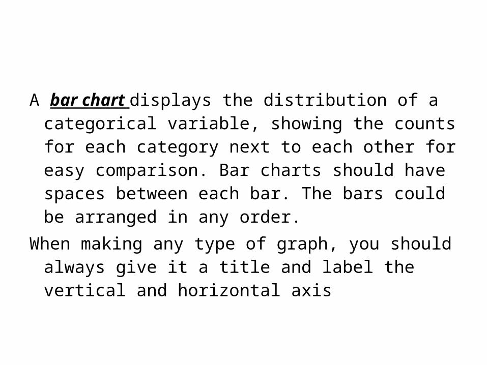
A bar chart displays the distribution of a categorical variable, showing the counts for each category next to each other for easy comparison. Bar charts should have spaces between each bar. The bars could be arranged in any order.
When making any type of graph, you should always give it a title and label the vertical and horizontal axis

Make a bar graph with the data below:
CLASS COUNT
FIRST 325
SECOND 285
THIRD 706
CREW 885

Titanic Passengers by Class
FIRST CLASS SECOND CLASS THIRD CLASS CREW0
100200300400500600700800900
1000
CLASS
FREQUENCY
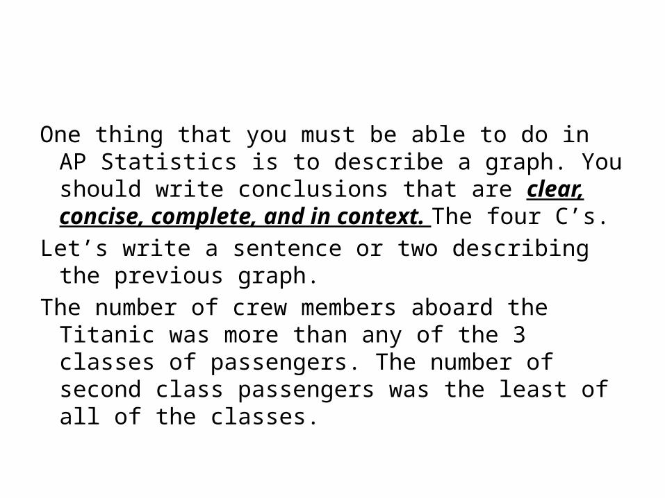
One thing that you must be able to do in AP Statistics is to describe a graph. You should write conclusions that are clear, concise, complete, and in context. The four C’s.
Let’s write a sentence or two describing the previous graph.
The number of crew members aboard the Titanic was more than any of the 3 classes of passengers. The number of second class passengers was the least of all of the classes.
A relative frequency bar chart will replace the counts with percentages.
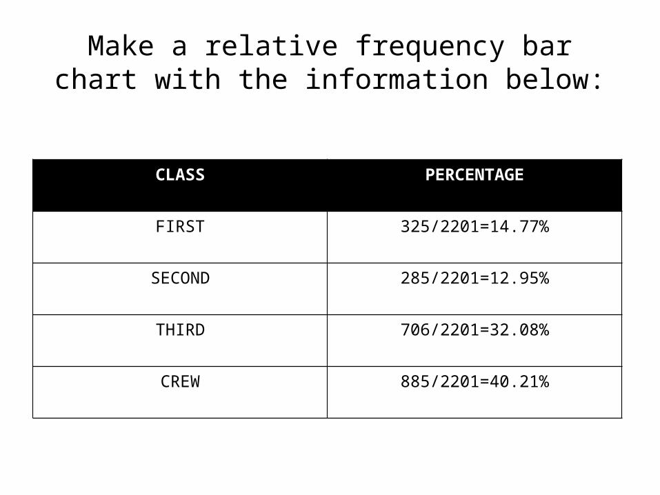
Make a relative frequency bar chart with the information below:
CLASS PERCENTAGE
FIRST 325/2201=14.77%
SECOND 285/2201=12.95%
THIRD 706/2201=32.08%
CREW 885/2201=40.21%

Titanic Passengers by Class
FIRST CLASS SECOND CLASS THIRD CLASS CREW0
10
20
30
40
50
60
CLASS
PERCENTAGE
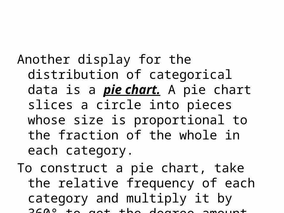
Another display for the distribution of categorical data is a pie chart. A pie chart slices a circle into pieces whose size is proportional to the fraction of the whole in each category.
To construct a pie chart, take the relative frequency of each category and multiply it by 360° to get the degree amount of each slice

Titanic passengers by ticket class
CLASS PERCENTAGE DEGREE
FIRST 325/2201=14.77% .1477·360=53.2°
SECOND 285/2201=12.95% .1295·360=46.6°
THIRD 706/2201=32.08% .3208·360=115.5°
CREW 885/2201=40.21% .4021·360=144.8°
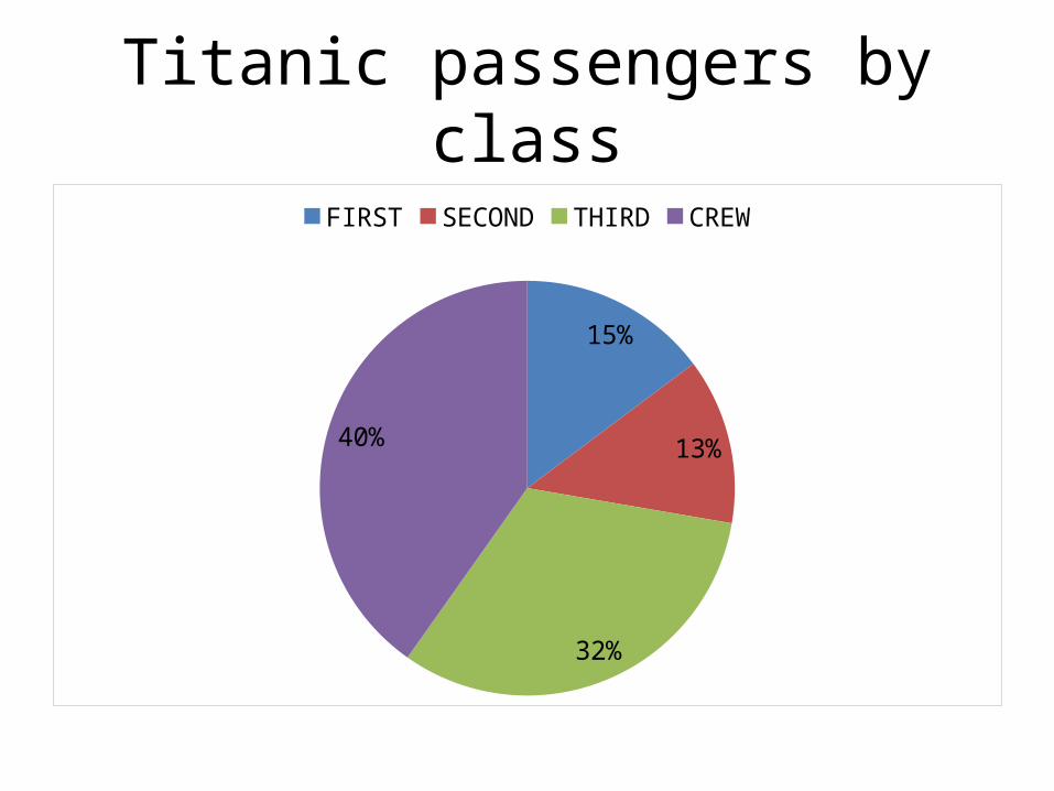
Titanic passengers by class
15%
13%
32%
40%
FIRST SECOND THIRD CREW

A Segmented bar chart for the number of Titanic Passengers in each class
Series10%
10%
20%
30%
40%
50%
60%
70%
80%
90%
100%
CREWTHIRD CLASSSECOND CLASSFIRST CLASS
To summarize, before you make a bar chart or pie chart, always check the Categorical Data Condition : The data are counts or percentages of individuals in categories.
If you want to make a relative frequency bar chart or pie chart, make sure that the categories don’t overlap, so no individual is counted twice. If the categories do overlap, you can still make a bar chart, but the percentages won’t add up to 100%.

Slide 3- 19
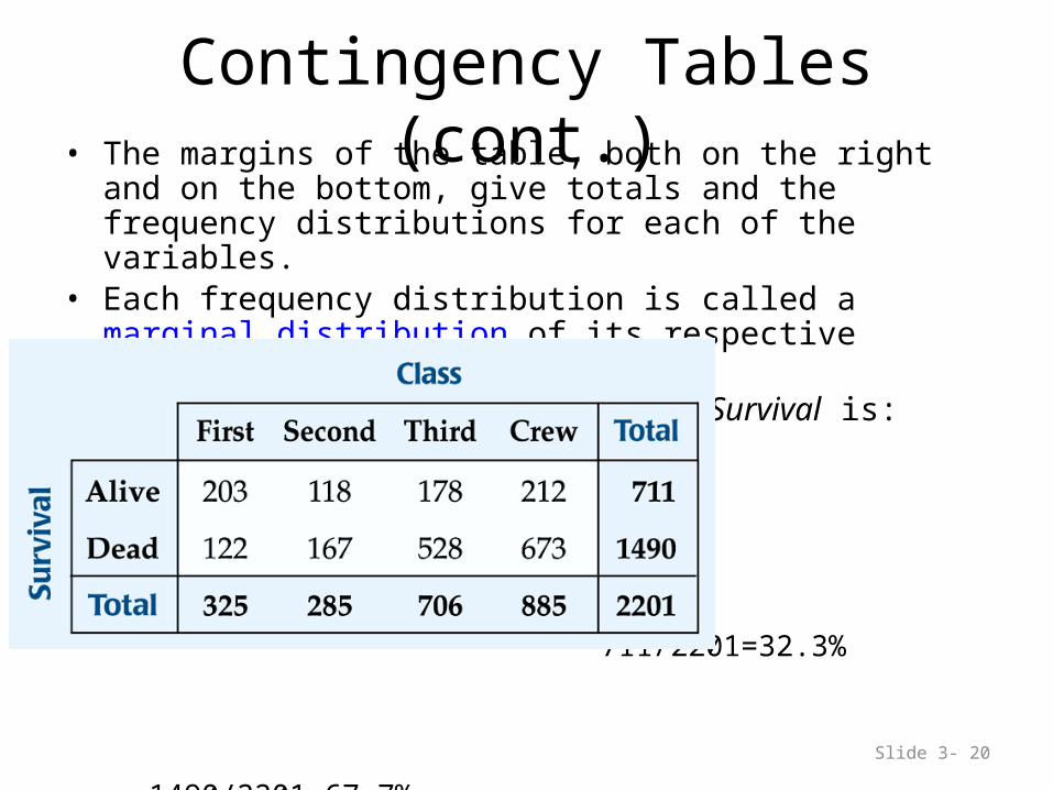
Contingency Tables• A contingency table allows us to look at two categorical variables
together. • It shows how individuals are distributed along each variable,
contingent on the value of the other variable.– Example: we can examine the class of ticket and whether a
person survived the Titanic:
Slide 3- 20
Contingency Tables (cont.)• The margins of the table, both on the right and on the bottom, give
totals and the frequency distributions for each of the variables.• Each frequency distribution is called a marginal distribution of its
respective variable.– The marginal distribution of Survival is:
711/2201=32.3%
1490/2201=67.7%

Slide 3- 21
Contingency Tables (cont.)• Each cell of the table gives the count for a combination of values of
the two values.– For example, the second cell in the crew column tells us that 673
crew members died when the Titanic sunk.

Slide 3- 22
Conditional Distributions• A conditional distribution shows the
distribution of one variable for just the individuals who satisfy some condition on another variable.– The following is the conditional distribution of
ticket Class, conditional on having survived:

Slide 3- 23
Conditional Distributions (cont.)
– The following is the conditional distribution of ticket Class, conditional on having perished:
Slide 3- 24
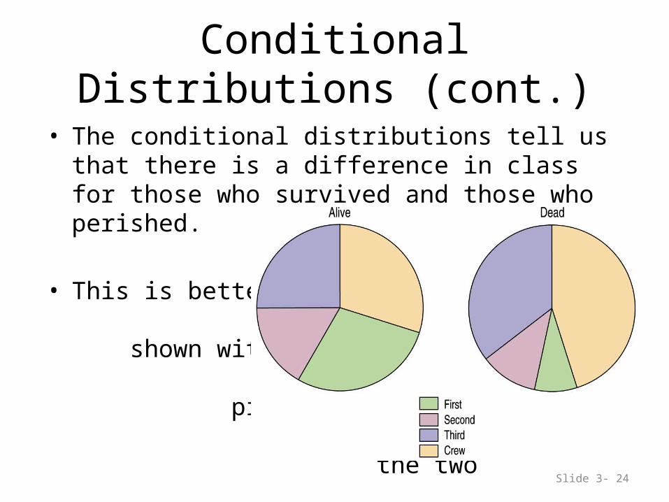
Conditional Distributions (cont.)
• The conditional distributions tell us that there is a difference in class for those who survived and those who perished.
• This is better shown with pie charts of the two distributions:
Slide 3- 25
Conditional Distributions (cont.)
• We see that the distribution of Class for the survivors is different from that of the nonsurvivors.
• This leads us to believe that Class and Survival are associated, that they are not independent.
• The variables would be considered independent when the distribution of one variable in a contingency table is the same for all categories of the other variable.
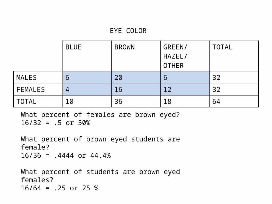
BLUE BROWN GREEN/HAZEL/OTHER
TOTAL
MALES 6 20 6 32
FEMALES 4 16 12 32
TOTAL 10 36 18 64
EYE COLOR
What percent of females are brown eyed?16/32 = .5 or 50%
What percent of brown eyed students are female?16/36 = .4444 or 44.4%
What percent of students are brown eyed females?16/64 = .25 or 25 %
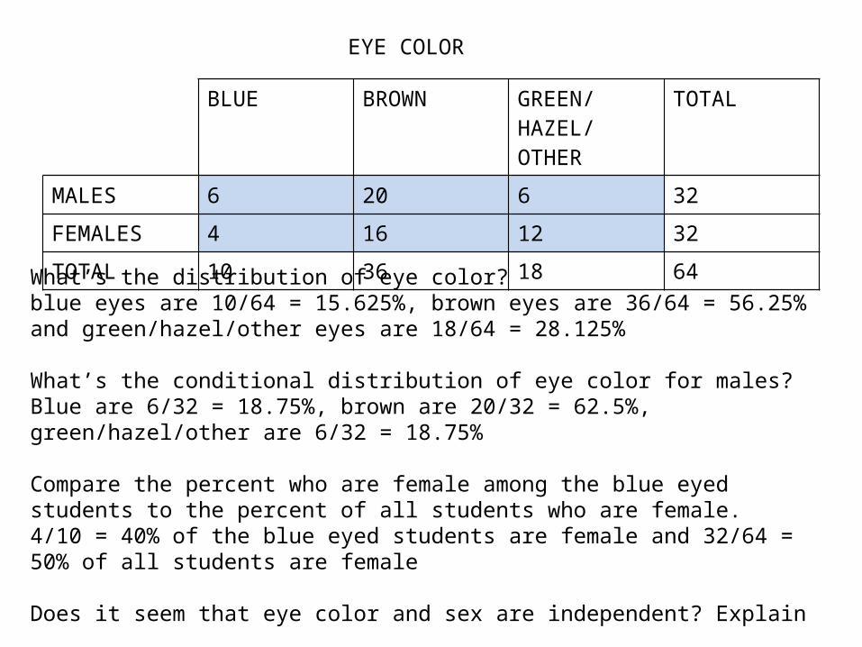
BLUE BROWN GREEN/HAZEL/OTHER
TOTAL
MALES 6 20 6 32
FEMALES 4 16 12 32
TOTAL 10 36 18 64
EYE COLOR
What’s the distribution of eye color?blue eyes are 10/64 = 15.625%, brown eyes are 36/64 = 56.25% and green/hazel/other eyes are 18/64 = 28.125%
What’s the conditional distribution of eye color for males?Blue are 6/32 = 18.75%, brown are 20/32 = 62.5%, green/hazel/other are 6/32 = 18.75%
Compare the percent who are female among the blue eyed students to the percent of all students who are female.4/10 = 40% of the blue eyed students are female and 32/64 = 50% of all students are female
Does it seem that eye color and sex are independent? Explain

Eye color
males females0%
10%
20%
30%
40%
50%
60%
70%
80%
90%
100%
green/hazel/otherbrownblue
The conditional distributions tell us that there is a difference in eye color for males and females. It seems that eye color and sex are not independent.

Slide 3- 29
• Don’t violate the area principle.
– While some people might like the pie chart on the left better, it is harder to compare fractions of the whole, which a well-done pie chart does.
What Can Go Wrong?
Slide 3- 30
What Can Go Wrong? (cont.)
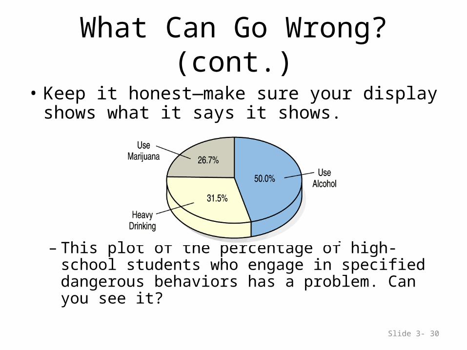
• Keep it honest—make sure your display shows what it says it shows.
– This plot of the percentage of high-school students who engage in specified dangerous behaviors has a problem. Can you see it?
Slide 3- 31
What Can Go Wrong? (cont.)
• Don’t confuse similar-sounding percentages—pay particular attention to the wording of the context.
• Don’t forget to look at the variables separately too—examine the marginal distributions, since it is important to know how many cases are in each category.

Slide 3- 32
What Can Go Wrong? (cont.)
• Be sure to use enough individuals! – Do not make a report like “We found that 66.67 of
the rats improved their performance with training. The other rat died.”
Slide 3- 33
What Can Go Wrong? (cont.)
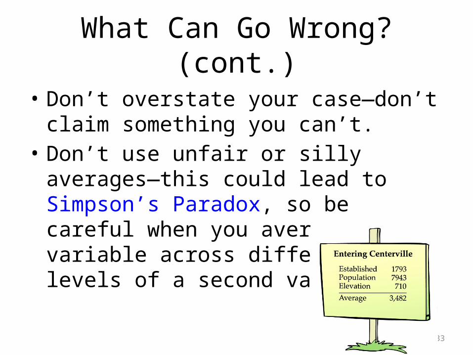
• Don’t overstate your case—don’t claim something you can’t.
• Don’t use unfair or silly averages—this could lead to Simpson’s Paradox, so be careful when you average one variable across different levels of a second variable.

SIMPSON’S PARADOX EXAMPLE
It’s the last inning of an important game. Your team is one run behind with the bases loaded and two outs. The pitcher is due up, so you’ll be sending in a pinch-hitter. There are 2 batters available on the bench. Whom should you send in to bat player A or player B?
Player Overall vs LHP vs RHP
A 33 for 103 28 for 81 5 for 22
B 45 for 151 12 for 32 33 for 119

Slide 3- 35
What have we learned?
• We can summarize categorical data by counting the number of cases in each category (expressing these as counts or percents).
• We can display the distribution in a bar chart or pie chart.
• And, we can examine two-way tables called contingency tables, examining marginal and/or conditional distributions of the variables.