Digital Grahics
34
Digital Graphic Narrative Development Emily Parkes
Transcript of Digital Grahics

Digital Graphic Narrative
Development
Emily Parkes

Shape Task

Shape Task
Evaluation
What did you like about your image?I like that I have used shading to the image to create shadows and highlights to the elephant to make it look more eye catching and not just one block of colour. The darker areas on the elephant I blurred a little bit to make it blend into the main colour more and to make the image look more professional and to add more detail to the elephant. Overall for my first go I think the outcome was good but once I get use to all the tools and practise more the image I create will eventually end up looking a lot better and more professional. For the second image I used a new technique to add a lot more detail onto the image. When creating highlighted areas I used the colour range tool to select the more highlighted areas on the original image then added the colour to give the cartoon more definition and makes the cartoon look more professional.
What would you improve if you did it again?If I could do this again I would add a more creative background to make the image look more creative and for it to be more eye catching and stand out more, instead of having one block colour I would add different colours like blue at the top for sky and green at the bottom to look like grass. I would also add a bit more detail near the legs of the elephant to make sure they aren’t one block of colour and show that there are actually legs. I would improve this image by adding a few more shaded just below the nose and around where the head is to define the head a bit more and to help it stand out more from the original block colour. For the background I would make sure it isn't just a block colour and add some detail on it to make the cartoon look more interesting and for it to stand out more.

Rotoscope
Rotoscope

Evaluation
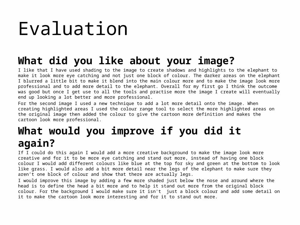
What did you like about your image?I really like the facial features on this images because I put a lot of detail and time doing them because I wanted them to be what stands out on the image. For the hair I used colour range to easily select different shadows and highlighted areas in the hair and then add different colours to the hair to make them look more realistic. My favourite part of this image is the lips and eyes because I used bright colours for both of them to make them stand out from the rest of the face and to be very eye catching, and when I was creating the lips and eyes I made sure I add loads of detail to them to make them the main feature of the image. What I like about the second rotoscope I created was the hair and the eyes because I spent more time on these sections to make sure that I put a lot of detail and definition in them because I wanted these features to be what stood and on this image and I feel like I achieved that. I also like that I have added a little bit more shading around the nose and eye area than my last image because I wanted to see if it would make a difference and in my opinion I think it makes the nose and eyes a little bit more eye catching and realistic.
What would you improve if you did it again?If I could do this image again I would make sure the skin tone of here face and neck aren't as grey and I would also make sure her clothing was a little bit brighter to make the image more eye catching. I would also use the colour range tool on the eye brows to add some shadows or highlights to make the brows look more realistic and make the image overall look a bit more professional. For my second image I would improve how much shadows I put onto the clothing because I think if I added a few more shadows and a few highlighted areas it would make the clothing look less like one block of colour and make It look more realistic. I could also try and add a few darker and lighter colours onto the face to create shadows and highlighted areas to make the image look more realistic and it could allow me to also make certain areas of the face stand out and extenuate certain features.

Text Based

Text Based
Evaluation
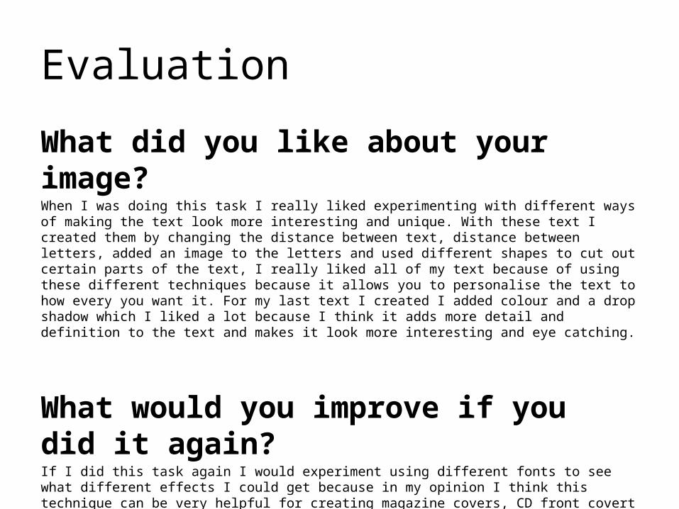
What did you like about your image?When I was doing this task I really liked experimenting with different ways of making the text look more interesting and unique. With these text I created them by changing the distance between text, distance between letters, added an image to the letters and used different shapes to cut out certain parts of the text, I really liked all of my text because of using these different techniques because it allows you to personalise the text to how every you want it. For my last text I created I added colour and a drop shadow which I liked a lot because I think it adds more detail and definition to the text and makes it look more interesting and eye catching.
What would you improve if you did it again?If I did this task again I would experiment using different fonts to see what different effects I could get because in my opinion I think this technique can be very helpful for creating magazine covers, CD front covert and lot more. I would also experiment with different shadows and strokes I could use on the text to make it stand out more and look more unique.

Comic Book
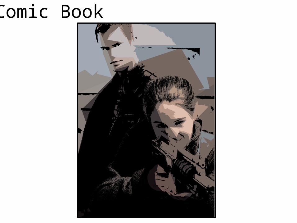
Comic Book

Evaluation
What did you like about your image?For the first cartoon I created I like the contrast between the colours because it makes the cartoon look more eye catching and I created this effect by changing the threshold to add definition to areas like the hair and eyes. Even though this image isn't very colourful and is mostly grey I like it because I feel like it makes the cartoon more unique and stand out more. On the second cartoon I like that it is more colourful than the first cartoon because it makes it eye catching. For this cartoon I made it a little bit more abstract by going onto filter gallery and putting the number of levels and edge simplicity up high to extenuate the shapes of the original image but I also made sure the image still had definition on the faces by changing the threshold to make sure there would still be detail on the cartoon.
What would you improve if you did it again?If I could improve my first image I would make it a little bit more realistic by going into filter gallery and making sure all of the settings weren't too high and I would try and add more definition by changing the threshold to make pars of the cartoon stand out even more but overall I like the outcome of my first image and wouldn’t change much.For my second image I would improve how much definition I put onto the cartoon because I feel like it makes the characters clothes just look like one block colour which I think ruins the effect of the cartoon. I would also try and make the image a little bit more abstract to make it look very unique and stand out more because I feel like if it was more abstract it would have put more emphasise on the shapes from the original image.

Photography

Evaluation
What did you like about your image?
What would you improve if you did it again?

Illustration

Evaluation
What did you like about your image?
What would you improve if you did it again?

Initial Ideas

Mood board of inspiration

Idea Generation
Mood board of chosen idea

ProposalDimensions
(number of pages and page size)
Story Overview
(Provide an outline of your story)
Export Format
Advantages:
Disadvantages:

Deadline
Audience
(Think about who you are targeting as your audience. Consider age, gender, class, location and other characteristics which could define your audience.)
Production Methods
(Explain the methods you are going to use to produce your pages. Show us the thinking behind your decisions for a more detail response)

What are the strengths of the proposal? What areas of the proposal need further work?
What are the strengths of the idea generation? What areas of idea generation could have been further developed?

What are the strengths of the proposal? What areas of the proposal need further work?
What are the strengths of the idea generation? What areas of idea generation could have been further developed?

What are the strengths of the proposal? What areas of the proposal need further work?
What are the strengths of the idea generation? What areas of idea generation could have been further developed?

Feedback Summary
Sum up your feedback.
Which parts of your feedback do you agree with and why?
Which parts of your feedback do you disagree with and why?

Storyboards

Storyboards

Storyboards

Original Script
Original Script goes here with link to where it came from

Original Script
Original Script goes here with link to where it came from

Final Script
Final script goes here.

Digital Flat Plans