
Digital Design Shift: From Mobile to Multichannel · items that website visitors use ... Think...
15
white paper Digital Design Shift: From Mobile to Multichannel Why marketers choose Sitecore Adaptive Design to create engaging customer conversations
Transcript of Digital Design Shift: From Mobile to Multichannel · items that website visitors use ... Think...

white paper
Digital Design Shift: From Mobile to Multichannel
Why marketers choose Sitecore Adaptive Design to create engaging customer conversations

Digital Design Shift: From Mobile to Multichannel
Table of ContentsI. Introduction: Which Is Really “First”: Mobile or Multichannel? 1
Responsive web design: The first choice of “mobile first” 2Adaptive Design offers multichannel flexibility 2
II. A Marketer’s RWD Primer 3High overhead — and costs 4When responsive web design makes sense 4Long-term considerations 5
III. An Overview of Sitecore Adaptive Design 6Presenting mobile content, in context 7Additional benefits 7Spotlight on multichannel conversations 8
IV. The Downstream Impact of an Adaptive Design Approach 9Sitecore DMS helps to improve the customer journey 10
V. Summary: Sitecore Offers the Best of Both Design Worlds 12A hybrid solution: Blending RWD and Sitecore Adaptive Design 12
About Sitecore 12

Digital Design Shift: From Mobile to Multichannel
CopyrightCopyright © 2013 Sitecore. All Rights Reserved.
Restricted Rights LegendThis document may not, in whole or in part, be photocopied, reproduced, translated, or reduced to any electronic medium or machine readable form without prior consent, in writing, from Sitecore. Information in this document is subject to change without notice and does not represent a commitment on the part of Sitecore.
TrademarksSitecore is a registered trademark of Sitecore. All other company and product names are trademarks of their respective owners.

Digital Design Shift: From Mobile to Multichannel
1
I. Introduction: Which Is Really “First”: Mobile or Multichannel? Famously coined as a rallying cry by Facebook’s Mark Zuckerberg, “Mobile first” has evolved into a book,1 a design philosophy2 and, among today’s digital marketing professionals, a topic of spirited debate. While the mobile channel is indeed the most popular for reading emails3 and accessing Facebook,4 should “mobile first” translate into “tablet and desktop a distant second and third?”
Logic, and the numbers, indicate the contrary. For example, in 2013, there will be an estimated 140 million smartphone users and 123 million tablet users in the US. Pew Research recently quantified the astounding rise of tablet computers, finding that fully 1/3 of American adults owns a tablet device, up from just three percent in May 2010.5 Meanwhile, 90 percent of smartphone owners access the same email account on mobile and desktop.6
And what about serious, considered purchases? The digital mass market makes the majority of its purchases via their home personal computers,7 and today 40.6 percent of buyers consult multiple channels — from
websites and traditional catalogs to smartphones, tablets and stores — before buying big-ticket home retail items. In 2002, only 10.1 percent of people consulted three channels.8
The reality is, people interact with companies and brands in multiple ways, across multiple channels, during the course of their individual customer journeys.
Clearly, while mobile may be “first” for email, social media and on-the-go browsing, tablet and desktop play critical roles in the digital conversation — and conversions. The customer experience on those channels should be personalized, and in the moment — a dynamic collaboration between the visitor’s informational needs, and the content the marketer can provide to fulfill them.
1. “Mobile First,” Luke Wrobleski, 2011.
2.“MobileFirstistheideathatwebsitesshouldfirstbedesignedformobiledevices,includingonlythosetasks/itemsthatwebsitevisitorsusemost.Thenasscreenrealestateincreases,addintasks/featuresasneededbasedonuserpriority.”Source:mobilegovwiki.howto.gov
3.Accordingtomultipleindustrystatistics,morethan40%ofallemailmessagesarenowreadonmobiledevices.
4.“eMarketerestimatesthattherewillbenearly100millionUSmobilesocialnetworkusersthisyear,ortwooutoffivemobileusers,andasignificantpercentagewillbeFacebookusers.”Source:“SmartphonesHelpDriveUserstoFacebook,”eMarketer,April17,2013.
5.“Forthefirsttime,athirdofAmericanadultsowntabletcomputers,”PewResearch,June10,2013.
6.“IsYourEmailStrategyMobileReady?ThinkMulti-Screen,”NancyPekala,AMAAccess,2012.
7.Source:CiscoSystemsIBSGsurveyconductedinOctober2012,citedin“54pcofUSconsumerscravein-storedigital,mobiletouchpoints:Cisco,”TriciaCarr,LuxuryDaily,January15,2013.
8.ResearchbyConluminoandWebloyaltycitedin“Multichannelmakesshopperstakelongertomakepurchases,studyshows,”RetailCustomerExperience,December6,2012.
The customer experience is dynamic collaboration between the visitor’s needs and the marketer’s content.
Should “mobile first” translate into “tablet and desktop a distant second and third?”
Digital Design Shift: From Mobile to Multichannel
2
Responsive web design: The first choice of “mobile first”“Mobile first” is closely related to the concept of responsive web design (RWD), a client-centric approach that delivers multiple channels’ worth of HTML content to the requesting device. The device then determines what to display, typically using grids that roughly correspond with the screen widths of three key devices: smartphone, tablet and desktop. (A more detailed description and discussion of responsive web design can be found in Section II.)
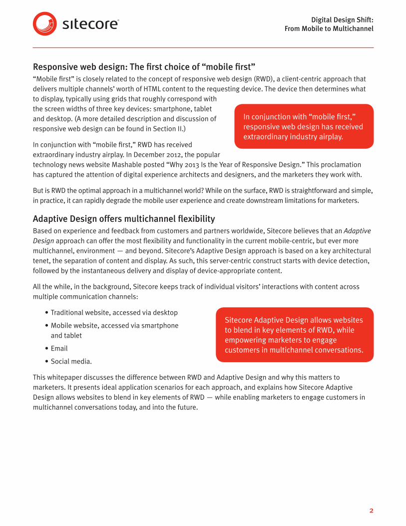
In conjunction with “mobile first,” RWD has received extraordinary industry airplay. In December 2012, the popular technology news website Mashable posted “Why 2013 Is the Year of Responsive Design.” This proclamation has captured the attention of digital experience architects and designers, and the marketers they work with.
But is RWD the optimal approach in a multichannel world? While on the surface, RWD is straightforward and simple, in practice, it can rapidly degrade the mobile user experience and create downstream limitations for marketers.
Adaptive Design offers multichannel flexibilityBased on experience and feedback from customers and partners worldwide, Sitecore believes that an Adaptive Design approach can offer the most flexibility and functionality in the current mobile-centric, but ever more multichannel, environment — and beyond. Sitecore’s Adaptive Design approach is based on a key architectural tenet, the separation of content and display. As such, this server-centric construct starts with device detection, followed by the instantaneous delivery and display of device-appropriate content.
All the while, in the background, Sitecore keeps track of individual visitors’ interactions with content across multiple communication channels:
• Traditional website, accessed via desktop
• Mobile website, accessed via smartphone and tablet
• Social media.
This whitepaper discusses the difference between RWD and Adaptive Design and why this matters to marketers. It presents ideal application scenarios for each approach, and explains how Sitecore Adaptive Design allows websites to blend in key elements of RWD — while enabling marketers to engage customers in multichannel conversations today, and into the future.
Sitecore Adaptive Design allows websites to blend in key elements of RWD, while empowering marketers to engage customers in multichannel conversations.
In conjunction with “mobile first,” responsive web design has received extraordinary industry airplay.
Digital Design Shift: From Mobile to Multichannel
3
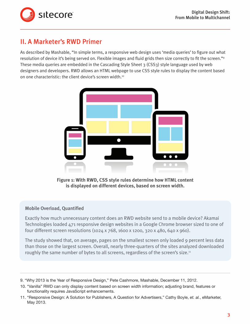
II. A Marketer’s RWD PrimerAs described by Mashable, “In simple terms, a responsive web design uses ‘media queries’ to figure out what resolution of device it’s being served on. Flexible images and fluid grids then size correctly to fit the screen.”9 These media queries are embedded in the Cascading Style Sheet 3 (CSS3) style language used by web designers and developers. RWD allows an HTML webpage to use CSS style rules to display the content based on one characteristic: the client device’s screen width.1011
Figure 1: With RWD, CSS style rules determine how HTML content is displayed on different devices, based on screen width.
9.“Why2013istheYearofResponsiveDesign,”PeteCashmore,Mashable,December11,2012.
10.“Vanilla”RWDcanonlydisplaycontentbasedonscreenwidthinformation;adjustingbrand,featuresorfunctionalityrequiresJavaScriptenhancements.
11.“ResponsiveDesign:ASolutionforPublishers,AQuestionforAdvertisers,”CathyBoyle,et. al., eMarketer, May2013.
Mobile Overload, Quantified
Exactly how much unnecessary content does an RWD website send to a mobile device? Akamai Technologies loaded 471 responsive design websites in a Google Chrome browser sized to one of four different screen resolutions (1024 x 768, 1600 x 1200, 320 x 480, 640 x 960).
The study showed that, on average, pages on the smallest screen only loaded 9 percent less data than those on the largest screen. Overall, nearly three-quarters of the sites analyzed downloaded roughly the same number of bytes to all screens, regardless of the screen’s size.11

Digital Design Shift: From Mobile to Multichannel
4
High overhead — and costsThe device’s “answer” to the media queries — desktop, tablet or smartphone — is applied against the CSS style rules and HTML content that were downloaded to the device, immediately prior. Importantly, all of the rules and HTML content associated with a webpage, for its potential display on all three device styles, have already been downloaded before the device’s reply to the CSS media query determines what is displayed.
Herein lies one of the key issues associated with RWD: performance and, ultimately, cost. If the HTML content and rendering rules for a smartphone screen are only a few kilobits in size, does it make sense to download the, say, three megabytes of rules and HTML content that would be destined for a desktop display of the same content? Intuitively, the answer is “no.”12
Put into the context of a visitor’s multipage web session, the RWD approach quickly generates a large amount of unnecessary overhead. The user experience can deteriorate in seconds, as the smartphone device struggles
to rationalize the many megabytes of HTML content and presentation rules it is being bombarded with.
From an enterprise website owner’s perspective, the transmission of unnecessary data translates into excessive hosting costs. Since hosting providers charge their customers for bandwidth consumed, the high potential costs of an RWD approach become readily apparent when calculated out across millions of page monthly page views.
When responsive web design makes senseHowever, while large enterprise or otherwise complex websites may not be ideally suited for RWD, certain applications can readily lend themselves to RWD-based deployment. These include:
• Form-driven sites, like surveys or data capture
• Small, basic websites13
• Simple campaigns on mid-size websites
• Small websites or microsites with short life spans
• Websites with no mobile requirements
• Desktop-to-tablet layouts, in which the content is the same
• Different device sizes within the same device.
12. Ibid.StudyconductedbyMillwardBrownandDynamicLogic.
13.Forexample,themanymillionsofentry-levelwebsitescreatedwithplatformssuchasWordPress,UmbracoandExpressionEngine.
RWD quickly generates a large amount of unnecessary overhead. The user experience can deteriorate in seconds.
Why Speed Matters
In general, mobile users have high expectations for mobile download speed. In a November 2012 study of US Internet, smartphone and tablet users, 59 percent of participants said download speed was the leading factor for determining whether a mobile website was “good.”12
CSS style rules and HTML content for all desired presentation styles must be downloaded to the client device before content is displayed.
Digital Design Shift: From Mobile to Multichannel
5
The common thread for these ideal RWD applications is their small scope, whether in physical size or duration.
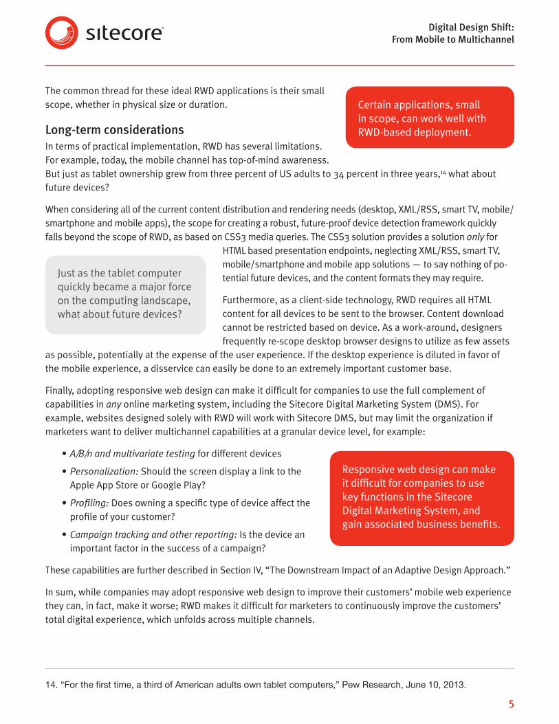
Long-term considerationsIn terms of practical implementation, RWD has several limitations. For example, today, the mobile channel has top-of-mind awareness. But just as tablet ownership grew from three percent of US adults to 34 percent in three years,14 what about future devices?
When considering all of the current content distribution and rendering needs (desktop, XML/RSS, smart TV, mobile/smartphone and mobile apps), the scope for creating a robust, future-proof device detection framework quickly falls beyond the scope of RWD, as based on CSS3 media queries. The CSS3 solution provides a solution only for
HTML based presentation endpoints, neglecting XML/RSS, smart TV, mobile/smartphone and mobile app solutions — to say nothing of po-tential future devices, and the content formats they may require.
Furthermore, as a client-side technology, RWD requires all HTML content for all devices to be sent to the browser. Content download cannot be restricted based on device. As a work-around, designers frequently re-scope desktop browser designs to utilize as few assets
as possible, potentially at the expense of the user experience. If the desktop experience is diluted in favor of the mobile experience, a disservice can easily be done to an extremely important customer base.
Finally, adopting responsive web design can make it difficult for companies to use the full complement of capabilities in any online marketing system, including the Sitecore Digital Marketing System (DMS). For example, websites designed solely with RWD will work with Sitecore DMS, but may limit the organization if marketers want to deliver multichannel capabilities at a granular device level, for example:
• A/B/n and multivariate testing for different devices
• Personalization: Should the screen display a link to the Apple App Store or Google Play?
• Profiling: Does owning a specific type of device affect the profile of your customer?
• Campaign tracking and other reporting: Is the device an important factor in the success of a campaign?
These capabilities are further described in Section IV, “The Downstream Impact of an Adaptive Design Approach.”
In sum, while companies may adopt responsive web design to improve their customers’ mobile web experience they can, in fact, make it worse; RWD makes it difficult for marketers to continuously improve the customers’ total digital experience, which unfolds across multiple channels.
14.“Forthefirsttime,athirdofAmericanadultsowntabletcomputers,”PewResearch,June10,2013.
Certain applications, small in scope, can work well with RWD-based deployment.
Responsive web design can make it difficult for companies to use key functions in the Sitecore Digital Marketing System, and gain associated business benefits.
Just as the tablet computer quickly became a major force on the computing landscape, what about future devices?
Digital Design Shift: From Mobile to Multichannel
6
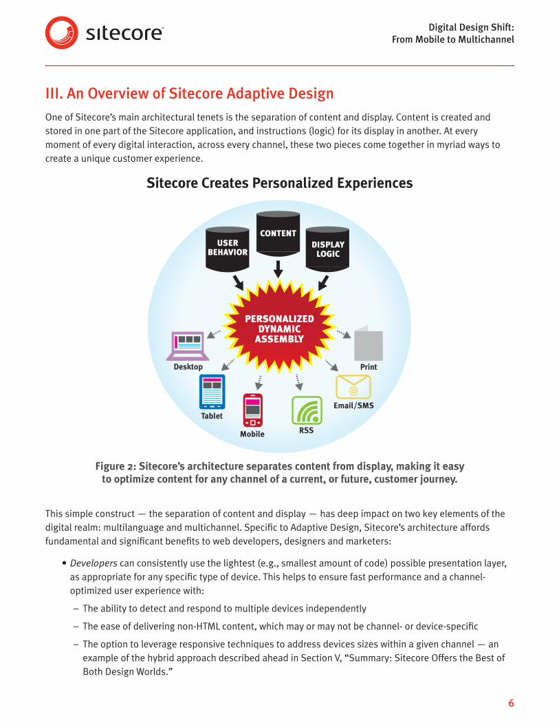
III. An Overview of Sitecore Adaptive DesignOne of Sitecore’s main architectural tenets is the separation of content and display. Content is created and stored in one part of the Sitecore application, and instructions (logic) for its display in another. At every moment of every digital interaction, across every channel, these two pieces come together in myriad ways to create a unique customer experience.
Sitecore Creates Personalized Experiences
Figure 2: Sitecore’s architecture separates content from display, making it easy to optimize content for any channel of a current, or future, customer journey.
This simple construct — the separation of content and display — has deep impact on two key elements of the digital realm: multilanguage and multichannel. Specific to Adaptive Design, Sitecore’s architecture affords fundamental and significant benefits to web developers, designers and marketers:
• Developers can consistently use the lightest (e.g., smallest amount of code) possible presentation layer, as appropriate for any specific type of device. This helps to ensure fast performance and a channel-optimized user experience with:
– The ability to detect and respond to multiple devices independently
– The ease of delivering non-HTML content, which may or may not be channel- or device-specific
– The option to leverage responsive techniques to address devices sizes within a given channel — an example of the hybrid approach described ahead in Section V, “Summary: Sitecore Offers the Best of Both Design Worlds.”
PERSONALIZEDDYNAMICASSEMBLY
USERBEHAVIOR
CONTENTDISPLAYLOGIC
Desktop Print
Email/SMSTablet
Mobile RSS
Digital Design Shift: From Mobile to Multichannel
7
• Web designers and marketers have the freedom to rethink the very nature of content and its presentation for different devices, and not just resize generic “one size fits all (channels)” content
• Marketers instantly gain full access to all the capabilities and benefits of the Sitecore Digital Marketing System, affording them more granular control over channel-specific customer experiences. The benefits of Sitecore DMS are discussed in Section IV, “The Downstream Impact of an Adaptive Design Approach.”
Sitecore’s ability to minimize client-side overhead also translates into lower hosting costs, as only necessary content and display logic are delivered to each visitor’s device.
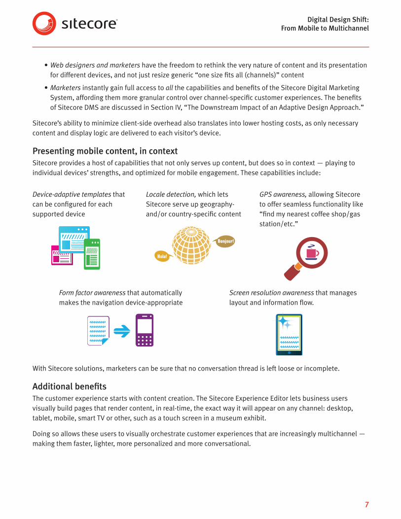
Presenting mobile content, in contextSitecore provides a host of capabilities that not only serves up content, but does so in context — playing to individual devices’ strengths, and optimized for mobile engagement. These capabilities include:
Device-adaptive templates that can be configured for each supported device
Locale detection, which lets Sitecore serve up geography- and/or country-specific content
GPS awareness, allowing Sitecore to offer seamless functionality like “find my nearest coffee shop/gas station/etc.”
Form factor awareness that automatically makes the navigation device-appropriate
Screen resolution awareness that manages layout and information flow.
With Sitecore solutions, marketers can be sure that no conversation thread is left loose or incomplete.
Additional benefitsThe customer experience starts with content creation. The Sitecore Experience Editor lets business users visually build pages that render content, in real-time, the exact way it will appear on any channel: desktop, tablet, mobile, smart TV or other, such as a touch screen in a museum exhibit.
Doing so allows these users to visually orchestrate customer experiences that are increasingly multichannel — making them faster, lighter, more personalized and more conversational.
Hola!
Bonjour!

Digital Design Shift: From Mobile to Multichannel
8
Figure 3.3: In the Sitecore Experience Editor, the user can preview adaptive website content exactly
as it will look on a particular device.
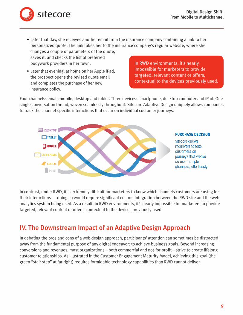
Spotlight on multichannel conversationsThere are a multitude of industries and instances in which a commerce transaction is the ultimate product of a multichannel conversation. Buying insurance is just one of them. Today’s path to conversion often looks like this:
• A prospect receives an email from a car insurance company promoting lower rates. She opens it on her smartphone, is redirected to the insurance company’s mobile website and requests a quote.
Figure 3.1: The Sitecore Experience Editor gives business users an intuitive, coding-free
environment for creating multichannel customer experiences.
Figure 3.2: The Mobile Preview function lets users preview how content will look on a wide
range of devices.
Digital Design Shift: From Mobile to Multichannel
9
• Later that day, she receives another email from the insurance company containing a link to her personalized quote. The link takes her to the insurance company’s regular website, where she changes a couple of parameters of the quote, saves it, and checks the list of preferred bodywork providers in her town.
• Later that evening, at home on her Apple iPad, the prospect opens the revised quote email and completes the purchase of her new insurance policy.
Four channels: email, mobile, desktop and tablet. Three devices: smartphone, desktop computer and iPad. One single conversation thread, woven seamlessly throughout. Sitecore Adaptive Design uniquely allows companies to track the channel-specific interactions that occur on individual customer journeys.
In contrast, under RWD, it is extremely difficult for marketers to know which channels customers are using for their interactions — doing so would require significant custom integration between the RWD site and the web analytics system being used. As a result, in RWD environments, it’s nearly impossible for marketers to provide targeted, relevant content or offers, contextual to the devices previously used.
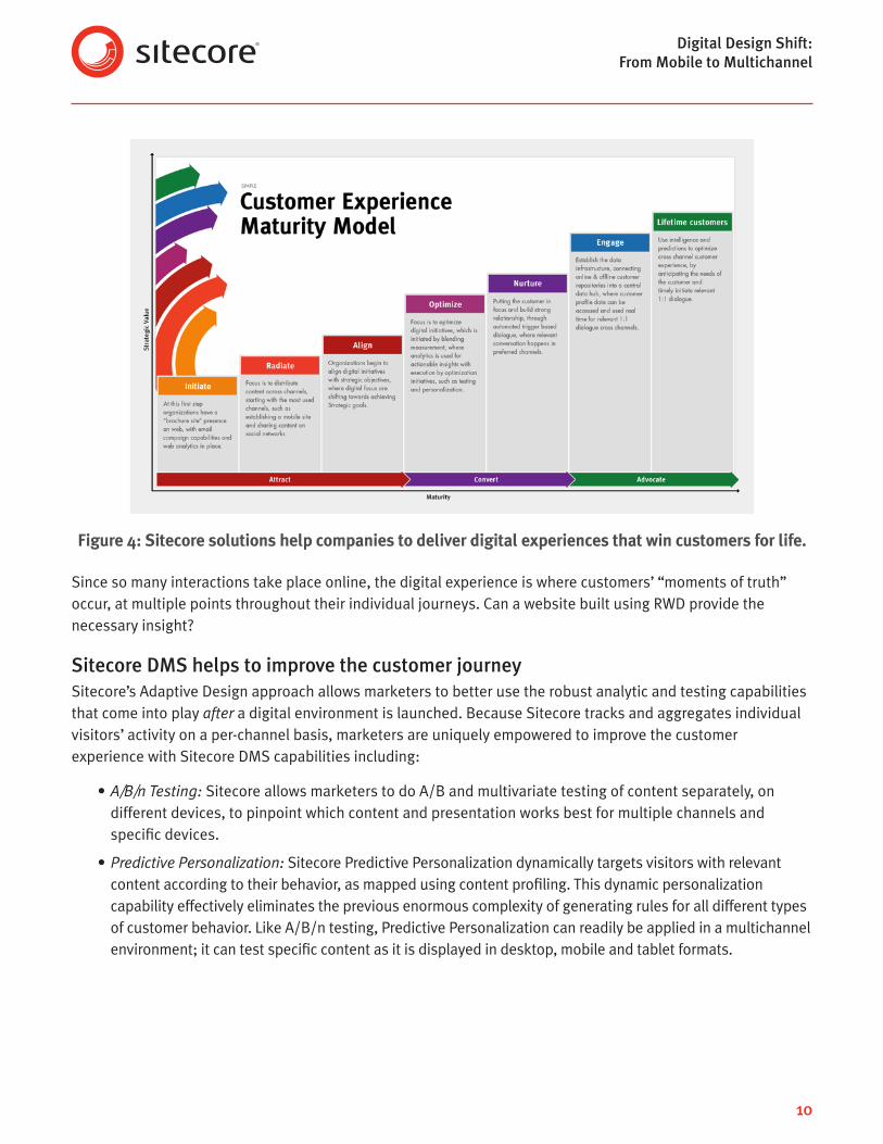
IV. The Downstream Impact of an Adaptive Design ApproachIn debating the pros and cons of a web design approach, participants’ attention can sometimes be distracted away from the fundamental purpose of any digital endeavor: to achieve business goals. Beyond increasing conversions and revenues, most organizations – both commercial and not-for-profit – strive to create lifelong customer relationships. As illustrated in the Customer Engagement Maturity Model, achieving this goal (the green “stair step” at far right) requires formidable technology capabilities than RWD cannot deliver.
In RWD environments, it’s nearly impossible for marketers to provide targeted, relevant content or offers, contextual to the devices previously used.
Digital Design Shift: From Mobile to Multichannel
10
Figure 4: Sitecore solutions help companies to deliver digital experiences that win customers for life.
Since so many interactions take place online, the digital experience is where customers’ “moments of truth” occur, at multiple points throughout their individual journeys. Can a website built using RWD provide the necessary insight?
Sitecore DMS helps to improve the customer journeySitecore’s Adaptive Design approach allows marketers to better use the robust analytic and testing capabilities that come into play after a digital environment is launched. Because Sitecore tracks and aggregates individual visitors’ activity on a per-channel basis, marketers are uniquely empowered to improve the customer experience with Sitecore DMS capabilities including:
• A/B/n Testing: Sitecore allows marketers to do A/B and multivariate testing of content separately, on different devices, to pinpoint which content and presentation works best for multiple channels and specific devices.
• Predictive Personalization: Sitecore Predictive Personalization dynamically targets visitors with relevant content according to their behavior, as mapped using content profiling. This dynamic personalization capability effectively eliminates the previous enormous complexity of generating rules for all different types of customer behavior. Like A/B/n testing, Predictive Personalization can readily be applied in a multichannel environment; it can test specific content as it is displayed in desktop, mobile and tablet formats.

Digital Design Shift: From Mobile to Multichannel
11
• Page Events and Goals: What does a marketer want to happen on each page of content? The answer varies widely, according to channel. In the insurance example in Section III, the marketer would not expect the customer to commit to making the switch to a new provider on the mobile channel, while on the go. But using the smartphone to check out the offer, and request more information for later consideration? Absolutely. With Sitecore, marketers can set up page events and goals that are granular and channel-specific.
• Campaign Tracking: With Sitecore DMS Engagement Intelligence Analytics, campaigns can be defined by individual channels, or as multichannel. This gives marketers a finer level of control, and the ability to track and compare campaign performance, channel-by-channel.
These kinds of capabilities empower marketers to be creative, efficient and effective. They are not readily available, at a fine level of detail, in environments in which RWD is solely used for a multichannel strategy. But they are an integral part of Sitecore DMS, helping to give marketers a holistic view of each customer – a business transition that requires seamless integration between the online and offline worlds.
By achieving a view of customer behavior that spans every touch point, companies can:
• Communicate with customers faster, with more relevance
• Quickly react and adapt to changes in customer behavior, in both the online and offline worlds
• Better predict revenue and proactively react to revenue trends, across channels
• Gain a shared, aggregate view of customer profiles and use the sum of this data to gain important insights that can catalyze business transformation.
Mobile or Tablet? Device-Specific Display Instructions
Sometimes a certain device, such as an oversized smartphone with a high-resolution screen, requires unique display instructions. Under a responsive web design approach, such a device displays content in tablet mode, when in fact the mobile format is more appropriate.
Sitecore Analytics allow marketers to check for any prevalent device that may need to be addressed for specific audiences, not just the wider industry norms, and create device-specific display instructions. In the oversized smartphone example, this capability would be invaluable to a consumer brand executing campaigns targeted at teens and young adults, an audience that can quickly flock to trendy new devices. These kinds of preferences can also vary by geography.
Sitecore allows marketers to better tap the robust analytic and testing capabilities that come into play after a digital environment is designed and launched.
Digital Design Shift: From Mobile to Multichannel
12
V. Summary: Sitecore Offers the Best of Both Design WorldsBecause the Sitecore solution is a platform, it is flexible and integration-friendly by design. This fundamental construct applies to many aspects of Sitecore-powered environments, from ease of integration to content design and display.
A hybrid solution: Blending RWD and Sitecore Adaptive DesignSpecifically, responsive web design and Adaptive Design techniques can be blended in the Sitecore environment. If a company wants to use RWD, this can be accomplished within Sitecore by having the site use RWD grids for sizing; Sitecore can then serve up device-appropriate content. And, when marketers want to be able to completely restructure a digital property’s navigation or Information architecture, or completely rethink the user experience specific to a device, Sitecore Adaptive Design is the correct approach. Both design approaches can be blended into a single Sitecore digital environment.
As digital developers, designers and marketers work together to engage customers in lifelong relationships with their company or brand, Sitecore offers an ideal platform with which to do so. Starting with an architectural foundation that separates content and display, and extending to granular multichannel controls and analytics, Sitecore Adaptive Design empowers companies to execute true multichannel marketing, and gain all the business benefits it entails.
About SitecoreSitecore is the global leader in customer experience management software for delivering the marketing that matters most – highly relevant content and personalized digital experiences that delight customers, increase loyalty and drive revenue. With Sitecore’s fully unified, powerful, and easy-to-use software suite, marketers can focus on engaging customers instead of managing data – to deliver experiences that are relevant, immediate, and integrated across channels. More than 3,000 of the world’s leading brands – including American Express, Carnival Cruise Lines, easyJet, Heineken, LEGO, Microsoft, and Nestlé – depend on Sitecore to help them deliver the meaningful interactions that win customers for life.
Both Sitecore Adaptive Design and RWD can be blended into a single Sitecore digital environment.