Digipak oasis
3
Oasis standing on the shoulder of giants This album cover by oasis is a very unique and quite attractive album cover because of its mixture of bight colors and interesting scenery that they have used. The picture has been well edited and you can tell that the theme has been well developed and understood. In respect to the location they have decided to base it in new york and I believe they have been able to achieve there goal that is clearly indicated by there title to the album. In regards to the title of the album I believe that what they have done is very credible and makes a lot of sense by using some of the worlds tallest buildings in the world to suggest that they are perhaps a entire body of giant buildings The attention to detail is fantastic in this shot. The photo took 18 hours of shooting time to collect and that meant taing a photo of the same spot every half an hour. And then it was edited to make it look like different times of day in different
-
Upload
g321markrattigan -
Category
Education
-
view
69 -
download
0
Transcript of Digipak oasis

Oasis standing on the shoulders of giantsThis album cover by oasis is a very unique and quite attractive album cover because of its mixture of bight colors and interesting scenery that they have used. The picture has been well edited and you can tell that the theme has been well developed and understood. In respect to the location they have decided to base it in new york and I believe they have been able to achieve there goal that is clearly indicated by there title to the album. In regards to the title of the album I believe that what they have done is very credible and makes a lot of sense by using some of the worlds tallest buildings in the world to suggest that they are perhaps a entire body of giant buildings out there are that they are standing on a section or one of the highest points a shoulder but this makes clear that they must be even bigger buildings to come. The shot of the empire state building and the world trade center towers show that there do keep getting bigger
The attention to detail is fantastic in this shot. The photo took 18 hours of shooting time to collect and that meant taing a photo of the same spot every half an hour. And then it was edited to make it look like different times of day in different areas of the photo which I think is one of the best album covers I have ever seen.
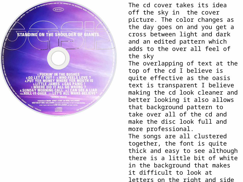
The cd cover takes its idea off the sky in the cover picture. The color changes as the day goes on and you get a cross between light and dark and an edited pattern which adds to the over all feel of the sky The overlapping of text at the top of the cd I believe is quite effective as the oasis text is transparent I believe making the cd look cleaner and better looking it also allows that background pattern to take over all of the cd and make the disc look full and more professional.The songs are all clustered together, the font is quite thick and easy to see although there is a little bit of white in the background that makes it difficult to look at letters on the right and side
I believe this cover photo works well with the album cover because the sky in the cover photo links with the pattern on the cd and I believe they have used the sky as the background because these big buildings stretch further and father in to the sky and more and more into the unknown

The back cover of this album shows a totally different picture. Still in new york this picture carry's the same details of the pictures before in terms it has the same design and it shows the place a different times in a day that have been shot and edited together. But this photo is off different buildings but they are all big skyscrapers and I bileve what this is tying to say is that they go on forever and that they will get more modern and better developed as time goes on.
There is a better understanding for what different parts of the day look like with the different lighting schemes and it is interesting to see all of the different splits of editing that has been morphed into one picture comprising of lots of individual photos
I believe that there is a message relating to this and I think it is this, that while we seen these buildings as giants there are only the shoulders of something bigger that we can possibly build in the future.
The song list is separated by a black back at the side that really makes the white font stand out and I think your eyes are drawn to that looking at the cover. The way in which they have the music traks written makes the album back look more like a single release cover than a full album release .