Digipak artwork
7
Digipak Artwork
Transcript of Digipak artwork
Digipak Artwork
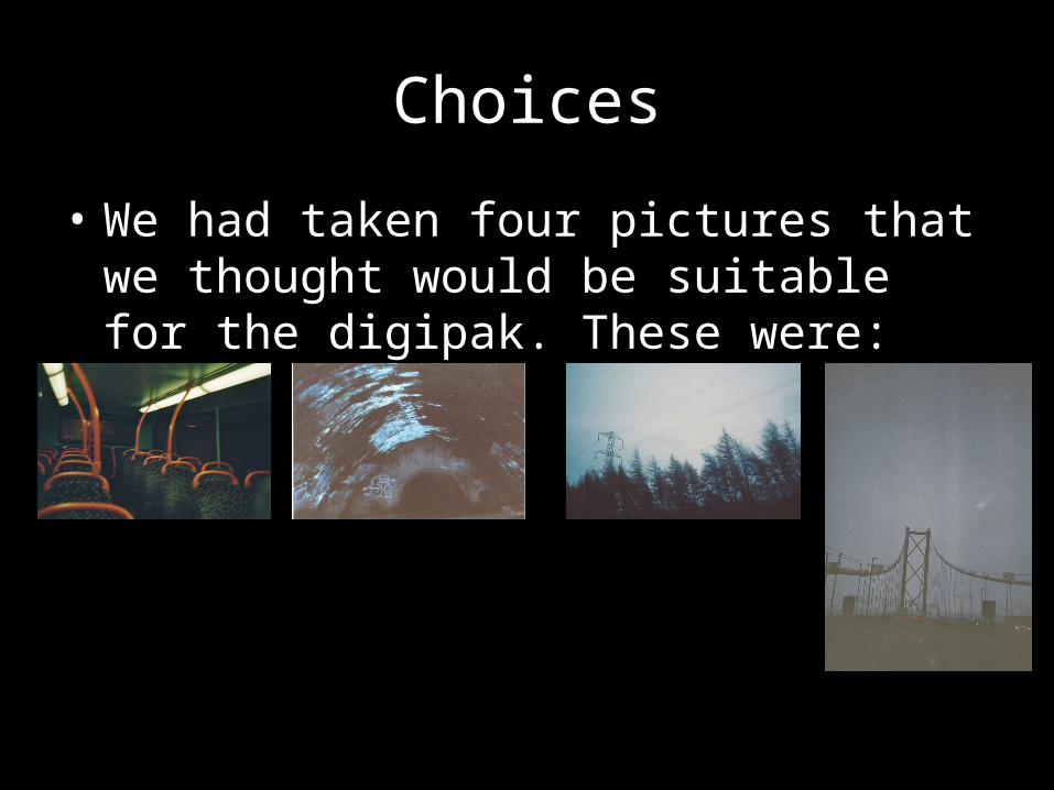
Choices
• We had taken four pictures that we thought would be suitable for the digipak. These were:
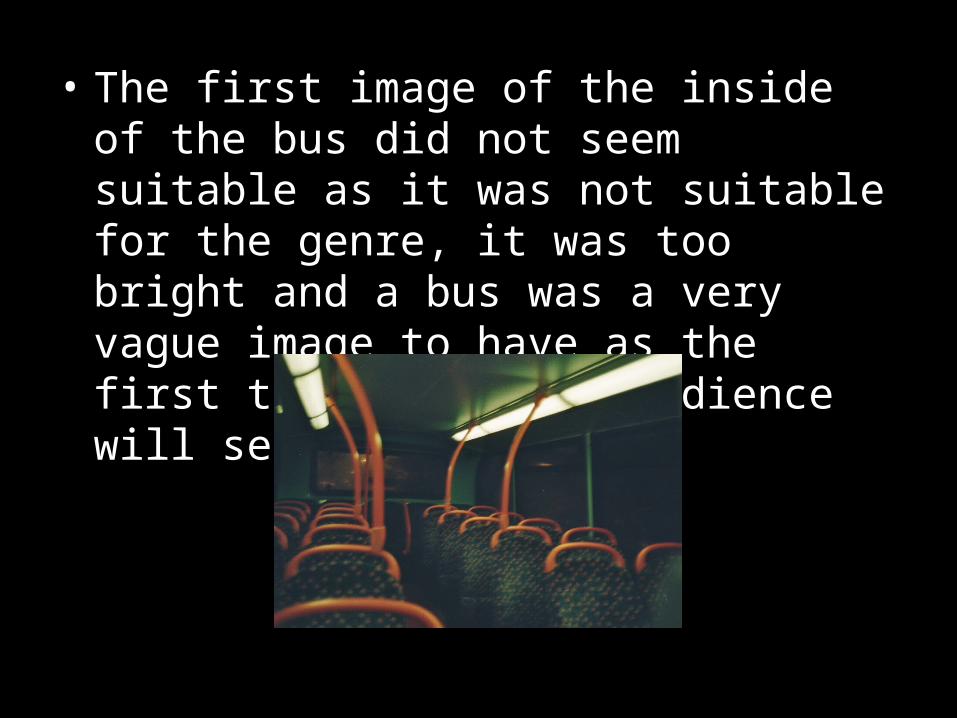
• The first image of the inside of the bus did not seem suitable as it was not suitable for the genre, it was too bright and a bus was a very vague image to have as the first thing that the audience will see.
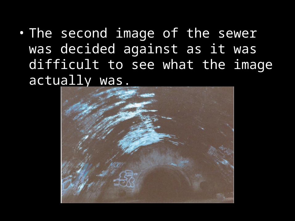
• The second image of the sewer was decided against as it was difficult to see what the image actually was.
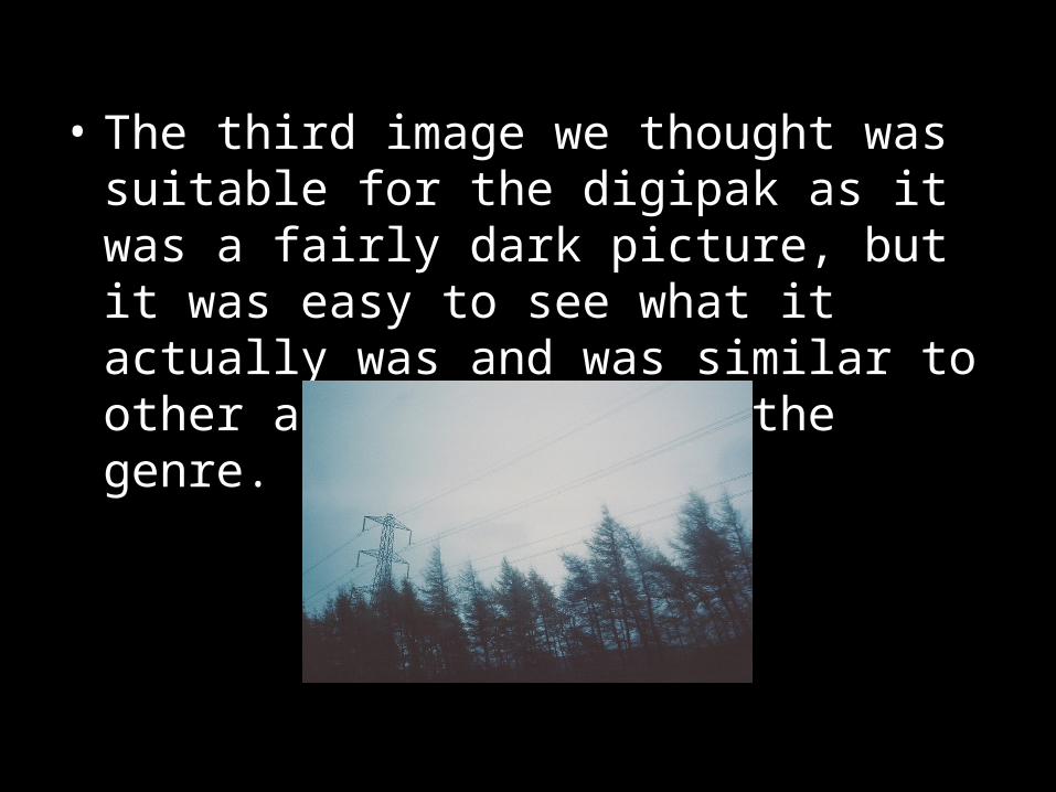
• The third image we thought was suitable for the digipak as it was a fairly dark picture, but it was easy to see what it actually was and was similar to other album artwork in the genre.
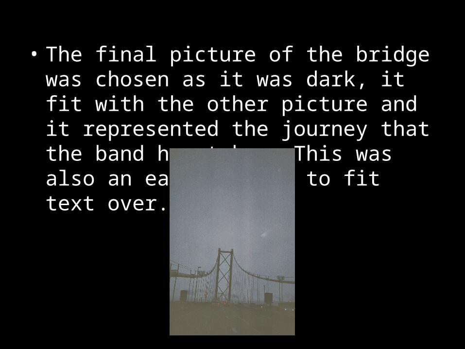
• The final picture of the bridge was chosen as it was dark, it fit with the other picture and it represented the journey that the band has taken. This was also an easy picture to fit text over.
Front and Back Cover
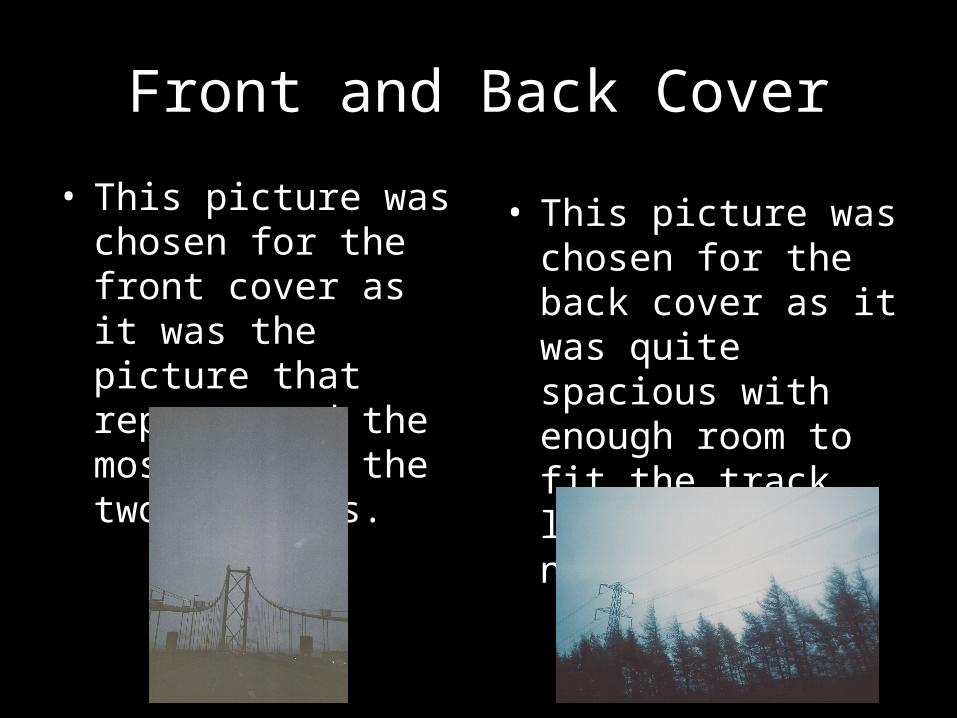
• This picture was chosen for the front cover as it was the picture that represented the most out of the two pictures.
• This picture was chosen for the back cover as it was quite spacious with enough room to fit the track listing and any necessary text.