Digipak analysis
5
Digipak Analysis
-
Upload
lauren-parton -
Category
Education
-
view
70 -
download
0
Transcript of Digipak analysis

Digipak Analysis

Front CoverBlack and white filter – suggests a lack of light and happiness. As if the life has been sucked out of everything. This creates continuity with my music video as several black and white shots are featured when portraying my protagonists life as miserable.Important information for the audience such as the name od the artist and album is of a large font size to make sure the digipak is instantly recognisable. Use of autumnal orange colour, signifies death and decay linking to the miserable attitude of the protagonist in the present.Overlapping and altered translucency – Shows that the two characters are connected(same person.) Also clearly signifies contrast of two characters, happiness and sadness, linking to the music video. Decided not to include a picture of the artist as my research suggested that Ben Howard did not want to be the centre of attention and wanted the themes and music to take more importance as he did not feature on the front covers that I researched
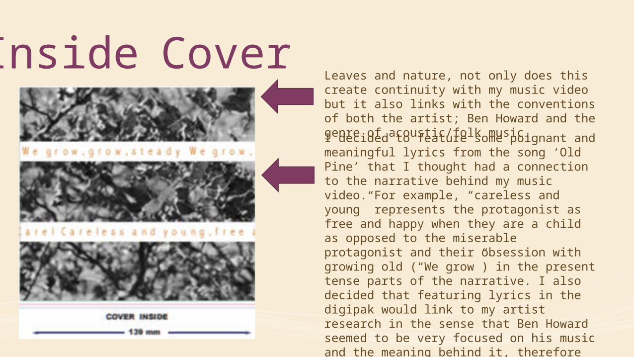
Inside CoverLeaves and nature, not only does this create continuity with my music video but it also links with the conventions of both the artist; Ben Howard and the genre of acoustic/folk music.
I decided to feature some poignant and meaningful lyrics from the song ‘Old Pine’ that I thought had a connection to the narrative behind my music video. For example, “careless and young” represents the protagonist as free and happy when they are a child as opposed to the miserable protagonist and their obsession with growing old (“We grow”) in the present tense parts of the narrative. I also decided that featuring lyrics in the digipak would link to my artist research in the sense that Ben Howard seemed to be very focused on his music and the meaning behind it, therefore featuring these lyrics again shifts the focus back to the songs and the music.

Left CoverThe sparks link again to my artist as in many of his music videos there is a large focus on light. The vibrancy of the fire is used to represent the happy side of the protagonist as a child as it links to the excitement and endless possibilities of childhood. To create this image I used a screenshot from my music video to create continuity and altered the brightness and contrast to make it appear even brighter and more exciting.

Left and Back CoverI decided to use the tree trunk of my image to create the spine of my digipak I believe this concept links strongly to the themes throughout my products as it represents the strength and consistency of nature which is something that I wanted to show throughout my advanced production. I believe this concept also links closely with the folk/acoustic genre.
I have included the logo for my artists record company, a barcode and a QR code as my research informed me that these features were needed to create an authentic digipak.
I included an image of a tree as it quite clearly links to the title of the album ‘Old Pine.’ However, I decided to distort this image slightly by using a radial blur on Fireworks. I wanted this effect to represent the confusion and instability of my protagonist as opposed to the consistency and strength of nature. This stark contrast links to how the protagonist eventually finds comfort in the familiarity of nature and its ability to stay the same.