Development of front coverroughcut
13
Development of Front Cover I selected one of the photos I had taken, which I think is an appropriate photo to use for a front cover. This is because the model is making direct eye contact with the camera and it adds a sense of mystery to the image. I chose the magic wand tool to select the background, which enabled me to colour it white.
-
Upload
katymarwood -
Category
Data & Analytics
-
view
290 -
download
1
Transcript of Development of front coverroughcut

Development of Front Cover
I selected one of the photos I had taken, which I think is an appropriate photo to use for a front cover. This is because the model is making direct eye contact with the camera and it adds a sense of mystery to the image. I chose the magic wand tool to select the background, which enabled me to colour it white.

Image with a fully white background.

Added masthead. When applying the masthead, I looked back at my research and found the gap between the models head and the masthead was too big. I then resized the image and started to think more about conventions of a magazine and added a banner. Whilst doing so, I reflected back on existing media products of the genre (indie rock magazines) After that I included the headline and also added text to the banner, which includes freebies the magazine provides. In this case it was two free posters. I first did the text red and then decided white would look better. This is another convention of an indie rock genre like NME; my magazine so far is following the colour scheme of red, white and yellow. However, I will play around with the use of colour and decide which I think is the most appropriate and aesthetically pleasing.


I then started to work on the puff and the features of my magazine. I used the font called ‘’eurostille’’ as well as ‘ezo sz’ to change things up. I used the circle tool and filled it yellow. I used the title ‘’The 1975 announce new UK dates’’ because from my research I found The 1975 are a big, popular band from the indie rock genre. I then added two pictures from my photoshoot for the ‘’free posters’’ and added the features of ‘’in depth interviews with the biggest bands of 2014’’ I then added a photo of my other models to feature in my magazine. I uploaded the photo to photoshop and roughly used the magic wand tool to make the background partially white. This was because it made the photo blend with the back of my main image better. I then used the line tool and increased the thickness to 10 and went around two sides of the image to make a somewhat border effect.


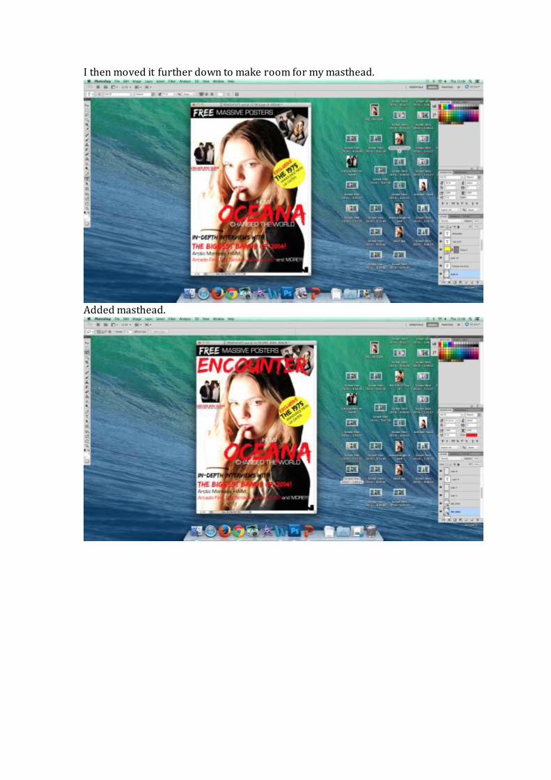
I then moved it further down to make room for my masthead.
Added masthead.

Added a bottom banner and changed the way text is organised and shown, by adding boxes which is a common feature of indie rock magazine covers like NME. I also added a number to my top banner to state how many free posters are inside of the magazine.
I then rotated the text for my puff making it easier for the audience to read. Font experimentation

lithios pro bold

Took inspiration from an issue of nme to include the extra artists featured
I then added a barcode and I hadn’t created a separate layer for my bottom banner using photoshop so the barcode wouldn’t go over it. To overcome this I had to put the barcode in the top right which is unusual but I know from my research that other magazines, like Q, do this.

I then reflected back upon my audience research and priced my magazine at £2.50