Designing User Interfaces User Interface: People’s perception of “The Product” Good UIs have...
30
Designing User Interfaces • User Interface: People’s perception of “The Product” • Good UIs have two well-integrated conceptual parts: – Form / Visual Design – Functionality / Navigation • Implementing good UIs requires harmony between them
-
Upload
lesley-small -
Category
Documents
-
view
213 -
download
0
Transcript of Designing User Interfaces User Interface: People’s perception of “The Product” Good UIs have...

Designing User Interfaces
• User Interface:People’s perception of “The Product”
• Good UIs have two well-integrated conceptual parts:– Form / Visual Design– Functionality / Navigation
• Implementing good UIs requires harmony between them

Visual Design is about
• Information “Resolution”– How much you try to tell in a screenshot– Especially if you convey quantitative information
• “Interaction” between Design Elements– It draws your attention, then what?
• Color Issues -- Support or interfere with UI?
• Typographical Issues -- Support or interfere with UI?
• Overall Design “Quality”

The ProblemIntelligenthuman
PowerfulmachineCommunica
tion B
ottleneck
One screenshot < 1% of one printed page

1-1 page to screen?
• Scrolling requires users to rely on visual memory
(a weak skill)• Multiple screens per page make it difficult
– to make a comparison, a choice– to keep track of context (“Where am I?”)
• Multiple screens management adds lots of administrative debris (buttons, menus, navigational images, etc.)
• Design needs to increase “signal” & reduce “noise”
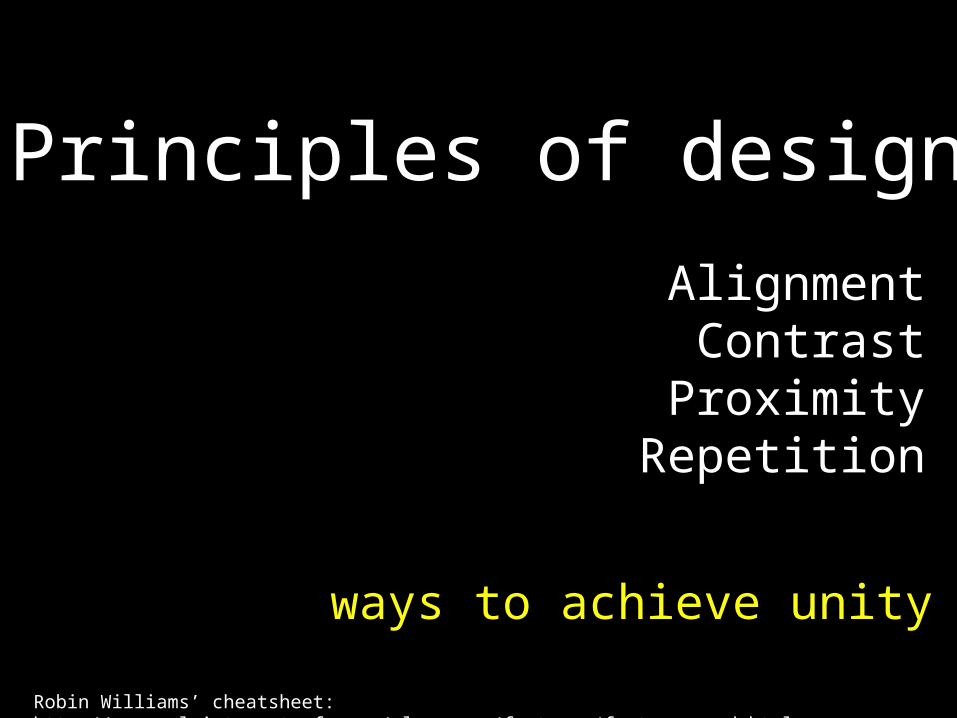
Principles of design
ways to achieve unity
AlignmentContrast
ProximityRepetition
Robin Williams’ cheatsheet: http://www.urlsinternetcafe.com/classroom/features/featuresgood.html
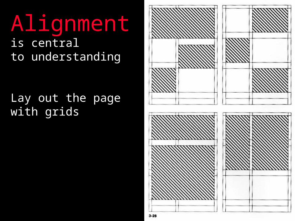
Alignment is central to understanding
Lay out the pagewith grids

Diagonals add tension

Alignment is not strictly via squares

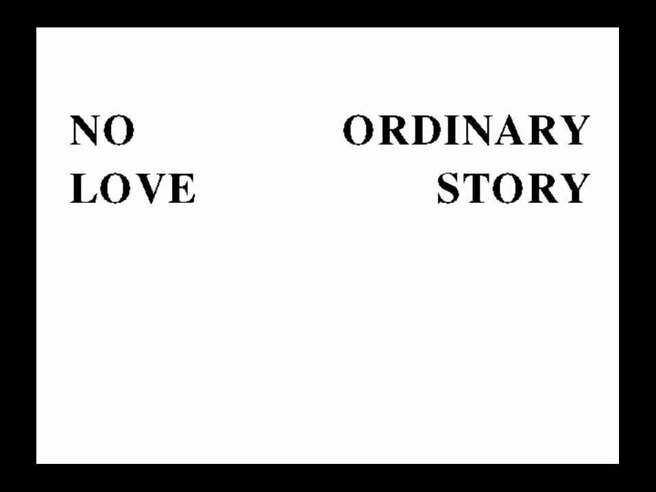
Contrast brings out the focal point

Where you place graphics or text creates or upsets
balance
Visual weight
Contrast in:
Colorsizeshapephoto v. drawingorientationfont
Anything that is different
from the rest

proximity
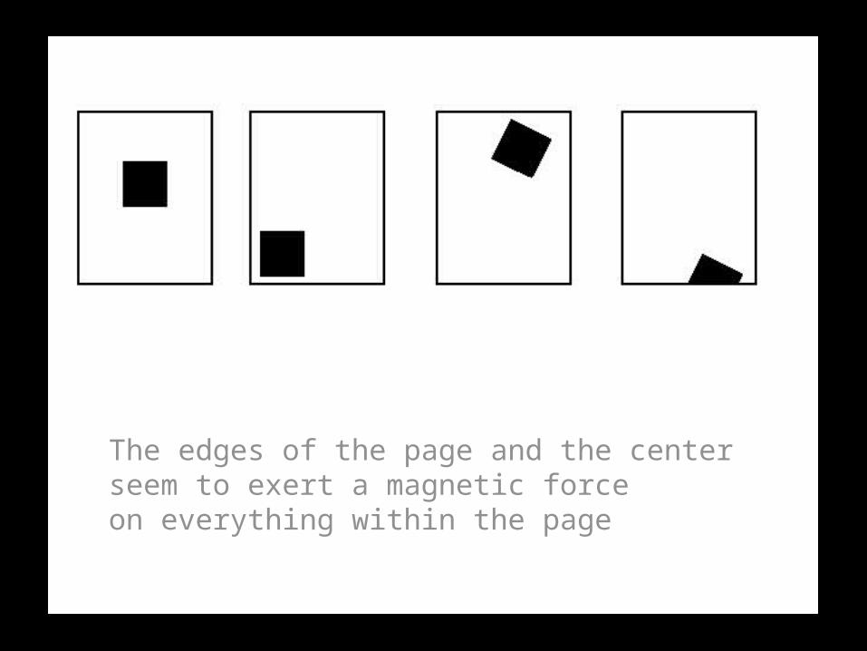
The edges of the page and the centerseem to exert a magnetic force on everything within the page

repetition
similarity

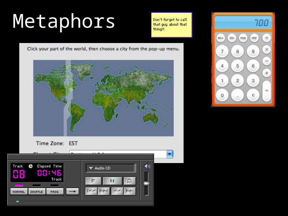
Metaphors

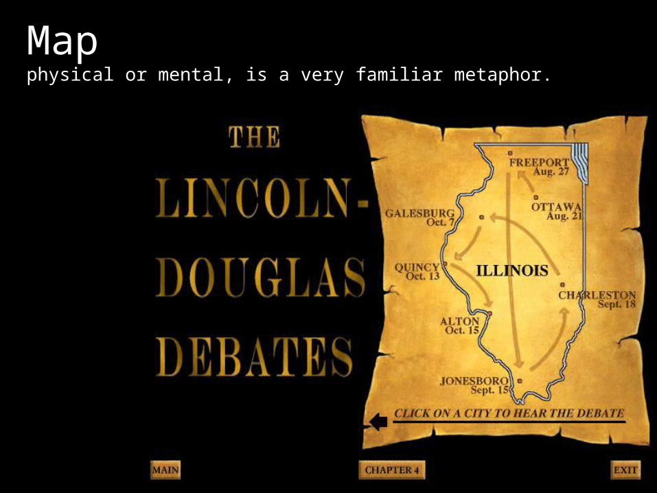
Map physical or mental, is a very familiar metaphor.

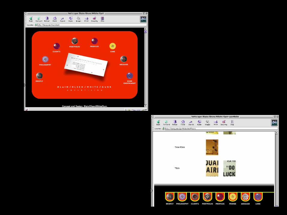
Example of a map used in lieu of menus or buttons
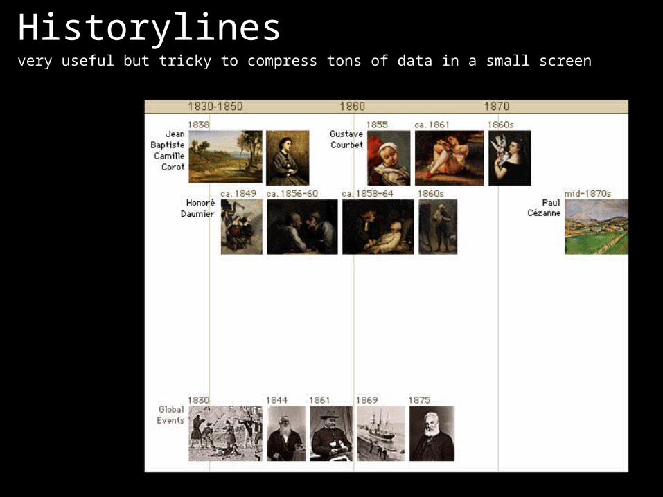
Historylines very useful but tricky to compress tons of data in a small screen

A good example of increasing information density
Beware!

Form beats function

Screen real estate sold cheap


Think of usage