
DESIGNING FOR THE WEB ART340. Strong vs. Weak Design Two main perspectives for judging design: ...
29
DESIGNING FOR THE WEB ART340
-
Upload
violet-burke -
Category
Documents
-
view
216 -
download
0
Transcript of DESIGNING FOR THE WEB ART340. Strong vs. Weak Design Two main perspectives for judging design: ...

DESIGNINGFOR THE WEB
ART340
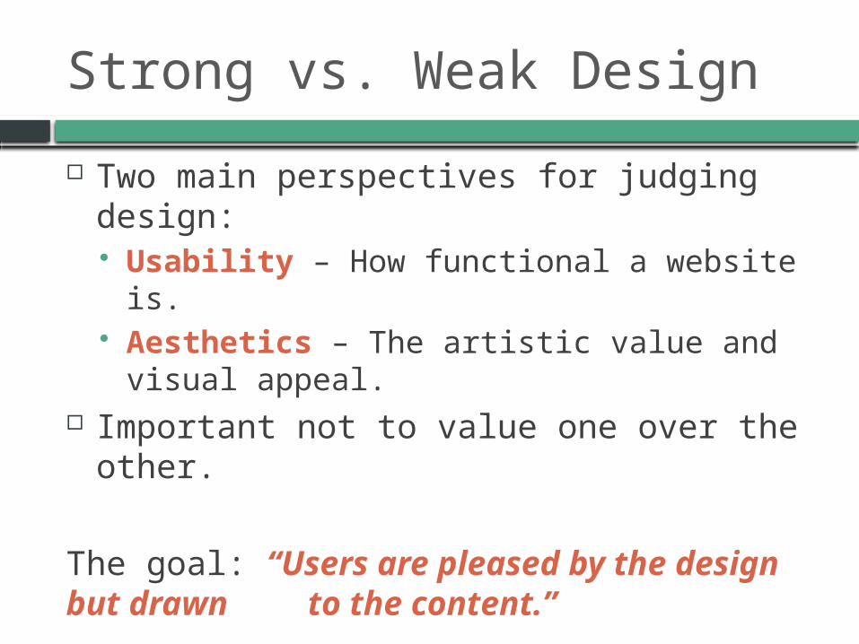
Strong vs. Weak Design
Two main perspectives for judging design: Usability – How functional a website is. Aesthetics – The artistic value and visual appeal.
Important not to value one over the other.
The goal: “Users are pleased by the design but drawn to the content.”

Usability
How intuitive it is to use. The design should not get in the way between the user and the information they are looking for.
Points to consider: Navigation should be clearly visible and consistent. Each link should have a descriptive title. Use pseudo classes on links to indicate link activity. Cohesive theme between homepage & subpage.

Web Page Anatomy

Web Page Anatomy
Container – Holds the contents of the page. Width can be fluid or fixed.
Logo – The identity. Navigation – Must be easy to find and use and
“above the fold (500px. from top).” Content – “Content is King.” Keep the main content
block as the focal point of a design. Footer – Contains the copyright, contact, legal info.,
and sitemap. Should indicate bottom of site. Whitespace – Allows breathing space to guide user’s
eyes around a page.

The Golden Ratio
Dividing a line by 1.62. Lines that are proportionate to the golden ratio are
considered to be aesthetically pleasing.

Using the Golden Ratio
How to use in web? The Rule of Thirds
Simplified version Use for general layout

Using Grids
Provides a solid, structural foundation. A visual consistency for placing objects. If your layout isn’t looking quite right, you can move
elements and resize them onto a grid. Experiment!

The Principles of Aesthetic Experience
Design Theory

Balance
Symmetrical: http://qlpros.com Elements of a composition are the same on either
side of an axis line. “Mirror-Image.” Helps us remember. Passive. Classic. Stability.
Asymmetrical: http://31three.com/ Most sites. Equalizes the weight of objects of
differing sizes, shapes, tones or placements. More interesting and dynamic. Active. Grabs attention.
Use both in creating a successful design: http://www.vanseodesign.com/web-design/symmetry-asymmetry/

Unity
The way in which the different elements of a composition interact with one another.
Your layout must work as a whole rather than separate pieces.
How to achieve unity? Proximity: Placing related items near each other, ie.
headings near paragraphs. Repetition: By repeating colors, shapes, textures, objects, it
creates a cohesive design. (sketch.odopod.com/))

Emphasis
Drawing the viewer’s eye to a particular feature on the page. Moves a viewer’s eye across the page. Placement: The top-left corner demands attention. Continuance: The path your eyes follow until a more
dominant feature comes along. Isolation: An item that stands out from its surroundings will
tend to demand attention. Contrast: The greater the difference between an element
and its surroundings, the more it stands out. Proportion: Difference in scale of objects.

Designing Your Site

Research & Planning
Every web site must begin with an idea. To develop your idea, seek to understand as
much as you can regarding the purpose for the site. What will users do? Who is your target audience? Who will generate content? Do you have graphic standards to meet? Look at other websites. What do you like
about them? What do you dislike?

Thumbnail Sketches
Before going digital, sketches help clarify a general layout direction for the design.
Layout possibilities are endless! However, this article is a great starting place: http://designshack.net/articles/layouts/10-rock-solid-website-layout-examples
Select your general hp/sp layout before moving digital.

Information Architecture
The organization of the content and how you get to it.
Draw a diagram or flow chart of how users will move through your web site.
Outlines navigation.Home
About Contact

Wireframe
A digital structure for prototyping the layout of the site. “The Blueprint.”
Focuses on usability. Benefit: Allows any issues to be discovered early on.
Minimizes scope creep. Usually lacks typographic style, color, or graphics,
since the main focus lies in functionality, behavior, and priority of content.

Content
The most important part of a web site is its content. Ideally, the client is responsible for generating the
content that goes on the site. Someone will be in charge of copy writing for the
website.
Image Source: http://realsocialpros.com/posts/content-creation-for-seo/

Mockups
For this course, we will create our mockups in Photoshop or Illustrator.
Mockups are visual designs of what the final website will look like.
Develops the graphic look and feel. Multiple versions (2-3) may be given to client. Best version is selected and refined to build final design.

Development
Once the design is approved, the site enters the production phase.
Putting the pieces together. The site is created using (X)HTML, CSS, scripts, etc. Essentially, the site is built!

Testing
All sites need to be tested before going live. Basic functionality Browser compatibility How easy they are to use

Launch aka “Going Live”
Uploading the site to the server and making it available to the world. Everything should be perfect beforehand. Testing, once again.
Your work is done, for now…and celebration, such as
sparkling grape juice, is required.

Points to Consider

Morgue File
Similar to a mood board. Create a folder to hold screenshots for design inspiration. Clip anything that inspires you!

Legibility
Research shows no reliable difference in reading speeds between serif vs. sans-serif typefaces.
Popular typefaces are easier are faster for people to read (Times New Roman, Georgia, Arial, Helvetica, Verdana), vs. unfamiliar typefaces.
Fonts smaller than 12 pts. elicit slower reading times.
We read familiar typefaces best, but we learn better with unfamiliar ones.
Source: http://www.usability.gov/pdfs/chapter11.pdfSource: http://www.smashingmagazine.com/2013/02/18/designing-reading-experience/

Avoid Horizontal Scrolling
Happens when web pages are too wide to be displayed in the browser window.
Rule of thumb: Max-width: 960-1000px. You can also use liquid layouts with percentages or
ems to avoid this problem.

Background Colors
Use background colors to help users understand the grouping of related information.
Source: http://www.usability.gov/pdfs/chapter11.pdf

Webfonts
Later in the semester we will talk more about these. For now, I want you to be aware of Google Web fonts.
http://www.google.com/webfonts By placing a link to the typeface in the <head> of your
document, you will be able to use different typefaces.

Research, Research, Research Admire the Web – The Very Best Web Design Inspiration CSS Drive Unmatched Style Pattern Tap Best Web Gallery Article: Top 10 Web Design Trends of 2012 Behance: Showcase and Discover Creative Work Cargo Abduzeedo – Sites of the Week Dribbble