Designing for the New Fold
24
Web Design Theory Sessions Session 2 Designing for the New Fold: Web Design Post Monitorism Presented by: Hashem E.Zahran.
-
Upload
hashem-zahran -
Category
Design
-
view
4.606 -
download
0
Transcript of Designing for the New Fold

Web Design Theory Sessions
Session 2
Designing for the New Fold:
Web Design Post Monitorism
Presented by: Hashem E.Zahran.

Session 2 Content
Designing for the New Fold
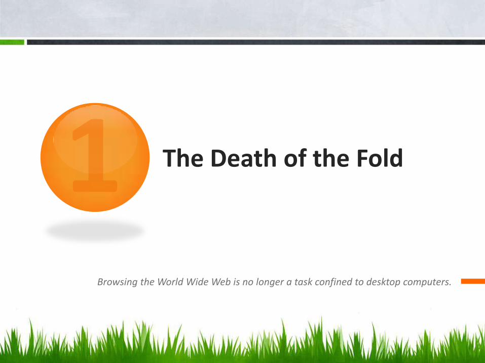
The Death of the Fold
Introduction:The old Fold
The Foldin Action
New Fold Problems
New Fold Design
StrategiesConclusion
The Death of the Fold
Browsing the World Wide Web is no longer a task confined to desktop computers.

The
De
ath
of
the
Fo
ldis
at
last
up
on
us
Why?Because the traditional “screen” that people view the web through has undergone an explosion of variety… we can no longer expect web-surfers to be on something close to a 19″
monitor with a resolution somewhere between 1024×768 and 1280×700. Screens nowadays come in all shapes and sizes, from iPhones (and smaller phones) to 60″ HDTVs.
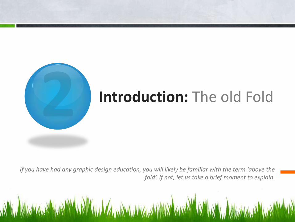
Introduction: The old Fold
If you have had any graphic design education, you will likely be familiar with the term ‘above the fold’. If not, let us take a brief moment to explain.

About the Fold

Above the Fold

Now, at this point some of you may be thinking, or even shouting (given the amount of debate this subject seems to cause) that the ‘fold’ is irrelevant and any discussion of it should be confined to the history books.
Phooey

The notion that a web designer is restrained to a small portion at the top-part of the screen is absurd. We would like to believe that all web users scroll and that we have the freedom to express ourselves and create a design in as much space as it takes.
Phooey

Undoubtedly there has been many an argument between a web designer and their client as to the importance of the ‘fold’ and this may have contributed to the somewhat bad reputation it has.
Phooey
On the other hand, to disregard the idea of the ‘fold’ entirely would be a mistake, and you would miss out on a potentially powerful design technique as we will see below.
Phooey
The Fold in Action
The importance of that first impression is recognized

Kaleidoscope
The beautifully crafted website for the Kaleidoscope app is an excellent example of designing with ‘the fold’ in mind.
It will always be second nature to include the key messages and call-to-action material near the top of a
site design… but dogmatically trying to squeeze content above the fold is no longer a strategy that should chain
down your designs.
Science of Web Design
The Problem withThe New Fold
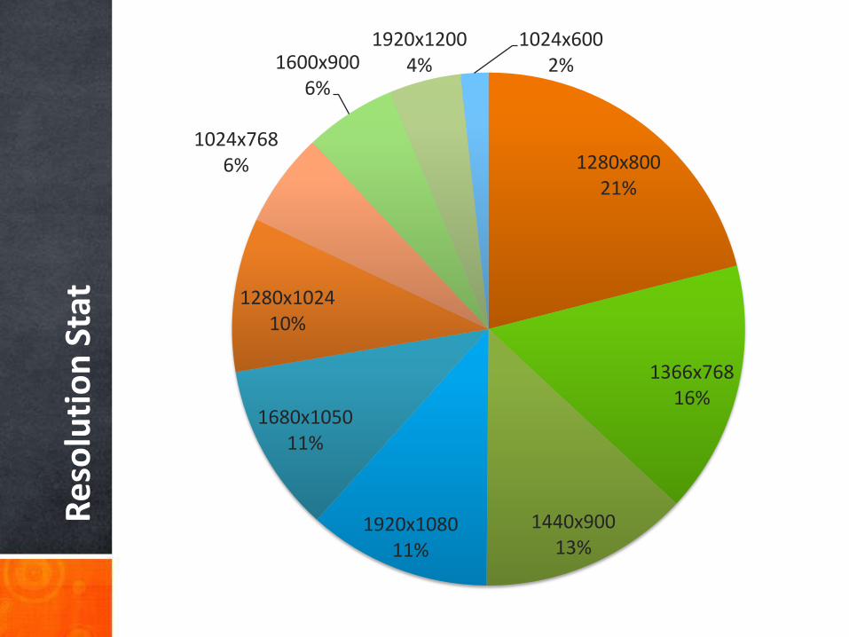
quick peek at the browser resolution statistics
Re
solu
tio
n S
tat
1280x80021%
1366x76816%
1440x90013%
1920x108011%
1680x105011%
1280x102410%
1024x7686%
1600x9006%
1920x12004%
1024x6002%

Strategies for Designing for the New Fold
how on earth is it possible to know where the ‘fold’ is?

A more sensible approach would be to design for general, ratio based folds that would take both landscape
and portrait orientated browsing into consideration…
is it possible to know where the ‘fold’ is?

The Bigger Picture
“…In the study, they found that 76% of users scrolled and that a goodportion of them scrolled all the way to the bottom, despite the height
of the screen.”

Conclusion
Final Statement
The traditional concept of designing for the ‘fold’ appears to be somewhat outdated when it comes to modern web design. We have seen that a combination of variables and a change in the browsing methods of many people means that a fixed position of the ‘fold’ line cannot safely be established. Web users are also very much prepared to scroll; especially with multi-touch devices such as the IPad that make the task very intuitive.
However it does not mean that the ‘fold’ should be disregarded completely. The ‘fold’ can still be an effective element in any design. There can be no doubt that first impressions do indeed count in web design and this space can be used to not only capture your audience but also lure them further down the page. Reserve this area for your most essential information while reassuring your clients that visitors will still see that paragraph on their history further down the page.

With no signs that mobile browsing is slowing, an argument can also be made for designing for a second ‘fold’ line for those browsing using a portrait-oriented device. It should not be detrimental to your design in any way and will only give those using such devices an added bonus.
So, What do you guys think? Do you still attempt to design for the fold? Is it a case that we designers are already aware of such changes and is it the clients that we need to educate?

?This is it…Any questions?
www.HashemZahran.com - www.eSpace.com.eg - Follow me: @antikano